#gif caption tutorial
Explore tagged Tumblr posts
Text


Are you intending to talk all the way through this?
#my lady jane#myladyjaneedit#jane x guildford#janeford#myladyjanecentral#janefordarchive#userninz#chrissiewatts#usertina#userelliee#tusermira#mine*#yeah. YEAH!#like. she got with the programme QUICK#its all about the hands#she had multiple opportunities to shut him up and took them#her hair is so good i need a tutorial asap#took a creative license with the caption but y'all get the idea
690 notes
·
View notes
Photo


#svtsource#svtgifs#svtdaily#jeonghan#mingyu#seventeen#gyuhan#kim mingyu#yoon jeonghan#**finally.mp3#so i finally learned how to blur captions kkskkkkkskk pero this will be the only set i can edit w the caption blurring#becosss i couldnt catch up with the tutorial and i also want to put this and the other sets out soon#but ill try following the whole tutorial when i also have the time and by that i mean the convert to smart etc sequence#i tried that today though but the whole gif froze :'(#kaya next time na
181 notes
·
View notes
Text

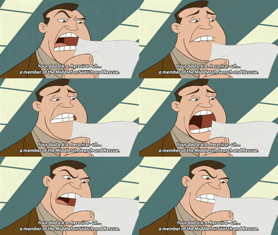
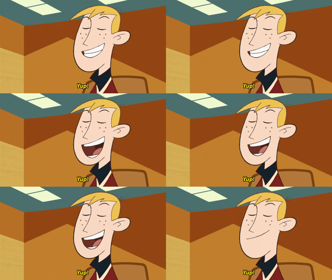
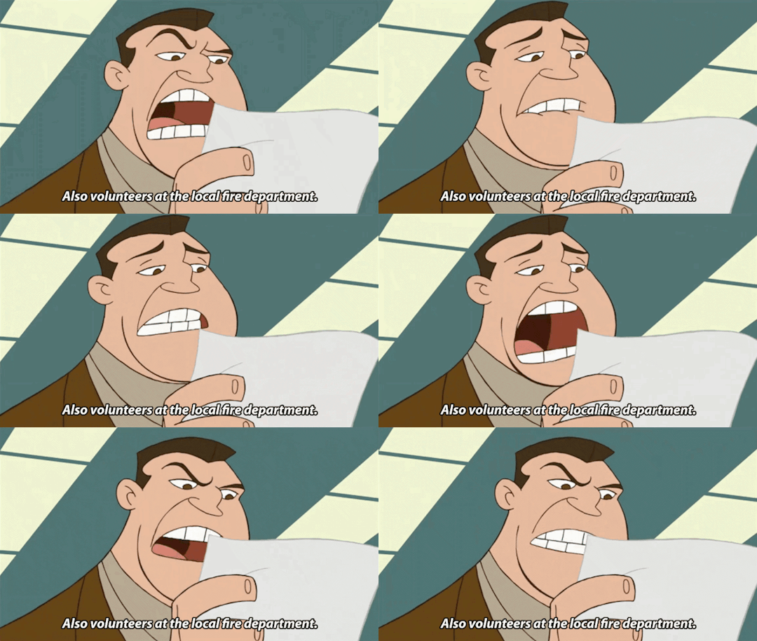
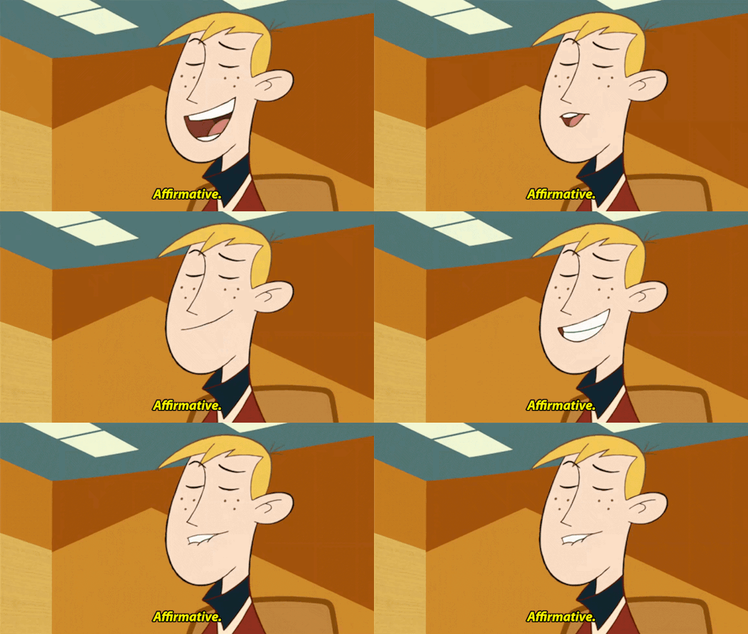
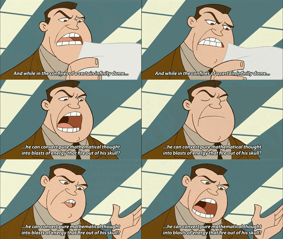
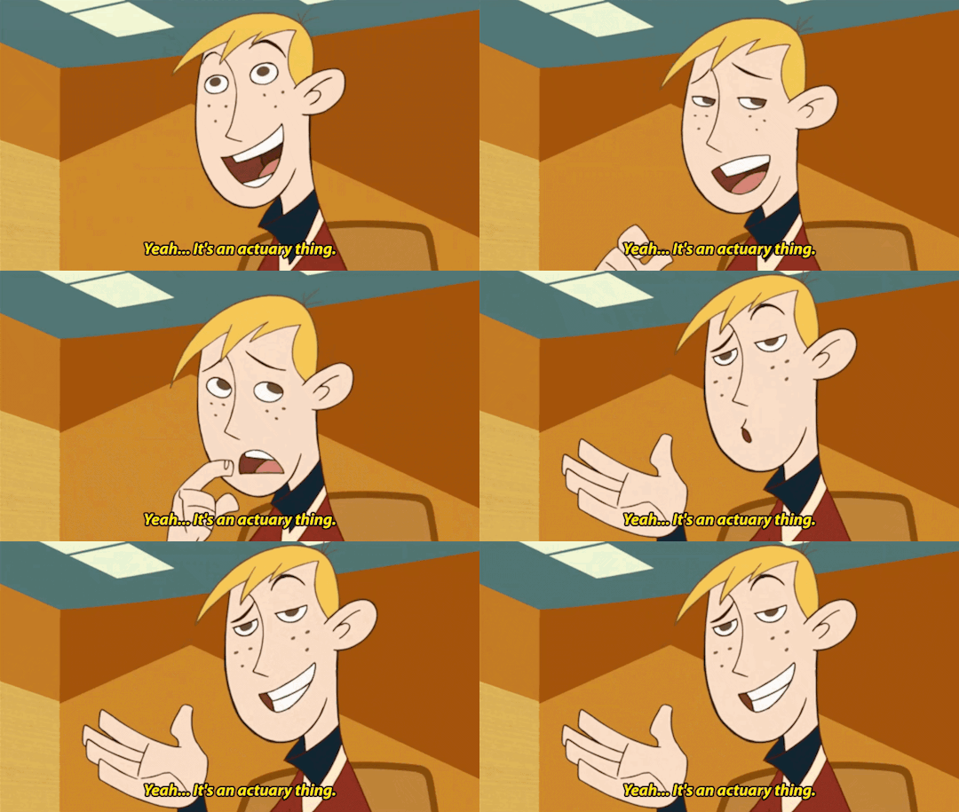
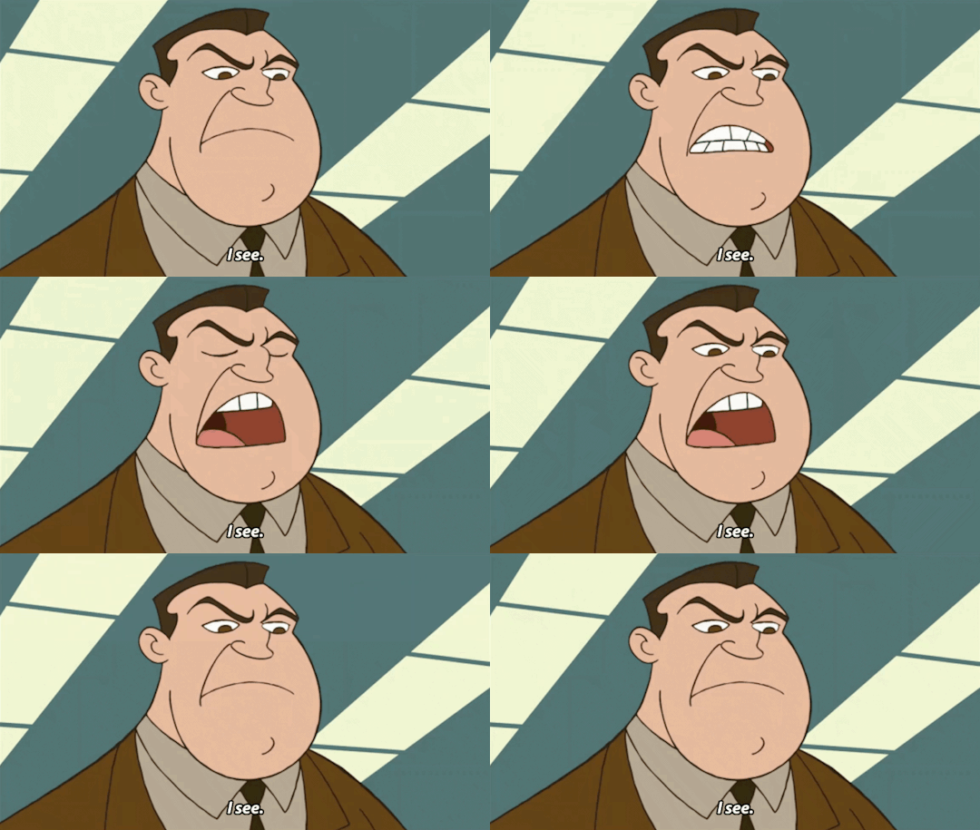
“Your dad rocks! A plus!”
#*my gifs#kim possible#ron stoppable#steve barkin#mr barkin#mr. barkin#s4e14 – the mathter#happy belated Father’s Day lol#don’t look to closely to the third to last gif. that was a night mare for me to caption bc I can’t find one ducking tutorial on how to add 2#subtitles on one gif with the first subtitles ofc not showing up when the second subtitles come one UGH
90 notes
·
View notes
Text
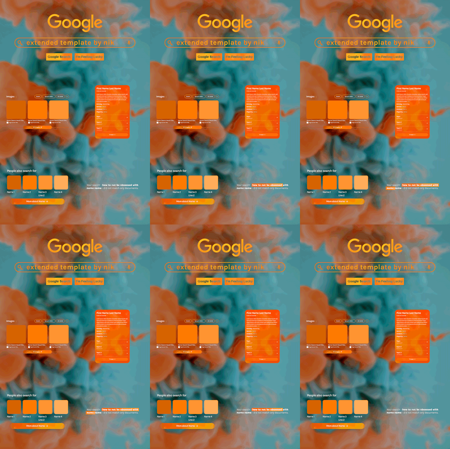
Hi! I've been asked for a tutorial on my new Google layout, originally seen here and here. So, to make it easy, here are FOUR free templates! All I ask is that you give me proper credit in your caption if you use my template or take inspo from my design. Enjoy! :)
Get the NEW Google templates free via ko-fi! (Donations appreciated but not required <3) Includes PSD templates with pre-made layer masks, shapes, and animations, plus tips for the following designs: – Image search results – Biography – Related searches – Animated "no search results"
Additional resources: – My original animated Google search overlay tutorial & template – Karla Google Font (this is the only font used) – Background via Unsplash

#gif tutorial#completeresources#usershreyu#usernanda#useryoshi#userzaynab#userrobin#usersalty#userhella#alielook#tuserabbie#useraish#userabs#mialook#resource*#gfx*#google*
745 notes
·
View notes
Photo
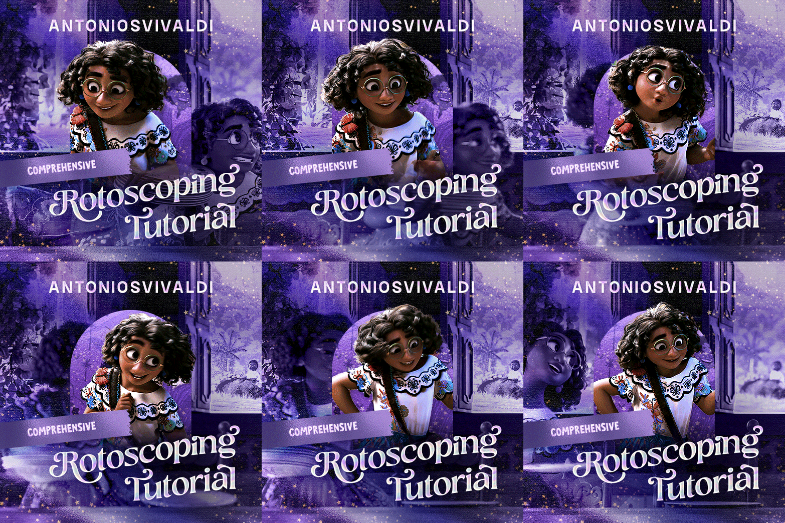

Rotoscoping Tutorial by @antoniosvivaldi
Hi everyone! I’m excited to announce my long-delayed Rotoscoping Tutorial - requested by a number of people over the past calendar year.
In this tutorial, I will show you how to create the cutout gifs like this (and seen in most of my gifsets under this tag) with Rotoscoping on After Effects. I’ll also provide additional examples and a number of things that I do to optimise my giffing / Rotoscoping workflow (e.g. useful shortcuts & other things to be aware of).
This is the structure of the tutorial:
Why Rotoscoping? Photoshop video timeline’s limitations
Photoshop workflow pt 1: Preparing your gif
After Effects workflow: Interface, shortcuts, and Rotoscoping tools
Photoshop workflow pt 2: Assembling your gif; with multiple examples
Bonus content: Rotoscoping tips* & workarounds to common issues
For quick reference, here are example gifsets (and where Rotoscoping is used in the posts) that I will mention in the tutorial:
Example 1: Cutout gif effect | panels 2 + 4
Example 2: Changing a gif’s background colour | all panels
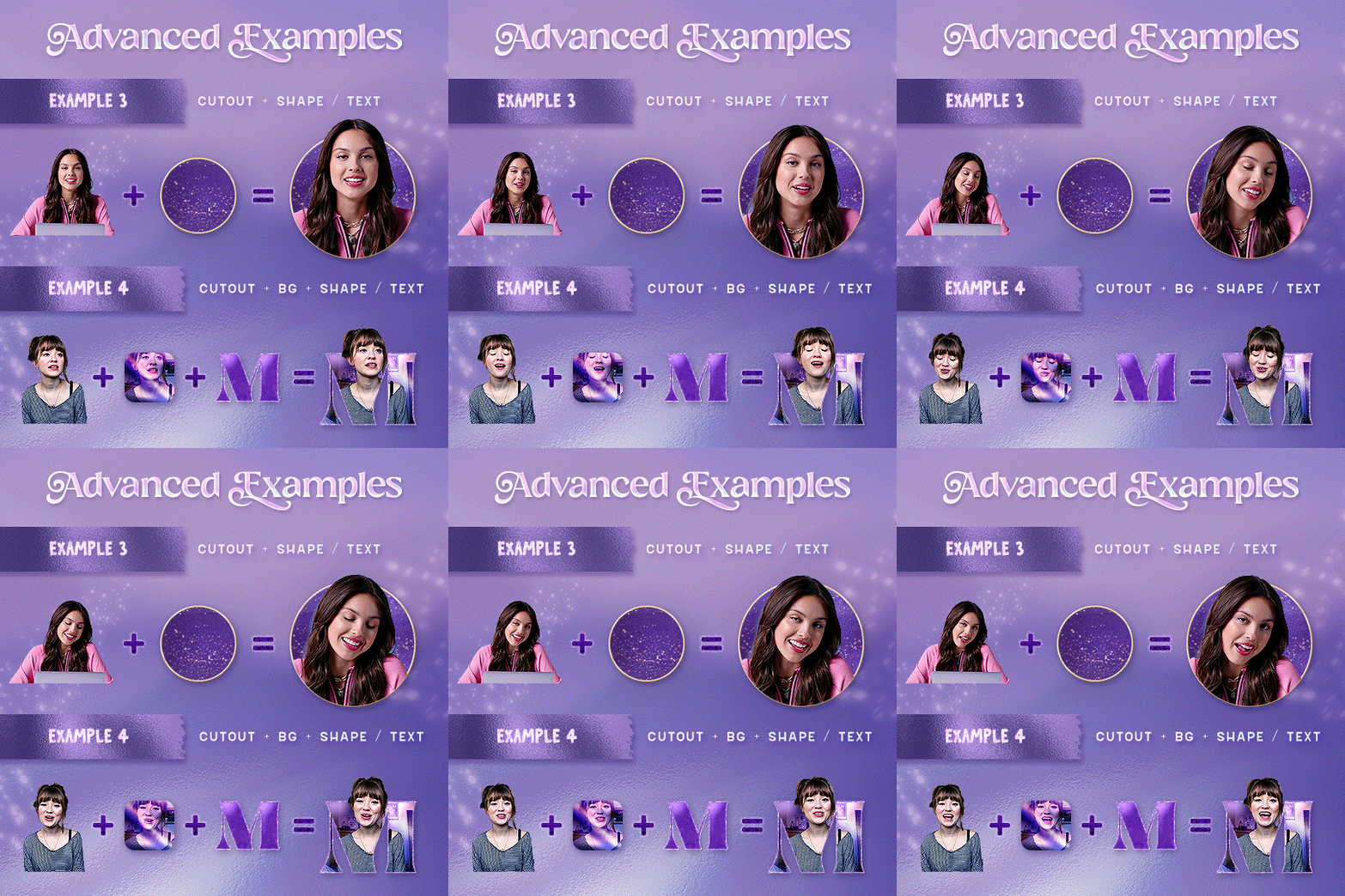
Example 3: Cutout gif effect in a shape | all panels
Example 4: Putting it all together | panels 1, 3, & 5
What you need & need to know:
Software: Photoshop & After Effects (After Effects 2021 or later for Rotobrush 2.0)*
Hardware: 16GB RAM required to run later versions of AE*
Difficulty: Advanced; Knowledge in making gifs, applying layer masks, and using video timeline interface assumed
Key concepts: Rotoscoping (AE) / Video Timeline (AE+ PS) / Layer Masks & Groups (PS)
Supplementary files: tutorial resources
*I’m currently running the latest version of PS & AE on an M2 Mac, but I’ve also used older versions (CC 2015 & 2020) on Intel-based Macs. I’ll outline some known compatibility & performance issues, and workarounds later in this tutorial that could help streamline your giffing workflow.
Tutorial under the cut. Like / Reblog this post if you find this tutorial helpful. Linking this post / the example gifsets in your post caption, will be greatly appreciated if you read this to create effects seen in Examples 3 + 4.
1) Why Rotoscoping?
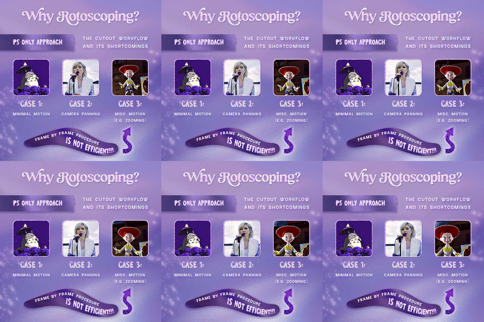
My Rotoscoping journey is motivated by the shortcomings on Photoshop - namely the limited options to manipulate the Layer Mask keyframes in the video timeline interface, as well my need to gif more efficiently.
Suppose I want to cutout this subject or recolour the background of a gif on Photoshop: I personally classify the gifs that I prepare on PS into 3 types based on the motion of the subject
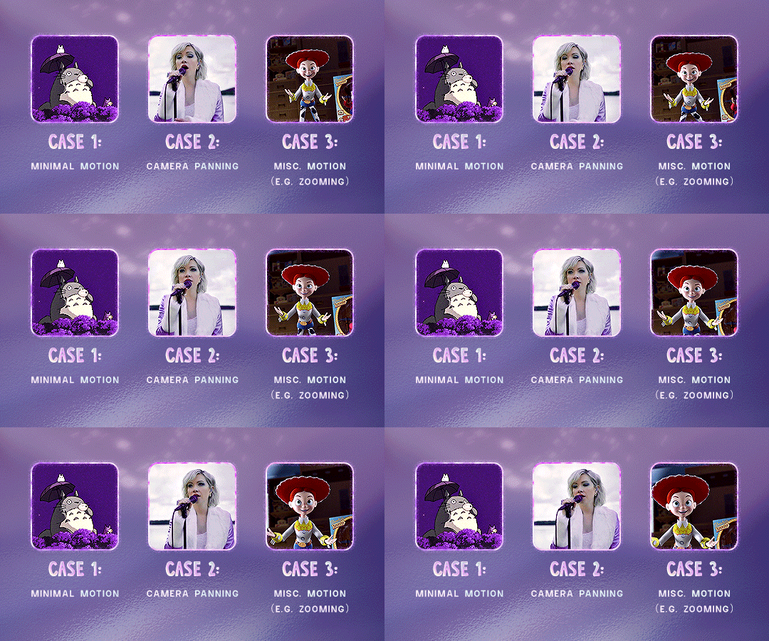
These are the common Photoshop-only approaches when attempting to mask the subject in the gif.
Case 1: minimal motion in the subject → a simple layer mask will do the trick
Case 2: some linear panning of the subject in the gif → using the Layer Mask Position keyframes in the video timeline interface will do the trick
Case 3: subject moves around a lot (e.g. zoom motion) → Unfortunately this is where a Photoshop-only workflow will require frame by frame masking. Layer Mask Position keyframes only apply positional translation (but not transformation / rotation) on the layer mask
Enter Rotoscoping on After Effects: Instead of resigning to frame by frame procedure on Photoshop, I opted to make my life easier by learning to Rotoscope on After Effects. This essentially provides me an opportunity to cutout / recolour a wider range of gifs with relative ease.
2) Photoshop pt. 1: Preparing your gif
Prepare your gif the usual way - whether you screencap or import frames from video.
Then your Photoshop should look like this:
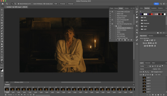
Now, I shall walkthrough & explain my personal giffing workflow (as of 2023) after loading the gif frames. To speed up the process, import my gif prep action file to Photoshop.
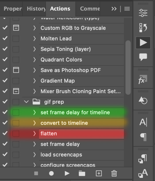
Going to Window > Action, you’ll see a set of actions under the “gif prep” folder.
"set frame delay for timeline” (highlighted in yellow) will set all of your entire gif’s frame delay to 0.03s
“convert to timeline“ (highlighted in red) will take you to the Video Timeline interface
To play an action, press on the Play button (highlighted in green)
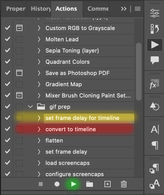
i. Set the frame delay of the entire gif to 0.03s. (play “set frame delay for timeline” from my gif prep action pack)
I work with everything in 0.03s frame delay (or equivalently 30fps) at first. It’s always possible to change the frame delay of the final gif to 0.05s before uploading onto Tumblr.
ii) Convert this gif to a Smart Video Layer (play “convert to timeline” from my action pack)
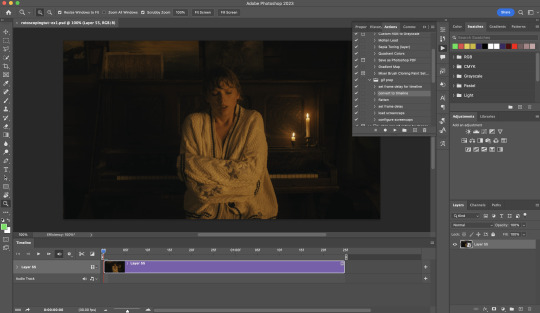
Note: I personally don’t resize the gif just yet. That’s because Rotoscoping in full video resolution will render higher quality details around the edges as well as more flexibilities later on in the editing process.
Performance optimisation: If your computer has 8GB of RAM or less, you might find it helpful to crop / resize your gif to Tumblr dimensions now for a less sluggish performance in After Effects later on.
(I have giffed on a desktop with 8GB of RAM and it’s quite slow at rendering individual frames of a 1080p short clip on AE)
iii) Add colouring adjustments on the gif. This will save you A LOT of time when you Rotoscope gifs that are originally very dark / poorly lit (e.g. the uncoloured Taylor Swift gif shown just above).
If you usually colour your gifs at the very end of your giffing process (i.e. after sharpening), this will be a bit of a change.Nevertheless I still highly recommend adding some base colourings now to at least increase the contrast between the subject and the background.
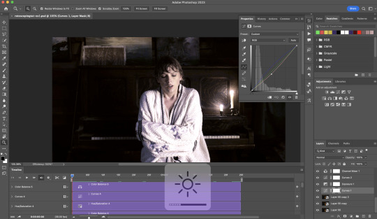
iv) To minimise lagging on After Effects, simplify this gif file as follows:
Flatten / Unsmart this gif file back to frame animation mode: play “flatten” (highlighted in red) from my gif prep action pack
Set the frame delay to 0.03s: play “set frame delay for timeline” (highlighted in green)
Convert the simplified gif file back to the video timeline interface: play “convert to timeline” (highlighted in yellow)
After “unsmarting” and converting back to the video timeline, your interface should look like this

And voila! This gif PSD is now ready to be imported to After Effects for Rotoscoping work!
3) After Effects: Interface and useful shortcuts
Open After Effects and Import (Cmmd / Ctrl + I) your gif PSD that you’ve just prepared.
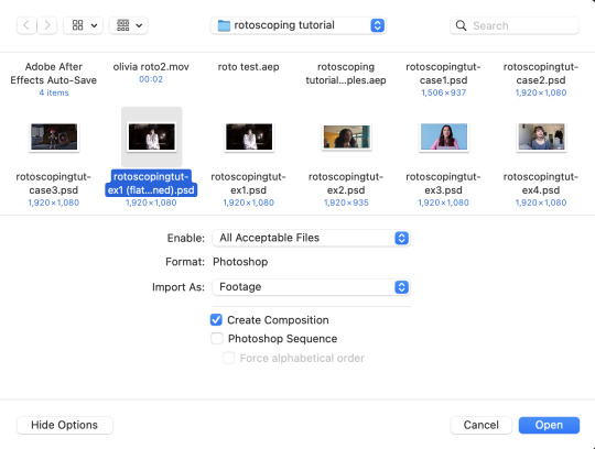
After importing your gif PSD to After Effects, the interface should look like this.
In the screenshot below, there are two compositions: the imported gif (highlighted in green) & another composition file made from selecting the imported gif (highlighted in red)
For the rest of the workflow, we will edit from the clone composition (the one highlighted in red), so select this one.
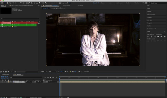
Before we take our plunge into the Rotoscoping, here are a few useful shortcuts to remember. I’ll explain the Roto Brush tool in the next section.
Preview the previous: fn + up arrow
Preview the next frame: fn + down arrow
Add to Roto Brush selection: holding Shift while you’re using the Roto Brush Tool
Subtract from Roto Brush selection: holding Alt while you’re using the Roto Brush Tool
Change Roto Brush size: while holding Cmmd / Ctrl, click + drag your mouse left / right
4) After Effects: The Rotoscoping Process
To access the Rotoscoping tools, click on the Roto Brush icon (highlighted in red in the screenshot below)

Then you’ll get the following dropdown options with two Rotoscoping Tools

Roto Brush Tool: This is where you add / subtract your Rotoscoping selection in your composition
Refine Edge Tool: Paint around the edge of your selection for more refined edges. Very helpful for Rotoscoping fuzzy edges / hairs
To make some Rotoscoping selection, first grab the Roto Brush Tool and click on the subject you want to cut out from your composition.
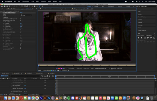
When you’re Rotoscoping you’ll see this in the Effect Controls panel.
There are two versions of Roto Brush:
Version 2.0: The Rotoscoping selection is powered by AI for higher accuracy when you propagate the frames.
Version 1.0 (Classic): This is the legacy Roto Brush Tool that uses a lesser algorithm. Recommended only if Roto Brush 2.0 is unstable on your machine due to RAM issues.
And two quality settings for Roto Brush 2.0:
Standard
Best
Note: I am currently unable to use Roto Brush 2.0 with Best quality model on my machine to compare the differences myself, so I’ll link this page that explains the two quality settings.
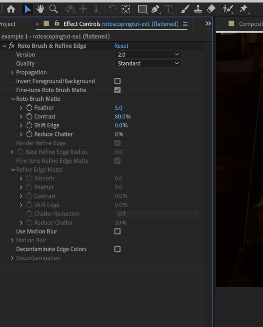
Note: if you’re using an older version of After Effects you’ll see this instead. This corresponds to Roto Brush 1.0 / Classic in the newer versions of AE.
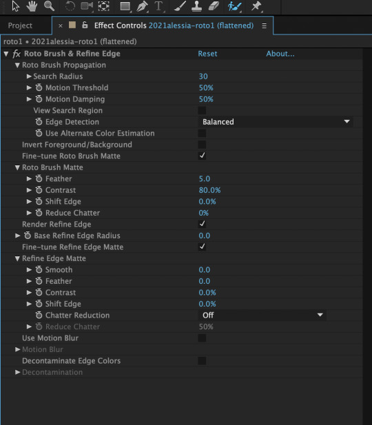
When you’ve made a selection using the Roto Brush Tool, you’ll see the pink lines around the subject. This is the region that you’ve selected to Rotoscope!
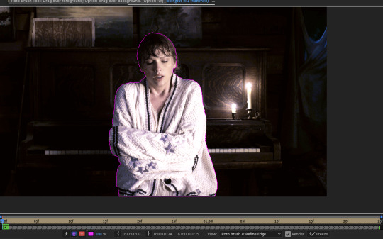
To bring out some details around the edges, grab the Refine Edge Tool and paint around the edges
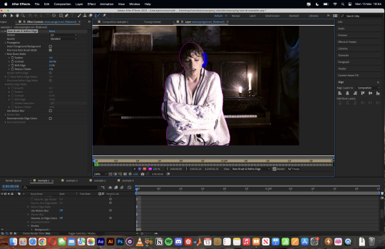
Then the interface will look like this
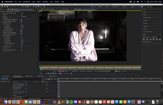
To view the Rotoscoping selection that you’ve made more intuitively, you could click on the following buttons.
Personally I like the viewing my selection using Toggle Alpha (the second box from the left) & Toggle Alpha Boundary (the 3rd box from the left)

Toggle Alpha
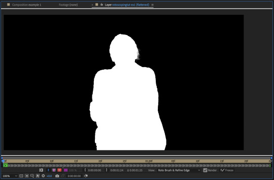
Toggle Alpha Boundary

Note: If you aren’t happy with the initial Roto Brush selection, you can always add (press Shift while using the Roto Brush Tool) / subtract (press Alt / Option using the Roto Brush Tool) your selection.
After you’re happy with your Rotoscoping selection in the first frame of your composition, press fn + down to view the next frame.
Repeat pressing fn + down and fix the selection along the way (e.g. I subtracted a small area from my Rotoscoping selection with the Roto Brush tool to make the edge look cleaner).

After fixing the selection along the way, go back to the composition file (select the clone composition again) and you will see that a cutout gif is made!
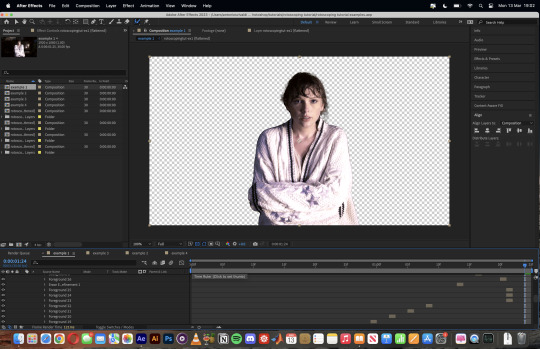
To export this, go to File > Export > Add to Render Queue. You’ll be redirected to the Render Queue panel at the bottom of After Effects.
Highlighted in red: click to change export setings
Highlighted in green: click to change save destination
Highlighted in yellow: click to render video

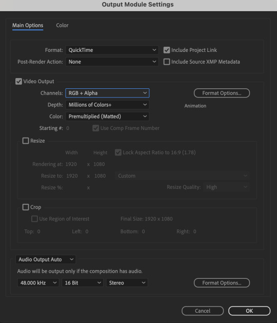
To preserve the transparency of your cutout gif, you need to change your export settings in the Output Module.
Under the Video Output section, change your Channels to RGB + Alpha. Press OK. Then Render the video.
5) Photoshop pt. 2: Assembling your final gif
The essence is to drag the cutout gif (aka the video file that you’ve just rendered on AE) into a new PSD composition file. This will be where you’ll do the rest of your giffing. Your workflow will contain the follow steps:
Make a new blank PSD composition file in Tumblr dimensions
Enable the Video Timeline
Follow the instructions detailed in the individual examples i.e. drag the cutout gif into the PSD & adjust the timeline start / end points
Exporting the final gif. If you’ve worked in 0.03s frame delay all the way up to here, just play the action that I’ve provided in the tutorial in the following order to set the frame delay to 0.05s.
EXAMPLE 1: finalising your cutout gif | sample gifset
After enabling the Video Timeline in your PSD composition file you’ll see something like this
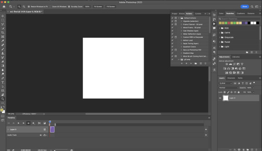
Go to your folder, drag the cutout gif you’ve made on After Effects, resize / reposition, then press Enter.
And also make sure to adjust the Video Timeline’s start / end values.
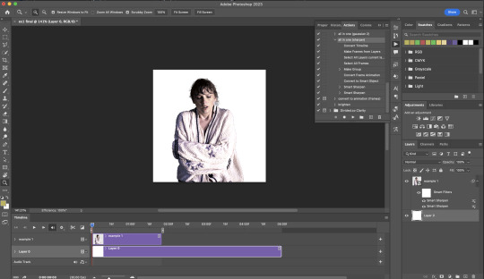
Add some finishing touches. Because I did the Rotoscoping at full HD resolution, I’ll also need to sharpen my gif in this step.
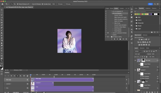
After you’re happy, you can export this into a gif file and do what you usually do to change the frame delay to 0.05s.
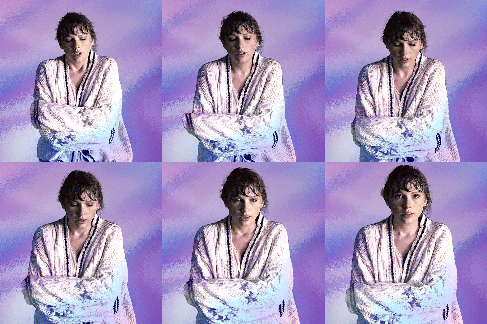
Notes on my “Unsmarting” approach:
To prevent accidentally writing over a PSD composition file that I’ve spent time editing, I personally render this into a short video (File > Export > Render Video) and use the following export settings (to prevent quality loss)
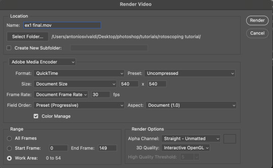
Then I open the rendered clip and play the actions in my gif prep action pack as follows:
flatten: this “Unsmarts” the clip / video
set frame rate: this sets all frames to have 0.05s frame delay
This is the final interface that I get before I pull up the Save For Web window.
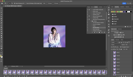
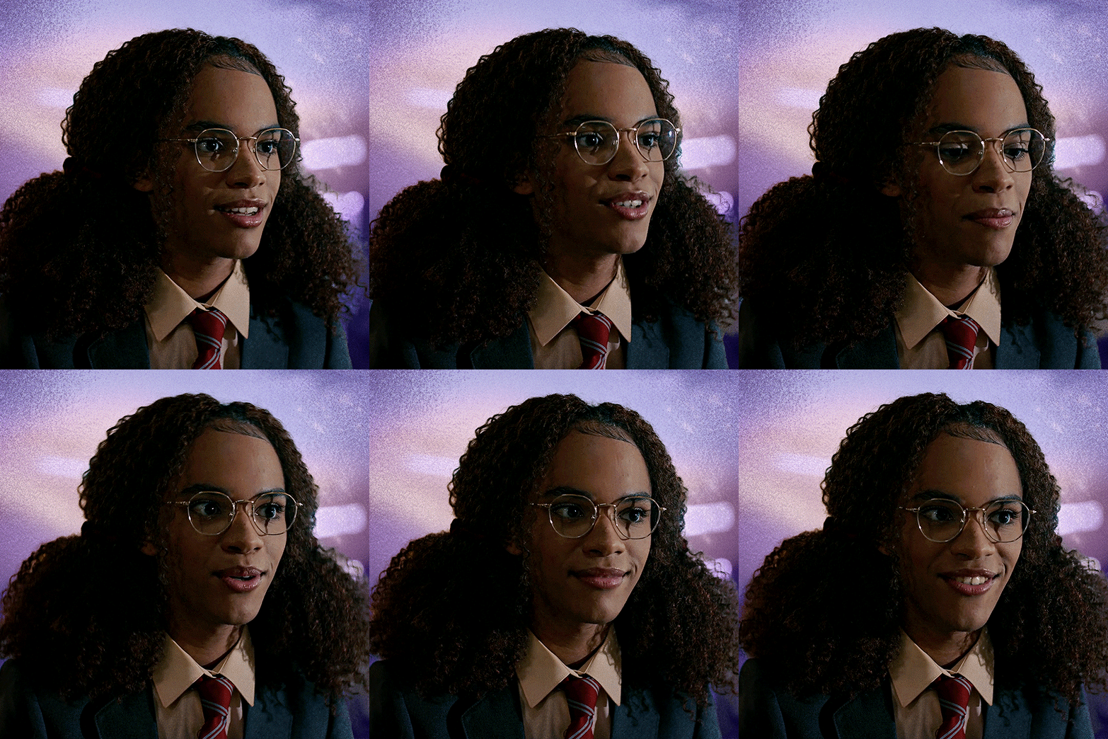
EXAMPLE 2: changing your gif’s background colour (for Case 3 gifs) | sample gifset
From your folder, drag BOTH the cutout gif (rendered on AE) and the original gif to your blank composition.
Important: you need to make sure that both layers are properly lined up in the composition file (i.e. selecting both layers when repositioning / resizing)
On Photoshop, press Enter twice and place the cutout gif on top of the original gif from the Layers panel. Then you should get something like this
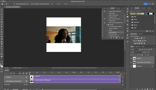
Select both layers and resize / reposition them in your PSD composition until you’re satisfied with the placements.
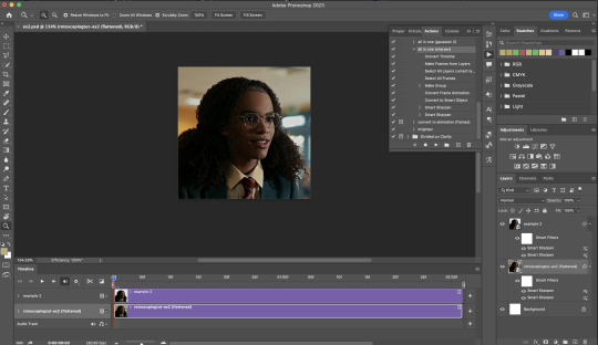
The basic idea here is to add some adjustment layers / other things in between the cutout gif and the original gif. To do this, select the original gif layer in the Layers panel.
Then you can start adding.a bunch layers e.g. textures, onto the composition.
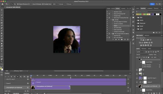
And then here’s the exported gif!
6) Fancier Rotoscoping examples
Note: knowledge in using layer masks / groups and making shape / text layers assumed
In the next two examples, I’ll show you how to combine the two previous examples with shape / text layers.
EXAMPLE 3: Placing your cutout gif into a shape / text layer | sample gifset
Add a text / shape layer to your blank PSD composition
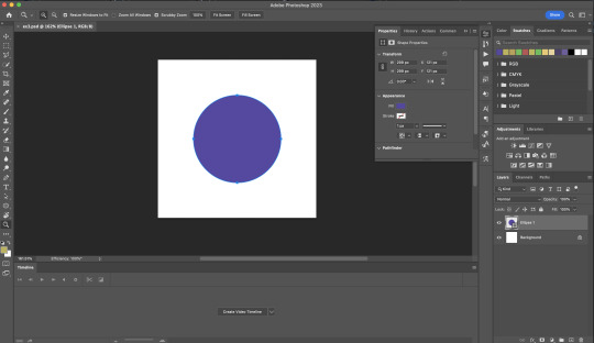
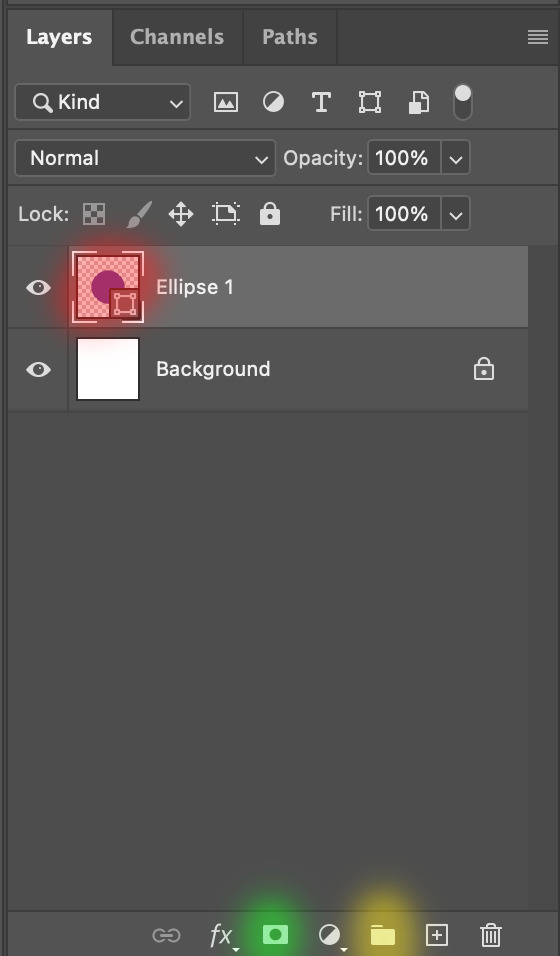
We want to prepare a masked group so in the Layers panel:
Make selection from layer: Cmmd / Ctrl + Click (highlighted in red)
Make a new group: click on the folder icon (in yellow)
Create layer mask: click on the icon (in green)
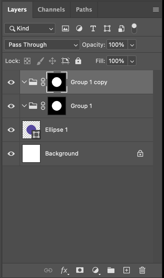
After duplicating the masked group you’ll get something like this in the Layers panel
Drag your cutout gif into the PSD composition
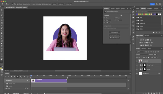
Place the cutout gif into the masked group on top
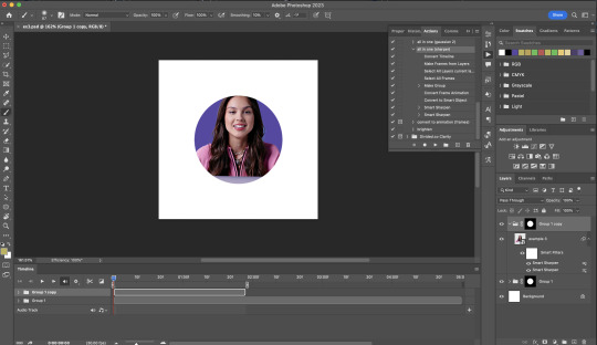
Select the mask of the top group and paint (in white) over the region you want to reveal for the cutout gif
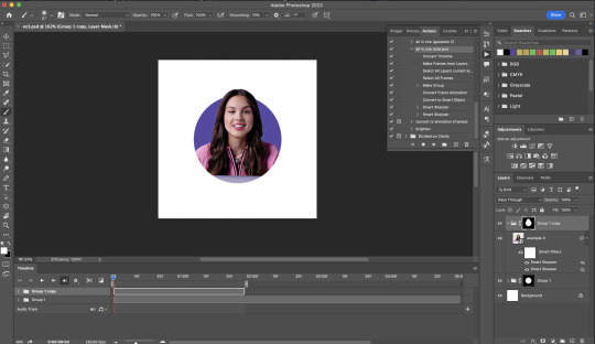
Add some finishing touches & export the gif!

EXAMPLE 4: Putting it all together | sample gifset
You follow the same approach as in Example 3 to prepare the masked groups, but you need to drag two gif layers in (and resize them using the approach outlined in Example 2)
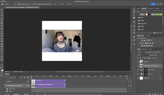
Place the gif layers as follows
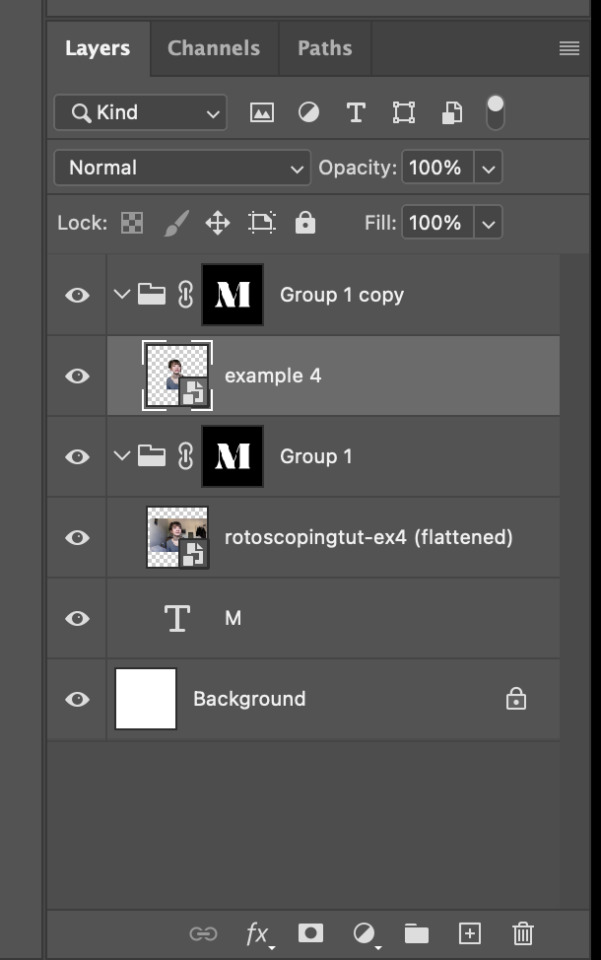
While selecting the mask of the group on top, paint (in white) over the region that you want to reveal in the cutout gif
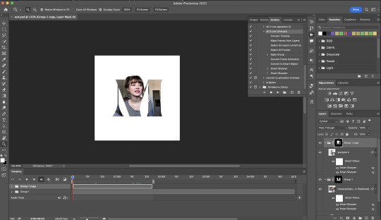
Now select the original gif (placed within the other group) and add some adjustment layers
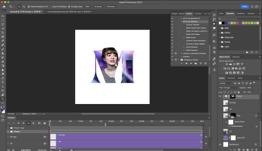
After adding some finishing touches & exporting the gif, I get this!
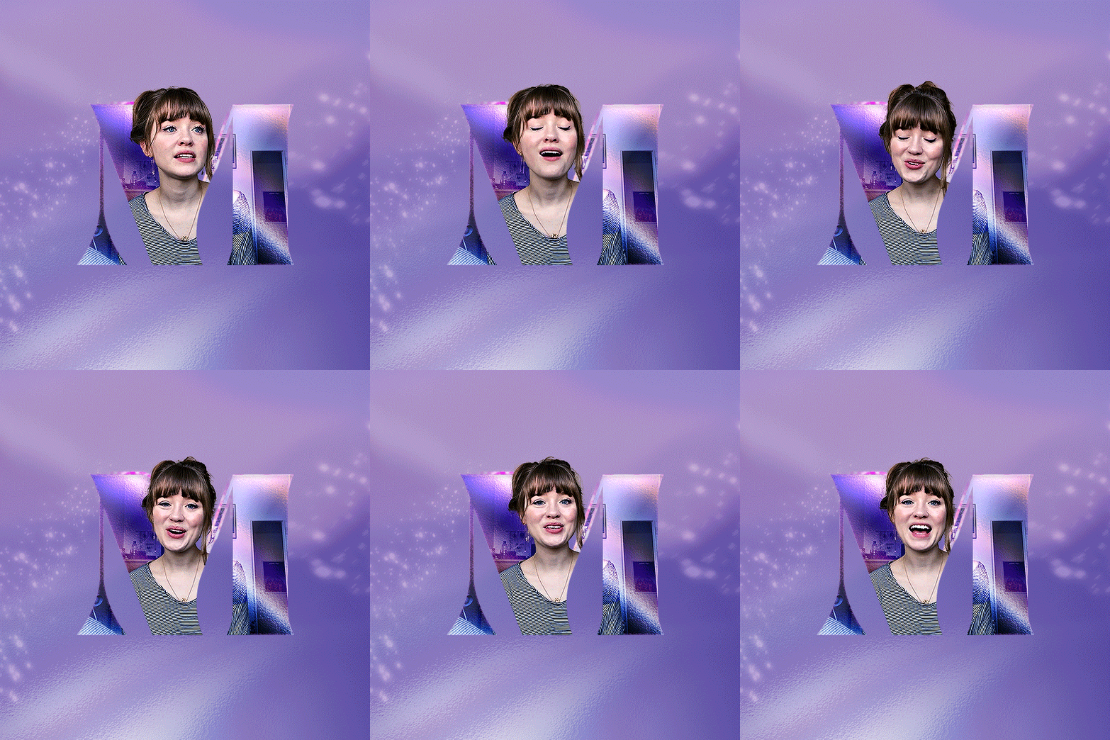
Note: you can do even more overlay effects in the background portion of example 4. There will just be more masked groups + adjustment layers
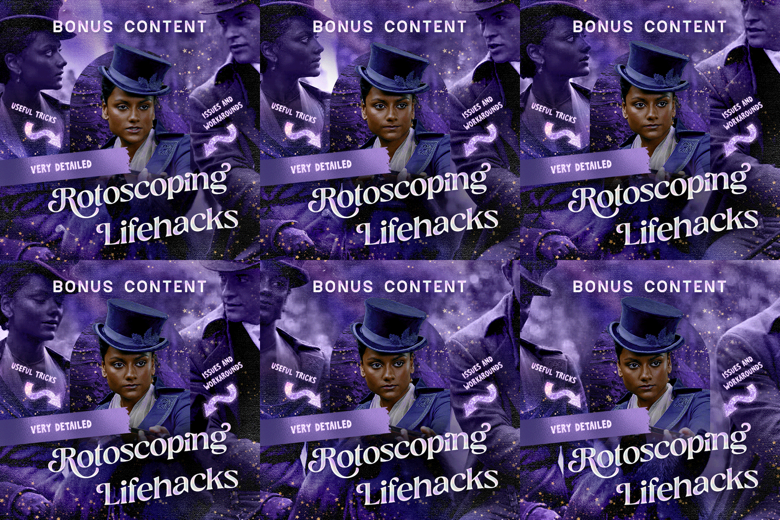
7) Bonus: Some useful Rotoscoping / giffing lifehacks
GIFFING LIFEHACKS:
— Use best quality footage that you could find & Rotoscope in full video resolution, for better details around the edges
— Poorly lit scenes & low contrast edges are harder to Rotoscope (e.g. Toy Story set / TS evermore set).
If you’re new to AE, I would recommend choosing videos with well-lit gifs with simpler backgrounds and high contrast edges (e.g. Maisie Peters Cate’s Brother set)
— Use Rotobrush 2.0 if you’re using After Effects 2021 or later. It’s more difficult to Rotoscope / change background colour for gifs with a lot of movements with the classic Rotobrush tool. If the scene is tricky, you might want to switch to the “Best” quality model.
HARDWARE-RELATED PERFORMANCE OPTIMISATION:
— The recent versions of Photoshop require at least 8GB of RAM. If you have less RAM, it will still work provided you have enough scratch disk space. For better performance, it’s best to close other applications when you’re using Photoshop.
— The recent versions of After Effects require at least 16GB of RAM. If your machine has less RAM than this, there are some workarounds to prevent your machine from hanging:
Essential: close other applications that you’re running on your computer
Resize your gif down to Tumblr dimensions & sharpen it before importing to After Effects.
Install an older version of AE
8) Bonus: Some known software + hardware issues, and workarounds
KNOWN ISSUES ON PHOTOSHOP:
I currently have minimal issues in my giffing workflow, but I’ll nevertheless outline a few common known Photoshop issues for anyone who needs some workarounds.
— Video Timeline interface missing: this affects Apple Silicon Macs (i.e. M1 / M1 Pro / M1 Max / M1 Ultra / M2 / M2 Pro / M2 Max)
Update to newer version of Photoshop (updated 2022 or 2023)
Open Photoshop with Rosetta
— Scratch disk full error: This is a common issue with machines that lack RAM & have nearly used up internal storage. Editing video layers in the timeline interface uses a lot of memory hence will require a lot of scratch disk space.
Make sure that you have enough free storage space while using Photoshop. Alternatively you can use an external hard drive as a scratch disk.
KNOWN ISSUES ON AFTER EFFECTS:
These are a few issues that I have personally ran into over the course of giffing on multiple devices & multiple versions of After Effects.
Note: Inputs from M1 / M2 Mac users with regards to experiences on using the After Effects Rotoscoping tools are welcome!
— Rotobrush 2.0 set to “Best” quality model causes AE to crash: this affects anyone who’s using MacOS Ventura
I’m currently experiencing this issue on my M2 Mac. The workaround right now is to change the Roto Brush 2.0 quality setting to Standard.
This is due to some software compatibility issues on Adobe’s side specifically with MacOS Ventura. Fingers crossed that they will properly fix this bug in the future updates!
— Cannot re-open project files with Rotoscoping: this affects anyone using the initial release of After Effects 2020 (I had installed this on an Intel-based machine and it sucked)
The only option here is to update to a later version of After Effects.
8) More useful Rotoscoping resources
Rotoscoping + Keyframes Tutorial by @jenna--ortega
Rotoscoping + Masking Tutorial by @usergif
Rotoscoping For Beginners in After Effects | Motion Graphics Tutorial
I hope you enjoy reading this! If you have any questions / need any help related to this tutorial, feel free to send me an ask!
#after effects#tutorial#gif tutorial#photoshop tutorial#dearindies#tusermelissa#usernik#useryoshi#usershreyu#usercim#userrobin#useralison#userannalise#userkosmos#userisaiah#usergiu#userives#*#my resources#my tutorials
2K notes
·
View notes
Text


NEW YEAR, NEW FONTS #USERGIFNYNF TYPOGRAPHY CHALLENGE ・ JAN 8-12
Let's kick off 2024 with a new challenge... all about typography! If typography has ever made you feel stuck, we hope this challenge helps you break out of your comfort zone, discover new fonts, and try new styles! This event is open to gifmakers from all fandoms and will run from January 8-12, featuring 5 prompts:
DAY 1 (1/8): LAYER STYLES ↳ Use any combination of blending options (screen, hard light, difference, etc.) and/or layer effects (bevel, shadow, glow, gradient overlay, etc.). DAY 2 (1/9): ONLY ONE ↳ Refine your choices and use ONLY ONE font throughout your entire set. DAY 3 (1/10): PERFECT PAIRS ↳ Use a different font pairing per gif. Check out our font pairing recs! DAY 4 (1/11): THREE TYPEFACES ↳ Use 1 Serif + 1 Sans Serif + 1 Script typeface in your set. DAY 5 (1/12): FAVORITE FONT(S) ↳ Show off your favorite font(s) any way you want!
Rules for how to participate below the cut:

Reblog this post and follow @usergif
Create a gifset using the prompts provided above
Tag #usergifNYNF so we can reblog your creations!
Caption your post with: @usergif new year, new fonts: day # - prompt description [fonts used: font name (source)]*
*Optional: We encourage including font names and their sources in your caption so others can find them [e.g. Blastimo Sans (dafont.com)]. After all, this challenge is about discovering new fonts and typography styles! You can also put this in a "read more" after your main caption or put a link in part of your caption that redirects to an internal Tumblr link (e.g. a page on your blog that lists fonts used). We don't recommend linking to external sites as doing this too many times in one post can affect the visibility of your post.
Questions about the event? Send us an ask here. We’ll tag all event answers with #usergifNYNF.ask. Need inspo? Check our RESOURCE DIRECTORY for typography tutorials or look through some of our members' font recs!
We also want to take this moment to thank you all for helping us reach over 10k followers! We hope this blog can continue to be a source of help and inspiration for gif effects, and we can’t wait to see what you create for this challenge! 🪄

Fonts used: Gif 1, in order of appearance: Traveling Typewriter*, Bassy*, Buy More*, Germanica [Plain Germanica]*, Doky*, Magic Retro*, GIN Grotesk [Gin Rounded] (befonts.com), Random House*, Lostar*, Amberla*, Schizoid Personality* (* = dafont.com) Gif 2: Karla (Google Fonts), Buffalo Script (dafontfree.io)
#usergifNYNF#userace#usershreyu#userelio#alielook#userhella#uservivaldi#usertreena#tuserabbie#userhanyi#tusererika#userbecca#uservalentina#useraish#larlies#usercats#userabs#tusermona#userpickles#*usergif
385 notes
·
View notes
Note
hii i love ur story's sm☺️☺️
but i was wondering if you can do a instagram with gavi? with the story!!☺️☺️
INSTA FEED - GAVI
summary: you tried your hardest to hide it, but your dog gave it away
warnings: noneee
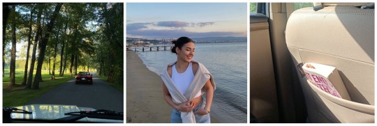
@yourinsta
Finally back in Barcelona 🫶🏻🫶🏻 missed my home
liked by random and 829,829 others.
random: i hope you enjoyed your spain roadtrip❤️❤️
random: youre so pretttyyyy
random: girly i love you but Colleen Hoover is not it.
random: i think it ends with us is good
random: i hope ill see you
random: where is that?
random: she said it in the caption, barcelona
random: no but where in barcelona
random: barceloneta i think
yourbestie: I MISS YOU
yourinsta: I MISS YOU TOO
random: so cuteee
-
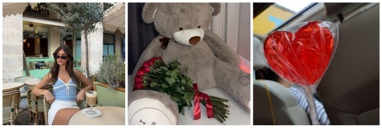
@yourinsta
feliz dia de Saint Jordi!!!!! 💞💞
liked by yourbestie and 299,619 others.
random: that bear is so adorable😍
yourbestie: who's that hot chick in that first pic??? 😍😍😍
yourinsta: awww❤️
random: can we switch bodies?
random: frr
random: ouuu who are those gifts from...
random: 😍😍
random: youre so prettyyyy
random: her and gavi would actually fit together as a couple
random: I SEE IT I SEE IT
-
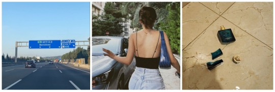
@yourinsta
do you guys think he will be mad at me??? 🫠
liked by random 508,729 and others.
yourbestie: yeah honey i dont know but that perfume costs 200 euros....
yourinsta: its okay... ill just tell him that it was an accident...😬😬😬
random: WHO IS HE?!??!?!?!
random: okay but her pics>>>
random: i wish i was you
random: im atill not giving up about my theory with her and Gavi
random: im with you
random: YOU. ARE. SO. PRETTY.
random: 😍😍😍
random: can you check the dm i sent you??
-

@yourinsta
< BCN 3
liked by pablogavi and 999,629 others.
random: love the fit girly
random: i was there yesterday
random: LOVE THE PICS
random: where is your jacket from??
random: THE FACT THAT GAVI LIKE THIS.
random: MY THEORY IS BECOMING THE TRUTH....
random: girl i get that you post gavi cause.....
random: im tired of hiding how fine he is
random: dont hide it. 🤷♀️
ferrantorres: 🤣
random: lmaoo what ferran??
-
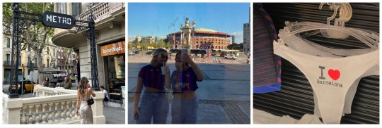
@yourinsta
i love acting like a tourist and going into all the souvenir shops
liked by pablogavi and 729,829 others.
random: I LOVE BARCELONAAA
random: GAVI LIKED AGAIN!??!?!?!
random: you are so prettyy 😍😍
random: the tourist shops are the best lmao
ferrantorres: he said he likes the third pic 🤣🤣
random: who is he...?
random: HE?
random: The fact that I miss her being somewhere else cause her party posts were always so fun
random: ARE WE REALLY GONNA IGNORE GAVI'S COMMENT?????
pablogavi: 😍😍
random: AAAA
random: IM FREAKING OUT
-
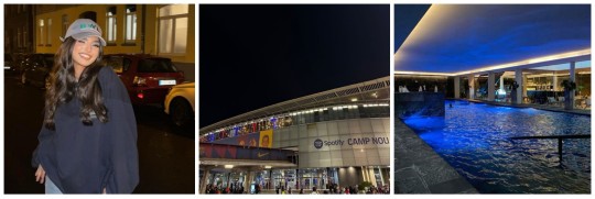
@yourinsta
night time in bcn >
liked by pedri, pablogavi and 829,729 others.
random: camp nou at night tho>>
random: how did she even get in there at night?
random: maybe it was a matchday
random: but there was no game yesterday
random: its older then
random: i love living in barcelona
random: i was there in that pool it was so cool
random: the third pic is so quiet...
random: WHY DO PEDRI AND GAVI LIKE HER POSTS
random: where did you get the hoodie from??
random: youre so pretty in the first pic
-

@yourinsta
this past week was an absolute dream, now I'm back to studying 😖
liked by pablogavi, ferrantorres and 739,729 others.
random: i can imagine that the past week was a dream. the barca players also like my posts in my dreams.
random: LMAOOO
random: I'd die to have your hair
random: whats the dogs name??
random: love how she represents the girl aesthetic of studying while having starbucks
random: frrrr
random: i absolutely live for the makeup in the first pic
random: hair tutorial when??
random: orange is so your color
random: nahh its still red
random: i still remember when she was in portugal... that felt like yesterday but ut was like 6 weeks ago
random: can we swap lifes? just for one day? pls
-

@yourinsta
photo dump 🎀
liked by pablogavi, pedri and 1,012,829 others.
random: prettyyyy
pablogavi: buen coche 🤔 (nice car)
random: AAA
random: whats with the emoji tho...
random: how is she so lucky that barca players keep liking her posts???
random: first
random: GAVI DRIVES A CUPRA TOO. MY THEORY
random: shut up do you know how many people drive cupras?
random: yeah shes right
random: youre gorgeous. im serious.
random: hala madrid
-
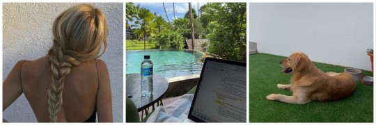
@yourinsta
day at home 💞
liked by pablogavi, pedri and 1,082,992 others.
random: YOUR HAIR IS SO HEALTHY. HOW.
random: okay i love that dog, its official.
random: youre giving golden retriver
random: i adore your aesthetic fr
random: how do you manage to stay so organized
random: when is your next trip?
random: youre so prettyy
-

@yourinsta
what am i without watching sports??
liked by pablogavi and 992,829 others.
random: F1 ON TOP
pablogavi: 😍
random: hey gavi
yourbestie: What are you without sports in general???
random: TAKE ME WITH YOU
random: frr football and f1>>>
random: oh how i wish to be a wag
random: idk how people can be bored of watching sports
random: i love camp nou its so pretty
-
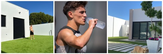
@pablogavi
liked by yourinsta, pedri and 2,829,729 others
yourinsta: ayy guapo *liked by creator
random: wait hear me out. isnt that yns dog?
random: Omg youre right
random: HES SO FINEEEE
random: since when does he have a dog???
random: cant wait for the game against Cádiz!!!!
random: maybe theyre just friends...?
ferrantorres: 🤣🤣
random: OMG HIII
random: FERRAN SNITCHING??
random: you focus on scoring goal first
random: 😍😍😍
random: THATS YNS DOG???
random: YESS AAAAA
random: oh my god theyre just hanging out, chill that doesnt mean that theyre dating...
-

@yourinsta
fine... yall little detectives figured it out...
liked by pablogavi and 2,018,662 others.
pablogavi: ❤️
pedri: finally!!! took long enough
ferrantorres: yall were so bad at hiding it from public
ferminlopez: they grow up so fast 😭😭
random: AAAAA
random: IM SCREAMING
random: THIS WAS SO UNEXPECTED
mikkykiemeney: welcome to the public wags 🫶🏻❤️
yourinsta: aaaa ❤️
hectorforr_: desearía serlo Y/n 😍😍 joder hermano te ves bien ( i wish i was yn, fuck brother you look good)
random: WHA
random: fort bro crazyyy
pablogavi: 💀
llamineyamal: mis padres 😍😍 (my parents)
random: lmaooo
random: THEYRE DATING???
jpcancelo: Por fin ya no nos molestará más jajaja 🤣🤣🤣 (finally he won't annoy us anymore)
pablogavi: 💀
aurorapaezg: 😍😍
random: aurora tell me is she good to gavi?
random: IM. DYING.
joaofelix14: @yourinsta tenemos que compartir ahora (we gotta share now)
yourinsta: PFFFF
random: HAHAHA
#pablo paez gavi#barca#fc barcelona#football#gavi#futbol#fanfic#mustread#espana#pablo gavi#gavi x reader#i miss gavi#smau#gavi smau#instagram#instapost
232 notes
·
View notes
Text

Welcome to @starwarscolors' first official event, "Coloring a Galaxy Far, Far Away!" This event is open to all creators who love colorful Star Wars edits just as much as we do. The event will run from September 24 to September 30. Interested in participating? Check out the guidelines under the cut!
PROMPTS:
DAY 1: FAVORITE COLOR [September 24] Make an edit of any Star Wars media featuring your favorite color!
DAY 2: COLOR THEMES [September 25] Make an edit of any Star Wars media featuring specific color themes, such as primary, secondary, or tertiary colors!
DAY 3: FAVORITE COLOR COMBINATION [September 26] Make an edit of any Star Wars media featuring your favorite color combination(s)!
DAY 4: COLOR MEANINGS [September 27] Make an edit of any Star Wars media featuring a representation of any color meanings of your choice! This can mean color associations (i.e. with characters, ships, media, etc), definitions of specific colors, "moods"/emotions of specific colors, or any other creative idea you think of!
DAY 5: UNDERRATED COLOR(S) [September 28] Make an edit of any Star Wars media featuring a color/colors you think are underrated!
DAY 6: COLOR PALETTE [September 29] Make an edit of any Star Wars media featuring a color palette of your choice from this website!
DAY 7: FREE CHOICE [September 30] Make any type of colorful edit of any Star Wars media! No restrictions here!
GUIDELINES BELOW CUT!
Want to create for this event? Here are the steps you should take!
Reblog this post and follow @starwarscolors
Create an edit that contains noticeable color manipulation — whether pale, vibrant, black and white, or something else, your edit must visibly demonstrate color manipulation.
Interpret each day's prompt to your own interests and abilities. You're free to participate as little or as much as you want.
Post your edit on the designated days. (Late submissions will be accepted up to a week after the event ends!)
Caption your post: @starwarscolors coloring a galaxy far, far away: Day # | Prompt Title
Tag us at #swcolorsweek23 so we can find and reblog your beautiful creations!
Note: we do not reblog any problematic characters, figures, actors, etc. If your creation goes against our rules, we will unfortunately not be able to reblog your work. You can find a list of content we do not reblog on our rules page.
Please make sure that you avoid [color]washing in your edits. We will not reblog your creations if we see [color]washing occuring. For guidance on how to avoid this, check out these tutorials: x, x, x.
If you have any other questions, feel free to send us an ask!
#star wars#swedit#starwarsedit#usermelanie#noalook#tuserhan#usersaoirse#tusertha#uservalentina#uservivaldi#tusernath#usersugar#userpickles#usernik#userisaiah#usertreena#userkosmos#usersavana#userashe#tuserlou
221 notes
·
View notes
Note
love love LOVE your The Sign gifsets. im still a newbie in giffing lmao and your gifs are like reaaally pretty so i was wondering how you do your gifs? i really like how it's sharp and the colors pop up beautifully (only if you don't mind sharing ofcc <333)
bun this is the kindest thing you could have said to me, thank you so much <3 i wanted to write down my giffing process for a while in case anyone would find anything in it helpful, so thanks for giving me a push!
guzhu-furen's photoshop gifmaking process (kinda oriented on saving up time)
from
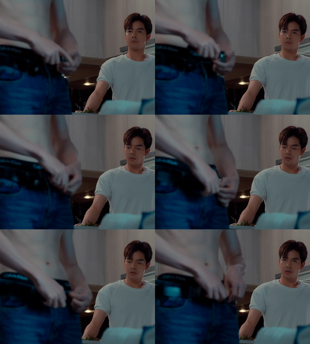
to
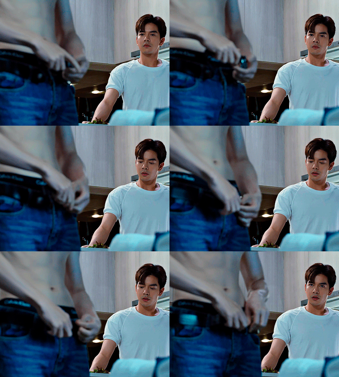
1. Downloading a video. i prefer to download video files instead of making screen recordings because the latter usually leaves watermarks/captions and makes image quality lower. i will not be linking the downloading websites themselves directly, but they are all easy to find through search engines if you know what to search for! i download ql dramas from:
youtube:
if the video you need is above 1080p quality, search for youtube4kdownloader
if the video is age restricted, search for 9xbuddy
both these websites work for normal videos too!
mkvdrama usually has 1080p episodes of most asian dramas.
dramacool also has downloading options in case the show is not available on other websites!
2. Screencapping (i learned it through this tutorial)
i screencap using KMPlayer. here is the installer i used, but you can find versions of this program on various websites and torrents too! install the program and proceed.
screencapping steps: open KMPlayer > press "CTRL + G" to summon the Frame Extraction window > set identical settings to these:
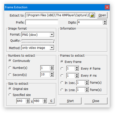
note which computer folder the screencaps will go to (it has a label "Extract to") > go to that folder on your computer and create a bunch of numbered folders there, for example ten folders named from 1 to 10, these would be our separate folders for ten gifs > write "1" or a name of another numbered folder after the backslash in "Extract to" bar in kmplayer > go the timestamp that will be the beginning of your gif in KMPlayer > press "Start" in the Frame Extraction window and press play on the video > when the moment you need to gif is over, press pause on the video and press "Stop" in the Frame Extraction window. great, you now have your folder of screencaps!
3. Importing screencaps to Photoshop
i use Adobe Photoshop 2023, but had used Adobe Photoshop CS5 for a long time before that, so you can use any version you have or find! it's available on various websites and torrents.
open Photoshop > Scripts > Load Files into Stack > press Browse in the "Load Layers" window that was opened
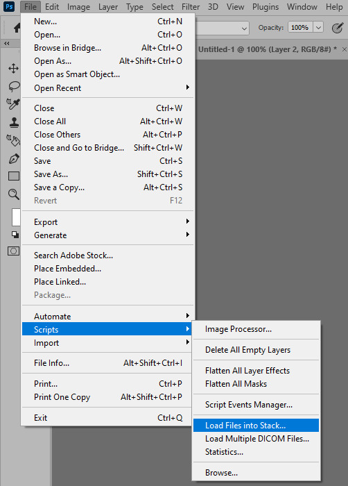
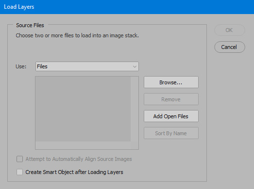
open your screencaps folder (and pin the KMPlayer Capture folder for faster future access) > pick the screencaps you want for your gif by clicking on the first one, and then clicking on the finishing one while pressing Shift on the keyboard > click OK and let them load for some time! i have 65 screencaps loading at the moment
when the screencaps finish loading go to Window > press Timeline > press Create Video Timeline in the opened sidebar > press three dots that will say "Convert to frame animation"
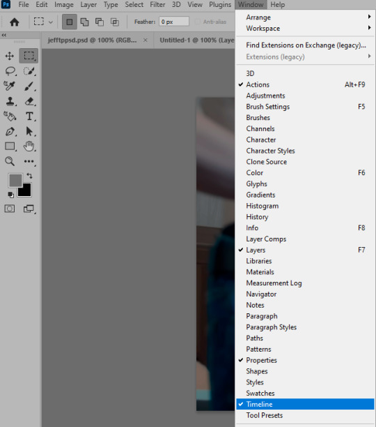


4. Sizing & making the base of a gif
next part will be automatic. i use actions for almost everything from this moment. download the basic action pack here and my additional action pack that we will need here. load them in your photoshop actions window (Actions > Load Actions).
play the Script action to create frames.
now onto sizing your gif. these are tumblr's width dimensions for 3 types of gifs
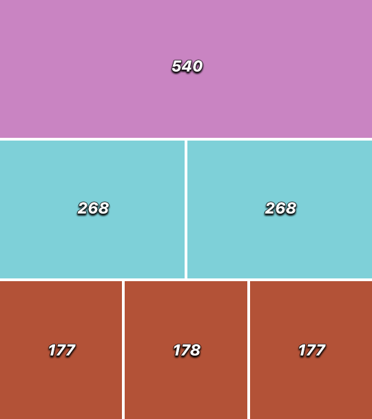
my gifs are usually 540 px in width and 640, 400 or 345 px in height. i added a 400 px action (Sizing 400) in the action pack, you can use it! or you can follow the steps by hand:
Image > Image Size > put in the height you want and add 4-6 pixels there (mine will be 406 for a 400 px high gif) > OK

now we need to crop the gif for it to fit tumblr's dimensions:
Image > Canvas Size > change Width to 540 (or 268 or 177) and take away the 4-6 pixels that we left in the previous step in Height
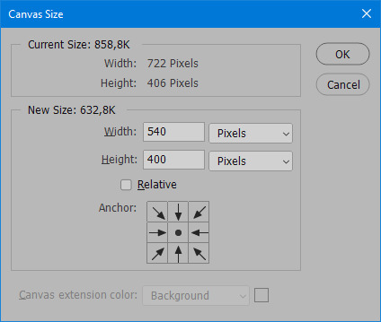
when you figure out which gif dimensions work best for you, record an action and use it to save up time!
after sizing use the action Smart Object. now we have the base of our gif!

you can move your gif left or right if you want! i will be doing this because i would like to show more hips in the gif.
press Ctrl + T > move the layer however you need (not in height though) > press Enter to save
i moved it to the right and my gif looks like this now:

5. Sharpening (i use Tan's sharpening settings explained here)
i added two sharpening actions in the pack, they are called Sharpen Spicy and Sharpen Spicy 12. you can use one of them or you can sharpen your gif by hand, i will explain how to do it below.
Filter > Sharpen > Smart Sharpen > 500% amount, 0,2 px radius > OK
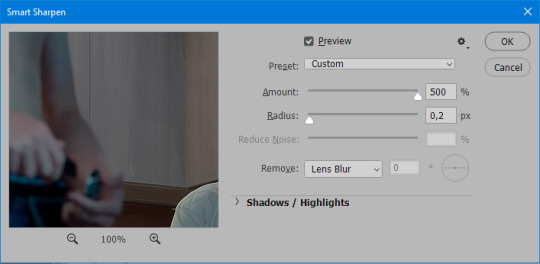
Filter > Sharpen > Smart Sharpen > 17% amount, 10,0 px radius > OK (you can change 17% to lesser or bigger, depending how intense you want your sharpening to look. i use 17% for 4k footage and 12% for 1080 px or less videos)
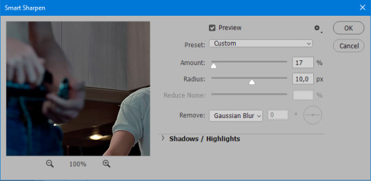
to smooth the sharpening a bit i use Gaussian Blur (this is optional, you can leave the sharpening as it is if you want your gif to be sharper).
Filter > Blur > Gaussian Blur > Radius 1,0 pixels > OK
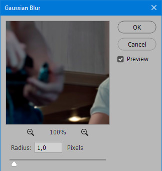
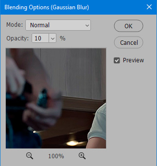
now change blending intensity to let only a bit of the blurring effect stay (you need to change this by hand if you used the sharpening action also).
press Blending Options (the highlighted place) twice > change Opacity to 10%

this is what my gifs looks like with sharpening now!

6. Colouring (i learned how to colour the way i do through this tutorial)
to make it easier for you to learn i will share my blank colouring file. i created it to save as much time while giffing as possible, so whenever i need to colour a gif i simply duplicate all the blank adjustment layers to the base of my every gif and start colouring! once you figure out which adjustment layers work for you best, i recommend creating a blank colouring file too to save time.
if you want to go the easy way, open my colouring file and duplicate selected layers to your gif file by Layer > Duplicate Layer > insert gif's document name

if you want to learn by hand, create the adjustment layers that i will be naming in the process on your own, you can find them all in Layer > New Adjustment Layer
now we will use adjustment layers for our colouring from the bottom to the top! first, Exposure layer to add a bit of light to the gif. i don't always use Exposure because sometimes shots are bright enough on their own. i will, however, use it here. don't use it on your gif too much, because in the next few steps we will also be brightening the gif with other adjustment layers. i added +0,49:

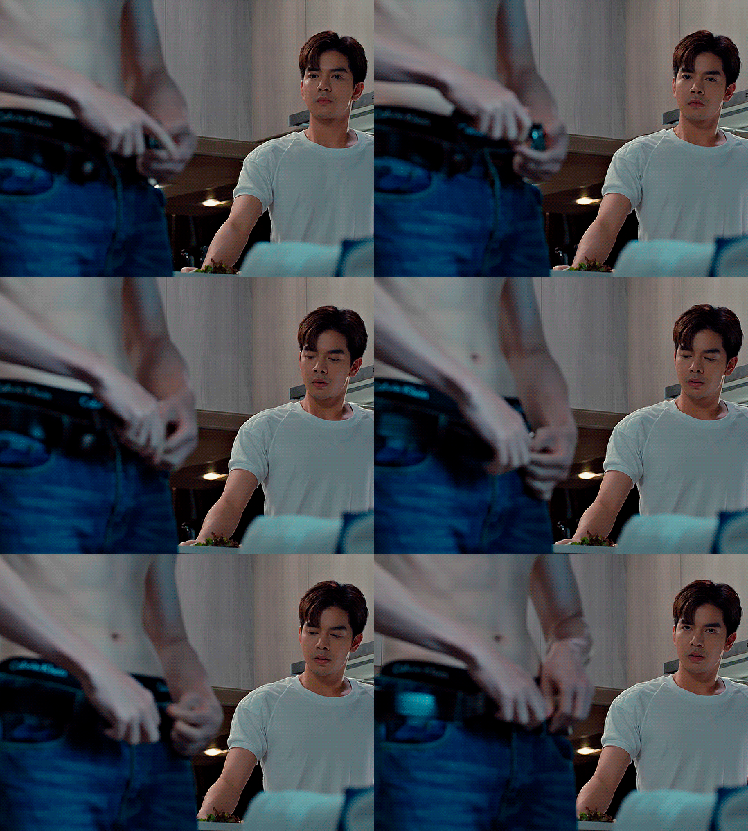
next, Hue/Saturation layer. i use it in gifs with neon lighting to color correct overly bright colours. for example if your characters are standing in neon pink, you might want to lessen Saturation in Magentas and Reds to make the final gif less pixelated, and etc. i will not use Hue/Saturation on this gif, cause it doesn't need it.
proceed to the layer Levels. this layer usually does most of my colouring. click on the lowest white dropper in your Levels window:
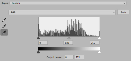
now choose a light place on your gif and click on it with the white dropper. it works especially well if you use the white dropper on the lightened parts of face skin. you can play around by choosing different bright spots and seeing what works best. here is the spot i chose and the resulting colouring:


this is too light, so now we need to balance it out with the black dropper:

choose one of the darkest places this time and click it with black dropper! once again, you can play around and click different spot to see what works best. i will be clicking the highlighted spot and you can see what my gif will look like with this Levels settings
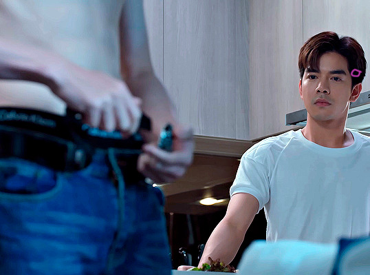

as you can see, darkest places became darker and other colours were corrected a bit! now, this is still too bright, so i will be decreasing the opacity of Levels layer from 100% to a smaller number:
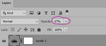
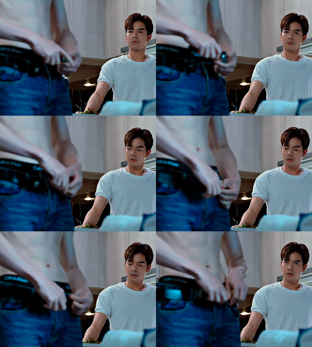
i will have to continue in another post because tumblr only allows 30 pictures per one post in the new editor now and i'd like to explain everything in visuals. click to continue
99 notes
·
View notes
Text
set up an image gallery 4 ur own website:

hello. with the instability and uncertainty of the various social medias in use today, its been the "cool new thing" to get back to doing the "cool old thing" and make custom html websites again. independence!
my friends have asked me how to set up an image gallery type thing for their own websites enough times that i made this tutorial a while back:
uhhh if this link breaks in the future for whatever reason let me know and i'll update it lol
why use glightbox over the zillion other image gallery lightbox things out there? well at the time this was the best one that suited my preferences: it has clickable arrows on the sides, an X button, keyboard left/right controls, a caption/description box, didnt require you to get a noncommercial license, etc. nowadays you could probably look into implementing something more modern like https://photoswipe.com/, but you're on your own there.
#pivstuff#ref#website#i dont remember when i looked into this originally. 2021? sheesh#i also kept forgetting to make a public post about this. sorry. here yall go
68 notes
·
View notes
Text
Deconstructing the sissy in you (extra)
Let’s go back to the beginning of the tutorial. However, let’s amplify it a little more. You always had a thing for this thing called “feminization”, which involved forcing men into wearing feminine clothing or adopting feminine roles in an embarrassing manner. That kind of thing was your kink/fetish for a good while and imagined what would it be like if it happened for real. Little did you know it was a gateway to explore your sexuality.
You browse the web for TG captions and transformations as a way to spend some “me time”. All of a sudden, you see this post:

“Damn, she’s sexy!” you say out loud. You obviously want to be inside her body, but deep in your mind, you secretly want to be in her body. As in, you want to feel her soft skin, her boobs, her skirt, hair, you want to be her!
In no time, you start to see more pics like this:
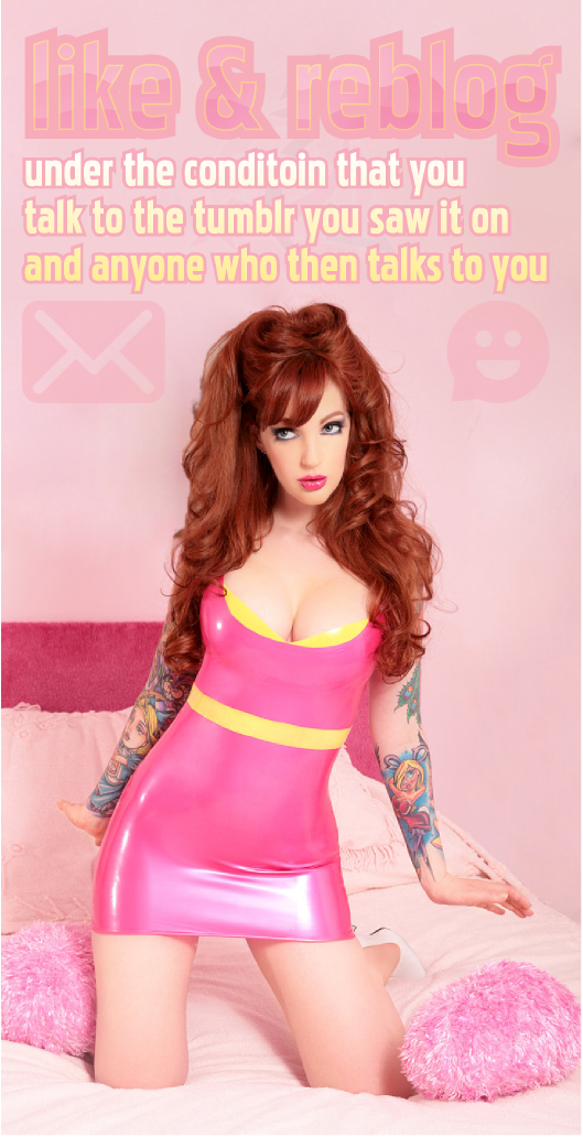
Eventually, your feed begins to fill with captions like these...


...while some daring strangers fill your inbox with captions like these...


Soon enough, you start to get into female fashion, changed your way of words, became interested in men, and slowly incorporated your feminization in your public life. Those hypnos and captions have changed your thinking! It got to the point where you opened a Tumblr, started to make "sissy besties", and asked for tips on how to become more "feminine". It felt mutual, it felt exclusive, it felt like becoming a part of the Mean Girls!

But you wanted more. You wanted hypnosis that can destroy your "manhood". You wanted captions that affirmed your "sissy identity". You wanted hormones to grow boobs and ass. You wanted to become a woman at an instant!


But how? Desperately wanting to view more captions, you decide to find more of them on your search bar. You type "feminization captions" and the results are abundant! But as you scroll all the way down to a dead end, you find a picture of a sexy, blonde woman in red that catches your attention:
"OMG! She's so gorgeous! She's the type I want to become! I need to find out who she is!" Just as you click to the image, you're sent to a blog that you're somehow familiar and/or following. You try to find the image and as you keep on scrolling, you found it belongs to a certain blog: @befemininenow. ""Be feminine now?" This is it! This is what I need! Someone who can instantly change me into a feminine woman!"
But as you read the pinned post and the introduction greeting, you feel a little conflicted. You like feminization, but the blog doesn't cater to sissies. Yet, the captions feel so persuasive and alluring, you don't know where to start. You decide to go all the way back and finally found the one that seems the sexiest.
What was the caption that caught your attention?:
Of course the one with Lilly Roma and her tight, revealing, black suit! But instead of being a sissy caption, it's a caption that tells you to be a fellow sister! "Sister? Mmm... I... I like that. Better than sissy!"
You browse the blog and find more than enough caption to your taste:
Some were a dream, some were so sexual, some were unbelievable, and some... hit right at home.
Very few captions mention the word "sissy" and when they do, it's usually not as you expected it to be. That's because the blog is about embracing femininity instead of treating it as humiliating. You try to find if there are more blogs like hers and luckily for you, there's a bunch more...
Joanna's Journey, A Miss Inside, Every Alice, Gym Bunny Candie Hart, GGS-Trans-Inspo, and so much more!
It took a while for you to realize that some of those feminization blogs aren't like the rest, including sissy blogs like Sissypinkfashionfun. They may seem a bit unrealistic at times, maybe a little overboard with the "wipe masculinity" posts. But what you love about those blogs the most is that all of them have something in common: they are not ashamed of femininity, but rather embrace it as their own.
It all makes sense: as a kid, you wanted to be a ballerina:
Later on in life, you wanted to become a princess:
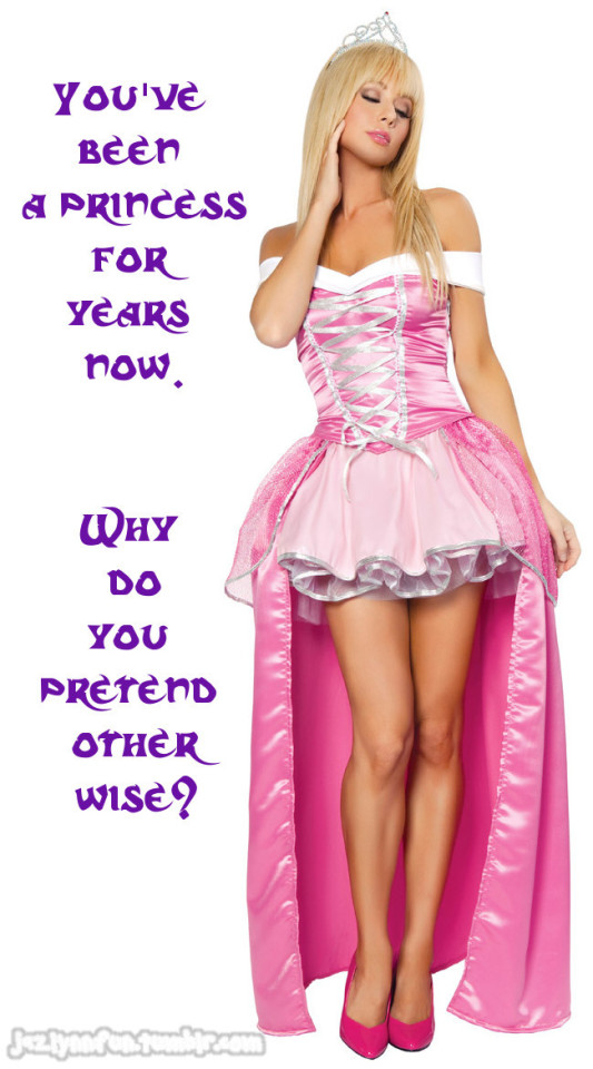
But now...

You just wish you can come out as your true self! Why be ashamed of being feminine? Why do you need to be punished for showing weakness? Why be subject to bullying for behaving a certain way? You don't really want to be a "sissy", but you want to be a girl. You love your feminine side.
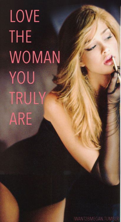
But in order to move on from your "sissy phase", there is one step you would have to do:
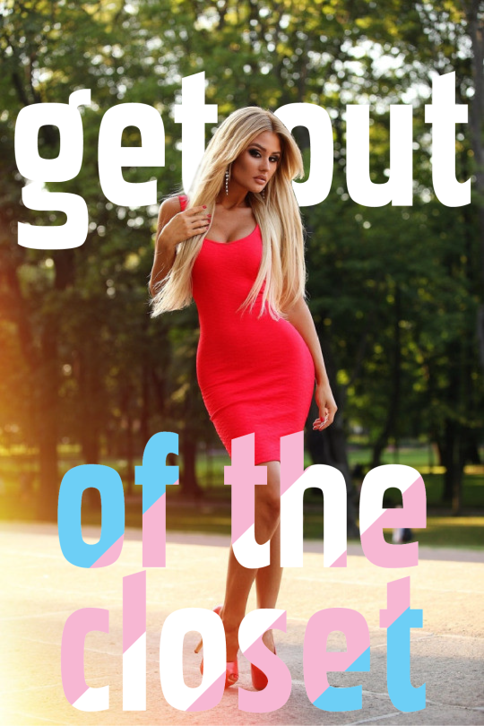
That's right, girl! It means you have to come out. Whether you like it or not, it's the next step to your change. You can keep hiding in the closet, experiment with the "sissy lifestyle", and reblog feminization captions all you want. But as much as you hate to face reality, she is you. You're transgender. You're a woman inside, even if your current anatomy doesn't match it.

The latter sentence didn't discourage Mikaela Ville nor Angelick Poleth (girl in the next pic) from postponing transition. Look at them now. Don't you wish to want to be like them?
But to be sure of the change, to be sure of what you really want, how far will you go into your life change? Do you want just dress feminine, but still identify as a man? Maybe you identify as a different gender? Or do you want to go further and take hormones to turn into a woman?

Whatever you end up identifying as, know your identity and femininity are valid. Find your nearest gender support group, talk to doctors and therapists who can assist your gender change, and be very safe in today's environment. Remember, you are not a sissy, but a brave woman! Unlock the cages and let the lioness inside out!
(End of guides. Thank you for reading 'till the end!)
110 notes
·
View notes
Text

HOW TO: Make an iPhone Layout + Downloadable Template
Hi! I've gotten a few messages asking for a tutorial on my iPhone gifsets — but instead of only doing a tutorial (that would probably be triple the length this one already is), I decided to turn my layout into a template with all the bits and bobs! In the "tutorial" under the cut, I'll share everything you'll need, a free template download, and quickly go over how to use this template. :)
Disclaimer: This template uses Video Timeline and this tutorial assumes you have a basic to intermediate understanding of Photoshop.

PHASE 1: THE ASSETS
1.1 – Download fonts. These are the fonts used for all assets I've included in my template: – SF Pro or SF Pro Display (Regular, Medium, Bold): Either version works, they look nearly identical. You can download directly from https://developer.apple.com/fonts/ or easily find it via Google – Bebas Neue: Free on Google Fonts, Adobe Fonts, and dafont – Times New Roman (Bold): Should be a default font in Photoshop

Make sure to download and install any of the fonts you don't already have before opening my template. That way, once you open the template file, all the settings (font size, weight, spacing, color, opacity, etc.) are as intended.
1.2 – Download my template. Before you use my template, all I ask is that you don't claim or redistribute it as your own and that you give me proper credit in the caption of your post. Making these iPhone gifsets takes me a longgg time and turning this layout into a template took several hours too.
DOWNLOAD TEMPLATE VIA KO-FI ← This template is completely free to download (just enter $0), but if you feel inclined to tip me, I appreciate you! 💖
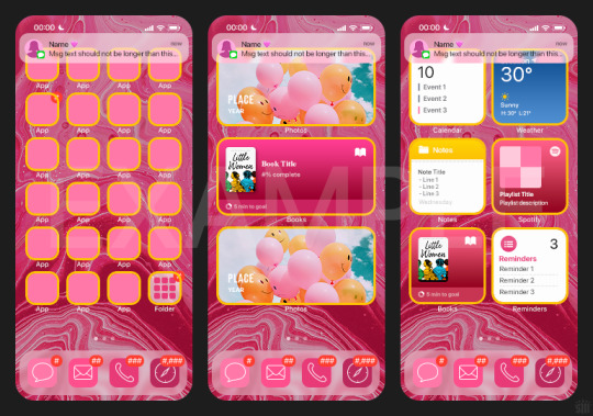

BTW this template also includes some of my frequently used icons!
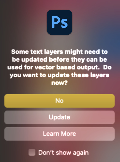
NOTE: If, for some reason, you open the template and see the pop-up shown below, click "NO" — otherwise, the fonts will be all messed up:
And if you see this triangle with an exclamation point by a text layer, don't double-click it — it'll mess up the font as well:

PHASE 2: THE GIFS
I'm just going to briefly go over gif sizes and my recommendations. Also, keep in mind when grabbing your scenes, you'll want all of these gifs to be the same amount of frames.
2.1 – Background Gif: 540 x 540 px. I recommend this size so you have a good amount of visibility for the gif behind the iPhone wallpaper. I also recommend making this black and white (or in my case, black and white with a slight blue tint — idk I just like the way it looks) so the wallpaper coloring can stand out.
2.2 – Wallpaper Gif: 230 (w) x 500 (h) px. Keep in mind the very narrow dimensions of the wallpaper! And also keep in mind that you'll have a bunch of apps and widgets covering the image. I try to use wide shots (or layer my clips into looking like wide shots). Also, keep in mind your color scheme for your set and your character's aesthetic! I tend to focus on one or two colors for the wallpaper.
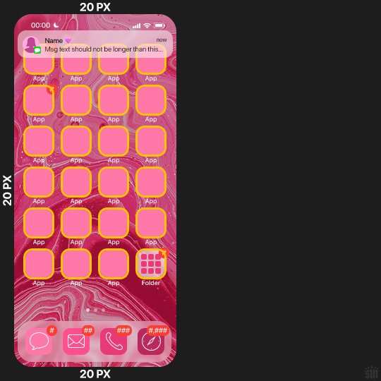
I usually position the wallpaper to the side with 20px bumpers, so there's lots of space to see the background:
2.3 – Large Photo Widget Gif: 201 (w) x 96 (h) px.
2.4 – Small Photo Widget Gif: 94 x 94 px.
PHASE 3: THE TEMPLATE – "IPHONE" FOLDER
In this section, I'll try to quickly walk you through how to use this template and some bits that may require extra instructions. I'll be going through each folder from top to bottom.
3.1 – Status Bar. Time, Service, and WiFi are pretty self-explanatory. In the Battery folder, you can use the shape tool to adjust the shape layers labeled "Fill (Adjustable Shape!)" to customize the battery level.
3.2 – Message Notification. Again, these are pretty self-explanatory. I've already masked the circle for the contact photo, so you can simply import any photo and use the transform tool to shrink it down. The circle is 24x24 px. If you don't want to use a photo, there's another folder called Default Initials.
If your message text can't fit the text box, the message should end with ellipses which is how iOS caps off long texts.
3.3 – Blurred Banner (IMPORTANT) This folder is easy to miss because there's only one placeholder layer in there. On iPhones, the area behind a banner notification and the dock get blurred (including the wallpaper and any apps).
What to do: Make a duplicate of the apps in Row 1 and/or widgets that intersect the message banner, convert them all into one smart object, apply a Gaussian Blur filter (Radius: 3.0 pixels) on the smart object, and move the smart object into this masked folder!
(There's another masked folder in the Wallpaper folder for the dock which I'll go over in that section.)
3.4 – Apps Turn off the yellow guide if you don't need it to keep things aligned and turn off layers you don't need by clicking the eye icon. Replace the "App" placeholder text with your app name, change the color or gradient of the square to compliment your color scheme, and add your custom app icon overlay!
If you can't find an app icon you need from the ones I provided, flaticon.com is a great resource. Also, if you can only find the filled version of an icon, check out this tutorial for how to make any text or shape into an outline.
Also, each app folder has 4 notification bubble options (1-4 digits). Again, you can toggle these on and off as you need!
3.5 – Big Widgets I like using these when my wallpaper has A LOT of negative space to fill. I included the Photos and Books widgets in my template, but there are lots of widgets available on iPhones. You can check some of the other ones I've done here, or if you have an iPhone, simply try adding some widgets to your phone!
There are also widgets bigger than these, but they would take up half of the phone screen which is why I don't use them for these edits.
3.6 – Small Widgets The only thing I'll say about these — because they're pretty straight forward — is there are a lot more weather themes than I included in my template. Also, if you set your character's phone to evening, the weather widget will show a dark background (sometimes with stars), so keep that in mind.
Speaking of, I've included Light Modes and Dark Modes for, I think, every applicable widget.
3.7 – Page Dots These barely perceptible dots indicate that your character has more pages of apps than shown in your gifset (so if an anon tries to come at you, you can just say "it's on the next page of apps" /j /lh)
3.8 – Dock Again, the dock has notification bubble options and I've included the default app designs, custom filled designs, and custom outlined designs for iMessage, Phone, Email, and Safari (there's also a FaceTime alternative if that's how your character rolls). These are usually the apps people keep in their Dock, but this is fully customizable too. So, if your character is, like, super obsessed with Candy Crush or something and needs it in thumb's reach — you can put it in the dock.
3.9 – Wallpaper This whole folder is masked already to a 230x500 px rounded rectangle.
Inside, you'll find another "Blurred Portion" folder for the area behind the message banner notification and the dock.
What to do: Duplicate your gif layer and place it in this folder, remove any sharpening filters, and apply a Gaussian Blur filter (Radius: 3.0 px). Be sure to add any coloring/adjustment layers ABOVE this folder and your original sharpened gif layer.
PHASE 4: EXPORT
We made it!
I hope this template makes it super easy for you to recreate this layout! If you decide to try it out, feel free to tag me with #usernik.
If you notice anything wonky about the template, kindly let me know so I can fix it! And if you have any questions about how to use this template, please don't hesitate to send me a message! I just ask that you try to be specific in your question so I'm able to answer you the best I can!
#gif tutorial#completeresources#userpickles#usersmia#userabs#usertreena#alielook#userkosmos#usershreyu#userzaynab#tuserabbie#useryoshi#usersalty#tuserlucie#usernanda#userelio#userhella#usercats#gfx*#resource*
936 notes
·
View notes
Text

computer-friendly giffing tutorial — how to make clear gifs on lightweight apps, from screencapping to animating & colouring :-)
i’ll outline two methods for processing here:
vsynth + photopea
potplayer + photopea
then two for processing your frames:
photoscape — obtainable for free @ Microsoft Store. very very light and user-friendly
photopea — known as the online photoshop alternative. tutorial adapted from @lacebird from here.
that being said, giffing is reliant on frames and there’s also dozens of methods for screencapping. after, there’s dozens of methods for compiling your frames into an animated image. i’ll just try and outline each individual step in a way that you can pick and choose what’s easier :-)
reasons being: i think it’d be cool if more people learned how to gif and we could stop gifmaker discourse one indoctrination at a time
ok so here’s how you can obtain your frames
vapoursynth, already sharpened and resized.
potplayer, which screenshots one frame at a time for you and then you resize + sharpen it after.
i already talked about vapoursynth previously here, but i’ll do it again if only because i like talking about it.
potplayer method

it’s pretty intuitive imo you just need to install it and boot it up. we’ll be using leon as a lab rat for this one again

if you right-click on the video and choose video -> video capture OR press K and then Capture Consecutive Images / Control + G you’ll open the screencapping pop-up
fuck around however you wish but i just input [frame] numbers as 90 and make a custom filename for the screencaps.
vapoursynth method
the run-down is that you only need to extract vapoursynth's portable app and then drag your video into the .bat file that says (drop your video here) LOL it will open a command prompt window and then you just write down the timestamps :-)

the cmd prompts open the resizer.html where you can just crop it and say how many frames you’ll want (60 for every second or 30 for every second) I like to do 30fps bc I think 60fps is so very slow but dealer’s choice

just copy and paste the text in the upper right window into the video editor. also these are my sharpening/denoise settings
video = mvs.BM3D(video, sigma=9.08, radius1=1, profile1="fast", matrix="709") video = fun.FineSharp(video, sstr=4)

pressing start will commence the screencapping and you'll have all your frames sharpened and ready to go. with vapoursynth you can export it like a gif already with the delay set and everything or just proper frames even. i won’t bother bc i already went over it previously but if you export it like a gif just jump to the photopea part below and it’ll be pretty simple from the on
you can do it via photopea or photoscape or straight from gif and then you just edit it minimally or don’t edit it at all. i’ll do photoscape and then photopea bc i grew up with the former and i’m just impressed that it works LOL
photoscape

it’s kinda self-explanatory but it’s really that easy LOL just press Create GIF. you can explore your files on the sidebar and then you just drag all of your frames into the center of the editor -> set a frame delay, i like to do 0,04 because it looks nice -> resize it as you see fit & if you want you can even caption it but you can’t move the caption which is just LOL but whatever works


you can just open the resulting file in photopea to colour it and sharpen it a bit more but if you don't like editing much you can just post it as it is.
photopea

i think this is called new project -> open and place but who knows. i just size it the dimensions of my gif and go from there

then you’ll delete the background layer -> select all your frames (hold shift while clicking on the first and last) and click on the little folder icon to group them. then you’ll select them all again and right click on them -> Rasterize.
then go layer -> animation -> make frames and

there you have it :-) the _a is what assures you that it’s animated. you can add text -> right click, make it a paragraph box -> adjust the width to be the same as your gif and center-align it. if you right click the text layer again you can also add stroke and drop shadow etc but i don’t really understand how it works

now just go to file -> export -> gif
if you did everything right you need only adjust the speed and you’re good to go. sometimes i do 80% sometimes i do 200% just mess around and see what looks nice.
final considerations
i’ll be honest idk how to describe the difference between them bc this is mainly based by the eye test. is it possible that they are all the same and no one who sees it around will notice the difference? yes. am i one of those people? i think so. but after doing like 200 of these i realized some gifs are more grating than others after you’ve also watched each 200 times. i’ll use the potplayer option bc it’s the fastest one LOL i forgot to include the potplayer process for photopea but i DO think it’s one and the same.


*ok i had to do it for the sake of the scientific process so here i’ll filter the last one out also to give you an idea of the difference in . sharpness. whatever. just select all your frames and go filter -> sharpen -> smart sharpen. i just use the default one (150% at 1.0px) and then i try and do like 30% at 10px or smth similar.
this is it :-) i’ll do another part on colouring and editing but newcomers aren’t very worried about it i feel... like they’ll cross that bridge when they come to it. meanwhile i was doing slow-motion ones with pretty colours like truly didn’t know a thing about anything etc hope this is helpful or even entertaining
#giffing#resources#solavie.gifs#bored af#I DO KNOW I SPELLED PHOTOSCAPE 45 DIFFERENT WAYS. BE MINDFUL OF THE NON-NATIVE SPEAKER!!!!!!!!#wrow............. why did i do this like i just finished it but it's like#people think it's hard but it isn't#i think i'm misunderstanding the reason for the lack of hockey giffers maybe they DO prefer to just gank them LOL
22 notes
·
View notes
Note
hiii kelli! i know u might be probably busy with stuff but i was wondering if u know any tip with the blurring caption stuff? i hate giffing content when theres caption flying all around and the ones that appear moving?? i literally have no idea how to blur them so i just blur them separately and it takes me like 5 hours to do so %$^%$% so i was wondering if u have any tip? or tutorial?
hi anon, sorry for the late reply! i wish there were a faster and more efficient way to blur animated captions, but i also tend to blur them frame by frame in timeline mode if they have a lot of movement. of course, you could just make a large selection around the whole caption at its largest point (like when the letters stretch/enlarge in the middle, you know what i'm taking about lol) or from where it starts panning to where it stops, but then you might end up with a lot of excess space of the gif blurred that doesn't need to be or a big weird looking block of gaussian blur on parts of the gif where the floating caption was at the beginning, but moved somewhere else by the end.
example with a very animated caption appearing gradually:

that is FINE and definitely the quickest and less nit-picky way to go, i personally just don't like frames of my gif blurred unnecessarily like on his clothes or his arm because the lettering appeared so large at certain points. i prefer to keep my blurring as tightly around the caption across every frame as i can, so i just power through it and get it done.
so like this:

to do this, instead of making a selection around the whole caption, i duplicated my base layer, applied my blur settings, added a layer mask on the layer, then used the paint bucket tool to make the layer mask black. then using my arrow keys, i made a cut on the timeline (on the duplicated layer) after the first frame with the little scissors button and painted white on the layer mask around the part of the caption that appeared on that specific frame. then i basically continued that process until the end of the caption's movement, making cuts after each frame and painting white on the corresponding layer mask wherever i wanted the blur to be and painting black wherever the letters reduced in size and left extra blurring around it. this way the blurring stays around the letters only as it appears in each frame. YES it's tedious and it's likely nobody even looks at it that closely, but this is just a personal preference of mine. you'd do this same method with captions that float around a lot.
my timeline ends up looking like this by the end:

3 notes
·
View notes
Text


RESOURCE DIRECTORY 2.0 + HOW TO NAVIGATE USERGIF
Hello! We hit 10k followers! I want to take this moment to thank all our wonderful followers and the talented members of usergif! We created this blog less than 2 years ago and are constantly blown away by your support and beautiful creations. As a thank-you, we're proud to announce our new and improved resource directory!!! Shout out to arithemes' custom page which allowed us to create a more streamlined and organized directory for everyone to use. Under the cut, you'll find a guide to help you find exactly the resource you're looking for on our blog. Happy gifmaking! :)

THE UPDATED DIRECTORY
All resources are in alphabetical order first by the creator's URL (at the time of entry), then by the resource's title. Each title is a clickable link that'll redirect you to the original post. Beneath that, you'll find the creator's URL and the resource's relevant filter tags:
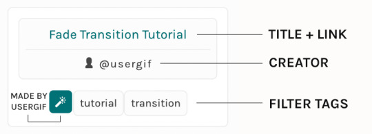
As always, whenever I add new entries to the directory, you'll see the last date listed on the right side of the blog here:
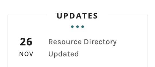
If you don't see one of your recent tutorials listed there, please be patient. I update the directory on a monthly basis, but only add resources that have already exited our queue.
THE FILTERS

Please note: the Source section has exclusive filters, meaning you can only select one at a time. In the Type and Effects sections, you can select as many filters as you want. However, if you select 2 filters in one section, like "animated" and "blending," it'll show results for any resource with either of those tags, not necessarily resources that include both of those tags.
Here's a breakdown of how we categorize our resources:
Source: ↳ all: posted by any creator ↳ usergif: posted by usergif
Type: ↳ all: click this to reset filter selections ↳ action: pre-recorded photoshop functions that can be replayed ↳ basics: non-effects-related resources to help new gifmakers get their feet off the ground (please remember usergif is not a resource for beginner-level gifs and focuses on intermediate to advanced gif effects. however, we thought it would be helpful to keep some basic resources available) ↳ brush: various brush shapes like ripped paper edges or intricate textures ↳ fonts: names and links to fonts or font packs ↳ template: pre-made, downloadable layouts and designs ↳ texture: overlays that add a different finish to a gif such as Ben Day dots (retro comic dots) or glitter ↳ tutorial: any post that provides an explanation for a gif effects process ↳ other
Effect: ↳ all: click this to reset filter selections ↳ animated: an effect that applies movement to an element such as rotating text or wiggling shapes ↳ blending: aka double exposure, this effect combines two or more gifs layered on top of each other ↳ color: specifically for color manipulation, an effect in which the original colors are completely different (e.g. a blue sky colored to look pink) ↳ glitch: an effect where color channels are toggled and layered over the original gif to give a flickering effect ↳ layout: multiple gifs on one canvas like a collage (e.g. hexagon layout) or poster-style templates ↳ overlay: an added element layered above a gif (excluding text) such as a shape, another gif confined to a shape, a texture, etc. ↳ transition: an effect that stylizes the passage from one scene/clip into another, such as a fade, glitch, linear wipe, or motion blur transition ↳ typography: any kind of stylized text added over a gif (does not include basic captions)
You can find examples of all these gif effects via their respective tags on our Nav!
THE SEARCH BAR

This search bar functions the same way as the search bar in the upper right corner of our main blog and the search function on Tumblr's mobile app.

Tumblr search allows you to generate results using keywords found in the body of the post or the tags. So, if you're looking for a post but can only remember it having the word "rotoscoping," you can type that in either in the directory's search or blog's search and find any post on our blog that mentions the exact keyword "rotoscoping."
THE NAV & TAGS
Tags function differently from search keywords as these relate to exact words and phrases found only in the tags, not the body of the post. Our members use tags to categorize original posts and reblogs. Some of our most frequently used tags are listed on our Navigation Page and saved in the mobile search function pictured below:
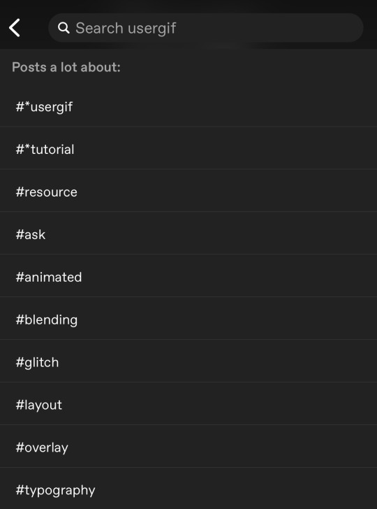
But if you ever want to quickly navigate a tag, simply add /tagged/word to the end of our url to find that tag! For example, if you want to see all the posts we've tagged as a #tutorial, just go to usergif.tumblr.com/tagged/tutorial.
BROKEN LINKS
Whether it's due to a creator frequently changing their url, the absence of an automatic blog redirect, or my own mistakes when coding the directory — you may stumble upon a broken link. Here's what to do:
If a creator has changed their username but their blog doesn't automatically redirect you to the new blog, check if they listed their new user name in the title of their old blog like I did:
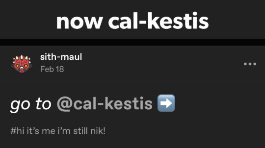
In this case, simply replace the url you landed on with this new url. For example, https://sith-maul.tumblr.com/post/692130400398704640/how-to-make-an-animated-google-search-overlay-a → would become → https://cal-kestis.tumblr.com/post/692130400398704640/how-to-make-an-animated-google-search-overlay-a
However, if you can't figure out the creator's new url or in the case that I messed up the link due to human error, feel free to send us a message so I can help find the source or correct the mistake!
WHERE TO FIND THIS INFO AGAIN
If you ever need to access this guide while using the directory, simply click the "i" button here:

And that's it! We hope this revamped directory is a lot more efficient and helpful. Thank you again for all your support and for helping us reach this follower milestone!
#*usergif#*usergifdirectory#completeresources#usershreyu#userace#uservivaldi#userbecca#usertreena#userzaynab#alielook#usernanda#userhella#userelio#useraish#userabs#tuserabbie#tusermona#usersmia#tuserlucie#usercats
340 notes
·
View notes
Text
Blur Tutorial
This will be a hopefully understandable tutorial on how I blur text or logos on my gifs. As said, my photoshop is set to German so if something is not clear, feel free to hit me up. At the point where this tutorial starts, I already sharpened and resized the gif to what I want. Anyways, let’s hop in.
The first one I try to explain is the one, were the text or logo is fixed in one spot and doesn’t move around. This is the easier one and I love when this happens :D after sharpening and sizing it looks like this (no coloring done yet).

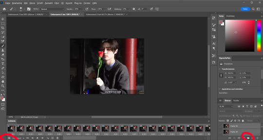
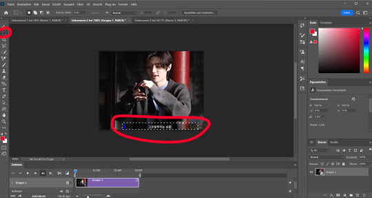
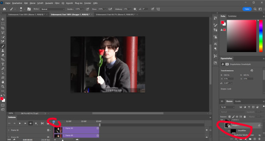
The work begins. Now you put all frames into a group and the timeline gets switched in the left corner. You do both on the symbols I circled on the picture below.
After that you go to the top bar and select filter. There you choose “convert for smart filters”. I stole a picture from someone else as for some reason my photoshop doesn’t allow me to make print screens of the menu. Ignore the one that the person opened and click on the one I circled red.
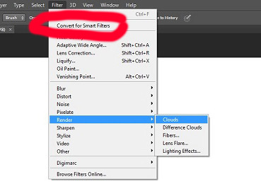
As of now the gif is ready to be worked on. Next you use the tool on the side which let you select a part of your gif. Then you select the part that should get blurred.
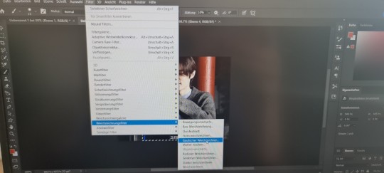
Go back to the filter menu and choose the right filter option. For me it is called “Weichzeichnungsfilter”. I think in English it could be the blur one or the noise, but I am not sure here. I apologize. By now I’m annoyed by my computer, so I took a photo of my screen. Again, I apologize.
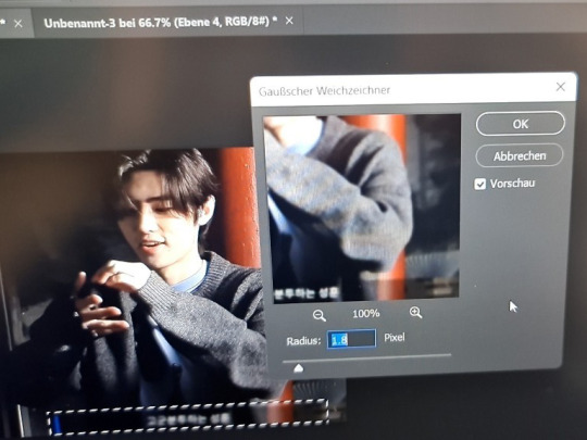
Now this little window pops up and you can change how blurred it should get. I change the number all the time, depending on how the text is or if it is a logo etc. Here I choose 1.8
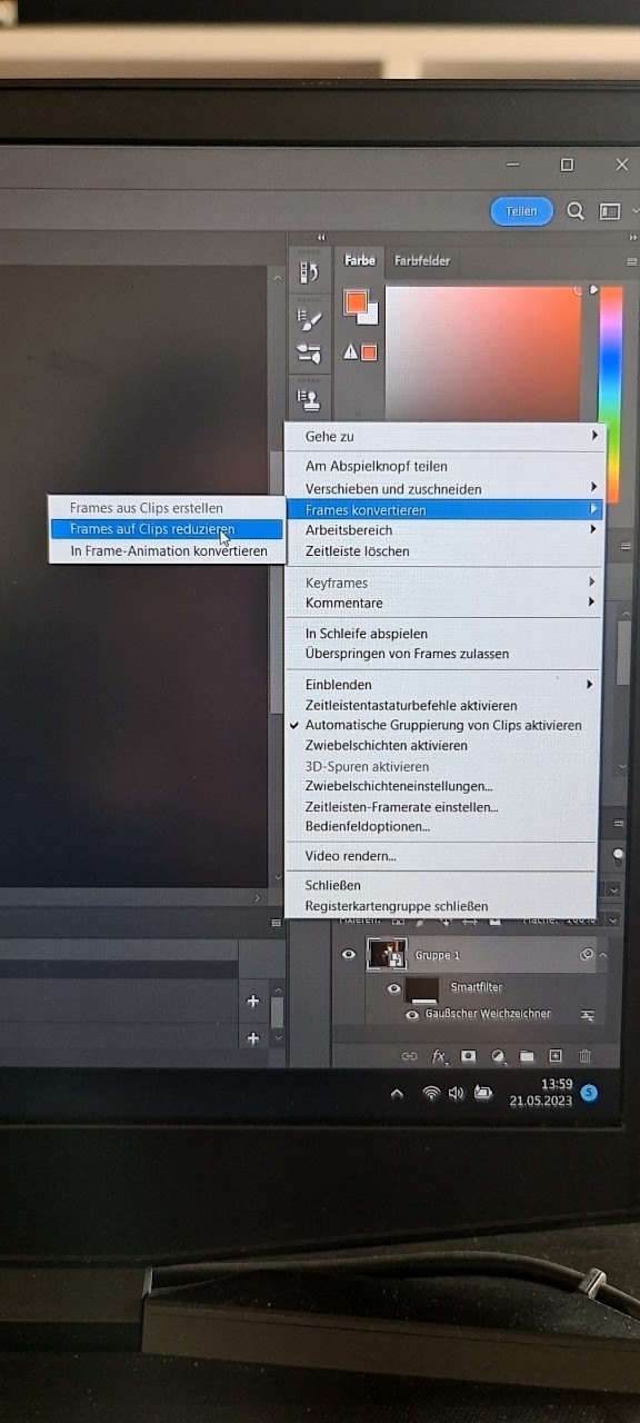
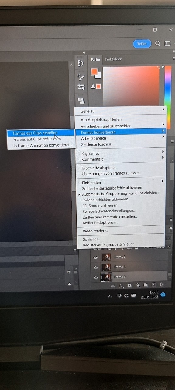
Now we nearly done. Next step is to get the gif back into frames. You go on the 3 strokes above each other on the right side of the timeline bar. Convert into frames -> frames to clips (again I hope it’s something like this in English)
If this is done make sure you’re at the start of your timeline with the ‘bar’ which decides where on your gif you are right now. Also, delete the frame I circled in the picture below.
Back to the menu on the side but choose the first option now. (Frames from clips)
Nearly same step again but now you choose the most down option next.
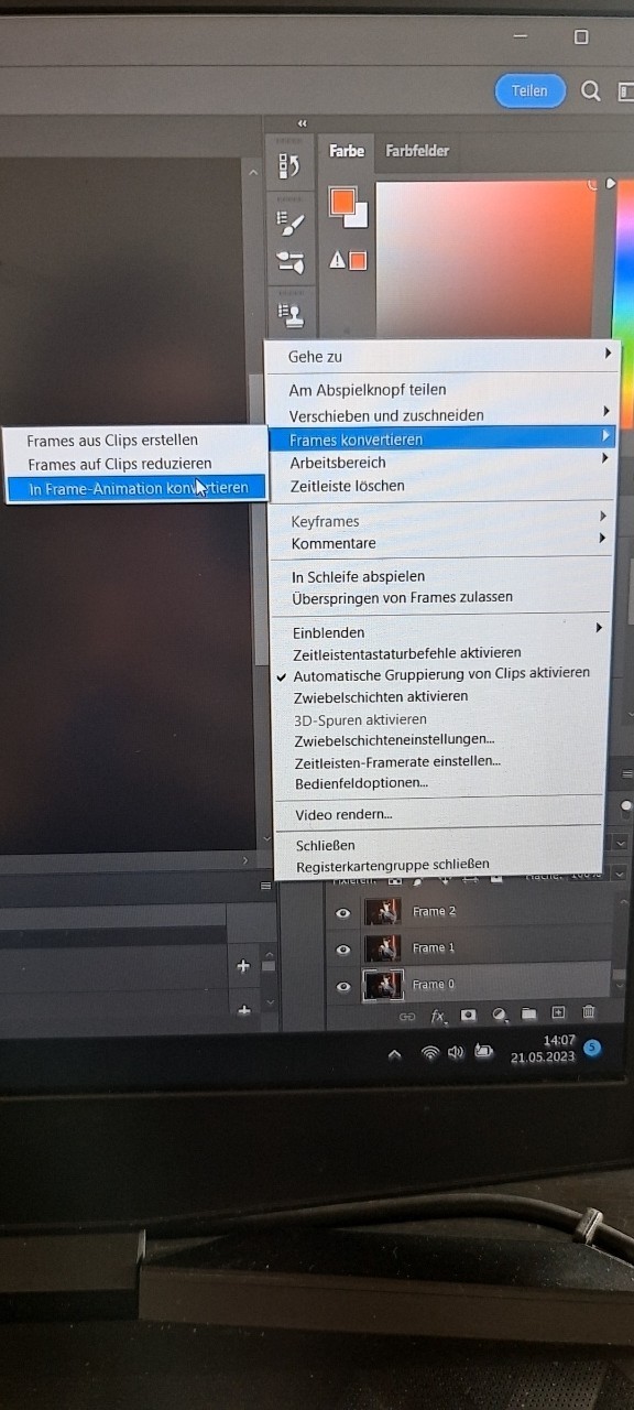
Done we are :D this is how I blur a none moving caption/text or logo :D it looks like this now

Then there is the other thing that can happen which is the text moves on the gif. There you can either select the frames in which the text moves and blur them separately. For example, like here.


I copied out the frames with this caption in a new work file and put it back on top of the ones in the original file after blurring.

If the caption moves around the whole gif I do it manually and if I say that, I mean it. I go on a frame and select the section. Make sure you select the frame on both, timeline, and frame list. The first time you have to choose the blur in the menu after that you can use ctrl + alt + F to put the filter on the next frame etc.
This is the end of my tutorial and I apologize for it. I’m not good at making tutorial and my pc worked against me on top. Still, I hope this was helpful and if there are any question, I will happily answer them or try to help. Thank you for reading this mess and finally, this is my way of doing it. Maybe there are easier ways to do it out there but yeah.
2 notes
·
View notes