#I'm kinda changing his design on the fly
Explore tagged Tumblr posts
Text
posting the WIP at this point because I like it enough to share w/ strangers lol


#Ulysses oc#Pressure OC#Pressure Robloc#WIP#Z-V06#He's an instance of Z-V06 that took over a human body :]#uses He/They/It pronouns but I mostly just use He/They for em ngl#they're probably about to eat someone right here lol#also I HAVENT MADE A REF SHEET YET#so#I'm kinda changing his design on the fly#like he's supposed to have short hair but I liked how long looks on him#+ he didn't have facial scarring#but I think it looks neat#:]
3 notes
·
View notes
Text
Had this AU kinda simmering on the sidelines for a while, but after the recent lore drop for the alt timeline (and for being in the franchise long enough to understand the characters a lil better), I finally decided to drop this thing.
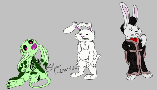
Basic premise of this thing is that instead of fully blowing up far away in space, Max wound up blowing up close enough to Earth's orbit (since Stinky was actually forced to toss her phone while leaving). This made it so his bits came barreling back like a meteor but recondensed themselves to form a body again (in part thanks to the dark matter still in him). During the process however the two halves of his brain refused to reconnect hence why there's two extra Maxes now instead of one.
Alt still shows up though, the above process took just enough time for the ending scene to play out but not long enough for Sam & Alt to leave the pier (the time elevator still gets sent away though so Alt's pretty much stranded in this timeline).
Now all 4 of em are kinda just stuck living together. Sam doesn't have the guts to ditch any of them because part of him wants to move on with Alt, but on the otherhand SuperEgo and ID remind him too much of when they were a whole person...rabbit.
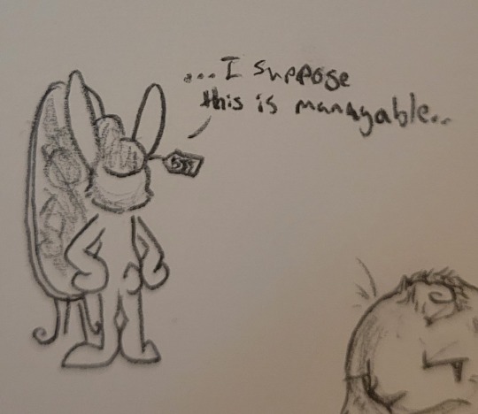
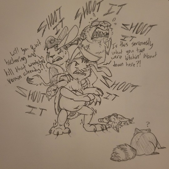
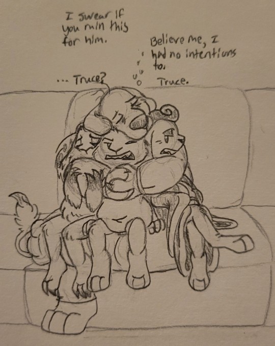
Bit of a sidenote sorta-kinda but, obviously all the Maxes hate each others' guts and try to get rid of one another by almost any means necessary. Problem with this is the fact SuperEgo and ID came from the same person afterall, so they can't really hurt each other or else they wind up hurting themselves. If one experiences damage done to their body then the other will experience phantom pain from it, be it sudden bruises coming out of nowhere or spontaneous cuts popping up.
#sam and max#sam and max spoilers#sam and max freelance husbands#the devil's playhouse spoilers#Three's A Crowd AU#silver's artwork#also just gonna add this here but even though SuperEgo was kinda standoffish in the game. I'd imagine he still likes Sam-#-hence why he sticks around#sure he may not be a fan of how he acts most of the time but he still finds comfort in Sam's company that noone else can seem to provide#other side notes I'm gonna add down here: despite his wings. ID can't fly and can only at best hover#and as for the exposed brains. tried to make sure it was obvious they were only exposed on one side#SuperEgo's popping out on his left while ID's leans from the right#obviously no exposed brain for Alt Max but he does get fucked up ears#those are thanks to ID from yanking them whenever those two fight#also also would've added Sam in the first pic but there wasn't much change in his design aside from baggase under his eyes#can't recall anything else that needs mentioning atm so Imma just leave it at this
57 notes
·
View notes
Text
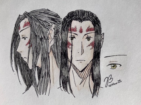
Some doodles as I try to work out/cement in my head what I want Camus to look like. He’s a half moon elven sorcerer/red dragon disciple | draconic-bloodline sorcerer of red dragon ancestry (I believe they’re also called dragonsouls?). He’s getting wings because screw whoever decided we couldn’t have them anymore after giving them to us in NWN1, and also horns and a tail because they’re cool and I can. I’ve written a few fics with him which can be found over on AO3—currently there are two each for NWN1, NWN2, and BG3.
They ended up looking yellowish, but his eyes are supposed to be pale jade (with the little golden flecks that apparently moon elves have, according to the FR wiki).
Original pen sketch under the cut:
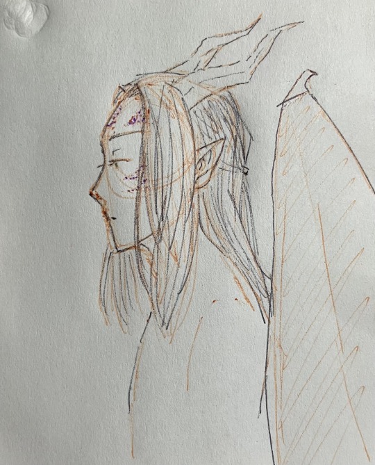
#dungeons & dragons#camus rashenevryn#dnd#ocs#ebw.op#drawing#pen#colored pencil#i also should figure out how to properly draw his scales#instead of just random circles and squiggles…#no but seriously the wings were the entire reason i fell in love with the class as a kid#i was so disappointed when i started playing nwn2 recently and found they'd been retconned already#it's basically the worst parts of nwn1 (no visible scales; can't fly) and bg3 (no wings)#at least you still get a breath weapon and fire immunity#why'd it get changed to conditional resistance??#i don't even care that it's not full immunity just give it to me straight-up#anyways yeah the chances of me ever getting to play a proper game and thus him existing outside of fic#(and approximations in video games)#are very much approaching nil#so i'm just doing whatever i want with him with little regard for rules written#basically my criteria are: 1) is it cool; 2) does it make sense to me#hmm i should design adrian too#all i know so far is he's average height; average build; and average looks#but i kinda wanna give him thick eyebrows#i like thick/heavy eyebrows#but camus is very 'thin/sharp/angular/long/narrow' so they don't fit him#he's like. a CLAMP character. (xxxholic's artist specifically)#(tho ofc some of them have thick eyebrows i'm p sure but.)
3 notes
·
View notes
Note
Ooo, I'm in love with how you write stuff for the series
Could I have something with a viltrumite reader that acts kinda like Beerus from dbz? Like she's all ready to have the plan be set in place but once she has a bite of the earth's most favorite comfort foods. She's suddenly all up for Earth's freedom
Like she'll fight off Nolan to keep her favorite donut shop from being put to rubble cause she make delicious cute animal shaped donuts
I'm not sure who you write for so you can do it for whoever you like
NOLAN GRAYSON & viltrumite!reader
— first time writing for the big man also idk if you wanted it to be like a relationship thing but i kept it kinda neutral
— trying to get through all these requests bear with me 😭
dubbed the 'god of destruction' by your own people was an impressive achievement, considering the average viltrumite was a higher being with a need for slaughter. your reputation preceded you, making you the perfect candidate to oversee the occupation efforts on earth.
you were sent alongside nolan to take the planet in the name of the viltrum empire. your ship crashed on that beach, and within minutes, a monster started to attack.
"not gonna help?" nolan hummed under his breath playfully. as if he needed help.
you didn't bother to respond—couldn't care less about the kaiju, more interested in what made this planet a topic of interest to your people. you flew into the city behind the shores, ignoring the screams of surprise below you as you touched down onto the roads and toppled a few cars onto their side.
you stalked into a nearby sweet shop, opening the door with such force it fell off its hinges.
you scoffed. "just how weak are you people?" you muttered, tossing the door to the ground.
the entire shop froze, unknowing if you were a superhero they haven't heard of or the last thing they'd see before death. you walked up to the counter, intrigued by the aromas wafting from the kitchen in the back.
"you. what is this?" your eyes drifted down to the steaming, sweet smelling treats underneath the glass.
the attendant trembled behind the till. "uhm... donuts?"
"give me one."
you were promptly handed a little baggie with a cute pink design on it, two glazed warm donuts safely packed inside. you ate one in two bites and unlocked a new level of happiness.
"this is good." you nodded as if you were performing a professional assessment. "kind of worthy of your meaningless lives."
"huh—?"
"don't worry about it," you waved the attendant off and left the store, flying to where nolan just finished cleaning up that kaiju. "want one?"
nolan raised his eyebrow. "looks cheap."
"i got it for free." you shrugged, offering the baggie to him. "i don't want to get rid of this planet anymore."
nolan's eyes narrowed. "it's barely been an hour."
"okay. and?" you swiped your fingers in the bottom of the baggie, colleting the sugar icing and licking your fingers clean. "what are you going to do, fight me?"
if you were to go up against nolan in a full fight he might give you some trouble, but in the end... you'd win.
he sighed. "i bet everything you'll change your mind."
"yeah, okay." you rolled your eyes, crumpling the bag and tossing it away.
in the next instant, you both turned to the sound of a helicopter touching down on the sand. a tiny man with a red tie jumped out of it, walking through the carnage with a surprising amount of indifference.
"littering is a criminal offense," he said, eyes darting down to the paper buried in the sand. "could have you fined for that."
"who are you?" nolan's voice was booming, and you snickered beside him. he always did that thing where he made himself sound more intimidating when going up against an unknown enemy.
"cecil stedman." he introduced himself. "you guys don't look like you're from around here."
nolan droned on and on about the cover story you memorized, how viltrum sent you two on behalf of the world betterment committee, and blah blah blah.
"okay," you put a hand on nolan's shoulder and tugged him away from the tiny old man. "let's go explore. there's gotta be more stuff like this." for the first time in your life, you were actually ... looking forward to something?
"wait—!" cecil yelled out, but was blown away by two sonic booms. he grunted in frustration and quickly retreated to his helicopter. back at the GDA, he reviewed the footage of his meeting with the two new players on his field.
"heart rate is elevated." donald informed him.
"yeah, i don't believe it for a second. 'world betterment committee?'" he scoffed a laugh. "talk about fairytale."
"and the other one, sir?"
cecil quirked a little smile as he caught the moment where you picked the baggie off the sand and tossed it in a bin. "nah, i think that one's okay. just keep them entertained and fed, and i think we've got a serious ally on our side."
© invoncible
#.queue#invincible#invincible show#mark grayson#invincible x reader#nolan grayson#nolan grayson x reader#invincible x gn reader
742 notes
·
View notes
Note
How would Armando be if he thought the reader was sweet cute never hurt anyone or a fly but when they are partnered up to go on a mission she the opposite… please do this
Damsel In Distress

A.N: This one is gonna be fun! Y/N will be used as bait for a mission, but Armando doesn't realize she can hold her own. The karambit scene from Bad Boys For Life, Y/N takes the place of Armando with some dialogue changed. https://www.youtube.com/watch?v=nHQFzABygCI
Warnings: Violence, some fluffy fluff
Y/N POV
Armando and I have been arguing all morning and afternoon. I don't get what his problem is, he's treating me like a child.
"¿Estás loca? ¡No lo vas a hacer!" (Are you crazy? You're not doing it!)
"Im doing it and that's final!" You stormed out the house.
You guys haven't made things official yet and it's fights like this that reminds you this relationship might be a ticking timebomb. Since I've been partnered with him, he doesn't let me get in on ANY of the fun. I am talking I look like a damsel in distress even AMMO squad laughs about it.
"I think he has a crush on you. It's kinda cute" Kelly teases you as you finish up some of the files that needed to get done for the team. No one really knew what was happening behind the scenes.
"Thinks? Oh he definitely does" Rita says.
"I am sorry in advance that my son is a pain in the ass" Mike shakes his head.
"Advance? You a little late on the apology Mike. This boy been a pain in the ass since we partnered them up!" Marcus adds in.
Everyone chimes their opinion in till the room went silent due to Armando walking in.
"I don't think Y/N should be used as bait tonight, it's not safe" He leans against the wall with everyone trying to suppress their laughter.
Armando really does not know who you are. Yes, your exterior may look sweet and innocent, but out of the whole AMMO squad: you're the deadliest. Which is why you stick to the tech stuff until they really needed you. Mike and Marcus pulled him aside to have a talk: good luck cause he never listens.
Armando POV
This girl drives me insane. Someone as innocent and sweet as her just READY to jump in the fire. Mike and Marcus try to be the voice of reason, but I really wasn't trying to listen. If anything or anyone touches a hair on her head, I'm putting a bullet through them and not thinking twice.
"Mando listen, I understand and I am genuinely surprised that you care, but I promise just stay on standby and watch from the overhead." Armando shoots Mike a glare knowing he wasn't going to win this one regardless so he decided he'll just be on sniper watch.
As it started to get dark outside, we loaded up everything we needed. Y/N was geared up and she looked gorgeous. This women drives me completely insane, but I'd do anything for her. We parked in our hideout spot and started exiting out the van. I grabbed Y/N's hand.
"Listen, just signal me if you need help. " I pulled her close and placed a kiss on her forehead, then proceeded to set up my sniper in the designated area.
✧༝┉┉┉┉┉˚❋ ❋ ❋˚┉┉┉┉┉༝✧✧༝┉┉┉┉┉˚❋ ❋ ❋˚┉┉┉┉┉༝✧
Y/N walks to the pinpoint location, meeting up with the drug dealers. She brought her favorite little karambit with her. She warned Marcus and Mike that it might get bloody. These idiots knowing she's a female they're going to try to ambush her. Mike said as long as the leader isn't killed, everything else goes under the radar.
"Karina!" The leader calls out cheerfully. You drop the bag filled with fake money on the floor ignoring his gesture for a hug. Armando lurking from his position, taking quick glimpses of how gorgeous you looked right now.
"We're so sorry to have to do this to you Karina. But your services are no longer needed" 6 men started to slowly close in on you. Armando positions his finger on the trigger, ready to take the leader out and fuck this whole case up. Your safety means more than any case and he'd gladly go back to prison for you. Right as he's about to pull the trigger, Mike says over the intercom to just sit back and enjoyed the show. Armando was confused as you snatched the gun from the leaders hand, placing a bullet in each of his knees and uppercutting him: knocking him out cold. Nap time! You took out your karambit and everything went black. You didn't know what happened in between, but when you came back to your senses your karambit was shoved into the mouth of one of this drug dealer's minions. With 6 bloody bodies surrounding you. You turned to Armando and said
"Oops" You wink.
"That's what im talking about!" Mike and Marcus cheered. Rita and the rest of the AMMO squad came out to wrap everything up. You headed back to the van. Armando was shocked for sure. Turned on? Majorly. Sweet and innocent was DEFINITELY not the words used to describe you anymore. You heard the door of the van open, seeing its your favorite partner in the world.
"You okay mami? I don't want any problems." He slowly creeps in with his hands up, teasing you.
"Yes I'm fine" You chuckled as he pulls you close.
"Yes, you most definitely are" He leans down placing a kiss on your lips.
492 notes
·
View notes
Note
wait, yo there’s an entire mage magic system in this au? Might I ask for more details?
Sooo...
The short answer is that is a soft magic system, with no hard rules, it's just fun with the characters.
The long answer on the other hand...
I had a similar ask before, but since then some things changed, so I guess I try to explain it as best as I can.
So! This is a magical-fantasy-medieval AU, I was loosely inspired by arthurameslove 's fic This Lonely Knight, but since then I made my own version of a similar premise. The magic system is based on the original fears, the avatars are people who are affected by their magic, in one way or another. The more close to the fear the person is, the more magical effect it has.
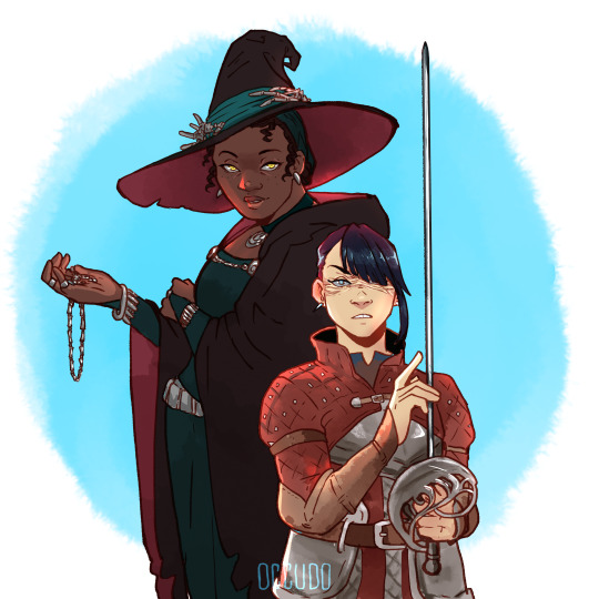
The most known magic users are witches. They go to school to study, and from there, they can go and become advisors in small kingdoms where they can get gifted titles like Lady and Lord, but they don't get actual lands or servants.
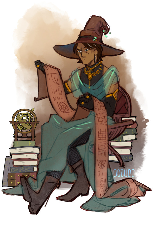
Jon is not an advisor, but Elias' protégé and he can afford to employ Martin, who is a Knight, and previously worked for Lord Lucas. Elias is the advisor of King Magnus.
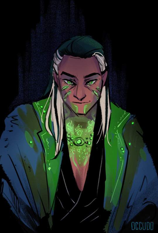
The kingdoms are based around the Fears, with most avatars being nobility or witches. (I wasn't sure if I wanted to make Simon a noble or a mage, maybe he is not so open about his skills) The witches are glass cannons- they can be really powerful in some situations but otherwise, kinda weak so is a common thing to have a designated knight bodyguarding them if they leave their palaces.
Martin is 'touched' but can't do magic the way Jon, or other witches.
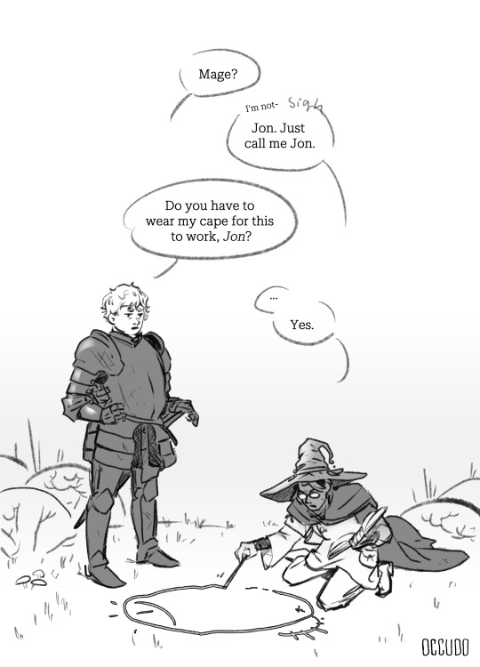
If a witch finishes school, they are respected and believed that they can control powerful magic (with circles and runes) without it affecting their bodies and minds negatively - not like Jane Prentiss, for example. She was a noblewoman who got- corrupted.
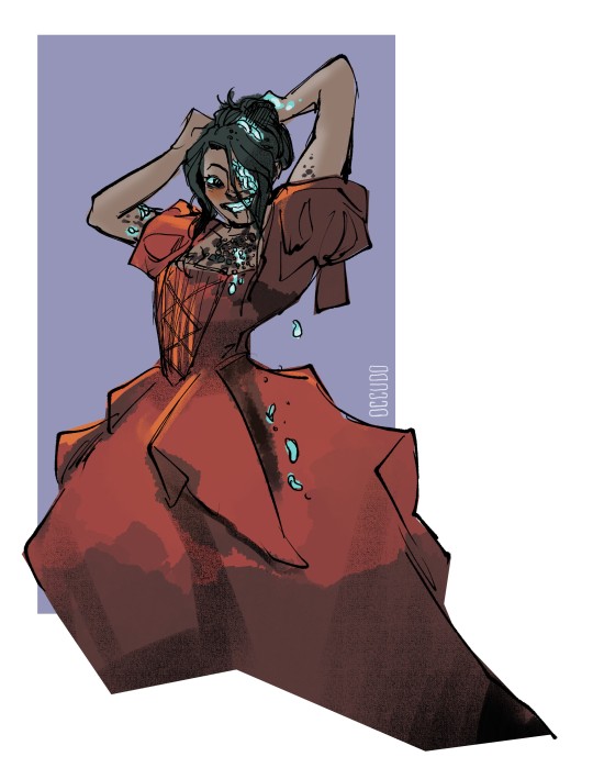
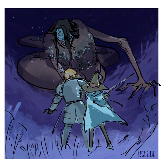
Not every witch goes to serve nobility, there are plenty of small village witches, and Gertrude also tried to leave the palace and become a bog witch kinda deal.
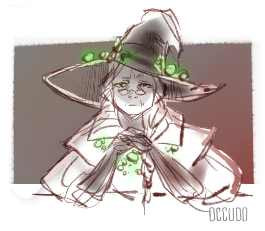
Innisially for this au, I made the 'witch factor' the characters' connection to the eye in canon. I didn't see either Tim or Martin really eye-aligned, so I made them knights instead.
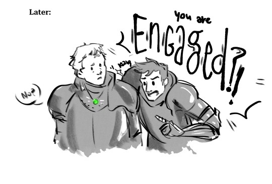
Since then I added Sky Mages for the Vast avatars- I just tought flying and stars and sky really deserve their own coven.
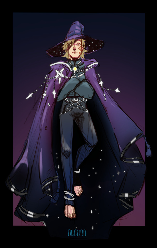
I'm not sure about the other fears names and schools jet. The phrase Seer Mage came from @skell3 's fanfic inspired by my comic, and I loved it so much that I baked it in my au. Also, the thought that eye-aligned mages are all about seeking truth and other's secrets, while can't really fly or fight mutch was funny to me.
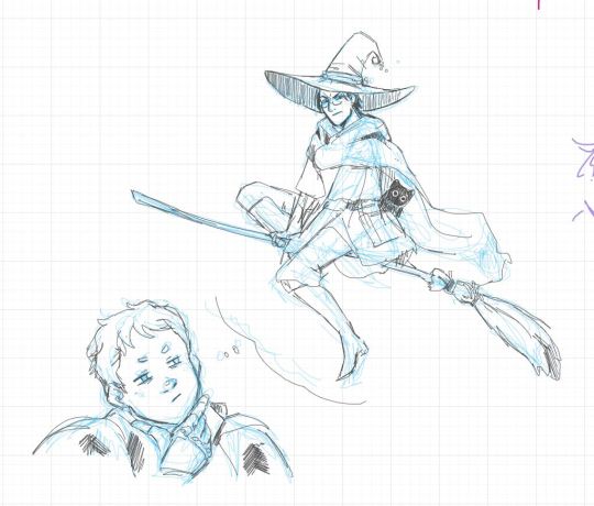
So this is a loosy-goosy system that I'm still working on. I'm also open to suggestions- like with Basira and Daisy- they ended up being witch hunters.
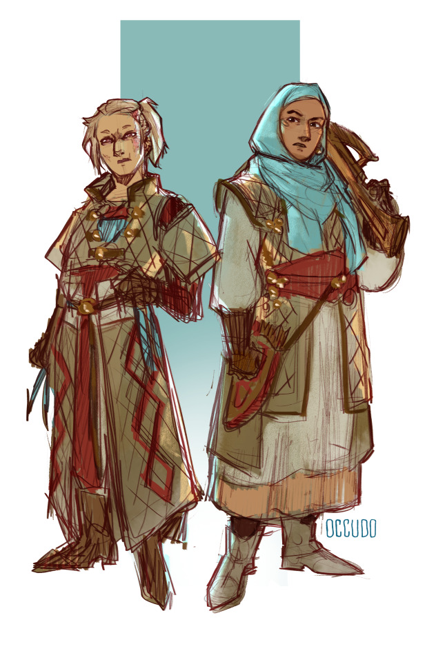
or Georgie and Melanie
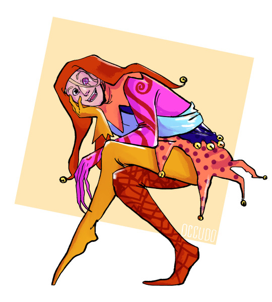
And I changed Michael from a jester to an actual noble/prince
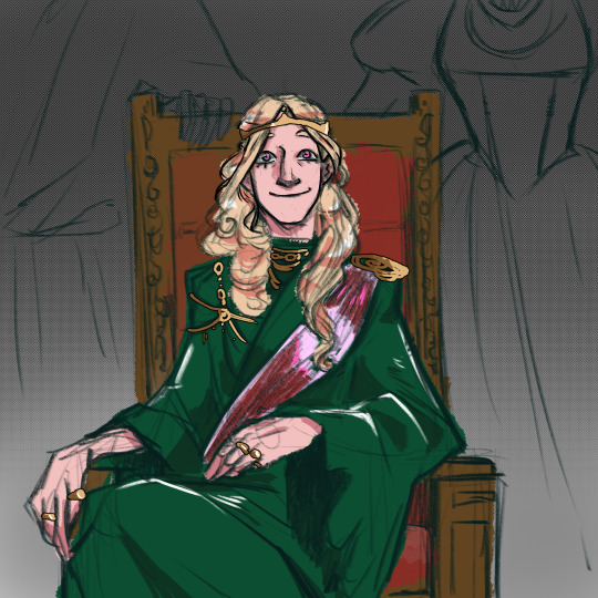
So yeah, I hope this answers your question. Mostly a character-based, case-by-case thingy.
803 notes
·
View notes
Text
Ok so for the last couple days ive been ill in the head about The Black Parade as mcr's alter ego/characters and i wanted to share some thoughts i had so far :3

It doesnt align with the canon lore that we have (i didnt really use it for reference at least) so it can be viewed as some sort of an au
I dont know if im gonna give them new names that just sound similar to the names of mcr themselves, so for now i will be referring to them by the names of the band members
So far I've been thinking about the typical "chosen by fate" scenario, where the characters lives lead them through a path for a specific cause
So
Post WW2 England
5 kids under their own circumstances witness a big parade (I will be doing some research and see if it could be some kind of victory celebration parade? It's just that I'm not sure if England had those. Not that I'm aiming for historical accuracy atp it's simple curiosity)
The kids get heavily impacted by that event and carry on (ha) that memory throughout their life
Now to the specifics of the characters cus by God they all gave me a headache
Heads up: they're all british orphans lol
Frank and Bob are students/residents in a Christian orphan school, and later on in life are priests in the town church
The reason why is that they both have badges on their uniform with crosses that could be associated with christianity
(I couldn't find any info about what exactly certain design details could be referencing, so ig it's up to interpretation)


The military theme in Gerard and Mikey's costumes will be explored on later (Mikey's medal could be either The Victoria Cross or The Distinguished Flying Cross, and the symbol on Gerard's shoulder is most likely the Order Of The Garter star)
And I couldn't figure out what to do w Ray, because I'm not sure if his uniform design details reference anything specific 🤷🏾🤷🏾🤷🏾

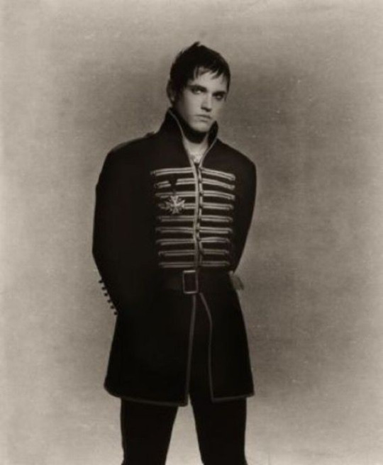

Now, Gerard and Mikey lost their father to war, and their mother passed away when they were both very young
And after that they ended up in the same orphanage as Ray, befriending him and finding out about their shared passion for music
This doodle was made abt that specifically <3

Later on in early adulthood they decide to start a cabaret band, in which Frank and Bob both join them later, deciding to leave their priest lives behind (partially because iirc both of them kinda fanboyed their way into the band irl lol)
After receiving little recognition, the band decides to take a train to America, to try their luck there. With a lot of hope and determination
That, sadly, doesn't last for long, for the train crushes with no survivors on board
The group crawls out of the collapsed train in their no longer physical forms. Yet, even after their death, they still have a desire to move forward. And that desire, though thoughtlessly, forces them to go forward. The souls of all the other people who lost their lives to the train accident follow them, through the landscape that no longer feels like earth
They then reach the end
Walking in one by one people disappear, finding their own peace and meeting their own finish line
After it's done, The Black Parade now have officially made themselves into what they're supposed to be. Gaining a new purpose and a new sort of life
I got too poetic for my own good here I fear .. anyway
Their job now is to lead the lost and the forgotten to the afterlife
They could be referred to as some kind of a grim reaper, I guess
I'm still thinking about adding more to the story, and maybe I will change some things, but so far this is all I can share really !! I hope if you've read this far you found this entertaining .. this is all for the satisfaction of my urges so I might or might not have too much fun w it in the future :3

The story was mainly inspired by this specific post from Gerard himself, because i liked the concept a lot ..
Also
She's gonna be here as a separate character too probably...... Cus I'm self indulgent and I love the ideas bubbling in my brain

#my art#asmo goes blahblahblah#my chemical romance#mcr#the black parade#tbp#im really .. thinking about them .....#i dont konw if im gonna end up making this into a big thing but i really want to#do i have anything else to shaaare ..?#the characters are younger than mcr were when tbp was released#their hair still grows out. this is not really a fun fact its more of a note to self#i like the idea of them all having long hair just because they cant interact with scissors#i wanna make like ?? i dont know if theres a name for it#but like a fanfic in image format ? you know ??#now that i think about it its just illustrated books#well.#anyway#the secretary will be playing a role that will change tbp drastically#at least thats what i have in my head as of now#ok i yapped enough. sorry#excited about themmm
201 notes
·
View notes
Text
╰┈➤ Keep The Lights On
~ Sam Winchester x sister!reader
~ Dean Winchester x sister!reader
Summary: You and your brothers watch a horror movie and it freaks you out more than expected.
Warnings: None
A/N: I just watched the Smile horror movie and now I'm freaked out. So while I still have adrenaline running through my body from the jumpscares, I decided to write about it. Also happy easter!


There hasn't been any signs of a case in awhile so you and your brothers took this time to do... normal people activities. Sure, you guys are people but you can't relax and watch TV or have movie nights like some families without worrying about the next hunt. You, Dean and Sam are finally changing that.
"Alright! Sam, you got the snacks?" Dean asked after he paused the movie so the first scene didn't play.
"Right here." Sam walked into the room with a bowl filled with popcorn and multiple candy bags on top.
"Blankets?"
You threw two big blankets on top of Dean's head from behind him. "Check," you smiled seeing the weight of the blankets making Dean lean forward a little bit.
He mumbles something under his breath and pushes the blankets off of him. Sam sets the snacks on the coffee table before he sits on his side of the couch as you take your spot on the couch - which is in the middle between your brothers.
"What movie did you pick?" Sam asked while he kicked his feet up onto the coffee table.
"It's a horror movie that has good ratings," Dean threw a smirk over at Sam who just rolled his eyes.
"Dean, you know how I feel about these type of movies. There's no point in watching them since-"
"They are basically our lives," you and Dean mocked Sam's voice in sync.
"We know, Sam. But I'm picking the movie tonight so it's my choice," Dean said as he reached for the bucket of popcorn. You nestled into your blanket when Dean started the movie.
The opening scene was already giving you goosebumps. Dark woods. Flickering flashlight. A scream in the distance. Classic horror setup, but something about the sound design was too real. You tried to act chill, casually eating a piece of candy while staying very much under the blanket like it was armor.
Halfway through the movie, things got worse. Way worse. The monster in the film was just human. He crept up behind people, whispered things only they would know, and then dragged them away into the dark. It reminded you of a few people you've unfortunately came into contact with over the years of your job.
You hugged your blanket tighter, glancing over at your brothers. Sam was clearly analyzing the psycho like it was a real case. Dean, despite acting tough, had that look in his eyes - the one he gets when something's hitting too close to home.
When the movie finally ended with a jump scare and the classic 'killer’s not really dead' twist, you jumped so hard your popcorn went flying. Dean cackled.
"Alright," Dean said, stretching like he didn’t just jump two feet a second ago. "Who’s ready for bed?"
You didn’t say anything.
Sam gave you a look. "You okay?"
You nodded a little too quickly. "Yeah. Fine. Totally cool. Just… movie was kinda creepy, huh?"
Dean raised an eyebrow. "Kinda? You looked like you were about to grab something to hit the tv with."
"Shut up, Dean."
But honestly? Yeah, you weren’t about to sleep in your room alone tonight. You hesitated for a few seconds while Sam grabbed the empty bowl and trash then started heading down the hall. Dean lingered behind, noticing your silence.
"You good?" he asked again, this time softer.
"…Not really. Can I, uh…" You scratched the back of your neck, suddenly feeling like you were eight years old again. "Can I crash in your room tonight?"
Dean stared at you for a second before giving a simple nod. "Yeah. Course. Come on."
You followed him, and by the time you got to his room, Sam was already sitting on Dean’s bed too, with his laptop open.
"You too?" you asked.
"I live with ghosts and demons. Doesn’t mean I enjoy watching pyscho killers like documentaries," Sam said with a small shrug.
You smirked and climbed in, grabbing one of Dean’s extra pillows and wrapping yourself in your blanket again.
Dean shut the door, then turned off the lights, leaving only the soft glow of Sam’s laptop illuminating the room.
"Wait, wait!" Your voice made Dean stop walking towards the bed and Sam to look over at you. "Can we keep the lights on?" You asked quietly.
"Yeah... yeah. Of course, sweetie." Dean flipped the switch back on and went to go lay next to you.
No one said anything for a while. It was just the sound of keys tapping, light breathing, and the occasional creak from the bunker walls.
Then Dean muttered, "Next time we’re watching Shrek or something."
You laughed softly. "Deal."

#spn#supernatural#winchester sister#supernatural x reader#supernatural x sister#dean x sister!reader#sam winchester x sister!reader#sam x sister!reader#winchesters x sibling#dean winchester x sister!reader
90 notes
·
View notes
Text
alright kids, gather around. I have some things I'd like to say regarding last night in a very organized list format
OVERALL SHOW THOUGHTS
Overall It was beautiful. I cried watching the stream. But sadly went to bed before it was over because I was feeling very unwell from staying up so late ): I missed blood,I'm not ok and Helena on stream but that's ok <3
MCR5,NEW TOUR?
-Did not expect them to release anything about that last night since it was night one of two. More likely they would do it tonight so I'm holding out hope for tonight since it's the more likely option
SOCIALS/ONLINE PRESENCE/POSTS
-Frank has NOT posted anything regarding MCR only dunes, which is very unlike him. As we know Frank loved MCR to death. He's the no 1 fan of his own band so I find it odd and very intentional that he has not posted anything about MCR at wwwyf only dunes
-along the same lines Mikey has not posted anything. Few weeks ago we got practice from him which was good, but all we have from him r 2 pics of him and his wife which r adorable, but not relating to MCR. also seems a little intentional to not have said anything about them playing at all
-MCR'S socials r DRY like bone dry. With swarm tour they posted things about "tonight were playing in (blank) at (blank time)" or something like that but they didn't post anything about WWWYF apart from when tickets went on sale for both days which is a little odd in my opinion
for all of them the silence seems ominous. Like they r trying to build suspense
OUTFIT'S, STAGE,GEE'S HAIR
-All black outfits head to toe, they looked good but it was very lacking black parade tbh (not a bad thing they looked so cute tho)
-STAGE-
-Only projections of spiders,tree (during cancer),swords,bridge (?),worms (?)
-SPIDERS PROJECTED
-swarm logo=fly
-spiders= eat flies
-"Witch" was leaked earlier this year. Paper kingdom was the album meant to come right after black parade. Their aesthetic kinda similar. Whites,blacks ect.
-some of the visuals like the swords was giving very paper kingdom 100% and if I rly did see a bridge projection in the background that's also very much the vibe. but most this stuff was done in short flashes across the backdrop
-Gee's hair-
-New haircut (stunning btw)
-new era? Gee had changed his hair for new era's. bullets/revenge it stayed pretty much the same apart from random dye jobs here and there but during black parade he got it real short and bleached it. Danger days ht dyed it red. hair is a big thing when it comes to Gee.
-New hair since shrine show (2019) pretty much. He's had long hair since MCR has come back together. U could argue it was to look nice but think about all the other stuff he's done that was also a big deal like umbrella acad final season and stuff. Why didn't he get a haircut then? Why now? and why was he hiding it?
-The last vid we got was earlier in the week the birthday one and he had the long hair still. It was recent like he did this JUST for the shows.
-i'm 100% taking this is a way of moving into a new era for MCR
MERCH
-some people were kinda bummed there was no new cool merch from the festival apart from the DEAD! zip up which is pretty cool ngl
-kinda looked like they were trying to get rid of older stuff before making something new perhaps?
-spending more time and resources on NEW shirts for a NEW album makes more sense than spending all the time and resources on designing new shirts for black parade when they can do that pretty much any time
HOPES FOR TONIGHT'S SHOW
I will not be staying up this time sorry guys. I slept 4 hours last night and feel very unwell from it. So i'll be sleeping tonight sadly but here is my hopes and predictions for tonight.
-MCR will play just like last night with the visuals and stuff but will maybe play one new song or announce it some how with the backdrop and "Paper Kingdom" will be announced to be released on OCT. 31
-Their socials will go live with all the info immediately
-Shortly after the album comes out there will be tour dates announced for spring/summer of 2025 INCLUDING warped tour
-END-
thanks for listening to my rambles if I think of more i'll add it to the list but I wanted a cohesive place to put all my findings and thoughts to share
#my chemical romance#mcr#my chemical fucking romance#gee way#g way#gerard way#ray toro#mikey way#frank iero
95 notes
·
View notes
Text
Tera's Journal, Entry 56
I never got why The Solver, like the thing not the virus, made tentacles and shit. It allows you to edit the fabric of fucking reality, change the makeup of atoms at will, even break the laws of physics entirely and delete matter.
So why look like robot Cuthulu? You could make yourself look however the fuck you wanted! Like a dragon, or a space worm, or, whatever. Why be lazy and just go with flying spaghetti monster?
Wish I had better control over mine.
If I could edit my appearance like that I could get way closer to the critters here, and actually observe them naturally, my shiny chrome ass definitely isn't natural.
Though, I'm not sure what that does to your old body, I kinda like mine. Despite the chronic pain, it is still me.
______ Entry 57______
Bishop was doing tests on me last week, he said that my core was different then Mom's and Dad's, and seemed to be constantly regenerating energy instead of slowly being depleted.
I asked him to repeat it in English.
He said that if I kept my core fed, I was functionally immortal.
I laughed at him because we're all pretty tough to kill but then he shook his head and said that I was different somehow.
My regen works differently, it's constantly repairing my internal code, and my energy, instead of my physical body. In his words. "My body will decay but my core will keep going."
So if I keep eating... I won't die. Of old age anyway. He assured me if my core was destroyed it would definitely kill me.
Not... sure how I feel about that. I don't think anyone's designed to live forever? I don't think I want to live forever.
Sometimes living until next week seems daunting
< Kiara says it's probably healthier that I don't talk-er write like that.
I don't know. I guess I still have an option to... end it. When I feel like my times run it's course. Just would have to ask someone I trust to actually do it and not chicken out.
Still a lot to think about.
30 notes
·
View notes
Text
...And here is the winning design and its sample designs for the Mask Poll!
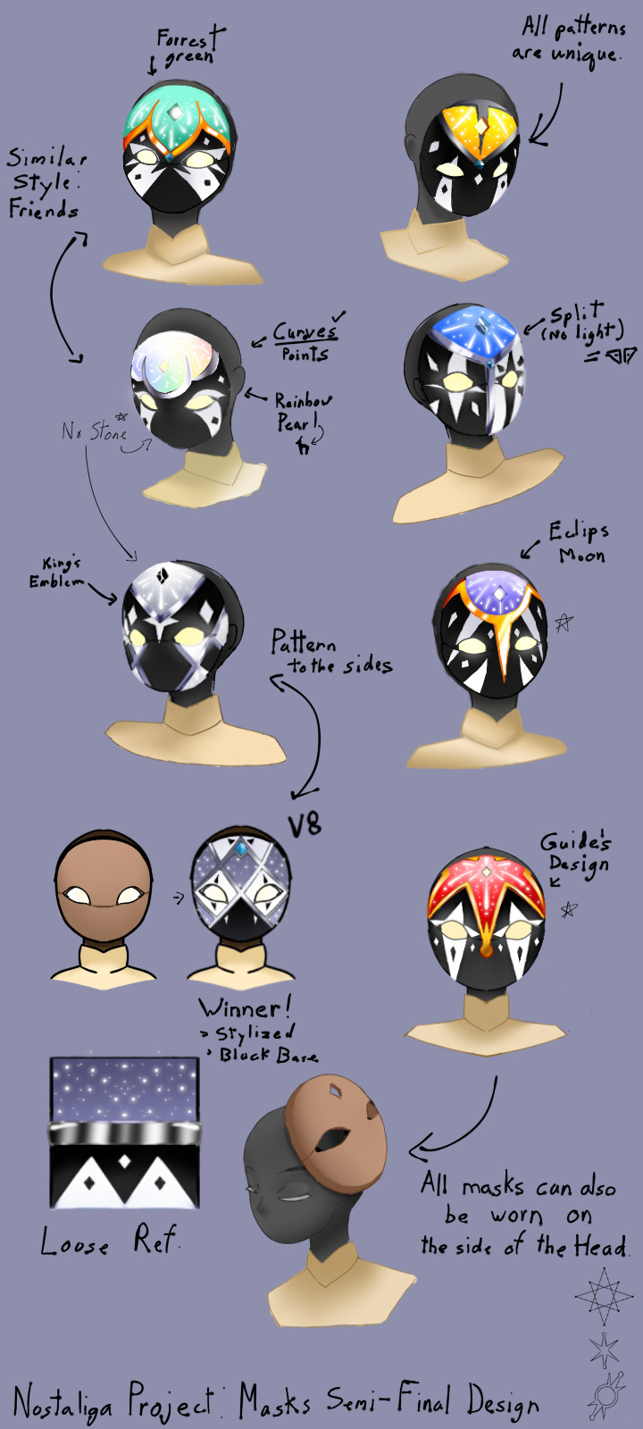
I thought it would be neat to have all masks have an additional position on the site of the head. I know the idea is probably not viable in game, but for this concept I thought it would be fun!
The original plan was to limit my secondary colors to red, blue, green, and yellow. But then there was a specific spirit that looked good in black and white, so I decided that each one would wear a different color.
The only thing I kinda regret is the fact that the new hairstyles kinda block the colors...
Here is the Cast. Say hello! :3
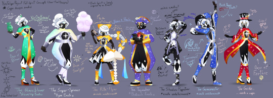
(Zoom in for a better look!)
For some of the spirits, I was having trouble figuring out what emotes they should have. More specifically, the spirits that don't have confirmed emotes are the Kite-Flyer, the Shadow Puppeteer, and the Game Master. I have considered a rock-paper- scissors emote for the Gamemaster, but I'm still not sure.
If anyone has any ideas for emotes for these spirits, them please put them in the reblogs or comments. I would love to see your ideas.
As you can probably tell, no one is wearing any capes. This is because the original plan was to have the capes be separate from most of the cast. However this plan has changed, and I will be giving capes to the Guide, the Glassblower, the Gamemaster, and potentially the Toymaker. I'm having trouble picking designs for the capes as I have a lot of ideas that I think would look cool for this cast.
I may do one last poll for the cape designs of the chosen spirits.
Location wise... This event would take place on an island. As for which realm, I don't know. I'm torn between the Isle of Dawn, the Daylight Prairie, and Valley of Triumph. The exact area name is simply called the Fair for now, and the center location in the Fair is called the Plaza. I want the location to be loosely based off of Venice, Italy, the place of inspiration for this collection of spirits and cosmetics.
If anyone has any suggestions, please reblog and comment!
More information about the cast is under the cut!
Here are four facts about each spirit.
Going in order from left to right-
- The Glassblower -
Others compare her personality to her craft: beautiful, yet delicate.
It takes her over an hour to do her hair done in the morning.
Her favorite prank to pull is putting little glass manatee figurines all over her friends' houses.
She is very protective of her work and will go to great lengths to protect her creations.
- The Sugar Spinner -
Her work station is more like a lab, she experiments a lot.
Absolutely loves it when customers try her new creations!
Her favorite prank to pull is recreating her friends' items entirely out of candy and then replacing them.
No one knows the relationship dynamic between the Glassblower and the Sugar spinner. They are able to work together, but they seem to bicker all the time....
- The Kite-Flyer -
She is the most artistically gifted of the group, specializing in crafting and painting.
Ever since she was little, she has always dreamed of flying over the clouds.
Her favorite pranks include drawing on her friends' masks with washable paint, and taping silly pictures over photographs.
Her favorite light creature is the Atlas Manta.
- The Toymaker -
Makes some toys to donate to charity for the poor children.
He always has a solution to fix any problem, and his advice is usually never wrong.
Has made replicas of all of his friends' shoes that squeak when they walk in them as a joke. Sometimes he'll replace the real shoes with the squeaky replicas.
Loves astronomy as a personal hobby and will spend hours after dark looking at the stars.
- The Shadow Puppeteer -
Is rarely seen around the Plaza, but is known to help behind the scenes.
If you find him, he may give you a secret gift to help you redeem some prizes.
His favorite prank to pull is taping signs onto peoples' backs. No one has ever caught him in the act.
Runs a shadow puppet theater at the edge of the Fair. However, his favorite type of puppets are sock puppets.
- The Gamemaster -
Considers himself a mastermind and will turn anything into a game.
Likes to set up games and puzzles for others to solve, but won't tolerate cheaters.
Is the number one prankster among the cast. His favorite prank? No one knows what it is. There's currently a bet on it to see who will guess it correctly.
His biggest secret is that he loves ducks. Don't tell anybody. :3
- The Guide -
Strongly believes that presentation is the most important aspect of a show.
Knows a mix of real magic and optical illusions. She'll often mix them to add some flare to her shows
Her favorite prank is that she will randomly change someone's entire outfit to a random assortment of clothes from their closet. She doesn't pull this often though.
Is actually really organized and a bit of a perfectionist. She stresses over the small details a lot.
The event back story and quests will be added at a later date.
28 notes
·
View notes
Text
youtube
I remade the trailer to Robot Monster, to serve as a trailer for a hypothetical remake of... you guessed it, Robot Monster.
Destruction has come, hu-mans, and its silliness will not protect you.
My thoughts and how-to process blog post under the fold.
I made Robot Monster's Trailer Remake primarily with Vidu and with Midjourney.
For most shots I started with a photoshopped midjourney gen (or stack of them), which was used either as a prompt image or starting frame.


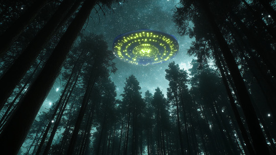

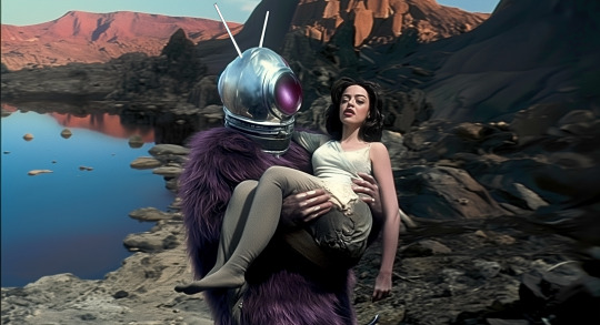
Some shots, like the earthquake, were done with start-and-end frames.
Vidu has some quirks for my Roland Emmerich Christ-the-Redeemer shot. I attempted the image several times as a direct image as start frame, but it would reset to a new camera angle each time, rebelling against my inaccurate version:

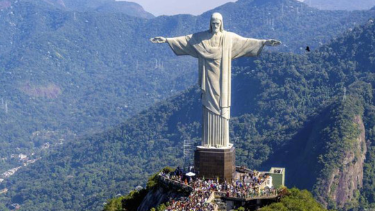
As the AI could recognize the statue, but not it being in inaccurate surroundings. I eventually used it as a prompt and not a start frame got a good enough shot.
I tended to go for 8-second shots on quality mode, to give me more to cut around and edit. Almost no shots play without some cropping, speed adjustments or other edits in this, and anyone using AI for a larger project is going to find much the same.
While 90% of the shots are from Vidu a few I used Hailuo's Minmax to accomplish. Mainly things like a few low-motion Ro-man talking shots, the computer-communication device, and the motion title card for "electrifying", etc.
Vidu likes to move, a lot, and for stuff that needs subtle movement I sometimes find it helps to mix things up.
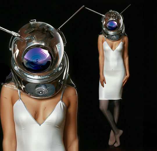
I've found that when image prompting for a character, like Ro-Alice, it sometimes helps to do a fullbody and portrait two-for-one. This helps keep the character design consistent, and you can kinda tell which Ro-Man shots I made before I figured this trick out.
I also reused shots of the dinosaurs from my other AI video projects for meta reasons.
Right now it doesn't make videos so much as it makes shots you can weave into videos.
I'm actually impressed at how well it understood the concept of Ro-Man, only giving him a full ape face or a weird tail or the like a couple of times.
My general approach to the concept was "What if you kept the premise the same but had a budget." Whereas in reality you'd never actually get that combo, since if they had money, they wouldn't have made Robot Monster.
It also let me play with a fanon idea I've had for awhile that the Ro-Men were the helmets, and the ape-creature was some biological organism used as a conveyance.
For the audio, I took the audio to the trailer and used Suno's cover-features to both clean up the sound and change the musical style. The back half of the original track was completely warped by the cover process, but I used another bit of trailer-style music to cover that bit, and to extend for the longer ending shot, since my version of the trailer is about 20 seconds longer than the original.
Some prompts utilized:
in a sci-fi lab in a cave, a furry alien monster wearing a spherical helmet with reflective faceplate walks around aubrey plaza in a white sleeveless slip-dress and dark pantyhose in a glass tube, the tube pulses with green light. She is in a glass cylinder, he is walking around it, with curiosity. The scene is menacing, slow movement, pensive. horror movie scene, the tone is tense and frightening. professional lighting and cinematography. Oscar winning, 2003, practical lighting, effects, and costuming.
the robot spider-robots with spherical heads walk around as though searching for something. horror movie scene, the tone is tense and frightening. professional lighting and cinematography. Oscar winning, 2003, practical lighting, effects, and costuming.
the alien ape-creature wearing a space helmet (the robot monster), in a modern city. He throws green lightning from his hand, disintegrating a policeman into ash. Monster-movie sci-fi scene, dramatic camera angles and lighting. Practical costuming and special effects. High budget and high concept.
slow motion fly-through footage, the air is full of slow-moving glowing bubbles. green electric sparks arc from one bubble to the next producing an ominous mood. The scene conveys spreading menace and fear. One long, unbroken shot. filmed on location, effects by weta digital, ILM, stan winston studios, believable and hyper-realistic. Shot on location. trailer shot. high-speed film
All-in-all, a fun project, and one that came along when I really, really, really needed something to concentrate on for long stretches of time.
Make something fun, folks.
#robot monster#the robot monster#unreality#fan trailer#my art#video editing#movie trailer#science fiction#mst3k#ai video#vidu ai#minmax#suno ai#ai music#midjourney#midjourney ai#ai tutorial#Youtube#vidu
45 notes
·
View notes
Text

Every time someone complains about Fully Charged Airmans design, my love for him grows even stronger.
I feel like most people are mad that he isn't blue. Like back in 2014 when people complained that Sonics arms were blue in Sonic Boom. But I honestly don't think it's that big of a deal.
But if you see Fully Charged as an alternate universe to the classic series (which it is), then I don't really get why you'd have to complain about Airman not being blue. I think it's good they tried something fresh with the robot masters. They didn't have that much personality in the classic series, to be honest, compared to Fully Charged. I just think he needed a little more screen time to focus on his character. Just like many other robot masters on this show.
Okay, I have to admit, I did change around his colors a bit for a joke that would have gone along the lines of "Just hire fans, lol", but it actually ended up looking pretty cool, so I can't really make that joke anymore……. Really shot myself in the foot with that one. Anyway, here's blue Airman:

I still think that an episode featuring an air race would have been really really cool. They could have introduced a robot master like Gyroman as his rival. Maybe losing that race could have been the start of his character arc where he finally confronts his inferiority/superiority complex. Along the lines of "Flying is all I have left! If I can't have that, what else am I supposed to do?" Well, now that we're already in headcanon territory, I might as well tell you about all my other ones involving Airman. I believe his family is suuuuper rich. All his siblings have well respected careers and probably make his parents buckets of money. Meanwhile Airman is like the youngest sibling who dreamed of becoming a professional racer, which his parents didn't support at all. Kinda reminds me of another robot master under Lord Obsidians command whose dreams were crushed by his parents......
And as we've seen in that one episode, Airmans siblings are assholes. They just pretend he doesn't exist, like he never belonged to their family at all. Like they're ashamed that he's such a failure.
Oh damn that got dark again, sorry. But just like Drillman, he gets better in the end. While Drillman gets Woodman to look out for him, I've had the headcanon for a while that Airman gets taken in by Blastowoman, since she's also a flying robot master like him. Maybe she even gets him a job as a cargo bot alongside herself. I feel like he really needs someone supportive who's not afraid to call him out on his bullshit in his life. And because I have another headcanon that Blastowoman actually has an adult child (Blastman, lol), she's like the perfect woman for the job. ;)
Coming back to Airmans design, I did change some things about it for this particular piece of fan art. When I was trying to come up with an awesome pose to draw him in, the first thought I had was "Damn, I gotta give this man some heels." And that's exactly what I drew.
Sorry for not posting anything for 2 months btw. I got addicted to Metaphor ReFantazio ;) If that doesn't become game of the year, I'm gonna be real mad.
Jenny out.
49 notes
·
View notes
Note
I don't know much about pokemon, so I'm curious about your choices for Siffrin, Loop and Isabeau's pokemons (and if you want I would love to hear your thoughts on the rest of the cast, including the little red pokemon).
Thank you for enabling me hfisndjs Here we go!!
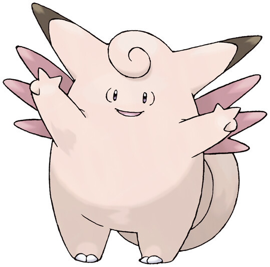
Siffrin
Clefable! A pokemon described as timid and generally living in isolated mountains. It is heavily tied to the night sky and the moon, and learns a lot of cool moves that remind me of Siffrin!
Follow me (redirects all attacks on Clefable), Healing Wish, Encore (forces enemies to repeat their last move), Metronome (activates a random move, pulling from every existing moves in the game, kind of reminds me of the sometimes random nature of wish craft)
None of these moves are unique to this pokemon, but I personally heavily associate them with it!

Loop
Gengar! So there's this theory that, because they look so much alike, Gengar and Clefable might have been initially designed as like, two sides of the same coin. Gengar is a ghost type, implying that it's a dead Clefable? Sorta? But it also has preevolutions that don't exactly match with Clefable's preevolutions, so it's mostly a fun theory/urban legend in the fandom at this point. And I felt like it matched well with Loop's whole deal lmao


Isabeau
Sudowoodo (and Sylveon for the trainer version) Sudowoodo's whole deal is "not what it seems': It looks like a plant, acts like a plant (literally will stand stock still to camouflage), but is actually a rock type! I kinda wanted to reflect Isabeau's façade with this pokemon, and Sudowoodo was the first that came to mind!
Also, Sudowoodo evolves from a small, very scadery pokemon whose whole deal is that it cries a lot, and it needs to be loved to evolve so. I liked the parallel with Isabeau's Change.
As for Sylveon, since in my head eevee is a popular starter choice, Isabeau probably would have gotten one too. And this eevee needs to be very very loved by their trainer to evolve into Sylveon! (And also. Trans colors. Cmon.)

The red pokemon
A shiny Jirachi! Jirachi is literally the wish pokemon, it's shaped like a shooting star and has empty wishing papers on its head ! It kinda changes depending on whether you're viewing the anime or reading the manga but when all conditions are gathered, a Jirachi can grant wishes! And when it does, the eye on its stomach opens up! (I think... forgor the lore a bit)
Also why am I calling this "their Ho-oh moment"? It's because in the anime, Ash begins his journey after seeing a Ho-oh flying high above him, granting him a blessing or something. It is a pivotal moment. I feel like Siffrin and Loop seeing a Jirachi (a shiny one at that!) would be just as significant to them.
I'm gonna stop there because that's a lot of text, but if anyone wants clarifications for the rest of the cast, pls do send an ask hxidbd
36 notes
·
View notes
Text
ALRIGHT SO
I watched HTTYD 2 for the first time and I have Thoughts. Spoiler warning ig but like, pretty sure everyone's watched the film who's reading this post anyway.
Thing number one: THEY DID THE GANG SO DIRTY???? Transitioning from RTTE to the second film gave me massive whiplash on that front, they gave them like???? no time????? no lines????? like wtf man????? Astrid turns up occasionally to give Hiccup a pep talk, with the rest of her limited screentime being devoted to a b-plot that was kinda pretty bad. Snotlout, the twins, and Fishlegs only barely exist, and the whole love thingy situation with Eret, Snotlout, Ruffnut, and Fishlegs was just....bleh.
Thing number two: The film simultaneously felt too fast and too slow. The slow scenes sometimes dragged a bit too long imo, and the fast scenes could be pretty difficult to follow, with just, a lot of stuff going on, but not in a good way (if that makes sense?).
Visuals were gorgeous throughout, the closeup shots of the dragons was cool because wow the skin looks so textured. Loved how they kept the philosophy of the scenes only being lit with objects actually there (or whatever it was), the lighting was ough yes very nice. The motion of the people (particularly hiccup) felt very motion-capture, but not enough to detract from the film.
I really wish I could've seen more of him exploring the uncharted parts of the world, that was cool (ig rtte is that but ehh).
There were definitely flashes of brilliance in the film as well. The flight scenes with Hiccup and Toothless were stunning, the scene where Stoick meets Valka is great, Stoicks funeral was also very good. One of my favourite moments was Hiccup flying in on the wingsuit, covering Drago in zippleback gas, and blowing him up because yes yes yes this is the person with the heart of a cheif and soul of a dragon!!!!!
Returning to visuals, there are many shots that are just gorgeous. I would say that it felt less like every frame could be a painting (which the 1st on genuinely did feel like a lot of the time) and more like a lot of okay stuff and then BAM most beautiful shot you've ever seen. They really got the sense of scale well, and did a good job placing how big and fast the dragons are in the 3d space (most of the time), something which I felt the shows were lacking, probably just due to not having the budget for huge sweeping landscapes that actually look any good, among many other reasons I'm sure.
Love that Hiccup kept the changes to the sword that Viggo made (even though yes, Viggo being the one to have the idea was added retroactively). Also cool that it retracts and stuff, it's cool to see the final design after the iterations in rtte. same for wingsuit.
Loved that Toothless's loyalty/friendship/love for Hiccup was what brought him back.
Drago was super forgettable as a villain ngl. I just kinda didn't care about him. I was very surprised that Hiccup didn't bring up his leg when Drago was monologuing about losing his arm to a dragon. Also was Drago supposed to be Hiccups foil? Or something? idk, whatever, I just didn't care about him. Why did he have a big army? idk he just does. Literally what even was his end goal i genuinely don't remember and I just watched the film.
If they could make the film cover a short TV show to flesh out basically everything more that could've been neat, but idk if the budget would stretch that far and still produce something good. Maybe the film was trying to fit in too much? Idk lol.
I'll probably watch No.3 on my own cause my family would NOT stop talking -_-
Anyway this is by far the longest post I've ever made so if you made it this far I'm impressed.
#httyd#toothless#httyd toothless#how to train your dragon#hiccup horrendous haddock iii#httyd astrid#astrid hofferson#hiccup how to train your dragon#httyd valka#valka haddock#httyd 2#toothless httyd#drago#fishlegs ingerman#httyd snotlout#stoick the vast#dreamworks animation#slapping all the tags on this bad boy
24 notes
·
View notes
Text
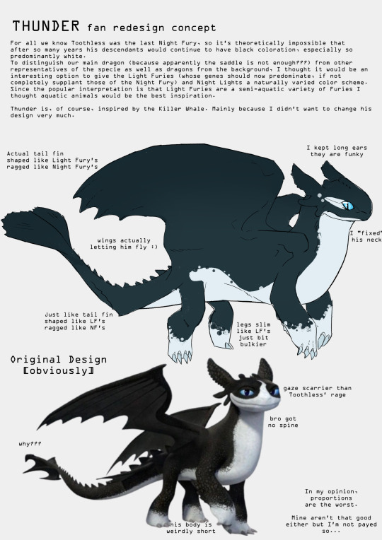
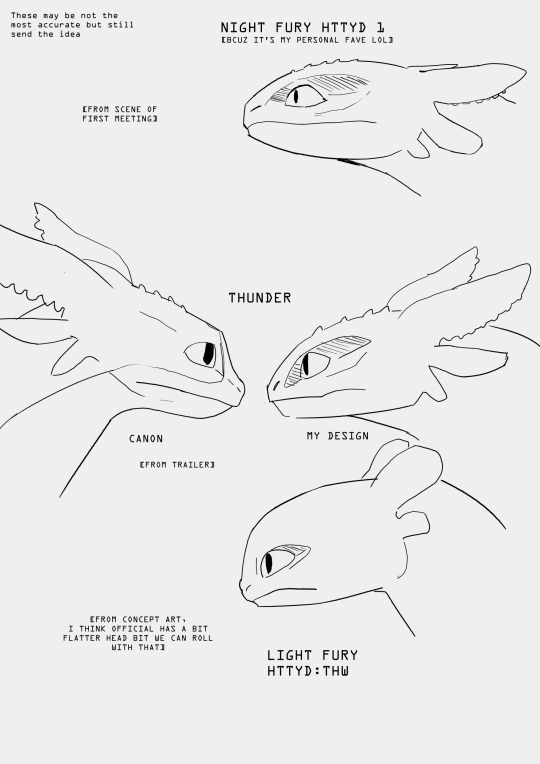
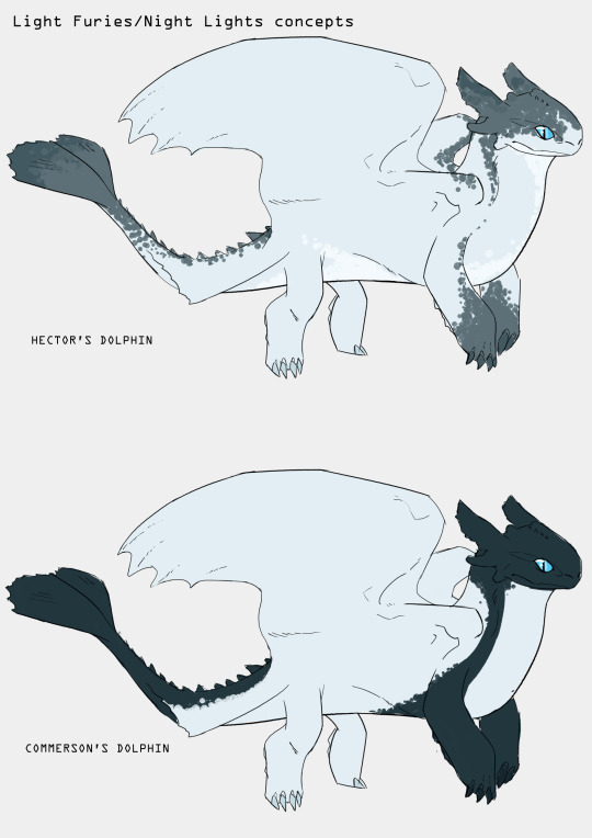
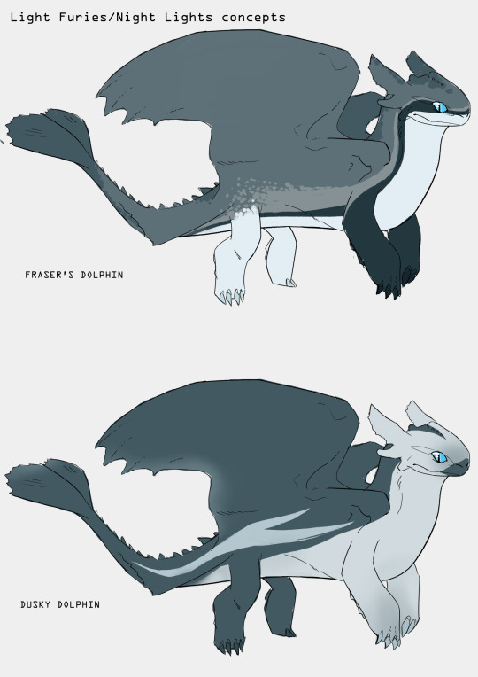
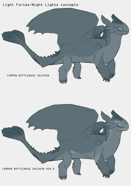
Concept doodles I did specifically for redesign of The Nine Realms Night Lights but could actually work for Light Furies too (I mean colors)
They are very late, but Bubblehorn's existence was reminded to me and I found that I could try to do a redesign for it, but I got distracted and ended up with Night Lights lol
Kinda inspired by @/sparrowlucero's idea of Night Furies colors working like those of wolves so they aren't all black.
These Night Lights are just ideas and there probably would be possible different versions of each patterns but idk. Just ideas
And Thunder's design diss lmao
Now I think his tail fins should be bigger but I'm too lazy to come back to it now so let's agree it's bigger. Mostly longer.
Text from pic + some notes under the cut
For all we know Toothless was the last Night Fury, so it's theoretically impossible that after so many years his descendants would continue to have black coloration, especially that much of it (unless they are heavily inbreed what after looking at those models is possible-)
To distinguish our main dragon (because apparently the saddle is not enough???) from other representatives of the specie as well as dragons from the background, I thought it would be an interesting option to give the Light Furies (whose genes should now predominate, if not completely supplant those of the Night Fury) and Night Lights a naturally varied color scheme.
Since the popular interpretation is that Light Furies are a semi-aquatic variety of Furies I thought aquatic animals would be the best inspiration. There I have only dolphins but probably some other could be used too (like sharks??)
Thunder is, of course, inspired by the Killer Whale. Mainly because I didn't want to change his design very much.
Notes:
All tail fins are shaped more like those of Light Fury but are ragged like those of Night Fury. I didn't write it on the doodle but wings are more like NF (they are kinda bat-like and dragons were living uderground.)
The wings have a much larger connection to his flank, giving a surface area that gives him the actual ability to fly
The legs are somewhere between NL and LF. Bulkier than LF, slimmier than NF
I kept his big ears. They are funky
Plus I made his body longer and neck thicker
#httyd#how to train your dragon#dragons the nine realms#the nine realms#night light#httyd night lights#fan redesign#my art#not transformers#Sorry for bad english
228 notes
·
View notes