#I’ll probably draw more actual redesigns later
Explore tagged Tumblr posts
Text
Miraculous Ladybug, Marinette Dupain-Cheng Drawings
I drew a lot of Marinette Dupain-Cheng from Miraculous Ladybug. I have the same love hate relationship with this show that most of the active fandom has. I may repurpose the time lapse from this drawing to use as visual while I rant about it and turn that into a YouTube video.
This is technically a redesign of Marinette, except I mostly like her canon design, so it’s actually just putting her in a bunch of different outfits to fit the occasion.
I started by tracing a picture of her and starting to adapt it to my style, thence freeform drawing her canon design in my style, then went from there.
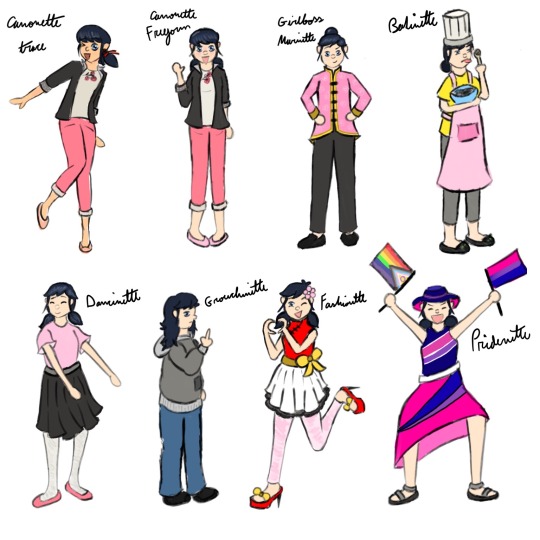
Imagined context for each one:
Canonette Trace: Marinette at a regular school day.
Canonette Freeform: Marinette attempting to greet Adrien like a normal human being and mostly succeeding.
Girlboss Marinette: She had a big presentation that she wanted to look professional for.
Bakinette: It’s 2 a.m. and she’s making brownies for some reason.
Dancinette: She’s ballet dancing alone in her room, cuz she’s not confident enough to dance in any public capacity.
Grouchinette: She hasn’t slept in 3 days and someone just asked her a really dumb question.
Fashionette: Showcasing her newest design
Pridenette: It’s a pride parade and she’s having a little too much fun.
#miraculous ladybug#fanart#marinette dupain cheng#redesign#miraculous redesign#soft redesign#look it’s not really a redesign#it’s putting her in different outfits and hairstyles and also I draw her bangs different#I hate her bangs#they’re so hard to draw!#and they don’t even look that good!#I’ll probably draw more actual redesigns later#draw in my style#I just think Marinette is pretty solid#except her bangs#character wardrobe update#character wardrobe expansion#chinese marinette#can you tell I really like putting her in clothes that showcase her Chinese heritage a little?#marinette is bi#baker marinette#fashion designer marinette#bi marinette#grouchy marinette#dancer marinette#I don’t think she dances in any official or public capacity she just does it alone for fun#miraculoustalesofladybugandcatnoir#miraculous ladybug fanart#miraculous#my art
29 notes
·
View notes
Text

Hey everyone~ I got some more stuff for ya~
Long story short, I've discovered the new Fairly Oddparents reboot, absolutely loved it and was inspired to make this AU idea for the show! With a slight reimagine/redesign of the characters as well.
Here's some more info about my AU:
Fairly Odd Parents AU/Rewrite
Au Name: FairlyOdd Brother
Summary:
Perri (previously known as Poof) recently graduated from Fairy Godparents School and is eager to start granting Wishes for his very own godchild! Only problem is that with his lack of experience Jorgen is weary of giving him an assignment and keeps finding excuses/reasons to not give him a godkid. Realizing it might be a 1,000 years before they give him a chance to be a Fairy Godparent, Perri decides he needs to be a little bold and perhaps, bend Da Rules, to get his foot in the door so to speak. And his answer comes to him from a new neighbor in his human home, a family with a sweet shy 10 year old girl who is absolutely miserable. Perhaps Perri might be able to offer this girl a little comfort and fun as her new Fairy Godbrother!?
(Basically the same premise of the show, except Perri’s first godchild is Hazel, and through a technicality in the rule book, becomes her god brother instead of her godparent.)
ALSO please note this AU is more of a slight reimagine of the original show, meaning I did tweaked / changed some of the characters personality to match the new story I made for them. Nothing majorly different, but again just a heads up before you read on. Hope you like it~
Name: Devin “Dev” Dimmadome
Age: 9/almost 10
Sex: Male
Physical Description:
Is basically the same as in the show, though there are a few key differences.
-Despite having slicked back hair he always has a single strand that no matter what always sticks out, he hates it and is always trying to move it back into place but to no avail. In reality without the hair product he has natural curly hair like his father, though his curls are a little more difficult to comb and manage than his father, something that he doesn’t like about himself
-Has freckles! But always wears makeup to cover them as according to Dale’s research are ’less desirable’ and would statistically do better with them covered up
-Also has heterochromia, one blue and one green eye, but always wears either a blue or green contacts to hide his ‘flaw’, again being told to do so by his father
- Though he is always required to wear a branded white hoodie, Dale actually lets him wear whatever shirt he wants underneath, just with the promise Dev never takes his sweater off in public. Dev usually wears all sorts of geeky and nerdy shirts, mostly love meridian and Crimson Chin related stuff, it's the closes thing he’s allowed to wear ‘freely’ without requiring his father’s approval. Again this ‘freedom’ is kinda pointless since he still has to wear the hoodie, but he still appreciates it.
-As you can see in the photo above I showed what he looks typically on the left, and on the right is basically what Dev would dress like if he had no rules or restrictions.
Personality:
It's basically exactly the same as in the show, I really like Dev both in a story sense and a comedic sense so nothing to really change. The only slight difference is that Dev in this version clearly gets a crush on Hazel in this version. I think the show is ‘hinting’ of them possibly being a couple later on, but in my version I wanted to make it a little more clear that he has a subconscious crush on her. Basically think Anya and Damion from Spy x Family if you want a good example. He likes her, but being a 10 year old boy with severe daddy issues has no idea how to handle this and ends up being kinda mean to his regret.
Other fun facts:
-I won’t get into it now, but his relationship with his father is a bit different, as I have a unique take on Dale and who he is as a person. I’ll probably draw him next but for now just know Dale isn’t an evil heartless father and there’s more to him than it seems, and thus the relationship between Dale and Dev is a little more complex.
-And yes though it isn’t important yet, he does end up getting Cosmo and Wanda as his fairy godparents instead of Hazel as the AU would suggest.
- In this version Peri is also not a big fan of Dev. As he obviously doesn’t like how he’s mean to her at first, but as they become friends and Peri soon realizes that Dev has a crush on Hazel this leaves Peri horrified at the thought. And of course being a proper big brother is completely against and despises the idea of Dev and Hazel ever ending up together. He’s not too over the top about his dislike, but definitely would be sitting in to conor with his arms crossed, while trying to subtly tell Hazel she could do soooooooo much better than him.
I hope you guys like this, I'm personally really happy with how this design turned out, especially his 'real Dev' design on the right. But I would love to hear your guys thoughts and opinions about my designs. Do you like them, hate them? Feel free to tell me below.
Also tomorrow I'll post a version of this photo with a transparent BG and maybe upclose shots of the design as well, just so you can see the design easier without the BG
Previous - Next
#fairlyoddbrother#fairly oddparents#peri#fop poof#cosmo and wanda#fairly oddparents dev#dev dimmadome#fairly oddparents a new wish
83 notes
·
View notes
Note
Analysis time
First off: Marked in green, the Red chain. Used in DPPt and PLA to contain the spacetime trio.
Cool blue looking diamonds (marked in orange). Probably Dialga. Has the whole Diamond motif and all that.
Red arrow points to something, Might be Palkia's pearl, Could also be Giratina, or Phosphor's eye.

I hope you like the silly edit, I did pretty well for the like 15 minutes it took.

That's a whole-ass human fist. damn.
This scene is probably a snapshot of the Bucket rescue.
also, more mega meau.
Kind of different direction. the Diamonds look like PNG's here which amuses me greatly.

I've NO clue what this is about though. Teefsers tho.


Something is screeching here. Is neon blue, so probably Noe

Neck is crooked here. Obviously after the axe disaster. It might also be after the Palkia kill. Which would explain why Noe is tied up.

Giovanni's kid, Silver, here. With what looks like a Quilava.
Bingo, red chain is used to keep Noe secured and unable to skitter~
Blue diamonds are indeed dialga’s attack! Based off his in game from Legend’s Arcues iirc!
The eye is also Dialga’s… but why oh why would he chain lil Noe up ;>
Edit is phenomenal, 11/10, I did indeed snort.
That scene is indeed a snapshot of bucket’s rescue! Featuring the proper redesign of Meau’s Mega form! (Ya’ll now see why she got that random ref update for it, had to redesign it for this particular scene X3)
Diamond was painted as in singular, then copy and pasted them with distort for the right angles. I did not have the time or energy to make them look better after I had poured hours into researching how the frick to paint them in the first place…. Ya’ll don’t know the amount of things I had to learn to draw for these two updates =w=
I’ll give away that scene with his teefers, Missingno. was forced to watched to what happened to Bucket and Meau’s attempted rescue. Hence why he never appeared there to help himself and only came later! And yes, his neck is defo still crooked ;3
Last scene is actually @loupy-mongoose Jamie! I had permission to have them Cameo months ago, but updates took very long to get out X3
Though Silver is my favourite Pokémon character, so he still may appear yet.
43 notes
·
View notes
Text
Somewhere in the MIDDLE OF JANUARY OF THE NEW YEAR, I finally post SOMETHING

New year and I realized I must draw my sillies being silly more often (I’ll color one of them if not all of them later)
Also CHARACTER UPDATES!!!
I’m gonna be renaming Bats to Boon for lore reasons and I also VERY SLIGHTLY changed their younger design (they got lil eye spots now, more scales around the face and a slight change in skin color) But Ollie is still Ollie most of her origin lore is the same BUT now speaks in different language at the start so there’s gonna be a language barrier when they first meet Boon (plot reasons :}) I have NO idea what language she speaks in yet, I’m still deciding if I wanna go with an existing language (irl most likely Dutch) or if I should make one up (cause y’know, alien cat)
The taller dude is an old oc who was actually my first treasure planet fic, Siren Of Gold, I had named him Abu cause some of his design had from the monkey in Aladdin who was also named Abu and I just couldn’t come up with a better name
His redesign was actually gonna be more centaur/bug-like cause some inspiration for his design also some from Scroop, but I absolutely DESPISED IT, so I just scrapped that and just redesigned him, Again, and now I got this!
He’s still a primate/bug hybrid and he looks similar to his old design I just swapped what was fluffy and what wasn’t which made him fluffier, tail also now covered in fur except for the scorpion tail of course, his other two arms are now obviously arms just neither of claws now just his upper left arm has it now cause hybrid genetics, I also changed his legs completely and made them more bug-like therefore I changed the pants along with em and made em shorter (I’m probably just gonna post a side by side of the old and new later)
During this I had also changed his personality making him a lil more friendly towards Boon and Ollie and less antagonistic,his color scheme also has changed ALOT (gonna roll with the inverted colors I found while messing with the old design) and I had also changed his name to Khaleel Nasir (plot reasons again :})
#YAAYYY IM POSTING AGAIN#Sorry I couldn’t find time to post my sillies been busy#I haven’t given up on my sillies though I’ll have you know#Khaleel Nasir#Boon#Ollie Yanderveck#character redesign#oc redesign#treasure planet oc#treasure planet#my oc#my art#art#sketchies#alien oc#pirate oc#n1ghtpers0n15#night 0’clock draws#digital art#oc#digital sketch#artists on tumblr#space pirate#character design#original characters#character art
8 notes
·
View notes
Text
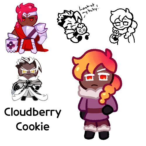
I’ve made another fankid, this one’s name is Cloudberry Cookie
So I’ve been struggling to come up with designs for my actual requests, which sucks because I want to draw more fankids, so for now I’m just drawing ones that I’ve been wanting to do, but aren’t on my requests, with wildchip being one of them
Anyways, so for the name, I picked cloudberry since cloudberries are berries, so like Wildberry, but they also grow in very cold climates, like where Crunchy Chip lives
Cloudberry I think was originally a contender for a hollycacao fankid, but then I thought it could also work for wildchip, so that’s what I did instead
Also, another contender that I had for this ship was pineberries, since they’re white with red seeds, which reminded me of Crunchy Chip’s hair, but if you replaced the dark brown with Wildberry’s pink. But I liked cloudberries more, so I went with that. But if I make another one, I’ll probably do Pineberry
Cloudberries:

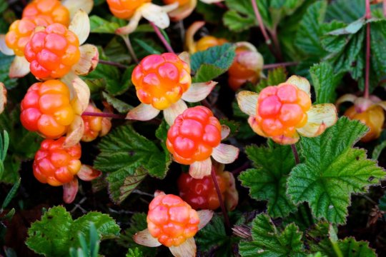
So I’m aware that neither Crunchy Chip nor Wildberry have orange in their hair, but cloudberries are that color, so that’s her hair color. I still worked in Wildberry’s pink though. Not the proudest of how her hair turned out, or at least the top part, like I think it looked different in my head, but I was trying to make it look closer Wildberry and Crunchy Chip
I admit, I probably could have done better with her outfit, I just wasn’t entirely sure what to do with it other than “cold climate”. Maybe I’ll redesign it some time later
I also made a version with markings like Crunchy Chip’s, but I thought maybe they were just tacked on, so I took them out. But I’ll still post that version at the end, to see if that looks better to you guys
Now let’s get on to her character, since I have some stuff for her
So Cloudberry lives in the Dark Cacao Kingdom, as she prefers the cold climate, but she mostly just lives in solitude in the mountains, not really part of the military like her father. She visits her parents from time to time, and she has a good relationship with them both, she just prefers to live by herself. Generally she farms cloudberries, knowing where they grow, and will on occasion sell cloudberry jam to others. But she also works as a hunter and tracker, being open for hiring if you want someone or something tracked down. Also, she uses and trains birds, like the Cacao Hawks (was that what they’re called? I can’t seem to find where they’re mentioned). She likes the Cream Wolves well enough, she just prefers birds. Plus, they can send letters for her
Generally she comes off as a rather serious person, at least to others, as she’s mostly focused on the task at hand, but she’s also very intelligent and witty, and will sass when you least expect it (unfortunately I am not very witty, so I cannot tell you what she says)
As for the sketch with Crunchy Chip, I just imagine he would just be showing her off to anyone with the time of day. Also that her hair used to be more bouncy and berry like in shape
Edit: oh yeah, something else I thought of that I wanted to mention. So cloudberries are supposed to be incredibly rare and hard to find if you don’t know where to look. Assuming Wildberry and Crunchy Chip baked her, I’m just assuming they were trying to figure out what ingredients to use, and Crunchy Chip suggests these berries he’s heard grow in his kingdom but are very rare, and as they aren’t really sold places, they have to make this long trek across the mountains to find cloudberries, which they inevitably do. I don’t know why I added this bit, I just thought it was neat
Also for some reason, in my head I kept calling her “Wendy”. I don’t know why, but she felt like a Wendy. I guess if she ever needs a proper human name, I’m going with Wendy, despite the fact it sounds nothing like her name
But yeah, I think that’s about it for her, hope you enjoy!
Oh right, the alternate one with her markings! Forgot that

#cookie run#cookie run kingdom#cookie run oc#wildberry cookie#crunchy chip cookie#wildchip#fankid#fanchild#my art#my ocs#what else do I tag these again?#cloudberry cookie
100 notes
·
View notes
Photo
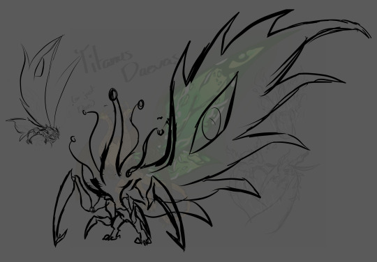
So... hasn’t taken me a while, before I wanted to redesign Daevas. I thought she looked rather bland and not much like the hybrid of a Queen and Devil, so instead of two heads, I’ll be giving her five total and revamping her head design so that she has two sets of split jaws on each head (which is going to be an absolute pain to draw each head).
Additionally, I’m going to give them the cobra hoods I gave to my new Ghidorah design, plus give them a sort of hierarchy of horns - the two outer most heads will have smaller, more ‘stump’ like horns, and progressing to the middle head is where they are the biggest and sharpest.
As for their limbs, I decided to revamp the inner chest limbs so that they’re bigger and more so used for stabilizing Dae, as she has a lot of front weight going on. Might make them bigger so that they’re like the outer set of limbs for better support. Her wings are being changed too to be more ragged - it bothered the hell out of me how I made the wings too streamlined, as I want to lean more heavily towards Ghidorah’s heritage than Mothra’s with this daughter. That’s pretty much it for Dae, as for the moth next to her, that’s actually a new character I’m slowly working on.
Titanus Askifro is the son of Mothra and Battra.
Askifro, I imagine, has a very posh way of speaking, almost like a Victorian style. He doesn’t enjoy short-conversations, so he’s typically advise to have something you can talk extensively about, preferably something he also enjoys - which, admittedly, isn’t a lot. He has a relatively stable relationship with both Mothra and Battra, but tends to prefer his father rather than mother.
he’s actually the older half-brother to Dae, as Mothra first landed with Battra before reaching out to Nii (there’s a whole poly relationship going on that I’ll maybe explain later). Dae never got to meet her older half-sibling, but honestly? Askifro and Dae would surprisingly get along - she understands and respects Aski’s knowledge of things, and is actually a little upset at not meeting him sooner. Something about his presence soothes her immensely, and she feels genuinely safe around him.
Aski doesn’t mind having Dae around, but finds it daunting to be the older sibling. He doesn’t have any trauma really, so it’s hard for him to exactly feel that connection with his younger sister - very much a advice rather than comfort guy too, but tbh his advice is just “kill your enemies and wear their skeletons as trophies” which Dae just responds with “please no”
very knowledgeable on kaiju biology, and is a pristine collector of their bodies if a kaiju is too pass. very careful, very precise. if its a fresh death, he’d likely eat the corpse then drag the remains elsewhere, or if it’s just the bones or a rotting corpse, he’d clean the flesh off of the bones and carve whatever he wants out of them
fucking hates Goji tbh, but keeps it veeeeeeeeeery close to himself. he’s not a big confronter, preferring to keep all of his secrets and opinions to himself rather than tell anyone, including his parents. WHICH REMINDS ME, SHIN AND ASKI
god, he didn’t expect her to be so blunt and outright rude towards him. he didn’t really find her intimidating though, just... kinda annoying. the most he’d do is just bap her on the head (Dae doesn’t do anything about it bc shes admittedly a little spooked of Aski despite the fucking power and height difference) and try to teach her proper manners, which Shin doesn’t actually need, she’s just being a dick
she does warm up to him after a while though, and so Aski watches over his little siblings with a lot of care, actually. HOWEVER, he definitely doesn’t want to get involved in Dae’s rivalry with Apoc. that’s a disaster in itself and while yes he cares for Dae, it’s her fight, he literally has no connection to them so he doesn’t care, plus he can probably get bodied if he got caught in the crossfire
random thought time, after getting to know each other, Shin grows comfortable enough to gossip to Aski about stuff with the other kaiju, and he listens, hiding the smile as he hears all the tales. OH and if they were in their human form, they’d definitely braid each other’s hair and go out to get their nails done, Aski doesn’t give a fuck
one last thing, with Aski and Dae, they have a something similar to what Goji and Mothra had - Aski sacrificing himself to give Dae power, then Dae goes absolutely ham. that is all
#mothra x battra#mothra#battra#king of the monsters#gkotm#godzilla kotm#godzilla king of the monsters#kotm#godzilla#mattra#king ghidorah x mothra#mothra x ghidorah#ichi ghidorah x mothra#ni ghidorah#ichi ghidorah#san ghidorah#ichi x mothra#ni x mothra#san x mothra
64 notes
·
View notes
Text
Not redesigning this character but I’m reworking his backstory which makes drawing some tasteful art of his youth necessary 🌝
Tristan is the very first angel I remember ever introducing to my world and the fact years later he’s still a prominent character makes him special to me and he deserves some work <3
He has been changed from a “hunter”, back to a “Guardian” like his first introduction(ik non of u know this stuff but I’m talking to myself ok) which r one of few exclusive born angel roles and treated somewhat like celebrities hence why I’ve made him a bit of an ex-model.

This is an example of his current look, he is currently a demon which he chose willingly to be with his current wife
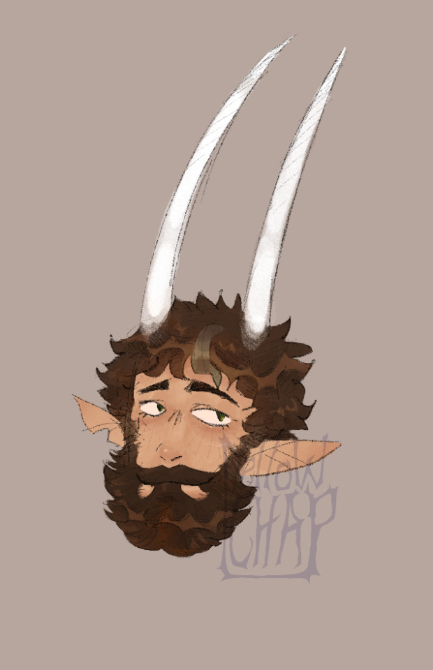
A little about him:
-so I’ve explained he is a Guardian Angel ,which can only be born angels, but essentially they get assigned to guard a mortal from evil like demons and other spirits that heaven deems untrustworthy, which is actually how he met his current wife! He was assigned a mortal that the demon Laurentius(a powerful demon, the first son of Lilith) was hovering around but he didn’t see anything wrong with their relationship so he kinda just left and pretended he was trying to ward off Lars(Laurentius) but he met Lars’ daughter, Delta, and decided to hover around her instead and they became good friends before becoming an item
-wacky demon and angel mischief of those two before they become a couple and years later Tristan has Lars cut his wings out to become a demon, since angel souls r in their wings and need to be entirely carved out to remove their soul and turn them into a demon contract(like a 50/50 chance of this working), and woo that works and they have their first son and then get married. They have like…. 6 kids now over a 20 or so year period and will likely have more bc they love being parents and they love their kids.
-Delta and Tristan have been the most consistent, drama free couple of the characters and Delta is the damn puppet master and has helped blossom most of the pairings in our world lol, seriously tho I adore these two bc they just love each other and their kids so much.
-Tristan has an ex-wife but this was like 500 years before current events and since becoming a demon he doesn’t remember much anymore unless asked about it, they lived on earth to get some peace from heaven but she fell victim to angel harvesters(humans r aware of angels and demons but it’s kept secret by the magic world and human billionaires and stuff bc they harvest angel organs for, basically, immortality and the magic world can use demon bits for more powerful magic which is illegal) and so yeah she died pretty horrifically which left him scarred for a very long time until he picks up Guardian work again and meets his current wife.
Love that I said little and then infodumped woops XD it’s like right before work so I can’t think anymore but this is the basics of him I hope any of u enjoy my blurb.
If I finish that sketch I’ll probably repost this info attached to it 🎉
#chappiesstuff#artists on tumblr#art#digital aritst#oc#oc art#original character#art wip#digital art#fanart#angel#angelic#biblical#demon character#demon#demon oc#original rp#rp#oc rp#magical world#world#worldbuilding#character lore#lore#infodump#sketch
10 notes
·
View notes
Text
Reading the W.I.T.C.H. reboot, part 1
Okay, W.I.T.C.H. reboot, here we go!:
AS: BTW, I was a huge fan of W.I.T.C.H. my whole childhood and most of my teenage years (where the writing quality dropped). The art style was a huge influence for my current art style and I even cosplayed Elyon three times. My favorite character was Hay Lin (then Elyon) and I still have most of the comics and the gifts they put on the magazine. So yeah, no pressure.
-Maybe it’s just me, but the cover looks… boring? It’s like Will here gave life to her dolls. Here’s a first look of the redesigns and… I guess I’ll talk more about them later, but: Taranee: sporty, weird, Irma: not bad, I guess, I like the combo of tan skin and curly ponytail, Hay Lin: well, that’s not my Hay Hey, but she looks cute, Cornelia: classy, not bad and… if I hadn’t read about it, never, in a million years, I’d have guessed that’s Elyon. She’s just an albino girl.
-BTW, I would have changed the logo. It makes no sense keeping it exactly the same. I’ve always thought the “c” is the odd one here.
-Oh, emojis, cool. But Taranee looks mad. And Irma looks like George of the Jungle. Sorry.
-You know, it’s sad when you put the six characters and then leave Elyon clearly out. No slide for her (even though her color was purple). And Taranee has an undercut? I’m guessing she’ll be quite different from the Taranee we used to know. Also, first look at the… magical outfits? They look like gymnasts. Or about to dance in the Dance Academy (I hated that arc). Also, also, Taranee looks concerned about that light in her chest and… yeah, girl, I’d be concerned too.
-While I enjoy that a multi-artist (that exists, right?) is the one behind the project, now I wonder if she was given it because she’s actually good or because she’s famous. Is she the writer? I guess? Also, putting the old designs? For what? Nostalgia?
-According to the intro drawing, Will will be the most important character, then Elyon (holding the dusty remnants of something she vaporized, probably), and then the other girls. The Heart of Kandrakar is golden now and… sorry, but I can’t with Will’s eyelashes. She looks like an old cartoon. And while Elyon’s new design would look good for any other character, I think the old one worked better for both her good and bad sides. And that hairstyle was iconic. Also, now that I see her black eyebrows… maybe she’s not albino after all? Taranee looks pissed to be there, Cornelia now has dimples (cute!), Hay Lin has the curse of “Asian-girl-with-colored-streak” and she’s extra pale and Irma… well, she doesn’t look that bad. PS: I know Hay Lin being yellow in the original comic was bad, but at least she could be light brown? I remember doing a lot of research to find my OC Aury’s skin tone and I knew it had to be a shade of brown. She looks a little ghostly-like.
-I actually like the art style.
-LOL, they did Thomas dirty.
#w.i.t.c.h.#w.i.t.c.h comic#rambling#will vandom#irma lair#taranee cook#cornelia hale#hay lin#w.i.t.c.h. reboot#elyon portrait
11 notes
·
View notes
Text
TES Cat AU: Skyrim Thieves Guild
My self indulgent TES Cat art is done, at least my favorite Skyrim Thieves guild NPCs are, Probably gonna’ post the Companions next because I was drawing the Skyrim Dark Brotherhood and for the life of me I couldn’t get Cicero to look right lol, but I’ll take suggestions :3c
(I’m so down with doing the rest of the Skyrim Thieves Guild eventually)
Anyway, my art for Skyrim Cat AU Brynjolf, Karliah and Mercer Frey under the cut, with some design notes :3
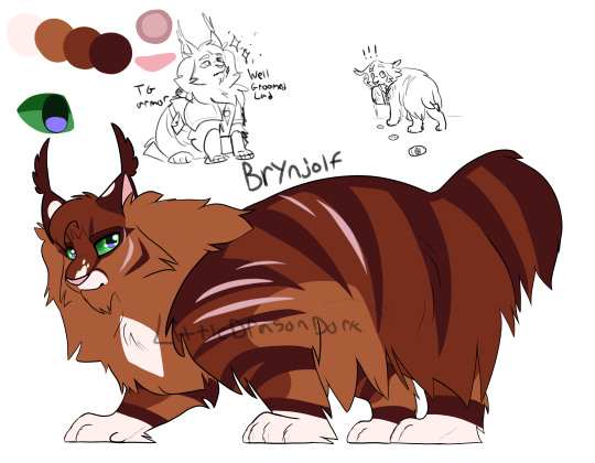
I wanted Bryn to be an orange cat, not only because I like orange cats and their low intelligence but because it just made sense. I also wanted him to be one of those massive fluffy cats, the ones that weight like 20lbs/9kg and have more fur than they know what to do with, he’d be 99% fur, go to pet him and your hand is just swallowed by the fur. I made him a mackerel tabby cuz’ I like mackerel tabbies and because they are just super common cat patterns. For a long time I wanted to give Brynjolf Sectoral Heterochromia, which is basically when one eye is 80% one color and has a little dot of another, in this case I wanted brown, but I couldn’t really get it to look right so I ultimately scrapped it.
He also has a docked tail because I liked the idea of all the known Nightingales having something fucked up with their tails.
I also did a little sketch with the thieves guild armor, I think it’ll fit like a harness with a few little pockets and bags. I imagine they’d all have dexterous enough paws where they can make stuff like furniture, buildings, tools, weapons, armor, cook food etc, makes everything a lot easier to me
I imagine all the Nords I’ll draw have ear tufts, extra fluffy paws and long fluffy fur coats, they’d probably slide on ice a lot lol, Think Maine coons, Norwegian forest cats, Siberians. I referenced Maine coons, Lynx and bobcats the most with Bryn here, but he is just a domestic cat.
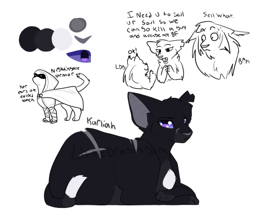
So, for Karliah (same with all elves tbh) I wanted big ol’ ears, I feel like I could have made them bigger but I decided against it because I didn’t want them to be in the way too much (might change that later though). She is also mostly back cat because I felt it was simple and cute (I have a black kitty and I love her). It’s also not shown here much but she’d have pretty short fur, and a thin and small build, think 10lbs/4.5kg.
Karliah’s tail is shortened and broken (a painless break, the kind that happened as a baby) as to go with ‘all Nightingales have fucked up tails’ deal.
did a more meme-y sketch in this one, I was in a goofy mood and thought it funny how quick both Brynjolf and the Last Dragonborn were to just accept selling their souls.
I imagine all Dunmer would have black or dark grey base coats and those that are tabbies to have them be lighter than the base, so for example a black cat with white stipes or grey with red stripes. They, and all elves will be mostly based on the Oriental Long/short hair cats because of their big ol’ ears and narrow faces but I’ll take creative liberties of course.
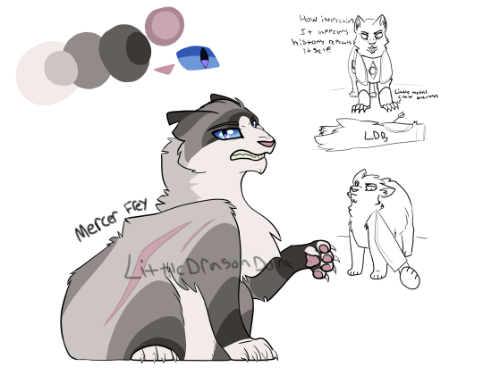
Last in this batch is Mercer Frey, I redesigned him at least 8 times, first he was solid grey+ Tuxedo pattern, then he was a dilute grey tabby, then a spotted tabby before I settled on a colorpoint because he was said to be “high born” and coming from a wealthy family, and I was like “hey, colorpoints are fancy cat coats and I can see a rich and powerful family wanting to breed that into their line” and thus Colorpoint Mercer was decided on. I knew 100% I wanted him to be grey because of the whole “grey fox” fan thing he has going on in the game
Seems like every time I would get near him in my playthough, any playthough of Skyrim actually, he’d look at me like I just spat in his drink so I tried to capture that here. Also the Knife cat meme because I thought it fit him.
he doesn’t have a tail because he doesn’t deserve one it’s with the ‘all Nightingales have fucked up tails’ bit.
I also wanted to share my ideas for weapons (still no clue how to do bows) but swords, great swords and daggers, would be little gauntlets made of the specific type of metal that go on the paws, and they would range in size and weight depending on the weapon its based on, so great swords would be huge metal claws while daggers would just be apart of a little leather glove that wraps around the paws. Lots of good ideas cooking up in my Autistic little mind lmao /pos.
I imagine all Bretons will just look like the average street cat, standard issue cats if you will, the common domestic short/long hair, probably have the most diversity in fur patterns and the like.
So that’s what I was able to get done in about about a few hours (with frequent breaks and work in between) A lot of the time was looking at both official art, fanart and the in-game models to get a good sense on the personality (both fandom and canon) and seeing what I can convert more easily to a non-humanoid design, a lot of shape language practice because I like shapes :3
I have a Solid design down for Ulfric but I wanted to do batches with like characters, so all Thieves guild girlies with each other and so all Civil War Girlies with each other, some might be drawn in pairs as well, like Hadvar + Ralof or Vilkas + Farkas.
#sorry if I rambled a lot I was very nervous to post this#i am cringe but i am free#I was a warrior cats kid can you tell?#I am also a furry if it wasn't obvious#If anyone makes this weird I'll kill you myself#my art uwu#TES Cat au#Skyrim#The Elder Scrolls V: Skyrim#TES Skyrim#brynjolf#karliah#mercer frey#Elder Scrolls Skyrim#the elder scrolls skyrim#thieves guild#skyrim thieves guild#skyrim fanart#The Elder Scrolls#tes: skyrim#TESV#I want to learn to draw people but man do I also not want to
18 notes
·
View notes
Text
I drew Alt-talia Japan, China, and Father Korea
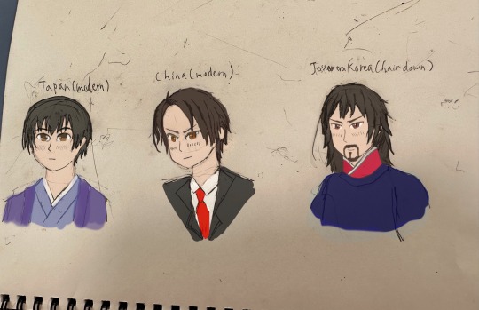
I decided I should start redesigning how I draw the characters, taking into account facial features from the countries in question; while I’ve done this before with my previous redesigns, I’ve looked more into it, took note of more stuff, and I wanted to see what the Asians would look like with this in mind too. It would help give the characters more distinct faces and all that, helping alleviate Hima’s Same Face Syndrome a bit. So almost all art I’ve done so far is now out of date lol. Also I wanted to see how short-haired modern Alt-talia China might actually look like, and I wanted to give Father Korea a design already. I maybe I should have drawn this in time for @hwsasiaweek , but whoops… Maybe I’ll submit it next year.
Despite me giving them these unique traits though, I wanted most of all to keep the resemblance to the original. Hence why I keep the anime pseudo-Hima style; if I deviated from the style too much they might be unrecognizable, I’d have to remove iconic parts of their design. Maybe it might clash with some of the subject matter I tackle, but whatever.
I’m most proud of Japan here! I was worried if changing his eyes, an iconic part of his design, would change him a bit too much, but I was able to keep them big and weird-looking. He looks almost cat-like for some reason. I wanna pinch his cheeks, he’s so cute. Pretty fitting for modern Japan’s image I must say.
I read somewhere that tareme eyes may be more common in Japanese people than other East Asians, and while idk if that’s true, it definitely fit Japan for him to be the only Eastern Asian with tareme eyes, counteracting the sharper effect more upward slanted eyes give, though them being more big and round definitely help too.
China… I fixed and adjusted him possibly the most, and I had many versions of him. I changed so much about him, the eye shape, the hair, even the eye color. Though I did heavily reference that one pic Hima drew of short-haired China. So I was worried if he still resembled China, but according to a lot of my friends he still does, so woo! The other thing I paid attention to was his androgyny; it’s a bit important to his character, so I wanted to keep it even with his shorter hair. I was also worried if he looked too “white” but my mother suggested that was just the suit. I tried a lot to keep these aspects in mind, and finally came up with a result I was somewhat satisfied with.
I drew him in a suit because I write Modern!China as a pragmatic businessman type; though I might draw him in something more traditional sometimes, I’d probably be drawing Modern!China like this often. The tsurime eyes definitely compliment the personality I give him. I debated letting him keep his amber eyes, and I darkened them, but they still look amber. Amber eyes apparently exist in East Asia and golden eyes could represent how special he was back in the day, so it fits I guess, so he still has sort of amber eyes.
Still, something feels missing without the ponytail…
Father Korea/Goryeo/Joseon/Korean Empire (though this is him during the Joseon era in particular) finally has a design! Yay! So people who read Student of China can finally have a face to put on him. Though he’d usually have his hair up, so he’d actually rarely be seen like this unless he’s going to bed or is about to take a bath or something. I’ll draw him with his hair up and hat on later.
I was split between giving him facial hair or nah, I just wasn’t quite sure on his age; but because a friend told me to keep the version with facial hair, I chose this one and to make him older. Pretty much all the Joseon reenactors aged, like, 30-50 I saw seemed to have this same exact mustache and beard, so I only assumed it was a thing. I was going for a DILF with this design and from the feedback I got it looks like I succeeded lol. I also tried copying South Korea’s face shape exactly, and had to use quite a bit of Photoshop to get it just right because my initial line work wasn’t quite right.
The stray hair may curl up or down depending on his mood; if he’s very excited for example it may curl up like South Korea’s hair curl, and if he’s depressed it may curl down like North Korea’s. I’m not exactly sure on this detail though because it might come across as Narm-y in serious scenes.
12 notes
·
View notes
Text
When Into the Spider-Verse came out, I made a spider-sona like a lot of people. Except…she wasn’t that good. The outfit was. The story wasn’t. I won’t go into it…but it was just lazy and…yeah. Not great.
I’d been wanting to rewrite and redesign her since Across the Spider-Verse, but I didn’t know what to do or how to make it unique. Or at least something believable.
Until now.
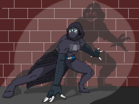
Introducing my redesigned Spider-Sona…who was not bit by a radioactive animal of some kind, genetically altered by science, or anything like that. Actually…she’s the symbiote (usually known as Venom) host of her world, except her actions and his past change things from usual probably.
I wasn’t going to do that at first, because I thought that seemed silly…but then decided why not? I like monsters, I like monstrous-looking heroes, and I like Venom (both together and as just the symbiote) (all versions of him, not just the one from his title movie).
I’m not an expert on Marvel comics or on Venom, though, so don’t expect absolute accuracy and smooth insertion…but I thought it would be fun.
She isn’t recruited by the Spider-Verse HQ either, either because she is also an anomaly, she was mistaken for being the Venom of her world, or they didn’t trust her to be a good hero since a parasitic monster is how she has her powers…and if she can’t control him, they can’t trust her to not cause damage. (Actually though she would say “fuck canon” and try to stop a horrible canon event like Miles did. And the symbiote would make sure she succeeds… So Miguel would probably fire her immediately. lol)
So that’s the idea…I don’t think I’ll do much with this since like I said, I don’t know a lot about the source. But if I come up with any short skits or want to draw this version of my s/i more I will.
Edit: I decided the symbiote with her is actually one I made up. They’re all more or less the same until they develop via bonding to people, so this one is an ‘OC’ in that it isn’t a canon one.
-
Bonus details on the design and some sketches under the cut.
Design Features
-The suit is the symbiote. She wears some kind of clothes under it (at least a pair of shorts and a tank top), but when changing to her Spider alter-ego he (the symbiote, or Venom if he goes by that name here) just forms as the suit around her. Settling on a design took a while…and deciding on a name took even longer. (She refused to go by the name ‘Venom’. It felt wrong and gave a bad impression of who she is.)
-When she loses control of her emotions, and later when facing a really tough opponent, the symbiote responds and becomes the more monstrous form we know him for. Meg was scared of this form for a while, since it was so much stronger and more dangerous.
-The belt was added by Meg. She used to keep a phone-holder clip there and have a pouch on the other side for headphones, which she wears to listen to music when fighting the average robber or weaker threat. It keeps her focused and calm, and keeps the symbiote from taking over completely. Later these are replaced by an enchanted pouch by a sorcerer that eventually becomes an ally. This pouch is basically a bag of holding but looks like a simple Velcro-strap pouch.
-She fought for the hood and eight-eyes look the mask has. The hood because it makes her feel less exposed and it looks cool, the eyes because spiders usually have 8 eyes. This is the only accurate thing to spiders on the design aside from the chest emblem in her usual hero form…the symbol being a tarantula. Her favorite type of spider.
The design of the mask helps to throw off her enemies. Especially when the symbiote makes the ‘eyes’ all narrow with her real eyes for effect. This has led fans and foes alike to come up with wild theories about her being a spider-human mutant thing with increasingly disturbing features under the mask. (A cryptid if you will)
-She also came up with the flying squirrel-like design element they use later. The symbiote changing the suit design to have wing arms like a flying squirrel for gliding if she can’t use webs.
-Her feet look like she has shoes on, because under the suit she does. If she is ever not wearing shoes when ‘suiting up’ her feet look more like most spider-peoples’, which is to say like slippers or barefoot under the fabric. This makes people even more confused on what the heck she even is…and there are entire blogs and magazine columns theorizing about it.
Bonus sketches
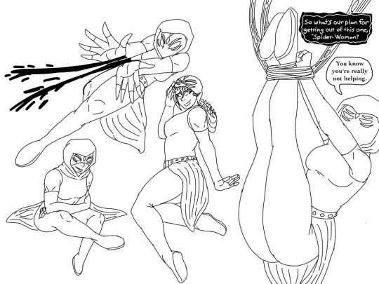
The redesign traced from the old ones I did. I drew all of these when I made the first, but I got lazy so just traced my own work here.

The more powerful and monstrous form they take when facing a much tougher opponent or when emotions run high. Meg used to hate this form…but as trust with the symbiote grew and she saw that when working together they could control the strength of it, she became more accepting.
She still does not want to run around like this, though. She wants to keep up that motto of “friendly neighborhood spider-hero” everyone else (except Miguel I’d guess) has. Only the bad guys need to see the monster.
Whether this view changes or not…who knows. But when this form was revealed people were more confused than ever on WHAT. THE. HELL. SHE. EVEN. IS???
She comes to really enjoy all the crazy cryptid theories they come up with. X’D
#marvel#spider man#Spider-Man#spiderman#spider man across the spider verse#spider sona#symbiote#venom#(I guess?)#super hero#blackdragon art#persona#oc#spider man persona
4 notes
·
View notes
Text
So now that I’m in a perpetual state of introducing friends to Yu-Gi-Oh, I’m gonna make another post to send all y’all. A lot of this will be a cleaned-up copypaste from a Discord dm, but to start with, if you’re reading this, chances are you grew up with the dub. But forget everything you know about Yu-Gi-Oh from the dub, it was cut and redacted and retconned to be Less Japanese, Less Dangerous, Less Emotional, More Comical/Theatrical and More “Family-Friendly.” They also replaced the entire perfectly-good-very-moving soundtrack to sound More Egyptian, and they cut out a lot of Yugi’s relationship with “Other Me” to be... not as... affectionate.
But if I’m sending you this, I probably already sent you the other post. It’s still pinned when I’m posting this one, so here I’ll just move on to continuity.
Chronologically, the early manga pre-dated the TCG, following more of a featured-game-or-sport-or-toy-of-the-day format, with The Card Game being just another one of them. Back then, it was a lot more feral, being more exclusively a horror series about getting supernatural retribution on bullies, abusers and criminal assailants. This manga got an anime adaptation by Toei widely called season zero, in which Magic & Wizards was renamed Duel Monsters and picked up enough popularity that the author (Takahashi Kazuki) was encouraged to polish the rest of the series to revolve more around it, securing the franchise’s success.
Which finally brings us to the subsequent TCG-era anime adaptation Yu-Gi-Oh! Duel Monsters produced by Konami. This one follows a separate timeline from season zero and would redact characters/events (save for homages here and there), give all the main cast some subtle redesigns (minus Nosaka Miho, who was cut out completely), make the Dark Yugi more ghostly than demonic, and tone down some of the violence but not censor it completely. This is the one that would then get heavily “adapted” by 4kidz for younger-than-intended audiences to watch.
...And then, presumably fitting between seasons three and four, 4kidz commissioned the Pyramid of Light movie and the short spin-off Yu-Gi-Oh! Capsule Monsters, the latter of which may or may not have written a continuity error into the backstory of another major character who was known for operating mostly behind the scenes, and whom was already getting more reveals in the very next canon season. This may be why it didn’t get localized back in Japan while the Pyramid of Light did, making it a 4kidz-exclusive canon.
“I didn’t realize how many canon-branches there were in YGO!”
Oh, but there’s more!
The fourth season is a filler arc (but it’s unironically my favorite, idc) and widely considered contradictory to earlier and later Duel Monsters lore, but I’d argue that there are ways for both to be true. This arc is also exclusively canon to the anime because in manga-canon, Pegasus J. Crawford was actually Killed Off at the end of the first season. In the anime’s fourth season, he’s involved in the plot again. He also makes a few cameos in GX, but only the first series is actually by the original author, just as with the dothack franchise.
And while that arc corresponds with the anime-exclusive continuity in which Pegasus wasn’t killed off, the manga also got a spin-off dubcanon arc by Ito Akira, called YuGiOh! R, and that one corresponds with the manga-exclusive canon in which Pegasus was killed off.
The fifth and final arc, meanwhile, never got the chance it needed to tie everything together in the way the author would have wanted to. At the time, he was recovering from Almost Dying of Blood Loss, from a Stress Ulcer, which production wouldn’t stop pressuring him to work through, so he wasn’t at mental or physical capacity to continue when he did and was in a rush to conclude the series just to take the break he needed. He’d been stated as having a poor recollection of what he was writing or drawing at the time, and also having a lot of regret over how it turned out. So anyone invested in YGO understands that the final arc needs to be treated as dubcanon too.
Bonds Beyond Time is a movie crossover with the later two series, GX and 5D’s, and that one’s also dubcanon cuz it’s unclear when in Yugi’s or Judai’s timelines they were plucked for this. It’s mostly just there as a nice feel-good movie with the level of art quality fans all envisioned to be uniform for the series.
The epilogue movie, the Dark Side of Dimensions, also follows the anime timeline; but that’s only confirmed by virtue of also acting as a teaser for the game. Duel Links involves multiverse shenanigans (as you do) to cross over all the YGOs, including later series set in AUs and a timeline representing manga canon.
YGO!GX technically follows anime-canon as well, since Pegasus is still alive, and none of the other subsequent series canonically descend from the season zero timeline either.
Yu-Gi-Oh! as a whole is perpetually suspended in a quantum state of dubcanon, but season zero (the Toei series) and Duel Monsters (the Konami series) are as canon as YGO gets, and all other subsequent series effectively teeter further into dubcanon.
YGO exists as a concept.
#yugioh#yugioh season zero#yugioh duel monsters#duelist kingdom#orichalcos#yugioh capsule monsters#memory world#yugioh r#yugioh gx#yugioh bonds beyond time#yugioh dark side of dimensions#yugioh duel links#tldr#etc
72 notes
·
View notes
Text
Rhombulus Rewrite Art!
Guess what my beautiful chimeras! While I’m working on Season 4, to satisfy you during the wait, I decided to draw my redesign of Rhombulus for my Rhombulus Rewrite!
Now, let me first just say that I absolutely adore Rhombulus’ original design and think it’s honestly an amazing one. I respect the creators and think the design is very fitting for most elements of his character.
But unfortunately, the changes I made for my rewrite have caused the OG design to not really work with said rewrite. I said that rather than being childish, Rewrite Rhombulus is basically going to be a child. So I decided that, mainly for fun, I would do a small redesign (it only works for this rewrite though, not for the OG show). Note: half the reason I’m doing this is for fun and because I had an idea and though “ooh, that’d be neat!” and just did it.
So without further ado, here’s the redesign:
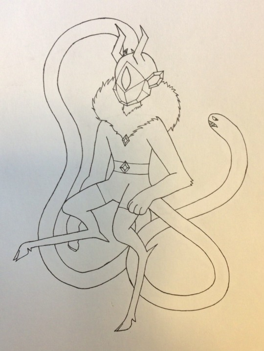
Artist’s notes under the cut (might mention certain story related things too)
I wanted to keep at least some of the primary elements of Rhombulus’ OG design, so I specifically chose to keep his snakes (and their general look because I love the snakes), his crystal head (despite it being a different shape), his eye being his only expressive facial feature, his nipple demons (though they are no longer nipples), and his hood.
The implementation of some of these traits were different, but a lot of the main ideas were the same. Also, I’m hoping I can color this in an use most of Rhombulus’ OG color palette because I did keep that in mind for this redesign.
As said in Part 1 of this series, I first got the idea of a chimera as the inspiration for this, and kept with that theme. But it slowly became a chimera of chimera as I unintentionally added in new, yet related creatures into it.
As I said, first was the chimera: front half is a lion, back half is goat, and tail is snake. But overtime I realized that there were other things mixed into it too. The second thing is a manticore. This is because he has a slightly humanoid face, a lion’s body (on the upper half), and, well, I’ll explain the tail a bit later when explaining each part of the design. The third thing is a satyr, which actually helped me in figuring out how to draw his legs, as I used preexisting art of satyrs as a reference.
The reason I used chimeras is, well, I don’t fully remember, but I do know that it makes him very much more monster like, which is going to be pretty important to the story, and because it adds to the mythological element of him. While they follow the queen, the MHC are still near godlike beings of immense power, and I want to capture that a bit more.
Now that I explained the main inspirations, I decided to add a breakdown of each element of the design and it’s purpose/incorperation into the story. I had a lot of fun with this, so I hope it’s pretty interesting why I chose to make the design the way I did.
First are the snake tails. I’m considering perhaps making them a bit like a shoulder angel and shoulder devil, to go with 1) Rhombulus’ impulsive nature and how he needs someone to help him think things through, and 2) the fact that part of his job involves imprisonment/punishment, so it would be part of his moral side. The snakes could also become a fun source of comedy if so desired, arguing with each other and having fun banter with both each other and Rhombulus. Kinda like Kronk from The Emperor’s New Groove.
The other purpose of the snake tails would be for fight scenes. Rhombulus was made to be the muscle/fighter of the MHC, and he’s canonically been on the battlefield the most, so he probably has the most fighting experience. This is why I gave him a bit more tools for these jobs, and the snake tails are part of that. Like in the show, during fights, he freezes them to use as weapons during battle.
Here’s an example of how he freezes them. But in this rewrite, for this design, he actually uses them a bit like scorpian tails (might draw an example image later). So this is the purpose of the snake tails.
Onto his goat legs. I decide to add the goat legs because, honestly, I though they’d look cool. But they can also add a bit of character and show a bit of his connection to Lekmet. After all, part of the reason he was created was to be a translator for Lekmet. I think this could be kinda sweet, and they share similar feature in that way. One thing that you might not be able to tell from my drawing is that the legs are designed to look like they are made of crystals. The hooves are crystal, the little things on the heels are crystal, etc, etc.
Now for his lion arms. These show his strength and are helpful in fights because they are quite muscular and have crystal claws. I was going to also give him opposable thumbs, but didn’t feel like drawing that, and decides that it would be better to just make them like normal lion’s front legs. He cannot grab things with his paws. At most, he can only claw or bap. I think that would be slightly funny to see him try to open a door before one of his snakes rolls its eyes and opens it for him.
Next is his mane/hood. I couldn’t decide if it is just a mane or just a hood, so I might ask ya’ll to help me decide. I might just give him a mane with a hood on top of it that looks just like said mane and blends in with it. I already explained the implimentation of the hood, and feel like the mane is just another way to impliment parts of the OG design.
Then there is his head. It is shaped very different from the OG head, but I still like the idea of a crystal head, and it’s such a prominent design trait, that I couldn’t take it away. I did reshape it a bit though, and added some crystal ears to make it even more crystally since I wanted a few more major crystal features.
One thing I noticed as a whole about the MHC is that all of them (except for Rhombulus and maybe Reynaldo?) have horns. So to make him fit in more, I gave him some horns. But they are also crystal horns because that would look cool.
I also tried to keep his actual face (aka, the singular eye) the exact same since I loved how they used that specific element of his design in the OG show. It looks a bit sharper here because I tried to make it a bit more lion/snake like, but I honestly prefer his original eye, so pretend that that’s what’s actually there. The way they animate his eye is also going to be the same here, because as I said, it can be very effective and you can find lots of ways to animate his face with just the eye alone. I also think this could make his body language into his main point of visual expression. It’s basically the same reason Rebecca Parham doesn’t draw mouths. So I just decided to keep this particular trait.
Lastly are his clothes. I didn’t really feel like changing them all that much, so I kept the pants mostly the same, but a little longer so it felt less like he was wearing underwear. I also needed to keep the two nipple demons, but since I didn’t feel like adding them onto his nipples (didn’t want to draw as much attention to his chest since he is presented to be a lot younger in this rewrite), I found other ways to add them it.
At one point, I was going to add what were basically crystal stegosaurus plates down his head and back, but that was 1) a little too hard to show and 2) felt like it would be a little much. I honestly prefer the lion’s mane anyways, as it makes slightly more sense and incorporated the hood in a way that fits thematically.
So that’s the redesign! As I said before, I didn’t make this to “improve” the original, just make something different and present an alternate interpretation. The prototype designs for the MHC were all diverse and amazing, and all equally pretty good, it’s just that they each set a different tone. This is an idea I had and I wanted to put it out there. So this is that. Hope ya’ll liked it!
#rhombulus#nr rhombulus rewrite#svtfoe rhombulus#rhombulus rewrite#svtfoe mhc#svtfoe#star vs the forces of evil#star vs#redesign#character redesign#fan art#art#my art#character design
20 notes
·
View notes
Note
Please babble about your designs i adore them
YESSIR, this’ll also be my character headcanon ramble
It’s a lot!

-Firestar and Leafpool are torties, I originally had Squirelflight be a tortie but I thought it would be nice for the sisters to switch places. (It also makes Leafpool’s design ‘less boring.’ Her tortie-ness is slightly passed down to Lionblaze.)
-Leafpool is huge, width wise. She’s truly built like a Thunderclan warrior and everytime I do draw her full body I try to convey that.
-Firestar is super short and tiny, Squirrelflight is actually slightly bigger than her dad but the two are both still short kitties. (Bramblestar is also big but he kinda looks tiny here.)
-Tawnypelt is way bigger than Bramblestar.
-Hollyleaf and Jayfeather have long legs and tiny paws, making them both taller than Squirrelflight and Leafpool. Hollyleaf is only slightly taller than Bramblestar.
-Lionblaze is actually the shortest of his siblings and looks the most ‘Thunderclan’ out of them.
-The red markings on Hollyleaf is based on sootslash’s design of Hollyleaf where the red markings purposely look like blood splatter
-The marking on Jayfeathers forehead is supposed to look like an eye while the marking on Lionblaze’s nose is supposed to be.. sun rays??? in my earliest design of him I originally had a crown markings.
-Fernsong is one of those characters who I will always draw with his eye closed because that’s just the kind of cat I imagine him to be. He’s also the smallest compared to his siblings, his kids tower over him.
-Hollytuft looks alot like Hollyleaf except she’s short and stout (Like her dad).
-I don’t have alot to say about Lionblaze’s side of the family other than Hollytuft being short and Bayshine and Myrtlebloom supposed to be mini Sandstorm-clones.
-Sandstorm, Sparkpelt and Snaptooth all have hair/mullet things. Nightheart and Hollytuft don’t, they just have long fur.
-Alderheart’s face shape is supposed to look like his grandma’s, Goldenflower.
-Sparkpelt is supposed to look more like a Sandstorm and Firestar kit more than a Bramble and Squirrelflight one,
-I reversed Finchflight’s design, her muzzle area used to be black while her body was orange. I’ll probably redesign her later on because looking back on it now I don’t think blue eyes suit her.
-I kinda went insane for Flickerkit’s design, if he lived he’d be Firestar reincarnate.
14 notes
·
View notes
Note
Sea Fairy and Moonlight fankid?

Here you are, this little girl is Moon Pearl Cookie
So, I wanted to name her after something that represents the sea and moon, and I decided to go with pearls. But I couldn’t find a name of a pearl that also encompassed the moon. Moon pearls aren’t a real thing, a “moon pearl” is an item from Legend of Zelda: Link to the Past. But the name I thought worked, so I just chose to go with it
At some point, I was going to use the name Evening Tide Cookie, but for some reason I chose against it. I still like the name Evening Tide, and now I’m thinking of another seamoon kid with that name, who’s an older sibling of Moon Pearl here. I’ll probably draw him at a later date
Moon Pearl:
(interestingly, while I found one version that I used for the character, I found another that was pink and purple. And going back to the game, that’s actually what it’s supposed to look like. I used that for an alternate look for MP)


So as you can probably tell, I took a few liberties with her hair, mostly because these guys are Legendaries and I don’t think they follow the same rules as normal Cookies when it comes to genetics. Also I wanted her hair to be colored like pearls. Her outfit was a bit of a struggle, particularly with the sleeves. I wanted to make her look cute and innocent, and I think I got that down, but I’m also not sure if she looks cute enough. I feel like she looks a bit too much like Sea Fairy and not enough like Moonlight, but I did try to incorporate some elements of Moonlight in her design, like the stars at the bottom of her dress
In terms of personality, I don’t have much. She’s just a cute kid who while shy, is curious about the world around her and eager to learn. I imagine she goes out and tries to meet other Cookies and make friends, which her parents definitely encourage. I’m not sure if she lives in the City of Wizards or the sea, but maybe she goes from place to place, staying some days in one and some in the other
Funny enough, I actually have more for Evening Tide than I do her. It’s just that there’s not much to say about her, she’s just a little kid
Now, as I said earlier, I did do an alternate version of her, though unlike Gancao, this was never going to be an option for her final design, just something I wanted to play with, since the Moon Pearl in Zelda is actually supposed to look like the second one. What I did here was just a recolor of her design, but I imagine it’d look different than her original; basically think of it like a costume for her. I’ve tentatively titled this look Untamed Magic
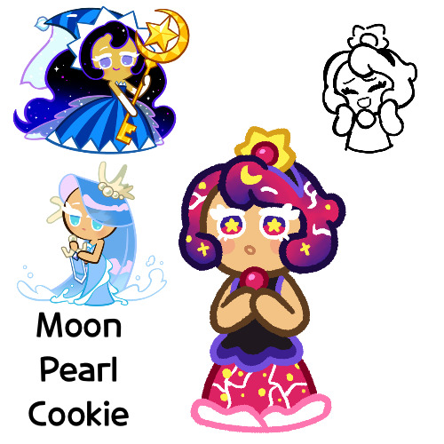
This design feels a little all over the place, but I was just experimenting with her look and trying to come up with something. I might redesign it sometime
Now for this, I’d say that Moon Pearl was made via magic, and perhaps because of her parents both being Legendary beings, the amount of magic she has in her is exceedingly powerful, being almost pure magic. Perhaps her default is her “dormant” state, but in this Untamed Magic form, it’s almost bursting at the seams
But yeah, I think that’s all I have for Moon Pearl. Hope you like her!
#cookie run#cookie run kingdom#cookie run ovenbreak#moonlight cookie#sea fairy cookie#seamoon#cookie run oc#fankid#fanchild#my ocs#my art#requests#answers#moon pearl cookie
78 notes
·
View notes
Photo

Back at it again drawing and redesigning my RC9GN mermaid au XD will I actually finish it this time?? who knows XD
Old designs under the cut :3 I have some more doodles to post so I’ll probably post them later :D

11 notes
·
View notes