#I wonder if csp can do this
Explore tagged Tumblr posts
Visit Tumblr Blog
Explore Tumblr blogs with no restrictions, modern design and the best experience.
Last Seen Tumblr Blogs


Fun Fact
There were a total of 171.5 billion posts on Tumblr in 2019.
Text


hey does anybody have $35
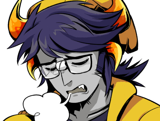
#my diary#mere weeks ago I thought it'd be fun to try to recreate the risograph look digitally and wondered how I'd do it#then this falls into my inbox#I'm gonna chew on my monitor#if I ever get a job and can afford a desktop tablet I'll buy these for CSP#but if YOU reader buy me the procreate version I'll.... draw you a picture with them?#sure I can comfortably promise that
3 notes
·
View notes
Text
tabbed over to photoshop to do some real life work and was greeted with the stankyle kiss i just posted a bit ago bc i had been working on that at like 4am last night and forgot to close it when i was done adgsfdhgj
#one of the perks of this time of year when i'm a freelancer who works from home is that im the only one who saw that 👍#can you IMAGINE being in a workplace and having that pop up on screen. i'd die#but also btw in case anyone is wondering: I do my drawings largely in csp but then just do some final adjustments in photoshop#blabbermouth
5 notes
·
View notes
Text
Anyone who uses clip studio paint, are y’all having any problems with using the filler tool? I click on the paint bucket and try to fill in a certain section of my drawings and it ends up filling in the entire page. Is it just me? Is anyone else having this problem, it was fine before the update so idk what is going on

#I’m starting to consider cancelling my membership#clip studio has really been pissing me off lately#idk how to fix this and I’m not seeing and openings or gaps in my art#can I contact them or report this problem#will it do anything#csp art#csp#clip studio paint#problems#I wonder what procreate is like#Idk if it’s the update or what
0 notes
Note
Can you give me art tips on how to render and how did you do the line art😭 I want to get better

I usually have different ways to render. But there's always just a simple breakdown of every process. Finding your style = You'll have your own methods you'll get comfortable with doing.
For lineart tips, check here! ^.^
Recorded:
420 notes
·
View notes
Note
Hiii I really love your art and was wondering if you wouldnt mind showing what kind of brushes you use for your recent drawings thank you so much and i look forward to your future arts!
Of course! I've answered this a few times before but have never really tagged it properly, and I also realised that I've never actually explained what I use each brush for so I'll do that now!:
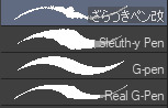
I'm gonna go through each of these brushes in order (and if i remember correctly, I'll link the top two since they arent default CSP brushes). (NOTE: almost all of these brushes have anti-aliasing turned off so that it can look more crispy and pixely!!! there is one exception to this that I will get into)
For this brush, I exclusively use it for sketching, it's advertised for inking digital manga panels, but with how the pen pressure is I feel like it adds form to my sketches

This brush, Sleuth-y Pen, is what I use mostly for MSPFA panels, mostly for lining, but sometimes for sketching too if I'm having a hard time with my usual sketching pen. It's really good if you want to replicate the homestuck style, and good for broad strokes on smaller canvases. The only issue is that the brush isn't great for that style if you use it on a larger canvas (ideally you would want 650 x 450) and can be especially messy if you're trying to get smaller details, such as open mouths, and certain facial details. I use another brush for that, which I will get into soon.
My second use for the sleuthy pen is for lineart on larger canvases in my usual artstyle! It has a texture to it that I like, as I like having my art appear a little rough around the edges, and the issue regarding small details isn't nearly as prominent of a problem
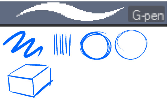
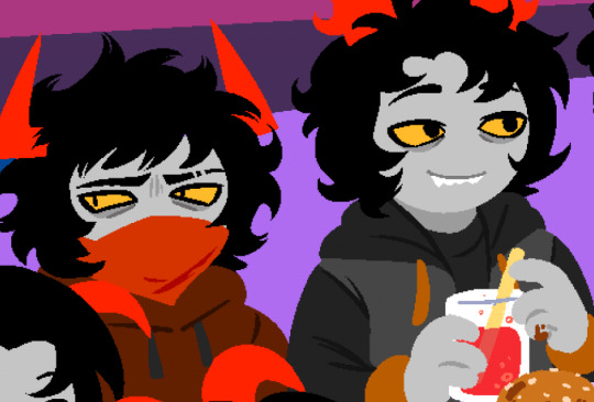
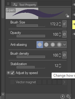
Almost done! Now we have the G-pen, a default CSP brush! This used to be one of my top 2 pens, along with its counterpart "Real G-pen" but nowadays I use it for two things: clean-up during rendering (usually getting those smaller details done that the sleuthy pen has difficulty with) and for doing SOME MSPFA panels (Vast Error, for example)
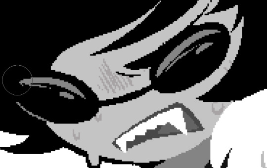
As you can see here, Liaaam's face is a little smoother than the rest of him, that's because I use the G-pen for those details, to keep things a lot cleaner! As for my other use, Vast Error's style from my understanding is a lot more "smooth" and "clean" which is why I exclusively use the G-pen for it, you can also make a lot of thick, juicy brush strokes with it which I feel works really well for the hair and folds in the clothes!
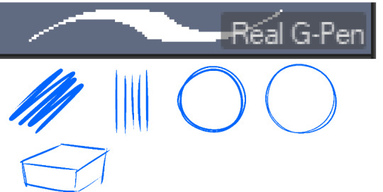
Finally, the Real G-pen, another default. This one is very similar to the last, its only differences are that it's slightly sharper and ever so slightly more messy. It's almost like a medium between the sleuth-y pen, and the g-pen.
I'll be honest, I don't use this pen much anymore, BUT, I still consistently use it for one thing and one thing only: Friendsim sprites. If you want to make friendsim sprites I highly suggest this pen, and making sure it's set to "weak" antialiasing. If you want to go the extra mile, I like to use a lasso-fill tool to block out shadows in all of my art, although if I'm using a rougher brush I'll usually do that manually. There's also other brushes I've been using more for rendering full pieces, such as a "rake brush" and a "design pencil" with low pressure to get details like blush down without making it too intense. That's basically it! I'll link the brushes below if I can find them: sleuth-y pen textured pen rake brush
179 notes
·
View notes
Note
Hey, I was wondering if you had any starter tips for digital art? I'm a traditional artist and have been for years, but I was recently given a tablet and clip studio. I am having SUCH a hard time getting anything to look right: shaky lines, flat/too soft pieces, just an absolute childish mess every single time. I see all these gorgeous digital pieces and have NO IDEA how to get there.
Heya!
So, it's been a very very long time since I transitioned from traditional to digital art, but I DID do proper traditional for a few years; we're talking ink pens, color pencils, markers, watercolor, fancy papers, the works. I did some acrylic painting too but only monochrome (and before anyone asks, these works no longer exist so I can't share them) all that to say that I do have some experience with the former and definitely felt the learning curve when I changed to a tablet.
To get the unhelpful advice out of the way first: It's a different and unfamiliar medium, and there is probably nothing significant that you're "missing" about it except time and exploration. There are pillars to digital art just like there are in traditional art, but when it comes to personal process everyone has their quirks and habits - you gotta mess around and find what works for you. I suggest looking up tutorials and speedpaints on youtube even if you know all the basics or if the style you see doesn't appeal to you; just watching how others do their thing might help you figuring out how you would like to do yours!
Now, for the more practical advice:
-I don't know what kind of tablet you got, but assuming it's a non display, that's an extra hurdle you have to get over in developing the eye-hand coordination necessary to use it. This feels very alien at first but it shouldn't take longer than a few weeks to feel completely natural.
-On that note, if there is a significant size discrepancy between the tablet and the screen you are looking at, that might mess you up. Try adjusting the size of the CSP window so it fits the size of the actual drawing surface you are using more closely.
-Every drawing tablet's pen has pressure settings that can be tweaked to your liking, I for one always make it a little softer than the default.
-BRUSH STABILIZATION! That's a setting every individual brush (and almost every tool, I believe) on CSP has. It does as advertised: stabilizes your brush strokes. A lot of people like this set between 8-20 depending on the brush, and it can make a huge difference to the way you draw.
It is usually always visible in the tool properties, but if not, you can toggle it on through the "sub tool details" menu by clicking the little wrench symbol on the bottom right.
Hopefully this has been helpful at all. Good luck!
208 notes
·
View notes
Note
this is a little random so i hope it isn't too much of a bother...i was wondering if you had any tips for preserving image quality when you post art?
there's not much you can do about image compression on socmed sites... but you can try:
check overall image resolution - i usually post images in the 1000px - 2000x range for any single side
diff btwn jpg (lossy) and png (lossless) file formats - jpgs discard unnecessary data resulting in smaller file sizes than png, but can lose image quality; conversely, pngs retain all data and result in larger file sizes, but support transparency and sharper quality and colors
i heard before that twt/tmblr compress images over 1mb. i don't know if that's actually true though.
save a websize version (72 dpi) - that's just so it's harder to take and print stuff if you don't wish for ur art to be used that way
depending on your drawing program (e.g. photoshop) it might have options for the quality/compression level when you save your image. if this is an option on csp i don't know how to find it yet lol
#ASK EVER#frankly i gave up on trying to keep my files under 1mb a long time ago#whatever you see is whatever twtbskytmblr have decided that image should look like
86 notes
·
View notes
Note
Hey I was wondering if you would do a post about how you make your feralnette au? I really like how you color it and was curious about your process.
Yes this is absolutely for plagiarism purposes /j
(I want to incorporate something similar on a smaller scale within my artwork, I don’t plan on posting anything but I can run the art past you if your worried about me actually stealing your style)
sure! as a note I'm not a pro or anything, this is just how I render my comic for ease of access
as a general note I draw everything in black and white first

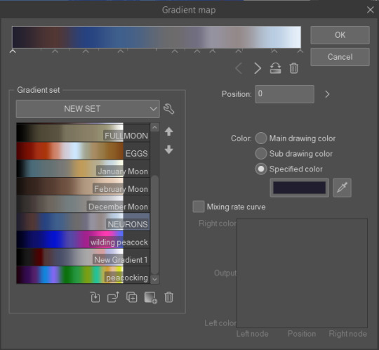
I use a LOT of texture heavy brushes for effects, and specifically because I render with gradient maps a lot. people ask me why I do AU's in different styles - usually anything outside of feralnette is done in color - but that's because the rendering process is different.
for instance in the dad villain au, I do basic linework and chunky colors. if I was to do Feralnette in the same style, the gradient maps wouldn't nearly have the same effect, as you can see up there ^
when a gradient map is applied I can fiddle with the color values to set a Tone for the update I'm going for, while also making it really pretty, bc textures can really bloom the subtle colors in a gradient map. I get a lot from the CSP page itself, but I also MAKE a lot too. this specific map I made by color picking off of a neuron map from a brain scan I thought was pretty~
I don't do the feralnette AU in full color because generally, anything IN full color will have significance - either to show that a scene is important character development,
is a flash back,

or to put emphasis on something supernatural happening.
with Feralnette, when something is colored purposefully, its to emphasize it, whether that be to highlight character moments, or to stress that something eldritched and unnatural could be occurring, as its colors that do not exist in the pre-existing gradient map. Color out of space, yknow?
((SOMETIMES I put gradient maps on my colored chunky stuff, but once again, for the purpose of creating a tonal shift, like when papa Tom shows up in the dad villain AU!))
anyway I hope that helped!
#replies#tutorial#sort of#im answering a lot of questions bc im bedridden w/ ms rona herself#my kitty retail sis caught it too (she's a champ so she's beating it like a fuckin pro)) and nudibranch sister remains unscathed!!!!!#we stay winning even if im dying!!
807 notes
·
View notes
Text

MORE RE VILLAGE AU LETS GO
Welp I tried to outline for the first time using CSP, not the best since I use Sai. Oh well, I'll have this posted to my original bluesky account.
Neighbor and Trudy are Donna Beneviento & Angie. Trudy isn't a doll, if you're wondering Neighbor is wearing part of a broken mask that's similar towards Trudy. He, Wegg, and Tillman are together however Neighbor was forced into becoming a lord to protect the two.
Boris Habit is Lady Dimitrescu. I thought this was fitting for Boris not to mention both are tall as hell. I gave him a fluffy coat for details on the outfit.
Hector is Salvatore Moreau. Hector's body seems to be more mutated with there being duplicate hands that surround the body. Hector will ditch his glasses and hat later on during the progress of the story.
King is Karl Heisenberg. Giving King a long coat to match the one Heisenberg has in the game. She still owns a megaphone but another one that acts as a hammer. The design was inspired by the hunting horn from Monster Hunter.
Lord Calum is Miranda. He is more of a leader in this au for reasons. He views everyone he gathered up to this point as failures. Hoping during the events of the au, that someone can eliminate Flower Kid's father. Especially Wegg, Tillman, Bizzyboys, the mortals of ggg, and Habitians were forced into joining the cult of Lord Calum, especially in need of keeping each other safe. While everyone is pressured into doing acts that Calum tells them, the situation involving Flower Kid’s father is something they can’t decline, which they are unfortunately going to have to deal with. Meaning Calum could punish them for not agreeing. They are mutations from the Cadou parasite and some from the Mold Virus.
#great god grove#smile for me#be kind my neighbor#ggg#boris habit#ggg inspekta#ggg hector#ggg king#art tag#smile for me game#s4m#bkmn neighbor#bkmn#hector ggg#dr habit#king ggg#dr. habit
115 notes
·
View notes
Note
I was wondering if you'd mind explaining how the dots work and if possible some colouring/background tips ?:0 I use CSP and I'm superr new so anything helps🫶(I used procreate for years before this so its all so different🤧)
hopefully i can explain this in a way that makes sense!! (DISCLAIMER THERE IS PROBABLY A BETTER/EASIER WAY TO DO THIS but this… is my design… aka i dunno an easier way so this is all i got)
if you want to do dots vaguely like So:
you’re gonna want to use the Tone layer property with an airbrush

turning the frequency up/down changes the amount of space between your dots, and so does messing with the opacity

once theyr about the size/density im looking for, next i usually merge the tone layer down onto a blank, normal layer

so you keep that fun dot texture, but now you can alpha lock or add clipping layers to change the color, make it a multiply layer, etc etc etc like you would any normal layer
thats basically it!
(also idk if this counts as a coloring tip but recently i am Obsessed with vaguely this specific stack of layer filters together it makes the colors icky in the tastiest way dont tell anybody)

86 notes
·
View notes
Note
hello!! i love your art so much, your colors are beautiful and your characters are just so 👁️👁️ and i adore seeing them on my dash :)
i had a question about how you do the details on your fabrics: how do you keep the patterns on clothes on a body looking so,,, clean and readable while also making it make sense on the form under it?
like the cape/sleeve(? idk what it is but it looks cool as hell) on the magnolia commission pattern looks so cool and it's still readable on the fabric (like, if i wanted i could probably do a silly sketch of it) BUT ALSO it seems to make sense with the folds so it doesn't just look unnatural and stiff?
i'm so sorry this is kind of a long ask but like. would you be down to talk about your process for patterns on clothing? it's cool if you're not, that's totally fair, just figured i'd ask
have a wonderful day!!
OOOH Thank you so much for the ask!! I wanna do a more in depth tutorial, but I tend to make patterns in two different ways, with one being fully hand-drawn and the other playing with mesh transforms or the... Uh, liquify CSP tool? Let me find examples

This is an example of a fully hand-drawn pattern. No trickery here- Only trying to eyeball everything. It's kinda a lot of work to draw it manually, but it's the more convenient option if the character I'm drawing doesn't have files for the patterns, or if the files are a bit too different from my usual style, as they could potentially not look great with my linearted or painted style
And then- For cases such as Nolia's cloak, I did the entire pattern as a separate file, then placed it using Photoshop's mesh transform!

Here's a WIP file from when I placed all the patterns after finishing the lineart, where you can see them in full contrast. I tend to keep my patterns in different files- The black parts here are not joined with the base color of the cloth, so I can bring nice highlights and texturing when they're meant to be golden inlays, for example. Now, the Photoshop mesh transform is a bit finnicky to use, and I don't have any proper step by step of it- I could potentially record how I do it someday. But let's take the humble cylinder and demonstrate it quickly:

So, the mesh warp tool is the one on the right- You can see these sort of blue lines creating a mesh. I'm sure CSP has it in it's pro level or something? Correct me if I'm wrong. You play around with the different sections, move it to the right place, and put it on the cylinder. This is a very simplified form. You can make many subsections to your meshes (that's 3x3- you can have stuff such as 20x20) for when you have multiple folds.

And then you can just shade your pattern accordingly so it fits the volume of the drawing, and- ta-daa!
This is by no means an easy method. Sometimes you can get away with the Liquify tool (which CSP has and it's very decent), which I've used when the pattern in question was over a simpler surface with few folds. It takes some practise to use that well, and it isn't gonna be the best for complex ones, but it's also an option. Let me do a lil compilation of some patterns I've done and which tools I used for each!
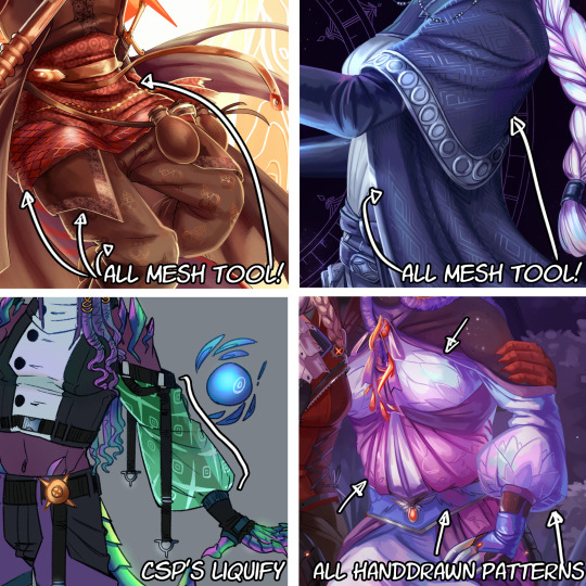
The tool I use highly depends on the time I have, the level of finish for the drawing, and so on. CSP's liquify is probably the fastest but gives simpler results, drawing them manually works better with some styles and more organic/less geometrical patterns, the mesh tool takes a bunch of time but it's great for small repeating patterns that are meant to be very precise or geometrical.
If people would be interested in it, I may someday do a video tutorial of me doing a pattern and then putting it over a folded cloth. I do hope this can help a bit tho!!
122 notes
·
View notes
Note
UGHH I LOVE UR ART AND EVERYTHING ABT IT AND I LOVE READING UR AZZY/FLOWEY INTERPRETATIONS AND HEADCANONSS AND AND WHATBRUSHES DO U USE ON CSP?
AAUG TYSM😭!!
here is a comprehensive list of my fav brushes in csp and the settings I use for them <3

this is like. my fav brush for coloring whether it's painting or just filling in lineart I loove the feel this one has. as per usual and as I will say a LOT I have the color jitter up to make it more visually interesting and to emphasize the texture so it can be seen against itself if that makes sense

ok now this brush is my current favorite for lining/sketching and allat. it's super fun and versatile and I rlly like the glowy/bleedy quality it has + I have a duplicate of this brush where I just have the spacing and size increased and color jitter turned up real high that I sometimes use for overlays. the only setting I rlly change on this otherwise is rhe angle

this is probably the brush that shows up rhe most in my art LOL it's a nice sharp lineart brush that can be rlly pixely when it's small and I love that look. I literally keep everything default with this one

this one is my FAAV for adding fun textures over the normal coloring I loove slapping random lines on there i highly recommend just messing around with this one

and last but not least another go to brush for coloring my beloved default charcoal brush <33 this one gets me all that wonderful crunchy texture bc I crank up that color jitter again for visual interest and texture emphasis
and those r pretty much the only brushes I use except the normal default round watercolor with absolutely no changed settings occasionally
44 notes
·
View notes
Note
I love Golden Shrike! I've had my own comic idea for about a decade now, but I'm wondering, for you, how long did it take you to be confident enough with your art to start your comics? had you attempted panels and backgrounds earlier and didn't put them out because you weren't happy with them yet? I'm almost done with my characters and writing but I'm worried I'm not good enough to actually start doing panels
(these are just my views and experiences! there's as many approaches as there's artists)
I was BAD when I started comics, but then I again I was a kid who didn't care if my bunny-cat-digimon comics weren't good enough, it was just fun to do. Which is what it should still be, fun and a fulfillment to you. I think the happiest an artisit can be is when they can draw like they have no audience.
My comics stopped in my teenhood when I actually wanted to make something good. I made so much groundwork but VERY rarely got to the actual page production because I thought everything should be perfect, but we all know there's no such thing. When I noticed all my attempts were doomed, I stopped making them for like ten years until I was zapped with Fuck It We Ball-mentality. And it's the best thing that has happened to me. Childhood whimsy. Make your own toys.
Did I make test pages for Golden Shrike before starting production? Well, the first page of the comic is a test page. And the second page. And the whole first chapter. I just never stopped. Not smart but it's what works for me. Starting these 'test pages' has kickstarted two bigger comics for me, Golden Shrike and Jet and Harley.
Sure I made couple of style tests for GS even though I had a clear visual vision from the start, but Jet and Harley I just started to draw without any real practice pieces, just based on couple of CSP brushes I wanted to use. This isn't very smart as you'll likely find out later that MAN, this style takes too much effort, but if you're unlike me and don't care so much for consistency, you can always simplify it on the fly. And even I've had to change it: I stopped shading after chapter 5, briefly used 3D assets in upcoming pages, now I'm gonna shrink the font a little. They're teeny tiny things for readers, but huge for me.
There's many comic authors who like to plan every little detail before getting to work, but it doesn't work for me so I can't say much about it. I have a skeleton to follow, but I fully flesh out each chapter one by one when I reach them with pages, because I like to revisit my old visions with fresh brains. When you actually get to work, you might realize some scenes aren't needed, or they'd be better changed. Don't be scared to crack some ribs off your story skeleton. Being too loyal to your old vision can often hinder you.
Starting production is the biggest monster in comic making, but after the first step you'll mow over it leaving it in your dust and create a baby you can be so proud of. I wish you, and everyone else on the cusp of their projects GOOD LUCK, HAVE FUN, LOVE YOUR WORK.
244 notes
·
View notes
Note
Hello! Your art is very cool! I'm wondering, what do you do when drawing two simmiliar panels, like, the character is in a slightly different pose, or has a different expression? Do you draw the entire thing twice, or do you copy/paste at some point? If so when? After color, before color/shading?
Hey there! If the panel is 90% the same and I've just changed a small detail like a facial expression or hands, I will copy and paste the lines, erase the parts I want to change and redraw them the way I want them to look. Then, I'll color and shade the original panel to completion, copy & paste all of those layers and fit them onto the new lines.


As you can tell I keep everything on separate layers, so it's very easy to just pick things up and move them as necessary, as well as to make alterations to individual layers so they fit the changes made to the new lines (just erase that area and redo it, same as for lines). TIP: If you hold SHIFT while moving a layer on CSP, the movement will stick to a grid so it's easier to place them with more precision.
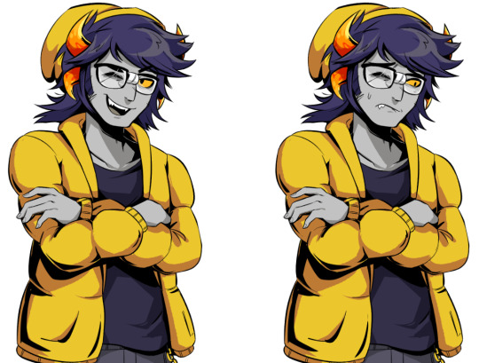
Even after this point, I will often still go back & forth between the panels making small adjustments, which leaves them with slight variations (If you flip between the two images on this post you will be able to tell). But it's nothing that the naked eye can see so there's no reason to worry about it.
If you want to be REALLY anal about it (hehe) you could place the merged layers over each other, use a quick mask to erase areas so that the changes show through, and merge that into a new layer so that the panels are EXACT copies save for whatever you intended to be different. I will do that sometimes if I've made too many alterations between panels, but usually it's not really necessary.


Hope this helps!
322 notes
·
View notes
Note
Hello! I was just wondering what brush do you use for your art? I’m trying to find a good line-art brush :)
Hello! what if I told u it's the SAI default brush 💀 I also have one that's an edit of that with a paper texture on top, and more rarely the marker brush, other than that I haven't really found brushes I like to use either and I tried a lot of the recommended ones (on CSP)
also in general I'd say unless you're a big fan of clean lineart, try to find brushes that are comfortable for sketching (good mix of line variation and opacity variation) and then just work with the cleaned up sketch because leaving in some sketch lines can make pictures feel more lively!
75 notes
·
View notes
Note
Hello Tempo! I really love your art and your Almost TGCF had me rofl-ing!
I hope everything goes well with your shop!
Out of curiosity, what program and brushes do you use? It kind of reminds me of Photoshop but I'm not too sure
I hope you have a good day!
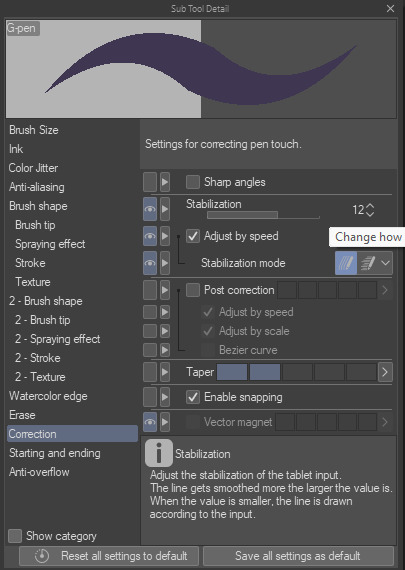
Thank you so much and sorry for the late answer!! 🙏❤️ As for which program I use, I use CSP and mainly uses the default brushes! (I've downloaded a few shortcuts brushes but no textured ones yet)
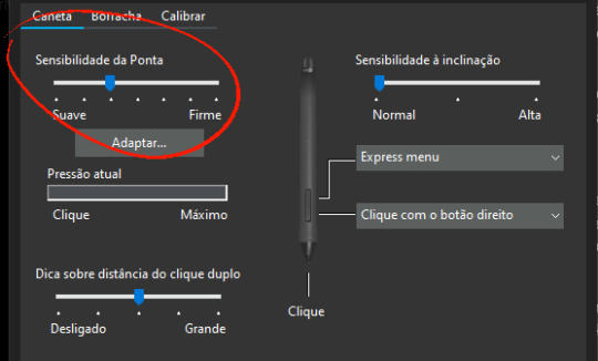
If you're curious here are the setting for the main one I use (I can't seem to be able to screenshot it so here's a photo) :

For my sketches it's the exact same setting excepts that I lowered the opacity with the pen pressure. You can achieve those results by tweaking the parameters on the G-pen's brush size and opacity!
I personally don't like it when things are too complicated when drawing, so I keep the brushes I use at a minimal.
I hope you have a wonderful day as well! ✨
#Tempo finally answered after years of egging for what brushes she used#Why did she kept that secret for so long??! She forgot that she had to answer it.#Okay no though real talk I had actually forgotten how I had tweaked my brushes since it was so long ago and I had to look it up again#And then I forgot to share#But anyway#Just like irl you can do a lot with just a pencil and a piece of paper#So I don't really like to complicate my process
20 notes
·
View notes