#I think I definitely want to focus on shapes and colours a lot more at least in a more purposeful way
Explore tagged Tumblr posts
Visit Tumblr Blog
Explore Tumblr blogs with no restrictions, modern design and the best experience.
Last Seen Tumblr Blogs


Fun Fact
After the announcement of the deal with Yahoo!, there were 170K signatures of unhappy Tumblr users petitioning to prevent the sale in 2013.
Text

gonna try spending 2025 doing more actual studies methinks
#my art#study#gotta get them skillz up baby#I think I definitely want to focus on shapes and colours a lot more at least in a more purposeful way#instead of just falling into lazy habits lol
28 notes
·
View notes
Text
Tears II
Alexia Putellas x Child!Reader
Summary: You wander off at Camp Nou
Having you was the best decision Alexia ever made.
You were so sweet and little and you loved to just be in her company no matter what. It didn't matter if you were napping or playing or eating, you just always wanted to be around her.
But, having you was definitely the most stressful decision she had ever made too.
Sometimes, it was like she would turn around and you would be gone.
Sometimes, loud noises overwhelmed you and you just had to leave.
This must have been one of those times.
The locker room was upbeat and loud and Alexia turned around for just a minute to get your ear defenders.
"Mapi!" Alexia yells over the sound of the speakers," Mapi!"
"Huh? What?"
"Where's my pequeñita?"
Mapi shrugs. "I saw her by the door a few minutes ago. I think she was talking to Marta."
Alexia knows immediately that you've run off. You didn't really like talking to her teammates bar very few of them. You were more likely to talk to Caro or Irene than Marta so she knows you've made a break for it.
Her cleats echo through the halls as she goes off in search of you. You're a creature of habit at Camp Nou and Alexia knows to bypass the toilets and the densely populated areas, ducking into one of the rooms that has no lights on.
"Hey, pequeñita," Alexia coos. She spots your darkened form hiding under one of the tables. "Was it too loud?"
You sniffle and Alexia crawls under with you.
"I'm sorry," She says," But here, I've got your headphones. Shall I put them on?"
You nod miserably. The ringing in your ears is terrible but it's dampened when Mami slides your ear defenders on. You take in a big breath before you expel all your air, slumping into her side.
Her voice is muffled as she speaks but if you concentrate really hard then you can still hear her.
"Do you still want to sit on the bench and watch, pequeñita? Or do you want to stay inside and colour?"
You sniffle, wiping your face on Mami's jersey. You like watching Mami play but it's too loud a lot of the time. But this is an important match because Mami's playing at Camp Nou rather than the Estadi Johan Cruyff.
You want to watch her.
"On the bench," You say softly, knocking your head against her collarbone.
"Okay, pequeñita," Mami agrees, her cool hands slipping under your shirt to gently trace shapes on your back," Do you want to stay here a little bit longer or should we go and see the rest of the team?"
You tighten your first in her jersey. "Stay for longer."
"Okay, we'll stay for longer."
Mami's heartbeat is nice. You've got your cheek against her chest and you can feel it thumping as she picks you up after a long while of sitting under the table in the dark.
You stay pressed against it as Mami returns to the locker room.
With your ear defenders on, the sounds are all muted now and you feel like you can breathe again. Your hand opens and closes around Mami's jersey and she holds you just as tightly as you're holding her.
Irene comes up to speak to Mami and she sends you little worried looks as she talks. You're not concentrating so you don't try to focus on what she's saying. You're content to just hold onto Mami.
"Do you want to go straight to the bench or are we having cuddles all the way out onto the pitch?"
"Cuddles."
"Cuddles, it is."
The crowd at Camp Nou is very loud but you've got Mami and you've got your headphones on so none of that matters.
She holds you nice and tight all the way up to the coin toss before she walks you to the side of the pitch.
Irene's waiting for you there.
"Mami," You whine. Today has been a lot and you're regretting not staying inside. You don't want to see Mami away from you.
"I know," She says, cupping your face as you're smoothly placed in Irene's arms," But today we're going to be very brave. Okay? Can you be brave for me, pequeñita?"
"I can be brave."
"Good girl." She presses a soft kiss to your head. "I'll see you in a bit, okay?"
You nod.
You don't leave Irene's arms for the entirety of the match. You don't talk to her either. You just sit there, your eyes tracking Mami.
She collects you during halftime and you just relax into her, pressing your forehead up against hers as you try to match your breathing before you're returned to Irene for the rest of the match.
Once it's over, she comes straight for you.
You slump into her as she makes her way back to the locker room, changing out of her sweaty clothes. You don't want to let go of her but it's only a temporary thing and you're back in her arms again.
Your ear defenders hang around your neck as Mami carries you out to the stadium.
She clips you into your car seat.
"Do you want cuddles when we get home?"
You nod. "Cuddles and sleepy time."
Mami brushes her thumb over your cheek with a fond smile. "I like that plan."
#woso x reader#alexia putellas x reader#alexia putellas#woso community#woso fanfics#woso imagine#woso
825 notes
·
View notes
Note
i am endlessly fascinated by the way you draw hair. it looks amazing even in your doodles, let alone fully detailed pieces. just stunning. could i persuade you to make a little tutorial? i'd be happy to write a soft sebinis ficlet for you in exchange. 🥰
Aaaaah, I didn't think it looked like anything special xD If anything I struggle with it a lot, so thank you for this compliment😭 I made a lil tutorial of how I do it so you'll know my secrets :D But it's very general and I bet there are a ton of better hair tutorials out there. I didn't include any colour as I focus more on the texture and the shape more. The sketching phase is definitely my favourite rather than colouring hehe... And I would love to read a sebinis ficlet omg!! But I want you to write whatever you're most interested in!! No need for separate gifts just for this!! x) (but I will be staring at AO3 and refreshing the tag lol)
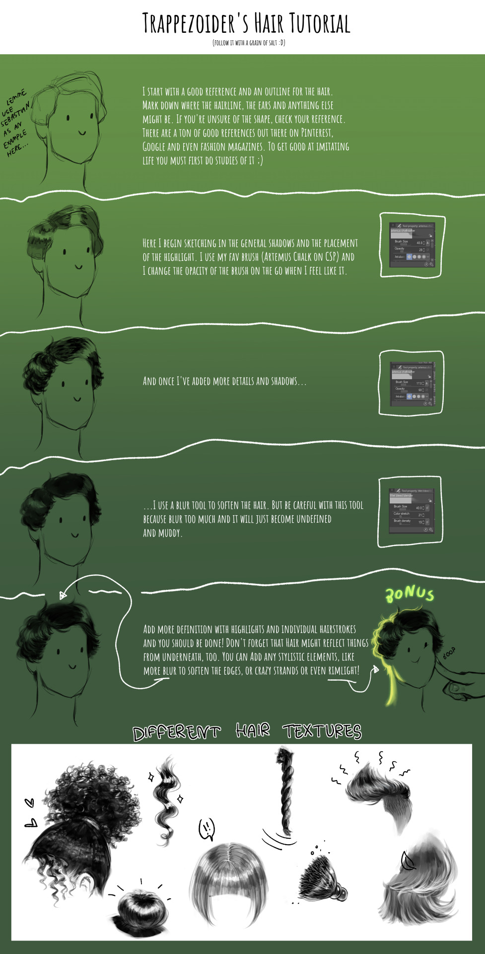
#tutorial#hair tutorial#art tutorial#art#digital art#sketch#hope this tutorial even makes sense xD#ask
107 notes
·
View notes
Note
i would love love love some fluffy romantic headcanons for Penelope Garcia 💜💜 :)
There definitely needs to be more Garcia content on this app! Thank you for your request and here you go <3
Penelope Garcia as your girlfriend

She is THE Office siren
Yet she knows how to include color in her fits, which i looovee
And damn being her lover is a whole rollercoaster
In a good way of course
Let’s talk about being her significant other
She has so much love to give and yet no one to give it to
Until you came along
Don’t get me wrong she showers the bau with love, but she still longs for something more
We all know she is an enthusiastic person
Therefore, she is not one to shy away from flirty banter. When you return the same energy… she is an unstoppable force of love
That means she isn’t ashamed to bury you with her affection
I mean- She’s probably already planning your wedding
In addition to this, she is a great planner. Your birthday party’s are the ones that everyone in the bureau looks forward to
Get her trinkets please
Like that’s the way to get into her heart
She’ll appreciate every little thing. She puts them in her office and takes them with her when she has to consult on a case. As a reminder of you everywhere she goes
Even if you are a profiler and literally a few feet away from her-
She just misses you all the time
Heart-shaped rocks, little notes with doodles and pictures of cats. Everything little thing counts.^^
Speaking of cats, she is definitely a cat person
I’m pretty sure she buys cat food just to feed the stray cats in het neighbourhood
You may have to warn her about the risks.. the illnesses and all that. However, it is endearing to see her care so much about animals most people usually ignore
I definitely think she can crochet. Which means she makes most of her gifts for you herself
Imagine her exited face when you open the colourful packaging to be met with a cardigan or a scarf in your favourite colours
She knows your style so well^^
Happy you = happy Penelope
Btw she also crochets hats and sweaters for the stray cats I mentioned earlier. They never want to wear them, but it’s the thought that counts
She stims a lot. Especially when she feels comfortable enough with you. She starts singing out of nowhere, rubs her hands together and even shrieks to transfer her energy. Later on she also uses your jewellery/clothes to fidget with
She rambles a lot when stressed so you have to remind her to breathe
I really like to see her with a quiet person who loves to hear her talk: the rambler x listener trope
She wears her emotions on her face
This means that you don’t even have to be a profiler to know what mood she’s in. Since she’s so cheerful all the time it is evident when she’s feeling down.
Fortunately, it is very easy for you to make her smile again
She makes her love known by giving gifts
But her actual love language is words of affirmation. She needs to know that she belongs and matters. Especially considering her past
If you don’t like Spencer she’ll won’t like you. Period.
You guys will be a powerful trio btw
If you work for the bau, you always hang out in her office. It’s your own little girlscave
Like Hotch has to force you out so you will focus on your paperwork
You guys share colognes/perfumes and beauty products
All in all, I need her, i want her and i need her to want me
#penelope garcia#criminal minds#penelope garcia x reader#penelope garcia x gn!reader#criminal minds headcanons#penelope garcia headcanons
53 notes
·
View notes
Note
Hey! A couple of questions for you 😊
AYS, to me, was never going to “confirm” jikook. It was just unrealistic considering society and that they’re serving now. That being said, did AYS reaffirm for you jikook might be real? And do you think if it was your first bts content would you also think that there might be going something on (ie watching with no bias). For me, it showed how incredibly close they are and several moments of intimacy that goes beyond most friendships.
The second one is now 6 weeks out from the car convo, has your opinion on it or its relation to jikook changed? For me still, that car convo didn’t show they broke up or disprove that they may be dating.
One of my pet theories, even before Face and long before knowing buddy existed, was wondering if they took a step back in prep for military service - a let’s focus on solo careers and work on not being as tied together cause we have service a head of us. A practice run if you will. Not breaking up, more let’s try long distance.
More so now, and what I haven’t seen people talk about, is I was thinking about how for the other guys and jikooks prior relationships, they would know how hard dating as an idol would be. I’m sure Tae and Jennie had a lot to contend w being so busy as idols and on differing schedules. Same thing for dating a non famous, dealing w the insane hours and workload, rarely being in Seoul. And that was never a reality jikook faced - for a period they would’ve both lived and worked together. They were in the same schedule, the same places. And that would’ve been for a majority of their relationship. So no wonder post October 2022 was an adjustment, when they truly did not have any schedules as bts. And they’re both human, and Jimin has said both he and jk get lost in their work (from that colouring live). Sometimes we aren’t the best and prioritizing work and relationships, especially when it gets busy. You hear stories about loving couples going thru phases where they’re just roommates before making the effort to not just be living together. It seems like Jimin got incredibly busy and focused with Face and Muse. And jk is allowed to have feelings about that. Doesn’t mean them not being able to see each other to hang out is any deeper than that. Doesn’t show that they broke up or couldn’t be dating. I also wonder, since we may never get the background on it, if that period of time solidified the decision to enlist together. Where before it was a ok well enlist it will suck, became after that period of time nah we’re not doing 18+ months apart.
Ahhhh sorry for the long post, a couple questions and a couple thoughts for you haha
Hey anon, sorry for taking a bit to post your ASK.
“Did AYS reaffirm for you that jikook might be real?”
Yeah, definitely.
“Do you think if it was your first BTS content, would you also think that there might be something going on (i.e. watching with no bias)?”
Oh, absolutely. I think if I'd seen AYS without much context, I’d be sure they’re a couple, no doubt about it.
“The second one is now six weeks out from the car convo; has your opinion on it or its relation to jikook changed?”
Are you talking about Jungkook complaining that Jimin never reached out? Honestly, no, I still hold the same opinion I had initially.
I think one of the reasons why that time they talked is confusing for us is that we don’t have the context for a lot of things. For example, when did they decide to enlist together? I think that decision shaped many of their choices, like focusing on their work and perhaps on other friendships, because their relationship wouldn’t just pause dramatically come December 2023.
Honestly, I think that period in their relationship solidified whatever they have and made them want to be together, which is why they ended up enlisting together through a system that guaranteed they'd be together. Even if Jimin and Jungkook took a break—assuming they really have a romantic relationship—the fact that they decided to film a show together and enlist together in the army shows they’ve overcome whatever was separating them or that they’ve just realised they want to be together.
So, I think it’s a bit tiring and unnecessary to speculate about what might have happened during that time in their relationship because, first of all, we have no context, and second, they’re still together. The fact that they enlisted together through the buddy system is the biggest “proof” they can give that their relationship is solid, whatever that may be.
48 notes
·
View notes
Text
writing neutral readers; a guide
(neutral = unspecified gender, race, appearance, etc.)
hi hi here's vee, the one of (hopefully) many neutral fic writers for atsv, showing YOU how to write a neutral reader for your character x reader fic!!!!
this is mainly about romantic x reader fics!!
lil disclaimer: you don't have to write neutral readers if you don't want to! this is just for people who do and might want some advice :) all of these are what works for me — there are plenty of ways to write a neutral reader!
contents page for your sanity:
avoiding white-coding
being gender-neutral
re-direction / re-phrasing
my general thoughts and opinions
before we get started: why are neutral readers great?
inclusivity! a lot of the times it can be hard to find a fic right for you especially if they tend to be for a certain demographic
forces you to think outside of the box — you can't rely on describing the reader, so you have to describe character interactions more creatively (as you'll see me try to do a lot in this post 😭)
helps with immersion! a lot of the time overly-descriptive reader inserts can make it hard to... actually insert yourself into them
your fics can reach a lot more people if they're neutral (though this is just an added bonus lol)
some colour-coding for your wellbeing: blue = general advice + examples, pink = my personal input
1. avoiding white-coding
this is a big point i'd like to address first because it doesn't get talked about enough! and all of this is in reference to a post i saw like a week ago lmao
i haven't seen this term being used a lot but the general idea is when a piece of writing is catered towards a white reader (usually implied through description)
this is usually done unintentionally but avoiding white coding is an important part of writing totally neutrally!
general things to avoid
describing physical attributes such as hair + skin tone
for example describing hair as silky/smooth implies that it is straight + excludes the majority of other hair types / styles etc
also things like running your fingers through your hair can be impractical w certain hairstyles
i tend to just avoid hair in general ? if you want you can focus on other gestures (hand holding, cupping readers face or sumn)
or just reverse the roles entirely and have reader do the comforting gestures to the canon character
skin tone is definitely more subtle however it can be implied especially through things like blushing
people with darker skin tones DO blush, but it generally tends to be less visible or not at all
instead i tend to describe the feeling rather than the outward changes (face getting warm, getting flustered, heart rate increasing, sweating, stuttering etc)
2. being gender-neutral
okay this admittedly can be difficult to write sometimes
the general rule for a gender neutral reader is to avoid referring to the reader as male or female AND any physical description specific to a certain sex
gendered terms
some people like to use they/them when reader is referred to by other characters
instead of boyfriend/girlfriend you can use partner
i personally don't do these things as you'll see in my next point about re-direction!
there are PLENTY of gender neutral pet names in english
for languages like spanish which have masc and fem versions of words i tend to use nouns (usually non-living or abstract) which have a set gender (such as my heart, my love, etc — one of my favourites is cariño (darling) because it doesn't change based on gender)
though again i rarely write terms of endearment in other languages so i suggest you do your research!
physical terms (sfw only)
also for body inclusivity
again this mainly to try and avoid implying fem!reader but also body types just a tiny little bit
i tend to avoid mentioning body shape but if i do then i use something vague like "shape of your body" rather than "curves" or anything specific
you can just write down the body part without describing it physically (chest, waist thighs, etc)
eyelashes are ... unisex! no way!
you might want to avoid makeup but this is just a *general* suggestion
i tend to NOT describing clothing choices unless it's relevant to the premise of the fic — usually vague references like your school uniform, pajamas, shoes, favourite shirt, etc
you can also cheat this if reader is wearing the other character's clothes 😭 next point re-direction WOOO
3. re-direction / re-phrasing
(a personal choice of mine + totally optional)
re-direction is when you change the focus of a sentence in order to get rid of any words descriptions that may take away from the neutrality of the reader (as you see me talking about in the little pink text everywhere or in the little suggestions in blue)
Re-direction can be used for anything! I think there's a book that exists that uses no words with the letter e and a book that uses no pronouns at all (but don't ask me what they are because I have no clue)
It's not particularly easy or straightforward all the time and you might have to change more than one sentence but re-phrasing your writing can be a good challenge! (if you choose to do so)
for me i tend to re-direct to avoid using any sort of third person pronouns (he/she/they etc) or gendered terms and to avoid using insert tags like y/n
example on pronouns & gendered terms
for pronouns i usually change "he/she/they" to "you" or a noun
"She's not welcome here" could become "Your friend isn't welcome here"
Or the sentence may change entirely to convey the same meaning. The woman turned to you, speaking one simple command: "Get out."
I also tend to use more masc / neutral terms in casual settings like "dude" or "bro"
I also avoid the use of "partner" (though this is just nit-picky) ex. "Is this your partner?" might become "Oh, [character] talks about you all the time!" (entirely dependent on context and if you care enough lol — one of the less clear-cut redirections)
while you could obviously use they in this scenario i personally don't out of preference (to me they/them is an nb set of pronouns if the gender isn't ambiguous and blah blah blah) but it doesn't really matter
example on insert tags
"(Y/N), wait!" can become "Hey, wait!"
Or you could use "your name" rather than a placeholder. He called your name, running behind you. "Wait!"
like i mentioned before things like clothes and favourite foods all tend to revolve around the character rather than the reader. in a lot of cases writing about the foods the character likes or wearing the clothes the character owns can actually be more immersive than inserting your personal preferences into a pair of brackets (in my experience at least)
4. general thoughts and opinions
one big thing i wanted to point out is that it's actually good for your writing to "ban" yourself from using certain terms and descriptions. i find that i focus a lot more on describing events, emotions and character interactions rather than being caught up on the reader.
fem!reader and masc!reader are GREAT too! amazing beautiful wonderful keep writing those — but i think gender neutral readers help to avoid a lot of biases that might (albeit unintentionally) come with a specific gender
and being inclusive for all kinds of readers when you're writing a neutral reader is so important!
to conclude
if you exclusively write one type of reader that is absolutely fine :) write what you want and be happy doing it
neutral readers are GREAT but so difficult to write so pls don't worry if u mess up sometimes 👍
i am still figuring out ways to make my writing more inclusive and i wouldn't know without other people's input! so please feel free to drop ur personal gripes or advice
this post is subject to edits (cuz i always forget to add something and it is very ranty spammy random lol)
this post can be found in the "favourite posts" section of my navigation (pinned)!
reblogs r appreciated if u found it useful <3
#vee rants#hobie brown x gn!reader#miles morales x gn reader#miles morales x reader#miles g morales x reader#hobie brown x reader#prowler miles x reader#prowler miles x you#pavitr prabhakar x you#pavitr prabhakar x reader#earth 42 miles x reader#42!miles x reader
186 notes
·
View notes
Text
So last year when the 15th Doctor's Sonic Screwdriver was revealed...
A lot of people were going on about how it doesn't look enough like a screwdriver. It made me think "well, what does a Sonic Screwdriver look like?" And the more I thought about it, the more I thought, ultimately, you can get away with a lot with the Sonic Screwdriver so long as it's at least cylindrical.
So I opened up Maya and made a bunch of pieces and swapped them in and out until...
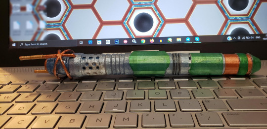
I had designed my own Sonic Screwdriver. Quite proud of it, too!
But to fabricate it, all I could really do was 3D print it, and while it's lovely for a hunk of plastic it just doesn't do anything.
So I asked a wizard.
Custom Sonics are absolutely amazing at making Sonic Screwdrivers. I sent them 3D turnarounds, photographs, and design documents and good (time) lord did they knock it out of the park.
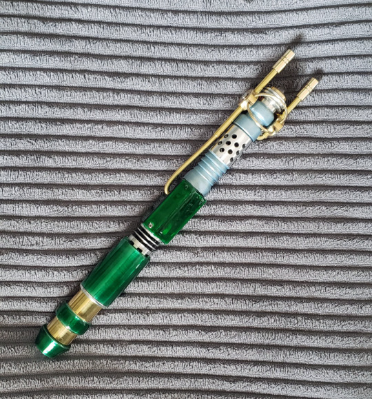
Look at this!
It's absolutely beautiful!
Machined in real metal, with brass accents and durable resin grips, and fitted with lights and sound. Its weighty but light, feeling good in the hand.
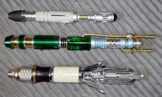
I feel like it certainly measures up to other Sonic Screwdrivers!
I am so happy and so proud to have this in my collection.
If you want your own Sonic Screwdriver, definitely consider Custom Sonics for replicas, original designs, or to get a quote on your own custom design! (I'm not being paid to advertise, I promise lmao)
About the design:
I wanted this to look like the original Sonic Screwdriver had been built upon over the years, rather than simply being replaced. So there are elements of the Sonic Screwdriver seen in the Classic series acting as a base for the design, with everything else added on over the top.
Thinking of how the Doctor might improve on that original design in-universe, I thought about its weaknesses as an item. The Doctor could easily drop it and it might roll away, so I added a flat-edged grip. It also gets used a lot, so I thought it should have a ventilation system to prevent overheating. There are two sets of vents: the round ones near the top, and more subtle square ones near the grip.
The War Doctor uses the original Sonic Screwdriver but with the emitter head removed. We're never told why, but I like to think this, along with the additional piece added to the base, was done to give it more power. With that in mind, I thought perhaps an even more powerful Sonic Screwdriver - without an emitter ring - would need something to focus and stabilize the sonic waves. The Eleventh Doctor's and Fourteenth Doctor's Sonic Screwdrivers have "petals" which may or may not serve that function. This design has two additional emitters mounted on antennae to focus and stabilize the beam. The emitter head has a screw thread so a new emitter ring can be screwed on. I did design an emitter head, but with the stabilizers, the shape wasn't very satisfying, so that went unfabricated.

The base was left with an opening, which I imagined would allow it to plug into the TARDIS. This worked out well as it left room for Custom Sonics to install a charging port.
The brass rings were inspired by the Dalek Time Controller and The Rani's TARDIS console.
The silvery metallic blue colour was inspired by K-9.
The emerald and brass colours were chosen simply because it's my favourite colour combination. The use of brass was also inspired by clockwork, with its obvious relation to time travel and my own personal enjoyment of clockwork.
So that's my custom Sonic Screwdriver!
17 notes
·
View notes
Text
For today's fic, we have an absolutely amazing one called Meet Again by @northpen.
I got introduced to this one by some gorgeous fanart by @teircetea. (Reblogged after this post on my blog). They're a wonderful artist and the way they use colours is the Thing that made me want to read this fic. If someone with such fabulous art read and loved this fic, then it must be a good fic.
And it was MORE than good by a long shot. It was so fun to meet all the new versions and learn about them. The world building in this was so good. It tackled mental health so well. I loved the characters and how they interacted and how they viewed the world.
(more under the cut)
I think the one thing that stuck with me was Nya's struggle with chronic pain. It made me have to put down my phone and breathe a few times. I had to take breaks and dry the tears from my eyes.
Personally, I have my own chronic pain struggles and permanent nerve and bone damage in my right ankle. And seeing Nya struggle to do the things she loves, to be scared to do the things she loves, because of her knee injury hit me. I understood. I know what it's like to be frustrated because you can barely walk. I know what it's like to feel incapable because of your pain. This fic had one of the most impactful depictions of chronic pain I've seen in a long time. Amazing job.
ANYWAYS BLAH BLAH BLAH who cares about the feely emotional stuff. What really matters is Kai's whole character. Oh my god I literally can't even get over how much growth he went through. Getting to see his character start off as a rebellious teenager who matures into a father figure and emotionally mature adult who cares about people was so cool. It happened gradually and didn't feel forced. He felt like a real human being.
Amazing job to the author for writing the characters so well. I absolutely fell in love with every single one of them.
The storytelling in this was so good. The villains felt more natural than even some of the canon villains. The plot made sense but the plot twists were still shocking. It wasn't predictable, but it also wasn't bizarre. It was a perfect balance.
Anyways. Overall. This fic was absolutely heartbreaking but also so funny and humorous. It has an angst sandwich with angst sprinkled in, but most of the filling is fluff and humor. It was an amazing and natural piece of writing on life and death and how to cope with all of it. It appreciates grief and understands it comes in all shapes and forms and knows it's unavoidable, but it accepts it and shows you that you can ease your grief with a lot of healing. It was beautiful. Had many moments that made me pause and giggle and kick my feet or cry or laugh or stare in shock or reminisce or just feel and focus on the writing.
Beautiful fic, would definitely recommend to anyone who's looking for a fantastic longfic with many different feels and a connection to the characters. Don't let the lack of tagging scare you lol 😂
Amazing fic, 10/10, thank you for birthing it into the world, author.
#ninjago cole#jay ninjago#ninjago jay#lego ninjago#ninjago#cole ninjago#kai ninjago#lloyd ninjago#morro ninjago#ninjago fandom#ninjago kai#ninjago lego#ninjago nya#zane ninjago#ninjago zane#jay walker#kai jiang#kai smith#nya jiang#nya smith#zane julien#cole brookstone#meet again#abstractpenny#pennys-fic-reviews#ao3 fanfic#ao3 link#ao3 recs#ninjago fanfiction#fanfic recommendation
18 notes
·
View notes
Text
Mini IAB! update for the Poppy Playtime fans
Hey, people. Hope you're having a lovely day/night so far, and if you're not, I simply wish you the best.
Now, I've been seeing the very positive reception this post for my takes on the Smiling Critters for Sonic: Into, Across and Beyond! got over the past few days, and I'm really happy for that new support. You should go check out the original artist (whose work was not made solely FOR the project, of course), as they did a wonderful job integrating the crew into Mobians.
Of course, the Smiling Critters are going to be the ONLY thing representing the game for all of IAB!, and I don't want that to detract away from the main focal points of my project. That means none of the other Poppy Playtime characters (e.g., Huggy Wuggy or Mommy Long-Legs) are going to show up in any shape or form; only alluded to on rare occasions.
While you're browsing this, I'd like you guys to come along and check out IAB! more as a project. It's my massive love letter to all corners of the Sonic the Hedgehog franchise (both official and fanmade), and contains a whole array of colourful characters and storylines, just like its major inspiration, the Spider-Man: Spider-Verse trilogy. And to think one idea from a friend evolved into a diet Spider-Verse, eh? 😅
You guys definitely deserve to stick around my profile to see what there is to offer. I've done backstories for a lot of the cast thus far (with supporting characters and villains as my next focus), as well as some general lore tidbits and full-on scripting posts if any of those peak your interest. I know I can't force you to look at it, but please do take it into consideration. I do want the other posts to gain a similar level of traction as the Smiling Buddies post.
(Plus, I've got the game counterparts of Sonic and Shadow in all their glory, if that interests you too!)
Well, that's all for this update. Catch you in the next one!
#sonic exe#sonic the hedgehog#spider verse#sth#sonic#sth au#sonic fandom#sonic au#spider man#poppy playtime#smiling critters
10 notes
·
View notes
Note
For the ask game, marvel superheroes? If not, metroid
Thanks for the ask! Gonna try for Marvel here first but I'll gladly do this for Metroid again! Not limiting myself to heroes cause 1. Can't think of too many that catch my focus 2. The breadth of characters on any end of hero-villain spectrum gets me
Blorbo: Spider-Man is my real one. Always has been, always will be! This dude was a fave before I could even pronounce Spider-Man
Scrunkly: can't think of a particularly shaped one but closest coming to mind is Gwen/Ghost-Spider. Adore her colour pallette and especially the stylization of her world
Scrimblo Bimblo: I don't pay enough attention to general community stuff to know who really counts as underrated. But! I feel like Sandman has a lot of potential with how often he's depicted not wanting to cause trouble or just a guy dealt a bad hand. Any media exploring that side gets good stuff going and it's always unfortunate to see him reduced to "evil guy #4136"
Glup Shitto: Power Pack my beloved. These kids were included in some Spider-Man comic pack back in the day and I just. These kids stuck with me. Never heard anyone talk of them. Never found enough of their comics to know if they had any longer plot lines than "a dimensional rift opened in the basement while mom was out" or "a skull crashed in our backyard" or "a mutant kid keeps teleporting to bright lights so we carried him home" but they always had a great charm to them
Poor Little Meow Meow: the Spot, specifically the AtSV depiction. Textbook definition of sad wet beast that embraced the sog and became all-powerful. Such an intriguing villain, can't wait for BtSV. Can you tell I really like Spider-Man significantly more than the rest? Lmao
Horse Plinko: any good depiction of Eddie Brock is already in the torment zone. Either deserved (rudeboy) or rooting for escape (goodboy) but knowing he can only find moments of peace
Eeby Deeby: fuck Tony stark. Cool robots to not absolve you of ruining MCU spidey by making it all about you. Superhell. Fuck EIDITH
2 notes
·
View notes
Note
Hello! I've been following your art for a while now and wanted to let you know that you are really amazing and that your art really inspired me to draw! Would you mind if i asked you how you ended up with your artstyle? its so cute!
Thank you for saying this! I'm very flattered to hear I've inspired someone! I don't really have words to explain how flattered I am every time someone says something like this to me, but it's a lot!!
As for my artstyle: I've never really pushed myself towards a particular aesthetic. I think my artstyle can best be described as "I figured out what sort of shapes my hand naturally likes to make when I draw, and then I leant into that"; there are certain sorts of shapes, or certain angles/curves which I easily default to, and most of my artistic development has been in figuring out how to work with my natural inclinations.
That said, something I do a lot is to temporarily pick up certain techniques from comics I've been reading, and see how they work for what I like drawing. A solid 90% of the time they don't work for me and I end up dropping them after a couple attempts, but sometimes I end up vibing with them and they stick around long-term (some examples are my coloured internal lines, or the way I'll often leave "breaks" in the internal lineart, or even the way I like to draw little cheek blushies on characters). There are definitely things I'd like to do more of - as an example, I super admire artists who make use of heavy spot blacks to define characters and I'd love to do more of that myself - but overall I've never specifically pushed myself towards a particular aesthetic because my focus has always been on what I find enjoyable to draw.
So uhhh tl;dr I guess my answer for "how [I] ended up with [my] artstyle" is that I chased my joy? I did what I found fun and then kept doing that super hard, and apparently I eventually ended up with something distinctive and which people enjoy looking at. I think the most important thing about art is to make yourself happy while you make it, and everything else is secondary.
5 notes
·
View notes
Note
I adore your artstyle. I feel like I'm never happy with my own cause it looks so boring and unstylized. Got any good tips?
AHHH THANK YOU ANON!! <<333
And believe me, I’ve been in your shoes. Seriously. Even now, I still have 26474885 new things I want to try with my art and things I want to change. But I DO have some tips for you- hopefully theyre good tips!
So, I think one of the key things is looking at other artists and pulling their art apart.
Practice and spending the time actually creating art is important, but I’d argue that spending time analyzing art is equally important. I spend a lot of time looking at art, and then instead of just staring at it, I try and figure out what EXACT elements of it that I want to incorporate into my own work. For example, if I like the way somebody does lineart, and the way another person does their rendering, I’ll try and figure out how they did it & why I like it & try to combine it with the way another artist does rendering or lines/the way I want to do them. I spend a LOT of time pulling at apart, seriously. I send various pieces to my own private discord server channel & literally talk to myself about them and what exactly I like about them and how EXACTLY I want to change my own work. I do probably as much typing as I do drawing when it comes to art.
Also, a good question to ask yourself when you see a piece of art you like is “I like this art, BUT- do I want my art to look like this?”. There’s artists whose styles I ADORE, but I don’t want my art to look like theirs- for example, I love looking at people with super heavily stylized art with only flat colouring & no rendering, but it’s not how I want my art to look & isn’t the type of art that I enjoy creating.
So, being able to pull apart various pieces and go “okay, WHY do I like this piece and DO i want MY art to look like this?” is something that’s definitely helped me.
I also think it’s super important to set actual, solid goals and figure out what you want your art to do.
What I mean when I say “figure out what you want your art to do,” is in terms of “okay, well, do you want everything more flat and visible with less rendering and less volume? or more rendering and more volume? Do you want to focus on design/concept work? Do you want to be able to do complex poses or complex lighting or both? What matters more to you- having a painting with dramatic, heavily contrasting lighting, or having a style where everything is easily visible & not obscured by shadow, or some combination of the two? Do you want to be good at drawing couples? Complex backgrounds? Both? HOW do you want to draw those couples and complex backgrounds? Lots of volume? Minimal volume? Focus on lighting? Focus on lines? Somewhere in between? tc"
Personally, I try and visualize it as a give and take situation/a sliding scale with tradeoffs when it comes to stylization. On one side of my scale, I’ve got super linework-focused, flat colours art that’s more focused on shape and less focused on volume and minimal lighting. On the opposite side, I’ve got super rendered, painterly art with complex lighting. And I’ve been trying to find an ideal combination of the two, and that’s where the tradeoffs I mentioned come in.
My work used to be even MORE linework heavy than it is now/flatter (which is great, just not the direction I wanted to personally keep going), and I had SO much trouble doing painting/rendering and it frustrated me and I couldnt figure out why. But then, I realized I had to make a tradeoff- my complex linework didn’t work well for heavily rendered styles, because the sketches/drawings/lines for paintings on that “super rendered basically no visible linework” side of the art scale are generally meant to be more for function rather than form.
My lines weren’t serving the function they needed to, they weren’t doing the heavy lifting that they needed to, so the rest of the painting would collapse & wouldn’t work and I would get frustrated as all hell when trying to paint.
What I mean when I talk about the lines doing heavy lifting is what I said earlier with the sketches in painterly styles generally being more function over form. I needed to think of my lines as supporting the painting and acting more as a *map* for things like the lighting (see: shadow mapping) & as using fewer lines to make room for more volume (the tradeoff). My lines weren't doing that, I wasn't really thinking about where I was putting them/how I was using them/how they interacted with other elements of the piece (such as the lighting & how that affects the way I do lines).
I also highly highly highly recommend the book/resource "anatomy for sculptors"- you can find a bunch of excerpts from it on pinterest/all over the internet, but it really is a phenomenal resource and a unique resource IMO because it does a really great job of demonstrating the link between the anatomy vs the planes of the face/shapes that make up that anatomy, and bridging the gap between 2D shapes and 3D forms.
Also, just some basic tips that help me in general: -Your areas of detail should also be your areas of high contrast. This sounds more complicated than it actually is, but basically, it doesn't matter how much detail you put in a low-contrast area of a painting, because it won't show up (because it's low contrast). So, keeping your high contrast areas as your detail areas is a good thing to keep in mind, esp when working on more complex paintings. -General proportion "rules". I try and keep in mind some general rough tips like "the eyes should have the width of one eye between them," and "the face should be roughly the sized of a splayed out hand".
-Straights vs curves. I think about the straight lines vs the curved lines a LOT in my art.
-What works for me may not work for you. Different people think differently. What works for other artists may not work for either or us. What works for other artists may work great for you but not for me.
Also, experiment with different brushes. They DO make a difference. No brush will fix a lack of understanding of the fundamentals, but a brush that works for you will make those fundamentals easier to learn/apply. Personally, I draw with a combination of the default photoshop pressure opacity tapered airbrush and one of Ruan Jia's free textured square brushes.
And also, experiment with overlay layers/all those different types of layer. Seriously, that was a gamechanger for me, especially in terms of stylization and giving more of my art that warm feeling/look that it has. My art actually usually starts out very cool toned and I slowly warm it up via colour changes and various yellow (or other colours) overlay/soft light etc layers.
And I don’t say any of this to box you in/overwhelm you, just to give you a list of things I wish I knew sooner.
Also, I think people focus too much on having one consistent style. I 10000% understand needing to have a consistent style for commission purposes, but as far as just developing your art goes. just experiment and figure out what you like and what works best and the style WILL come.
ANYWAY! Hope this helped, I'm like half awake rn so it's not as coherent as I'd like it to be.
2 notes
·
View notes
Text
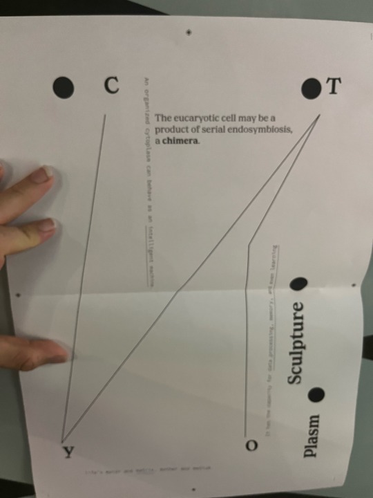
a new draft law of my formative poster. This direction feels a lot better for me. At this point I think I’m going to avoid using any colour because I think the composition I’ve ideated works best with only black and white point and line to guide the eyes. I’m currently considering integrating data oriented compositional elements as well adjusting the type of grid I’m using to better adapt the shapes I’m using. Still, I want to keep circles in my design since I want that rounded contrast to stand out among the lines and type.
I may consider doing something more playful or abstract with the circles to introduce more of an organic feeling to the poster and bring out some depth and balance, if I end up using more data-style elements I think this will work best.
Currently I’m using Ernst serif and adobe source code serif (?) because the science papers I draw writing from used serif style and so the association with science, and information but also “older” type works quite well with something also data associated but in a more modern way like source code.
I think if I were to develop this draft further specifically I should focus on the weight of the typography. The lines are feeling disconnected and not as harmonious as I would like. Right now it definitely still FEELS like a draft.
1 note
·
View note
Text
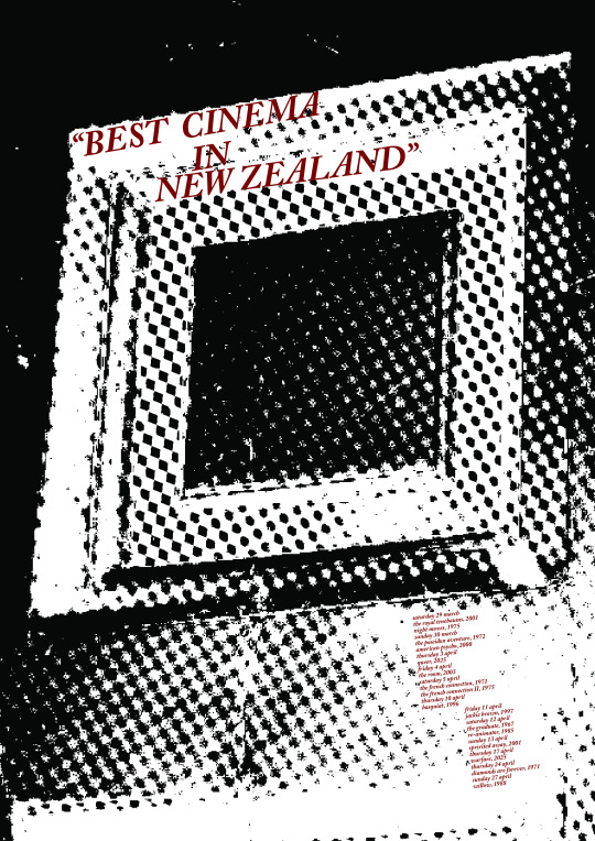
After receiving feedback from last week's class, I went back and did some more experimentation this time really focusing on type and incorporating suggestions into my work. My work here is quite simplistic in terms of colour as I didn't want to stress about it.
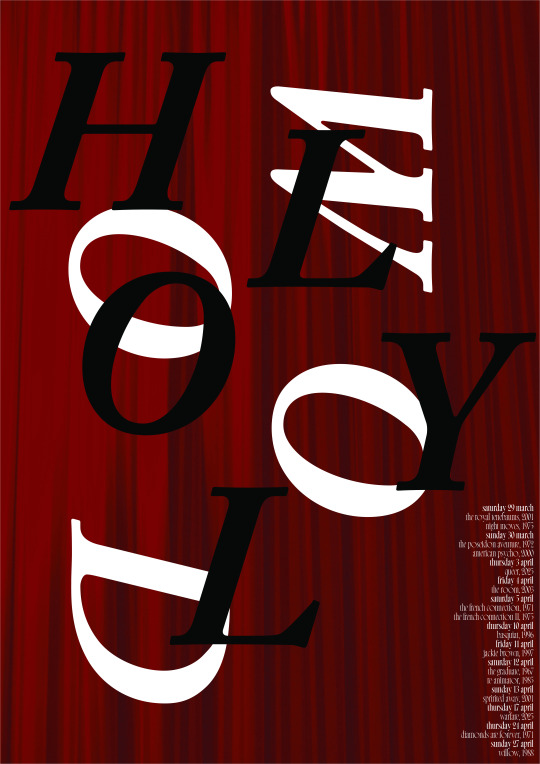
This first poster I created really hones into the coffering around the stage showcasing the architectural elements of the Hollywood. I wanted to use Quinten Tarantino's quote that is found on the Hollywood's website where he says "best cinema in New Zealand" as I thought it would be good to use a quote from a famous filmmaker. I've put the text on the same angle as the coffering in order to make the image and text blend into one another. I think if I were to develop this design, I would make the text stand out more and make the image fade into the background more in order to make the text stand out more. Otherwise, I think this is my strongest design out of the lot.
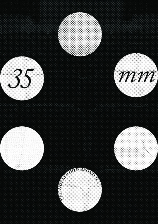
The second poster I created was an effort to focus onto the film aspect in that the Hollywood still uses 35mm film to showcase their films. This is something that they are proud of as it leads into the authenticity and differentiation in comparison to other cinemas. I've used the seating as a texture for the circular shapes and background. I think this design was a bit rushed and could definitely be improved.
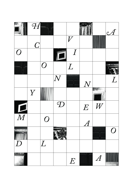
My third design uses a grid format and I have filled some of the squares up with letterforms and some different architectural elements found in the cinema. The letterforms (when properly arranged) spell out Hollywood Avondale Cinema. I think the face that they are jumbled up adds a level of interest and draws the viewer further into the poster. I think if I were to move forward with this poster, I would add some colour as well as play around with the typeface more.
I think that my chosen poster from last week and the first design I've done for this week are my strongest and so I will combine or keep developing the two for my final.
0 notes
Text
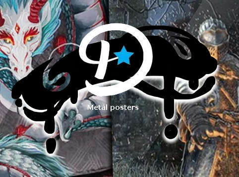
‧͙⁺˚・༓☾ BANNERS ☽༓・˚⁺‧͙
Currently, this is Displate's twitter banner. Although it clearly shows some of the metal posters they sell, I think I can make some adjustments. Similarly to how I enlarged the poster thumbnails for the web design update, I could do the same thing for this banner. I think it would benefit from being enlarged, like so:

The blue background is distracting and unappealing. If I were to remake this banner completely, I would cover the entirety of the banner, leaving no blue background. I think it could benefit from just showing the posters, without gaps between them. I will show exactly what I mean below

I tried to retain the 3d look by adding shadows, and drawing some metallic shine on each poster. Displate's original banner shows the texture and gloss of the posters better. This example is just a draft.
I could elevate this banner by adding the logo of the brand on it. I'll attempt placing it in the corners of the page first.


It's a little hard to focus on the logo if it's placed in the corners. Not to mention the logo would be entirely covered if placed in the bottom left corner. The final option is placing the logo in the middle of the banner.

Already, the logo gives the banner more personality. The logo's placement also looks a lot more natural and beautiful when placed in the centre of the page. I think I can elevate this design even further, by drawing a backdrop for the logo.
The logo's animation is pretty fluid and reminds me of liquid, so for the logo backdrop I can do something similar. Following the brands identity is crucial.

I started with a simple shape and added more and more movement and fluidity to it. Below is what the shape looks like with the logo added on top, and a few effects to make it look more three-dimensional. Some shadows and light.


I attempted adding a few more shadow/lights. This made the design look crowded. I decided to scrap it and aim for the simplistic look.


This is what the graphic looks like on top of the banner I made. Although it already looks pretty good there's lots of adjustments I can make. The graphic does not seem centred either. I will move it up.

To make this design prettier, I can make the dark shadow a different colour, like blue, white or yellow.


I used the blue in the logo, white and yellow. White looks bad, as it clashes with the "D". While yellow doesn't necessarily look bad, it definitely doesn't work as well as the blue.
Now that I decided what I like and dislike, I can make a final version of this banner. The adjustments I proposed did help make the logo look prettier. Even if this is the "final" design, I still have a few ideas I want to execute.


I tried putting a filter over the posters. This was to draw more attention to the logo, while also encouraging the audience to squint in order to understand the images in the background. The longer they spend squinting, the longer they are spending on Displate's page. This is a bit like bait marketing, reeling in the viewer and enticing them to keep looking, eventually buying a product

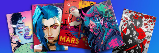
After looking through Displate's collection of posters I found these ethereal cosmic pieces. I wanted to make a banner with this different aesthetic. People enjoy cosmic themes, but it's a bit more niche than Spiderman or Star Wars. It's beautiful, but it won't sell as good as the posters above.
After that experiment, I wanted to see what the graphic would look like on a plain background. I used blue because that is Displate's main colour. The top design is a little eye straining, while the other 2 don't have enough contrast. I wouldn't use these designs in a final piece but I think they were good experiments to conduct.


I realised that the stroke behind the logo looks like Calligraphy ink. These types of ink strokes are popular in Japanese designs and artworks. I thought I could develop something using that idea.

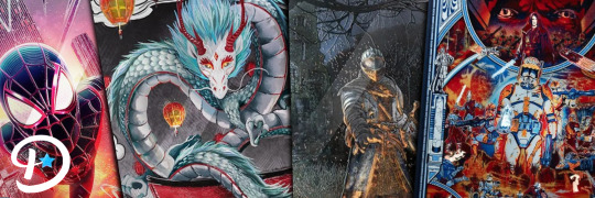
Displate has anime posters. Anime originates from Japan. This banner combines those two aspects.
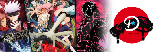
Displate is a polish brand, so I would not encourage them to use this kind of design for their brand, as it might attract discourse of cultural appropriation. However, if they become a large enough company to make accounts for different regions like this:

Then it wouldn't be a bad idea to use a design like that.
⠁⠂⠄⠄⠂⠁⠁⠂⠄⠄⠂⠁⠁⠂⠄⠄⠂⠁⠁⠂⠄⠄⠂⠁⠁⠂⠄⠄⠂⠁⠁⠂⠄⠄⠄⠂⠁⠁⠂⠄⠄
Due to my time constraints I could only afford to make one banner. I will draw my conclusions in the next post.
0 notes
Text
It’s midnight and I’m thinking of what my aesthetic would be described as in terms of my spaces and makeup rather than clothes.
My interior design for my bedroom is definitely shaped by my love for museums and the way they display things in old museums. There’s a very coastal vibe to my room because of all the shells and coral, but I try to add a touch of history and intellectualism with the books. Idk if that rlly comes across as much as I’d like, but I suppose it takes a certain type of person to understand the art.
I want to take elements of grunge, like the Fiona Apple « criminal » music video, but make it like North Shore rich kid grunge. Lots of white and middle class status symbols but depicted through a grunge lens. Like « Party at a rich dude’s house » but after you tried to clean it up cos your parents are coming home. I want to blend luxe with trashiness in a way I can’t quite put my finger on yet.
Like I rlly like the grunge aesthetic and the eclectic look of rave culture, but I want to maintain a degree of sophistication and middle class prétention because in some sense that’s all I’ve got…
In terms of my makeup style, I’d say it relies on small focus points that make it look like I’m wearing a lot more makeup than I am. Like if I do an eye look, it’s indiscernible if I’ve also got concealer or foundation on — honestly once I have an eye look or a lip colour on, I could be wearing a full face and it would look the same. I have a theory it’s because I have quite a high contrast complexion with my dark eyebrows, eyes and lips, so everything in between looks a lot more evened out. So, when I wear foundation and really even out my skin, it just looks scary because it’s just eyes and lips poking out of my face. Yes sometimes I do like that look and I do it for dramatic effect when I want to make a statement.
So yeah my makeup style is mostly about bold eye looks. Recently I’ve been really drawn to blue eyeshadow. Today and yesterday, I focused the colour on my inner corner and dragged it down beneath my eye where there’s a natural shadow, instead of bringing it onto my eyelid like I usually would. It actually looked so cool and honestly went with my face better than eyeshadow on my eyelid.
I think that’s something I’ve been thinking about especially this year: the natural shadows and shapes on my face and how I can use makeup to trace them without forcing lines or angles. I simply want to decorate, not change my face. Even contour I usually neglect because it draws attention away from the more important places on my face.
It’s funny to think how insecure I am about looking « European » when in reality it’s probably quite a covetable look. Ig maybe it’s just a delayed adolescent desire to blend in and be normal. Because when I hear « you look European », I hear « you look like you don’t belong in Australia and your parents are probably immigrants and you’ll never truly be part of Australian culture », which is definitely a lot of projections and internalised nonsense. But yeah, I don’t really take pride in being European, like maybe I should. I more so see it as something that holds me back from being « one of the beach boys ».
Like ideally, I would look like this guy
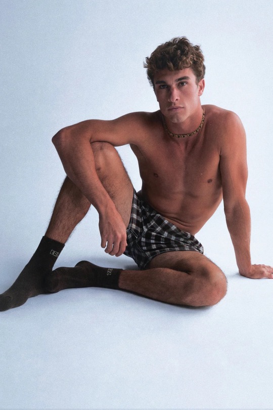
But I realise that it’s simply not possible.
I covet that all-American look so much because I know I will never attain it.
Anyway, so makeup-wise, I try to make interesting edits to my face. Lots of bold eye looks and interesting textures. I try not to construct entire eye looks because they just feel too « travaillé ». I want to look effortlessly cool - like I’ve just put colour on my face because I’m so liberated from conventional masculinity and I’m a bit of a party girl who also blends into polite society ». For me, it’s about creating that tension between classic and rule-breaking, which I think expresses my personality more than an overt expression of either one. Like if I went full Alt, something of my innocence would be lost, but if I went full classic, dressed like a 50s leading man, I would feel like I was performing masculinity.
I actually think my style is interesting because of what it says about my position in the world. There’s is a pressure to perform masculinity to keep the peace, but I think I take it to an extreme by wearing collared shirts and quite formal clothes on the daily, almost as a backlash against the pressure. I’m giving them what they want, but in a way that pushes it too far and makes them uncomfortable. If they want good boy, then they can have it, and I’m not going to do that mild teenage rebellion thing of wearing band tees and sports clothes as my way to « break out of the mould », because that in itself is a moulded way to break out of the mould. My style is almost a parody of masculinity.
Idk maybe I’m giving myself too much credit here. I’m not making some bold statement against the stifling patriarchal hegemony of suburban Sydney by wearing country road. I mainly wear country road because my mum buys from there and trust the brand and because I know their clothes are good quality and generally safe. Like ik if country road is selling them, they won’t be outrageous on the streets of lindfield. Because I don’t trust my judgement when it comes to what is and isn’t « too much ». I tend to take things a bit far.
Im wondering what makeup I’m going to do tomorrow for work. Part of me is feeling a blue eyeshadow under the eye moment, but maybe it’s more of a burgundy lip day. Idk either way I want it to be a bit avant garde and runway, but not too effortful. I never want to look « travaillé ». Even though the simple act of wearing makeup is travaillé in itself. See, again, my life is defined by tensions that translate into my aesthetics
0 notes