#I should just color and shade sketches more often without really lining
Explore tagged Tumblr posts
Text

That rabid dog Undyne except if I was the one designing her ig
#UNIRONICALLY SHE TURNED OUT SO CUTE GUH#idk if the legs work but then again I make spontaneous descisions and then regret them all the time#I really liked the idea of her having a big bolbous tail even though she doesn’t need that at all#I think it looks REALLY cute on her ngl :)#also instead of hair I gave her a giant fin that sorta resembles a… Mohawk?#there’s a term for this hair style idk if Mohawk is exactly it but oh well#I should just color and shade sketches more often without really lining#Undyne#Undertale#Deltarune#art#digital art#The Kiwi Draws
32 notes
·
View notes
Note
How do you color in your art?? I can never make mine look right, i’m still relatively new to procreate and I just wish I could instantly know how to use it because AGEGGS
I don't use Procreate and I'm not sure what you're personally having problems with, so I'll just go through my process using some of my old drawings and try to give some general advice that might help
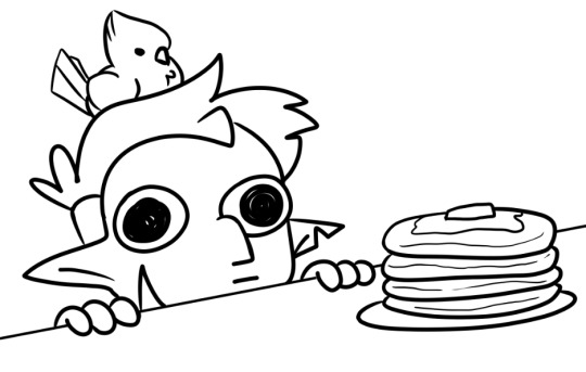
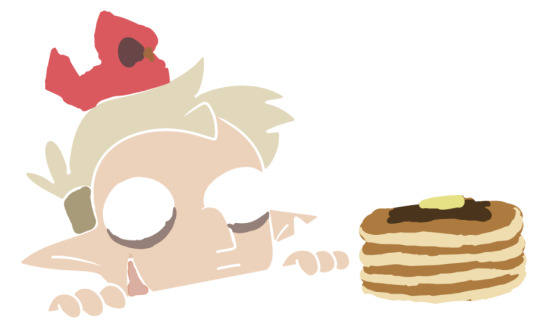
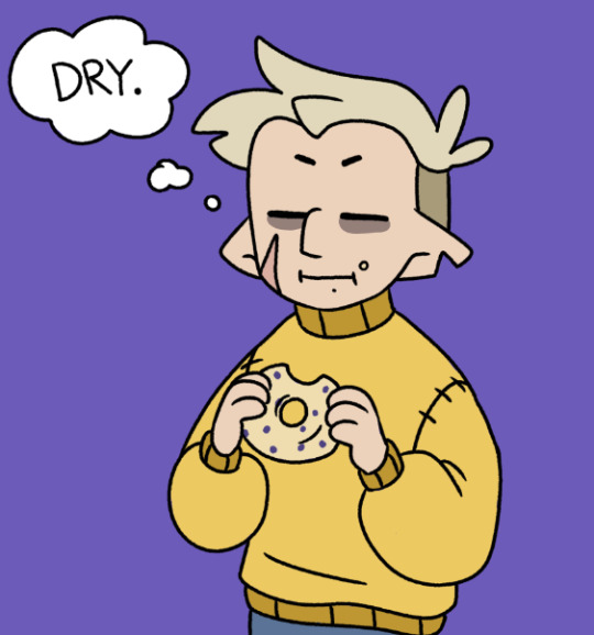
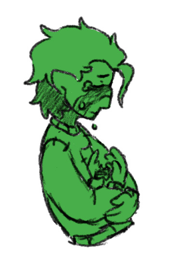
So I have the line work of "Hunter wants pancakes" here. I usually copy images from screenshots of the show and paste them onto the canvas so that I can eyedrop the colors, but I probably had it on a different canvas there.
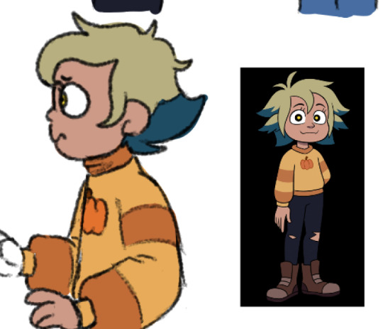
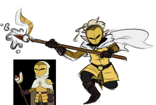
Sometimes I'll change the colors a little bit for clothes to make them a bit brighter or less saturated (depends on what I think looks better), but really for fan art of characters that already have a color scheme, I just copy the colors.
But your line work is going to be your topmost layer the majority of the time. All the coloring stuff should be underneath the line work so that if you do color into the lines, the linework isn't impeded
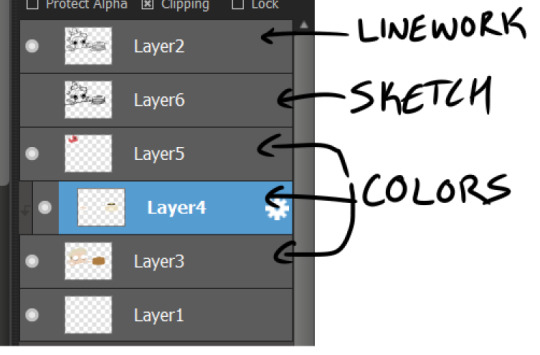
I typically put all my colors on the same layer, but feel free to use layers in whatever way is more convenient for you. (When I'm doing lineless, I'll typically make a new layer for each color so that I can shade them individually later on. Idk if that's at all smart or convenient but it's just a thought)
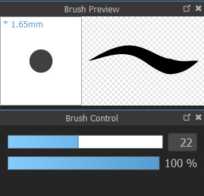
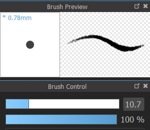
As for the actual act of coloring, I pick a large, textureless brush. You could use whatever you want depending on what kind of look you're going for, but for my finished pieces I usually like the coloring job to look cartoonishly clean. Like you can see that the second brush changes opacity as it reaches the end of the stroke (or with lighter pressure, since I use a pen), which I don't want, since I prefer the colors to be uniform in shade and texture. So I use the first one instead. Also less texture helps keep the color in the lines from my experience.
I don't use the paint bucket tool very often because it typically won't fill in all the white space, especially when your work is more detailed (which would lead you to have to go back and go over all of the edges again with a brush anyway), so I color most everything manually now. But for "Hunter wants pancakes" I think I did use a paint bucket and then probably went back to fill in some of the gaps since there are clean white gaps where the line work would be.
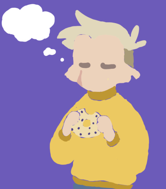
That is to say you should color with your line work visible (I don't know who wouldn't but I'm trying to cover all the bases here). You made yourself a coloring page, now you get to enjoy it. Without the lines it can look pretty silly and very messy, but it doesn't really matter if it's going to be covered up by your line work anyway.
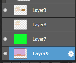
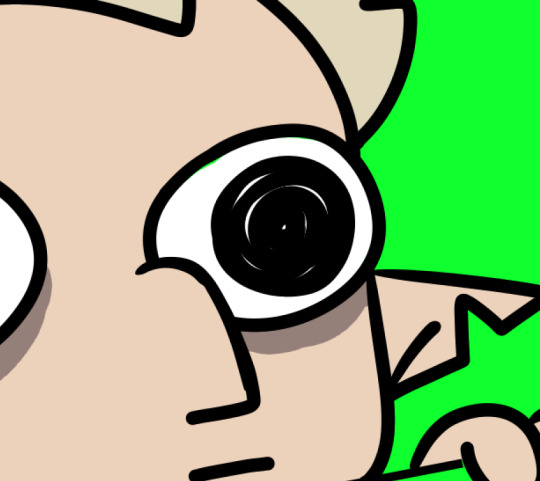
Sometimes when you're coloring with lighter shades on a light background, it's hard to tell if you're missing a spot. I like to use a really REALLY saturated color like neon green or red to see any gaps in the color. Put the layer of neon green under the color layer and it will become very obvious where you missed haha. Sometimes I'll look at the neon color for too long and will need to change it to refresh my eyes
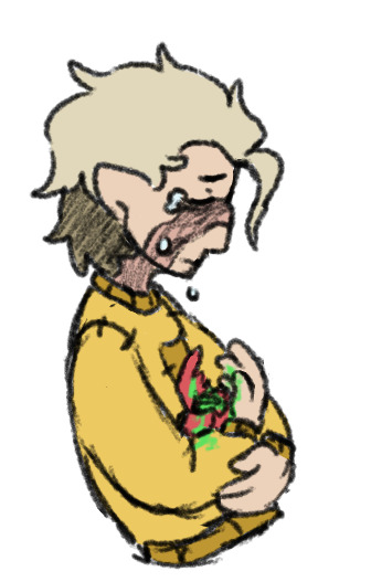
This colored sketch isn't very clean but it shows that you can also make a clipping or masking layer (if you don't know what that is the Internet could honestly probably explain it better than I could), color over the whole thing with a different color, and lower the opacity to give it a cool-looking tint
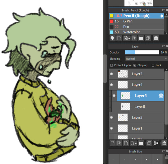
I don't know what your specific issue was but hopefully I was able to clear at least something up for you
19 notes
·
View notes
Note
I love your art! (I clicked on your art tag and started scrolling.) What is your process for creating a piece? Do you usually look at a single reference photo which you draw from? Do you somehow incorporate photos into your drawings by drawing over them? (I did that once on a tablet.) Or do you use another method? Thanks!
omg hiiiii thanks so much!!!!!!!!
my process is a bit all over the place (I've tried to describe it before with not much success, maybe now I can do a better job hahaha) but yes I always need reference photos, I can't draw anything from my imagination :( sometimes I use more than one picture, but most times I think I use just one photo that I really like and want to reproduce.
when I'm feeling super inspired and I have a lot of free time, I draw from observation only. And then if I get stuck on a particular spot that I feel I can't get right, I overlay the reference picture and make the necessary adjustments. I've been replicating images for such a long time that nowadays I can usually overlay the original over my drawing and 90% of lines match 😅 And when I draw on paper I do the same thing, I place the paper over my screen to check if the lines are where they should be, but always retroactively, first I draw then I check.
I actually started out drawing everything upside down! I learned that technique with another artist (I took a course when I was in high school 15 years ago), cause apparently if you flip your reference upside down, a house stops being a house, eyes stop being eyes, a mouth stops being a mouth, so you can focus on distances between points, lines, areas and proportions only, without thinking "oh a mouth looks like a little cartoon bird on top of a minimalist boat" or whatever, but rather "this shape is about the same size as that one, and is positioned in relation to that other one and that other line..." So that's sort of how I learned to draw/replicate I what I see (if that made any sense). And replicating a photo is much easier than drawing reality cause a picture is already 2D, when I'm drawing something real I have to convert the 3 dimensions to 2 in my head and I often get a headache by the end of the process lmao
Sometimes I don't have the time or energy (it takes a lot of effort from the brain to do the observation thing) and in those cases I do some lines over the reference pic just to get key areas, then I delete the reference layer (of course I keep a copy in another corner of the screen so I can keep looking at it) and paint over the sketched lines till they mostly disappear.
I think painting is the most fun - either in color or b&w - getting the shades to blend and the painting to look realistic is the part that I like most.
I usually paint on photoshop but I recently got a tablet and I've been trying out new software on it. I mostly require a soft brush with opacity varying with pressure. I start out by doing blocks of color and then I blend blend blend.
I often think that my art is not very good (sometimes I question whether it's art in the first place), cause the only thing I'm good at is copying what I see, and because of that I've been trying to play more with colors and textures, trying to make my paintings a bit more different than their reference photos, a bit more "artistic" idk. I wish I could do more stylized stuff. But the realism can be fun too, it relaxes my brain after a whole day of PhDying.
Thank you so much for the ask!!! And for telling me that you like my stuff (ಥ _ ಥ) means a lot <3
#I hope this made some sense??#I think I'm gonna try to put some examples in a reblog later#thanks for the ask!#wild-raven-and-crow#kirk.goes.to.gallifrey
9 notes
·
View notes
Text
FINAL CURATED PORTFOLIO & Artists Statements
1) sketched ideas from first weeks and movie notes day one. !!!
Notes:
My favorite artists: Betye Saar and Joseph Cornell. (Betye Saar is one of the artists that I personally enjoy the most out of all these collage artists)
Bette Saar:
used her work in assemblages to make radical statements in support of African American communities and the civil rights movement.
Her pieces elicit an emotional response by using carefully selected objects that have historical value in a poetic way.
One of my favorite pieces: “The Weight of Color”. I particularly enjoy her use of racist toys to construct her message, I see it as a way of reclaiming power.
Joseph Cornell:
ability to create a mysterious and elegant habitat within his pieces with the aid of thoughtful layering, balance, and overall, a great attention to detail.
The complexity of his pieces are compared to “miniature theaters” in one of the videos and I feel as if this encompasses the beauty of his work: they truly create a dynamic and interactive experience for the viewer.
The way he reverts back to the use of birds and how that connects to the human experience according to him is really a testament to just how thoughtful every single aspect of his work was.
My favorite piece: “Beehive Thimble Forrest” as it is fascinating to me how he incorporates the tiny opening in the box to playfully invite the viewer to experience his version of a forest, creating a peculiar and personal adventure.
Kurt Schwitters:
often called the collage artist or one of the pioneers of assemblage, who was always faithful to his painter beginnings.
We see influences from cubism and expressionism in his work, but these are not what his work is about.
He moves from focusing on geometry to playing around with organic shapes throughout his career, overall using the combinations of color to add a dynamic effect that keeps your eyes moving throughout the piece as the shades blend with the shapes of his assemblages.
George Herms:
referred to as the “Poet of Garbage”
takes a different approach and focuses on the usage of forgotten and cast aside objects.
He puts these objects together in a way that, to me, is controversial, because it catches your eye. I enjoy this poetical effect in which you want to appreciate and keep looking at his pieces although they are made up of objects that should have been forgotten and cast aside.
Rauschenberg:
focused less on the type of objects collected and more on the form of the compositions
He creates pieces where the lines keep moving through space and explores his painting origins a bit further by integrating it into sculpture.
Nevelson:
also focused on form, although her work adds in a play on light and reflection, as well as her own personal narrative.
She used glass, metal, wood, plexiglass and a variety of other materials for reflection to fulfill the light effect she wants from her assemblages, and she played with different forms and lines to keep her work truly energetic.
As she says herself, her work is about energy which “multiplies in an accumulation of objects”.
She accepts color in an innovative way by adopting mainly black, white, and sometimes gold in her work, and allows the viewer to truly travel through the forms and shapes without being distracted.
Conclusion: overall, I enjoy that these artists are faithful either to their beginnings (like Rauschenberg and Schwitters), to their message (like Saar, Cornell, and even Herms with his collection of garbage), or to their desire to purely explore energy in assemblages (like Nevelson). I admire their thought process and creative innovation when putting together these pieces and hope to, one day, put together something even half as meaningful as some of these artists did.
Sketches:
Balance (Symmetrical and Asymmetrical)


Idea for assemblage

2) Process photos from assemblage.


3) Assemblage- side by side photo of final product and artist statement and title.
Title:
"A Mother is Born" & "A Woman is Forgotten"
Artist Statement:
From the beginning, I approached the assignment with an open mind. Not having too much experience with abstract art or 3D art for that matter, I wanted this project to be about learning and possibly finding a new way to express my ideas creatively. I also wanted this project to convey a message, this was kind of a challenge that I set up for myself; transmitting a message through non-representational art, which I have no experience with. I wanted to choose objects that held a personal meaning. Moreover, I wanted to choose objects that truly represented a personal duality; two parts of myself that are still trying to understand each other. I chose objects that related to my motherhood experience and objects that related to my experience as a young woman. I decided from the start that the motherhood pieces would be arranged in an asymmetrical way as to represent the chaos and messiness that motherhood entails, and that I would arrange the rest of the pieces in a symmetrical way as to represent the opposite; a part of my life that seemed simpler, more orderly and harmonious. I chose to spray paint both pieces in white because it is often associated with perfection; the perfection women are supposed to convey both in motherhood and in life in general.
In the symmetrical piece, I tried to construct an ode to a part of me that is not quite forgotten but often overlooked. Since becoming a mother, not only do I have little time to take care of myself, but even feel guilty when I decide to prioritize myself over my son. In this piece, I decided to arrange old and used beauty and skin care items making sure to keep a symmetry between the right and left side as well as the superior and inferior part of the assemblage, which I think can be noticed. In the asymmetrical piece, I wanted to portray the mess of motherhood and the way this mess can be isolating, by choosing objects like an old breast pump, an old pacifier, breast milk storage bottles, and more. Additionally, I added two necklaces to the composition as to accentuate the quality of perfection women are still expected to portray even when they are struggling to find themselves in motherhood. Moreover, I added texture to these objects to make them seem old and bring forth a feeling of nostalgia and melancholia. These objects are not arranged in any particular order other than in one that still holds some harmony, so that the eye of the viewer can flow through the piece and appreciate the chaos. My assignment is successfully completed, when I look at it, I see the message I wanted to convey, I see the two parts of myself I wanted to dissect, and I see an abstract piece of art that is extremely personal and emotional to me. I thoroughly enjoyed this assignment because it allowed me to not only explore a new type of creative expression but also to put a raw part of myself in a piece of art in a way that I don’t think I had done before.

4) Process work for Soap Sculpture


5) Photo shoot of soap and final product with artist statement and title.
Title:
"Dynamic Coral"
Artist Statement
Starting off this assignment, it was important for me to be able to rid my mind of any images or expectations of what the final product might look like and just carve what I felt just made sense with no reason behind it. It was an interesting experience to be able to think abstractly and carve a piece of art that I did not envision first or sketched. It was also very fulfilling to be able to work on this and detail it to my liking and to the extent that I wanted. I worked very intricately on every single curve and opening, smoothing it out and making sure the shapes made sense to my artistic intuition. I am overall happy with my piece, I feel like it is interesting and dynamic as it invites the viewer to enjoy it from all angles and go in and out as well as side to side with the grooves and openings of the carving. Without meaning to, I made a piece that resembles a coral, which is the reason behind the title. I also played around with the orientation of the soap and finally decided that it's meant to be looked at vertically. I chose the base to be wooden as to resemble nature surrounding this piece of coral and also chose the base to be oval and smooth to contrast all the edges and grooves of the soap.

6) Ephemeral Art - process photos


7) Ephemeral art - completed project and photo shoot with artist statement and title.
Title:
"Impermanent Freedom"
Artist Statement:
This assignment posed a challenge from the start, after working with assemblages and carvings, this constructive ephemeral art meant that I had to dig inside a whole other piece of my abstract thinking. It was however, the assignment I enjoyed the most. After finding the structural pieces and starting to put the secondary structural pieces, with no thought in mind, I kept being shocked at how something can start taking a shape when it was constructed with no sense in mind. From the bigger pieces to the tiniest pieces I added, everything was put together abstractly and in a way that felt freeing. The final product was a piece of ephemeral art that was abstract and that invites the viewer to go around and look at every opening and every area that is enclosed in this sculpture. I am very happy with the result and hope this piece made from pieces of nature that are impermanent and will eventually die out and disappear again into nature, can transmit to the viewer the same sense of freedom that I felt while making it.

8) Ceramic work process photos.
Sketches and pre-firing ceramic:


9) Museum Sketches and studies
Museum Inspiration:

Sketches:

10) Final Artist statement explaining the different processes from the semester.:
a) Additive , subtractive, constructive and critical thinking.
There was definitely a lot of different thought processes and manual processes going into every single project done in this class throughout the semester. I consider to have utilized an additive process when working with the assemblage for instance and it entailed a lot of arranging, distancing myself from the piece, looking at it from afar, and rearranging. This was a process I was familiar with, although not in an abstract non-representative piece of art, I had worked with art in which you start with a blank piece of paper or wood in this case and start adding to your liking. I underwent a similar process when working on the ephemeral art piece, although this was was more constructive than additive. Working my way from a structural piece, to secondary pieces, and finally to the filling of the spaces and the tiny details, this process entailed a lot of intuition and thinking about forms and structure. This process was my favorite because it truly allowed me to work slowly and freely from one big piece all the way to tiny and thin pieces, following shapes, curves, and forms in my mind and making sure they made sense to my personal artistic intuition. On the other hand, I was not too familiar with subtractive processes and I was able to practice through the soap carving process, which was my second favorite. In a way, I realized that a subtractive process is thinking intuitively to set a form free. I thoroughly enjoyed working with no thought in mind intricately, putting a lot of work into every single detail to make the shape smooth. This process was proof to me that many positive things can come out of just following your inner voice and your inner artist without putting too much thought into it. For the ceramic piece, I think I utilized a mix of constructive, additive, and subtractive processes in making the initial form, adding the front pieces, and carving out the texture I wanted throughout the whole piece. Of course, all the pieces required lots of critical thinking and problem solving, from materials, structure and shapes, to how each of these interact with each other. Overall, all of these have added to my creative repertoire as an artist and will help me in my artistic career to become the type of professional I aim to be.
b) what was your favorite process and why.
Like mentioned, my favorite process was, undoubtedly, the constructive process of the ephemeral art piece. It was my favorite because it felt truly freeing to listen to my inner artist and construct something without imposing my thoughts on it, rather using materials that already had a form imposed on them, and following their shape, form, and curves, to construct a dynamic piece that seemed appealing to me, not thinking about how it might look to others, just listening to what my intuition told me.
c) Final statement recommending this course to others and why.
I thoroughly recommend taking 3D design to anyone considering a serious career as an artist. I think it is important to take classes like drawing, 2D design, etc. but, in my opinion, none of these classes will open up your mind and connect you to your inner creative voice like this class will. Working with sculptures, assemblages, carvings, constructions, and even ceramics, help you bring your visions to life, sometimes visions you didn't even knew you had, in a way that make you a more complete artist.
10) Show how you used the sketchbook during the semester .
Post 3-4 pages from your Sketchbook.


0 notes
Text
Alright, you're right. In fact, that's very true. You don’t magically get better; rather, you start noticing things that help you improve. I hope this doesn’t sound obvious or silly, but here are some things that have helped me a lot:
1. Line Quality.
This is something I changed thanks to a teacher in school, and I'm infinitely grateful for it. "Line quality" (in Spanish, "calidad de línea" – I’m not sure if there’s a different term in English) refers to making the line thicker or thinner depending on:
a) Light and Shadow: Areas where light reflects on the character should have thinner lines, while shadows are marked with thicker lines.
(I personally use a thicker outline around the character to separate them from the background, especially when there's a lot of line detail in the background.)
b) To Create Depth and Separate Planes: To some extent, this feels basic, and I might be stating the obvious, but using a lighter line for distant elements helps to avoid drawing attention away from the main character or object.
I draw the closest objects with a thicker line and the distant ones with a thinner line or sometimes broken ones.
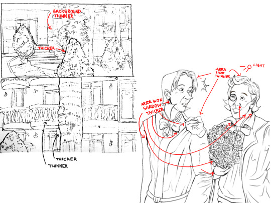

Line work should be intentional; it’s not about randomly varying line thickness. Proper line quality truly enhances a drawing, especially in line art, adding an extra dimension.
2. Volume Lines, Hatching, and Planes.
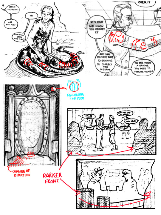
Volume lines, which follow the form of objects, are something I started incorporating this past year. It may be subtle, but it’s there. Following the shape with lines, like drawing a tube with curved lines, gives volume even without color or shading. The same applies to bodies. I also use this approach to emphasize planes in solid structures by marking the directions that follow the form. It may sound simple, but it genuinely makes a difference.
I also use hatching to darken elements in the foreground to bring them forward. Separating planes is crucial in scenes with many elements; objects in the foreground appear darker, while those in the background are lighter. Of course, there are exceptions, but generally, this is what I do. Varying the direction of lines also helps to avoid a monotonous look, and variety always brings more life to a drawing.
3. Positioning the Character and Marking Ground Perspective.
Positioning the character in the environment always adds more context to a scene than leaving the background blank. It can be subtle, just a couple of lines, but it really enhances the drawing.
I often indicate the ground's perspective or surfaces like roofs, walls, or tables. I can’t explain it perfectly—sometimes, I don’t even set up a vanishing point but imagine how floor tiles would look. A teacher would probably say this is wrong, but it works for me.
(although you probably need to learn perspective anyway, I'm on it too)
For this maybe is better watching tutorials on YouTube, particularly about storyboarding, since I can't explain it very well.
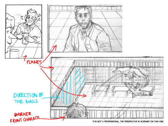
4. Use References.
PLEASE USE REFERENCES. Don’t believe the myth that it’s “cheating.” References are invaluable! Download apps with 3D models, take photos of yourself, or ask a friend to pose. I have countless photos of myself posing for scenes in my mini-comics, and most artist-friends I know do the same. There’s nothing wrong with using references.
Of course, it’s also useful to study some simplification techniques by artists like Lewis, but understanding real body dynamics helps avoid over-simplification.
About Comics (from my self-taught experience):
1. Thumbnails and Page Layout Design.
This helped me a lot because, at first, I used to draw each panel in detail individually, which led to me getting a) exhausted and unsure of how to proceed, and b) having repetitive and boring panels.
Creating thumbnail sketches helps visualize the overall look of the pages and clarifies how you want events to unfold. It also enhances "page design", ensuring that each page layout has enough variety to keep the reader's eye engaged. This helped me let go of rigid planning and arrange sequences better. While things often change during cleanup, thumbnails reveal what works and what doesn’t without getting bogged down in details.

2. Varying Types of Shots and Camera Angles.
Variety is crucial in comics. Using different panel types and shot compositions (like close-ups, medium shots, or full-body views) along with camera angles (high, low, frontal, etc.) strengthens the narrative. It would be a long explanation, and a YouTube video or a good read (like Dave Gibson’s work) might help more, but essentially, shifting perspectives refreshes the visual flow.


(I didn't find an image in English that was what I wanted to say, sorry)
Dave Gibson even advised that at least one panel per page should show the character's feet. This ensures that your panels aren’t just head-and-shoulder shots.
While this rule isn’t strict, it encourages variety. Specific angles also support the story; for example, drawing a character from below can make them look intimidating, while drawing from above can make them seem vulnerable. Personally, I like to focus on the eyes during dramatic moments. These sound a bit basic too but there are good videos explaining it.
Personal Tips and maybe bad habits I learned.
1. Don't Wear Yourself Out with Detailed Backgrounds (for mini-comics).
Sometimes, you only need to suggest elements. For background characters, silhouettes often suffice. At least that's what I do and it allows me to move forward faster.
2. Not Everything Has to Be Perfect (for mini-comics).
It was hard for me to accept, but not every panel in a comic will come out perfect, and that’s okay. Letting go of that expectation speeds up the process. Think of the comic as a whole, not individual “perfect” panels.
I looked through some of the comics I like and I realized this, that even in those comics there are scans that don't look perfect, but you know what? It doesn't matter.
3. Don’t Take Drawing Too Seriously.
Recently, my drawing class introduced the idea of “un-drawing” and allowing imperfections. Some things can be left implied; it’s a relief from the perfectionism that can hold us back. Of course, it depends on your goal, and there’s nothing wrong with a polished result, but loosening up has reduced my self-imposed pressure.
To conclude, yes, practice and keep drawing. But be mindful of why you do what you do. Analyzing your style can reveal interests that guide improvement. Also, remember not to stress too much. A teacher shared a quote from Eduardo Galeano with us that I think about from time to time:
“Utopia is on the horizon. I walk two steps; it moves two steps further away. I walk ten steps, and the horizon runs ten steps further. What, then, is the point of utopia? It is to keep walking.”
Our teacher explained that drawing is often a negotiation between our vision and our abilities. You may not achieve the exact result in your mind, but that ideal pushes you forward. The utopia is there to keep you going, even if you never fully reach it.
While it may sound overly sentimental, I genuinely encourage you to let go of the fear that something won’t turn out well. I used to avoid making comics, thinking, “I’ll never get it right” and although I have not yet reached what I would like them to be, I wouldn’t have progressed without trying.
It’s always challenging, and there are moments of doubt. But remember, stumbling is not the end, and others progressing faster doesn’t mean you aren’t making strides. Take a breath and keep practicing.
Anyway, I hope something here is helpful! I feel like those videos titled “I went to art school so you don’t have to” talking about things they learned there, haha.
Although I'm not that good at explaining things lol.
'ohh i practiced so hard i got better' - WRONG. YOU PRACTICED SO HARD THAT:
YOU NOTICED THAT YOU CAN ADD THE THIRD COLOR WHILE MIXING AND MAKE IT BRIGHTER TO AVOID MAKING THE TRANSITION DULL;
YOU NOTICED THAT TO COLOR SHADOWS YOU NEED TO MOVE THE BASE COLOR ON THE COLOR WHEEL AND TO COLOR LIGHTS YOU MOVE IT IN THE OPPOSITE DIRECTION;
YOU NOTICED THAT IF YOU PUT GRADIENT MAP OVER YOUR GREYSCALE DRAWING YOU CAN PUT IT ON HUE BLENDING MODE NOT TO LOSE THE TONES;
YOU NOTICED THAT ADDING RED ON TERMINATOR WHEN YOU COLOR SKIN LOOKS JUICY AH;
YOU NOTICED THAT CYAN AND YELLOW LOOK VERY BRIGHT ONLY WHEN THEYRE LIGHT ENOUGH, OPPOSITE FOR BLUE AND PURPLE;
YOU NOTICED THAT COLOR THEORY IS A SCAM BC YOU CAN COMBINE EVERY COLOR IF YOU REALLY WANT.
#I don't know if they are art secrets but things that I do and that are useful to me#Now this is what I have understood with my silly brain
17 notes
·
View notes
Text
Art Block tips that helped me
I’ve recently experienced art block after 3 or so months of overcoming my last one. Thankfully this block only lasted a few days thanks to some things I’ve observed and noted down from the previous time. So I’m sharing these few tips in hopes that it might help someone get unstuck :D!
First and foremost if you’re tired, sad or anxious don’t be surprised that you can’t make art, go and take care of yourself by treating yourself with kindness and patience, the sketchbooks and canvases will wait for you :)
The tips are under here:
Separate art studies from the creative time: When you do art studies you’re there to focus on specific things, learn and understand how things work so you can apply them later in your art. Studies take a lot of energy and focus and are the opposite of the creative "flow” of making your own pieces. If you combine the two the results are either unfocused studies or stiff drawings. When you sit down at your desk ask yourself “Do I want to learn something new or do I want to create something of my own?”
When you have an idea don’t be afraid of being messy: Let’s say you want to make a picture of several cats kolo dancing in the moonlight. How do you go about doing this? Well since you came up with the idea you already have a vague image in your mind, sketch it out with simple shapes, stick figures, circle and spheres etc Don’t worry about cat anatomy, or the dancer’s moves, sketch out the essence of it. This method removes the need to be perfect or accurate.
Ok after the messy sketch then what? Well now that you have sketched out the essence of your idea (and hopefully had fun doing so) now you go on to look for references! You put the creative process on pause and you can do a few brief studies if you need to: anatomy, color schemes, values, poses. Pick out a few of your favorites but don't obsess over them, they are a guide, a tool.
You know much more than you think. You’ve probably been drawing for a few years now. You’ve probably done some studies and drawn more than one type of subject. Then you have already internalized some of that information. I used to be obsessed with capturing the minute detail of the subject, and not be able to draw ANYTHING without reference. Instead of a useful tool, references became another obstacle to my creativity. That’s perfectionism my friend, and that’s no good. Here is an exercise a good friend of mine offered: Draw a few characters, animals and objects from imagination. Make sure that the subjects have no personal value to you (no ocs for example) so that if you make a mistake you won’t feel bad about it. Make the process relaxed and comfortable, pour a nice cup of joe, listen to your favorite music ... You will notice that you do indeed know how to draw some things without reference, and it’ll help with your confidence.
The more you do studies the more you understand This seems evident but the more you understand your subject the freer you can be and the easier it’ll be to draw it from imagination in the future. If you really struggle with something to the point of frustration (as in you can’t get it right even with reference) It means you have to study it. Have a study list, for example: hands, perspective, color theory etc. And one of those days you want to study pick something from the list, and look for videos on youtube or useful sites like line of action etc. Only study one thing at the time. You can go from studying hands to studying arms since they’re more immediately connected, but you can’t study hands and then jump to learning perspective right after. Trust me you can learn perfectly fine with the resources online, and I’m sure you’re clever enough to do it :D
Mistakes don’t mean you “suck” I’ve noticed that the two most common causes for art block are perfectionism and lack of self-confidence. The two can often go in tandem which is worse :’D But let me remind you of something, you can fix your piece along the whole process. Use erasers, lasso tools, liquify , select, paint it all over etc If something looks off to you then you also know deep inside how to fix it. Useful ways to see what clunks: flip canvas horizontally (helps with placement, proportions), turn the image to grayscale (helps to check values and where your eye tends to look), look at your image in thumbnail size and ask yourself if it’s clear, see the pose’s silhouette and ask yourself if you can tell what the character is doing etc. Don’t fret, everything can always be fixed :)
Perfectionism, sometimes it stops you before you begin Perfectionism causes you to overwork a piece, it makes you draw less, it makes art stressful, it brings insecurity. Let’s remove it with a simple exercise. It can be combined with the “draw things from imagination” once you’ve drawn something you like: dont do line art, don’t shade it, keep it as simple and crude as possible and then...post it. Yes, post it. You’re not at your best? You’re only human, this will help you embrace that very human side of you. You make mistakes. So what? The more mistakes you make the more you know what you need to study and the better at art you become. Mistakes are there to show us what we need to learn. See them as another tool and not a sign of failure.
Make the process as enjoyable as possible: You like art. You love drawing. Never forget this. Otherwise why are you drawing if you don’t enjoy it? It’s easy to fall prey to the mentality of those relatable memes that “art= suffering” or “I can’t even draw the other eye”. No no no my friends, these messages are fueling your insecurities instead of overcoming them. Let me tell you what, art is fun. It is. Art is fun, because I decided to make it fun again. And you should decide on that too. Personally I adore lineart but my hand-eye coordination is lacking to do it digitally, so....I just skipped it. Yes. I skipped it. I do the sketch, I clean it up a bit and then jump onto color which I adore. It allowed me to draw more and more freely. When I draw I listen to music, make strokes with the rhythm, I take breaks often and I drink my favorite iced teas. If you don’t like coloring do it in grayscale, if you love lineart then do that etc It doesn’t mean you won’t learn your weak points in the future with studies and practice, but you won’t let your weaknesses prevent you from drawing at all. No no, you won’t let them. You draw because you want to, despite of them.
Don’t wait for inspiration, provoke it Inspiration is not a divine and capricious muse. You make inspiration. It’s easy just collect all the things you like, music, artists, objects, characters, animals, patterns, plants etc Make boards on pinterest or similar sites, combine things you like. You like suits? You like birds? You can draw a bird in a suit, or a bird-inspired suit design, there is frankly a lot of ideas that can spring up from little things like these.
When a project stops being enjoyable either pause it for now or move on to the next thing. Pieces aren’t precious. They’re not “the one time I got x right” they are one of many. This advice goes mainly to hobbyists who can afford the luxury of passing to a new project. I have a WIP of a character who is overly complicated (I enjoy a challenge from time to time) sitting for half a month. I sometimes come back to it and add something... but as soon as it starts to create discomfort and insecurity instead of enjoyment I move onto something else. In the meantime I created 3 or 4 new pieces. If I had waited on finishing that piece I would have been severely creatively and physically exhausted. The art comes from you, not inspiration. The more art you make the better you become.
That’s about it :D I know it’s long but I prefer to be thorough and cover all the possibilities. If you have read of this: Thank you so much I hope this helps you at least a bit, if it helps only 1 other person I’d still be very happy. Have a nice one, and kick art block’s butt!
#art block#art block tips#art block advice#art advice#art help#BloggityDiary#art reference#I hope this will help someone out#This will also help me remember my own advice sksksk
200 notes
·
View notes
Text
Gold Writing
Pairing: Loki x reader Summary: When a charming, handsome stranger gives you inspiration for the first time in weeks, you try to guess what it is he’s famous for in exchange for his name. Warnings: none at all :) A/N: Just a little idea I’d been toying around with for a bit. Enjoy :)
Tag List: @lucywrites02 @frostedgiant @lunarmoon8 @twhiddlestonsstuff @lokistan @lowkeyorlokificrecs @gaitwae @whatafuckingdumbass @castiels-majestic-wings @kozkaboi @cozy-the-overlord @birdgirl90 @myraiswack @mythicalgarlicknot

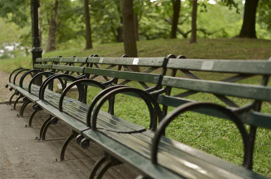
Disclaimer: Gif and picture not mine
It was an uncharacteristically warm day for this time of year in New York City. Or so you’d been told, anyway. You had been living here for three months, tops; not really long enough to have a feel for the weather patterns. Either way, you were grateful for the sun’s rays coating your face, bathing you in their heat.
You turned your face away from the sky and down towards the sketchbook in your lap. It had been your hope that Central Park might inspire you, but you were still having artist’s block. It was at least better than being cooped up in your apartment all day. You didn’t really know anyone yet, save for your old friend who you had moved in next to. If it hadn’t been for them encouraging you, you probably never would have packed up and moved. They’d promised to introduce you to some people they knew, too, so you wouldn’t get lonely. Sadly, the scheduling never worked out.
And so, here you were, alone on a bench. Looking at all the couples and families and friends bustling and laughing around you, you thought you might be the only person all by yourself on this Saturday afternoon. Well, no, not the only one, you realized, spying a raven-haired man on a bench not too far away. His nose was buried in a book, a few locks of his shiny, dark hair falling out of his bun and framing his face. He looked familiar, but not in a "you knew him" sort of way. More in that you thought he might be famous somehow. No one else seemed to notice him, though.
You glanced back down at the empty pages, waiting to be filled by the strokes of your pencil. Then you looked back at the mystery man again, scooting a little closer to the end of your bench. Without really thinking about it, your deft fingers picked up your standard 2B pencil and began to sketch.
Starting with the sharp lines of his jaw, you moved onto his hair that intrigued you so. You don’t think you’d ever seen another person with hair that dark a color. Trying to get every last detail right, you kept glancing up and down. By the time you were onto the shading, you were certain that you had seen him somewhere before. The next time you glanced up, he was gone, and a frown settled on your features as you looked left and right, searching for the only subject to inspire you in days.
“It is a lovely drawing, darling,” a smooth baritone voice with a British accent said from behind you, “but I do not really think that is my best angle.”
You squeaked in surprise and dropped your sketchbook. The man somehow managed to reach out in front of you and catch it. He came to sit next to you, and as he walked around the bench, you realized just how tall he was.
“I think you dropped this,” he said with a charming smile, handing your sketchbook to you.
“I, uh, yeah. I did,” you stammered, hating how you couldn’t be as suave as him. Plus, he was unfairly good looking. “Thank you. And, um, sorry. About, you know, drawing you.”
“On the contrary, darling, there is no need to apologize. I am quite happy to have my likeness captured in such a flattering light,” he chuckled, taking off his sunglasses and revealing his brilliant blue-green eyes. “Really, I should be thanking you.”
With all the small details you were gathering, it felt like his name was on the tip of your tongue. Infuriatingly enough, you still couldn’t place it. You didn’t think he was a singer, that didn’t feel right. Though you did feel like his mesmerizing voice would be well suited to it. So, a well-known author, perhaps? He had been reading, after all. But you were woefully behind on your own reading list, so you had a feeling it wasn’t that either. You briefly wondered what even happened to the book he’d had; it was nowhere on him, almost like he’d stored it in some pocket of space.
“Oh,” you finally responded, nervously laughing. “You’re welcome, in that case. And thank you. For the compliments, I mean.”
“Ah, you are very welcome, too. It is not often I meet such a talented artist.” He somehow managed to sprawl out on the somewhat uncomfortable park bench, his long legs spread wide. It wasn’t indecent, exactly, but it somehow felt like it was. His arms were resting on the back of the seat so that, had you been leaning back, one of them would have been wrapped around your shoulder. “I do somehow find it hard to believe I was the most interesting thing in the vicinity, however. Though, I suppose I am rather flattered by that notion, too.”
His mischievous grin sent pleasant shivers down your spine. “Well, when inspiration strikes,” you anxiously chuckled with a shrug. Your nerves were still telling you he was about to get mad at any second.
“I do suppose that is true.” He cocked his head at you in the most adorable way. “Then I am honored to provide you with it.”
You suddenly felt even warmer than you had before, but you knew it had nothing to do with the sun anymore, but rather was from this enrapturing stranger. Though, this man’s smile certainly rivaled the sun.
“I hope you don’t mind my asking,” you began, “but you seem awfully familiar. You don’t happen to be famous, do you?”
“Oh, so you have not yet figured it out, then. I had been wondering. I suppose that, yes, I could be considered famous.”
When he didn’t say anything else, you continued, “Can I get a name then? I’m afraid I don’t really keep up with pop culture all that much.”
“Well, I suppose I could tell you my name.” His grin somehow grew to be even more mischievous. “But where is the fun in that? Besides, I am afraid you might start treating me differently if you knew.”
“Ok, that’s fair.” A spark of excitement lit behind your eyes as you got an idea and turned to face the captivating stranger. “How about this, I get three guesses about what it is you’re known for. If I get it right, you have to tell me your name. If not, then it can stay a mystery forever, if you want it to.”
“A most intriguing proposition. Alright, I accept. First guess?”
“Hang on,” you said, putting up your hand. “If I only get three guesses, I feel like it would be fair if I got to talk to you for a bit longer, at least. Unless I’m holding you up from something, of course.”
“I have time to spare, darling.” He stood up and offered you his hand. “Join me on a walk?”
An easy dialogue flowed between you as you strolled through the park. The way the light was illuminating his features made your hands itch to sketch him again. That reminded you to ask about his book, which he pulled out from seemingly nowhere.
“Hang on,” you said, getting your first idea. “Are you like a-a magician or a, um, an illusionist or something?”
“Well, it is interesting that you mention that. Magic is more a hobby than anything else,” he replied. “But not what I am known for, per se. Two guesses left.”
You frowned and flipped through the pages of the book he’d handed you. Hoping he’d made some kind of foolish error, you checked the covers for his name. No such luck. Absorbed in your hunt for clues, you weren’t paying attention to the world around you. Your companion suddenly grabbed you and jerked you to a stop. A ball whizzed past your head. If you’d kept walking, it surely would have hit you.
“You really should be more careful,” he playfully tsked. Then he grew more serious as he gently turned your head, checking for injuries. “Are you ok?”
“Yeah,” you mumbled, feeling flustered from the attention of his piercing gaze. He also felt surprisingly cool for how warm out it was. You looked up at him and saw him raising his eyebrows as if he didn’t believe you. “I’m fine, really,” you added more convincingly. “Just my pride that’s wounded, I guess. But you stopped me in time. So, thank you.”
“It was no problem, darling,” he replied as you set off on the path again. “After all, I can’t have you getting hurt before you finish guessing, now can I?”
Again, you giggled, simultaneously loving and hating how he had that effect on you. “No, I guess not.”
“So, have you found whatever it is your looking for in my book?”
Glancing down at the page you had open, you saw it was the story of Rumpelstiltskin. How ironic. You tried to forge a connection between the book of fairytales and this man in your mind, but were coming up empty. Unless, of course, he was going to the source material for some reason, like he was preparing for a role.
“An actor!” you said, feeling sure you’d gotten it now. You’d definitely felt like you’d seen him on your TV screen before. Plus, he was definitely handsome enough for it. “That’s got to be it.”
“While I have appeared on television before, that is still incorrect, darling. One guess remaining.”
Oh how you wanted to wipe that smug yet ridiculously captivating grin from his face. Maybe with a kiss... Nope, no. That was ridiculous; you just met him. Besides, he was famous. Why on God’s green earth would he be interested in you as anything more than an entertaining encounter to pass the afternoon? So, you’d just have to do it with the right guess. You put your thinking cap on.
“Ok, well if you were on TV but aren’t an actor, maybe it was in an interview,” you thought out loud, gauging his reaction. You were excited, but also sad that your game was coming to a close. He’d surely leave after, whether you got it right or not. You supposed you could always try to look it up once you got home, if you couldn’t guess correctly. At least it would make for a fun story then. “I suppose there’s reality shows too, but that doesn’t quite seem your style. And, I guess you could be doing the interviewing—like a reporter or something—but that doesn’t sit quite right either. Sports! They televise sports. Plus I’m not really a fan, so I could believe I’ve heard of you but not totally recognize you. So, my final guess is athlete.”
“And you are certain that is your final guess?” He had a wonderful poker face and gave away nothing as to whether or not it was right. “Last chance to turn back.”
You appraised him, thinking he looked like he could be an athlete. And maybe it was some reverse psychology, trying to get you to abandon the correct guess. You didn’t really have any better ideas, anyway.
“Yes?”
“So sorry, but that is incorrect. And you are regretfully out of guesses, darling.”
“Of course it's not,” you sighed. He seemed genuinely saddened by how dismayed you seemed, so you perked up. “It was fun, though. So I, uh, I guess I won’t hold you up any longer.”
“You are correct; this was quite fun. Unfortunately, I do have another arrangement to get to,” he said in a way that made you believe he was actually upset over it. “How about that sketch that started this all, though? That one you made of me?”
“What of it?” you asked.
“May I buy it off of you?”
Your mouth formed a surprised little circle. “I mean, you can honestly have it for free. It is an unsolicited picture of you, after all. I wouldn’t feel right accepting your money for it.”
“Nonsense, I am only offering a small amount, anyway. Say, the price of a cup of coffee?”
You smiled at your feet as you caught onto what he was saying. It made your insides feel fuzzy. Maybe you wouldn’t accept, though. After all, you still didn’t know who he was. But if you were to go on a date, then certainly he would tell you.
“Sure,” you agreed. “I would love that.”
You tore out the sketch and handed it to him. In exchange, he gave you his card and said to call him to set a time and place. You glanced down at the small paper in your hands, not yet reading it. By the time you looked back up, he was already gone. With your handsome stranger nowhere to be found, you went to actually read his information. Unable to contain your surprise, not to mention shock at how foolish you were, you gasped, and your jaw hung open.
Gold writing on a green card held the secret you’d been trying to find the answer to all afternoon. Of course he was an Avenger, a hero. You ran your fingers over his name, a small smile forming on your lips. You quickly punched the contact into your phone and headed off in the direction of your apartment.
“Well, I’m glad this isn’t goodbye, Loki Laufeyson,” you mused to yourself, relishing in the way his name rolled off your tongue. “I’ll see you soon.”
#loki x reader#loki x you#loki laufeyson#loki odinson#loki#mcu loki#loki fluff#fluff#mcu fluff#marvel fluff#reader insert#gender netural reader#marvel#mcu#marvel reader insert#marvel fanfiction#loki fanfic#mcu reader insert#loki friggason#loki friggason x reader#loki laufeyson x reader#loki odinson x reader#loki oneshot#marvel oneshot#loki x y/n
213 notes
·
View notes
Text
[ID: A cream-colored banner that says "A Nice and Interpretive Fanzine: essays and art about the meanings we've found in Good Omens." There is a photo of a book page with a key on it behind the banner text. The photo source is rosy_photo on Pixabay. /end ID]
A Nice and Interpretive Fanzine: Information Masterpost
Welcome!
This is a zine for those of us who love the subtle, complex work that is Good Omens, and who’ve enjoyed the thoughtfulness of the fandom as people interpret how the many moving pieces of the story come together, creating a slightly different meaning for each of us.
To put it simply, it’s a book full of the fandom’s own analysis and commentary about the Good Omens TV show, enhanced with illustrations from our brilliant artists.
This zine is analytical in the sense that all the writers are expressing their own nonfiction thoughts and feelings about the show, rather than writing fanfic, but it is not meant to be heavily academic. Anybody who likes to pick apart the series and discuss it should be able to enjoy it.
The zine will contain essays by fans who are passionate about analyzing and interpreting different parts of Good Omens - the characters, the plot, the writing techniques for the book and script, the cinematography of the TV show, the popular content of the fandom itself. Accompanying these essays will be black and white illustrations from our artists.
How are you organizing this process?
May 1-May 15: Everyone submits their application to do writing or art through a Google form. Behind the scenes, I’ll be setting up a separate email and Discord.
May 16-20: Applicants will be screened during this time.
May 20: I’ll email everyone to let them know the outcomes of their applications. The final participants will get a link to the Discord server for the zine (totally optional, of course).
May 21: If there’s any clarification or solidifying of ideas that needs to happen, I’ll contact you and discuss with you by this point. This is also when artists will be matched up with essays.
May 22 to August 14: This will be a period of just working on our essays and art. The Discord chat and Tumblr will be there for support and for exchanging ideas!
August 15: Participants need to email their full works to the zine’s email address by this date. No special formatting is needed; I’ll do that in InDesign.
August 15 to August 31: I’ll be putting the zine together in InDesign.
September 1: Preorders will open.
September 30: Preorders will close.
October 1: The zine order will be placed!
October 15: Assuming all goes well with printing and shipping, the zines will be shipped out in waves starting on this date. If the printing or shipping from the manufacturer is delayed, then shipping will just start ASAP.
Writer Application HERE Artist Application HERE Asked and Answered Questions on Tumblr The Fanzine's Page on Twitter
Read below for more detailed information about the zine in a Q and A format!
What are the specifications for the zine contributions?
For writers, I’m starting with 3k words or fewer per essay (approximately 10 pages at the size of this book). This depends heavily on how many participants we actually get, so it may change!
For artists, I’d be looking at black and white works, 300 DPI, 5.5 x 8.5 inches or smaller. If your art is supposed to fill up the entire page (i.e. no white space), please make it a total of 5.75 x 8.75 inches with nothing too important around the edges to account for bleed during the printing process.
Can I submit an essay to this zine if I’ve already posted it on Tumblr?
Not as you’ve already posted it. We don’t want to just copy/paste the exact thing that hundreds or perhaps even thousands of people have already read.
However, it IS fine and maybe even a good idea to take the same thought from your post and refine it, preserving your same thesis. For example, a lot of Tumblr posts are just us fans jotting down 5 or 6 paragraphs of random thoughts at 2 AM, but some of them are really cool thoughts! Expanding them and turning them into a bona-fide Essay would make those posts into excellent zine chapters. And you can copy small pieces of your own language as long as the whole thing isn’t just pasted word-for-word.
How long do essays have to be? Is there a limit?
With the number of writers we have, I've calculated that each person should ideally keep their essay to about 6000 words. There is wiggle room.
There’s no real minimum for your contribution; some analytical ideas are really good but can be expressed concisely, so it’s okay if your essays only come out to a few pages typed. For reference, with our book size, a page is about 300 words.
What happens if the zine sells a lot and you end up not only breaking even, but turning a profit?
It’ll go to charity. While I’ll ask the participants what they want to do for certain if we do make enough money, my suggestion will be donating it to Alzheimer’s Research UK in honor of Sir Terry Pratchett.
I’m not really comfortable calling this a “charity zine” up front since I simply don’t know if it will raise a significant amount. For the most part, I just want the thing to physically exist, which means breaking even, and don’t want to make it more expensive for buyers than it needs to be to afford the printing costs.
What kinds of essays are you talking about? What could be included?
In short, any analytical thoughts about the Good Omens TV show - and possibly even the fandom as it interacts with the show - are possible inclusions for the zine.
To expand a bit, think about the meta posts you see floating around Tumblr. Often these involve analyzing characters, or picking up on patterns in the plot. Sometimes fans use their own background knowledge to write posts about the significance of certain costume choices or the way music plays into each individual scene. Some posts examine the ways the series approaches gender, while others might discuss ways that the characters present as neurodivergent. That’s how diverse the pool of possibilities is for subjects in this zine.
How does art come into this?
Images will be black and white, to match the bookish mood of the project overall. Images can range in size from a half page to a full page.
I’m planning to talk to the artists and authors and loosely pair artists with essays that appeal to their personal interests.
I know how to illustrate a story, but how do I illustrate an essay?
There are infinite answers to this! I’ve seen some beautiful symbolic artwork in the fandom already (e.g. a number of takes on Aziraphale munching on an apple with Crowley in snake form curving around him), and there are tons of symbolic motifs to draw from, but these are not the only options. An artist illustrating an essay about cinematography, for example, could draw a well-known scene from an alternative angle. An essay about Heaven as a capitalist corporation could be illustrated with a cartoon of Gabriel giving some sort of excruciating PowerPoint presentation. A character analysis could be accompanied by a simple portrait. And on and on. I’m not interested in limiting the possibilities by trying to make a list, but just know that there are many and you don’t have to make it complicated if you don’t want to.
If the writers can reuse their essay ideas, can artists reuse their drawings?
Similarly to the writers, if you already have an interpretive drawing that you’re in love with, artists can use the same ideas and the same fundamental composition that is present in their own existing work. However, it has to be redone in some significant way. Whether it’s taking something you drew in 2019 and redrawing it using an updated style, taking a sketch and turning it into a lined and shaded piece, or redoing a full-color drawing so it presents more strikingly in black and white, it shouldn’t be identical to the thing you’ve already posted.
So how are you choosing participants here?
It’ll be based on what people are interested in writing about (or illustrating). I’ll be looking for people who are passionate about their essays, but I’ll also be looking for variety. It all depends on what people want to offer, so I won’t know for sure what it will look like put together until everyone’s application is in.
For artists, I’ll be trying to figure out whose style looks like it would adapt well to illustrations in black and white, and also who demonstrates an interest in the same subjects as the writers.
If we don’t get a lot of applicants, I’d love to simply include everyone, but I can’t commit to that without knowing for sure how many people are involved.
Do I have to use a formal writing style to participate?
No. You should use a style that makes your thoughts and ideas as clear as possible, but as long as it’s understandable, you can also get a little artistic with it. You can “write like you speak,” though perhaps in a more organized way. You definitely don’t need to worry about stylistic rules like not using the first person. This is not academia.
Is this zine going to center only on Crowley and Aziraphale?
That remains to be seen! It depends on what ideas show up in the applications. There will be a lot of the ineffable partners for sure, but whether the whole zine will center on them or whether there’s plentiful stuff about other characters will depend on what the participants suggest.
Do we have to agree with all your personal interpretations of Good Omens to be in the zine?
No! In fact, I’m assuming that a number of essays will contradict each other, too, and that’s perfectly okay. The zine is a sampler of fan interpretations meant to inspire, not instruct. It’s not “Here’s a fan-made guide on how to understand this TV show,” it’s “Look at all these moving parts and how many meanings we can find in them. What does it mean to you?”
However, there are some basic rules and assumptions by which I’m working here.
I don’t personally have the energy to include essays that are highly critical (“negative”) in this zine. It’s analytical but also meant to be fun.
I’m pretty focused on the TV adaptation. This isn’t “no book analysis allowed” but just that the essays will end up being weighted toward subjects that apply to either the TV show or both the book and the show.
Each writer should focus on making their own points over disproving other fan interpretations. If you’re writing in an expository style, it’s normal for the essay to contain rebuttals to opposing ideas, but these should be minor supporting points, not the heart and soul of your essay. For reference, I’d say the majority of meta I see floating around on tumblr would follow this rule just fine.
Essay ideas that seem to contain bigoted or exclusionary sentiments will not be accepted (no TERFy stuff, for example).
What kinds of editing will go into the zine? Are you going to argue with us about the contents of our writing?
While I might ask you to elaborate on certain points in your writing or clarify your thoughts about your subject, I’m absolutely not here to ask you to change the thesis, opinions, or headcanons on which your writing is based. If I really have a problem with your initial idea, I’ll tell you that up front and politely decline the contribution.
While formatting the zine, I’ll make minor edits if I think I see a typo or misspelling, something small and obviously unintentional. As with any other zine, your content won’t be changed without consulting you.
Is this a SFW zine?
Yes. If people want to discuss sexuality in a theoretical way, like erotic subtext, that would be allowed. There are canon references like Newt and Anathema’s moment under the bed that might come up, too. But there will be nothing explicit, and since these are essays instead of stories, there will be no “action” going on between characters. Let’s just say sex isn’t a forbidden topic, but it will be like discussing it in English class.
As for other topics that could make the zine NSFW, like gore or extreme language, I don’t think they will be an issue. Some dark topics, like abuse by Heaven and Hell, may be discussed, but they will be warned for, and these are not stories, so you aren’t going to see violent actions playing out.
Will there be any “extras” like charms or stickers?
I’m not sure yet. I’m most inclined to keep it simple, because of the nature of the zine, but would be open to including some bonus items if there’s an artist who’s really passionate about it.
With that said, I am pretty committed to making a hardcover edition of the book available, in addition to the standard softcover version.
You’re doing this with only one mod?!
Yes. I personally find it easiest. While I’ve worked on multi-mod projects in other domains and adore all of my co-mods, it’s a little bit different when it’s a project with this many moving pieces that includes real-life components like printing and shipping. Though there are a lot of individual things to be done, I am experienced with all of them, so it’s less overwhelming to just take on the whole project. That way, I know exactly what needs to be done and when, and there are no issues with assigning tasks.
What qualifies you to run this zine?
The résumé answer: in fandom, I successfully solo-modded a large not-for-profit zine in the past, the @soulmakazine2018, and while I can’t speak for the whole fandom, it definitely seemed to be well-received. <3 In real life, I’m a case manager and this involves coordinating and communicating with a lot of different people including my 100-person caseload, budgeting services, and filling out all kinds of paperwork on the fly, all skills that can be imported into zine work.
The practical answer: well, I’m the one who decided to start this project, so if you like the sound of it, you're stuck with me. I say with encouragement and enthusiasm that if you’d like to do a different take on a commentary zine, you should absolutely do it.
89 notes
·
View notes
Text
how to draw faces
So awesome human being @smallpumpkinboi posted an wonderful WIP sketch earlier and said ‘Can someone please explain to my why, everytime, without fail, my eyes are always too high??’ I offered to give my two cents, and asked if it was ok for me to make it a public post- they said yes :) This ended up going long- but hopefully it’ll be handy for people. :D
BEFORE YOU DRAW- some tips to keep in mind:
1) do some warm ups! (sketches and drawing exercises) yup! artists need warm-ups just like athletes! :D)
2) Get the structure drawn first! don’t get into details, shading, or color until you have the structure DRAWN (Aka, the major features are all placed, the pose is in place etc)
So let’s look at some heads, y’all! :D
what’s with that ball so many people draw before they do a portrait? You know the one:
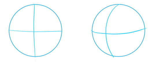
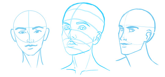
In and of itself it’s confusing. It’s like, Faces aren’t shaped like this. Where am I supposed to put the eyes? The mouth? The nose?? HERE ARE SOME HEADS I VERY QUICKLY DREW USING THE ‘CIRCLE METHOD’
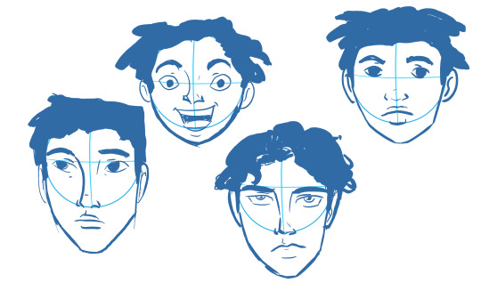
Wait a moment! Do you see what’s going on? Do you see how I messed up? OH NOOOO - I wasn’t using the circle method consistently! Look at those proportions!!! Look at the placements! There’s all using different ratios!
Look at how the noses were placed in different ways
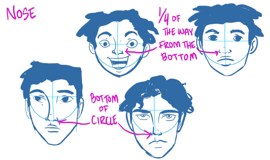
Omg! And the eyes too.
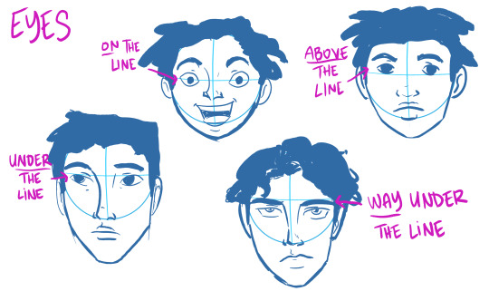
Oh my gosh! What do I do to fix this? How can I do it the same every time? Which is the RIGHT way to draw a face?
Want to know how to draw using the PERFECT ratio?
Here’s THE secret:
THERE IS NO ‘PERFECT RATIO’
Depending on the face shape, depending on the style of drawing, age of the character being drawn etc. you might change up the placement of eyes, noses, mouths etc. But the one thing you need to know is:
Faces and heads are all different.
Some people have tiny little squished faces, some people have LONG faces. They’re all different.
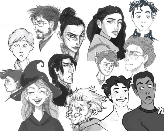
‘AHHHHH!’ HILL- YOU ARE MAKING THIS MORE CONFUSING FOR ME!!!’
I know! I’m sorry! But wait wait wait. I’m getting to stuff that’ll help. I swear!
Even though there’s ‘not a perfect ratio’ there are ratios that play into certain styles better.
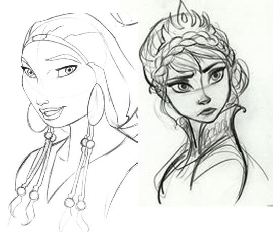
Cartoons, especially, can be all over the place on how they do ratios. Like, look at Prince of Egypt and how they place the eyes SUPER high on heads- vs, like, Disney- who likes to place eyes for heads super low (they love to give women the proportions of doe-eyed children.)
__________________________________
A ratio I generally like is what I use for REALISM/REALISTICALLY PROPORTIONED PEOPLE
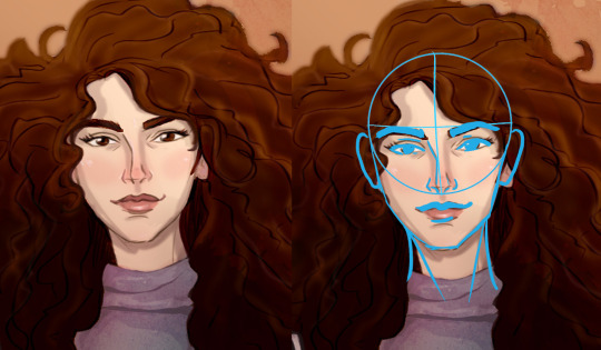
Here I’ll be going into a general breakdown of the proportions for an ADULT head.
Remember- every face is different!!! There is ENDLESS variety to faces. The variety can and does affect every feature- from eyelids, to noses, to brows, to foreheads etc.
These varietes vary person to person, and also there are varieties and commonalities you see more often in certain populations- be it race, sex, or ethnicity.
I am not giving examples of ALL these varieties here today as this is just a general guide to proportion. However if anyone wants me to go more in depth on this topic I’m happy to. :D Let me know in the comments.
________________________________
THE PROPORTIONS OF A HEAD
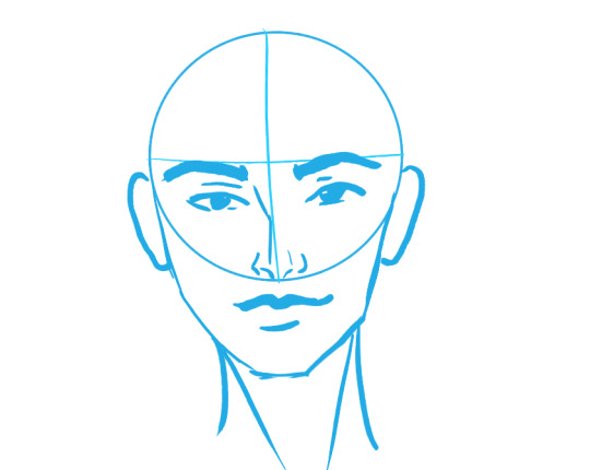
__________________________________
NOSE
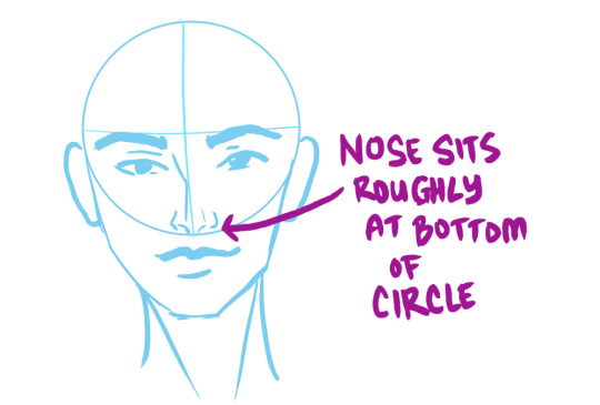
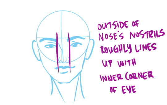
________________________________
EYES AND EYEBROWS
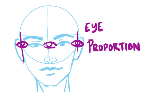


________________________________
JAW, CHIN and MOUTH
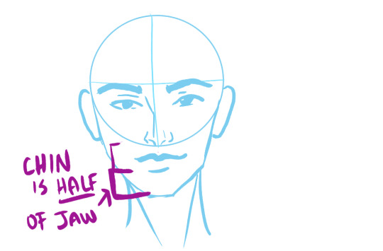

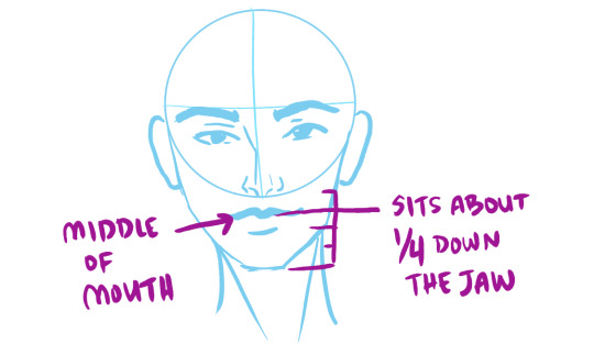
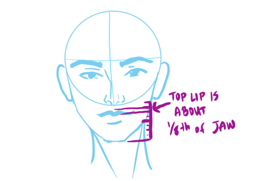

________________________________
EARS
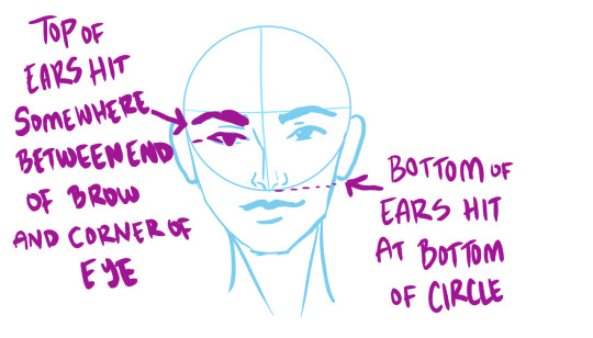
________________________________
WE TEND TO THINK ABOUT DRAWINGS IN A 2-D WAY
Which makes sense. It’s a 2-D drawing!
BUT HEADS ARE 3-D
Heads are a three-dimensional object. When it’s a straight on portrait like above you can get away with not thinking about it as much. A bit of shading here and there- and bam! You drew a face! :D
But what about when that dang head has the AUDACITY to TURN?
All of a sudden it’s a whole lot harder to draw.
________________________________
3/4 VIEW OF HEAD

ahhhhhhhhh the proportions feel different now!!!!
DON’T BE SCARED. They aren’t different, they have just TURNED.
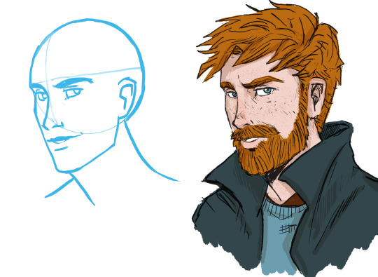
Ron here has slightly different proportions to Hermione up Above.

He has a longer face, longer nose, a bigger more defined jaw, slightly lower brows, thinner lips etc.(
I made the ‘circles’ the same size- but in reality- his head is bigger than hers. REMEMBER!!! People have different size heads!)
But even with all that, a ton of his proportions are the same as hers.
When you turn a head, the main things people forget to take into account are:
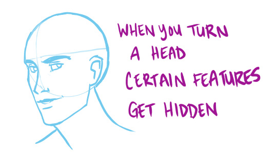
And some are getting FORESHORTENED- aka- they look all SQUISHED AND SMALL.
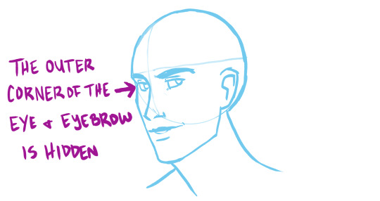
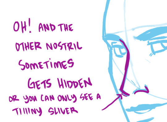
a lot of the time with my ‘cartoony lines’ this little sliver disappears altogether.
Even though there’s suddenly foreshortening happening to the features of the face
YOU CAN SUDDENLY SEE SOME THINGS BETTER
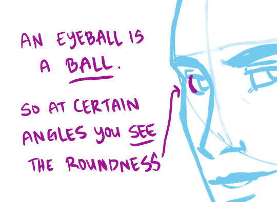
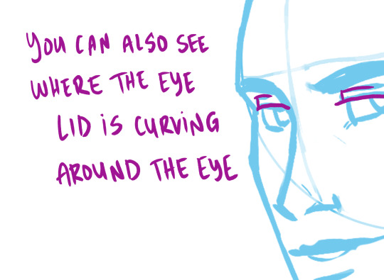
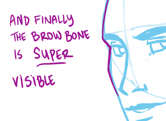
BROW BONE

EYELIDS, BROW BONES AND BROWS ARE VERY VERY VARIABLE FOR PEOPLE- LOOK CLOSELY AT IMAGES OF DIFFERENT PEOPLE OF VARYING RACES, GENDERS, SEXES ETC.
Again, this is just a general guide.
So now we’re going to look at @smallpumpkinboi ‘s awesome WIP piece
(gonna refer to them as SPB when talking about them later :) )
LET’S PRAISE THIS DRAWING, BECAUSE IT HAS A TON TO PRAISE

As you can see, they have been VERY SUCCESSFULLY using the ‘circle method.’
They have some wonderful proportion going on! Look at those brows, eyes, nose and jaw! They are very well placed.
Also, look at some of this early shading they started? It’s very effective and really gets across MASS well. :D
Also, the expression? It’s really well done. Like, super arresting!
You should be very proud of this Work in Progress, SPB!!!
Earlier SPB said “Can someone please explain to my why, everytime, without fail, my eyes are always too high??’”
Your eyes are NOT necessarily ‘too high.’
I think what’s happening here is you are applying ‘straight on 2-d proportions’ to a turned head, but aren’t entirely familiar with how to do this. This is making you struggle a bit with certain features when they are at an angle.
Source images are very helpful, but also remember that source images can be at weirder angles than just a head turning left to right.
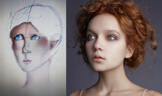
The image you were working from was actually INCREDIBLY challenging, as not only is it 3/4 view, but the model’s head is slightly turned UP.
look at all that angle happening! super hard to draw :P
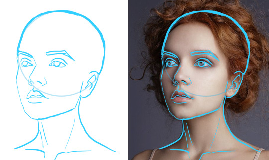
So the artist has a choice here: 1) change the drawing so it matches the pose
2) use the source image as inspiration for color/shading/expression- but find a simpler pose to work from that more matches the angle drawn.
Either choices is a valid one! :D But it’s probably easier to do #2
So here are some things you could edit
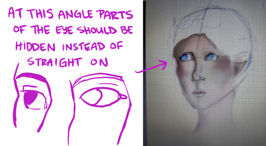
And define the brow bone, so that it hits the corner of the eye. That’ll fix your ‘eyes too high’ problem really quickly! :D
For a drawing of a face, the eyes are correctly placed as far as height goes!- but they are very different from the proportions of the model.
For future drawing keep in mind proportions- like eye distance, mouth size, and think about defining jaw/ear shapes. Getting structures (like eyes, ears, mouth and nose) firmly in place before you start shading/putting in details will help a lot! :D
HOPE Y’ALL FOUND THIS HELPFUL
If ya’ll would like other tutorials, or want help with your drawings, let me know! :D
My hands aren’t all the way well, but I’m the road to recovery and love helping people- so while I can’t draw-draw much right now, I can do this!
344 notes
·
View notes
Text
Modern Inheritance: Art Therapy (Short)
(A/N: I still don’t know how to write Islanzadí but I needed to get my ‘Arya has always kinda been that person you don’t expect to have a sketchbook but does’ headcanon out of my brain. Have some really badly written, forced-out-at-11PM Islanzadí trying to be good!parent during MI!Eldest. Again, sorry for the quality, but I pushed myself to write this and I’ve been away from MI so long that it feels a little clunky to be writing it. Izzy is inconsistent and her reasons for doing things are all over the place and make zero sense. So yeah, you’ve been warned that it’s a jumbled cluster.)
MODERN INHERITANCE
ART THERAPY
Islanzadí paused at the door, inspecting it as one would inspect a patch of earth suspected of concealing a minefield.
It was too early in the morning to be called late, but too late in the night to be called early. While it wasn’t unusual for the queen’s daughter to be up at this hour due to recent events and their lingering after effects, it was unusual for the light to be on. Islanzadí could see it now, a faint line beneath the door. Two conflicting beams, the soft red glow of a teardrop lantern and a bright slash of white light, settled across the mossy floor at her feet.
Islanzadí did not hesitate out of fear. A mother did not, should not, fear facing her own daughter. She told herself that she hesitated out of respect. This was Arya’s room, her sanctum, after all. She called it a ‘base of operations’ in a close-to-home joke, the place she always returned to if she disappeared into the night to fight her inner demons side by side with old fyrn breoal. After everything that had happened the queen was loath to breach one more place of peace for her daughter.
Then again, it would not be the first time Islanzadí had entered in the dead of night, once more attuned to the natural instincts of a mother when her child is in danger. Finding her daughter curled in a corner with her arms wrapped tightly around her knees was painful, and the nights the queen had to wake the younger elf from the clutches of her dreams were worse.
The light on was something new. Something that she did not know how to react to. If Arya was awake then she didn’t want to intrude.
But if she was having trouble again….
Islanzadí carefully opened the door, just enough to peer inside.
Like many nights before, the queen saw that the bed was still made, corners tucked tight in the strict, military efficiency that Arya had picked up in years spent alongside Varden soldiers. A sleeping bag was on the floor beside the bed with a spare blanket bunched at its end from restless sleep. The makeshift indoor camp was lit by the teardrop lantern on the nightstand above, cast in strange, ruddy shadows.
Compared to the gentle glow of the lantern the white light was almost startling. A simple white werelight hovered just above the knotted, cup-like roots of the stand at Arya’s desk, bobbing and turning lightly with the imperceptible changes in the air.
Islanzadí breathed a quiet sigh of relief that she didn’t even realize she was holding in. Arya had an arm folded on the desk and her head rested on it, her left hand laid over a page and pencil still loosely in her relaxed grip. The woman had fallen asleep in the middle of her work.
With soft footsteps the queen padded into the room. It wouldn’t do to sleep in such a way. As she reached out to gently wake the younger elf though, the sight of what scattered the desk gave her pause.
What had to be over a dozen sketches littered the usually tidy surface. Islanzadí had known that Arya often drew when her mind was troubled, but she had never seen the results for herself. As gently as she could Islanzadí collected the papers together, curious at what had driven her daughter to such a late hour.
Brom started back at her from the first page, gruff around the eyes and holding his pipe up to his lips. The hard line of his jaw gave the impression that he had clamped his teeth down on the pipestem, soft clouds of smoke wafting up around his nose. It was the face of a man who was thinking and grumbling to himself in equal measure, but there was a softness to it that led Islanzadí to believe that whatever was giving him such trouble was something he deeply cared about.
One was of a campsite. Brom was still present, perched on a rock with his ever-present pipe in hand and using it as a pointer as he called criticism to the two young men that danced around the burned down fire at the center of camp. One was obviously Eragon, Zar’roc a sudden streak of pastel red in an image that was dominated by only two other shades: the ebony of the pencil and the expanse of shaded blue that made up Saphira where she crouched beside Brom. The other man was unfamiliar to the elvish queen, but she suspected the lean youth with near-black hair and hand-and-half sword was Murtagh.
Islanzadí’s chest tightened when she shifted to the next page. It, and the one following, were done in what appeared to be frantic, almost manic motions. Most of the paper was dominated by deep grey, walls and barred windows all almost black cut through by patches of startling crimson red and the pearly, muddied white of a single light fixture high on the wall. The floor was a cooler tone but puddled with the thick red pastel, which collected under the iron cot and shredded, sooty sheets.
It was one of several views from a personal hell. A view from the corner.
And then it was a portrait again, another from frozen memories of travel. The light silvery tones that dripped from the foliage signaled an early morning, but half of the occupants of the work were asleep. Eragon lay sprawled comfortably beside Saphira, one of her wings draped over his form. Above him, the dragon was watching him carefully, as a mother would a sleeping cub, her gaze protective and gentle all at once.
Another page almost overtaken by dark ebony. A sliver of moon cast the starless sky into faintly silvered darkness, reflected by the path below. Trees arced and bent over the strip of earth, monstrous shapes boiling up from between their trunks. At the end of the path, a lone figure wreathed in ghostly red tendrils that coiled up and around their body like ethereal smoke.
Glenwing was next in the line of art, and beside him, arm tossed casually over his shoulders in friendly companionship, was Fäolin. Both were smiling, laughter playing at their lips. Fäolin had his free hand around the neck of a bottle of dwarvish beer, and by the fading background it was clear that the memory took place in a bar. Even without color the neon of the signs flickered and hummed, bringing a sense of welcome despite the clear signs around that indicated that the war was never far away.
Saphira’s egg, the edges of the carry bag that was her home for over two decades puddled around its base. A gentle pulse of life and warmth in the blue and white that decorated the marbled surface. A glow of hope, all contained inside a single layer of shell.
A view from the branches of the Menoa Tree, looking down at the sprawling expanse of roots that raced away from the great monarch of the forest. Light played through the needles above, pinpricks of dappled sunlight that strained to reach the forest floor.
Eragon, his forehead pressed against Saphira’s snout as the Rider and dragon shared a moment of quiet peace. The rigid hold of his far shoulder compared to the slope of the other indicated it was not long after the battle for Farthen Dur, a time of chaos, tumult and new realities. It made the frozen scene of simple yet deeply primal comfort that smoothed over Eragon’s features that much more poignant. Reminded those that saw it that he was still a growing youth and Saphira was not yet a year old, yet they had been thrown into a world that required, demanded their lives for the sake of millions of others.
“One of these days we will give each other a heart attack.”
Islanzadí couldn’t suppress the sudden jerk of surprise at her daughter’s bleary words. The younger elf lifted her head and stretched, tossing down her pencil as she did. Arya winced when the light of the white werelight caught her eyes, and with a tap on the floating orb the color changed to the same muted red as the lantern on the nightstand.
“I was going to suggest you move to your bed before you strained your neck.” The queen gave her daughter a slightly forced, gentle smile, heart still fluttering at the start.
Arya nodded, still appearing half asleep as she rose from her desk and tapped off the light. She waved groggily over her shoulder to indicate to her mother that she was fine before she tumbled onto the bed, not bothering with the covers. It was a good sign. The younger elf was heavily in sleep debt as it was, and Islanzadí did not want to be the source of another night of under four hours of rest.
Islanzadí placed the stack of sketches back on the desk with a newfound reverence before following Arya towards the bed. She gathered up the discarded blanket on the floor and draped it over the woman’s body, smiling again at the muffled mumble of “Thanks, mum.” that drifted from where Arya had buried her head under the pillow.
She touched the lantern by the bed, lowering its intensity till it winked out. Gently pulled the door shut behind her.
And gave a very quiet, very tired, sigh of relief.
#modern inheritance#eragon#inheritance cycle#modern inheritance cycle#the cyclists#modern inheritance stories#arya#brom#saphira#islanzadi#queen islanzadi#war trauma#flashbacks#art therapy#PTSD#islanzadi is just a clusterfuck to write ngl#woman does not know how to parent#everything is just awkward as fuck#mic shorts
18 notes
·
View notes
Text
FE8 Novelization Translation - Chapter 13, Section 1
If you would like to start from the beginning, read a missed part, etc., click here!
FE Game Script Translations - FE Novel Translations - Original FE Support Conversations
If you are interested in donating to support my work, please check out my Ko-fi here. Thank you!
———————————
I call this a “section” because it is not a separate part of the chapter in the book, but divided from the rest of the chapter by a scene break.
———————————
Chapter 13: The Desert Palace
Jehanna was known as the Country of White Dunes. Just as that name implied, the capital city was chosen to be built upon a tiny patch of green land in the middle of a giant desert.
The rainy season was very short, and the air was dry almost the entire year round. Skeletons of animals that had collapsed from exhaustion dotted the desert. However, despite being suffocated by such harsh nature, Jehanna was also beautiful.
The country was ruled by Queen Ismaire. Her husband had passed long ago, and after overcoming countless hardships, she’d come to be a fine ruler for the country. The palace towered majestically over the white desert, and was a symbol of how the queen lived her life.
Eirika’s army traveled along the narrow main road built throughout the desert and towards the capital city. The palace looked so very far away.
What was going on inside that beautiful palace now? Just thinking about it lowered their spirits. Eirika was lost in thought as she swayed gently atop her horse, but noticed a small flower that had bloomed on the side of the road, and stopped.
When she jumped off her horse and went to pick the flower, she smelled a refreshing aroma.
Tana saw what she was doing, and peered over at her. “It’s so cute! Wow, flowers can even bloom in a dry climate like this!”
“This is a medicinal plant. I forgot its name, but… it’s supposed to be very effective at relieving the pain of wounds. It only grows in dry climates, so it is a valuable plant.”
“Wow… you really know a lot about it! I'm surprised that you know something like that!"
Eirika smiled and stared down at the beautiful flower in her hand.
The person who had taught her all about it was Lyon. He had his very own medicinal plant garden in a corner of Grado Castle’s garden, where he grew a wide variety of plants. He’d even worked very hard to recreate a desert environment and tried to raise plants that only grew in that climate.
Ephraim showed no interest in medicinal plants, and did not come near them, but Eirika often visited the garden with Lyon. Even Lyon, who’d been shy at first, opened up and answered all of Eirika’s various questions on the subject, telling her all the plants’ names, effects, and how to care for them.
“Those without money cannot buy expensive medicine, right? But there are plants everywhere that can become effective medicines. I’m studying medicinal plants, and want to teach the people about them, because it should make life much easier for those suffering from illnesses…”
Eirika was impressed by all the things Lyon passionately shared with her. She still had much to learn about the world at the time, and hadn’t thought yet about the lives of the people.
“You’re so admirable, Lyon! You think as hard as you can to find a way to make everyone happy, don’t you?”
“Oh, I’m not admirable at all… This is the only sort of thing I can do… I’m terrible at sword fighting. I lose even to you.”
When Lyon said that, he seemed embarrassed, so much so that when Eirika looked at him, she felt sorry for him. She couldn’t keep herself from frowning.
‘Why can’t he realize what his own amazing strengths are? It doesn’t matter if he’s bad at sword fighting, because he posesses kindness and intelligence that is unlike anyone else’s.’
This was the same Lyon that had led the Grado Army and conquered Jehanna. Eirika still couldn’t believe it.
Of course, a commanding officer didn’t need to be an exceptional soldier. It was also conceivable that Lyon was just being used as decoration, and someone else was really leading the army. However, Eirika was still not convinced.
“I’ve heard that Prince Lyon has a gentle personality, and loathes fighting.” Innes whispered, as if he could read Eirika’s wavering heart. He had come up beside her at some point, and was now walking alongside her horse.
“Seems like it was all an act. Perhaps he deceived you and Ephraim to get you two to let your guards down.”
“...That’s...” Eirika wanted to disagree, but she couldn’t find any strength to put into her voice.
Innes had never actually met Lyon, so he was suspicious of him. Eirika could assert that the many different ways he'd shown kindness could not have been false, but it would only be her insisting that her memories were the truth with no proof at all against the fact that they knew for certain that he had conquered Jehanna.
“I’ve heard that he can use dark magic. Do you know how skilled he is in it, Eirika?”
“...Yes. The bishop that taught him always praised him highly because of his intelligence and passion for studying. He seemed to read difficult books a lot.”
"Then he is very dangerous.” Innes furrowed his brow.
Though he may know dark magic, Lyon never studied it with bad intentions. Darkness was important for bringing peace to people’s hearts. Lyon’s passion for learning magic was always for the sake of others.
L’Arachel was listening to their conversation, and added, “We have no reason to fear the power of darkness, for we have received the gods’ blessing! We shall retake the palace in one fell swoop!”
“No, we do not know if the queen is safe yet. She’s been taken as a hostage, so we must tread carefully.” Innes said.
“You’re right…” All of the energy drained from within L’Arachel, and she sighed deeply.
ー
Eirika’s army set up camp outside the city and decided to finalize their strategy.
There were hardly any people in the capital, and it had become very quiet. At first, Jehanna Palace looked like a beautiful mirage, but from this closer distance, they could see that it was guarded by a sturdy wall. Now that it had fallen into the hands of the enemy, the strength of that wall had backfired.
“The only way to minimize the damage we cause as we attack the palace is to swiftly tear down the front gate. The armored knights should rush in with the cavalry, then the infantry should follow in right after them. Still, we must prepare to damage the palace if need be…” Seth’s expression was dark.
Innes asked, “Were we able to acquire any knowledge about the palace’s inner structure?”
“No. It is very complex, and we do not know the details of it.”
“That’s not good. We have no idea what kind of traps the enemy has laid out...”
“Rather than tear down the front gate, we should go around the side.”
Eirika and the others all looked up towards the source of the voice that had suddenly cut in from the side.
Those attending the meeting should have been only the army’s leaders. However, at some point, Joshua had entered the tent.
Innes huffed and ordered, “We’re in the middle of an important meeting right now. Please leave.”
“You want to know the inner structure of the palace, right? I’ll tell you.”
“What? Why would you know…?”
“Please wait, Innes!” Eirika stopped him.
Joshua had many years of experience as a mercenary. He might have had an opportunity to obtain a map of the palace at some point. It was unfortunate, but they didn’t have time to question him about it. If they did not hurry, then the queen would be in trouble.
“Please tell us everything you know, Joshua. Are there any other methods of getting inside the palace besides breaking down the front gate?”
“The layout of the palace is very complex. The front gate is not the only way inside. There is also a small passageway that merchants use to get in and out. It is likely that the enemy has not realized it is there.”
“...Can you lead us to it?”
“Yes.” Joshua nodded lightly.
Innes narrowed his eyes in suspicion.
But Eirika decided to trust him. She had been suspicious of his true motives once in the past, but up until now, he had always fought as another member of her army with all his strength. She did not want to question that sincerity any longer.
Joshua pulled out a piece of paper that had a quick sketch of the palace drawn on it. Though the drawing only consisted of simple lines, it was surprisingly detailed. It had everything they would need written on it, from the placement of the hallways and rooms, to where the stairs and even pillars were.
“The throne room is inside here. Prince Lyon is most likely leading the army from in there. And in the basement, there is an altar. If they are keeping the queen confined, then it is likely that they are using this room down there to do so.” Joshua pointed at the map and explained.
Seth and Innes stared at the map with very serious looks on their faces.
“We’ll designate a large enough force to rush the gate and feint an attack on it. They will be a diversion and draw in the enemy, and should attack and retreat repeatedly so that no one is injured. Using that gap in the enemy’s defenses, a small elite force will attack from the merchant’s entrance on the east side. The enemy's guard there will probably be light, so we should be able to attack and defeat them in one swoop. After we establish that area as a base, we will head for the throne room.”
“...Alright.” Innes seemed to agree with that strategy. He raised his head up with confidence and looked at Joshua. “I shall lead the diversion team. At the very least, we will make a scene, and keep them in one area. Eirika, I want you to lead the elite force. Joshua, you will of course guide Eirika down the merchant’s entrance.”
Eirika nodded and looked at Joshua.
He had the same thin smile on his face as always, but his expression looked a bit more stiff than usual.
It wasn’t just a strange feeling. Something about the way Joshua was acting was undoubtedly strange. A dark color shaded his eyes. He seemed to have noticed that Eirika was staring at him, as he quickly turned his head away, and rushed out of the tent.
#fire emblem#fe#fe8#sacred stones#eirika#game boy advance#gba#japan#japanese#translation#novel#light novel#fe8 novelization translation
12 notes
·
View notes
Note
What's your top 10 drawing tips?
Ohhh!!! Yes okay!!! This is gonna be long. Be prepared lol also keep in mind I'm a traditional artist so these may not work for digital artists!
1. Draw as often as you can. Don't over do it though because you'll burn yourself out and then it'll have the opposite effect and you'll not want to draw anymore. But the only way to get better is to put the time in which is hard because most of us want to be good immediately but it doesn't work that way! And trust me if you put the time in you'll one day look at your work and just go WHOA I IMPROVED HOLY SHIT like it'll slap you in the face and it will make you feel so good about the hard work you put in. Basically my first tip is is keep trying, take breaks, be persistent but don't over do it. never quit art though please! always make art. The world needs it!
2. Use reference pictures!!! Don't be afraid of reference pictures! All artists need reference pictures!! Even the most talented artists need reference and its actually pretty fundamental to learning how to draw. That's why art classes make you draw bowls of fruit! To teach you to draw from life! So find stock photos, take pics of friends and yourself and of objects, google image search and USE DAT REFERENCE!!
3. Try limiting your color pallet. Use a color pallet generator and make an artwork only using like 3, 4, or 5 colors. Limiting your color pallet helps you learn to think about the placement of colors and how to choose the right colors for an artwork. It helps you avoid the mistake that lots of people make where you use too many colors and your art looks like a tacky rainbow mismatchy mess!
4. Try doing ballpoint pen art!! Drawing without an eraser forces you to slow down. It forces you to think about the placement of each line so when you go back to pencil you feel much much much more confident and honestly it helps me sketch in pencil much faster and just makes me a more confident drawer overall. Like if I can make something look decent in ballpoint I'm like damn imagine what I can do with an eraser!!
5. It's okay to take tidbits of other people's style and work it into your art style. Don't outright copy someone but if a particular way they draw like say... eyes or something just really vibes with you then try drawing eyes like that! Everyone's art style is inspired by other art styles like my art style is partially inspired by ben 10 and I ain't about to deny it 😂
6. Try shading skin with lavender/purple. it looks fucking rad as hell try it do it like put the skin color down, shade with purple, then go over the purple again with the skin color. Try it and tell me how it goes
7. When doing lineart, if it fits your style, try outlining the silhouette of the character in a thicker line than the rest of the lineart.. it gives the lineart some cool line weight variation and makes the art look polished and more finished
8. Tracing art is okay and really helpful in learning how to draw! Just make sure that you either don't post it to social media or make sure you have explicit permission from the original artist to trace it and that you credit them
9. Try different mediums! Sometimes you think a medium is the one for you but sometimes you're wrong. Lol I thought I was going to be a digital artist for a long time but dude. Digital and I do not mix. I remember when I one day was like shit let's try these prisma colored pencils fuck it! This was after trying digital for like a year and when I worked with those pencils it was like the sun finally shown down on me and Angel's were singing and damn I haven't touched my tablet in like a year 😂 and that doesn't mean I couldn't get good at digital it just means you should work with the medium that makes you happy! I honestly hate digital now lmaooooo so ya! Try painting try pencils try markers hell try digital! Try it all!! Art is so fun omg I'm getting wild Haha
10. Don't let other people's art make you feel bad about yours. Like this one is hard because its difficult to not compare your art to other people's but I just know from experience that it's better to think "wow they're art is great I need to practice drawing like that style more" rather than like "wow their art is great I'll never be that good I should quit" because that artist was where you are once and the only reason they're at the level they are now is because they didn't quit!!! This is like my first tip lol I just get so heartbroken when people stop drawing. Art is so beautiful and everyone should make art always 💖💖
#art#art tips#artists on tumblr#ask#mars art#THANK YOU FOR TALKING TO ME ABOUT ART IT BRINGS ME SO MUCH JOY
150 notes
·
View notes
Note
Hello! May I ask how you draw? I'm currently learning how to myself and would be highly interested into a step to step process by you! Like from sketch to the done thing (no color necessary)
Hello there!
I dunno how I feel about showing how I work/giving advice to someone who’s learning (and I say it as a pro artist who went through years of traditional art education) because when I do the illustrations you see here on my tumblr I BREAK THE RULES you’d learn though life drawing routine, and give in to bad habits, and my methods are rather unplanned and chaotic which makes it difficult to pinpoint significant stages. But I used my portable potato to take some photos during working on my last piece, so I’ll throw it here with a bit of an explanation of what’s going on.
Before I begin - and because you’re about to look at a mess of a WIP - I’d like to give you some general advice that generally makes life easier when you draw (again, things that I learned in traditional arts education - another artist might advise you the complete opposite, dunno!)
Work holistically. Forget them satisfying-to-look-at clips on instagram showing someone produce a hyperrealistic portrait starting from an eye, with each and every element emerging being finished before they proceed to another part. It takes a lot of talent, yes, but these are ppl redrawing a photo in a kind of a mechanical manner. Most artists don’t work this way. Especially if you’re working without a reference, or if you’re doing a life drawing - your process will be layering and changing and finding what works best to give an impression of what you’re drawing rather than reproduce the exact image, and your artwork is likely to look messy most of the time.That said: don’t start with the details. Don’t spend too much time on a particular part while neglecting others. Your goal is to keep the whole piece at the same level of ‘finished’ (even though it’s unfinished - do I make sense?) before you’re confident that everything is where it should be and proceed to the details. So sketch out the composition first. See how things fit, what’s the dynamics. You’ll save yourself from limbs sticking out from the frame, odd proportions etc etc.
Because it’s a game of relationships between different parts of the picture/scene. I ask you not to worry about finishing a single element before laying out the rest because you’ll find that said element will look different once the other part appears! For instance - you might think that the colour you picked for a character’s hair is already very dark. But once you’re done with the night sky background, you’ll find that it’s in fact too light, and doesn’t work well with the cold palette. You’ll have to revisit different parts of the image as you go to balance these relationships and make the picture work as a whole.
Give an impression of something being there without actually drawing it ‘properly’- because details are hard, mate. You’ll see that my lineart usually has hardly any, and my colouring is large unrefined stains, but the finished thing looks convincing. Like, fuck, I can never focus on how Crowley’s eyes are really shaped. So I just turn them into large glowing yellow ellipses crossed by a line, and heard no protests so far.
Don’t panic if you messed up (you probably didn’t anyway). It might turn out to be a completely unnoticeable mistake - because, remember, things work together to balance each other, so another finished off prominent element will probably drown that badly placed line that looked so visible and out of place a second ago.
It might not look good before it’s finished. I’m mostly immune to it after years of drawing, and my recent illustrations all follow a specific method (ykno, my sunset glow effects and all that) so I can kinda predict the next stage. But I do my linearts on a specially picked crap paper, I don’t bother erasing the smudged graphite, and it looks messy af until I make the background white in Photoshop. Conclusion: you might have a moment of doubt as you work through a piece, but try to break through it - I often suddenly start to like what I cursed a minute before! - and try to finish it even if it’s meant to be bad. This way, looking through your past pieces, you’ll see the progress. And trust me, I can’t even look at my art from literally three months ago. It’s normal.
Now, pics! The sketches are paler in real life, but I increased the contrast a little so you can see something.
1. Laying out the composition!
I wanted to just show them kissing, but I got carried away due to some Art Nouveau inspiration. As you might have noticed, most of my illustrations are quite self-contained (ykno - they look like a sticker on a plain background). So I wanted a tight swirl bordered by Aziraphale’s wings creating a sort of rounded, yin-yang like bubble around them. Consequently I made the whole composition revolve around their heads.

2. Adding more details to the sketch. It’s messy af. It will be messy until I’m done. It’s fine.
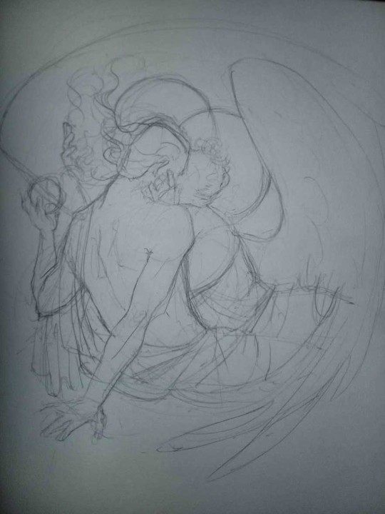
3. These are the fineliners I use for the linearts! They are made by Uni-ball and come in light and dark grey. I also sometimes use the guy on the left - ‘Touch’ sign pen by Pentel, when I want more brush-like, wider strokes. I work in grey because when I scan it and do my usual boring trick with sunlight highlights - which is an Overlay mode layer in Photoshop - the highlights ‘burn out’ the lines too and make them vanish a little, and the lighting effect gets more striking. I also like to use the light grey ones to make something look pencil-y without actually using pencil, because pencil fucking smudges.
4. It smudges! So because I am right handed, I start inking from the right hand side, no matter how tempted I am to do their faces first.
5. You can see the composition directions here. I made it intuitively, but ofc some ppl actually use grids etc to lay out their drawings.
6. See how pale ans thin the lineart was at first? I kept adjusting it as new inked parts were appearing. It starts to look nice and consistent now!
7. Finished lineart? There are some mistakes which I later corrected in PS. Notice that Aziraphale’s face has hardly any details on it - I tried to make the drawing suggest his expression rather than risk overdoing it.
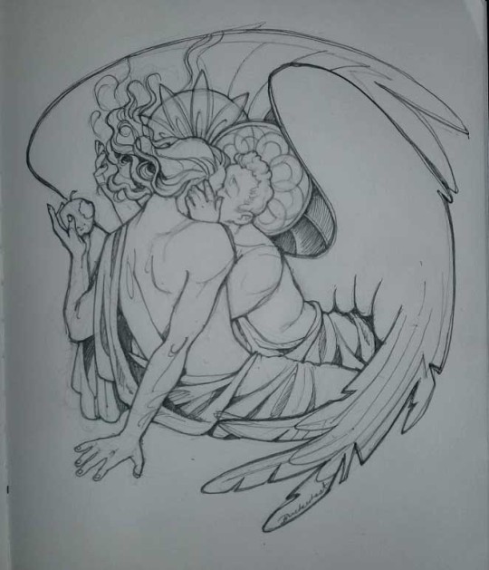
8. Photoshop time!! You can totally do what I did here even if you don’t have a graphic tablet. I used Curves tool to enhance the lineart, then Quick Selection Tool to select the background around around my sticker-like piece and filled it white (on a new layer ofc). I keep this white layer on top of the layer order so it works as a mask as I colour. I decided I did not like the hatching shading underneath Aziraphale’s halo, so I erased it with a Stamp tool (because I wanna keep the textured grey fill my crap paper naturally gives me!). It’s done roughly but won’t be visible once the thing is coloured.
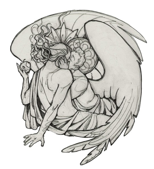
9. And the reason why I keep the grey shade instead of easily getting rid of it by using Curves/Levels is because when I set this layer to Multiply mode and colour underneath, it gives me this nice desaturated look like from an old cheap paper comic page. It works as a natural filter! But of course I can’t do bright colours this way, so all my glowing highlights happen ABOVE the lineart layer - on a separate layer in Overlay mode!
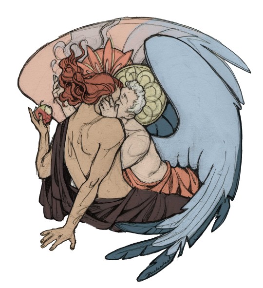
Finished thing here!
_____
Commission infoBuy Me a Coffee - help me with my transitioning expenses!Prints and stickers and things on my Redbubble!
#ask the buckwheat#long post#tutorial#drawing advice#drawing tutorial#good omens#ineffable husbands#good omens fanart#good omens art#my illustrations#doodles#toastedbuckwheat
1K notes
·
View notes
Text
lachesism I
Compounding pressure, stacking situations which teetered on the edge of a tumble and threatened to break apart Eilithe at every turn. Weeks continued to pass into months and she was no closer to accomplishing anything.
Shadeala was still alive. Shae and Aydri were still dying. Azura and Nyllaen’s grove withered by the hour. Her Aunt still suffered in the Maw. Kurel grew further away from her each day, until it felt like strangers brushing fingers in the night time.
She focused on the former three in burst-- digestible pieces, where she could swallow a few more bites of shit fed to her. And on the night she decided to make a jump, she’d been fed the whole shit pie.
Weeks before, Azura had called to Eilithe and it was that night she discovered that what was draining Nyllaen’s grove was most certainly the unnamed cult headed by a Shal’Theran apostate, Is’Stallae. And years before that, they’d collected a tablet from said cult and hidden it away in a place potent with Light.
And for years it had sat. Safely. Until Eilithe had decided it was worth the risk to take it out and read it. If there was even a chance something in its dark magic could tell them how to undo it all--she deemed it worth it. Only to essentially send a beacon to Is’Stallae.
“Thank you, little witch,” she cooed in a voice too familiar. “We have been searching long for this.”
And so, Eilithe had handed it to the cult. A means to bring raise their Champion, and ultimately their Death god into this realm to do gods knows what to it. Sitting there with the tablet in pieces, its magic freed. Eilithe felt something..cracking, and like all of her meltdowns-- she went to have it in private.

When she was a little girl, she’d often spend her free time watching Feril as he sketched. His wife, Is’Stallae herself, would braid her hair and read her poetry. And so it was only fitting that Feril came to her then, as she sat sobbing into her knees. “I really fucked it up this time, Feril. I told them I would help them save his grove. I told them I could read the tablet without danger. And.. she is going to ascend to fuck knows what. Our kids..those effigies. She got to them so fucking easily.." She inhaled through cries,"Why is it-- that I cannot seem to win against a single force that opposes me. Shaedala's still alive. Is'stallae. Still alive." This is not your fault. It wasn’t enough-- or perhaps she didn’t believe it. "This is not your fault. Thy have had nearly a thousand years to plan this. I have no answers. What I do know though, is that you and those your surround yourself with are survivors. Not ones to give up. Nor to lose hope. You have beaten both of these forces before. You will do so again." Afterwards, he once more lapsed into silence, letting her take any time she needed.
"I'm tired of just fucking surviving, Feril.” And that was the size of it. The utter exhaustion she felt which only came from thousands of years of merely treading water. “I'm so fucking tired of happiness and peace being a fleeting fucking moment. Any time it gets close, either I spit on it or someone else does."
"The world has always known turmoil. You are so close. Nothing but these final death rattle of forces that have tried and failed again and again. Can you see that light? Shining at the end of the tunnel?"
No. No, she could not see it because she had been running away from it. Shortly before her death, her a had told her simply, “You have all the tools you could ever need, you must be unafraid to use them.”
It was time to take her place then.
"I want to call the Shan. I want to mobilize the Shal'Thera,” she started with-- but there was much more. “ Do you believe..that I could unite the Shal'Thera again. As Shan'di." As her Aunt had intended.
“I do,” was all she needed to hear from Feril’s lips.

Just as the hours ticked over into evening, the magi joined forces to open two large portals, one after the other. For anyone nearby to witness, two large parties of mostly Kaldorei shimmered through the portals.
At the front of one party, an elder Druid with dark hair and silvery eyes. He bore a striking resemblance to Shaedoril Seawalker. He was accompanied by a man with similar features, though his hair was an aqua color. The were accompanied by roughly ten others. Most of them druids, though there were a few mages, and hunters within the ranks. Two of the elves in the first crowd held banners, a stark white flag with a black circle and two arrows pointing straight up.
The second group was led by a tall woman in white. Her hair, brows, eyelashes-- even her gown were all in the most bright shade of white. She nearly glowed. Accompanying her, was an even taller woman-- whom some might recognize as Yria. Her hair and eyelashes were all the same as her sister's, though she dressed more in furs than pretty gowns. While the first group had a mix of races, this one seemed exclusively to bring more Kaldorei to Dead Sun. They were overwhelmingly priests of one kind or the other. Two of those Kaldorei carried banners like the first. Stark white flags with a circle, the difference being that these flags bore the silhouette of a leaf instead of the upward facing arrows.
Assembled to greet them were two more parties, those chosen to receive the other two families of the Shal’Thera. The first was led by Reveria, dressed in a rich black gown with stark white bear furs draped over her shoulders in contrast. Beside her was Azura, those in their party mostly elves with a variety of other races mixed in. They looked to be the roguish types, with a few hunters, sailors, and druids mixed in. The Shan'Min's own ship captain, Jin'sarr - a tall kaldorei with dark hair wielded their banner, white with only a dark black circle.
Along side them, awaiting the arrival of the other two families stood Thaereus Stormwalker, dressed in deep sea blue dress leathers with a cloak of white hanging from his left shoulder. His emerald hair flowed in the wind, tied into a ponytail. Beside him stood Shaedoril, dressed in similar dress leathers though his cloak hung from the right shoulder. While mostly elves, there were humans, orcs, and even trolls among their number. Most were clearly sailors, though some were discernible as priests or roguish outrunners. A mage, here and there as well. Their standard of white bore the black circle, with three white wavy lines within. Meanwhile, Eilithe-- Fadrina's polar opposite cared very little for this welcoming ritual. Inside of the Reach, she was dressed in her formal gold and black dress, slouched back into her chair as though it was a throne. When the parties entered the Speaker Court-- she wasted no time, rising from her chair to get started.
"Thank you all for coming," Eilithe said, pulling her hands behind her back. Her golden paulder glimmered in the evening light that seeped in through the open arches behind her.
"Now more than ever-- we require a united front. Direction. A Shan'di," Eilithe said, getting straight to the point. "I stake claim to the title, formally. I will lead this family with as much ferocity as my Aunt and Grandmother did. Do I have a second?" She searched, Ur'Sen and Thaereus particularly.
There was no hesitation in Thaereus, who rose a confident hand. "I second her claim. The Tel'nar have had the chance to witness Eilithe's leadership first hand, through struggles that saw her save many innocents. Her First priority is always those lives and it would be with honor that I followed her."
Not long after Thaereus spoke up, did Reveria predictably raise her hand. "The Thal'Ana support Eilithe Duskbringer's claim as well. For many years she led us with unwavering and unflinching resolve. Capable of making the difficult choices any leader has to. It would be our honor as well, to follow her as Shan'Di."
Ur'sen was quiet at first-- the same way he had been after Elsennia had died. He looked across the way at Shaedoril for a long time before he seemed to get the will to take action. "The Quel'later support Eilithe An'diel's claim," he said, dipping his head to Eilithe. A quiet came-- as the fourth vote was awaited. A vote which had to be unanimous. "You did not deserve to be Shan'min, and you do not deserve the seat of the Shan'di," Fadrina said, in calm and collected tone. "It was under your direction, that we nearly lost our foothold in Stormwind. It was under your direction, that the Thal'ana nearly turned apostate. It was under your direction that Shan'di Stormsinger died. How many more people will die? The Shal'Thera was never meant to be a monarchy, Shan'an Seawalker..Keeper Duskbringer.. I should think you would remember that." Her eyes never left Eilithe's, "Your only claim is your blood, and blood should not be the only decider here. I reject Shan'min Duskbringer's claim." It was only then, that Idorin showed himself. The woman’s own lifemate. He stepped forward and looked Fadrina in the eyes. "You are blind with jealousy and hunger for power. It pains me, to see you have fallen so far. I do not speak for the Alor'Anir but I hear Eilithe's claim and support it."
Chaos erupted but Eilithe waited until the exact height of it to interrupted. “I challenge Fadrina Whitemoon to Tal'ashar. If I win, I take the seat of the Shan'di. And if I lose, I will remove myself entire from the Shal'thera. For good."
The two exchanged a stare-- Fadrina’s nearly white eyes more sharp than the dull ones Eilithe maintained. Fadrina could not refuse her. Eilithe spoke first "Tomorrow. The Shans deserve a night of rest." Eilithe stretched her neck from side to side, "We will fight at dusk." Fadrina’s gazed turned to a sneer, "So be it."
@ferilclawmane@kurel-andiel @theshalthera @azuraduskwalker @revthepunchbear
11 notes
·
View notes
Text
Madness draws: Behind the Scenes of the “Alleine in der Nacht” die ärzte fan comic.
A few weeks ago I posted this comic:

This post is yet again just another drawing behind-the-scenes post but You can go and reblog the original post here.
And as always, all my ramblings are under the cut!
This one was relatively easy to do because I just woke up one morning and internally died from laughter because this idea just happened like a random pop up window in my brain. I wrote it down to my phone notes and later on also into my sketchbook:
I was laughing out loud when I was drawing those images, Bela’s face still is cracking me up :D And because I’m yet again trilingual with my comics, there’s only one word in my mother tongue and it’s: Bela laulaa = Bela sings.
And other fans might recognize the lyrics of the song, I needed to write them down in order to decide which ones would fit the comic the best.
This one is then again me trying to see how it will fit on a A4 paper. Originally I saw it in my head more like a short, regular comic strip with 3 panels but somehow I couldn’t get it to fit into 3 panels. And 4 panels was too many in a row so I decided to go for a full page then. That caused bits of trouble to me because I normally don’t draw the comic book faces THAT big and it’s surprisingly hard to draw them in bigger scale. (With pencil drawings it’s the opposite, the bigger the better. It’s much easier to draw an eye the size of a finger instead of a size of a tip of a needle.)
Here’s the first sketch! Just the shapes to see how and what I need to draw. Sorry for the awful photo quality again, my phone’s camera has really gotten really bad after these 3 years of use...
Anyhow, the third panel caused me some troubles because I knew how I wanted Bela’s arms and hands to be but I didn’t see them that good in my head so what I did next was to try different postures into my sketchbook:

I also tried this foreshortening technique I saw in a video of after a Tumblr post, even tho I don’t find that too hard to do myself anymore but it was still interesting and can really help making the eye and brain to see the image in 3D. So here I finally figured that I wanted Bela to have is arms like he was singing something very theatrically. I think it turned out pretty good.
Next I struggled with the bedsheets and I figured that I am a bit too good at blocking out information when I draw because I tried to draw unmade beds from reference photos and I’m able to follow a line but also able to completely not see any other lines around the line I’m following. Like I’d often follow a line to somewhere and suddenly notice that wtf there’s SO MUCH MORE lines all over the place in the photo but I just did not see them.
^Here’s two pages in my other sketchbook that I got for the comic stuff especially because the paper is actually white. The bigger sketchbook has light yellow tint to the paper so it can mess up with the colors when I need to try out and look for perfect colors from the colored pencils. (This sketchbook is also smaller aka A5 because Derwent sketchbooks are expensive but this was the only A5 one with a bit grainy paper in white. The A4 one is cheaper and from Mont Marte.)
After a while I was done with the besheet and the rest of the second sketch. I don’t have a photo of the comic with just the lineart, only a photo where the first panel is already colored and now I actually need to talk about the coloring.
That caused me lots of trouble because I really love playing with lights and shadows in everything (drawing, photographing... everything) and I do know how to do the night effect in black and white, but I have only once before done that with colors and it’s never that easy. Plus that one was my first comic when I started drawing again in 2018 and it was not that good to begin with.
I run some tests with the pencils, as well as some shading tests:

Käsi = hand, iho = skin. I use Derwent Flesh Pink (I have a 72 set of Derwent Watercolour pencils) for the skin color and was then trying out other colors to see which one would look the best for shading. It was actually really difficult to do and my sister suggested that I’d use only cold colors but like... how do you use cold colors on a skin without making the character look dead? :D
I imagined that there’s a moon shining in from a window that would be behind the “camera”. I almost ruined the first panel because I wasn’t exactly sure what was I even doing and what did I want from the colors:
Here’s the lineart and almost finished first panel in colors. I really liked the lineart and this would have looked so nice in black and white too, maybe even better. But I just saw that blue background so strongly in my mind that I just had to go for it.
The first panel was really difficult to do like I said and I almost ruined it at some point. But it also taught me something because with the rest of the panels I knew to start with the skincolors and end with the black (I started the first panel with black, I think... kids, never do that, always start with the light colors! :D) and I think the last panel is the best what comes to the colors in the final comic. I also added light blue here and there to make it look more like the colors of a moon at night:
I’m actually very happy with all of the other colors in this panel! It also reminds me of a book I had and used to read as a child. It was about this girl that went to an appendix surgery and all the images were drawn with either colored pencils, pastels or crayons and it looked grainy the exact same way as this one too. It also had lots of red and orange and brown colors in it. (I wonder if I still have the book here...)
Then there’s also the title and “Das Ende”. Originally I was going to do the late 80s logo they have e.g. on the 80s live vhs/dvd but then I just saw another post in my dä blog’s queue and I just needed to do this logo instead!
I had just a couple of weeks prior ordered a pack of white Sakura Gelly Roll pens and needed to test what would make the best compination and with which black!
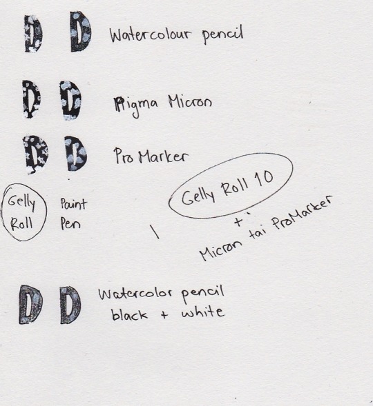
I also had bought a white paint pen but it’s useless. As you see, it just looks grey after it dries and it just... doesn’t look nice. Plus it takes so much time to dry AND it’s extremely messy and I have paint more in my hands and a puddle on the paper but barely none where it should be. So my choice for the logo was to use either Pigma Microns or Promarkers (I think I chose the latter) and the thickest Gelly Roll aka 10. This was the result:

And I’m actually super happy about how it came out! Couldn’t do that good looking spots on the letters because can’t make splashes with a gel pen so I did a few bigger ones here and there and then just poked everywhere with the pen to make it look more random. You can actually see how it’s slightly whiter than the paper if you look closely, but it’s not too strongly whiter so it looks pretty nice like this.
So, this was less work than the “Widumihei” one but it was also an interesting piece to draw. And I think I have now this comic drawing more freshly in mind so that drawing the next ones (there’s three waiting for sketching already) will be much easier as well :)
#here take the last behind the scenes post then#I mean next ones are going to be actual new drawings because now I'm done with these I had in mind#mcrmadness draws#mcrmadness draws: behind the scenes#my comics#dä fanart#die ärzte
7 notes
·
View notes
Text
How I Digitally Paint like a Scenic Artist/Designer
Aka: how I did this and put my degree to good use.
LONG POST WARNING
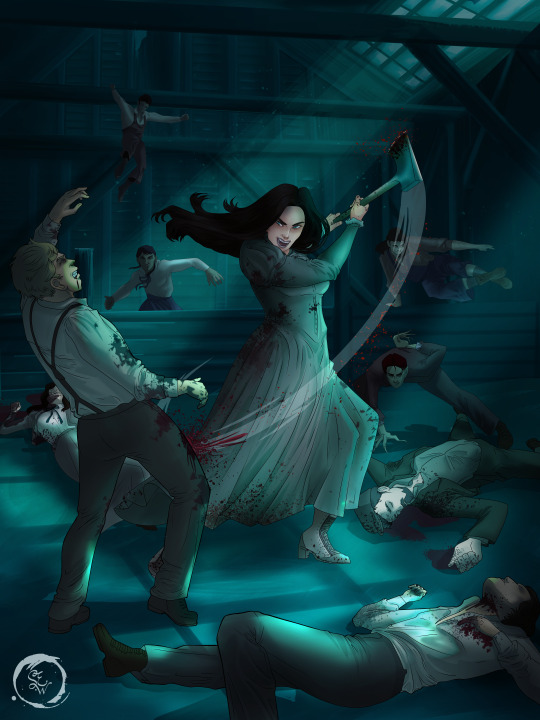
Step 1: Research.
First off, get to your image search. If you are going to be using Google, you may want to type “-pinterest” in the search to eliminate the countless boards.
I had to figure out clothing that is vaguely late 1800s. I found a multitude of reference images that were fancier clothes- but I wanted to find images of clothing for kindred across all social classes. Photographs from the era and paintings are your friend. They will more accurately showcase what was worn.
After Fashion research comes location research. The 1890s in America is known for the rapid industrialization. Factories were getting bigger and work days were getting longer. But, I wanted the moonlight to be cascading into the place, illuminating the scene. This means I needed to find a structure that had skylights or let sunlight in. And the best images I found? Slaughterhouses. Fitting, huh?
The same rule for fashion still stands- if you can find photographs or paintings from the era- they’re better. There are tons of places still standing today from the 1800s. But today, they look WAY different. Ya know, Abandoned! So just be sure to take this into consideration if you search “abandoned slaughterhouses” or go trespassing like I did.

Lastly, pose research. Finding the poses for a fight scene can be tedious. So, I enlisted some help from a few fight choreographers and stunt men. You can record their fights and play them back at quarter or half speed. You can also get a mirror and flop on the floor a bunch. I did both. This lets you see the action/motion lines you are going to replicate in the drawing. Heres how we initially did fina’s pose:

And sometimes you have to go back and get a clean shot. I ended up using this pose for the axe.
Step 2: Set up and Background!
When you open a new file, set it to the dimensions and resolution you want. I was working at 600. Usually, I’m working at 300-350. You can always reduce resolution. Its hard to prevent fuzzy lines if you increase it later.
I cannot stress the following enough:
You work background to foreground. Big Shapes and areas to little shapes. Work your way forward. What this means is you need to fill in as much space as possible first. Then build your details. I prefer working as follows: Big Solid tones, Soft shadows, Dark Shadows, Highlights, then final blend. Once you finish this, put an overlay on top. This knocks everything back and helps create the illusion of depth. See this at work with the video below or here
Step 3: Figure Drawings + Composition
Utilize that research and images you collected to pose your characters. I create subfolders for each set of figures. Organization is important here. This will help keep you on the right layer and prevent the eternal digital artist struggle of “Fuck that was on the wrong layer!”
Even after you move on to lineart and shading, Keep the sketch layer as a reference. You may need to see what youre original notes/ figures looked like as you do the lineart and shade. Don’t be afraid to move them around and alter the composition rn. You want to be able to make changes. Make notes! Detail light sources!
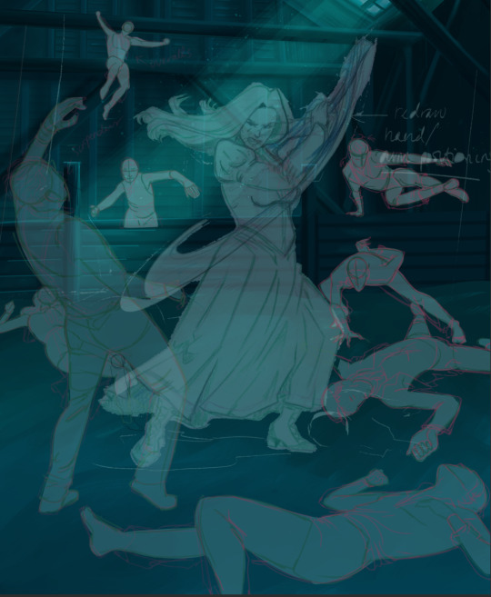
I’m about to through out some art jargon:
You want to think about asymmetric balance. The easiest way to achieve this in an eye-pleasing manner is to use the Fibonacci spiral. Yeah. This boi:

Place your figures and actions in a similar sequence to the spiral and the viewer’s eye tends to naturally follow it. This is sometimes called the Golden Ratio in the art world.
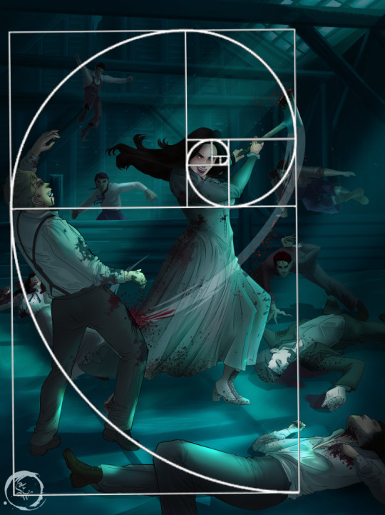
Doesn’t need to be perfectly on the spiral. You can break it- but its an excellent tool to plan how things move in the piece.
Step 4: Lineart
Once you got things sketched- its time to do the lineart. I’m using clip studio paint’s standard brushes. Nothing fancy. I often switch between the G-pen and the For Effect Liner. Mapping and Turnip are for thicker lines.

Usually I set these pens to a specific thickness depending on where I’m drawing.
My background figures are lined at 0.05 thickness, the midground is .1 to .2, Fina is .3 and the foreground is .4. I set my stabilization high to help keep my lines smooth. Stabilization 100 means there’s a significant delay between where the pen is and the cursor. I like the stabilization to be at 20 for freehanding and at 50 ish for outlining. Dont become completely reliant on the stabilization though. Good and smooth lineart is drawn from the arm not the wrist. Your range of motion is severely limited if you only move your wrist. Practice moving from your elbow and you’ll be surprised how much smoother your lines get.

Once I finish lining the figures, I usually go around it with an outline. This does three things:
1. Solidifies the figure and cleans lineart for paint bucket tool. More on that in the next step.
2. Its a stylistic choice. Helps give it that comic book feel with a heavy outline.
3. Pushes figures forward or back in the composition. Thicker outline helps denote that a figure is farther forward than another. My background figures have no outline to push them away
Step 5: Digitally coloring
For each figure you are going to select outside the lineart.
Create a new layer under the lineart
Invert the selection. Paint bucket. You should now have a solid shape of the figure under the lineart. Do not deselect.
Create a new layer above the one color. Title it solid colors. Paint in thick, solid tones. I like to use the mapping pen and turnip pen to color in my solid tones: skin, clothing, hair, etc.
After that, deselect. Create a multiply layer if you can. If your program does not have a multiplier function, Pick a tone you want to use for shadows and lower the opacity (usually 30-40% I like to use lavenders or blue tones). It will not be as vibrant, but you can edit it in post. Select off of the solid colors layer. I like to start with skin tones. Use the airbrush tool to create soft shadows. You don’t want to create harsh lines on this layer.
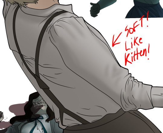
Then repeat this process with harsh lines.
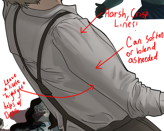
Then knock it all back with an overlay. If you dont have the ability to create an overlay, you can again drop a solid color and lower the opacity, but you’ll have to mess with the color balance/ brightness/contrast to let all the hard work come through.
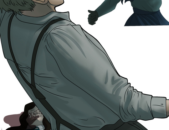
You’re going to repeat this for every single figure. Here’s a few color theory tips though.
Your overlay colors should be darker (not more vibrant) in the foreground and lighter (avoid using pure white) in the background. This helps with the depth of the piece. Things closer tend to be darker (not always true, depends on lighting)
You can choose to use color theory to aid your shadows. Instead of choosing black or grey for shadows, choose a complimentary color. I used a lot of green for this piece, I used red for really dark shadows. Its not that black drains color- its just loses some depth if not used carefully.
Keep your colors consistent. Helps unify the piece. You can strategically break the consistency to draw focus. For example, Fina is the only figure with a true blue overlay. This helps her stand out from the other figures who have reds and greens.
Step 6: Touch Ups and Final Renderings
Now comes the most tedious part. If you’re like me, your computer fans have been whirring for the last few hours trying to render this monster of a file. If you havent already, SAVE FOR THE LOVE OF ALL THINGS GOOD

These are the last four layers I have for the entire piece. Here, I am trying to create effective and believable lighting. This kind of work I have only been able to achieve in clip studio or photoshop. You can do it with normal layers, but choose your colors CAREFULLY. Stay away from pure white. Carefully utilize your knowledge of light and shadow to create soft highlights. Harsh lines tend to be a stylistic choice for me. The final layer, subtract, dulls out harsh red tones. I used this as a final overlay to help put everyone and everything in the scene. Without it, things are a little too green and skin tones are a little too blushed for vampires.
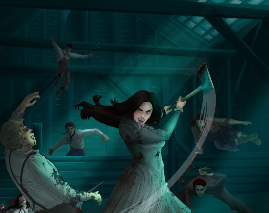
The challenge here is I want to tone down the red, but not lose the vibrancy of the blood. So, shift it to a blue. This also helped reinforce the “nighttime” effect. Its only a slight change.
Final thoughts:
Whenever you finish something, its important to reflect.
1. I am so FUCKING PROUD OF MYSELF. This is easily one of the most complicated pieces I’ve done in a while- and I’ve made 16′ tall faux stained glass. Brag. Let yourself feel awesome cuz you just made something awesome.
2. I timed myself on the piece. I could have easily spent another 7 hours on it. But its important to know when to stop messing with it. Partially for budget reasons but also when you get down to the details you can make yourself go insane. Theres also a ton of detail work I lost cuz of overlays or its just too small to notice. Fina’s face? hard to see cuz its not close enough.
3. I needed to take frequent breaks for this piece. That was good. Resting and stretching was very important. That is one of the reasons why I was able to work so fast.
4. I started doing more digital art in April 2020. I have to say, practice makes perfect. I practice drawing and digital painting for at least 3 hours a day.
That discipline has allowed me to improve so rapidly. So- I don’t wanna hear shit about I can’t possibly get this good! Or I couldn’t even draw a stick figure! BULLSHIT. You can. Get yourself some free software like Krita or Autodesk sketchbook and start playing!
And thats what I got! Thanks for coming with me on this long post!
27 notes
·
View notes