#I really like this paper texture
Explore tagged Tumblr posts
Text
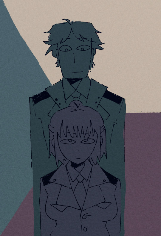
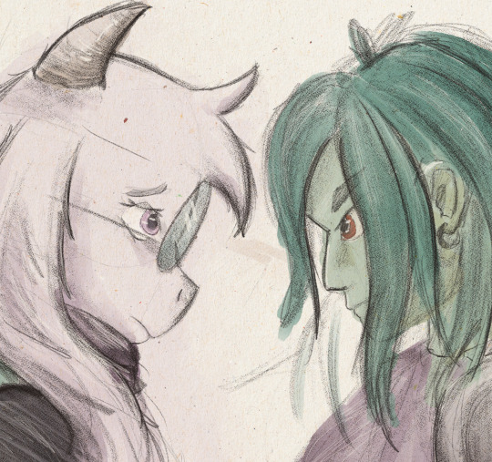
Czechy-Slovakia
#something I drew out of bordeom in like 20 minutes enjoyy#wanted to try this style again#I really like this paper texture#hetalia#art#my art#hws slovakia#hws czechia#hws czech republic
186 notes
·
View notes
Text

I like to think that when he's up late running tests and waiting on results, Bashir reads the stuffy Cardassian literature Garak keeps recommending him.
#and yes he is reading an actual book. paper books for life ok shh#star trek#star trek deep space nine#ds9#deep space nine#garashir#julian bashir#my art#I always struggle with anatomy and proportions but I hope this looks mostly ok#i tried a few new things here with color and texture#I also really enjoyed drawing him in pastel-ish shades he is so cute but wow shoulders are hard to draw#nobody is actually reading these tags but I keep using them like whole ass journal#if anyone is reading this you win a prize. or something
320 notes
·
View notes
Text
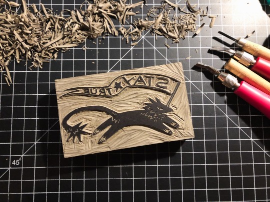
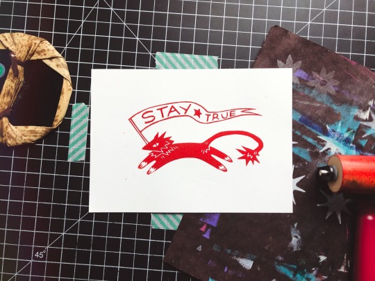
STAY ★ TRUE || patreon print for dec / shop
#art tag#patreon tag#linocut#printmaking#block print#block printing#relief print#traditional art#linoprint#they should invent a baren i like more than my dented tea canister lid. the bamboo one is ok but the texture roughs up the paper#if only i wasn't allergic to spending money on better stuff#also i fuckin. hate speedball professional that shit sucks. gets fuckin tacky as hell even tho its oil base#what a nightmare. caligo you are my one and only love#i shouldve asked for one of those fancy clay or glass barens for christmas. you know the ones with the really smooth glaze...#ok anyway yeah this is the patreon print for december!#for once i wasn't very careful about the chatter so a lot of them have some bits on the edges. whatever its art#gotta remind people its all carved
465 notes
·
View notes
Text
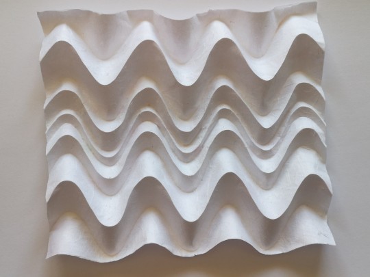
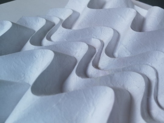

Curve study, Origami, one piece of paper
#mine#origami#curved origami#ekaterina lukasheva#she has a bunch of these in her book I really like the different spaces between the waves of this one#rendered in my printer paper-mulberry mix which is again PERFECT for curved origami#the middle pic was taken outside crazy how the lighting hitting differently can do for the volumes and the paper texture#i took so many photos lol
481 notes
·
View notes
Text

little bunny, it was just a dream !
#click for quality#journal#i don't really like how it came out but mae likes it and i can always fix it in the future#my art#i'm really sad the textures of the paper don't show up in the scans so i just touched it up on ibispaint on my phone#also for some reason on mobile it looks better than on desktop#bunny
49 notes
·
View notes
Text

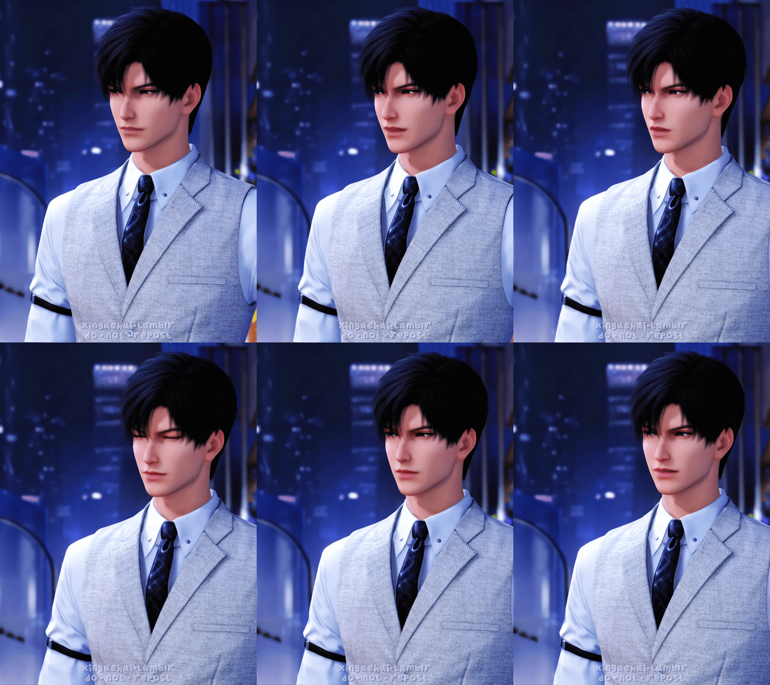
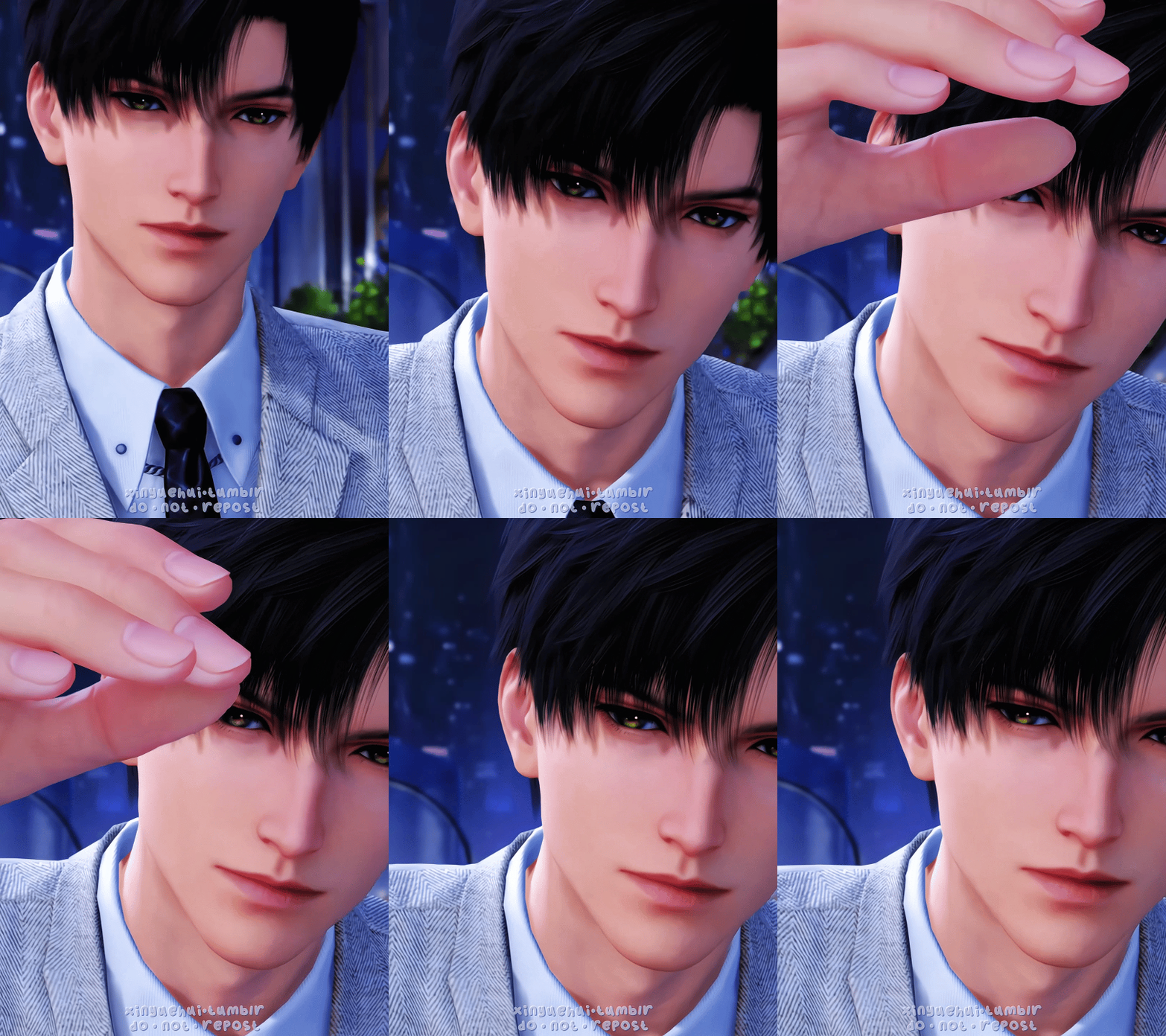
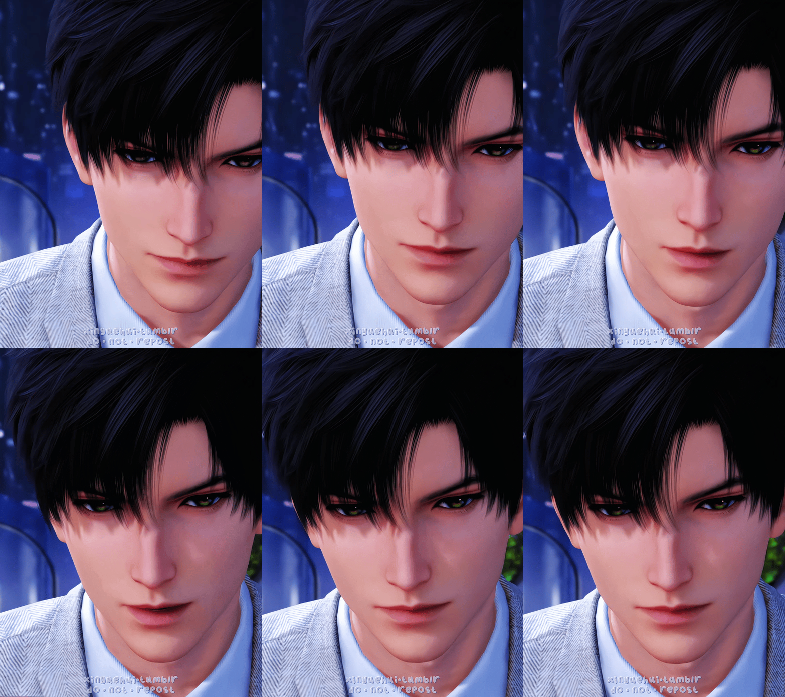


﹢﹢ Spring Outing ✦ Li Shen ﹢﹢
#love and deepspace#恋与深空#love and deep space#黎深#li shen#zayne#dailyvideogames#gamingedit#dailygaming#3d animation#video games#*4#otome#otome game#paper games#chinese game#i really like the darker night time shadows in this scene it just looks like it has good texture ya know#like the rendering of the 3d model looks nice#i love how one of the dialogue here said you moved your lips upwards by 0.00005 degree#and it fully plays into the joke about how the corner of his lips lifted by a few pixels 😂😂😂
116 notes
·
View notes
Text

I do, in fact, enjoy drawing different variations of this moment. Mostly I just wanted to doodle some wrathful Apollo (and practice doodling more of Hyacinth's curls since I usually dodge colouring them LOL) Bonus doodle under the cut <3

:D
#ginger draws#ginger chats about greek myths#apollo x hyacinthus#apollo#hyacinthus#hyapollo#Once again I managed to have a lot of fun with drawing digitally!!#Playing with colour and texture is something I really enjoy doing on paper so I was very pleased to figure out ways of doing that digitally#I am also aware that this could've been a serious piece with like y'know#neat rendered edges and such#however I really am not interested in that kind of thing right now#Anyway wrathpollo wrathpollo wrathpollo#Zephyrus ooooh Zephyrus he's coming for you#I feel bad for poor Zephyrus tbh#Poor guy is described as gentle pretty much everywhere else but then has this one single incident and gets typecasted for the rest of time#I need to introduce him sometime#Zeph and Hyacinth were good friends in my story tbh#This art is a fun little what if scenario LOL#also again reason to draw Hyacinth's sproingies
48 notes
·
View notes
Text
Drafted on 3/16, doodle to test paper overlay
#queued#kris#ralsei#could be kralsei if you want it to be#not sure what this means if it means anything at all#truthfully i just was aiming to draw a cool kris#but apparently dawntheduck's brain associates ''cool'' with ''twilight princess box art''#because after stepping back i think this really just looks like link from tp#how many times have i mentioned twilight princess in a deltarune post#it has to have been at least twice now right#perma wolf link brainrot holy crap#anyway i needed to test a paper texture for a poster i was working on and i settled on this one because i liked how the pencil looked on it#future dawn; i dont like how kris' mouth looks anymore but oh well lol
62 notes
·
View notes
Text


New coptic-bound sketchbook just dropped 🌿
Featuring:
- 4 types of paper
- Rounded corners
- Front cover window (showing a glimpse of Banana Fish inspired art)
Wanted to delve back into bookbinding... shoutout to my workplace for having an industrial paper cutter and round cornering machines ✨
#reposting this also cus I was most likely shadowbanned when I posted it originally#had fun putting this bad boy together… also in love with the textured green paper for the covers#I love drawing ofc but feels good to work on a project like this#really focused on an aesthetic… foresty…#bookbinding#book binding#book art#coptic binding#sketchbook#banana fish#🍌 🐟#eiji okumura#ash lynx#asheiji#pomegrantArt
21 notes
·
View notes
Note
Ang ganda yung art mo GGHHHOORLLLL!
I was looking at the line work you do and was wondering: do you ink it physically and then scan it, or is it fully digital? It's really good and gives a solid grit to it and adds texture to your works. How do you do that?
shdhfh maraming salamatttt 💞💕
99% of what I post here is all digital because I don’t really have access to a scanner very often! my inking style looks the way it does because I draw traditionally in my sketchbooks a LOT and the way I ink digitally is Exactly The Same as I do traditionally (which is why you see a lot of double lines in my inking, stray lines, or scribbling when I fill in solid blacks without the fill tool, I also always turn off any stabilization features a brush might have bc I don’t like the way it feels) and I often go looking for brushes that are gritty or crunchy so that it looks similar to the pens I use on paper!
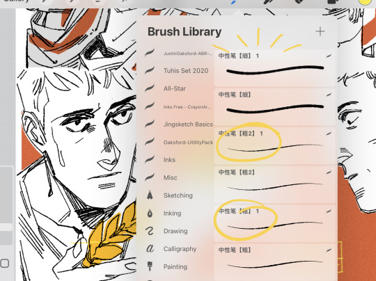
You can see a bunch of the stray lines and general scribbling I did here, which is exactly what my irl sketchbooks look like, and the circled brushes (I edited these after I downloaded them all to have 0 stabilization) are the ones I used for it!
#I consider myself a traditional tools artist first and digital second so I frequently use traditional drawing techniques but. uh#make it digital??#Wendy Xu has a flex nib brush that I grabbed when it was free that feels exactly like the flex nib pen I use so that’s the other one#I like dead line weights a lot tho so these brushes (above) are really fun to me#I have HUGE respect for people that do really clean and smooth line art and I love looking at it but I simply cannot stand it for#my own stuff. feels Wrong and Not Fun and low key kind of unrecognizable when I look at it after#ask tag#basically my whole digital art experience is trying to recreate my traditional art experience in some way. I’m on a constant#journey attempting to accomplish it#I also add a noise effect to the flat colors (between 5-7%) to mimic a paper ish texture
78 notes
·
View notes
Text
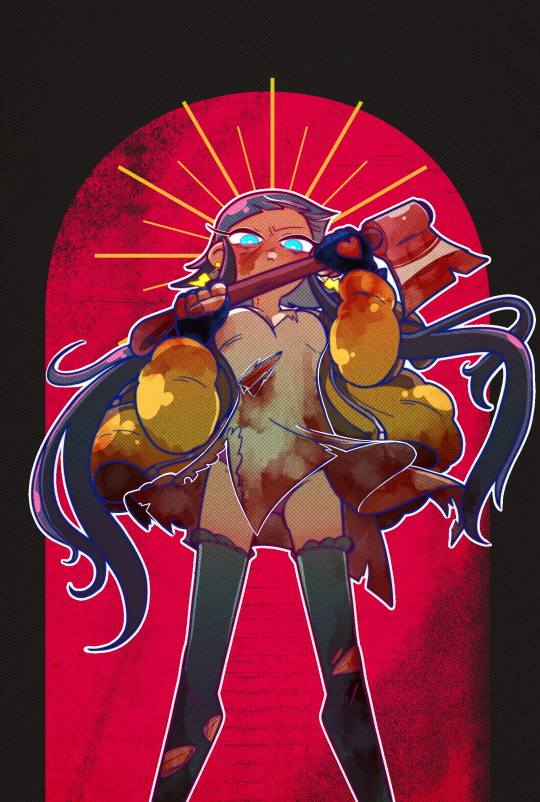
Ingo and Emmet may be the physically stronger of the Nimbasa Trio, but Elesa's the one who isn't afraid to go for the kill if it's a life or death situation. The bastard thought that she was trapped and helpless without Ingo and Emmet to save her. Unfortunately, it mistook her kindness for softness and realized far too late that she wasn't afraid to get her hands dirty.
Elesa would be the final girl in a horror movie, just saying.
also i've been rewatching buffy and i think elesa should be a vampire slayer.
I keep putting off talking about my elesa headcanons, but i just have to say that my version of Elesa uses she/he pronouns. i just think she's neat and can be a little transmasc as a treat.
#pokemon#gym leader elesa#elesa pokemon#my art#tw blood#suggestive#there is a slight panty shot but its hard to see#its been a long time since ive used clean lineart and shading and i wasnt sure how itd look with my paper overlay texture#but i actually really like the vibe#kinda wanna make this a print actually
116 notes
·
View notes
Text
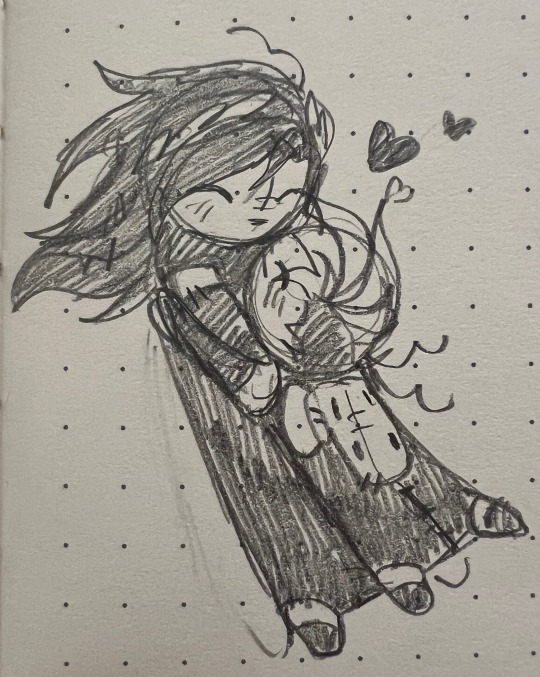
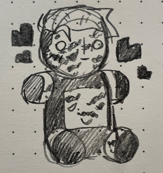
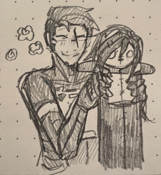
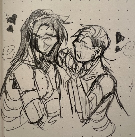
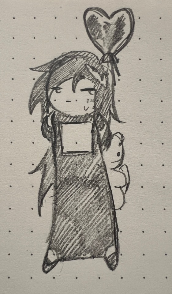
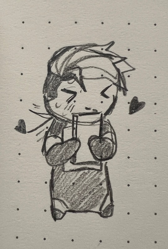
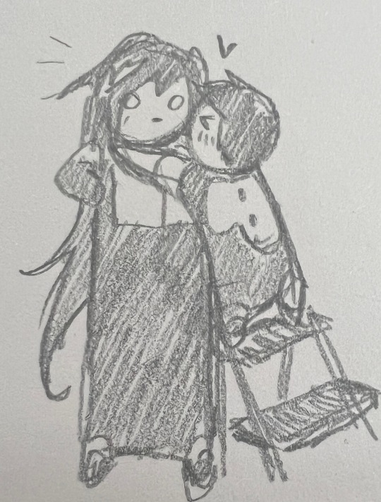
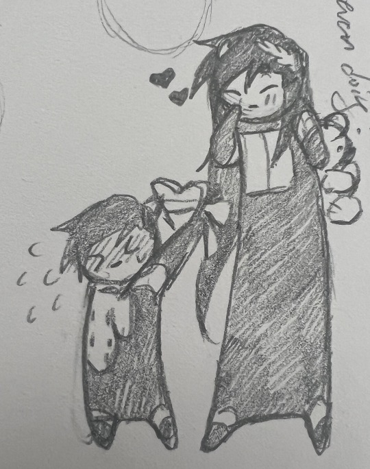
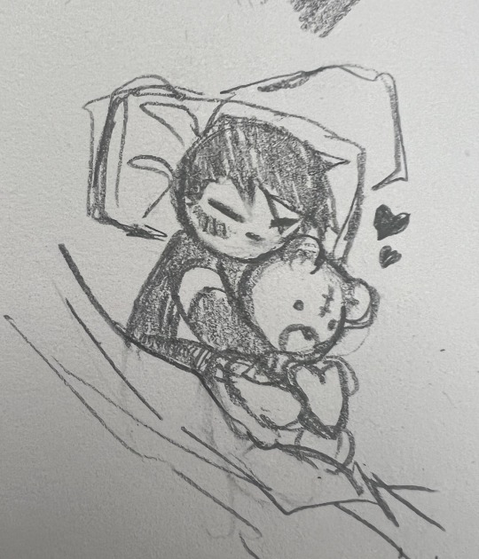
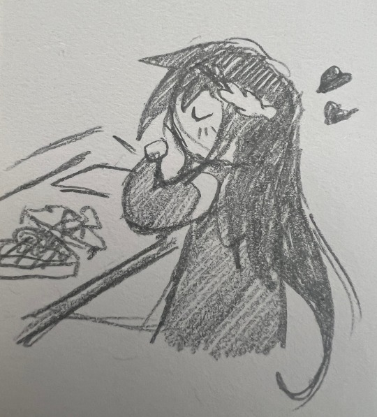
(comically late) valentines day falkler doodles
#signalis#signalis falke#signalis adler#what i mean is that most of these were drawn around/on valentines day but im just posting them here now!#anyways#i filled my bulletjournal and ive been using a sketchbook i got for my birthday#the covers cute but the paper is so SHIT!!!!!!!!!!!!!#my pencil glides across it kinda awkwardly . and the texture reminds me of slightly thicker humid printer paper#i also find it a bit difficult to really get a wide arrange of shades w a pencil like i did w the bullet journal (though this may just be a-#-skissue .. i am honestly a bit heavy handed when i draw)#anyways ive been thinking about buying another bullet journal cause i really liked these ones ….#they have little ribbon bookmarks and a little pocket to keep papers n things which i greatly enjoued …. hmmmmmmmmmmm#myth.sketches
55 notes
·
View notes
Text

HELP I DONT KNOW WHAT IM DOING HELP!!! HELP!!!!! its not don yet,,,,,, eoaugh. shoutout to like the 20 coloring/rendering tips and tutorial videos i watched you all did NOTHING to help. GOD. how hard is is to get a tutorial and help for something that actually ISNT naturally intuitive to me???
waaa waaa lineart hard 🥺🥺 waaa waaa sketching hard!!! ok man how about you struggle with figuring out basic color palettes (color is my absolute worst element of art ive yet to even improve on. this backfired on me i shouldve done more coloring pages when i was younger)
#ok but after like 30 minutes of fighting with the colors i do really like the color scheme i did with this..... like#i tried to keep everything desaturated. but also yellow warmish toned#yellow is supposed to be joyful happy yippee but this is NOT a good moment (for killer at least)#so i desaturated it. idk if that got the intended look but i wanted it to be a bit of like a twisted feeling moment#and then the red against the black of his dt vomit is like to show a contrast between the yellow#which could be calming if it was just left on its own to portray intensity and pain and yadayada#can you tell i love color psychology. can you tell. but i cant even apply any of the stuff ive learned at all#I HATE COLOR I HATE TEXTURE!!!! I HAVE ART OPPS AND THOSE TWO ELEMENTS ARE THE OPPS BRO#im glad i chose killer's as first since compared to horror's and dust's in this series his is the most normal ish#i dont know how to improve this anymore but i'll figure something out i guess idk.... art man#i think i deserve to eat a poundcake to congratulate myself for this. at least i got colors down#the tutorial lady said i should figure out color palette and placement first on the piece#and then i should do the actual thing afterwards and kinda clean things up after i figured everything out#worst feeling when you understand a concept in your head but you can't depict it on paper UGH#i have no idea how to draw buttercups btw. in fact any flower. i cannot draw nature#maaaaan i suck ass at this art shit bro i should just give up#nooo noooo..... lifelessly reanimates my disappointed body...... ink would be sad if i gave up#that stupid little skeleton is lucky he's a cool enough concept of a character to motivate me. thank you ink........#tricule rant
15 notes
·
View notes
Text

"My Mind in Love"
#my art#digital art#if you notice the word sonnet in the corner it's because i used a page of a poetry book for the paper texture#i decided to keep it because it's cute#do i know what it's like to be in love? not romantically really but I've been feeling a lot of love lately
14 notes
·
View notes
Text

dave :)
#art#traditional art#watercolour#oc art#ocs#oc group: dave#oc: dave#was testing out a different brand of full cotton watercolour paper that was pretty affordable#(thats why you can see my entire watercolour palette to his right LOL)#i got hotpress cause i was curious and im like so mad because its so good#i think i like hot press better for smaller drawings like this like this is under 10 inches. for something like 15 inches or bigger#cold presses texture is really nice BUT for smaller stuff hot press lets the colour shine through#while the cold press papers ive tried at a small scale they tend to dull down the colours a lot and it takes way more layers to build up#hot press does seem to have funky blooming situations sometimes if you put on too much water at once (like you can see on his arm)#but isnt that the charm of watercolour now that i think about it.... i definitely leaned into it in the bg LOL#but anyway im so excited dude this paper was a DREAM to work with#i am mad tho because now i fully see the light. i understand why everyone tells me to use professional paper. but it is still. Costly#LUCKILY the stuff i got was not tooooooo expensive but still...... It Is Costly hjrkfsjkrfsd
12 notes
·
View notes
Text
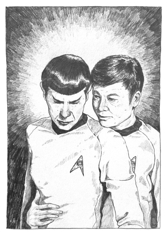
here's my finished drawing for @fuckyeahspones 12 days of Spones event — Bones is trying to keep Spock warm whilst he attends to his instruments during an away mission, but instead ends up as more of a distraction // graphite on paper, approx A5 size
#spones#star trek fanart#star trek tos#12daysofspones#in my head bones is trying to keep spock warm whilst he attends to his equipment on an away mission#but is actually being more of a distraction#but also the joy is in making up your own interpretation if u wish#I just like when he grab spock's waist#also wow the texture of the paper really showed up here even though it was pretty smooth but I guess I'm into it#my art#my trek art
271 notes
·
View notes