#I really can’t do typography
Explore tagged Tumblr posts
Visit Tumblr Blog
Explore Tumblr blogs with no restrictions, modern design and the best experience.
Last Seen Tumblr Blogs


Fun Fact
Tumblr Inc. has $15.1M in annual revenue.
Text


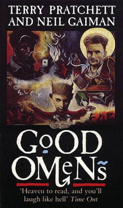
RESPECT 🪩 MIN YOONGI & KIM NAMJOON
for @rjshope

#dasha you brought this on yourself#you’re the only reason this song made its way to my playlists#I wanted to do something funky with it just like their performance#I really hope you like your late present#bts#min yoongi#kim namjoon#btsgif#dailybts#dailybangtan#userbangtan#cyphernet#*mine#I really can’t do typography#coloring this was hell#ps I love you dasha#ps2 I really hope this Korean work actually means respect 😂#word*
469 notes
·
View notes
Text
I have gotten a lot of messages saying that they really love the presentation of CURSE/KISS/CUTE. Often the commenter in question can’t say what exactly it is about the formatting that they appreciate, but that it just reads well and looks good. Well!!! Allow me to bare my wealth of secret knowledge for you once and for all:
I sorta just did some research into book typography...?
Here’s something you should know about web development, alright: typography on the web is really, really bad. The tools we have at our disposal—HTML and CSS—are incredibly powerful, but they are set up to fight you every step of the way towards Good Typography. When you know what you’re looking for, you can fix all the common issues quickly and easily. But it’s not easy to know what to look for, because
problematic typography is overwhelmingly the norm on the web, and
good typography is invisible.
Here’s a screenshot from CURSE/KISS/CUTE episode 0:

Now, I don’t want this post to come across as prescriptive. It is not my intention to tell you, “This is what good typography looks like, so follow my lead exactly.” I made a lot of choices with the typography of my web novel: many of those choices would not make sense in other contexts. What I want to convey to you is what those choices are, so that you will know they’re available to be made.
I mentioned that the web “fights you” when it comes to good typography. What do I mean by that? Well, check this out:

This is how that passage of text renders “by default.” In other words, this is how a web browser would render that text without any input from me about what styles to apply. It kind of sucks ass! But it also looks pretty familiar, right? This is not that far off from how a lot of websites—even websites full of prose (looking at you, AO3)—render text.
I think the most illustrative thing to do here would be to walk you through my thought process and show you, step by step, what decisions I made to turn this unstyled text into the styled version you see in the novel.
So, first things first:
1. We have got to shrink that text column.
Computer monitors... are wide. They are wider than they are tall. They are so wide, and they have so many pixels. This means you can fit a lot of characters on them. If you wanted, you could just have a wall of characters from the left side of the screen all the way to the right side. Talk about efficient!!
You should never, ever, ever do this.
This is one choice that I actually will make a prescriptive statement about, because it’s supported by quite a lot of research: fairly narrow text columns are more legible. Specifically, research seems to support the idea that a width in the range of 50 to 70 characters per line is the most comfortable for people to read*. Every font is different, so it takes a little doing to turn that “characters” figure into a pixel measurement; I went with 512 CSS pixels for the maximum width of my text column:

Isn’t that just so much nicer to read already?
*A commenter reminds me that I’d be remiss not to point out that the research on column width legibility isn’t completely conclusive. You do want to limit the width of your text columns, but going over the 70 character-per-line recommendation isn’t necessarily the end of the world, and you might have good reasons to do so. I did not: as mentioned, one of my goals was to mimic book-style typography, and books by nature have fairly restrained column widths, on account of they’re books.
2. Picking a font.
I’m not going to give you the blow-by-blow on how I decided what font to use. The short story is that I asked some designers, and one of the recommendations I got was the free font Crimson Pro, which I took a liking to immediately:

It’s just an all-around attractive serif font, but one thing I really like about it for use in a novel is its highly-visible quotation marks. They’re just kinda jumbo! They’re real big! Easy to see! In a novel, those things aren’t just ornamentation. It makes a great deal of practical sense for them to stand out just a bit. It also has a fairly large x-height, unlike a lot of the more traditional options, which is good for legibility on a computer screen.
3. Adjusting the line-height
Web browsers default to a line-height of about 1.2em, which, as you can probably tell, is quite cramped. If you go and Google “optimal line height for legibility”, you’ll get a number of results right off the bat suggesting 1.5em. Sounds good! Let’s do that:

Well... hmm. That’s definitely an improvement, but between you and me, it actually looks a bit too spacey to my eyes. I wonder why?
I’ll cut to the chase: the 1.5em recommendation makes some assumptions about the font you’re using. In Arial, the letter “A” is about 0.6em tall; in Crimson Pro, it’s about 0.5em. That means that there’s no one-size-fits-all solution to spacing your lines, because different fonts have different amounts of empty space baked in. How annoying!
Let me tell you something about the kind of nerd I am. When I had this realization, I grabbed some books off my shelf and pulled out a literal micrometer. I started measuring the line-heights against various font features to see if there were any patterns I could spot in professional typesetting. Here’s what I found:

Almost every book on my shelf spaces lines such that the distance between one baseline and the next is about three times the x-height. How cool is that? I clapped my hands like a seal when I put this together.
Adjusting the line-height to match what I observed in the wild gives us this:

It’s a subtle difference, but to my eyes it feels just right. It’s almost like magic!
4. Paragraph spacing...
Let’s address the elephant in the room. Probably the most controversial choice I made with CURSE/KISS/CUTE’s typography was to opt for book-style paragraph indentation rather than web-style paragraph spacing—like so:

I did this for a few reasons:
It’s what I’m used to. I’ve read a lot of books, and this is just the way that books are formatted. I think for something aspiring to the title of “novel”, there’s value in making it look the way a reader probably expects a novel to look.
A novel has a lot of paragraph breaks in it. A paragraph in, say, an encyclopedia entry might go on for half a page or more; whereas it is unusual for a paragraph in a modern work of narrative prose to run for more than a handful of sentences, especially in any scene with dialogue. Because paragraph breaks are so common, spacing between paragraphs in a novel results in a lot of wasted space. Also, subjectively speaking, the additional space seems to me to lend an undue amount of weight to paragraph breaks. I’m just starting a new thought; there’s no need for a 21-gun salute, you know?
Having said that, here are some good reasons you might decide not to do paragraph indentation anyway:
Doing it right requires a bit of extra legwork. Notice how the very first paragraph in the image above has no indentation. That’s because it’s the start of a new section, and the first paragraph in a section traditionally goes unindented. This is an easy detail to miss, and it can be difficult to wrangle CSS into doing it for you automatically.
Web users don’t expect it. For the first decade of the web’s existence, there was no good way to do paragraph indentation; by the time CSS rolled around and made it easy, paragraph spacing had already become the norm. And while CURSE/KISS/CUTE may be a novel, it is also, specifically, a web novel!
But it’s my house and I get to make the rules, so I went with indentation. Incidentally, there seems to be a dire lack of research into the question of whether indentation or spacing is more legible for readers—but the data that does exist appears inconclusive at best. So, the choice really does come down to vibes.
5. The tragedy of justification.
You’ll note that one way in which I did not make my web novel look like a paper novel is the text alignment. It’s un-justified: the right margin is ripsaw-ragged.
This is because it is not possible to justify text on the web.
Oh, you can try. Look right here: there’s a CSS property for it and everything. Just turn on “text-align: justify” and...

Nightmare! The interword spacing on that first line is almost as wide as the indentation!
Reader, I’m afraid that your web browser is simply too dumb. That’s not the browser’s fault: robust algorithms for justifying text without creating these distractingly huge gaps between words have existed for many decades, and modern computers are powerful enough to run them in real time with little performance impact. It’s just, uh—nobody has ever bothered to implement them into web browsers. It is the damnedest thing.
I tried, I really did. You can mitigate this problem a bit if you enable automatic hyphenation, but browsers are unfortunately also kind of dumb at hyphenating. Firefox, for example, will refuse to hyphenate any word containing a capital letter, so any sentence with a lot of proper nouns in it is a lost cause. I tried manually inserting soft hyphens with a text preprocessor I wrote myself, but still these overjustified lines plagued me: when the text column narrows, for example on a phone, even hyphens can’t save you. The line-breaking algorithm is simply too naïve to optimize for well-justified text, and that’s not something you can fix as a web developer.
As a result, my heavy-hearted recommendation is to never use text justification. It’s just too distracting.
6. And then some extra stuff just for me
I added drop-caps because it looks neat and I made the ellipses spacier because I think it looks good when it, uh, when they are spacier. I think that looks pretty good that’s just my opinion though.
That’s all! Hope you learned something bye!!!
523 notes
·
View notes
Text
It’s horrible how my design course has killed my enjoyment in creativity because all they want is finished pieces founded in nothing but a spontaneous mark just to hang at some concrete art gallery or to sell to some “join our revolution” comfy business-casual company with a prison cell wellness room. I’m not saying that it’s “not art” —cos that’s a different post altogether— it’s that the ethos behind this particular formula for art education is ruining the way we think about creation.
Design courses (and other art courses I’ve heard?) are no longer teaching artists or designers techniques, drawing skills, art fundamentals and allowing them to find their own voice so much as they are only instructing how to tic boxes alongside pushing corporate and classist motivated style/methodology bias aimed at producing workers, not creatives, not to mention providing Adobe with endless funds for their despicable scam programs. That’s it. My creativity is only a means to money for them, and if they can extract the process of creation from me without the complex creative intimacy involved in it, they know they can churn out products and services faster and it’s concerning some lecturers don’t seem to be aware this is what they’re teaching? Like they’re buying into industry propaganda?
And the whole time it’s sold to you like you can be some trailblazer when the irony is they’re usually either prepping you for cubicle work or for some misguided high horse creative team pumping out design solutions completely divorced from the reality. I’m tired of all the talks about sustainability in a vacuum with no conversation about nuanced designs that factor in broader social and economic perspectives which lack thereof is leading to sustainable products being sold at a price only able to be afforded by wealthier people who are causing said economic and social problems and contributing to the rapid obsoletion of trades and crafts. Lecturers and speakers don’t seem to think that’s any of our concern and should just worry about producing the design for the hypothetical Bluetooth powered organic hairbrush or using the twigs to make the pattern for the £85 fabric square.
Like? Can I please make something that actually resonates with people outside the circle jerk of egotistical creatives and corporations? Something charming and maybe idk something that doesn’t make me want to tear my miserable portfolio in half with my teeth? And they’re like Mm nope sorry it has to be an extreme close up of a mark making abstract leaf you made from a recycled trash bag inspired by a stalled urban space which we will force you to price at £100 during your exhibition 5 people will bother to attend and no you’re not allowed any other style cos this isn’t the Dark Ages :///
I think the worst thing my lecturer ever said was, while looking around the room of our class work reduced down to a series of cubes and splatters and abstract typography, “Wow, I love how you can’t tell what anyone’s [main artist discipline] is!” Like awww conformity at the expense of a person’s individuality to make pieces for airport hallways and rich people’s living rooms wow so cool heehee like girl that’s not good?? Why on Earth are you complimenting us for that? Like I get it, I thought this course would boost skillset as an illustrator (as we were told), turns out the degree is really not for me, fair enough to anyone thinking that, but forcing students to produce modern abstract art because you think it’s the ONLY Logical Pathway for the future of design, judging them intensely for doing a different style, and thinking producing financially inaccessible art + design is the solution to things like climate change and community severance is an objectively bad take.
#needed to get that off my chest it’s been sitting in my drafts and it’s still true#genuinely hate just about everything I’ve produced on this course#like illustration as a course was fine#this one is just depressing#had to almost completely reinvent my art after first year cos this Forced Style threw me off so bad#I am Scared for the future of creativity in academia#wrote a 10000 word essay (for fun) about why the corporate bullshit is contributing to the downfall of art#so needless to say I have my dissertation for my honours already#ok to rb#illustration#design
157 notes
·
View notes
Text
The art director & the Good Omens book cover tier list of doom, part 2
Part 1 l Part 2
I am your resident Art Director/Good Omens enthusiast, and welcome to my completely meta-free book cover tier list. Listen, making a book cover is HARD. I should know. But while we salute these artists for their hard work and time, I think we can all admit that once in a while, the vision is just not on. And on very rare occasions, publishers seemed to have managed to commission the cover art directly from hell... here's where we left off last time:
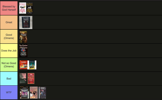
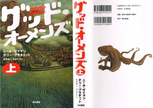
Onwards and upwards, as they say. 11. International paperbacks, Goda Omen
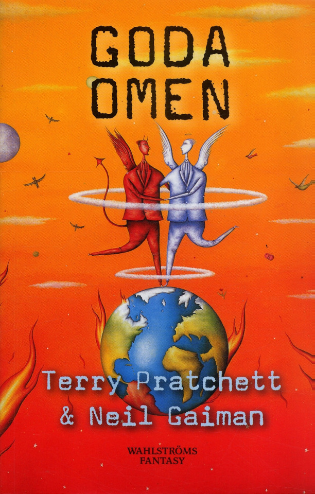
It is inexplicable to me but I LOVE this cover art. It's so sweet and innocent, the colours are contrasty and fun, and the layout leaves enough room for the text. Maybe I would call it slightly inaccurate to have our boys dancing on Greenland while the UK has drowned in a great flood, but hey. It's charming. The international cover gets a thwack with a ruler for trying to fit "creator of Discworld" in between the two wings like that, though. Tier: Great
12. Italian Cover, Buona Apocalisse à tutti!
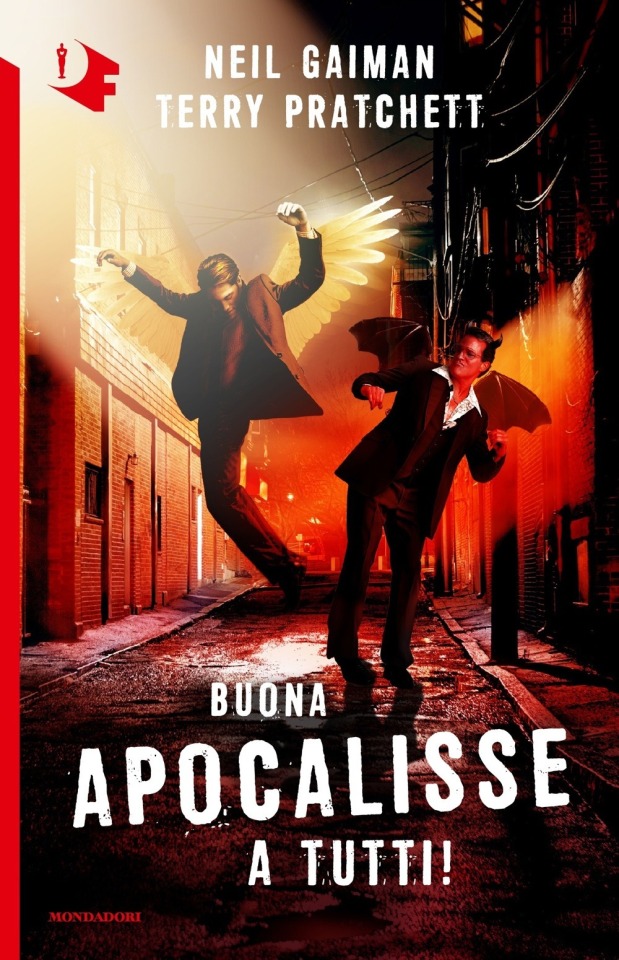
The Italian translation of Good Omens into "Happy Apocalypse to All!" really tickles my funny bone. Unlike this cover which is trying to scrape at it with a dull knife until I'm screaming on the floor. I know demons can only dance badly, but does Crowley *really* have to fracture both ankles while trying? Aziraphale pelvic thrusting his way into heaven is a visual I didn't think I'd ever want. Minus so many points for random murder alley where this is all occurring. At least the designer managed to wrangle the type into one of the best proportional layouts I've seen thus far? Tier: Bad
13. Italian Cover, Good Omens
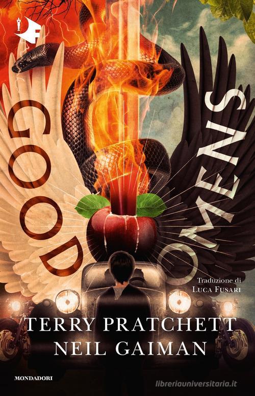
A truly valiant attempt here to rectify a terrifying situation with that earlier Italian version. While this one actually seems much more interesting at a glance, the details kinda get to me. The Bentley's steering being on the wrong side, the word Omens kindasortanotfquite fitting on the black wing, the motorcycles with no drivers... TIMES NEW ROMAN FOR THE AUTHORS NAMES. I don't think it can even be redeemed by the most powerfully rendered Sacred Heart/Cardi B W.A.P. imagery I've ever seen. Tier: Good (Omens)
14. Japanese cover, Good Omens
Look, this designer GETS IT. Crowley and Aziraphale are a pair, a group of the two of us. Do not separate. It's also the only cover I've seen that uses shades of grey! The woodcut vibes are STRONG AND POWERFUL. The type is well placed! I should love this, except the end result kinda looks like a manual for clinical depression in the workplace? It's ending up higher on the list than it deserves, frankly.
Tier: Good (Omens)
15. Japanese cover, Good Omens
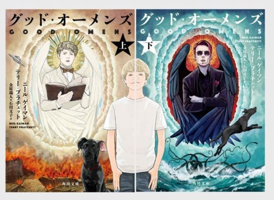
This cover might as well be an Ethereal/Occult firemen's calendar. Someone wanted teens to cut off this cover and tape it to their bedroom wall. I can't even judge the typography or the symbolism because I'm just getting hit with waves of pheromones and angst. I can't even tell if it's good but it's going in the Good pile because I can't look at it anymore...
Tier: Good (Omens)
16. Japanese covers, Good Omens

Other people have assured me that this is, in fact, a dual Good omens cover. Alas, I cannot tell. I don't possess compound eyes or even an exoskeleton, and as such lack the ability to decipher these decisions.
Tier: WTF
16. Japanese cover, Good Omens
Holy overlap, Batman! I can’t fault this designer for wanting to reuse the wonderful dual illustrations in a Ying-Yang layout, all the elements are there, but there’s a clinginess to the type and positioning that makes me feel like someone is trying to hurt the letters? Is this designer okay? Do they need a hug?
Tier: Does the Job
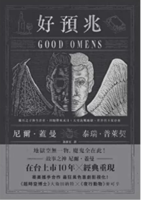
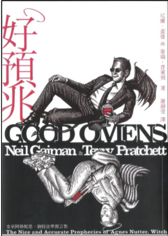
18. Chinese cover, Good Omens
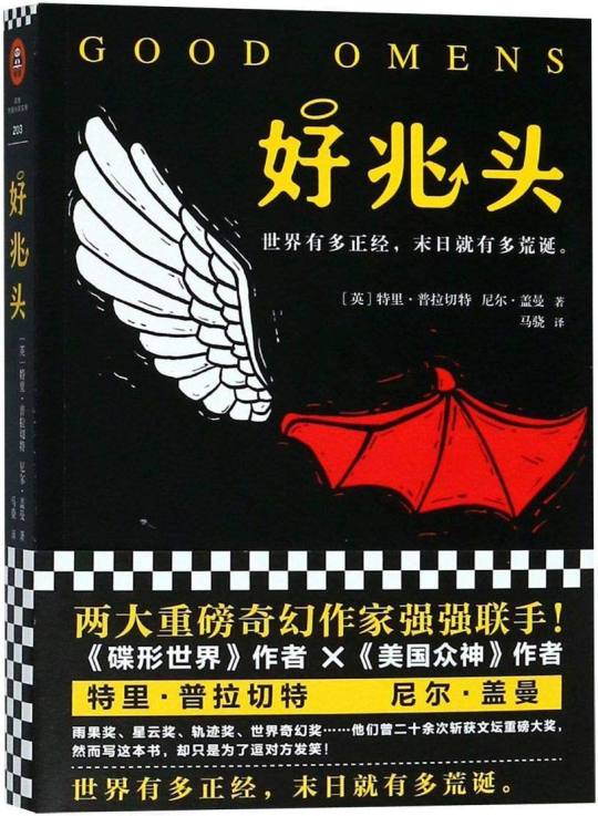
Can I say how charming it is they’ve managed to conserve the halo and devils tale on the Chinese title, as well as the woodcut detailing? However, the simplicity of the cute, contrasting wing design is sadly swallowed by the intense, New-York taxi cab vibes coming off the yellow and checkerboard text block. It could have been so good! Chinese readers: I am mad on your behalf!
Tier: Not so good (Omens)
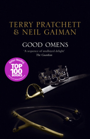
19. UK 1991 paperback, Good Omens
What are we doing here, people. I think I've stepped into a Jungian analysis of what it feels like to have read Good Omens. It's dreamy yet unsettling. Right yet very wrong. And Ol' "Tiny Hands" Aziraphale up there is really judging me for what they found inside my mind. In less upsetting news, we've kept the improved typography and layout of the authors and book title. All is not lost to the nightmare.
Tier: Not so good (Omens)
20. 50 Shades of Gray rip-off cover, Good Omens
*panic* WHAT ARE WE DOING HERE, PEOPLE...?! Bonus : the guardian quote is almost as much of a mystery as the cover it’s on.
Tier: WTF
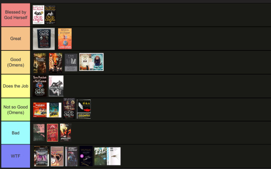
End of round 2.
#good omens 2#art director talks good omens#tier list#good omens#aziraphale and crowley#aziraphale x crowley#crowley and aziraphale#book omens#book cover#go2
115 notes
·
View notes
Text
✨ fave creators art challenge ✨
starting with the one and only @nataliescatorccio
becca, you have been my inspiration and my idol for years and years now. i don’t even know where to start because you’re just on a whole other level. seriously, you are the definition of talent and hard work, and every time i think i’ve seen your best, you go and make something even more breathtaking. you’re constantly setting new trends in the gifmaking community, inspiring the rest of us to think outside the box. i mean, how do you do it? it’s like you have a never-ending well of creativity and magic, and i’m honestly just lucky to witness it.
you have such a distinct style that always feels so effortless—but i know better than to think it’s really that easy. the way you color and blend is pure magic. more than that, you always seem to pull these brilliant concepts out of nowhere, and i have no idea how you manage to bring them to life with so much precision and detail. i can never get over the way you make every single gif feel like a piece of art—and i'm not just talking about coloring and blending, but the emotion you infuse in each set. it’s always so personal, so heartfelt, and it resonates in a way i can’t even describe.
so, without further ado, here are some of my favorite sets of yours from this year! (i had to limit myself to this year only otherwise we would be here til next year at the very least.)
alicent appreciation week: this one is fresh in my mind, as i've just made a set inspired by it! and for a good reason. it's seriously one of my all-time favorites from you. the way you wove these scenes together is just magic. you matched the young and old alicent scenes so well, i can only imagine how long it took. the soft green tone you used gives the whole thing such a calming yet melancholic feeling, and i think that perfectly captures the heartache of the scenes. it’s so beautifully painful to watch, but in the best way possible.
jackieshauna + good luck, babe: fun fact, this set sent me down the chappell spiral! even tho i was already loving the song, i simply couldn't stop thinking about it after i've seen your set and started to make connections to jackieshauna in my head. then i ended up fixating on chappell's music for weeks and that's all on you <3 i’m absolutely in love with the pink and mint combo, it feels so fresh and vibrant! and the lyric arrangement is so simple yet totally unique. love, love, love!
annabeth chase + nikita gill: from the moment i first saw it, i knew this was going to be one of my favourite sets from this year. and i wasn't wrong! the way you combined so many amazing effects and techniques without it ever feeling overwhelming is beyond impressive. the use of shapes, especially the little heart and dagger doodles, is brilliant, and the way the text warps around them is so creative. the geometric b&w elements? my mind was blown. then, there's the sick glitch effect in the middle and the last gif where the squares appear one by one—i can’t even imagine how much time and effort went into this. this set seriously belongs in a national history of gifs museum.
yennefer + all-american bitch: i feel like this set captures your artistry like none other. just one very simple font and yet you made it look like a masterclass in typography?? i bow down to thee. and all the scenes and coloring are so well balanced and just incredibly pleasing to the eye. the rich red coloring feels so deep and powerful, and you really brought out the intensity of the character with it. truly, the whole vibe of the set matches yen’s sass perfectly!
yellowjackets as yellowjackets species: i am obsessed with this concept! it just feels like one of these things that simply HAD to be made. the colors you chose for the set were absolute perfection, and that little bee detail? too cute for words. but honestly, what really had me blown away was how each gif really embodied the essence of the characters. this set felt so thoughtful, and i love that it doesn’t just look good but also tells a really cohesive story.
the crows as species of the crow family: you know i'm a sucker for a gif series! after falling in love with the yellowjackets set, i was so excited to see this one, and you absolutely nailed it! the blending, the coloring, it's all there in a perfect becca fashion. i will never get over how you chose the hooded crow for inej—such a perfect fit. also don't think i forgot this little series was supposed to have a third installment… just saying!
rhaenicent + say don't go: becca, this one is on a whole other level. i'm pretty sure i screamed when i first saw it. you managed to incorporate so many scenes from the show that it feels like a beautiful, exhaustive tribute to rhaenicent. i was blown away by how you combined all those effects and overlays so seamlessly. the shattered mirror in the first gif? genius. and the way you used the ripped pages with those perfect fonts? perfection. and the taylor swift lyrics just sealed the deal for me. i’m honestly in awe of how much heart and soul you put into this one.
jaskier in daffodils: this one was another showstopper for me. i love how “j” stands for both jaskier and joker—it’s such a clever little detail that you just nailed. the shades of yellow you used here? pure magic. you really turned these similar tones into something that feels dynamic and mesmerizing, and the way you played with color is honestly next-level.
jackieshauna + you can't catch me now: i can't get over how haunting this set feels. it's truly as if jackie's ghost is tied to it, ready to remind anyone who sees it of the lesbian high school drama of the century. i love how the first forest gif feels so ethereal, and the footsteps vector is another incredible detail. the black and white gif adds a whole other layer of mystery, and it feels like the perfect visual for shauna seeing jackie everywhere!
rhaenicent parallels: i don’t think i’ll ever get over this one. the merlin quote? chef’s kiss. i didn’t expect it, but it fits so perfectly with rhaenicent, i’m in complete awe. the coin motif was brilliant—it felt like such a personal touch to show the duality of the characters. the way you worked the paper ripping effect in and connected it to their younger and older selves was genius. the whole thing feels like a powerful emotional punch, and i can’t even put into words how much i love it.
becca, to say that you’re one of my absolute favorite creators is an understatement. i’m constantly in awe of your work, and i feel so lucky to witness it all! i'm sorry to see you struggling with inspiration and/or motivation these days, but hopefully this little love-rant of mine will remind you that everything you make inspires and resonates with so many of us here on tumblr.com/hellsite. love you loads <3
9 notes
·
View notes
Text
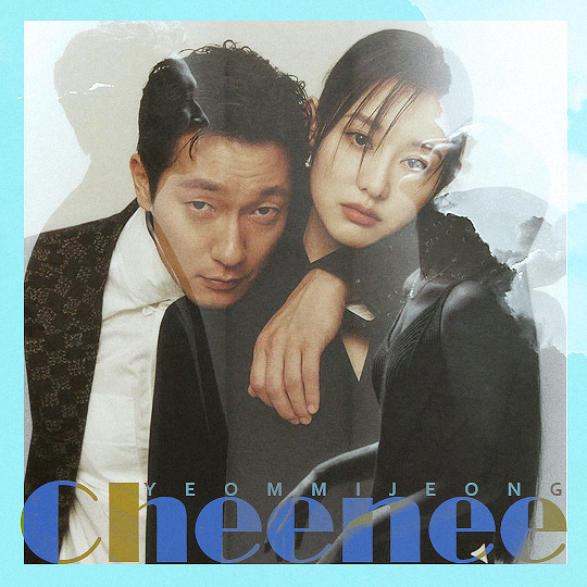
MEMBER OF THE MONTH ↳ Congrats cheenee @yeommijeong
💌 NOTES FROM THE ADMINS
Layla: CHENEE!!! the mln gifmaker queen!!!! that's what i've been associating with for over a year now... all those parallels sets, quotes sets and compilations sets... i can't emphasize how neat they're... your giffing style is so pretty, the natural warm coloring and the good sharpening... and your blending always comes out amazing a top-notch one.. i love when a drama inspire you so much and espcially when we have dramas on-common✨✨✨... so thank you for feeding us with many content and for being part of our network family.. with all my love💛 ↳ favorite works: [ 1, 2, 3 ]
Sam: cheenee! first off, congrats ❤︎ it’s been lovely to see your gifs and have you as a part of our community. not only that, but a duo editor + writer, share the talent! I love the simple, clean, but impactful, typography you use in your sets, as well as the soft and natural colorings. I didn't even watch MLN but your sets for that drama are soooo lovely, 100/10 top tier content. also, extra thank you for participating in our 2022 year in event, you made so many wonderful sets! ↳ favorite works: [ 1, 2, 3 ]

Alexa: yay cheenee! when i think about my liberations notes, your blog is inevitably the first one that comes to mind! your love for the show is infectious and even though i haven’t watched it myself, i really feel like i can feel the heart of the story and of the characters through your edits and sets. the coloring and sharpness in everything you create is absolutely stunning!! i feel like you really capture the feelings of the show in the way you create for it, and that’s definitely not something that’s easy to do. also i can i say i loved your love for the secondary couple in love all play!!! thank you for supplying us with gifs of so many of their beautiful moments. i can’t wait to see which show you create for next! congrats on your motm pick, it’s so deserved~ ↳ favorite works: [ 1, 2, 3 ]

11 notes
·
View notes
Text
ugggh sort of slogging through an artwork right now and I’m getting sooooooo in my head and self conscious about the way I make art
like. idk. i use strong language a lot because im melodramatic bitch, but generally i would consider my overall opinion of my art to be…harsh but fair. I could definitely cut myself some slack, but I’m also not *making shit up* just to hurt myself either. It’s critique that I’d give anyone, albeit harsher since it’s myself and not someone else.
I really think i have a complex because i have a graphic design background and…if you’ve seen my art…you can probably see why I found it very difficult to mesh my illustrations with my designs. Or maybe you can’t because you’re a better designer than me and would know what to do with it lmao. But i was doing that stuff when The Height Of Graphic Design™️ was Swiss typography and minimalism. So I pretty much never made anything that was on trend—aka marketable, which is sort of the entire point of graphic design—and it killed my confidence.
my skills stagnated because i was burnt out and couldn’t make anything, especially since i believed that the only stuff i was good at was literally unusable. And I did try, but it went pretty poorly. Looking back some of this was just imposter syndrome and me being a horrible inner critic. A lot of it looks better to me than it did then when i was making it. But i still see the exact same issues with my illustrative style in that space.
the never-ending complaint i have against my own art is also the thing that makes it good at all: it’s an absolute fucking mess of lines. Don’t get me wrong, i ADORE messy art. I love impressionist painting. I think gesture drawings and sketches are beautiful, and i like making mess art. But goddamn if it doesn’t feel like it’s the only thing i can make.
There’s so much i want to do but I feel extremely limited. I know the answer is that i should just practice and deal with stuff…sucking and looking ugly for a while. But it’s hard to throw all that time into making something that i know is subpar or even just bad.
And it’s just annoying to feel like the reason i can’t do something isn’t a materials or a money or even an inspiration or concept thing. It’s purely a skill issue. I literally just…can’t do it. It reminds me of when i went ice skating the first time and couldn’t make any progress despite my brain knowing what to do. My body couldn’t execute it. And it’s the same thing with this stuff.
I hate having to give up on something, not because i want to or am not enjoying it or don’t have time or anything, but because i simply can’t. I can’t ice skate, and I can’t make beautiful, clean art either, and for weirdly the exact same reason.
There’s also something to be said for the fact that any artist worth their salt regardless of their style can do what i do, really. It’s like i stopped after step 2 of sketching and never finished or learned anything past it lol. Every great artist out there doing great portraits or figure drawings can do gesture, can do sorta messy, etc. But i can’t clean my shit up to save my life lmao
idk this isn’t supposed to be a pity post or fishing. if i didn’t like the art i make i wouldn’t post it, you know? And i didn’t for a long time but i like everything I’ve put on here. I don’t think they’re bad, obviously. But when I see all the stuff I wish I could do…a wistful envy follows.
2 notes
·
View notes
Text
thank you @mickschumachergf @usersewis @brawn-gp and @lewisrises for the tags! you guys are amazing and i love your creations <3
1. which drivers do you mainly make gifs for?
my main three are charles, lewis and seb! they also happen to be my favourite drivers on this blog. i love giffing them individually and as a pairing.
2. out of the above (if more than one) who’s your fav to make gifs for and why?
i can’t possibly choose between them. charles’ expressions and mannerisms are to die for. lewis is beautiful and super stylish. i enjoy seb’s quips and wholesome personality. i love them all equally!
3. link the favourite gifset you’ve made and tell me a little about it.
currently, it’s this one of lewis and all his 2020 championship-winning races!
from making the poster template from scratch and adding in all the little details to colouring each gif and tweaking the colour palette, i’m proud of the effort i put in this one. there was a lot i learned from the creation of this set — although there were some stuff i had to fix — and i’m incredibly satisfied with the end result. i wanted to make something as vibrant and radiant as lewis was, and to achieve that self-set goal is liberating. now i'm tempted to rewatch his 2020 season!
i also like my seb x ferrari x red gifset. it’s the second set i made and i learned a lot about colouring from it! i got my hands dirty tweaking the different colouring layers and was genuinely surprised by how well the gifs turned out.
4. link your fav gifset from another creator.
oh this is very very hard because there’s so many i really love. @josefnewgayden's lewis x fashion designers gifset is simply incredible when it comes to their use of blending and layout. @brawn-gp's lewis' 100th win in f1 set has stunning, astoundingly good typography and colouring. @ivettel’s latest seb set is a gfx masterclass; their creations tag also features lots of sets with rotoscoping and other advanced gif effects!
5. off the top of your head, tell me about the most memorable tag you've received.
there are a lot that i love and laugh about in equal measure, like "op i love your colouring!" "op this is insane!" and "OUCHHH!" but one that really stood out to me recently was "op i don't watch racing but your gifset is really nice, the design and colours are really beautiful" which made my heart ache in the best of ways.
6. which f1 media source (post race interviews, sf full accesses, no brakes, etc) is your fav to make gifs from?
honestly anything that is in good quality (1080p and above) and have downloadable links on youtube/other websites is great for me! don't really like torrenting (too much fuss) and screen recording (only for race weekends, otherwise no due to questionable quality). sf full accesses are great, i also like mercedes' videos and f1 compilations (top tens etc) featuring certain drivers.
7. tag someone else!
not entirely sure who's been tagged and who hasn't but @hakkinens @vandoornevettel @goatseb @umflowers @localoptimist if you all want to or have not done it yet <3 as always, no pressure!
11 notes
·
View notes
Text


I have to say I have very much enjoyed my time in this class. I feel like at the start of this semester I was nervous about doing discussions and doing critiques but by the end I had immensely enjoyed looking at classmates' art and presenting my own. And that's all thanks to our wonderful professor, who did nothing but support our discussions and encourage us to get creative with our projects. This class encouraged creativity and outside the box thinking, and the lack of specific requirements was at first nerve racking but I grew to really enjoy the creative freedom of this class. This class exponentially increased my appreciation for art and all the avenues we explored in terms of projects and ideas and theories was fascinating. Especially the archive project, being able to see patterns in the art I enjoy and create that I had never seen before or recognized was fascinating to see. And being able to find more artists and art to include into the archive was so fun, and will be used as inspiration far in my future. I feel this class has taught me a lot about color theory and composition, which is something that will be used constantly in my future art endeavors. My artistic and creative plans specifically are to complete my Bachelors Degree in Fine Arts for Communication Design, which involves taking Art History classes, Fine arts classes like Core 2 and others following that sequence, and Graphic Design classes like Imaging 1 and Typography which I will be taking next semester. I have already completed my core curriculum from my time at Austin Community College, and so being able to focus on only art classes has been a weird adjustment but very refreshing overall, and makes school a lot more fun. I still am taking classes for my minor, which is in Business, but that's nowhere near as fun as these art classes. But I am overall excited for my future here at Texas State, I’m excited to take Printmaking and Metal Working in future semesters, and I'm hoping this will all help me creatively, as I’m not sure what specifically I will be doing out of college, but my achievements will help me tackle any job or project I get assigned; or will allow me to make my own art and express myself how I want to. I think overall the biggest take away I will get from this class is just a newfound appreciation to art of any kind, whether that be paintings, or sketches, or prints, or graffiti, or movies, or books, I just can’t help but appreciate the work that was put into it, and I think it’s such a enjoy to dissect another artists work. Also this class has made me permanently aware of any typography I see on the street or in my daily life now, and aware of all the art that surrounds me each day.
Thank you for the amazing Semester!!
7 notes
·
View notes
Note
1, 3, 40!
1. What font do you write in?
Typically, Alegreya. I find it a very comforting font to look at. If I’m using monospace (as I do for some things), Fira Code. (While rare, if I need to use sans serif font, I use Fira Sans.) Jauría is another font I love, but I use it in my flash cards, so writing in it would be strange.
While my preferred font has changed over the years (I used to use Georgia, and before that others I don’t remember), it is deliberately chosen. I consider myself a bit of a typography nerd, but moreover, I hate Ariel and TNR with a passion. I couldn’t stand to write in either. If you’ve ever worked on a shared document with me, I have changed the font.
3. What is your writing ritual and why is it cursed?
I’ve been informed quite reliably that my notebook system is cursed.
On a more explainable level, I think the way I end up writing the same scene for like five fics. What I mean is — let’s say I’m writing a scene for reuniting after torture. I’m kind of in a groove, and I have another fic that needs that scene, so I just keep writing. The cursed part is I end up using very similar dialogue.
Also, my general attention to detail. I don’t typically get to flex it when I write for warriors, because there’s only so much to know, but typically I end up downloading at least one paper per fic. These vary from psychology to malacology (the study of mollusks!) to released protocols of an FBI special unit. (Those three are all relevant examples.) I might take it a little far but there’s something soothing for me in it. (Also, anyone who follows my main will likely not be surprised by this, but I go a little insane for thinking out details.)
40. Share a poem
Aside from what I have on my main, hm. It’s been a long time since I’ve kept poetry on my phone. I’ll offer this, which is technically a text message, but a poem as well
I say “hypothetically wouldn’t it be fucked up if someone’s parents treated them this way” and they say “here is a complete tour of the hospital” and I say “I am going to tell you about how much of a nerd I am” and they say “I want you to braid my hair” and I say “I think love is supposed to be angry” and they say “I hope not” and i say “is it fucked up that I was relieved that it was just an allergic reaction?” and they say “I want my brother to give you a tour of my city” and neither of us say I love you because we know that would destroy me right now, but we mean it
Also, a list of some poems I’ve loved enough to memorize (apologies for the lack of authors, I’ve never been good at that part):
the envoy of mr cogito (English translation)
[i carry your heart with me]
Heartbeats (I need to add on this one, it’s worth reading out loud. Also, because of the steadiness of it, I used to mutter it under my breath when I was focusing, and my boyfriend had to alert me that saying “Today? Tonight. / it waits. For me.” was creepy and I should maybe not)
About the weather (another one with a note, I like this one so much I wrote an essay analyzing it)
I sing the body electric, especially when my power’s out
Crossing the bar
Do not go gentle
Queen mab speech (Romeo and Juliet)
I also really adore Walt whitman’s “I sing the body electric” but it would be…difficult to memorize, to say the least. I’ve considered adding it tho. And from Andrea Gibson, “Alaska says sun”, “good light”, “fight for love”, “boomerang valentine”, “I do,” and “say yes” are all some favorites. I wanted to single this out, though — “how it ends” is probably one of my favorites of hers.
I could probably keep going with poetry — if you can’t tell, I’m a fan. I’ve used poetry to keep the world stable under my feet since I was a child, and I’ve got some favorites.
<3
#mine#dantelupine#ask#ask game#I’m not sorry for going on my little poetry tangent#I get deeply attached to poems#if asked my favorite is the Envoy of mr cogito#it’s what I repeat when I’m anxious#be courageous when the mind deceives you be courageous#In the final account only this is important#those aren’t even my favorite lines lmao#just the ones I think make things clearer
2 notes
·
View notes
Text
Jasper!!!!! You know him you love him

For the digital art course I’m taking we’re doing music festival posters and I REALLY wanted to draw Jasper. My professor really liked it immediately and I love it too. Since he’s inspired by alt fashion I wanted fitting bands. It’s probably a mix of multiple genres but it was good enough. The pink and orange is my favorite part. Also drawing all his little accessories and his super cool guitar!!!! Was so fun :3
typography is so hard for me but it’s also fun and I liked the font I ended up with, felt texturey enough. During my sketch I really wanted to keep some of the scraggle and roughage.
the guitar has wings which is probably very impractical to reach around but it looks very cool. And they’re patterned like his own wings which I still change all the time cause I can’t quite decide. I think he turned out super well though especially his arms and paws. The reference I had up helped a lot.
I assembled a playlist for him also and I was listening to it on the way home so I came up with 2 other bandmates for him, a dog thats similar to him that plays drums, and a color changing lizard that does keyboard (subject to change). They’re super cool and inspired by different alt subcultures as well. :> I can’t wait to draw them but I’m away from my drawing pad for the holidays so I must. I’ll update my art fight soon though. If anyone knows a site like art fight that you can just list your ocs on I’d love to know. Art fight’s fantastic but the website is still a little janky. But yeah!!! The 1 Jasper fan out there, come get your juice
#art#oc#oc art#anthro art#artwork#sfw furry#Dog#alt fashion#alt music#music festival poster#FICTIONAL#jasper#typography
0 notes
Text
Thinking about the amazing feedback I received from my design teacher. It’s so amazing when someone voices something to you that easily hushes your tiny doubts about what you think you’re good at or what you even just love. He reaffirmed me. I realized I’ve never had someone do that before. He told me that I was brave for doing a redesign of a logo that was already good; that my type was great and that I’m really good at type and he realized that ice always been really strong in type????? (WOW). If anyone wants to know why this is so affirmed it’s because I do indeed love typography so much, and I just didn’t know; if all the attention to detail I gave to it in design, was good or needed or even valuable? But in this typography class…it just means that it was, but even outside, it was. Idk. I’m yapping. I just can’t believe it, this is probably one of the only good things I’ve had happen to me in the past year.
0 notes
Note
9, 28 and 41 for the gifmaker asks 😉
hi aimz!!
9. what/who inspired you to start making gifs?
every gif maker on this website to be honest! i’ve talked abt this before but i’ve been photo editing since myspace days (2007 or so) but never really knew what gifs were until tumblr. even then, i was content with using screencaps and editing based off screencaps! and i was fine with it when my laptops felt old and sluggish while constantly saying next laptop i’ll learn to gif. i said that for like 3 laptops 😭 but last year (late october) i got a new laptop and finally decided i was going to gif! and now here i am! i really wanted to gif back when i was rping so i could make my own resources but now that i gif i would cry having to make my own resources. y’all need to respect all types of gif makers, esp those who make 100+ gifs of an actor for rp bc that can’t be fun or easy.
28. have you ever posted a set, regretted it and immediately deleted?
nope! you get what you get. and if i really don’t like it, i’ll do a remake. i’m all about improving and showing my improvements. this blog is 10 years old and it hosts a lot of shit that i no longer like or care for but it doesn’t mean it needs to be deleted! i’m gonna look back on old edits like here let me color this better as a gif. i should start a special remake tag 🤔
41. what is your least favorite part about your giffing process?
capping and typography. they’re even. with capping i use a program where i manually cap and i tend to over cap scenes bc idk what i want to cut away and what not. so i’m usually hitting two buttons back and forth for a while. and i get tired of it pretty quickly. and then typography is my nemesis. idk how people can use small fonts and be able to see (i also don’t know if i could make my workspace larger. idk how to explain it but it always feels smaller in photoshop and then i upload it like oh that looks bad). i did a quote edit last night and i was having an almost breakdown over the typography before i gave up trying to do something cool. it’s whatever. i’m still gonna post it 😂
gif maker asks!!
1 note
·
View note
Text
Okay, thoughts written down after class when I’ve actually got time to listen to the whole thing because this thing is movie length for some reason
This is gonna be long but it’s all in one reblog so it doesn’t clog up your feed
Insert from future me: I ended up listening to half of it before taking a break so this is gonna be the first half. This should’ve been two different albums. I feel like a 15 song album is my limit for a listen-through. I’ll give thoughts on the second half later
Fortnight: not about the video game sadly. the song is mostly standard Taylor Swift fare with some edgy flavor thrown in there. I’ve never listened to Post Malone before and I like his voice in this one. Might see if I like some of his other work later. Can’t say I’m a fan of the music video’s specific use of psych ward imagery.
The tortured poets department: I don’t really like this one. Specifically the writing. It just doesn’t vibe with me. Hopefully it gets more young people to read Dylan Thomas though. This just sounds like Taylor Swift song and nothing else to me. She’s not really breaking new ground with this one.
One of the things I like about Taylor Swift is that she’s fairly different between albums while still sounding solidly like Taylor Swift but at this point I’m sorta struggling to figure out what she’s doing differently here
My boy only breaks his favorite toys: It’s aight. I’ll probably listen again but not on repeat. It’s too similar in tone to the last two songs though in my opinion
Down Bad: it’s on this album for sure. The lyric video for this one is a good example of my problem with official lyric videos these days. Like there’s getting creative with your typography and then there’s whatever that PowerPoint slide looking abomination is.
So Long, London: It’s pretty good but not in a knock your socks off way it’s just pretty good I like it but at this point as an album I’m wondering where we’re going with this. We’ve mostly stayed in a very similar tone musically with these first five songs
But daddy I love him: This is the first one that’s going in the casual listening shuffle playlist. It’s more similar to her older stuff but not in a way where it feels like a step backwards. Just a little bit of her old country flavor here but not too much. Just a pinch. Classic persona stuff as well. She’s done this sort of thing from the beginning but did a lot of it in folklore and evermore
Fresh out the slammer: I don’t really get this one lyrically. Like the whole concept of it is sort of lost on me I think. Musically it’s pretty similar to stuff she’s been doing since Reputation so not much to report on that.
Florida!!!: This song gets better as it goes along. I really love the drums in this one. It’s also reminded me I need to listen to more Florence + The Machine. Love the vocal mixing here too. It’s got good texture. I’d like to eat this song, tbh. In a good way. Going on the shuffle playlist.
Guilty as sin?: Classic Taylor Swift pining sing. That’s the good stuff. It’s even got a chorus! Might consider putting it on the shuffle playlist.
Who’s afraid of little old me?: Obviously written for teenage girls to have revenge fantasies to. I think this was the one people were getting mad about on tumblr. I think I get the criticism but this song is not that deep and I don’t think it needs to be. Not going on the shuffle playlist but I might listen to it on loop while writing as background noise
I can fix him (no really I can): it’s here for sure. It’s on the album. Don’t super care about this one either way but I just know if there’s ever a music video for it it’ll be insufferable
loml: not my vibe but it’s well done and has some good turns of phrase in it
I can do it with a broken heart: Classic song about being famous and under pressure that the average person can’t relate to. It’s kinda fun though. I think we needed some fun in this album. I mean yeah the lyrics are about being depressed after a breakup but it’s fun musically.
The smallest man who ever lived: Not exactly sure what that was tbh. Breakup song I suppose. It’s fine. Won’t be seeking it out again.
My thoughts so far are that there’s some good stuff here but I worry that maybe she’s reached the point of fame where people can’t tell her when a song doesn’t need to be on an album anymore. Some of these songs tire me, I’ll be honest. There’s a lot of sameness going on here I haven’t come to expect from her.
I have figured out that all the sudden Taylor Swift hate on my dash is due to a new Taylor Swift album being out and seeing that I'm a casual Swift fan (I do not identify as a Swiftie) I think perhaps I should listen and report my findings so I'm gonna have it on while I get ready for class today. Which is fitting because I'm going to poetry class so seeing as I am technically a tortured poet supposedly this album is meant to speak to me so *mario voice* Here we go!
587 notes
·
View notes
Text
ARTS246 - Ch2 - Anatomy of Type.
anatomy of typography
Just scrolling through the chapter before I read it, I notice that I’ve learned a lot of this in the past; whether that be from my GD classes in high school, or right across the hall in Meena’s class.
Although I know majority of it, there’s still really a lot to learn about it, I hope to one day understand everything but I don’t have the quickest mindset so It’ll be a while.
Looking at the proportions of the letterform page, right side 2-14, I didn’t really know about “1928 Ultra Bodoni” or “1816 First Sans Serif”. Everything else I’ve seen or heard of, very cool.
When looking at p.37, you can definitely see the similarities between the letters; C,G,O,Q in the curve all have a common round stroke.
Meena might’ve gone over this but it doesn’t look all that familiar; There’s different names for san serifs throughout the years of Grotesque. I.e., Grotesque, Neo-grotesque, Humanist, and Geometric. She might’ve but again, I can’t remember everything.
_____________________________________
Class
Class has been good, I’ve been a struggle bus in the beginning but I think I’ll be okay in the end. I like what I made, just hope I can execute it well that’s all. I didn’t really like what I showed Valdes in the beginning, I don’t really do drawings with type, it’s not my thing but I freaked out so I just did it. I want to do more typography in my life, that’s what I think I’m good at, but I just wish I could’ve shown him that first, not the greatest first impression on my work but It’s life, no big deal. I like what we both decided on, I’m happy that it looks good in both color & black and white. Still debating on a new name but I won’t even bother. I gotta work on my poster and grid soon because I work on the weekend and never have enough time to do anything so, that’ll be fun. If it looks bad, you read it here that I tried but it’ll be better in the end.
Thanks for reading my TedTalk.
Goodbye for now!
0 notes