#I never practice my calligraphy but I have the nibs for it
Explore tagged Tumblr posts
Text
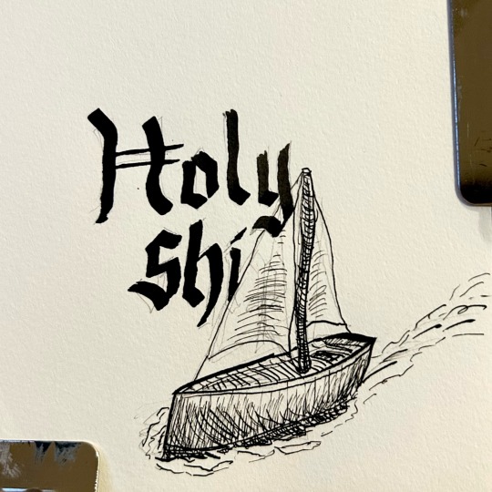
Botober day 9 - Holy Ship
#botober#botober2024#I never practice my calligraphy but I have the nibs for it#sketchy sketch#pen and ink#speedball c1#speedball 102#ID in alt text
16 notes
·
View notes
Text
Ok so recently I saw a post about "Oh, Aziraphale's handwriting in the Edinburgh minisode is so dainty! So angelic!"
And like... no. No it's not. Now, this is coming from someone whose handwriting has never been described as pretty or dainty or anything. In fact, my teachers once wrote on my report that it was "legible." Yep. That one hurt. Anyway.
Also, I am not an expert in fonts, but... What is this?
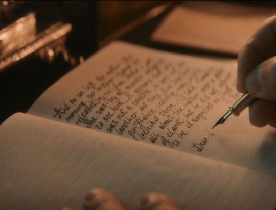
He's printing! Why is he printing? He should be writing in the most elegant English Cursive. Instead, he's just barely connecting his printed letters. And with that fat kind of nib, too!
This is what English Cursive should look like, according to the calligraphy books I've been hoarding in hopes practicing that would improve my own handwriting:
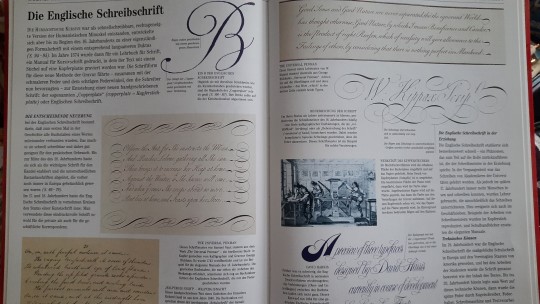
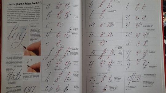
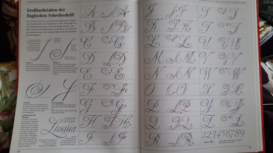
Now this is dainty and angelic. And it needs to be written with a quite fine nib.
And it's not even that difficult! Look, this is what I did in about half an hour (most of which was spent wrestling with inkflow and bleeding and prying open inkwells):
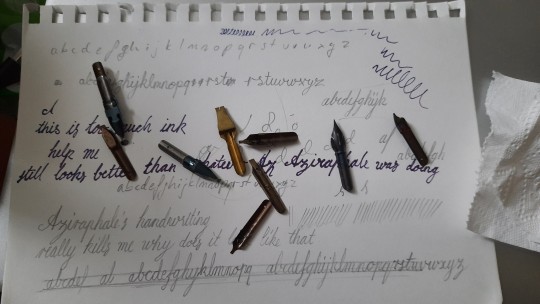
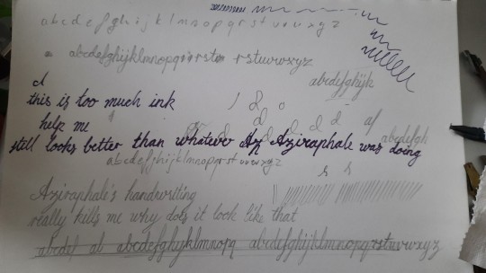
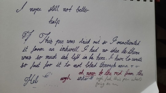
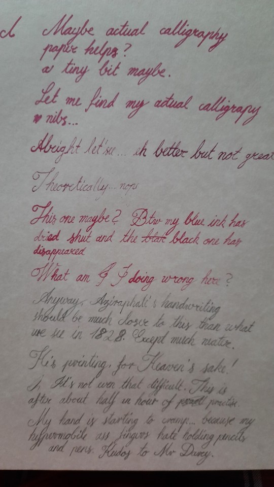
Imagine how much prettier it would be if I actually put in, let's say, a week of practice. Which is not too much to ask of a professional actor.
No shade to Michael Sheen, I don't know the bts of the writing scene, but it just actually grinds my gears. It would have been so easy to have, let's say, an actual calligrapher stand in for the shot where you onyl see the hands, or just to tell MS to practice his Cursive. Again, when it comes to preparing for roles, the amount of work this would take is well within what you can expect (I would know, I'm a performer myself after all). I'm just confused why that didn't happen.
Gripe over.
#this has bugged me ever since I first saw that scene#btw i know i wrote 1828 but is that correct? i didn't check#anyway#now i want to do calligraphy again this was fun#and in this post you see me turn a turnip - uh i mean...#good omens#Aziraphale#aziraphale's handwriting#why is it so bad (in the context of the scene! MS's handwriting is actually pretty good i think just... why here)
13 notes
·
View notes
Note
Thank you everyday for your art!! Your lineart work is absolutely gorgeous, and especially on calligraphy pens?? 😭 It's amazing!!
I used to do calligraphy, but I 'm now trying to practice a calligraphy pen with lineart, and I'm hoping to get lines as clean as yours. What type of nibs do you use? Do you switch them for different line thicknesses? Any tips you can offer? 🥹
I hope you have a great day 🌟
omg thank you so much!! as much of a struggle it can be, i do enjoy doing lineart a lot when i draw (mainly digitally but i’ve been having fun with these lil traditional drawings too) so it makes me happy to hear you say that 🥹
also im still super new to drawing w the gpen/calligraphy pen as i’ve only just gotten one for the first time about a month ago so i’m still slowly experimenting with them (and i’m also partially winging it to be really honest) but this is the pen/nibs i got! It came with a set of five different nibs, two each. Since this is my first time getting and using this kind of pen, i don’t really have anything to compare it to in terms of quality and such but it’s doing what i expected it to do for the most part LOL (also the bottle of ink that i got if anyone was interested)
(the rest is under the cut since it's kinda long haha)
My first initial drawings were drawn with the 004 nib from the set, whereas my more recent drawings were drawn with the 003 nib. (For filling in the solid black areas, i just used a micron brush pen)
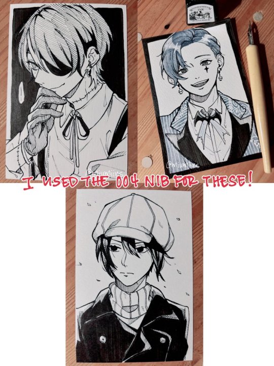
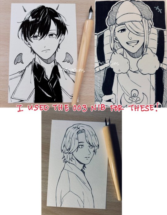
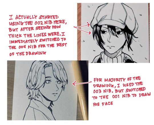
For the most part, i pretty much used the same nib throughout the entire drawing for each one. Part of it is just me being lazy about changing it, but also, because these are postcard sized (about 6” x 4” / 148mm x 100mm) and not very big drawings in the first place, i didn’t really feel the need to switch nibs too much. If i was working on a larger canvas/paper, i might switch between nibs more often for more variety in line thickness, and if anything, i definitely would use one of the smaller nibs (like 001) for finer details
(also here's the paper i got that i drew all of these on. keep in mind that i ordered it off amazon jp but it was a set of five packs so now i have plenty to practice on LOL)
As far as tips for clean linework, a lot of this is stuff i do for digital art but i’ve been more or less applying the same logic to the stuff i’ve drawn traditionally recently (some of these might be really fundamental/obvious and you might know this already but it is kind of what helps me a bit):
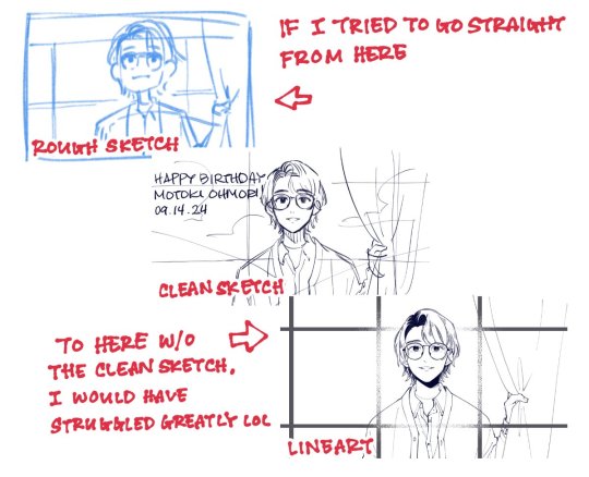
▷Having a clear sketch of what you want to draw and where you want to place your lines is really helpful, both for digital and traditional art, but probably especially so for traditional art.
As someone who honestly avoided doing traditional drawings for so long, my biggest struggle was honestly getting a clean rough sketch down on paper and getting past the sketch stage to do anything more with the drawing. Part of it is, again, laziness on my part, as it’s a lot easier for me to do sketches and clean them up digitally since i heavily rely on undo as well as the lasso and transform tools to fix proportions and whatnot (plus, not being able to undo once you start inking also held me back, because i know that my hands aren’t the steadiest and will occasionally move unexpectedly when inking sdlkfg). That said, using my ipad as a light table and tracing my digital sketches onto paper is what got me past that hurdle so that i could experiment with more traditional art (though i know i should eventually work on just starting from scratch on paper too haha).
But having a clean sketch gives you a clear guide of where and how you want your lines to be, rather than just having a vague idea of how you want it to look and having to think on the spot about the placement of your lines at the same time as inking your drawing.
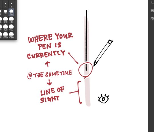
▷This is something i saw someone else point out in their tutorial once and i never really took notice of it until i saw it, but as you line over your sketch, keeping your line of sight on the path slightly ahead of where your pen is currently at kind of gives your brain a heads up of where your pen needs to go and your hand will naturally follow. It’s probably something that the more you draw, the more it comes to you subconsciously, like i kind of do this but i’m not super conscious of it, so you probably don’t need to get too hung up about keeping this in mind.
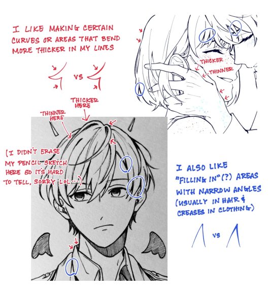
▷this is moreso a tip on line thickness rather than clean linework, but even without changing the nib or brush size, i like to manually vary the line thickness in various areas! This can be achieved by applying more or less pen pressure, and even if you can’t do it in one stroke, you can draw the initial line and go over the areas you want to thicken.
▷rotate your paper or canvas as necessary! When i draw digitally, i rotate my canvas a lot, as well as heavily rely on the flip canvas function. Obviously you can’t flip your canvas and continue to do lineart with traditional art, but rotating your paper can help with how you draw your lines. Sometimes it’s hard/uncomfortable for me to draw lines that go inward towards my drawing hand, so rotating the canvas so that the line flows outward makes it a little easier and more comfortable for me to draw.
▷draw with quick(ish) strokes! The slower your hand moves when you draw each stroke, the more wobbly your lines might become. Of course, if you draw each stroke too quickly, your lines will end up in a direction that doesn’t follow your initial sketch. This comes with time, and the more you draw, the more confidence you’ll gain in your lines once you have a grasp of how you draw them and you can adjust accordingly.
▷if watching natsume-sanchi’s videos has taught me anything, when you ink your traditional drawings, always start from the top-left (or top-right if you’re left handed) and work your way down and right so you don’t risk accidentally smudging the ink with your hand before it dries (i still somehow end up smudging the ink one way or another though LOL)
I’m not the best at putting how i do things into words since a lot of it is just based on feeling/in the moment but i hope any of this is helpful!
#anon#ask box#sorry for my handwriting it's hard for me to write nice digitally i've had to rewrite some of it multiple times sldkfjg#also it's cool that u used to do calligraphy!!#that's smth i wanna try out eventually but ohh my shaky and unreliable hands
4 notes
·
View notes
Text
Why are my art supplies considered hoarding right up until they’re considered useful, and then it’s straight back to hoarding afterwards.
‘You have too much stuff~’
It’s just disorganized. A messy stack always takes more space than the same things when clean and orderly. I know I need to straighten up.
‘You never use these~’
I’ve literally used every single kind of item I’ve bought. I might not have used all of each, (eg. a set of five stamps, but I’ve only used two so far), but that is just a matter of time.
‘Why do hold on to these things, they’re garbage~’
I specifically only hold on to a set amount of what you called ‘garbage’, and I reuse these items as I see fit. Old, non-donate-able clothes are now practice cloths for embroidery, cheap filling for pillows, patches for quilts and other decorations. Those paper towel rolls are supports and filler for papier-mâché. Those jars are, well, jars. I put things in them. I use scrap lace and leftover patterned paper on homemade cards. Cardboard boxes can be cheap canvas, supports for 3D projects, or just boxes. Maybe put the jars there lol
‘Hey, I need tissue paper and card stock for this gift I’m wrapping. Do you have any?’
And suddenly my apparent over abundance is no longer just some eyesore, but your great boon. Because yes, I have twelve kinds of tissue paper and two kinds of card stock. I also have wrapping paper if you’d prefer, dozens of kinds of ribbons if you’d like, and a calligraphy pen with four different nibs and three kinds of ink if you wanna get fancy on the card.
And they walk off with gift, impeccably styled, and my art stuff is all seemingly just junk to them again. The same stuff they were so grateful for just a moment ago. I don’t understand it. Why can’t my art supplies just be art supplies.
0 notes
Text
Thank you!! This was the first time I've drawn with ballpoint pen since like.... 2020 I think? Most of my other work is pencil, (some marker), and digital, so this was revisiting an older medium and just going practicing with it until I landed on a process I liked. I have some fun inks and fountain/calligraphy pen nibs that I never had the chance to use though, so I think that might be the next project. I usually hate lineart but I ended up really enjoying it when I do it by hand and not on the tablet.
1101 BC: A Space Odyssey
Inktober 2023
I first remember hearing this story when my mom read aloud a children's version with a picture book in 2nd grade. As a little kid solidly in my space phase, I always imagined the whirlpool Charybdis like a black hole, and the rest of the worldbuilding followed from there. While I was working on these pieces, the Epic the Musical soundtrack was a huge inspiration and I love seeing all the creative art that the community shares. Though this setting is a little off beat, I hope I can join this centuries old storytelling tradition as well.
.
18 notes
·
View notes
Photo

my masterpost | my studygram | ask me anything
[click images for high quality]
[transcript under the cut]
Other advice posts that may be of interest:
All About Procrastination
How To Study When You Really Don’t Want To
Common Study Mistakes
7 Strategies to Improve Concentration
How to Make Your Notes Aesthetic
How to Stop Procrastinating Series
how to improve your handwriting
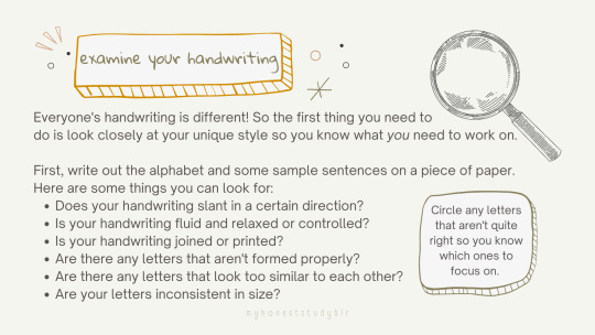
examine your handwriting
Everyone's handwriting is different! So the first thing you need to do is look closely at your unique style so you know what you need to work on.
First, write out the alphabet and some sample sentences on a piece of paper. Here are some things you can look for:
Does your handwriting slant in a certain direction?
Is your handwriting fluid and relaxed or controlled?
Is your handwriting joined or printed?
Are there any letters that aren't formed properly?
Are there any letters that look too similar to each other?
Are your letters inconsistent in size?
Circle any letters that aren't quite right so you know which ones to focus on.
choose the right pen
You should never underestimate the power of a good pen! Having a pen that flows nicely and fits comfortably in your hand can make all the difference to your handwriting! Unfortunately, finding a pen that suits you can take time and lots of experimentation and I can't just tell you what to use!
What should you look for in a good pen?
Does the ink flow smoothly?
What size nib does the pen have? (Some handwriting looks better with a thicker or thinner line width so try out different sixes to see what suits yours!)
Is it a gel, fountain, or ballpoint pen?
Is it thick enough that you can hold the pen in a relaxed grip? (A thicker barrelled pen can help to extend the fingers and loosen a tense grip)
Popular pens
Muji Gel Ink Pens (what I use!)
Pilot G2 Retractable Premium Gel Ink Roller Ball Pen
Pentel EnerGel Deluxe RTX Gel Ink Pen
Uni-ball Jetstream Stick Roller Ball Pen
Zebra Gel Pen Sarasa Clip
Find the right paper
Just as a good pen is important, so is the paper you use! Do you prefer lined, square or dotted paper? Does the pen flow smoothly on the paper? Does ink bleed through the paper? Again, it is about finding what works for you!
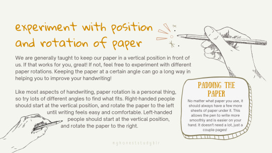
experiment with position and rotation of paper
We are generally taught to keep our paper in a vertical position in front of us. If that works for you, great! If not, feel free to experiment with different paper rotations. Keeping the paper at a certain angle can go a long way in helping you to improve your handwriting!
Like most aspects of handwriting, paper rotation is a personal thing, so try lots of different angles to find what fits. Right-handed people should start at the vertical position, and rotate the paper to the left until writing feels easy and comfortable. Left-handed people should start at the vertical position, and rotate the paper to the right.
Padding the Paper
No matter what paper you use, it should always have a few more sheets of paper under it. This allows the pen to write more smoothly and is easier on your hand. It doesn't need a lot, just a couple pages!
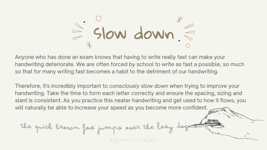
slow down
Anyone who has done an exam knows that having to write really fast can make your handwriting deteriorate. We are often forced by school to write as fast a possible, so much so that for many writing fast becomes a habit to the detriment of our handwriting.
Therefore, it's incredibly important to consciously slow down when trying to improve your handwriting. Take the time to form each letter correctly and ensure the spacing, sizing and slant is consistent. As you practice this neater handwriting and get used to how it flows, you will naturally be able to increase your speed as you become more confident.
embrace your personal style
Handwriting is a very fluid, personal thing that is always evolving. Your handwriting at this very moment is probably very different to what it was a year ago. Handwriting is not like calligraphy, where you more or less write the same every time. Instead, you’ll have neat days, and you’ll have not-so-neat days! That's perfecting natural!
No matter how your handwriting looks, it is a reflection of you and your personality. So, don’t get too hung up on a radical change that completely alters how you write: instead, focus on making clearly formed letters that are easy to read and neater.
Remember it's not about getting it "perfect", but rather, progressing and improving over time.
practice and persevere
Like anything, handwriting takes time and practice. The more you write using good habits and implementing styles that appeal to you, the better your handwriting will get.
But at the same time, sometimes it will look worse before it gets better, which can be demotivating. Therefore, it is important to persevere and remember that it will improve. You might also not even fully notice the gradual improvement so make sure to look back over your past handwriting to see how far you have come!
Ideas for Practice
Quotes
Song lyrics
Pangrams
Crosswords
Journalling
Snail mail
Shopping lists
School workbooks
Doodle
Thank You!
I hope that this will help you improve your handwriting and that you found this useful!
#how to improve your handwriting#heypat#heyharri#heycazz#heycoral#heysaher#heyzainab#heylihi#heyara#bulletnotestudies#stuhde#studyvan#problematicprocrastinator#medustudies#jeonchemstudy#serendistudy#huitingreads#einstetic#stillstudies#gloomstudy#boldlystudy#academiix#studylustre#knife gang#my advice#myhoneststudyblr#studyblr
2K notes
·
View notes
Text
Okay so I'm cleaning out my closet and there's a few things that I figured I could give away rather than throw away. Most of this stuff was never used, and the stuff that was "used" was used once or extremely lightly EXCEPT one paint brush handle that all the paint is peeling off of; I don't think I ever used the brush, it's just doing that.
So, here's the deal. If you want any of this, I will send it to you for the cost of shipping. Descriptions of what's in the picture are under each pic.
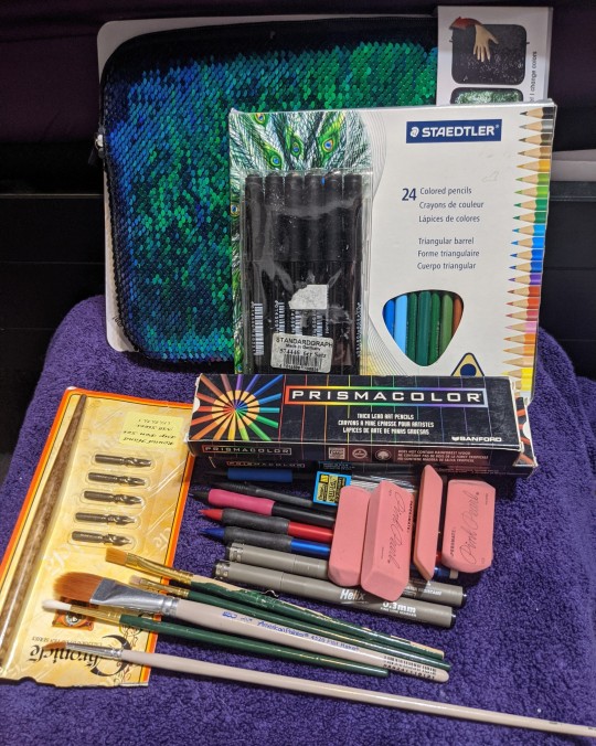
Random art supplies. The sequined bag is supposedly for tablets but it will hold all of this crap except the long paintbrush. The pens all look like decent inking pens. The colored pencils I don't think have ever been used. The prismacolor ones are boxes of blues; ultramarine, non-photo blue (looks like a pale blue), and indigo blue. Why did I need so much blue? I apparently didn't. The mechanical pencils are all 0.7mm, but the extra lead is 0.7 and 0.5. the package on the left is some kind of calligraphy pen + nibs. This stuff has been claimed!
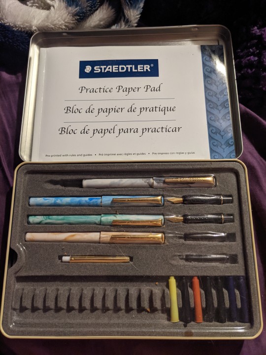
I actually have a staedtler calligraphy set too, if anyone wants that, I'll even leave in the deranged notes in the practice pad made by my partner before we got together. I don't think any of the ink still works, but the pens are nice. You'd just need to get some ink replacements. This stuff has been claimed!
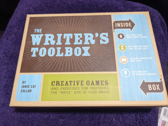
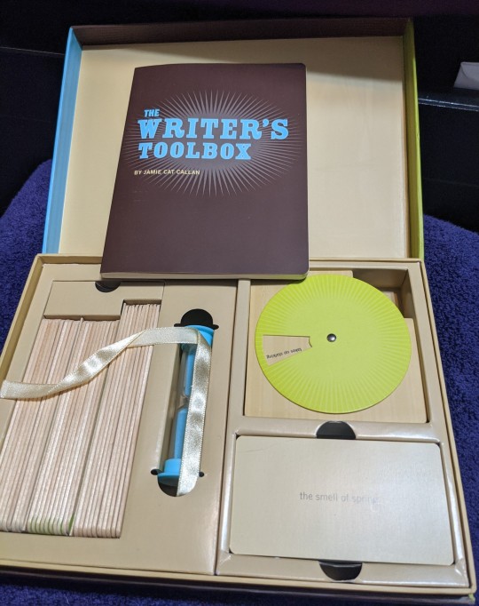
The writers toolbox. It's a neat little kit for prompts you don't have to think of yourself, and for random character creation and other writerly things. I've never used it, but it looks neat. Might be fun to use in a group, or make up a game around. This one has been claimed!
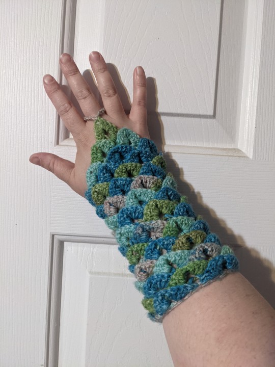
Green/blue/grey scales fingerless gauntlets (knitted). Only one is pictured but it's a pair.
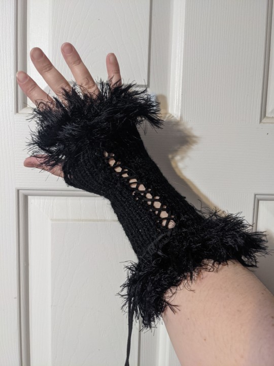
Black fingerless gloves (knitted) with furry cuffs at the fingers and the opposite opening. Laced with a thin leather strap. Only one is pictured but it's a pair. These have been claimed!
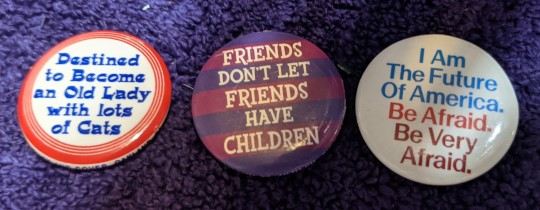
Three buttons, they're fairly small, just a bit bigger than a quarter.
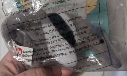
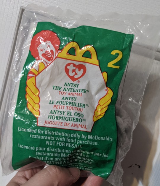
Small Beanie Baby McDonald's toy, still in the original packaging. It's the only one I saved because I just like anteaters. This one has been claimed!
Anyway, please send me a non-anon message or better yet drop me an email at [email protected] if you want anything or everything.
34 notes
·
View notes
Note
hi i want YOU to infodump (ofc whenever you have time and energy to do so) (ノ◕ヮ◕)ノ*:・゚✧
Veduuu bb helllooo ❤~(=^_^)ノ
I started writing this infodump about problems of being left-handed in a right-handed world. And then kind of broke down in the middle of it? So here it is, in all its half baked glory, for your enjoyment. <3
Also linking my previous infodumps about Ancient Pigments and the Koh-i-Noor and Hope Diamond in case anyone wants to read! (Those ones are a lot more coherent, I promise!)

So as I said, I’m left-handed, and oh my god right-handed people, you guys have no freaking clue how you easy you have things.
There is a proper term, “bias against left-handed people” for design or bias that is unfavourable to left-handed people.About 90% of the world’s population is right-handed. So most everyday products are mass-produced with right-handed people’s ease of access and convenience in mind. And using those products as a left-handed person is very annoying, painful, and in some cases, dangerous. Left-handed counterparts of those products are sometimes made too, but they are very expensive, sometimes have to be specially ordered, or are just a bitch to get hold of.
Sometimes, you will see scissors marketed as "ambidextrous" or "suitable for right- or left-handed use". But those are just right-handed scissors with slightly changed designs. They aren’t as painful as normal scissors, but they’re still very annoying.
Also SPIRAL NOTEBOOKS! I have never in my life have been able to write properly in spiral notebooks BECAUSE THE BINDING KEEPS DIGGING INTO MY HAND!.
Most languages have scripts that go from left-to-right? Why? Because a left-to-right motion is the one that feels most natural to right-handed people, so the scripts evolved that way. But it makes writing very difficult for us. Our natural motions go from right-to-left, so for the very basic process of writing, we have to contort our wrists in weird angles to form the left-to-right and up-to-down strokes that form our alphabet.
Which brings me to calligraphy. For left-handed people to do calligraphy, we have to use special nibs, or hold the paper at weird angles. And those left-handed calligraphy nibs are not easy to find. Sure you will find loads of hoax ones, which claim they’re for left-handed use, but they actually are regular nibs. To give you context, in my almost 22 years of life, I have only seen one proper left-handed nib set in stores. Also, while we are on the topic of writing, one thing I hate about hand-writing things is the way my hand will always, without fail, be stained with smudges from the pencil or pen that I am using. Every. Single. Time.
(This bit has been entirely copy-pasted from Wikipedia because this is the point where I remembered my own childhood experiences and noped out.)
Due to cultural and social pressures, many left-handed children were forced to write and perform other activities with their right hands. This conversion can cause multiple problems in the developing left-handed child, including learning disorders, dyslexia, stuttering and other speech disorders. Shifts from left- to right-handed are more likely to be successful than right to left, though neither have a high success rate to begin with. Successful shifters are more likely to become ambihanded than unsuccessful ones. Conversions can be successful with consistent daily practice in a variety of manual activities, but though activity in the non-dominant left-hemisphere of the brain will increase during tasks, so too will activity in the dominant right-hemisphere. Consistent left-handers have no higher activity in these task centers than converted left-handers, so it may be inferred that "attempts to switch handedness by educational training far from weakening the functional expression of left-handedness in higher-order motor areas of the (dominant) right hemisphere in fact enhance it."
Many Asian countries force their children to become right-handed due to cultural perceptions of bad luck associated with the left hand. In India, Pakistan, Bangladesh and Indonesia, it has traditionally been perceived as "rude" behaviour to use the left hand for eating, as the left hand is commonly used for tasks considered "unclean". In a 2007 study in Taiwan, about 59.3% of children studied had been forced to convert from left-handedness to right-handedness. The study took into account the economic status of the children's families and found that children whose parents had less education were more likely to be forced to convert. Even among children whose parents had higher levels of education, the conversion rate was 45.7%. Among naturally left-handed Japanese senior high school students, only 0.7% and 1.7% of individuals used their left hand for writing and eating, respectively, though young Japanese are more likely to convert to using chopsticks right-handed than forks or spoons (29.3% to 4.6%). The proportion of females subjected to forced conversion is significantly higher compared to males (95.1% to 81.0%).
In Sanskrit, the word "वाम" (waama) stands for both "left" and "wicked".
In 19th-century Europe, homosexuals were referred to as "left-handed".
Also contrary to popular opinion, BEING LEFTY DOES NOT MAKE YOU RIGHT-BRAINED. Most right-handed people use the left hemisphere of their brains to process language, but that doesn't mean most lefties are "right-brained". Studies show that about 98% of right-handers are left-brained, but so are about 70% of left-handers. Only about 30% are right-brained or bilateral-brained (in which both halves are equally capable). We definitely don't have reversed brains.
Being left-handed also doesn't automatically make you more creative. As left-handed people, we have to be “creative” in the ways we go about our day-to-day lives to avoid being inconvenienced or in pain because of using things made for right-handed people. That does increase the general levels of creativity but correlation is not causation, people.
8 notes
·
View notes
Note
hey nara! first off, I absolutely adore your blog and your writing, Perhaps is on my comfort fics list that I pull out whenever I’m having a bad time. I also happen to be a fan of your pen instagram and I was wondering if you had any suggestions on some fountain pens for beginners? I recently bought a “Pilot MR Retro Pop” that I really enjoy but I think I’m ready to branch off a bit. Do you have any tips with practicing with fountain pens you’d be willing to share? As much as I try, my handwriting never looks as nice as I want it to with mine. No pressure to respond if not, just wanted to stop by and let you know how much I enjoy your content! Hope you have a pleasant rest of your day/night!
Oh goodness, you’re talking about fic AND fountain pens in the same ask? Stop, stop, I’m already married!

First off, thanks for reading; I’m so glad Perhaps is there for you when ya need it, it makes me really happy to hear. Seriously warms my heart!
As far as fountain pens go... ANON I HAVE SO MANY THINGS TO TALK ABOUT I AM SO SORRY THIS WILL BE SUCH A LONG RIDE so I’m going to put it under the cut sorry sorry sorry in this essay I will
Hooray for the Pilot MR (or Metro, here in the US), it’s an AMAZING little pen, and if you’re calling it the MR, chances are you got it with an international standard converter, you lucky, lucky duck. I’m happy you’re enjoying it, as far as beginner pens go, this one is an excellent choice.
When you say “branching out”, this can mean one of two things. It can mean you want to branch out to other brands but a similar price range, or that you’re ready for a ‘next level’ pen. I’ll try to cover both! (I’ll link some of these models to the Goulet Pens website, but feel free to look for them elsewhere--I just really like Goulet’s very thorough descriptions)
If you’re looking to explore other pen models in the MR’s price range, there’s a metric ton of options! Sticking with Pilot, you can try the Explorer-- a completely different, more streamlined pen than the MR, but if you’re used to the nib on your pen, you have a better idea of what to expect with it. There’s also the Kakuno, which is cheaper, but very cute with its little smiley face nibs haha
Another Japanese pen you can try: the Platinum Plaisir. Aluminum body, but do remember that Platinum nibs generally give a little more feedback than Pilot’s, which are some of the smoothest Japanese-made nibs I’ve ever seen.
You can also try the Diplomat Magnum -- it’s a a great little pen, and I love mine. Keep in mind, it is very lightweight, especially compared to the MR’s metal body, but to me that makes it great for long writing sessions. The nib is completely different--it will write a little wider, a little wetter than the MR (and any other Japanese-made pen), but it’s slightly springy and awesome to write with. Plus, it has an ink window so you can keep track of your ink!
Other options in this price range: the Jinhao 8802 (Shell or Rosewood, and the most bang for your buck imo as far as cheap fountain pens go), the Jinhao x750 or x450 (these are heavier, but they look great!), the TWISBI GO (a teeny, amazing little pen with a spring-loaded piston filling mechanism), and a Kaweco Sport (another pocket-pen, German-made, so the nib will write a little wetter/wider generally) or the Perkeo.
Now, if you’d like to push your price range a little further (only a little! I promise not to break the bank!), you cannot go wrong with Lamy.I am a self-admitted Lamy fangirl, so I may be a little biased, buuuut... it is what it is, their pens are great, they’re easy to disassemble for cleaning (I go totally nuts over it and even disassemble the converters, which you absolutely don’t need to do), and their nibs are SO EASILY INTERCHANGEABLE!
You can pick up a Lamy Safari for fairly cheap nowadays (and ever cheaper look-alikes, which I will never endorse but also will not judge anyone for buying), and they come in so many colours (the O.G. 1980 colours were also just reissued!), they’re like my Pokemon because I want to catch ‘em all.
For a little more, you can get yourself a Lamy AL-Star--the same design of the Safari, but this time in aluminum, which makes it look super cool (but also prone to scratches if you’re the kind of person that puts your pen in your pocket with your keys... that’s... definitely not me...), so keep that in mind.
You can also pick yourself up a Lamy Logo, for a couple more bucks. A completely different design, but still great, particularly if you like slimmer pens.
The nibs on ALL the Lamy models (even the more expensive ones like the Studio or the Scala or even the Dialog) are interchangeable! Even the gold nib on the Dialog! The only exception is the Lamy 2000 (which is probably one of the best pens out there period, and certainly an amazing first-gold-nib pen).
The one thing that absolutely kills me about the cheaper Lamy pens is that, for the most part, none of them come with a converter--you have to buy it separately. Which is fine, it’s not super expensive, and it is widely available, but COME ON, LAMY, JUST GIMME.
If you’d like to try a cool-looking pen with a CRAZY ink capacity and a nifty piston-filling mechanism, look no further than the TWISBI ECO. I have one of these (green, obv), and I love it. Never tires me out, and I stg mine never. dries. out. I don’t know what witchcraft is involved, but it’s an amazing pen for long writing sessions.
Finally, if you’d like to try another Japanese-made pen that is a little more expensive than the Pilot MR or the Platinum Plaisir, there’s the Sailor Compass 1911. This is one of the cheapest Sailor pens I know of, and a good introduction to the brand. Keep in mind that, like Platinum, Sailor nibs will give more feedback than the Pilot you’re used to!
If you would like to push your budget even further, here are some options for fountain pens under $100 (I know, big jump, but it’s good to see what’s out there to you can compare!) from JetPens.
There are a million other brands out there that you can look at. Sheaffer makes great, very cheap and fun beginner pens (including a whole Star Wars Line! They’re adorable!). Hong Dian has a ton of pens that look sleek as hell (like the Forest Series) and they’re all like under 20 bucks. Kaco is another one that makes surprisingly good pens! Parker is also an option, with the Jotter, which is a classic-looking pen. There’s Conklin and Monteverde (which have a ton of fountain pens in a wide range of prices, but I’ve had bad luck with their nibs, so I would suggest you do some independent research on those!), as well as Noodler’s if you’d like to go crazy with some flex nibs! The fountain pen rabbit hole is bottomless. Welcome :D
As far as handwriting goes, I’m afraid I don’t have much more to say besides practice, practice, practice. I learned cursive as a child, but never got into calligraphy, really. Even today, I only just dabble, but whenever I see something I like, I usually just like to try and replicate it. Very often I’ll see a video on Instagram and go Oh my god, how the hell did they write that G, I’ve got to try that and then what follows is me going through page after page on a Rhodia pad trying to imitate them. I like janinescribbles and aidanbernal on Instagram, they’re like handwriting goals--check them out!
A lot of the time, we’re looking for more line variation to make our handwriting look prettier--that’s usually what you see in that fancy, old-timey Spencerian cursive, or even copperplate calligraphy. Unfortunately, you won’t get that with just a regular fountain pen, but there is good news!
There are a TON of different nibs out there. Stub nibs, fude nibs, flex nibs, obliques, cursive italic -- you can even get your pen ground by a professional nibmeister to fit your specifications. There are calligraphy pens (like the Lamy Joy) or pen sets (Kaweco has a Perkeo Calligraphy set, and I believe Sailor has one of their own as well). You can even check out the Pilot Parallel set -- the whole thing is like the price of a Lamy AL-Star, you just won’t do regular writing with it; it’s pretty specifically a calligraphy/lettering set. There are even flex pens in the market (though none of them are as flexy as those old, vintage gold nibs) like the Noodler’s Nib Creaper, Ahab, and Triple Tail or the Conklins with their Omniflex nib (which has been problematic in the past, but I’ve heard good things recently). It’s a whole other rabbit hole!
But honestly, don’t sweat the handwriting too much. Just write a few lines every day, try new things, and get lost for eternity on some Instagram tags!
I think this is a long enough post as it is, so I’ll stop there! SORRY. HOPE IT HELPS!
#ask naralanis and maybe she will deign to respond#anon#fountain pens#fountain pen network#fountain pen geeks#fic writing#cissamione#and all the weird things that overlap in this godforsaken blog
17 notes
·
View notes
Note
I'd be interested to hear more about teaching yourself handwriting as an adult. I hate hate hate writing by hand and my writing is horrible. But I have to write on chalkboards and mark up papers a lot, so improving would be good. I imagined a process of many hours a week for a year, which sounded too miserable to contemplate. 10 hours spread over a summer sounds worth doing.
I was in the same position. When I was young we actually took me to an occupational therapist, who basically said my hand muscles suck and I would never have good handwriting. And to be fair I still maybe don't have great handwriting.
But I write on boards a lot, and I write comments on papers a lot, and when I started seriously trying to draft the book I discovered that it's a lot easier for me to write first drafts if I do it by hand. So I was writing a lot. And it was marginally legible even to me, and my hand would cramp quickly. So I decided to fix it.
I did a couple hours of research on what I wanted to do (thanks /r/handwriting), and decided that the best option was to learn a Modern Italic script. I got the book Write Now The Getty-Dubay Program for Handwriting Success, and every night I'd sit and work on it for like 20-30 minutes, doing two or three pages. (There are like fifty pages before you hit the calligraphy section, so this took a few weeks.)
Then when I was sitting around and doodling, I'd practice my letterforms instead of drawing bad Sierpinsky triangles or whatever. And whenever I was writing things, I would consciously think about my letter shapes. (So I'd often do like twenty minutes of practice in the book, and then sit down and write for a while, which was like 70% thinking about what to say and 30% thinking about handwriting.)
And now when I want my handwriting to be pretty and pseudo-calligraphic, I can do that. And even when I'm just scribbling notes to myself, they are _far_ more legible. Like, this isn't the prettiest thing ever written, but I think it's reasonably readable even to not-me people. And this was just scribbled notes to myself.
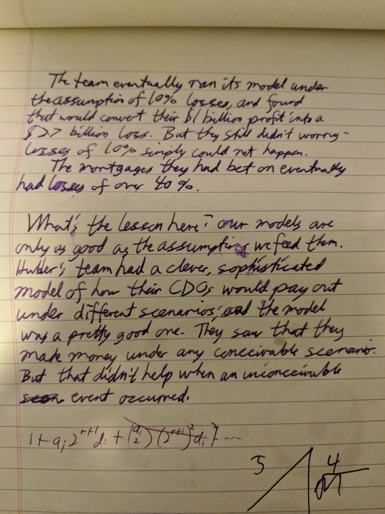
(Warning: I also picked up a fountain pen habit in this process. Calligraphy nibs are great and make everything look better with no extra effort.)
7 notes
·
View notes
Text
Gouache and a Wedding
I hope everyone has that one friend with the superpower of seeing details that ordinary humans cannot. Maybe more than one. Or may it’s you yourself, lucky. I am fortunate enough to have this friend, and I even try to remember how fortunate I am when I’ve chosen things that fall below the standard and I get “the look.” In hindsight, it’s never undeserved, but without my friend’s superior eye for detail I would never have seen where I went barreling along mindlessly in the completely wrong direction, and she knows it, too.
In 2017 when my friend was planning her spectacular wedding and asked if I could do calligraphy for her, two things crossed my mind: absolutely this sounds like fun, and sheer terror, and not in that order. Fortunately, she was waist-deep in the eternal well of Instagram weddings and had done most of the research already. (As I wrote this she reminded me of how this skill has continued to serve us now with houses, babies, and gardens.) One of the things in her findings was gouache, which we couldn’t pronounce, but the super talented calligraphers on Instagram chose over and over for its stunning, matte depth and luscious opacity.
With this in mind and being mostly familiar with traditional broad nib styles, I set out to learn pointed pen calligraphy, quickly realized I had all the wrong tools, and then set out again a bit better prepared. One of the first new tools I determined I would need was an oblique nib holder. Things got easier once I had a pen that could achieve the correct angles. To help me on my way with the Copperplate style she loved, I studied Dr. Joseph M. Vitolo’s fabulous resources on this script available at Zanerian.
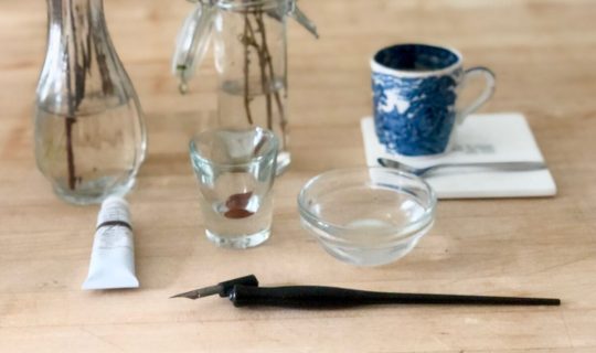
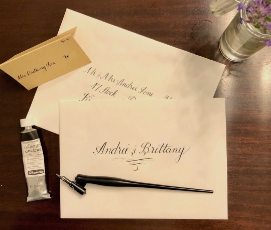
After a few months of practice with the new script, I finally had the courage to start learning with the gouache. Based on the wonderful gouache intros by The Postman’s Knock and Patricia Lovett, I went with Schmincke Calligraphy Gouache in the rich Jet Black that my friend wanted from Paper & Ink Arts. It was fairly easy to get the “heavy cream” consistency by adding a little bit of water at a time. The gouache had smooth, creamy flow vs. the looser flow of my go-to Higgins Eternal Black. It tended to cling to the nib rather than pooling, and on the paper had a velvety presence. There’s another post dedicated to my obsession with this on The Calligraphy Supply blog.
For her envelopes (inner and outer), my friend chose an off-white. The black gouache created a crisp, elegant look.
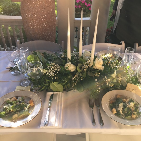
The tablescape she created was that effortlessly elegant place where everything simply comes together. She chose placecards in Shimmer Gold from Paper Source. Against a long white table, lush greenery studded with ivory roses, tapering white candles, white plates with golden rims, and classic flatware, the placecards caught the warmth of the afternoon sun. The deeply matte black writing the perfect anchor on the gold. Again the detail of the calligraphy created a special space where each guest was invited to the table.
Even now the Schmincke’s Calligraphy Gouache on the envelopes and cards has remained as beautiful and as deeply opaque as it was that day. Looking at the suite brings me right back to that table, and maybe also to the moment when I was told I would speak for my friend after the eloquent British gent, and without a microphone.
Including hand drawn calligraphy for her wedding suite wasn’t the most expedient, or easiest choice. However, by not overlooking this detail, she infused the ambiance of timeless elegance into every moment in the day. She told her guests how vitally important they were in her life without saying a word. Though she did tell me they looked good.
#gouache#art of calligraphy#calligraphy gouache#thecalligraphysupply#wedding calligraphy#hand lettering#schmincke gouache
1 note
·
View note
Text
Mary Lawton.
Bio: I was born on Long Island, New York in 1958, and loved drawing and making art since I was pretty young. I remember really loving Rat Fink, the anti-hero of Mickey Mouse, and tracing pictures of him. I even had a plastic Rat Fink ring when I was eight. I am the youngest of a very loud and raucous group of six siblings who always encouraged me to make art. My parents were my biggest fans, they would parade their friends through my bedroom to show them the murals I drew on my walls. I read MAD and National Lampoon with a fervor, and I still remember some of the insanely hilarious cartoons I saw in those magazines, although Alfred E. Newman's face gave me nightmares. After backpacking in Europe for a while after high school, I moved to Boston in 1979, and became friends with a bunch of artists, some of them cartoonists and animators. We were all enamored of Lynda Barry and Matt Groening, who were bursting on to the alternative comics scene at the time. I devoured their comics, and also loved Roz Chast, B Kliban, William Steig, Mary Fleener, Gahan Wilson, and many others. I knew that I wanted to do what they were doing.
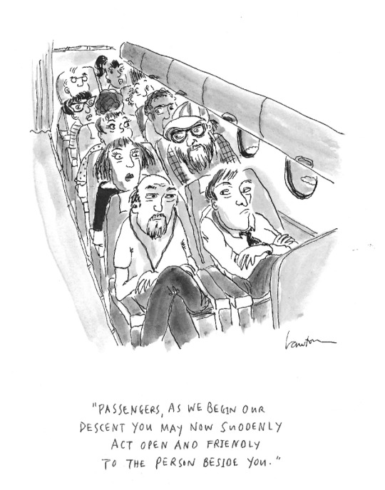
Find this print, here!
I was drawing very primitive, autobiographical strips about my childhood at that time. I sent them out to magazines and newspapers and they began to get published. It was a nice time to be an 'alt' cartoonist as there were so many markets and the pay was great. I also loved cooking, so I worked in restaurants during the day to make a living, and drew in my little bedroom/studio at night. After ten years cooking and cartooning, I left Boston in 1989, moved to Manhattan, and worked at Chelsea Animation, an ink-and-paint studio on 23rd Street. Working there with a great group of like-minded artists was like going to a party every day. Non-stop hilarity. We all sat over our light tables wearing white cotton gloves, painting cels of all sorts of commercial animated films. At that time I took a few classes at the School of Visual Arts at night.
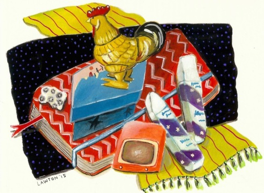
Since then, my art has been in many magazines and newspapers, books, greeting cards, museums and galleries, and I've done a gazillion commissions. In the 1980's I sent samples of my cartoons to William Steig for his advice, because I just loved his drawings and books. He became my friend and mentor, and always encouraged me to send to The New Yorker. I did this for nearly thirty years and finally got one accepted in 2017. I have sold several to The New Yorker online, and a few more in their hard copy magazine. Around the same time, I was invited to join Six Chix, a comic strip by six women, a different one each day of the week, syndicated with King Features. It was created in 2000 by Jay Kennedy, the masterful editor at King, who died tragically in 2007. Mine is the Thursday comic, and every six weeks I draw a Sunday. I love being part of this group of women cartoonists!
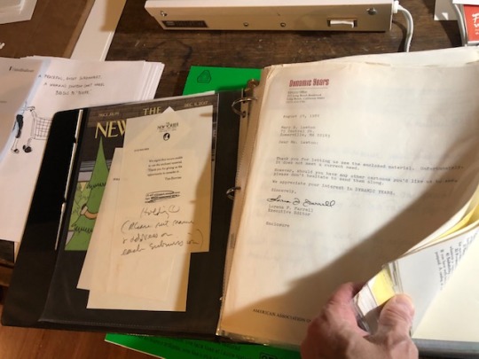
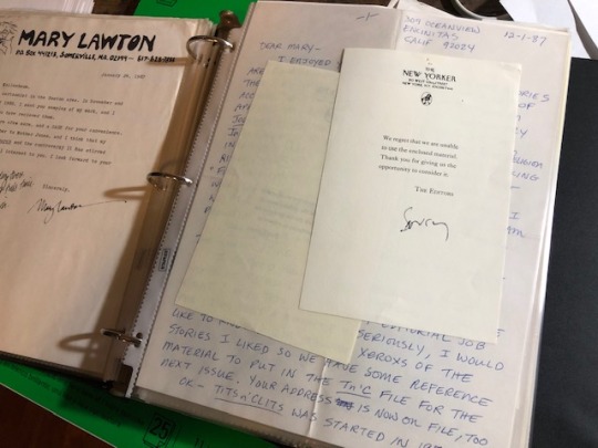
I have saved all of the rejection slips I got since I started sending out my cartoons in the early 1980's. They are in an album that now weighs 4.5 lbs. It's my reminder to never give up, to just keep returning to my work table. Persistence pays.
Favorite cartoon: I think my favorite cartoon that I have had published in the New Yorker magazine is my very first [editor’s note: the cartoon at the beginning of the interview], because it was so dang thrilling to finally be in that magazine. I happened to be in New York the week it appeared in print. On my way back home to Texas, as my plane flew over Manhattan at night I looked down at those lights below and I felt like I had really made it. It was a dream come true! Also, since it was an airplane cartoon, I shared it with the flight attendants, who all got a good laugh, and they brought me a glass of champagne. Later that year I was part of the Funny Ladies exhibit at the Society of Illustrators in New York. Liza Donnelly was so kind to invite me to be in the show. To be there on opening night and to meet Emma Allen and the cartoonists that I have admired for so long, felt like being at The Academy Awards. Only better.
I really love to draw political cartoons, so I'm also proud of the ones that have made it into The New Yorker Daily Cartoon.
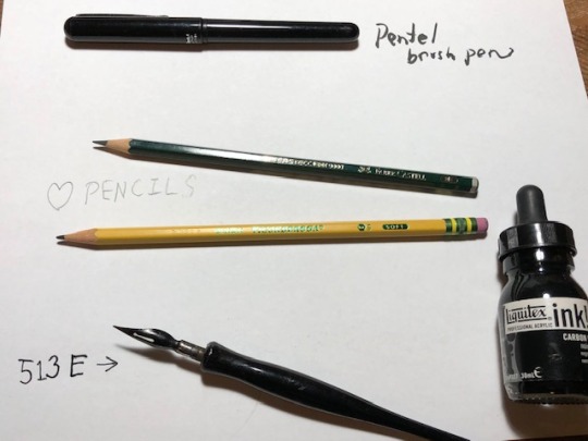
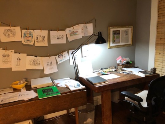
Tools: I drew with Rapidograph pens for many years. I switched to dip pens, which I enjoy depending on the paper. Lumpy or textured paper, ugh. Smooth paper, and it's perfect. I practiced using the dip pen by doing calligraphy for a long time, with lots of different nib sizes and shapes. At the moment I use Pigma Graphic in all sizes, but they are disposable, so I'm on the hunt for a new reusable pen so I don't add to the land fill. I sketch out cartoons in pencil most of the time, then ink in. I love Arches papers, and use them for finishes and gouache paintings. Or Bristol paper. I buy big sheets and cut them up. But every day, I use a lot of printer paper for roughs. The pencils I mostly use are the Faber Castell 9000, in a 3 or 4 B. I also love Ticonderoga pencils, not only for their beautiful name but they feel perfect on Boise all-purpose printer paper. I love paint brushes of all kinds. I use gouache every day. It took me many years to learn about gouache, to finally get how it works. It's complicated because of its soluble nature. I looked at instructional videos on Youtube, and got the hang of it. I use black gouache for my washes, and Titanium White right out of the tube for covering up mistakes, or all sorts of highlights. My old work lamp has a long arm so I can move the light all over my table, which is really handy.
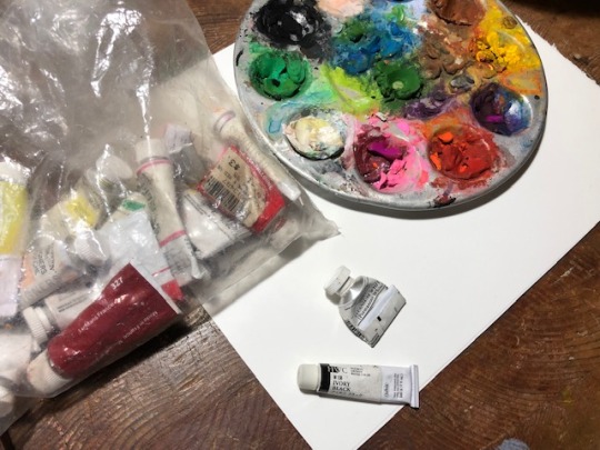
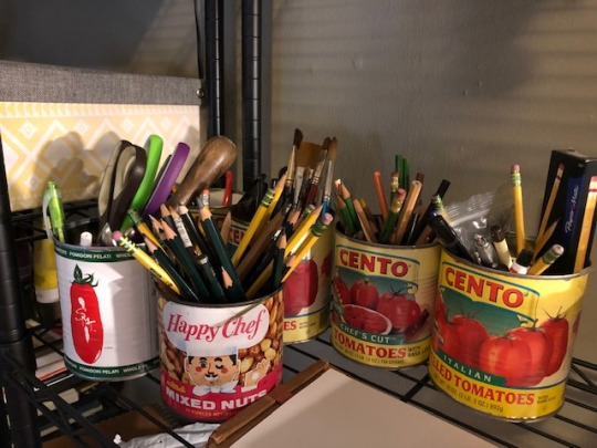
Tools I wish I used better: Sketchbooks! That seems odd, but it's true. My sketchbooks are very messy, and not something I'm proud of, or want to save and look back on. I have seen beautiful sketchbooks which are themselves art pieces, but it's not my style! I mostly want to toss them into the recycle bin once they are full. Also, I wish I could use computer drawing tools.
Tool I wish existed: Can't think of one.
Tricks: I don't look at social media much, and I think that helps my creativity, and certainly gives me more time to do stuff.
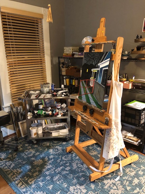
Misc: I have three big-time men in my life, my husband and my two sons. Four, if you count my dog Buddy. All bring me a ton of joy. I've lived in Texas for 25 years, and I encourage visitors! We always like to show folks the Texas we know and love.
Website, etc:
Instagram
newyorker.com
sixchixcomics.com
funnytimes.com
narrativemagazine.com
thenib.com
Editor’s Note: If you enjoy this blog, and would like to contribute to labor and maintenance costs, there is a Patreon, and if you’d like to buy me a cup of coffee, there is a Ko-Fi account as well! I do this blog for free, and your support helps a lot! You can also find more posts about art supplies on Case’s Instagram and Twitter! Thank you!
#mary lawton#how to be a cartoonist#mary lawton cartoonist#artists on tumblr#art supplies#drawing process#art process#cartoons#cartooning
17 notes
·
View notes
Text
Sheaffer No Nonsense pens. A Good first decision, or a step in the wrong direction?
As someone who's spent a good amount of time over the course of my life using fountain pens because of neurological issues that make it really hard to write unless I can actually feel the paper, which is something I might go more into later. I've spent a lot of time with Sheaffer No Nonsense pens because they tend to be very easy to get your hands on especially second hand if you happen to live in the right area, and it's easy enough to get your hands on the ink cartridges, or a convertor, simply given how popular these particular pens were over such a long period of time. (1969-mid 2000's) The colours these pens came in ranged signifgantly and while they make a good entry level fountain pen, however it becomes pretty clear pretty quickly that these pens are pretty.. lacking fairly quick as soon as you use literally anything else, even within the same brand. I think it has to do with the fact that these pens were pumped out at an alarming rate, because, as I've noticed, using them over and over and over again, that even if the box has never been opened, QC varies signifigantly. more specfically,variance between having to press too hard to get menial feed, or not having to press at all to get way too much ink were probably the most common problem I had with theses ones specifically, with the next most common problem being pretty harsh digging sometimes to the point of the pen physically tearing the page even while it's being held correctly.Though this isn't to say that they didn't have Upsides. As mentioned before, they were (and are still) really cheap, even in kit form.They come in a wide variety of colours, ranging from blue, to lime green, to like a creamsicle orange.They also come with usually about three nibs in varying sizes, (small, medium, and big) for use in practicing calligraphy or simply writing in different sizes. So really, it's hard to come to a definite conclusion. If you see one in the wild, I would just say to curb your enthusiasm, and try not to get too excited, but also try to enjoy it if you can.
0 notes
Text
'Calligraphy is the most intimate, private and spontaneous expressive means. Like a fingerprint or voice it is unique with every person'. - Hermann Zapf, German designer Learning Calligraphy Is All About Being Patient: At the beginning, it can be discouraging to be starting from the ground up, practicing mundane ‘drills’ and feeling like your skills will never be as advanced as you’d like. But calligraphy and lettering are specialized skills. And just like you wouldn’t pick up an instrument and know how to play a song right away, you can’t just pick up a brush pen and be a master at calligraphy or lettering. You need to practice. A lot. Dedicate time for practice every single day, and you will get better. s we already established, calligraphy and handwriting are very different. In calligraphy, there are actually some BASIC strokes you have to learn before you can ever do your alphabet. 'Perfection of handwriting needs proper education, regular exercises, and purity of the soul'. Skipping Basics Can Lower Down One’s Performance: In calligraphy, you need to start with the very, very basics. These are referred to as ‘strokes’. All of your letters are made up of strokes. So, practice the strokes- over, and over, and over again- until they’re consistent. The more consistent your strokes, the more consistent your letters. picking up a brush pen and copying someone’s else’s style would be like picking up an instrument and learning a song without knowing how to play each note. You could eventually figure out how to play the song by copying the sounds, but if someone asked you to play them a ‘G minor’, you wouldn’t know how. You skipped a step. Just grab some fancy brush pens and use them with my already-nice handwriting. Turns out, that’s the fast track to failure! Each letter in every script known to man holds an eternal power, an individual beauty in its vertical, horizontal, angular lines, in their continuity'. -Achyut Palav, Indian Calligrapher Use The Right Lettering Tools: just until you know what you’re doing enough to get the expensive ones. And this is true- to an extent. You can practice with any supplies you want at the beginning- a pencil, a ballpoint pen, Crayola markers, your kids colouring supplies- but when you want to get serious, you need the right supplies.The simple reason: brush pens, inks, nibs, and papers are not created equal. If you use the wrong ones, you will frustrate yourself and ruin your supplies. even though some tools DO make our life easy, or can speed up some processes, the only way to see improvements fast is with practice, so try to carve as much time as you can, download some of my free workbooks and let's focus on our deliberate practice! The art of beautiful writing is accessible to anyone who wants to unlock its secrets. Julien Chazal Socializing With Others Of The Same Filed: When you browse hashtags and look through your search page, you start to come across the same people over and over again. If you find someone whose style you really love, or who you think you’d get along with in real life, MESSAGE THEM! Be genuine- tell them what you love about their work, ask questions, and start a conversation. Learning calligraphy & lettering is tough, and it’s so nice to have other like-minded people on your side. I am a firm, firm believer in community over competition. So reach out to others- engage with them, tell them when you like their stuff. It really does go far.
0 notes
Text
Oftentimes, I’ll see something cool on the Instagram and I’ll want to get into it. I don’t really remember how I got into calligraphy but it was my first hobby. I think I saw some brush pens and decided to give it a shot; it was a pack of 10 or so different colours; then I bought a tonne of nibs and lots of different calligraphy books and practice pads. The next thing I got into was self help books. I can’t remember if this was before or after calligraphy but one day, I’d randomly decided to go into a book store, picked up a self help book and thought I needed it… and so began this massive buying spree. I’d go around to different shops, read a few pages, agree with the content, felt as though it was what I was missing, and proceed to buy the book. 100+ self help books later… I think I’ve finally gotten over it. Do I regret it, kinda… I feel as though it’s here for shelf esteem nowadays. There are definitely some books that I regret buying. I think I’ve only really sat down and read maybe 20 of them. I want to donate them to others but part of me reckons that I’ll go back and pick them up one day. I think this all started when I was feeling a little bit down in my first job (not teaching). I think I was feeling a bit useless at the time. I’d just graduated from University with a teaching degree but practicum was hard work and I didn’t want to jump into teaching straight away. I wanted a 9-5 job that would allow me to not think about work when I went home and could therefore, spend more time with my family. Anyway, some of those books were really valuable and it helped give me some insight into my neuroticism. I’d like to think that I’m where I am today, quite happy and satisfied because of those books (even though I haven’t read most of them). Anyway, massive detour from the hobbies I was talking about. The next one is model kit painting; I saw some pictures on Pinterest, so I bought an airbrush, a spray booth, and a whole tonne of paint. Then I saw resin making in a craft shop, and again, I bought a whole tonne of moulds and resin dyes(?). Then I saw some cute doodling books, went ahead and bought them and got sucked into endless scrolling through kawaii art on Instagram. Around about this time, I saw someone making calligraphy labels on Instagram, so I went and bought an iPad (just for Procreate) and a Cricut. And then I started conveniently using Procreate for Calligraphy and digital art - mainly just doodles though. Then I saw people selling polymer clay creations on Instagram… and I went and bought all the colours of the rainbow. The one thing that all of these hobbies have in common is that they’re artsy, I’m creating something, and I’,m obsessed with having all these different options. I’m the sort of person who loves convenience. If I decide to make resin stuff again some day, I want to have all the colours at hand, and it’s the same for when I want to paint. I seem to be a Jack-of-all-trades, master of none. I know more than the average person but I’ve never really dedicated myself solely to any one of these hobbies to master any of them. I like to think that these hobbies are all intertwined somehow. E.g. Asking questions about different types of paints one might use to paint polymer clay; or the fact that UV light (which I use for resin) can be used to cure paints. Sometimes, I’ll wonder if there’s anything wrong with being a Jack-of-all-trades. I guess it would seem kind of boring. There are just so many opportunities for me to create things. I’ve also come to the realisation that I love creating things for others. Of course, I’ve posted pictures of my painted models on Instagram, and it is for validation… (is this a bad thing). I guess I really want my existence to be acknowledged in this other way… Does this mean I have low self esteem? Anyway, I’ve realised that I’m motivated to create things for my friends and students. That being said, sometimes I wonder what’ll happen to all this stuff if I were to pass. I’ve got a whole lot of art-making ‘junk’ lying around…
0 notes
Text
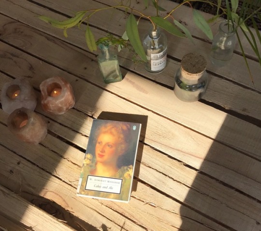
As My Calligraphy Nib Weeps
🌴Peace is like a gentle river, but we must not chase it, rather allow it to flow in its unhurried temperament, within its own charmed dialect, charging through its woes and barriers, meshes of unseen roots, tangles, webs and knots, past creamy pink and gold leaf edged fields of dahlias, wild violets, peach and ivory roses, meandering through slipping silver and gurgling streams, cantering through sweeps of cypress and cedar groves, rollicking down lush fern and iris crowned waterfalls, to the vast, unencumbered sea. For anything we chase, senses our pursuit; the level of difficult raises higher in order to prolong the experiences, knowledge gained and the longevity of the game. We may attempt to trick this system, hide our true inclinations, even from ourselves, in order to chip away at the unwelcome obstructions planted upon our labyrinthine paths. Within the daily insurrections, the weekly battles, the monthly clashes and the yearly wars, we must intensely and forcefully create open expanses for peace within ourselves. Through yoga and meditation, I come closer to learning to transport myself to the realm of incandescently. This evening, sitting under a giant cauliflower white whale of a cloud, a full moon teetering behind it, slowly rising under a fall of delicate stars, by opening jasmine, shooting moths, abstracting breezes and the inimitable musical orchestra of swishing palm trees and wind chimes, I felt peace, a state of mind that makes us lighter and more infinite, than the last ray of moonshine upon the Robins egg blue dot, or the first tears ever shed by humankind.
In our terra-cotta tiled, eucalyptus, chaste tree, desert ruellia, hibiscus and lantana surrounded apartment in the desert, my office, our living room and dining room windows face the south west. It is here, a tiny bit more everyday, that I am seduced by the unremitting light. In the afternoon, it becomes animate and intoxicating, our houseplants, books, candles, seating, mirrors, paintings and disco ball are drowned in the suns lashings. At the pinnacle of brilliance, at the peak of the afternoon, it becomes too bright, almost as if, we become the facets of a diamond in a jewel box of a room. So we seek shelter in the Adirondack chair in the cooler south facing bedroom, with our second cups of french pressed coffee, or to my husbands office/lounge, to work or read, or the children hasten to their sheltering north west facing window bedroom, with toys, chalkboard and buckets of imagination, till we all gather for a home cooked meal as the sun descends in the inexpressively beguiling, never to be repeated and the seldom understood grace of the heaven saturated desert sunsets. It is here, that I have come close to praying to the sun, seeking solace from the moon and dancing, reading and writing by candlelight.
As my calligraphy nib weeps for the words I did not write, I am struggling between a distaste for my ink soaked letters lingering between the sky blue edged lines of my notebook and a wish to keep trying. I have heard that our handwriting rarely changes as an adult, yet, with calligraphy, I attempt to change my style, even as it has become a long standing habit to write each letter a certain way and space words in two dimensions. I discover, that I dislike how my descenders appear, the way my ascenders slant and the overall appearance of my work. I also become disheartened when I practice favorite words, French phrases, names of flowers, concepts or mantras, but am bored, unimpressed or unmoved with the quality of my hand writing. Yet, I am loyal to an activity that I enjoy, committed to improving, as well as open to bursts of inspiration, thus I am eager to pick up my ink and paper and try again, tomorrow. Perhaps, I might focus more on the words that I write than the appearance alone, yet consistently, slowly and deliberately form the letters to create meaningful symbols and poetry. After all, giving up is the easier road to travel, while, struggling with a craft, may open up unexpected realms and manifest unimaginable and haunting possibilities. What if words could float of the page and dance away, wouldn’t you write the word joy a million times? 🐝
#design#healing#lifestyle#love#gypsy#style#bohemian#flowers#wellness#yoga#meditation#peace#bliss#ideas#gardens#magic#alchemy#calligraphy#shortstory#desert
1 note
·
View note