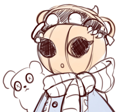
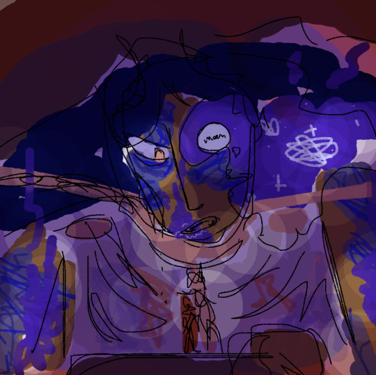
#I might do an actual good render of this sketch at some point I like where it's headed
Explore tagged Tumblr posts
Visit Tumblr Blog
Explore Tumblr blogs with no restrictions, modern design and the best experience.
Last Seen Tumblr Blogs


Fun Fact
The Tumblr app for Google Glass was released on May 16, 2013.
Note
Saying this in best way possible.
I envy on how you can convey everything wonderfully with only sketches yet it feels like a finished piece. I envy you not because I think my art is bad but more because of my perfectionist mind forced me to fleshed everything out before it deemed "post worthy" one day I want to improve and be more confident with my sketch just like you so I won't physically strain myself by making everything I made as polished as possible.
This might come as me also venting, (but!) this ask made me.... think.
Believe it or not, anon, what you envied of me is actually one of the biggest insecurities i have as an artist. I really think I should have put more effort to finish my works, but it just feel off whenever I did :")
Anyways!
It's totally alright to take time for your art! But if you do want to try to be confident with your sketch more, I'd suggest......to think that nobody cares.
This.... might be a bad advice and a bad way to see your own artworks, but these are what I kept telling myself:
Nobody would care if I had/hadn't finish or perfect this. Nobody will point it out anyway. No one ever did.
To me this looks clear enough. Readable enough. If my dumbass brain can understand it, so can everyone else.
Does this sketch sets the mood/feeling/intensity enough? If it doesnt then its time to rely on splashing some colors
If they like this messy excuse of an art then good for them and if not? Well at least my thoughts are already put OUT there and not kept locked inside. Like breathing a fresh air.
And thats that. I hope you can feel more comfortable with your sketches soon🫶 OH and thank you, anon🥹💖
Sad thoughts/vent part below cut. Not necessarily connected to answer anon!! (just me pouring my own feelings/thoughts out!)
I... really enjoy just putting out my thoughts emotions and ideas via my sketches but at the same time, it kept made me question myself if I—as an artist—was ever worth all this attention when I couldn't even deliver something "finished." Hells, even when I did a finished, rendered art, it never made an impression as close to equal sd my "stupid doodles" does.
I feel like i perform and deliver better using rough sketches because I love to emphasize the rawness of gestures and emotions that raw sketches provide. But nobody around me thinks so. Because it's like im not done yet.
I didn't know my place. Nobody around me (in my local indo artist communities) preferred my works because there's always someone out there with a more polished & pretty art. Mine is... just never seem to look finished. I always look like i... underperformed.
So what Im trying to say is. Maybe we have our own strengths and weaknesses. Whats important is that we find out own comfortable paces and methods. And that is still a long heck of an artist journey that i myself still need to discover.
86 notes
·
View notes
Note
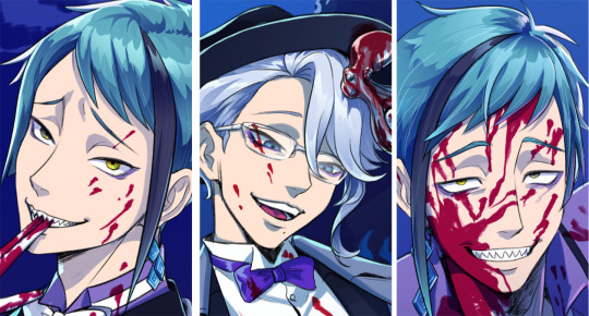
I love how you draw the tweels and Azul. They look so imposing in your art style! I know you love drawing Ignihyde, Octavinelle and Scarabia boys a lot, but I'm curious if you have drawings of the rest of the twst cast as well. I'd love to see everyone in your art style!
Anon! Thank you so much for your kind words. I’m glad you like how I draw the Octa-boys. I’m not even sure which dorm I draw most often, but it has to be either them or Ignihyde haha. But in all honesty, I really love drawing all the characters; even if we don’t care much about them, they are usually still quite pleasant to draw at least once.
Which is why I can actually compile my drawings of pretty much every character in this reply! It’s honestly surprising lol but also not really. I can’t believe it’s been a year since we started drawing and posting twst…
Alright, here we go!
Heartslabyul – wow, I can’t believe I don’t have any coloured Aces that are relatively new… We like Ace a lot, I should probably draw him. And Cater too, to be honest, this is my only coloured sketch with him. I never expected to enjoy drawing these boys as much as I do, to be honest.

Savanaclaw – Leona is the only character I don’t have a proper sketch that is not a commission with lol I’m sorry. But I actually quite like the comms of Leona that I got to draw, so here is one of them! I also really enjoyed drawing Ruggie, I should do it again… And Jack too…

Octavinelle – aw yis yakuza fishies babyyyyyyyyyyyyy. Come on, you know I love these guys lol Whenever I look at them I feel at home. It’s a shame I don’t draw them wearing fedoras (for some reason I’m still intimidated by fedoras), because I love everything about their dorm uniforms.
Scarabia – I also don’t feel like I draw these two often enough, but their uniform is probably the most difficult one to draw, simply because of all the details and prints and gold and accessories. But it’s so worth it!... I also think that Jamil is the prettiest snake in the world.

Pomefiore – it’s stupid how long it took me to find a Rook that doesn’t look creepy in my drawings lol I really love this side of him. I also really enjoy drawing Vil, but whenever I do, I feel intimidated. I just can’t mess him up..! But if the Vil that I drew ends up looking good, I get so emotional that I cry (not a 100% lie)

Ignihyde – picking an Idia and an Ortho out of hundreds of sketches of Idia and Ortho was more challenging that I thought it would be, so I picked these because I still really like their faces and think they’re cute! I also can’t get enough of them… to this day… Their hair, their teeth, everything.
Diasomnia – I feel like whenever I draw these guys we have an urge to make it into an art, this is why we have a lot of finished rendered artworks with them. Their aesthetic is just… super fitting for all kinds of dark and gothic stuff. I also adore drawing their eyes!!! All of them have such pretty eyes.
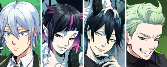
The teachers – if you feel the urge to laugh at Crowley for only getting a black and white sketch, I encourage you to also laugh at Vargas for not being here at all… I think he is the only character that I’m missing, huh.

Others – bonus round! I actually also have a sketch of Fellow Honest and Gidel but by the time I remembered them I got tired of making this thing lol, and we haven’t watched the event yet anyway, so they’ll get their chance to shine some other time (you can find it on my ko-fi though). Meleanor is also here, and I honestly I would be happy to draw every twst mom at some point… And other minor characters too…
But not the dwarves; screw them (just kidding I might draw them too at some point).
241 notes
·
View notes
Note
Hi you’re very kind in always answering people with their art questions i appreciate you so much!! I wanted to ask if u have any books/videos that helped you on your art journey? Love your art so much ur an inspiration 😘😘
hi!! this is so nice of you to say and you’re very welcome 🥰 - books and videos under the cut!
videos
what helped me a lot when i started with art is to watch time lapses or draw-with-me sessions so i can kind of copy how artists draw or paint. however it’s "Level Up your Portrait Drawings" by Chris Hong (ETA: sorry the link doesn't seem to be working, so i've included the title of the class) that was like a turning point in how i drew faces. it’s available via membership on skillshare but i think you can sign up for a month free. i can’t recommend it enough! the quality of my portraits changed after this especially with regards to anchor points—i learned how to tweak my art with this video and i do feel it carried over and improved the way i drew very visibly <3
another video i feel created a huge improvement in my drawing is this class by Lexin Yuan (qrbits). this is a lot more rigorous and thorough than the previous one and also included feedback from the artist (!!) and it’s available via subscription to Class101 but lexin has since made a free version on their youtube which i HIGHLY recommend as well (actually i would recommend their entire channel) - from here i learned how to make characters stand and pose properly, i learned to draw from dance videos, i learned about boxes and anatomy in a very approachable way.
another artist i’m subscribed to and whom i enjoy watching draw is likelihoodart. i love looking at their art bc i feel like they have the perfect blend of semi-realism and stylization - plus their OCs are amazing (the general art rule for teeth is don’t fill them out, but i’ve never seen anyone draw teeth a good as them! i mean look at this work in particular). i picked up some rendering styles and tips from watching their draw-with-me videos.
i’m also currently subscribed to Loish’s patreon where she has very useful and in-depth tutorials and guides. she explains it so well and i also see a lot of the artists in their patreon community sharing their improvements and it's SO cool and encouraging. she has accessible tutorials here you can check out :)
books
comic books/graphic novels - i think i mentioned before but when i first started drawing (again, after living artless as a corporate cog), i was in my marvel (mcu//stucky) phase and one of my fav comics back then was matt fraction’s hawkeye. i liked david aja’s style and i would copy entire panels from the comic in ink into my sketchbook. so i would recommend copying whatever art style comic or manga or graphic novel you like into your sketchbook as personal practice (not for public sharing). re-draw your favorite panels! copying directly from the source also helps you figure out how the artist might have drawn their works.
figure drawing by michael hampton - if i were to recommend just one figure drawing/anatomy book to you, it would be this one - this is also a direct recommendation by lexin yuan and i found this book to be easy to follow and the concepts are understandable. i am at heart more of a gesture drawing artist so his emphasis on line of action and dynamism is something i really appreciated.
ART BOOKS! in particular: spider-verse 1 and 2 art books - everyone knows these and for good reason; ami thompson's character expression sheets alone are worth the price. seeing concept art is always very special--you get to read how a team of creatives come up with ideas and you can learn how to incorporate them into your own art. these two are currently my favorite art books, but i also like the art of tangled (glen keane's sketches are in the inside of the covers and that alone made me want to weep they're so beautiful). and sometimes i go into the japanese section of my local bookstore and see what art books they have - i got this one last year which i really enjoyed, and i got a copy of ryoko kui's doodle book for dungeon meshi and i just love it SO much. their character designs are varied and top-notch and it's just so FUN to go through (if you're interested in this, they'll be releasing an english version soon!)
i also draw a lot of inspiration from artists who make and sell zines of their own art or sketches or sketchbooks - some of them even offer it for free! it seems to be a lost art nowadays because people think zines have to be like big collaborative productions, but it can just be a pdf of your sketches. i literally have a page from one of my fav artist's digital zines printed and taped in front of my desk for constant inspiration, and it's just a sketch of theirs. there's nothing quite like seeing an artist's work in zine format <3
my gawd sorry that was so long BUT i hope these are helpful to you in any way!! <3
25 notes
·
View notes
Note
your portraits are really amazing and i find your ability to capture likeness + control of value super inspiring…do you think you can talk about your thought process and beginning stages behind your drawings?
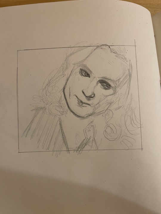
yes yippee!!!!!!! these asks helped me remember to actually photograph some process steps which i usually.... Dont do bc im using my phone for reference images lol (my work setup is in a "transitional phase" rn....... im working in the kitchen. its fine) i downloaded one of these lestat gifs made by @fearwakes ! then first thing i've been doing recently with portraits is lifting something that works from my comics process and applying it to these pencil drawings. i love having borders. i almost invariably will draw outside them but it gives me something to build on top of/inside/around rather than floating to the edges of the page. i used to be really envious of people who could spontaneously produce "sketch pages" from blank sheets but my spatial eye just does not generate those pleasing distances automatically. i need boxes lol GOOD THING I DO COMICS!!!!!

i did not actually measure this box or even make sure it's straight bc i'm just turning my brain off and doing a portrait. ok step one of capturing a likeness is just eyeballing distances for facial features. like i mentioned before with spatial reasoning it's a weak point for me as an artist so i do not give myself a hard time if i cannot immediately correctly guess the distance between a subject's chin and hairline. i start with shorter distances -- chin to mouth, mouth to under-nose-shadow, then often fill in either cheek before i take a shot at laying the eyes in relation to the nose. i'm always thinking of my pencil portraits as a kind of heatmap for dark/light values, so i'm laying down the scaffolding that's going to allow me to emphasize where all those shapes ultimately bleed together as a 3D object.
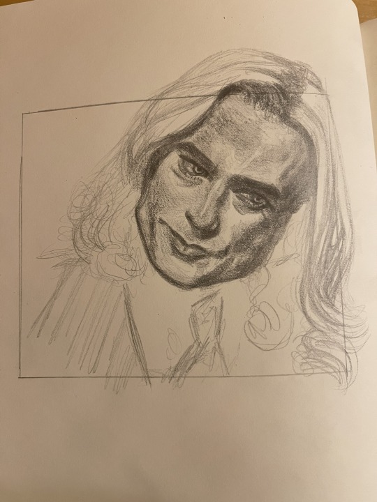
there is always a stage (left drawing) where i'm kind of peripherally going oh my god. oh my god i lost it. i can't draw faces anymore. this looks like fucking garbage. oh my god. i need to kill myself. and i think it's partly just being a human person like the demons never completely shut up for anyone as far as i know LOL. but it's also sometimes coming from thinking i'm supposed to be simplifying the shapes. like if i took those guesstimates on lestat's proportions on the left and just went right to representing his features with solid black ink on top of these guidelines, it's true, he wouldn't really look like lestat even if the proportions are alright. it's important for me to remember that my sketches look very different depending on my medium and priority; if i was ONLY representing lestat in exaggerated shapes, lol, i might actually..... exaggerate those shapes. this is a sketch that is gonna work best as the preliminary stage for a fully rendered pencil drawing, not a line drawing. i just don't think drawing a subject precisely how he actually looks is gonna get you the best results for cartooning and striking that balance is a whole other thought. but for straight portraiture with an eye for value like this, it's perfectly fucking fine, cuz the thing that's gonna make him Look Like Lestat is actually how light connects over this 3D object.
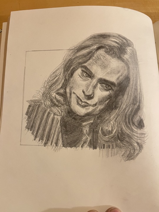
like ok i no longer want to kill myself. i have successfully guessed the distances between his features "well enough" and tricked the eye into seeing something Lestat Shaped because enough of those shadows connect in ways they 1) do in this particular reference image and 2) just Do on his face in general from my broader observations of this face. this particular portrait is building on all my previous understandings of how sam reid's face is put together. so i'm able to correct a lot of the assumptions i made before i drew him enough times to start figuring him out. like Ok, his forehead is always taller than i think it is and his nose is broader (esp his nostrils). the lack of buccal fat is essential but he can also start looking too gaunt if his jaw is not wide enough. his mouth is made up of so many complex and delicate shapes and is imo his most prominent feature lol i never quite feel like i've fully captured it and idk if i ever will bc the thing that makes it so lestat is the way it actually moves. and just from Character Knowledge i'm always inclined to emphasize how heavy lestat's under-eyes are, i feel like that's an essential emotional component of his expression. sooooo i am satisfied enough with this sketch lol. this took around 45 minutes which is longer than some of my portraits of similar detail-level bc i was distracted by on-and-off sexting. many such cases. more thoughts re: pencil on paper. the next bump up from this has gotta be going BACK IN with white oil paints which i just do not care enough about this drawing to do. but when i'm working with pencil i really know the only highlights im gonna be able to bring out are the ones with much darker areas surrounding them, and the bits i miraculously do not smudge by total accident (i'm a serial smudger. fat hand. someone's gotta be endeared to this). anyway i fucking love white oils. they are everything i previously wanted out of, like, white-out and white jelly roll pens lol. it can do so much and when you're working with paint you simply have so much of it. paint rocks. like in this portrait there are a bunch of blond flyaway hairs that i simply cannot capture at this distance by carving out "blank space" either bc i do not have the skill or space to make the strands not look wildly overblown. but if i wanted to go in with paint, i'd darken up the background and just delicately go over strands until they glowed. portraiture like this is a very meditative process to me lol. i'm just falling into an image i feel is representative of something abt a face i like looking at. simple as. i do not have a concrete strategy for where my pencil goes next most of the time when i'm just feeling out shadows and translating them into pencil pressure. i know i don't wanna do the VERY darkest areas first just bc that makes the portrait pretty inflexible if i lay something down wrong (happens often) or the aforementioned smudging problem.
anyway i should probably scan this lestat but like i said i'm working in my kitchen and im disabled and do not want to walk upstairs LOL. imagine this example portrait looks good and not bad. very good
19 notes
·
View notes
Note
I adore your style and content - I’m considering doing masters studies of some of your pieces just to try it out, but I’m still fairly new to art. I was curious if there’s any part of your process or any particular advice you’d have?
Gave this answer before to someone who asked me the same question, and I think it still counts! 1) Build stamina. You can do this by drawing often- and with intention. Start your drawing with a warm up- something light, not overly serious. Focus more on the literal mechanical feeling of your hand moving to draw. Then focus on the heavier stuff after you’ve both literally and mentally warmed up, setting the stage for more involved drawing. Make this a routine and drawing overall will be less tiring over time.
2) Focus on replicability, not detail. This goes hand in hand with the previous point. A lot of people develop a kind of perfectionism early on, where they get overly attached to a specific sketch and don’t wanna budge from it, and put details until it “looks good,” even when the subject as a whole is wonky. I like to equate this to “too much icing, not enough cake,” or “building on sand foundations.” I’ve been there before, and it can hold you back. Instead of focusing on a specific piece and how you rendered it that one time, focus on how you render it such that you could do something similar, easily replicate the concept. Once you’ve built more stamina, you can open up the gates to tackling the same subject matter in different ways.
3) Mind your mark making. Some folks agonize over the tiniest detail, sometimes for hours. At the end of the day, that itself doesn’t necessarily bring improvement- that’s more of a test of patience. Unless someone specifically asks, you don’t- for example- need to draw every single ridge of every knob on a switchboard in great detail. These things can be implied through mark making. Remember, a lot of drawing isn’t about literally making something for people to see- it’s tricking the eye into believing what’s drawn is actually there. You’ll be amazed at what detail can be like even when you don’t define every part.
4) Drawing is more seeing than “making it up.” * Don’t be afraid to use references and such. It’ll help you render form than imagining it- sometimes the imagination can conjure things incorrectly. *Even seasoned artists who don’t typically use too much references need to do studies from life or books every now and then to reinforce skills.
One point I didn't add before for style things specifically is: 5) Look where the artist got their inspirations from if you want to learn from them. No art exists within a vaccuum, everyone has their influences. Trying to do a study from someone's art will only take you so far- because then it'll feel more like mimicry than actual, learned study. Research or try to see parallels with artists that you might think had a hand in influencing a given artist's style. Notice the patterns there- certain textures are invoked here, this form was defined like this, etc. A lot of folks confuse wanting "more of a thing" as opposed to "what makes that thing desirable/unique." If you'd like to know where some of my influences come from, I'd say look at the works of Squiddy, covers for Hellboy comics, and the Snowpiercer graphic novel.
Addendum: If you're looking to draw anatomy specifically- study from real anatomy, and learn how to do those before you begin to "break the rules" (exaggerate, anthropomorphize, etc). For resources on that, I'd recommend the Morpho books (all of them haha) and Dynamic Human Anatomy by Roberto Osti.
Hope this helps somewhat, feel free to ask if I missed anything.
45 notes
·
View notes
Text
Behind the canvas: Painting 'Finally getting that drink'

This is a post about some of my thoughts while painting Rugan's pin-up for this month. Some technical ideas, rambling and mild nudity below the cut.
Inspo and references
The pin-ups of Gil Elvgren are on the left, and 'Elspeth Resplendent' by Anna Steinbauer is on the right.
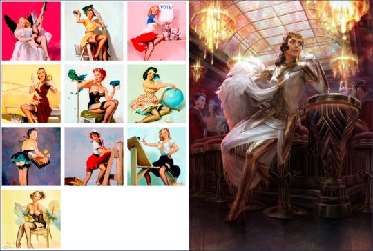
Elvgren is one of my favourite artists and I spent some time looking through a book of his collected work to see what ideas I could take for this pin-up project. The things that jumped out at me were:
The women felt like 'subjects' rather than 'objects'. There's some implication of hobbies, an inner life. They're often in the middle of doing something when they're captured on the canvas.
The subjects know they're being looked at, and they are taking it as an opportunity to flirt (signalled through eye contact, coquettish facial expressions and body language). It feels like a conversation between viewer and viewed.
Parts of the body may be exposed, but the eye is drawn back and forth between the subject's face and more titillating parts of the image.
I knew that I wanted to show Rugan in a similar setup, then; in this case, he's halfway through dinner and then catches sight of the viewer. His eye contact and smirk are flirtatious and mirror what you see of him in Act 1.
I initially wanted the pose to mirror Elspeth's in this beautiful Magic the Gathering planeswalker art by Anna Steinbauer, whose work I am obsessed with. Since I started taking art seriously, it's been my goal to paint for MtG, so I often try to study from artists whose illustrations I admire.
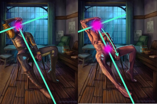
However, I didn't want to copy her pose or the composition of the piece. Don't get me wrong, I'm not above doing this - but I felt it just didn't work with the subject. The horizon line (shown in red) is very low. This is a gnome-level view of Elspeth. And I didn't want to place the viewer at the eye level of Rugan's penis.
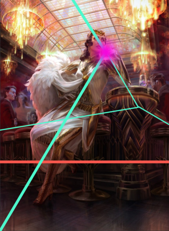
I kept the composition similar in some other aspects though - there's still a T shape (pale green) that draws the eye to the focal point (pink). I did some sketches where Rugan is leaning forwards/sideways in the same way as Elspeth is, but I feel that this final leaning-back pose demonstrates more dominant body language and allows me to paint the musculature of his torso in more detail. This acts almost as a 'ladder' that draws the viewer's eye up and down between the two focal points of the nude variant.
Painting
I've already said quite a lot on a post that was supposed to be short, so I'll keep it brief here and write more about the painting of Gortash and Raphael (February and March respectively).
It's been quite a while since I've tackled such a detailed painting, so I had to do some research/studies to remind myself of some helpful rendering rules:
Veins beneath pale skin might look blue, but they're actually just a desaturated version of the same colour. There are other parts of this image where the veins are particularly lovely. I'll leave that to your imagination.
2. Highlights on leather are not as saturated as you'd expect until you get to the most reflective part of the material. Also, a good texture brush can work wonders.

3. I try to use as few layers as possible when painting, but I remembered the importance of putting design detail on a separate Multiply layer. Multiply allows the layer to modify/darken the layers below, so you can more easily add detail that follows the shape of the object. For example, the body hair or the snake's head going over the chest. If I were painting traditionally, I'd have had to put in a lot more effort. With Multiply layers, it's one colour. Nice! I got a great tip from @dustdeepsea about the blue-ish tint that tattoos, particularly older ones, can get. I felt like this massive tat is not something that Rugan has had done recently, so I added a Gaussian blur as well.

Well, if you got this far, thanks for reading! This is a great way for me to reflect and record what I've learned from the painting. I want to paint sexy stuff, but I also want to keep improving as an artist!
Keep an eye out for updates on my next pin-up, who will be Lord Enver Gortash. Time to practice using my hair/fur brushes 🥵🥵
#rugan#digital painting#digital illustration#illustration#pin up#male pinup#bg3 fanart#bg3#painting diary#male pin-up#male pin up
45 notes
·
View notes
Note
How do you sketch & render your clothing folds, if i may ask? They look very pretty!
I am the least qualified person to give a tutorial but sure let's do this.
No I'm a self taught artist so a lot of this is just me using the good ol' "Fuck around and Find out" technique. So the example I'll might not be the best but it will give a general idea.
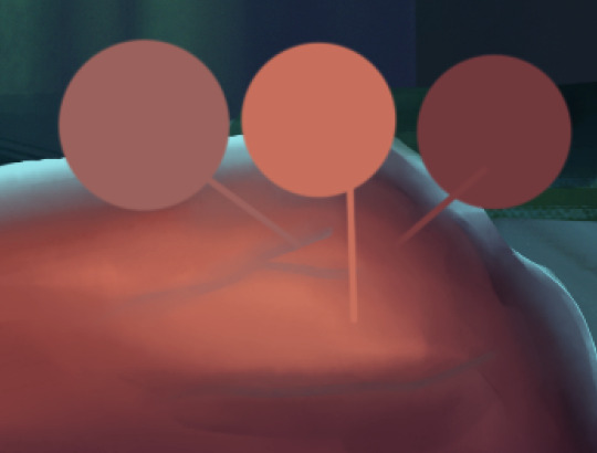
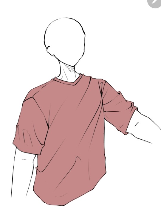
First you get your sketch/lineart + flat color. As you can see I've already drawn the fold lines. It's best to know where the shirt is getting pulled more from because that's the general direction that the folds start from and where fore folds are.
Next, on a clipping layer, I just draw with a darker color the places that will be shaded with a watercolor brush or pencil brush, just a brush that kind of fades works. This doesn't have to be accurate coloring it can be just messy blobs. But always keep in mind were the light is hitting the shirt so you'll know which direction to draw the shadows bigger and darker at
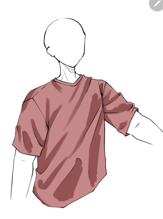
Than with a soft eraser I start erasing the shading and fixing it by going back with the brush. This is a lot of back and forth between the eraser and brush until you get to a point where it looks good in your eyes (i lowered the opacity a bit here because I thought the shade color was too dark)
(Note: during more detailed drawings I like to go in with a darker shade color at the deepest corners for more depth and detail)
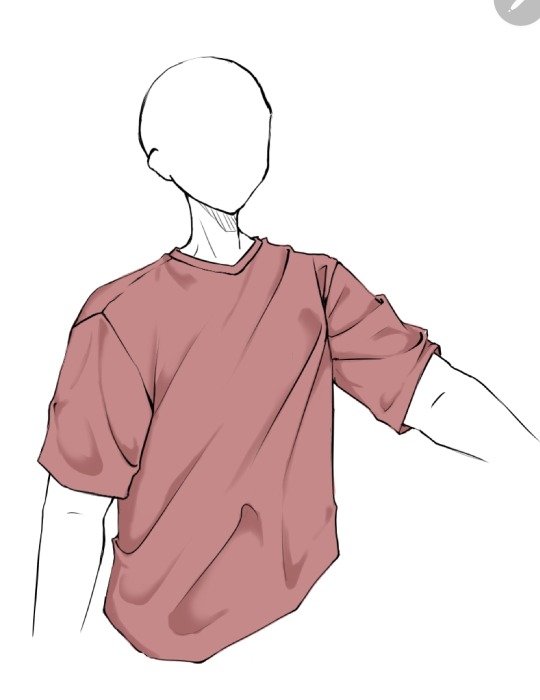
On a new clipping layer, by using an airbrush or the gradient tool, with the same colour I used for the shading, I darken the top and bottom. Why? Because it looks cool idk.

And usually that's where I leave it but sometimes I might add a lighter color for some lighting on the cloth by using the same steps as for the shading, this may depend on the fabric you imagine the clothes have. Or I've seen some people airbrush the parts of the outfit near the skin and that gives off a cool effect too
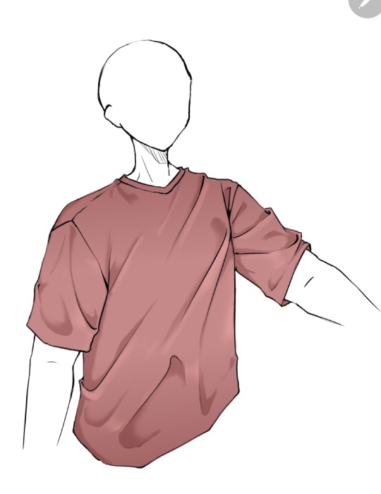
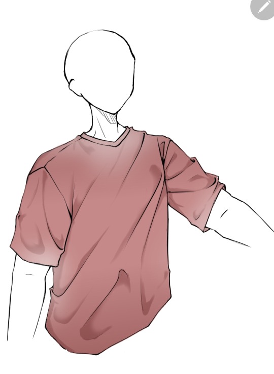
Now as you might have noticed this is the ugliest shirt ever. And that's because I did this in 10 minutes from my ✨️imagination✨️. Usually I have reference pics when drawing which give me a general idea of how the folds should look like and that is a life saver. This was just to give a general idea of how it works. Here are some examples of actual good shading I've done
Hope this helps👋✨️
#mura answers asks#shading#shading tutorial#art tutorial#digital art tutorial#digital art tips#digital artist#digital drawing#digital art#artist#artist on tumblr
50 notes
·
View notes
Note
I saw your reblog about asks and then you gave me an ask and I realised I've never asked you anything before so I sprinted over here to reciprocate the favour (and now I'm a little out of breath because my cardio is shocking!).
So... my main problem as an artist is having a thousand ideas popping into my head but not being able to put even a fraction of them on paper - if you have the same problem, would you like to share any of those ideas??
haha aw, thank you! and same about the cardio 😰
this is a really interesting question!
I struggle with the exact same problem tbh, it's always really hard wrangling so many ideas! I wish I had some like groundbreaking tips to help manage this but my methods are pretty basic:
-as ideas come, i try to write them down (i usually fail at this) but if it's a good idea it will stick in my mind for days or even weeks, so when i get the chance i will sketch something out. it usually turns out really bad but that's ok bc it's just to get the barest essence of the idea, and i'll write down the actual idea down on the paper or canvas of whatever i'm working on so i can decipher that later. (i like to have a good bunch of these drafts ready at any given time so i can pick and choose what to work on next once i complete something)
-this one might not apply to everyone, but: i cycle between a few different art styles. sometimes it depends on what brushes i use, or if i know i want something to be a casual sketch, a whole sketchpage, or an illustration. it also depends on knowing how much time i want to spend on it. faster drawings done with my favorite chunky pen in a more cartoonish style usually rank higher in order of what to work on, because i know i can finish it in a few days (or even hours). stuff that's more detailed/rendered is lower on the list of execution because i know it'll take longer to finish because of details and the linework, and that i'll definitely want to take breaks from that one to work on the faster ones. (i have two pieces for Bad Blood i've been working on for MONTHS now bc they have so much detail and i still don't know when they'll be done lol, just chipping away at them bit by bit)
-sometimes, depending on what art projects i'm currently working on, i won't get a chance to actually develop that new idea until much later on. or maybe i try and just don't feel into it anymore. in that case i try to just focus on something else. i usually have about four or more other art ideas in various stages of completion to work on in rotation which has really helped. and then some days i really don't feel like working on one particular thing and want to work on another, but i compromise with myself that if i get decent progress done on one then i'll switch to the other after a point. just as a little treat :3
i also think a large part of managing all these ideas is accepting that some of them will just never be made. every now and then i go through my procreate files and delete drafts that i know i'll never actually draw. either because i don't love the idea anymore, have no time, i don't think i can execute it well, or just pure laziness.
it kind of sucks but it's just the way things go, and the ideas keep coming anyway so it's not like that's the end of the line if you decide to toss a few out the window! (ESPECIALLY considering we draw a lot of wwe based art and since it's a weekly show there's just so much more potential for new art every few days.) it's great to be able to get anything out at all tbh! i do feel a lot of pressure sometimes that i have to get things out as fast as possible but it does work as a great motivator and i'm just always so excited to see what everyone else is working on and posting! it's a very inspiring environment.
this turned out so long, but i hope it helps! :D
6 notes
·
View notes
Text
Aight so I don't talk about this much here. But I struggle a lot. With. Rendering. IDK i've never been able to find a way that feels good and natural to me? I always feel like i'm fighting my own art and shortcomings anytime I get to the rendering part. Except once in a blue moon. Now honestly this could just be a "it takes time" Kinda thing, but i figured since I'm here I might as well ask: 1. If you struggled with rendering a whole lot at some point, what was your breakthrough solution? What Made it all click for you? Do you know why it did? 2. Are there any basic Pieces of advice you'd give somebody who wants to learn/do better rendering? 3. I actually struggle a lot with my art tablet. I feel really handicapped by it compared to when I draw by hand. I've been using a tablet for 7-9 years. Are there any settings or advice for somebody struggling with this? It tends to hurt my hand to use... (although that might be my grip and something only i can fix) 4. This is more emotional, but did you ever feel like you would never improve? that you were stuck in the same loop of failure for almost a decade (or just a long period of time)? Has it improved? Can you look back and see that it just took some time and patience? Don't worry if you see these questions and can't answer them/don't want to. I just figured that hey it didn't hurt to ask alsdfjasldgSLGD. Just know I don't have any expectations for responses! For reference by "rendering" I mean the process of turning A colored Messy Sketch into a fully Cleaned/Realized piece, or the process of doing all the shading/lighting/finishing/detailing etc. in any piece of artwork. Essentially the thing that for most artists moves it from a WIP or doodle to "Finishd Art Piece"
#isa screams#isa talks art workshop#weird for me to actually talk about this stuff but idk seemed like it couldn't hurt#i'll keep working away at the problem regardless. but IDK figured maybe somebody might have a direction i can look into for why#i'm struggling so much with it.
45 notes
·
View notes
Text
✨Weekly Progress 2024 #18-21✨
oh... shit, it's been a month since the last update huh 💦
Well, I hope it's very obvious why that is! In the few weeks before the announcement, I was preparing marketing posts and promo arts so I didn't want to ruin the surprise via a devlog!
Weekly Progress #18
Programmed SYVNH gallery
Made a programming to do list
Updated variables
[Fan project] Planning
Tested SYVNH main game, Side B
Programmed cheat codes
Programmed choice jumping
Made marketing plan and sketches
Updated SYVNH Guide
Drafted Post Mortem
Refined countdown sketches
(SYVNH as a whole project was finished at this point)
Weekly Progress #19
Fin 4 Promo art
Generated 14 SFB BGs
Tested SFB shading methods
Rendered Avia SFB sprite
Play tested for Canvas Menagerie
Scheduled SYVNH announcements and promo posts
Rendered Raven SFB base sprite
Wrote 981 words for KHP
(SYVNH full game release announcement was made at this point)
Weekly Progress #20
Rendered Raven SFB sprite
[Fan Project] flat color (x4)
Worked on [BL RPG] world building & outline
Sketched [BL RPG] chibis
Revised SYVNH Guide/Post Mortem
Sketched [BL RPG] faces
Weekly Progress #21
Drafted SYVNH game page updates
Finished Dove SFB sprite
Evaluated SFB fight scenes
Finished 4/4 [fan project] illustrations
Started P^3 designs
Released SYVNH!! 🎉🎉🎉
I'm sure everyone knows with how often I've been saying it, buuuut!!
The full version of Stuck in a Yandere Visual Novel...HELP!! is now released and available to play for free!!
Itch is currently down for me so I hope that link I copied from previous posts will work once it goes back up.
At 2.5 years of work, this has been my longest creative project yet. I think I've said everything I could in the post-mortem for the project. It has been a huge mountain for me to climb and I'm glad I finally got through it. A lot of things have changed since I started working on this project, some good, some bad, most of which I can't really discuss. But it is over and I am proud of myself for it.
I'm also really relieved that folks have been enjoying the ending! I was definitely very worried that I did not drop enough hints and it would come way too out of left field.
So once again, thank you everyone for giving my project a chance and sticking with me for 2.5 years to reach the ending. Thank you so much!! 🙇♂️🙇♂️ This is more than I've ever dreamed for and I hope I can continue to bring good stories for folks to enjoy!
A Sky of Falling Birds
Once I was done with SYVNH, I got to work on my next big project because I can't sit still. I haven't a marketing plan for SFB yet. It's a very different story and vibe from SYVNH. I think the only similarity are the length of the main character's bangs.
I'm tentatively aiming to release SFB for BAF VN Jam.
(Ad break!
Do you like shounen manga?? Do you like making VNs?? Consider joining Battle Action Fantasy Visual Novel Jam 2024! We're hosting a game jam focused on action stories with our beloved shounen tropes!! Join today!!)
Oh god that was terrible, don't put me on the spot like that, me.
Anyways, A Sky of Falling Birds is a yuri-ish visual novel about depression, finding a will to live, and the end of the world.
It's yuri-ish because you have two "love interests" who aren't lovey-dovey to you at all. In fact, one of them might murder you before the game ends. The main portion of the script has been finished at about 20k+ words and the sprites are done. It's time I made a proper roadmap for creation of this VN('s demo).
(Oh, what's that? Does one of their silhouette look familiar? I wonder...)
A Variety of Unnamed BL Projects
+ a named not-BL project
Although SFB is closer to being finished, I can't help but be tempted by these new ideas I have... and start designing for them.
Last time I talked about P^3, I finished the outline. There is still no title. But I worked on some potential designs for the MC and the two LIs.
I am both unhappy and un-done with LI2's outfit. They're actually a bit plain compared to my other designs, but this story's a historical (Victorian) fantasy and only LI2 is close to the upper crust of society that would wear flowing dress... shirts with lots of ribbons.
I'm still working on how to best summarize this story. But perhaps it's a little more "what would you do for family" than love story.
The other BL project, which I've named [BL RPG] is a story set in a modern fantasy society. There is turn based gameplay for this project. I had their designs finished a while back, but I finally put colors to the remainder of the cast for Part 1.
(Oh, this will be a long one, my friends...)
The outline isn't done yet.
This is a story about kissing boys, taming punks, and maybe over throwing the government.
The last of my "projects I worked on mindlessly now that SYVNH is done" I worked on this past... month is Killer Hiding Place (KHP). This is the next entry into the Kill Series and something I had outlined since last year. I kept trying to start writing it, but I keep running into trouble on how I want to tell the story. I originally intended to do another manga-esque format like that of Exorcist Killing Lie, but this protagonist tends to monologue a lot, making it difficult to put in manga form.
Other...!
I finished 4 images for a fan project, and I'm still behind on another part of that project 😢 That'll be my focus for this week...
I also did some playtesting for @arimiadev's upcoming BL visual novel Canvas Menagerie!! It's a soft and comfy SoL BL story about the struggles of being an actor.
It also has one of the best lines I've ever read in a visual novel.
You can play the Canvas Menagerie demo for free on itch!
Whew! That was a long one!
But that's all the info I got for this... month. Look forward to... next week...??? Let's go with the positive expectation that I will be able to make weekly devlogs again ahaha...
Bye-bye, Pumpkin out!
8 notes
·
View notes
Text

Gelnek Goes to a Gala
More Dan Jones & Dragons art! This time their glorious Double Leader, Gelnek (played by the inimitable JoCat) all fancied up in his best Goblin party-attire.
More Flower Crowns Gala Outfits: Morenthal | Hobson
Design talk under the cut:
Unlike with Morenthal’s outfit (which was mostly drawn from Dan and Gamb’s official stream design) I thought it would be a fun challenge to take the chaos of JoCat’s Gala outfit brief for Gelnek (a large fluffy fur coat and stacked tower of Cowboy, Pork-pie and Trilby hats) and try to render out something fashion-adjacent.
Figure-wise, I wanted to push the broadness of Gelnek’s build and body-shape, since Jo introduced him as being atypically bulked-up for a Goblin (to the point that he sometimes gets almost-mistaken for an odd-looking Dwarf) and charging Hobson down like small green boar during their first training spar. I thought it would be fun to lean into him being a stocky bundle of muscle compared to how Goblins are typically drawn.
For the coat, I liked the idea of taking men’s fashion-furs and giving him a long-cut trench-style coat with a big fur ruff around the collar. Really fluff the guy up with an impressive “beast-coat” that makes him look even bulkier.
Gelnek’s under-coat situation wasn’t described, so I went with a close-fit black two-piece since I figured that could help emphasise his actual silhouette without being too visually busy, and might make some fun strong shapes if I wanted to draw him in more dynamic situations later. I also gave him a few sash-belts with some of his hunt-trophies pinned on (the Voidcrystal Snail-eye, a Wyvern Tooth from their fight on the Javelin and Trilby’s gifted Dragon-Scale button), just to keep the under-outfit from getting too conventional.
Hat wise, there’s not much that can be done to rein in the “putting a hat on a hat” effect of the Trilby on Porkpie on Cowboy tower, so I just tidied them up a little with some nice complementary colours and bands that coordinated with the rest of the ensemble. The Cowboy brim and long coat combo ended up giving him some strong gunslinger energy, which is kinda fun for a traveling war-bard.
For his hair, I wanted to neaten up his big mess of fluffy curls for the formal setting, without going the same slicked-back conventional-imperial-common route that Hobson and Morenthal were already sporting. Since Gelnek’s birth-tribe come from a swampy region and places a lot of cultural importance on headwear, I thought it might be fitting to do him up with some neat protective braids.
Gelnek’s shoe situation was an interesting one since canonically he doesn’t wear them. I didn’t want to deprive him of his quest for the perfect shoe, but also figured he would need something to avoid the standard “no shoes, no service” rule at formal events, so I ended up pulling inspiration from Across the Spiderverse and giving him some Pavitr Prabakar-style foot-wraps with a bit of fancy gold trim to match the sash and middle hat.
I also decided to rep’ his drum-shield, seeing as Gelnek ended up being allowed to bring it into the venue. It’s barely visible in the final drawing but a good quarter of his thumbnail page was notes on how do drum-shield work? In my head I see it as something like a kettledrum set inside a convex round-shield/Dhal that lets him beat the drumhead while keeping the shield between him and danger. I also like the idea of him being able to play the shield part like a handpan.
Bonus look at his sketch layers because this man's hats and physicality fought me harder than he fights drakes:

#Dan Jones and Dragons#DJ&D#The Flower Crowns of E'lythia#Gelnek#Gelnek (Gladiolus)#A Party to Forget#a VERY different take on his outfit to canon but it was a lot of fun to come up with#one of the reference sets I looked up while figuring out his shape was bear cubs standing on their back feet#three foot tall but built like he could dead-lift a cart with the driver still inside#Move aside Shade Destall#Gelnek doesn’t need a firearm to pack the biggest guns at this show#Fun story: Something I wanted to lean towards was trying to style Gelnek in more of a non-white/non-western way#(Since Ustenki Goblins are a very different culture to E'lythian Imperial Common)#So it was really cool when I ended up showing some work-mates a sketch of my weekend drawings (a lot of my new team are First Nations)#and they went 'oh hey hes a little bit Indigenous-coded' completely on their own#I'm proud of that#goblin#d&d#my art#fanart#3WD
8 notes
·
View notes
Text
It's that time again, time for "I spam multiple polls on you and then run off to do errands". Yay~
So. Summoner OCs. As you know, we're nearly done wrapping up all of the six in sprite form at least, with the only odd one out currently being Eclair (and his alt as Magni) before they've all collectively graduated to 'actually has an up-to-date visual on them for once' status.
The original plan after this was to then go and make ref sheets based on the visuals given by the sprites.
But then the art meme invasion happened, and now I'm stumped. So, that brings me to this latest bout of questionaires with the gist being: "Shit. What now?"
So first question (this'll be rapid-fire-repeated for the sake of slotting the polls in proper, sorry in advance, I hate it too): What should I prioritize first? It's for-sure related to the summoners at least (other OCs exists, but they're still baking in the oven at the moment, give them a bit more time), but the question comes in what's next and what now for them.
Of the possible choices, we have:
A) Ref sheets (like initially planned).
Pros:
Tries to document as much as possible of certain details to the summoners from multiple angles.
Has a more finalized and uniform documentation and idea on things from drawn details to color palettes and such.
Get a more closer-up view of what the FEH sprites originally conveyed, including details simplified, too tiny to see in detail, or straight up skipped due to either the angle or the simplification of the sprites.
Cons:
It's a LOT of details to unpack. Including certain alt details, including details that might not fit in a single sheet, and so on. It's a pretty big project that'll take a bit of time per summoner I feel.
In terms of immediate reference, you now already have the FEH sprites to have a more immediate general idea of what each summoner looks like in their 'default' state, so this is a more detailed walk-back of much of what you already know by now.
Worth noting:
That's not to say I also might not have other drawings on the side that escape containment (especially if I get stumped on specific parts and try to visualize it mid-work, like what happened with Magni-Eclair), but for the most part, there'll be quite the ref sheet flood.
I'm also torn likewise on whether to do the ref sheet with minimal (thin) lineart (neater than sketch but around the same idea) or to go all-in on the usual stronger lineart (mostly out of concerns whether or not it conveys properly or the line thickness might get mistaken as overdetails).
B) This big-ass compilation of OC meme prompts hmrg brought to my attention (thanks~)
Pros:
Conveys a lot of prompt ideas and alts that I've been sitting on that a quick cautionary glance at the prompts hit the nail on the head of giving it a good platform to bring certain prompts up.
Silly times for silly moments in a lot of these. It's a lighthearted break from being either informative or dark-heavy-handed lately. (Well, some of them anyways...), and since a lot of these memes are based around capturing moments or pointed context, less word vomit this time.
They're fairly small, straightforward, and isolated, compared to a lot of these being bigger or fuller spreads (especially the ref sheets).
Cons:
Certain prompts might be about things I already just did and reiterating what you already know very recently even. Not all of them, but some of them (ex: the sudden spike of attention to Ephrel/Spectailis and again likewise with Eclair/Magni).
Derails reference based prompts and collections compared to a lot of these. This gives visuals to key moments of their lore, but is a lot less referential compared to the other two options here.
Many, MANY parts to the meme as a whole, so Summoner OC tag is gonna have quite A Time...
Worth noting:
I'm also torn on whether or not to do this sketch style (again, quicker, but somewhat messier), proper art style (fully rendered) or the aforementioned compromise (lineart, flatter colors, simpler shades) so that's a whole other discussion about how to approach it too.
I'm also going to properly break this down into individual parts, rather than dump the entire compilation on everyone's heads, and more than likely, it'll rotate across the six summoners, rather than be uniformly on one each.
C) This other big-ass meme quite a bit of you had been chipping away at for a good while before that I've been watching other people work on for a time (Henlo buds, nice to see your summoner alts 💖)
Pros:
Much more detailed and pointed look at the summoners and their specific alts (compared to the haphazardness of the other two, especially the other OC prompt meme) and even pokes at a lot of the rarer alts the other two options might gloss over.
Lore for alts not necessarily plot-centric compared to the others which tend to focus on alts or the moments that inspired them. It gives a chance to see or hear about seldom-seen or seldom-discussed alts.
Cons:
Basically the same as the second option where they'll be broken up into a LOT of parts, a lot of tag spam, and a lot of word vomit to go with. Not to mention it might single out a summoner, rather than rotate among them, so you're gonna be especially spammed multiple times over by one summoner in particular out of the rest.
There's also a lot of lore attached to the fleshed out alts too... which people might be a lot less patient of the essay floods to go with. hrm...
Worth noting:
I'm also only going to focus on one summoner at a time, which leaves it up in the air of which summoner even goes through these gauntlet of alts in the first place.
Whether or not the five who DIDN'T get picked right away also go through it is up in the air, but in the hypothetical scenario all six of them got a go on Summoner Alt's Wild Ride, that means you take all the concerns of this and multiply it by six.
-
Which brings us to the second half of this questionaire: What's a good bare minimum here?
As you saw recently, I tried to experiment around with a good grasp on what is the bare minimum to aim for before something's presentable enough to share. The last two things that flew by were sketches I felt were my new bare minimum (cleaned up sketchy lines with enough cleaning to fix details, overlap, or early-sketch jank to convey the main idea, but no attention otherwise to being neat and tidy, adding weight like cleaned up lineart, and either no color and shading or doing it more sloppy style in the future).
In the past, my previous bare-minimum used to be to at least get them to lineart level, give or take a much more emphasis on color-flats or much simpler cel-shade if even that. The former was way quicker and I had an easier time getting more art out (especially "give general ideas of what I'm trying to convey" pieces rather than fully-realized pieces) while the latter is tidier and at least more presentable, short of going all-in from start to finish with rendering and the whole nine yards.
There WILL be a return to art-that's-fully-realized, but how do you guys feel so far about the sketchy-lines (quicker but little to no line-weight and less stress on tidiness) versus the inked-lines (as close to final lineart as possible with lines, but takes a bit longer)? A good comparison of what I mean is compare for instance the last bit I did with Magni-Eclair versus pretty much all of Sharena Week.
-
So for poll 1 or 2...
4 notes
·
View notes
Text
Kronos what are you doing here-??
Guys save me it’s gotten so bad that I giggle and hand flap and like gurgle whenever Kronos is mentioned-
ANYWAYS, uh as per what the brain worms are demanding,
Here are two sketches for a Luke and Kronos piece! Or- a Kronos piece let’s be honest, it’s gonna take me a while to render but it’ll be fine because he’s my guy-
*note; my phone doesn’t like saying Luke and will autocorrect it to Like so uh- yeah. Just in case there’s a like there and it doesn’t make too much sense- also sorry that the draft might be hard to like- vibe but I know what’s going on and it’ll hopefully make sense
Something something, uh. I get to talk about my Kronos design!! He has two things going on rn, those misty purple bits and then those darker purple bits (forgot the ones he has on the rest of his body- they’ll be in the final one)- so, as per my Tartarus Kronos design he’s still reforming, still falling apart he’s in chunks, his hairs probably in chunks so are his arms and everything- you get the idea. But this is my ‘I need the three kings to all have design relations’,
The darker purple that is not swirling mist is like- magic god Vigilito? Best way I could put it- it just. Okay uhhhh, Kleos interpretation and great Pjo hc lore, the titans and their human forms/the basic human ones that are not disguised inherently have not human aspects, if that makes sense. Kronos’s is his little patches that reflect the sky, this is for time- that you can watch the full sun and moon cycle through these patches, and to connect him with Ouranos. Along with that Zeus has something similar on his limbs though he’s usually full on human-human because he doesn’t like how it reminds him of his dad and stuff and like lore or whatever- also Space Kronos makes cool designs (not talking about Lore Olympus, I know they have a space type thing going on with him but I don’t read Lore Olympus and I only like spiting it)
Second are the foggy bits. That’s his like what are they called-? The true form light thingies. That, it’s those bits like seeping out of the human-esque form. The fog I assume moves in the direction of where the bit it as he reforms and like Kronos essence stuff, there’s some Ichor floating around there and space. He gets to have a moon eye and I really dig that.
There’s also probably little rhyme or reason for some of the design too. It boils down to ‘I thought it looked rad y’know?’ Uh, but Luke is there on the little Dias. I assume this illustration is during one of their dream talks. Probably one of the earlier ones, I’m also making the choice that Kronos is straining to have as much of himself not be in true melt-mortal-eye-form as possible, the dialogue that plays in me head for this is Kronos saying ‘Avert your eyes [cool thematic Ancient Greek nickname for Luke that totally won’t be Odysseus’s epithet that boils down to like ‘dude whose got a bunch of tall tales’]. Lest you die in your sleep.’ And then they like, vibe and talk and Luke is shielding his eyes but he’s not the focus here I just wanted to Render Kronos and do an actual full like- thing. :3
I’ll get the actual rendered piece and updates on how it’s going at some point, but good night!!
#hehe :3#pjo hoo toa#kronos#pjo Kronos#percy jackson and the olympians#titan army#? i guess#uh#luke castellan#idk#guys can you tell that Kronos is getting to me#found too many people who like Octavian had to pivot to the most unliked character in the series/j#it’s like almost midnight I have to sleep-#okay bye
16 notes
·
View notes
Text
Rating the TriStamp Designs based on Suitability for Desert Travel
So, to give this post some context, in my character design class from two semesters ago, it was a super big thing for our professor that characters were dressed to the environment, ie hot weather causing folks to wear short-sleeved clothes, or combat focused characters dressing based on their style of combat and mobility requirements. I was doing some sketches yesterday and realized, man, some of them are actually fucked when it comes to the environment itself. And...well, here's my hotcakes.
Zazzie the Beast: 9/10
Clothing is the loosest out of the group, with the lightest over all colors. The outfit has not just one but two possible ways to cover the face, such as the mask and that scarf thingie. The main reason I'm marking the fit is for the pants, which would give them one weird sunburn. They'd also need more warmth once the suns go down.
Meryl: 8/10
Loose fitting and light clothing is a huge plus. She also has layers, allowing her to adjust better as nightfall hits. However, she has almost no face and eye protection, which would leave her with a nasty case of windburn.
Knives: 7/10
Tight fitting clothes trap the sweat against your skin, increasing the odds of overheating. His feet are also bare, so you know good and well that they're going to get roasted and burnt by the hot sand, causing blisters at best. However, having the cloak could, in theory, keep him cool during the day, and its looseness should allow for more airflow. Would've been a 6, but I'm giving him the benefit of the doubt when it comes to his skintight suit. Who knows, it could be some real damn breathable fabric.
Roberto: 7/10
Light colors, layer potential. He's doing really well in terms of clothing. However, a suit coat would absolutely be too heavy for day wear. Also, he doesn't have any sort of face, eye or ear protection, so fighting the sand would be difficult.
Legato: 7/ 10
Same thought process here as Roberto. His clothing is light on the outer layers, which could help with heat management. However, his under layers are black, which would make him feel a whole lot hotter in the case that he had to remove his jacket, which he probably will need to, because it looks thick as hell. No facial protection.
Wolfwood: 6/10
Dark clothes, not good. But they're at least pretty loose and unbuttoned quite a bit. He has eye protection in the form of sunglasses, which would help with both sand and UV protection. Loafers might be an issue, though. If he can't keep the sand out of them, he could end up with some vile blisters.
Vash: 4/10
Has eye protection. It doesn't look like it would block much sunlight, but it would help for the sand, so that's a massive boost. However, tell me that jacket isn't going to be hot as hell out there. I dare you. He's also wearing very tight-fitting black clothing, which is not going to work out too well for him. He also runs the issue of his prosthetic. There isn't any way for him to keep sand out of the joints, which will, after some time, render his prosthetic unusable or extremely uncomfortable. His undercut gives him an extra point, though, because it'd help with the weight of hair and help keep his head cool.
Livio: 3/10
Dark clothes, not very lose. No eye protection. He'd be absolutely fucked. Keeping his hair out of his eyes will provide a slight advantage when it comes to seeing things, but it's completely irrelevant when compared to the horrible sun exhaustion this poor man is going to face. And he's got a turtle neck so he's just going to have more sweat trapped close to his body with nowhere for all of that to go. Dehydration and heat management would be a horrible issue for him, besides the fact that the metal thing on his face would heat up from the sunlight and begin to scorch his skin or even blind him. His outfit when he was young would've been fantastic, if his shorts were longer, but, yknow, three layers of black suits.... Poor dude. Someone get this man a kool-aid pouch.
Thats all for now folks. Enjoy!
#might do a redesign based on my research#rambles#trigun#tristamp#trigun stampede#tetraharmonic#knives trigun#legato trigun#zazie trigun#roberto trigun#meryl trigun#vash tristamp#wolfwood tristamp
43 notes
·
View notes
Text
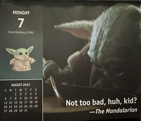
Here we go again. The Mandalorian had not been talking about soup. Or stew. Or chowder. Nope. He’d been talking about the fancy flying it had taken to protect Greef and Cara from Tie fighters. More stinking Tie fighters.
Grogu was not having it. He was going to call his agent and ask them to make sure that in future merch deals he got final say on the content. He couldn’t keep covering for these people and their odd choices. His fans expected better and he was willing to take the time and make sure that they got it.
His dad pointed out there was nothing he could do about a product that had already been launched. They’d both promised the production company that they wouldn’t use the Force or any other force to compel changes to things they didn’t like. They would use words. Nice, safe, contractually obligated words.
Grogu understood all that. It still didn’t make him happy. They could have used a vid of Din and he in the cockpit of the Razor Crest when it was upside down and he had his hands in the air cheering his dad on. Or it could have been a vid of him just sitting in the Razor Crest, all buckled up, looking impressed. It even could have been that one they used already showing how he’d thrown up.
It didn’t matter that they had used it already. Whoever made this calendar reused certain vids a lot. That would have been no different. Now that was the question. Considering the fact that the calendar used content from two whole seasons of Grogu’s show, which encompassed six hundred and thirty minutes video, you’d think that it would be that hard to 365, or wait, 313 unique stills to use.
He knew there were vids that the fans really wished had been in the calendar, and they were not all the one where Din Djarin leans back against a building in Mos Pelgo on Tatooine. Nope.
What about the one where Grogu was walking down the ramp from the Razor Crest and he looked super sad and the fans just cried about that scene because they wanted him to be happy? That would have been great. He could have a very sad story that just tore away at your heart strings and made you cry. But no. They didn’t include that one.
What about the one where his dad was with IG-11 on Arvala-7 and actually said “There’s too many!”. That sounded absurd, right? When did Din Djarin, Mandalorian bounty hunter, best in the Outer Rim, ever say there were too many bad guys? Never. That’s when. He would have said something like ‘I like those odds’. Now, that would have been a great vid.
Or the one where the IG-11 and the Mandalorian were walking through the door they had just destroyed and where in silhouette with the bright blue sky of Arvala-7 behind them. That looked really cool. Taika had even commented on that scene when he saw it.
But no. The merch people did not include that vid. They did include a lot of concept art, which was great. Grogu loved the artists who made all the sketches and paintings and renderings of the adventures as he and Dad explained them to Jon. They were really good at paying attention and putting the in the details. So why was it so hard to have unique images?
“Maybe the studio constrained them,” Din had commented when he heard Grogu grumbling under his breath about it.
Grogu shook his head emphatically. Why would the studio do that? It was to their benefit that all the merch generate the royalties that they charged for the use of the images for commercial purposes. Plus, the more images in use the more people felt like the product represented the show and the happier the fans would be to buy the next one. Wasn’t that what it was really all about? Happy fans?
“I don’t think you understand how their system works, buddy.”
That was probably true. There were a lot of things about how this planet worked and did things that Grogu did not understand. He supposed he would figure it all out eventually. His mom told him that it would take time to learn about cultural differences and that some fans might like the repetition.
He had snorted at that. Who liked repetition? It was boring. He wanted new stuff for entertainment purposes as well as for storytelling prompts.
“Is that why you’ve watched all of the episodes three times at least?” She had asked him while he was dictating this story.
Another snort. Re-watching the show was all about getting the details right. Making sure that his stories fit the narrative that the show covered. Otherwise, he’d get all mixed up and would start talking about how funny Pedro and Amy were on set and that would break the forth wall again and people might figure out that he’d been visiting Earth for a while with his parents and did they really want that? No, they did not.
Better for everyone to think this was all Watsonian, even when a good chunk of it was Doylist. If they knew he was here they’d come looking for him and he’d never get a moments peace, or be able to just sit with his mom and dad and have soup again without people realizing that he wasn’t just a cute piece of merch himself. And he didn’t want that. Even for the sake of the fans. He just liked frog soup too much.
13 notes
·
View notes
Text
May 2024 Monthly Devlog!
Hello everyone, happy May!
Another month - another monthly devlog!
WHAT I DID
This month really seemed to fly by, gosh! Where does the time go…(sob) I was originally going to work on finishing The Deepwater Witch in the lull between NanoRenO and Otome Jam, but at the beginning of the month I realized that I was a bit burnt out…(I suppose releasing a game a month will do that to you!) So this month was a bit of a break month - I took a week break from dev work at the beginning of the month, and I also went on a small vacation to spend time with my family in the middle of the month!
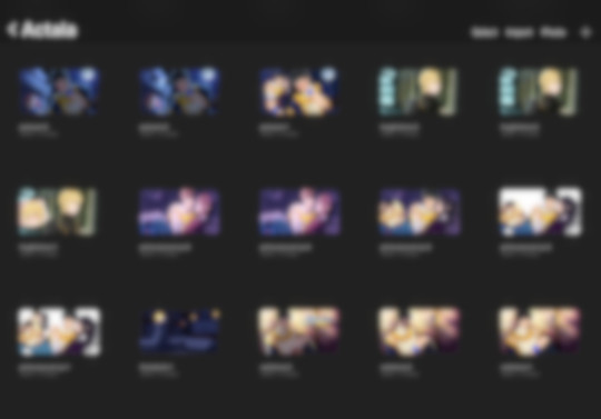
After that I started to ease into producing assets for my Otome Jam game, which is a complete demo revamp of my big fantasy title, Actala! I completed around 3 backgrounds (out of 20+ sob) and finished 5 CGs (also out of 20+ sob).
On the writing side, I continued writing for Hanasu (currently at 25k words, which is longer than Kanau and Karamu combined), and I also finished up the script for my Mythology Jam project! I probably won't announce it until a week or so before the jam actually starts, but I'm excited to work on it! (I also made plans and outlines for my Once Upon a Time VN Jam and Winter VN Jam projects!)
In addition, I did some other miscellaneous tasks! I'm happy to announce that Kanau and Karamu will be receiving a French translation! I also plan to translate Hanasu when it releases, so the full trilogy will be available in French! (And I also did some business related tasks that I won't bore you with…tl;dr government things…)
PLANS FOR MAY

As you probably saw, I announced my Otome Jam project, which is a complete overhaul of the original demo from my first project, Actala: The Hero's Shadow. It's a fantasy/mystery/romance game with 5 male love interests about the "side character that needs to save the Hero" after the end of the Hero's journey. The original demo had 60k words with scenes for one love interest (Liam), but I'm planning on adding scenes for all of the love interests in the update.
Since the revamp involves redoing ALL of the art, I'll be going full steam ahead into the art for Actala in May! Hopefully I can get a good chunk of it done; I thought it might go quicker since most of the art is being "redone," but considering almost all of the compositions/lighting/faces and such are being changed, it's ending up taking me about as long as doing art from scratch (and longer than it took me originally, since my rendering process is longer).
I'm not quite sure if I'll be able to release the full revamped demo by the end of June, to be honest! I'm being very optimistic, but I'll reassess at the end of May to see how I'm doing. Since this is my big project, I really don't want to compromise on the quality. If it looks like I can't, I'll release an abbreviated demo and plan to release the full updated demo at some point during the summer.
For writing, I'm definitely going to finish Hanasu this month! After that, I'll be tackling revisions and additions to Actala's script to get that done for the updated demo release.
CURRENT PROJECT ROADMAP
My game dev plans have shifted a bit, so here's an updated roadmap! This is all not concrete, but this is my current planned work schedule:
May/June: Actala: The Hero's Shadow July/August: Mythology Jam Project (TBA), Hanasu, The Deepwater Witch September/October: Once Upon a Time VN Jam Project (TBA), Winter VN Jam Project (TBA) November/December: Hanasu if not complete, Actala (Liam route)
I am very excited to announce the jam projects, but I'll restrain myself! I post most of my major announcements on here and Twitter! If you want to hear from me more often or see the WIPs, I post frequently on my Patreon with sketches, writing snippets, sneak peeks, high resolution art, and weekly devlogs.
Thanks to everyone who's following along, and see you next month!
Chattercap
5 notes
·
View notes