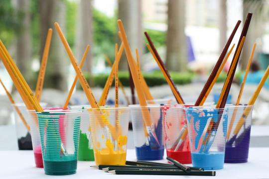
#I like gouache it takes light in a lovely way
Explore tagged Tumblr posts
Visit Tumblr Blog
Explore Tumblr blogs with no restrictions, modern design and the best experience.
Last Seen Tumblr Blogs


Fun Fact
The Tumblr office adopted Tommy, an 11-year-old Pomeranian.
Text

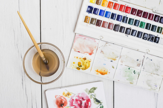
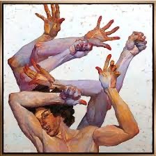
Found some more old gouache paints and tried them out on a doodle
#naked women with long hair#painting#gouache#traditional illustration artists on tumblr#traditional art#I like gouache it takes light in a lovely way#there's also a bit of a paint whose nature I didn't find out#it's gel-like#no idea what it is but it seems to do fine with water
14 notes
·
View notes
Text


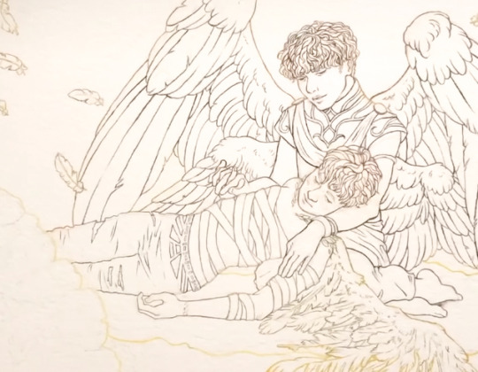
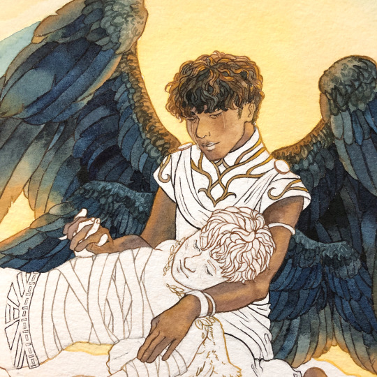
Wounded Angel 1903 oil on canvas by Hugo Simberg
Description: painting showing two boys carrying an angel on an improvised litter. The angel is dressed in white, with white wings with two red scratches visable on one. The angels hair is long and blond, and they have a bandage wrapped around their eyes. Both hands hold onto the litter, but they also hold some snowdrops in one hand. One boy is looking at the viewer with an unhappy expression. They are walking on a brown road beside brown fields with some white flowers scattered on them. There s a bush and a stream running into an lake in the background. In the far background the ground rises out of the lake and two chimneys are visable in a notch.
Propaganda: To quote wikipedia: "The procession passes through a recognisable landscape, that of Eläintarha, Helsinki, with Töölönlahti Bay in the background.[6]" First of all I love when a place is depicted in a way that it is very regonicable for people familar with it, this realness of space gives such personal context. But to quote further "In Hugo Simberg's time, the park was a popular spot for leisure-time activities among the working classes. At the time, many charity institutions were located in Eläintarha park; in The Wounded Angel, the healthy boys are carrying the injured girl towards the Blind Girls' School and the Home for Cripples [sic]." I think both the disability and the working class aspect are very interesting - like look at the boys clothes (the boots of one of them and the ill fitting suit of the other) I do not know what could hurt an angel, but two very ordinary children, are taking care of them, and that touches me.
Propaganda 2: The art is referenced in the music video for "Amaranth" by Nightwish, from 2007. Nightwish is a finnish band (link to the music video here: Warning for flashing lights and quick cuts!)
The wounded angel 1903 by Hugo Simberg. Oil on canvas. The art is 127 cm × 154 cm (50 in × 61 in). The art is at the Finnish National Gallery (link to the art here). This version was accessed though Wikipedia Commons (link here).
The Garden of Death 1896 by Hugo Simberg
Description: A mostly yellow painting shows three skeletons, clad in black robes, tending to a garden. The skeleton closest to the viewer is watering the plants; the skeleton in the middle of the painting hugs a flower to its chest; the last skeleton is turned away from the viewer.
Propaganda: I love this painting. It's one of my favourite art pieces ever, and I adore it for much the same reason I love the Deaths from Discworld and Sandman. The Garden of Death personifies death not as something scary, but as gentle, peaceful, nurturing.
Propaganda 2: what can the harvest hope for, if not for the care of the reaper man? - Reaper Man, Discworld, by Terry Prattchet.
Propaganda 3: It look so incredible tender and warm, with the golden light that is most of the art (beside the white bones and black robes), I specially love the skeleton holding (hugging!) the blue flower. There is also a fresco version in the Tampere Cathedral, which is a less bright golden color and more muted with more contrast with the green grass in the background.
The Garden of Death 1896 by Hugo Simberg. Watercolor and gouache. The art is 16 cm × 17 cm (6.3 in × 6.7 in). The art is at the Finnish National Gallery (link to the art here). This version was accessed through Wikipedia Commons (link here).
#image description in alt#hugo simberg#1890s#1900s#20th century#19th century#painting#oil painting#finnish art#finnish artist#polls#round one
119 notes
·
View notes
Text
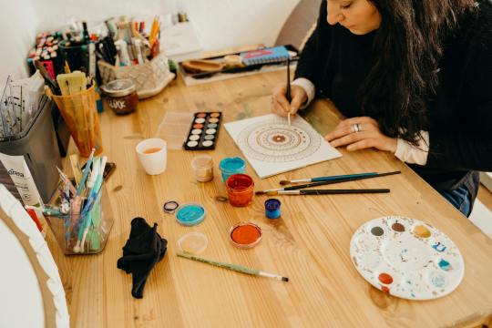
Love at First Paint: A Beginner's Guide to Painting

"Almond Blossom" by Vincent van Gogh (1853 - 1890), Saint-Rémy-de-Provence, February 1890
Have you ever dreamed of being like Picasso or Vincent Van Gogh? If you do, you are looking at the wrong blog because I am far from them. But hey there! I'm Eden Amor, a freshman student and a self-taught artist who just loves to paint.
Art has been my passion since I was a kid, and as I grew older, I fell even more in love with it and started trying out different mediums and styles. But there's just something about painting that really excites me! I started with graphite, then moved on to colored pencils, and even dabbled in charcoal (although I never got around to using those charcoal pencils I ordered online). Finally, I found my true love in watercolors, and I've been obsessed with working with wet mediums ever since!
If you are a beginner in painting (like me, have been a skill of a beginner for years), you can enjoy my blog and get some tips that I learned from my starting journey. But if you are just interested in painting or in art generally, you can still read this blog.
Just a disclaimer: I am no expert and just a self-taught artist. Some things might work for me and not for you, and vice versa, so take this blog with a grain of salt.
LEARN ABOUT PAINTING
Since I am a self-taught artist myself, I never applied for workshops in drawing or painting. But most of my art knowledge is from YouTube tutorials, shorts, and IG reels (I have no TikTok, I don’t know why). I suggest learning about the basics before painting whatever you want because you’ll get disappointed after the result or wondering why everything is not working the way you wanted.
But before anything else, find the medium that you want. Mediums like acrylic, oil, gouache, and watercolor. There might be more but these four are some of the common wet mediums. One thing to address about these mediums is that they all have different properties and the techniques you’ll approach, the materials you’ll use, and the finish or outcome of the painting will depend on the medium.
MEDIUMS
Watercolor
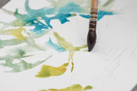
My recommendation for anyone wanting to start painting with no experience is to use watercolors. The only things you need are watercolor paint and water. Unlike acrylic paint, which, although water-based, can get pretty messy and dries quickly, giving you little time to blend and touch up unless you use an acrylic medium called Retarder, which is a medium that you mix with the paint to slow its drying time, but will cost you more. So, as simple as watercolor can be, it's a great starting point for a beginner in painting.
However, watercolor painting can be tricky when it comes to water manipulation. The amount of water your brush holds affects in creating an even layer of paint. The drying time takes hours, especially if you are working in layers, if you paint the still-damp surface too early, you will ruin everything and you cannot cover it up since watercolor is transparent. That is why watercolor painting is done light-to-dark because dark colors cannot be covered by light colors. So planning ahead of time is suggested and should not paint with watercolor impulsively.
Acrylic
If you want to take the next level or just explore other mediums, acrylic painting is great for high coverage and textures. What watercolor doesn’t have but acrylic has is the ability to cover mistakes. In acrylic painting, you can paint on top of a painting, which is great especially if you change your mind or decide to start all over again, as long you coat more than one layer of white paint then you have a blank canvas again.
However acrylic paint, as said earlier, dries quickly which can be a disadvantage if you are a slow painter (like me) and especially if you are making a seamless gradient, which is very difficult to achieve and not as easy as you think. Since acrylic is water-based, cleaning is very easy with just water as long as the paint is still wet. Hardened paints can be peeled off easily but only on smooth surfaces, but if you got it on something like fabric, it will be forever on it.
Gouache

I describe gouache (pronounced as ‘goo-aash’) as a combination of watercolor and acrylic. Because like watercolor, gouache is water-activated paint, which means that dried paints can be revived and used the paint again when wet. And just like acrylic, gouache has high coverage and a thick consistency which is great for texture. But unlike acrylic, which has a glossy finish, the gouache creates a matte finish once the paint is dry and it also dries fast giving you no more time for creating flawless gradients.
I use gouache for mini projects, or creating art trends I saw online, but I don’t recommend it for painting a big major project since it can be smudge once wet, and as of now, I don’t know if there’s an appropriate varnish for gouache so if you have any idea please let me know in the comment section.
Oil
The most expensive of the four mentioned paint mediums is oil paint. However, oil paint creates the most realistic paintings. Despite its high cost, what makes me love oil paint is how smoothly the paintbrush glides, like butter. Blending oil paint is very easy, and you can create flawless gradients between colors. Oil paint has a very slow drying time. For small projects, such as those the size of half a sheet of bond paper, it can take days to weeks to fully dry and be ready for varnish. This slow drying time can be both an advantage and a disadvantage, depending on the complexity of your painting. It allows you to fix mistakes or make adjustments even the next day. Additionally, a small amount of oil paint goes a long way.
Oil painting can be hazardous because it involves flammable oil-based paints, as well as mediums like thinner and linseed oil. While water is used to dilute watercolor, gouache, and acrylic paints, oil paint requires the use of thinner. It's important to avoid washing oil paintbrushes with water, as it can damage the brushes and won't effectively remove the paint. Additionally, it's crucial to store oil paints, thinner, and linseed oil away from sources of heat and fire.
Since I am only new to oil painting, I cannot give much in-depth information about it and if you do please I beg for some advice and tips in oil painting.
Materials in Painting
Painting can be an expensive hobby given that the materials used (especially the branded ones) are not really as cheap as a pencil and a piece of paper. But aside from being a painter, I am also a cheapskate.
I will never buy an art supply that is as expensive as my kidney, UNLESS if it is worth it or I can make money out of it. I don’t really have all the money to buy all the art supplies I want, I am still dependent on my parents and have no job yet (currently at college, 18, and an irresponsible young adult).
That is why I chose to buy art supplies online instead from the art stores near my place. And I think as a beginner, expensive materials are unnecessary because for me an artist should be able to make a masterpiece with his/her skill and not the tools. But that doesn’t mean the quality of materials will not make a difference. So if you are the same as me, you can use my tips.
Paint
The paints I use are not of great quality, but they are good enough. I honestly thought that some of the paints I bought were much better than the pricier ones.
In watercolor, there are two common types: in the tubes and in the pans. The tubed paints have a consistency of acrylic, unlike the ones in the pans, which are hardened. What I have is the Superior Watercolor in pans set. I bought them online for less than $10, and it is a set of 18 colors with a brush pen and sponge included. The quality is great, it is not chalky, and it doesn’t smudge once dried. I spent my money wisely, and I do not regret buying it even though $10 is already a lot to me.
When it comes to acrylic and oil paint, I suggest buying the primary colors (ultramarine blue, crimson red, cadmium yellow), titanium white, black, and magenta only. I highly suggest buying a large amount of white because you’ll need it most of the time. Buying a set is very costly, but with these 6 colors, you can create any color, save money, and at the same time improve color-matching skills, which is an essential skill as a painter. If you wonder why I added magenta, it is because the combination of red and white is not bright enough to be pink or it is just different from the color magenta, and I think having magenta in the collection is a good addition. I used the Mont Marte brand in acrylic and Marie’s for oil paint.
Paintbrush
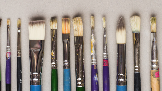
There are different shapes of brushes: flat, round, filbert, and detail are the commonly used shapes, and it depends on the medium you are using. For watercolor, a round brush is recommended, and a flat brush is recommended for thick paints like acrylic and oil paint. A filbert brush is also a flat brush, but the trim is round, and it is good for painting clouds. A detailed brush is used for small details like painting dots and thin lines or for small paintings. There are more shapes of brushes out there, but having a variety of brushes can be overwhelming. Get only the brushes you need and have them in sizes small, medium, and large. The size of the brush will depend on how small or big your painting is. Using the appropriate shape and size of the brush will lessen your expenses and you’ll learn to depend more on your skills than the tools.
There are cheap but not too cheap brushes available online. They are not branded, but the quality is good enough (like the ones I use), and the bristles don’t come off easily.
Paper
We can paint on anything, but nothing beats paper. However, the paper used in painting is not just an ordinary paper. The thickness of the paper used in painting, particularly watercolor paper, is important so that the paint would not easily destroy it.
Watercolor paper is usually combined with cotton, making it more durable than regular paper or cardstock. The percentage of cotton in the paper varies as the price varies. It is recommended to use 200 gsm paper, which is what I have because it is affordable and good enough to hold a few layers of paint.
However, I highly recommend using 300 gsm paper because the 200 gsm papers I use still curl up or bend and get wavy, which is a hassle when painting. The higher quality, 300gsm paper or paper containing 100% cotton is easier to work with, as I have observed online, even without taping the paper down, it doesn’t curl up. But of course, high-quality paper costs more, so 200 gsm paper is good enough.
If you are wondering why I called the paper used in painting "watercolor paper," it's because you can also use watercolor paper for acrylic, gouache, and oil painting.
There are two types of watercolor paper:
Cold Press - Cold-pressed watercolor paper has a rough texture, which is great for watercolor painting because it gives more depth to the flat painting (water is water, they can't have shapes and textures like acrylic).
Hot Press - The hot-pressed one is recommended for thick paints because it has a fine, smooth surface, which is great for blending smoothly.
Aside from paper, you can also use canvas paper, stretched canvas, or a canvas panel for thick paints. However, since you are only starting in painting, paper is recommended for practice and is much cheaper than the canvas mentioned above.
OTHERS
Masking Tape
Why masking tape? It is used for tapping down the edges of the watercolor paper so it stays put and flat on the surface which makes painting much easier, and also it creates a clean border. You may see other artists use washi tape because they are less sticky and won't damage the paper once it is peeled off, but I think using washi tape costs more, instead, stick first the ordinary masking tape onto your clothes until it becomes less sticky, and then you are good to go.
Mixing Palette
Usually in watercolor paint sets, the lid of the container serves as the palette. However, when using thick paints like acrylic or oil, a better alternative to a traditional paint palette is a picture frame. Mixing paint on a glass surface is convenient for two reasons: (a) it is smooth and does not absorb the paint, and (b) it is easy to clean. Dried acrylic or oil paint can be easily peeled off the glass or scraped with a blade or glass scraper, leaving a fresh and clean surface for mixing. Additionally, the wood or plastic frame around the glass provides protection against breakage and sharp edges.
Towel/Tissue
A used towel or tissue is not only used for cleaning; it is also mainly used for soaking up the excess water on a brush or for wiping off the excess paint. It is very handy, so you should always have it by your side while painting.
Jar
A brush washer is a must-have for painting. This is where you wash off the paint with water from the brush. You can use an old cup or jar as a brush washer instead of buying the fancy ones which is unnecessary. I prefer using a jar because it is heavier than a regular plastic cup, which prevents it from tumbling or spilling.
Here's a tip I learned from YouTube: use two brush washers. When you wash your brush once in a single container, the water gets muddy. This can make your fresh paint muddy when you switch colors. To prevent this, wash your brush twice: once in the first container and then again in the second container. This ensures that the water picked up by your brush is clean and not muddy.
ART STYLE
Early in my painting journey, I started practicing by painting scenic landscapes because they seemed easy to me. Of course, I overestimated myself. So I continued practicing more. Painting nature has grown on me, and I realized that my genre is landscape painting. The good thing about it is there is less structure unlike a portrait of a person, and shapes are organic so I will have no problem with imperfections.
However, I still don’t have the ability to create my own work. I still have to watch tutorials online to have a guide. Most of my artworks were tutored by the artists I follow. Once I start painting with just a reference from Pinterest, I tend to get lost and suddenly don’t know what to do. I end up not continuing the work, which is a waste of time, energy, and material.
Lately, I returned to working with watercolor, but instead of nature, I used a reference photo of a person as a subject. Sketching the face first is my least favorite part, because if I mess up sketching the face, the whole painting is also a mess. Most of my subjects are K-pop idols, especially BTS, because I am also an ARMY! Working with faces is difficult but once you succeed, it is all worth it.
Social media has highly influenced my art style. The fact that I get envious whenever I see new art trends gives me a push and inspires me to continue doing my art and explore more.
Check Out These Artists I Follow
Correa Art
Youtube: https://www.youtube.com/@CorreaArt
Instagram: instagram.com/correaart_
Jess Chung
Youtube: https://www.youtube.com/@JessChungArt
Instagram: instagram.com/jesschungart
Emily Mackey Art
Youtube: https://www.youtube.com/@EmilyMackeyArt
Instagram: instagram.com/emilymackeyar
Genelyn Sandaga
Youtube: https://www.youtube.com/@GenelynSandaga
Instagram: instagram.com/genelyn_sandaga
Socials
If you want to know more about my art, you can visit and support my two Instagram accounts:
@ChiliCheeseLover
@paintwith_amore
💜💜💜
If you have feedback to share, please do! I am eager to hear your thoughts. If not, kindly give this blog a heart; it is greatly appreciated!
💜💜💜
49 notes
·
View notes
Text
Patchwork Soul
Written by: ThisIsVee
Fandom: Trash/Lout of the count's family
Ships: None
Tags: Mystery, Light Angst, Fluff and Hurt/Comfort, Sick Character, The Henituse Family Take Care of A Sick Cale, Cale Henituse | Kim Rok Soo Needs a Hug, Original Cale Henituse Needs a Hug, They get the hugs, Sibling Bonding, Deruth is Trying His Best to be a Good Parent, Blood and Injury
Thoughts:
Something is wrong with young master Cale Henituse. Everyone is worried. No one knows what is going on. As new information comes to light and disturbing events unfold, one question remains: Whatever happened to Cale Henituse?
Y'all... I'm so so weak to KRS and OG!Cale angst, especially when they have to rely on each other and WHOO BOY does this fic scratch that itch! I'd even argue it gouaches out that itch.
I finished this fic in a tear filled haze and I don't even want to spoil ANYTHING for this fic cuz it leaves you guessing, worried and on the verge of your seat!
So instead, take the comments I left on different chapters to summarize my thoughts: (the missing chapter ones is cuz I was fucking locked in)
Chapter 6: ":head in my hands: MAN THIS IS SO FLUFFY YET SAD UAHHHH" Chapter 7: "GOD THE WAY YOU WRITE THE CONFUSION, THE BORDERLINE DESPERATION AND SADNESS MAKES ME WANT TO SCREAM!" Chapter 9: "OH DAM WHAT A CLIFF HANGER" Chapter 10: "TALK ABOUT SPEECHLESS OMFG-" Chapter 11: "IT'S HOPEFUL GUYS, IT'S A HOPEFUL CHAPTER AND IT HAS ME ON THE VERGE OF TEARS CUZ I'M SO RELIVED DHSAOHDL" Chapter 12: "HE CHOOSES CALE! HE FINALLY CHOSE CALE BUT IT FEELS TO LATE! HDOSDFHDOFJA LIKE EVERYTHING HE'S DONE BEFORE AND TO COME, HE'S ALWAYS BEEN TOO LATE"
more info under cut
Rating: Not Rated
Warnings: Creator chose not to use Archive warnings
Chapters: 12+
Word Count: 17.9k
Status: Ongoing/Uncompleted
(Please do not pressure the author into updating! I've seen a few comments asking for an update but let them cook in peace and send some love instead!!)
Reminder that ask box is open for any one to share fics you love!!
9 notes
·
View notes
Note
would you consider dropping some tips on how you color? your art always has such a nice feeling to it
Thank you so much, and yes, absolutely!
So... I have been agonizing over how to answer this question for over a week because I tend to make a lot of my major decisions based on what looks and feels good to me in the moment. It’s sort of hard to explain. Then I started getting philosophical with it (“how does one color? How do I explain aesthetic?”), and I started rambling, and had to cut the answer way, way, way down lol.
But here’s what I can help with right now. I think the most important part of how I color is my tools and what they allow me to do. These are currently my favorite brushes to use:

From top to bottom, I use Kyle T’s Gouache for just about everything. A lot of my recent pieces are done entirely in that– I love the chunky texture and how the pressure mimics traditional gouache. It’s great for children’s book illustrations, and filling linework, and realistic portraits. She is my soft wife and I love her.
I practically never use the default hard round. Ignore that.
The roller brush is another one I use for painting. It was my go-to before KT’s gouache, so you’ll find it a lot in my older work (and as a big texture thing in my current works). The “Sampled Tip” below that one I usually use for children’s book styled illustrations. It’s like a really dense, waxy crayon, so it’s fun for textured lines and details.
I always paint in my own shadows and highlights, but I like to use the soft round if I want to blow the shadow or highlight out. It’s for extra large areas.
And finally my pencil. I use it for sketching as well as linework, if I plan on doing a linework-centric piece. I don’t think there’s much of a difference between the two there… one is probably smoother than the other.
______________
The reason why I like textured, pressure-sensitive brushes so much is because they’re important to how I paint. When I blend, I don’t use a blender brush or a smudge tool. What I do is layer two colors– lightly– then use the eyedropper to select the color between them and continue painting with it. That’s probably the key to most of my work. I’ve gotten pretty fast at it, so I’m constantly selecting colors from the painting and reusing it throughout my painting.
I still use the color-wheel to hand-pick what I think will look best, though. This is probably going to be a really frustrating answer, but I choose color palettes based on basic color/lighting theory combined with personal aesthetic preference. It can take some studying (of both theory and other artists’ work). If you’re ever looking for a really great reference on the former subjects, I highly recommend Color and Light by James Gurny. Even if you’re not into watercolor or dinosaurs or realism, the guy is a master at explaining all that different stuff in depth.
Shape and negative space are also pretty important to me, but that's a whole other thing. And as a side-note, I recommend following more children’s book illustrators. Their work may look simple, but a lot of intention goes into how they use color, shape, space, and texture.
Also, on texture, I hand-draw most of mine. I love to add little scratches and drops and splashes when the painting is almost over. It's one of my favorite things to do :')
____
Now, the other most important tip:
Once I’m happy with the sketch/linework, and once I’ve laid down the basic colors of my piece, I do a Really Terrible Thing. I become a graphic designer’s worst nightmare and collapse everything onto one layer.
Then I paint directly on top of it, linework and all.
I do this for a lot of reasons, but mostly because 1) my tiny brain is overwhelmed by the clutter of too many layers, and 2) it forces me to approach a piece as if it was traditional media– a process which I find a lot more comfortable and rewarding. I paint right on top of the base colors, and right on top of the linework, effectively redoing and cleaning up what I already have there. Even if I'm working with a blank background, I'll paint a new blank one on top because it gives the feeling of a more unified piece, if that makes sense.
Basically, I approach my drawings as if I’m using traditional media. I like chunky brushes, utilizing (what I personally think are) interesting color combinations and textures, and smashing everything down onto one page so I can just paint.
Anyway, please let me know if there’s anything specific you’d like me to go into detail on, any pieces of mine you’d like to know how exactly I went about it, etc etc etc. I’m happy to answer ^^
115 notes
·
View notes
Text
Tiny Gouache Studies


Been trying my hand at doing master studies with gouache, and i think they turned out pretty well!
Reference images here:

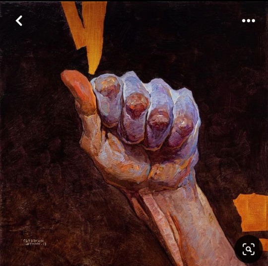
The hand is a study from a Denis Sarazhin painting and the foot is from a J.C. Leyendecker. (Probably. I found these cropped images on Pinterest so I am not 100% sure.)
.LEYENDECKER
The first J.C. Leyendecker image I came across was captioned “finding poetry in realism” and I think that is a very apt way to describe his paintings. Distinct shapes, vibrant colors, and often playful poses make his pieces feel slightly “more” than life, - the tinniest bit cartoonish- yet still elegant? Idk I’ve been finding them very fun to study and I feel like I’m learning more about light and color when I try to recreate them. Here are some examples of Leyendecker:
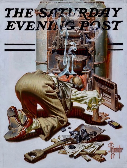
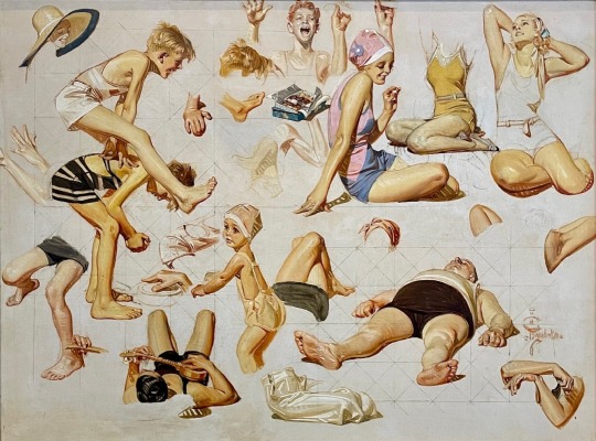
.SARAZHIN
I adore Denis Sarazhin‘a oilpaintings. I love the raw motion in so many of his paintings and the way he paints anatomy. His hands are always so scrungly and expressive! And the color! I feel like there’s often these stark very dark or bone white backgrounds paired with the subject in these vibrant almost pastel colors that make the people he paints look like they are glowing from within. I love them so much I can’t describe the feeling they sometimes give me deep down in my skull. Frozen awe but wide awake as if doused by and ice bucket and absolutely buzzing with energy? Beautiful art. Surreal, powerful, breathtaking!
Here are some examples of Sarazhin:

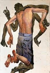

I just can’t show enough photos to capture his full range but you should really do a google and treat yourself to all the pretty pictures. I’ve gotta stop thinking about Sarazhin now or I’ll take to much psychic damage and explode.
Thanks for reading!
#gouache paint#gouache#master study#denis sarazhin#jc leyendecker#j.c. leyendecker#traditional art#artists on tumblr#studies
29 notes
·
View notes
Text
Eggtober 15th 2023
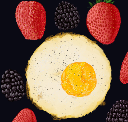
"Minutia" Air Fryer Fried Egg with Berries.
(Clip Studio Paint, Gouache Brush, Air Brush tool for the pepper. 17 colors, 2 hours with breaks.) I kind of just blacked out and worked until it was done with remarkable focus? The ADHD hyperfocus is real. I would have gone back and put the extra reddish shine on the blackberries to do the reflective light from the strawberries, and would have done the strawberries in a more meticulous way but I started getting hungry and was like "Nah, this will take too long. Gotta find a shortcut. Not sure if the meticulous 2 tone approach for the little pits on the strawberries where the seeds are is worth the time it takes but I do think that when I do that right it looks much better than the "just shade it like a matte object, then as a shiny object, and then carve the little pits in with the dark base color and then plop the seeds in" method. Key phrase being "it looks better when I do it right."
A labor of love, honestly, I knew from the moment I first saw the reference that I loved the colors and shine and the organic textures all working together so I knew I simply had to draw it for one of my Eggtober entries.
One problem with my method is if my reference is too big or I need it big to see more detail, I forget it's there and so when the final composition time happens I realize "Oh. I need to add in more strawberry. And I thought I was done... Yeesh. So yeah, enjoy me realizing at the last second "either I cut off one of my stellar blackberries or I have to draw more of this strawberry" when you watch the speedpaint. XD
@lady-quen's breadbugs will have lots to steal in this piece. Strawberries and blackberries are very portable!
And, as always, praise be to the Egg King, @quezify.
Can you tell that rendering the blackberries was my favorte part? So round and shiny. Hopefully the surface of the strawberries doesn't trigger anyone's trypophobia.
#Eggtober 15 2023#Eggtober 2023#Fried Egg#Strawberries#Blackberries#my art#art by GKD#me blacking out and conjuring shiny berries from the ether like little jewels:#''hehehe shinyyy''
43 notes
·
View notes
Text
10 good things/things I'm proud of this year
thank you so much for the tag @roseofbattles 💕 You're right that it's a good way to wrap up the year. And good luck with your novel! I hope you have fun writing it ☺️
-
1. I finished 2 sketchbooks this year! It used to take me years to finish one but I did two(!!) this year, so that's really something. I'm hoping to take that energy with me into next year
2. Baking! After discovering that one of my coworkers has a huge sweet tooth, I decided to get back into baking and rediscovered my love for it! These two cakes are the winners for this year but I owe my life to these cookies, too.
3. I hit a 500 day duolingo streak in Japanese 🔥 It's not the best way to learn, so I've enrolled in beginner classes this upcoming spring. I can't wait to learn more and hopefully be able to carry a conversation someday lol
4. I went on a really fun road trip to Bryce Canyon with my bestie. This year has been really hard for both of us, so it was really great to get away from everything and just be in the moment for a bit.
5. I started writing again! It'll probably never see the light of day but it feels nice to do it. Thank you to all the wonderful writers on here who inspire me daily 💕
6. I've been a lot more social online and that's honestly done a lot to lift my mood. I'm very thankful for all of the kind people I've met on here. Even if we've only talked once or twice you hold a special little place in my heart.
7. I was able to help a friend move out of a bad living situation. She's a great roommate and I'm happy she's living with me and my partner. (I'm also really happy she brought Onion with her because I would die for that cat)
8. Speaking of finishing things, I actually finished a few games this year. I'm notoriously bad at starting and then never completing games. Books too 😅 I did read a lot this year but not as many books as I'd like.
9. I've set and maintained some pretty hard boundaries with some family members and I'm proud of that. Some very bad things have happened this year and I still don't know how things are going to end up but I'm at least proud of myself for setting boundaries around it at all. Honestly, I wouldn't have been able to handle it a year ago, so I'm glad I can now.
10. I've had soooo much fun just going places and doing things I enjoy on my own. It's great doing things with my partner or with friends but idk it just feels nice going alone sometimes. I never would've felt that way before but that really changed for me this year (Highly recommend getting cheap last minute seats to whatever concert/play/ballet you want to see and just going by yourself. You'll have a fun time, I promise)
Bonus: I'm hoping 2024 brings more time with my friends and family but also more creative time. (I wouldn't say no to a raise, either.) I'd love to get back into more traditional art. Having birds means I can't use oils anymore but I'm thinking gouache might do it for me.
Happy New Year to everyone! I hope it treats us all with kindness ♥️
-
no pressure tagging @wingsofescape @rizayaoi @aicasey @kazsama @tsaritsa @terminalberserker @rowanisawriter @fanimalcreations and anyone else who'd like to do this 💕
18 notes
·
View notes
Text
The first official post.
I posted some preliminary work over on @qwertyfingers a few days ago, but I've decided to be organised for once and stick everything on it's own blog, so here's an intro post for organisational clarity. I'll be posting any and all updates about the project here, and that's all it'll be used for, to keep the streams from crossing.
What is this project?
I’m aiming to produce a full major arcana for a tarot, using themes, imagery, characters and places pulled from Everything Everything lyrics and odds and ends like interviews, song Q&As and so on.
Some major arcana cards have immediately evident analogues in EEs body of work. For example, The Empress is a ‘great mother’/'mother nature’ figure, protective and wrathful in turn, obvious parallels to Tin (The Manhole).
They will embrace me tonight as a A father and a son And I will carry homo sapiens through the night
Our Empress can be represented by the Fox, and potentially bring in some evolution imagery from Choice Mountain, Leave the Engine Room.
Judgement meanwhile is a representation of a rapture-like apocalyptic event that rewrites everything we know - which is heavily telegraphed in much Mountainhead but especially Wild Guess and The Witness.
Do you know what I saw? Nothing but endless fields of bodies swimming in the pit There was blinding light There were many eyes How could I know that? How could I know that? If I wasn’t there?
The role of Judgement in this deck will be played by this great accident in the pit. The exact visual it will take on is less apparent, but we have our basic inspiration already.
Other cards are more difficult. The Devil is hard precisely because there are almost too many options to draw from, but few prominent or recurrent enough to be the obvious choice. There are multiple places to draw lyrical inspiration for The Hermit from, but none of them provide any visual information. But this whole thing is a process and I’ll get there eventually.
Why are you doing this?
I had the initial idea for this project in 2021. I became really intrigued by tarots status as a sort of agreed-upon set of glyphs and stories shared across time and spent a lot of time researcing the different designs and meanings of cards throughout time. I don’t “believe” in the power of tarot any more than astrology (i.e. not at all), but I’m fascinated by the function of the imagery and art of the cards themselves.
During my reading I got to thinking about what I feel strongly enough about to consider creating a deck and I struck upon this. The first card I ever had a plan for was The High Priestess. Described as a sort of spiritual or social leader-by-example, a representative of the best of humanity and our collective knowledge. In a tounge-in-cheek way, that’s exactly what Come Alive Diana is about.
Her phantom head is thinking for all mankind I saw her portrait in the Mail Her phantom head was directing the holiest of hunts
I was immediately struck by the image of a spectral Diana cradling her own severed head in a pretty gruesome pastiche of the traditional depiction of the card, and haven’t been able to get the thought of it out of my mind since. It’s spiralled out of control since then.
So yeah. Mostly I’m doing this because it interests me on a purely artistic level, and because it’s a fun challenge to approach something really creative in a strangely scientific way. Like I’m dissecting and analysing a bunch of art I really enjoy and creating horrifying chimeras with the remains. I love it.
How will it all get done?
I’m a relatively experienced watercolour and gouache painter and illustrator, though I’ve never tackled a project this big before. The thing that scares me most is having to learn architectural drawings for at least two of the cards I have planned so far. But I look forward to it.
Right now I’m working on typing up all of the notes I have scattered between sketchbooks and notepads about my ideas for different things and making sure I know which areas need my attention most right now. Otherwise, I’m just vibing.
I welcome any questions or suggestions you might have in my ask box or messages! In an ideal world I’d like to complete all of the card artwork myself, but I have no pre-existing skill in graphic or product design and have no idea how to go about choosing a font or designing a card beyond the illustration and so if that’s something you do know about and would like to get involved please do.
Currently I have no plans of printing these up or making any overtures towards this being more than a casual passion project. My only experience with the professional art world is very informal local gallery shows and I don’t feel ready to change that!
4 notes
·
View notes
Note
I would just like to say… that your use of colour in your work is absolutely insane!! Every time I look at your drawings and I see your colour-use my mind starts to go into overdrive. As someone who struggles with colour and colour palettes I’m so jealous in like the best way possible
Do you plan your colour palettes before hand (if so how do you go about doing that) or does it just sorta happen?
Anyway, I just wanted to tell you that I love ur art! <33
omg thank you so much for this ask, I absolutely love talking about the more technical side of art!
Believe it or not I actually really struggle with color too, it kinda feels like I have to wrestle the piece into looking cohesive while also having interesting and fun colors. I don't typically plan out a color palette before I start coloring since it feels too restrictive to me so I'll just have a rough idea of what the lighting and background is going to be and then I'll choose a base color that I paint everything on top of. I'll use these two [1] [2] as an example
My process for adding color is more or less just adding the base layer that I build everything else on top of, adding solid colors and shading with multiply and then throwing on some glow dodge and then adding on some details.

and these set the undertones and lighting for everything else that goes on top. it's a bit like painting in gouache if you've ever done that before. whatever is beneath everything doesn't just act as a background but will show through to the layers on top
Then its just blocking out the simple colors using a brush at half opacity. I don't think I ever actually choose their clothes beforehand and I kinda just go with whatever I think is gonna look the best or makes the most sense. So like with Ice and Goose in the second one, I wanted them to have contrast with each other so they would be easier to see who's who, and ended up with Ice in blue and Goose in warmer bright colors.
From there it's just a matter of using a mix of purple and blue to shade and adding in reds and oranges to make skin look less lifeless and then adding details and using different blending modes like glow dodge to add effects


But sometimes even after the 500 adjustment layers there's still some things that I still feel like messing with like making sure the lineart blends into the piece and environmental lighting such as the lighter blue reflections in the shadows here because of the water

but yeah this process isn't the same for everyone and it's just what feels right for me. I'd recommend taking something simple and figuring out what you like the most! My process changes from drawing to drawing, especially if it's more focused on the background like that one of Mav and Rooster arguing in the forest. and I tend to draw a lot of warm lighting like sunsets or blues and purples just because I like them but I rarely have a solid idea of what the final colored version will look like and instead I just start out with a general feeling I want the final to give off
#omg sorry this ended up being so long lol#if you guys want me to break down my other drawings I'd be so down!#I'm not even sure I answered your question in the end lol#but hopefully it made sense#art breakdown#answered asks#anii talks art
13 notes
·
View notes
Text
My DIY Art Degree
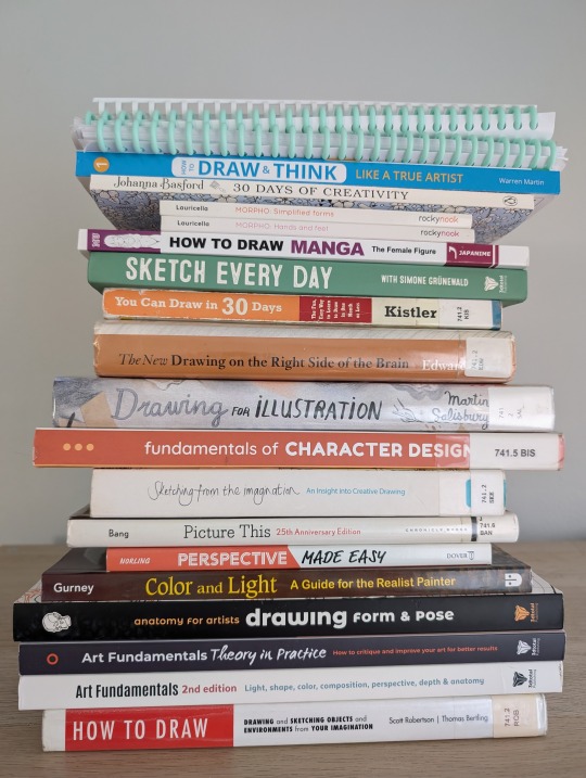
Some people think there’s an arbitrary marker where you’re finally a self-taught artist, that you eventually reach a point where you’re done with your art education. But I think we spend our whole lives learning, so my goal for my 37th year on earth is to start being a committed self-teaching artist.
I have so many interests I want to improve and learn that I can’t predict what my progress or end result will look like, but some of the things I want to explore are:
Sketching and drawing
Coloring techniques and color theory
Painting with watercolor and gouache
Painting on the Procreate app
Creative Journaling
Handwriting, hand lettering, and calligraphy
So I dug up a bunch of books and videos to make up a curriculum and planned out my own DIY art degree to start learning them all!
Each month has its own focus:
Learning About Learning Art
Mark-making, Sketching, & Basic Shapes
Perspective
Figure Drawing & Anatomy
Gesture Drawing
Character Design
Color & Light
Composition
Landscapes & Environmental Design
Using Markers & Colored Pencils
Painting with Gouache & Watercolor
Digital Art
I don’t have a syllabus for the full year planned out yet, but here’s a rough draft of the materials and activities I want to try out for Quarter 1:
❄️ January ❄️
✨January Focus: Learning About Learning Art✨
📚 January Materials 📚
Drawabox.com: Lesson 0
[Book] Art & Fear by David Bayles
[Book] Debt Free Art Degree. Foundations in Drawing by Marco Bucci: Chapters: 1
[Book] Drawing on the Right Side of the Brain by Betty Edwards
[Book] How to Keep a Sketch Journal by Marisa Lewis
[Book] Sketching from the Imagination: An Insight into Creative Drawing by 3DTotal Publishing
[Book] Art Fundamentals: Theory in Practice by 3DTotal Publishing. Chapters: Fundamentals & Critical Thinking
[YouTube] Veritasium: The 4 Things it Takes to Be an Expert
[YouTube] Ian Roberts: 5 Principles to Master Anything
[YouTube] Proko: Getting Better Faster - Painting with 80/20 Rule
[YouTube] Proko: How to Hold and Control Your Pencil
[YouTube] Sycra: Iterative Drawing
[YouTube] Love Life Drawing: 10 Stages of Learning Any Art Skill
[YouTube] Love Life Drawing: Practice Like a Pro - How Steve Rude Improves
[YouTube] Sinix: Art Theory Tutorials Playlist
[YouTube] Sinix: Art Warm Up & Exercises
[YouTube] belartsy: the “right” way to start learning how to draw
[YouTube] Paintable: Sketching For Beginners
[YouTube] Marc Brunet: How to Draw Anything - The 7 Fundamentals
[YouTube] Marc Brunet: How to Draw Good Lineart
[YouTube] Marc Brunet: Stop Learning to Draw the Wrong Way
[YouTube] Marc Brunet: The Most Important Art Skill
[LinkedIn Learning] Drawing Foundations: Fundamentals
[Gumroad] moderndayjames: Intro to Dynamic Sketching ($8)
[Reddit] r/ArtistLounge: How to get better at observing the world around me?
✍️ January Activities ✍️
Set a baseline by making whatever I want
(I know January has already passed; I'll post an update with what I actually managed to get through.)
💝 February 💝
✨ February Focus: Mark-making, Sketching, & Basic Shapes ✨
📚 February Materials 📚
[Book] How to Draw and Think Like a True Artist by Warren Martin. Days 1-5
[Book] Drawing for the Absolute Beginner by Mark and Mary Willenbrink. Chapters 1-2
[Book] You Can Draw in 30 Days by Mark Kistler. Lessons 1-7; 10-13; 15; 19
[Book] Perspective Made Easy by Ernest Norling. Chapters 1-8
[Book] Art Fundamentals 2nd Edition by 3DTotal Publishing. Chapter: Perspective & Depth
[Book] Drawing on the Right Side of the Brain by Betty Edwards
[Book] Debt Free Art Degree: Foundations in Drawing by Marco Bucci. Chapters: 1, 3
[Book] How to Draw by Scott Robertson. Chapters 1-2
[Reference Pictures] Fundamentals: Shiny Forms
[Reference Pictures] Fundamentals: Basic Forms
[YouTube] Uncomfortable: Drawabox Videos Playlist (Lesson 1)
[YouTube] moderndayjames: Perspective 1
[YouTube] moderndayjames: Perspective 2
[YouTube] moderndayjames: Perspective 6
[YouTube] The Art of Nemo: The ONLY Box Rotation Exercise That’s ACTUALLY Useful
[LinkedIn Learning] Drawing 2-Point Perspective
✍️ February Activities ✍️
drawabox.com
Lesson 1 & Homework
250 Box Challenge
🍀 March 🍀
✨March Focus: Perspective ✨
📚 March Materials 📚
[Book] Perspective Made Easy by Ernest Norling. Chapters 9-18
[Book] Drawing for the Absolute Beginner by Mark and Mary Willenbrink. Chapters 2; 5
[Book] You Can Draw in 30 Days by Mark Kistler. Lessons 22-27
[Book] How to Draw and Think like a True Artist by Warren Martin. Days 6-14
[Book] How to Draw by Scott Robertson. Chapters 2-7
[Book] Art Fundamentals 2nd Edition by 3DTotal Publishing. Chapters: Perspective & Depth
[Book] Framed Perspective I - Marco Mateu-Mestre. Chapter: 1
[Book] Debt Free Art Degree: Foundations in Drawing by Marco Bucci. Chapters: 3
[YouTube] moderndayjames: Perspective 3
[YouTube] moderndayjames: Perspective 4
[YouTube] moderndayjames: Perspective 5
[YouTube] moderndayjames: Visual Library I
[YouTube] moderndayjames: Visual Library II
[YouTube] moderndayjames: Visual Library III
[YouTube] moderndayjames: Vehicle Sketching I
[YouTube] moderndayjames: Vehicle Sketching II
[YouTube] moderndayjames: Vehicle Sketching III
[YouTube] moderndayjames: Vehicle Sketching IV
[YouTube] moderndayjames: Sketching Figures in Extreme Perspective
[YouTube] moderndayjames: Emulating Even Amundsen Series
[YouTube] moderndayjames: Becoming a Gi Series
✍️ March Activities ✍️
drawabox.com: Lesson 2 & Homework, 250 Cylinder Challenge, Begin 25 Texture Challenge
100 Rotated Objects - based on moderndayjames Visual Library videos
100 Unique Studies (machinery, vehicles, plants, animals)
🖌️ Some Ongoing Activities 🖌️
50/50 Rule: 50% studying, 50% funsies
[Book] 30 Days of Creativity by Johanna Basford
[Book] 2025 Johanna Basford Wall Calendar
[Book] The Lost Art of Handwriting by Brenna Jordan
[Book] Spencerian Handwriting: The Complete Collection of Theory and Practical Workbooks for Perfect Cursive and Hand Lettering by Platts Roger Spencer
[Workbook] New Spencerian Compendium Plate 2 Practice Sheets (Found on PDF Drive)
Hand lettering worksheets I made in Canva
This is by no means a comprehensive education, but I feel like I came up with a good introduction to the things I’m interested in. I’m not going to learn everything about all of these topics in just a year, and I know I'm not going to get through all the resources I found.
I also want to make this process as cheap as possible, so I’m using a lot of free stuff from YouTube and my local libraries. Many of the resources came from radiorunner’s Curriculum for the Solo Artist and suggestions I found through the almighty social media algorithms.
If your libraries can’t get the books on order or Inter-Library Loan, or if you’d rather just buy them to keep, I’m including Amazon affiliate links. (Many can be found as PDFs through other free methods but I definitely don’t recommend looking for the books on Demonoid, Mobilism, or PDF Drive.)
What do you think I'm missing? What do you think is too extra?
Learning is a life-long process, so even though I gave myself a year to restart, it’s just that: my restart.
0 notes
Text
100123 He stole nightmares from others about trifectas of fortresses turned them into dreams a ritual walls and walls and walls of protection from the inside or the out? I know he saw himself as a monster a titan with a tectonic temper he told me so many times how he couldn't love me in the ways I needed and I denied it until grey in the face sending smoke signals to the others numbing myself into someone who could fade into him the awful things we do to make the head go quiet a warm cloud around him to feel but never hold; falling apart under his touch - My gracious girl hospitable hag a direct shooter of sensibility she watched me fading until I left, told me two years too early for me to know: "How could he say he loved someone he couldn't tell was dying?" I as Himi a moth to a flame a gauche gouache a likeness of a lover; all spectacle without substance all white-hot skin and visions of blue skies to blaze into: Bhfuilis soranna sorcha Ach tagais 'nós na hoíche Trína chéile - And there on the precipice of the beginning in her exalted position (as is correct, with her angels flanking her each morning) sympathetic not para- (lysed, or sympathetic) armed with her own hurt; unrelenting morals steady hands that touch skin and souls with softness in her moment burnt by my careful words that I tried to douse so they would not light as embers at her feet blown into a bushfire - Finally, I am safe; I walk to her expecting embrace as she pulls each person forward like a pin to stick an acupuncturist of pain until I can bear it no longer and I take my moment of reprieve like the carpenter's son back into the cool and shaded letting the water rollover the rocks of my cheek the heat now inside of me; as each thought she showed to me weren't ones that I had slashed into me echoing relentlessly from a rabid animal of a person for this month of madness now imprinted in my mind and said in sorrow as forming a new ritual in each moment of regret to each flesh and bone person of the ghosts she defends her voice saccharine now stoking a sonic sickness: "Delly, this isn't helpful" as though I'm unaware and needing of the valence of judgement as though able to hear words from anyone close to resembling her if only her walls, and walls and walls were high enough to keep her from me
0 notes
Text
Many traditional Arts & Crafts need PPE to protect your long-term health and safety. Always research your materials safety precautions.
The most common precautions are wearing a skin protective barrier lotion and lightweight gloves/single finger dams, a mask (make sure you're wearing ones meant for particulates or fumes, depending on material you work with!), and an apron or smock. Some materials will also require protective eyewear, heavier gloves, close toed shoes, and/or air filtration systems.
Things you need some kind of PPE for:
Pastels of any kind: if it makes dust, mask up. Wear gloves. Repeated skin exposure or inhalation of particulates is the problem with many toxic colors! (trust me, the mask is so you're not sneezing color and inhaling heavy metal dust from certain colors.)
Oil painting. While you CAN go entirely solvent free (check out the book The New Oil Painting!!), you should still glove up, because repeated skin exposure of toxic paints is bad for you. I've been taking art classes for no-credit at the local art school and we work in a big ventilated room, and absolutely cannot use turpentine. We can use OMS (odorless mineral spirits) which are still toxic. Most everyone keeps their OMS totally covered. I use gamsol very sparingly — mostly I am using rublev's Oleogel (which is basically silica gel and linseed oil, and creates transparency without muting color), and Velasquez medium (also solvent free, and thickens paint.) If you are solvent free, the main issue is skin absorption.
Acrylic or latex paint: also has fumes to consider and similarly you should avoid getting it on your skin.
Watercolors and gouache: probably the "safest" painting medium since you are inherently diluting everything. Don't bathe in or ingest the paint water (this goes for all paints). Still, I've seen indie watercolor companies sell like...paints made from lead (ehhhh) and mercury and for the love of God: don't buy that. Don't use that. You do not need Genuine Cinnabar watercolor paint. Cinnabar (aka Vermillion, AKA PR106) is Mercuric Sulfide. It's an extremely toxic heavy metal, is very expensive, and as a watercolor, is also highly fugitive. Which means it loses its color when exposed to light very quickly. (It goes from a bright/bold red-orange to a dingey red brown).
Do not varnish or fix anything without proper PPE and check to see if it's even necessary! (Graphite-only drawings can be fixed with a skim milk spray. Look it up! No need for toxic spray.)
Sealants, stains, fixatives, expoxies, enamels, and resins all need PPE.
If it makes dust or crushes something to pieces or powders, or shreds and makes fiber dust, you need PPE. If you're sanding, carving, or milling, you need PPE.
If it gets very hot or there is molten liquid or a liquid becomes a solid due to chemical processes you need PPE. If it's involving welding, melting, or sawing, you need PPE.
If you have a funny little headache or your chest feels tight after doing something, wear PPE next time.
Are you fine not wearing a mask and gloves to use wax crayons, colored pencils, and pencils? Absolutely.
What about charcoal? Well you probably won't die from it, but consider this: charcoal is literally charred and compressed wood, and inhaling smoke isn't good for you. So inhaling a lot of burnt wood dust (charcoal) is probably also bad for you over a long period of time.
Put a mask on and stop sneezing black dust.
For more, take a look at Get Your Shit Together: Health and Safety Issues for Artists, and search "studio safety," and you'll get plenty of guides for various activities.
There's no way for us to know if Bob Ross died of Lymphoma because he smoked cigarettes, or because he painted constantly using solvents and thinners. Practice safety.
I spend a lot of time worried about how many craft/fine arts people fail to use appropriate safety precautions for. Especially with small businesses and the popularity of expoxies/resins, I'm always kinda worried that folks aren't wearing PPE.
25 notes
·
View notes
Text
Art Tips for Vibrant Lighting
Some tips and tricks for getting glowy, beautiful, vibrant lighting effects...especially in traditional art, with no ctrl+z! The example piece is a watercolor work in progress of mine and, if you’re familiar with watercolor, you know it’s super unforgiving. What you put down stays!
Tip 1: Create a thumbnail

Do a very loose, messy sketch of your illustration. This helps define the composition, but it can also help you pick where your light is coming from and what colors you’ll use for it. This way, you can reference the light source and colors while you’re painting!
Even if you’re working digitally, this creates a great color key you can turn back to. You can make a thumbnail digitally or traditionally.
This thumbnail only took about 20 minutes...and it’s saved so many headaches during the painting process.
When you have a thumbnail, the rest of your painting is just a translation of those colors with a better technique.
Tips:
Feel free to make many thumbnails! This is the easiest step to revise and repeat.
Use a photo for inspiration for your color scheme. I used clouds in the evening as color references.
Play around with layers and effects (like overlay, multiply). This can help you figure out new colors that you can then try to capture traditionally!
Tip 2: Don’t forget about your lines!
Line art is important for gradients! I did mine first, so I had to consider the glow effect too. It’s a bit blurry (as its a screenshot from a reel, lol), but you can see yellows to dark browns and blacks. This established the glow from the start!
Tips:
Consider using a media you can get gradients in. I used acryla gouache here, but ink, watercolor, and even markers can work well!
If it’s hard to visualize highlights in line art, do the lines after with pen or paint! Adding shadows and highlights that way can be easier.
Tip 3: Start with big gradients first

Once you have your sketch on paper finished, start with large gradients! This helps define your light source and keep your whole composition making sense.
Here, I started with the background sky, then added in the shadow coming off the wing before doing anything else. Take note of how helpful the thumbnail was in helping me lay this all out, too!
Tip 4: Think warm to cool

See how both the hair and wings move from warm (yellow/browns) to cool colors (blues, payne’s grey)? This is a surefire way to keep the strong light source and make it look like the light is glowing!
Tips:
This is all about keeping the colors close to your light source, so if your light source is cool (like the moon), your highlights are cool and your shadows are warm tones. The key is just to keep it consistent!
Lighting isn’t just light to dark gradients. It’s also warm to cool/cool to warm!
Think about all the spots the light catches (like that one front feather on the left top). It takes a lot of thinking through, but it’ll make a huge impact! (Remember, you can always revisit your thumbnail or add more details in there)
Don’t forget about reflected light, bouncing off another surface. It’ll be more subtle than the main light source, but still there!
Final Tips:
Love those gradients! Watercolor is meant for beautiful gradients, so use multiple colors for a glow. The feathers in the light go from yellow ochre to prussian blue to payne’s grey.
Start with the highlights first, then work into the shadows! Above, the skin isn’t even painted with shadows yet, because I wanted to get the lighting first.
This is just a WIP right now, but I hope these tips help! If you want to follow, I’ll be posting more progress pics (and the finished illustration soon too). :D
My: Instagram | Twitter
#art tutorial#watercolor#painting tutorial#color theory#artists on tumblr#art tips#painting tips#watercolor tips#watercolor tutorial#color tips#angel oc#angel art#oc art#art wip
2K notes
·
View notes
Photo

Some of you may have seen the color rough of this in my instagram stories, but I finally got around to scanning the paintings I created over my winter break. Here’s the first one -- a little bit of Hilda fan art. I love that show so much! The second I saw this scene, I knew I had to paint it.
This painting also served as technique experiment. If you’d like to read the nitty gritty technical details, click below~
Okay, so.
I paint in winsor newton gouache watered down like watercolor. I do this because gouache doesn’t bleed like watercolor does, meaning it’s easier to get crisp, solid shapes. Ever had trouble getting watercolor to not look blotchy? I recommend trying watered-down gouache! The major draw back of gouache is that there are fewer colors available (especially that are lightfast, non-toxic, and permanent) and sometimes you want colors to blend and the paint just isn’t going to do that for you.
But painting thinly in gouache has one other large draw back: unlike opaque gouache, I can’t paint light colors on top of dark. With watercolor-like paints, you must move from light to dark and can’t make corrections. I’ve developed a few tricks over the years to get around this (super clean wet paper towels work like watercolor erasers for one!), but mostly I’ve just gotten really good at painting it right the first time...as time consuming as that is. If you’re curious to see some process shots, I upload them for most of my pieces to my instagram stories, and some are highlighted. But anyway, most of my paintings take around 4-6 hours just to paint, not including all the lead up time of sketching, color-roughing, and transferring. The more complex ones, 12 hours or more.
Lately, however, I’ve learned a cool new technique!
In the past, I’ve tried painting light colors more opaquely in winsor newton gouache on top of my thinner winsor newton dark washes without much success (it just soaks in) -- but it turns out you CAN paint holbein acryla gouache on top of winsor newton without it simply disappearing! The little hexagon-ish shapes up there were painted in holbein after the rest of the piece was completed (the white circles are white gel pen). For best results, I recommend not mixing the holbein acryla gouache with any other gouaches, including winsor newton. I used completely different palettes and brushes for them (it’s a sticky paint and hard to clean!). Instead of using these paints like more colors to add into my usual ones, I instead use them like correction fluid and in moderation. Just like with winsor newton, I recommend checking the lightfastness and permanency of each color, but more of holbein’s range is lightfast (likely because it’s plastic).
With this technique, I’ve been able to not only paint small details in lighter colors after a series of dark washes but have been able to mix matching colors in holbein to make corrections to my winsor newton, too. The best method for making the two paints blend into each other (so it doesn’t look like thick paint is sitting on top of the thinner paint underneath) is to not paint the holbein TOO thickly; instead, paint just opaquely enough to cover what’s below.
Another example of this technique is my new year’s piece, which I actually painted after this one -- the little confettis were painted with holbein, as well as the ribbons. It meant I didn’t have to be TOO perfect with my background washes because I could go back in and correct in a way that wasn’t noticeable...and it meant I didn’t have to try to paint AROUND all those little confettis, I mean talk about a nightmare. And let me tell you, not having to paint around every tiny detail saves a ton of time! I time myself for every painting in hour-long pomodoros, and paintings that would have once taken 12 hours now take around 4. That new year’s piece would have once taken me two work days, but took only one. GAME CHANGER.
So I just had to share, in case anyone wanted to try the technique. I know lots of artists paint opaque gouache on top of watercolor washes, and this is kind of a similar idea to that...but I wanted to avoid the two paints looking different, and wanted it to look like I had painted the entire piece with one technique. Painting in washes is still a perfectionist’s technique and you still have to get almost everything right on the first pass, but so long as you don’t overdo the areas painted in holbein acryla gouache on top, this method will let you paint tiny corrections and tiny details!
Hope someone found this useful! 🦊💛
#hilda season 2 spoilers#hilda season two spoilers#hilda fan art#children's illustration#children's illustrator#gouache#gouache painting
5K notes
·
View notes
Note
Hello Vika, would you please share what Procreate brushes you use? 🥺 I only found the ones you've used back when you used Sai when searching your blog / the tutorial live stream you released on YouTube. Thank you so much, I hope you're doing well!
Helloˆˆ To be honest, the majority of brushes I use currently are bought, so if you don't mind that part, I can totally share💫
🦔So for lineart/small details/sketching my favourite is Vis Dev Sketch from Retro Max Packs set. The way it behaves is something absolutely unique and I haven't found an alternative in standard procreate set. But I used Technical pencil from standard set for ages before it, so it works just fine too! Although quite differently.
🐿 For colouring I use standard Script brush from procreate! I think it should be in Calligraphy (or how is it called in English?) folder, though I tweaked it so the streamline isn't so heavy. I have it at around 15% or so. 🦦 For shading I use another brush from Retro Max Packs set, which is Gouache Shader Wash. That is for Multiply layer shading, I then do some extra shading on face/hair, and for the face I use Watercolour Eraser (from watercolour maxpacks, I think), and for the hair I use Watercolour wash clean (also from the same set). In general I have like. 3-4 sets bought from Max Packs alone and I tweak and use many brushes occasionally from each set alsdasld I . I really love them. But in a way I think something from Calligraphy set can work (with tweaked steam line). Mine are in Russian so I can only translate vaguely how they can be in English, but something along the lines of Pen with nibble or Water pen!) 🦥 Foooor lighting, it depends. Currently it's Thin Render Solid from Jingsketch brush set (but I bought everything, moved it into favourites folder and now I don't remember which section it was in initially) . But seriously, for this I can feel like you can use script, which will act similarly (though Thin render is softer on edges). I also sometimes use Gouache Clean (from same old Gouache set of, take a wild guess, Max pAcks.) But same as in previous, for this if I was limited to standard set I would use Pen with nibble or Waterpen from Calligraphy standard set. That's mostly is. Considering how many I have now I switch and experiment here and there (especially with backgrounds and such), but that's pretty much it for my faves! I'm sorry they all aren't free;;; I hope it helps!ˆˆ
1K notes
·
View notes