#I left out some pics bc of the 10 image limit
Explore tagged Tumblr posts
Text
Stuilly but that trolls thread;
“Why? Why won’t ship Stuilly?
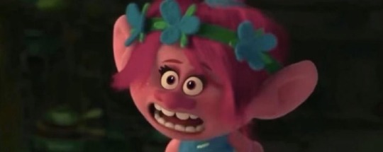
“Because Stuilly killed my grandma, okay?”
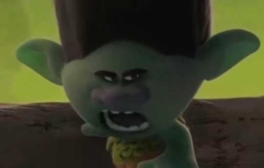
“My uncle broke his neck reading an exclusive mlm ship on ao3 once.”
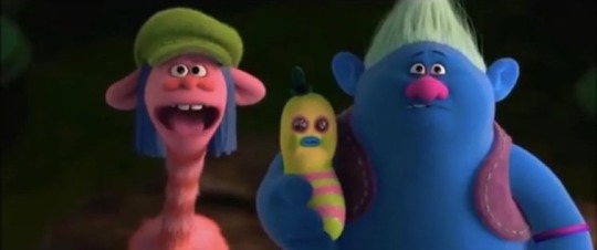
“How did..how did Stuilly kill your grandma?”
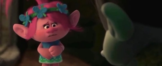
“I was the one shipping Stuilly.”
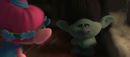
*Branch scrolling through the Stuilly tag on tumblr*
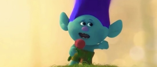
*Grandma saves him from poly!Ghostface and x readers*
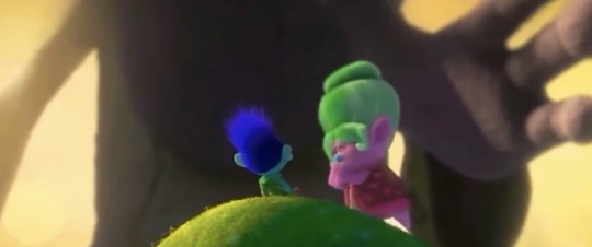
“GHOSTMA NO!!”
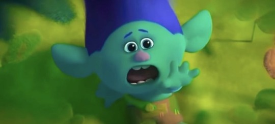
*Branch starts calling mlm stuillys misogynists and biphobic*
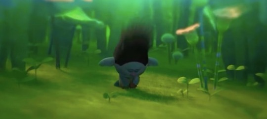
#I left out some pics bc of the 10 image limit#):#anyways sometimes I think I’m funny#I know the trend is dead but shhh#ghostface#stuilly#stu macher x billy loomis#Stu Macher#Billy Loomis#Fuck the moral high ground#I’m putting this shit on your tags too#billy loomis x reader#stu macher x reader#poly!ghostface
305 notes
·
View notes
Note
How did you make your edits for the Austin Moon stuff?
hello bobby lol thank you for the ask!!! um my explaination is going to lack technical terms because i kind of just go with whatever looks right as i edit (hence some inconsistencies) but hopefully this makes sense.
to start: i do all the editing on my phone with the apps pixlr and proknockout. both are free, though they have a quite a bit of ads—they get the job done. additionally, all the original photos either came from ross lynch’s or laura marano’s instagram or a lot of google searching for the perfect picture
now the concepts for the playlists as fake albums came from me rewatching austin & ally this year and being like “wHAT HAPPENED IN THE TIME SKIP???” yknow those years between ally giving austin her book and them being on the helen show? yeah. i was like “what happened?!? i need to know” and originally i was thinking of a fic but i started also getting into the driver era and thus i thought up “what if like... austin moon had other albums?!” cos we kind of just know of his first album in canon. and then it extended to “hOLY MOLY WHAT ABOUT THEIR DUO ALBUM?!?” anyways that’s way more backstory so onto the edits
WiLdHeArT

okay so this was the simplest of the edits. basically i took this photo:
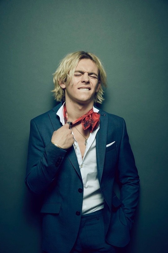
cropped it into a square, played around with some of the exposure and such to make ross look less washed out, and then rotated the image and put some text over it. the font is provided with pixlr and i chose it because it conveys how i’d kind of imagine austin moon’s handwriting. the “album” itself was meant to have a very personal/authentic aspect so i thought it fit.
for the back cover/track listing, i took this photo:
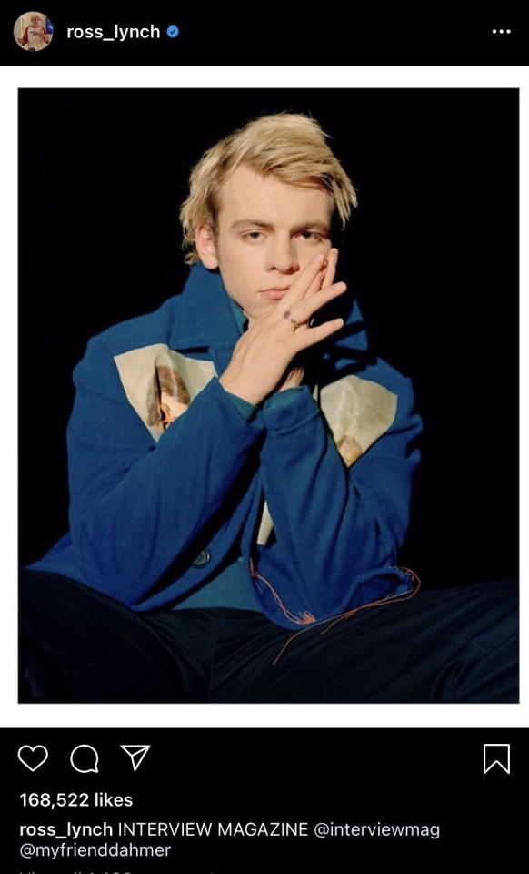
and used proknockout to crop out ross. then in pixlr, i layered it over a solid background, with some rotation. add some filters, played with lighting, then blurred the whole image before adding the text on top. definitely one of the more rushed back cover edits.
ECLIPSE

okay so i had fun with this! the front cover comes from this original photo from some magazine shoot the driver era did (i think it was MOOD but i can’t remember)
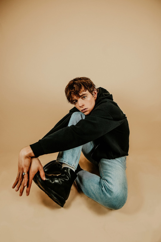
this “album” was intended to capture a darker side to austin moon’s music and i really love ross’ harley hair so i had to go with brunet ross lynch. in pixlr i cropped to a square, did a lot of filtering to have cooler tones (matching the darker feel of the playlist) and then played with a filter that adjusts texture. after that, i layered the image over itself with adjustments to size and position to get that distorted effect. then i added the font and such lol
for the back cover the original came from pexels which is a royalty/copyright free image site
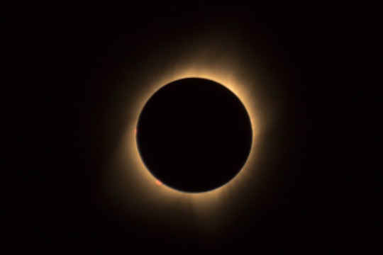
basically to match the title i wanted to utilize an eclipse image. i played around a lot with how i wanted the track listing to be. eventually i figured it out, put the text down with pixlr, and then played with filter and exposure and such to get the bluish glow that matches the front cover edit along with a warmer tone for the background. then i used a filter that inverted the colors to get the contrasting blue-black side. then i used proknockout’s collage option to put the two together—kind of to convey the crossing-paths aspect of an eclipse.
last step was going back into pixlr and if you look closely, it’s not just a solid background. it actually has several lines of the text “there’s no way i could make it without you do it without you be here without you” which is an oblivious reference to the austin & ally theme song. it’s meant (in this au of sorts) to be austin giving recognition to ally’s impact in his life and career on an album that marks a step away from his past. ANYWAYS! the text just has very very low opacity to make it blend better.
where you are
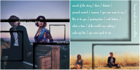
this one i think i had the most fun and the most trouble with because i could NOT find a nice image of both ross and laura. thus i had to search to find the right images. bc tumblr is limiting me to 10 images total on this, i’m only including one of the two images of laura i used. they’re both from the same photo shoot and screenshots from one of her recent instagram posts. the images of ross/base photos for the edits came from the driver era instagram.
okay so front cover edit took this phot of laura:
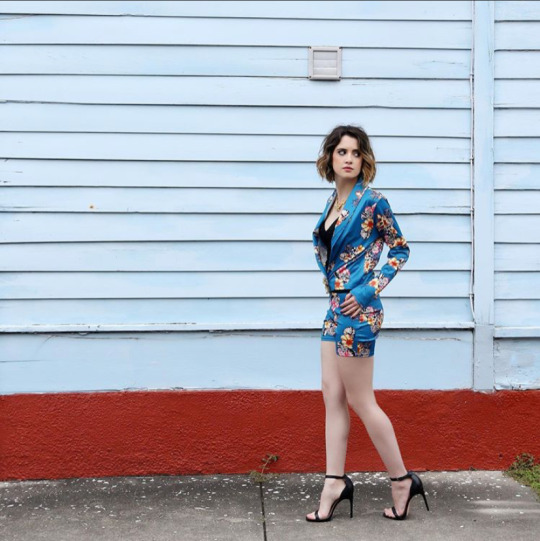
and used proknockout to crop her out of the background. then i used pixlr to layer it into this image of ross to kind of make it appear as if she’s standing behind the piano:
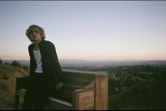
which you can see in the final edit! then i layered black squares, erasing majority of their inside, to get those black frames throughout the edit. finally i added text. originally I had a logo concept for austin & ally but then thought the simple font looked much better for the concept of the album—which was meant to convey their maturity as artists. also played around with the coloring and shadows and exposure.
finally for the back cover, i cropped this image (sorry rocky):
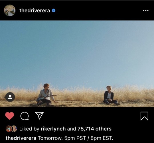
and used proknockout to take an image of laura sitting and layer it onto the driver era image. then i played with some exposure and filters to get laura’s lighting to match that of the original image. after realising the pic of laura was way higher in quality than ^this, i blurred it A LOT. then i used the same technique with the black squares, only this time lowering the opacity a bit. then i went with a font that was a bit more playful to set up the track listing. “two in a million” was left as a bonus track since it’s not on the playlist because it’s not on spotify.
and yeah! that’s how the edits were done! they were honestly a lot of fun and sparked by the playlists i made towards the beginning of this year. they all had a few different versions LOL but anyways, thank you for asking! i had fun sharing and i hope you enjoyed the playlists, the edits, and/or this explaination! sorry it’s not too technical!
#askbobby-t-wilson#mutuals#i dont have a tag for asks so i guess i’ll make it this#my writing#using the tiny font to save space on the internet lol#long post
1 note
·
View note
Text
the best character creator
do u want to make characters but cant draw for shit or ur hands are tired of holding a pen?? have you ever raged at character creators bc they only have 10 hairstyles and 5 outfits??? fear no more because here’s Kisekae!!!

the models start like the default girl on the left, but w some effort you can make your husbando, cute gremlins, pokemon gijinka or whatever u want!!!
ok but, what is Kisekae?
Kisekae is a flash game/application that works mostly as a character creator, using a mix of interchangeable parts, bits you can move around freely, and lots of sliders to change sizes and positions. Think of it as the 2D version of the Sims/Spore creators.
ngl it started as a k-on hentai game back in like 2011?? there’s still k-on girls and lewd stuff around but the focus is far from it now.
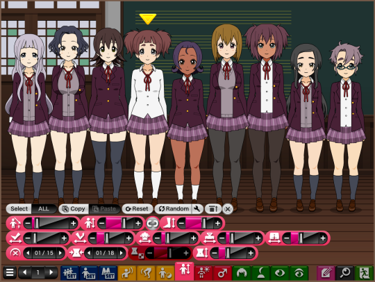
HERE is the sfw link and HERE is the nsfw one. careful w the hentai ads. You can also download an offline version from the creator’s Enty site
IF U WANNA TRY IT OUT CLICK THE READ MORE FOR A SMOL TUTORIAL
so u wanna learn about the suffering that is kisekae?? dont listen to people who say it’s the lazy tool for people too lazy to draw just like drawing, you can make a quick sketch in 10 mins or spend 6 hours adding detail and makin sure everything is PERFECT
so after this disclaimer lets bring it on!!!! click on a link and wait for the randomly generated k-on ocs to load

maybe when you open it for the first time, the tabs look like this. THIS IS BAD it means it loaded on the easy mode.

click here to unlock the Expert mode. it sounds scary, but it’s actually been the default mode for years. now you should see a lot of tabs.
LETS TALK ABOUT THE IMPORTANT STUFF FIRST
SAVING.

This is the save tab. “SAVE” and “LOAD” save the entire scene in a .txt (all models, background, items etc). "Export” shows the codes of the selected models, so you can copy them and store them somewhere. You go to “Import” to paste codes and load characters. The small pencil button opens a window to save and load entire scenes in the app’s cookies. It’s very handy but you will lose everything if you clear your cookies. The last two buttons save or load ALL the data you have in the game, aka all the scenes you saved with the pencil button.
KISEKAE DOESNT HAVE AN UNDO BUTTON SO SAVE OFTEN IN CASE YOU MESS UP
TAKING PICTURES

fOR THE LOVE OF GOD DO NOT DARE TAKE SCREENSHOTS there’s a handy way to save better quality pics. First slider is the zoom. It’ll be your best friend to get closer and edit faces and hairstyles and details and such. See that 05/05? That’s the PNG quality, so make sure it’s always at 5/5. The squares button next to the PNG one will make the background transparent when you snap a picture. Very cool, bc kisekae backgrounds are kinda ugly. The icon on the far right lets you select a region of the screen that’s great too
STOP THE AHEGAO
Next. If you click on the model’s clothes you’ll notice they disappear and they get surprised. The automatic emotions were good when it was a porn game but to actually create content it’s just annoying idk why it still automatically loads like that tbh.

Anyway, go here to set the facial expressions to manual mode. The “Select/All” switch makes you edit all the models at the same time or just one. (Note: as pochi adds more tabs, they can get moved around and be put in a different group. just keep looking thru the pages until you find the icon you want)
HAVE ONLY ONE MODEL
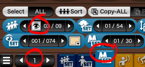
You’ll most likely don’t need all 9 models at the same time, so you can go here to deactivate them. tbh it’s placed in a really weird place... a year ago it wasnt as confusing idk why Pochi added this update :/
TIME TO HAVE FUN
My recommendation is clicking on everything to see what happens. That’s honestly the best way to learn how to use it. Instead of explaining how to make good looking stuff (i cant do that bc. there’s not a single way of “doing things right” this is artistic expression u do what u do) i’ll jsut give some tips and tricks
1. HOLD SPACE TO GO OVER THE LIMITS OF MOST SLIDERS. It works wonders. Make heads smaller, shoulders broader, eyes thinner, hair pieces larger, bend time and space with the unlimited power of space key.
2. HAIR PIECES ARE NOT HAIR PIECES. BELTS ARE NOT BELTS. RIBBONS ARE NOT RIBBONS. Think of them as shapes to make stuff. Use hair pieces to make capes. Use the lines in the facemark section to draw a new nose. Make entire pieces of clothing out of belts and ribbons. The only downside is that if you move the head, hair pieces and ribbons move with them so making clothes out of ribbons turns your characters into statues
3. CLICK ON CLOTHES TO CHANGE STUFF. If you click on some clothing pieces you can change some things like unbuttoning shirt buttons, opening sweaters, putting sunglasses on their head and removing parts of scarves.
4. THE DEFAULT PALETTE IS UGLY. please do use a custom one
5. YOU RAN OUT OF SLOTS? Use the free floating items on the 3rd set of tabs. You can have extra belts, ribbons, arms, furniture and speech bubbles. Even load external images. But keep in mind extra stuff is not attached to characters, so it won’t move around with them or save in their individual codes.
6. USE OTHER PEOPLE’S EXPORTS RESPONSIBLY. There are lots of people on deviantArt and the Pochi forums (official Kisekae forums) that make character, clothing or hairstyle exports for other people to load and use on their creations (like Sims mods!). However, most dA people have rules if you want to use them on something you upload, so make sure to read each user’s rules!
7. TECHNICALLY THERE ARE NO MALE, MUSCULAR OR BIG BODY TYPES. You can force it out, but we’ve been forever cursed with the hip size being linked to the leg size. So your guys will either have feminine hips or scrawny ass legs. There aren’t any muscle options apart from abs, and the most similar thing we have for chub is a pregnant looking belly. You can always edit it with photoshop later or suffer and make muscles and fat with belts and hairs.
Have fun suffering with Kisekae!!! Feel free to ask me questions on how to do X or Y, or request me to expand more information about stuff like what each tab does.
CLICK HERE FOR THE OFFICIAL GUIDE!! It does explain a bit what each tab does, and also explains the keyboard shortcuts. It’s in japanese, but nothing google translate can’t fix if you need it.
79 notes
·
View notes