Text
Evaluation
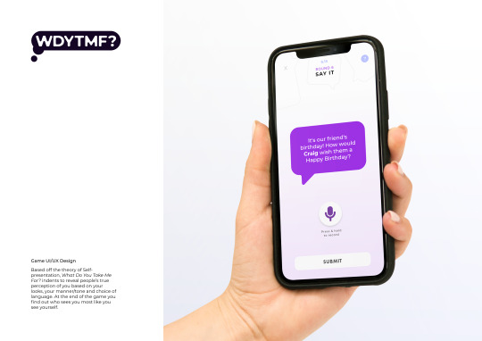
To begin, I’m very happy with the subject that I finally decided on. The contextual research I completed, in order to have a full understanding of the theories, was very interesting and made that part of the process quite enjoyable. I’m also glad that I was able to pick a subject that tied in with the overarching theme of my portfolio. Although I initially had difficulties figuring out a creative route for this project, I believe a game was the most appropriate outcome for what I had aimed to achieve with the project - to become more aware of our abilities to present ourselves differently and the alternative perceptions people have of us. I knew I wanted to create an outcome that allowed people to interact with the content. A digital game was also best suited to the current trend of digital communication.
I used this opportunity to learn effective Ui and UX design which was a brand new skillset that I didn’t have intentions of learning before hand. However, after reading through numerous blogs on this subject, I’ve come to see the importance of such skills for the future of creative disciplines. Researching and experimenting with UI was the most challenging part because I wasn’t familiar with adobe XD, however, it’s very rewarding to look through my development process to see how refined my final outcome is. As a result, I have grown fond of UI design and now it’s flooded my pinterest and behance feed.
Overall, I am very pleased with my outcome and the final concept of the game. I think the minimal approach to the UI and UX worked well and I won’t change that if given the opportunity to. However, I think a lot more work could have been done on the copy and the refinement of each round. If I had finalised the game concept earlier I would have used the tutorials as an opportunity to get feedback on the rounds.
During the first half of this project, there were a few technical difficulties that made it difficult to make as much process as I could, it had a snowball effect later on in the project. For this reason, I was unable to manage my time the way I would have liked to. On the other hand, once I had a grip what I was doing, I was able to make a lot of progress on my designs in a shorter space of time. If given more time, I would have learnt how to create video mockups of the app using XD injunction with AfterEffects.
23 notes
·
View notes
Photo


Portfolio pages
Not all pages - Tumblr’s limit is 9 images
the-dots
0 notes
Photo

Business card inspo
embossed logo
only one colourful side
multicolour
www
0 notes
Photo

Business Card inspo
Two coloured card
Large text on the back
Using my initials for the logo
0 notes
Photo

Business card inspo
Although the design is very minimal the embossing adds a design flair
Centred text keeps everything neat
www
0 notes
Photo

Business card inspo
Colour alternatives
Simple layout with experimental type
0 notes
Link
Learnings
Explain the most important user story of your app in the first two screenshots. Only 9% of users coming to your app listing will scroll past the first two screenshots.
Increase the font size and cut down on text. With bigger displays, users are getting conditioned to scan and glance the screenshot instead of tapping on it and reading. Less than 4% of users will tap on your screenshots to read it.
Highlight UI elements that represent text captions. It makes scanning the screenshots easier and improves your screenshot’s glance-ability
0 notes
Photo

APP STORE ADS
It may sound simple, but your Screenshot order plays a significant role in conversion. Most of your visitors will not scroll through your entire Gallery, so you must prioritize the order wisely.
This will allow you to appeal to both types of visitors we tend to see:
Decisive Visitors, who make a decision solely based on content they see above the fold in the First Impression Frame. Exploring Visitors, who spend additional time scrolling through your Gallery assets and vertically scrolling through your Product Page before making a decision.
0 notes
Photo


APP STORE ADS
https://www.storemaven.com/apple-app-store-gallery-landscape-vs-portrait-best-for-cvr/
0 notes
Photo


APP STORE ADS
Feature-oriented Screenshots are real screenshot s of the app that showcase a variety of features and highlight unique value propositions. If your UI is a key differentiator in your app’s category, this approach may resonate well with your target audience.
Lifestyle-oriented Screenshots are feeling-oriented images or visuals that include real-world elements to convey a distinct style of living. These images tend to create a stronger emotional connection with the app. If your app UI is not necessarily where the advantage of your app lies, we recommend testing this approach.
Hybrid Screenshots are a combination of feature and lifestyle-oriented images. This style often offers the best of both worlds—visitors see an image that is both emotionally appealing coupled with an accurate representation of your app’s functionality.
https://www.storemaven.com/app-store-optimization-aso-screenshot-tests/
0 notes
Photo

UX Research
I found this earlier in the process and paid a lot more attention to composition and layout for enhance the user experience
0 notes
Link
UI Research
Guidelines for more sophisticated UI design.
The ‘How not to’ section of the blog was very useful for mindful design
0 notes


