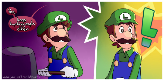
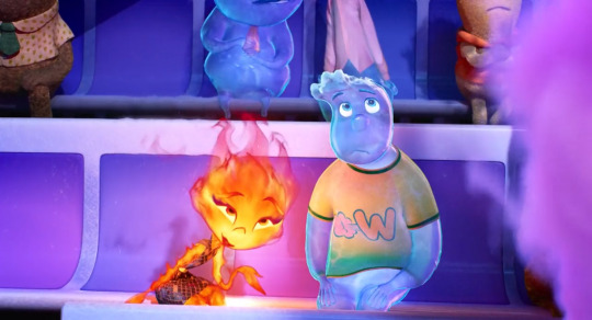
#I just LOVE the magenta and purple color palette used in the background
Explore tagged Tumblr posts
Visit Tumblr Blog
Explore Tumblr blogs with no restrictions, modern design and the best experience.
Last Seen Tumblr Blogs


Fun Fact
Tumblr is available in 18 languages.
Text


UGHDUHDTJJDNOGV 😫😫😭😭😭
Sorry for my blubbering there. This just had me screaming and crying on the inside 🥲🥲🥲


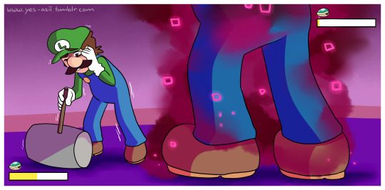


Mario getting glohmed during my Zokket fight made me yell and scream like a child
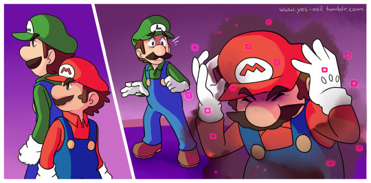
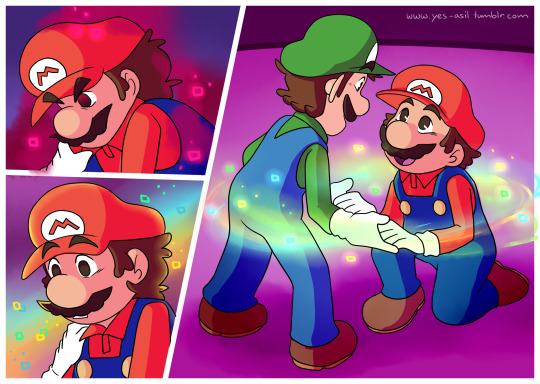
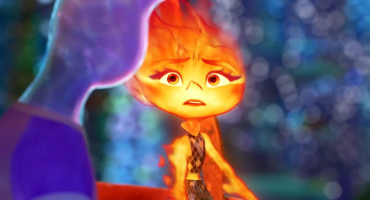
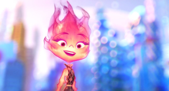
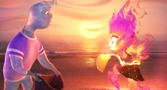
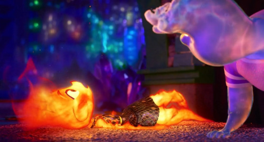
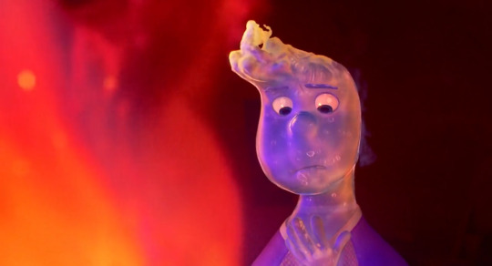
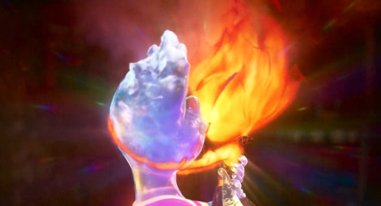
#I just LOVE the magenta and purple color palette used in the background#it certainly makes the forced conflict between the bros more intense#god Luigi’s initial hesitation to fight his Gholm’d brother hurts to see 😭😢💔#and I actually love that he activates his Logic mechanic to disarm Mario and break the possession#THE BOND POWER SWIRLING AROUND THEM AS MARIO BREAKS FREE FROM THE GHOLM 🥺🥺🥺#IT’S SO BEAUTIFUL 🥺🥺😭😭❤️💚#mario & luigi brothership#m&l brothership#brothership#mario & luigi brothership spoilers#m&l brothership spoilers#brothership spoilers#mario#luigi#mario and luigi#fanart#fan art#fan comic
372 notes
·
View notes
Text
I have this whole headcanon about C'rizz using color shifts in place of most facial expressions and body language, and I've been slowly deciding which colors should correspond to which emotions.
Desaturated colors: neutral, not very emotionally engaged
Pastels: moderate emotions
Bright colors: strong emotions
Dark colors: overwhelmingly strong emotions
Blues: Grey-blue for disinterested, pastel blue for interested, bright blue/cyan for excited/amused, sapphire for overstimulated, navy blue for truly overwhelmed.
Greens: Grey-green for comfortable, pastel green for uneasy, bright/lime green for worried, emerald for afraid, dark green for terrified.
Yellows: Greyish-yellow for unsurprised, pastel yellow for slightly surprised, bright yellow for shocked, muddy to dark yellow for horrified.
Oranges: greyish-orange for uncaring, pastel orange for disapproving, bright orange for disgusted, dark orange for offended/insulted.
Reds: greyish-pink for indifferent, pink for annoyed, bright red/magenta for angry, ruby for furious, dark red for murderous rage.
Purples: greyish-purple for content, pastel purple for happy, bright purple for ecstatic, royal purple for sad, dark purple for miserable
Colorless: white for love, true grey for depression or emotionlessness, black for hatred.
Mixed colors: small patches of rapidly changing color for confusion, even patterns of color for positive mixed emotions (eg white and lavender stripes for happy and loving), irregular patches of color for negative mixed emotions (eg bright orange and red splotches for disgusted and angered).
Chameleon colors/patterns: imitating a background can indicate fear or self-deprecation (a desire to be emotionally unseen) as well as serving as an instinctive defense mechanism in response to fear or a deliberately activated disguise for hunting.
Pattern imitation: copying a design or pattern using non-matching colors expresses creativity, an artistic mood, or a desire to impress (either just for fun or to prove something). There's a traditional contest that involves matching increasingly complex patterns using creative or emotionally meaningful color palette.
11 notes
·
View notes
Text
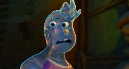
had a hell of a time (good) bit ago watching elemental and feeling things including enjoying a film, great ride, i love a metaphor & anything vignettey (just living life, alongside but also including the [this is about the metaphor] threads), i do love it when a couple of fun people have an enriching dynamic that they enjoy and huaaaghwgh (good) & i liked the premise metaphor exactly as is for what it is for what it did with it & i liked overlaps & resonances w/other experiences i saw ppl perceive. i liked the way i was going oh my god that painting looks the way i feel b/c like navigating a complementary dynamic where what's holding one person back is what helps the other person along, vice versa, no interaction or relationship that develops by like having some [theoretically your trait/quality/behavior] contained in the other person, rather it being an interaction within yourself, such that i was going "i have this interaction Within Myself, right now, in life currently like always and the past years but also past months especially really, it's ongoing, i'm going Oh Goddamn Omg" scintillating to see it externalized as a conversation imagined by others. and also still different / more capacious on both ends than "wow Exactly that." feeling things going ohh my god. music is going for it so Noticeably. hot air balloon scene And track changing me with an immediate Resonance
easier when having fun but i was also like continually so hype gasping about intrigued about pointing at art direction decisions & execution and one especial element i was sooo noting was the use of Color b/c it's Really colorful like rainbow palette nigh constant noticeable saturation, And it was atmospheric, always readily visibly parsed, varying in styles but cohesive. the backgrounds babey, with obvious priority for working with a vivacious orange and/or blue. oh and the related use of Light like different visuals for different glows and just different effects and waugh....i collected mostly a bunch of bgs to point at often for that "look at the color design & atmosphere" but also so much more & foreground things big time too. semitransparent characters like bitch. the physics of fluid dynamics. optics like refraction like my God. i'm mclosing it and that these effects would be sooo prohibitively intensive w/o computer but it's so impressive w/computer and that Stylistic Decisions were made all over, it's clearly not ever simply just "oh this is what it'd 'realistically' look like if uhhh someone was made of fire or water" even as realism Based effects were employed for style and fun and our lives. the use of of course 2D animation / art conventions for style and effect and fun & our lives!!! maybe ember a bit too but wade has a whole like 2D style profile so the [curved droplet] shape always faces the camera, how are we doing that it's so cool & i love to see it. not to mention being transparent but also like clearly not!! first time i've properly thought about how inside of mouth 3D animation has Ever worked lmao
cut so i can go on & on (^ that's brevity up there lol) & post mostly various backgrounds to gesticulate at what i notice abt the use of color like oh my god. and some other things. laughed, cried, lived & loved like for real lol
oh my god
and like immediate intro theme going "oh my god blue and orange making Purple (magenta, pink) oh my god we're doing Additive Light with that holy shit yes"
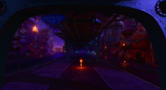
so extra [!!!] about city nighttime shots especially. and the details of all the building designs, it's all the shit like i haven't even sat and Studied any given shot for all small elements like that but that you know they're There so that it looks this complex and "realistic" like you know the attention & effort is there & you get the Overall Effect baby. also the way purple/green are employed to contrast with blue/orange often. the Glows here, the Bluer upper half and the Oranger lower half that both also have some purplishness to them, the Green bridge breaking it up / spanning this
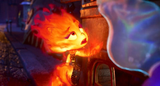
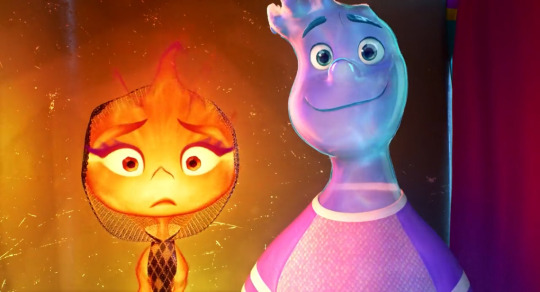
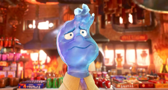
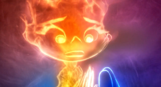
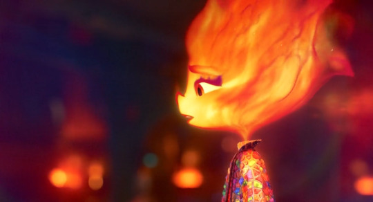
the colors in closeups even. first of all the expressions styles are after my own heart & got it, and i'm sure i'll go on & on more there. pull mouths down do the m upper lip n lower lip lines combo, you know what i mean, i Love it. wavy flowy design vs more triangular / ending in peaks/corners design for your water vs fire aesthetiques. i think that's [heat creating refraction in the air] effect like lord. the pink blue purple here. the slight shadow framing the pic for better contrast, the pink / glow around ember, wade slightly Glows from within too, the constant wave refraction there. okay obsessed again with both sorta transparent and fluid Figures like you've got the outermost layers. you've got the Inside. you've got the silhouettes and the lines that are "drawn," reddish outlines of flame shapes and constant highlight "outlines" for water so it never "realistically" blends in with everything / just Is clear and is impossible to easily parse. that those silhouettes are constantly Flowing and responding to motion / pressure as well. i can only imagine. oh and the colors again that the Glow for fire is often a Soft gradient, but there's this like, slightly convex polygonal style of "glow" / Light in backgrounds a lot and it works great for style and contrast with the important Soft Glow from fire and even also water, again the slight inner glow there too. and again the mutual [pull mouths down] expressiveness lol so much fun. the Elasticity is fantastic, same with like 2D style Movement like invoking a smear frame for example like fuck yes it's about What Works it's about style & effect & what things like lighting color faces can do that aren't just aiming for "be peak realistic" like clearly it isn't. note the sharper line of shadow in the upper corner with a deeper blue. we framing
oh this one was to point out "look at how you can see the full spectrum rainbow in the wave surface light refraction oh my fucking god" not to mention of course In Motion the shapes, the effect, some bubbles and flow for flare and seeing that constant Light Outline, the cyan leaning aqua that's put in along with the overall slight blue not b/c it's "realistic" but b/c it's what works baby the artistic design choices fuck like hell. and only when i took this one frame was it like oh my fucking god look at these split second flame shames flowing off of ember there above her head especially. all the more stylization required for fire without it being like, "realistically" mostly transparent, overly bright, not very strongly delineated / silhouetted....the shape, color, flow of flames on the "inside," outermost breaking off shapes & "outline" as well augh god. and look at the purples in the background's left side
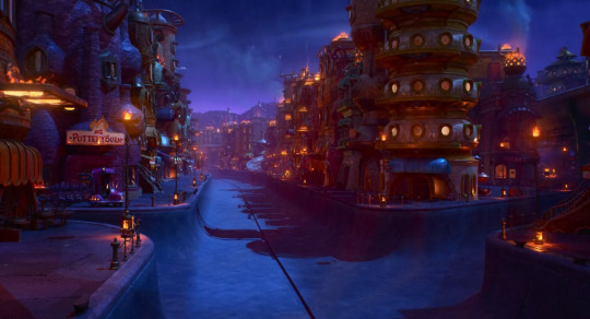
AUGH the night city backgrounds. pottery burn haha yeah the blue orange AND purple my god!!!! it's thematic ([blue + orange = purple] b/w the blue & orange characters) and it fucks like hell holy shit!!!!!
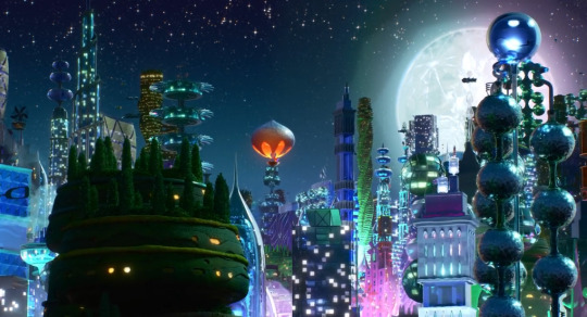
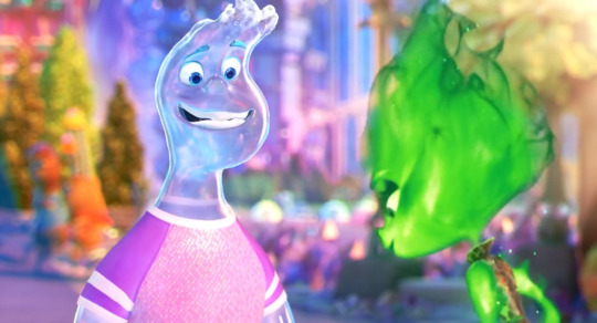
meanwhile the green & purple here with One orange element getting to stand out / not that much blue either, but more ultramarine style than aquamarine, and LOOK AT THE MOON!!! the surface!!! check out that Polygonal glow around it and the green/purple there too!!!
and the use of bokeh. immaculate, not holding back, after my heart. the Purple/Pink additive light properties coming into play!! her reflection is more simply orange(tm) sometimes and i would presume it tends purpler when we are getting [emotionally connecting / recognition of the self through the other] but oh my god heaving overhead like a hero this additive light blue+orange=purple ingenious and stylistically fucking like hell choice. and again their "outlines" working so well while also retaining enough softness/fluidity to be part of them as a whole. everything is so cool
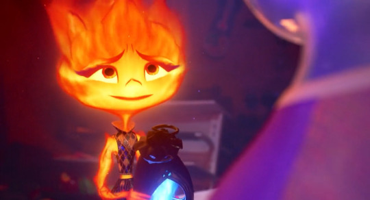
there's the mouth shape i was talking about. you see the slight m upper lip simply n lower lip and resultant (idk like a video game controller?) shape lol. flexible expressive asymmetry. the closeup transparency of [can always see the other side of shirt collar]. green bg for contrast while also incorporating the orange glow. the full spectrum rainbow refraction just also an immaculate and probably characterfully relevant lmao as a bonus. also hell of cute moments wauugh yes, fun, dying thanks
the additive light!!! (how magenta/purple/pink the reflection of Orange is off the Blue like employing what's realistic in another context for what fucks aesthetically & carries symbolism. like wade wouldn't Realistically be constantly [surface wave refractions] but it fucks like hell. also wouldn't be someone made of fire or water but it fucks like hell & embodies a central metaphorical layer to the literal material). also look at that curtain from deep purplish red to deep bluer purple!!! the line of bright blue!!! the glow in the Background with sharper polygonal lines / corners to contrast with the visual effects of glows elsewhere!!! wade default =3 as [wavy featured] and inherent =3 vs ember's more flame tipped => (not pictured)
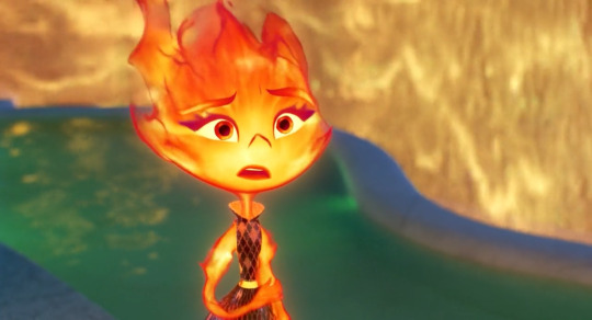
ohh this one for rainbow color / out of focus usage and b/c it's like how the semi transparency but only So Much + constant outline of Highlights / constant inner glow and visible infusion of like aquamarine / bright turquoise cerulean color helps a water guy stay perfectly Visible / parsable. also besides ember being green, an effect subtly pictured at any given point: like cinders continually rising off fire but depicted so much like Sparkles :') there's so much colors and highlights and choices after my own sensibilities out here like i love a shoulder swoop design that flows right into the arms from the neck from the head. and that's exactly what we get precisely b/c it has so much flow!!! ember's like whole head Flaring out from her neck, terminal points like tips, or sources, of flames. Styles
the bokeh!! the blues and pinks and purples!!!
ouuwaah
UGH obviously in motion the like arcing falling curtains of water, the shimmering....the purple into pink into dusky orange!!! the little bit of contribution of the turquoise light aaa wahooo, ofc what the bridge adds in Composition for this & that previous shot
lmao this is b/c Wavy Scribble Squiggle Mouth again the design choices after my own heart. the constant extra wobbliness to Mouth Outline obviously works great to emphasize [water design] but it also works great b/c i love it
every shot of the background with this beach is gongious like jesus christ. the closeup of sand is like that looks amazing and So soft. look at the wavy swoopy shapiness of the clouds, look at the [in this shot] faintly detectable Polygonal outlines of Glow from the sun. feel free to look at that water like i said every shot of this, wrow. tasked with Pretty Beach Sunset and coming through big time
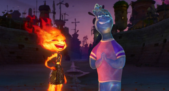
expressive design contrast, glow contrasts, refracting, silhouettes, those flame shapes breaking off again epic hot wheels style fuck yes....and the bg!!! look at the purple to muted purple pink sky, the atmospheric distancing on layers of buildings that goes from blue to purple!! the dimmer purple / blue / teal on the ground in the foreground here UGH the COLOR USE
ooh i was so Noticing the like, full ultramarine blue here, like it's been used Before in any night environments but the way here it's brighter, making it like "okay yeah night but more Lit Up. also the visual variety of [water curtain] textures there, the area of Pink, the Yellow that hasn't previously shown up too much but might be saved for associations with tension / "danger" lol. also love the "straightup a pool" designs lol wish i was swimming
oh the orange + blue = purple on display here / translating Outlines
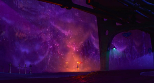
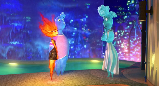
amazing sequence and again look at the Purple shadows the Blues the Oranges the Greens!!!! aughhh again like So colorful and so bright but also ofc dimmed, atmospheric, balanced, waughhh!!!
oh my god what can i say. "bisexuality" for one but and also fr like the pink of the sky vs deep purple, lighter with more blue in the water, the streak of oranger light, pink atmospheric haze....augh!!!
speaking of "and then really vivid striking colors in another overall palette we haven't seen before" the teal & golden yellow for this shot was new & noticeable. the yellow of problems, but not too bad lol, looking at that Contrast with the blue on the outer pool edge there. i wanna take a swim yippee....but fr like holding some colors more in reservation, finding new combinations, as Ever how bright the bgs are but atmospheric, non overwhelming of other elements, i Love it
bokeh!!!! colors!!!!!!!
bokeh!!!!!! colors!!!!!!!!!!!!!!!!!!!!!!!
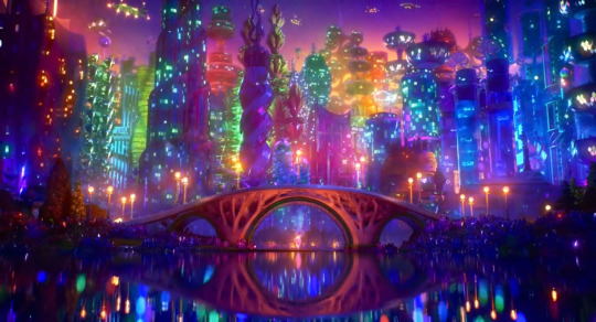
fucking roy g biv like yes gorgeous. nice tree evocative bridge. composition. lots of lights and colors but the distribution being so balanced, but organic, broken up in all the right ways and all encompassing....the bright orange lights in shadowed blue/purple buildings in the upper left corner, leading down to the path of lights across the center of everything....ugh incredible great
out of focus bg, the lights, the purples, the blue/Green, look at everything on the right side ugh lovely, the slight Shapes of glows, can see that arc in the right side as well, the emotional relevance of all the colors and glows as this bg dims / desaturates a second later
and so similarly here, the Purple, the Glows....like the use of both the perfect balance of soft edges/borders but no sacrifice in clarity
oh and i suppose there's then any amount of spoilers following but like, in part only b/c i point them out as as much but also like. it's about the journey lmfao you see two screenshots, containing some information, well you've seen it all
and to pad that out i'll also note without screenshots about it like bringing in a very like Clear for Compositional Effect sort of Danger Yellow again twice over, with the harshest like chartreuse leaning yellow yet for it, v much a color that it'd just take more effort to fit into a palette / would have to be kind of the color centerpiece, vs the orange/blue/purple here
(but also not to say yellow was never used otherwise....some perfectly harmless golds, paler lighting like just Daytime vibe, constant presence w/fire of course. so the Particulars of a hazard yellow are all the more notable)
the COLORS....look at that orange that pink red the pink reflections the Purples....the just deep slightly slightly purple red in the bg and how like smoothed over / Immediate that background is to just make everything close & present!! the flame textures going!!! water textures going!!! cinders as points of light!! the colors the orange purple pink blue UGHH it's amazing they're really off the shits with it in every scene
spoilers they do kiss about it and i was like smacking hand to forehead like oh my god and they did another "breaking out a new Light thing" when we've glowed and refracted within and without, lit up or dimmed, sparkled, reflected, used further styles in environmental lighting....answer was Lens Flare rainbow refracting glow like goddamn!!! and again like putting In the purple, but also the blue, the orange, the out & out more cerulean / aquamarine that is not gonna simply come from elsewhere in the environment. nice commitment to also having someone smile into a kiss lmao we've all been like i Will make this work. i'm still just like ugh the focus on and variety of Light too, the backgrounds' like soft polygon/hexagon glow "fields," straightforward soft/even gradient glows, wave pattern refraction, refraction also separating light into rainbows, remember water is a lens, stylized light of fire, bokeh, additive color mixing....holding on to & breaking out Cinematic LENS FLARE is fr like ohhh my god they're just fucking On It, got this, here's another effect for you
i also have a gif b/c i couldn't note anyone's fluid dynamics / flowing / Interacting physics enough, and little moments giving that some extra flair are a delight, but holy shit a highlight i'm instantly obsessed with forever, now if there's something and nobody pours themself, i'm out
oh we sloshing!! all the water physics going on here to fantastic effect but also all working within the confines of "and it's some guy." immaculate joke 5 sec later around the "i am Not an inspector" line just What a delight. the vision....the manifestation of effort, craft....i'm not kidding at all i'm like okay forever treasuring [pours yourself] clip and if someone doesn't get it it's like it's called joie de vivre, panache, taking all kinds. some sloshheads out here
again i had a delightful time at the cinema (figuratively. i didn't go anywhere. though i did go "oh fuck re: even the idea of seeing plenty of this in theater format" like i was going oh Shit at visuals and music and every damn thing enough already, can only imagine) i was like bitch i love ppl living life vignettesquely with the emotional arcs aids of metaphor, symbolism. i love the styles and designs and i love paying attention to details and going damn how they'd do that, i love technical shit, noting techniques that are centered around 2D derived visuals, about aesthetic effect & visual purpose....i was going "oh my god same. lately, always, ongoing. oh my god it's me always crying at everything, but also never at anything, and also just sometimes at some things. it's me with the Temper it's me with one like everyone else but not about to let it out at all / not be making room for anyone else's. me like 'just powering through like arghhh' me like 'that, but [a puddle]' liable to spontaneously interact with randos by just doing your own thing, also [dying] and beloathed at that, going with the flow trying to carpe diem it, having these conversations and navigations like just as one person lmao, and also ofc it's different" lol like oh damn okay. and twentysomethings popular with the nebkids like wow in real life....and just having a great time entirely straightforwardly and expecting as much but also being increasingly delighted and surprised and going "wow my aesthetique sensibilities piqued" and going "wow okay a journey" and like Gasp at details and loving the overall effects and little moments and shots and entire deal. did weep repeatedly, when you slosh, when you soggy....delighted a lot, along for the ride having fun for the whole way, so much abt [bummed 20somethings who are nevertheless very vivacious Feeling Things, including About feeling things] and the way that's given sooo much space, Saturating things even, maybe with light & color....i liked it a bunch, [aaaaaa], great time, thinking about feeling things and feeling about it and about thinking about it & so on & so forth too like man hang on a second. and the soundtrack. and the character designs Overall there did i mention?? so cute & fun. wobbly wavy shivery tapering having Flow in the lines / shapes of silhouettes in different ways just like flow in [fluid dynamics] of flame or water in different ways. there's a lot i can say but i just mostly did the backgrounds / color / lighting noncomprehensive slideshow lol. i was very engaged like oh wahoo yippee aaa then mfs let's go and keep going
#i'm big on like rainbow lot of color constant saturation....Yet; Atmosphere / skilled balance in application/usage#i don't have the restraint (or like full knowledge / experience lol) to Use it myself but i Love when i see it used lol. Very colorful here#and i had thoughts & feelings & a good time so that made it easier to be like oh whee AND look at that background. mf we sloshing#nonzero spoilers via largely contextless static images; many wide shots / environments; really doesn't matter much#but i guess if you're like ''i specifically want to know Nothing at All'' like well then there are images in there#like 65% me going ''and look at that purple. oh my God the green blue & blue green. Orange''#b/c like wrow....#pixar elemental#films to whisper to myself like omg. like me. right now#btw it's kind of long post inside there. but For Me; typically so lol#can't say shit in thirty tags!! esp when i had a great time i liked it i was like oh my god#can't even say that shit in regular text which is why i mostly talk about colorful backgrounds lmfao. and even Then!! and so on so forth#and hand over heart like omg when by yourself you're a bit too much; but together; you're a bit too much together ;w;#like wow just like me; me; & still me!!! and not caring about what's all ''too much'' like it's about the me & me actually thanks#(and ofc the premise / central metaphor/conflict there as is; vulnerable cultural identity that needs to be maintained but uh oh)#speaking of uh oh look who's underway in the tags!! i'm heading myself off now lmao. time for half past 3 am Night Sandwich
6 notes
·
View notes
Text
#showyourprocess
I was tagged by the wonderful @wangxianbunnydoodles for this gifset. This tag game was started by @lan-xichens (starting post here).
From planning to posting, share your process for making creative content!
To continue supporting content makers, this tag game is meant to show the entire process of making creative content: this can be for any creation.
RULES: When your work is tagged, show the process of its creation from planning to posting, then tag 5 people with a specific link to one of their creative works you’d like to see the process of. Use the tag #showyourprocess so we can find yours!
Process will be underneath the cut!
1. Planning
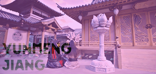
This was the very first post I put a considerable amount of time into, and I’m really proud of it. I wanted to make a set showcasing the Twin Prides, which is my favorite character dynamic of MDZS due to Jiang Cheng. I knew that I wanted to use the scene from CQL episode 14 because that’s where the quote “Yunmeng Jiang will have its Twin Prides” comes from. I also wanted to include the scene from the MDZS donghua episode 10 because it was different visually, and I wanted to incorporate both visual adaptations of MDZS.
I was really happy that the scenes in both the live-action and the donghua are visually captivating. I don’t really know how to explain it very well, but the scenes are just interesting to look at and I’m glad that JC and WWX are in the same frame for every single frame of the gifs.
I took a few notes on paper to organize the layout and decide how I wanted to break up the text.
2. Creation
I choose to gif by using screenshots. I use MPlayer OSX Extended to pull the screenshots and use Adobe Photoshop 2021 to create. I like using screenshots because it allows me to control the exact frames I want to use, so once I open photoshop, I can just load the screenshots and start the actual editing process. I organize the screenshots into folders based on which gif, which makes it easier to load into the stacks.
Step 1: Coloring
I don’t really have a specific process for coloring my gifs. I approach it from the process of “click until it looks good,” but I do like making some colors pop. In the CQL gifs, I wanted to make sure WWX’s red ribbon stood out. I also adjusted the hue/saturation of some of the colors to make the lotus seed pods more green. Here are the hue/saturation levels I used:
Blue: Hue (+24); Saturation (+24)
Red: Hue (+18); Saturation (+18)
Green: Hue (+39); Saturation (+36)
Magenta: Hue (+24); Saturation (+24)
Step 2: Text
Because of the text effect, I knew I needed a blockier type of font. I’m also a fan of simpler fonts, and I didn’t want something that would be too distracting. I tried a couple different fonts until I settled on Forta (downloaded from dafont[dot]com).
Placing the text was a little tricky. If the background was too light, than the text would be too hard to read. I used the setting “soft light” (you can set it to this using the dropdown menu directly to the left of the opacity setting where the layers listed) for the text and moved it around and adjusted the size until I was happy with the placement and I could read the words.
After I was happy with the placement, I used the following steps:
CTRL + click on the text layer to select
Select --> Inverse (or Shift + CTRL + I)
Step 3: Adding more color
This is a continuation of the previous steps, and these steps will get that overall purple/pink color. I chose that color because I thought it matched Yunmeng colors and the color of the scene the most.
Create a new solid fill layer (I chose white first, then adjusted later)
Set opacity to 40%
Play around with the color until you find something you’re happy with! For this set, I used #e67af3.
Done!
This is what my layers look like. Ignore the second Hue/Saturation layer, I don’t know why its there haha.
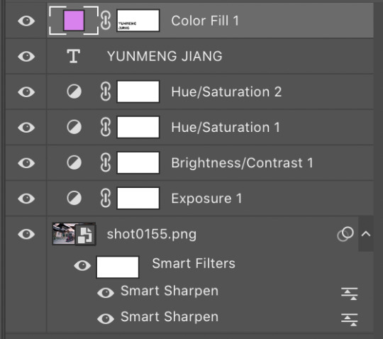
I used the same coloring and font for each of the CQL gifs on my set. As for the donghua gifs, I just played around with the hue/saturation as well as the exposure until I liked how it looked.
3. Posting
For the caption, I used a gradient text generator. I went with the purple gradient text because that is Yunmeng Jiang colors. I chose WWX’s quote as the other part of the caption because I believe that is part of what makes the “Twin Prides” promise so important to Jiang Cheng, and it is also very important when understanding the relationship between Wei Wuxian and the Yunmeng Jiang Clan.
I saved the post as a draft first, so I could see how it would look, then I posted it!
Anyway, I hope that makes sense at least a little bit, and I apologize for this being so text-heavy. I had a really fun time making this set and it was my first time playing around with different elements outside of basic editing.
I am tagging:
@mylastbraincql for this beautiful Lan Wangji color palette edit
@marquisguyun for this awesome WangXian video edit
@perkynurples for this lovely WangXian fanfiction
@blinkplnk for this stunning WangXian waterfall fight edit
@wendashanren for this amazing WangXian lyric edit
Please don’t feel pressured to complete this! Or if you wish to talk about something else, feel free to do so! If anyone else sees this and wants to do it, consider yourself tagged!
Thank you for reading so far. <3
#showyourprocess#tag game#thank you for the tag!#i hope this makes sense#the untamed#cql#mdzs#mylastbraincql#mine*#mymdzsthings#if you have any more questions feel free to send me an ask!#(don't mind me sneaking in commentary on my favorite character)
21 notes
·
View notes
Photo

Kim Dorland, After the Party
How was the painting fabricated? Tell me what you feel came first, second, to last. Give me a step by step about how you feel the painting was built layer by layer.
I believe the painting started with a violet / magenta underpainting. The sky background looks like the thinnest part of the painting to me, and I can see bits of purples and pinks poking through in certain parts of the painting (like in the snow, in the tops of the houses, and horizon line.) After some thinner layer (like in the distant tree branches and houses), the painter applied thicker layers last (like in the roadway, the figure, and the closest tree trunk).
What paint colors do you feel the artist used to make this painting?
Titanium or flake white, lemon yellow, cobalt violet (light), ultramarine violet, permanent rose, ivory black, payne’s grey
Explain how you feel the paint was applied. Dissect (blending, brushstrokes, passage directions).
It looks like the artist used smoothed out and blended brushstrokes in the background to make the distant imagery appear more flat. However, in the foreground, the artist used a thicker application of paint (likely with a palette knife) to build heavy textures. The heavy marks made in the road follow the direction of the road, which aids in the image coming forward / moving back into space. The texture in the tree trunk closest to the figure juts out towards the viewer in raised hills, mimicking the formation and texture of actual tree bark. Both of these techniques feel very intentional and make the image feel more believable and personal.
What area of the painting do you find to be the most interesting/ Why?
I really adore the tree trunk in the foreground; it’s so textural and glossy - I love how it reflects light. I also like the pink aura around the figure, I think it helps to break up a really dark part of the painting and adds a lot of visual interest in that area. It also helps to bring your eye from the background to the foreground and vise versa.
What area (only 1) of your chosen painting are you most perplexed by? This could be an area in the painting in which you are not sure how it was crafted, but would like to know how.
I would like to know more about the roadway - I want to know the exact colors used to make that grey (looks almost green in some areas, some other parts look more yellow). Also, at first glance I thought it was straight paint from the tube because of how raised and textural it is, but in some areas of the road, I can see drip marks which implies a medium of some kind must have been used. I’d like to know how they build it up and how they achieved such a range of tones and textures.
Do you feel the artist used any particular painting medium? If so, what do you feel was used/ Why. This could include more traditional mediums such as 1/2, 1/3, or just plain paint thinner. Do you feel multiple mediums were used for different parts of the painting?
I think the artist started with a thinner medium like linseed oil for the first several layers and colors, and then transitioned into a thicker medium like some kind of resin or encaustic, or possibly even just straight paint from the tube in some areas. But because of how glossy it is, I think they definitely used a lot of resin / liquin at some point in the painting.
1 note
·
View note
Text
Garden Update ~ Tulips, Trillium, Trout Lilies, and Trees
More blooms from the ever evolving yard! Today’s flowers celebrate the letter “T,” and represent just a small smattering of bee and butterfly delight. Yes, some hungry pollinators have already found our yard. In addition to the wild trillium I saved from a destroyed woods a few years ago, we’ve also got trout lilies from the same woods, along with still massive amounts of dandelions, plantain and wild violet, courtesy of Nature herself. I thought I’d share some of today’s more stunning displays:
Behind those peachy beauties, you can see the later blooming magenta yarrow, which has become its own tough competitor in the colorful riot to dominate this permaculture haven. I leave some of the “heal-all” with purple flowers because the bees love it so much, but my goodness, it loves to spread! Fortunately, the heat kills it off in late Spring and early Summer. The garden angel keeps an eye on the last round of tulips, which should bloom in another week or so. Alliums and irises will follow those.
These mysterious white tulips arrived without name via the squirrel relocation program. They’ve settled in well next to the grape hyacinths, more yarrow, and long awaited peonies. Hopefully, we’ll get some blooms from those bushes this year!
Meanwhile, these peony-style ruffled tulips make me smile:
Trillium and trout lilies continue on the north side of our house, getting their slight supply of sun in early morning before the ferns pop up.
I love these rescued plants, which also included Jack in the Pulpit and a very delicate pink flower whose name I’ve never learned. Not to be outdone, many of the fruit trees and bushes are already in full blossom. Below, you can see our North Star cherry and three-way Asian pear, with a bed of garlic growing in the background.
The yellow daffodils surrounding the trees died back just as the dandelions decided to assert their claim. It’s definitely a pollinator’s paradise. All the additional blooms have transformed yards that used to make me cry in embarrassed and sad frustration into an ever changing palette of colors, form and taste.
The abundance continues to overwhelm a little bit, but in a good way. All those chives at the base of the trees made a mighty tasty vegan chive pesto, which we enjoyed over pasta two nights in a row. I loosely adapted Kevin Lee Jacobs’ recipe, using nutritional yeast instead of parmesan. he rhubarb you see to the far left middle of the photo formed the base of a delicious rhubarb salsa, coupled with Egyptian walking onions and last summer’s frozen Poblano peppers:
For the rhubarb salsa, I just mixed and matched about six different recipes to taste — fresh rhubarb, chopped poblano’s (or whatever hot pepper you have on hand), chopped Egyptian walking onions, since they’re marching all over the garden beds, apple cider vinegar, chipotle pepper powder, a smidge of raw honey, and just a dusting of ground cumin.
This salsa means rhubarb makes the cut — quite literally a root cutting — to transplant into the new yard. I’m currently making my way through all the perennial veggies and unusual fruits growing now or frozen last year, so that I can decide which must repeat in the new yard, and which can stay here as their living experiment.
Details on our new place will eventually find their way onto the blog. For now, suffice to say, the yard presents the opposite challenge these yards did. Here, I had a blank slate, and anything I did would be an incredible improvement over the status quo. The new place is already beautifully landscaped for year round color and has some planting limitations built into the yard. Instead of filling everything from scratch just to inject a little beauty into a weedy, dry, compacted landscape, this new process involves careful observation, selection, very deliberate hardscaping, and perhaps some substitution. More Zen than Bollywood. More formal than wild.
All good things in their proper season … I’ve had some leads on people who might be interested in these properties. Meanwhile, we wander through the blooms and harvest the bounty I planted years ago. May your life blossom as abundantly as our yard!
from Thomas Reed https://laurabruno.wordpress.com/2017/04/20/garden-update-tulips-trillium-trout-lilies-and-trees/
0 notes
Text
I’m in Fort Myers, Florida for spring break vacation right now, and the great weather has given me a great chance to see and photograph animals outdoors.
I took a picture of this squirrel this past week.

Do you see the ugly neon purple/pink color that surrounds the branches? Do you see the un-natural neon green as well? This is an example of chromatic aberration.
Chromatic aberration is an optics issue that occurs because different colors of light travel at different speeds when passing through a lens. The result can be manifested in color fringing– colored edges within the image. (Source: Photography Life).
This is something you can fix quite easily in Lightroom, using its Defringing tool.
NOTE: I’d love for you to use this image to follow along this color adjustment tutorial, so here’s the RAW file for this squirrel photograph: https://www.dropbox.com/s/imhw9m87hi98q23/Squirrel_Color_Fringing_Template_Matt_Lau.ARW?dl=0
Here’s the image before after making Lightroom color corrections to remove chromatic aberration/color fringing.

Step 0: Crop the Image.

Step 1: Find the Lens Correction Tab on the right hand side toolbar in Lightroom. Step 2: Select the Color section. Step 3: Click on the “Fringe Color Selector” (the dropper icon).

Step 4: Hover over the image. With the dropper now “equipped,” you’ll see this palette of colors when you hover your mouse over the image.

Your selection will be the center square of the palette grid. Once you click on a spot, Lightroom will do its magic and remove purple fringing from your image.
Step 5: Click on a spot in the image where there is purple fringing.
Note: If you click on a color that Lightroom doesn’t recognize as purple/magenta or green/blue, the program will give you a nice error message and you can easily try again).

Lightroom’s magic will immediately remove some of that harsh neon purplish-pink-ish color. But not always enough, as the case here. There is still very terrible fringing in man parts of the image. One that particularly “sticks” out is the branch right above the squirrel’s right ear (viewer’s left-side). Pun intended :)
Step 6: Make manual adjustments. Here’s when we want to manually mess around with the settings in the Color section of the Lens Corrections Tab.
Focus only on the first “Amount” horizontal bar and “Purple Hue” bar below it (these have to do with purple fringing. The two bars below are for green fringing).
Here are the settings I had for the squirrel image before after I manually adjusted the fringing:
Before
After
Lightroom had used the color I had selected with the color picker and chosen to drastically defringe the image (Amount: 20) over a small Purple Hue range (32/45). After messing around with the settings myself,, I extended the Purple Hue range to 32/100, which removed a good amount of the purplish/pink that was still present in the image.
Here’s a look at our progression so far. No color adjustments -> Lightroom Auto-Adjustment –> Manual Setting Adjustment
Before any adjustments
After Lightroom auto-adjustment
After manually tweaking settings
Important Note: be EXTREMELY careful when performing color corrections on Lightroom. Always check the entire image and see if the color has affected anything else incorrectly. Sometimes when removing purple fringing too much, it will start to remove pink/red/purple color from the image (for example: purple clothing, dark red lipstick, etc.).

Image after purple-fringe removal.
Step 7: Remove green fringing, using similar steps as before.
Alright. On to the green fringing. I’ll be less detailed- let you figure more of it out on your own!
Choosing the color selector again, I hovered over patch of cyan color on the twig to the upper left hand side of the squirrel’s tail, then clicked on the most neon grid.

Lightroom did a great job here. But there’s still a little cyan hiding around somewhere.

Can you find it?

There’s a little bit in the fur of the tail, as well as the border of the squirrel’s left ear (your right side).
I would then adjust the Green Hue range to account for more blue (48/69 -> 48/100).
As you can see below, a good amount blue in the tail has disappeared.
Before manual adjustment
After manual adjustment
Color corrections complete!
Step 8: Make image more sharper and/or more appealing. Lastly I’m going to use the adjust the sharpness of the image and some basic light settings to make the image more vivid and appealing.

Sharpening: (+) Sharpness – 77, (+) Radius – 1.5 Noise Reduction: (+) Luminance – 11, (-) Detail (under Luminance) – 7, (-) Detail (under Color) – 3
Then I just adjusted a few Basic light settings.

And alas, the final image.

Challenge #LR1: Try making color corrections on Lightroom to remove chromatic aberration. Feel free to use my image, or perhaps your own (which leads to Challenge #LR2)!
Challenge #LR2: Find a photograph of your own that you have taken in the past that has chromatic aberration in it, or take a new one! I’ve found that it occurs very often when a subject is in front of an overexposed (or very bright) sunlit background (for example, the squirrel’s background is the sun-lit sky).
Please comment with any questions you may have, or if there is any part of this tutorial that is unclear or difficult to understand. I would also love to the see any results you may have achieved while trying the challenges listed above. Until next time!
Photography Guide LR1: Chromatic Aberration – What It Is & How To Fix It (a Lightroom Tutorial) I'm in Fort Myers, Florida for spring break vacation right now, and the great weather has given me a great chance to see and photograph animals outdoors.
0 notes