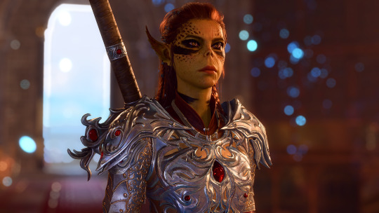
#I enhanced this set so it should look high quality
Explore tagged Tumblr posts
Text
My 2025 Resolutions List
Pre-New Years Resolutions (Nov/Dec 2024)
MY TIP: I think it’s important to establish pre-new year resolutions to get the momentum going for the new year. The best way to go about it is to look at your NY resolutions first, then see what you can do beforehand to prepare and those would be your Pre-New Years Resolutions
1. Prioritize Health + Fitness: Commit to a consistent fitness routine that enhances my body and confidence. I’m going to achieve this by attending 4-5 fitness sessions per week, stay disciplined with a healthy eating plan (with holiday plate exceptions), and setting physical milestones (like weighing X amount of lbs by 1/1/25)
2. Personal Branding Solid Foundation: Get clear on what personal brand I’d like to create for myself and indulge heavily in content and experiences that embody this ideal image I have for myself. I’ll achieve this by constantly checking in with myself by asking “is this on-brand with who I’d like to become?”
3. Build my Luxury Sales Career: ***For the record, I’m in luxury real estate (I’m licensed in 2 states) and international yacht sales.*** I’d like to grow on social media with my business accounts and reach my accounts to 400,000 across all of my BUSINESS platforms (right now I have a little over 350,000 followers)
2025 New Years Resolutions
1. Keep every promise I make to myself if it’s going to benefit me. I’ll make changes if something better comes along
2. Start taking reformer Pilates on a more regular basis
3. Get my desired hair length without extensions
4. Get back into coed stunting/tumbling (I was a cheerleader all my life and still love it in my 20s)
5. No more blackout nights when I drink (embarrassing but I’m such a lightweight)
6. Get back down to 110-115lbs
7. Start dating again, but dating guys that actually meet my standards and not settling because I’m bored or feeling lonely
8. Make the most $ I’ve ever made annually
9. Start fresh with my personal social media and keep my IG followers to under 10,000 (for those of you who don’t know or are new, my personal TikTok has over 1M followers and my IG is close to 800K). The issue is that I have more male followers than I do women and I want to change my IG to friends/family/acquantances/brands/women. I don’t even get paid all that much on IG anymore but TikTok I do so that’ll stay.
10. Break the habit of buying a sweet treat every single day
11. Lower my A1C to under 4.8 (it’s at 5.0 rn)
12. Practice buying quality, no matter the price point. I should be able to afford what I want if I hit my annual income goal.
13. Move to (a different city local to me) in downtown and live at (one of the new high rises they are building)
14. Become more photogenic without nitpicking every single thing about me with each picture I take— this also goes hand in hand with no longer using filters on my photos or making any changes
15. Renew my passport (I’ve been extremely lazy to do so) and travel more. My goal is to travel at least 3 times AT LEAST out of state, preferably out of country if time/work allows
16. Get close with God again. He is the only reason I got to where I am today and then I fell off.
17. Prioritize in taking care of myself and treating myself like a princess. I should always be checking in with myself by asking “is this on-brand with who I’m becoming?” and act accordingly.
18. Start going out more— go to more events, dinners, say yes to invites more, date. I’d like to increase my social calendar to at least once a week. By the end of the year, I’d like to be social at least 3-4x per week.
19. Reset my gut health and actually feel like I’m in my 20s and not in my 90s
20. Become completely unbothered and know when to emotionally detach (or avoid attachment altogether— seriously)
21. Stop oversharing… being exclusive with information about me/my life
22. Don’t dream big, but dream bigger
23. Stop being so trusting and forgiving— HUGE lesson I learned in 2024.
I’m sure I’ll be adding to this list. But any personal posts regarding my own rebrand and level up will be under the hashtag on my blog #2025. I will constantly be updating from now until the end of 2025.
#2025#level up#self care#level up journey#personal development#femininity#hypergamy#leveling up journey#that girl#leveling up#leveled up woman#leveling up tips#level up tips#femininity tips#glow up tips#self care tips#glow up journey#glow up#femininity journey#feminine journey#dream girl journey#dream girl aesthetic#dream girl#it girl aesthetic#it girl#self development#self improvement#hypergamous dating#hypergamous lifestyle#hypergamous
302 notes
·
View notes
Text
Baldurs Gate 3 High Quality Screenshot Tutorial 2.0
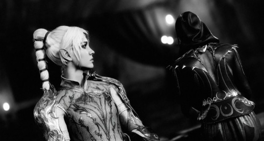
Hi everyone, I decided I wanted to make a more specific and slightly more in-depth tutorial on how I take screenshots in Baldur's Gate 3. For this tutorial, you will need ReShade and Otis_INF'S Photomode Mod. If you do not want to download these for whatever reason, my older tutorial covers alternative ways to get some nice screenshots.
1. ReShade (skip if you already have ReShade downloaded)
For this step, you're going to want to download ReShade. ReShade is important to this tutorial as it's going to allow you to take screenshots of your game in higher resolutions. To do this, find a ReShade preset you like on the Nexus. (You can find lots of them by just typing in "reshade" in the search bar). From there, most mod authors will explain how to download ReShade in their mod description and get it working for your game.
Once you successfully have Reshade installed, a bar of text will appear at the top of your screen, prompting you to press 'home.' This will put you through a mini-tutorial if just installed it.
2. Photomode Mod
For this mod, you'll need to subscribe to a patreon to get access. Installing it is really simple, just unzip the zip file and put its contents in a folder, then run the tool once you have BG3 running.
Personally, I choose to re-map all the controls to different keys on my keyboard as I find it makes it much, much easier for me to use. Specifically, I re-map the movement, camera tilt, and starting the photomode controls. FOV is also really important to pay attention to, so make sure you like the controls for that as well.
Make sure to test the camera mod to make sure it's working before moving on to the next step.
3. High Resolution Screenshots (Hotsampling)
Hotsampling simply means that we're going to briefly make our game run in a resolution much higher than what we usually would, which often times means your game window will end up looking huge and run off your screen.
To do this, we need to make sure a few things are in place before trying to hotsample, or the screenshot won't be captured properly.
Go through this checklist to ensure hotsampling will work:
• If you have more than one monitor, you have to make sure your monitor is set to show only on one screen. (This setting is found in Displays on Windows)
• Make sure BG3 is set to borderless windowed mode
• In ReShade, go to the settings tab. Ensure you have a key set up for taking screenshots, and that you know the folder your screenshots will be saved to. It's essential to use ReShade to take screenshots, nothing else will work. Use ReShade's screenshot key.
Once you make sure you have the above done, go to the photomode mod, and click on the hotsampling tab. From here, you can change the resolution of your game. Typically, I take my screenshots in 3,840x2,160 or 5,760x3,240 if I want a very clear image. Those are just 2x and 3x my monitor's resolution (1920x1080), so you can adjust if your monitor is different. Once your chosen resolution is set, your BG3 window will likely run way off your screen and potentially make your computer lag. (This means it's working). Make sure your BG3 window is active, then hit the screenshot key you set earlier in ReShade. This screenshot should now appear in the folder that's set for screenshots in ReShade. (It typically defaults to the folder where your game is installed).
4. Extra fine-tuning
There are a couple of ways to enhance screenshots in BG3 even further.
The first way is through using ICGS Depth of field. This tool will allow your sceenshots to minic depth of field the same way cameras IRL can do it it—it makes for some beautiful screenshots, and I'm seriously impressed by how well it replicates that look. The author gives a tutorial on how to get it working—I know it seems complicated, but follow it step-by-step and play around, it'll come to you very soon!
The other tool that I just found recently is Relight for ReShade. This tool allows you to add some lighting on a character, which I thought was so cool. Here's a tutorial for this, too.
5. Post-Processing
This step is entirely up to your own creativity, but I just thought I'd share Photopea as a good, free software (that you don't even need to download) to help you edit your photos. It basically works exactly like photoshop!
Ok that's it for all but I think I will continue to update this post and add to it whenever I find anything helpful :)
& Thank you to all the wonderful mod authors out there for creating all this software and allowing us to take beautiful images, it makes me so happy !!
150 notes
·
View notes
Text
How I Make Gifs ~ For Anon ❤️


An anon asked me if I would ever consider doing a tutorial for how I make gifs! It's very flattering that you like my gifs enough to want to know exactly how I make them, so here is a little tutorial using my favourite character from my favourite movie ❤️
I might also make a separate tutorial for giffing dark scenes later 😌
Here's a download of my gif in PSD form if you'd like to get a better look at the settings I used.
Programs used: PotPlayer, Photoshop.
First, you need to get your screencaps. I would suggest using a high quality recording of whatever movie/TV show/video you want to make gifs of. My recording of Fellowship is in 1080p, and the quality looks incredible!
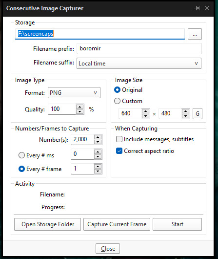
I use PotPlayer to get my screencaps. To do this, open the video file in the program and find the moment you want to gif. It's probably best to go back to just before that particular moment, and then press Ctrl + G. This will bring up the consecutive image capturer window. Below are the settings I use to get my screencaps:
Then, press start and wait for your moment to be captured! Once you've got everything you need, press stop and navigate to the folder that you indicated under storage. Here you will find all of your screencaps! You probably ended up with way more than you need (I know I certainly did 😅). Now, delete all of the screencaps that you don't want in your gif.
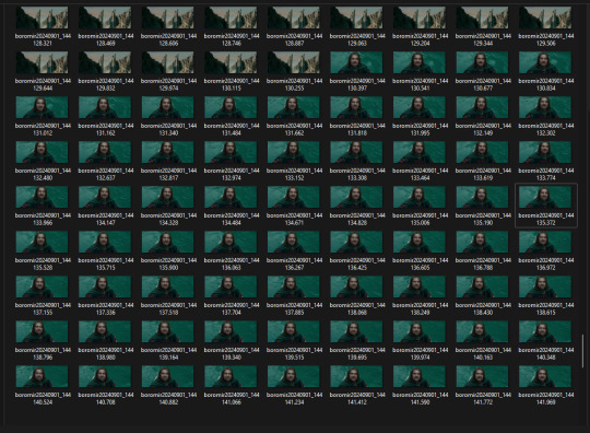
For the actual gif making, I use a cracked version of Photoshop. I don't exactly remember where I found it unfortunately, but I'm sure that there's people out there who might have some links handy if you look around! Once you've got PS open, navigate to File > Scripts > Load Files Into Stack... and click on it! That will open the Load Layers window.
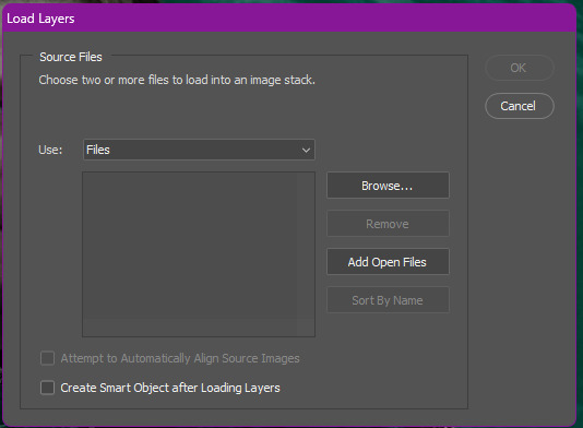
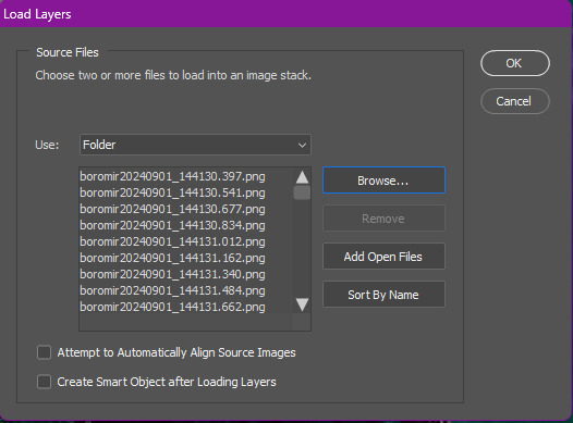
Now, change Use to Folder. Then, click browse and navigate to the folder that contains your screencaps. Click select folder, and after a few moments of loading your window should look more like this.
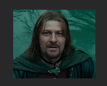
Then, press OK, and wait for your layers to load. Depending on how many caps you have, it could take longer. Once it's finished loading, you need to decide on your gif dimensions! For this, I decided on 268px x 225px. Once you've chosen your size, use the crop tool to get your gif to that size. Now, you should have a smaller image, like this:
The next step I do is to use this Photoshop action by @maziekeen. They have a little tutorial on how to use this action there, so I'll just say that once you've loaded it into your program, use part 1 / load into stack. Press the play button, and then the OK button on the two windows that pop up. Now, your gif will be nice and sharpened, and you'll be able to see it move for the first time! Here's what mine currently looks like, without any other edits:

Now, it's time to start on colouring. Every gif (or scene, sometimes you can reuse the same colouring if you're giffing an entire scene) is different, so it will have different needs. However, I tend to always use the same layers in the same order for all of my gifs — it's just the settings that change. I think the colouring of this particular scene is lovely, so I don't want to change it drastically, I just want to enhance it.
First, I create a Curves layer. At this point, I also like to make a group to hold all of my adjustment layers. This makes it easier for you to switch your adjustment layers on and off if you want to compare with the original colouring!
Going back to your curves layer, pick the little white eyedropper tool in the Properties tab. You want to find and click on the whitest area in the gif and make it a bit brighter! I picked the white in one of Boromir's eyes.
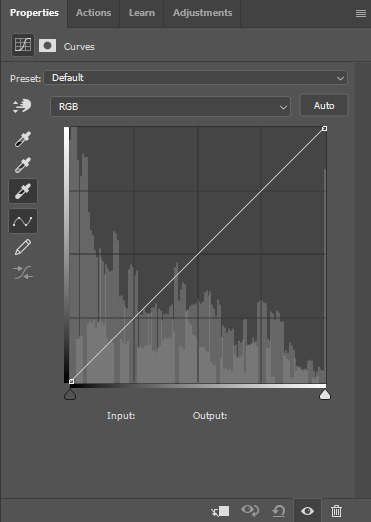
This is what my gif looks like now with the Curves layer:

Next, I use Levels. It's a very subtle change, but you can notice a slight darkening of the blacks in the image. Here's my settings for this layer:
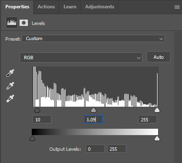
And here's the gif with this step applied. Like I said, it's a very subtle change:

Up next is Brightness & Contrast. This layer is just a case of messing around with the settings until it looks right for you. You don't want to make it look too bright or too contrasted, though, because it will make the colouring look weird.
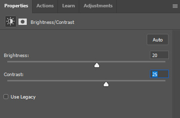
A bit more of a change this time! We're getting there:

Next, I like to do Colour Balance. Sometimes I wait and do the Selective Colour layer first (it'll still be above Colour Balance though), but with this gif, I decided to do it first. I want Boromir in the foreground to contrast more with the watery background, so I upped the Red in the Midtones. I think Midtones is the most important part of Colour Balance, so the Highlights and Shadows are more minor adjustments here.
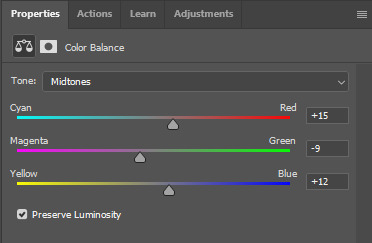
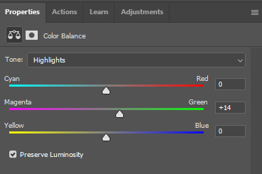
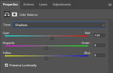
Here's the gif with the Colour Balance layer!

Now, we have Selective Colour. Like I said before, I sometimes like to do this layer and then go back to the Colour Balance to make minor adjustments. For this gif I mainly focused on slightly reducing the cyan in the reds and yellows to add a little more colour to Boromir's tunic and hair.

I'm a big fan of bright, vibrant gifs, so I like to use the Vibrance layer copiously.
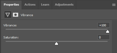
I upped the vibrance to max, but it's left Boromir's face looking a bit too red and his neck is a little pink, so I went back and did some minor adjustments to the Colour Balance and Selective Colour layers to fix that. Then, voila!

Now that we're done with colouring, go back to the beginning of the timeline at the bottom the screen. Then, go back to Actions and scroll down to the bottom, and look for the action called part 2 / finishing. Just like with the first action, press the Play button and it will work its magic!
Press Ctrl + Shift + Alt + C, and try playing your gif from there. Sometimes, the gif will be too fast and you'll need to slow it down, and you can't always tell until you play it in the 'Save for Web' window. I ended up slowing mine down from 0.05 to 0.07.
Once your gif is looking just right, press Ctrl + Shift + Alt + C again. These are the settings I use to save my gifs, and I think it makes them look really nice! Then click Save, and save your gif wherever you want.
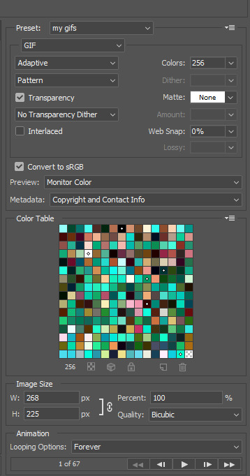
Now, once you've saved your gif, you can post it to Tumblr (if that's what you're wanting to do) or simply keep it to yourself! But I'm sure that others would love to see your creations :D
***
A little extra info - this gif doesn't have text because there's no dialogue, but these are the settings I use for gifs with text (the text size depends on the dimensions of the gif):

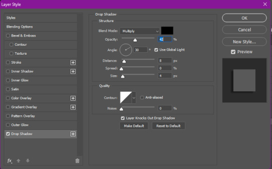
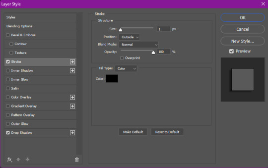
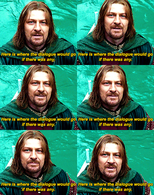
Sometimes I use white text, sometimes I use yellow. And if there's more than one person talking I use both!
I hope that this tutorial was helpful, and if you have any more questions, feel free to ask!
#gif making#gif making tutorial#gif tutorial#psd tutorial#gif coloring tutorial#gif colouring tutorial#mari speaks#mari’s stuff
39 notes
·
View notes
Text
10 ways to look good on a budget 💸
before we begin. I just wanna thank y’all for 650 followers 🤍🤍 love y’all so much

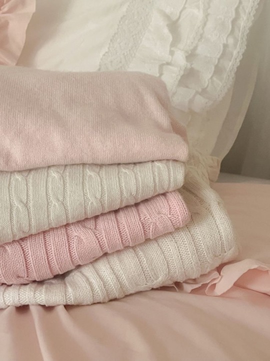
Shop at thrift stores and yard sales: Thrift stores offer a wide range of clothes, accessories and even furniture at reduced prices. While you may not always find brand-new items, there is typically a good selection of high-quality items at great prices. Many thrift stores also offer regular discounts or sale days, so it pays to check back frequently for new items and deals. Yard sales are another great place to find bargain items. While they're typically seasonal and require more effort in digging through piles of items, yard sales often offer the most affordable prices.
Wear what you have: The majority of our wardrobes are full of items we rarely wear or have only worn once or twice. Instead of buying new, look through your closet and see what you already have that you may not have worn in a while. Consider creating new outfits with the items you already have, mixing and matching to create a new style. This not only saves money, it reduces waste and helps you make the most of what you already have.
Buy timeless staples: Building a wardrobe of high-quality, versatile items can help you look good on a budget. Look for classic, simple pieces like a white t-shirt, a well-cut pair of jeans, or a classic black dress. Investing in quality items that will last will save you money in the long run, as you'll be wearing them for years to come.
Take care of your clothes: How you treat your clothes can determine how long they last. Always follow the care instructions on the label, and don't be afraid to hand-wash items if necessary. You can help reduce any damage by investing in a good de-piller, and avoiding the dryer whenever possible.
Accessorize: Accessories can elevate any outfit, transforming what was once a simple look into a stylish one. Look for pieces you can mix and match, like a neutral handbag or a set of simple gold studs. Accessories are a great way to add interest to an outfit without breaking the bank.
Shop sales and clearance racks: The end of season sales can be a great way to find bargain items. Look for items that are on sale or marked down, especially at the end of a season when stores are trying to make room for new merchandise. Look in the bargain bins as well. You never know what gem you may find hiding in plain sight.
Join loyalty programs or use coupons: Loyalty programs are a great way to get discounts and earn rewards for your purchases. Look for loyalty programs in your favorite stores, and take advantage of any special offers. Many stores also offer mobile apps with digital coupons, which can save you money on specific items.
Shop for beauty products in drugstores: Drugstores often carry popular beauty brands at more affordable prices compared to department stores or high-end makeup counters. Look for affordable skincare and hair products that cater to your specific needs, and don't be afraid to ask for recommendations from the staff.
Be confident: The most important thing is to always have confidence in yourself. Standing tall, taking care of your appearance, and being proud of who you are can enhance your beauty and make you look your best, even if you're wearing budget-friendly clothes. Take pride in who you are, and don't let others' expectations bring you down.
Have fun with fashion: Fashion should be fun, not stress-inducing. Mix and match your clothes to create your own unique style, and don't be afraid to experiment with new outfits. Experimenting with different styles can help you find what works best for you, and make fashion more enjoyable as well.
Remember, looking good on a budget can be challenging, but it's all about being creative and making the most of what you already have. With these tips and a positive attitude, you'll be sure to look your best without breaking the bank.
#beauty#fashion#light feminine#hyper feminine#pink moodboard#that girl#beautytips#confidence#soft moodboard#pink pilates princess#makeup#it girl#just girly things#girly#rich aesthetic#fashion tips#fashion tumblr#fashiontech#fashion trends#fashiontiktok
135 notes
·
View notes
Text
thoughts on the Daevabad Trilogy, short version: holy shit that was good
longer version:
holy shit that was good.
I adored the writing style, the imagery, the worldbuilding, the characters, the character dynamics, and the pacing all the way through. I first picked up this series because of how Global Medievalism talked about it as a stepping stone away from Eurocentric medieval fantasy and it definitely delivered. this is tied with Spinning Silver for my favorite recent reads--which is even more impressive since SS was a standalone, meanwhile this series kept up a consistently high quality across three separate books.
after Fourth Wing masquerading as a rich, complex adult fantasy and then being What It Actually Was, this was an immensely satisfying series to pick up. it skirts the fantasy staple of the Inherently Evil Race/Species that so many works fall into (even asoiaf with the Others) and instead opts to explore in-depth religious and racial prejudices, revolutions, bigotry, power, and privilege in ways that can be frightening for a lot of authors (and readers). I can see why this series would frustrated a large swath of fantasy fans and not just because it steps completely away from the Europe-but-slightly-to-the-left settings that they're so familiar with; people looking for escapism and a palatable black-and-white conflict definitely wouldn't find it here.
that said, I also think the narrative did a fantastic job of showcasing the brutality of oppression, as well as cycles of revenge and violence, without turning into a sermon about how anyone who fights back is Just As Bad as the oppressor. you can sympathize with any faction within the trilogy while still seeing that there's a clear hierarchy. this is a series that asks the reader to be open minded and to sympathize with a variety of people's suffering while still condemning heinous actions, crimes, and ways of thinking. portrayals of violence, swearing, and sex aside, this is where I believe the adult label is earned. the Daevabad Trilogy outshines Fourth Wing in its entirety, actually following through on promises of depth, complexity, and exploration.
I don't think the series reaches into absolutely flawless territory; on reflection, there are a lot of scenes I wish we'd seen happening in the moment rather than summarized or briefly flashed back to. this goes especially for the end of the last book, Empire of Gold, which would have enhanced the pacing quite a bit. there's a bit of rushing through the final battle, and though it's still quite fantastic and follows through on a deal of foreshadowing and character build-up, it definitely feels over too soon. there are also a few loose ends and potential conflicts when it comes to the characters themselves that the series felt too tired to actually flesh out by the end. I can forgive that chiefly because of just how well-rounded and consistent the characters themselves are, even despite those instances.
and holy shit did I adore these characters. I've only seen the barest tip of the iceberg of discourse this series caused (which I'm sure was insane when it first came out), but thankfully the 10 million+ Way More Problematic Characters (that I also love) in asoiaf has made me immune to whatever the hell was going on over there. I also couldn't get involved in a ship war if you paid me.
I think the first book made a good call only having Nahri and Ali's POVs not just from a technical standpoint (Dara's POV wouldn't have added much, and may have even spoiled some meaningful twists) but also in priming the reader for what is the heart of the entire trilogy: their dynamic. Nahri and Ali carry the series whether they're young, platonic best friends who should be enemies, awkward ex-friends who still get a long way too well, or best friends who are deeply in love which each other but too traumatized to admit it. they both stand incredibly well as individuals (evidenced by the fact that they don't even meet until over the halfway mark in the first book), with Ali being a particular favorite of mine from the very beginning. their opposite upbringings yet similar interests made them a fantastic duo, one where it made sense the impact each one would have on the other's journey. there's something so incredibly endearing about their inability to legitimately dislike each other despite their circumstances, one that makes sense based on their already established personalities; they propel the series' most meaningful moments.
for the elephant in the room: as frustrating as Dara's POV could be I found it a worthy and fascinating addition in the later books, one that I think a lot of people missed the weight of if they were too busy excusing him/hating him. his perspective, biased and misguided as it often was, provided so much rich exploration of the trilogy's overall themes: militarism, religious fanaticism, prejudice, free will, just war, revolution, cycles of violence, conditioning and abuse, etc. that so much of this seemed to fall to the wayside in a strive to decide if he was excusable or not (and thus a viable love interest or not) is a huge shame. his ending was, to me, profoundly satisfying; not redeemed but finally allowed to act of his own free will, no longer bound by outside magic or internalized religious obligation. I never violently disliked Dara and Nahri's romantic entanglement so much as I knew it was doomed from the moment Ali had a POV chapter.
the secondary characters were no less engaging for me, especially as their prominence grew throughout the books, antagonists or otherwise. it was refreshing to see Muntadhir and Jamshid's individual characters (and thus their relationship) become a more prominent aspect of the story--again, especially after the tokenism in Fourth Wing. side characters always seemed to have deeper personalities and roles to play, with even early character deaths like Anas having lasting impacts for our main POVs. their presence was as vital to the immersion and depth of the world as much as the setting and imagery--which are also aspects that completely blew me away. from character, technical, to thematic standpoints, the Daevabad Trilogy absolutely amazed me.
final thoughts and rating: if you give me a book where two married characters are in love with the other's brother and expect me not to give it a high rating you're insane. 8/10. maybe even 9/10. go read these books.
#spoiler warning for people who want to read this series (which you should)#thank you chakraborty for Thee character dynamic of all time#ali love of my life. apple of my eye. <3#the daevabad trilogy
119 notes
·
View notes
Text
Here's my review on Metaphor: Refantazio after being 5h in and not quite done with the demo:
First let me say if you're on the fence about getting this game or not, try the demo. It's available on Steam, PS, and Xbox. It's free. It's ~5h, more or less depending on how much you want to play around with it. The save data can carry over if you decide to buy the game. See if it's fun for you. I talk about performance and graphics on my PC, but see how it works on your system too.
And with that, on to my review.
Graphics & Performance:
I saw a lot of Steam reviews saying they were having a lot of performance issues with the game, even on high-end computers. I didn't really experience anything like that. There was one scene really early in the demo, like an intro narrator bit where it was panning over a map and for some reason that did have some dropped frames and stuttering, but it was only for those 5 seconds and I haven't had a repeat since. I did max the graphics settings and uncap the frames and still had no issues.
I should also say, I don't have a super high-end computer. However, my computer is still pretty nice so maybe on much lower end PCs there would be some issues. I tried min settings as well and honestly didn't see too much of a difference in quality. If you did need to run it in lower graphics, it would still look fantastic.
And it DOES look fantastic. I've noticed there is a lot of different art styles going on. There are animated cutscenes just like in persona where you kind of just watch an anime. There are gameplay cutscenes, where you are watching the 3D characters models in their scene. I noticed the surroundings take on the same level and detail as the characters in these scenes. Then you have the gameplay graphics, which have an almost stylized sort of living painting feel to them.
You'd think having that many styles going on would be chaotic and immersion ruining but honestly it's kind of seamless.
Gameplay:
As is typical of an Atlus game, I'm only just barely getting out of the tutorial, even being 5 hours in. Now that I'm kind of getting into the flow of combat, I genuinely really like it. I wasn't sure how I was going to like a combat system so different from their current IPs (what do you mean there is no demons??) But overall I think they've managed to keep the spirit of their games alive and well while still trying something new for them. I also love that they stuck with the P5R system of being able to kill enemies lower than you without having to go through the whole turn based process, but also made it slightly more involved. They're really leaned into the hybrid action/turn-based gameplay and it's very satisfying.
Archetypes hold the spirit of personas or demons in that you can level them up and build them to suit your characters, but they come with the advantage of your entire party getting to mix and match. Also like personas, you strengthen and enhance them more through social bonds. Thus far in the demo I've gotten as far as unlocking them so I'm not really sure how ranking them plays out quite yet.
By far my favorite part of the game play right now is that if your protagonist dies, it's NOT game over. In fact as long as you have 1 party member standing, the show will go on. Also at the end of the fight your dead characters will revive (with 1hp) and still gain all the xp from the fight.
Some really cool bits that I personally think make the game more fun and challenging: there are many different status effects, but they are divided into 2 categories, physical and mental. Mental status effects expire after the battle, but physical status effects persist. It's a cool little blend of old JRPG punishment with new age JRPG simplicity. (Ask me how I feel about it later when I'm suffering.) Also turn icons, like in SMT, are back. They work relatively the same, which I've always found to be fun, but does make the game a little more challenging. And finally, there is auto-battling if you want to engage it. It will repeat the actions you used prior to engaging it, so if you have a flow going, it does make that kind if easier.
My complaints so far are: for the first few battle areas, your party members are on auto. It's not really fun, and frankly their AI is bad. It's not a long time, but it's more than I liked to see. Also enemies can spawn in right in front of, next to, or behind you where they were not before. This makes it harder (impossible if youre me) to avoid getting ambushed, and honestly feels counterintuitive for a game that's primary gameplay design is strategicly deciding when to attack and when to engage in turn-based combat.
Story:
I am 5 hours in, which in the terms of Atlus games is like, .5%. So I can't really tell you a ton about the story yet. I can say it's interesting. The whole concept is something so fresh for Atlus, and I am eager to know more about the story, the world, the different races, the humans, everything. They have built a solid foundation I absolutely want to see the completion of.
And the characters? I would die for them. Atlus has proven they can write characters with strong bonds and beautiful friendships that will make me go absolutely feral and I can already tell this is where these characters are going as well. I cannot wait. Plus the character designing in this game is above and beyond.
In conclusion, this game has so much potential and promise. I can already tell it's going to be an experience to play though (in a positive way). It's doing a lot that feels very new for Atlus, while remaining true to their current franchises and what makes them so good. I had my doubts about their releasing a brand new IP for their 35th anniversary, but honestly this is perfect. This game pays homage to what already makes their games so good while also showcasing a broad future.
Oh and the soundtrack is absolutely insane. It's Shoji Meguro so of course it's great but I'd be remiss not to mention it anyway.
#metaphor refantazio#game review#long post#if you see typos#sorry my eyes hurt#if you have any questions or wanna just talk about it hit me up
12 notes
·
View notes
Text
Trigun Manga Reaction
Now reading Volume 1 Chapters 7!


Oh. Nice foreshortening!
Have I mentioned before that the art in the manga is amazing? I mean not only is it pretty but the techniques and the visual storytelling!

This manga really spoils me rotten with beautiful double spreads.
Was Trigun a weekly manga or a monthly comic in the 90's? Like, how is this level of quality maintained every chapter?!

This sweet apologetic smile. Baby Girl Vash. SOMEONE PLEASE PROTECT HIM!!!

I love this part because of how the "tech" looks. Maybe I'm just high on nostalgia but if you ask me, the best and most creative visual takes of futuristic technology are from the 90's. OK... 70s to 80's too. BUT 90'S ARE THE BEST!

LMAO! I remember this! Vash loves teasing his enemies with cheeky notes, doesn't he?

Dime novels??? Penny dreadfuls?? Gasp! HARLEQUINS?!!
DOES THE SETTING OF TRIGUN HAVE AN EQUIVALENT OF HARLEQUINS?! IF SO, I'D BE SO HAPPY BECAUSE I HAVE THIS HC ABOUT WOLFWOOD'S FASHION CHOICE BEING CONNECTED TO THOSE RAUNCHY CHEAP ROMANCE NOVELS!!!

Also, another amazing nightmare face! But then...

WHIPLASH! Vash adding levity by hyping himself up. Tho more likely, he is telling the truth. Not that anyone would really believe it with the facade he puts up.

Oh, wait. I only notice this just now. The Vash's glove design in the manga is what was used in in Tristamp. Only three fingers are covered. In '98, it was all of his fingers are concealed by the glove.

AH! I REMEMBER THIS! ESPECIALLY HOW IT ENDS! I'm laughing already. Kaite... is not the best navigator.

Ah Classic Vash. Deflect. Deflect. Deflect.

Oh... This scene. It's kinda scary how catching Vash off guard is deadly for his attacker. Really highlights how much he has to control all himself all the time. Killing is too easy for him with his abilities. So, he has to exercise strict disciple and caution for the sake of others all the time.

This is also sad. A kid telling off an adult for not wanting to kill. It really hammers down how awful their world is - that killing is the norm and logical thing to do. Avoiding violence and killing is seen as stupidity.

This page makes my heart hurt for so many reasons. Vash is suffering physical pain from being shot. However, I think what is more devastating is his ideals being questioned and insulted by a child - someone who should be innocent from the concept of taking lives.
Vash was hurt by what Kaite said. But, I think he also understands why he did it too. It was out of both worry and the unfortunate circumstance of their violent word. Hence, his intense glare at the top of the page then softening into a sheepish look at the bottom.

Oh wow. Another beautiful art and amazing composition and...
Rem just has strong presence in the manga, doesn't she? It's something that was in Tristamp but kind of lessened in '98.

Oh... I wish this had not been cut out from '98. I don't think this can be rehashed in Tristamp, can't it? Damn... it deserves to be animated.

Kudos for '98 in doing a great job animating this page.

Boo for not doing justice for this page, '98! WHAT THE HELL?! Why was Rem not featured a lot in '98?! At least, Tristamp made up for it... BUT I LIKE REM'S LONG HAIR DESIGN BETTER!


HAHAHAHAHA!

AH.... Ah? AHHHH?!
Fuck! I forgot. This was not supposed to be funny?! Why did I remember this scene is funny?!
Also:
@poofyphluff

I read about the filler thing. Didn't expect it to be that much. And yeah, I'm really admiring Nightow's skills with scaling in his art. It really enhances his visual story telling.
@revenantghost

It is slowly dawning on me the differences between '98 and the manga PLUS the similarities between Tristamp and manga.
I guess my memory is not as accurate as I believe. I thought the OOC-ness from '98 is not that much yet. I thought Vash being a horndoggy perv is just a Badlands thing. It's really nice that it is nowhere here in the manga tho and Tristamp.
It begs the question tho, why make Vash like that in '98?
Oh. So Wolfwood's situation and I guess the '98 ending is similar to what happened with the first Fullmetal Alchemist anime? The studio was forced to do an AOE.
Thanks for sharing your thoughts! Feel better soon.
#trigunbookclub#trimax journey#i think my memory is a bit unreliable regarding '98#hmmm maybe i should re-watch while reading the manga#for comparison's sake#however i'm mad!!! we were deprived of so much early rem scenes!#why??!!!
13 notes
·
View notes
Text
My Revision Of Wish (pt 2): This Wish
Welcome back to more of my personal revision of Wish. Today, I will presenting my version of the film's "I Want" song, This Wish
This is the moment where Asha makes her wish for the townspeople of Rosas, after discovering a dark secret about her parents using the townspeoples' wishes to enhance their dark magic. She argues that they should give their wishes back to the people, while trying to keep what she saw a secret. In her frustration, she escapes from her palace walls to the Wishing Tree of the woodlands to make her wish.
Now, my biggest problem with 'This Wish' is that Julia Michaels has written the song to be generalized and more likely to be sung by any character, instead of making it feel like Asha's song. It sure doesn't help that the song was written before the script... I'm not even kidding! It's a true story!
The song is supposed to be our big "Somewhere Over The Rainbow" moment, and also establishing Asha's character: Her passions, her love for art, her philosophical belief in the stars, and the conflict that she faces as a character. She sees the world around her as a living painting, and this musical number needs to be a reflection of her fantasy. I will note that this version will have the instrumental from the early demo that was heard at D23 Expo in 2022. I actually do have an audio version of my interpretation, which combines both the demo and the official instrumentals of the song, but I can't release it because of that mouse company being strict with copyright. Anyways, onto the lyrics!
[Verse 1]
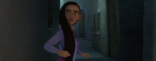
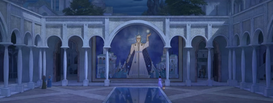
If the truth’s supposed to set me free, why do I feel so weighted down by it
If I could show the people everything I’ve seen, open their eyes to all the lies then, they would change their minds like did
Cause when I speak, they tell me sit down, but why should I when I found something to believe in
I know where I began, but it’s not where I belong. They say I’m naive but, I know I’m not wrong
[Asha looks up to the wishing star overlooking the kingdom, pulling her closer to the far-off woodlands.]
[Chorus 1]
So I look up at the stars to guide me
And I pray for them to give a sign
If knowing it be could be is what drives me
Then let me bring this dream into life
So I make this wish, to bring something more to all of this
So I make this wish, to have something more for us than this
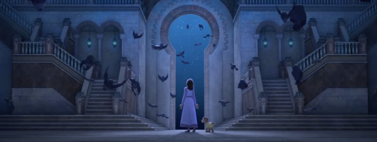
[As she vocalizes, she imagines the birds around her with glowing star-like speckles, the speckles having a sketchy quality to them to illustrate her imagination]
Hey-yeah-yeah-yeah
Hey-yeah-yeah-yeah-ah-ah
More than this, oh-ahhh-ahhh-ahhh
[Verse 2]
[Asha walks through the forest, letting out all of her emotions]

I never knew I needed room to grow
I always did what I was told, and I never said no
Now I got all of this freedom in my bones
But I can’t even let it show, can’t let it overflow
[Asha climbs the wishing star to a large walkable branch above the ocean]
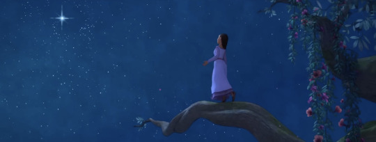
Cause I got expectations and hesitations on where I should even begin
Always dipping my toes in, but I don’t know if I should sink or swim
I won’t let myself be pointed in any given direction on where to go or what to do
My legs are shaking, but my head’s held high in the way they always taught me to
[Asha imagines a glowing staircase of stars that lead her up to the heavens, beginning to let out her emotions as she runs up the staircase]
[Chorus 2]
So I look up at the stars to guide me
And I pray for them to give a sign
I’m sure there will be challenges worth striving
But I can take them on, one at a time
[Asha sets foot onto the watercolored clouds and gazes at the big, bright wishing star glowing overhead, now closer than she could ever imagine. This climax is inspired by unused concept art for Snow White and the Seven Dwarfs]
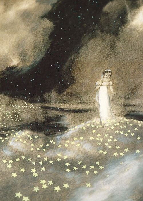
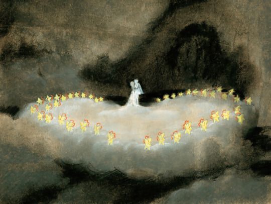
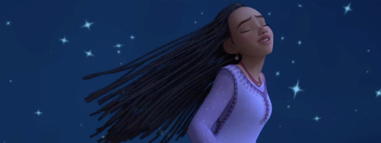
So I make this wish, to bring something more to all of this
So I make this wish, to have something more for us than this
[Here is our ultimate climax! The camera rotates around Asha as she twirls amongst the stars. The stars are shining brighter than they ever have before. Celestial creatures shining with stardust begin to surround her, the stars on the clouds create a bright, symphonic dreamscape.
Hey-yeah-yeah-yeah
Hey-yeah-yeah-yeah-ah-ah
More than this, oh-ahhh-ahhh-ahhh
[Before the outro, we fade back to reality, with Asha on the wishing tree, as she finally makes her wish to the stars above her]
[Outro]
So I make this wish, to have something more for us than this
[The camera quickly pulls back, giving us a huge shot of the sky, the sea, and the Wishing Tree all in frame, as if it were a masterpiece painting.]

[The song ends with a patient silence, as Asha smiles. The pause is much longer than in canon, at least 10 seconds. Her smile drops as she notices that the star is slowly starting to glow bright, and explode with a light of hope and wonder. Asha shields her eyes as the glow engulfs the kingdom of Rosas, and that is where we meet our fabled star boy! End scene]
So that's This Wish! Hope you've enjoyed my intrepretation of the song, and maybe I'll share a couple more revised versions of the canon songs. Goodnight, Kingdom of Rosas!
Part 1: The Story
31 notes
·
View notes
Text
SBS Hyena, episode 1 rewatch (part 3)
Today we will look at cute watch ads, the storm before the actual storm and bonus Yoon Hee-jae being expensive.
Hwang Bo-ra is so wonderful in everything she does. Sim Yu-mi has a great sense of style and an equally loud personality, but she feels quite personable. This means she’s quick to make friends and pull them in, which is what puts Jung Geum-ja in Yoon Hee-jae’s circle.
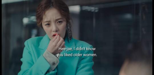
Kindly note her single earring, the contrast of her aqua blazer, her neon pink nails and her lip. Let's put a pin in that comment by her.
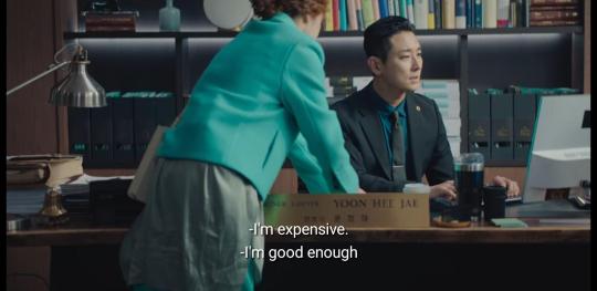
(I live for Hee-jae saying he's expensive. I'm sure you are, babe.)
On any other show, their age difference would have been played for hijinks, laughs or a plot point. Ga Gi-hyeok as the bestie might have told his friend he could do much better (untrue). Boo Hyeon-a might have had an entire jealousy arc with her (you know they would have done that.)
Not on this show. This is the first and the last time a named character says anything on the topic. It’s a sometimes grating comic character who makes the comment, which would have been a sneaky way to slide in something mean or judgmental. But there's none of that here. It’s super refreshing.
And then, total obliteration:

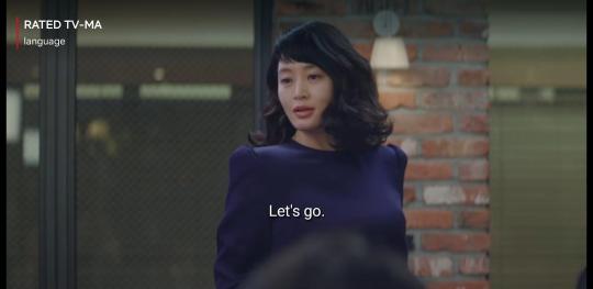

Kim Hee-sun is luminous, sexy as hell and completely in control. Yoon Hee-jae may have upped the stakes here by turning up and dropping that outrageous line about leaving with him, but Kim Hee-sun does the metaphorical equivalent of cuffing his chin, smirking and saying "Let me show you how it's done, dear boy." Of course he leaves like he's been lassoed.
Ju Ji-hoon is never going to look like this in a show, ever again. I feel like the costuming team sat down with the PD and went, listen, we have an actor-model in the house. Let us at him. Let us put him in gorgeous suits and saturated colours and lots of great lighting.
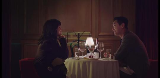
This is presumably the Gran Bleu, which is where they met twice more, and...the lighting is not like this on those occasions. Here it's cosy, with lots of warmth on their faces, but there are also plenty of shadows. Almost as if to say that romantic lighting also tends to conceal a lot.
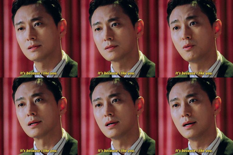
The last time they do meet here, the lights are up, because the show's over, and the things they say and do are so achingly loving that you won't need any romantic pap. Substance over form.
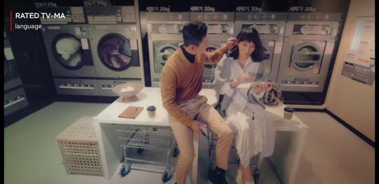
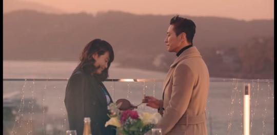
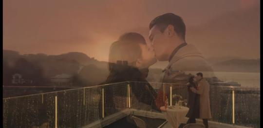
This entire sequence plays out like a generic, if extremely posh, romance. Form, rather than substance: two beautiful people listening to the same record, cooking in the kitchen, looking at art dressed like they should be in fashion magazines - culminating in this gorgeous windswept kiss with the sun setting and the mountains behind them. HIGH ROMANCE, or rather, what we think high romance should look like.
I say “generic”, because this could be any couple. There is nothing here that is specifically them. It’s stock architecture over the heart of things that Hee-jae loves, but there is nothing else of him, and absolutely nothing of her. Even that kiss on the rooftop is made to look exactly like those ubiquitous East Asian watch commercials with the blurry slow-motion - and it is, because it’s very smart PPL, I’m certain - but it enhances, rather than detracts from the generic quality of this sequence.
Anyway, the ad film’s coming to an end because…it’s courtroom time. DUN DUN DUN.
13 notes
·
View notes
Text
Woman's Empowerment: Safe and Efficient Cooking with a Pressure Cooker

Introduction
Cooking is an art that has been practiced for centuries, but what if I told you that there’s a kitchen appliance that can revolutionize the way you prepare meals, saving you time and enhancing flavors like never before? Enter the pressure cooker—a culinary powerhouse that transforms ordinary ingredients into extraordinary dishes in a fraction of the time.
We’ll cover everything from how pressure cookers work and the different types available, to essential tips for using them effectively and delicious recipes to try. By the end of this journey, you’ll understand why pressure cookers are a must-have in any kitchen and how to harness their potential to create mouthwatering meals that will impress family and friends alike. So, let’s dive into the world of pressure cooking and discover the magic that awaits!
Choosing the Right Cooker
Choosing the right cooker for your kitchen can significantly enhance your cooking experience, making meal preparation more efficient and enjoyable. With various options available, it’s essential to consider your cooking habits, kitchen space, and the features that best suit your needs. One brand that stands out in the market is Omichef, known for its innovative and high-quality cookers that cater to a range of culinary requirements.
Understanding your cooking needs
Before diving into the specifics of different cooker types, reflect on the following:
Cooking Style: Are you a busy professional who needs quick meals, or do you enjoy leisurely cooking on weekends? This will influence whether you need a pressure cooker for speed or a slow cooker for convenience.
Family Size: The number of people you typically cook for will determine the size and capacity of the cooker you need. Omichef offers a variety of sizes, making it easy to find one that fits your household.
Kitchen Space: Measure your kitchen area to ensure that the cooker you choose will fit comfortably without overcrowding your workspace.
Types of Cookers to Consider
Pressure Cookers: Ideal for quick cooking, pressure cookers trap steam to cook food faster while retaining flavors and nutrients. Omichef pressure cookers are designed with safety features and various capacities to suit different needs.
Slow Cookers: Perfect for those who prefer to set it and forget it, slow cookers allow for low and slow cooking, making them ideal for stews and casseroles. Omichef’s slow cookers come with programmable settings for added convenience.
Induction Cookers: These cookers use electromagnetic energy for fast and efficient cooking. Omichef offers induction cookers that are compatible with a variety of cookware, ensuring versatility in your kitchen.
Electric Cookers: Great for multitasking, electric cookers can perform various functions, from steaming to sautéing. Omichef’s electric models often include features like timers and automatic shut-off for safety.

Key Features to Look For
Durability: Choose a cooker made from high-quality materials. Omichef cookers are built to last, often featuring stainless steel or hard-anodized aluminum for durability.
Safety Features: Modern cookers, especially pressure cookers, come with advanced safety mechanisms. Omichef prioritizes safety, ensuring that its products meet rigorous safety standards.
Ease of Cleaning: Look for non-stick surfaces or dishwasher-safe options. Omichef cookers are designed for easy maintenance, allowing you to spend more time enjoying your meals and less time cleaning up.
Conclusion
Selecting the right cooker is a personal decision that should align with your cooking habits and lifestyle. Brands like Omichef provide a range of options that combine functionality, safety, and ease of use, making them a great choice for any kitchen. By considering your specific needs and exploring the features available, you can find the perfect cooker that will elevate your culinary adventures and make cooking a delightful experience.
If you are interested in buying, you can visit this website: 👉🏻 omichef.com.
2 notes
·
View notes
Text
Hi friends! I'm dabbling in tomgreg, again. Don't worry, though - I'll be back steddieing very soon (there are like... four WIPS on the way!) I thought it'd be fun to dabble with sugar daddy esque Tom. Here's hoping you guys enjoy! Catch a sneak peek of the fic below, then head over to AO3 to read the rest. It's spicy, so minors DNI!
It becomes Tom’s sole responsibility in that moment to fix this glaringly obvious problem.
There’s a little work that goes into the whole thing – while Tom understands himself and his own sense of style, he’s still getting to know Greg. Tall isn’t a measurement that can be used to make someone a custom shirt. Which means there’s no way around being a little creepy to find out Greg’s size.
Of course, the odd touching and weird comments that make Greg bend over enough to see down the back of his shirt give Tom an opportunity to indulge the unchecked crush blossoming further by the day. Their weird connection upon first meeting (that Tom absolutely ruins in his hasty to overcome nerves and the funny feeling of love at first sight) lit something in Tom that’s refusing to putter out into the snuffed out thing it already is. Or, well, should be.
So, Tom indulges himself while collecting the needed data to fulfill his task. After he gets the numerical information, Tom does nothing to stop himself from continuing the arm grazes and long looks. He’s so used to it by now that it’s too big of a burden to even consider. It’s not like Greg does anything about it, anyway. In fact, Tom is almost positive that Greg moves into his touch. Or maybe that’s just the wishful thinking Tom can’t allow himself to put to rest.
Either way, the indulging does not stop.
When the shirt eventually comes in, Tom thanks his tailor for the last minute addition – his usual order is pristine as always, earning Leon a nice tip. Tom can’t wait until he’s home to take a peek at his commission and isn’t disappointed with the result.
The black of the shirt is deep and dark, beautiful because of its shadowlike nature. Tom’s thumb stopped on the example tab while flipping through the palette book thoughtlessly, like the thought of black enhancing the paleness of Greg’s creamy skin is an everyday thing. Sadly, it probably is.
Either way, Tom is happy to note the buttons are thick and durable, even at the cuff. Greg is a clumsy nuisance who’s like Bambi on ice at his best. Providing him with a garment that’s both pretty and made to last is Tom’s way of showing care. He hopes to see the soft, obviously high quality fabric of this shirt for a long time to come.
He’s meticulous in the way he packs it later that night. It came in a nondescript black box but Tom is hoping to impress. He buys a fancy gift box and folds it like he’s seen his own shirts a billion times before. It looks professional and classy – just like the man Tom wants Greg to be.
Despite being stoked about researching for and buying the gift, Tom can’t stand the thought of being there when Greg opens it up. He’s got this stealth plan that frees him from having to experience Greg’s reaction first hand. It’s so good, the plan that is, that Tom is cheery and upbeat throughout the entire day. People give him a wide birth but that’s just as well – not having to mop up other people’s bullshit adds a yummy cherry on top to a pretty good day.
After waiting until he’s almost certain everyone is gone, Tom sets things in motion. He sends a text to Greg about getting him a coffee for the road. When he hears the squeak of Greg retreating to do Tom’s bidding (just like the very good boy that he is,) Tom pulls out the box and makes quick work of putting it on Greg’s desk.
He’s seconds away from being in the clear when the intoxicating sent of tobacco infiltrates Tom’s senses. Greg is back and Tom is still there, lingering around Greg’s desk. The perfect day is quickly flying downhill at a terrifying speed. There’s nothing he can do to salvage the situation, so Tom does his best asshole impression, instead.
“Took you long enough, Gregory,” Tom says, turning around to snatch a nonexistent coffee cup from Greg’s hands. “What happened? Where’s my coffee?” The exasperation in his voice is real, though it’s not Greg’s fault.
It is a convenient excuse, however.
Greg looks flabbergasted, stuck between staring at Tom, his empty hand, and the obviously out of place box amongst his things. Tom, because he’s close to a breakdown already, is having a hard time not laughing it all. Karma is speaking loudly to him now, heckling Tom ruthlessly for his attempt at being a good person.
Thankfully, Greg’s broken up speech brings Tom back from the edge of a very embarrassing spiral.
“I uh – what’s that?” Greg asks, bypassing all of Tom’s questions in favor of honing in on something shiny and new. It’s the exact reaction that Tom wants, though there’s mixed feelings churning in his gut because he’s here to see it. His imaginings aren’t nearly as good as the real thing – that spells trouble for Tom, he can already tell. Being here, seeing this – Tom’s not sure he can recover.
Read the rest on AO3!
#tomgreg#tom wambsgans x greg hirsch#greg hirsch x tom wambsgans#greg hirsch#tom wambsgans#gregory hirsch#succession#bobbie writes#you own my nights
12 notes
·
View notes
Note
1, 50 and 100. ☺️
"C'est Magnifique" - Frank Pourcel
Really not sure why this is #1 or even top 10. I suspect it's tied with no.2 and "won" for alphabetical sorting reasons. Again, I use Spotify for playlist creation not really dedicated listening. I have a free account so the ads get verry annoying. Anyway this is on my Concorde playlist - I figured given the Concorde was a joint Anglo-French project it was important to represent some French musicians.
50. "Naima" - John Coltrane
A classic, really really gorgeous chord changes and so meditative. See I listen to real jazz too. Anyway this is on my Cowboy Bebop vibes playlist lol. I've always loved how diverse Yoko Kanno's music for that show is, and I made this playlist as a way to sort of get myself to better understand the kinds of music that she draws from. To be clear that playlist contains ZERO music from the show, just stuff I think sounds like music from the show/that universe.
100. "Dear Diary" - Britney Spears
When making my Barbie (2023) hype playlist I looked at music from a bunch of blonde pop princesses. I'm not super familiar with Spears' catalog, but exploring it this title caught my eye. Not knowing the plot of the movie yet, I imagined my own. This song is part of the arc it has about Barbie and Ken meeting and dating - I wanted it to feel, not sure how to describe it, but so wrapped up in the conventions and tropes of straight relationships and playing this role because that's what they've been taught, if that makes any sense. Like when I had a girlfriend in high school in an attempt to be straight...
The song has a 'tween' quality to it. Though there's a lyric, "one touch of his hand", it doesn't feel expressly sexual. Also I think it's funny how the line "Should I tell him how I feel, or would that scare him away?" is set in a clunky way that emphasizes "that", de-emphasizing and rushing "scare". There's other such clumsily-set lyrics and in another song they would just feel like bad writing. It's still kinda bad writing, but in context I think it enhances the tween vibe. Not to say kids don't deserve good or even sophisticated writing. But kids are often more willing to overlook (or not notice) things like that, and there's a lot of pop music aimed at them that like this has clunky lyrics.
2 notes
·
View notes
Text
Baldur's Gate 3 Screenshot Tutorial
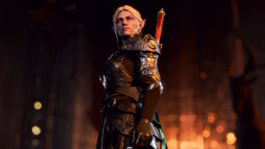
Hi, I decided to make a more in-depth guide for my twitter followers, as I'm super limited in characters and formatting options over there.
For this tutorial, I'll explain how you can enhance your screenshots. I'll divide it into five parts: ReShade, making your screenshots high resolution, camera mods, photography basics, and post-processing. By the end of following all of these steps, you should have something way better than the start!
I recommend going through this tutorial downloading things step-by-step for the first three parts, as it'll help you to quickly identify where you've gone wrong if you have any issues.
1. ReShade ReShade is a post-processing tool that allows you to change the look of a game with an array of different effects and adjustments to use. It can be a lot to wrap your head around at first, so I recommend starting off by finding a ReShade preset that speaks to you from this page if you're not already familiar with using it. The mod authors should explain how to download it. I find 22:20 of this YouTube video to be helpful to introduce ReShade if you're completely new to it. This video is for the Sims 4, but ReShade typically works the same across different games. Now that ReShade is downloaded, we can get depth of field working within the ReShade. This step is optional. Depth of field refers to what will be in focus in your screenshot, and what will be blurred. It's essentially simulating shooting with a camera, like so:
To get this effect working, you need to follow this tutorial within the ReShade menu.
2. Making Your Screenshots High Resolution Typically, Baldur's Gate 3 is ran in 1920x1080 resolution, or standard HD (unless you have a higher resolution monitor and are running the game in 4k, in which case, you can ignore this step if you'd like). This is definitely an acceptable quality, but if you'd like to capture any detail, you're not going to get much out of this. To get a better quality image, there are two ways to achieve this. The first method is through hotsampling. Hotsampling is briefly running a game in a much higher resolution than your monitor supports, allowing you to capture screenshots with incredible detail, then bringing it back down to a native playable resolution. To hotsample, you'll either need to use the BG3 camera tool, or SRWE. For either of these hotsampling tools, it's important that you've downloaded ReShade, or they will not work.
Once you have either of these downloaded, make sure your game is running in windowed mode. If you have more than one monitor, you need to change your display to show only on one screen. Or again, this will not work.
Next, you're going to want to make sure you have a key set for taking screenshots in ReShade, as well as making sure you like the folder where your screenshots are set to be saved. You can find this in the settings tab. Once you have those set, you're ready to take really HD screenshots!
To do that, you want to set your game's resolution to 2x, or even 3x what it's currently displayed as. Once it's set, your game screen is going to look giant and probably run way off your monitor. This is a sign it's working! Once it looks like this, press the screenshot key you set earlier within ReShade, and there you go, a nice big screenshot should be in the folder you set!
If you don't want to do hotsampling, and if you have a Nvidia graphics card, you can download their their app, which can take resampled screenshots. It won't be as high quality as hotsampling, but still better than standard HD.
3. Camera Mods
There are two camera mods that I know of for BG3. One is paid, the other is not.
The first one is the Native Camera Tweaks mod. This mod allows you to move the camera around more freely as you're traversing the world, but in cutscenes you'll still be stuck.
The second one is the paid one, but it allows for total freedom within the game, even during cutscenes. This tool is also very helpful for hotsampling. Within this tool, it's very useful to configure your own controls for moving the camera around in game, as well as setting a key you'll remember for pausing the game so you can set up a screenshot. I changed the movement keys to be wasd and the keys to change the angle of my camera side to side/up and down to the arrow keys.
4. Photography Basics
Taking screenshots in a game is a lot like doing photography irl tbh lol, same rules mostly apply. You of course want to do the basics like making sure your subject is in focus, it's not too dark or too light. But some other tips for people not very familiar with taking photos to take note of are:
Make sure if you're taking a photo of a person, the top of their head is within frame
Try and either make sure someone is front and center, or in the rule of thirds
Pay attention to the lighting, sometimes it's too bright or too dull. Sometimes it's unflattering in certain angles. Lighting will always make a huge difference
5. Post-Processing
You can now leave your screenshot as is, or edit it further with a photo editing software! I recommend using Photopea, as it offers basically everything Photoshop does without the insane price tag. From here you can do whatever you feel is best to enhance your image.
And that's all! If you have any questions, feel free to ask, and if you get stuck anywhere in this tutorial, don't feel bad. A lot of this stuff is just trial and error, but if you're very persistent with it, I promise you'll get these working. Also I would just like to mention that a lot of this stuff applies to taking screenshots in a lot of games! So you can take this knowledge with you elsewhere <3
If you happened to follow all this, please send in an image of your Tav you took!
123 notes
·
View notes
Note
Hi! Long time liker, occasional reblogger, first time asker piping up to ask what your favorite Rimworld mods are! I just picked it up and am enjoying it so far, minus getting wrecked by rabid squirrels an embarrassing amount...
OH BOY LOL ARE YOU IN FOR A LONG ANSWER
First off: I am someone who takes zero shame in enabling Development Mode, so my subscriptions are big on adding complexity to the game while being able to address things spiraling out of control with a panic button. If you're not into that, I would ramp up slowly with these.
Putting behind a cut, because again: long.
For context, though they're not all currently active, I'm subscribed to 268 mods. ...I am not going to recommend them all.
Here are some favorites I would recommend for starting to round out the game. I'm grouping them up into significant vs. smaller QoL improvements. If you enjoy a mod, I would highly recommend going to your subscription page and checking out that modmaker's full workshop to see what else looks fun. That's how I discovered most of these.
Big Deal Mods
Harmony - a framework mod required by a lot of other mods.
HugsLib - same deal. Use autosort with your mods, and these will get moved up to the top where they need to be.
Humanoid Alien Races - and another framework. Needed for a bunch of new race mods, e.g. if you want Star Wars alien races. (I'm sure someone's made that somewhere.)
Hospitality - you can host visitors from other factions, improve relations, and even convince the visitors to join your faction.
Expanded Prosthetics and Organ Engineering - exactly what it says. A huge new range of options to buy/craft, from very low tech emergency options to very powerful upgrades.
Pawnmorpher - quite possibly the inspiration for Biotech, and in some ways I still prefer parts of it to that gene system. (But I do have a bunch of fun playing with genes.) You can upgrade pawns with fur for their boreal home, or downgrade them all the way into mindless animals.
Ambition of the Cosmic - adds a bunch of high-tech research tiers above and beyond the core game.
Glittertech - adds a bunch of new tech and gear, along with a new faction (commandos) who pose a strong lategame threat. They'll ignore you until you're worth their while.
Misc. Robots - this came well before the Biotech mechanoids, and here, I clearly prefer it. It requires research and materials (or buying from a trader), but you can get mindless hauling and cleaning robots that let your pawns focus on more important tasks. They're available in different tiers for speed/battery life.
Misc. Robots++ - adds the other types of robots (crafting, cooking, etc.). I enjoy setting up a custom starting scenario with one rich, pampered explorer and a bunch of robots.
Prepare Carefully - lets you super-customize your pawns for the starting experience you want. I use this (and the next one) to craft myself a group of pawns from [some fandom] and watch the chaos develop.
Character Editor - I actually use this one a lot more. It's a great way to change the basics of individual pawns at any point, and can also adjust their health conditions. I refuse to let some beloved pets bleed out! (The pawns themselves... whatever.)
More Vanilla Biomes - obviously only applies for newly-generated worlds, but these are some interesting new conditions to deal with. I'm a big fan of grasslands and cloud forests.
Dubs Bad Hygiene - adds hygiene/bladder needs. This will make the early game harder, as your pawns deal with being miserable and filthy. As you are able to take better care of them, you'll instead see them with mood buffs from being nice and clean, enjoying the swimming pool and hot tub, etc. I don't know why, but I love this mod to pieces. Lol.
TD Enhancement Pack - DOWNLOAD THIS ONE, IF NOTHING ELSE. All this shit should be in the base game.
Quality of Life Mods
Metals Trader - adds an orbital trader that's the best place to find certain materials. Not a big deal if you like to play mountain bases, very useful elsewhere.
Smarter Deconstruction and Mining - should avoid your pawns bringing down roofs on top of themselves.
Faction Customizer - yep. What it says. You can easily make other factions your allies or enemies.
Variety Matters - pawns expect a certain level of variety in their diet, based on colony wealth. Like with Hygiene, it'll be more challenging early on but can add buffs later.
Tier 2 Temperature - you can research additional temperature control devices.
Vanilla Plants Expanded - also look at Oscar Potocki's Workshop linked at the top of the page. Vanilla _______ Expanded is a MASSIVE collection he's created, and there's a shitton of neat stuff in there.
Healer Mech Serum Choice - you can pick which condition it's used on.
Stockpile Ranking - I put this as a QoL mod, but honestly, it's pretty core to how I play. You can prioritize different stockpiles, so—for example—I can set medicine to critical inside my infirmary, and rest assured that it'll be placed there instead of over in the general spillover warehouse. (While still allowing myself lots of room to store all of the different types of medicine I have access to with all of my mods.)
Tilled Soil - with effort, your pawns can turn any growable soil into fertile soil.
Prisoner Harvesting - :)
Incident Person Stat - get a feeling for what sort of stranger you're dealing with, so you can avoid admitting a pawn being chased by maneaters only to discover they're a pyromaniac.
Apparel Tainted Only When Corpse Rots - it's so much easier to clothe your pawns in early game with this.
Bad Can Be Good - re-balances some bad traits and gives them tradeoffs.
VGP Vegetable Garden - again, linking for the workshop at the top. Tons of mods for new crops, etc.
Ore Yields - yep. Adjustable.
Tradeable Meals - another way to make money, if you're flush with crops and meat.
Tech Advancing - you can customize when you move up to the next tier (e.g. Industrial -> Spacer).
Smarter Construction - get this one. Your life will be much less frustrating.
RimHUD - a nice redesign of the pawn info window.
Lightning Rod - once you have the resources to spare, storms become much less of a threat.
Replace Stuff - yep. Replace it without dismantling the old one, first. Terrific for situations like, say, upgrading your freezer walls to something non-flammable.
OgreStack - adjust stack sizes for all items. Get this one.
Medical Tab - adds a tab where you can see everyone's medical conditions at a glance. Check this workshop, too; there are other good tabs you can add.
Mad Skills - adjust learning speeds, slow or turn off knowledge decay, etc. Very useful.
Map Designer - you can set specific conditions (e.g., maybe you want a fuckton of ruins, or mountains at a certain angle, or a river so wide that it's nearly impassable). You can also reroll a map to get variations on its core features. Love this mod.
Adjust Quest Chance - there are some quests I hate and will never accept, and others I'd want more of. I can go in and adjust my chances accordingly.
Quick Stockpile Creation - so simple. So nice. The very definition of a QoL mod.
Underground Power Conduits - and finally: NO MORE UGLY WIRES EVERYWHERE.
Okay, as mentioned, this is just a small fraction of my subscriptions, but... I am sure it's more than enough. More. Than. Enough.
5 notes
·
View notes
Text
Okay, let’s sift through this, shall we?
“Here at Tumblr, we’ve been working hard on reorganizing how we work in a bid to gain more users. ... This strategy provides guidance amid limited resources, allowing our teams to focus on specific key areas to ensure Tumblr’s future.”
“Business business business numbers numbers numbers” Basically, the community is what makes Tumblr awesome, and we should make that better.
“In order for Tumblr to grow, we need to fix the core experience that makes Tumblr a useful place for users. The underlying problem is that Tumblr is not easy to use. Historically, we have expected users to curate their feeds and lean into curating their experience. But this expectation introduces friction to the user experience and only serves a small portion of our audience.”
This gives me pause, because one of the draws of Tumblr is that it you have to curate your own feed. Yes, you can see the “for you” and “trending” tabs, but they’re optional. You can turn off everything except those you’re following if you so choose.
“Tumblr’s competitive advantage lies ....”
Ugh, my buzzword allergy is flaring up. Where’s my EpiPen?
To enhance Tumblr’s usability, we must address these core guiding principles.
Expand the ways new users can discover and sign up for Tumblr. Provide high-quality content with every app launch. Facilitate easier user participation in conversations. Retain and grow our creator base. Create patterns that encourage users to keep returning to Tumblr. Improve the platform’s performance, stability, and quality.
So... 1) Ease of use 2) Content 3) Ease of use 4) Keep users 5) Keep users with content 6) Ease of use.
Fuggin’ brilliant.
Principle 1: Expand the ways new users can discover and sign up for Tumblr.
“Tumblr has a “top of the funnel” issue in converting non-users into engaged logged-in users....”
If users can get what they’re looking for from Google searches, why do they need to sign up? Also, some worrying verbage about “experiment with logged-out tumblr.com”. They better not require folks to sign in to view Tumblr because that will hurt in the long run.
Principle 2: Provide high-quality content with every app launch.
“We need to ensure the highest quality user experience by presenting fresh and relevant content tailored to the user’s diverse interests during each session...
Some crap about algorithms and showing “fresh” content first. Now, if that’s something that we can toggle, I’m all for it. Give me an option for The Almighty Algorithm, but don’t force it on me.
Principle 3: Facilitate easier user participation in conversations.
“Part of Tumblr’s charm lies in its capacity to showcase the evolution of conversations and the clever remarks found within reblog chains and replies....
In short, replies vs reblogs is confusing for new folks. Fair point! They’re talking about engagement with replies as an ‘action item’, so I don’t know if they’re thinking of adding likes to replies, or being able to reblog a reply, or what...
Principle 4: Retain and grow our creator base.
Creators are essential to the Tumblr community. However, we haven’t always had a consistent and coordinated effort around retaining, nurturing, and growing our creator base....
The lack of feedback stems from the outdated decision to only show content from followed blogs on the main dashboard feed (“Following”), perpetuating a cycle where popular blogs continue to gain more visibility at the expense of helping new creators. To address this, we need to prioritize supporting and nurturing the growth of new creators on the platform.
...
Bolded part is a red flag for me. Don’t fuck with my “following” tab. It’s “Following”, as in “The people I follow”, not “people I follow and other shit I might like”. I already have settings for turning my “following” tab into that, and I have them off for a reason!
Principle 5: Create patterns that encourage users to keep returning to Tumblr.
Push notifications and emails are essential tools to increase user engagement...
This part made me cringe, but they at least talk about how they don’t want notifications to be too spammy (which they definitely are, even for someone like me with single-digit followers)
Principle 6: Performance, stability and quality.
The stability and performance of our mobile apps have declined....
“Shit’s buggy, yo, and we need to fix it.”
Conclusion
Our mission has always been to empower the world’s creators. We are wholly committed to ensuring Tumblr evolves in a way that supports our current users while improving areas that attract new creators, artists, and users. You deserve a digital home that works for you. You deserve the best tools and features to connect with your communities on a platform that prioritizes the easy discoverability of high-quality content. This is an invigorating time for Tumblr, and we couldn’t be more excited about our current strategy.
Buzzword, platitude, buzzword, buzzword.
Tumblr’s Core Product Strategy
Here at Tumblr, we’ve been working hard on reorganizing how we work in a bid to gain more users. A larger user base means a more sustainable company, and means we get to stick around and do this thing with you all a bit longer. What follows is the strategy we're using to accomplish the goal of user growth. The @labs group has published a bit already, but this is bigger. We’re publishing it publicly for the first time, in an effort to work more transparently with all of you in the Tumblr community. This strategy provides guidance amid limited resources, allowing our teams to focus on specific key areas to ensure Tumblr’s future.
The Diagnosis
In order for Tumblr to grow, we need to fix the core experience that makes Tumblr a useful place for users. The underlying problem is that Tumblr is not easy to use. Historically, we have expected users to curate their feeds and lean into curating their experience. But this expectation introduces friction to the user experience and only serves a small portion of our audience.
Tumblr’s competitive advantage lies in its unique content and vibrant communities. As the forerunner of internet culture, Tumblr encompasses a wide range of interests, such as entertainment, art, gaming, fandom, fashion, and music. People come to Tumblr to immerse themselves in this culture, making it essential for us to ensure a seamless connection between people and content.
To guarantee Tumblr’s continued success, we’ve got to prioritize fostering that seamless connection between people and content. This involves attracting and retaining new users and creators, nurturing their growth, and encouraging frequent engagement with the platform.
Our Guiding Principles
To enhance Tumblr’s usability, we must address these core guiding principles.
Expand the ways new users can discover and sign up for Tumblr.
Provide high-quality content with every app launch.
Facilitate easier user participation in conversations.
Retain and grow our creator base.
Create patterns that encourage users to keep returning to Tumblr.
Improve the platform’s performance, stability, and quality.
Below is a deep dive into each of these principles.
Principle 1: Expand the ways new users can discover and sign up for Tumblr.
Tumblr has a “top of the funnel” issue in converting non-users into engaged logged-in users. We also have not invested in industry standard SEO practices to ensure a robust top of the funnel. The referral traffic that we do get from external sources is dispersed across different pages with inconsistent user experiences, which results in a missed opportunity to convert these users into regular Tumblr users. For example, users from search engines often land on pages within the blog network and blog view—where there isn’t much of a reason to sign up.
We need to experiment with logged-out tumblr.com to ensure we are capturing the highest potential conversion rate for visitors into sign-ups and log-ins. We might want to explore showing the potential future user the full breadth of content that Tumblr has to offer on our logged-out pages. We want people to be able to easily understand the potential behind Tumblr without having to navigate multiple tabs and pages to figure it out. Our current logged-out explore page does very little to help users understand “what is Tumblr.” which is a missed opportunity to get people excited about joining the site.
Actions & Next Steps
Improving Tumblr’s search engine optimization (SEO) practices to be in line with industry standards.
Experiment with logged out tumblr.com to achieve the highest conversion rate for sign-ups and log-ins, explore ways for visitors to “get” Tumblr and entice them to sign up.
Principle 2: Provide high-quality content with every app launch.
We need to ensure the highest quality user experience by presenting fresh and relevant content tailored to the user’s diverse interests during each session. If the user has a bad content experience, the fault lies with the product.
The default position should always be that the user does not know how to navigate the application. Additionally, we need to ensure that when people search for content related to their interests, it is easily accessible without any confusing limitations or unexpected roadblocks in their journey.
Being a 15-year-old brand is tough because the brand carries the baggage of a person’s preconceived impressions of Tumblr. On average, a user only sees 25 posts per session, so the first 25 posts have to convey the value of Tumblr: it is a vibrant community with lots of untapped potential. We never want to leave the user believing that Tumblr is a place that is stale and not relevant.
Actions & Next Steps
Deliver great content each time the app is opened.
Make it easier for users to understand where the vibrant communities on Tumblr are.
Improve our algorithmic ranking capabilities across all feeds.
Principle 3: Facilitate easier user participation in conversations.
Part of Tumblr’s charm lies in its capacity to showcase the evolution of conversations and the clever remarks found within reblog chains and replies. Engaging in these discussions should be enjoyable and effortless.
Unfortunately, the current way that conversations work on Tumblr across replies and reblogs is confusing for new users. The limitations around engaging with individual reblogs, replies only applying to the original post, and the inability to easily follow threaded conversations make it difficult for users to join the conversation.
Actions & Next Steps
Address the confusion within replies and reblogs.
Improve the conversational posting features around replies and reblogs.
Allow engagements on individual replies and reblogs.
Make it easier for users to follow the various conversation paths within a reblog thread.
Remove clutter in the conversation by collapsing reblog threads.
Explore the feasibility of removing duplicate reblogs within a user’s Following feed.
Principle 4: Retain and grow our creator base.
Creators are essential to the Tumblr community. However, we haven’t always had a consistent and coordinated effort around retaining, nurturing, and growing our creator base.
Being a new creator on Tumblr can be intimidating, with a high likelihood of leaving or disappointment upon sharing creations without receiving engagement or feedback. We need to ensure that we have the expected creator tools and foster the rewarding feedback loops that keep creators around and enable them to thrive.
The lack of feedback stems from the outdated decision to only show content from followed blogs on the main dashboard feed (“Following”), perpetuating a cycle where popular blogs continue to gain more visibility at the expense of helping new creators. To address this, we need to prioritize supporting and nurturing the growth of new creators on the platform.
It is also imperative that creators, like everyone on Tumblr, feel safe and in control of their experience. Whether it be an ask from the community or engagement on a post, being successful on Tumblr should never feel like a punishing experience.
Actions & Next Steps
Get creators’ new content in front of people who are interested in it.
Improve the feedback loop for creators, incentivizing them to continue posting.
Build mechanisms to protect creators from being spammed by notifications when they go viral.
Expand ways to co-create content, such as by adding the capability to embed Tumblr links in posts.
Principle 5: Create patterns that encourage users to keep returning to Tumblr.
Push notifications and emails are essential tools to increase user engagement, improve user retention, and facilitate content discovery. Our strategy of reaching out to you, the user, should be well-coordinated across product, commercial, and marketing teams.
Our messaging strategy needs to be personalized and adapt to a user’s shifting interests. Our messages should keep users in the know on the latest activity in their community, as well as keeping Tumblr top of mind as the place to go for witty takes and remixes of the latest shows and real-life events.
Most importantly, our messages should be thoughtful and should never come across as spammy.
Actions & Next Steps
Conduct an audit of our messaging strategy.
Address the issue of notifications getting too noisy; throttle, collapse or mute notifications where necessary.
Identify opportunities for personalization within our email messages.
Test what the right daily push notification limit is.
Send emails when a user has push notifications switched off.
Principle 6: Performance, stability and quality.
The stability and performance of our mobile apps have declined. There is a large backlog of production issues, with more bugs created than resolved over the last 300 days. If this continues, roughly one new unresolved production issue will be created every two days. Apps and backend systems that work well and don't crash are the foundation of a great Tumblr experience. Improving performance, stability, and quality will help us achieve sustainable operations for Tumblr.
Improve performance and stability: deliver crash-free, responsive, and fast-loading apps on Android, iOS, and web.
Improve quality: deliver the highest quality Tumblr experience to our users.
Move faster: provide APIs and services to unblock core product initiatives and launch new features coming out of Labs.
Conclusion
Our mission has always been to empower the world’s creators. We are wholly committed to ensuring Tumblr evolves in a way that supports our current users while improving areas that attract new creators, artists, and users. You deserve a digital home that works for you. You deserve the best tools and features to connect with your communities on a platform that prioritizes the easy discoverability of high-quality content. This is an invigorating time for Tumblr, and we couldn’t be more excited about our current strategy.
65K notes
·
View notes
Text
Where to Find Kitchen Window Curtains When it comes to enhancing the aesthetic appeal of your kitchen, window curtains play an essential role. They can transform a bland space into a cozy nook. So, where can you buy kitchen window curtains that combine style and functionality? Let’s explore the options. Why Kitchen Window Curtains Matter Curtains are not just decorative. They provide privacy, control light, and even help with insulation. In a kitchen, these factors are crucial. The right curtains can make cooking a more pleasant experience. They come in various styles and materials, each offering unique benefits. Color and pattern can reflect your personality. They can also set the mood for the space. Additionally, materials like cotton and linen are ideal. They are easy to clean and maintain. Understanding Different Styles and Materials Before purchasing, consider the style and material of the curtains. Do you prefer a modern look or something more classic? For a contemporary vibe, go for neutral colors and minimal patterns. On the other hand, bold prints can add a touch of drama. Materials matter too. Cotton is popular because it is durable and washable. Linen offers a chic, airy feel, making it excellent for a light-filled kitchen. Polyester blends provide a more cost-effective option while being easy to maintain. Exploring Retail and Online Options Local home decor stores are a good starting point. They offer the advantage of seeing and feeling the curtains. However, online platforms provide a broader range of options and competitive pricing. Crazy Joe's Drapery offers custom drapery with the best quality at the best prices. Call to get a free decorator consult and quote. Their website, crazyjoes.com, offers an extensive selection of kitchen window curtains tailored to fit any style or budget. Why Choose Crazy Joe's Drapery and Blinds? Crazy Joe's Drapery and Blinds has a stellar reputation. They are known for their quality, variety, and customer service. They offer free decorator consultations and quotes, ensuring you find the perfect fit for your kitchen. Moreover, their team is dedicated to helping you make the best choice. Whether you need guidance on style or material, they can assist. Their competitive pricing also makes them an excellent choice for budget-conscious shoppers. Making an Informed Purchase When buying kitchen window curtains, keep measurements in mind. Measure your windows carefully to ensure a perfect fit. Also, consider the installation process. Will you need additional hardware or professional installation? Another factor is maintenance. Choose materials that are easy to clean, especially in a kitchen setting. With these considerations, you can make an informed purchase that enhances your home’s aesthetics. FAQ 1. What styles of kitchen window curtains are trending? Modern styles with clean lines and neutral colors are popular. Bold patterns also make a statement. 2. Why should I consider Crazy Joe's Drapery and Blinds? They offer high-quality, custom drapery at competitive prices. Their free consultations are invaluable. 3. How do I maintain my kitchen window curtains? Regular washing according to the material’s care instructions is essential. Opt for easy-care fabrics like cotton or polyester blends. Read the full article
0 notes