#I don’t have screenshots of my refs unfortunately
Explore tagged Tumblr posts
Text
Frankenstein doodlezzz

Sorry for the low quality! Closeups under the cut <33


#art#traditional art#frankenstein#the modern prometheus#i saw a thing where in the olden days#it was a trend for lovers to have paintings of each others eyes on jewelry#:3#I don’t have screenshots of my refs unfortunately
9 notes
·
View notes
Text
|No Mercy Rants| Rant post: Profily, the puppeteer and hiding from the truth

AND ANOTHER ONE DOWN, AND ANOTHER ONE DOWN, ANOTHER ONE BITES DA DUST- /ref
Anyways, hello, lads, lassies, fellow letter mafiosos and attack helicopters, since this is my THIRD rant on this blog, I decided to make a series out of it called the ‘No Mercy Rants’, which is a play on Undertale’s ‘No Mercy Run’. Now, to stop myself from further digressing, I’ll put in a disclaimer. (I know that PAF was done to death at this point, but bear with me- T^T)
(Disclaimer: This rant will be discussing topics of harassment and theft. If you’re not a fan of these topics, then please click off and view something else. Do NOT harass anyone mentioned, as I don’t want yous to stoop to PAF’s level. All of the testimony is screenshotted with the users’ consent.)
Now, the next one on the chopping block is @profily-and-friends, which I’ll refer to as PAF for short. So, let’s start from the beginning. In around August, 2023 (I was on my summer holidays, btw-), PAF had started posting several artworks that have been stolen from Twitter (or X, as Elon Musk puts it. Such an eejit-), Deviantart, Tumblr, and other sites. Somewhere around that time, maybe later, @knighttobreath, a user on Tumblr, started the spree of crediting the stolen art to their respective artists. This is where the drama and the beef began…
Now, a few months later, @akalikestodraw, a mutual of mine, was harassed multiple times by PAF because she ‘allegedly stole her art’. Now, take note that this is false, and that Aka has made amazing artwork on her own. She was also accused of tracing artworks. There’s also been asks sent to other users, like @justapplenothinghere, @galaxy-brushs-posts, and many other users, telling them to cancel Aka. Fortunately, no one took the steps to cancel Aka. They instead supported her. PAF told @wowwzaaxei-aster, that Aka was deactivating her account (also false). I’ve interviewed Aka on the matter, and she sees this as them trying to pin the blame on her. All of this had happened on her birthday. (Wow, that’s a shitty way to celebrate one’s bday… ) This whole thing made Aka, and her partner worried, and I’d be worried too, if I was in her place.
Another sin that PAF has committed was the harassment of other artists, requesting them to draw Profily with multiple asks, presumably using alternative or burner accounts, otherwise known as ‘sock puppets’. For some unfortunate artists who fulfil said requests are met with harsh criticism from PAF that they drew Profily ‘incorrectly’. They even get upset when their request is ignored, spamming the artists’ inboxes. I’ve seen them and their sock puppets interact with some of my posts, and the only criticism that I had from them was asking where were the other algebraliens when I made the Eight as Sans post. (In my defence, I was lazy af, and I had school shit going on).
Now, another thing I’d like to mention is that they’ve tried to cancel @talkingteardrop, another mutual of mine. There was a conversation between PAF and their sock puppets about how TD was ‘allegedly racist’, (another false claim) because they ignored PAF (I smell insane troll logic here-). They even claimed that they and TD were ‘best friends’, which they weren’t. (That pissed me off the most, as assholes in my school claimed that they were my friends, even though they’re not.)
Now, as the drama goes on, it becomes even more apparent that PAF is a manipulative puppeteer who’ll harass others to get what they want. They actively hide from the truth and tries to bend the narrative as to how they see it. Their actions have real life impacts, as it has made people feel terrible and having anxiety about going on with their business.
With that said, “What the fuck do we do now..?” Welp, for starters, block every single alt and sock puppet PAF has and report them all for harassment and art theft. Do NOT engage with them, just for your own mental health and to not waste your time and energy on them. (The fact that they use sock puppets reminds me of ZR0finix).
Make sure to drink plenty of water, get plenty of sleep and stay determined, lads. It hurts me to see that people like PAF are making this much trouble in our little community on Tumblr. (I guess my work on rants will never be done-)
Evidence under the cut-
Evidence and testimony from these files:
Knighttobreath's testimony
Talking Teardrop's testimony
Aka's testimony
Screenshots
54 notes
·
View notes
Text
hope yall don’t mind me sharing some screenshots of the lair that i made in the sims 😳 the third floor is still not completely finished, but i really like what i’ve got so far :)
sorry it's....long, this place is huge 😭
first floor! it's shaped like a turtle 🥺 the hallway leads to a set of ladders that connects every floor

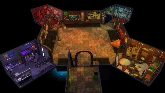
donnie's room; mikey was chillin on the bed when i opened the game and i just had to leave him there for the photo op 🥺🧡 had to add a lot more decorations to it so it didn't look like a sad little depression chamber lol
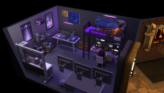

leo's room; had to keep from gagging as i made it...you can almost smell the gym musk 🤢🤢 (im kidding 😭 ....mostly). also the lighting is sposed to be red, but i kept getting his and raph's rooms mixed up while playing so i color-coded all of them instead :)
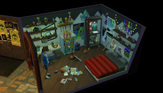

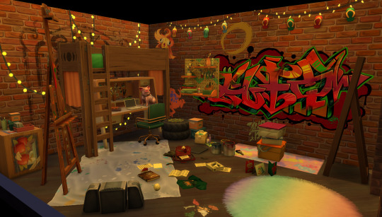
best boy mikey's room!!! it looks like a tornado came through it and we love that for him 🧡 unfortunately could not find a hammock bed, but there was a very cute bunk bed with the perfect colors for him ehehe

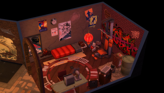
raph's room; could not find a whole lot of refs for it in the show?? had to improvise basically half of it. and can you believe this game doesn't have a weight lifting bench???

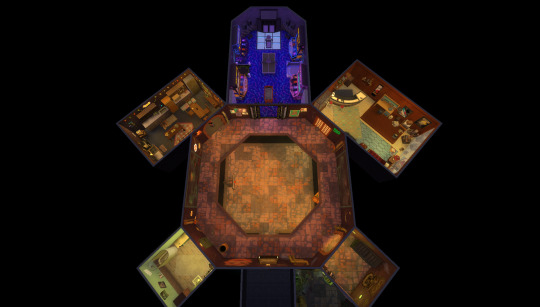
second floor! ignore the fucked up little hallway, i just wanted to keep the layout (relatively) accurate while still making the map playable 😭 the dark room was the gnome room, but i might have sold all of the gnomes 🤔

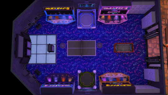
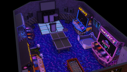
arcade; the flooring is inaccurate, but they added it in the new update and it just looked so fun
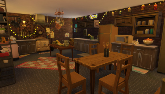
kitchen; one of my favorites! i wish i had this many string lights in my house irl..



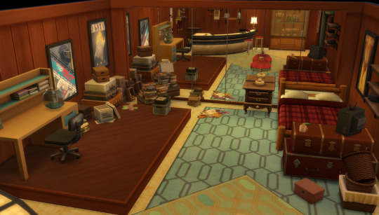
splinter's room (it's honestly so barren in the show, i had to improvise a lot 😭)

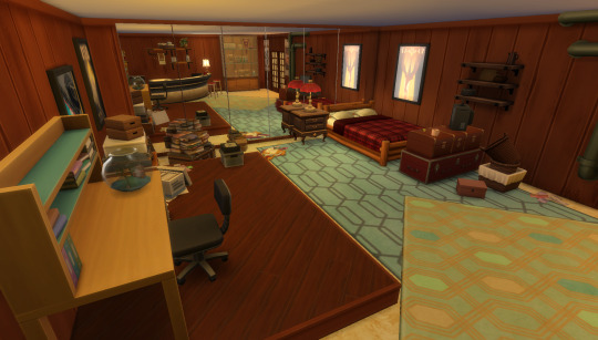
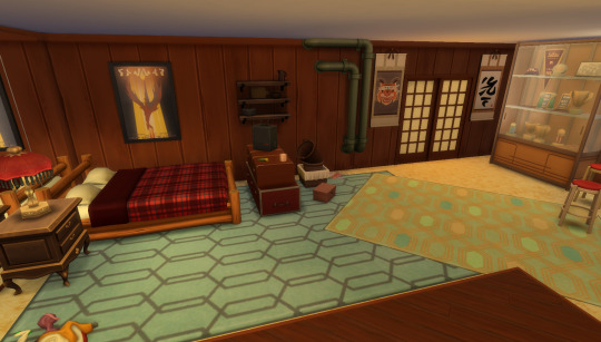
third floor....is very much unfinished so i won't share as many screenshots 😭
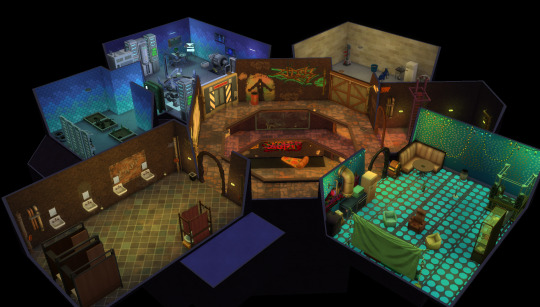
projector room; it's super barren, i still need to decorate the walls and i've just been dumping random hobby-related furniture in here, but i'm still sharing cuz i'm really happy i was able to get the colors, lighting, and floor as close as i did 😊 (SO lucky i found those rugs lol)


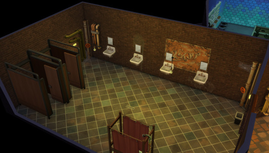
aaaaand everybody's least favorite bathroom! from the piebald episode lol. it's so goddamn ugly, but tragically it's the only finished room on this floor 😔
donnie's lab and the garage are hardly accurate to the show (afaik this game does not have a giant tank, or even cars, to just park inside your sims' house), so i've mostly been using them to dump hobby/needs-related furniture like donnie's science stuff and kitchen appliances. i'll get to finishing them eventually 😭
i'm happy with how it's turned out so far, though! their whole house is so colorful and full of personality and it's been super fun to both make and play on in this game 🥺
335 notes
·
View notes
Text
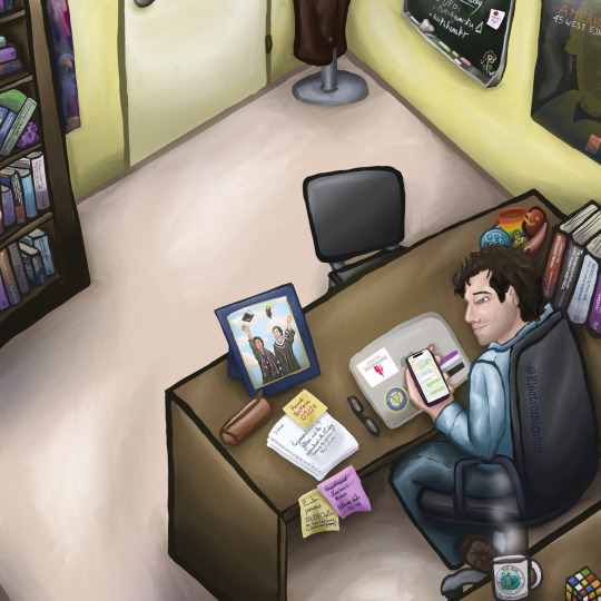
Bridgewater fanart again! (Jeremy Bradshaw in his office)
This is my biggest biggest fanart I’ve ever done so far and let me just say that I’m super proud of it!! There are a lot of details once again 👀 (kudos if you can see the references!)
This is a fanart totally dedicated to @thelaurenshippen , thank you so much for your support on my fanarts, it truly means the world to me, and it isn’t much but it is my way to thank you, as you said that you had a new headcanon as you reblogged my Jeremy sleeping fanart “also: new headcanon I now have vipin started TAing for Jeremy when he was still in undergrad so Jeremy also has one photo of the two of them at Vipin's graduation in his office” so I had to do this: Jeremy’s office where there is a picture of the two at Vipin’s graduation!
Once again as the details are detailing and the headcanon is headcanoning, I’m putting some further explanation after the read more! (And also I’ll tell the refs if you don’t want to search for too long 😭)
It took me 19 hours (I’m slow don’t judge me too much and this is not counting the frame on Jeremy’s desk 😭) so let me just say that a LOT of thoughts went through that little (big?) piece.
First of all as you saw, there is Vipin’s graduation pic on Jeremy’s desk, so here’s a further explanation of it under the post of the art itself (in case you want to see it in a bigger way too)
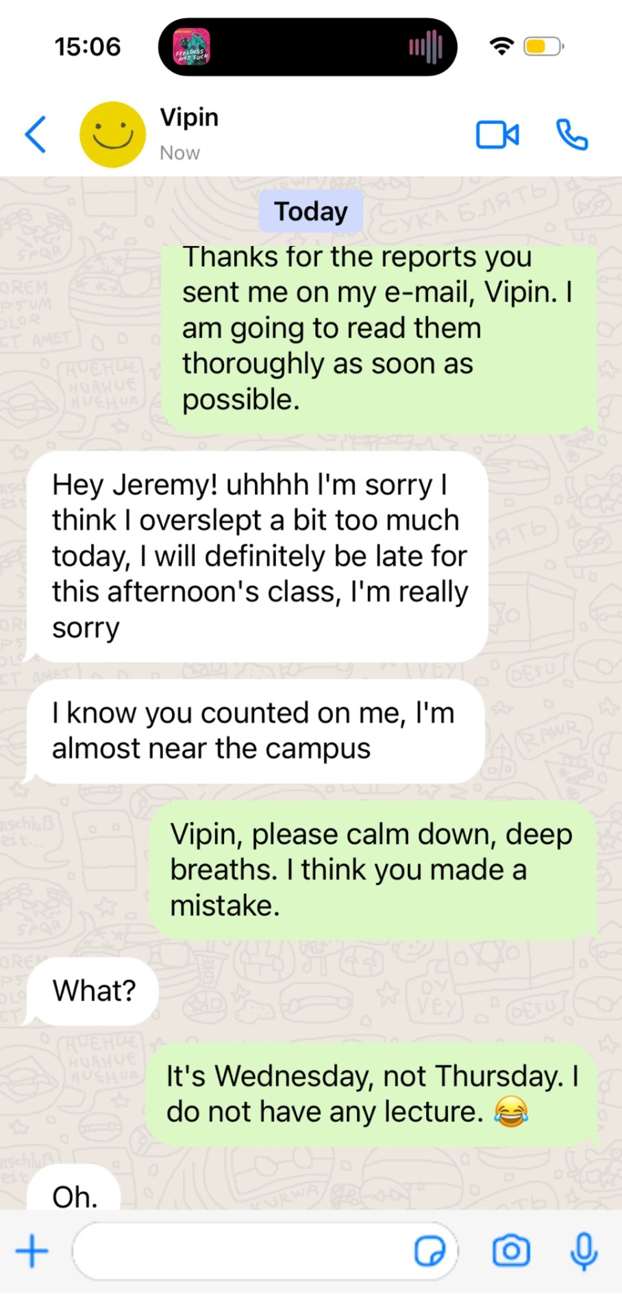
Then, for the phone’s screen, I did a fake conversation between Vipin and Jeremy which I think totally happened at some point. And here is the real screenshot of it because I don’t think you can see well what is written on the fanart unfortunately. (I also put a little reference to the album “Feelings and Such” by Louden Swain in it which is what Jeremy is supposed to listen to, I gotta say the main reason is because it’s my fave album and group but I would totally see Jeremy listening to that kind of music from time to time, I see him listening to “There’s the Rub” from that album)
Then comes his computer: it is truly the logo of the Bridgewater State University, the sticker from the real merch of the Bridgewater podcast, and the ace flag (because Jeremy Bradshaw being on the ace spec soothes my soul)! It’s my headcanon about Jeremy’s computer, it’s the third time I’ve drawn his pc, and the stickers stay the same no matter what and it’ll stay this way jsksksk
There is little basket of stim toys on his desk too and that’s totally my headcanon: I see Jeremy as a really caring professor, and to me he would have it in his office for the stressed out students coming to see him so they can feel better, or at least his students know he has some to lend! (And I’m nd, I would love to have a professor like that 😭) (thanks for a moot on Twitter for the slinky idea!!)
For the sticky notes on the desk: the one on the papers states “read before 03/24” which is the date the last episode of S2 aired, the pink one “proofread Lauren’s thesis defense date 08/06” Lauren is a direct nod to Lauren Shippen, and the date corresponds to the first airing date of the two first eps of S1 of Bridgewater.
The sticky note it “printer password BSU1976JyBw PS: Vipin I do have a limited amount of copies!” because I thought that printers in the uni might have password deferring from each profs (at least it was like this in my French highschool — as a reminder, I’m from France so it’s really me trying to find stuff on the internet), so BSU = Bridgewater State University, 1976 being Jeremy’s birth year (at least I tried to calculate it and it was 1976? Hopefully I’m right 😭✋ as the show aired in 2021 I tried to assume that 2021 was also the date in the podcast and as Jeremy is 45 during S1 welp), and JyBw is just the first and last letter of his first and last name. Comes my headcanon: at some point Jeremy couldn’t print anything because Vipin had printed too many stuff, hence the little reminder because Jeremy doesn’t want to beg to have more copies 😭
The research paper Jeremy has to read before 03/24 has been written by a certain “J.Novak”! (Totally a Supernatural reference) And when it comes to SPN refs, it’s much more subtle, but I did the same soles for Jeremy’s shoes as Castiel in the episode The End of spn (because the shoes are quite famous for being also identical to the one Dean wears so it was funny and on a funfact Jeremy’s legs and feet posture is bc I saw Misha sit like this so I thought it was fun (I also sit like that so it made me happy))
Behind Jeremy there’s an undone Rubik’s Cube, because I totally see it as Jeremy’s very own stim toy but the catch is that he doesn’t know how to solve it 😭 (thanks another moot for the idea @stillwinchester ily!!).
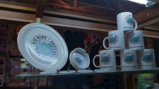
There’s also a mug, because our man needs to stay concentrated (tea? coffee? Your thoughts, to me Jeremy is more of a tea guy), this is a reference to the X-Files! Big Blue is txf’s Nessie, and the mug is a literal copy of the “real” merch mug you can see in “Quagmire” (3x22 of the X-Files)
For the posters on the walls, the one behind the bookshelves was the main art of an exhibition which occurred “Supernatural America: The Paranormal in American Art” and I’m persuaded that Jeremy would have gone to see that! And he would have loved to keep something from it! (But he ended up having to put his shelf in front of it because he had to put his books somewhere and maybe it creeped out his colleagues and students, here’s a picture of the original painting)

Agatha Wojciechowsky (American, born Germany, 1896–1986), and Spirits. Untitled, 1963. Watercolor and crayon on paper. 11 3/4 × 8 7/8 in. Courtesy the collection of Steven Day, New York, NY. Photo: Steven Day
And for the one near his desk, it is an old poster from the American Folk Art Museum, and to me Jeremy would totally be a museum guy, it’s very “academic” after all, plus he would be interested into it as it’s more around people and self taught people and so on, as he is very interested into anthropology, it goes well with the whole vibe.
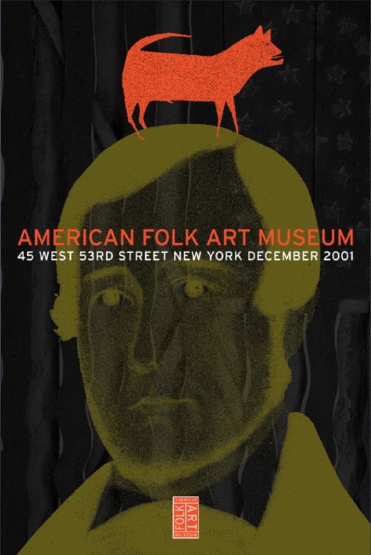
https://pirtledesign.com/portfolio/american-folk-art-museum/
For the blackboard, the titles are basically what he is teaching in his lecture in S1 EP01 so to me it would be his way to see more what he has to work on for his students (and I think he fidgets his chalks in his lecture because in the same ep as he speaks you can truly hear a lot of chalk sounds which weren’t due to him writing so I understood it that way?), and there’s a little magnet with a “buy cat food!” because headcanon to me but Jeremy owns a cat (a black cat you can see him on his lockscreen on my drawing of Jeremy sleeping) but as he spends a lot of the time at the BSU, I think he would put reminders just in case 😭 (and there’s a little flower drawing made by Vipin! to me he would doodle little stuff from time to time with little smileys to brighten up Jeremy’s day a little)
Then in the bookshelves you can see a little purple owl! It’s to me, an amethyst carved one, as Jeremy had had his esoteric era when he was younger (it was said in S2 that he tried to be Wiccan) he must still have some stone knowledge and as amethyst is supposed to have soothing and good vibes properties, he might have taken this although he doesn’t believe in it anymore, and of course he picked it because it was an owl because it’s better now to laugh about the owl situation 😭
Lastly: all the books are real books! It took me some time but all of these exist, it’s mainly anthropology book, faculty/uni book, research stuff, and there are two books about the Bridgewater triangle! I tried to keep it around Jeremy’s field of course so it’s the occult, witchcraft, the Salem trials, UFOs, beliefs and all!
Thank you so much if you’ve read this far and I’m very grateful for all your support, it truly means the world to me and Bridgewater is very very close and dear to my heart, lots of love to you all! And thanks for bearing with me through my ideas and headcanons 💜🫶
#bridgewater fanart#bridgewater podcast#Jeremy Bradshaw#vipin khurana#jeremy bradshaw fanart#Bridgewater#fanart#artwork#digital art#it took me way too long#I love them so much#headcanons#hcs#Misha Collins fanart#supernatural reference#the x files reference#details are detailing#too many details#bridgies#Vipin and Jeremy are besties#I want Jeremy Bradshaw as my professor#drawing#fanwork
34 notes
·
View notes
Note
hi!!! i was wondering if you could do a tutorial for how you draw transformers? i can never simplify them like you can. do you have any tips?? also love your art sm <33
hi ヾ(•ω•`)o
I WILL TRY MY best to explain what i do… i don’t actually have a very structured system but this is vaguely how i got started and how i simplified the process
1. look up and compile a whole bunch of references
this will be useful for EVERYTHING– transfomos come with lots of shapes and gizmos and details and stuff so a variety of references from different angles and in different poses is really useful because you can see the shapes they’re made out of and also understand how everything connects with each other
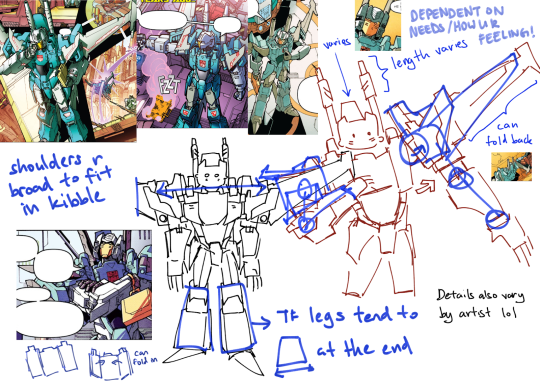
trapezoid town! this is a mess but it’s a quick example of how by looking at everything you start to notice trends or details like what moves with what or how flexible some parts are
there are a whole bunch of resources very nice people have compiled on the web like here here here here and here (mainly MTMTE) and there is a discord server (this is a link to a tumblr post about it and not the invite link itself) for it too but you can always look through the source material and just start screenshotting and pasting shit into a folder.
you don’t have to do humongous in-depth breakdowns if you just want to be able to quickly doodle robots (god knows i don’t!!) but having the references on-hand makes it easier for the times when you’re like This pose is going to be challenging and I’m not sure how all of the cuboids will be positioned.
references also help break you out of thinking of it as just drawing blockier humans because the proportions and shapes vary a looooooot
2. draw draw draw
at first i drew a lot using refs heavily to get an idea of the shapes then i got lazy and just started drawing anime girls and smacking rectangles and kibble on top BUT as you draw more and more you start to pick up on the Salient Features as well as their General Silhouette.
drawing from memory means that what makes them look recognisable will become more emphasised in your mind so you’ll naturally pick up on how you can simplify them without losing what makes your guy Look Like Your Guy. so if you want to simplify the robots just be incredibly lazy like me B)
i'm kind of horrible because i don't even do like Basic Shapes i literally just eyeball it
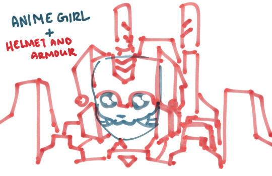
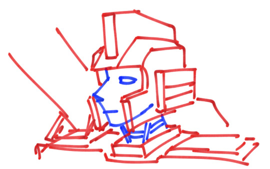
for poses i rectangle it out while thinking really hard
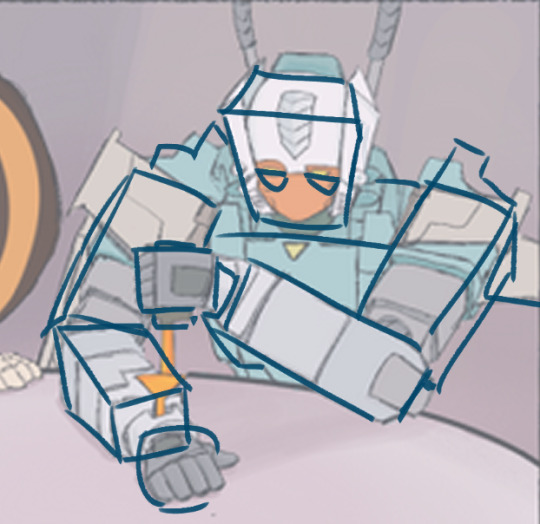
anyway when i first tried to draw transformers but Something Didn’t Look Right it was either a) the level of detail across the entire drawing was inconsistent and threw it off balance or b) proportions weren’t right and these things only got better with me finangling and doodling and learning by iteration.
of course sometimes i don’t give a fuck because no cops in transformers doodle land but yeahhhh i’m the kind of guy who only gets through stuff by throwing a lot of rocks at it. i don’t have a Method to offer you unfortunately but what i did do was
3. experiment and exaggerate and experiment!!
The First Rule of Gun Safety is to Have Fun and Be Yourself! i took a lot of liberties and rarely stayed on-model when i doodled and waffled around (and i still do…) but it helped me figure out how much i was willing to draw lol and consequently how i would stylise them.
i would play with how big or small or exaggerated or expressive they'd be… even my most detailed drawings are nowhere near comic-detail but my least detailed ones were. turquoise triangle that’s vaguely brainstorm-shaped. having fun with it and just doing it to make stupid jokes makes the practice seem like not practice.
so yeah tl;dr i started by reffing what bots actually look like, would trace comic panels to get an idea of the shapes and details and then start drawing side-by-side → drew billions of perceptors from my diseased mind and played around with lines → ??? → upgraded from goofy-looking rectangles to goofy-looking rectangles
that’s it for advice! (i don’t feel qualified to say that much)
below are just examples of stupid doodles i’d make on my ipad in class or in the margins of assignments lol, you can tell the last one is from when i still didn't understand brainstorm's build very well because the wings are placed wrongly... But i grew.
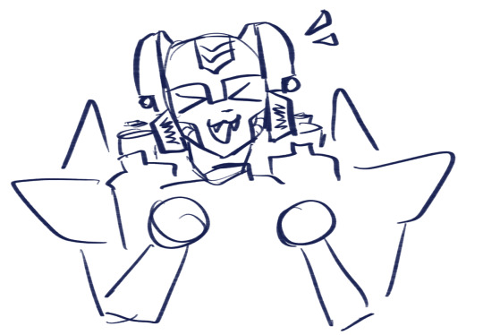
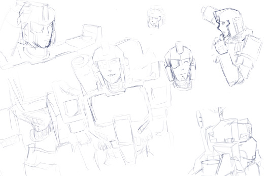
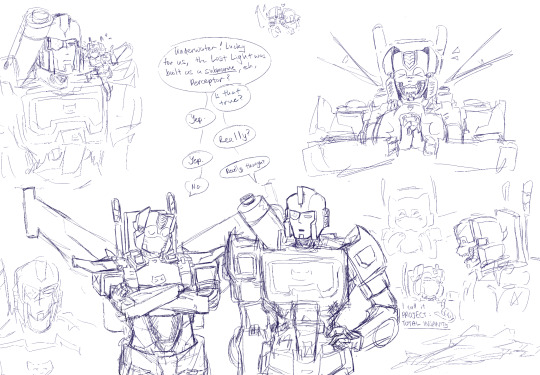
hope this was somewhat helpful! there are other tutorials from other artists that i can direct you to but this is how toyotacorolla2008 got to shitposting on tumblr dot com
#anonymous#ask#thanks for liking my art and thank you for this ask!#If you wanted me to talk about something that i did not touch on imma sowwy.. you can send another ask and i will respond and go deeper#i typed up this post really fast so i hope its coherent#local blogger too Freaken busy with school to draw detail#going to class like Im ready for my hard days work of drawing cuboids stealthily#bonposting
11 notes
·
View notes
Note
Tell me why I didn't make a more recent folder backup than March 10th for my SSD with all my Sims saves and mods to die on me randomly overnight about 12 days ago and only yesterday did I get a new drive.
Am I really gonna spend hundreds to recover data from it? Yes. Yes I am. Am I gonna figure out a system to automatically backup that folder every fucking night afterwards? Yes. March 10th isn't terrible but it also is. Telling you as who else is gonna understand this plight lmao. Explaining the importance of this on the phone to some guy working at a company for data recovery was something else. Yes Sims saves and mods and screenshots are that important to me. Why is my most recent screenshot in my backups of Alex and Jack fucking, why. I'm sorry data recovery people you're gonna see my Sims fucking 100 ways to Sunday. I guess I have excuses to write and work on art in the meantime. I seem to have Sims 2 and 3 and Castaway Stories backups that are up to date as I haven't played those in while but I have to reinstall them all again and I am so sick of setting up my graphics card in 20 different text files for every Sims 3 pack man. Maybe in half a year when I get bored enough.
Relevantly I've probably said this before as I repeat myself a lot but I use Sims builds for story references so much, I usually try to imagine a baseline in my head first and then build something based on it and fully flesh it out so I can better imagine rooms and shit in writing in something rigid versus it always shifting around based on fuzzy memory. Plus it gives me an excuse to use all the super specific CC I've made. It's even made good art refs as I am fucking terrible at architecture and perspective.
My guy I would choose DEATH before letting ANYBODY see my jalex sims fucking you are braver than any US marine fr
Like I started reading this like “dude I set up my apocalyptic save file the day before the last patch update so I feel you” but your WHOLE DRIVE??? I’d die. I’d start fresh. I am never getting that save back and that’s unfortunate but I will fr die before I let any tech people see my sims save
Tbf I start new saves all the time so like not as big a deal to me, but I also just,,, don’t hold onto my screenshots
Like I’m deleting that folder every three days because there’s no way in hell it’s getting seen
That and I take a lot of accidental screenshots
As for builds, there’s probably been a sims 4 build for every single building, house, apartment, dorm, or motel room for every fic I’ve ever written INCLUDING oneshots
My attention span is negative two so I will start a build, get an idea for another build and leave the first build unfinished until I get bored with the next three builds and that is entirely reflected in my writing as well
#I fr hope you get your save back#all those mods 💀💀💀💀#I have a long running save file now which is CRAZY but all I really had to do was let my game become a little unhinged#rip sim Travis Barker you would’ve loved the sims 4 bands pack were never gonna get#I want a bands pack for the sims 4 SO FUCKING BAD#they’re gonna do bands so dirty and it’ll NEVER WORK#but I need drums in my sims four game#it’s not a want it’s a need#neon answers#lightning plays the sims
0 notes
Note
FERENGI MILF 👀👀👀👀👀👀👀 do u have any art refs for her
I don’t unfortunately </3 </3, im super bad at art, so most of my refs are... screenshots
But she really just is knife cat emoji. She makes a profit by putting some of the stipend her husband gives her in an off world bank and letting it gain interest. Her husband is a big idiot sweetheart and they have one infant son
6 notes
·
View notes
Note
THE OFFICIAL DBD STORE SELLS A HUNTRESS (and shirtless david) BODY PILLOW AND IM 👀👀👀👀👀👀👌👌👌👌

Keep ‘em comin’ lads
(Haha. I do gotta say tho Anon, if you want a body pillow for DbD, please consider getting a custom one instead. I think you’d actually like it much better! The rest was meant to be under a cut but tumblr is the dumbest shit site coding wise & I made this on mobile, which will not allow you to add read mores anymore. In past this has been no problem bc I can just save as a draft & edit + post on my laptop or edit the second I post & throw in a read-more but apparently now if you make a post on mobile you can never edit it in desktop again. : ) I love that. So fucking much! But this is going to be long now & I physically cannot fix that bc it also won’t let me swap it to html now it’s posted : ) : ) : ) fuck this site : ) —anyway! On a brighter note, here’s my pitch:
Okay! So to start.
First up. Let’s look at what the devs are offering you.

Here are the official body pillows. Now, these aren’t the worst pictures of Anna and David I’ve ever seen, but they’re not great. David’s in his default queue pose, I got no idea wtf Anna’s doing, and neither of them have interesting, good, or attractive poses, lighting, expressions, or detail. Considering this is decently funded company with multiple artists on staff and full body 3D adjustable rendered models of Anna & David on every computer there, it’s lazy as hell. It’s not even as good art as their official sketches or character renders or promo art. They know how to do the work:

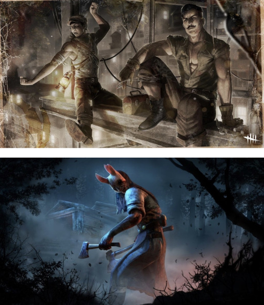
They’re just being lazy.
Okay, though, but you really want a body pillow, so what to do? Well, maybe it’ll be cheap enough you don’t care about the quality too much. So, how much will this cost you? For me to ship to myself in the us with the cheapest shipping option, Anna would cost me $80.

Okay, so. That sucks. But you really want this and what else can you do? There’s nothing else to pick.
OH WAIT. Yes there is! So here’s some actually good news for ya 💪
If you want a custom body pillow, you have two options: 1, buy a custom pillow case and a pillow separately, or 2, buy a custom pillow with the image on the pillow print itself. Now, you can get the second option, but it is exponentially more expensive. I’ve seen maybe 60something-70 as the cheapest option for this, although I didn’t spend a ton of time looking. Still, if you want to go full hog, it’s possible. If you don’t mind a pillowcase/the cheaper option, though, (and many pillow cases are custom to the exact specified pillow size and aren’t really noticeable at all), it’s a good deal. For example: A body pillow can be bought at many stores for about 15 bucks. There is some variance in pricing for size, shape, and material, but here I’d like to add the official DbD site doesn’t even list dimensions for their body pillow, let alone material. So, for me to get what I want if I wanted this, I could buy a $15 pillow at a store, and then a pillowcase from a place that I could get it custom made & delivered, IE price + shipping is $30 from here https://www.etsy.com/listing/653983430/custom-21-x-60-zipper-body-pillowcase?ga_order=most_relevant&ga_search_type=all&ga_view_type=gallery&ga_search_query=custom+body+pillow&ref=sr_gallery-1-1&bes=1
So we’re at about $45 right now. (eBay offers cheaper custom pillowcase options but I didn’t want to try to vet sellers for quality & reliability making this post & this is a good price).
This leaves about $35 to commission an artist for something to put on the pillow case. Now, price for commission varies greatly from artist to artist, and full body is the most expensive base option for a single subject, but there’s definitely people offering really freaking incredible commissions at this price, and sometimes even lower. Even though their art should really be worth more than that. Unfortunately, we artists gotta eat. And a lot of the people who buy commissions are also young adults who gotta eat and don’t have a ton of cash. 🤷🏻♀️ So there’s a lot of people who’d be genuinely very happy to be paid for that commission even though it kinda sucks we be there. And if you want to commission someone more expensive, sure you’ll be spending more on the body pillow than DbD officials $80ish. But uh. Would you rather give the same devs who picked the most racist Claudette design they could put into the game for the most recent costume contest $80 for one of these:

Or
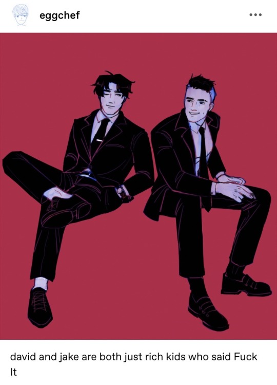
Spend $37 for a David of @eggchef ‘s lookin this kinda fine:
https://eggchef.tumblr.com/post/190185302972/david-and-jake-are-both-just-rich-kids-who-said
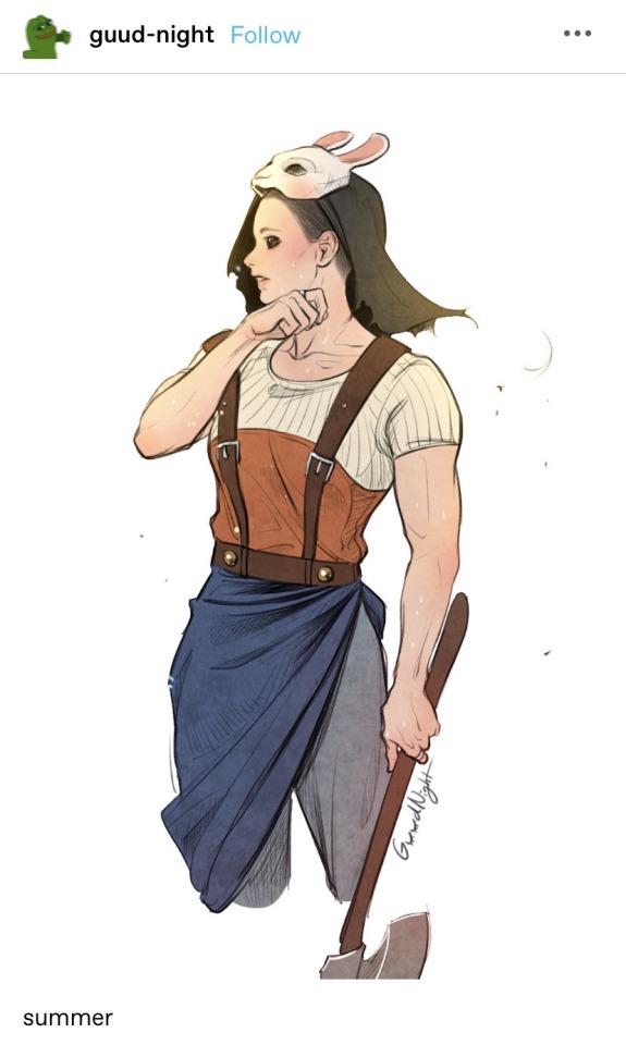
$40 for a full body Anna of @guud-night ‘s in the style they did this: https://guud-night.tumblr.com/post/185148722468/summer
Or $42 for a full body Anna like this one by @sleazy-art https://sleazy-art.tumblr.com/post/169548091038

or $70 for a full body of @guud-night ‘s in the style of this Anna seen here https://guud-night.tumblr.com/post/165476621798/the-huntress

The fan artists do better work—I mean think of how amazing a pillow could look if your heart cries for one. Vs the low-grade renders the devs be offering. They do so much better it’s like a “Look at your body pillow. Now look at the body pillow the devs told you not to worry about” meme it truly is. TBH, you could screenshot a DbD store screen with Anna or David, edit out the BG in photoshop, and already have a better 3D image than the official offering. 😂 And with an artist? 👌 Mmmmm. Anyway, haha. There was my in-depth pitch to buy from fans instead of official. I was just very motivated to *Robin Williams Genie voice* Illuminate the possibilities! I hope it may have given you inspiration for something even more beautiful than what you thought your heart desired :’-)
#ask#anonymous#dead by daylight#i was gonna just link to posts but auto image for that kept being torsos so i screenshotted blogs including poster/description#& put that with the link each time. so#visual references of artist works are clearly screenshots of the blog in question instead of just the art itself & are lower quality#screenshots. also linked to post in question each time. however! if you dont want the screenshot up in this ask answer or do not want to be#tagged in it @ the three artists i tagged. just message me & as soon as i see the messgae ill take it down#you were all good artists whose commision info id seen/remembered & had David/Anna art up so i wanted to toss the lead your way if anon be#on the prowl for some good ass art commissions#body pillows w charcaters on them actually scare me lol#but i know theyre wildly popular so I guess thats a minority take haha#anon i saw this ask at like 4 am and it was the funniest possible thjng to see at 4am thank you#long post
7 notes
·
View notes
Text
Fallout 4: Nuka-World DLC
youtube
Nuka-World trailer featuring DLC cover art by John Gravato.
It has been a while since I have had the time to post and I wanted to get something up about Nuka-World. Rather than hit all of the details in a bunch of smaller Nuka-World posts I decided I would cover as much as I could in one overview post. While re-watching the trailer recently, I was reminded of just how many different aspects of that DLC I got to work on as the art lead. Highlighting my work from the trailer felt like a good way to run through my efforts, so take a look at the trailer linked above and then read on below.
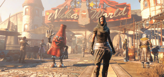
Nuka-World screenshot I created for marketing.
My general responsibilities began with creating the pitch for the DLC. The two design leads, Justin Schram and Alan Nanes, and I started developing a series of ideas for the DLC. After one false start, we came in with a stack of new ideas as one-sheets and started the pitch meeting with what was then called “Raiders and Rides” as a working title. Todd accepted it before even hearing the other ones. I was very happy about this as it was my favorite pitch of the group.
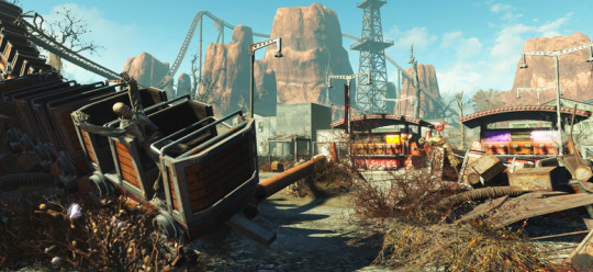
Nuka-World screenshot I created for marketing.
As the art lead for the project I was responsible for overseeing all things art-related; art direction, pipeline, etc. Since this was a DLC for Fallout 4, much of the core art direction was established by Istvan Pele, the art director on the base game. My job for the DLC was to create a reason for players to want to come back to the game for more. I also wanted to test some of my ideas for improvements to the pipelines and the smaller scale of a DLC was a great place for that. More than anything I wanted to use my additional influence on the DLC to give the players loads of memorable fun and value for their money.
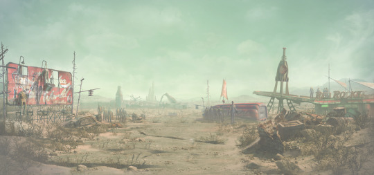
My Nuka-World key art based on the original Fallout 4 key art.
One of the first things I did once the plan was greenlit was to create the key art. I used it in all of my slides for internal and external presentations and to set the initial tone and pillars of the DLC for the team. More detailed post on the key art here.

My original Bottle & Cappy slide art turned into Nuka-World coffee mug art.
A key contrast built into the DLC from the start was the mix of horrible, violent, raider gangs with the fun, lighthearted, theme park. To add that contrast into my slides I created a closing slide featuring who I imagined the park mascots to be. Bottle & Cappy were born as a way to incorporate a fun note as my closing slide. As the DLC progressed it became clear we needed to use them in the park and then in the marketing. Post DLC they have joined the permanent Fallout lore in other titles and in merchandising.

Nuka-World screenshot I created for marketing.
As the first artist on the project, I started by sketching key broad strokes of the DLC into the engine to guide the art team toward my vision. I added in the first-pass landscape and weather to get the environment feeling like I wanted. Then I started blocking in key landmarks of the park in grey boxed art to get the layout started. I added sub leads for the park environment art (Jason Muck) and the landscape (Andrew Barron). To help build enough new geometry to fill the park, I prototyped some park assets using the color remapping I developed for the base game. This workflow would allow faster park asset creation allowing us to build a larger environment with a smaller team.

Nuka-World screenshot I created for marketing.
Once the environment team was going I shifted focus to characters, creatures, and weapons. I knew they going to take much more hands-on work from me duse to the small team size. We had one character artist (Charles Kim) and one weapon artist (Dane Olds) in house. Concept art and the bulk of the non-environment art was planned to be outsourced. Raiders were the main focus for the DLC and I knew they would take up the majority of the resources. Inspite of that limitation I also wanted to get the players as many new creatures as I could. I came up with a list of easy but dramatic creature ideas to test to maximize reuse but feel new to the player. I did fast "proof of concept" tests for each idea to determine which ideas would work in-game. I repeated this same pattern to fill out the weapon list with cheap and fun additions at a minimal cost.

Nuka-World screenshot I created for marketing.
The raider gangs were the main feature of the DLC but due to the volume of work they required, and our lack of staff in those departments, the decision was made to outsource all of the raider concepts and the models. I knew outsourcing the concepts was going to be tricky since the outsourcing group was in China but I had no other option. I supplied lots of ref and photo bashed some quick collages to get something for them to start with besides a written description. This method yielded a few good designs but nothing good enough to move forward with alone. Luckily for me, John Gravato (concept artist) stepped up and took on wrangling some of the design revisions and additions in his spare time. Ray Leder (concept artist) also knocked out a few additional helmet designs. Leveraging their stellar support and iterating with the team in China I was able to arrive at the armor sets that defined the three raider gangs and could combine for massive variety for the player.
youtube
My trailer directorial debut: the Nuka-World E3 teaser.
For this DLC, in particular, Todd's plan for us was to market it like a full game. This meant we would work with marketing on screens, a teaser, a trailer, a theme song, a Bottle & Cappy trailer (similar to the SPECIAL videos for the base game), and a physical park map. The Bottle & Cappy trailer was handled by an outside vendor which took most of the load off of us except for lite direction and feedback. The rest was up to myself and a handful of people on the team. Animator Neal Thibodeaux did a lot of the heavy lifting on both the teaser and the trailer which were both made in the engine. Artist Natalia Smirnova created the logos and artwork for the map and we worked very hard to make it accurate to the park and have that authentic theme park map feel. Not only were we going to use it to guide people around the park in-game, we were also putting a physical version in Game Stop as a preorder bonus.
youtube
Bottle & Cappy trailer.

Nuka-World park map pre-order bonus.
One of the things that got me the leadership role on the DLC was my history of adding all kinds of content to the game in addition to my role as a VFX artist. I don't like it when a good idea dies from a lack of resource time. Over the years I have learned all of the workflows in our engine to find clever ways to make my ideas come to life without additional help. This often includes sourcing existing art for kitbashing new work from in order to save time. Unfortunately, this is the kind of work that has often proven hard to teach and or delegate. Having the lead role allowed me to incorporate it more than ever before into our pipelines, but throughout the DLC I still had to do a lot of the work myself.
Below is a breakdown of all of my work in the trailer which turns out to be a good cross-section of all of the additional things I did on the DLC.

00:02 Direction and feedback for outsourced Bottle & Cappy video.

00:15 Unique models and editor setup for Nukatron. Flipbook port of B&C video for in-game Nukatron and Nuka-Cola machines.

00:20 Water VFX for the landscape. Art direction for the five themed areas of the park.

00:23 Ported mannequin models to animatronics and animated them. Created all Nuka-World mannequin outfits as texture swaps or new meshes.

00:24 Set dressed and captured trailer footage in-game.
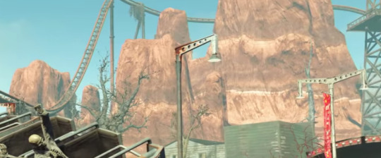
00:26 Developed efficient color remapping pipeline (CRP) for the fast creation of park assets. I built fake western mountain rocks for themed park area.
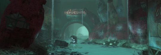
00:28 Created a quantum variant for all 6 Mirelurk creature types. Created the water and VFX for the Quantum river.

00:30 Concepted and built the armor for Porter Gage the main companion for the DLC. Modeled and posed Bottle& Cappy park sculptures (using CRP). Built the Fizztop Mountain asset for the main landmark for the park (using CRP).
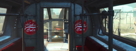
00:40 Technical assistance on execution of the intro train ride.
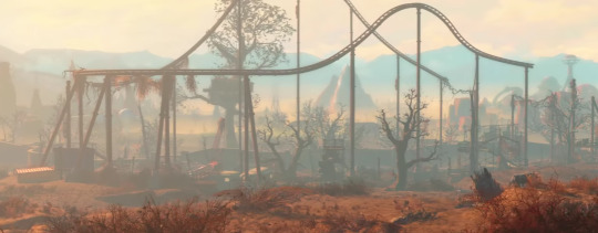
00:42 Created park color guide and prototype weathers for DLC color direction.
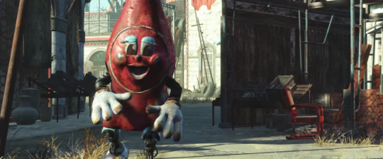
00:43 Concepted and built Nuka bottle Protectron (using CRP).

00:45 Art direction for park map and then execution of in-game navigation via map kiosks.
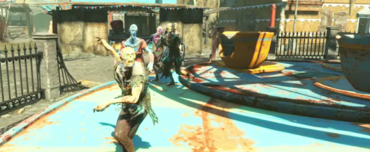
00:48 Created all of the painted feral ghoul DLC variants.

00:51 Created the Gatorclaw death claw variant model. Created a Nuka-World specific lunch box player prize system from my lunch box system in the base game.

00:52 Created the Brhamaliff models. Planned a high-level melee tree with art assets to supplement a limitation of the base game.

00:56 Created the unique robot meshes for Nuka Spray Mr. Handy
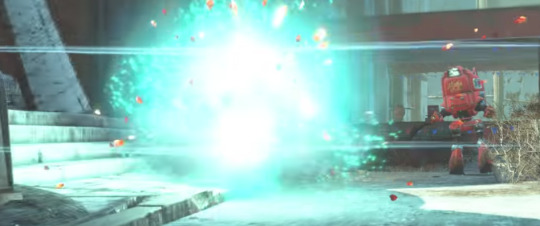
00:57 Designed the damage structure for weaponized Nuka-Cola flavors.
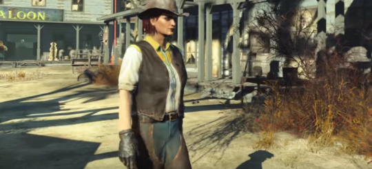
00:58 Created all of the western clothing meshes.

01:00 Prototyped the original sandworm concept in-game to test viability. Created the Sandworm VFX. Trained the character artist in kitbash modeling to add Acid Soaker. Created all of the VFX for the acid soaker.

01:03 Art directed the raider factions. Designed all clothing as armor/under armor for maximum mix and match. Cleaned up all outsourced outfit meshes for maximum compatibility within the armor system.

01:04 Created all texture variants for raider underclothes. Brought the slave collar from Fallout 3 and rebuilt for Nuka-World with power on/off functionality.

01:07 Added motion to some Bottle & Cappy statues.

01:09 Designed trash pile loot system to add the feel of overflowing trash at a theme park and add a new loot system to the park.
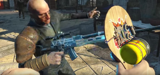
01:13 Concept and design for paddleball weapons and mods. (see other post)
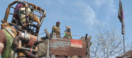
01:18 Art direction for raider gangs.

01:19 Ported alien mesh to animatronic enemy for the park. Revised the Fallout 3 alien blaster as playable weapon (not shipped).
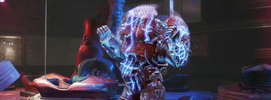
01:20 Built the Overboss bumper car power armor. Worked with design to create the plan for the opening boss fight with squirt gun mechanic (see other post). Built all of the electric VFX for the boss fight.
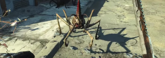
01:21 Original concept for spider cricket hopper enemy.
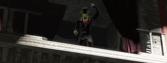
01:17 Tuxedo mesh for Kiddie Kingdom boss ghoul.
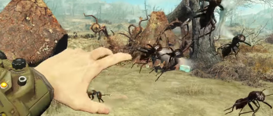
01:23 Flying swarm as a single enemy proof of concept. All ant variant meshes.

01:28 Shot this shot setup and set dressing for the teaser.

01:33 Original Bottle & Cappy idea and concept painting.
#fallout 4#fallout4#nuka cola#nukaworld#nuka world#nuka#BethesdaGameStudios#artdirection#concept art#proof of concept#dlc#Skyrim#fallout
12 notes
·
View notes
Text
Butterfly Soup Asks, batch 10
More under the cut, including Diya dog questions, Akarsha’s hair length, and more!

She loves them all, this changes depending on her mood. One of her favorites is Samoyeds (the breed she uses as her chat avatar) because they’re large and fluffy.

Yes! Many more


It’s surprisingly long -- it goes down about halfway between her shoulders and elbow. It looks like less than it really is in buns because she has pretty fine hair compared to other characters like Diya.

Despite not being as book smart as Noelle or Akarsha, Diya is enrolled in all honors classes and has to try extra hard to keep up sometimes. So both times we see Diya wake up in the game, she’s fallen asleep studying.
If it makes people feel better, it’s pretty rare that Diya has to do this! She does sleep in her bed most of the time.

I’m alright with it. If it makes people happy and it doesn’t hurt anyone, it’s cool


Min is only attracted to girls, so that makes her a nonbinary lesbian.
Diya self-identifies as lesbian, but she’s only ever been in love with Min, who’s actually nonbinary. I’m not sure how to label her (maybe pan?) -- It’s hard to say with a sample size of literally 1
The rest I’d like to keep a secret for now, sorry! I don’t want to spoil the entire sequel before I’ve even made it

This’ll be touched on a bit in the sequel!

Ooh I love that...I have an idea of what everyone sounds like in my head, but I don’t have any actual voice refs!

I actually feel like I haven’t seen enough movies to give the best answer to this??!?? Classic Gamer problems...
Diya: Harry Potter and the Sorceror’s Stone/some dog movie
Min: Fight Club
Noelle: probably a particularly educational documentary
Akarsha: an anime movie I bet

Akarsha: Shortstop. This position has to field many balls, which gives Akarsha many opportunities to mess up and invent new excuses. Noelle: Right fielder. Chryssa and Liz put her there in hopes that since most people are right-handed, few will hit the ball out there -- so if all goes well, her lack of skill is hidden and she’s just standing there doing nothing for most of the game.

Misc. fun fact: I actually wanted a scene set at Chinese school in the story, but couldn’t figure out how to work it in. That’s a problem for future Brianna...

This is true! .........I, personally, have started tagging them on my blog as ppkm for “Pee Pee Ketchup Man” but I realize this is a lot harder to remember than Noesha or Akano! Please feel free to use whatever makes sense to you!

Yeah! I gain followers on Tumblr pretty consistently, but Twitter popularity has always eluded and mystified me. I’m actually a bit nervous about tweeting normally now that I have more?? We’ll see how this goes

Almost everything! I used to be addicted to Hearthstone but then transitioned to being addicted to Overwatch (Winston main). My favorite game of 2017 so far is Nier:Automata, I really want to draw fanart of it soon! Also, I love rhythm games and puzzle games! I also like Telltale-style adventure games and narrative-heavy games in general like Ace Attorney, Persona, etc. I tend not to play games that pander to straight white guys, though. It’s like as soon as they target straight white guys, they shift to the most bland art style and most boring stories in the world.
For example, I didn’t know what PUBG was and had to google it, and even after looking at the brown/tan colored screenshots, I still can’t muster up even one shred of interest in it. I’m sure their game mechanics are fun, but personally, it totally ruins the deal for me.
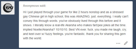

You’re welcome! And OOH I remember being so nervous about applying to the Interactive Media program, best of luck! I actually even failed to meet all the requirements -- I only sent them 2 letters of rec instead of 3 because I’m super shy and was too scared to ask any more teachers LMAO I guess they liked me enough that they let me in anyway

i love you too! Diya’s hoodie doesn’t exist...yet. I really really want to make it happen...to be continued...

Unfortunately those old ref sheets are all I’ve got! I’m planning on drawing updated ones, and when I do I’ll post em on here and twitter

you’re welcome, and if you draw fanart please tag me!!!! I’d love to see it! ;~;

Yes!! My mean and insincere daughter...

haha sorry for the stomach pain! You’re welcome!!

You’re welcome (you’re welcome)!!!!

I love when people realize!! You’re welcome, I’ll do my best!

You’re welcome!!!!!!!

you’re welcome!!!!!

You’re welcome!!! I love being praised for having the best children...

You’re welcome! And YEAH GREAT MALL the world is so small!
I’m so glad my game was able to help you out a little bit!! Thank you for the message!

You’re welcome, I’m so glad you found Diya relatable!! Hope you like the rest of it!

Thank you!! I’ll do my best from now on!
Thank you so much for the support! TT_TT I’m super glad to hear you enjoyed it!!
153 notes
·
View notes
Text
Dating app horrors: The untold stories
I just watched this documentary on Hulu called Dating App Horror Stories and because I am actively on these sites, I was really interested in this.
There are thousands of women that are sexual assault every day by men they meet on these dating sites. It never seems to surprise me how stupid women are sometimes. I am sorry to say this but seriously we all know what kind of a world we live in and if you don't know then you should Google the dating protocol before you decide to date. I am always uplifting women but if you do these things either your uniformed which I can't imagine in this day and age or your just plain stupid, period. There is no other excuse you have that is valid if you are not doing these things.
So if you still don't know here are my top 5 dating tips to keep you safe.
Never tell a man you met on a dating site where you live. Never go in his car and always meet him somewhere.
Always tell your friends or family who you're meeting and where. I take a screenshot of his picture, his name and number and where I am going and send it to my girls.
Never, never walk away from your drink, in fact put it on the opposite side of you away from them so they don't slip something in it while you're not looking.
Make sure you take a different way home and watch to see if you're being followed. Seriously ladies you can never be too careful.
Never go to a man's house you don't know. I thought this was a given...but obviously it's not as many of my friends do this...yuggg!
These are my top 5 things to be safe but I know many women who don't do this and it's crazy to me. Yes. I know I am a New Yorker and I am taught to distrust everyone but hey for good reason. I tell these guys who are like:
"Let's Netflix and chill at my house"
My response is:
"Dude I don't know you, you can be an ax murderer"
Him: "Do I look like a ax murderer?"
Me: "Did Jeffrey Dahmer??"
No, no, no! Hell no! I don't know you like that and before you come to my house we will have to be dating a while and I will be running a background check on your ass. You better believe it, that 60.00 is worth my life.
I laugh all the time when I hear them trying to smoze me… like yeah, keep it moving mister… heard it all before still not happening. Unfortunately it happens all the time with other women and that's why they think they can get away with it.
But in all seriousness, these things that are portrayed in this documentary happens all the time. Things like catfishing, crazies, dudes who are plain nuts, who end up stalking you, sexually assaulting you or even worse, killing you. This happens every day and we as women need to be more aware, we need to be careful and we need to be smart. No good looking man is worth your life.
So today my friends, check out this show on Hulu and tell all of your single friends. We need to be accountable to our friends and family for our safety. We need to be safe out there but most importantly we need to be smart. We cannot simply trust a man who looks good or seems nice because it is not always that way. You must always listen to that inner voice that says something is not right, those hairs that stand up on the back of your neck, that gut feeling you can't seem to shake, these signs are telling you something is not right and to run.
We must be diligent in taking at least these 5 steps to save your life.
"Be the change you want to see"
"And just when the caterpillar thought his life over...he turned into a beautiful butterfly"
**Now released my latest book**
The Blessing in Disguise.... revealed
https://www.amazon.com/Blessing-Disguise-Revealed-story-faith/dp/1074340493/ref=sr_1_19?keywords=the+blessing+in+disguise&qid=1561392004&s=books&sr=1-19
***Now available***
My 1st book The blessing in Disguise
Selling on my website
:
Http://www.treadmilltreats.com
And on Amazon.com
http://www.amazon.com/gp/aw/d/0692437398/ref=mp_s_a_1_13?qid=1462358109&sr=1-13&pi=AC_SX236_SY340_FMwebp_QL65&keywords=the+blessing+in+Disguise
http://www.am6azon.com/gp/aw/d/0692437398/ref=mp_s_a_1_12?qid=1434452632&sr=8-12&pi=AC_SX110_SY165_QL70&keywords=the+Blessing+in+Disguise
My weekly Youtube page, please subscribe:
https://youtu.be/LDSXCFJVnzM
Twitter: treadmill treats
Instagram: treadmilltreats
Facebook :treadmill treats
#treadmilltreats
#Theblessingindisguise
#TheblessinginDisguiserevealed
#livinglifelarge
#bethechangeyouwanttosee
#Thankyounext
#Garyvee
#Jayshetty
#newyearnewme
#blogginglife
#write
#writer
#blogger
#NewYorktimesbestseller
#womenoffaithtour
#Motivationalspeaker
#OnOprahSupersoulSunday
#Oprah
#TylerPerry
#TylerPerryproducingmylifestory
#thisismypassion
#livingmypurpose
#blogging
#Newyork
#Florida
#internationalblogger
#francescavillardi
#francescavillardienterprise
0 notes
Text
FAQ
Okay so I’m doing this because people keep asking the same stuff over and over again. Please read this before asking me something. If possible, do not use the IM please I keep that thing for friend and its makes me unconfortable to speak with strangers that way. I mainly answer asks privately. Please remember that English is not my native language. I’m trying my best but I’ll still make mistakes.
Q: What kind of tools do you use?
I mainly work with traditional medias: watercolor (brand doesn’t matter, cheap one can be as good as expensive one) or copic markers. I usually tag my works with which one I use.
Brushes size/brand is up to you. I advice you to buy good one here because brushed need to be washed often and cheap ones tend to wear out quickly. Take good care of them, store them well or you’ll need to change them quite often...
For the lines I use multiliners (copic, sepia & gray and sometimes black, nib size 0.1 & 0.3).
Now the paper... there is no need for me to give you a brand because... you need to test the paper to know how good it is and if you like to work on it. The only advice I’ll give you is, choose the thickness wisely. If you plan to use lot of water choose one that is around 300gsm or more. 200gsm is fine if you work on a simple character and/or don’t use to much water.
Q: Do you scan or take a photo of you watercolors?
I use a scanner. (Canon MG4200 series Printer for the ref). You can correct the colors directly via the scanner software but I prefer to do that in photoshop. (and you can use photoshop or other similar softwares if you take photos of your work)
Quick advices in photoshop for the colors.
Here is the drawing without corrections. The colors look washed out. Meh not good.

I mainly focus on two things:
The levels (my software is in french but it’s ‘levels’)

The image saturation (hue/saturation in the english version)

The screenshot are here to give you an idea which figures I use for each. Of course, it can change depending on the colors/lighting of the drawing. It’s up to you to choose what look best.

BTW, you can find the level and hue/saturation options here. Easy to find.
Q: Can I use you work?
You can make icon and background for social networks I don’t mind as long as you credit me. You can also use it as phone background or print it if you want to hang it on your wall, I don’t mind as long as it’s not for commercial use.
I almost forgot but DO. NOT. EDIT. MY. WORK. and then put YOUR url/watermark on it. Just because you did some modifications on a work you’ve STOLEN doesn’t mean it’s yours. It’s totally disrespectful and it doesn’t make you the owner of the drawing (some of you really need to read what copyrights and authors’ rights are). Just because you can find on the Internet doesn’t mean you can do everything you want with it. Also, remember that artists need a lot of courage to share their work on the Internet, doing that kind of stuff discourage most of them and some will even stop sharing their lovely work. Always check if the artist is okay with you using /editing stuff (via FAQ or just ask). We all have different opinions on that matter. Just respect the artist choice.
And, obviously, do not sell it.
Q: Can I repost you work? I’ll credit you!!
Please don’t do that, even if you credit me. Please respect my choice. I don’t care if it means more exposure, I don’t care about this stuff and I’m not after popularity.
Q: I really like your flowers drawing, how do you feel about me getting a tattoo of it?
I don’t mind. If it helps someone feel good and beautiful then do it. If you get a tattoo based on my art, please send me a photo. I would love to see the result!
Q: Do you have a shop where I can buy prints?
Unfortunately no. Don’t think a lot of people are interested in my original works and I won’t sell fanarts. (if you want to know why, there is a thing called copyrights. End of story.)
Q: Do you take commissions? Request???
Once again, no. I’m busy with work and I don’t need more money, so I want to use my free time to draw for myself. I don’t not take requests. If by some miracle I do, I mainly do it on twitter. (less people, more friends)
Q: Why do you not answer me??
Either because I don’t have time or I’m exhausted (you can’t even understand how stressful and how much energy I need in order to aswer to your questions.... I’m not a sociable person)
If you have any questions that are not here, use the reply button to ask it here (or send ask). Thank you! ☼
94 notes
·
View notes
Text
I don’t really use tumblr that much anymore but I want everyone who follows this account to know that this page stands in solidarity with the Black Lives Matter movement and the Black community, today, tomorrow, yesterday, and everyday. If you are ignoring what’s happening right now you need to unfollow this page.

If you you’re unable to attend the protests happening right now (I’m unable to attend them, for instance, because I’m immunocompromised and we’re unfortunately still in the middle of a pandemic); you can still be ACTIVELY anti-racist by educating yourself, being vocal when friends/family/ people you encounter say something racist, and by donating to organizations that are aiding protestors and the Black community.
Bail funds currently circulating:
Atlanta Solidarity Fund (atlsolidarity.org)
Brooklyn Community Bail Fund (brooklynbailfund.org)
The Liberty Fund NYC (libertyfund.nyc)
Philadelphia Community Bail Fund (phillybailout.com)
Peoples City Council Freedom Fund (Los Angeles) (https://t.co/nKlltd3oHH?amp=1)
Restoring Justice (Houston) (restoringjustice.org)
Know Your Rights Camp Legal Defense Initiative (Minneapolis) (knowyourrightscamp.com/legal)
Richmond Community Bail Fund (rvabailfund.org)
Colorado Freedom Fund (Denver) (fundly.com/coloradofreedom)
Vegas Freedom Fund (https://secure.actblue.com/donate/vegasfreedomfund)
The Bail Project (National) (https://bailproject.org/)
Statewide Florida Bail Fund (https://t.co/5ZQaABHm49?amp=1)
Milwaukee Freedom Fund (https://fundrazr.com/mkefreedomfund?ref=ab_9oX6WX6j3eT9oX6WX6j3eT)
Minnesota Freedom Fund (https://minnesotafreedomfund.org/)
Non-profit organizations:
The official Gofundme for George Floyd’s family “was established to cover funeral and burial expenses, mental and grief counseling, lodging and travel for all court proceedings, and to assist his family in the days to come as they continue to seek justice for George. A portion of these funds will also go to the Estate of George Floyd for the benefit and care of his children and their educational fund.” (https://www.gofundme.com/f/georgefloyd)
Black Lives Matter is an organization that is “striving towards a world free of anti-Blackness, where every Black person has the social, economic, and political power to thrive. By working vigorously for freedom and justice for Black people they, by extension, are working for freedom and justice for all people.” (https://secure.actblue.com/donate/ms_blm_homepage_2019)
Campaign Zero is an organization that “utilizes research based policy solutions to end police brutality in America.” (https://www.joincampaignzero.org/#vision)
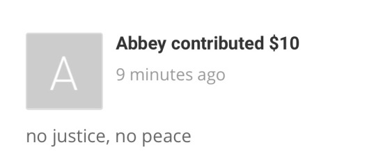
I have donated $25.00 to the Black Lives Matter movement as well as $10.00 to the Milwaukee Freedom Fund (adding screenshots just so y’all know i’m not talking out of my ass). I challenge each of you to match one of my donations to any one of this links. If you cannot attend the protests that are happening right now, I implore you to donate to organizations like these if you still wish to be active (as you should be) in the fight against police brutality, white supremacy, racism, injustice, and oppression that plagues many if not all of the institutions we have in place. It is one thing to say that you’re against these issues; repost and share what is trending on social media, but at the end of the day a post on facebook does nothing if you do not translate your words into action. This is literally the bare minimum we (white people) can do.
#blm#black lives matter#black lives movement#george floyd#george floyd protests#bail fund#bail funds#freedom fund#freedom funds
0 notes
Note
so Kagura dresses like a dancer and Hakudoshi wears his 'suikan' like a noble. but i've never heard anything about what Kanna wears. the inuyasha wiki claims that both she and Shunran wear kimono but I'd like to know more if that's possible. sorry if you've already answered something like this before, but I can't even figure out how to work some of the websites in the research guide...
Thank you for actually checking out our Research Guide before asking (a lot of people don’t think to)! Sorry to hear you couldn’t find the answer that way on your own; let’s see what we can do to help...First, let’s get this out of the way: it’s technically never inaccurate to refer to traditional Japanese-type clothing like Kanna’s as “kimono” since it’s still a term used for it today. However, that’s very general - literally, the word originally meant just “thing to wear” (mono was “thing”, ki is one way of saying “wear”)...so in other words, my hand to god, at the time the story is set, it just meant “clothing”. Congratulations Kanna, you are wearing clothing! :DAh...not helpful? No, not helpful.All kidding aside, it’s true that the term as it’s used today is a little more specific, but it’s not by much: these days, even in post-Meiji era Japan, "kimono” refers to specifically “ethnically Japanese” i.e. traditional Japanese clothing (the more general term in the modern era for “clothing” in Japanese is apparently 被服, which we would romanize as hifuku)... but, that is still unhelpful because yes, we can see it’s “Japanese” clothing, but seeing as “Japanese clothing” refers to a REALLY broad swath of clothing ranging from furisode to yukata, suikan etc - it’s incredibly non-specific. In other words, almost as bad as calling both pants and skirts “hakama”; accurate, but not helpful in the least! :PSo. What IS she wearing?Well, I...am sorry to break it to you but I’m not entirely sure yet, anon. >_>Since I’m prepping for Hurricane Irma as I respond to this, I’m unfortunately unable to do that much poking around, but I will say I immediately noticed something interesting about it after looking up reference pictures, one of which was this screencap from the anime adaptation (which is I believe from "Kagura's Dance and Kanna's Mirror", from Season 2, in which Kanna first appears):
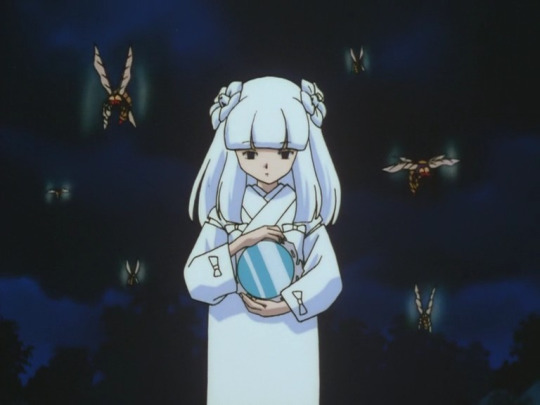
Actually, let’s summarize what I’m noticing here, which helps me tell you what it is definitely NOT, and hypothetically might be (or...I thought it might be, more on that in a moment):1.) Looking at the ends of the sleeves near the wrist I can tell her garment is NOT any kind of furisode (literally “swinging sleeve”) type kimono, which have long sleeves that hang down (Sesshomaru’s top, for comparison, is a furisode).2.) Her sleeves are more like those found on the kimono type called a kosode (literally “small sleeves”). They are meant to not get in the way, in other words (Sango wears a kosode when she’s not just wearing her armor by itself, for another comparison; you can see the end of the sleeve near the wrist is of similar design).
3.) SLITS IN THE SHOULDERS.I’m going to have to add some visual ref here to point out why this jumped out at me as a detail.This is a “standard” looking kosode:
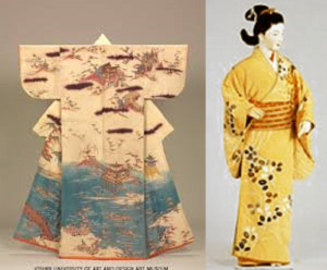
(image pulled from this nifty overview of the evolution of kimono! I recommend giving it a read, it’s very informative!)Now. Pay attention to the shoulders. Scroll back up, and compare - again, there are slits in Kanna’s kimono’s shoulders, but not in “standard” kosode designs.
Slits in that position on the shoulders aren’t at all unheard of in traditional Japanese clothing - they’re found in the suikan type garment that Inuyasha and Hakudoshi both wear, for instance, which as we’ve mentioned before, is designed for as a “hunting jacket” type garment, making me think that that’s why this garment of hers also has them? - but it’s not always a standard feature.(It’s also a feature in Kikyo’s outfit by the way:
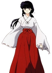
Kikyo is an archer, so it makes sense she’d enjoy the fuller movement that those slits provide! Why does Kanna need it though if she relies on her soul-sucking mirror as her “weapon”? Hm. Good question!)Oh -and one more thing. Which I almost missed but which kicks it out of just “kosode” into “okay no, this is a fair freaking question, what IS this??”Look at this other screenshot from the anime I ran across when trying to see “what her obi looked like”:
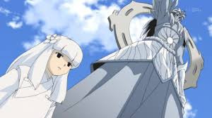
What in the....there’s. Wait. No. That - can’t be.....?*googles more screenshots, confirms*
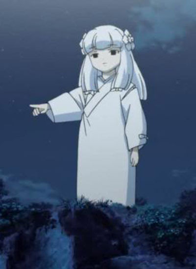
THERE’S NO OBI.NONE. AT ALL. WHATThere’s no belt?? Where’s the ties?? Is this even a real old-school kimono style or at this point is Takahashi kind of just making it up because “hey it’s a youkai anyway so whatever”? Is it tucked up in there?? How is this even staying in place...? (There’s also those little bows to consider, granted - but I feel like most of those are probably decorative? - but it’s hard to tell, without knowing what the garment even is! Maybe they’re not! Schrodinger’s bows)Okay, Anon. Yes. I see now why you sent this in. I SEE it. I never looked closely at her outfit before and now that I have, I am so far baffled. o_O All in all, I’m not sure exactly what is up with Kanna’s outfit - not 100%. But I do find it interesting (and probably notable!) that it has slits in sleeves, and that it’s clearly not held in place with a normal old-fashioned obi, as we think of one at least. It’s possible (just spit-balling here, especially with Hakudoshi “wearing his suikan like a noble”, and Naraku’s having taken over a noblemen’s place!) that it’s a REALLY old-fashioned noble class children’s outfit? Maybe? That might be a good avenue for research (and I probably would have tried it, were I not prepping for a major hurricane this weekend, sorry anon! ^^;;). I wouldn’t even be surprised if it would be old-fashioned even by Sengoku era standards, mind - we know Takahashi included a by-then-“old-fashioned” suikan for Inuyasha (and Hakudoshi) and put Inuyasha’s very much human mother in a junihitoe (the latter is more like from the Heian period, MUCH earlier), so you never know. Keep it in mind!I will say this though:The more I think about it, the more I find it extremely interesting, too, that the ENTIRE outfit - outer garment, undergarment (which she does have; you can see it under her collar, peeking out through the sleeve-slits, and if you saw a full-body shot that showed her feet, peaking out from under the bottom of her outer garment as well)... the bows on the outfit... even her very hair, and even the decorations in her hair! - All, ALL of them, are solid, pure, non-patterned white.Why do I find this so striking?Because of the various nuanced implications of that in Japanese culture (warning: this link includes a picture of a Japanese corpse being prepped for burial. It’s actually not gross looking at all, but you may find it spooky or unsettling when you realize what it is, so I feel a need to warn ahead of time).Now, despite what the warning in parentheses for that link might seem to imply, and despite what some rumors may say, “death” isn’t the only association with white (and especially white clothing) in Japanese culture; it’s associated with “purity” and cleanliness as well. People aren’t just buried in white, they’re often married in it, too, and many priests and priestesses in Shinto and Buddhism include white clothing in their garb, especially for specific rituals requiring “purity”.I also will clarify that that is NOT a funerary kimono, in the sense that she’s wearing it folded the normal way, and not the opposite way, which corpses are dressed in, so let’s clear that up right away, that she’s not dressed “like a corpse”. At all. But.Still...This feels like it can’t be coincidental...? It’s hard to tell if the white theme is a sign of her “blankness”/emptiness (which is another fair possibility), or if it’s indeed meant to evoke those other WELL known elements in Japanese spiritual beliefs (and it’s still noteworthy I think that to the Japanese, it IS still common to see ghosts wearing solid white, because they are still buried in white, so there’s the subconscious “creepy factor” too, sure)...hn. It’s a real question!I am starting to doubt that it was purely for aesthetics or to save on ink though :P So basically the short answer is: I am real sorry anon, I have no idea. :( I wish I did!The long answer, clearly, is: “WAIT, THIS RAISES EVEN MORE QUESTIONS...??”-Mod VorpalGirl(PS: I probably will not be online the rest of this weekend, at least on here. Seriously, Irma is making her cranky way right up my home State and we decided not to evacuate sooooo. Not only do we need to prep like heck tomorrow, power will likely go out for us before Monday, and given what happened with Hurricane Matthew last year, that could keep me away from ya’ll for up to a week or so. >_> Wish me luck....and Tekka too, since she’s still likely in the path of it as well)
22 notes
·
View notes
Text
ref pages

(( hello; so it has come to my attention that there are many blogs around that lack ref or character pages, that is, pages or links to posts that contain the refs of one or more characters.
now i have to tell you this really isn’t ideal. why? well, refs allow others to easily access a good picture or paragraph of your character from which to draw them from. if you add more than just a picture or description of them, then it can also gives others a sense of their personality and what they are like. this can increase the amount of asks you get, in particular, that can mean asks that are more tailor fit to your character or plot!
so, to reiterate, ref pages are very much a good thing. even if you just put a tag linking to posts of ref sheets, that’s fine. but that is of course if you tag the ref sheets. I’d even say ref pages are very vital and there’s really no reason not to have them.
if you post it once but never link it anywhere, it will be inevitably be lost to time and it won’t do much good, unfortunately.
the thing is though, especially with the presence of so many new people around, i figured people might not know how to make ref pages. so here is a tutorial under the cut.

you are first gonna want to go to “edit theme” which can be accessed from your blog itself. this icon looks exactly the same on all themes so do not fret if you and i do not have the same theme. this can also be accessed from the dashboard by going to account > tumblrs > edit appearance.

it should take you to a screen that looks like this. sometimes this takes a moment to load.
scroll all the way down ...

you will be taken to tabs that look like this. at the bottom (or right there if there are no pages) is an “add a page” option which i have circled. click on this tab.

and you’ll end up here! the page on the right will be blank, with no text and no title. (i put [character name here] and [put info here] for the title and info by the way)
put whatever you’d like as the title and info, of course. also to be put on the left side is the url for the page. this, and some kind of content within the page, are required to save the page. the url can be whatever you’d like too, but personally i make it the character’s name, so askpluminescent.tumblr.com/rowan, for example, for my character Rowan’s page.

all you gotta do is click “save” at the top and you’re done. “update preview” isn’t required i don’t think, but if you click it, it will show you changes made to the page should you edit any info in it.
another thing i should note is that it will ask you if you want to show a link to the page with an yes/no switch. for some themes, like mine, this isn’t required because the theme has settings in it where i input links manually. however, on the default themes that are used most often around here (optica, redux, etc.) you should click on this, and it will make the page link for you without you having to do anything extra.
(also, if you are using a custom theme (aka not one found in the site’s theme garden) do try to use one that enables input of custom links (that is, something other than ask/index/archive)
and then you’re done! you now have a reference page for your character. nice!
special last note:
this is difficult to do on mobile. all these screenshots are desktop. if you are a mobile-only user and have difficulty making pages, then what i would suggest is:
making a special tag for ref sheets/posts, tagging each ref sheet/post with this tag, and mentioning the tag’s name in your blog’s description for ease of access.
that’s all i got! thank you for reading and i hope this was helpful. ))
94 notes
·
View notes
Text
Post-Match Day Thread: Spartak Moscow 1 - 1 Liverpool via /r/LiverpoolFC
Post-Match Day Thread: Spartak Moscow 1 - 1 Liverpool
Team
Player Rating Karius 6.04 Alexander-Arnold 6.86 Matip 6.36 Lovren 6.86 Moreno 6.93 Coutinho 7.60 Can 6.36 Henderson 7.33 Salah 6.58 Firmino 6.31 Mané 8.05 Sturridge (sub 69') 6.12 Wijnaldum (sub 72') 6.28
Match Events
Fernando - 23'
Philippe Coutinho - 31'
Links to Other Threads
Post-Match Thread - credit /u/DatGuyDench
Match Thread - credit /u/23899209
Pre-Match Thread - credit /u/_cumblast_
Talking Points
Starting Lineup
Right now this was our strongest lineup. We finally got to see our best four attackers on the bench at the same time, the CBs are settled, Moreno continues after his good start to the season, and Can partners Henderson in midfield. The bench is as strong as it's ever been under Klopp. This should have been enough to win the game, and win handily.
Fernando Goal
I've actually gone back and found a full match replay for this one, mostly because I was to highlight how poor Can is (he's not alone) and have another look at the foul for the goal. The free kick itself is decently hit but Karius should be saving it.
http://ift.tt/2xKIgkQ
So we pick this up when Lovren has just snuffed out an attack, strode out of defence, and laid the ball off to Can. He's got Salah ahead of him pulling out wide, someone (I think it's Firmino) on the far side if he wants to lift it, or a simple ball back to Lovren. That's not going to be a popular move but I think it's the right one. There's three men ahead of him blocking off the pass to Coutinho in the centre circle.
http://ift.tt/2wWHv3T
Can hesitates and waits for play ahead of him to develop. This is fine, and as he brings the ball onto his right foot there's an easy pass out to Salah. He's a couple of yards off his defender and a ball out to the touchline would be safe. However, you can see just out of frame a Spartak player closing him down. Can has no idea this guy is there, he has the time to just glance behind him if he wants it, but really he should be getting a shout from someone. Maybe he doesn't hear it over the crowd.
http://ift.tt/2xLuPkG
Can uses some good strength to actually hold off the challenge, and in this shot he's actually got the ball back under control. There's three passes on, through the centre to Coutinho, lofted down the line to Salah, or he could try and knock it back to TAA. These passes aren't without their dangers and it's possible he hasn't seen them. Unfortunately, Can panics.
http://ift.tt/2wWPezf
He chases the ball down the line and a challenge from a Spartak player means Can knocks it back to his own goal. What he should do here is just let it go out for a throw. We can get back into position and defend from their. Can doesn't see the three Spartak players between him and TAA, though, because he only has eyes for the ball. Can hits it, on his left, into a blind alleyway.
http://ift.tt/2xLBhYP
So Spartak get down the line and put in a cross. We're back into a good position - there's only one attacker in our box, and we have a couple of men around the edge. If I'm being critical either Hendo or Can should have gotten over to cover the free man.
http://ift.tt/2wWFSn5
Now we're in a spot of bother. There's two Spartak players on the edge of the D and we only have Coutinho to block them. Henderson should be charging them down, as possibly should Moreno.
Coutinho does get a block on the ball, but it comes back in immediately. It's hard to grab in a screenshot, but looking at it closely it is a foul. The Spartak player manages to flick the ball up and Coutinho comes through him to bounce it clear. I can't complain about the ref here.
http://ift.tt/2xLk4Pg
I think Karius has set his wall up wrong and blocked his ability to actually see the ball. Coutinho is too far over to the right and I don't think Karius can see when it's kicked.
http://ift.tt/2wXdr8e
Looking at it from the other angle you can see how late Karius reacts. The ball is about a third of the way along it's path before he moves. The moment it's kicked you can tell that it can only go into the top left corner of our goal. Karius is just barely going over to cover that side.
http://ift.tt/2xxmEsA
The other issue with Karius is how little he moves over when he dives. I've highlighted his original position - it's barely a yard over. The ball (highlighted) is clearly going further over - again, if he saw this earlier I think he could have gotten over further.
It is, in fairness, a very well taken free kick. However, panic from Can and poor keeping from Karius has cost us.
Coutinho Goal
Really clever movement on this one.
http://ift.tt/2wXdpx8
Coutinho picks up the ball on the edge of the box. There are three Spartak defenders in a row in front of him, with Mané square. Coutinho is going to play it off to Mané and make a swerving run into the box.
http://ift.tt/2xM6tqZ
Coutinho gets the ball back and shapes to shoot. What I like here is the position of our other attackers. There's three places the keeper could parry the ball - out to the near post (Firmino), into the center (Salah), or across the face of the goal (Can). We're gambling in the box, something I didn't see enough of last season.
What I don't like is that two of them are offside, but I'll let that go for now. Anyway, Coutinho takes it on and slams it home. Tidy.
Positioning
What I also wanted to look at was the positioning of our midfield and attack with our "strongest" team.
http://ift.tt/2wXdxgi
This is the midfield three. I was surprised at how far left it was - Can is slightly higher on the right, but the rest are very much shifted to the left. With Moreno dominating our left wing I was expecting us to be further right to accommodate Trent. Coutinho is very much playing in that inside-left position.
http://ift.tt/2xynG7H
And this is the front three. Again, very much shifted to the left, with a big gaping hole in the middle. This confirms my theory that Firmino was straying out of the centre too much, possibly why he had a poorer game than usual.
http://ift.tt/2wXdvFc
Altogether, this is even clearer. We need to get better at getting into the middle to finish off some of these chances.
Defending
A big shout out to Lovren and Matip, who had very good games. 5 successful tackles and 4 interceptions, no errors, and weren't at fault for the goal. We shouldn't need to applaud them for doing their job but, in light of recent events, good performances should be highlighted.
Substitutions
I think Klopp got these wrong. Personally, I would have liked to see Can come off for Sturridge and a switch to a 4-2-3-1, just giving Mané and Salah a chance to get down the wings and hit someone in the centre. Alternatively, Ox could have replaced Mané's pace on the right flank. It was clear that Spartak had very little intent of attacking in the second half, so we wouldn't have been sacrificing much in search of a winner.
Newcastle (a)
I really hope that the front four will start again. I'd like to see Wijnaldum in place of Can, despite his poor performances in away games in general I hope that this is one he can get really up for. In defence, Gomez for Trent and possibly Robertson for Moreno (unless Klopp sticks to his current two on two off strategy) should be the only changes.
Submitted September 27, 2017 at 06:00PM by voliton via reddit http://ift.tt/2y89cf7
0 notes