#I did use a really light colored highlighter to block out the shapes but I tried to do most of it w/ just the darker ones
Explore tagged Tumblr posts
Text
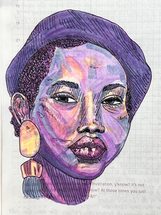


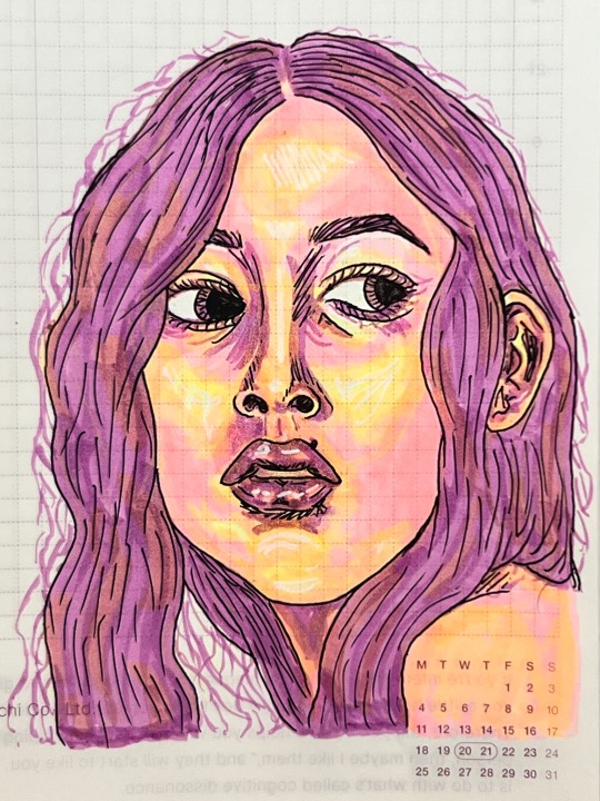

daily journal sketches 3.16.24 - 3.21.24
#experimenting w/ going straight in w/ ink instead of sketching in pencil first#I did use a really light colored highlighter to block out the shapes but I tried to do most of it w/ just the darker ones#also been working on non realistic color palettes and I think I’m finally getting the hang of it maybe?#my art#zebra mildliners#traditional art#portraits#markers#traditional drawing#artists on tumblr#from the sketchbook#portrait drawing#my art: original#my stuff
11 notes
·
View notes
Text
Okay, guys, after reading a post by @centrally-unplanned I just took that ACX "AI Turing Test" that Scott Alexander did, and I am screaming, as the kids used to say.
You guys are way, way overthinking this.
I thought I would do better than average, and I guess I did; excluding three pictures I had seen before, I got 31/46 correct.
Not great if you're taking the SAT, but I feel like if I could call a roulette spin correctly 2 times out of 3 I could clean up in Vegas.
So, what is the secret of my amazing, D+ performance?
You have to look at the use of color and composition as tools to draw the eye to points of interest.
AI is really bad at this, when left to its own devices.
For example, here:

Part of the reason to suspect that this is AI is the "AI house style" and the bad hands that I literally only noticed right this exact second as I was typing this sentence. Even if the hands were rendered correctly, I would still clock this as AI.
The focal point of this piece ought to be the face of the woman and the little dragon she is looking at (Just noticed the dragon's wings don't match up either), but take off your glasses or squint at this for a second:
Your eye is being drawn by the bright gold sparkles on the lower right side of the piece. That particular bright gold is only in that spot on the image, but there's no reason to look there, it's just an upper arm and an elbow. The bright light source highlighting the woman's horn separates it out as a point of interest.
Meanwhile, the weird aurora streaming out of the woman's face on the left side means that it is blending in with the background.
In other words, the way the image is composed, and the subject matter suggest that your eye should be drawn here:

But the use of color suggests that you should look here:

That's a senseless place to draw the eye towards! It would be a really weird mistake for a human to make! In fact, I think there's a strong argument that the really close cropped picture of the face of the character is a strong improvement. It's still not a particularly good composition, but at least the color contrast now draws the eye to the proper points.
In fact, I would say that a good reason for my performance not being even better was this alarming statement at the start of the test:
I've tried to crop some pictures of both types into unusual shapes, so it won't be as easy as "everything that's in DALL-E's default aspect ratio is AI".
Uh...
So how about this one:
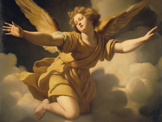
This is a lot better anatomically and in terms of the use of color and light to draw the eye towards sensible parts of the painting. The lighting makes pretty good sense in terms of coming from a particular direction and it also draws the eye to effectively to the face and the outstretched hand of the figure.
It's also a really flat and meaningless composition and subject matter that no renaissance artist would have chosen. What is this angel doing, exactly? Our eye is drawn to the face and hand, and the figure is looking off towards the left side, at, uh, what exactly?
But then I thought, "Well, maybe Scott chopped out a giant chunk of the picture, and this is just a detail from, like, the lower right eighth of some giant painting with three other figures that makes total sense"
This makes sense as a piece of a larger human made artwork, but if you tell me, "Nope, that's the whole thing and this is the original, un-cropped picture" I'd go, "Oh, AI, obviously.
All of the ones I had trouble with were AI art with good composition and use of color, and human ones with bad composition and use of color. For example, this one:

This has three solid points of interest arranged in an interesting relationship with different colors to block them out. I'd say the biggest tells are that the astronauts' feet are out of frame, which is a weird choice, and looking closely now, the landscape and smoke immediately to the right of the ship don't really make sense.
But again; I had to think, "Maybe Scott just cropped it weird and they had feet in the original picture."
Here's another problem:
StableDiffusion being bad at composition is such a known problem that there are a variety of tools which a person can use to manually block out the composition. In fact, let me try something.
I popped open Krita (Which now has a StableDiffusion plugin) and after literally dozens of generations and a couple of different models I landed on ZavyChromaXL with the following prompt:
concept art of two astronauts walking towards a spaceship on an alien planet, with a giant moon in th background, artstation, classic scifi, book cover
And this was the best I could do:

Not great, but Krita has a tool that lets you break an image into regions which each have different prompts, so I quickly blocked something out:

Each of those color blobs has a different part of the prompt, so the green region has "futuristic astronauts" the blue is the spaceship, the orange is the moon, grey is the ground and pink is the sky, which gives us:

Still way too much, so we can use Krita's adaptive patch tool and AI object removal to get:

I'm not saying it's high art, or even any good, but it's better than the stuff I was getting from a pure prompt, because a human did the composition.
But it's still so dominated by AI processes that it's fair to call it "AI Art".
Which makes me wonder how many of the AI pictures I called out as human made because one of the traits I was looking for, good composition, was in fact, actually made by a human.
182 notes
·
View notes
Note
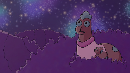
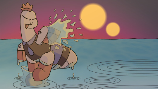
I love you chickens and offer two of my own. Do you have any advice on how to improve my backgrounds? I have a lot of trouble with flowers and other plants, like the purple hyacinths in the first drawings?
all your BAWKtobers are so cute I love them
!!!!!!!!!! I'm so glad you are enjoying BAWKtober! It is the highlight of my year. And my goodness, these are lovely! Your choice of colors are so nice to look at, they feel like a soft place to rest your eyes.
Honestly, backgrounds have always been something I myself struggle with, and I don't know if that makes me more or less qualified to offer advice, but I can pass on what I have found helpful for myself.
1.) Start with something you LOVE. Trying to draw something you struggle with can already flick the little task avoidant I Do Not Want To Do This switch in your brain, so we are going to stack as many positives against it as we can in an effort to get our mindset as far away from This Sucks and I'm Not Doing It zone as we can, so: Start with something you love.
Are you passionate about nature and plants? Start practicing with nature backgrounds. Fascinated by roman architecture? We're gonna get drawing those pillars. Have a bunch of OCs that live in a fantasy setting and desperately want to be able to draw them interacting with the places you've imagined in your head? Get ready to get worldbuilding. If it's a subject you are already interested in it is going to feel significantly less like pulling teeth at the start than if you are stuck doing Boring Square House In 2 Point Linear Perspective (unless you love Boring Square House in 2 Point Linear Perspective, in which case, follow your heart).
I do this a lot with my BAWKtober drawings. I love drawing chickens and want to be able to have them interact in fun environments. The Chickens Part of the drawing are easy and familiar for me. It's something my brain is comfortable with. So I use it as a bit of a mental touchstone to keep myself skirting just shy of the This Sucks edge long enough to stay motivated on the background part of it.
Find your "Chickens."
2.) SIMPLIFY! Even complicated things are just many big and small shapes. Learn to break things down into their most basic shapes and use those as the building blocks to map out your background. Everything is Shape. Think Shape.
You don't have to get hung up on finer details right now. Those can come later. I did this with the rows of wheat field in my Harvest Moon prompt. Envisioned them as large blocks laid out next to each other. I mapped out shadows by darkening the sides away from the source of light (Big Ol' Moon Circle),
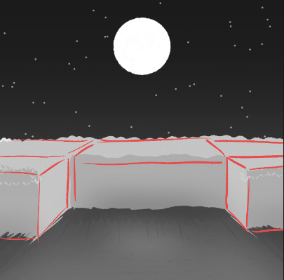
And after i got that base work i built off it with details (notice how you can still picture those shapes underneath it all). While this is by no means a Complicated background, the general method works for more intricate things too.
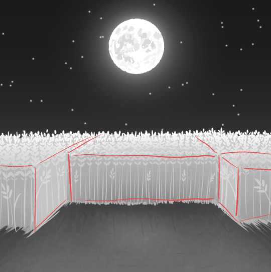
It's also helpful when trying to map out lights and darks. I do this a lot when I am trying to get a sense of depth and shadows for an environment:
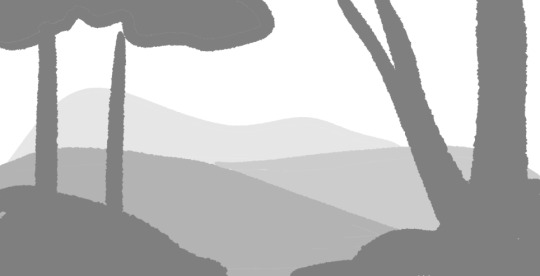
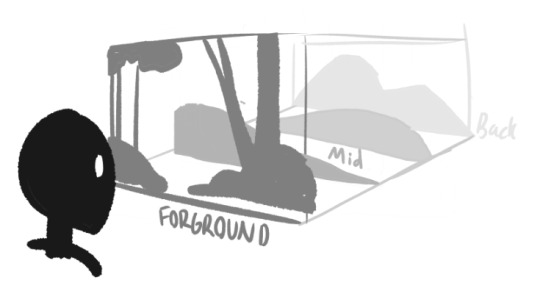
Start with the really basic shapes. I like to imagine the background, middle ground, and foreground are all on different layers stacked atop each other facing the viewer (think those cut paper shadow boxes).
GENERALLY speaking, you are gonna have things closest to you be darker and more vibrant colored, and objects in the distance will be lighter and less saturated as they fade into the atmosphere. There are of course instances where this is not the case ( a background of a dense jungle or mouth of a cave may do the reverse, getting darker and darker the deeper you go, to show the lack of light and shadows that grow the further you venture from light) but it is a good rule of thumb when starting out, especially with landscapes.
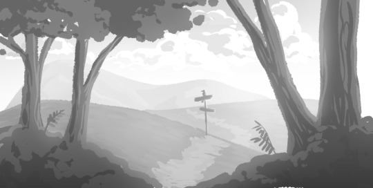
Once you have that figured out, you can start slapping down more details~
3.) REFERENCES! I know everyone and their mother says this but it's true. The human eye and memory can be so, so faulty when trying to think back on how something looks. You might THINK you know, but when you try to sit down and draw it you sit there and have a 10min existential crisis (If you don't believe me, just try to draw a bicycle completely from memory. It's miserable).
So look at real things! Pay attention to the way your fav walking path curves over the hill on your walk home. Make note of how the distant skyscrapers on the outskirt of town fade into the soft pinks of the sunset much more the the stark, towering ones right outside your window. Look at cars and bushes spaced out in your local wal mart parking lot, take pictures of the flowers in your grandmother's window box. What's the simplest shape they can be broken down to and still be recognized? You are training your eye to see things in a new way and help you get good at positioning them in 3d space. Eventually, you will get better at this and won't need to reference things as often (but you always CAN. References are your friends!)
4.) Lastly, JUST DO IT!!!
JUST DO IT OH MY GOD JUST DO IT! JUST DRAW tHE BACKGROUND. I know, i know! It sucks and it's hard and it's not as fun as drawing the characters that you love and it might look bad at first but jUST DRAW IT BAD.
In the past i've spent so much time getting in my own damn way because I somehow get it in my head that there's some hidden knowledge or information or tutorial that i am missing, and if i wait until i Learn It i will finally understand the thing and Then i can go about learning it the "right way." Which is a wonderful way of shooting yourself in the foot before you even take a step.
It's really easy to get bogged down in the mindset of "i'm not good at this right now, so i have to wait til i Get Better so i can do it right" and this is Lies. This is the devil on your shoulder talking. This is the mind killer, and it is also a paradox. You want to get better at The Thing before you Do It, but you have to Do It to get Get Better. So you just do Nothing and then you feel bad 'cause you haven't moved anywhere.
So, just start trying. Pick something you love and let that carry you through the hard parts of the learning. Try not to care so much about how it looks at first. You are learning a new language, a visual one. If you get frustrated take a step back, or try drawing something else. Keep it simple, at least at first. And if you feel discouraged, remember i recently had a 10min existential crisis when i realized i couldn't remember how to draw an egg carton, which I see and hold in my hands every single day.
TL;DR DRAW IT BAD, BUT DRAW IT!
#i am so sorry for making you read a giant block of text that may not have even helped you at all#i don't usually do tutorials but i hope you find even a fragment of this helpful or relatable#everyone has their own method that works for them#the important thing is to just let yourself start somewhere and don't give up#backgrounds my beloved and belothed#backgrounds (affectionate and derogatory)#kenna answers#Makenna Made a Questionably Helpful Tutorial#chickens#tiny fluffy dinosaurs#the BEST animals#BAWKtober#asks#long post#demonicchicken1121
8 notes
·
View notes
Text
Gonna attach info in reblog so there’s a version of this post without a massive text attached to it.
This image is an experiment of mine, where I tried to speed up my workflow with AI assistance. I know – I know, cheating this soulless that. I get it, but Slug is juggling two jobs right now and would still like to put out some bug art with background without losing quality.
With that out of the way, I’ll describe exactly what I’ve done here
To start with: here’s the initial sketch done fully by hand with all colors and lighting blocked in

After this it was time for some 2d kit bashing and here we get to “Artificial Intelligence not being Intelligent” stage of the process. The free service I chose is bad at stylizing stuff, so it provided stellar materials like this

... Okay, not using the prompt “cartoon” might help But in the end it gave me something promising

It’s kinda blurry but in my case it’s a good thing because I’ll be using this thing as a base for a more thought through bush. Some Frankensteining later I had this:

Shadows too harsh, highlights too bright, green too nuclear, light direction doesn’t match. Gotta correct it all. Boom.

Not too shabby. Lets me skip the awkward stage where I’m just throwing all the brushes I have at the canvas in an attempt to get the pattern I want.
Then I milked the AI for some clumpy mossy texture and the best result was this:

This is definitely not moss and I don’t know how it decided that impressionist style should be used (I didn’t put that in) but hey, not complaining. Into the amorphous mass it goes.


In the end very little of the original collage is showing through all of the modifications I made, but it was my intention with this experiment: skip the tedium of drawing random dots/clumps/what have you and move on to the more creative parts, like lighting, faster.
For the rest of background it was mostly the same: choose some textures, cut out the parts you want, bash them together to block out the shape, correct colors, work on top of it and add details until it’s al harmonious. Rinse repeat.
I didn’t do any of that directly on the character because there isn’t really anything I could use help with there. I did, however, use it for some design choices.
Prompt was “orange fruit fly”, the results are abominable in terms of anatomy but it’s not what I’m looking at


As useless as these are on their own, they gave me some nice details (white eyes, yellow fluff on neck) that I ended up using on the character.
So all in all it a nice tool for both concepting stuff and using the results as a base for rendering textures. Definitely reignited my desire to draw lush vegetation after the trauma of having to fiddle with all the leaves entirely by hand. Hi carpal tunnel
Ancient grotto

672 notes
·
View notes
Note
Do you have any advice for drawing with markers? I'm trying to improve and wondering how you do it so well
alright yes i do. okay so markers are all about LAYERS of color. so here's some WIP's of a work i did recently we'll walk through some tips.
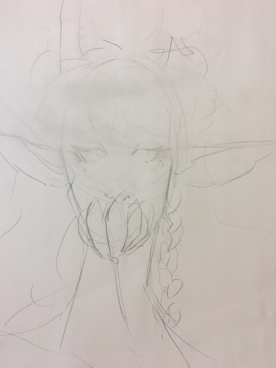
so step one here is the sketch. you'll want to get either a kneaded eraser or just be careful, and lightly erase over the entire image. this picks up loose graphite, and keeps your markers from smearing gray across the entire thing.
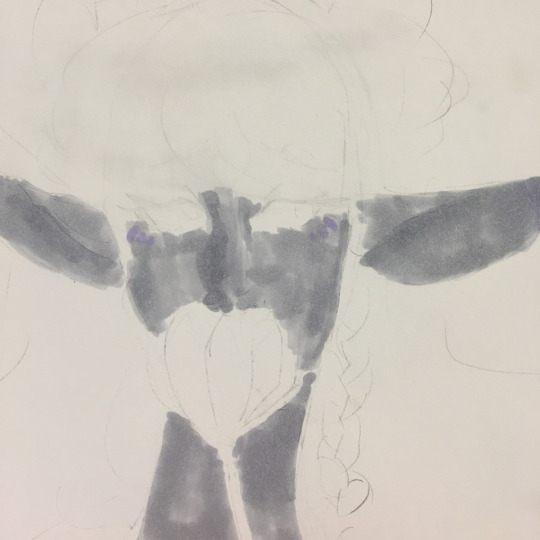
so i lay down a base layer. this isnt actually one marker though, its three. using the lightest marker, block out everywhere youre going to color. use circular motions or a brushtip if you can to avoid streaking like what's in this shot. then, if you have markers of very similar hues, begin darkening the picture where you need to. in this case, it was the ears and side of the nose.
remember: YOU CAN ALWAYS GO DARKER, YOU CANNOT GO LIGHTER.
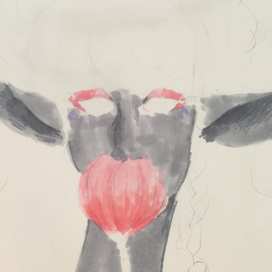
i then went in to block in her makeup, the tulip, and darken some of the shadows. you can see specifically in the ears and neck that ive used the smaller tip of my chisel markers to slowly transition it from one marker to another. blending doesnt exist in markers. you just need to IMPLY a gradient. the flower is a good example as well. use multiple markers, and slowly make your way from one half of the gradient to the other.
a lot of what i can do is due to the fact i have so many markers. if you need large marker packs and cannot afford copics, try arrtx. that's what i used for the flower in this.
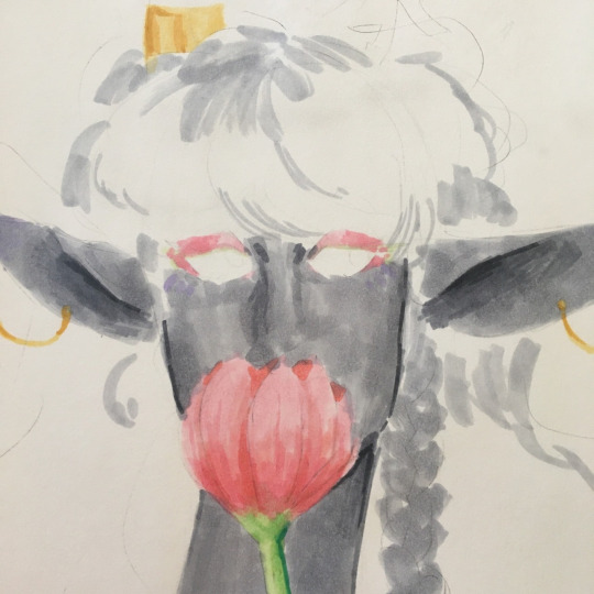
when i draw hair- something i know people want to know about a lot- i start with my lightest color, and sketch in the directions the hair is flowing. for stelle here, her bangs swoop down and to the right, so thats the direction i will lay down those colors. its like painting.
also in this, you can see how deep ive made the insides of her ears, and how ive used a dark gray to line her face and give it shape.
this shot is also a good example to show how i fucked up on her earrings, and since i cannot go lighter, theyre going to be tinted gray now. just something i forgot to keep in mind.
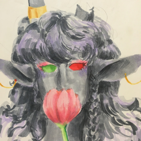
alright theres a lot to talk about in this one. firstly, let's talk about UNDERTONES. to give your piece more depth and life, you can go in with other colors besides your main shading color- in my case, gray- to make the piece pop. ive switched to a light purple, and have added it as a highlight to her cheeks, tips of her ears, and hair. it brings out her hair, and makes it seem fuller. less flat.
a lot of how i use markers is with curved strokes and many colors to sculpt out an image, rather than just filling in the lines. this is why i add line art last.
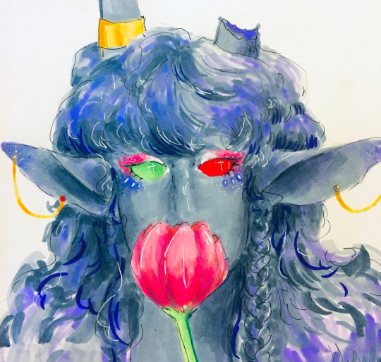
okay one step at a time with the finished picture.
first step here is line art. youll notice how i dont harshly outline every single part of the piece. instead, i lightly go around areas i think need defining. i outline her horn cuff, i outline her ears, her eyes, and then i loosely go around her hair with similar strokes to when i sketched it in the first place.
second step is a white gel pen. it can be a simple jelly roller theyre really cheap. just make sure it works. if your pen isnt rolling smoothly, try warming it up in your hands by rubbing it quickly between them. if not, try multiple pens before buying them. bring a piece of paper to your local michaels or hobby lobby or other craft store, and see if it rolls smoothly on YOUR paper. then, go around anywhere that needs a highlight. i did this over her eye markings, her makeup, tiny dots over her earrings, and over her hair to once again round it out.
my final tip is to adjust your pictures in some kind of editor once you are finished. i went in just using the basic iphone settings, and messed around with it until it matched what i wanted the pic to look like. in this case, i turn the highlights to the left, and played around with the temperature and tint settings, and messed around with their basic filters. honestly, just play with it until you think it looks good.
those are my tips for coloring! i hope this is comprehensible!!
108 notes
·
View notes
Note
What is your coloring process? If you don’t mind me asking 🤔
I assume you mean my shading / rendering process. If so it's, a wholeee process alright hahahh,, hhh- It get's a bit complicated when you're talking about rendering specific forms (Skin, hair, fur, clothing, glass/metals, etc.), but the core steps usually remain the same. I've been asked this a lot in the past so I might as well try to go over it extensively now. Fair warning I'm really bad at explaining things but I'll try to be as detailed and coherent as possible, that being said this might get long so hold on- If you have any questions afterward then please let me know!! GEEK'S COLORING / RENDERING PROCESS BELOW THE CUT (with photos to follow along)
- I'm gonna be using practice sketches for base reference, the first is for fur / clothing with my Bear!Otto design to start. The second is gonna be for exclusively skin at the very end- - NOTE: Keep in mind the way I do my rendering is just a mess of combined stuff, but your art program must contain Layer Modes (multiply, overlay, luminosity, shade, etc.) if you're gonna follow step-by-step. The program I'm using is Paint Tool SAI, but there's plenty of other programs that use layer modes just the same!
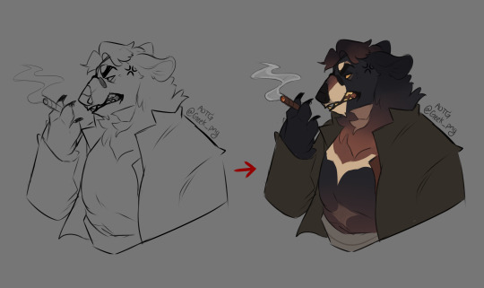
STEP 1: Flat-colors! (I just used a basic marker brush to fill in, keeping the fur, clothing and extra bit layers separate. His fur is a bit dark but we can make it work subtly.)
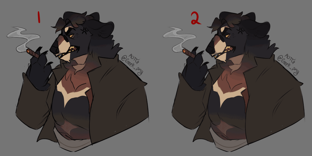
STEP 1.5: Coloring the Line-art! (This step is optional, and can come either before OR after shading, but makes your artwork look much softer in the process. A very quick way of doing this if you don't want to do it by hand is as follows:) 1. Flatten all your color layers and copy them, unflatten by hitting undo a few times. 2. Make a new layer above your linework layer and paste those combined colors onto it. 3. Find your blur tool and gently blur all those colors, then clip it to the linework layer below, adjust opacity/saturation as you see fit!

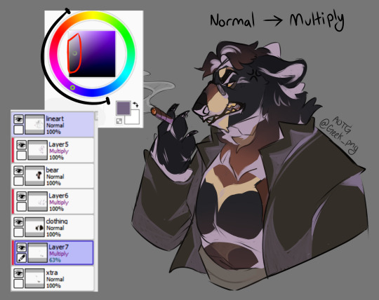
STEP 2: Cel Shading! (Or just the block-shading step, although I combine my cel and blended shading together all in one, I'm separating them for simplicity's sake on this.) [ When shading I use both the Multiply & Overlay layer modes as bases (for multiply I'd use lighter, dull pastels, while for overlay I'd use darker, more saturated colors. Combining them both can give a little bit more realism when doing the lighting effects later on. It all depends on the colors beneath and the effect you want to achieve with whatever atmosphere the artwork is showing! I NEVER go straight black/white for colors, especially while shading, it's literal hell and won't look good, imo. ]

STEP 2.5: Blended Shading! (Same process as Cel Shading except you're gonna get into the nooks and crannies and blend it out! Define where the darkest parts are and fade it using a blending brush and opacity, keep in mind I use multiple layers for this step and stack it a lot, but it's up to personal preference how far you want to go with it. Use both Multiply / Overlay for this bit and experiment with different warm / cool shades!)

STEP 3: Base Highlights! (Using Overlay and a light color to accompany, add some basic shapes of light from whatever direction it's coming from on your piece. Always keep in mind the general location of prominent light, minor sources can be added on after. Blending can be used at this stage, which is what I did for the fur tufts.)
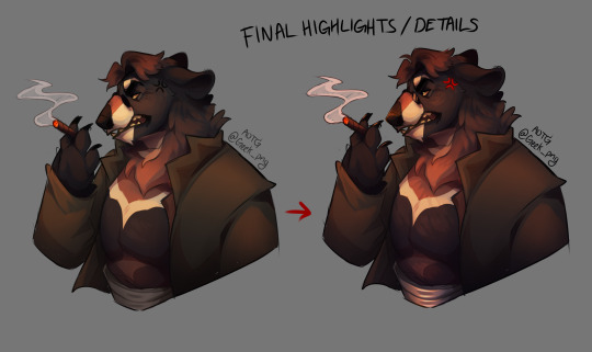
STEP 3.5: Final Highlights / Details! (Now for the fancy shit [part 1]! Keep in mind it's incredibly easy to go overboard with this step and it's entirely up to preference! I usually try to keep it pulled back a bit but for the sake of this example I'm going all out- I basically just added more detail to the fur, highlights on the nose / eye / glasses / girdle using Overlay & Lumi+Shade, and added in shadows & highlighted bits I might've missed.)

STEP 4: Mess Around with Colors / Layer Modes! (Fancy shit [part 2]! Experiment with different color combinations to set different moods for your piece! I tend to lean more towards the oranges / reds / purples, but that's just my personal preference. Light obstruction, rim lighting, anything and everything- Go fucking buck-wild LOL References for certain lightings can come in really handy too!!!) ------- That's it for the basics, but here's an extra tidbit for how I do skin specifically:
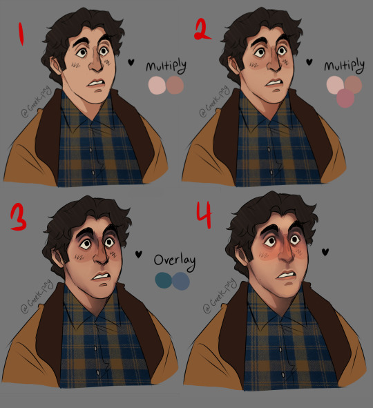
1+2: Same process as above, cel shading and blended over it with warm but pale pastel pinks / oranges. This can work with any skin tone, I don't suggest using cool colors for base shading as it can make the skin look kinda,, dead- 3: That being said I'm using cool colors for the overlay part- It works well for getting the darker areas and for creases / eyebags usually. For darker skin tones I tilt more towards purple rather than blue. 4: Final details, coloring the linework and adding highlights. (I added a lot more blush than I normally do but yeah that's up to you lmao) ----- Hope this gave enough insight on how I generally do my stuff, not a strict guideline or anything but there's the basics as best as I could explain :^) Have any questions? Please let me know!
#art tutorial#digital art#digital art tutorial#how to art#fanart#this took ages for me to put together so I would appreciate reblogs a fuck ton ;;#I hope it's concise enough without being confusing#I tried to make it seem fairly straightforward but when I'm doing it on my own I jump around in between steps a lot#but again it's entirely up to preference that's just how I do my stuff#geek png#geek asks#paint tool sai#alfred molina
227 notes
·
View notes
Text

Minors and Ageless Blogs DO NOT INTERACT. You will be Blocked.
Content Warning: Rough sex, mild overstimulation, marking, Trainer! Porco, fem!character, Semi-public sex, unprotected sex, use of names Doll and Slut, Light Prep.
Kinktober Masterlist


When she joined the gym, she hadn’t really planned on getting herself a trainer. She wanted to start getting into shape, so she planned on just coming in after work. But, it seemed that she had a couple of free sessions when she joined the gym, to let her try out and see if she was willing.
It wasn’t the training that had her wanting to sign up. And she had a feeling that was why the gym trainers were hired. She just picked a random name from the list that lined up with her day off after errands. Reiner, Porco, Erwin, Bertholdt, Ymir, and Mikasa.
The only one with an open slot when she needed it had been Porco.
‘I. Am. Screwed.’ Was the only thought running through her hair as she met with the man. She was on the chubbier side, whereas he was tall and muscular.
It wasn’t just the muscles. It was the cocky grin on his face, the spark in his eyes, the way he didn’t hesitate in looking her up and down. A predator ready to devour its prey.
“Porco.” He put out his hand for her. “You must be my client for this afternoon.”
It felt like she’d swallowed her tongue. “Y-yeah, nice to meet you. W-we’ll see if this whole trainer thing works out for me.”
The grin on his face told her that he wasn’t going to let her say no.
Porco was observing his newest client, the woman was getting better. Her goals to get in shape were simple, but she was dedicated. It made him proud to have such a client.

He found her beautiful, the soft color of stretch marks along her skin, the softness of her body when he’d felt her during their measuring. He loved women in all shapes and forms, but something about her was special, he supposed.
Though, he didn’t know why he felt such a tightness in his chest when he noticed the marks on her neck. Likely from a lover. Some even on her hips, he’d noticed when she’d bent over during stretching, making her leggings shift on her soft tummy.
“You got a little…” He motioned to her neck, watching her squeak was the highlight of his day when he saw her.
“I... “ She sighed. “It was a little fling after a girl��s night.” She didn’t do that often but since working with Porco she was always wound up. “I don’t do it often--”
Another squeak left her as she found herself pushed back against the wall. The private room he’d booked for their session had at least another half an hour before anyone would need the room. “But?” His amber-brown eyes gazing into hers.
She was stuttering, unable to form a sentence with that intense look on his face. “I… W-well….I…” Every time she tried to speak, her cheeks only grew warmer, feeling it inch down her neck and up to her ears. Her words escaping her each and every time.
“Was it my fault?” He asked, his body moving closer, head leaning down until his breath was on her neck when he brought his mouth to her neck. “Come on, doll. Did I cause you such a need you went to a stranger instead of comin’ to me?”
When he felt her nod, there was no more holding back as large hands grabbed her hips, dragging her to him. His fingers digging into the soft flesh of her hip as his mouth pressed to her neck. Hot kisses and careful bites over the marks left on her skin.
The soft moans as her fingers twisted in his shirt were beautiful music to him. “Next time, doll, come to me.” His fingers at her hip began inching her leggings down. “It’s okay, I’ve had such a need since I met you too.” His fingers trailing back up to the soft curves her body held. He loved how plush she was. Soft and warm, just made him want to hold her in his arms… whether or not he was fucking her stupid.
His fingers dipped under the fabric of her panties, a grin appearing on his face as he was trailing more kisses along her neck, making sure to leave a line of marks along her neck. He wanted anyone who saw her to see she belonged to someone already. “Look at this, doll. Already soaked.”
Porco was talkative, confident. He said what he wanted, when he wanted, and it only excited her more because he was so sure of himself with her.
Thick fingers sank into her, thumb toying with her clit as his fingers pushed in deep. “So fucking tight… Fuck, gonna have to stretch you if I want my cock to fit in here.” He knew he’d have to keep her now. He wanted to keep her, to break her daily.
Pulling back to look at her, she was already a mess. Her fingers grasping helplessly at the wall behind her, her back arching slightly as her hips involuntarily bucked towards his fingers, letting her ride them a bit easier. He was lost in her face, however. Lips damp parted as sweet, sweet moans left her mouth. A small line of saliva beginning to leave her open mouth. Typically bright eyes were glazed over with lust and need, rolling back slightly.
Porco loved the fact that she was so sensitive, feeling her inner walls flutter and clench around his fingers.
“I-inside…. Please.” Her hands reached to grab his wrist, stopping his fingers from pumping inside of her. “I… I want to cum around your cock.”
That alone could have sent him over the edge. Those needy eyes looking at him, her lips pursed slightly into a sweet pout. All of that mixed with her confession.
Porco pulled her away from the wall to turn her around. “Normally, I’d wanna do this somewhere better. But I can’t say no to you. Not with that face.”
His fingers were shoving his shorts and briefs down his legs, bringing her hips back carefully so her back was arched. “Fuck… you’re gonna be a tight fit for me.” His cock wasn’t overly long, but he was very thick. He made just about anyone a tight fit.
“D-don’t care… I need this.” The bold statement just made him smirk. There was no way he was letting this woman go after this.
The tip pressed to her dripping cunt, watching her slowly split open as he sank into her. His hand on her hip as he inched his way inside her, feeling how she pushed up onto her tiptoes, listening to her breaths go ragged between the moans and whimpers.
He could feel how she trembled as his hips pushed against her backside. It was all it took. Her body trembling and her voice turning to desperate whines and moans as her walls clenched and convulsed around his cock as she came.
“Look at that. You were really fuckin’ needy, doll. Fuck… you feel so good.” His hands tightened on her hips as he began thrusting, not caring that she was still writhing and lost in the middle of her climax, his cock slamming deep inside her, stretching her, hitting all those sensitive spots inside her as he rutted against her backside.
His hands left her hips to pull her away from the wall and against his chest. A hand against her belly, feeling how her muscles clenched and relaxed with his every thrust, as the other moved to her jaw, forcibly turning her head to the side so he could kiss her.
Moans muffled by the kiss, her body squirming in his grasp as her hips bucked back towards him, his hips roughly rutting against her ass. “That’s it.” He growled against her lips. “That’s a pretty little girl for me. Little slut…” He pulled nearly all the way out before slamming back into her. The powerful thrust sending her already sensitive body over the edge.
“P-Porco…!” Her body writhed from her climax, making him hold her tighter in his arms as her clenching cunt was forcibly milking him, sending him right into a climax along with her.
Hot ropes of cum painting her insides. His grip on her jaw was strong as he held her, watching her face as she moaned and panted, drool slipping from the sides of her mouth.
He knew two things. He was never gonna let this woman go after today, and today was far from over. He had no intentions of letting her get away with just one session. It was his job as her trainer to make sure she was able to push her limits with training… and what better way than to train her with his cock?
Thank you to @asmos-pet for the dividers and also thanks to @seraphdreams for looking over this for me. You're both amazing!
#attack on titans x reader#attack on titan porco#attack on titan smut#aot smut#aot porco#porco snk#snk smut#snk#aot#shingeki no kyoujin smut#shingenki no kyojin#shingeki no kyoujin reader smut#porco x reader#porco smut#porco galliard smut#porco galliard#porco galliard x reader
109 notes
·
View notes
Text
for a blog named art talks there is an awful lack of the talking.. here is the promised yapping! This idea was proposed by my friends, with photos of their cat included, so not much of the initial concept is mine. both photos were of their cat in a dark room with a tablet.. he is an ipad kid..? because of this dramatic lighting, it was really perfect to be translated into a painting inspired by the baroque art era.
Art from this period is very varied and I think there is not an extremenly commonly agreed on standards to dictate "baroque" art. Despite this, many characteristics are similar in drawings that can be called baroque. They often feature very intense lights and darks, dramatic posing, and the subjects are often rich or religious.
My process for this painting loosely imitated traditional oil painting. (for the process vibes and buildup) I started with an underpainting that gave me a great base for the shapes and composition, but also the values that are placed in the piece. It is based on a burnt sienna color since I am always loving warm tones.. I usually use raw umber when oil painting because the values are able to be darker than burnt sienna, so this was a real treat. In oil painting, the values can be layed down in a traditionally additive way - building up the shadows with layers, or in a subtractive way - putting a very wet layer of paint over the whole canvas and wiping away at the lighter areas. I prefer to block out the bigger shapes first and then adding the shadows on. Even if the shapes are not perfect, getting it onto the canvas helps me see how the painting will come together easier. ( you may notice the head here is too large.) Raw unber, burnt sienna, ultramarine, and black (i forgot which kind..) are some of the most popular to use because they have faster drying rates.

on the next layer, I start blocking in the main colors, being sure to reference the photo and the values I layed down. Here is the color pallete I picked for this painting. The light was very blue in the photograph, but there was a majority of warmer tones in baroque paintings I saw, so I toned them down for this painting.

As I'm painting, I'm also refining the shapes. I look at the photograph a lot in this stage to get the form, but also keep in mind that cameras and photographs compress and flatten light and shadow - so it's a benefit to study and understand the forms and shapes of the things you are drawing so you can sometimes fill in the blanks.
Fur can be very difficult to draw because of the level of detail. A way of tackling this in painting is to simplify and make the detail impressionistic. In baroque era paintings, they often included a lot of detail all around, but I do notice simplification of detail in the shadow. (lots of very dark shadow in these works) Impressionistic detail can not only ease the workload, but also put more emphasis on the focal point of the drawing. It can make a painting feel less crowded. Here is some simplification I did for this little fella's fur. The face, eye, and whiskers have tighter and harsher edges with more strokes representing the fur. The markings are also more clear. On the leg, the fur is painted a lot looser. I paint the edges very softly but do not blend fully (this would create more of a smooth look, something like skin).


Here is another example of the simplification, because the paw and the light are both very bright, I combined their shapes .. just a fun thing.

Although the lighting is very dark in baroque, the artists often use secondary light to break up the shadow and add more interest and form to a subject. many times if the main, very strong light is from above, they will paint a softer, warmer light from below to highlight the form. Although the secondary light may look bright in the shadow, keep in mind that it is always darker than the main light source. Checking values are very helpful for this again! I do this by adding a "color" overlay layer of black. The secondary light here is a contrasting color to the blue fur. The orange is taken a little from the underpainting and adds a lot more warmth to the cooler drawing. I also let some of the underpainting peak out in sections for the same reason! Underpaintings can be any color.. they are very neat!


lastly for editing, I just emphazised the white light by amping it up with tone curves, and added a warm overlay layer over the whole piece.
If you have any questions or would like to yap about art, that's what i made this account for ! I'm a huge fan of talking about art and twitter has a very nice formatting for that [:

I paint my friends' cat in a baroque inspired style
2 notes
·
View notes
Note
Any tips for lighting scenes when drawing? I find myself struggling with it the most
HMM mostly im always thinking about how much light there is, where its coming from, and how it hits the subjects
ambient light scenes (whether day or night) are the easiest because theres not really a direct light source, so its more general shading. but once you add a direct light source/subjects are close enough to block light, things start working differently
these TWO VIDEOS video about ambient light and color are pretty helpful if you dont know what it is/how to apply it
long explanation (with examples) under cut!!
im not always thinking about the lighting for my scene when im drawing unless i have something very specific in mind before i start, but even then i dont worry about it until im actually coloring and adding depth to the scene

this scene has both ambient light (night sky. blue arrows), and a harsh direct light (emergency lights. yellow). so theres soft rim lighting coming from the environment (light bouncing around), plus one direct light source. its a close, bright source so its harsh
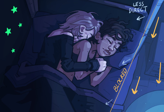
this one is also a night scene but its just one light source. moonlight coming in through the window, blocked by the bunk bed. so only part of them gets hit by the light and its a little softer (more ambient). but theyre also close to each other and a wall, so less light will bounce between them. the wall is in almost complete shadow so bounced light wont really make it back to violet whos closest

this one is a general light source but their proximity is casting them (mostly clem at this angle) into shadow. the light source is being blocked (why i didnt put the light shine in her right eye). but you can see it still hitting clems right shoulder a bit because the light isnt blocked that far out
it can be really easy to get carried away with lighting and lose your source. when i find myself struggling with how an object will be hit by light, i'll add directional arrows (like i did here) to help me keep in mind how much light there is and where its coming from. you can also block out the shapes of the light and shadows like ive done here. i color by blocking out shadows and then adding more detail to the shadows and highlights
theres also different ways to apply light and shadows! some people like to start in light and block out shadows, and some people like to start in shadow and block out light. i mainly use the first method except for hair where i start from shadow to light for some reason. but depending on severity of light i might start in shadow

it might help to to think of your light like a flashlight. you can make the cone wider or smaller, and move it closer or farther. you can rotate it and angle it. the wider the cone of light, the more light hits your subjects, and the farther it gets, the softer it gets as it diffuses. you can have different flashlights producing different kinds of light at the same time from different directions and angles. have fun with it :)
also learn the different planes of your subject. theres a lot of planes on the face that im still memorizing, but knowing the surface of your subject will help you figure out how itll be affected when hit by light. a lot of things can be broken down into the simplest of shapes
#i hope this is helpful#replies with lexi#incognito#i like being able to share the things ive learned from classes and stuff#i think lighting is so cool#its kinda daunting especially when considering how it affects colors too but its still fun#bounce lighting is my favorite#OKAY i think i addressed everything.................
27 notes
·
View notes
Note
H-how do you draw carved bones???
OH YEAH I WAS WAITING FOR THAT ASK!!! Lemme explain uωu
Tutorial under the cut
because it kinda turned out too long XD
At first we need to understand the physics of this, how it works in life to understand how to think while drawing it!
Let's see the bone in cut. Carvings are just small moats right? Can be flat, like Cavai's ones, can be more smooth, depends on the instruments that was used for it.

When the light hits the surface there some shadows appear, because light can't reach that place and some sunlight places where is more light.


Light places usually are that other edge, because edges are sharp and to show that sharpness we need to put a bit light on it.
That's how it works uωu, let's see how I draw it.
Step 1: base color and base pattern shapes!
First of all we need a layer with base color and a layer above with the patterns of your carvings. Usually I draw patterns with much more darker colors, to see smaller details better - either way it will be easy to change their color in future.

Step 2 - light source
Then I press lock opacity of layer with patterns (i circled that button) - that way it will be easier to recolor it in any color. I choose just a bit darker one. And also think about light source - where the light comes from?

Step 3 - shadows!!
On same layer choose a darker color and draw some shadows. Don't draw it around all shape, just that place where the light hits the edge and get blocked by it.


You may draw some lines to better understanding. Also don't be afraid to leave places with no shadows - that's okay, that how it works sometimes uωu
Step 4 - LIGHT!!!
So now go switch to base color. And choose a bit lighter color, almost white (but not pure white, you know) and trace the opposite edges, where the light hits and stays.

As previous one you don't need to trace all the shape - there will be places without high light.
Look! They aren't really big, but that are the places that goes parallel to sunlight rays. They pass by, so leaving no highlights and nothing blocks them, so there is no shadows.

ALSO!
Don't forget that with change of light source shadows and highlights change their position!!

And the last one thing... There can be situations where carvings won't be visible. For example like this:

OKAE ONE LAST THING. Did you know that same technique works for convex pattern? Just color your patterns with same color as base (or a bit lighter), color your shadows into color of your light places, and light places into shadow color!!! That works I promise XD

68 notes
·
View notes
Text
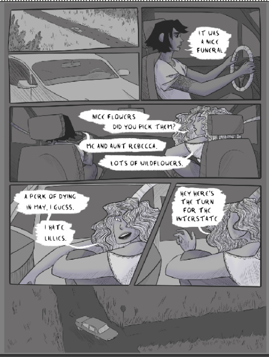
step-by-step comic page
@weremouse and I were talking yesterday about drawing comics, and the shortcuts and tricks that you end up figuring out to speed up the ordeal. I ended up breaking down one of my short-comic pages into the steps of my current process, and having done that I figured I’d post it here in case anyone else finds it useful!
everything under the cut, since this is pretty image heavy:
1. Panels! I freehand them these days, which saves a lot of time, and I like how it looks a bit softer and more dynamic, especially compared to the perfectly geometrical rectangles I used to do.

2. New layer for major lines, and a new layer for speech bubbles (I seem to have deleted the rough draft layer I was working on, but it was definitely there - no details, but I sketch out the panel layout/major shapes/speech bubbles beforehand and draw over that).
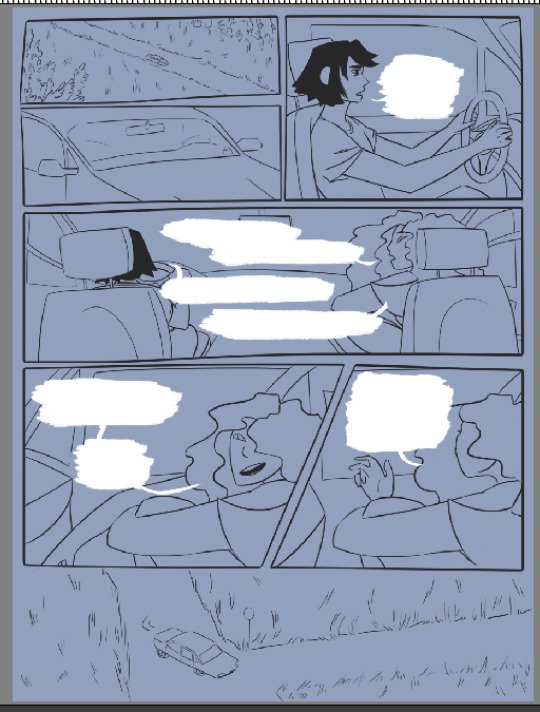
3. New layer for text, new layer for details like hair, tattoos, etc, and new layer for line shading (which is probably the single biggest step backwards I’ve taken in terms of saving time lmao)


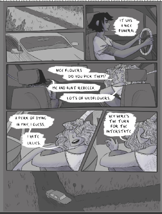
4. And that’s the hard work! The rest is pretty easy. I color most of my short comics in greyscale and then add color later. Wouldn’t work nearly as nicely for full-color, but it’s a good quick way to color limited palette comics. First step is to pick a shade of grey for the overall background:
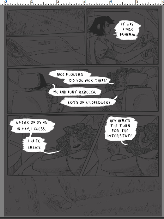
5. New layer, and block color the small panels. Use greys that contrast the background shade, either much lighter or much darker. (note - I didn’t color the car windows, since I wanted to shade what was ‘outside’ differently than the car interior. I also colored the road on this layer instead of the previous one, which was a mistake I just didn’t care enough to fix whoops).

6. New layer, color the people and any any other objects you want to shade/color separately from the background. Having the big panel background, small panel background, and people on three different layers makes it really easy to color them later.

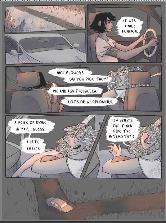
7. Time to add color! I’ll break down the individual steps I used, but the tl:dr is that I make a couple different clipping mask layers attached to a layer of flat grey, and play around with color/opacity/layer settings with a big soft brush until I like how it looks. I use a lot of soft light and overlay! Anything on a clipping mask layer only affects the layer it’s clipped to, so you don’t have to worry about precision.
Once you’re happy with it, then do the same for the other two grey layers. Each grey layer ends up looking more or less like this:

I’ll use the people layer as the example - first clipping mask layer is set to soft light, at a low opacity, and I used purple with a soft brush to add some shadows.
Next is another low-opacity soft light layer - yellow and purple, with a watercolor brush, to add a bit of texture. It’s very very faint on the people layer (you can barely see it, honestly) but recreating it for the background levels I turned up the opacity a bit more.
And the last clipping layer is set to high-opacity overlay, painting on pink with another big soft brush. I like how sharper shadows and highlights look but they take up a lot of time so I almost never do them in comics. And I like the kind of glowy look that less-exact soft round brushes add.

8. And that’s the people layer done! Because I wanted the same colors throughout, I did the same set of clipping masks for each of the other two grey layers. but this is also a really quick way to color something like my comic cursed - if you want the people to be one color and the background another, or the small panels to be a different color then the big panels, just add a clipping mask set to color/hue/overlay/whatever else works over the grey layer in question and fill it with the color you want.
anyway! here’s the small panels with the same treatment, and then the background with the same treatment.
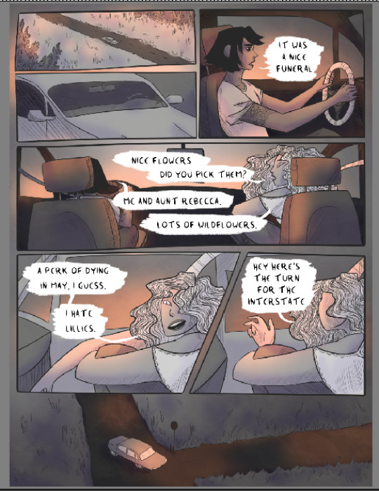
9. That’s highlights, shadows, and some basic color all set! The last thing is adding some additional soft light/overlay/etc layers on top of everything, filling them with different colors, and seeing what works. I want to get rid of the last of the grey, and unify the page’s color scheme a little more.
full disclosure: I have absolutely no idea what most of the layer settings actually DO. it’s a mystery. I’ll cycle through different settings with different colors and I am surprised pretty much every time by what happens.
What I ended up with for this comic was a layer of mid-opacity light grey, set to screen, which lightened the page a little:
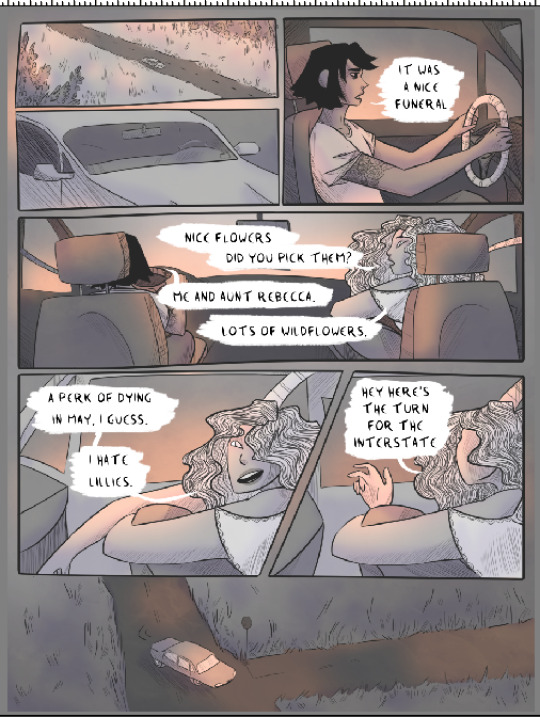
Then above that a mid-opacity layer set to color burn, this one filled a pale blue. Now the remaining greys are more bluish, which is closer to what I wanted:
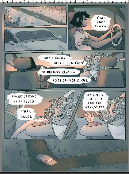
But still not quite the right atmosphere. So above that there’s a low-opacity vivid light layer, filled with the same purple I used for shadows. Now the color’s pretty much perfect.
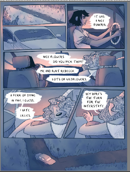
But it looks a little dark, and the pink has been toned down by the cool-colored layers. So one final layer, on top of everything: soft light, full opacity, using a big soft round brush to add the same pink in places I want to be brighter.
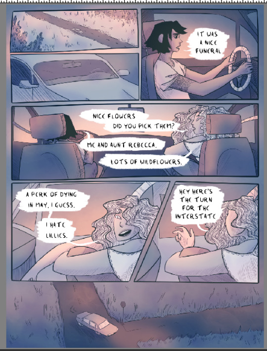
And that’s the final page! The linework still takes a while, but I’ve pared coloring down to pretty much just clipping masks, haphazard soft brush application of colors, and dicking around with layer settings. I hope this is useful!
#long post#like. long#my art#process breakdown#i learned a LOT of shortcuts from seeing how other artists made comics#even if i didn't end up using them#understanding the options available has always been helpful!#so here's this
260 notes
·
View notes
Note
How do you ink and color? Any tips? I love your art! 💜🖤
oh shit i got this ask months ago and forgot to answer
inking: god i hate lineart so much. the trick is to not do it 😂 unfortunately, i still find myself spending hours on lineart all the time @_@
the biggest thing i’ve found is making your lines varied in thickness. it adds to the interest. i also try to make my outside line thicker than my inside ones to break up the figure from the background. don’t be afraid to skips some lines and imply them with shading instead. i will color over my lines at the end to make them not as strong, but i’ve learned to still keep some lines black for extra emphasis.
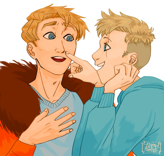
^ here’s one of my older pieces that i’ve been considering redoing. it has very little line variation, ALL the lines are colored so there’s no solid black, and there’s very little hard contrast in shading values. overall, it looks flat and uninteresting and if i had the time i’d redraw this one.
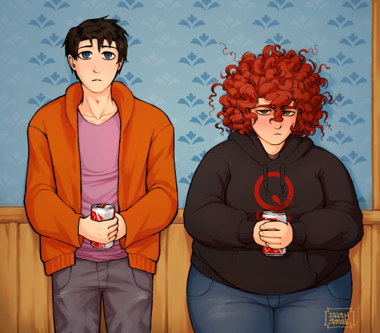
this is a more recent example of lineart that i think works a lot better. the characters are really well defined with a strong outline, but the inside lines aren’t harsh and distracting. you can see i recolored the lineart in kyle’s hair to be a dark red, and in some places it blends with the shadows to imply areas with more highlights. stan’s pants don’t have and lines in them, just the outside shape and pockets.
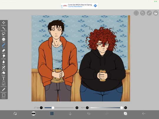
you can see in this wip what the lineart looks like before i do all the shading and fancy stuff. stan’s pants look totally flat and straight until i start shading.
a lot of the time though i won’t even do lineart, especially if it’s a big scenic piece. the more zoomed out less detail you can convey, and lineart takes up a lot of space.
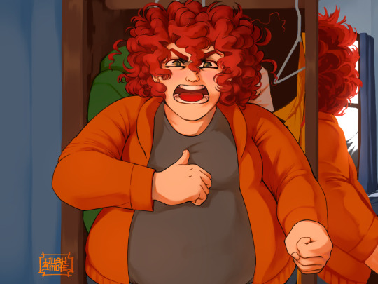
^ this piece is an example where i do both, lineart and no lineart. the mirror image of kyle isn’t the focus, and i honestly didn’t feel like going in and drawing exact lines because they’d probably look fucked up anyway. i typically don’t put hard lines in backgrounds because it would take FOREVER and just be distracting.
the one thing you do have to be careful of with lineless art is contrast. hard lines are good contrast that show you what you’re looking at, and without them your image can blend together.
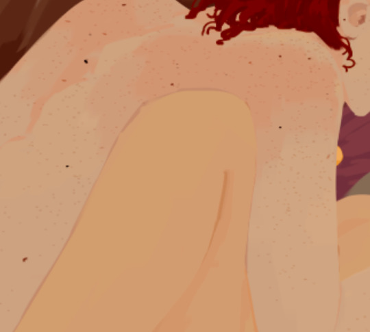
here’s part of a painting i did last august, when i was first experimenting with lineless styles (full image on my NSFW twitter). can you tell what’s going on here? i sure as fuck can’t. there’s no contrast, and it makes all the skin tones blend together in an unintelligible mush.
contrast has always been one of my biggest weaknesses as an artist, so i’ve been trying to improve over time. here’s a more recent lineless drawing:
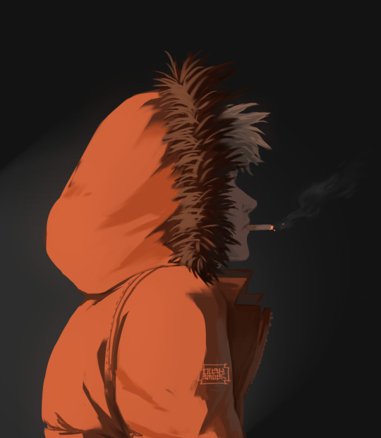
this one works because it had high contrast. the highlights are really bright and the shadows are really deep. you can still make out the facial features too, but there’s no ‘lineart’ layer’. everything was painted on in the same layer.
-
-
coloring: oh my god i love coloring. it’s my favorite part of drawing and the reason why shit takes forever. a lot of the same stuff from before comes into play, like contrast. you can also portray some really interesting moods based on colors if you’re being stylistic, but also pay in mind to your environment.
i always color my background first. in fact, a lot of the time i’ll do the entire background before coloring a piece. the environment establishes your light levels and light source, and it’s typically easier for me to tweak colors on a figure than the ones in the background. in the above example with kenny, the background is a mostly solid black with a beam of light from the left. i picked kenny’s colors to fit in this environment.
it’s also important to use references.
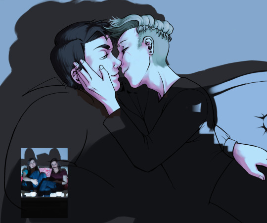
you can see in this wip i’ve got a reference image for how light from a TV looks against figures and the way their shadows are cast across the wall. it also helped me figure out what colors to use in this situation.
a lot of coloring is just trial and error to see what works. i usually start with a flat base color and add value to it. if you put all your colors on different layers it’s really easy to change them quickly.
here’s an example:
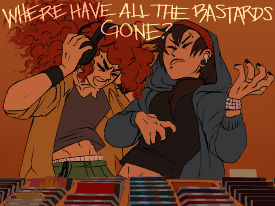
i got my base colors down and here i can see the skin tone is blending with the background, so i lightened it up for better contrast
i typically shade the skin first, then clothes. you can see here i did a dull skin tone with a bright colored shadow. this adds more contrast and interest. i always try to avoid doing dull shadows where you shift toward black. black shadows are really uninteresting and they can make your piece look muddy. i’ll typically shade with an orange, red, blue, or purple.
the final piece has a really bright highlight on it coming from behind. this just adds more visual interest and contrast. you can also see i’ve gone back into the pink shadows and added an even lighter, brighter peach value in places to show reflected light. this also gives the darker pink shadow an added outline effect, because it touches the base skin tone but looks lighter within.
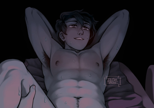
^ this one’s a good example of light and shadow (full image on my NSFW twitter lmao). there’s not a lot of color because it’s dark out, so everything had to be conveyed in values. there’s hard light across the stomach and then a shadow over the chest, but there’s still light being reflected up into stan’s face that lets us make him out. the rest is deep shadow and unimportant, so it’s all black.
that’s the other part, color and value determine where your eye is gonna look, so consider that when drawing.
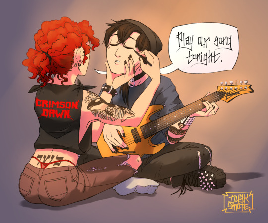
^ consider this piece i drew like a year ago. it has a lot of blues and reds, and originally i was going to make stan’s guitar blue. i don’t have the wips anymore, but it didn’t stand out and it didn’t look right with the image. after a lot of playing around i went with yellow because it’s bright, it breaks up the image, and it adds another color to the piece to balance it out.
the same thing happened when i was working on the cover image for What They Say About Us.
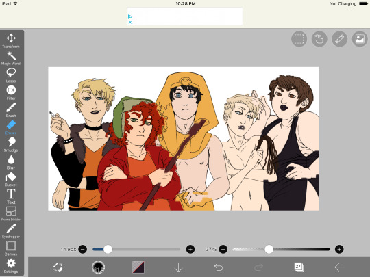
you can see in this really early wip that i’d blocked in the colors and butters is totally naked. for one, i was like “damn that kid is WAY too naked in this image” and he also blended in with stan and cartman. additionally, there was a lot of warm colors on the left, a lack of color on the right, and an overall lack of blue.
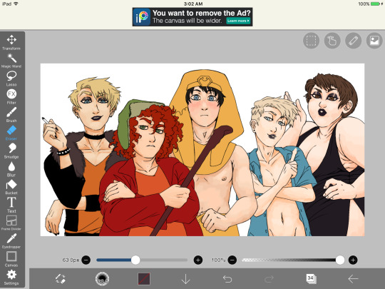
first change i made was throwing a shirt on him and it made a huge improvement. the image looks much more balanced now and he’s not super distracting with his naked-ness.
other than that, coloring is just picking your base colors, blocking in shadows, adding highlight, and cleaning it up. if you wanna improve, look at photo references. look at other people’s art and examine how they use color and value. practice practice practice. have fun with it. the most fun i have coloring comes from figuring out interesting textures like the pharaoh headdress or kenny’s leather jacket.

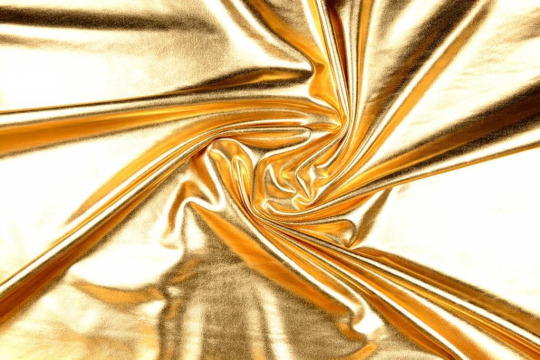
i find stock photos like this and study them to see how the light works
other than that, the rest is just playing around, seeing what works, and making things up as i go!
70 notes
·
View notes
Text
HASO, “Dye and Diversity.”
Hope you guys enjoy the story today
Yeb stared.
She tilted her head this way and then that, and then continued to stare on the other side.
A soft sigh, “My eyes are up here.”
Yeb looked up to where the human was staring at her ascance his head slightly tilted.
“What?”
“Sorry dumb joke.”
He pulled to a stop, and the strange wheeled chair below him pulled to a halt.
She stared some more, “That is so strange! It looks so fun!”
Her interjection seemed to surprise him, and he glanced down at the chair, “Um, I suppose I’ve never thought about it. It’s kinda fun sometimes. I don’t use it much.”
Yeb waddled behind the chair and clambered up on two little pegs she saw jutting out from behind, “Why not?”
“Well usually I can walk, and it is generally frowned upon to use a wheelchair if you don’t need one.”
Yeb felt a rush of wind as he pushed the chair forward, and they began to roll slowly down the ramp, “Well why not?”
He laughed and shook his head, his earlier sour demeanor lost behind grim amusement. A few of the others came to join them as they rolled downward and off the platform. Yeb lifted her eyes wide-eyed in shock as she stared at her strange and unusual surroundings, and the massive interior docking bay of the space station…. To think! An entire city built in space! Looking around she could see ships of many sizes and designs, and other unfathomable and strange creatures hurrying this way and that.
A thought came to her, “Why aren’t you using the arm sticks?”
“Arm sticks…. Oh the crutches?”
“Yeah.”
“My arms are sore from using them, and plus the wheelchair seems safer on the station. I'll Be less likely to trip and get hurt.”
“Oh ok!.”
It still surprised her to no end that the human had even managed to survive without a leg. At first she thought he might have been born with that deformity. On her planet, while it was possible to survive with an issue like that it was not very common at all. She could think of only one Tricar she had seen live to adulthood in such a condition. There were always complications, plus, while Tricar were semi-social they tended to live only in mating groups and abandon their pups at a very young age.
If you couldn’t survive to adulthood in the cold metal mazes of her planet than that was a personal problem.
She climbed up higher onto the back of the human’s wheeled chair to get a better look. She wobbled dangerously in her excitement, her hands and feet not exactly built for climbing with her stubby fingers and large flat feet.
With wide eyed excitement she looked all around them marveling at the diversity of lifeforms. There were so many of them!
She pointed to one, eyes wide, “What alien is that!”
The human turned his head to look then frowned “What do you mean?”
“That one right there!”
He frowned and looked again then laughed, “Oh well Yeb, that is a very tall human.”
“Oh, she frowned.” It sure didn’t look like any of the other humans she had seen, sure it was the same general shape, but it just looked so different that she couldn’t have been sure. But she supposed now she could see the resemblance. Like a stretched human.
“How about that one!”
The human continued to smile, “That is a human with a lot of fat, Yeb.”
“Oh…. what is that?”
“Er, like blubber but not really.”
That translated better and her ears flipped back over her head in mild understanding, “Oh, I get it, so those humans must be from cold climates, and that’s why they have insulation?”
“Not exactly.”
Her head turned and she pointed to another group, “Are all of those humans too!”
“Yes all of those are humans.”
“So pretty!” She exclaimed, they came in such interesting and new color combinations, ice white to stone ebony. Granted they all looked human, but the diversity in them was so astonishing that it was hard to believe they could all be the same species. As a biologist herself she might have assumed that maybe they were under the same classification, like fish, and how fish all sort of looked the same but that didn’t mean they were in the same biological category.
“Are they all the same subspecies?” she wondered.
“Yes.”
“Really? But they all look so different!” on her planet while they did tend to be diverse in height, their fur was generally always the same color, a grey white.
“There used to be other subspecies of humans a long time ago, but then they slowly started to die out. At the end it was only the Homo Sapiens and the Homo Neanderthalensis. Both of them coexisted for a while and even interbred but then the Neanderthal died out leaving only the Homo Sapiens with some Neanderthal DNA in certain cases,so we are all that's left, and our diverse lifestyles have given us different adaptational traits despite being the same species.”
She stared at him enthralled by this strange revelation about humans.
“For instance, in the middling areas towards the equator, things are a lot warmer and the light of the star hits the Earth directly, so humans kept their original dark skin color as protection against UV rays which can cause DNA mutations leading to cancer. A lot of times humans towards the equator tend to be taller and leaner which helps them to not overheat.”
“Your planet has a climate that diverse?”
“Yes, we can be as cold as your planet, or more than twice as hot.”
She stared wide eyed and shuddered at the thought.
“In fact, where I grew up we had seasonal changes in temperature. In the summer it was about thirty degrees hotter than the comfortable level I keep on the ship, and in the winter it could plunge to temperatures well around your home world.”
“How does anything survive in a climate so varied?”
“With air conditioning and heaters.” he said smiling, “Anyway, humans slowly began to move north, and as they did the rays of the sun couldn’t cut so easily through the atmosphere, as they were angled. That meant less UV light actually making it to earth. Problem is, humans need the sun to create certain vitamins used in the body. Darker skin helped to block the sun's rays when they become too much, but when there is less sun it isn’t so easy, and so humans developed lighter skin tones that were more vulnerable to sun damage but more easily allowed for the creation of those vitamins. In addition humans in higher climates tend to be shorter and stockier to conserve heat.”
“So…. you can tell where a human comes from?”
“You can tell where their ancestors come from.”
“So your family is from a cold climate?”
He smiled, bright white teeth showing the light above, “Yep, my ancestry stretches back to Russia, Norway, and other assorted parts of north eastern europe, but my family has lived far away from those places or the past few thousand years.” He smiled, “And yes, I can trace my lineage that far back. We’ve had pretty good record keeping for the past few thousand years considering we have internet databases stretching back about that far, and massive archives.”
“Wow/” She muttered quietly, “And I don’t even know who my mother was.”
The human raised an eyebrow at her, but by that time she had already transitioned to looking and pointing at something or someone else. She loved looking at the humans, they were so diverse and strange, and there was always something new to see. Sometimes it was their clothes sometimes it was their skin, sometimes it was their hair,
Sunny, the big blue Drev, placed a hand on the human’s shoulder in a quick gesture, “I am going to go look for the parts, I’ll get back to you in a minute ok?”
“Cool, bring me a working leg when you do.”
“She snorted but nodded and walked off,while he and the others continued onward.”
Yeb lifted her head in wide eyed wonder watching as they passed down a dark hallway from the docking bay, and then out, into an absolutely massive room. It was so large they might as well have been outside, a huge curving room in the shape of a doughnut that went around for miles and miles in either direction. Much of the ceiling above the mwas covered in some sort of see through glass structure giving her a view of space outside,and the rest of the expansive station highlighted by thousands of stars and hundreds more blinking lights.
Voices echoed and warbled all around them as hundreds and thousands of people filtered through the station like slow moving ice water. The room was so large that they had even built structures on the inside, which rose up many stories into the air glittering with colorful neon lights. She saw hundreds of aliens slipping in and out of these buildings and passing overhead on catwalks high in the air, talking, chatting and walking together.
It was all so alien and she was so excited.
She almost fell off the back of the chair as her unfit feet and hands slipped off a climbing surface. A hand steadied her from behind, “Don’t get too excited.”
She was pleased to find after that that the humans were very interested in bringing her around and showing her all of the new things. WIth her ability to eat a wide variety of food, she even got to try and taste some of their more strange concoctions, both excited and repulsed by some of them.
They walked past another shop whose brightly glowing lights attracted her like a moth to a flame and she backpedaled. Sounds pulsed and throbbed around inside her head and brightly colored pictures decorated the walls. On the inside, she watched in wide eyed fascination as one human sat patiently arm exposed, as another inked a pattern onto their skin with a whirring machine. The colors they used fluoresed under the strange blue light above.
A hand on her shoulder, “that is probably a human tradition you don’t want to experience.”
“What?”
“Tattoos, injecting ink directly into your dermal layer through use of tiny needles.”
She cringed a bit, “Why?”
“Because you can get cool pictures.”
There was a hum from beside her as one of the other humans walked up, “Maybe not the tattoo, but…” She trailed off and pointed to the other side of the room where humans were sitting in chairs leaning back as other humans painted strange chemicals on their fur. One of them stood up, and when she did, her hair was long and blue.
Yeb stared, “You change your fur color!”
“Yeah all the time.”
Adam rolled up behind them, “I don’t know if that's a good idea, we don’t know what kind of chemicals….”
“Well there is only one way to find out.”
They turned to look at her, “Want to dye some of your fur a cool color?”
She was so excited all she could manage was a squeak. The thought was so strange and exciting. There was only one fur color on her planet, to think that she could just go and change it!
Why hadn’t her people thought of this!
“YES!”
Her enthusiasm seemed to surprise them, but with smiles they were very encouraging and walked in with her as one of the humans came to greet them, “What can we do for you.”
Maverick patted Yeb on the shoulder, “Our alien friend here would like to go a different color.”
The human looked down and started with a frown, “Er…. what…. What are you. You don’t look like any Tesraki I’ve ever seen.”
“That's because she’s not. A new species, just coming into the galactic community. Anyway what do you say?”
The human paused then shrugged, “Long as you sign a waiver saying that we aren't responsible for any allergic reactions or damage to the hair of an unknown species, then sure.”
They glanced at Yeb, and she waved it off, “Let's do it!”
It was probably a horrible idea to have a team of humans not exactly known for their good life choices cheering on a naive Tricar as she chose bright neon green which was supposed to be at its brightest on the top of her hair and fade down slowly to the furn on her back.
The humans were excited all around, and she drew a small crowd as they began the process.
She probably should have been more concerned not sure what the chemicals would do to her, but nothing ventured nothing gained: that was a human expression she had learned just a few minutes ago, and she really liked it.
Warm water ran through her fur, and then a strange sticky paste was applied to it. Shehad to sit around and wait for a little bit as the color set, and then sit around some more as they washed the residual color out. When they were finally finished, she was turned to face the mirror, and her eyes went wide again.
Her grey white fur, against the bright neon green!. She turned back and forth watching the light glitter over the bright color.
“Wow.”
“Wow.”
“Wat have we done.”
“I love it!” She exclaimed, leaping out of her seat to look at herself more readily in the mirror.
She watched as Adam leaned over in his seat and passed his arm over some sort of device.
Se assumed he was paying for it and was quite pleased walking out of the shop with her new fur enjoying the eyes on her as she passed.
It wasn’t long before some of their other companions returned. Sunny turning to look at Adam with a frown, “What did you do.”
He raised his hands, “Oh come on, its harmless, na look at how happy she is. Come on.”
Sunny rolled her eyes..
“Spirits give me strength.”
Yeb capered around the group, rubbing her paws through her newly colored fur. It didn’t feel any different, but she sure FELT different.
She was sure she was going to really enjoy all these strange human things.
Then again.
She had really only experienced the good things.
It would remain to be seen if she was going to be able to handle the darker side of humanity.
279 notes
·
View notes
Note
I love your art so much! you have such a cool style. the Falnorian fashion is really interesting, I was curios about the fabric patterns, would you mind sharing how you did it?
Sure! That project was a process of experimenting with the way brushes were textured in order to emulate the feel of different textures of cloth, but there’s also a couple places where I more explicitly crafted textures/brushes/etc. I’ll go through and show you the brushes used and any additional techniques that were relevant under the cut!
So a lot of this is just flat out instructions for how to do a thing in Photoshop. If you use different software, you may or may not have all the same layer settings and options. I don’t know how to post the brushes I use to the internet, but google around--there are a lot of cheap or free cool brushes for most drawing software. These are the ones I’ve accumulated over the ages.
Also I was gonna do all the outfits but I found I was repeating myself a lot, so you only get the ones with the most to teach you, which is like four of them.
An overall note- I worked in a CMYK file format which limits the available colors and in some cases majorly changed what colors looked like under relevant effects or when changing layer settings. I don’t generally recommend this unless you need your work to be printable because it constrains your palette, but there are definitely some things that are easier to make look cohesive with those kind of automatic color constraints, so. It’s a mixed bag.
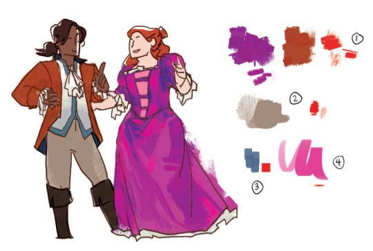
This is one of my favorite texture brushes. It jitters color, and it has some fun texture to it that can be very different depending on how heavy you set the pen pressure and how long your strokes are. I used it as a baseline for both her dress and his coat and boots, to provide texture and also give me a set of varied colors to move around and blend and work with. I spent a while on her dress blocking out color more specifically from the set that brush provided before bringing in new ones. It’s fun too because when I do texture with it it feels kind of multicolored and blended.
His pants, and probably one of the most common brushes for the Western set. It’s got a somewhat more roughspun texture while also being able to go to just being flat and cover a decent amount of space between for light texturing.
A simple square brush which varies opacity by pen pressure, for shading him.
A mostly flat oval brush that I used for highlights on her clothing. Same deal--the opacity is determined by pen pressure. Helped smooth things out a bit, and with very bright lights helps make the cloth feel more reflective and satiny.
(It should be said I know nothing about fabric and satin just seems like the ting with that kind of reflectivity--I have no idea what the fabrics in my reference images are, they just look reflective and crinkle in certain ways.)
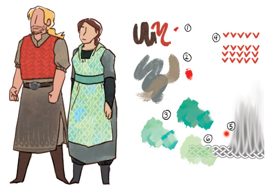
This is a brush that jitters saturation and brightness in a tad that looks a bit stripey, and I like it for his vest and their shoes because it feels a little rougher, and sometimes a bit knitted or wooly.
The base texture of both their main pieces of clothing is the same as brush number 2 from the last one, but this time with two colors overlapping one another to give it more depth and make it feel a bit rougher and thicker as material.
So this is brush 1 from the last set, but I’ve made it one color (the light green), copied it and changed the hue to a bluer shade, and then placed the two exactly one over the other, setting the bluer version to Vivid Light in the layer settings. Then you just futz around with the specific color and opacity til you’re happy with it.
The vest pattern is easy. Draw a row of shapes. Duplicate several times. Arrange in rows. If you need to, you can rotate rows a tad to get them to look good when they line up.
I have a celtic knot pattern. For his clothing I set one row of the pattern at the bottom, lowered the opacity, and used a soft brush with the smudge tool at 80% or 90% to pull the color from the top up over more of his clothing.
For hers, same deal but instead of using the smudge brush I set the layer to being some kind of color burn or linear burn in the layer settings and set copies of it in a line so it looks like a repeating texture.
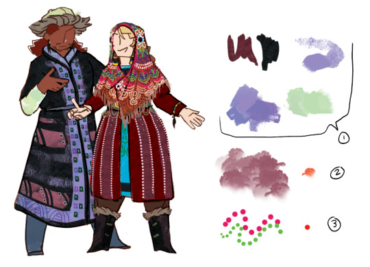
You know all of these by now, they’re the ones that keep coming up and from now on I’m not going to talk about them anymore.
This brush looks like trees! And also I use it for weird cloud patterning on both these guys and the Lakeshore pair.
I made a brush that is dots! It is just a circle with the spacing settings turned up so that there’s distance between them. The dots brush is a fucking lifesaver. It can look like beads or coins or be converted into other patterning. It’s great. A+ don’t know why I didn’t do this earlier.
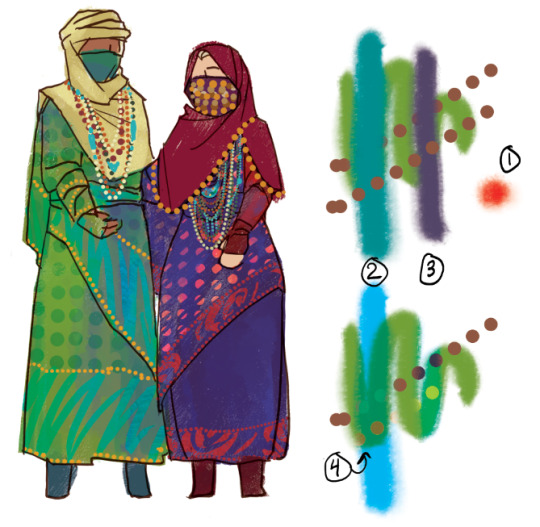
The last thing I have for you is mostly about layer settings, which I am very poor at explaining, so sorry about that.
I used a watercolor looking brush thickly for the Greyfen to give the cloth a kind of slightly iridescent silky vibe. How the colors work in the other points.
The difference between the blue stroke in the above version and the below version is that the bottom one is on a layer set to Pin Light. I’m not sure exactly what pin light does, but it tends to produce colors that kind of combine the feels of the relevant colors? It’s definitely one to use when you’re trying to make things shade in a way that feels iridescent.
The difference between the purple stroke above and below is the one below’s layer is set to Vivid Light. Vivid light tends to produce brightly saturated colors and I kind of have no idea how it works either. Just futz around with the hue of the Vivid Light layer until you like how things look.
Lastly, the bottom line of dots has been set as a Clipping Mask over the two stroke layers. Because of this, it only shows up where it overlaps those strokes, and I think takes on their properties? So it’s operating like it’s Pin Light over the Pin Light layer and making that weird gold color and acting like vivid light on the vivid light layer and making the yellow green. The Clipping Mask is your best friend because it saves you a lot of erasing and lets you make things transparent along with or otherwise fall in line with whatever they’re attached to.
I hope this was helpful and I’m sorry if it was confusing. Thank you again for your support and your interest!
33 notes
·
View notes
Text
with you [mark]
in which anywhere is fine, with him. [friendship/romance/fluff]
word count: 2k
“dude, let’s go outside. i’m going crazy,” mark announces as his busts into your room which may as well be his room from all the times he doesn’t bother to knock. quarantine had you two, like many other people, cooped up at home. while you didn’t mind the downtime, you have to agree with his sentiment. you’d seen too much of your tiny apartment in the past half year. you wonder if you’ve seen too much of each other in the process.
you look up from your phone. “do you actually want to hang out with me or do you just need me to drive because you can’t?”
mark scoffs in mock hurt. “don’t ask me stupid questions.”
you weren’t actually going to deny his request, in the end. there’s not much you wouldn’t do for him, but you’re never going to let him know. you roll off of your bed, glance at yourself in the mirror to make sure you don’t look too unacceptable, and grab your keys. you two make it all the way down to the parking lot and in the car before you think to ask, “where are we going?”
mark fumbles with the seatbelt. “literally anywhere. just go. i’ll tell you if i see something.” you roll your eyes but smile a bit to yourself. he never has a plan. but you trust his gut, so you start the ignition.
you two don’t live right in the city, it’s a bit of a ways out. you’re familiar enough with the few coffee shops and shopping centers nearby, but you won’t be stopping in to those today. seems like this late afternoon is going to be a time for exploring. you head towards the city. on the drive up, mark rambles over the hum of the car about some class stuff, some total nonsense, as he usually does. he's the talker in this friendship. sometimes you bicker with him, most of the time you just listen, because you love everything he has to say. everything that funny little noggin comes up with.
“... like, they’re so cute, oh my god dude do you think we should get one? does our apartment allow—wait, turn here,” he cuts himself off suddenly. you lift the blinker to turn. “why, is something down here?” you ask. “no, i just... i have a good feeling about this right turn.” you snort. “yeah, ok.”
a few minutes later, he decides to turn right again. then left. “mark, you better remember all these turns.”
“don’t worry, i’ve got it. i’m a natural at directions.” (no he wasn’t, but it’s fine, you’ll GPS the way back.)
eventually, it seems you have made it to the edge of the city, but a side neither of you have seen before. by some miracle, you manage to find free parking. (albeit in a sketchy location, but something tells you towing management has long forgotten this area) the sun sits lower than it did when you left home, colors deepening into an warm pink and orange. sunset doesn’t seem far off. mark takes note of that. “let’s find a roof and watch the sky.”
“couldn’t we have done that at home?”
“i don’t know, something about being lost when the sun is going down in the city hits different.”
“oh, so you are planning to get us lost?”
mark gives you that cheeky grin of his. “i never plan for it, but even if it happens i’m not worried. we’ll find our way.” you believe him. he’d never actually put you two in crazy danger.
you two head off, commenting on the displays of the small shops that are closing. the outskirts of the city have a personality you can’t put a name to. quirky? unseen? the center of the city has urban outfitters or whatever, but here where the sidewalk is cracked and the brick is several decades old, the shops look timeless. there would always be a time and place for antique toys and custom stationery.
“yo, let’s come back here during the day. i need to see you wear that hat.” he points to some white, lacy monstrosity.
“i’d look so stupid.”
“that’s the point.” you shove him lightly. “i’m joking. i think you’d look cute.” he says things like that sometimes. you can’t ever tell if it’s just because you two are best friends and have that level of honesty with each other, or something else. you have never allowed yourself contemplate the latter possibility.
you pass a few more blocks before finding a parking garage. you regret not parking here, but it’s okay. the walk was nice. it’s not the tallest structure in the city, but it’s tall enough to have a nice view. you two take the elevator to the top.
“damn, it’s windy up here,” mark says once you step out. the setting sun seems brighter, more intense here. you glance over at him. it was indeed windy, the breeze tousling his bangs and exposing his forehead. he squints as he scans the area for a good place to sit. it should make him look silly, but you should realize by now you’re whipped for him, because all you notice is how prettily the sun highlights his cheeks.
“over there!” you’re jolted from your thoughts as he turns to face you. his eyes glow, a warm brown that shapes into crescents as he smiles. he grabs onto your sleeve and pulls you to sit on the ledge. it’s wide enough to stretch your legs out, but you’re thankful for the short railing. during construction had they considered activities like looking off at the sun from this ledge?
the two of you settle yourselves, sitting thigh to thigh and leaning forward onto the railing. it’s getting a little chilly, but his leg is warm. tints of blue have joined the pinks and oranges in the sky, sun continuing its descent onto the skyline.
you sit in comfortable silence, because even though it is mark, he’s not talking all the time. he knows how to appreciate the mood. still facing the sky, you glance over to mark at your side, and you admire how admiration looks on his own face as he looks out. he’s so in the moment. when he's focused, he develops a stillness that you’d never find from him any other time. when he’s focusing on work or studies, he has a furrow in his brow and his jaw is set, but in this stress-free sort of focus his features lack tension. his eyes are glazed over as his mind stirs with thoughts. he looks like he’s forgetting to breathe. (he probably is.) you poke him in the ribs. he turns to you slowly, raising a brow.
“you must be thinking up a storm, you haven’t said anything for like ten minutes,” you say, leaning back onto your crossed arms and peering at him over the folds of your pullover. he smiles gently and mimics you, faces not far apart, eyes open wide enough to see into each other’s souls, if you so desire.
“hmm... i dunno, like...” he glances up in contemplation, minimizing his need to say “like” five times. but he can’t help letting out another one. “like... i’ve just been thinking about the future, i guess.” it’s your turn to raise a brow, prompting elaboration.
“you know, like, after we graduate, what's life going to be like? i probably won’t be able to talk to all of the other guys like i do now.” pre-quarantine, he had a pretty hefty friend group he would hang out with, some he was closer to than others but he still really loved them all. some of them would still come over nowadays, but he has a point that things would be different in the real world. “i know we care about each other, but i noticed when you get older you kinda have to focus more and more on yourself. so then... we’re not gonna be able to talk to each other as much. and maybe i’ll never see some of them again.” his mouth settles into something shy of a frown.
“whoa there, don’t be dramatic. whenever you get married—if you do—” he pouts at you and you grin. “—you can invite all of them to your wedding, you can look forward to that at least.”
“haha, yeah i guess. well, i mean, i know i’ll get over it once the time actually comes. life moves faster than we do, you know? so it’s ok, i’m just overthinking.”
“damn, you sound so profound today.”
“thank you, i know it’s rare.” even though he doesn’t share his serious thoughts too often, you know underneath the rambles and high energy, he’s so intentional about everything in his life. you’re grateful to be part of it.
you move one of your arms out from under your head to fumble with the cuff of your sleeve, staring at your fingers as you ask, “what about us?”
“what do you mean?”
more fumbling. “i mean... do you think we’ll inevitably grow apart too?” a moment passes with only the fabric of your sleeve making noise. you look up to him to gauge his thoughts, only to find him staring at you. there it is, the set of the jaw. you blink, unable to hold his gaze.
“what’d i say about not asking stupid questions?” you thought your question this time was valid. his eyes soften. “well, i mean. i can’t imagine life without you. you’re always there. you’re always here. i never even had to consider it... the idea of us growing apart. so... if we suddenly don’t talk anymore, it’s your fault, because i have no plans on doing that.” he’s so confident in the two of you. it was just you afraid that he didn’t feel the same way. how could you have doubted him?
the sky’s more blue and black than orange now, but the sun is still there, a sliver that permeates the horizon. the light has receded from mark’s face, the remaining shadows contouring his small, prominent features. another breeze cuts through the air that has shifted from chilly to cold, and you put your hands together, sitting up.
mark covers your hands with his, straightening up to scoot even closer to you, which you didn’t realized was possible. he rubs his palms over your knuckles then brings your hands up and breathes warm air onto them. he touches you delicately, like something precious. he knows you’re not fragile, but he only wants to show you tenderness at the moment. his thumb swipes back and forth over your fingers as he seems to be lost in thought again.
making up his mind, in the last light of the day, he lifts your hand to his lips and presses a kiss to it. warmth spreads from the point of contact all the way to your toes. you hope your face isn’t as red as it feels hot. mark lifts his head to meet your eyes. even though the sun’s down, his eyes glow. you could lose yourself in them. you can’t help smiling widely at him, joy overpowering your shock and the palpitating of your heart.
mark looks out over the railing. he holds your hands to his chest, to keep them warm, or maybe just to have you close to him. “well, i guess the show’s over. should we go home?”
“yeah, okay.” the two of you hop off the ledge, mark still firmly holding your hand and your other tucked away in your pocket. once you make it to the bottom of the parking garage, there are only a few streetlights on and ahead the sidewalk is mostly lit by the moonlight. standing under one of the streetlights, you look at your intertwined hands and steal another glance at mark. you think that he glows in sunlight, moonlight, streetlight, anywhere. he’s simply always alight.
“how are we supposed to get back to the car now, mark? do you even remember the way back?”
mark laughs and puts up his hand not holding yours to your cheek. “it doesn’t matter, as long as i’m with you.”
#mark scenario#mark scenarios#nct scenario#nct 127 scenario#nct dream scenario#nct u scenario#nct 2020 scenario#super m scenario#SuperM scenario#mark#mark lee#nct#nct 127#nct u#nct dream#nct 2020#SuperM#super m#type: scenario#format: normal#genre: romance#genre: fluff#scenario: mark#scenario: nct#scenario: nct 127#scenario: nct dream#words: 5k#author: jae
41 notes
·
View notes
Text
My Art Process (sort of, for painterly portraits)
So a long time ago @iartsometimes asked me if I could make a post about my art process and here it is finally! I'm not really sure how to explain it in an accurate or interesting way since a) I didn't save as many progress pics as I should have and b) my process isn't always exactly the same every time, but I'll do my best to describe the main ways in which I make this sort of art most of the time. And I'm using the process for this drawing as example.
This was a relatively very quick one so it's not as detailed as some others but the basic principles still apply. For practically all my art on this blog I was using at least a couple of different brushes but nowadays I'm only using one of those, set at 50% oppacity. I always start by just filling in the background with the main color that stands out to me from the bg of the ref itself, and then I lay down some more basic big blotches of color here and there to get a sense of the overall colors and values (light and dark areas).

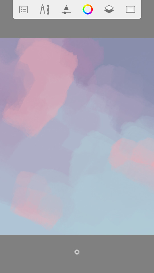
It doesn't have to be totally accurate to the ref but I just take my cues from there so it fits well in the end and also because I don't like to start drawing on a blank/white canvass.
Then on a separate layer I just start blocking a general shape of whatever part of the subject grabs my attention the most, so sometimes I might actually start with the clothes if it's a bigger area of solid color, or the hair, but in this case it was the face. And again I just pick a main color to start blocking and then keep blocking dark areas to start getting the shapes before eventually moving on to highlights and other colors (like warm and cold tones).
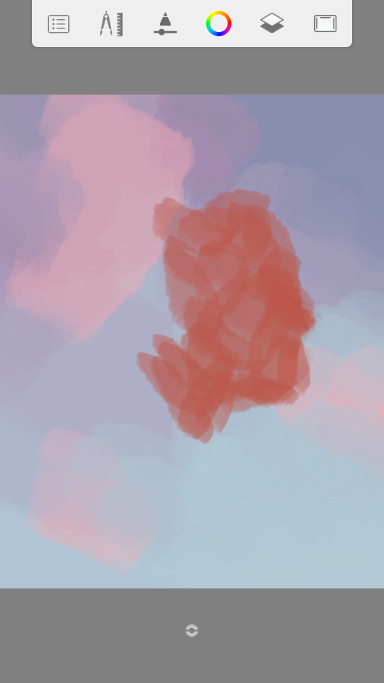
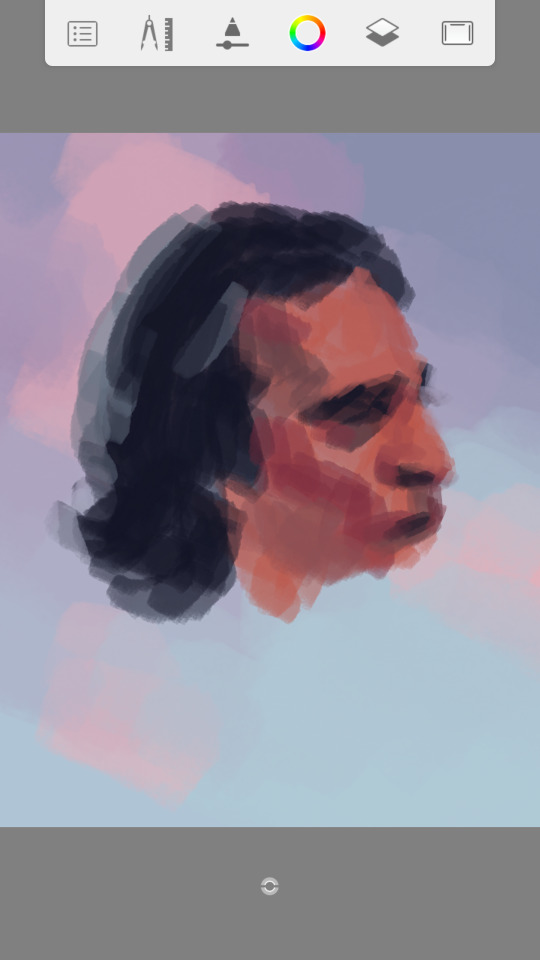
I never sketch with this kind of drawing where I'm using a ref and find it easier to just paint and slowly make out the shapes and build the details, and I prefer doing it on one layer or as few layers as possible that I'll end up combining into one.
Sometimes I block out the whole overall shape before starting to add the inner shapes and details but in this case for some reason I just felt more like doing it part by part so I did a lot of work on just the head for a while, and then the shirt, and then the jacket, and then the cigarette, but kept going back and forth to all those parts to add and adjust more little details. While I'm doing this I'll often also resize the drawing at least once or twice and move it to where I want.

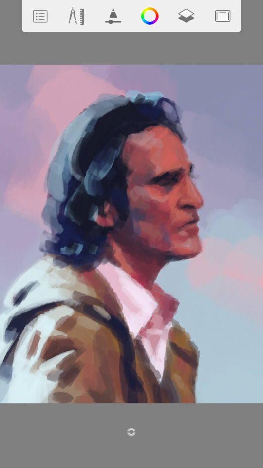
I usually make colors by just changing them however I need from some color I already put down in the bg or some other part of the painting. Something I really like is color contrast so I often like exaggerating little blocks of warm and cold tones, and I also love just leaving things looking a bit rough around the edges with visible brushstrokes.

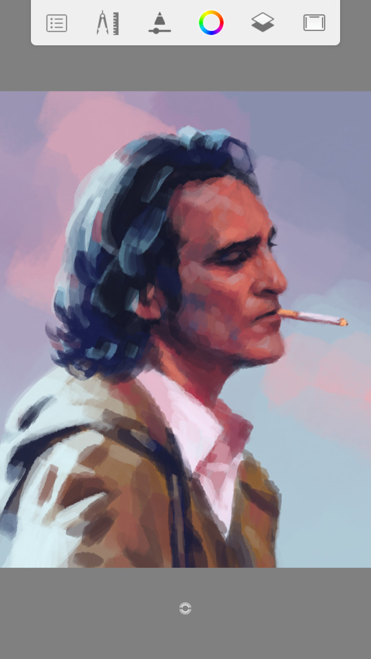
So after these one I didn't save any more progress pics I think. I just finished some details everywhere like the top hair, the print on his shirt, some stuff on the jacket and probably his face too. I'm never really completely done with any particular part of a drawing until I decide I'm done with the whole thing.
And then another thing I always do, sometimes during the process of the rest of the painting but other times, like in this case, after I finish the subject, is that I add more detail to the background. I do this on a separate layer and usually it's just adding more colors to make it all flow better with the rest of the drawing, fix anything with the values, and just add some random spots of contrasting colors to make it more interesting by making some big brustrokes and then partially erasing them (though I didn't add the smaller spots so much in this case and left it at bigger adjustments).
After that the only thing left is that I almost always adjust the final colors in all the layers (I usually end up with about 3-5 layers) to make them a bit more intense. Usually I like to make the midtones warmer by increasing the reds or magentas, I make the shadows more blueish, and the highlights more yellow.
Not sure if I mentioned everything I do or if it was cohesive and interesting but yeah I think these are the main "steps" or elements about my portrait painting process. In general, I prefer painting without sketching, focusing on the bigger picture rather than details, leaving things kinda rough and having visible brushstrokes, and play around with bright colors and exaggerated color contrast. And finally here's a little progress gif of all the images above plus the final drawing where you can kinda see it coming together.

Thanks for reading! And thanks Tanya for asking about this!! Hope it was the sort of thing you had in mind XD
15 notes
·
View notes