I am a student at the school of art in Belfast. This is my research and thought process to all of my work. Digital Portfolio IXD 303 Lecture notes IXD 304 Lecture notes
Don't wanna be here? Send us removal request.
Text
Logo
The logo was really cool to create because I was able to work with Laura’s initial design and then try and turn that into a logo that could represent the brand. When coming up with a logo for an app it’s easy to go overboard and forget that the screen is smaller. I think that this design works for the brand and looks well in the context of the app design.

0 notes
Text
Profile screen
We didn’t want to make a profile just for the sake of it so I wanted the profile to have a purpose made since to store the data here so the user could track there progress as well as altering what you want help with.
When it came to the design I wanted to make it consistent with the design of the rest of the app. I’m really happy with the way that it turned out because it isn’t just a wasted page and holds an actual purpose.


0 notes
Text
Colour palette and font
Colour palette
For the colour palette we wanted something bright and colourful but not have it overwhelming and take away from the purpose of the application, went in a few different directions like trying out a brighter palette, we also tried a darkened version which ended up being too monotone and not the best looking.
in the end we went with the colour palette you can see at the bottom of the post. We went with this because we though it was bright and complimented the information really well and it also had quite a calming and welcoming effect to it as well.

Typeface
For the typeface we didn’t have to really dwell on it for too long because Laura, one of my teammates had spotted the font and we really like the look of it and when we put it in the context of an app it worked really well.

0 notes
Text
Search feature
I think the search feature was really important to the app so I did a lot of research in order to properly design it for the purpose that it was going to have which was provide the user with the best information possible in a clear and understandable way.
I am really happy with the way that it turned out because I was able to adhere to the design style I had incorporated in the previous screens as well as create a way for users to find the information they were looking for.

0 notes
Text
Playlist feature
This feature allows users to play different media such as podcasts and music playlists with the using this media as a form of helping students calm down and be productive. The podcasts will give them information about mental health and they will be able to listen to other peoples personal experiences with mental health and how they overcame them.
I took inspiration from Spotify and apple music in terms of the layout as well as my own sketching process and I really like the way that it has turned out and the whole design work really well with the other screens and I think there is a strong consistent style through my screens and also through my groups screens.
I also added the ability to like the podcast but this won’t be visible to everyone just the app and creator.


0 notes
Text
Home screen
When designing the home screen I wanted it to warm and welcoming with calming colours so the user doesn’t feel overwhelmed, I think that it is a really important element of the design because of the type of app we are creating.
I didn’t want to put a lot of text into the home screen so it doesn’t get crowded and hard to read and understand but enough to explain what each feature is. We thought a lot about the language and tone of voice we used when designing these different screen.
I tried to design the icons as consistently as possible throughout all of my designs so that they all fit the one design style and if you took one icon out and put it on another screen it would look like it would belong on my teammates screens as well.


0 notes
Text
Working on paper pt2
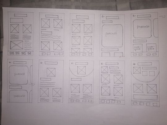
During are group calls I decided to sketch while we were talking so that I could be on the same page with my team, I wanted to test different layouts to see if the information we were discussing would fit in different layouts and this helped a lot when going on to sketch more defined layout designs.
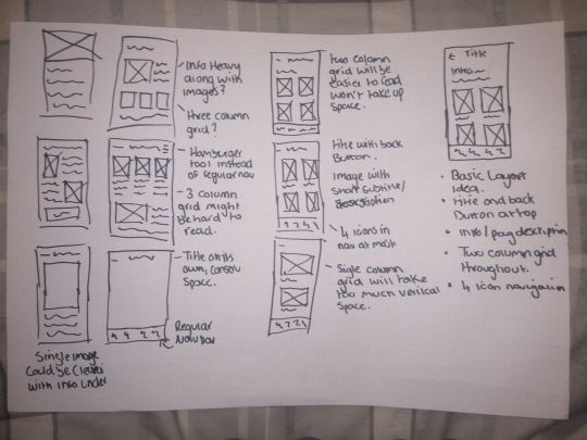
Layout sketches
These are the sketches that determined the design of the screens I designed and because there was such a short turn around from the brief being give out and the final hand-in I needed to establish what the layout design would be so that I could show my team what direction I was going in.
0 notes
Text
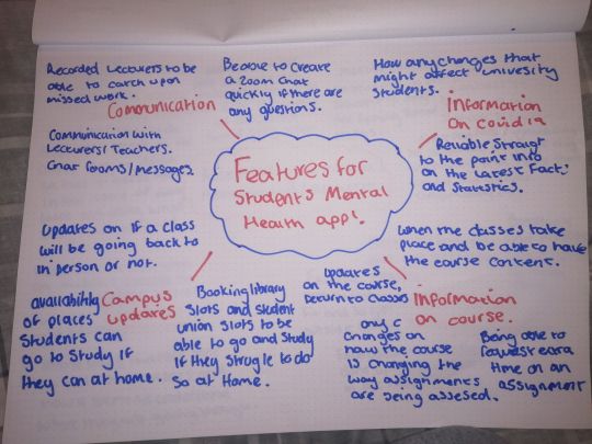
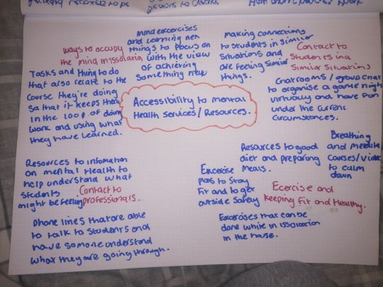
Working on paper
After we had enough research and we had a solid idea on what the app was going be and the topics we were going cover and the amount of information we planned to include.
I then had enough to start developing the idea on paper to see all the potential features we could include and then boiling that down to 3 or 4 aolid features that would help students during this time.
0 notes
Text
Questionaire part 2
Who has supported you with mental health stuff?
Teacher - 3 votes
Friend - 20 votes
BF/GF - 7 votes
Parent/Guardian - 15 votes
professional -4 votes
From this question we were able to see who students relied on in terms of advice and help regarding mental health during this time. We wanted to make sure people had access to professional information.
What have been some of the common challenges of managing your mental health during Covid-19/lockdown?
School/University - 18 votes
Loneliness - 18 votes
Working from home - 11 votes
Routine - 16 votes
procrastinating 16 votes
We were able to address what people were struggling to deal with at the moment and from this we were able to plan the features we were going to implement in order to take some of the stress of students with these issues.
What do you feel have been common mental health problems for you during Covid-19?
Anxiety - 16
Depression - 10
Self esteem - 12
low mood - 16
eating behaviours - 11
alcohol/drugs - 5
Do you feel like your mental health was harder to deal with before or during the pandemic?
Before - 11.11%
After - 81.5%
On a scale of 1 to 5 rate how severely has your mental health has been negatively affected during the pandemic?
1 - 3 votes
2 - 8 votes
3 - 8 votes
4 - 7 votes
5 - 1 vote
0 notes
Text
Questionaire
As a group we put together a questionnaire to see what who the main audience was and to see what problems they encountered on a daily basis so we knew what features the app needed to have to best help the target audience.


0 notes
Text
Big Motive project
For the 2nd assignment of the CER Economic recovery module we did a project that was put on by Big Motive and the brief was simple and it is as follows.
The ongoing transformation of public services has highlighted the increasing ‘digital divide’ between Millennials (who possess a high level of digital literacy) and large groups of the population who struggle to access essential services. This problem has been compounded by the restrictions imposed by the Department of Health in response to Covid-19.
We would like you to identify a vulnerable group within the population, research their specific needs and challenges and develop ideas for a new digital service that can support better health advice and care.
Who to choose?
In our first meetings we discussed several options that we could go with and it was either older people who are greatly effected at the minute and are very vulnerable to Covid 19. Another heavily effected group is students who are trying to navigate through the hardest and most important parts of their lives in university and they have to do it through a computer screen.
After a group discussion we decided that we were siding with the latter and focussing on students and we were going to research this and see what we could come up with to pinpoint the struggles that students face.
0 notes
Link
This is my prototype, this is one of my most favourite projects that I have done and I think the style I ended up going with and how it was ececuted in the final design was really cool.
Although I was scared to coding it and turning it into a functioning website I think that given I have so much time because of the early finish that I can put my head down and tackle everything that will end up going into this website.
0 notes
Video
tumblr
I wanted to do a video showing how a user might use the app and show the page transitions although this was meant to be a website and a one page scroll so most of the things I was trying to do in the final website wasn’t really possible in terms of trying to get a transition that looked like the way I wanted to do in the shortened time I had.
I really liked the way it turned out and I really enjoyed doing this project because there was a lot of creative freedom awarded to me in terms of what style and direction I wanted to take the project in.
0 notes
Link
Here is the link to my prototype, It is not 100% done but I am happy with the progress I have made despite the shortened time frame. I really like the design style that I have ended up with for this project and I am really excited to get back at it and finish the prototype.
0 notes
Video
tumblr
I the Loop prototype video
I did a quick video to demonstrate how someone might go through the app and show some of the transitions that I have included.There are a few things that I would like to improve on such as the animations and the different ways that would make it more immersive but for the time I had with it, I am really happy with how it turned out and I will continue working on this in the future to make it a lot better.
0 notes
Photo
logo Sketches
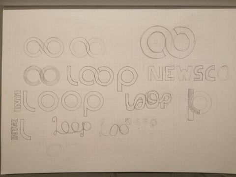
This mess of a sketch is my logo design I started with the idea of the loop and then I was sort’ve obsessed with the loop and how I would make it perfect, eventually finding a grid that helped me out.
About midway through the project I realised that I had a few problems because my logo was a bit too close to a youtube channel called Looper that also used the looped double o, although different context, it was a bitt too similar so I went back and adjusted and tried out a few different ideas I thought could work.
0 notes
Photo
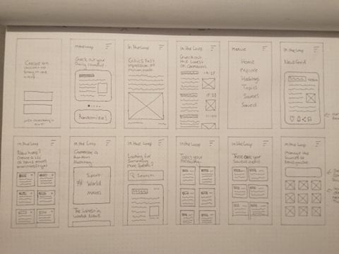
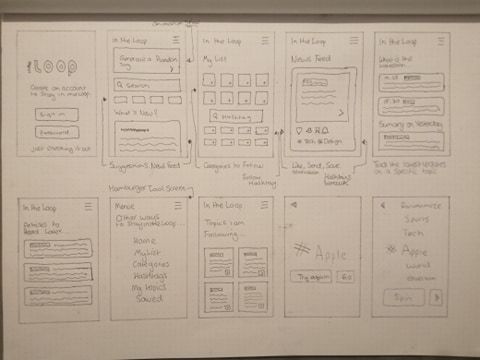
Wireframe Sketches
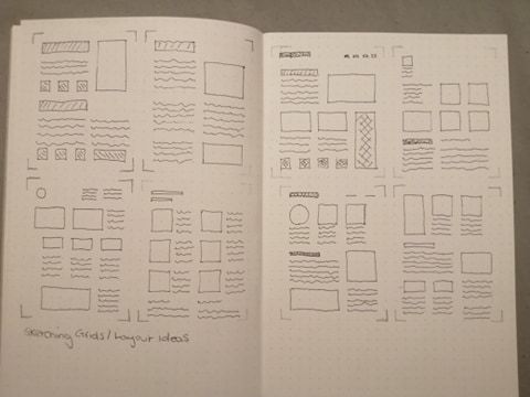
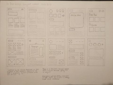
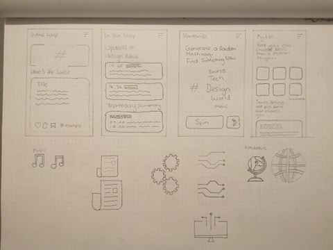
These are a few pages of my wireframe sketches, I had so many ideas for the layout and I was finding so much inspiration for the layout online so I was able to bring ideas to paper and mix and match from the inspiration that I had found.
I really liked doing this process and I fell like I have made a big progression in terms of delivering a decent level of sketches for a project and I feel like it helped a lot when it came to wire-framing the app because I had clear ideas on how to position things and the grid that I used for the designs.
I am really happy with the way the sketches looked and how that then transitioned into the digital project that I have now. I think I need to work on movement and showing that in the sketches that I do.
0 notes