#I did the title illustration and the anime intro background
Explore tagged Tumblr posts
Text
youtube
more work stuff eeey the long term project I've done a lot of concept work for has finally been announced :D Alabaster Dawn! while we wont do a full release for a good while, we're aiming for a 2025 early access release, and you can wishlist already on steam <3
#indie games#indie dev#gamedev#workstuff#game art#Alabaster Dawn#AlabasterDawn#crosscode#I did the title illustration and the anime intro background#really proud of how it turned out#Youtube
13 notes
·
View notes
Photo

July was a very Death-esque (as in, tarot Death) month for me. I lost one of my pets, I got assigned to a new highschool (a yearly occurence for most of us working in the public school system), some of my hubs’ projects didn’t come to fruition, others did. There wasn’t as much me-time as I anticipated, tbh! But today, I’m going to showcase one of the tools that did make an appearance during the highs and the lows of the month: the Dirt Gems Oracle, a botanical deck by Anne Louise Burdett & Chelsea Granger. These friends were inspired by their love for the earth and all the medicine and healing that it holds, and it is a stunning set of cards and guidebook.
I know the deck already looks awesome by the pictures, and the first time I read about it, it really caught my attention. But there’s no way of expressing how much power and beauty it has when you see it in person and work with it. It has such a strong energy, vibrant but steady. It has its own structure, created by combining the elements, weather systems, alchemy, and energetic signatures of the plant allies. The 65 cards are in fact divided into suits: ablaze (15 cards), afloat (14), adrift (17) and amidst (19). The division is clever and based on the different charactersitics of each of the plants involved, and each suit is associated with an element and a colour palette (most clearly seen in adrift with its b&w).
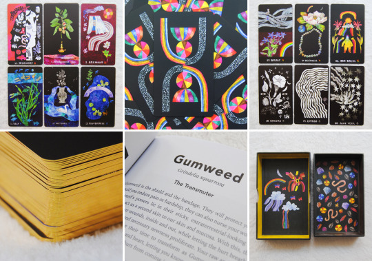
And it is incredibly fun. It doesn’t mean it can’t get deep (it does!), but honestly working with it is just so enjoyable even if it can look dark and kinda moody. The art style is very unique, with a dreamy feel, and the use of colours (including the restricted palettes) feels magical. It does show the care, experiences and knowledge that went into it. The illustrations make use of the black background to give them space and a lightness that works amazingly well when using these cards with other decks. Most of the elements presented are plants and animals, but there are also other natural elements, charachters, and human-made objects. The cards have a buttery matte finish (they are able to slide, unlike with the rose-petal finish), they are gilded (in either gold or copper) and they come inside a fully illustrated two-piece sturdy box.
The companion guide is juicy, at 165 pages. It has a small intro which includes plant magick, the suits exploration with intro to and associations for each, a how to, example spreads, and a few words on tradition, arriving at page 25 to the cards’ information: a b&w image, the plant name (including its scientific name), an assigned title (eg. The Transmutter for Gumweed), and the message and meaning of each card itself. The illustrations can offer enough of an intuitive hit to work with them alone based on the symbology that goes with the plants and the way in which they are presented and coloured (especially if you’re versed in plant lore), but in my case I find this to be a deck whose guide I find necessary and enriching.
The Dirt Gems Oracle is a deck that links the very tangible reality of plants to their ethereal aspects, as well as guiding us along this bridge to (re)connect with the earth, and hence, with ourselves. Though the four elements are present, I feel it’s mostly a grounding and reassuring deck with lots to teach. It is fun, eye-catching and well-designed, and it vibrates to an energy that should be very basic and present for and in us, but that the modern world can tamper with frequently. Anne Louise Burdett & Chelsea Granger have done an amazing job with this deck, so if you want to know and see more, head over the Dirt Gems site!
39 notes
·
View notes
Text
20 Years of Mazeguy Smilies, 35 Years of Pixel Art
It's been twenty years since I first shared my smilies with the world! To celebrate the occasion, I made this collage:
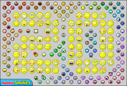
Coincidentally, this year also means I've been making pixel art for about 35 years. I've written an article about my journey which you can read here, but I'll recap a few highlights:
1986: Dazzle Draw
The reason Mazeguy Smilies exists is probably due to Dazzle Draw, a painting program released by Broderbund Software in 1985. My family had an Apple IIe computer at the time, and I believe we bought Dazzle Draw the following year. I was eight years old at the time.
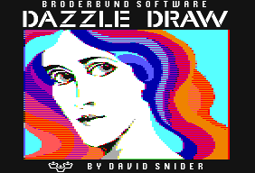
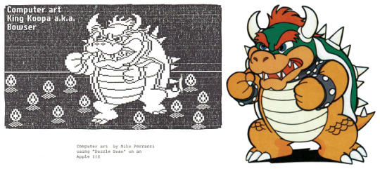
Back in those days, I didn't have a Wacom tablet, and drawing freehand was difficult. I figured out that the best way to create the curved lines and details I wanted was to zoom in and draw one dot at a time. Unbeknownst to me at the time, I was learning the basics of what would later be called "pixel art". Today, I create smilies using the exact same technique.
My siblings and I had a lot of fun with Dazzle Draw, filling fifteen floppy disks (the ones that actually WERE floppy) with over 100 paintings. Unfortunately, only one has survived to this day. This portrait of Bowser was converted to black and white, and printed in my junior high school's newspaper.
1992: Mario Paint
My next drawing program was Mario Paint for the Super Nintendo. I loved the fact that you could combine art, animation and music to create multimedia. I still have my copy of Nintendo's Official Mario Paint Player's Guide, even though it's quite worn out from reproducing video game sprites and songs.
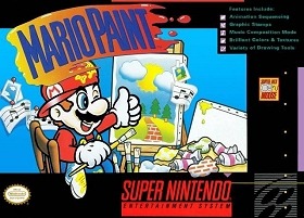
Mario Paint included several "stamps", small pictures you that could paste onto the canvas or use as a paintbrush. A Stamp Editor tool let you edit existing stamps or design new ones on a large, 16x16 grid. Sound familiar? Thanks to Mario Paint, my pixel art skills were refined a little further.
So, what kind of videos did I make using Mario Paint? Well... Um... Stuff like this...
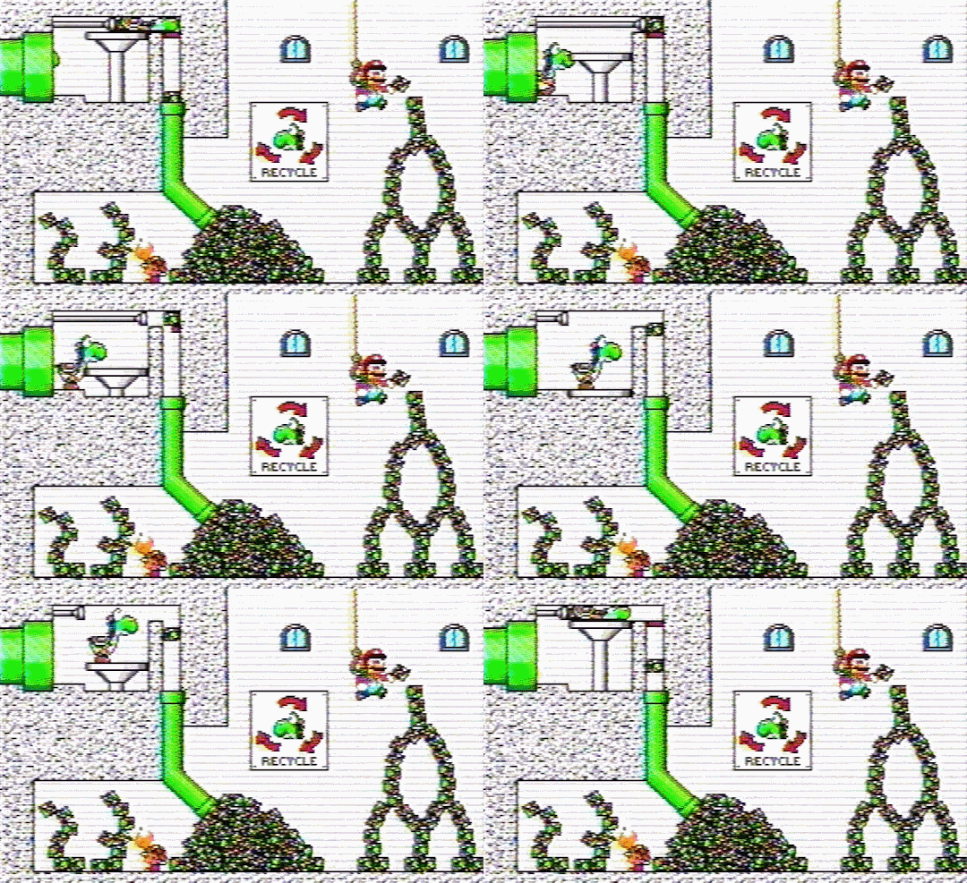
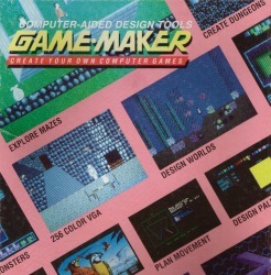
1994: Game-Maker
Game-Maker was developed by Recreational Software Designs. It's a collection of design tools that allows users to create their own DOS games. To test out the software, I made a simple game in which a guy tries to get through a maze. Yes, this is where "mazeguy" came from. Somehow, it became my nickname, then the name of my website.
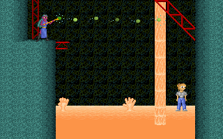
Mazeguy grew in complexity, and eventually morphed into Invasion of the Blobs, which later got a sequel. Both games required drawing and animating backgrounds, enemies, and heroes. Title cards, level intros, and cutscenes were also illustrated pixel by pixel.
2001: Flash Kit and Tripod
At the beginning of the new millennium, I started using Flash for the first time. I needed help learning how accomplish certain tasks, and discovered many helpful tutorials at FlashKit.com. I joined the forums, and found a thread titled "Smiley Award Winners". A user named ThundaChunk, a.k.a. JohnnySix, was awarding a small banner to the best smilies submitted in an earlier thread.

It was too late for me to participate, but after fifteen years of creating pixel art, the idea of making smilies intrigued me. I made a whole bunch and put them on my Tripod website. While I was having fun seeing how many emoticons I could come up with, I was also secretly hoping that another smiley contest would be held in the future, and I'd get my own Smiley Award.
Then, on March 29th, 2001, The all new FK members smiley thread appeared. I quickly posted a link to my collection. And so, after a little prodding, I got my Smiley Award.

Over the next two years, my website would get more traffic, and suggestions from visitors helped make my smiley collection grow. Both of these factors caused the site to routinely go over Tripod's bandwidth limit. My free web hosting service was no longer sufficient, so I registered Mazeguy.net on October 25th, 2003.
2005: Hoagie's Revenge
My brother and some of his friends formed a film group, and they needed an animator for one of their short films. It's about a man challenged by his roommate to complete a brutally difficult video game. My job was to build an original Nintendo game that is so unfair, so impossible to beat, that the programmers didn't even bother creating a second level.
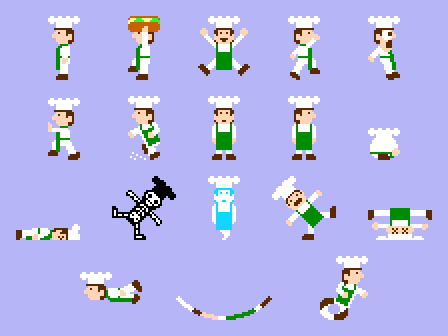
You can read more about Hoagie's Revenge, the game within the movie, as well as complete sprite sheets here.
2013: Wordlock
Fifteen years after completing Invasion of the Blobs 2, I revistited Game-Maker and made a puzzle game containing 100 riddles. The graphics weren't particularly complex, but I think the sci-fi font I designed was pretty neat.
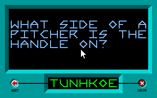
You can learn more about Wordlock and how to play it here.
2021: What's Next?
The introduction of emoji have pretty much made smilies obsolete. One avenue that might be worth pursuing is Twitch Emotes, but I've kind of moved away from creating pixel icons.
These days I spend most of my time working on my webcomic, Chuck's Devils. Sometimes I depict the main characters in pixel form, as seen here:
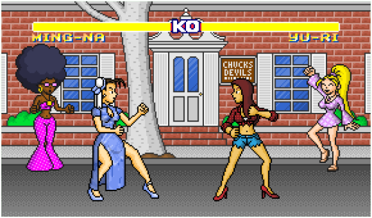
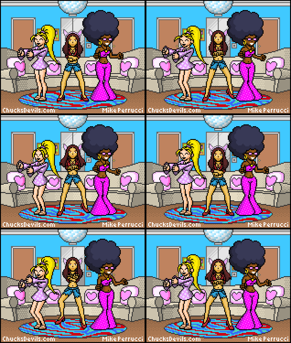
While the series is nowhere near as popular as my smilies were, or even my domino toppling videos (which is a story for another day), I like the process of creating wacky misadventures for Candace, Yu-Ri, and Lily. I hope you'll check out the comic and follow along. :)
5 notes
·
View notes
Text
Steven Universe: Art and Origins (Outline & Review)
Steven Universe: Art and Origins is not just an art book--it's also a collection of early material, a reveal of many initial concepts, and an amazing experience to sort through.
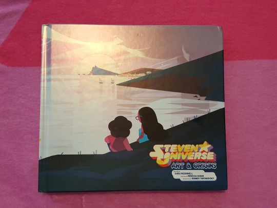
Finally getting around to importing my review to Tumblr. I wrote this on the release day.
In my review I'll give you a description of the structure and overview, while also collecting notable information for fans. Obviously just about everything is "notable" with a book of this magnitude, so this may get long, but I'll try to include anecdotes that have some unique insight or perspective on the main source material--with as little of "OMG this was the original idea for this!" as possible.
This is illustrated with some low-quality pictures of the book and it gets super long, so I have to cut. But please read. :)
The overview:
After a foreword from Rebecca Sugar and an introduction from Genndy Tartakovsky, we get:
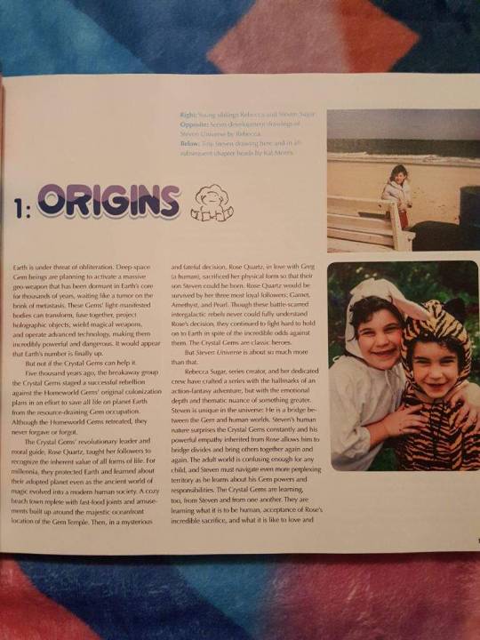
Part 1: Origins. This contains some narratives about Rebecca Sugar's early life as an artist--inspiration, family, college projects--all illustrated, of course, with childhood photos and early art. Rebecca mentions having wanted to bury her femininity for a while, but coming back to draw female forms and include dancing after she learned to sort through her issues using art.
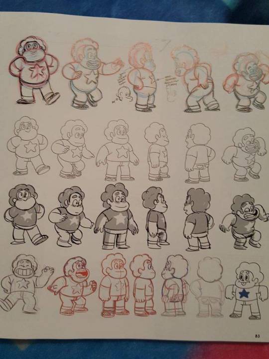
Her college education and connections with other artists are discussed--some in interview format, some in narrative--and there is some background regarding her time on Adventure Time. The story moves on to talking about developing the pilot and what went into her character and plot ideas. Character design is discussed in depth, with Rebecca giving initial sketches to a design team and developing the characters' initial pilot look.
Some really slick promo art is shared--posters, sketches, great concepts that were designed to bring in new viewers and make them curious about the show. The pilot succeeded in getting the green light to develop it into a TV series.
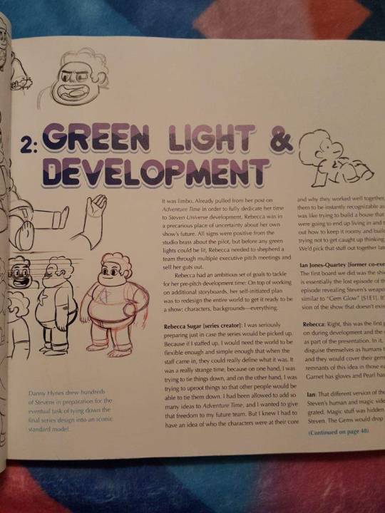
Part 2 discusses the show's Green Light and Development. Rebecca and some of the other crew, in interview format, talk about getting the team together and allowing for both nailed-down character essentials and flexibility for the writers to explore and collaborate. Developing the setting was also a big part of the to-do list; coming up with Beach City itself, its businesses, its residents, and also the creatures the Gems would fight.
Some cute stories are shared about the early Crewniverse hanging out at a cabin and talking about the show all the time, hashing it out. There are some great, loose character model sheets for early versions of Greg, Connie, Sadie and Lars, and the four main characters.
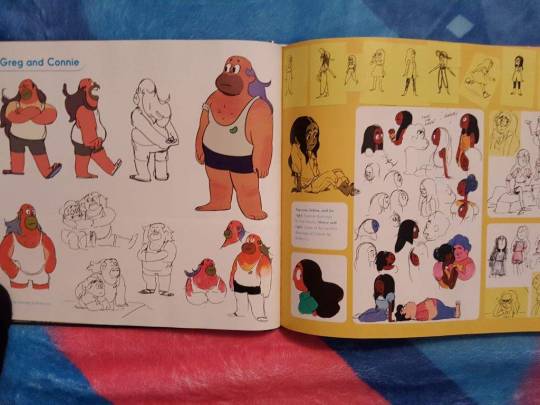
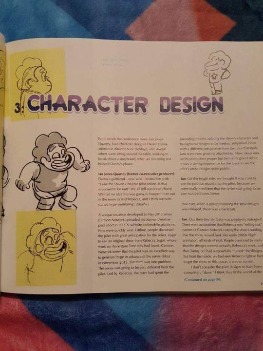
Part 3 is about Character Design. They discuss how the pilot got released and fans grew attached to what they initially looked like, only to be "outraged" by the changes, making tons of assumptions about who was controlling the process.
Rebecca shares some thoughts on her development process and her philosophy on letting different artists draw the characters differently while gripping onto specifics she set. Main, palette, and distance models are discussed, with some technical details of what different artists do on the team and how they handle props or special poses.
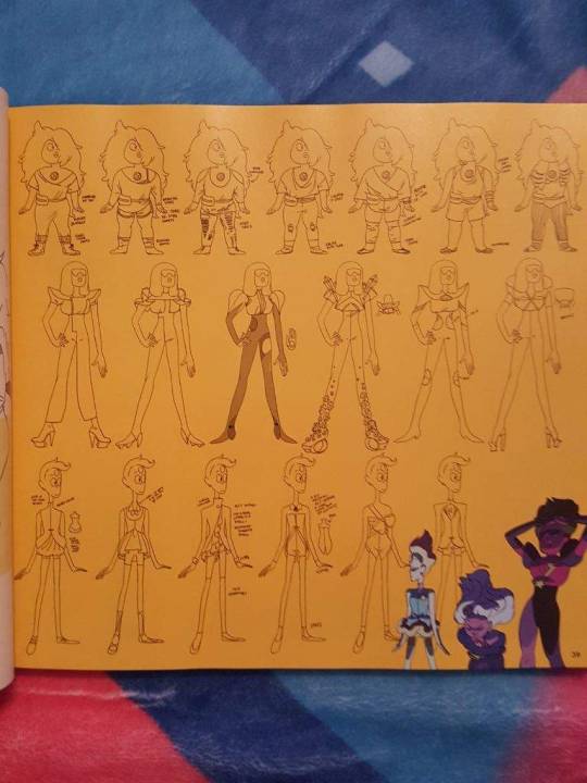
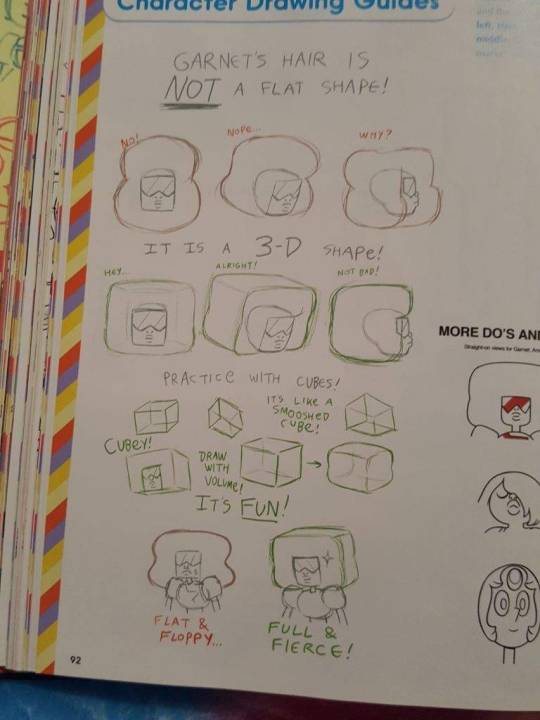
There are many sheets of how to draw the Gems on model (with pointers on what NOT to do), and then there are some Homeworld Gem ideas that didn't get used, and finally, some sketches and concept art for Lapis Lazuli, Peridot, Jasper, and Bismuth.
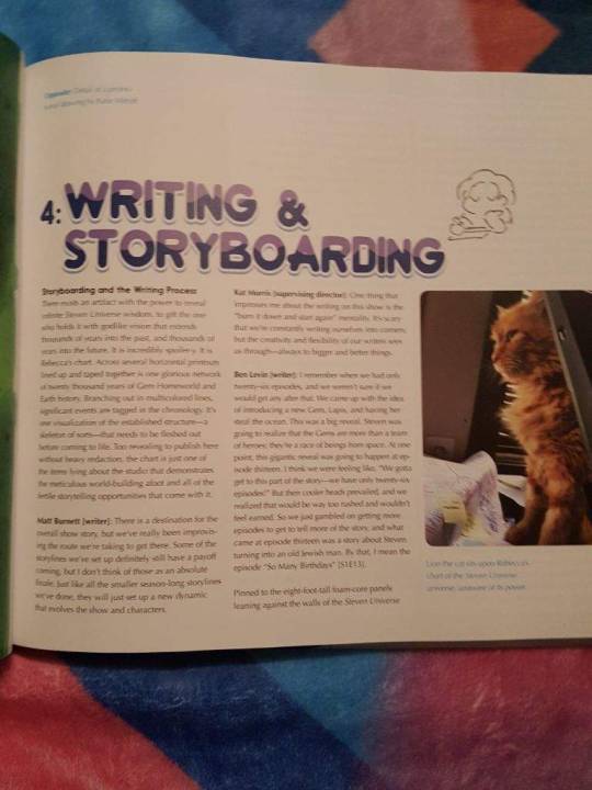
Part 4 is on Writing and Storyboarding. More Crewniverse interviews provide insight into the process, including how much is revised from the early days and how collaborative everything is. Some specific episodes, like "Ocean Gem," "Monster Buddies," and "Island Adventure" are put into perspective with how they were written by the group.
There's heavy discussion of how the process works and why processes that work on other shows wouldn't work here, and what "rules" are firm and what's just a suggestion, and what's changed as the show's plot became more complex and important. Steven still having access to the "side" stories, the ones that involve Beach City humans and non-world-shaking stakes, is still very important to the story that the original Crew wants to tell. Cute images from the Crew's thumbnail storyboards, Gem designing, and technology designing workshops are shared too.
There's some good continued discussion of concepts in Part 4, especially about fusion and relationships and the larger message the show is sending. How do you tell a story and why? There are many answers to that, and sometimes it's about fun and sometimes it's about a message and sometimes it's about wanting to make an episode about something you've never seen a cartoon do before--something specific to you that other people can suddenly see represented.
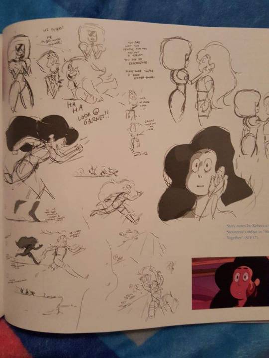
One of my favorite parts of it is when they discuss Steven discovering the Gems' weaknesses over time and having that NOT make him think less of them--more like he admires them for being strong enough to shoulder the burdens he didn't know they were carrying before. Storyboarder Lamar Abrams talks about the importance of growing up not just being about becoming bitter, and I really like that.
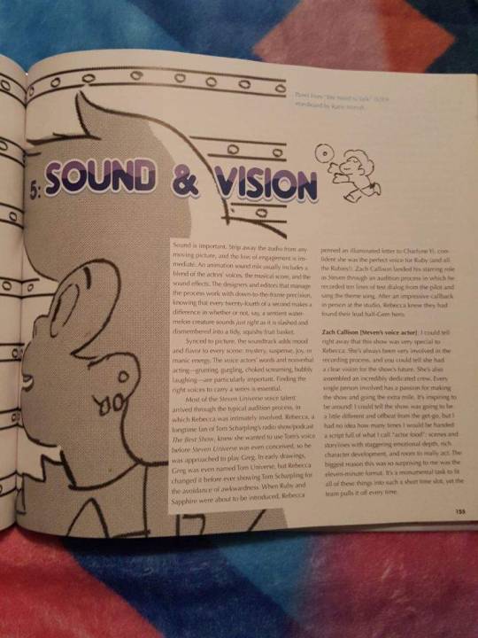
Part 5 is on Sound and Vision. There's some history of how they found the voice actors for the major roles, and some of the actors give perspectives on their relationship and experience on the show.
Aivi and Surasshu, as the composers, discuss their process as well, with some anecdotes and discussions of why musical palettes work better for characters instead of assigning them themes. Places and objects have their own sounds too.
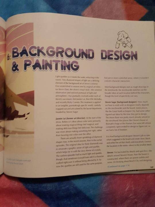
Part 6 covers Background Design and Painting. Steven Sugar takes the stage and explains general background thoughts as well as specifics for certain settings. His focus on detail is really fascinating to read about--it's really him who nails down the locations in Beach City and where an outlet is in a house on the wall.
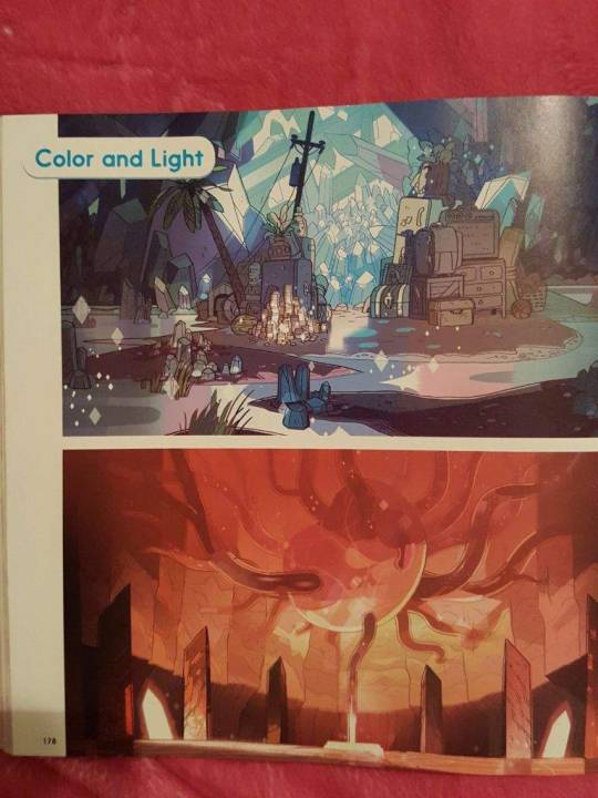
The directors and other Crewniverse folks discuss the use of color and background items in the show, and how they use it to create mood or feel changeable enough to be real.
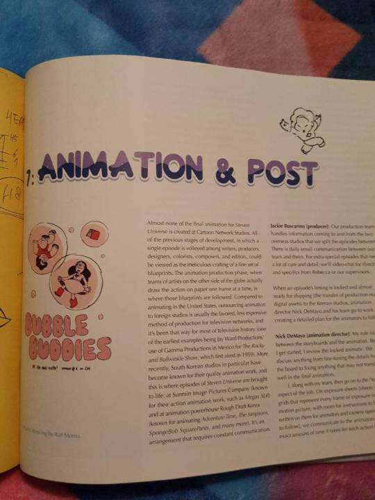
Part 7 discusses Animation and Post, with a spotlight on the work they do in Korea at animation studios Sunmin and Rough Draft. The process is described--how and when the material is transformed from animatics to animated cartoons.
Nick DeMayo discusses timing and adding the sound effects and whatnot. There's also some design instruction that's provided to the animators in Korea.
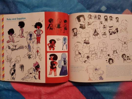
Some special highlighted drawings and pieces, like the "C.L.O.D.S." zine or some keys for Ruby and Sapphire, are included.
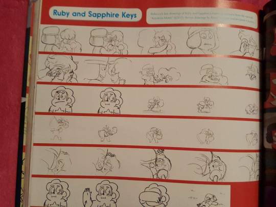
Even the bumpers and end tag animations are discussed here. And of course they had to mention a couple very special episodes, such as when Takafumi Hori from Studio Trigger came in to do "Mindful Education," or when they did the musical episode, "Mr. Greg."
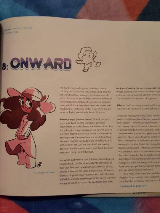
And Part 8 is called "Onward." The intention of the section is unclear at first based on the title of the chapter, but you can quickly see they're discussing the forward-thinking message the show has--how its representation of its creators' experiences has also struck a chord with people who wanted and NEEDED its diversity.
Zuke says a very wise thing when they state that they want the show to provide "insight . . . not a solution." That's one thing this show does well; it spotlights problems and situations and feelings, but only shows you how those things can be dealt with, not necessarily how they SHOULD, in all cases, be dealt with.
Representation matters, and seeing evidence that you are a part of this world when you're from a marginalized or underrepresented group is valuable in a way that you can only know if you DON'T have it.
The show's writers also weigh in on good vs. evil and how it's too black and white; that we needed a show with nuance, and has a message of love and tolerance. Kat Morris acknowledges that there are more important things than making a feelsy and entertaining piece of media, but as she says, the point is to let people see themselves in something and be challenged.
And the creators are able to see at conventions and online that people are responding emotionally, viscerally, to their work. It puts a lot of pressure on an artist to do it right, but in the words of Dogcopter, "Just be true to yourself and people will appreciate your honesty."
The book closes with some photos of the Crew and a few more pages of art. And it kinda leaves you with a squishy feeling. :D
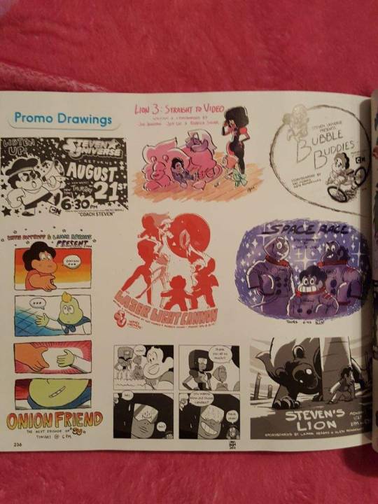
Notable:
1. I was relieved to see Rebecca state it plainly in the foreword: the items you see from the development phases of this show are not to be taken as canon or as "real" insights into how you should interpret it now. She specifically mentioned that she does not consider the Gems "girls" or "goddesses," and that was particularly important to me.
Throughout, you're supposed to see the contributed bits and in-development pieces in the context of what they were: early drafts, embryonic. We all become different from what we were even though we grew from it and may have roots in it still, but that doesn't mean you can point at the seed and say its flower is meant to be understood surrounded by dirt.
2. The original designs for the Gems fluctuated a lot, and in a couple cases even names flopped around. An early name for Garnet was "Onyx," and if you've seen the pilot, you know Pearl got her signature nose later and Garnet's hair took a while to become the splendid square afro. Amethyst seems to have changed the least.
Themes were given to them initially (like Amethyst being "flora and fauna," which you can sort of see in her pilot intro with her lying on big cats). You can still see some of the original intentions in how the ideas manifested, but the first ideas do not gel particularly well with what the show became.
This is particularly interesting because non-creatives commonly think creative people simply receive inspiration and birth their creations into the world wholesale. Inspiration exists, but it's much more common to take an inspired idea and REALLY WORK ON IT. This book's origins section does a great job showing how that works.
3. Some early sketched-out ideas for episodes seem very far from what would fit into the show now (such as an idea for an episode where Pearl is obsessed with the pizza guy??), but one seems to be the roots of "Bubble Buddies," which implies that Steven's original crush was "Priyanka" instead of Connie. (That's now Connie's mother's name.)
4. The pilot's title was "The Time Thing."
5. Initial notes for Garnet say she should have the coolest shoes of the three, that she's commanding and outer-spacey and also weird, and that she's inspired by Grace Jones, boy Michael Jackson, and Estelle in "I Can Be a Freak."
Initial notes for Amethyst insist on the "fanny pack" pouch and suggest her clothes are cut, her hair is in chunks, and she should have an animal theme with a wild texture.
Initial notes for Pearl indicate a desire to have her opposite Amethyst in her formal way of dressing and needing to have an outfit that would allow her to be hung upside down, possibly with a pearl stone theme for baubles in her hair. (Rebecca indicated she needed the most help with Pearl.)
6. Early versions of the show included the idea that the Gems might be trying to hide being Gems in public, and that they kept magic away from Steven for the most part instead of encouraging him to use it.
A "lost" episode about Steven summoning his shield (later incorporated into the episode "Gem Glow") had him saving Greg with it and dreaming about his mother, and having Pearl drive a crappy old car (later incorporated into "Last One Out of Beach City"). Rebecca and Ian reveal that the dream Steven had in it was used a little in "Rose's Room," and that a song called "The Meatball Sub Song" was involved which could have contributed to the show getting picked up despite that we never got to hear it. (Imagine that, Steven singing about food!)
7. There's a note in the early character design section that says "the girls can all turn into Steven" with an accompanying illustration of Garnet, Amethyst, and Pearl shapeshifted as him.
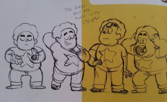
Cute, because we actually got to see them do this in the episode "Keep Beach City Weird" with the exception of Pearl.
8. Rebecca Sugar shares an anecdote about thinking there was a "best" way to draw that was objectively correct (influenced by some art-school stuff), and through that she arrived at the idea that Pearl was a cone, Amethyst was a sphere, and Garnet was a cube, because all of those things say something about who they are (pointedness, fluidness, stability).
She evolved from that idea to a more flexibile idea of how drawing works for different artists, but that was part of what helped her nail the characters down. Steven, eventually, was fixed to having a heart-shaped face.
9. The Tiger Millionaire and Purple Puma flyer shown in the episode "Tiger Millionaire," presented as something Steven drew, was actually drawn by Lily DeMayo (daughter of Nick DeMayo, animation director) when she was seven.
10. Guides are made for the Crew to use featuring reminders on drawing the characters. It's kind of adorable to see common drawing errors or misconceptions or inconsistent details discussed in a how-to format for the people who actually work there.
11. A timeline exists for the show and it encompasses TWENTY THOUSAND YEARS of Gem and human history. It was too spoilery to be in the book, but there is a LOT of lore that is laid down, and this tool mentioned in Part 4 established that this document is referenced often to make events make sense in the timeline.
12. It's been established before, but Amethyst's origin in Earth's Prime Kindergarten was not initially known as part of her character when she was invented, and that was discussed in Part 4 of this book--how the writing retreats the Crew takes to discuss the story sometimes result in huge revelations like this. "Oh, that makes sense, that's why we wrote her like that" is one of those things I recognize as a writer--you know a character has a certain vibe, but you don't know what explains it. You just trust that something does. And eventually, sometimes you find out what it is and it all makes sense. Interesting to know they did this with Amethyst.
13. "Lars and Sadie make out even though they're not together" was the basic idea for making "Island Adventure." And the original idea for "Onion Friend" had a "Grandma Shallot" character.
The writers sometimes play writing games to brainstorm, and those were shared. Some ideas for a story which was later used in "Future Boy Zoltron," covering Mr. Smiley's romance/comedy partnership with an old flame, were shared with more emphasis on the characters being lovers.
Garnet's part in the story was more explicit too, with her giving people future predictions that are not at all nice or gently delivered, and they have to shut down the business in the wake of Garnet's badassery. Weird.
Other ideas were used but not as they're presented, like one where Greg learns about fusion from the Gems (but witnessed the fusion of Pearl and Amethyst, not Pearl and Rose), and a complicated one where cross-Gem fusion is a new idea in a flashback and Rose wants Garnet to fuse with her to teach her about it but she's too unsure of her own fusion relationship as such to risk it. The idea was that Pearl would be jealous and Pearl, Rose, and Garnet would actually fuse in the episode. This has not been done in the show.
14. Rebecca Sugar apparently just pops up with concepts she wants the writers to work in. Like "I want Steven to be in a mushroom forest" (which hasn't happened yet) or "I want Steven to have cats on his fingers" (which, obviously, happened early on). Rebecca gets little concepts that are sort of dreamlike, and they figure out which episode they can put them in. Working those things in sometimes seems like as much of a priority as getting plot elements in!
15. I like that they dish a bit about the fan reaction to Garnet's Fusion status. They thought they were being a little too obvious to not get caught, but Ian said the fans figured it out and then got bored of the idea and decided it must be even more complicated than that. People were apparently worried that Garnet would be replaced by her component Gems in the story if she were to unfuse, but obviously since Ruby and Sapphire want to be together, that doesn't happen.
16. Kat Morris's "rules" as discussed in Part 4 are "Garnet never asks questions" and "the story has to stay in Steven's perspective." I love how strict they are about Garnet not asking questions (except in the episode "The Answer," though there have been a couple ~technical~ questions from her; she usually just finds a way to ask a question with a statement, like "tell me what you saw").
17. A great quote from Zuke on the incidentally queer content of the Gems' relationships and gender: "Personally, I'm happy to not have to think, 'I'm writing a character based on my queer experiences.' That would be so hard! I'm just writing from my perspective, and I happen to be queer. I think that's what makes the show feel natural when it comes to that. It's a fine line between defining something so that people are aware it exists, which is so important, but also letting it breathe, so it's not forever contained in a box labeled 'queer media.'"
18. In Part 5, Michaela Dietz relates her experiences as an adoptee to relate to what Amethyst deals with as an "adoptee" into the Crystal Gem family without knowing where she really came from or what it means to be a part of that. She's said this before in some other interviews and panels, so it's not new in general, but it's probably new in print. Deedee Magno Hall, who plays Pearl, obviously relates to Pearl's maternal nature.
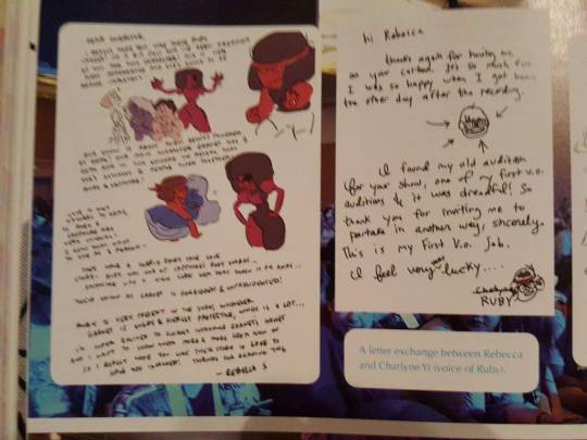
19. Tom Scharpling and Charlyne Yi were voice actors that Rebecca specifically had in mind for her characters (Greg and Ruby respectively). Rebecca's illustrated letter to Charlyne explaining Ruby and Sapphire's relationship and Ruby's role on the show is really adorable.
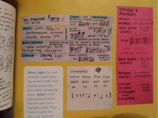
20. Music nerds like me will very much appreciate the photographed notes on music motifs--the Diamonds each have a solfège syllable and a chord (White is F#M7/Sol, Yellow is BM7/Fa, Blue is EM7/Fa, and Pink is AM7/Mi), and Steven's powers and modes are coded with instruments and styles.
21. Some world maps provide new possible insights. Greenland in our world is Blueland in theirs. South America is called Pangea. Aqua Mexico is labeled about where Mexico is in our world. India is the Indian Islands. There's an Australia and a New Australia. A big sea in the middle of Asia is called the Tunguska Sea. Rose's Fountain is in Spain or Portugal; the Sky Spire and Strawberry Battlefield are in Norway; the Shooting Star Shrine is in the middle of the drastically different Asian continent; the Galaxy Warp is in the Tunguska Sea; the Lunar Sea Spire is off the coast of Canada; Mask Island is in the Atlantic near Beach City; the Comm Relay is in the Western United States.
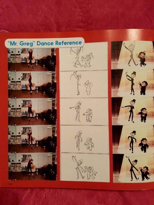
22. It was known from interviews that Shelby Rabara (voice of Peridot) is a dancer and provided the foot sounds and coaching to create the short tap number in the episode "Mr. Greg." But what's great is here, there's a visual reference included! Photos of Shelby doing the dance are lined up next to the drawings of Pearl and Steven in the "Mr. Greg" number doing the steps! She poses in dance moves with her husband for the Greg/Pearl dance for "Both of You" too.
23. There's a really cute story in the last section about Amber Cragg ascending from fan to Crewniverse member through posting Pearl art in response to the pilot and eventually getting contacted to take a board test. That is the kind of thing so many online artists dream of!
[SU Book and Comic Reviews]
#steven universe#steven universe reviews#steven universe art and origins#steven universe books#rebecca sugar#myblog
121 notes
·
View notes
Text
I want to be a creative Technologist Because…. *Behind scenes
#CTEC502 Intro to the Creative Technologies Assessment 1 - 4-minVlog
For our first assessment we were given the task to record a 4-minute Vlog with the title I want to be a creative Technologist Because….
You would think a 4 minutes video on this topic, should be easy to achieve, it was not! But I feel proud of my final product
Here is a little bit of the behind scenes
Process:
Planning and execution
I Made sure to read the rubric
What did I want to say…?
I thought it was important to share a bit of my background and the journey that led me to NZ and to choose this career path, as I see it’s interconnected
What questions would I make myself?
Who I was?
What do I think of education and university?
How have I developed through the years?
How did my interests match the BCT description?
What are Creative Technologies?
How did I choose AUT and consequently found out about BCT?
The research and envisions that motivated me to enroll for this course?
*I didn’t mention this in the video, but I had done my research, compared with other providers, even considered moving out of Auckland and made the decision since 2019
How did I wanted the video to be?
I wasn’t very keen in recording myself, I wanted it to be more illustrated
I chose Animatron Studio to create my video on, as animation/storytelling is one of my biggest interest to explore and I definitely have loads to learn
I enjoyed making the video through Animatron a lot, it has very interesting features, there is so much more to explore and their tutorials are short and clear, I didn’t have enough time to utilised them all though; I had to be realistic and simplify my ideas a little
I also included external videos to explain my ideas better. *See references at the end
I used OBS studio to screen video record and Microsoft video editor to edit the external videos
Storyboarding
First week, after having wrote few questions down, I drew few scenes on my sketch book to give me a visual idea
I wrote down my first script, after I read it, I cried, I was so proud of my path up until now
I decided to use the power point storyboard template given in the assessment brief; each slide had three sections, images, script, and production notes
I then started creating each slide in Animatron, searching for content inside and outside of Animatron
Second Week we were given more information about the assessment and shown few videos from previous years, after watching these videos I realised my content spoke a lot about me but not much about Creative Technologies, so I re-wrote it all, however kept the same purpose so it took me less time, I changed it a third time... I took some inspiration from Ted talks to make it simple and concise
I continued creating and upgrading the scenes
During the weekend I recorded my script and adjusted it to each scene, I repeated this process over and over, I wasn’t very happy with my voice I tried to make it sound as natural and even as possible
Once I had done the recordings and edited the video for everything to match, I recorded my voice again, another 100 times...


Conclusion
In this video I hope to express
How since at a very young age, I have been interested in exploring and expressing my creativity, aware of the world problematics and wanting to make a positive impact
How my path has been marking itself, up till this point
My conscious decision to choose the Bachelor of Creative Technologies, which rather feels, as it chose me
My future envisions
I want to be a Creative Technologist because… I just know it!
Sources and references:
University VS College - What's The Difference? Education Comparison - YouTube
AUT website: Mission, Bachelor of Creative Technologies, students’ testimonies
Why Study at AUT - AUT
Creative Technologies Examples
Third World vs First World Countries - What's The Difference? - YouTube
Museums Test New Technology, Interactive Exhibits - YouTube
technology | Search Results | TED
Definition of Creative Technologies
Britelite Immersive | News, Insights, and Experiments
Alejandro Davila, AUT’s student testimony inspiration
Meet the Team | CONICAL | Virtual Reality, AR Apps & Mobile Games
INSIDE OUT Review - Bing video
1 note
·
View note
Text
Title Sequence/After Effects Research
We were tasked to plan and create an unofficial title sequence in After Effects. I started theorising base concepts of what any film title sequence should have and what I should use.

The ideas I’d noted down were to have text with opening credits and to eventually reveal the film’s logo, using a fitting font for all of it, and to use silhouette imagery of the characters to avoid copyright infringement too.
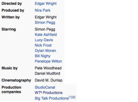
I then assembled a list of information I could use, including the “starring” cast of characters, director and producer, musicians, and the production companies, the latter of which I think ends up getting forgotten by a lot of people.
A resource we were given for research was Artofthetitle (artofthetitle.com)
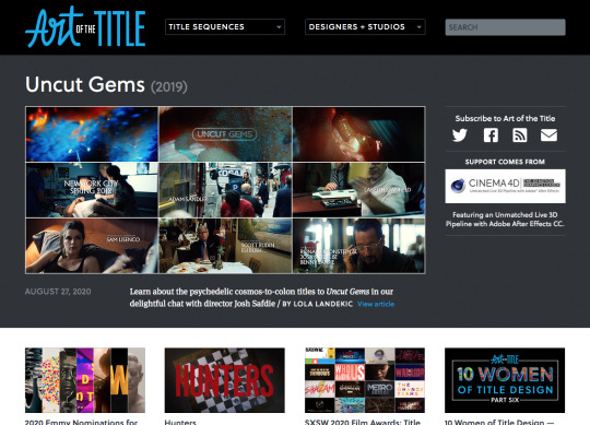
We were shown a selection of film title sequences for inspiration and I noted them down for inspiration, writing details about them that I’d thought was interesting or particularly noteworthy.

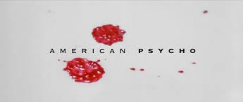
I very much loved the cleverness of American Psycho’s intro, with blood visuals on a white background to set the tone for horror with chilling, and then transitioning into food imagery to settle it into the following restaurant scene.
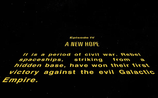
The Star Wars opening sequence is, of course, iconic, but I did note the interesting fact of which only George Lucas was mentioned in it, none of the cast were shown in the opening credits, only the information about backstory explaining the plot was shown and deemed more important.
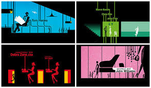
The intro to Catch Me If You Can was extremely clever and inspiring, it was entirely animated and elements of the text shown on-screen were used to take the audience through the story before the film had even started, and many elements were synced up to the intriguing music in the background.
Shaun of the Dead title sequence
https://www.youtube.com/watch?v=cnZGdC-vTCo
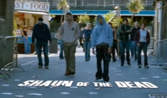
This title sequence is one that I think is very clever. The opening shots seem to be all unified with the camera scrolling to the right consistently in all of them, with slide transitions used and an element of text on every “slide”, exposing the zombies in the world for three slides before the film’s title appears, tracked to the bottom of the screen as if it is on the floor, all while jolly music plays in the background.
I think this is a very clever sequence and very concise/to the point. It is entirely live-action but it provides exposition to the film’s setting and tone with the visuals, as well as telling the audience that it is a comedy more than a horror, with its semi-upbeat background music. But at the same time, it makes it clear of the contents of the film by showing zombies to its target audience from the beginning.
The Fifth Element title sequence
https://youtu.be/hXfoUGhKx0c
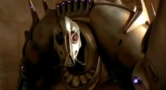
I can’t seem to find a proper title sequence for this film, but the opening of it sets a dark, strongly sci-fi tone, establishing large alien robots, other-worldly weaponry and spacecraft, which makes a good exposition to the audience for a film like this, setting the tone as said. It shows clear sci-fi traits front and centre for its sci-fi oriented target audience.
Fight Club title sequence
https://www.youtube.com/watch?v=5XSqI-iw8sI

The opening sequence of Fight Club is entirely VFX and no live action. It is acclaimed as an excellent opening and it pictures simulated imagery of the narrator’s brain at microscopic level, representing its neural network. The film’s information zooms into the screen in a light blue font of the film’s logo on the poster.
I think the design of this is seriously cool and holds up today, and the dark drone-y music sets the edgy tone of the film, as well as its title. I truly think it’s amazing how well a sequence of text and visuals can preview a film without showing anything actually in it. It appeals to its target audience by seeming dark and damp rather than bright and flashy like something for children.

Here, I examined DaFont for an alternative font to Impact, which in my opinion is an excellent font for film, but is rather overused in its original form. So, I instead found two variant edits that looked similar but were different enough and suited the feel of a horror comedy to me.
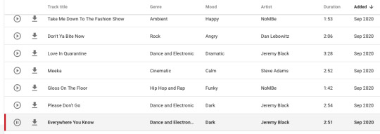
I assembled assets for my video, particularly looking for music to use. I signed into my YouTube account to browse the YouTube music site for creators, as it is all royalty-free and therefore suited to this project, and it turns out that there are hundreds of pretty good songs on there for various projects. I eventually landed on “Everywhere You Know” and deemed it ideal for my opening sequence, so I downloaded it.
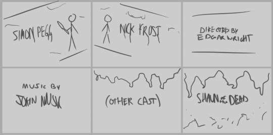
I drew up the first draft of the storyboard, the concept in my head. I used a drawing tablet and Photoshop to conjure this concept.
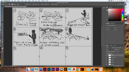
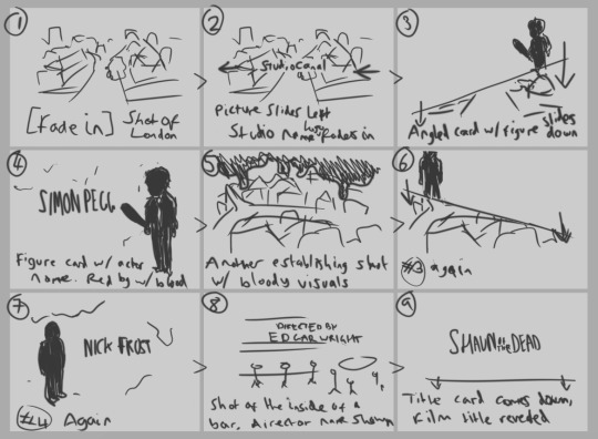
Second and final draft of the storyboard, what I added and what I adapted from the first draft.
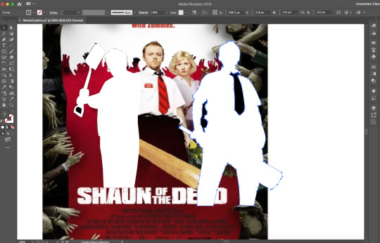
I used Illustrator to generate assets for the video, outlining the poster photographs of the main characters Shaun and Ed.
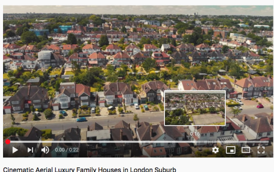

I gathered the above royalty-free stock images for use in an After Effects project. I wanted to capture the setting of Shaun of the Dead as best as I could, so I found photographs and footage of north London suburbs.
Learning Adobe After Effects
Creating the composition involved hitting the “New Composition” button, adjusting it to 1080p 24fps, and giving it a white background on the following screen.

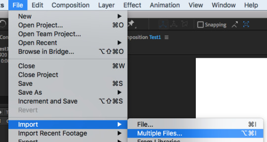
Upon using Import>Multiple Files, I opened the folder in which the files were saved and imported two of my images.
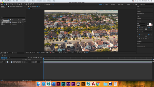
I introduced new layers into the timeline, including instances of the images I was using for later, as well as multiple layers of text and a white square. I rearranged the orders so that they would follow each other in order.

And, using the transform tools, I experimented with and (with keyframes) automated the scale, position, rotation, and opacity. Not all of the effects were used on each layer, but I’d used all of these tools by the end of my experiment.

Using Window>Effects & Presets to open the following section on the window, I found the following 3D text animation effects. I ended up trialling “Z Cascade” and dragged it onto the text layer I had
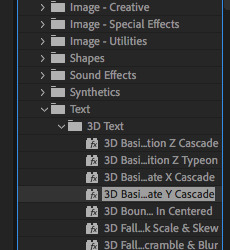
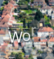
The effect did the following with the word, cascading each letter down from the end until the beginning, I then found the animate effect in the timeline and I have indeed learnt how to apply text effect animations at will.

0 notes
Text
Cardcaptor Sakura: Clear Card-hen 1 | Gakuen Babysitters 1 | Idolish7 3 | Zoku Touken Ranbu Hanamaru 1 | Karakai Jouzu no Takagi-san 1 | Miira no Kaikata 1 | Death March 1
The debuts for the winter season keep coming, but we’re almost at the end of them with this post.
Cardcaptor Sakura: Clear Card 1
Note I don’t have any prior experience with Cardcaptor Sakura aside from 1 volume of manga and watching the show in passing while other people were watching it, plus knowing about a few spoilers and the show’s reputation as a seminal magical show show…then in more recent days, I finished 2 episodes of it (in fact as of the day I’m typing this, I finished episide 2 today!).
This OP makes Sakura look like later-stage Sailor Moon, and I think that’s the point.
Where did the bear in Syaoran’s hand go when Sakura hugged him?
Eriol! I don’t really know much about him, and I knew I should’ve known about him before starting this, but…it was a bit of a shock to see a character I technically haven’t seen the debut of with my own eyes.
I get the feeling these are the “two bears” from the prologue OVA…
Emails! In the world of Cardcaptor Sakura! Wow, I feel old…and I didn’t even grow up with her.
Hot dang! Gimme dat bishie (Yue)! I knew he was coming, but…I still don’t really know how he came to be!
Wow, this Yamazaki kid spouts such rubbish! I’m looking forward to seeing him in the main series now.
It’s pretty obvious I need to watch the original before understanding this fully, so I’m putting it on hold.
Gakuen Babysitters 1
I’m here for my Ume and Nishiyama. I’m not particularly good at dealing with kids, especially younger kids, but this doesn’t make me run for the hills either.
Ryuichi involves the kanji for “dragon” and Kotaro has the kanji for “tiger”.
That man with the hat is so not sketchy…
I’ve never heard of NAS before (but I have heard of NAZ through Idolish7).
That joke Saikawa told actually worked! These shows may all be middling this winter, but I’d be happy with even some of them on my docket. I’ve been pleasantly surprised more often than not that I haven’t found “stinker of the season” yet.
The comedy for this show’s really on point, although the overall design is a tad lackluster.
K-Kamitani?! Apparently Ume-chan’s character is Hayato Kamitani, so that’s how Ume got involved, so to speak. This sudden intro of 4 kids works on a story scale, but not in a way any person can process without pausing the video (or getting individual intros later).
Well, there are those individual intros I was asking for. Spoke too soon.
It’s actually kinda sad and quite telling how independent Kotaro is. (I still find it extremely hilarous Nishiyama – whose first name is Kotaro - didn’t voice Kotaro, although from a practical standpoint I understand why.)
Usaida has such bedroom eyes, it’s hard to ignore (because they make him look like En)! Dangit, I want my En back!
This brings back memories. My mum used to deal with kids all the time, and of course I was in the background for some of the shenanigans.
Dragon puppet symbolism, eh? (see the dotpoint a bit back about Ryuichi’s name)
As soon as this guy (who kinda looks like something out of Haikyuu) started demanding Taka come with him, I screamed. That character doesn’t seem very Ume, but…uh, it’s Ume. Gotta deal with it. Now that I listen to their voices properly though, Ume does have a “big bro” voice and Nishiyama a “earnest young man” voice.
Oh dear. Taka’s imprinted on me already, and I don’t even like boys that age.
I haven’t felt a genuine sense of danger from any of these winter shows until this one, so it seems like it’s one of the strongest debuts. Then again, CCS was my frontrunner before this and YuruCamp the second best, so I guess I can’t talk, eh?
Gah, I feel like I wanna cry now. That is a strong premiere!
I have a real problem with how anime tears come out in globs. Then again, I’m too much of a crybaby, as my notes can attest…so I guess no arguing here.
Should it be “Chairman” or “Chairwoman”???
Tsundere grandma. Now there’s something I thought I’d never think in my life…
Oh, I didn’t realise earlier but Taka = “hawk” and Hayato = “falcon man”. Animal jingoism at its finest!
Whoo, that was a real nice debut. I thought I was too old for this stuff, but it’s a keeper!
Idolish7 3
It’s a good thing I chose to cover episodes 1 – 2 so I won’t have to do them now.
I didn’t notice Nagi getting all huggy there with everyone in range (the first time, at least).
In case you don’t know from all the other idol shows, the centre is the one in centre stage. They’re often seen as the leader, so it’s a very important position.
This song can’t be anything but Monster Generation! Woohoo!
Wow, I haven’t seen one of those “watch from a distance” things in a while. Makes me nostalgic.
“Ichi” would probably refer to Iori, right? (He has the kanji for “one” in his name.)
Wowee, Nagi’s entendre…is really thick. Like pudding.
I agree, brothers can be so strange…
“…spoil me sometimes.” - Laying on the entendre thicker than custard here, Iori!
These boys are so into their Magical Kokona. I want in now.
Tamaki really is an En-chan…En-chan! Come back! (But why does Tamaki have no socks???)
These ED outfits are so elaborate! Ooh! Imagine a gender-swapped cosplay of them, that’s be great!
Who’s that on the edge of the ED video though? (You can see something hopping up and down.)
Zoku Touken Ranbu Hanamaru 1
Can we please just call this “Hanamaru 2” like Crunchyroll? “Zoku” just refers to a continuation…anyways, I got Hanamaru season 1 done last year while dealing with Katsugeki, so…here I come, sword boys!
Didn’t Hanamaru get a dub, by the way? Why would you dub this? For me to criticise it? The Touken Ranbu fanbase is kinda small…
W-Wait, did they just write Yams out of this season? Yams is the protag (if not a protag) here! What did Ichiki do now to deserve this???
It was getting too hard to jump through the proxies to play Touken Ranbu as of late, so I deleted my DMM account. Even still, the sword boys have multiplied since I left! Yikes!
Wow, unexpected 1st person bit there, Kashuu/Masuda. I thought I told the industry to stop doing that…
Exposition wave…I don’t need this wave, but I guess anime-only fans might. Carry on, Heshikiri.
So this multiple Konnosuke thing wasn’t a Katsugeki-only gag? Oh dear, my head’s spinning…
I don’t think I noticed, but Kashuu uses a brush (and not a specialty brush provided in the lid of nail polish). Probably because in Touken Ranbu, plastic isn’t much of a concept…
I still appreciate how Kashuu was this Saniwa’s starter. Makes me feel warm and fuzzy for my own TR days…
Photos are a nice way to recap. After all, 1 picture speaks 1000 words.
Wow, Shishiou’s a real chibi compared to these tachi. But Shishiou’s a tachi too…
Dang, I’m jealous. These bros were around when I was a TR player, and I missed ‘em! Dang Kebishii drops!
So that thing really is a nue. I could never see it on Shishiou’s card, y’know.
Hmm…considering the bros are new swords, the Saniwa’s strategy is to level up them up using the younger bro as leader (remember, the leader gets more experience). I see…
A “pincer attack” is a V shape, so the description fits the Crane Wings formation…
I can’t say I wasn’t impressed by Akashi just then. Come to think of it, he didn’t have any battles in Hanamaru’s 1st season.
A double attack suits a pair like this, of course!
Oh my gosh, they even got two dfferent voice actors for the Konnosukes! LOL!
Hanamaru’s EDs kept changing and it seems like they’ll continue to change, eh? This one looks quite spiffy.
The style of this ED doesn’t look like Hanamaru at all. It was probably done by the original illustrator for the swords.
It’s a great return to form for Hanamaru! I’m sold!
Karakai Jouzu no Takagi-san 1
Another day, another long title…plus this show I would’ve passed on, if not for that resolution…
Michiko Yokote is on a lot of shows I watch. I don’t really know what her influence is, but it seems she’s genuinely competent at what she does.
So…uh, Gendo pose anyone?
I think the teacher is the best part of this. I’ve been a bit of Tonari no Seki-kun, and the pull of that is the sheer ludicrousness of what Seki does with his stuff. However, there didn’t seem to be any intervention aside from Yokoi (I think that was her name)…
Nishikata’s reactions are just way too easy to read…
Well, that was okay, but it’s definitely a show to binge all at once. On to the “on hold” pile it goes.
Wait, but they missed a segment (the 100 yen segment). Gotta skip forward…
I didn’t get any laughs out of that show at all, but it’s still a decent school SoL.
How to Keep a Mummy 1
I have absolutely no experience with this manga, mind you…aside from seeing this tiny mummy on Comico…
Wow, if the mummy can fit in his shoe…how big is it?
The translation of “ready” is surprisingly ganbaru, and there’s a “but” mentioned in the Japanese title missing from the English. Also, “ready” has sexual connotations I’d rather not pair with a tiny mummy…I’d say the translation of the episode title should be something more along the lines of “White, Round, Small, Very Wimpy But [Also] Tries Its Hardest” (“It” being the mummy and not Pennywise…).
Is Dracula even public domain right now? (Does anyone care about the intellectual property of a classic vampire novel anyway? Because I sure don’t.)
Can we please start making jokes about how Sora’s daddy got him a mummy? It may seem childish, but I’m tempted to now.
This mummy is so adorable, I think it even beat out the kids from Gakuen Babysitters! Geesh, I’m spoilt this season! It completely set off my moe senses, and I don’t even have any!
It imprinted on him! Oh wow!
The mummy doesn’t even have a mouth…how can it spit things-oh wait. That’s the joke, isn’t it?
Come to think of it, crybaby characters ae few and far between. However, between this and Devilman…er, Crybaby…they’ve suddenly become popular…I guess?
It’s like a harem, only it’s between a dog and a mummy. Why I never…
One of the best things about anime is that you can learn about other cultures through the things included offhandedly…like that molokhiya thing that Sora mentioned. Apparently it’s a Jewish vegetable of some sort.
Do mummies get jet lag too? I was just thinking how Comico stories, with their full colour and yet simple design (to allow for downward scrolling and intake by the eyes) are perfect for anime.
I listened to the show with volume for once…because Tazuki seems to be the guy voiced by Keisuke Koumoto…and I think I was on the money there. Plus, Sora’s VA really sells the delivery of jokes (although he seems to be voiced by a woman…?)!
Yamanba…like Yamanbagiri’s namesake. The mountain hag, right?
Yep, I was right on the money with Tazuki being Koumoto. Kamitani Tazuki, it seems his name is…
This dance ending’s kind of cute, too. It’s a keeper!
Death March 1
(looks at title just above this dotpoint) C’mon. There’s no way I’m going to repeat “Death March to the Parallel World Rhapsody” over and over again for at least 11 or 12 episodes…by the way, I’m here because I was reading a KonoSuba novel and saw an ad for this, just in time for the anime…
“SADA”, my butt…
I love how they almost replicated Windows 8 in this show. Or is it 7, or 10? They don’t show the taskbar, which is the main visual difference between 8 and 10, but either way the Windows replication without being sued is really something…
This OP’s gonna make me dizzy someday…
Classes, eh? So that means Suzuki’s working with an OOP language. Plus you can see Cortana on the computer as the mention of classes goes by, meaning that person’s on Windows 10.
UML.
By the way, Satou is a fairly common name in Japan…at least to my knowledge. But Suzuki is a pretty common one, too, hence the mistake.
The client? Unless Suzuki is referring to the client as in the program, it could also mean the client as in the person/group who wants the game made. Considering what he says though involving a call, it’s probably the latter.
That’s the second show with a lost kid in the first episode. It seems a bit trite, don’tcha think?
According to his phone map (flip phone!), he’s in Akihabara.
FFL…eh? Google says there are multiple Final Fantasy games for Android, meaning I’ve probably thinking of Fire Emblem Fates (which doesn’t match), and there’s no such thing as Final Fantasy 50 (L in Roman numerals) yet.
That’s the second time they mentioned work/daily life being a death march. Can we not???
Come to think of it, Suzuki looks like Nobuaki (King’s Game), which doesn’t bode well for either show.
Apparently you can get Facebook Messenger for Windows 10, which I didn’t know…
“…being a corporate slave.”
C’mon! This ain’t the Animatrix, but still, if you’re trying to make stuff look technological, at least make it look a bit better.
Third time they’ve mentioned “death march”.
It might just be Houseki no Kuni’s fault, but this CGI is really janky.
Welllll…at least it looks like a game.
Welllllllll…at least they knew where to put their money for some sakuga…
This running through fields scene is either a homage to Every Anime Opening ever, or Pokémon. I distinctly remember it being in Emerald’s opening animation, at least.
Dude, if you want to look for a wyvern, do it from the ground where you won’t get injured, dumb Satoo.
Does this look a lot like Berserk (2016) with all its CGI knights…or is that just me?
Zena…? I might be showing how old I am with this (or how much I scour the internet), but…by any chance, do you mean this gal instead?
I think I’ve had enough of this flip for now, so I’m putting it on hold.
#simulcast commentary#gakuen babysitters#zoku touken ranbu hanamaru#touken ranbu#touken ranbu hanamaru#miira no kaikata#how to keep a mummy#death march to the parallel world rhapsody#cardcaptor sakura#cardcaptor sakura: clear card-hen#karakai jouzu no takagi-san#teasing master takagi#idolish7#school babysitters#Chesarka watches Gakuen Babysitters#Chesarka watches Hanamaru#Chesarka watches Idolish7
1 note
·
View note
Text
The Life Cycle of Plastic Bottles - Production


These are my initial ideas and development before creating my motion graphic. I started by creating a mind map to generate some ideas and I picked the ideas that i think would be best and most interesting to make a motion graphic about. From here I started making some sketches on how I could make the logo and text look in it. I also drew a rough storyboard out to visualise how I want my animation to look. I drew each slide I wanted and how I thought it would look best.
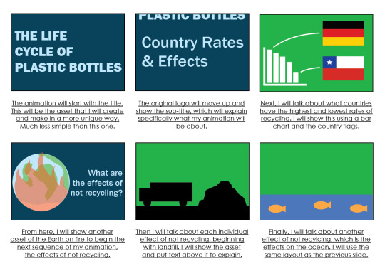
This is the digital storyboard that I created using Illustrator. In this, I visualise my ideas better to properly show how I imagine it to look, using basic assets and some text. It shows how I want the lay each slide out as I give a brief description under each panel. Some colours I’ve used aren’t my final ideas. I plan to change it depending on the transitions I use. For example, I think the way it goes from a green background to a blue and then back to green seems a bit all over the place. So I may change the background to a dark blue for the Effect slides.
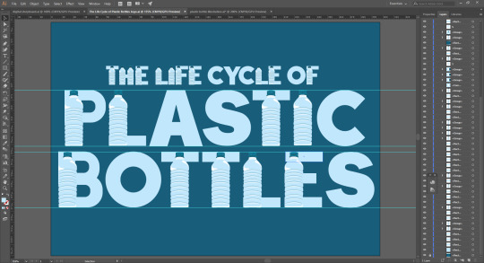
After this, I started to develop my animation in After Effects. I started by creating my assets. I used Illustrator for any assets that will already have a background and Photoshop for any assets I want to have a transparent background so I can import it directly into the animation. For example, the title card I did in Illustrator by creating a plastic bottle vector and using it within my letters to make it look unique. I created the letters myself too using the pen tool or shapes. I chose to use a dark blue background as I thought this would be suitable for the theme of plastic bottles as my illustration is plastic water bottles. I used a light blue for the bottle vector and used the same blue for the letters so it blends in and looks like a natural typeface.
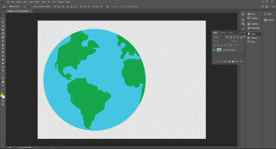
The next thing I did was create my Earth vector that I had planned to use based on my storyboard. I used the eliptical marquee tool and created a blue circle as the base and water of the Earth. I then used the pen tool to create the shapes of the continents based on images I used as a reference from Google. I chose a light pastel green to go with the blue as I thought these two colours go well together and would look good on the dark blue background I plan to have in the sequence of my animation.

Next, I wanted to create a vector for when I talk about global warming. So I thought an obvious vector to represent that would be the Earth vector I used but with fire around it. To create this, I duplicated my Earth vector and drew out fire around it using the pen tool and a bright orange fill colour. I also added a circle the size of the Earth and painted it the same orange but reduced the opacity so I can cover the whole vector and make it look like it’s all on fire.
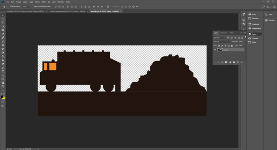
Next I created a vector for when I talk about effects and landfills. I decided to create a silhouette of a bin truck and landfill next to it. I used the pen tool to create the shape of the landfill and the shape tools for the truck. I added windows the same colour as the background I will be using in the animation so it looks clear in it.

Next, I created the vector for the ocean and fish which I will also be talking about in my animation. I used the pen tool to create the waves and created three versions of it, each in different shades, so that it shows the depth of the ocean and makes it look less simple. I duplicated the bottle vector and used it in my vector and resized it to an appropriate size. I created the fish using the elliptical marquee tool and the polygonal tool for the fins and used the pen tool to create the face. After this I created the six-pack holder using the elliptical marquee tool and kept duplicated it till there are six of them aligned together and used the pen tool to fill in the gap between them. For the fish, bottles and six-pack holders, I reduced the opacity for them all to they look darker. This makes it look like they’re actually underwater and that there is water in front of them that makes them less visible.

Next I opened up a new composition in After Effects. I created a solid fill layer for the background and chose the colour of the background in my title card so it blends while I animate it.

After this, I imported my title asset into the composition. I animated the positioning of the asset by making it like a slideshow. It slides up into the screen as if it is being pulled up from above.

After this I used the type tool and created the sub title for what aspects of water bottles my animation will be about, which is about the best and worst recycling rates in the world and the effects of not recycling. I coloured the text the same colour as the original title card so it stays consistent. I animated this the same way I did for the title card by positioning it so that it moves up along with the title. This makes it look like it’s all one page and makes the animation itself flow better.

From here, I added the transition for the next slide by using a ripple effect I’ve learned previously. I made four circles, each a different shade, darkest being the biggest and lightest being the smallest, and made them all expand by animating the scale. They all expand at the same time from 0-100% except the final and lightest circle which expands all the way so it covers the screen and is used as a background for the next part of my animation.

Next, I started the next bit of my animation. I imported the Earth vector and animated the position so it comes in from the corner of the screen. It also moves along with the text I used for the title of what I’ll be talking about next. The 4 rows of the text come from 4 different directions and also disappear from the opposite direction it came from, while the Earth vector shrinks to 0%, leaving the background plain for the next part.


The next sequence in my animation focuses on the best and worst rates of recycling. For this I used a bar chart to show the stats. I only focused on the best and worst as I thought everything in between wouldn’t matter as much, therefore the bar chart doesn’t involve all the countries and is only used to present the best and worst rates. The bars all rise up from the bottom of the graph to the size I thought would be best. I did this by animating the scale and changing it from 0% to whatever I wanted. After this I added an arrow and animated it using trim paths so it extends out and points at the flag. After this, the opacity of everything on the slide, except the background, reduces to 0%.
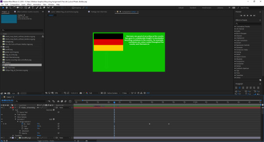

Next, I started talking about what the countries do to get such a good or bad rate of recycling. The flags appear by animating the opacity from 0-100%. After the flag appears, text starts showing up next to it in an effect where it looks it is being typed up. I did this by adding an effect to my text known as “typewriter”. I added the same effect for the next flag and text.

From there, everything on my page disappears with the opacity so it’s a blank green background. This green background then shrinks the same way it expanded with the ripple effect but in reverse. I did this by arranging the keyframes the same way, but making it go from a high to a low percentage, instead of low to high.
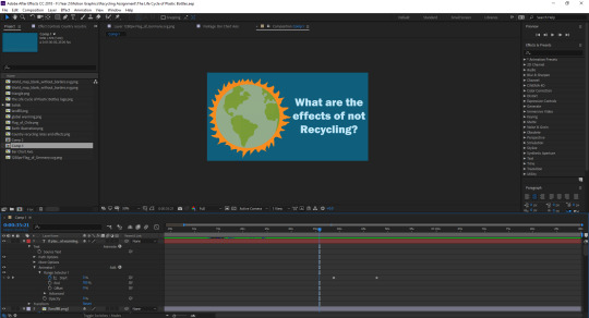
Behind the ripple effect, there is a new slide with the original dark blue background. On this slide, it begins the next part of my animation, which will be discussing the effects of not recycling. For this, I used the vector I created of the Earth on fire to represent global warming. I also asked the question of what the effects are so the view knows what the next sequence will be about.

The next transition I added was making the Earth vector expand where the fire is so it creates a new orange background for the next part of the animation. I did this by moving my anchor point to the fire and animating the scale from the original size till it’s big enough the fill up the whole screen.

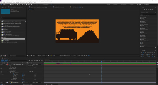
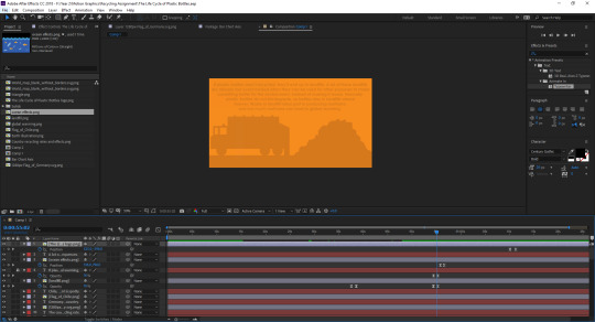
After that I began the next part of the animation where I talk about the actual effects with the orange background. I made the vector of the truck and landfill appear by changing the opacity from 0-100%. As soon as the vector appears, the text shows up talking about landfill. I added the typewriter effect to the text on this slide too. Then, everything on the page except the background disappears by changing the opacity back down to 0%.
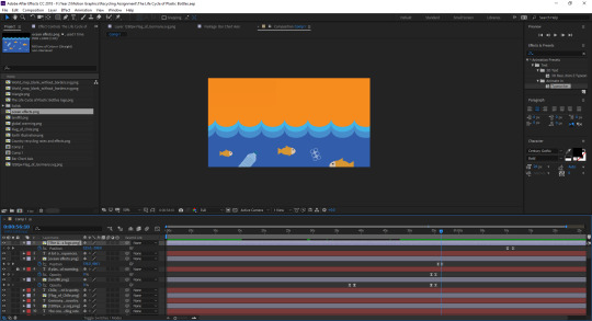

The vector of the ocean and fish the appears from the bottom by changing the position the same way I did with the logo at the start. This vector comes up about halfway through the screen leaving enough space above it for some text explaining the effects on the ocean. This text also shows up with the typewriter effect as I thought it would keep it consistent with the rest of my animation.
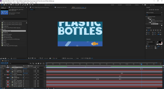
The last part of my animation is how it started. The Life Cycle Of Plastic Bottles logo drops down and finishes off my animation. I thought this would be a good idea as it would be sort of abrupt for it to finish on the ocean slide. So I thought finishing it the same way it started would be a suitable way to signify that it is the end of my animation.

These are all the sounds I’ve used in my animation. I got all my sounds from freesound.org and used multiple sounds that I thought would be appropriate for each slide in my animation. It starts with simple intro music I found up until the slide with the bar chart. After that, I used a typewriter sound effect for when the text starts to appear. I used an explosion sound for when the global warming vector expands to make it seem like it’s blowing up. I used a reversing truck beeping noise when I talk about landfill and ocean sounds when I talk about how not recycling affects ocean life.
youtube
This is my final animation. Throughout it, I made sure all my keyframes were set to Easy Ease as this allows the movement of my assets and text to be smooth and more natural. I also ensured whenever text appears on the screen, there is a few seconds pause to allow the viewer to read all the text, before transitioning to the next slide.
1 note
·
View note
Text
Production Logos

The name of my production company is just a made up word I used as a character name for a dwarf and that is also where I came up with the logo design. I used adobe illustrator to design a simple dwarf style head and beard. For the trailer itself however I decided to change the colour to a grey beard as I thought it might be more fitting for a horror production company. For the logo sequence itself I simply made it fade in and out of a black screen.
Blumhouse Productions

Blumhouse Productions famously produces many horror films like Get Out, Split, Insidious etc. While it does have a simple, recogniseable logo, it also comes with an entire setting which is a feature I could have used. The logo is found in a dark room with a simgle filament bulb dimly lighting it all up. A very typical horro setting to immediately show what genre they prefer.
Legendary

The Legendary logo sequence is made with a 3d animation of the whole celtic style design. And with light shining throught it at parts the whole animation is really interesting all the way through to when the logo and title stop moving and meet eachother.
20th Century Fox

Responsible for a whole plethora of films such as War for the Planet of the Apes, Ice Age, Avatar and the upcoming Alita: Battle Angel, 20th Century Fox has a very complicated intro. Not only does it have an entire town setting in the background but they change the position of the camera constantly in order to end with a different shot of it. And with all this going on there are spotlights moving in towards it the entire time. While I couldnt pull something off like this I could have encorporated some animation into it to make it more interesting.
Universal Pictures

This intro is relatively simple to the others. Theres no complicated backdrops like 20th Century Fox , it only uses an image of space. And while the Earth is 3d the letters simply emerge from behind and and set into position. However it is quite slow and the animation is very smooth and elegant with the camera panning out to get a shot of the whole image at the end. It also employs nice, small details like the light of the sun behind the Earth shimmering and moving around the circumference. If I used a 3d logo I could have played with the lighting as they did here.
Disney

From the colour pallet of this intro the audience can immediately know the genre of film that theyre about to watch. This is one of the simple features that makes this such a successful intro. Alongside this it plays to light, the orchestral music sets the fantasy tone as well, giving off a lighthearted atmosphere before the film has even begun. For this reason I could used some music or just some sound to suggest the genre of the trailer following it.
0 notes
Text
Say a prayer and kiss your heart goodbye —Madonna
Who’s That Girl may not be the most memorable movie of Madonna’s career, but its main titles are unforgettable.
The animated (in both senses of the term) intro directed by Ric Machin of Broadcast Arts offers not only a preamble to the narrative, but a lesson in how to make your main titles pop — even further than the film, in this case. Even filmmaker James Foley concedes that they are “maybe the best ‘scene’ in the movie” about a bleached blond manic pixie ex-con with a penchant for tutus (this is Madge circa 1987, remember) who joins forces with a lawyer (An American Werewolf in London’s Griffin Dunne) to prove her innocence. Co-written by Canadian Newsroom creator Ken Finkleman, of all people, this screwball comedy is only really noteworthy as a time capsule of the Queen of Pop’s True Blue years. But the credits? Those are a thing of art.
The entire opening sequence, set to Madonna’s catchy ’80s groove “Causing a Commotion,” animates the events leading up to Nikki Finn’s arrest, a swinging key at the end dissolving into the one in her jail cell. The freneticism and overall anarchy of the main character is captured by the equally chaotic artwork in which the colours don’t always fill in (if they are coloured at all) and the seams make the odd appearance. While the bobble-headed vixen at the center is clearly formed, everything around her seems to fall apart, much like it does in the film. Sketched in grease pencil, per cameraman Glen Claybrook, “This gave it a vibrant, sketchy feel, sort of like old xerography animation.” Director James Foley came up with the idea for an animated intro, Madonna wrote the song for it, and late Argentinian artist Daniel Melgarejo conceived the bobble-headed commotion-causing babe. “He did some sketches and just thought he caught the energy of Nikki Finn,” Foley says. “Love how his angular style matched the sonics of the song.”
A discussion with Who’s That Girl Animation Director RIC MACHIN.
You had only made a short film before Who’s That Girl. How did you end up working on this live-action feature? In 1986 in London [UK], the company I was working with at the time, Speedy Cartoons, were producing storyboards and layouts for a New York Company, Broadcast Arts Inc., mainly 2D animation. But then with the success of Peter Gabriel’s “Sledgehammer” video and the rise of MTV, mixed media productions enjoyed a renaissance. Speedy Cartoons began pre-production on a cereal commercial for Cocoa Puffs, featuring Popeye with real modelled backgrounds and 2D characters interacting.
It was supposed to be a six-week stay in Manhattan, but when the Cocoa Puffs project ended, the management at Broadcast Arts invited me to stay on to continue directing their other mixed media projects — Super Golden Crisp, Dinersaurs, Pop Secret popcorn, etc., as well as some MTV idents. When the Madonna title sequence was awarded in 1987, I was there to accept the challenge of directing the production.
What was your specific job on the project? My specific job was Animation Director. The soundtrack had already been selected by Warner Brothers — Madonna’s “Causing a Commotion” — and an Argentinian artist, Daniel Melgarejo, had been drafted in to help with concept sketches and the general style of the piece. After a week or so, I had a catchy song and a pile of unconnected drawings and the brief to turn it into a three-minute animated sequence.
Working with Daniel, we began to refine and simplify the characters and backgrounds and prepare them for animation.
#gallery-0-21 { margin: auto; } #gallery-0-21 .gallery-item { float: left; margin-top: 10px; text-align: center; width: 100%; } #gallery-0-21 img { border: 2px solid #cfcfcf; } #gallery-0-21 .gallery-caption { margin-left: 0; } /* see gallery_shortcode() in wp-includes/media.php */
I created a narrative storyboard with the theme of Madonna being chased through Manhattan by the bad guys and being framed. From this, an animatic was shot to the track with held frames used as place-markers for the animated sequences to come. From there, freelance talent was assembled from the studio to animate the short sequences between titles, prepare background art, and work with me on scene transitions, sound effects, and editing.
#gallery-0-22 { margin: auto; } #gallery-0-22 .gallery-item { float: left; margin-top: 10px; text-align: center; width: 100%; } #gallery-0-22 img { border: 2px solid #cfcfcf; } #gallery-0-22 .gallery-caption { margin-left: 0; } /* see gallery_shortcode() in wp-includes/media.php */
How much direction did you get? Apart from seeing the rough cut of the film, which they approved, and a fleeting visit to the twelfth floor of the Broadway studio, Madonna and James Foley left the entire project in my hands.
#gallery-0-23 { margin: auto; } #gallery-0-23 .gallery-item { float: left; margin-top: 10px; text-align: center; width: 100%; } #gallery-0-23 img { border: 2px solid #cfcfcf; } #gallery-0-23 .gallery-caption { margin-left: 0; } /* see gallery_shortcode() in wp-includes/media.php */
Were you simply asked to illustrate the backstory or was it specified, for instance, that Madonna should come out of the WB logo? The logo at the start and the swinging key at the end were the only two immovable frames I had to work with. The general idea of how Madonna’s character ended up in jail at the start of the film had to be told, but I had completely free rein to create a story between those two points.
#gallery-0-24 { margin: auto; } #gallery-0-24 .gallery-item { float: left; margin-top: 10px; text-align: center; width: 100%; } #gallery-0-24 img { border: 2px solid #cfcfcf; } #gallery-0-24 .gallery-caption { margin-left: 0; } /* see gallery_shortcode() in wp-includes/media.php */
How did you work with the music? I usually find it easier to work to a music track as there is a natural beat to work to and to calculate the cut points. There was a finite amount of credits to fit in, with a legal amount of three seconds held on screen per name. It was easy then to calculate and create the animated “bridges” between these points.
What were your influences? I was heavily influenced by the work of Paul Vester at Speedy Cartoons. Of all the London Animation Companies, his had a unique, slick and stylish and instantly recognizable style.
Do you have personal favourite title sequences? I enjoyed National Lampoon’s Christmas Vacation titles, The Pink Panther series, The Animated Batman Series titles, Catch Me If You Can, and anything by Saul Bass.
Glen Claybrook, the cameraman, mentioned the cels were done in grease pencil, which gave the sequence a sketchy feel. How did you decide on this? It was just a style I had grown used to in London, which gives a light, feathery, and natural look to the cels. Marker pen or ink line can be cleaner, but in this case a freer line seemed to suit the character and backgrounds. They were deliberately left open and sketchy and textured, rather than being flat enclosed fields.
#gallery-0-25 { margin: auto; } #gallery-0-25 .gallery-item { float: left; margin-top: 10px; text-align: center; width: 100%; } #gallery-0-25 img { border: 2px solid #cfcfcf; } #gallery-0-25 .gallery-caption { margin-left: 0; } /* see gallery_shortcode() in wp-includes/media.php */
What elements of the sequence are you most happy with? Apart from the obvious appeal of the Madonna character, it was challenging to create interesting transitions between the three-second held frames. Vertical and horizontal wipes and cross dissolves would have been easy choices, but I wanted to make each one unique, animated, and fitting for the scenes they were attached to. The clothes flying off the rail, the TV switching off, the removal van wiping horizontally, the key in the hand, etc.
Turning to present day, what have you seen or watched lately that’s been exciting to you? Not much animation I’m afraid, but I have been enthralled with Game of Thrones, Mad Men, and House of Cards.
Film Director: James Foley Titles Production Studio: Broadcast Arts Inc. Producer: Peter Rosenthal Animation Director: Ric Machin Concept Art: Daniel Melgarejo Animators: John Canemaker, Doug Frankel, Dan Haskett, Norma Klingler, Richard Machin, April March, Bob McKnight, Bill Plympton, Edward Rivera, Bob Scott Animation Camera: Glen Claybrook Assistant to Daniel Melgarejo: Neil Martinson Animation Editor: James Romaine Assistant Editor: Conni X Music: “Causing a Commotion” Performed by Madonna Written and Produced by Madonna and Stephen Bray
artofthetitle.com
“Say a prayer and kiss your heart goodbye” | An Interview With The Animation Director Behind The WHO’S THAT GIRL Titles Sequence Who’s That Girl may not be the most memorable movie of Madonna’s career, but its main titles are unforgettable.
1 note
·
View note
Link
Make Mine Music
Release Date: April 20th, 1946 (released nationwide August 15th)
Inspiration: “Casey at the Bat” by Ernest Thayer and “Peter and the Wolf” by Sergei Prokofiev
Budget: $1.35 million
Domestic Gross: $2.085 million
Worldwide Gross: $3.275 million
Rotten Tomatoes Score: 70%
IMDB Score: 6.3/10
Storyline (per IMDB): Segments: “A Rustic Ballad,” a story of feuding hillbillys; “A Tone Poem,” a mood piece set on a blue bayou; “A Jazz Interlude,” a bobby-soxer goes jitterbugging with her date at the malt shop; “A Ballad in Blue,” dark room, rain and somber landscapes illustrate the loss of a lover; “A Musical Recitation,” the story of Casey at the Bat; “Ballade Ballet,” ballet dancers perform in silhouette; “A Fairy Tale with Music,” Peter and the Wolf; “After You’ve Gone,” four musical instruments chase through a surreal landscape; “A Love Story,” about the romance between a fedora and a bonnet; “Opera Pathetique,” the story of Willie, the Whale Who Wanted to Sing at the Met.
Pre-Watching Thoughts: The run of the package films continues with this film which is seen as a bit of a spiritual successor to “Fantasia”. It is interesting that they continued to do the package films now that World War II was over, but in their defense they probably had a lot of unfinished ideas left during the war and nothing was enough to make a single film. This is another film that I have never seen before and after the last two package films were decent at best, it will be interesting to see if this film does any better than the last two and if I end up enjoying it.
Voice Cast: In a bit of a change, we finally have some major stars appear for this film though it is mainly musicians and singers with the only exception being the returning Sterling Holloway who does the narration for “Peter and the Wolf”. Obviously at the top of the list is the legendary Dinah Shore who sings “Two Silhouettes” and she does a graceful job in performing the song, and coupled with her is the ballet duo of David Lichine and Tania Riabouchinskaya who are rotoscoped into the background. We then have Benny Goodman who leads his orchestra in playing “All the Cats Join In” and “After You’re Gone”, and then we have Andy Russell who sings “Without You” and he does a good job in performing the ballad. Next we have Jerry Colonna who does the narration for “Casey at the Bat” and he also sings the song as well which he does a solid job at, and then we have opera singer Nelson Eddy who provides all the voices for “The Whale Who Wanted to Sing at the Met” and he does a great job especially in his performance as Willie. We also have a few groups involved as the Andrews Sisters sing “Johnnie Fedora and Alice Blue Bonnet”, and the Pied Pipers who join Goodman on “All the Cats Join In” and finally the Ken Darby Chorus sing “Blue Bayou” at the beginning. I do want to make an honorable mention to the King’s Chorus who sing “The Martins and the Coys” though it was left off the DVD release. It was good that they brought in professional musicians for this film and helped make it better than if they just used regular actors.
Hero/Prince: N/A
Princess: N/A
Villain: N/A
Other Characters: With a grand total of 10 segments in this film, we had a variety of characters involved in the film with each one situated into their own segment. Since there was no main character interwoven within the film, we instead as mentioned get a bunch of characters in each segment. We have the two egrets who fly together in “Blue Bayou” and then the group of teens that dance in “All the Cats Join In”, and then we have the full crowd in “Casey at the Bat” including Casey, the two teams, and the crowd themselves. We then have the ballet couple in “Two Silhouettes” before going to “Peter and the Wolf” where we have Peter, Sascha the bird, Sonya the duck, Ivan the cat, the wolf, the hunters, and Peter’s grandpa along with the village that doesn’t show up until Peter returns with the wolf. After that, we have the instruments dancing in “After You’ve Gone” and then we have Johnnie Fedora and Alice Blue Bonnet in their segment, and finally we have Willie the Whale in his segment along with his sea friends, and we also have Tetti-Tatti who mistakenly believes Willie ate three opera singers and has him killed even though the crew he hired tried to stop him. While again there was no central character to connect all the segments together, the characters in each segment were fine enough to carry that specific segment.
Songs: So much like Fantasia which featured orchestral pieces that already existed and had animated segments made around them, we have the same thing here except we have songs sung as opposed to an orchestra doing them. Therefore, they will not count in the rankings with the songs since they are not considered original songs written for the film, but we do have one that was written for the film and that is the intro song “Make Mine Music”. The song was fine enough for the film, but it definitely feels like they just made it to put an original song in the film so it will probably rank near the bottom.
Plot: As mentioned, this film was seen as a bit of a spiritual successor to Fantasia as it was just a bunch of different animated segments set to music with the exception being the songs were sung as opposed to just being done by an orchestra. Unlike the previous two films that did have a plot interwoven between the segments, this one was just a bunch of segments thrown in together to make up a film. While it worked for Fantasia since that felt more like an actual film, this one just felt like the segments should’ve just been released as separate segments and didn’t fit together as a film which makes it fall flat as a film.
Random Watching Thoughts: A couple of notes here, this is the one film in the Disney animated canon that is not on Disney+ for some weird reason and so I’m having to watch it on DVD, and also the Martins and the Coys segment is not included on the DVD release; I think this is the first film where we have well-known performers involved; It always seems like they have to create an original song that includes the title of the film; I like the little program they put in to make it feel like you are watching a stage show; Fun fact: the Blue Bayou segment was originally created for Fantasia; While the Blue Bayou song is nicely done, it does make you feel somewhat sleepy and wants to send you to bed; I wonder if some first thought the “All the Cats Join In” segments was going to be about cats, especially since they included the “caricature” pun; Was this supposed to be the stereotype of what teenagers were in the 1940s?; Another note is there was some slight nudity in this short that was edited out though it is seen very briefly on this version I’m watching; Does the little girl actually think she’s going to be able to go out with the teen?; That poor pencil having to try and keep up drawing everything; This scene with the teens really feels more reminiscent of the 1950s as opposed to the 40s; We go from an upbeat song in “All the Cats Join In” to a sad ballad in “Without You” which was an interesting choice in song placement; I wonder what would be the modern day equivalent of Mudville, a team so bad that they would be able to get the first draft pick; It’s funny how this story was written in the 1880s and yet in the modern day, there are a lot of players you could consider are a lot like Casey, an overly arrogant player who believes his own hype but is ultimately not a good player; I love that the crowd turns on the umpire when Casey blatantly gave himself two strikes; You know that Casey was destined to be let go after his performance; It is cool to hear an artist that you always hear about but never actually heard them sing, and Dinah Shore has a really beautiful voice; I’m not sure I would consider “Peter and the Wolf” a fairy tale; You can’t blame Peter’s grandpa for not wanting him to go out and hunt a wolf by himself; Does Peter actually think he will be able to take down a wolf with just a pop gun?; Only in Russia would a bird and a duck wear hats to keep themselves warm; How sad everyone must’ve felt when they thought the wolf killed Sonya; How was Peter and Ivan able to turn things around on the wolf and tie him up like that?; I think by this point they were running out of good ideas since they had to add an interlude that featured a bunch of dancing instruments to use as a segue; Now we have a love story between a fedora and a bonnet; $24 for a bonnet?; That fedora went through a lot in his life before finally reuniting with the bonnet as they were used for horses; How big would they have to make the stage for a whale to sing on?; I love how Tetti-Tatti immediately assumed that the whale must’ve swallowed an opera singer just by looking at the story of Jonah and the whale; Willie had a “whale” of a singing voice; Tetti-Tatti just couldn’t fathom that a whale could sing even though the crew knew it was the whale singing; I can only imagine what the poor seamstresses would be thinking if they were told to make clothes to fit a whale; It is sad that Willie thought he was auditioning not realizing that Tetti-Tatti wanted to kill him; So Willie had the ability to sing three different ranges when he was alive and now he can pretty much be a whole chorus by himself in death.
Overall Thoughts: Overall, this was possibly the worst film to this point in the Disney canon which is unfortunate because it wasn’t bad per se, but it just felt like a bunch of segments thrown together as opposed to an actual film. In Disney’s defense, they were just getting their animators back after World War II ended and they were in a bit of financial distress from the war, and in addition they had a lot of unfinished ideas laying around from when the studio lost their animators. So because of this, they were backed into a corner in that they had to get stuff out so they could bring some money in and get the studio back on its feet. However, they could’ve gone in a different direction and maybe not released a full-length film during this year while releasing the segments by themselves. Now whether this would’ve been bad financially is all in hindsight and these films helped get them through the rest of the decade, but it is fair to say that Disney is in a bit of a lull at this point. We will see how the rest of the decade plays out for them, but it is safe to say that this is arguably the worst film in the Disney canon at least to this point.
Final Grade: 3/10
0 notes
Text
LOS CAMPESINOS! REVIEW/ANALYSIS: Hello Sadness
Okay, so this requires a slightly longer intro for context, because actually quite a lot happened that led up to this album being the way it is. The biggest word that immediately strikes this album is “change,” and it all begins with the stuff that happened outside of it and the band itself.
First of all, according to this interview from early 2011, this then-unnamed next album following “Romance is Boring” was intended to be a “more direct and poppier affair” after “Romance is Boring” started to breach more towards experimental noise pop. It’s likely to assume that it wasn’t going to be like a “Hold on Now, Youngster…” level of pop appeal, because not only did the band at the time not look fondly on that record as I’ve mentioned before, but also, indie music was going through a bit of a change at this point. This type of overly punchy, maximist “indie” style of previous albums was starting to die in its popularity, as it was slowly just kinda blending into the mainstream (and as we all know, mainstream means everything has to be boring now because shut up).
This wasn’t really helped by how the original team had already been in a transitionary period of shifting its lineup, and sadly, much of it entailed band members that really did lend Los Camp a lot of its unique and compelling energy: Drummer Ollie Briggs, violinist/keyboardist Harriet Coleman, and probably the most notable loss, lead vocalist/keyboardist Aleks Berditchevskaia, who actually left before “Romance is Boring” was released. A new lineup with Jason Adelinia, Rob Taylor, and Gareth David’s sister, Kim, was formed for the album, and while I’m comfortable with this shift, and it was inevitable since this is a band that at that point had been around for about 5 years, it’s still a shame, because damn, a lot of what made their previous records so dynamic, lively and colorful came from them.
Also, during this time, Gareth was apparently going through a really nasty breakup, and it shows in the subject matter and lyrics of “Hello Sadness,” and that statement about this album being “more direct and poppier”... well, the end result is definitely more direct, but poppy it is not. It’s the band’s most clear-cut breakup album, and it’s likely the darkest album they’ve ever released by a wide margin. Oh, some of Los Camp’s initial appeal still remains, with the catchy melodies and choruses, intricate poetics, and some genuinely poppier tracks, but here are all the things you have to consider:
The instrumentation has become less vibrant as a result of the moodier atmosphere the album’s trying to convey and possibly as a result of the changed-up band lineup. New vocalist Kim Campesinos!, while not bad, doesn’t have the sing-songy, colorful, or vibrant energy and chemistry with Gareth that Aleks provided in previous albums, and now she’s just more of a backup singer, meaning no more lively call-and-responses from here on in. The surrounding music scene has changed to prefer a more refined alternative-rock sound than the concentrated and blasting noise rock or punky influence of before. And on top of that, the album was recorded and released in what the band’s lead vocalist/lyricist described as “the year of the most upsetting breakup of my life.”
And it’s called “Hello Sadness.” Does it end well?
IT'S NO LIE IF THE WATERS ROSE / AND DROWNED THAT PLACE FROM COAST TO COAST / YOU WOULDN'T SEE THIS SMILE LEAVE / MY FACE FOR ALL ETERNITY /
Well, no, not really, but it does start very well, at least! The first few tracks of this album start off the band at its liveliest and poppiest, though there are some changes, primarily the nitty gritty of the production style. Much of the noise and grit that was found in the band’s previous works is gone, making things a bit more mellow, but tracks like “Songs About Your Girlfriend” come pretty close. It’s a very tight track, there’s a lot of really nice melodies and riffs, and while it doesn’t speak too much differently about Gareth’s lyricism -- it’s basically about being a fucking rock star in the face of an ex and her new boyfriend -- it’s still a fun bit of indie rock with a lot of potential for getting stuck in your head.
The first track, “By Your Hand” is also very catchy; I have to imagine this was one of the earliest songs made for this album before the band started to go in a moodier direction, because it’s just that nice to listen to. Again, it’s not as bombastic or dramatic-sounding as something from any of the band’s previous albums, but it is very lively and has a lot of pop appeal; those little looping e-piano riffs, the brass accompaniment in the background, and the catchy crowd choruses, and the lyrics are kinda just like some cute, kinda funny romantic encounter. I could imagine this playing as like maybe like a theme song to some teen-oriented high school movie or something, it’s basically just a decent, pleasant-sounding pop tune with some really nice choruses and some vibrancy to it.
YOU DO NOT LIKE US CAUSE / YOUR GIRLFRIEND LIKELY DOES / AND ALL YOUR FRIENDS AGREE ON HER SOFT-SPOT FOR ME / I'LL HAVE MY HARD HANDS OVER / HER SOFT SPOTS SOON, YOU WILL SEE /
However, the title track is where I think the band starts getting really interesting. Something I’ll touch on more in a bit is that the album honestly doesn’t do a very great job at presenting conflicting emotions, something that I’ve very much praised the band for, since most of the time, it doesn’t seem like we’re given enough context for any of the scenarios presented to feel anything more than just “sadness.” I’ll explain why I think that’s the case in a bit, but essentially, most songs from this album feel like they’re presenting one strong emotion, but previous songs of other albums presented far more.
The song “Hello Sadness,” however, I think stands alone since it IS able to establish more of an internal conflict, clearly illustrate it for us, and manage to bring us on Gareth’s side, as he just belts these gorgeous-sounding vocal melodies that paint a really strangely hopeful yet utterly futile-sounding and hollow mentality, but in a way that works to the song’s advantage as the production is probably the most simultaneous bombastic and heartbreaking on the entire album, building up to just this epic climax of wailing guitar riffs, epic drums and background vocals, and Gareth just fucking roaring his lines.
Throughout this album, Gareth is trying to bring us onto our side and convince us the idea that heartbreak is pretty much akin to death, and I think this song, more than any other on the album is able to do that and make it just so utterly epic.
I CHRISTEN ALL THE SHIPS THAT SAILED / ON YOUR LITTLE KISSES' SALIVA TRAILS / GOODBYE COURAGE / HELLO SADNESS AGAIN! /
Unfortunately, this album takes a bit of a nosedive starting from the middle section, and that’s where I start having a lot of problems. See, as I’ve said, Gareth is trying to build up a sort of emotional state where much of the enjoyment comes from thinking “wait, what emotion am I supposed to be feeling here?”, and never getting a definite an answer because it just makes their music that much more versatile. Sadness has always been a thing in Los Camp records, but it’s made much less overbearing by covering it under some other conflicting emotion, and Los Camp has shown to already be masters in making things feel equal parts of multiple moods and emotions at once, be it anger, disappointment, fear, sarcasm, or even joy.
However, with “Hello Sadness,” much of the songs feel content in just evoking a single mood of anguish and despair and that’s kind of it, and unfortunately they feel kinda boring after a while, especially since the instrumentals on songs like “Life Is a Long Time” and “Every Defeat a Divorce (Three Lions)”, just feel kinda standard and unsophisticated and not all that diverse or intriguing, sonically or lyrically.
A part to making heavily emotional artwork work is to have the artist(s) be able to bring the audience into their intended mental place, and give them context to be able to relate and convince them towards this feeling. Unfortunately, this album kinda lacks context, and it’s just not that compelling, and that’s a shame.
We can tell from the lyrics of a lot of these things as to what Gareth is feeling, maybe some of the circumstances, but despite how flowery and… interesting some of the lyrics are -- for example, the “three lions” of “Every Defeat a Divorce (Three Lions)” appear to be based on the lions on the English National Football logo, which come to life and start clawing him to death as a metaphor to heartbreak. Yeah. -- they just can’t move me, because I don’t really “get” or really relate to the context most of these songs were born of, and he doesn’t really do a great job of convincing me to get invested.
I can get the high anger and volatility of something from as harsh and abrasive as “Plan A” from “Romance is Boring,” and I can get the mildly cringeworthy but upbeat cheeriness, lighthearted joy of “By Your Hand” of this album, but I just can’t get a lot of the other lyrics that ultimately boil down to “I’m sad. I’m disappointed. Heartbreak is like death. Here’s another lyric about me being brutally killed by a giant animal to illustrate that. Would a bird do this time?”
YOU KNOW IT STARTS PRETTY ROUGH / AND ENDS UP EVEN WORSE / AND WHAT GOES ON IN-BETWEEN / I TRY TO KEEP IT OUT OF MY THOUGHTS /
Not that it doesn’t get a little better by the end, though. That bird line above is referencing “The Black Bird, the Dark Slope,” which does pick up a lot more energy, and honestly kinda feels like a darker-and-edgier reinterpretation of the band’s twee indie rock days. It’s less gritty and raw-feeling, Kim’s vocals, while not bad, are just kinda relegated to a background accompaniment, maybe with a few lines here and there, and the lyrics just get kinda ridiculously too edgy at times (seriously, THE ENTIRE SONG is about a giant black bird tearing him apart limb from limb), but it still works pretty well, again, kind of like a blacker, cleaner response to something from “Hold on Now, Youngster…”
But the ending doesn’t really do this album concept a proper service, I think. “Light Leaves, Dark Sees Pt. II” is just kinda… dull, and while I don’t dislike slower songs just by principle, this just feels kinda plodding and too listing to really make it feel any more than just kinda lazy. I much prefer “To Tundra” earlier on this album, which is still a little too basic lyrically and instrumentally, but it does have a more satisfying climax, or “Baby I Got the Death Rattle,” which is also not the most adventurous song on this album, but does have a little bit more viscerality and punch to it, and as well a pretty nice and funny outro.
AND I CHEWED MY ONLY NECKTIE / FROM THE METAL FRAME OF MY BED / WHERE I TIED YOUR WRISTS TOGETHER / SPENT ALL NIGHT GIVIN' (OH, YOU GET THE MESSAGE!) /
Overall though, this album is kinda boring, but totally listenable. It has a few really good ideas, and some of the songs from here do rank as some of my favorite Los Camp tracks, and overall it’s not really a tedious listen, but ultimately it’s just not the most engaging thing this band has to offer. If you actually do manage to fit that moody or darkly snide atmosphere it’s almost completely consumed with, I think this might do it better for you (there was a time of depression when I considered this my favorite more than “Romance is Boring”, so heh), but as its own thing, it’s kinda just meh.
It’s a shame that this wasn’t as dynamic as I was hoping it would be, or as compelling, but you know, times change, life hits you, and if this is all you can really feel like writing? Eh, go for it. Thankfully after this, Los Camp would later spend a longer while for their next endeavor, something that would stand out much more, and perhaps be… less sad? How could they do that? :O
Eh… we’ll get to that next time. (3/5)
FAVES: “By Your Hand,” “Songs About Your Girlfriend,” “Hello Sadness,” “Baby I Got The Death Rattle”
0 notes