#I did LOTS of changes from the inside because i delete half of my ccs but still. where did you gone my beloved person who built this
Explore tagged Tumblr posts
Text
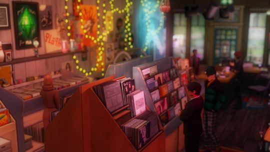
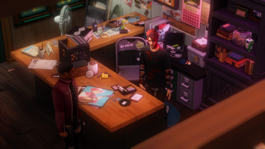
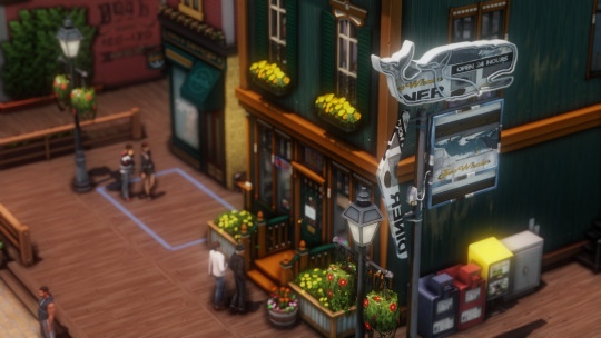
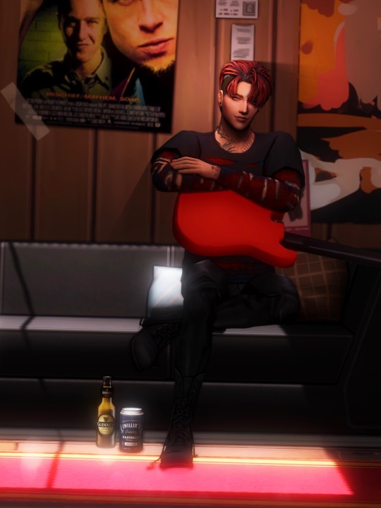
floyd’s little record store: ECO OF EGO
#floyd cyprus#sims 4#ts4#simblr#show us your sims#my sims#sims 4 screenshots#imma lose my mind.#i wanna credit the build to the original owner which was cc heavey) BUT I CANT FIND THEIR ACCOUNT.#I did LOTS of changes from the inside because i delete half of my ccs but still. where did you gone my beloved person who built this#honestly i wanna check their account again BUT THEY ARE GONE. MISSING. ig#I also had this build since last year???#cant believe I never took a picture of it again- glad I still have a floyd to brag with it#I fuckin miss lis.#;floyd
67 notes
·
View notes
Note
What website/software do you use to create your gifs? They're always such good quality.
hello! I’m so sorry for only getting round to answering this now, it’s been sitting in my inbox for months and since you sent it I’ve completely changed the platform I make my gifs on. I’m now using photoshop cc 2018 but the gifs you must have been referring to were made using completely different, free and accessible software/websites. There’s a lot of photoshop tutorials out there but less so for other options so I’ve decided to just go through my previous process in the hopes that someone will find it useful!
To be honest, the differences between my gifs BP (before photoshop) and AP (after photoshop) aren’t that huge as long as the video quality is good. It’s easier to add subtitles, to colour and to play around with the gif size/quality, but there’s no need to give your soul away to adobe to create good gifs there’s obviously always the possibility of downloading ps less legally which i of course would never in a million years do. So, to create gifs as I did BP you will need three different things:
a screen recorder (I use QuickTime Player which is preinstalled on a mac but there are many others out there, and then VLC player if I had already downloaded the video which didn’t happen often as I mostly gif matches so I’d just screen record parts of the match if I couldn’t download it)
a video editor (I used iMovie which again is preinstalled on macs but there are other options out there if you have a poke around - if necessary this step can also be skipped but it’s useful and will improve gif quality)
the lord and saviour ezgif.com (a free website at everyone’s fingertips which provides many of the features you can get with ps)
1A. Screen recording: have the part of the video you want to record on your screen, open up QuickTime Player, right click on the image of the app in your dock, then click on “new screen recording”. You can then click on the arrow pointing down to change your sound settings, I usually have mine like this
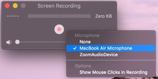
click on the circle with smaller red circle (play button) after which these instructions will appear across your screen: “click to record the full screen. Drag to record part of the screen. End recording by clicking the stop button in the bar menu”. So you can chose to record your full screen or just a part of it depending on whether you click or drag. If you drag you are then given the opportunity to adjust the area you want to record and then you press “start recording. Once you have finished recording the part you want to gif, click on the circle with a black square inside (stop button) in the menu bar at the top of your screen. Go to file > save and then save the video in whatever file and under whatever name you want. After this you will have finished step one!
1B. The alternative, if rather than screen recording a video you haven’t downloaded you want to record a certain part of an already downloaded video then you can use software such as VLC (you can also just upload the video directly to iMovie and crop it there but if it’s very long/you don’t want to go through the middle step then you may want to consider this as an option). Go to Finder for the video you’ve downloaded, right click on it then Open with > VLC. Find the part you wish to use for your gif, go to Playback > Record like so.

It will immediately start recording what’s playing, stopping when you click on Record again once the part you want to gif is over. Then step one method two is done!
2. iMovie: as ezgif isn’t the best for colouring, and anything that it does do is pretty slow and arduous, then I used iMovie to shorten, slow down and colour my videos before turning them into gifs. Here I go Create New > Movie > File > Import Media. I find the video(s) I want to use to make gifs, click import and then drag and drop them into the timeline.
Usually I try to make my gifs about 3 second long, so first thing I would do is change the speed from normal to about 70/80% (this is a completely individual choice though!) so these would be my current settings

Then I find the exact bits I want to gif and divide them into individual clips, as I said they’re usually 3 second long but it can vary. This is done by right clicking on the part of the video you want your gif to start and clicking on “Split Clip”, and again at the point you want your gif to end. Repeat for however many gifs you want. Simply delete the parts of the video(s) you don’t want to keep after this is done.
Now I attempt to add some colouring. First I go to “Colour Correction” which is in the same bar “Speed” is - it’s the little artist’s palette. I play around with the different toggles a little bit until I find something which I believe works. This honestly varies so much from gif to gif but usually I up the saturation just a lil bit, leave the temperature as it is and darken the video so that it ends up a bit like this but honestly it fluctuated a lot and it’s all about personal preference.

If I’m feeling funky I’ll also mess about with the “Colour Balance” which is under the first icon on the left which is a half white circle. I use the eye dropper to change the skin tone balance and sometimes the “White Balance” eye dropper which is a simplified version of ‘curves’ in photoshop.
Once you’re happy with how your video looks then save it by going to File > Share > File. Name it and, if possible save it in as high a quality as possible. My settings usually look something like this

click Next > Save and step two is finished!!
3. Actually making the gif using ezgif.com/video-to-gif. Go to “Choose Files” and select the video you want to gif, then click “Upload Video!”. Chose the time frame you want for your gif, the size (the x540 one which says for Tumblr is the one to use if you’re uploading them onto here), the frame rate (the more per second the better the quality but also the bigger the gif size). All of this is also very well explained by ezgif at the bottom of the page so I’d definitely recommend having a read through all that. Then click “Convert To GIF!”.
From here you can either ‘crop’ to make the gif a particular size or use other tools such as ‘effects’, ‘speed’ or ‘optimise’ if you didn’t use iMovie or want to make some further changes. I usually only use the ‘crop’ as iMovie won’t let you change the dimensions of the gif whilst here you can do that. However I mostly stay away from the other tools as I find them a bit clunky and annoying to use. Once you’re happy with the final product click “Save” and hey presto your gif has been downloaded and is ready to be used!!
I hope some/all of this helped and feel free to hmu with any questions you might have if anything isn't explained that well. It took me ages to write this because I'm never sure whether these explanations make sense outside of the realms of my brain :)))
#sleep who? i only know what making gif tutorials at ungodly hours is#genuinely hope this helps people!!#i developed this process bit by bit so thought id finally share :))#gif tutorials#tutorials#colouring tutorials#how to#og#ezgif tutorials#coloring tutorial
21 notes
·
View notes
Text
VI c. UV_1
(Previous: Changing the texture displayed in Blender)
As mentioned before, the uv_1 map plays a very different role than uv_0: it tells the game where certain parts of your mesh are located, so that the whole thing could move with sliders. It seems many people struggle with it a lot – and to be honest, I have no idea why, as in my experience uv_1 has always been totally unproblematic. Hopefully you'll share my feelings on this!
Let's click once again the little triangle on the right ('Data') and choose 'uv_1' this time.
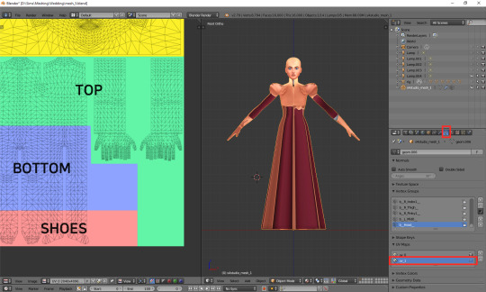
As you can see, the texture on the model turned very weird – and it'll stay this way, as that map is not meant for texturing. You can as well change to solid shading, if you find that craziness spooky or annoying.
If you switch to edit mode, you'll see that the map looks just as crazy:
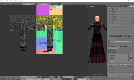
UV_1 uses a completely different type of template. It differs very slightly depending on age and gender of your sim; the adult female one looks like this:
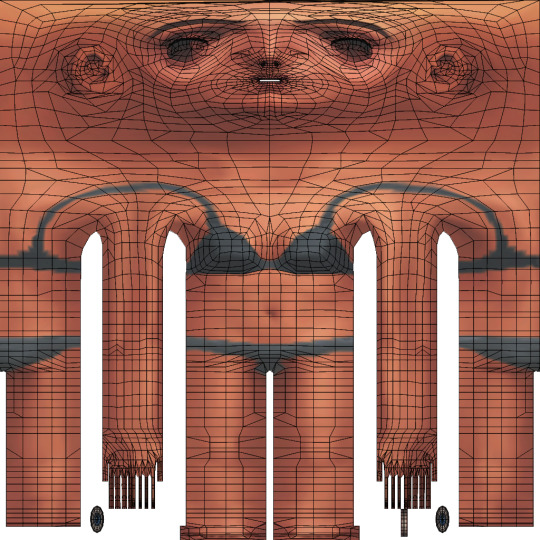
You can download all the versions from S4S forum, in HERE (I highly suggest you make some kind of 'Basics' folder for all those things which you'll keep reusing!)
Once you have downloaded it, click 'Image' and then 'Open image'. It works exactly the same as in case of uv_0. Now it should look like this:
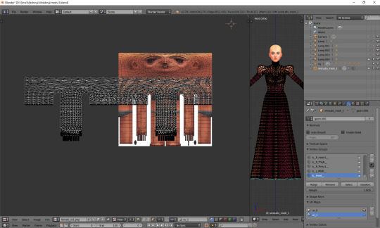
You can see that your vertices are twice wider than the template. I'm not sure why the template has been made in this way instead of getting adjusted to the TS4 requirements, but that's what we have to work with. Select all the vertices (a), press s, then x, then type 0.5 and press enter. Do not move your mouse! Your uv map should be twice narrower now:
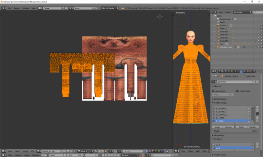
We still have to move it, so that it'd align with the template. Select all again, this time press g, x and type 512. That's exactly the number of pixels you need to move your mesh to the right. Now it should finally look correct.
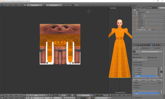
Just like in case of uv_0, the top part is completely done, so the only thing we have to do is unwrap the skirt. This time the only valid methods for doing it are no. 1 and 2 (see: VI a), namely moving the lines manually or using cylinder projection. As at this point making manual adjustments would be too cumbersome, we're going to use option no. 2.
Select the lowest line of vertices to select your whole skirt, go to front view this time (num 1) and choose cylinder projection.
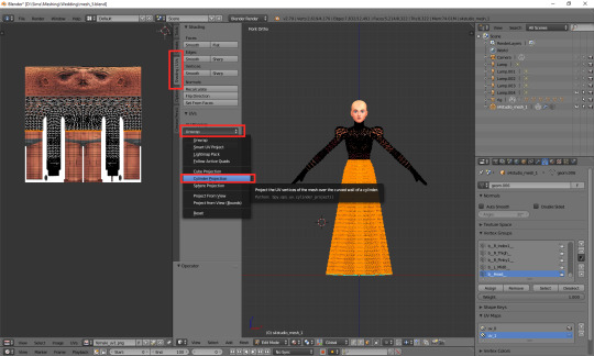
Move the newly unwrapped faces up or down (g, y), to the black area, so that you could properly see them.
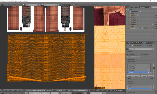
You can see that my dress got unwrapped a bit unevenly – there are small 'steps' on the sides. I highlighted all the faces which should form the left edge. Now I'll move the highlighted parts on the right to the left, and the non-highlighted parts on the left to the right, and then it should all look and work fine.
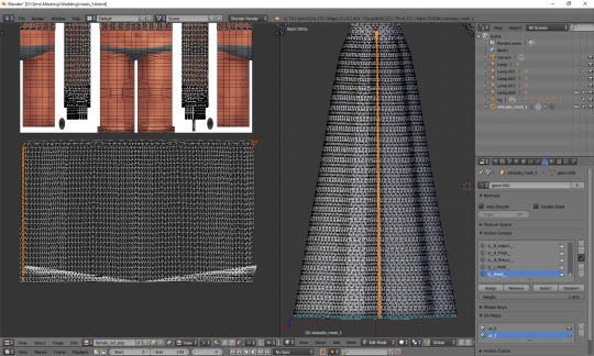
Tip: you can also move them precisely into the right place by typing g, x, 1024 (to move to the right) or g, x, -1024 (to move to the left)!
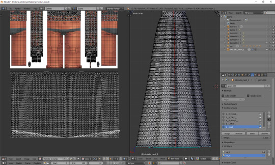
The weird part at the bottom is the closing circle; you can select the central vertex (which is here doubled on the sides), weld it and move it down, to more or less align it with the lowest row. Or simply wait with closing your dress until you're done with uv_1 ;). The bigger problem is that step my dress still has at the top. I'll select all the vertices below it and just very gently move them along the x axis to the left. Now, that looks better:
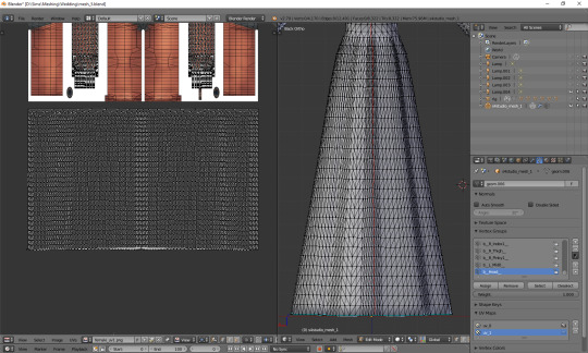
And now, just as we did before, we have to connect the skirt with the top. It's a bit trickier than in case of uv_0, because you can't do it in one piece: your mesh has to be split along the back and both sides. Take a look at the top mesh. Let's start from the left: click the rightmost face and then, in 3D view, the faces right underneath it. This will tell you where your skirt should be split.
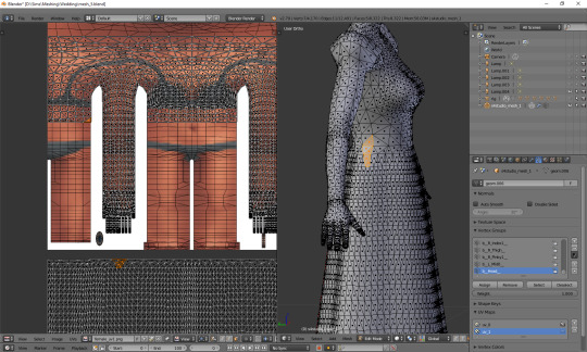
I'll deselect the face of the top, select the whole part of the skirt left from the selection and then move it to the left (g, x), separating it from the central part.
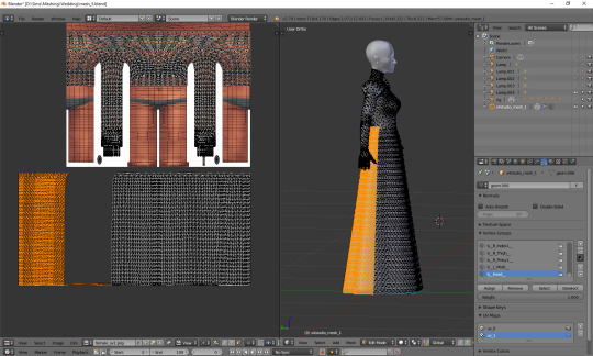
That weird line at the bottom is the closing circle again – I'll delete it and redo it afterwards, it'll really be easier.
Repeat the same steps for the part on the right.
The edges of those three parts should be, if possible, straight. Mine aren't. To be able to adjust them, I'll select the edges and temporarily split them (ctrl + e, in 3D view). Select a vertex or two above as well, or the uppermost one won't get split!
(If you're having problems with selecting edges, it might be smart to select the whole skirt (not the top!) and change it back from tris to quads (alt + j). Then you can easily select edges by clicking them while holding alt).
Split also the top row of vertices, to separate the skirt from the top. Just for a second.
Now select a whole edge, press w and choose 'Align X'
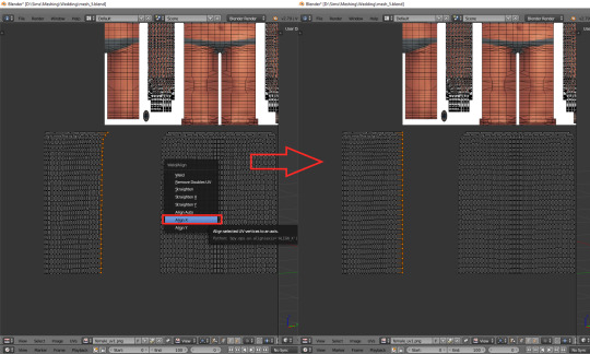
Repeat for the remaining edges. If you want to and feel that it's needed, you can also straighten other lines in your mesh.
Now it's finally the time to put it in the right place. Select the skirt and move it up (g, y).
One can immediately see that it's way too tall. Scale it along the y axis until it looks more reasonable. It should start at the lowest line of the top and end a bit above the feet. Nothing big will happen if it covers them, but it has to fit inside the picture!
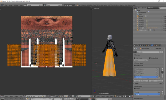
And now just scale and move each of the 3 parts individually, along the x axis, to match them with the top.
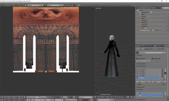
The only thing left to do is to weld the vertices. It's unlucky that we separated the skirt from the top; now we have to select all, remove doubles and then once again split the side edges to be able to weld everything properly. Just like with uv_0: select a vertex, press w and choose 'weld' from the drop-down menu. Repeat for aaaaaall the vertices connecting the skirt with the top.
Sometimes the vertices can be quite far away from each other. Is it still safe to weld them? I'd say risk it. If you see some weird stuff happening in game when changing your sim's body type, you'll know you have to fine tune it: straighten some lines, make them more regular etc. However, chances are quite high that it won't matter at all.
Select all and remove doubles. Yes, again (I keep doing it all the time, that's probably why I love the edge split modifier so much).
And now a very important, final step that I usually forget about: you have to revert the moving and scaling changes you made at the very beginning. Select all and press g, x, -512 to move it back into position, and then s, x, 2, to make it twice wider again. Otherwise TS4 will get quite perplexed with your mesh (and so will you, seeing everything being weirdly deformed and moving with all the wrong sliders)!
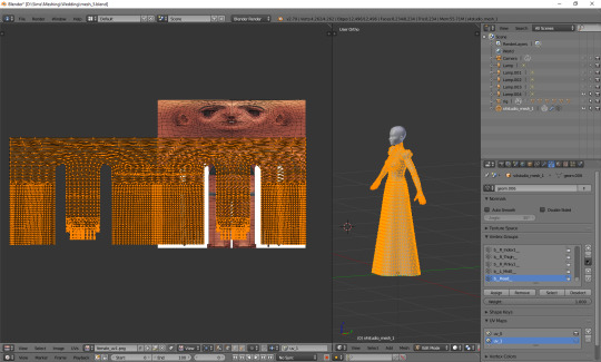
As you see, it's not very difficult and once you get a grip of it, you can do it in no time. To be honest, 90% of the time I don't even do the whole scaling and moving thing; I just open the picture, to know where the feet are, and adjust the rest to the top. UV_1 is really not that bad, at least as long as you don't have to deal with the upper body half.
Here are just a couple of general, closing remarks which I'd like to share:
If you move any vertices of the top, immediately move them on the uv_1 map as well. I try to avoid it at all costs, but sometimes I can't resist making just one teeny tiny adjustment... Arms are usually not a problem, neck can get problematic, and breast area is an absolute nightmare. I already mentioned it once, but honestly, better dissolve vertices and cut new edges with the knife tool than move anything in there.
If you're frankenmeshing, remember to weld any vertices you merged in 3D view! If your mesh is getting split in game when you move any sliders, that probably means you didn't connect those parts on the uv_1 map (or that it's vertex paint... but that's another story).
Of course, if you added any other parts to your mesh than just a skirt – or if you frankenmeshed a thing, but changed its location, e.g. took a hair ribbon and put it on the skirt – you have to put it in the right place as well! In case of frankenmeshing you just have to change its location on the map; if you made it yourself, you'll have to experiment with different types of unwrapping first (pssst, projecting from view usually isn't a bad idea).
There are also certain cases - rarely, but still - when it might be a better idea not to properly unwrap a part of the mesh, but weld it all together to a little dot and put it in the right place on the uv_1. The first example which comes to my mind are 3D buttons. I always weld each button to a single dot, so that it’d be changing its size evenly, without deformations. However, this comes at a prize of an increased risk of clipping.
And finally: if you're having big problems with uv_1 and my method doesn't work for you – or if you made your mesh completely from scratch, so you don't have an unwrapped top – you can always make a data transfer, copying uv_1 data from another mesh. I won't elaborate on this one, because Teanmoon already explained it all in her amazing tutorial, which you can find HERE. Scroll down a bit until you see 'UV-1 Transfers'. I think I used it myself once or twice in the past and I was quite pleased with the results :).
***
Once again, I'm sorry both for how long you had to wait for this tutorial and for its final length. I swear I intended it to be a simple, concise explanation ^^. I hope that at least it's all clear and will help you avoid any problems with uvs. Please tell me if you have any questions or if something doesn't work for you – really, I mean it! Half of my inspiration for this tutorial comes from me watching other simmers struggle with making their first pieces of CC, as it helps me notice what hasn't been explained yet.
From now on we'll be moving into the dangerous territory of clones, cuts, regions, bones and weights, and I need some time to figure out how to divide this whole topic into sensible parts. It's not even that hard, but very interconnected, and that makes it difficult to tackle – as covering it all in one part is absolutely out of the question. Please have some patience with me and stay tuned!
52 notes
·
View notes
Photo
Illustrating in 360°
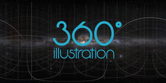
When I decided that a 360° illustration was going to be my first project of 2019, I never would have guessed, how much knowledge I would gain and how much enthusiasm I would develop for this topic. In the course of just a few tutorials I was able to learn everything to make it work properly. Therefore I decided to share those tutorials and links with you.
3D illustration is generally a topic that evolves these days, with VR technologies becoming more and more common. Especially if you have a look at Artstation or the portfolios of concept artists, you find a lot of really cool worlds that you can experience by moving around inside of them. We are used to see 360° photos but it’s breathtaking to see fantastic worlds and imagined stories coming to life when you explore a spherical illustration little by little.
Terminology
Before starting, I want to make sure we’re all talking about the same subject. It’s not about flat images with a perspective grid (1/2/3-point-perspective), nor about an image with a parallax effect. We mean a drawing on the inside of a sphere, where you have a fixed standpoint but can change your view by turning and also looking up and down.
Software & setup
I started by buying and testing the app Panopainter on the iPad, ending up firstly fascinated and soon frustrated because of bugs and constraints that made it hard to establish a constant workflow. For example, I searched forever for a way to deselect a selection, turned around and found half of a picture deleted that I didn’t even work on at that part of the process or I did not manage to import a png without a transparent background.
So I watched this wonderful tutorial and decided to use the good old photoshop: Pano painting tutorial by Jama Jurabaev In it, he explains the basic setup for using a spherical map in photoshop and he created a 3dimensional grid for downloading that helps so much to navigate.
Summarized, the workflow goes like this:
create a big canvas with an aspect ratio of 2:1 (e.g. 6000x3000 px)
load a grid (like the one in the tutorial) or another picture that works like a 360 photo and make sure this layer is selected
(in the current Adobe CC:) click on „3D“ – „spherical panorama“ – „new panorama layer from selected layer“
you now only see a part of the picture and can move around already and draw directly on the sphere
you can also double-click on the spherical map that works like a smart object, and work directly on the map
Workflow
For the drawing process, this tutorial was very helpful: Edit spherical panoramas by Photoshop Training Channel Although it shows and explains everything based on a photo, it contains the best tips about a non-destructive way of working.
The problem is this: when you sketch something on a new layer in the normal mode and move around, the new layer moves with you. If you want to fixate the drawing to the spherical map, the steps are:
open the spherical map and create a new (empty) layer, make sure the layer is selected
save and close the spherical map
in the normal view, draw on a layer directly above the spherical one
when ready, right-click on the drawing layer and choose „merge down“ (if you are not sure you’re ready, keep a copy of the layer)
the drawing is now part of your spherical map, but it is on the layer you created before
Preliminary 3D model
For my personal workflow in the future, the next tutorial on how to build and export a scene as a 360° panorama in Cinema 4D might come in handy as well: Panorama Rendering by Konstantin Magnus I’ve successfully tested it already. The scene that is described is random but the export of it is quite tricky. The program doesn’t offer a direct way yet so there’s a little workaround:
in render settings, choose the format „Quicktime VR panorama“
the default resolution and the output size should be the same (aspect ratio 2:1)
unclick „save“ in the render settings
render and then save the image as a picture manually. Tadaa!
I hope these tips help you getting started. Are you as excited as I am?
#jbohn#digitalpainting#digitaldrawing#drawingtutorial#howtodraw#learntodraw#360tutorial#360degrees#360drawing#360project#3ddrawing#vrart#vrartist#conceptart
6 notes
·
View notes
Photo

So because I have no life and because I offered to help an anon, I’m making this manga colouring tutorial.
Now first off I’d like to apologise because I personally suck at explaining things. I really do and I’m sorry if this confuses you.
I used Photoshop CS6 (its pretty easy to get it off the internet and I can’t remember where I got mine google is your best friend. But you can see if this masterlist by itsphotoshop still has working links) But, I’m sure other versions of photoshop like CS5 and CC can do this as well.
If this actually helped you please give it a little, like/reblog!
Now on with the tutorial!
Ok so I’m going to use a mangacap from bungou stray dogs and I’m gonna be colouring something I coloured before (here), my depressed home boy Atsushi
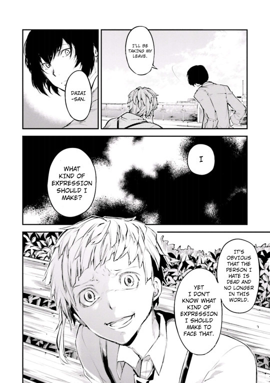
(scan courtesy dazaiscans)
When you open it in photoshop please ensure that your image mode is RGB and not Index (this is common with scans from mangastream). To change it go to Image>Mode>RGB
Crop out the area you’re gonna colour. And resize to desired size (I chose 540px) because I wanted to upload it to tumblr)
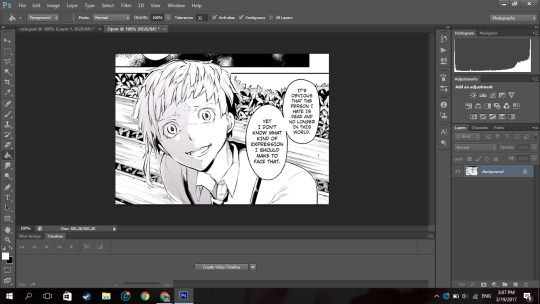
Now we’re gonna clean it. I have no idea how other people clean theirs, this is just how I do it.
First double click on your background layer and click ok on the box that comes up so it will not be locked.
Now click channels

And then click the dotted circle at the bottom. After, click delete on your keyboard.
The image will show up something click this:
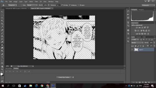
Now go to Layer(on the topbar)>New Fill Layer>Solid Colour and you set the colour to pure white). Move that layer below your mangacap.
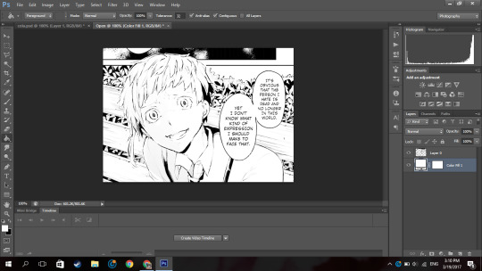
Now it’ll look like that. Then I merged those layers together.
Because I don’t want the background with the bus andbench and the panel above Atsushi, I’m going to create a new blank layer (so if I make any mistakes I can fix it), take the polygon lasso tool

(if you dont see it right click on the area where you see the normal lasso tool/magnetic lasso tool and then click polygon lasso tool)
and then I select the areas around Atsushi.
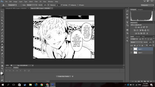
Then on the new layer I created, I use the paint bucket tool and fill in the selected area with the colour i wanted which is white.
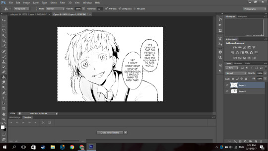
now it looks like that.
Then on a new layer, I take a black solid brush and I change the size to something small (like around 2-3px) and I just fill in the black areas which look at little weird. For example, I thought Atsushi’s pupils looked a little weird so I filled them in.
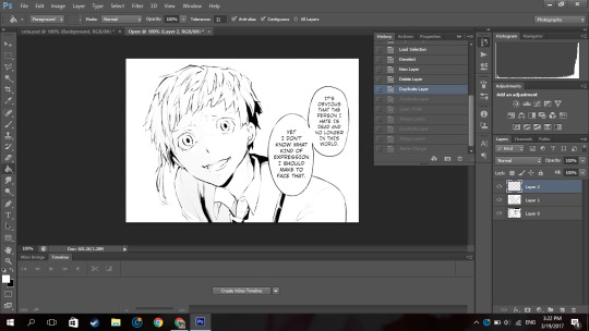
So now it’s time to colour. Now go google a random animecap/coloured pic (preferably official art) of your character. Then open it in photoshop.
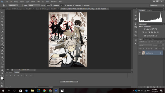
I used this pic so yeah.
Now using the colour picker tool, pick their skin colour. Ok now go back to your mangacap, create a new layer, and select all the areas where your character’s skin is with the polygon lasso tool.
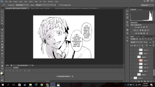
Then use a solid brush (basically one of the first default brushes from photoshop you see here), adjust the size to suit, then colour in with the characters skin colour. Set the layer to multiply.
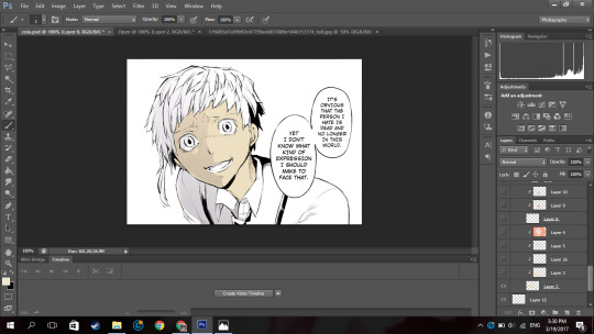
Now, create a new layer and clip it to the layer you coloured their skin on. (clip a layer by right clicking on the layer and click clip layer and the layer will clip onto the layer below it). Set the layer to multiply
Then you select the areas where you see a shadow on the character’s skin.
If there is none, what you can do is google some lighting references and choose shadows on faces that are at a similar angles as your character (does that make sense??). Or you can just not put it in.
Now using the same colour you used to colour the skin. Colour the selected areas.

If you decide that other areas need a deeper shadow, you can create another layer, set it to multiply, clip it to the layer below, select the areas you want to be darker and just fill in the selection. I did this for the frown lines on Atsushi’s face.
Now because Atsushi looks as if hes about to cry, using a pink colour (like the one below),

I make a new layer, set it to multiply I clip it to the skin layer and using a soft brush I brush over under his eyes and a horizontally across his nose.
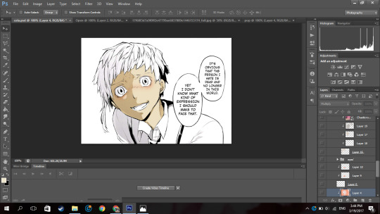
Now to get some soft shadows (?) around his face and like the areas of skin below his hair, using the same pinky colour, and a huge soft brush (i used 288px) brush the area around his face but not directly near like this:
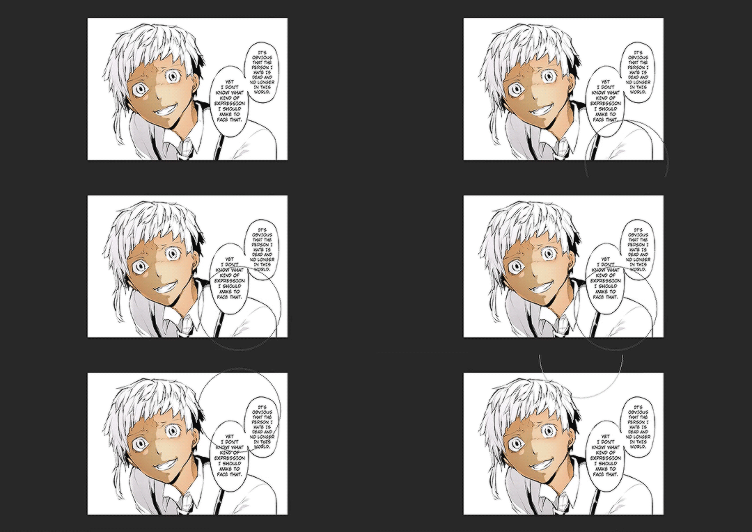
(the gif is shitty and rushed im sorry)
Using a soft brush eraser you can just fix it up from the inside of his face. I’m sorry if that sentence made no sense.
Now on a new layer (set to multiply), using the same colour I used for the soft shading, I select the area where inside his mouth is supposed to be and using a hard brush I fill that in. And then you know the drill, I create a layer, clip it to the layer before, set it to multiply and just put in where I think the shadow would be.
And then going in with a soft brush on another clipped layer and just put in some soft shadows around.

Now I’m going into his eyes. Now I do practically the same thing I do for his skin here: I pick the colour of the eye from the art with the colour picker tool, make a new layer, set it to multiply, colour it in.
Now it, really depends on how I feel to do the shadow on the eye.
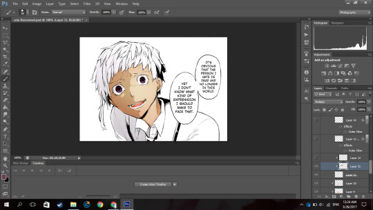
Sometimes I do something like this where I shade the top half of the eye, like in the image above.
Or I simply outline the eye and the edges alone are made darker. Like this:

In this case I chose to go with the latter because I felt like it.
NOW. Normally eyes have that ‘shine’ to them right. I normally don’t do the eye like this, I just put a normal circle kinda by the pupil like this or follow whatever highlight the mangaka drew like this:

But since I thought Atsushi’s eyes looked bland like this, I highlighted it more. Now this is optional, I thought it looked better this way because following the highlight it originally had was bland for me so I did it. You by no means have to do it, it just depends on your preference.
So on a new layer, on the eye I selected a kind of a crescent shaped like so:
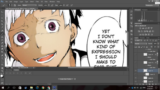
Up close and personal with my depressed son. Then using the colour white, I colour it in with a hard brush.

So now at the bottom of the last panel on the right, you’d see a button that says “fx,”

Click that and click outerglow. And a tiny window will show up. Now choose a colour a little lighter that your eye but make sure its around the same tone(?) (a warm colour or a cool colour; red under tones, blue undertones, etc.). In my case I chose a pinky colour.
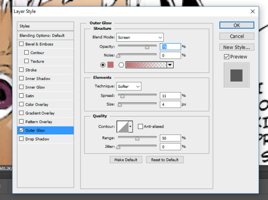
As you can see I set the blend mode to screen now this part is a must, but the opacity and the spread and size are all up to you, again its all based on your preference.
Now your eye will look something like this:
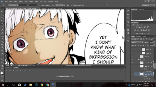
Now just duplicate that layer and move it to the next eye and rotate it by clicking ‘ctrl+T’ if necessary
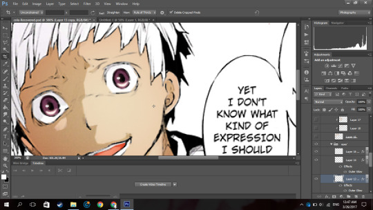
now boom you got your eye. I put it in a group so it’ll be a little organised.
Now onto his hair oh the pain.
Now you know what to do, make a new layer, set it to multiply, pick the hair colour off your reference image, select the areas with the hair (this includes eyebrows and lashes if they’re there), colour it in.

I hid the layer where I put the redness of his eye and only realised just now so I unhid the layer sorry.
Now Atsushi’s hair on his head has a lot of layers (?) so I had to select the areas where I saw the shadows going (?) (I’m sorry if that doesn’t make sense). If your character has shadows in their hair to go along with by all means follow it but in my case his hair sort of didn’t.
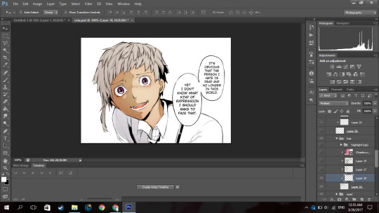
So as you can see, I selected the areas where I deemed fit to have harsh shadows, I really did not put much but you can tell I did something. It all depends on where you want to put it though, I’m no expert in shadow theory so I probably suck at it but eh.
Now if you notice there’s kind of a shadow over his hair and it’s cast over his face to. So I just followed what I saw, and on a new clipped layer I selected the area and using the same colour I used for his hair and just did a shadow for that area like so:
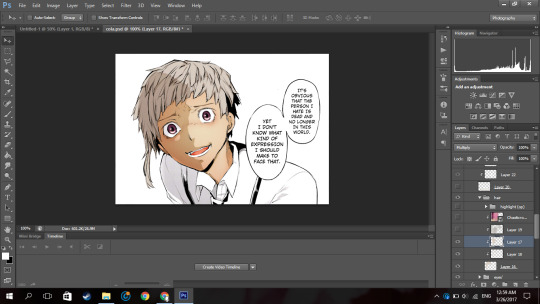
Now normally I put soft shadows and you can see I used a pinky shade for that when I did the skin and his mouth, but since the colour didn’t look like it had any pink undertones (did I say that right), It kind of looked weird with a pink shading. So for the soft shading I used a greyish colour:

and I just did the normal thing where I brushed around the hair with a soft brush.

NOW this part I’m about to do is completely not necessary, I barely do it but I did it in this colouring so yeah.

Using the texture above, I clip it to the hair, set it to screen, change the opacity to 50% and the fill to 28%.
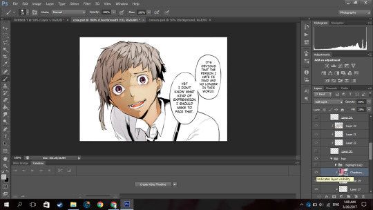
Its bare noticeable but it gave his hair a slight purplish look so I liked it.
Now this part is something I barely do as well but I did it here so I’ll show you how.
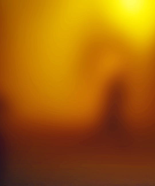
Using this texture, I set it the opacity to 22%. I then select where I want the line of the highlight to be (you know how anime characters especially have this line of shine across their hair). Like this:
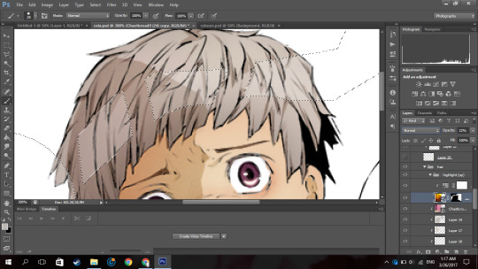
And then add that to a layer mask by clicking the button next to the “fx,” button. (I did it before I’m sorry I didn’t take a screenshot before I added the layer mask I’m really sorry).
Then you set the layer to soft light and boom.

You have a highlight looking thing.
Now for the shirt I basically did what I did for the skin, hair and other areas: make a new layer, set it to multiply, pick the hair colour off your reference image, select the areas needed, colour it in.
Now advice, I don’t know if you want to do it or not but, I personally think that if your character has a white shirt do not leave it pure white. Colour it with an off white colour like a light grey. Like this:

It makes it easier for me at least to put in the shadows and stuff as you have a layer to clip it to and its easier to just use the same colour and click multiply.
Then again this all depends on your preference.

For the soft shadows I used the same colour I used for his hair soft shadow.
As you can see, he has a tie and suspenders which are both black.
Now again advice and it’s my opinion I am by no means an expert but I think one should never use a pure black colour to colour it in unless it’s what you’re stylistically going for it. I’ve seen a lot of artists on tumblr say this and they use a somewhat dark blush-ish grey colour and I 100% agree with it.
However again, everyone has their own preferences.
Now the colour I typically use for black areas leans more to the gray side rather than the blue.

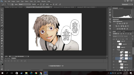
Now again what I’m about to do is not what I normally do but I did it in this colouring so I will show you but it is not necessary you do it.
Using the same texture I used for his hair, I clip it to the various black pieces of clothing he has, moving it around until I think it looks nice and changed the opacity as I saw fit. I did not change the blending mode from normal to soft light but you can if you want to.
To do each part individually, Using a layer mask and a pure black soft brush, I removed the parts affecting the other parts. And I unlinked the layer mask to the original layer (double click the chain link that’s between in the layer and the layer mask) so I can move it if I wanted to without moving the layer mask.
For example his suspender which appears to be at your left, I place the texture over that, moved it around, changed the opacity as I saw fit, removed the parts affecting his tie and other suspender. And was left with this:

Now just do that for the other parts.

Now I forgot to colour his teeth and white of his eye and only realised now so I just used the off white colour and coloured it in real quick (I put in the harsh shadows as well)

Now by all means you can leave it like this but I like to put in highlights to the skin but you can leave it like this. I have not put highlights to the skin before in some of my other colourings like this one of haiba alisa from haikyuu.
Now what you’re gonna do on a new layer set to normal is select a fine line around areas like, the perimeter of the lower half of the face, frown lines (if you want), the outer perimeter of the ear, the bridge of the nose, a little circle by the lip (if you want) and if the character has sweat or water on their face, select the outline.
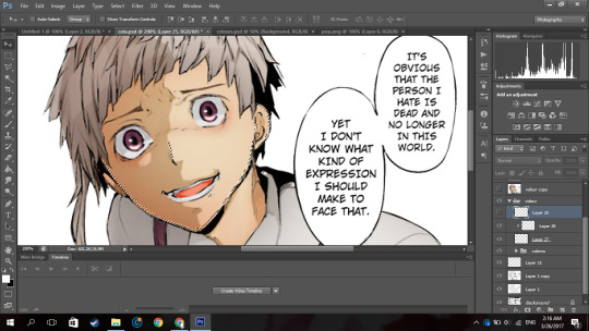
It’ll be something like this. Now with a hard white brush fill in selected area.
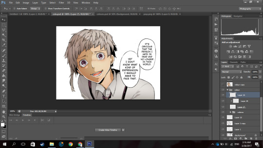
BOOM NOW YOUR PRACTICALLY FINISHED CLAP THE STRUGGLE IS OVER.
Now you don’t have to do this part it’s your personal preference. I have a photoshop plugin Topaz Clean 3 which is really easy to get off google so if you want you can go get it. Now I copy every layer and merge it. Now using Topaz clean with these settings:

I apply it to the layer and set the layer to 50% opacity (i literally wrote 50% free the 1st time im trash)
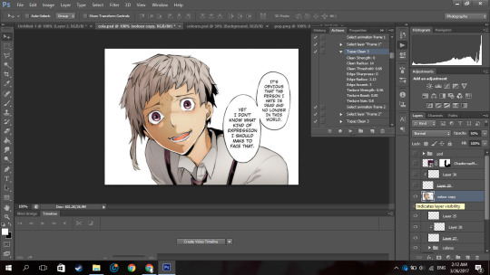
Now to add a little more oomph to my colouring because I can.
I used the same texture I used on his hair, set it to screen, I added a layer mask and erased the areas it affected besides the text so they text looked coloured.
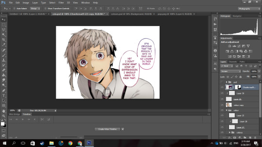
Then you apply your psd. Now the psd I’m using is psd 01 from this psd pack but its really heavily modified and I removed a lot of the layers. Then I used 2 textures
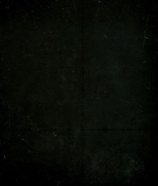
with blending mode soft light and opacity 37%
and
with blending mode screen, opacity 51% and a black and white gradient layer clipped to it.
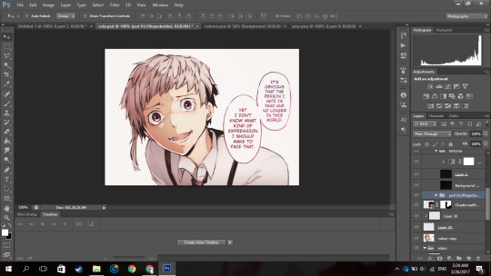
and boom you’re done!

And that is the end result! I hope you enjoyed and that it wasn’t too confusing!
#itsphotoshop#yeahps#tutorial#photoshop tutorial#*mine:tutorial#*mine#photoshop#manga colouring#manga coloring
326 notes
·
View notes
Note
Why don't you ship Captain Canary?
That’s a complicated question with a complicated answer.
It’s hard because I’m compelled to be honest because I respect my anons enough to give a serious, honest answer to pretty much every ask I actually take the energy to respond to, but I feel like any person who would ask this doesn’t actually want my honest answer from it. Last time I answered a question about CC, I was accused of attacking the anon because I summarily disagreed with the points they were making and explained why.
So, if I say this question feels a bit like an accusation, I hope you understand that it’s because it makes me nervous to go into negative detail about another ship and to know that it can ruffle feathers even with the best intentions. I’ve always been 100% disinterested in bullshit like ship wars and I don’t consider CC as in any way counter to anything else. I just… don’t ship it.
But I’ll answer my reasons for why honestly, leave it out of the ship tags, and hopefully you respect my answer.
The reason I don’t ship CC is a mix of on-screen chemistry, characterization, Sara’s seeming genuine dislike of Len at the outset and lack of attraction to him throughout, and… the shippers.
To go into detail on those. Their on-screen chemistry is amazing, and to a certain extent, I do ship them. I ship roguecanary (len x mick x sara), or Len and Sara for a fling, a dirty make-out in a dark corner sometime, a quickie in a supply closet sometime. I also ship them in the sense that they could, in theory, be a much much slower burn. I genuinely thought they might have a slow progression across two seasons or so, back when it first looked like there might be something between them, that they had some mild flirting. I think I might of liked that, and I certainly wasn’t against it. Killing off Len kind of accelerated that timeline though, if it existed.
But what I don’t ‘ship’ about their on-screen chemistry is that it feels so much more like friendship to me than romance. And that’s fine for some people. But the same way I don’t ship sn*wb*rry because I literally cannot see them as anything other than friends, and simply do not see romantic chemistry there at all, I also don’t see any genuine romantic chemistry between Len and Sara. That they become friends is sort of undeniable and I loved to see them playing cards and having insight into one another, but I didn’t feel that needed to be romantic and I thought it was better off being what it was, simply.
Characterization-wise? Well, this isn’t anyone’s fault, but I was a pretty hard Nyssara shipper, so Sara’s prior characterization made me not want to ship her with anyone other than Nyssa for a while. I’ve finally relaxed off that after it became clear I’d never get to see them together again, but it was hard letting go of that canon ship. I also found the logical ship for Len to be with Mick, because of their amazing dynamic. I found their chemistry to veer more toward romantic than Len and Sara’s did half the time. Moving in sync, the angsty break up, literally willing to die for each other, having a little memento ring, inside words, Mick being the only one Len seemed to initiate contact with.
So none of that helped. But none of that made CC a nOTP either? I mean, it’s not really a nOTP across the board. like i said, i do ship roguecanary or len and sara for a fling or an open thing, a casual understanding.
But Sara disliking Len at the outset did make give me an anti-romance sense. And throughout the entire season, she seems disinterested in him romantically.
Contrary to people with shipper goggles on when they watch that deleted scene from the pilot, I see her being annoyed by him and like she finds him distasteful. they get along for a drink by the end of the episode and she’s teasing him, they get closer, but she also says that she literally doesn’t like him when they’re dying of the cold. teasing? maybe, idk, but it’s not really something you say to someone you’re crushing on. it just seems so very platonic and also like the notion of being with him makes her uncomfortable. it’s hard for me to read her otherwise. he alludes to his feelings about her when he’s deflecting talking about mick and she looks surprised then impassive, completely shutting it down. he mentions thinking of a future with her when she’s already upset and doesn’t want to talk to him and she… well she basically tells him to fuck off? but as a “soft” no instead of a hard no, because maybe she doesn’t have her feelings sorted out but now is obviously not the time and she’s not interested in pursuing things with him with how things stand.
but basically, she never demonstrates reciprocal interest in him at all. and we know that she’s not especially shy when it comes to expressing herself, her attractions, or her intentions. i know it would be more complicated with a teammate, but i don’t think she’d be dishonest about her feelings either; she values honesty far too much for that.
and this makes him a pursuant of a person who is totally uninterested in him, and that’s a place i’ve been? people uncomfortably trying to pursue their attraction to me when i’d shut them down already? it’s not a pleasant position to be in, after a while. and i trust that len’s not so much a creep that he’d push it after getting a clear answer from her, but it still wasn’t something i found… romantic? endearing? a little cute in the scene where he says “my feelings about you” when deflecting, but if he were pursuing it further after she gave him that “have to steal a kiss” line without getting a clear signal from her that she’d changed her stance, it would have actually pissed me off.
anyway… so there’s all that.
there’s also… if you look at that ask i linked above, that’s the type of thing that really pushes it into… i have the ship tag blacklisted because stuff like that annoys me. and look, it happens in the coldflash fandom too, and i ignore it then as well. i’m never a fan of reducing a character down to a ship, attributing their development to a single romantic relation, saying they’re “so in love” when they’re literally really not. and look, gifset edits for your fave ship are cute af, i get it. it’s fun to speculate how your ship’s characters are going to feel when they see each other again.
but i get asks about ‘don’t you think len would have died for sara as well as mick?’ and my answer is… literally no. i don’t. i don’t think that’s how they saw each other, or how deep they felt about each other. and given that the producers have literally said sara has basically moved on, posts making her arc this season about len, or about how him coming back is going to affect her, just make me sigh. but i’m a canon-compliant asshole with my meta even with shipper goggles on, most of the time.
and i’ve seen a lot of those shippers try to reduce len’s relationships with lisa, mick, and other characters (including, yes, barry, who was important to his arc preceding legends) to being lesser than his friendship with sara. that’s so discomfiting to me. and it’s even more discomfiting to me how they reduce all of sara’s best emotional moments to being about len? her overcoming the order to kill martin was aided by len but not about him. her decision to talk to mick in the brig and that awesome conversation and the emotional insight she had? i’m tired of seeing people make that about her feelings about len. that was a great moment for her. she has so many great moments like that. so many great relationships i wish the fandom would explore more, rather than focusing on just a single romance.
and… look, i’m a person who prefers things when they don’t go canon half the time. my canon vs. non-canon ships are radically different. i love WA in the flash and wanted it to be canon and it is, but i love CF just as much and would never want it to be canon. with CC, the ways i would’ve wanted it to be canon never happened, and the ways it’s romanticized and populized in the fandom tend to rub me the wrong way maybe because of that.
So… long answer there. but it’s really honest. i don’t hate CC, and i do respect the fandom and genuinely wish them all the best. these generalizations, as with any generalization, are obviously not going to apply to every shipper or every fic or every meta. but they’re trends i’ve personally encountered and opinions i’ve either seen in the tags or had to interact with and eventually, it slowly turned me off the ship as a major romantic pairing.
#long post#long post for ts#and no i'm not gonna go look up posts or sources to support any of this#or gifs or anything#this isn't a meta#it's a completely subjective and personal post#even if it is a long one#and i'm completely uninterested in arguing about it or in people trying to convince me otherwise#let me know if this needs more tags for anything#Anonymous#replies#anti captain canary
34 notes
·
View notes