#I also really really improved on my color mix and matching
Explore tagged Tumblr posts
Visit Tumblr Blog
Explore Tumblr blogs with no restrictions, modern design and the best experience.
Last Seen Tumblr Blogs


Fun Fact
When “GIF” was named word of the year in 2012, Oxford Dictionaries U.S.A. credited Tumblr for pushing the word.
Text
Yes it's a 5 year difference but still the improvement is INSANE
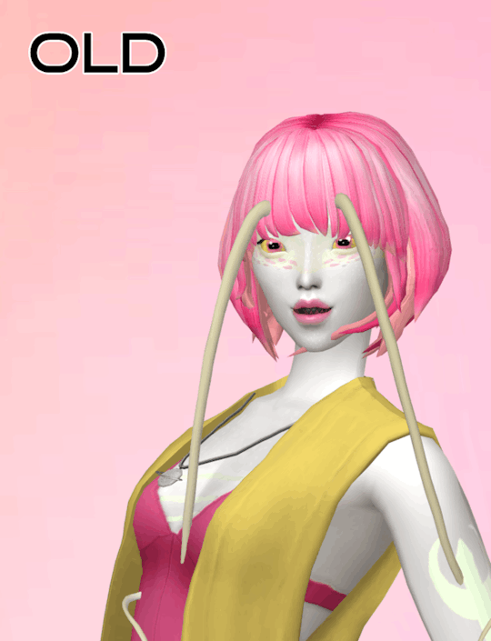
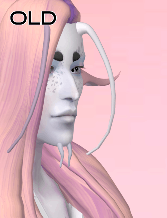
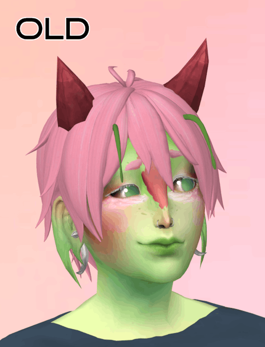
#..I hate my old art so much </333#The old drawing was when I started to really discover how this type of lighting works#and now.. It's me doing that same lighting but doubling down on accuracy#does that make sense??#or alternatively cranking up that intensity of the lighting to 11#I also really really improved on my color mix and matching#bc the recent one on the left has a noticeable warm look on everything; and the right just ... it really doesnt !
14 notes
·
View notes
Text


On the first day of GOATmas, my true love sent to me...
...coffeetables! Wood recolors of coffeetables!
I've recolored every coffeetable that EA has created in a pack or expansion that:
1) already had wood recolors
2) didn't have wood recolors, but I felt that wood recolors suited them

For the colors: I am using Dynamite, Depth Charge, Shrapnel, Safety Fuse and Time Bomb by @pooklet, and Nesert and Honey by Io aka @serabiet.
Please check out the Add-On's I've recommended! They are meshes made by community members that will use these textures too. Or, they are bits of CC that go along with these nicely!
~~~~~~~~~~~~~~~~~~~~~~~~~~~~~~~~~~~~~~~~~~~~~~~~~~~~~~~~~~~~~~~

Ada Quaint Coffee Table - tablecoffeequaint
notes: same texture! removed the shine though.

Centerpieces Coffee Table - tablecoffeeartnouveau
notes: not the original texture! This uses a texture from Seasons.

Chabadii Yet Another Coffee Table - tablecoffeechabudai
Notes: brand new texture! The legs are mostly the same but the top and square parts are that Seasons texture I like.
Recommended Add-on: #1

Club Distress Avigno nRectangular Coffee Table - tablecoffeeclubrectangle
notes: mostly the same texture but I messed with the edges of the top just a little.

Club Distress Square Coffee Table - tablecoffee1x1
notes: texture is unchanged but boy was this one shiny! Shininess was removed.
Recommended Add-ons: #1 #2

Coffee For Four - tablecoffeeluxury1x2
notes: uses a texture from (I think) a BG wall. Shininess removed and just the one glass recolor.
Recommended add-on: #1
Cozy Colonial End Table - tablecoffeeendcolonial1

notes: mostly the same texture! Also had the shine removed.

End To End Table - tablecoffeeenddesigner
notes: another BG table that was hugely improved by having the shine removed from the TMXT. This one has no white recolor, as the base game already had one.
Recommended Add-on: #1

Eye Of The Brain Trust - tablecoffeecomfy
notes: this is one of my very favorite coffee tables! This one uses that Seasons wood again on the top, but the legs are unchanged.
Recommended Add-on: #1

Fair Square Surface - tablecoffeejock
notes: a coffee table that I never use! But it's cute. Same texture.
Recommended Add-on: #1

Full Of It Coffee Table - tablecoffeesocialite
notes: the top is a new texture, but the bottom is the same. This table has 2 subsets, so you can mix and match the wood of the table and the decorative curlicues.
Recommended Add-on: #1

Mission Coffee Table - tablecoffeemission + tablecoffeemission1x1
notes: EA didn't repository these even though they share the exact same texture? 🤔 Texture is not changed.
Recommended Add-on: #1

Psychadelic SimAtri Coffee Table - tablecoffeegroovy
notes: this is another one of my very favorite coffee tables! I think it's got a very cool atomic age/midmod design, so I was happy to put some brand new wood textures on it. The base and top are also 2 separate subsets, so you can mix and match the woods I've made, or any other RC's you have for it.

Queen Anne Coffee Table - tablecoffeecolonial
notes: new texture! removed some shine too
Recommended Add-on: #1

Scraps Ranch Cafe Mate Coffee - tabletablecoffeepine
notes: uses a blend of 2 textures of this to make one. So cute, really.
Recommended Add-on: #1

Simple Structure End Table - tablecoffeeendvalue
notes: no need to improve on a classic! Contains no white RC as the base game already had one.

Spindle Table Recolor - tablecoffeespindle
notes: I got to be creative with this one! Uses some of the base texture, but also a few textures from the pirate ship from Bon Voyage.

Tempered Tea Table - tablecoffeecentralasian
notes: I know that not a single one of you uses this mesh regularly (me included) so this has a BRAND NEW texture. And the top and bottom are 2 separate subsets.


AND 4 different options for tops! They use the grass mat for the fire dancers from Bon Voyage, and some textures from some paneling walls.
Download - Sims 2 Coffeetable - Wood Recolors
~~~~~~~~~~~~~~~~~~~~~~~~~~~~~~~~~~~~~~~~~~~~~~~~~~~~~~~~~~~~~~~
Recommended downloads: ariffrazalin's "One More" Slot Package For coffee tables
#merry goatmas#merry xmas from goat#sims 2 download#ts2 download#sims 2 cc#ts2 cc#ts2cc#sims 2 object recolor
228 notes
·
View notes
Text


DL (sfs, no ads)
The originals have been revamped. All meshes have been completely redone from scratch. I have fixed some chunkiness, wobbliness, and other strange issues that have been present in the originals since 2019. I also went ahead and made at least 1 new shape for each family while I was at it (plus a bonus shape for Classic that I made as a personal edit, years ago, and forgot about until now)
You may notice a folder labelled 'OLD VERSION' when you click on the download link. These are the original 2019 files, and they are still available if you prefer or need them for any reason whatsoever. You can have both editions in your game at the same time. Any sims wearing the old version will have to manually update to the new ones once you install them.
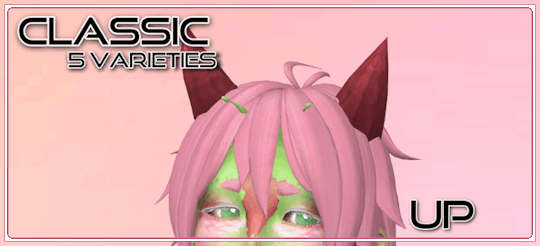
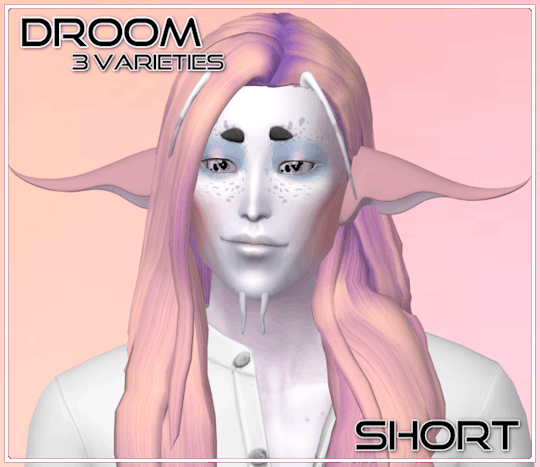
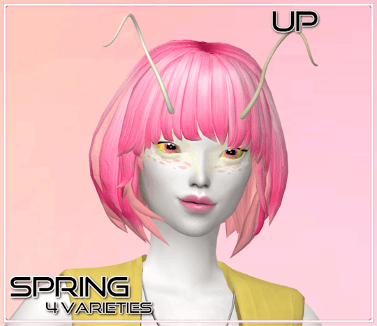
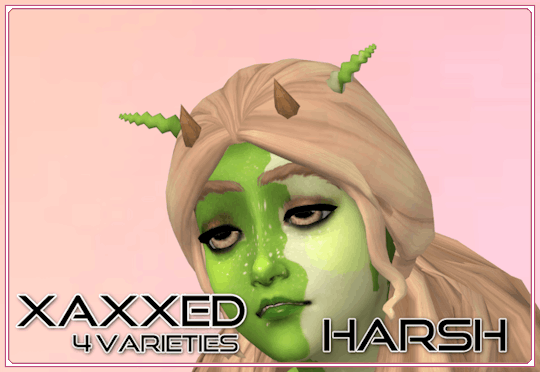
They are available on the following slots:
Acne
Brow Scar (Occult Brow)
Face Birthmark (NEW!)
Forehead Crease
Hat
Right Brow Ring
You can have any combination of the slots installed in your game, or all of them at once (there is an all slots merged package for your convenience, in this case). If you have multiple slots installed, you can mix and match different antennae on different slots to make your own unique combos!
So what's new?
All the meshes have been remade to look a little smoother, while still staying as close as humanly possible to the shape of the originals.
They have all LODs now!
The placement of the UV maps has changed as well, and as you may be able to see from the Irked images, they can pick up some patterns from your sims' faces now in addition to just colors! (They can all do it, but on my models, Irked is the only shape that really demonstrates this. Play around with antenna/skin overlay combos and see what you get!)
There are also better weights now! The longer antennae especially, as seen below the cut, needed improved weighting. They bend with the body now, instead of clipping through it so much. But, there will still be come clipping issues on larger sims and in some animations. There's only so much I can do
And, perhaps the biggest quality of life improvement, they only take up 1 thumbnail spot in CAS. Simply change the swatches as though you were changing colors to access all of the unique shapes!

Some before/afters and additional previews of longer shapes below the cut


1K notes
·
View notes
Note
U gotta tell us how Neige reacted when he first saw Arlo's merform and maybe how it happened?? /Nf
Was going to make this a comic at first but then I realized I had too much I wanted to say and a lot of it wouldn’t translate well, so here’s a little scene lol. read under the cut!!
also tagging ppl hehe,,, @jadelover69 @lallopsyou @miriaocs
“You know… RSA has a pool!” Neige says, arms behind his back while he smiles at Arlo. “It can even be reserved, and there’s both an indoor and outdoor one!”
Arlo blinks at him. “Oh… that’s cool? I didn’t know you liked swimming that much.”
Neige makes a face at him, fond but a little exasperated.
“What?”
“I was inviting you.” He explains.
“Oh. Oh!” The mer tilts his head. “To… RSA? To swim? I don’t know how to swim as a human, though.”
Neige shakes his head. “That’s okay! Lots of mers use the pool in their normal forms, it’s plenty big enough and it’s maintained by magic, so there’s no chemicals! I thought it would be nice, since you said it was a bit annoying being stuck as a human all the time the other week.”
“But would it really be okay…? I’m not an RSA student.”
Neige smiles at him, “I promise it’s fine.” He reassures, and Arlo finally seems to calm down a little.
“Alright, then.”
-
“You weren’t joking about the pool being big enough.” Arlo says, staring at the outdoor pool on the RSA grounds.
Neige laughs, tilting his head at him. “We have a swim team! They usually use the indoor one, though.” He moves to sit beside Arlo, who’s on the edge of the water with a hand reached out. He touches it, feeling the temperature and humming.
“It’s not too cold, right? It’s heated.”
“The ocean is colder, and my body handles the cold well even as a human. I’m more worried about you.”
Neige giggles. Arlo’s always worrying about him, even when he doesn’t need to. “I’ll be okay!”
Truthfully, he’s not that great of a swimmer, but he’s decent enough. He’d like to improve, especially now when he plans to spend a lot more time around one particular merfolk.
“Do you need to change, or anything?” Arlo asks curiously.
“Nope! Made sure I already put on swimwear, so we can just jump right in!” Strangely, he’s a little nervous. He’s never seen Arlo’s mer form before! It’s exciting!
“Okay.” Arlo nods, and then simply jumps into the pool immediately, making sure to angle it so the splash doesn’t hit Neige.
There’s moments of still silence, the other boy not re-emerging from below the water, and although it’s irrational he starts to grow a bit worried while waiting. Nothing could have gone wrong, right? It was unlikely, but maybe he should just go in right away—
There’s another splash, and the surface breaks, Arlo re-emerging from beneath the water.
There’s a moment where Neige can’t even process what he’s seeing, the only word coming to mind being wow.
Arlo tilts his head at him, and there’s so much blue of so many different shades and the scales on his cheeks are so shimmery, glittering in the light. The color of his hair is a little different, too, the hues mixed with reds and greens and blues to match the rest of him. It’s come loose from its usual style, and the strands curl around his face, longer than Neige usually gets to see.
This is how you look? He thinks, and he knows he’s got a dumb, awestruck look on his face. He can’t help it.
“Oh… I probably should have warned you how big of a difference it is.” The mer says, and wow his eyes haven’t changed color but the sclera is red now and they’re so green. “It’s not as big a difference as some other mers, but… it’s probably a bit strange.”
“It’s not strange!” Neige immediately blurts, shaking his head. He moves closer to the edge of the water so he can see better, eyes on the swishing tail he can see behind his companion. The colors are mesmerizing, glittering under the sunlight. “Arlo, you’re gorgeous.” He says, sincerity dripping from his words.
Arlo’s eyes widen—his eyes really are so pretty—and he stares for a second before shaking his head frantically. “You— Wh—.. I—“
The mers skin flushes a darker blue (blue!!) and Neige has only a second to appreciate it before he’s ducked back beneath the water.
“Wait! Arlo, ack, come back! Don’t be embarrassed, it’s true!”
#Arlo proceeds to stay under the water until he’s calmed down#this is easier said than done#twisted wonderland#disney twst#twst oc#twst original character#arlo wake oc#twst neige#neige leblanche#red camellia - sunny’s ships! ☀️#sunny’s writing! ☀️
38 notes
·
View notes
Note
have you reviewed the techo yet? i like their big ol feet


Techo are pretty underrated pets; maybe I'm just biased because I have a deep love for geckos, but they're cute little guys with nice, simple designs. They're not technically that different from actual geckos in terms of anatomy, having the distinct sticky toes/fingers, large bugged out eyes, and big tails, but being bipedal instantly gives them a bit of flavor, and I like the way their tails stick straight up and have a naturally wiggly look to them.
Another thing that helps is their markings; they have these subtle swirls on their limbs, but they also have a few spots on their heads (typically red, though it varies when painted). There are plenty of geckos that have spots like this IRL, though the one that immediately jumps to mind is the Madagascar Giant Day Gecko:

My only issue with their basic colors is that the cream-colored underbelly feels a bit low-contrast, and doesn't always work well with the base colour. I kind of feel like something more colorful would've been better; either a lighter tint of the base colour or a yellow to match the eyes. This isn't a big deal though, as most paint brush colours change this anyway.

Conversion was sort of a mixed bag here; on the one hand, I like the anatomy of the converted version better with the better-proportioned arms, thicker tail, better-placed/bigger spots, and improved flow to the overall body. However, it also lost a lot of its personality; the customized version is just kind of there, while the unconverted version is delightfully cheerful and easy-going.
Favorite Colours:


Faerie: The UC/styled faerie Techo is amazing. I love that they didn't just slap generic butterfly wings on it, instead opting for some ruffled, folded wings vaguely reminiscent of something like a frilled-neck lizard. They fit the gecko base perfectly and the way they run all the way down the body is really cool. The light yellow body is then contrasted not only with the lighter blue wings but some darker blue spots that kind of invoke the default ones on the Techo's head, which makes it so the body isn't just a generic yellow Techo base. Beautiful stuff.
The only con is that the converted version sucks; not only did the markings change slightly for the worse, but the wings are both too light and no longer run down the tail like they used to, resulting in it looking 10x more generic. Defiantly go for the styled on this one.

Woodland: I've already talked about this one before so I'll keep this one brief, but the woodland Techo is really neat; it's based on the leaf-tailed Gecko, which is both thematically appropriate and makes for a neat visual. The leaf tail and underbelly are integrated pretty well, and I like the more subtle color palette for this one.

Maractite: The Maractite Techo does a fantastic job of integrating the Techo's natural markings into the design; not only are the arm and leg swirls present, but also the spots on the head, all detailed and seemly integrated with the rest of the body markings. There was also a lot of though put into the intricate flow of the markings on areas like the tail, and the plain underbelly has a wonderful hard polished rock texture to it.

BONUS: The toy Techo is one of those sticky gecko toys, and like the Maractite, has a great texture to it. The concept is fun, and I like the use of neon-bright color here. My only issue with it is that the tail feels disconnected from the body; I think it being green would've solved that issue, especially because there are three colors competing here already (pink, green, and red). I'm also not a huge fan of the spots here, as they look weird with the raised texture. The rest of it is pretty delightful though.
30 notes
·
View notes
Text
Creeproduction Spectra
Figured this would be valuable to post here as well since these are so new lol Despite spending almost an entire day complaining about Creeproduction Spectra having the wrong head sculpt and polypropylene hair, I did actually buy her from Paulmart the day she was first listed because Spectra is one of my favorite MH characters (along with Cleo ofc, and Wydowna- please make a collector or G3 Wydowna Mattel I am begging you) and because I was curious to compare her with my original Sig Spectra that came from the very first batch and is slightly different from later batches of Sig Spectra lol Original on the left, Creepro on the right!


Some things of note: -Can confirm she has poly hair! Appalling. I get that kanekalon is discontinued, but there are nearly identical saran matches for Spectra's original hair colors, so this was purely a result of Mattel being incredibly cheap. Mattel has recently made a pretty significant effort to make new saran batches of g3 dolls that originally had poly, so I really do not understand why they would do this for a reproduction doll that is primarily directed at adult collectors lol It's also horribly layered in a way that I find baffling? Sig Spectra has always had weird layers but the creeproduction has, like, a mullet. I'm not even bothering to style it because she's getting a reroot ASAP.
-Creepro uses the less detailed Spectra sculpt with less prominent cheekbones that was introduced with the final batch of Signature Spectra and used for most of her subsequent dolls until 13 Wishes. It also sits a lot lower on the neck than the original sculpt, which is why she looks slightly less relaxed than my original.
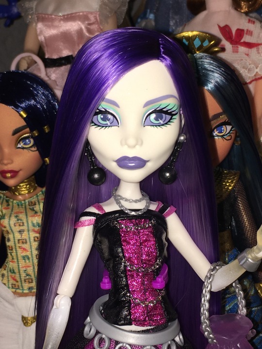

I honestly hate that they chose to reproduce this sculpt instead of the original (her HC doll also lacks cheekbones btw) and she would have been lesser compared to my original even if she didn't have poly. Spectra's original sculpt is one of my favorite MH heads they've ever done so it's pretty annoying to see them using the simplified version for her new dolls, especially considering they made switch in the first place because corporate allegedly thought the original was "too scary" for children. Despite my disappointment at her lack of cheekbones, I do actually really like her face and I find it a little hilarious that I managed to get such a good one after all the complaining I did lol
-While Creepro Spectra has a shorter neck than her original doll, she has a longer neck than the other Creeproductions; this is because the other Creeproductions (both waves) have shorter necks than their original dolls, but Spectra's original doll already had a much longer neck than the other characters. I guess she had some extra neck to spare compared to the rest lol (it's more accurate to say that the neck length is still the same, but all of their heads sit lower on the neck knob than their original dolls for some reason) -Her screening is mostly based on the version used for the late batch of Sig Spectra, but interestingly has a side glance! The only other version of Sig Spectra with a side glance is a variant from her second or third batch (with cheekbones) so it's interesting that they chose a side glance for the reproduction.
-Her earrings match the first batch Spectra (black chains instead of silver like subsequent batches), but the rest of her outfit is more reminiscent of the batches that came after. For example the belt on the first batch is much more simple than the one used on later batches, and the creepro comes with the more detailed belt. -Skirt is slightly shorter and her boots are also darker (improvements imo) -The silver necklace and bracelet shackle are made of a much more transparent plastic than the original (not an improvement) -Her top is mostly the same but the construction is slightly less fitted and the pleather feels a bit cheaper.
As much as I actually sincerely like her, I think it's overall a mixed bag; the poly is the worst part imo. I can look past the sculpt being wrong because she is really gorgeous despite that, but it's unacceptable for any doll to be rooted with polypropylene, and especially not a reproduction. And I can't help but think about how amazing she would have been with her original sculpt. Luckily I can reroot and I look forward to giving her knee length saran hair..... but I shouldn't have to do that! According to the retailer who first got these, they will get a wide release on Amazon exclusively in April of 2024 and he only managed to get them directly from Mattel because they hadn't decided to make them Amazon exclusives until after he ordered stock. So keep an eye on Amazon in a few months! Also according to a very reliable inside source on Reddit, there will also be a new batch of wave 1 Creeproductions in 2024 as well!
Don't buy from scalpers!
84 notes
·
View notes
Text
i saw wicked!! 8/10 movie very good. i also have many thoughts head full. i fully acknowledge that these thoughts could only belong to the diseased mind of a person who has thought too much about wicked for the last 7+ years. anyway spoilers and general ambivalent thoughts ahead etc
good things first:
cynthia erivo slay!! she was like an average good elphaba imo which means she was incredible by normal standards
set design and choreography ATE. munchkinland? the emerald city? the clockography? ate ate ate
overall the movie was just visually beautiful. it was colorful and sparkly and looked soooo expensive. whenever a new location appeared for the first time i literally gasped. i loved it
elphaba’s party dress was GORGINA 😍😍😍
michelle yeoh and jeff goldblum my beloved evil parents… they can’t sing but idc they were so cunty
they sort of kept the hammerheads in one short day which is all i wanted from that song. wicked is not wicked without the egg puppet freaks
they didn’t add anything from the book thank fucking god
ari was funny and pretty good! will expand on her later. i think they did popular the best they could in a movie format given that the song relies so much on improv, physical comedy, audience response, etc.
neutral to bad things:
ok so ariana. very eyebrow-heavy performance. not bad vocally! it was foul to make her sing with cheno during osd though, the difference in quality was so clear lmao. i’m interested to see how she’ll deal with act 2 both vocally and acting-wise
i didn’t like how light ariana sang throughout the whole movie. idk if she was directed to do this though—i could see them telling her to do glinda less obnoxious or tone down the comedy which i understand for a movie. but come on girl it won’t kill you to do a full belt in the studio ONCE
ariana and cynthia’s voices do not blend well. you can tell cynthia was trying to tone herself down to match ari and ari was just not giving in return
the mixing was weirdly unbalanced in a lot of the duety portions and i couldn’t tell whether it was the fault of the sound design or the actors just not being able to sound good together lol
it fucking DRAGGED. there is a 90-minute edit of this movie that could easily have existed. none of us needed to hear something bad or a sentimental man. they took every small pause in the music and stretched it out to the point where it interrupted the flow of the song AND became patently obvious that they were trying to pad for time. the new part of one short day with idina and kristin was not good and also too long. the added chase scene before defying gravity started out fun but then went on way longer than it should have. the ozdust dance was SO LONG my god. i could write up a whole list of shit that went on pointlessly for way too long but we would be here all day
there are some elphabas who can carry i’m not that girl. cynthia is not one of them and this is my only complaint about her performance. she divafied a song that is not meant to be divafied
dancing though life was arranged and directed badly. for lack of a better term it’s meant to be a stoner song and it was way too punchy. also if you’re going to insist on casting a white fiyero at least make him good #notmyfiyero
the lighting was often not good??? i think because a lot of it was filmed outside and the sun washed out the set or created a glare. some odd color grading choices as well. really weird because otherwise visually the movie was stunning as i said before
this is a criticism of many modern movies, definitely not wicked-specific, but a lot of the the costumes looked cheap and it’s because of productions cutting corners when it comes to materials and tailoring. especially compared to the show costumes which are so intricate and structurally well-made because they’ve had to last for literally 20 years. we need to ban polyester from film sets i’m so serious
glinda and elphaba should have kissed each other on the mouth
11 notes
·
View notes
Text
New Ninja Designs (with head cannons)
Okay, so I improved my art style and changed some of my techniques, so now they all have their own face shape instead of looking like carbon copies.

My height HC’s:
Zane: 6’8”
Cole: 6’5”
Kai: 5’8”
Nya: 5’7”
Lloyd: 5’4”
Jay: 5’3”
Yes, I know that Lloyd and Jay are rlly short, it’s purposeful, okay? It’s my head cannons anyways, it’s not like I draw them like twinks, personally, my head cannon is that Jay might be lean, but he has muscle and can still kick ass, same with Lloyd.
I personally made Jay short and Nya tall because I like that dynamic, it’s not seen a lot, I just love it, I feel like Jay gets insecure over his height, and that he’s not taller than Nya, but Nya always reassures him, and makes him feel good about himself, they’re both emotional and mental support for each other.
For Lloyd, I just couldn’t help it, I laughed at the thought of Lloyd being shorter than Arin and Sora, and like, one day, Sora pokes fun of it, and Arin kind of just chuckles, and Lloyd’s like ‘oh yeah?’ And wins in a monitored fight with them easily.
Close ups:

I changed his ears, I kind of just grew out of his old ones, and I like these ones way better, I also added scars on his face, and slight eye bags (bcuz of season 2 of DR), the chocker covers a scar on his neck that he gets slightly insecure of, him, Kai, and Nya have matching ones that the two sibling bought for Lloyd. I only gave him one horn cuz, I dunno 🤷🏻♀️ . I personally head cannon that Misako is fully Japanese, and of course, Garmadon is Oni and Dragon as far as we know.

Kai didn’t really change much other than his choker tbh, my head cannon is that Ray is fully Hispanic, while Maya is half Polynesian and half Chinese, Kai looks Hispanic mixed with some slight Asain features, while Nya looks more Polynesian.

The marks on her face are lighter than the rest of her skin.

I changed Jay’s irises, his human looking eye is blue with a regular pupil, while his other is from season 1 when he nearly got turned into a serpentine, the color of it is yellow. His bio mom, Libber, is white, and his bio dad, Cliff, is Korean. He also gained a chin scar from a time where he fell and cut his chin of a sharp piece of metal when he was building something.

Cole didn’t change much either, only his eye shapes. My HC is that his mom was black, while his dad is Japanese.

Was originally going to draw him smiling, but it looked weird. He was designed to look human, but the race he looked more like ended up being Asain, which I kind of just toss Korean around when asked.
Eyes:

Lloyd’s eyes are like a cat, he gets it from the Oni.

Kai’s eyes are brown, but when he uses his powers, you can see hints of orange and red.

Nya’s eyes are a grey, but can look very light blue while indoors, or in shade, if you look long enough. (Jay was the first person other than Kai to figure this out)

Zane’s eyes are just an unnatural icy blue color.

I kept the eyebrow slit, I couldn’t help it, also, when he uses his powers, you can see hints of what looks like lightning.

Cole’s eyes are brown, but when using his powers, you can see hints of orange.
Hope you like it :D
#ninjago#lego ninjago#lloyd garmadon#ninjago lloyd#ninjago dragons rising#art#lloyd montgomery garmadon#kai ninjago#ninjago fanart#fanart#kai jiang#ninjago kai#lloyd#zane#rgb siblings#cole ninjago#cole brookstone#ninjago cole#nya#nya ninjago#nya jiang#ninjago nya#nya smith#zane ninjago#ninjago zane#zane julien#jay ninjago#jay walker#ninjago jay#kai
26 notes
·
View notes
Note
Weird thing I’ve noticed:
Rachel seems to be deathly afraid of giving her characters facial hair- even tho that was like, a staple for a lot of male Greek gods and deities
Well, except for the “unattractive” ones
In Rachel's defense on that one, I can attest that it's difficult to give these characters facial hair when they're all painted neon colors LMAO like, I LOOOOVE drawing facial hair, but even I haven't really bothered giving the male cast facial hair because they're so ethereal/non-human looking that if you gave them something like a mustache or beard, it would start to tip them more towards the 'human' look and it could clash with the colors and enter uncanny valley territory. Like, the characters would either have to have full stylized cartoon beards-

-or nothing at all.
(that's how I get away with it with Dionysus, because his beard is basically just a big 'ole berry bush, so it's able to color match his face and not be distracting with its stylization).
That said, I've seen some great edits of LO panels where characters have facial hair, so that's not to say it can't be done! I just don't know if it's something that Rachel is capable of doing.
Because straight up, Rachel also just doesn't know how to draw men. Or rather, she only knows how to draw one type of man. Most of her portfolio pre-LO consists of drawings of women, many sharing the same body types (though there are some variations around 2010-2014). And just like with the women, when she does draw men, they've all got the same facial structures and body types:

(from The Doctor Pepper/Foxglove Show)
Like, you've got 6 guys here, six, and not a single one of them has facial hair or any extremely varied hairstyle. Half of them look like Hades. I get the sense that Rachel basically learned how to draw one "type" of male and one "type" of female and has just been drawing from those same templates ever since while swapping out minor details like nose shape and hair type.
Shit, here's an actual Hades drawing from back when she started doing Hades x Persephone sketches around 2016/2017:
Like, that's just a guy from The Doctor Pepper Show. He looks like a mix of Donovan and Shifty Ricky LMAO And it's not like she doesn't have mortals in LO either who aren't colored with highlighter marker, but I don't think she ever really gives them beards either. The only guy I can think of off the top of my head is Psyche's *future husband:

And that has the exact kind of stylization/structure that I was talking about before that Rachel would likely have to do if she gave the gods facial hair to keep it from looking silly. Case in point, that time Hermes grew a mustache:
All that said, I do think it's a combination of Rachel not knowing how to draw men (she's even admitted in past AMA's and interviews that she's bad at drawing men and that doesn't seem like something she's tried to improve judging by how the men look in LO) and LO's art style just not mixing well with more human features like beards and body hair. It could wind up looking like a Barbie doll with marker scribbled on it LMAO
(*edited because that's not her dad, that's the man she was married off to , my bad LOL)
#lore olympus critical#lo critical#anti lore olympus#antiloreolympus#ask me anything#ama#anon ama#anon ask me anything
130 notes
·
View notes
Text
LITA (jpn) Episode 1 Feelings
I watched the first ep of the Japanese LITA and I kinda wanna talk about it. I absolutely love the OG. It is probably one of my top 5 Thai BLs and top 10 BLs overall. I know and recognize the problematic tropes that Mame is known for using, but I think that overall the ones she brought into LITA were handled remarkably well.
But that penchant for using iffy tropes makes her work a bit scary to adapt I think. I am and will continue to be nervous over how they handle Sky's story, because that is where you have kind of the biggest pitfalls. Rain and Payu's story has some potential hurdles, but since kinda the main issue for it in the OG is how the D/s dynamic is handled (not well bc Mame doesn't really know how to handled it super well) and is that going to be exacerbated or improved in the Japanese adaptation? I'm only on episode one, so I couldn't really say. We'll really have to see how things play out in episode two to know, I think.

I know some people had very strong reactions (some very wrong- I'm looking at you the 'Payu's actor doesn't look like a top' people) to the casting announcements for the adaptation. (I made a little graphic to show who is who.) They've made some changes to their names, which is reasonable and makes sense, but I do think it's kind of odd in some ways how they went about it. It seems clear they changed Rain to Rei and Sky to Kai because those sound similar, and the changed Payu to Arashi and Prapai to Fuma because those names match the meanings of the original Thai names. Why it strikes me as a bit odd is that the novels are named Love Storm and Love Sky, so in my mind, those would be the names you would want to retain their original meanings, but I digress.
As far as casting, I thought everyone looked fine, but it's how they express the characters that matters most and while we don't get much of Prapai in this first episode (just a sprinkling) I will say the portrayals of Payu, Rain, and Sky are very promising.

We'll talk about Rei first, because there's just more to talk about there, he is the main character. I have mixed feelings on how the sort of inherent silliness of the Rain character is adapted, since when Japanese BLs do comedy it's a very specific brand of over the top...and adding that to Rain's already sort of overdramatic nature can be overwhelming.

Rei (and the actor who plays him) does go a little too hard for my taste sometimes, but it is reined in more than I kind of expected...at least so far. The whole concept of Rain is kind of young/foolish/a bit brash, and that's very well shown here. Rei I think comes off a bit more sexually aware, in that it's not quite the big doe-eyed innocence of Noeul's Rain, but it's still has that undertone of inexperience. We do see that curiosity of the character truly maintained, which I really am happy about, because I do find it to be one of Rain's best traits. I talked before about how Rain is kind of the classic ingenue character.

We see that upheld here, especially in terms of Rei continuously just believing the best of people, but also in the relationships he has with Kai and Arashi, who have a desire to protect him, though they both go about it differently. It's been a very long time since I read the novel, and I did intentionally not do a rewatch of the og because I didn't want comparisons to be coloring my view of the adaptation. But I will say that the kind of speaking without thought aspect of Rei is something I find pretty delightful. Rain did have that also, but I think they relied more on internal monologue for him, so only us as the audience was aware of his thoughts.

Talking about Arashi or Payu, it's difficult to get much of a read on him. Since this episode is basically from Rei's perspective, we only know as much about Arashi as he does. Just as Rei doesn't really know what to think of him, neither do we. As we know from the source material and the og series, he is a character that's a bit cold on the outside, but has his own softness and warmth. I think that concept is a difficult one to portray, and I think looking back it's almost surprising how well Boss managed to do it, especially in epsiode 1. Shoma (Arashi's actor) does a good job with this very difficult task. I don't want to continuosly compare one actor to another, because I think that's kind of pointless, but I think there's potential opportunities that might have helped to add that warmth. They've done some cutting down of the source material to fit a very different runtime (10 episode of about 30 minutes compared to 13 1 hours episodes) which I think cuts out the slower moments of Payu/Arashi watching Rain/Rei and us getting to see his facial expressions portray his feelings. But truly that a director/producer issue, not an actor one in my opinion. I've seen some discontent over how Arashi doesn't appear to be as wealthy as he is in the og, and while I guess that's true, I never felt like his financial status was super relevant to the plot in the og series. It's relevant to Prapai/Fuma's but not to Arashi. Him simply being older, established in his chosen career, lends the appropriate level of contrast between him and Rei's life experience. I was very happy to see that they kept the short scene at the end of the episode to really show us Arashi's gentler side. I think it was one of the most necessary things in the og version to help us really know how much affection Payu had for Rain, and that it wasn't simply a sexual cat and mouse game for him, so seeing it really helped to reinforced that knowledge in the adaptation.

Side note: I feel like for many people the NC scenes are what is iconic about the og series, and while they are certainly amazing, they're not what I would present as the most representative of the show. The quiet moments are what really show the heart of the series.

Now to talk about Kai. Sky is my favorite character from the series, so I have a lot of affection for him. The actor looks perfect from what we've seen of Sky as portrayed by Peat, but in adaptations, it's definitely not whether actors look like the previous actors, but how they inhabit the character. We're still in Rei's POV, so we only know as much about Kai as he does, which is not much. Kai is very closed off to us in many ways. But we do see the two kind of defining traits of Sky/Kai which is his sarcastic/dry humor and his quiet care of Rain/Rei. The deliveries from Reo are spot on in terms of humor, and I do feel like even when he scold Rei or teases him, there's very much an affection there.
I think that's all I have to say about it so far. We'll see where things go for episode 2. But I am enjoying it, which doesn't surprise me in itself, but I do sometimes wonder if I'm accurately expressing that while I have all of these thoughts or what could be seen as criticisms, I am having a good time.
7 notes
·
View notes
Note
Hello :D
You probably get this question very often-- (sorry)
I wanted to ask you how long it took you to find your artstyle and what inspires yours?
(I really like it especially your owlhouse AUs!!!)
I Don't mind at all and it's OKAY to ask!!! Well form my own experience it was a very long journey and it's still going to this day , mostly from trying more than one thing !!
• my interests changes from time to time so my Artstyle do !! It could be also something like taking inspiration from a character you love in soem specific Media!!
• Some of The most things that helped A lot is TO COPY !! the artstyles , yep ! , copying artstyles or taking a huge inspiration is valid , it's part of the Artstyle journey whatever you like it or not , and yes there's a difference between copying artstyles and Tracing Art pieces so dw !!
• your Artstyle is going through a building stage so it's OKAY to take Time slowly , take all the time you need to discover New things you think it'll be useful for your artstyle ( it took me 4 years so yeah nobody is perfect )
• You could also mix different artstyles you inspire from for example ; you like an artstyle because of the eyes shapes ?? Use it !! , Another artstyles that has a unique Nose and shapes style ?? Take that too !! You found some cool brushs that match your artstyle ?? Try it out!! , mixing stuff is fun and mostly leads to great results !!!
• And for my inspiration :
my begging with my art journey was with the animation meme community , there I got one of my biggest inspiration was the Artist @/sir_fluffbutts on insta , multiple artist / animators
I was Also VERY inspired by old 2000s / 2010s Cartoons , Especially Ok ko let's be heroes !!
2000s Cartoons especially the CN ones like Flap jack , Sym-Bionic Titan , power puff Girls , Foster's Home for Imaginary Friends etc
Fandoms I have been that Also improved my artstyle :
• Eddsworld , Fnaf , Bendy
• Don't Hug me I'm scared ; inspired me to understand how color threoy works
• Happy tree friends ; added more cartoonish style to my art
• south park : lineless art + A lot of cool artists
• The Owl house + Steven Universe + OK KO ; understanding Character shapes and dynamic + simple anatomy + Also cool artists in the fandom
Good luck with your art journey , remember to be patient and HAVING FUN with your Art
7 notes
·
View notes
Note
Do you have tips on what makes a good amv editor please
hmmmm well the most important things for me are
clip choice! choosing clips that go with the lyircs (literally cuz its fun or emotionally to make me crazy) is imperative. amvs where theres no thought put into what goes where aren't as fun to watch. i'm still mad at an old amv of mine where the lyrics mentioned punching a wall and i didnt use a scene where the character punched a wall cuz i forgot about it lol (this also ties to amvs with really inappropriate songs for the character/ship...like if youre editing a ship positively but use a song about abuse or breaking up, it just doesnt work)
timing! an amv is most engaging when the video moves along with the beat of the song. not every beat needs a clip change but its nice when something happens on the beat, and if theres a big moment where the song goes from soft->loud then there needs to be visuals to match. the video should vibe with the song every step of the way
those are my top things for sure
aaand then theres, like, littler things that are very preferential but ill go into it 'cause i have other things i need to do and thats when im most talkative
knowing your strengths/weaknesses: for example, i dont love doing typography nor am i very good at it - so i limit it! i dont go crazy and fill my amvs with nonstop typography. but i dont use none 'cause you can't improve without practicing lol. sometimes as practice i will stare at typography from other amvs that i love and just imitate it as best as i can, see if i can figure out how they did it and try to incorporate the style into my own editing
moderation: overlays are a good example. overlays are fun! they can really enhance an amv. but too many overlays can become headache-inducing or just take away from the actual footage you're editing with (another moderation example) sometimes you'll see a well-edited amv but there's soooo much zooming in and out back and forth that it can give you a headache. i obviously love adding zooms but its good to take a step back and try to decide if you're relying so much on the zooms that you're not letting the footage play its part
coloring: not every amv needs to be colored but even just a little bit of levels adjustment can make your footage stand out more. that being said - its also important to pay attention to how the coloring fits each piece of your footage. you don't wanna whitewash dark skinned characters or make things so dark you cant see whats going on. coloring a Generator Rex amv can be difficult because the show utilizes a lot of Bright Whites and Dark Blacks which is nice but also makes you think more
balance: this is hard because, yknow. its subjective. but like...i like to use a lot of parallel imagery/typography in my amvs, but its also good to have a lot of variety and mix things up. it really depends on the song/the vibe youre going for/the type of amv.
i am happy to talk about editing stuff any time if you want me to talk more lol
18 notes
·
View notes
Text
God I hate the late Naruto Shippuden/ Boruto anime style...
Why does everyone's face look like it's made of gum? Why do they all have the exact same baby face? Like Naruto looks older in the first arc of Shippuden than in the last one! It isn't even accommodating to the evolution of Kishimoto's art, which changed drastically and only improved with time.
This is not me trashing their skills, as these artists are all clearly talented people. I am criticizing the art direction from their executives and managers whose orders they have to follow. They have to be rather minimalist when it comes to coloring and shading, have to lessen the detail of facial features to make the characters easier and cheaper to animate, and have to churn out episodes weekly... like this schedule was bound to make the art deteriorate, but boy, was it sad to witness.
Let's compare
The manga version
The anime adaptation
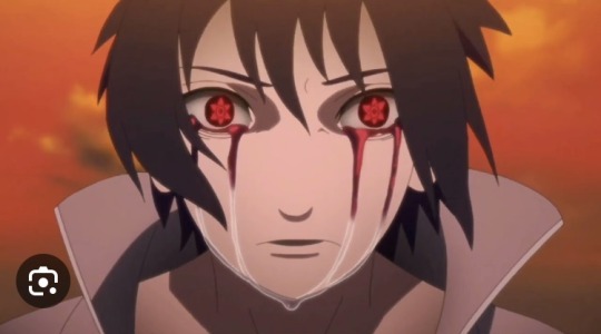
and the animated reboot
On the surface, the newest version seems more similar to the original than the first animated adaptation. But I think it ultimately fails in capturing the original, and in improving on the adaptation as well.
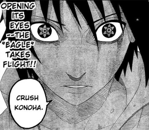
I am not certain whether this is a fish-eye perspective or a close-up high angle in the manga, but it is used to draw more focus to Sasuke's eyes, as they appear larger in this perspective. Because Sasuke is shaded completely, his eyes and his expression really pop- the eyes against a dark background really stand out. Kishimoto used a very similar composition when Sasuke beats Naruto in VotE1. He uses several techniques to make sure that what is most important is emphasized properly. When Sasuke says "Crush Konoha", we are not only meant to focus on his expression of hatred (which is incredibly important and beautifully conveyed) but on his Sharingan specifically - as a testament to the Uchiha legacy's perseverance- an ideology Leaf tried to crush coming back to haunt it.
While the first adaptation didn't deliver on many of these fronts, it matches his expression of singular hatred and determination really well. His eyes are also disproportionately large and look as if they are to fall out of their sockets, and while there isn't much focus on his Sharingan, Sasuke's emotion is conveyed really well. They also take other liberties, showing Sasuke as "illuminated" by this revelation (the lighting). The color palette is absolutely stunning, with blues and purples (Sasuke) against a yellow and orange background- complementary contrasts. It is not the same perspective but it makes sense. Some liberties were taken, and while I don't think these choices are better than the original, they are far from bad choices.
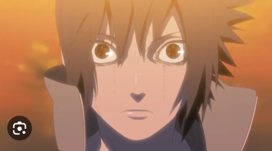
Now the last adaptation does not emphasize Sasuke's eyes well, nor does it convey the same emotion as the other two. Sasuke just looks confused, and while the other two iterations also have a hint of this emotion, they are mixed with Sasuke's anger, sorrow, and determination. The colors are ALL rather dark, without proper contrast. His eyes wouldn't stand out at all had it not been for the color of his Sharingan that clashes with everything else. The perspective makes no sense, as it is an eye-level perspective, but his nose and mouth are turned downwards.
I wish more thought was put into artistic direction, along with more artistic liberty. This also stems from my being critical of my own art of Sasuke, much worse than any of these three.
34 notes
·
View notes
Text
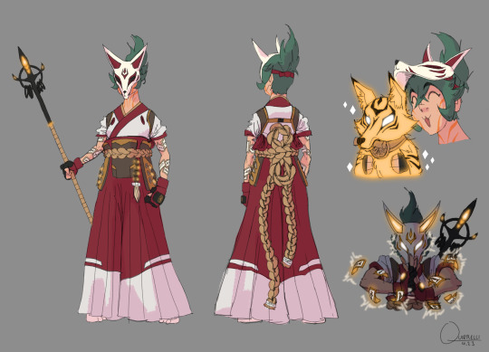
Quick and dirty Kiriko redesign
Main issues I tried to address:
The shilouette is pretty meh. It's not dire but at a glance/distance there is potential for confusion. So I tried to exaggerate notable features (hair, mask ears, hakama) and added a spear, like she has in some of the concept art. For one thing it looks cool and for another, it's been established through the Shimadas that these animal spirits are tied to a weapon and a spear fits in very neatly with a sword and bow.
The design is bland. (Which at least makes her fit in with the other OW2 default skins lmao). The first time I saw her I literally thought it was a D.Va skin. The idea, I would guess, was to merge traditional japanese clothing with modern day hip street fashion vibes and it just doesn't come together at all. Instead of enhancing them, all the aspects that should have visual impact are watered down. From her leggings to her face, there is no flavor; except in that trash garbage mask-visor nonsense. So I leaned into the traditional clothing, since leaning into the "hip young person" would just make her even less distinguishable from similar characters. I also tried to add some bits and bobs for flair (like the seals on her arms), just can't be bothered to really go into texture and detail atm.
Generic personality. This is more of a vibe thing than a character design thing but I want her to, at least at first glance, come across as a bit more cool and confident, maybe a little mysterious and just more interesting than the knock off Tracer/D.Va she turned out as. She can still be a bit of a goofball behind the mask but I feel her protector role demands that she can be at least a tiny bit intimidating.
That trash garbage mask-visor nonsense. My least favorite part by a goddamn mile. It just looks so fucking dumb and there's no way to make it cool; with its teeny kitten ears, dumbass white eyebrow triangles and perfectly flat bottom cut off. Again it's like mixing two things (naruto style ninja headband and kitsune mask) and ending up with the worst of both worlds. And you just know the reason she doesn't have a full or even half mask is because god forbid you can't see a female characters cute, utterly indistinguishable from the other cute 20-somethings, face. Fuck you, she gets a whole mask and it's badass.
Color. Her color palette has powerful "I'm 14 and this is my OC" energy. Actually, everything about her kinda has that, but the color palette especially. Now, I'm the first to admit that color isn't my strong suit either but even I can see some very obvious improvements. Like, why are her normal healing and her ult different colors? To me that's unnecessarily confused and looks bad, simply put. On top of that, they're yellow and cyan respectively, aka the most overused colors for glowy things ever. So I picked a yellowy orange bc it matches the fox motif and sets a nice contrast with the Shimadas' blue and green, just like the red in her outfit does. I incorporated some of that orange into her clothes as well, you know, for cohesion, and kept the green hair as a nice complementary to all the warm colors.
Feel free to make suggestions for improvements, might do a V2 eventually
#idk to me that already works much better and with some more finessing could be pretty awesome#kiriko is the first (and so far only) OW character I looked at and went “wow that's pretty fucking weak”#even the second worst design (Echo) is merely boring#my stuff#overwatch#ow2#kiriko
50 notes
·
View notes
Note
Good morning, are you still looking for neopet suggestions? If so, have you talked about Chomby? Adore that little guy, it was my first (and possibly only, I can't remember 100%) neopet!
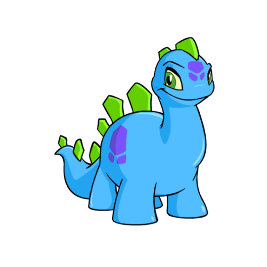

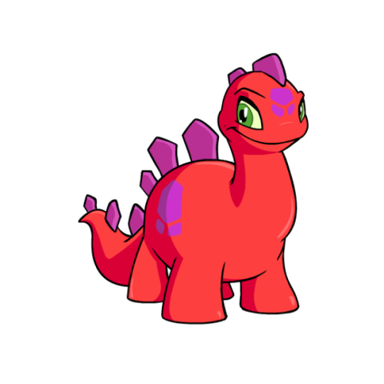
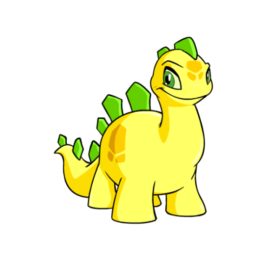
Thanks to the presence of Tyrannia, we have a few different species of dinosaur-based 'pets. Out of them, the Chomby is probably my fav. It's mostly just a simplified stegosaurus, though it only sports a singular row of plates and no thagomizer (tail spikes). It also has an upright neck and overall body shape that's closer to brachiosaurus, and a row of spots that exist to break up the body. I like how the spot shape matches that of the plates, and the overall body has a good shape to it.
One thing the Chomby struggles with a bit is the color proportions and usage, as you can see a fair amount of variation just in the base colours alone. For the record, I prefer the handling of the yellow Chomby for the base colours, wherein the spines are an accent color that matches the eyes while the spots are a secondary shade.
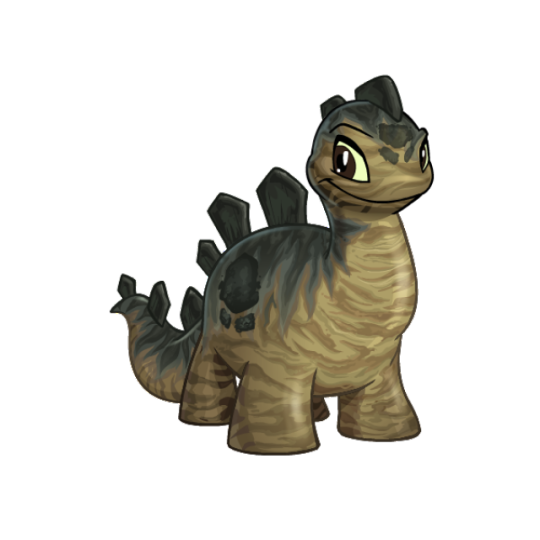
The Chomby had some massively dated art that was in bad need of an update, so for the most part the customized version is a good improvement. My only issues with the converted art is that the eyebrow looks really weird, and the mouth and eyes almost go a bit too far back on the head.
Favorite Colours:

Darigan: I really like the way the Darigan Chomby plays with the base design. Fro example, the back spines have been changed into spikes and the markings have been given a sharper, more bat wing-like shape. I also really like the addition of an underbelly and how it runs up to the jagged mouth, and the semi-transparency effect on the wings. My only nitpick is that the black fin-like structures on the head feel too busy when paired with both the horns and spikes, and I would've liked the wings to be just a little bigger. Great colour overall though.
Camouflage: Probably vaguely based on stegosaurus interpretations, the naturalistic markings on the camouflage Chomby look really nice. The markings contour with the body properly, and the countershading with the darker green elements on the back adds a lot of contrast and richness to the design.
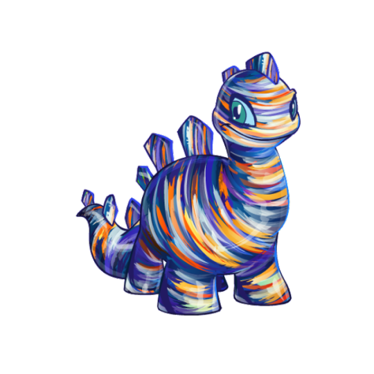
Oil Paint: Oil paint is just an inherently pretty colour, but I really like the use of it here. Like the camouflage Chomby, it carefully contours the body in a way that makes sense, and there's both a good amount of detail in the brush strokes and a nice texture. The actual color palette is also lovely, using a mix of dark purples and blues to contrast with birght oranges and yellows. I just wish the eye had also been painted, as it looks out of place compared to the rest of the design.
BONUS: The Halloween Chomby has it all, with skeletal elements in the head and back spines (which have been given a slightly different shape as well), a striped tail, bandages, and a cloak with an eye on it. None of it should work together, but it surprisingly comes together well due to the muted greenish-gray base combined with black, red, and white accents.
The only reason this one is a bonus is because the base colour is pretty mid. The tail wasn't made a wearable so it just suddenly becomes striped out of nowhere, and it's left with skeletal back spines despite the skull being removable.
28 notes
·
View notes
Text
sims get to know me tag!
@akitasimblr @oasivy @duusheen @druidberries thank you so much for tagging me ❤️
1. What’s your favourite sims death? getting eaten by a cowplant!!
2. Alpha CC or Maxis Match? maxis mix! and i have a lot of alpha hair too. i can't help it, they all look so pretty...
3. Do you cheat when your sims gain weight? not for weight but for the muscle. idk but it seems funny that they go buff so fast even if you've not made your sims exercise for long
4. Do you use move objects? it's on as soon as i enter build mode
5. Favorite mod? mccc and ui cheats. but for gameplay wonderfulwhims.
6. First expansion/game/stuff pack you got? get to work! and then i got that bundle with parenthood and vintage glamour/bowling night.
7. Do you pronounce “live mode” like aLIVE or LIVing? now that i think about it i've called them both ways.
8. Who’s your favorite sim that you’ve made? so i made this gorgeous sim in cas and he just became my favourite right there. he will eventually make an appearance in tjol posts, but my favourite sim you've seen it's bryce of course!!
9. Have you made a simself? yep! once i saw that simstrouble hair i had to make myself! but i've only shared it to my good friend @oasivy!! maybe i'll show you all in the future.
10. What sim traits do you give yourself? lazy, foodie and hot-headed. nooo those are awful traits but it's true....ok if i had 5 traits then it's also clumsy and perfectionist!!
11. Which is your favorite EA hair color? i love all the blond hair swatches!!
12. Favorite EA hair? when i saw that outdoor retreat hair, the one wavy hair parted in the middle i used it on all my females! it was my favourite at the time, but now i only use cc hairs.
13. Favorite life stage? has to be YA. i always have lots of plans with them and get the most gameplay at that stage (as you can tell).
14. Are you a builder or are you in it for the gameplay? definitely gameplay, but my building is slowly improving! i rarely go into cas unless it's to create a new sim for my legacy
15. Are you a CC creator? nope! no skills or patience lol
16. Do you have any simblr friends/a sim squad? yes! i have talked to a lot of wonderful people here, simblr would not be the same without you guys!!
17. What’s your favorite game? sims 4!! but sims 3 for the nostalgia.
18. Do you have any sims merch? no.
19. Do you have a YouTube for sims? no.
20. How has your “sim style” changed throughout your years of playing? i was an on/off sims 4 player since 2015 and back then i was completely vanilla, then i found out about cc in 2018! only in 2022 i started using more skin details and gshade. but one thing's for sure, i have always been a legacy player!!
21. What’s your Origin ID? same as my simblr, but there's nothing on my gallery. i changed it bc it used my real first name and i upload sims for ppl to download on simblr, but ive not done that for a very long time.
22. Who’s your favorite CC creator? there are too many creators that i have downloaded everything of. i love everything from pralinesims!!
23. How long have you had a simblr? this simblr is almost a year old! i started posting on the 13th July 2022!
24. How do you edit your pictures? i completely rely on my personal gshade/lighting mods and don't really edit, i just sharpen on photopea or add the moodlet stuff when needed.
25. What expansion/game/stuff pack is your favorite so far? when cottage living came out it was my absolute favourite!! i made all my families live there including nsb pink gen, gen 4 of another legacy and my 100 baby challenge! by the time i started my postcard legacy i played with too much cottage living so i decided to start on freegan.
26. What expansion/game/stuff pack do you want next? honestly it would be great if the sims team improves the older packs, i feel mostly everything from previous games have been included. but it was family gameplay i wanted before growing together was released.
i'll tag: @weindenburg @raiiny-bay @bloomingkyras @glowbloom @igotsnothing but feel free to ignore ❤️
20 notes
·
View notes