#I LOVE YOU SO MUCH FREE TO USE LINE ART/BASE ARTISTS
Explore tagged Tumblr posts
Text
I love you free to use bases
#i love making silly one of furry ocs out of free to use bases#especially those ones with all the different line options#I LOVE YOU SO MUCH FREE TO USE LINE ART/BASE ARTISTS#AND PAY TO USE ONES TOO!!!!!!!#i love you line art/base artists#y'all have my heart as a disabled artist who likes making things but has a hard time drawing a full thing#it's like coloring pages but i get to design stuff!!!!!
1 note
·
View note
Text
eaudera's detailed tutorial for skin rendering
okay loves i've put together a tutorial in text form detailing my step by step process of shading darker skin + the brushes and techniques I use and why I use them. you will be following along as we shade a piece together, you can find the lineart to the piece here. *turn off your true tone and night shift displays for the most objective viewing.
i wrote a lot on the preview pictures, if you find spelling errors (which you def will) or are unable to read my handwriting, you'll find the typed out version of the writing in the alt text feature.
disclaimer: i'm not an art professor nor am i academically/classically trained in art. a lot of the verbiage and techniques i'm using to teach you all here are from my current self taught and observed understanding of art, light, and anatomy
support me: kofi / ig / twt / commissions
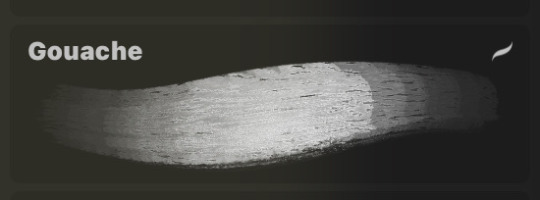
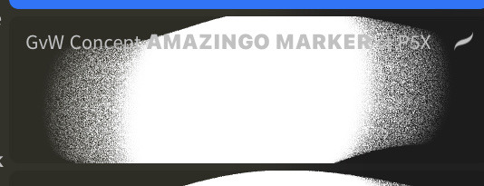
firstly, here are my two staple brushes. you can find the second brush here, i modified it by making it larger.
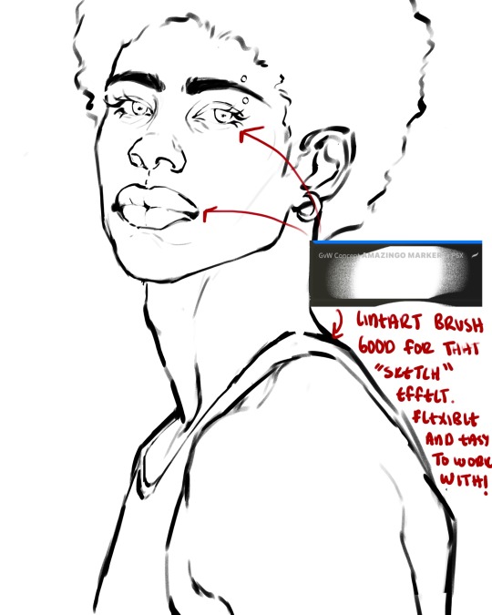
the lineart brush is very good for easy sketching and simultaneously cleaning up that sketch to produce the final lineart you'll be using in your piece. the diffusion from the erased parts/the diffusion created by lowering the pressure of your pen creates a light graphite effect which i enjoy! give it a shot.
you'll notice quickly that there are lighter strokes throughout this lineart, these are simply acting as rendering guides for me in order to remember certain placements. i erase/draw over these lines a lot.
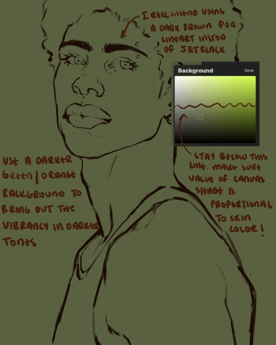
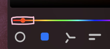
i initially learned to shade skin on a completely grey background with very slight orange undertones, and for a while this was very helpful in providing the most objective view of the base colors you're using (objective as in free of being effected by colors of different values). as you might know, using a white background for dark skin will seemingly darken the value and dim the vibrancy of your base colors, and using a black background will do the opposite. if you're using a darker skin tone, you want your canvas shade to be of a value that is proportional to your skin tone to avoid the same problems created by colors with too light or dark of a value. now if you're using a screened device to draw, you have the extra burden of screen reflections/wavering color output on different screens, so you're never really sure if the exact color you're using will be consistent across the board. priming your canvas with neutral colors will help with that. whereas priming with more vibrant colors will slightly change the undertone of your skintone (especially if you're using a low opacity brush), but it makes for a funner canvas and more creativity with your color palette imo. if you're a beginner i recommend you stay below the wavy line to avoid too light of a canvas shade.
for these same reasons i avoid keeping my lineart jet black. when you lay down the base colors under a black lineart it can look very unfavorable.
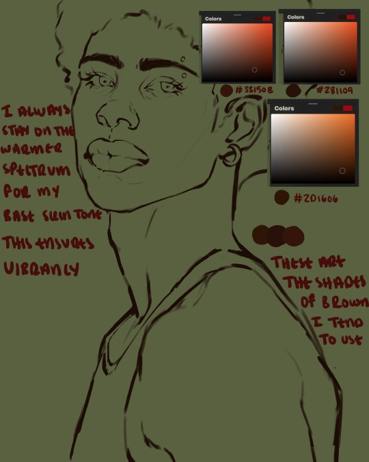
here are some skin tone variants that i tend to use the most, peep how i never wander off too far to the left of the spectrum where the reds are. i definitely favor red-oranges as compared to green-oranges for my skin tones, however, because i stay primarily on the left side of the color spectrum for my rendering, red can quickly become too much too fast. so i make sure to use a skin tone that can work very well with green-orange shadows. for this specific piece i will use the third shade (#2d1606).
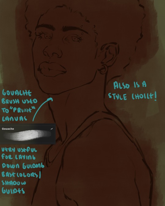
heres where the gouache brush comes in handy. i use it very loosely to "prime" the canvas almost. if you've ever done oil painting you'll realize very few artists draw directly onto a completely white canvas, though i've already primed my canvas essentially by changing the background color, i loosely shade over it with the skin tone color using the gouache brush. i find this gives me a better grasp on the composition of the piece due to increased harmony between the canvas and the skin color. it also looks really cool to me and resembles a real canvas almost.
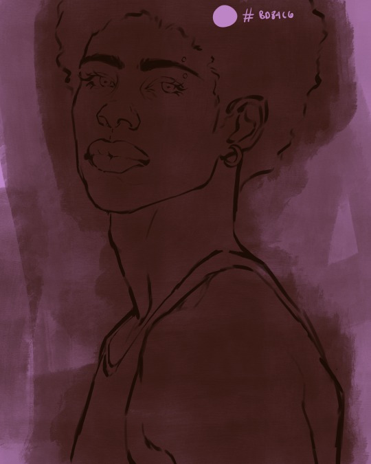
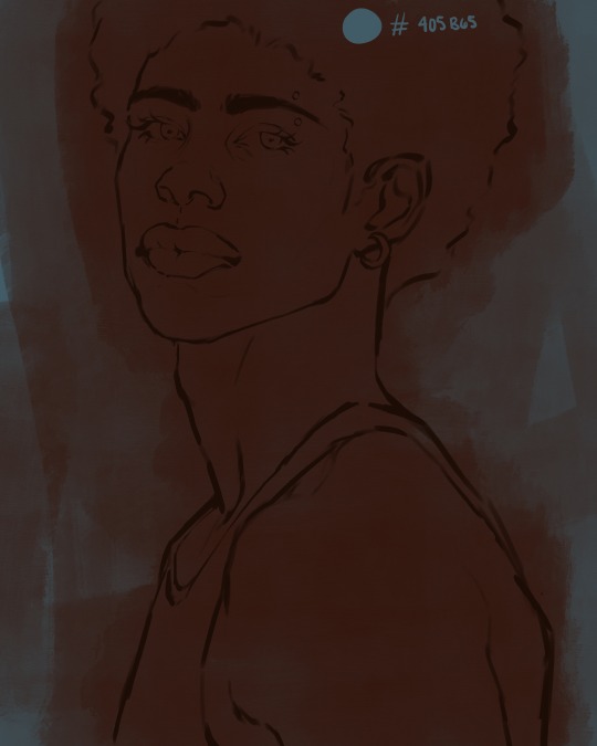
as stated before, priming your canvas with neutral colors (grey) can help give you a more consistent view of your base colors, when you get the hang of understanding the colors you most often use (i.e, how they interact with other colors), you can start using more vibrant and fun colors to color your canvas with! the gouache brush changes opacity depending on the pressure exerted by the pen, if you zoom in you'll notice patchy areas where the canvas color bleeds through the layer more prominently than it does in other areas. for some people this might throw off the consistency of the shadows, but you should be fine as long as you're using a consistently opaque brush (which we will be doing)
i know i recommended beginners use a grey canvas like i did, but since this tutorial is using my techniques i figured i'd also teach you guys how to use variantly opaque brushes to your advantage. we will be drawing on the pink canvas from here on out.
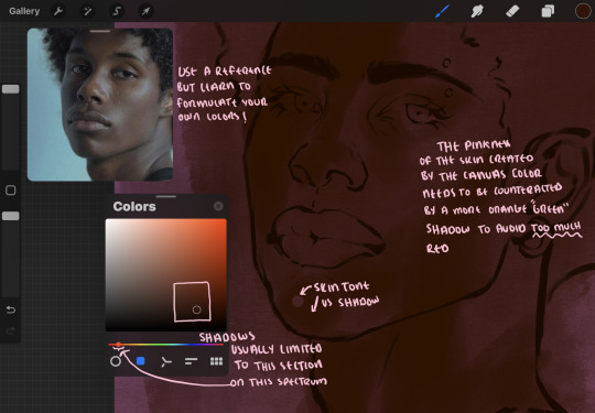
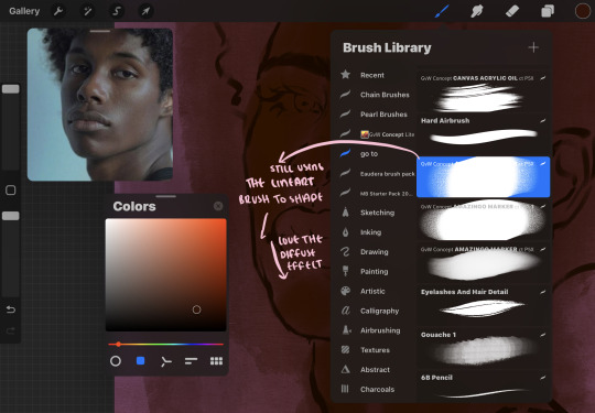
a reference is so helpful, i still rely on references to guide my shadows/lights. i'm past the point of relying on references for exact coordinates for rendering or lineart, but they are still incredibly helpful. in most references of darker skintones you come across, color dropping directly from the picture will give you very grey colors! we want to prioritize vibrancy in this case, so attempt to formulate your own colors or colordrop and increase the vibrancy :)! keep in mind i'm now using the lineart brush to shade. the diffuse/soft corners of this brush allows fewer pixels to be scattered wherever you lessen the pressure, this is perfect for color dropping medium colors to blend two colors together. you'll see how i blend colors later on.
as mentioned previously, red can become too much too fast- so i avoid monochrome rendering as much as possible by using shadows of different undertones. my most frequent combination is using a red-orange skin tone and then using a green-orange shadow.
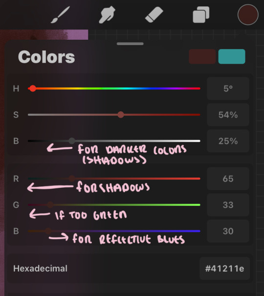
the value spectrum will be your best friend in mixing values and undertones, i use it all the time to formulate the best less saturated darker shadow that is proportional (not too dark, not too grey) to my skintone value. if the shadow is too green simply increase the magenta, if you're looking for a "reflective" shadow, increase the blue.
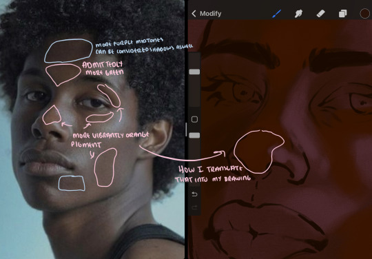
when i begin shading, i always slide the curser to a truer orange color on the spectrum and increase the saturation (slide towards the right) while i decrease the brightness (slide down). heres how it looks when i'm jumping between shadows and highlights while trying to keep my colors proportional (but not identical) to whats happening in the reference ^. i most often times will rely on the value tool, however.
you will notice that a lot of darker skin tones have patches of orange vibrancy, these areas are most common on the nose and cheeks. this is only a detail to pay attention to if you're going for more of a realism rendering style :)
now onto how i prefer to bridge/blend colors together by utilizing the blend tool.
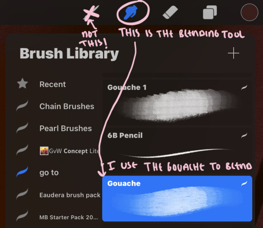
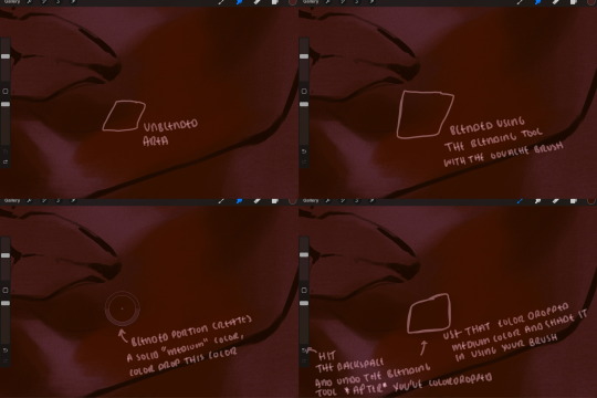
i do not like simply blurring colors in order to blend colors together, it can lead to overblending which can make your portrait look heavily gaussian blurred (think 2010 deviantart art... yea that). the brilliant thing about procreate is you can utilize brushes really efficiently, which include changing the brushes you use for blending. so in reality, artists who use the blending tool on its own can still have portraits that don't look it! there also exists plenty of brushes that have properties allowing it to blend into its surrounding colors are you draw. but in my case, the above photo is 99% of the times how i will bridge two colors together. doing this allows me to keep pretty consistent brushstrokes across the whole portrait, which i enjoy. it also gives me better control of the shapes i use in my rendering, an aspect that is pretty easy to lose when you're using the blending tool directly and solely.
in case the blending process is a bit hard too see, heres that same process recreated with different more visible colors:
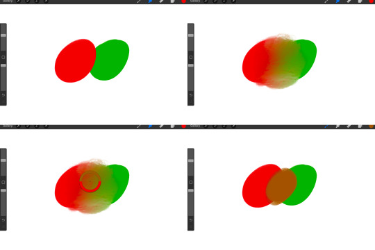
now once you've placed your shadows where they generally tend to be (according to the reference photo), let's make those shapes a bit more specific and pick up on smaller details to make your rendering look more complete.
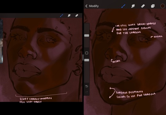
your base colors will never be as dark or as light as you need them to be when you begin rendering, making sure you have a decent contrast between your lightsource highlights and the shadows is key to capturing the essence of a light being cast on your character. it's much easier to keep building upon your shadows before rendering the highlights, i laid down the highlights only to create a guide/help me map my shadows better. do not darken the entirety of the areas affected by shadow, you'll find that shadows are rarely ever the same value, it's a gradual process affected by things like position, height, etc. so make sure the darkest of your shadow colors are preserved only in areas where the shadows are the or should be the darkest.
you'll notice i labeled some areas as "detail", adding very specific shadow placements is a detail. in the reference, the model has a pretty prominent brow bone, creating a shadow over where his eyelid creases just above his lash line, paying attention to feature details like this help enhance the rendering and its realism.
now that i've mapped my shadows i'm going to move onto to rendering my highlights and the region of the face where the lightsource is most prominent.
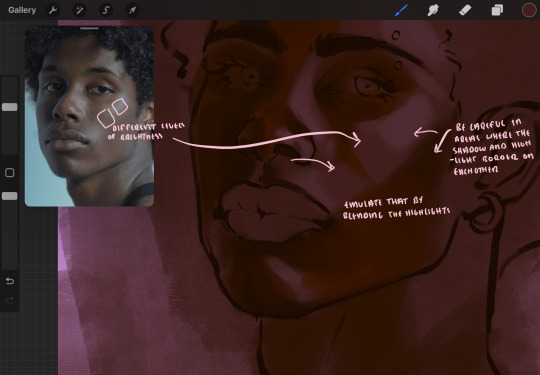
i described shadows as a gradual process earlier, this is because of the lightsource. light tends to spread when its further from the affected surface, creating a larger area affected by the light. of course, this varies depending on how intense and how close/far the light source is. in this case, the light is being casted above him further to the other side of his face, but again, remember that the face is not 2d and more prominent areas are affected more by light. it's due to this that there still exists a, albeit very minimal, shadow beneath his cheekbone. i exaggerate the shadow here for stylistic purposes, but it also helps in keeping me uphold that contrast between the highlight and shadow once again. so i refrain from blending the light into this area like i did in other areas.
midtones are the areas most unaffected by the light source, they're neither shadows nor highlights. and because light spreads, it is brighter in certain areas and darker in others. it is most easiest to blend the darker ends of the highights into the midtones of your portrait. you can emulate this by once again using your blend tool. blend the outer areas of the light and colordrop this color and use it as the darker light more proportional to the midtones. note that before i add even lighter shades to the areas where light is most concentrated, i blend what highlight placements i currently have there.
we're going to switch gears now and focus on the reflective shadow occurring on the darker half of his face.
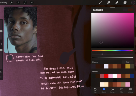
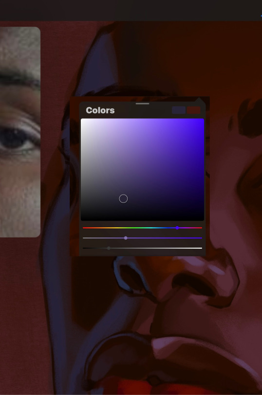
this shadow is a reflection from the lighter background the model is up against, the light being casted above him is allowing for some bounce back from his surroundings, leading to very faint light visible in areas primarily affected by shadows. hence why i'm referring to these colors as "reflective shadows".
in this case, the reflective shadows are blue, or appear to our eyes as blue. on darker skin, "true" blues (blue-purple) are not often times present. what is present rather, is a very grey tone with cool undertones/a grey tone on the blue side of the spectrum, which creates a blue that is much more proportional to the value of the skintone than a true blue. in this case i used a deeper grey on the pink color spectrum, which is more purple. this was intentional, and was done in order to create some sort of color harmony between the contrasted deep oranges im using for the bordering shadows and the blue-grey i'm attempting to emulate.
while i utilize this blue-grey, out've a purely stylistic choice, i still introduce true blues to my rendering. in fact i love using blue/purple reflective shadows in my art, it creates a stunning and colorful render. in this case, i used the blue-grey as a stepping stool to introduce that trueer blue more naturally. you'll see this happening in the second picture above, where i used a slightly more vibrant and slightly more brighter blue, and used it on areas where this reflection was more prominent (and therefore brighter).
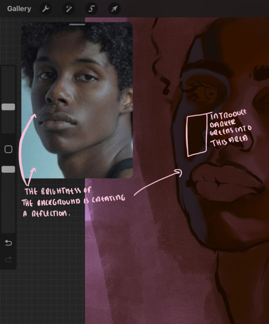
you'll notice how the shadows that border on these reflective colors are less saturated and darker than the shadows on his chin. introduce a darker and less saturated (more green) shadow to that area on his cheek and the darkest shadow of this photo, the sunken area near his nose bridge and inner eye corner. i emphasize this line in the lineart so you can follow this shadow more accurately:
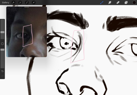
this is also a detail in my opinion and can make your portrait more realistic if you include.
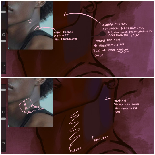
we're going to pivot to his neck area before continuing. you'll find the area of his neck with the most light is also the least vibrant, i laid down a grey base color to emphasize this detail in the portrait. afterwards i added key details. i wanted to stay at least somewhat true to the color dynamics occurring in the reference hence why i used the grey, but i'm not a very big fan of using blatant grey directly on the skin, so i made it more blue.
moving forward, the outer eye and the nose can be some of the most "detail focused" areas of the face when it comes to rendering. due to their more "bulbous" anatomy, light tends to curve around them in more complex ways than the flatter parameters of the face.
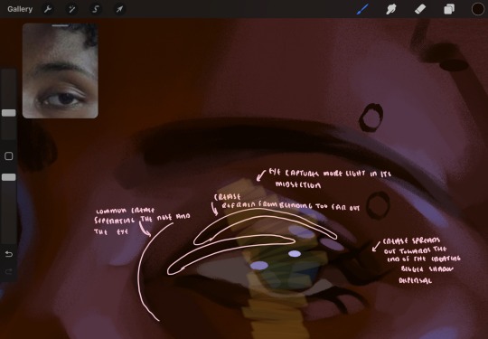
when it comes to the many creases that surround the eye, the skin folding over itself creates a very thin shadow from between the folds. the key to rendering this crease is to concentrate the blending to a very small scale, do not overblend the area because the hill created by the crease very easily captures light, creating an area where the shadow and highlight meet in very close proximity. slight blending is needed for this area, you can deepen the shadows in both horizontal corners of the eye for more accuracy. the midsection of the total eye area (eyeball and socket) tends to capture the most light, remember this is due to how bulbous rounder shapes tend to capture light from whichever direction its coming from.
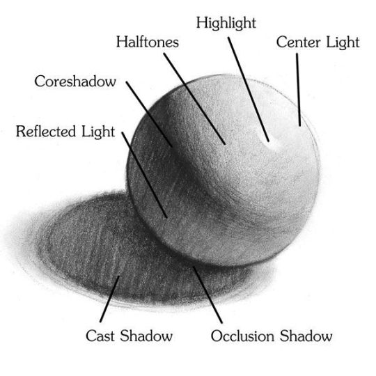
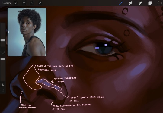
this is of course the case for the nose as well. highlights are typically placed as a dot on the outermost part of the nose by artists, but highlights also spread on either side of the tip of the nose. the nose tends to collect a lot of oil, creating a sort of sheen on the upper parts of the nostril. when rendering a portrait where the position of the head is more cast to the side, the highlight of the nose changes from the bulb of the nose, to the upper nostril. in this case, the highlight spreads, causing a "half tone", or the remnants of the light on the bulb of the nose. this is the easiest place to blend highlights and shadows together. now for the shadow detailing on the nose, i'm actually drawing on top of the lineart on a separate layer. which i'll go into detail about in the next part. you want to focus the shadow on where your lineart is, the outermost part of the nose.
now were going to really detail your portrait by introducing a new layer, the detail layer! this isn't technically apart of the skin rendering, so i'm gonna keep it very brief. this is the layer you're going to render the lips, eyeballs, and eyebrows. more specifically, the purpose of this layer is to reduce the reliance on lineart. in terms of order, it goes above the lineart layer. we're going to soften and even erase the lineart in certain aspects. i use bolder/thicker lines when creating my lineart, but this can become a nuisance/hinderance when rendering.
starting out with the lips:
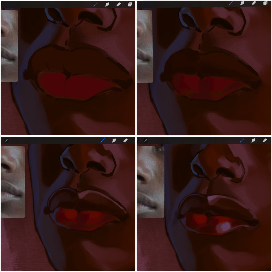
people w brown skin tend to have two toned lips, with the top lip resembling the same skin tone as the face and the bottom lip being redder/pinker and lighter than the upper lip. in my case, i prefer a more vibrant red for the bottom lip. once i lay down these base colors, i begin shading on the second layer.
i personally enjoy the look of a poutier lip shape, this includes emphasizing the middles of the lips as opposed to the ends. i've highlighted the shapes that this lip shape often entails. the small circles on the corner of the lip line are just pockets that occur when the mouth is closed and become emphasized by the fat around the mouth. the parameters of the lip lines do not often meet these round corners, theres often times a "double lip line", that exists around these areas. i love including that in the art, its very easy to emphasize by simply drawing a highlight from the corner of the lips along the curvature of the bottom lip towards the middle.
shadow mapping on the lips tend to go: highlight, shadow, highlight, shadow. the top lip going inward creates a highlight on the most outward part: the top of the lip. and the bottom lip curving outward thus creates a shadow on the bottom of the lip.
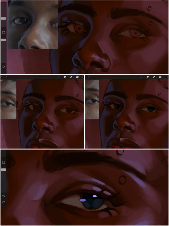
when it comes to the eyeball, i don't draw the white parts as solid white, nor do i make them too bright most of the time. they're most often times an orange grey, i also dont spread this color out if you can notice the uncolored white part of the eye. i do this intentionally to keep some of the shadows that are naturally present on the eye. very specifically right where the upper eyelid sits on the eyeball, it tends to create a small shadow that follows the curvature of the eye. this shadow is crucial, if you can see the first and second picture do not have this shadow, making the iris look more exposed and the eye appears to be held wider.
when it comes to the iris, i do very little. if i'm drawing a dark colored eye i will cover the entire iris brown, before darkening it with an almost black color. i leave the brown sides of the iris exposed to aid in bridging the values between the whiter parts of the eye and the very dark iris. this blended ring also appears on all eyes in real life. lastly, dark eyes tend to show light reflections much easier than lighter eyes. these reflections can be any color in art, in this case i kept it blue-green. i bend these reflections around where the pupil would most likely be depending on the drawing.
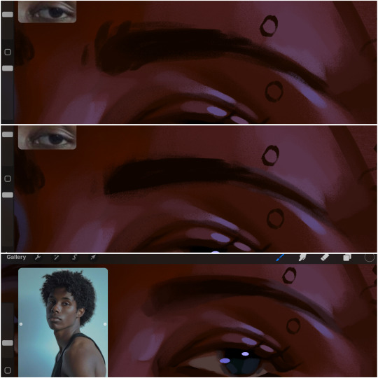
next, the eyebrow. i find it tedious to draw individual eyebrow strands when it comes to rendering, i actually prefer to blend the parameters of the eyebrows to create cohesiveness. sparse and fine eyebrow hairs are penetrated by light and shadows more than what you'd find on the scalp. it's harder to see light on someones scalp due to the bulk of hair crowding the scalp, whereas as its easier to see such light on the eyebrow. to introduce this concept to my art, i will initially draw the entire shape of the brow. then when rendering, i erase the parameters, leaving the darkest part of the brow. then i blend. the lower brow bone will be blended the least, whereas the area of the eyebrow connected to the T zone will be the most blended thanks to the shadow following the nose bridge. the far end of the brow by the hairline tends to be the lightest given the light source.
and lastly, i loosely draw a white border around the portrait for stylistic purposes. then i combine the layers (group together your layers, then duplicate and compress the duplicate group so that you still retain your individual layers) to edit. i typically add noise and play with the curve setting. and heres the finished image:
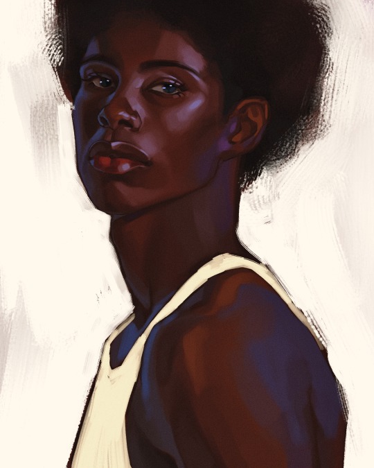
i hope you enjoyed!!
#i didnt proofread this if u find spelling errors pls lmk#black artists on tumblr#digital art#illustration#painting#black art#commissions#tutorial#art tutorial#how to shade#rendering tutorial#brushes
217 notes
·
View notes
Text
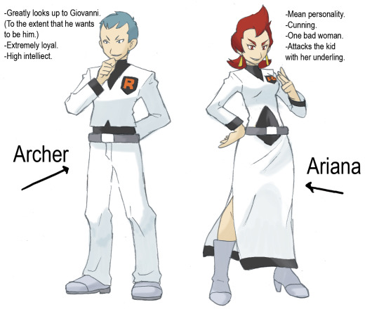
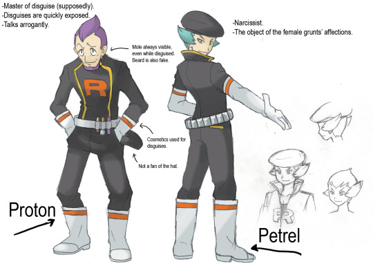
Ok I did it I finally set out what I promised myself I'd do. I'm free! (Now I just need to stop stalling on the Cyrus scenario draft....................)
Here is my translation of the leaked rough sketches for the remake Rocket executives. These images are attributed to Takao Unno, the art director for HGSS. It was already known that he was the artist behind Proton and Petrel, because of the TCG, but it is nice to have confirmation that he designed all of them!
As you can see, because these are formally unreleased, wip concept sketches, I wouldn't take any of the "new" information here as gospel regarding their final game selves. Though getting to see the initial ideas behind their designs and personalities is a big treat in and of itself!
Also this probably doesn't need to be said here, but please respect the Gamefreak employees and don't bother them with anything related to leaks in any capacity.
If you want to share my translation of this leak on another site, please only do so by linking to this Tumblr post and don't repost the images directly. (This also probably isn't something to worry about, but I'm saying it just in case.....)
Under the read more is my translation notes and personal thoughts:
Archer: Archer's notes were the big bottleneck for this, ngl. I was unsure what the nuance was with "he wants to become Giovanni," so I spent a decent amount of time looking into it. Based on that, I can infer that the nuance here is that Archer's feelings of admiration for Giovanni are so strong that he either wants to straight up be Giovanni, or exactly like him. Either way, it implies a desire to be just like the other person so strong that you lose your own sense of self. So take of that what you will I guess…..
Ariana: I translated the last bullet point under the assumption that it was referring to the plot point where Ariana and her subordinate go after the player character in the TR HQ. Japanese doesn't have plurals so when I first read it I thought it said they routinely attack children together, but I am going to assume that that wasn't what Mr. Unno was going for here.
Petrel: Petrel and Proton's names being switched around here is not a mistake on my part, btw. Petrel's arrogant way of talking is present in the final game! I have no idea how obvious it is in the English version tbh, so I'm pointing it out here!
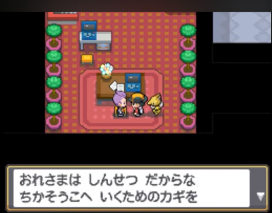
(Example: he uses "ore-sama" in HGSS like twice ok. He's so cute and I love him so so much.)
Based on the wording, I'm still kinda unsure if the mole was intended to also be fake. (I'm leaning towards yes rn.) So I will just leave this convo I had with a friend here:

Also in relation to lack of plurals, you could interpret the hat line as him hating hats in general, but based on the context it's most likely just referring to the TR hat.
Proton: I don't really have much to say here except that I've stared at his cleavage for longer than necessary.
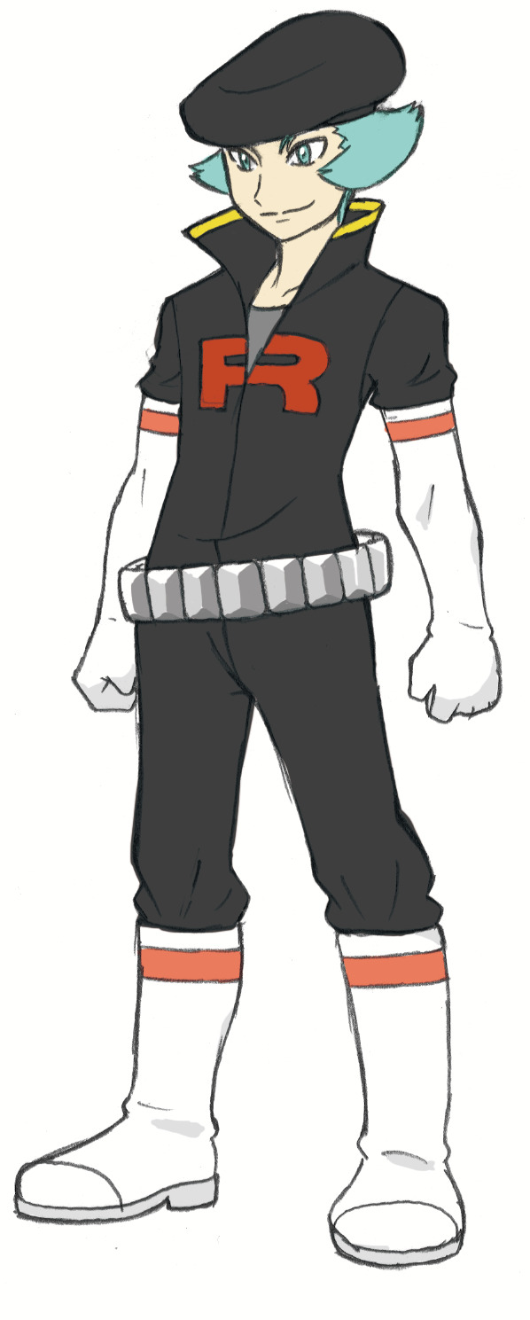
There is another leaked image that shows Proton from the front (definitely made as an internal reference image). It is interesting that this reference gives him a grey undershirt while his official depictions from the front (Hitoshi Ariga's 3ds theme and Masters) have him wearing a white one!
#team rocket executives#pokemon leaks#ive looked over this 10000000000 times by now if i accidentally made a mistake or left something out i will be sad////
23 notes
·
View notes
Note
to artist en— your work is so gorgeous!! may i ask a little more about your art materials/process? i work in traditional mediums because i find them the most comfortable, but i feel like my stuff never feels very clean when compared to digital art. meanwhile your traditional stuff looks very polished, and i’m curious just what tools you use to get there :0
(please do feel free to answer privately, i wouldn’t want to clutter up the art blog!)
Hello! Thank you so much, I'm super happy that people like my drawings <3 and haha, same hat, I definitely prefer doing traditional art but also feel it's waaay messier than my digital stuff, but I'm very glad you think it looks polished!
As for art materials, I basically use anything :'D for sketching, I always use a light red pencil (and then never erase it after I do the lineart oops) and then a blue pencil to define the sketch a bit more. For lining, I like using brushpens because I like me some line variation :'D but I also often use different colored fineliners if I want some less harsh lines. Or even colored pencils. For coloring, I basically use whatever I feel like at the moment (and what works best with the paper I'm using xD), so it can be watercolors, alcohol markers, colored pencils, paint markers, highlighters, and often it's everything at once haha. I love doing base color with alcohol markers and then shading with colored pencils, it creates a fun texture. Or if I color with colored pencils, then I like to go over the area one more time with a marker/highlighter in a similar but lighter color to have the whole thing look more blended out.
For the comics I post on this blog, I "color" them with water-based brush markers. And those tend to be kinda streaky, so I think the key here is to have a steady hand and find a good rythm for putting down the color???? Like, not go too fast or too slow, so the ink flow is consistent???? Easier to do for small areas, for bigger ones I gave up and accepted the streaks XD
Ahhh I feel this answer is kind of chaotic and not very helpful, but I hope you can get something out of it! If you need me to elaborate on anything, let me know!
16 notes
·
View notes
Note
question if I may! are there any resources you find helpful with drawing comics? I’d like to start but I’m kind of intimidated orz
plenty!! you'd be amazed how far you get just by starting. but in terms of generic advice:
insp folder of comic pages on my phone. i try to read a lot and i save whenever a panel layout looks interesting. witch hat atalier, mob psycho 100 and blue period are my favourite inspo! but i also snap pictures of indie comics, doujins, or other artworks with interesting compositions. looking at other big or small artists online can give a real ''oh i can do it too'' type attitude. recently i loved sneckoil's comic in the jaws of st camillus
Understanding comics by Scott McCloud (free download on archive.org) is a comic itself. literally covers ALL the bases. its so good
some of these video essays. by lines-in-motion have great points about visual storytelling and deconstructing what makes certain manga great. good for if you want to think about an overarching story
in terms of the actual drawing process?
time-saving methods. i take a fuck of a long time drawing comics but i dont think it has to be that way 💔 i use CSP which has some GREAT support for comics and i want to get my hands on the upgrade for its manuscripting tools. if you're using a software that has some tools for panelling / speech bubbles / text layout its well worth getting used to them. i also use 3d character models, my own reference photos ALL THE TIME. I could talk more about my process but a lot of it is kinda specific to clip studio paint
i've been having so much fun ever since i got into making comics cuz they have so much overlap with all other visual and narrative art. but that does mean that thinking about everything that makes a comic ''good'' is pretty overwhelming. keeping track of everything while drawing is tough. but it also means that i get inspiration from literally anywhere.
9 notes
·
View notes
Note
your art is really coool! im inspired! do you have any art tips?
Thank you so much and yes I have a bit of knowledge since all the work I have done over the years. However, I understand everyone does things differently. So perhaps not all I will share will benefit you much. Especially if you already knew it BUT I will try give as many I can!
I saw that you mostly do traditional drawing, so I will keep it mainly for that. However I will mention some digital tips but will have them related to traditional in some way.
Pencil types. There are many types of pencils and most depend on darkness or light. I usually have a 0.6 and 0.9 on me. A step further is charcoal however I'm not as experienced in that. Something I often do in case of smearing is lightly dabbing my finger on the art. This can work for many tools but I think a pencil smearing can just be annoying lol. How far you press can be very important too as going to hard can leave lines into the paper that will permanently be there and affect your art in case you wanna erase. I usually go light first then dark then work around. It's okay if it's messy at first if its light as that can be a lot easier to clean.
Paper. Paper is very important to me at least due to how much it can vary. For certain tools, I'd prefer certain types of paper. Always check texture and thickness before buying. Don't just buy random sketchbooks. I've regretted many times of getting paper far too thin or way too much texture.
Texture and thickness all depend on what you'll use on it. Thicker paper can handle wet bases like water, paint, or markers. While thinner paper is much better for pencil. As the more texture the more difficult it becomes to not make a mess of extra that might smear if you're not careful.
If you have thin paper and are using markers, make sure you know when is too much for the paper. It could tear or eat a hole in it if not careful. I don't think it depends on art supplies either. I just think it depends on skill and paper. Like, I would not use Crayola markers on printer paper. But I would on card stock since it's more likely to handle it. Speaking of card stock, it can be really good for just sketching. However I don't think it takes pencil very well depending on it's texture. Since most are usually kind of glossy on top.
Thin paper can also be great if you want to transfer a drawing over. Imagine a digital sketch that you draw over. Thin paper can be used in the same way so I'd never fear messing up when you can easily get it onto something else and start over. This applies to tracing it in digital.
Speaking of tracing, I would not be afraid of using it as a learning tool. I've used references but sometimes I cannot see exactly how to draw that. So I trace and see what it looks like on its own. I don't think using something traced in your final piece is practical or good. But I think learning and guiding yourself with it is an excellent thing and I want more young artists not to be afraid of it.
Poses and certain features can be quite difficult for some. I think the best way to build up on these is to break them down. Like making the person who is doing the pose into very simple shapes.
This like all off the top of my head. If you want to ask something specific like, painting for example, feel free and go ahead! Or need further elaboration I can certainly try!
My biggest art tip of all tho, is to have fun. Draw whatever you want. Make yourself feel happy and don't let others dictate what you do.
I think cringe culture really hurt a lot of learning and growing artists. People who just inserted themselves into stories, made strange aus. They all were just having fun. I let myself not show that I loved things just for others comfort and you know what fuck them!! So what if evil teletubbies is weird?? Why are you upset that I'm having fun!
Love what you love. Draw weird and strange things and never give up on yourself when you feel disappointed.
You will get there with your art. You will if you feel love and passion for the craft.
7 notes
·
View notes
Text
Design Chatter - MLP East Blue Crew!
>> Link to the art here! <<
I've seen some fellow MLP au artists talk through their design ideas, so I thought I'd share my two cents and ramble a bit! Fair warning this will be long and there will be spoilers!
I kept a few simple guidelines for myself in mind:
Keep it fun and surprising, in the spirit of the original!
I draw in the G4 style, but features from every gen and toy line are fair game
Anypony who appeared in the comics as a cameo is not immune and has been redesigned for my selfish needs
I love back card / blind bag style character blurbs. I live for crumbs of worldbuilding XD
I've purposefully not included cutie marks because I suck at drawing them and I'd never finish a piece if I had to draw them :v (maybe a post for another time?)
🌅 Luffy 🌅
In-universe:
"Friendship isn't so much magic but a mandate for those this pony captain likes! This joyful newbie idolises Shanks, a fellow flightless Pegasus pirate. Though rubber wings are useless for flight, his ultra-lightweight body means he is still adept at aerial combat- falling slower and flinging faster. He passes the time between islands gliding by the mast with the gulls."
Design:
I'll level with you all; I'm not huge on red and black ponies. It's nothing personal to anyone who uses the scheme; it's just not my bag. The contrast is a bit harsh on my eyes. (And that every brony in 2015 slammed ponies with the scheme, forever ingraining that bias into me)
Rather, Luffy's scheme is based on his shorts! Light blue and white evoke the shoreline and sky, two limitless places where he spends a lot of time. A softer scheme allows me to draw his vest and hat without them becoming lost on his fur, and I feel it gels better with his light n' bright attitude to life. There's no way he's edgy enough for red and black-!
The swirls on his wings (and hoof fluff) are from the G3 depiction of Pegasi. It's such a gosh darn cute way to draw wings. It's also a fun little nod to the pattern on his fruit and Gear 5 form later on. Ponies are always skirting around the idea of destiny. For him to be a Pegasus was an easy pick for me, the wings symbolising both freedom of movement and spirit!
💚 Zoro 💚
In-universe:
"This aloof Zebra spends all year saving for Apple cider season, where he promptly blows all his bits in under a week. He often unknowingly intimidates those he meets; a bias unaided by the three swords he wields with magnets embedded into his front hooves."
Design:
I'm weak. I couldn't resist the alliteration of Zebra Zoro. You can blame Zecora for starting that. You can also blame her for the parallel of people misunderstanding Zoro's personality based on first impressions. I Pinkie-promise he's a big softie really.
Before I'm bashed, I'm well aware Zoro is Asian. In this instance, you can view that his being a Zebra just connotes that his ancestry lies outside of the East Blue rather than drawing any real-world correlation.
It's the little things that make this version uniquely Zoro, though. His stripes are sword-shaped, come in threes and neatly avoid his back. Hoof magnets were a popular play feature of G3 ponies before kids kept eating them 😶 But I think it's a fun way for Zoro to retain that Earth Pony-adjacent strength whilst still being able to hold all three swords. His stance has always looked weird, anyway.
🍊 Nami 🍊
In-universe:
"A light-footed, citrus-scented Pegasus who gambles with the best in Klugetown. Nothing escapes her- not even the bits from your purse! After a decade of being on high alert, she's more in tune with the weather than even other Pegasi. The sight of rainbows stretching across the sky makes her think of home."
Design:
Honestly, it's nice that we don't know anything about Nami's birth family. When she was adopted, she was just a baby, even younger than Sanji. Belle-Mere (Mare…) and Nojiko shaped her entire life. To that end, I wanted her design to be free of speculation and to focus on what we know for sure.
Her being a Pegasus was influenced by a few things. In G4, Pegasi often have an affinity for the weather and sky. Like Luffy, her wings symbolise the emphasis on freedom in her story. Farming is traditionally an Earth Pony job, so it also shows the disconnect between her passions and current situation.
In this case, the clipping of her wings doesn't stop her from sailing away any more than it does in canon. But it adds to the feeling of control Arlong holds over her, another physical reminder of her duty and self-sacrifice.
Despite what the timeskip art style wants us to believe, Nami is pretty but also really... normal. Normal proportions, face, hair, profession. She's weird for an OP character in that way. To reflect that, I decided that her coat should reflect the colour of the maps she creates. Unique from the pastels around her, but not super stand out, much like her orange mane. The darkened ends of her fur walk the line between showing hard graft and dirtied hooves 🥲 I expanded her tattoo to be a full leg design- 'cuz why shouldn't she show off the symbol of her life truly beginning!?
🎱 Usopp 🎱
In-universe:
"A young, apprehensive Changeling who often lives disguised as a Pony. He uses his transformations to bring stories to life and dazzle those he meets! When danger arises, he shifts into the form of a smaller animal and hides..."
Design:
The choice to make Usopp a Changeling speaks to his insecurity. Why present yourself as a village foal when you could be a great pony of the sea? Or anyone else you could dream up? It also speaks to my own insecurity as an artist, not touching the idea of drawing his nose on a horse face with a 10-foot pole. It's not happening, nuh-uh. It's a horn now for a reason, trust me!
But it also allows for some very literal metamorphosis as he grows throughout the series. His horns grow larger and change shape as the slingshots he uses evolve. (Yes, he absolutely does use his horns to fire things from!) In Pony form, his cutie mark changes to reflect which part of himself he identifies with -or has the most faith in- at any one moment. As an artist, I bet he has great fun drawing up new marks to use.
Rather than becoming a muscly bug after the skip, his wings literally break out from his shell. It isn't the end of his development, but it signifies his change in outlook and newfound faith in himself. Followers of God Usopp view his Pony form as one they, as "common folk" can easily comprehend, rather than his true nature.
He's the only one I drew as his timeskip design, just because it was the most interesting to me. Hyperfixation does strange things to a man.
🍥 Sanji 🍥
In-universe:
"A hot-headed Unicorn who breaks expectations, he fights rude customers with kicks that match the strength of a true Earth Pony! His unusual tail is a hot topic of speculation for off-duty chefs at the Baratie- but he won't speak a word about his past. Maybe try asking about his specials instead?"
Design:
Classic Unicorns are calm, refined and beautiful. Everything that Sanji is... on the surface. I love how Sanji constantly plays with our expectations; who says a creative can't kick ass? Further to that, Sanji's magic skills are wholly unimpressive, with a grand repertoire of two spells. It helps separate him from Robin, the actual magic scholar on board. As an Earth Pony unable to teach him, Zeff has always felt guilty.
His blue coat reflects the shirts he often wears, sure, but blue feels so appropriate for someone who loves the sea so much. It also allows for his fluffy black socks to stand out, coining his epithet. (If horse Sanji wore pants, would he wear them like this? Or like t h i s?) Not naming any names, Luffy he's the only fighter sensible enough to wear horseshoes to protect his feet and often visits Farriers when they make port.
His tail isn't hairless, but is covered in a thin layer of fur like his body until it reaches the tip. It's useful for working in the kitchen as it's easy to wrestle into a hair net. In the Baratie, he's often seen with a red bow decorating it, warning customers that he'll kick if provoked. This style of tail is a largely lost trait of old Unicorns, now most commonly seen in nobility who care a little too much about bloodlines. It's not a feature he's proud of, especially when it calls into question the nature of his relationship to Zeff- a pony he otherwise closely resembles.
#if you didn't want autistic rambling then idk what you're doing in an mlp au tag XD#or this blog as a whole#I'll make another post for the second half of the crew whenever I get around to posting the art for it oops#anyway I hope you enjoy pointless lore as much as I do!#straw hat grand friends#east blue crew#one piece#one piece au#monkey d luffy#luffy#straw hat luffy#roronoa zoro#zoro one piece#nami one piece#cat burglar nami#god usopp#usopp#one piece usopp#sniper king usopp#sanji#one piece sanji#vinsmoke sanji#black leg sanji#my little pony friendship is magic#mlp#my little pony au#my little pony#ponify#pony au#ponified
16 notes
·
View notes
Note
I am bothering you with questions and statements.
Do you also sketch what you paint?
How often do you paint?
Are there any pieces you've done lately (or in the past) that you're super proud of?
Is it just a hobby, or do you want to make it more than that? (Nothing wrong with either, just curious)
I swear, I'm not actually the Leanansidhe, and I'm not angling to trade your life forces for inspiration.
Any other artistic impetus besides the need to breathe life into pigment?
Oh! Many questions! Yay!
1. These days I do most of my painting in sketchbooks full of watercolor paper. I sketch in colored pencil (sometimes wax-based where you can see the lines through the paint like Marcille, sometimes watercolor pencil where the lines will blend into the painting like Chappell Roan) and ink and paint right on top of the drawing! If I have a big composition I want to treat with care I’ll draw it on a different piece of paper first and then trace it onto a fresh sheet of watercolor paper with a lightbox.
2. Not as often as I’d like! I did a ton of little paintings during the pandemic but I hit a bit of creative block after I quit grad school and my Horrible Job earlier this year. I got through that by taking up crochet, but the Marcille and Chappell Roan paintings I did recently have help unblock the painting dam a bit. I should paint something this week when I have a bit of free time. I’m ordering some books of stock photos so I can copy the poses since Pinterest (where I used to keep all my drawing references) is nigh unusable these days, between the AI and the ads.
3. As an adult, I’ve really mellowed out about my art being perfectly presentable (and as such the quality has improved a lot.) I’m proud of basically anything that escapes my brain and gets to paper, but I’m especially proud of anything I’ve composed with a background. Riding Home (can’t believe that painting is five years old!) is still one of my favorites and I love the response it’s gotten. On here, my piece with the most notes is this Doropetra piece, which… I think that was my first time drawing something queer? Either way I’m quite proud of it and I know it’s made a lot of people happy.
4. It’s strictly a hobby. I’m addicted to being a W-2 employee and knowing where my next paycheck is coming from. If I drew more high-concept things than fandom stuff, I might try entering into local art shows. My friend is involved in the local poetry scene and I can’t imagine my paintings would be poorly received.
5. >:)
6. I have a big binder full of trading card-sized swatches of all my watercolors and notes on their pigment properties. I am incredibly intense about the pigments, fret not. I like to think that my art is a reflection of my education in art history. When I’m not feeling super inspired, I will go to my local museums and see what bits and pieces I can take for my own work. I think I learned more about how to paint from studying art history than from most of my actual art classes over the years. In practice though, I’ve been drawing and painting seriously since I was about 12 because I couldn’t find a better way to express how much I loved Pokémon, and honestly most of my art since then has been fandom related. It helps get some of the inspiration out of me.
And anyone who knows me from my days of cranking out Fire Emblem art knows I love to draw a Pretty Lady in a Nice Dress. (I love being a Pretty Lady in a Nice Dress too, frankly.) I love making new dress designs and incorporating my knowledge of historical fashion into them.
I have a lot of drawings I want to get too soon (I want to draw a full body piece of Marcille and of Chappell Roan’s VMAs look, for one… Maybe Susato Mikotoba Great Ace Attorney too… and I just started playing Baldur’s Gate 3 in earnest and I need to draw those ladies too. And maybe Wyll for fun. I like him.)
#ask answered#thank you for the questions!!#i love getting to think about this stuff and talk about it#i’ll get back to painting once i finish crocheting this pillowcase#my art#bryn's art
5 notes
·
View notes
Text
EMERGENCY COMMISSIONS
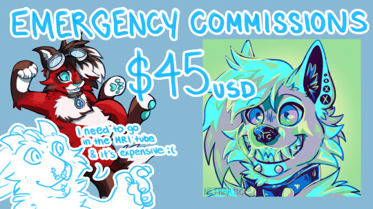
[ID: writing reading: Emergency commissions - $45USD. In the background there is an example chibi. To the right is an example icon. In the bottom left corner of the image is my dragon/dog hybrid fursona pointing toward the image and saying "I need to go in the MRI tube and it's expensive :(" /end ID]
Hello funny furries in my phone!!
I am in a bit of a sticky situation where I currently can't work because of acquired spinal injury and chronic illness - however need money for doctors appointments and imaging that I can't afford on government benefits. I am unable to take large amounts of work at the moment so will only be offering limited slots of the following, but may take more on if I am handling the workload okay.
The first 2 options are $45 as they take about the same amount of time to complete. I have just added 2 more options that are more expensive (as of 26/6).Can be either artistic freedom or give me some prompts. They won't come with a wip unless you explicitly request one as I aim to get these out as quick as I can. Please share - Info below the cut!

[ID: A fox/wolf hybrid showing a big toothy happy smile toward the viewer. He is coloured using shades of yellow, green, blue, purple, and pink. /end ID]
GRADIENT MAP ICON
Will use more than 3 colours, but pick 3 you want to see in the icon
You can give me an expression, or I can choose one at random
See complex characters image below for complex character additional fees
Can also make pride colour ones :>

[ID: Heading title: Chibi style. Style examples from left to right: A red, grey and white Maine coon cat. A dark blue unicorn with black and purple hair, and a white and purple fox. /end ID]
CHIBI FULLBODIES
Sketchier lines and more minimal shading than the icon
Transparent png
Any body type
See complex characters image below for complex character additional fees
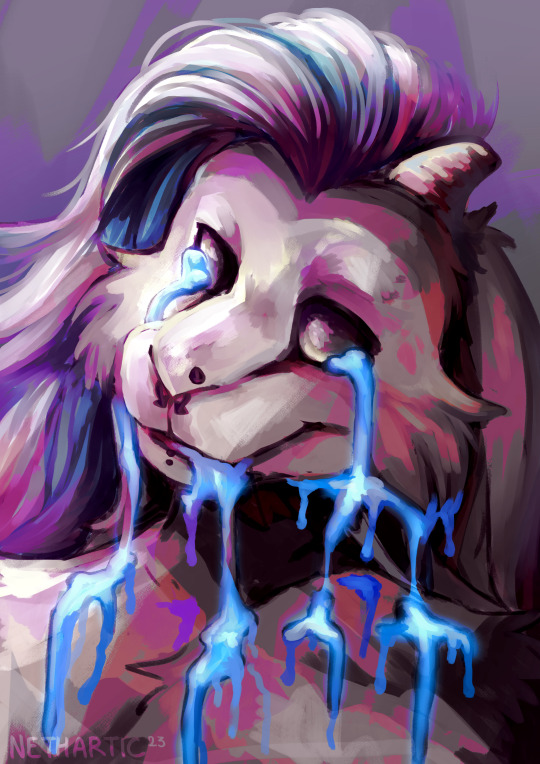
[ID: Digital painting of Neo (dog/dragon hybrid) with liquid leaking from their eyes and mouth. The painting uses saturated shades of pink, puple, blue and orange. /end ID]
EXPERIMENTAL PORTRAIT
I can also do a loose bust portrait like this for 68 of your United States Dollars. The style is quite experimental but you can give some prompts or just give me your character + their personality and I will do the art thing!

[ID: A digital painting of Neo flying through the air coloured with highly saturated colours /end ID]
FULL PAINTING
Putting this one out there just in case (if anyone buys this I will close for any more slots) but I can do a painting like this for $900USD (20hrs work) or a less refined painting for $450USD (10hrs work). This might take a while though with my pain/fatigue and will include wips.
Wondering if your character is too complex? Check out this little guide I made:

[ID: A chart with increasingly complex designs and their additional costs. Extra limbs/complex markings are + $10, and wings/very complex markings are + $20. /end ID]
Note: Charge will be more on a full painting, the above is based on icon/chibi/bust style. To be discussed before the payment invoice is sent.
WILL/WON'T Draw:
WILL:
furries, mlp, feral
queer characters (pls give)
Mobility aids (free)
Any body type
NSFW/fetish/gore/adult content*
mechs at $20 extra charge
*(if you are wanting more extreme/niche adult content please discuss first. Won't do any illegal content, if it's fully legal but a bit questionable please run it by me first). Probably won't be posted to tumblr but won't charge private fee.
WON'T:
NSFW feral
Police/military
Accept commissions from minors
TOS and Payment
Terms of service:
Payment through PayPal, but can do bank transfer if you live in Australia.
If you just want to throw me a couple of support dollars (I would love you forever), I have a Ko-Fi.
Please send me a DM if you are interested in a commission, I would love to work with you :D
Thank you so much for looking! Please share this around.
More about my situation
I have a family history of spinal issues (my dad had major spine surgery when I was 6, with his side of the family having consistent acquired spine injuries going back generations) and unfortunately my turn on the family spine came a good 10 years before 'normal'. I seem to have 2 separate issues co-occurring in the T and S sections of my spine which are causing gradual motor function loss and a LOT of pain. I have also had a mystery fatigue/pain condition which we are now about to confirm as fibromyalgia since about age 15.
After my legs nearly gave out at work last November during a particularly bad pain episode at work, I went and got an intial MRI that showed irregularities in my spine in the areas my pain comes from. I have gotten much worse since then so need new MRI's with added contrast dye which brings the price up quite a bit (it will be $4-500+). I quit my job in February under the impression that I just needed to rest for a bit and could go to a less intense job after 3 weeks. I honestly don't think I would have lasted much longer if I didn't quit anyway because I was taking close to or the 24 hr limit of panedeine forte at work just for the 8 hour shift (needed to drive so couldn't take stronger opioids + opioids make me feel HORRIBLE). I think my body was holding out until I had a period of rest because I began declining quite rapidly between February and now.
I have been using crutches to help walk/stand for about a month and a half now and I can't stand for more than an hour max (30+ mins is starting to push it tho), which is a HUGE contrast to 6 months ago where I was standing 32+ hours a week and moving around constantly. I've also gone from being able to comfortably lift 25-30kg to struggling with less than 10. These limitations knock out a LOT of jobs I'm qualified for (read: non-skilled, physical labour) - so trying to find answers for what's happening to me is very difficult and slow because I can't afford to just throw myself at specialists; and with the unofficial and slow death of bulk billing in Australia even my GP is getting too expensive. My partner is also disabled and receives DSP from the government so is not in a position to help finance my medical care because he is barely affording his own.
You're of course under absolutely no obligation to support me (and this isn't a sympathy post), but sharing this around would mean the world to me because I REALLY need to get some money together for medical care.
#Having a go at writing image descriptions let me know if I've done anything wrong :)#furry fandom#furry art#commissions open#emergency commissions#furry artist#artists on tumblr#physical disability#chronic illness#disabled artist#anthro#signal boost
49 notes
·
View notes
Text

charlie/aster. tree-hugging animal nerd. enjoyer of sci-fi, fantasy, the paranormal, historical fiction, and everything in between. draws stuff sometimes
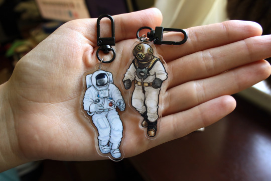
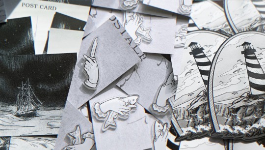
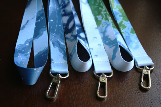
other art ▪️ buy my wares ▪️ zine bash
faq ⤵️
can i use your art for [personal thing]?
as long as it wasn't commissioned by someone else, you can use any of my art for your personal icon, profile pic, header, playlist cover, dnd home game, etc etc. please credit/link back to me whenever possible
can i get a tattoo of your art?
again, for my personal non-commissioned art, sure! i'd appreciate it if you leave a kofi tip or buy a little something from my shop when you can. a shout out is also appreciated if you post a pic to show off the tattoo, partly for design credit and partly because i'd like to see it :)
are you open for commissions?
maybe 👍 please email [email protected] with "commission" in the subject line. tell me what you have in mind and i'll let you know if it's something i can do right now
will you restock [item]?
franklin leg and terror/erebus ship pillows: nah. i might do a new ship pillow eventually, but no immediate plans. feel free to yoink the ideas and make your own; they're not super original concepts lmao
polar explorer shirts: "all well" will have another preorder campaign (probably its last) in december 2024. "make history or die trying" is available through my redbubble (and as of nov '24 has a few still in stock in my etsy) but otherwise i have no plans to do another run
prints and stickers: will probably be restocked (shop updates are usually in april and november ish), and/or is available through my redbubble shop
how do you produce your merch?
i use catprint (US based) for all of my prints and have done for many years; they're great, lots of options, no minimums, and i highly recommend if you want to get into selling prints. i've used stickerapp (US based) several times for stickers; their minimum quantities are higher than i usually want but the prices aren't bad and the quality is nice. i use zap! creatives (UK based) for pins, charms, and stickers; as much as i'd love to produce everything this side of the pond i really haven't found anyone comparable in the US and i've been pretty happy with them. pillowcases, lanyards, glasses cloths i've done through a group order organized by another artist; dm me and i will hook you up with the mailing list.
i get basically all my mailers from ecoenclose, glassine paper from blick, and otherwise try to reuse brown paper, cardboard, etc for inner packaging as much as possible.
will you draw [fandom] again?
[shrug emoji] it could happen. i'm still fond of everything i've done fanart for in recent years, so there's always a chance i'll return to it if struck with ideas and motivation and energy at the right time
what happened to [various original story things]?
i'm tired dude. i haven't forgotten about them i'm just Tired
----
if you have a question or something to say, you can send a dm or ask here, although my response may be a little slow. for anything time-sensitive or otherwise very important, please email me at [email protected]
3 notes
·
View notes
Note
I think that when a fan of 12 years is about to give up, because there isn't anything there for them to be a fan of or to support, it should be taken seriously. It's a sign they're losing their core fanbase.
Even as a Larry I will never understand this! I’ll almost first and foremost be here for their music, not because of Larry! I became a fan because of their music, not because of a relationship we have never had confirmed was real. Yes I do believe it’s real and that they are still together, but even if it wasn’t and even when they don’t give me signs of that relationship I’m here for their music and their art, not because of who they date. If people are only here for the relationship, then in my opinion they are bound to be disappointed, because H&L don’t owe us anything but their music and their art.
I've talked about this many times before, but i firmly reject the notion that they don't owe us anything. They do. We're in a symbiotic relationship, where they get our support, money and engagement (free promo) and they give us content.
How do you define content though? I have paid for and consumed 3 amazing Harry albums and 3 amazing Louis albums. I have paid for and consumed 4 Harry shows and 2 Louis shows. I listen almost daily to all of their albums and watch and enjoy videos I took from my concerts. Their music has given me so much enjoyment. I can’t wait to see what is next from Harry, and hope after an equally long break we will get something great from Louis. They are musical artists and what they owe us is their best efforts.
I’m a Larry since 2011. I’m sad we will never see an OT5 reunion. I’m sad that there doesn’t seem to be any move towards a more open relationship. But that’s not contingent on my support. I love their music and that is the content they provide, that I happily pay for.
I know as original 1D fans, we were fed constant content. And that was fun but that type of engagement can’t last forever. It never does. I would love a big splashy coming out article. But I’m not owed it because of my support of their careers. I get that you feel differently, just wanted to say my peace on this topic.
All of the guys have had changes to their fanbases as time has gone on and it’s been interesting to see over the years. I’ve been here since 2013. I still firmly believe they’re together but I’ve always sort of been in Louis’ lane so if my mind ever changed it wouldn’t really affect my musical choice or support for him. I like Harry as a person but his current music just doesn’t speak to me like HS1 & FL so I wasn’t able to support Harry’s house, etc. For me their music exceeds any relationship they may or may not have because I choose to focus on their careers as musicians firstly. Not saying people have to do that, but I find that more and more people are shifting to that thought process.
The line isn’t so clear anymore between Larry & anti. There are ex-Larries who don’t know what to call themselves anymore so they just go with neutral because they don’t care either way but that’s not even an all encompassing term.
You have the ex-Larries making it their mission to debunk Larry lore and label Larries a cult, Larries who believe F is Louis’ son, conspiracy theory Larries who are trying to fight the music industry and try to link even the most obscure things (no stunts), other Larries who don’t want to be associated with no stunts, solos, OT4/5, Larries who think they broke up but still ship Larry and the list goes on and on. A Twitter post was going around for a bit with a graph of where your beliefs fall regarding Larry. And honestly I was shocked seeing all the different answers. My point is I guess that Larry has evolved into all of these shades of gray currently and things aren’t so black & white anymore so their support is based less on Larries than it was previously. Harry’s fanbase reached casual listeners and built a solid fanbase outside of Larry for a while and now Louis has also built himself a solid fanbase not based solely on Larries. Seems like his casual listeners are growing a bit more also after people discovering him more. And yes there seems to be a bit of Larry resurgence happening at the moment since Liam’s passing but thats probably not going to last. I don’t want to seem like a Debbie downer here, I’m just noticing more of a shift of focus to their music vs a relationship in regards to the very diverse fandom now. 130k+ people on twitter in mere hours showing support of F being Louis’ son with just a pic of F alone was not on my bingo card but that’s a just an example of how things have changed around here.
Hi, anon! (Yes, i believe you are the same anon, because i doubt i got three larries referring to themselves as "a larry" in a row making the same arguments...)
First off. Some people come into this fandom as larries, without knowledge (or interest) in 1D's music or their solo music. They're just larries. You are no worse or better fan for also loving their music and ventures. I came into this fandom as a larrie first, and then found 1D's music. It's okay to be here just for larry and not here for their career and music. It's okay to be a fan of them as people and want freedom and a coming out for them, and want them to help change the music industy and be role models for their queer fans. Some fell in love with larry and their story, because they're queer themselves. Some are here because larry is a romantic love story that captures people, and unites people. Some are just here waiting for larry to come out and tide themselves over by reading fics and answering a bunch of asks or contributing to the community or fandom in other ways. It's okay to not be here for the music.
Even if you are here for the music, please understand and respect that not everyone is like you. And they do owe us, i'm not going into that discourse again.
Second. About defining what content is. I think people define that differently, because fans are different. Some people need albums and tours, others need tabloid articles, social media fan service or just about anything that will engage fandom and have us talking for days. Some don't need content from the boys, because they're happy with the content fandom or the community creates. I'm happy you are enjoying their albums and tours (3 Louis albums?) and that a coming out isn't contingent on your support. If i didn't think they were coming out at a point in time, i would be out of here a long time ago lol. So me and you are very different.
Third. Yes, the fandom is fractioned. Larries are also fractioned. It's because there is less tolerance and respect for other people's opinions, and it's impossible to debunk stuff and correct wrong information when everyone is spread over different social media. Nobody does research anymore and makes masterpost, putting things together in order to paint a picture everyone can agree on. But it's also a big misconseption that we larries have a hive mind and used to believe in the same things. We never did.
Since it's so hard to debunk things, and explain 14 years of history to 14 year olds on tiktok, you get 130k likes on a F pic. People are gaslighted, because they weren't around when H and L more explicitly fought the fake narratives. Explaining it to them in a way they'll understand takes effort and energy no veteran will bother with. The new fans will forget it by the next gaslighting attempt from lthq and hshq. So it's useless work. So i'm kind of just like sitting here watching them being wrong, coming to the wrong conclusions and using debunked information as a foundation for their beliefs. It's frustrating, but it is what it is i guess. They'll figure it out at some point when they get older.
As long as you believe larry is real, L is not a father and that H and L wants to come out, you're good in my book. The rest is just details of no importance.
#i'm sick and this took me hours to reply to#headache is so bad reading one sentence is difficult#so i'm gonna sleep#goodnight#fandom#larries ftw
2 notes
·
View notes
Note
hii!!! i’ve been following you for a long time now and i really love your art!! i’ve also been trying to learn how to draw so i was wandering if you’d have some advice for someone who’s completely new to this ??? pleek-
forgot to say this in the original ask, but of you have any tips on how to draw hair i’d thank you forever 😭 i’m really struggling with that
aw thanks! idk if im the best to ask for advice but hopefully you find any of this useful!
honestly it's really as simple as just drawing even if you think it looks bad don't get discouraged because it's all part of the process and you will get better when you are drawing on a regular basis. just look at the first drawings i had on here compared to my more recent stuff - the more you do it the better you'll get!
look for inspiration and references, its not cheating to use references as long as you are not straight up copying your reference 1 to 1. i like going on pinterest for inspiration especially for clothes! i also like to see what other artists are doing, instagram is also good for finding art inspo, i also found watching speed paints on youtube a good way of seeing how other people color and how to apply it to your own drawings
I'll talk more about what i do under the cut lol
for my process, i like to start off with a super messy sketch im talking chicken scratch. it's not supposed to look good its just supposed to give you a base for your drawing and allow you to figure out what you want to do.
then i start a new layer on top, lower the opacity of the initial sketch and i start drawing on top and refining everything so I have a cleaner sketch that's closer to the final drawing. this is usually where i finish figuring out the poses anatomy, hair, expressions, hands etc. it's still kind of messy but it'll feel more like you are filling in the blanks rather than starting from scratch
finally i do my lineart in another layer and for your lineart where you just make sure to keep your lines smooth and clean
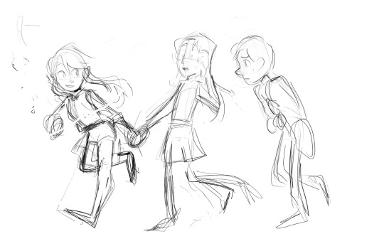
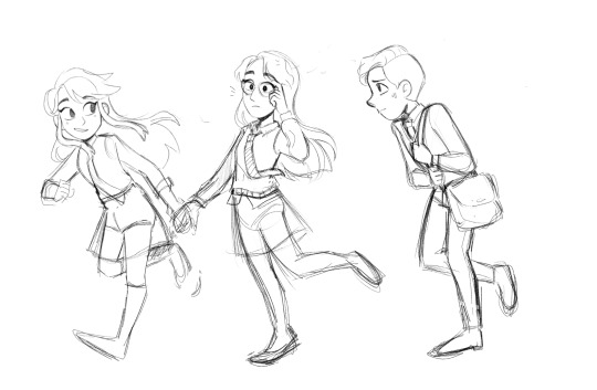


Then i just do my base colors and shade, for this one i didn't really go all out with the shading so it may not be the best example lol, i just kept it simple which is ok! sometimes less is more it just depends how you want the final piece to look.
for hair specifically - i don't really have a tutorial, when i draw hair i just sketch out the shape i want the hair to have in the initial sketch, and then i had more detail when i clean up my sketch. I usually start by adding the strands that frame the face first or the hairline and then go out from there to the rest of the hair. I also don't draw every single strand, i tend to keep it more simple since i have a simple style
I found this tutorial on pinterest which pretty much how i go about it execpt i usually have a rough idea of the overall shape first and i don't go as detailed as the final result, i usually stop around the third step
i hope ANY of this was helpful and not too rambley! feel free to ask more if you have any more questions!
18 notes
·
View notes
Note
I love your art style and how you draw hands! Mind showing us how you draw said hands? ✋🤌✌🤟
Hey there, thank you so much for your kind words! ✨
I really if I'll ever be able to explain how I draw hands with pedagogy, but I'll give out some tips that were always useful to me and I'll break down some sketches with notes explaining the creation process!
👌 ||| t i p s
• Draw the hands. Keep drawing it. Sketch it several times on the side if you're unsure and need to practice with the pose - but draw it. No one's gonna think less of you if it looks clumsy. But draw the damn hands! Just like everything else in art, practice is key and you won't get it anywhere else.
• Look at hands. Look at your own hands, at other people's hands. At the way hands are drawn in your favourite manga/comic/cartoon/anime, how artists render their hands - try to look for their personal tricks. Is it obvious that they use references? Do they simplify the process by stylising hands? How do they deal with foreshortening?
• Give your hands some character. I know it's hard to get the hang of it in the first place, but a big part of learning how to draw human figures is all about diversification. Learn to draw all kinds of hands, and when you draw them, ask yourself - who do they belong to? Height, weight, age, body shape, fashion, hobbies and work - these are parameters that will shape your hands. And to an extent, that will also determine the position you want them in.
• Struggling with the position? Go for an alternative. Sketch out the overall rudimentary shape of what you might have in mind. Use a bigger brush or a marker and determine the silhouette of the hands with no outline. Go for something simpler. Practice on another canvas; if you're struggling with a position, try drawing it from another angle or with another shape of hand; if you're struggling with a shape of hand, try drawing it from another position or another angle until you get the hang of it more naturally; if you're struggling with the angle, try drawing it with a simpler shape of hand and adjust it until you're satisfied.
🌟 ||| b r e a k d o w n

I gathered some old sketches of Bella Yaga that I lined and finished. I put the creation process with notes under the readmore! Fair warning, my sketches are horrendous and barely readable.

When I start constructing a character's base, I want to determine the position's dynamism right away - I find my balance with a few strokes, and I by the time I'm satisfied with the rough base, I know what the hands are supposed to be like, even if my sketch indicates nothing. Here's my thought process:
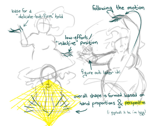
You'll see that being comfortable plays a huge part in how you construct your sketches. I used a character that I know by heart, so the shape and position of her hands came to me naturally - if it was someone I wasn't familiar with, the sketch would have been a lot more detailed and hesitant.
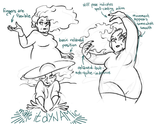
I tend to determine the details when I draw the lineart because it's a lot more efficient and time-saving - but you're free to draw an additional sketch to detail your hands before you line them.
Here's the finished look!
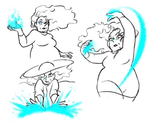
Thank you so much for your ask, I really appreciate your kind words 💕 I hope I made sense here and my tips will be useful to you!
#.ask#.tuto#.art#earwig and the witch#.bella#im unable to be normal about hands and i actively enjoy drawing them fr#thanks a lot tho i really appreciate the validation <3
20 notes
·
View notes
Text
Jack of all Trades
Good at it
It takes
a lot of…
courage
To believe
you are…
…Good…
At something.
… Anything…
When do you decide…
you are…
“good at it?”
When you…
can do it
When you…
can teach it
When you…
can make money with it
When someone…
says you are
I’ve spent…
a long time
trying to be
…Good…
At a lot of things
A lot of people…
think I’m
…Good…
At a lot
of things
But I don’t…
think I’d define…
Myself as
…Good…
At any of it
“Jack of all trades, master of none” has been burned into my mind since childhood. I always had too many hobbies, too many interests, and I wasn’t “good enough” at any of them to make my parents proud. My dad considered himself to be a “master of many trades” and set an incredibly high standard any time I showed interest in anything. If I couldn’t win, be published, or make money, I was bad at it. For many years they encouraged me to “narrow” my focus to one or two passions. But I think a touch of undiagnosed ADHD may have helped me continue to be a “jack of all trades,” and in the eyes of my parents, “a master of none.”
I spent a massive amount of time and energy trying to please them, but nothing was ever good enough. I would try new things from month to month, and my parents were constantly frustrated that I couldn’t choose one thing to be passionate about. Instead I went around collecting hobbies and skills based on my interests in the moment. I was constantly reminded “Jacks of all trades, are masters of none.
When I started college, my parents saw it as an opportunity for me to master something useful, especially since I had been encouraged to choose one major and not change it by one of my favorite teachers. I started as a journalism major, and finished with a degree in media arts, with a focus in German Expressionist film. Unfortunately, during my time as a student, I had yet to land the perfect directing job, or get picked up by a major studio. None of the short films I had created had received recognition outside of student showcases. Not published, no job, no money, yet another useless trade under my belt, but clearly, I was no master.
I spent a few months post graduation unsure of what I wanted to do next. While I loved making independent films, there wasn’t much money in that, and I wasn’t sure how long I could handle being a “starving artist.” So, one day I took a shot on a junk email from my university, “Free Masters and Teaching Licence” was the subject line.
It turned out to be an accelerated teaching and masters degree program. When I was a little kid, teaching was what I had wanted to do with my life, perhaps it was time to consider that path again. I was accepted into the program, and spent the next year of my life taking masters classes, student teaching, and subbing.
Surely this was it, I would make my parents proud and become a master teacher! I was even mastering something useful that came with a job. Unfortunately, my master’s degree was cut short due to Covid’s impact on my personal life. I finished the program with a teaching license and two credits shy of a master’s degree. Once again, I had failed to become a “certified” master, and a new phrase began to come from my parents.
“Those who can’t do, teach.”
Fortunately for me, all I needed to step into the classroom was a valid teaching license, which the program had given me. With some encouragement from my husband, I was able to find my first teaching job.
It’s been four years since I finished that teaching program and got my license. Working as a teacher has demanded more than any other job in my life that I become a “Jack of all trades,” and the idea of being a “master of none” still haunted me. How could I possibly become a “master” of my trade of teaching, when teaching demanded a Jack of all traits? And what was worse, if I was a teacher, was that because I couldn’t do something greater with my life?
The longer I teach, the clearer the answer to that question becomes. I’ve learned to be flexible, rise to any occasion, and meet the needs of every student in my classroom. Sure, I’ve had to master some new skills along the way, but I’m not scared to be a Jack of all trades anymore. It makes me strong and flexible, and helps me meet the diverse needs of my students. I’ve come to realize that Jacks of all trades are still masters of some, and much better than a master of one.
4 notes
·
View notes
Text
Art of the Day: My 1st fur OC CapyBARA
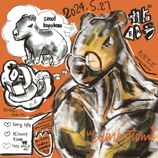
Day 13: I am an Embarrassment to myself
I've read all the rules before I post anything to any subreddit but I always get my first post deleted with something so stupid that I put in, thinking I was being precise and conclusive but I conclude too much & triggered every auto-bot with my precised words. I want to crawl up in a hedgehog ball.
Here's his story if u made it past my rant, you deserved it:
CabyBARA lore:
He was once a capybaby, adopted by kangaroos.
Capibaby thought he was a kanga-baby, so he worked out super hard as his parents were BUFF.
Lately he developed a tiny tiny crush to Lady Sicilia Snake, the librarian.
He started reading more.
He daydream about being an old, healthy capy, with lots of stories to tell, and possibly, Sicilia by his side.
"How do others give out their best first impression?" CapyBARA wondered.
His kangaroo parents met on stage at a boxing match. So their love story weren't really helpful here.
I ended coz I ran out of ideas and thought I'd get some comments on the subreddit, & I typed everything for so long. My eyes dried up & now's perfect to cry. Following is a long promo for my FREE (+ paid) art sale.
Free sketch includes:
Monochrome / lineart for ONE fur-oc / fur-fanart / fursuit / fursona / any non-100%-human creature.
Default size in square canvas. Change can be requested.
From headshot only, half body, to full body, can be requested.
SFW or NSFW, clothes to naked, can be requested.
Pose is decided by Tomi, for studying anatomy.
A name : your human name / username / fursona's name.
Tomi's watermark-signature. Unremovable.
Gratitude from CapyBARA.
A request from Tomi to share the sketch on social media / portfolios. You can say yes or no if you own the character.
Sketching for anatomy study purposes, & possible friendships.
FREE SKETCH IS ROUGH & NOT FOR COMMERCIAL USE plz.
Sketch is protected by copyright laws. ASK for PERMISSION to RE-DISTRIBUTE sketches.
NOs: 100% guarantee offers / multiple offers to 1 human / re-doing finished offers.
If you want to have more in the artwork / to support CapyBARA + Tomi: (Paypal) - USD 4.20: The above + specified pose + specified angle - USD 6.90: The above + base colours - USD 9.60: Detailed clean line art + base colours - USD 19.98: Detailed clean line art + detailed shaded colours + simple background - USD 24.68: The above + background line art - USD 30.62: The above + detailed background - USD 42.00: Full art with detailed line art, shaded colours, and background - USD 69.00: The above with 2 characters - USD 96.00: The above with 3 to 5 character (+ less or more than USD 10.00 : per request)
If you just want the basic free one, you probably skipped, so here's more to read:
By requesting for a sketch, you allowed Tomi Limbo to use the requested character in the said sketch, with aforementioned conditions. If the character is not yours, it should be a personal use fanart or you received the original creator's permission for Tomi to draw. Tomi do not own any legal responsibilities if drawing the requested character was not permitted.
If you want the free art, please give the following info to Tomi in a legal, and friendly to CapyBARA manner:
The character's name, Your name
The character's species
The character's appearance / important features / signature outfit
Head / shoulders / knees / toes. Or be greedy for full body;)
Any gender / nationality / personal identities important to the character
Answer yes or no, if you allow Tomi to post it, as mentioned above
Possible reference images of the character
Possible reference to your prefer art style (E.g. "Disney" or "Ghibli" styles, NO asking for independent artist's styles)


#commission open#free commissions#character design#furry#sfw furry#furry oc#furry commisions#digital illustration#style study#capybara
3 notes
·
View notes
Text
I don't care about how beautiful or ugly AI pictures are.
Before you read this, keep in mind that I have taken History and Culture of the Arts classes (from ancient history to the days of today), History of Drawing classes, as well as studying on my free time because this quite literally my area of expertise. I am also finalizing my license degree in the artes field.
Art in it's many forms is a form of communication. It doesn't matter if it's paintings, illustrations, video games, books, architecture, sculpting, pottery, you name it. It's how each artist/writer/musician views and shares the world, how each person has an unique approach reflecting their own life experiences and tastes.
It's how one writer drafts poetry upon the ocean, while another fears it, and a third one merely views it as a body of salty water. How one artist tenderly paints the hands of a portrait while another slaps a couple of brush strokes on it and calls it a day. How some do a lot of messy and sketchy charcoal lines, while others prefer a pretty and rendered piece. How some prefer the melody of the violin, while others the beat of the drums. It's how you draw backgrounds, what backgrounds, people, which people.
The details you choose to put in - a flower pressed into the background, with no importance to the picture or environment but still consciously put there, for a reason or another; the way a character shows their emotions, in ways we rarely think about but the author knows intimately; how a game developer hides little easter eggs in their game and delights in those who find them and get the reference...
How we still talk to Homero after he's been dead for millennia. How we see ruins from civilizations past, where people once had their first love, first tragedy, last breath. How now we use digital art to depict animals, the same way ancient humans used stone to carve them upon walls.
A machine has no thought. It copies without meaning. You cannot talk to it or marvel at the details it puts in, because they are mindless. The machine puts in a rose because the artists it references also put in roses. It draws a blue ocean when you write prompts for mermaids because mermaid = water = blue. It takes from the humans before it and doesn't adapt it or build upon it, for it cannot combine two completely different - and at first sight irrelevant - things on its own without it having been done before. This is not Detroit: Become Human. The AI is not alive or intelligent. It's a tool, the same way your phone or microwave are.
I love pretty art. In fact, as someone finishing my license in the arts field, I would consider myself quite elitist. I have a strong love for Pre-Raphaelite and Noveau art, and classical architecture. I would suck Alphonse Mucha and John William Waterhouse's dicks if they so commanded, if I could get a small napkin drawing from them afterwards. I don't like XX century art movements like cubism or dadaism. I find them ugly, and they go completely against my aesthetics.
But as much as I hate those, the artists who made them had a story to tell. They had hands and a brain. They put it forward in their own way, with their own language, based on their own likes and dislikes, happy and tragic memories.
A machine has none of the touch.
Art is not the same as working in the mines or in the sewers. It's a human connection. It has been here before we even called ourselves human, it has been here when there was more than one human species walking the planet (for the homo sapiens wasn't always alone). There ir no need to replace it.
Does AI artwork has it's uses? Well, I believe so. I believe there could be ways to make it work. A tool is a tool, after all. But I have yet to see it being used in a ""good"", innovative, useful way.
There is no TLDR. I cannot contain what I just wrote in few words. It would defeat the purpose.
#ai#ai art discourse#ai art isn't real art#anti ai art#my opinion if you disagree ignore#unless you have the bare minimum of art history I don't believe I can have a conversation with you on this topic#I dont care how much faster AI is#I dont care if you think I'm gatekeeping art#shoving prompts into a machine isn't creating art the same way me shoving a pre made meal in a microwave isn't cooking#if you have a disability there are many different types of art you can follow so don't even try to use that as an excuse
28 notes
·
View notes