#I FINALLY DREW MY DESIGNS FOR THEM!!!!!! THEYRE REAL
Explore tagged Tumblr posts
Text

my designs for them hehehehe
#no i dont....have a name for c.c#im sorry 💔💔#fnaf#five nights at freddys#r7inyz scribbles#art#fnaf fanart#my art#elizabeth afton#crying child#fnaf 4#sister location ???? kinda#digital art#I FINALLY DREW MY DESIGNS FOR THEM!!!!!! THEYRE REAL#i honesty think i drew them pretty cute#c.c's outfit was originally meant to be pretty like the sprite thing#but idk i thought that was a bit too basic so i gave him dungarees hehe#i kept on adding detail to liz 😭#big wavy hair liz just felt so real to me#PSYCHIC FRIEND FREDBEAR!!!!!!!!!!!!!#fan designs#cute art#artist on tumblr#infinite painter
163 notes
·
View notes
Text
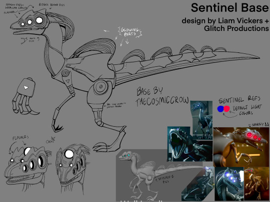
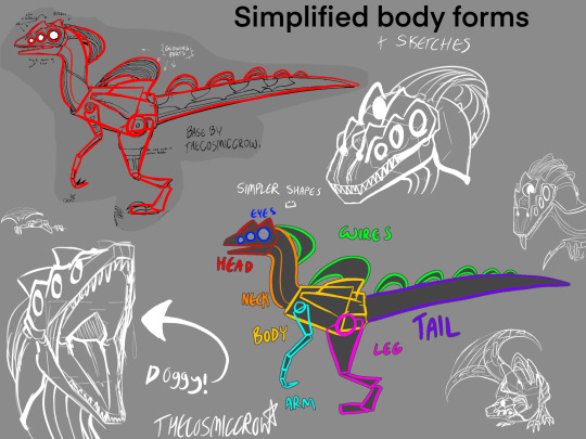
only finally time to post this. also this isn’t a step-by-step tutorial. im assuming you generally know how to draw already, this is just a bunch of references compiled together that could help you draw them easier.
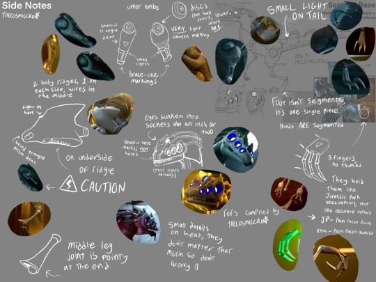
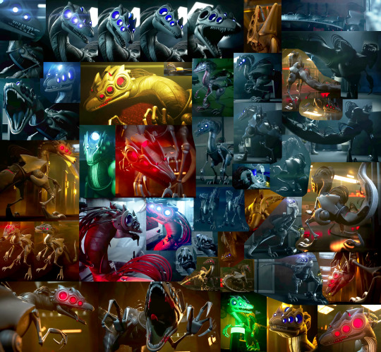
SENTINEL REFS :3
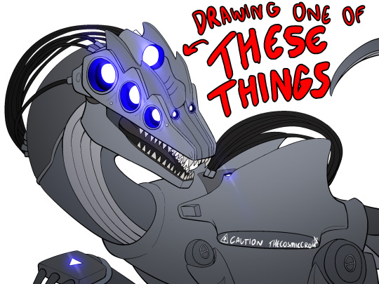
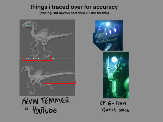
extra notes:
dont worry about a bunch of the smaller details. sentinels are littered with them and itd take ages to draw them if you tried to make them 100% every time. just focus on the bigger shapes and add from there.
their eyes ARE octagons, not circles. that being said it does not matter how you draw them because octagons are absolutely fucking obnoxious to consistently draw. i know, i have a half-sentinel oc, ive given up by now. do not place that burden on yourself. the rest of their face lights ARE circles though.
the smaller two flashers are part of their head ridges. their eyes are on a completely separate layer, and have duller ridges atop them. sentinels just have a lot of ridges in general.
if you want to use real-world dinosaurs as reference, i would use Velociraptor, Utahraptor, Deinonychus, and Dilophosaurus as references, given that theyre all similar in body shape and structure. In the concept art, Sentinels looked extremely like the Dilophosaurus, though it got switched to being more raptor-like in the actual show.
I also MORE THAN LIKELY drew their tail wrong. So if you wanna figure out its design on your own, go for it. I just had to put something down so I tried my best, but it is absolutely NOT perfect.
Same with their colors! they’re almost a completely solid grey so it was difficult for me to tell what colors went where, so I just kinda put em at random in that first image. Doing something completely different is also good, since nobody can tell anyways :)
and on a final note, you technically do not have to follow any of these!! stylize them all you want. these are just references for anyone that may want to draw them more accurately :)
transparent sentinel base png: (MAY NOT BE VISIBLE IF YOURE USING ANY DARK MODE, BUT ITS STILL THERE!)

if it doesnt download as transparent, you can set the layer mode as multiply and it’ll work perfectly as lineart. this is free to use, I just want people to be able to make ocs easier :) i just ask that you leave the watermark in, and credit me if you use it, but you dont have to ask to do it.
(plus the image @1-800-hellyeah made for her sta.sh that i used as reference)
Happy dino drawing!!
(ps. you should totally show me any sentinel ocs you make :3)
#murder drones#murder drones sentinels#sentinels murder drones#sentinel references#murder drones art#thecosmiccrow#my art
219 notes
·
View notes
Text
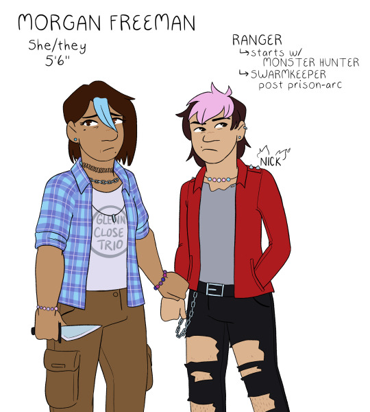

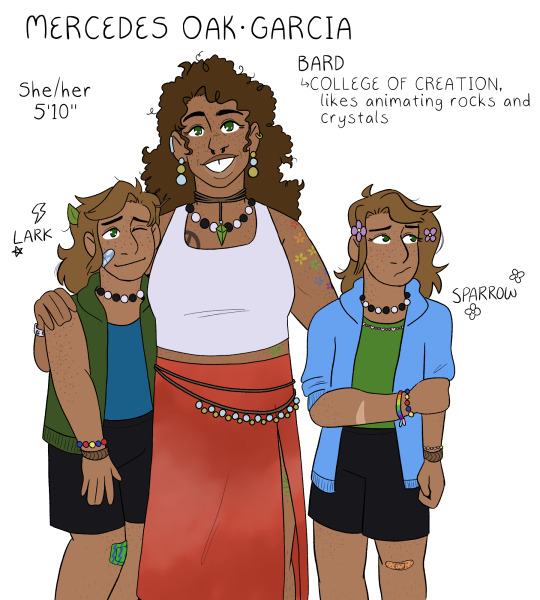
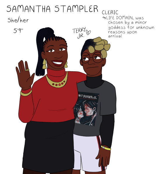
a return to the monsters and mommies au designs, this time properly lined and in color! :D posted in the middle of the night just like last time though because i have problems <3 there are some small changes to these designs, but for the most part i was pretty happy with them so this was mostly just to give myself a color reference for them all lol
gonna ramble about small decisions i made below the cut, but its not necessary at all to understanding the designs! just wanna dump my thoughts somewhere :P
for the most part, the kids' designs are the same as i do them for normal canon, but there are some small differences. i've never really done a proper reference for their kid designs either though, so i guess no one would even notice LOL
freeman family: well, firstly - nick's last name is freeman in this au LOL but its easier to refer to him as nick close so people know who i mean as opposed to nicholas foster. usually, i draw nick close with blue hair (i think he goes through a range of colors, but blue is my default), but i do this because he does it to honor morgan. since she is alive here, instead, his default is pink because thats his favorite color to dye it! morgan and nick both have various bead jewelry because i like to have the headcanon that morgan is really into pony bead jewelry; this is also why all of my nick and nicholas designs have the same trans pride necklace, morgan made it for him :] both nick and morgan wear glenn's old clothes, both of them are wearing his shirts in this piece. aaand morgan has subtle heterochromia as a reference to the split timeline! she always has it, it doesnt just magically happen or anything, but its just a small nod to that.
wilson family: its real important to me that grant got his dad's exact coloration except for his gray eyes, which are all carol. why is this important? i dunno! its just interesting to me. also, carol doesnt usually leave her top buttons undone, but upon entering the forgotten realms, she unbuttons it because otherwise her shirt will pop open while she's doing things (to be honest, as a person with a larger chest myself, her shirt probably still pops open but it does help-!). usually i draw grant with a gay pride necklace, but since he doesnt come out pre-forgotten realms in this au, i tragically had to drop it. i miss my rainbow grant. please come home, baby.
oak-garcia family: i always forget to do mercedes's tattoos in my sketches because tbh i never know exactly what to give her. but! but. this time i just went for it. these tattoos arent necessarily set in stone, but i think theyre cute. the tattoo hidden by her skirt is an oak leaf for henry :] her gem necklace is also the same color as his eyes! her skirt is supposed to be, like, tie-dye or maybe more bleach washed, but i dunno how to draw that so whatever. the twins are, like, 100% the same as usual, i just gave sparrow a pink bead necklace instead of the multi-colored necklace i use for my default canon design lol. also, i think i drew the twins slightly too tall here, which is funny because theyre the only ones who are notably shorter than their mom HDFJKGHK
stampler family: i struggled a lot with what colors to give samantha, because i wanted her to have a bright color palette but not anything garish or patterned. originally she was gonna have a white shirt, but then i realized that would make it so all the moms had white shirts and i just couldn't have that LOL so i ended up landing on red for her! it matches with terry junior, so i thought that'd be cute :] terry's design is probably the most different from my default for him? which still isn't a lot but i swapped his dark blue flannel for a black undershirt instead. i cannot explain why i did this. it just felt right in the moment. i gave him a sweet revenge shirt instead of the usual black parade shirt i give him because... well. if you know, you know. and finally, terry gets a little concert admission bracelet!! i always do that, but i just wanted to point it out because i think continuing to wear an admission bracelet for ages after a concert is a very teen thing to do. i always felt so cool doing that in high school hehe
#monsters and mommies au#dungeons and daddies#dndads#morgan freeman dndads#carol wilson#mercedes oak garcia#samantha stampler#nick close#grant wilson#lark oak garcia#sparrow oak garcia#terry jr stampler
213 notes
·
View notes
Text
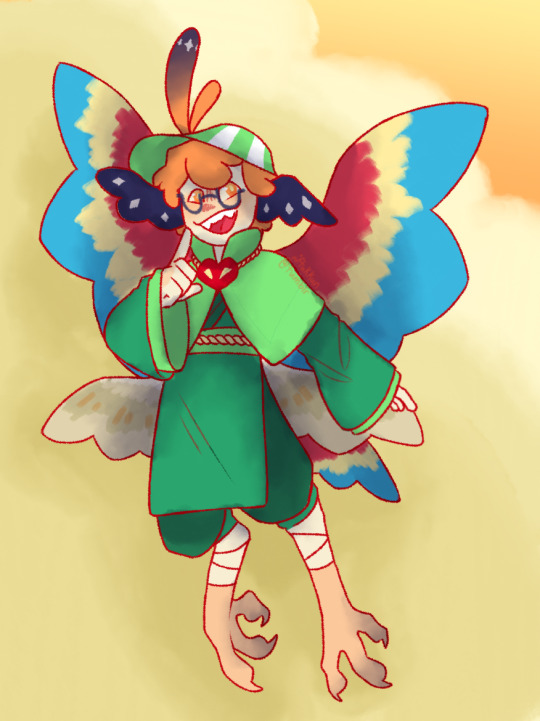
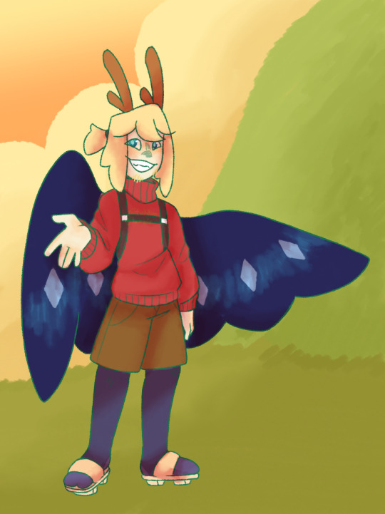
for the fourth and final week of @/shepscapade 's hermitcraft character design event, i offer an outfit swap between two blonde british minecraft men!
ok so im actually gonna take the opportunity to talk about how i generally design characters but especially mcyt characters. ill get to why grian and philzas designs are the way the are later but i wanna talk about how i design mcyt characters for a hot second. to start with i generally have two big rules when it comes to base character designs! they arent hard rules but i find them generally helpful when designing, again, base designs (so special one off style designs like the ones from this design challenge dont really count).
(1) is one i feel a lot of artists know, especially those in animation and comics - its KISS! aka 'keep it simple, stupid'. easily memorable and memorisable designs are good! more details can be good, especially for rendered pieces, but i find that designs i can easily remember and doodle from memory are the ones that stick and therefore become the base of other designs. the Silhouette Rule is also a good thumb rule, though i tend to be more loose with it - have your characters have one or more. identifiable? bits?? like, yknow, if your characters swap clothes with another what bits tell you this character is this character yknow? like with grian i have the two feather anime hair bits (and dave strider style hair) + four wings and a unique tail! and with philza i gave him antler horn things (because why not its unique ish) and, funnily enough since i dont use facial hair in my designs often his facial hair became a bit of an identifier too! my original character ambrosia has a signature bunny mask, big fwuffy coat, unique hair etc etc things like that!
the (2)nd mcyt design rule i have is literally a personal preference thing - No Humans. again its a personal preference but i. i cant!! theyre not real WHy Do They Have To Be Human!!! they dont!!!!! therefore they are not human. every mcyt if i can get away with it and find a good way to make them Not Human even if its like a simple tail or horns or what have you I Will Make Them Not Human. if they are human (tommy) then it means its like a cool story thing (tommys human) or its temporary until i find a better design (not for tommy) or for the case of Tommy Fuckin Innit idk his Vibes are Too Strong he Cant Not Be Human I DOnt KNow WHY. every character is lowkey on a scale of how many nonhuman features they have - grian with ear wings, four wings + tail, and funky birb legs and occasionally bird hands is on one end of that scale, and funnily enough philza - who by all means is human if not for the antlers (he can take his wings off) is on the other side of that scale. most designs i have are between those, notable exceptions doc who has four legs and a nonhuman face and Fuckin Innit.
now to actual design notes on the characters i drew - first up is grian! he has three sets of wings including his ears. its a personal headcanon that he gains a set of wings for every season of hermitcraft he was in, not including the one hes on now. so he has chicken ear wings (s6, poultry man) parrot wings (s7, pesky bird) and barn owl wings (s8, moon = owl). when the season ends im gonna find a bird thats sufficiently eldritch because with how the season has been going (rocks, entity, rift) it seems fitting. i generally give him glasses because he has them irl and also it fits - though i do tend to forget them because its uncommon in other grian designs and not actually on his mc skin. the tail i originally had as a more,, aquatic one? not that its not one now but like it had the mermaid tail end before. i didnt really like it! it looked cool but i felt like it didnt fit so i looked up more tail fins and chose one that looks vaguely like an axolotls but without the top fin part? if that makes sense. and it fit better and looks better so im proud of it but as is the nature of designs it may change at a later date
for philza i didnt really do anything special. kimono top with a looser bottom cause philza explores a lot, baggy pants and mostly human everything because it surprisingly fits? idk i feel like most phil designs i see lean more on the immortal angel of death thing he has but i feel like its more fitting if hes Just A Guy but hes tenacious enough that he Gains the nonhuman parts. the wings especially - a lot of people add those in by default but actually i feel like its more fitting if he only gets wings when he has an elytra! so on q/smp for example he doesnt have wings (even if he said theyre clipped that one time im a philza has no default wings truther he gets those by elytra and hes so good at them through practice you cannot change my mind). also in addition to the wings the elytra also gives him the coat poncho thing that i drew on grian because why not. also hardcore heart necklace!! hell yeah.
#gamble the queue#art#my art#digital art#artists on tumblr#drawing#fan art#fanart#hermitcraft#grian hermitcraft#philza fanart#ph1lza#outfit swap#shepshermitdesign23#quick and easy drawins because Busy. i think they turned out great but i feel like theyre also somewhat unpolished and thats fine and valid
15 notes
·
View notes
Text
i am going to dump a bit of lore on your doorstep (by copy and pasting smth i wrote on discord a few days ago) so i can give context to something i have drawn
disclaimer: it may be long and wordy. but thats what its all about baby
"in short i finally figured out how Arthur gets their name.
so to preface this i must offer. context. be warned this is gonna be one of those Rambles.
before we begin, i am debating on whether or not i should keep the 'arthur possessing gidget' thing, change it to where they possess chip (?), or get rid of it... my reasoning being: i think it makes more sense for arthur to be closer to chip especially cuz they end up as siblings in the end, ALSO i dont remember why gigi had to be the one that was possessed and i think the story would work just fine if it was somebody else.
in fact itd probably work even better with chip not only bc the theming of Being In The Wrong Body and everyone claiming u r somebody youre not works even better if its with chip, it also works cuz chip in the story is frequently like... whats the word. overlooked. or not taken seriously.
but anyways:
two, there is a plot point sometime during chip & gidget's stay in the castelle manor in which everyone but chip is trapped inside a dream by moonlight (in the waking world they are all asleep & cant wake up) bc she is searching their dreams in order to find Arthur (and kill them)
hopefully that doesnt sound. too convoluted. ah. anyways. something something chip teams up w arthur to enter their dreams and wake them up. i think.
i think probably arthur was either forced into going w chip or he agreed relunctantly, but (assuming he is still possessing someone) chip asks arthur if they can see his real face. and he agrees but in a way that makes it clear he is Lying
they wake up in (.....i dont think i have a solid name for this place yet. i think i called it Space 2 in my lore doc for the bit but i think itll be called 'otherside')
and Arthur just looks like a weird version of [whoever they were possessing at the time.] chip comments on it and art's like 'oh you mean my REAL REAL face yeah ok let me. um.' (they change into an exact copy of chip.) 'Better?'
at this point it is becoming clear that arthur might not have a 'real face,' but chip doesnt know that yet
meanwhile there is some chatter between the two, w arthur passively explaining who Midnight and Moonlight are. ALSO there is a fun fact i think about moonlight canonically having a preference for Women & that Arthur's pre-death appearance was modelled after the first human woman. i think. at one point they get onto the topic of art and chip asks Arthur if they like to draw, in which they respond: 'no.' Riveting.
something something climactic point where arthur breaks down and finally admits that they dont have a body, dont have any of their powers, and they cant even remember what theyre supposed to look like. he says that he feels useless!
& then chip says something like 'you dont have to have powers to like. create stuff.'
and then they draw together :]
chip agrees to help give him a "new face" so to speak by drawing him a FURSONA (it is a JACKRABBIT with a RAINCOAT AND UMBRELLA and an EYEPATCH and like. epic scars. and two swords. and a pet dolphin & demon wings. and other convoluted detailed design elements akin to that of a sparkledog) which they lovingly name 'Arthur.' (maybe w a last name like 'skullcrusher' or soemthing)
and arthur like draws his own version of that. which is Close to what Arthur's design is currently. & he's like 'yeah. so um. uhh. close your eyes i cant do it while youre looking.'
(chip puts their paws over their eyes.) 'um ok! what are you doing?'
'im gonna show you the real me.'
& then he looks like the character he drew."
#oc#chip pockett#arthur#saying stuff#lore dump#im having one of those moments where i think of a plot point thats really really good#qnd it gives me tons of motivation to come up w more stuff#i am fine tuning this story and when i am done it will be very very wonderful#that is my dream
4 notes
·
View notes
Text
long post about systematizing the fate/stay night power scaling to unique ttrpg rules, avoid unless you got that obsession like i do
ok so first things first, theres been some attempts to make fsn ttrpg rules before and they dont use the stats in the actual game, they usually just convert d&d to be more applicable to fsn. boring! so i tried to make a ttrpg ruleset that actually looks like the game.
so firstly the stats are obvious, the fucking series has them already:

HP or Defense stats could be tied to Endurance, damage to Strength or Magical Power, accuracy based on Agility, Luck can do mulligan effects or other shit idk. NP is the one thing thatd be hard to put into mechanics since they defy logic by design. if youve ever played the ttrpg Exalted i think the artifacts are a good comparison; the higher the Rank, the more rules you can break.
so what about numbers? well the series has some already:
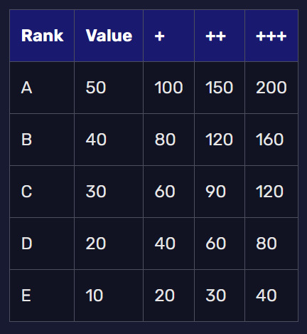
theres two ways to do this:
make the numbers exact (like you pick Rank D for Strength in character creation so the stat starts at 20) and the number is used for dice (either roll a die under your stat number or add the stat number to the roll, whatever)
make the numbers relative to rank (like spend 20 points for Strength in character creation so the stat is Rank D) and the rank itself determines the die target/bonus (like Rank A = +5 to the roll)
either works, tho that still doesnt decide the dice and numbers you use. i lean more towards the 2nd option (cuz otherwise ranks are useless) with a d100 cuz big number is fun. in terms of "target to roll under" or "add this to your die" i lean towards target. so with d100 the Ranks would be something like:
E = roll 35 or under
D = roll 45 or under
C = roll 55 or under
B = roll 65 or under
A = roll 75 or under
EX = roll 85 or under
and the stuff like A+ or C++ would either be from skills (you can buy in character creation) or experience (spend 20 points to make a D Rank stat a D+ Rank stat). in terms of dice rolls, giving a + to a rank would probably bump up the number by 5. so like B++ would have a target of 60 or under. these numbers arent solid or anything, im just drawing in the sand.
for character creation, i like the idea of giving you points to buy for stats and using the Ranks table for the costs; Magi would have 150 points and Servants would have 300 points to spend, and so you would spend, for example, 30 points to make a stat like Endurance Rank C. you use any leftover points for class/personal skills etc. which would be pretty nebulous and/or personal since thats how theyre treated in the series. i drew up a massive list of some and it was a waste of time, so many of them overlapped it wasnt funny stop laughing
when making Servants, class is obviously important. this table could either work as either a template you could apply during character creation or just a suggestion for a starting point.
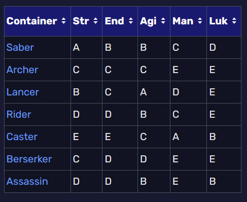
trying to figure out magic is too much of a pain in the ass since theres like a million different types and they kinda do whatever the writer wants in the moment. so my judgement call is to just say fuck it, pick a particular type of magic you wanna focus on and let your magic stat determine how good you are at it. go crazzy.
and finally, even though this system isnt exactly finished or real, i made a character sheet because i clearly have too much time on my hands and have underlying problems i could be solving instead
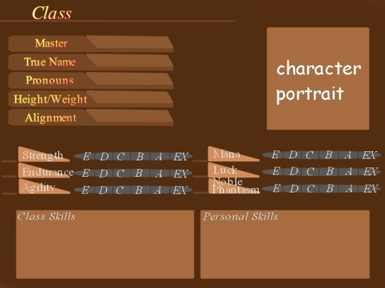
hope its interesting. you have my permission to play this if you think its worth it, feel free to change things around to better fit what you want out of it. ok now paypal me $30 you asshole
1 note
·
View note
Text


ignore the first posts caption thats not what this is about anymore. i hate time loops actually. some ocs designed to ask the question on everybodys mind: how many days could you spend trapped in a car with a dashcon attendee before you started trying to open the door on the highway.
fake blurb + long vomit of my thought process regarding them below.
Lizi (LastName) is probably the world's biggest fan of the YouTube duo (IDK), and now that she's finally got her driver's license, she's ready to undertake what may be the most important task of her entire life: proving once and for all that they're a couple. While attempting a solo drive from New Mexico to a convention they're paneling in California, she encounters Melanie (LastName), the third child and youngest star of a massively successful family vlogging channel, accidentally left behind at a gas station while their family took the very same trip (or so they claim). Lizi promises to drive them to the convention, in exchange for use of their creator pass to get backstage and finally meet her idols. The plan is simple, the execution less so, where only the strongest of keyboard warriors can survive. And, ultimately, the drive leaves Lizi with a difficult question to answer: is RPF… fine?
who knows. none of this is real. theyre generally the same characters as they were in the first three pics (chronically online teen and 12yo whos really not into it) but the situation is much different. i tend to go 'characters/fun story element' first, 'plot' second, which um. isnt the best way to do that lol. so i was like i want to put characters in a time loop. and then drew them. and was like, great, but how do i put them in a time loop? i kind of figured itd being 'sneak backstage to some tv show or something, try to meddle,' but couldnt work anything more concrete. so i stopped thinking about them!
then maybe over a year or so at this point, i read an article abt kids who had grown up as part of those family vloggers/bloggers and how it affected their life. and then i thought abt the difference between that vs the emotional neglect of kids who kind of grew up with the internet as their parents. so i always meant to draw them in these new circumstances, but i wasnt quite sure what i wanted those circumstances, beyond their new backstories and the Meddling Kids conceit, to be.
and THEN, i was thinking abt ocs at work today when a bolt of inspiration struck: but like, what if this was actually about dan and phil the whole time. i watched them as a kid but wasnt like, big into them. but ive been watching more recently and have been kind of fascinated by the fan culture they built, both in their heyday and how its transformed into what it is now. like, the fake working title (on that very very rough poster draft) is blatantly stolen from an old dnp video title. and thus all the elements have combined. though let me be clear: ITS NOT ABOUT DAN AND PHIL. its about my fake ocs and parasociality and 12yos and their terrible babysitters and unrealistic roadtrips. .......but its also not... NOT about dan and phil.... make that the new tagline.
im not going to do anything big with them. but im glad to at least finally have figured out what to do with them, so i can draw them more. clearly i need to. bc what is up with what i did to lizis design this most recent attempt compared to her original (tbf cartoony) design. i realized as i was coloring she looked too much like me and i got scared so i gave her green hair.


some ocs designed to asked the question on everybodys mind: how many days could you spend trapped in a time loop with a genshin fan before you started scratching at the walls
#i was thinking about them all through the end of work. bc i was fake interviewing my ocs in my head and i was like.#but i only have three ocs! thats boring. what about those two. but i never figured out what i should-- OH HEY WAIT.#so here they are! sort of. literally none of this - particularly the names or the colors or lizis appearance - is set in stone.#i want to do fake blurbs for the other two stories/three ocs as well..... but theyre hardddddddddd#selk.art
17 notes
·
View notes
Note
Hi! I saw the Link and horses ask pop up on my recommended page and the way you drew the horse in that was glorious, I always have the hardest time drawing horses lol u got any tips? If u don't mind
oh this is gonna expose me as the former horse kid isnt it. the only reason i can draw them is because theyre all i wanted to draw for the first like 10 years of my life before i grew a brain. anyway let's get into it
the first thing you have to understand about the horse is that it is the worst animal ever designed. nothing about it makes sense and it sucks in every way possible. you are not going to have a good time drawing it because every horse in the world is made of spite and hates you specifically. ok now that we have that out of the way it's basically just a bunch of shapes lol
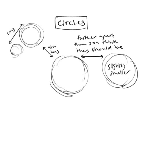
this is where you start. circles. the important thing to remember here is that everything is bigger and farther apart than you think it is. when in doubt google "horse" and measure against real horses because these things are so goddamn disproportionate that you're probably wrong no matter what

next is all the curves, which horses have a fucking lot of. the top of their nose is straight but that's basically it. the thing that makes a lot of drawn horses look wrong in this stage is the bottom belly curve imo, it's way more exaggerated than you think it is. (and fun fact, because horses are assholes, when you try to put a saddle on one of them it will fucking puff out that belly curve so the thing won't fit and you have to wait until it forgets that it has a saddle on to tighten it all the way. i hate horses)
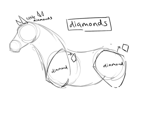
diamonds. like 90% of the joints on a horse are diamond shaped idk why just go with it. the ears are also diamonds that try to fool you into thinking they're triangles because all horses are full of spite and they want you to draw them wrong
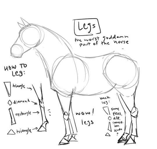
god this is a truly awful animal. the legs are always somehow both too short and too long and the only way to tell is to google what horses look like again, but different breeds of horse have different leg lengths and thicknesses so good fucking luck finding the right reference. anyway it's mostly triangles but they fit together in a really weird way. you just kinda have to draw it over and over to figure out what it looks like
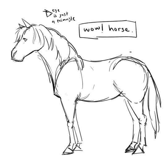
wow! horse.
my final words of wisdom now that you have drawn a horse is that if you want to put a rider on the horse take the rider that you have drawn that you think is proportional to the horse and shrink it by like 25%. horses are so much bigger than you think they are
congrats. you have drawn a horse. im sorry for your loss
#asks#thank god tumblr auto shortens posts now so i dont have to decide whether or not to subject you all to my horse hate liveblog
305 notes
·
View notes
Photo
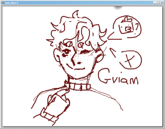
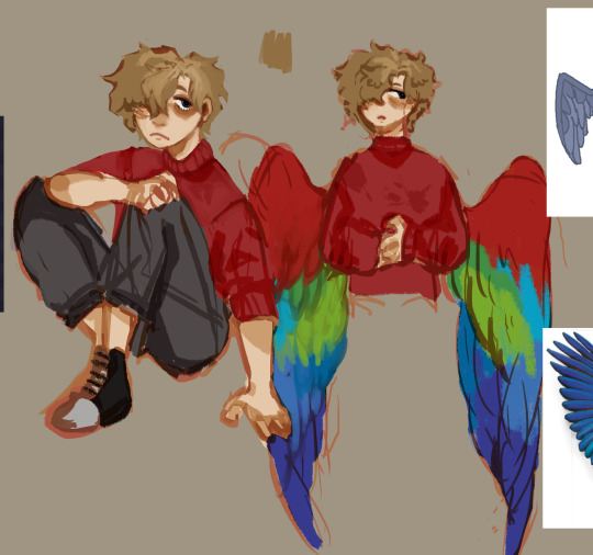
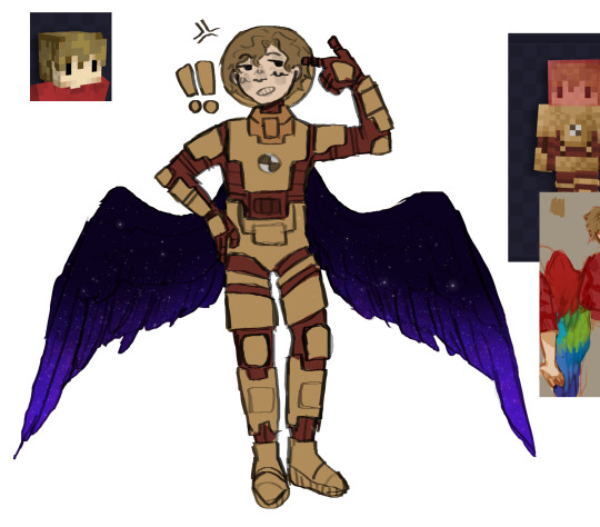


My grian designs from oldest (2019) to newest (2022) the 1st image is from 2019, its my only drawing of grian from that time. i then kinda took a 2 year break from drawing him haha, the next 2 images are from 2021 and the last pics are from this year. As you can see, he gets more bird-y and i think thats nice. kinda of a break down of the designs under vvvv
:readmore:
2019 - i basically drew his skin how most people drew him around that time, i wasnt super in to hermit at that time so i didnt bother making a better design. 2021 (1) - i finally got in to hermit craft again around season 8 where the moon was being silly, and that was the time where grian had the tired skin. I went with parrot wings since theyre majorly popular in the fandom. i gave him his usual clothes just more roughed up. he has a purple ring in his eyes to represent the witcher part, just mostly subtle.

2021 (2) - space grian ! never finished drawing like the previous one but there is a tiny change, the wings. It was then where to boatem crew landed in void/space/whatever. i like the idea of grians wings being able to shapeshift to whatever he needs (thanks to that one fic on ao3 about grian shifting his wings to diffrent species. if i find it again ill link it here), and since he’s a watcher in a way, i thought his wings would become more spacey with starts ! . this is pretty much for this one 2022 (1) - MAJOR upgrade from the last one. i made it around the break between season 8 and 9. I wanted to go for more avian/birdy side of him in this one, hence the 2 wings on his head. I decided to abond the parrot wings, mainly cause it just didnt fit the grian in my head. His wings are not really designed after a particular bird, i just made them look closer to his hair color (they also got silly eyes in them to once again refrence the watchers).
He has more feathers on his face/along his body, which most you cant see but trust me its there. His eyes still have the watcher ring color. His clothes changed too, i dumped the sneakers and his older pants. I gave him strong high calf shoes where he can tuck his pants legs in lawl. He has more bags/pockets stuff to carry his stuff inside (its like the inventory just with more logic to the real world.) there is feathers sticking out of his shoes for whatever reason. I was originally planning on giving him bird feet and claws but i didnt know how to draw it so i went with covering his hands with the sweater, and giving him normal legs. 2022 (2) - Ah yes, the actual bird-yfiction of grian. The clothes stayed pretty much the same, i just gave him a pair of glasses that were inspired by my good friends @he1ian grian design. I made him way shorter and this time went and gave him bird legs and “claws” (glorified long black nails lol). His hair has became longer, which he can now put in to a ponytail. He has trinkets from his friends on the bag (which i will draw more clearer one day), red scrape of fabric from mumbos tie and a moon charm from pearl. (there will be pins, one will have vote for mumbo, the other one will be the sarah pin and etc. mainly memories from past seasons and other stuff ^_^)
I deleted one pair of bags from his pants due to him now being shorter. If you compare his height to my scar design his head is somehwree under scars shoulder. OH YEAH he also has a tail now For whatever reason.

THE END ! if anyone read this thank you ur the best i hope you enjoyed my ramblings of a mad man.
#groza fanart#groza art#hermitcraft grian#grian#grian fanart#hermitcraft fanart#hc grian#hc grian fanart#groza rambles#character design#i like rambling about hermits#hermitcraft
70 notes
·
View notes
Text
mephistopheles love post
the equivalent of a mental breakdown tangent is all going under a read more
yes believe it or not that freaky ass literally not even human clown in fgo gets love, and love from who? me and like 3 other people
first off
ok and with that out of the way,

i’m not even familiar with their lore. Reason why i stopped caring about the lore behind faust and mephistopheles is that an interlude happens that shows that mephistopheles is just some homunculi made by some mage nobody named faust. and even then the interlude doesn’t talk about the lore behind the novel, its just you helping mephy kill faust
that being said though i would hope the developers expand on their origins more and potentially even release a “true” mephistopheles (a girl can dream)
So, they’re not even the real deal demon known as Mephistopheles in the first place, and i can hear u going “well that’s lame” and like, no, we just need to redirect our feelings from appreciating a demon to appreciating a homunculi who has a weird characterization in the fate universe

Design tangent:
Fgo was actually my first gacha, and so when I came across this servant I kinda instantly fell in love with their design, I love the colors used in their final ascension and overall appearance. The hat that has horns but they're not quite horns, theyre these weird colorful pointy twisty things, the large garish butterfly ornament on their chest (which isnt ugly at all and somehow works so well with their everything on them) is cool, the tights are so cool to look at, i mean look -- a checkered pattern with golden lining on the shorts portion, the tits out look like yes we get it youre insane, the gloves??? purple and also cool, plus theyve got this gradient thing going on? and the fingers have this line going through them, thats so cool. actually the only other servant that comes close to this in terms of “out there” colorful designs is probably final ascension kama and qsh ( i love them both). Also, mephy has this scissor weapon?? thats so cool lol i dont see any other servant wielding giant scissors (for the love of god give mephy an animation update i need to see them use the scissors while doing flips) and they also have this bomb obsession going on? cant relate, but the bombs designs are so so cool i mean its a fucking centipede -- no idea if centipedes are a thing in the original faust but thats something Ill have to look up at some point. ALSO mephy is wearing heels oh my god anytime people wear heels is an automatic win. No clue whats going on with the hair but its kinda cute (dont question me on that) and it has curls and the hair colors are cool i mean its like a lavender thing with darker purple highlights? i love colorful things and i love people with wacky personalities so. Oh my god their tail how could i forget that its so cute and dumb i almost forgot it was there, like what is that even a whip? i dont.. but its got these little purple tips to them that are kinda cute/cool but more cool because tails are fucking up there alongside heels in terms of cool stuff on characters. and of course their fluffly cape -- again no idea what the designers were going for i mean look its a mess of a design i have no fucking idea what any of it means and i hope they explain it someday because that hair and the butterfly and the tail and the hat and the fluffy garb and a bomb obsession?? and this got the go ahead - yeah lets add that to the game like what
ALSO LETS TALK ABOUT THEIR EYES
appreciate these with me for a second
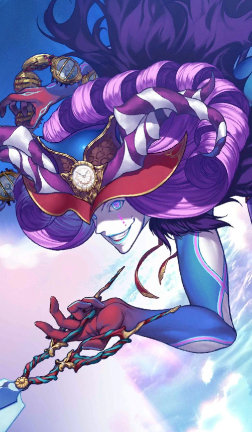
god.
oh and the blue lipstick and face paint god thats a cool design ugh

they can be normal too or at least as normal as possible i mean they even trimmed their eyebrow here lol but you can see the not so well hidden insanity/goofiness peaking through with the inside of the suit at the bottom being highlighter purple and a green shirt with gold accents underneath the black coat at the front <3, fuckin hate that hairstyle tho bro we gotta get that middle part hairstyle outta hereeeee--
TAKE A DETOUR AND LOOK AT THIS LINK THOUGH THIS IS THE MOST NORMAL AND BEST IVE SEEN THEM IN FANART. THE POTENTIAL IS THERE. WE CAN HAVE NICE THINGS AND THEY LOOK GREAT ITS POSSIBLE. I HAVE TEARS STREAMING DOWN MY FACE FROM THAT DRAWING.
anyways this is me going off all about why i like their design! but we haven’t even touched the nitty gritty of it all. their personality! what personality you may ask? havent they always been some weirdo laughing a lot and saying dumb shit all the time? well yes and no
Characterization:
True to their dumb little clown design mephy also acts like one.

Some servants bond 1 lines are like “fuck off” and some actually talk to you, nah this bastard mephistopheles’ just laughing. and for the second bond line it seems to imply theyre fuckin with you more (showing up and dissapearing and saying ‘afterimage’) so thats nice that theyre actually making some effort to mess with you in a way? some servants take a long time to actually interact with you so this shows theyre not afraid of interacting with you and thats just at bond 2. and of course the third bond line implies they were probably trying to betray you, its stated in more than 1 place that mephistopheles (actually isnt this a caster class thing?) will betray you or attempt to do so. So the third bond line seems to imply that their attempts have been stopped by you and that’s what they say after some failed attempts. So after stopping this freak from doing some shit their next bond line is actually doing a confession! a jester being honest who couldve seen that one coming but theyre 100% not lying, they really arent a demon but a homunculi made by faust
speaking of faust we’re going to backtrack a little into their interlude that i brought up at the start of this post, its one of those dream interludes and it starts with mephy asking you to help him plant bombs for their eventual reuinion/showdown with faust -- in the meantime faust keeps sending golems in an attempt to kill both you and mephy

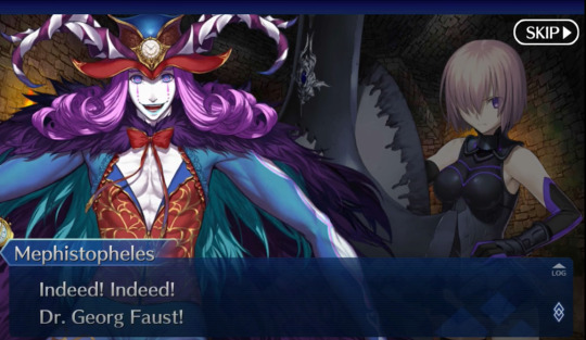


When you track faust down, it’s shown that faust was your typical mage, inhumane and uncaring. It’s also pointed out that this faust killed innocents, but this typical mage behavior is boring to mephy, and they say that boring typical behavior is why they wanted to kill them
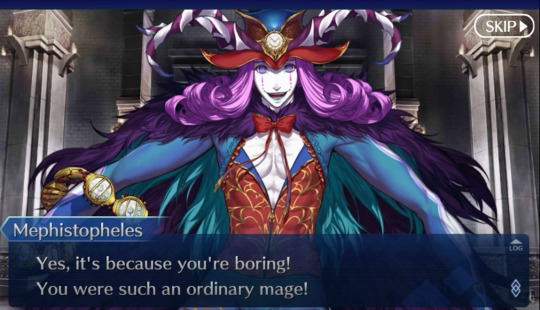
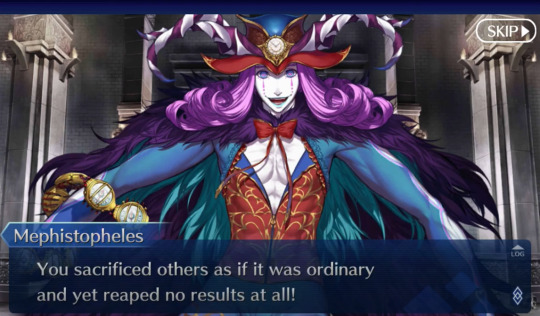
so i really cant blame mephistopheles for being the way they are, being raised by this type of guy, even if mephy was always messed up and wacky from the beginning its no reason for faust to attempt to kill him.
Mephistopheles also shows up in salem, cu alter’s interlude, and of course the knk crossover event, and some other things im most likely forgetting but those 3 are ones that i find notable
anytime they show up theyre actually helpful, in salem mephy points out that the nature of the being responsible for the salem epic of remnant is something alien rather than a typical foreign god, mephy also tells you that time is also being sped up and in their weird way they try to cheer you up by spouting some nonsense at the beginning (guda needed some kind of distraction from the grim events that had just transpired at that point in the story), i cant quite remember what mephy did in the knk event but they were a part of your group and were helpful the whole time, actually @/zeravmeta does an amazing analysis of their role in the knk event as well as some extra character analysis here
mephistopheles is kinda cryptic in a weird way though,
like overall i mean theyre a jester homunculi in appearance so yeah its to be expected but come on i love morally gray characters, despite their supposed betrayal hints scattered around here and there

they have this one line that always gets to me

and this line is said with a completely serious face too
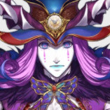
the rare serious mephistopheles face! its kinda grim to see that line, no laughs, no nothing, their voice is kinda serious and monotone too. of course this could be just to get you to lower your guard but its still kinda out there that they have this rarely used portrait and that line, so i like to take it as being said to you when youre by yourself and with sincerity
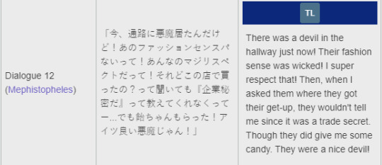
and at least sei (with her wacky outfit and all lol) seems to get along with mephy and thinks theyre nice woohoo
so at the end of the day you have this guy that laughs a lot and gives mixed signals

and they fuck with you

and will most likely try to kill you more than once but hey thats just another tuesday at chaldea
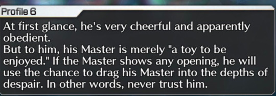
Before I finish last thing I want to point out is this snippet from the fgo source material book which provides more information on servants, and this specific translated bit under mephistopheles
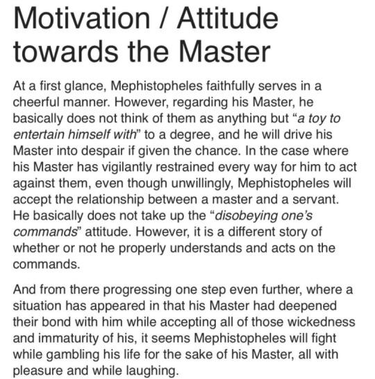
at the core of it all this homunculi....can be your friend! you just need to not go into despair i guess
of course this entire post is an overanalysis into an underwritten character, quarantine + all online college classes have done this to me, i have a douman icon what did you expect
OH...BEFORE I REALLY SIGN OFF AND FINISH THE POST HEY CLOWN LOVERS CHECK OUT THESE FANARTS AND FANARTISTS...
THE FIRST ONE IS HASENDOW YES THE DOUMAN DESIGNER... <3
i cant believe they drew mephy
twice !
and for those of you on twitter check out @cuz_pb and @L0VEYAMA003
#mephistopheles#fgo#i just go off on the various things i like about this clown#a whole lot lol#this started bc someone asked about my thoughts on mephistopheles well..
63 notes
·
View notes
Text
WAIT DESIGN NOTES I FORGOT ilove writing my thoughts on designs. okay okay iummm.
terus required more thought from me cause ritsu is just Ritsu. he looks like that every time i draw him.
after shige ripped his earring out of his right ear he swaps ears because the other ears. um. squish part what is thatcalled. its like GONE like it got completely fuckint ripped out. same thing with him being BALDED as the last time i drew this design 4 him. the wig is still there actually but his roots poke out from his Real hair so u can tell which part isth wig and whichp art isnt. hes alittle bald leave him alone . ALSO IHOPE THIS IS NOTICABLE BUT his eyes get like. not bigger but Wider post-canon. like he's finally opened them & can see past what he WANTED to see. like my design for him pre-confession gives him very squuuuuuinty looking eyes because. again. he only sees what he wants 2 see. rose tinted lenses. does that make sense?
okay ritsu. hes Ritsu. little brother shape i dont know what else to say really hes just . He Is Ritsu. i like 2 make him rounder to tie into the Looks exactly like if shigeo had scruffy hair. hes got much more angled eyes that dilate like a cat's.. & i really wanted to give him dimples post-cleanup arc because. you know. ekubo possesses him alot during this time. dimple. dimples. you know. i thought itd be cool. but i decided against it cause dimples r terus thang for my designs. but i still gave possessed ritsu a minute 2 shine . i havent drawn a possessed character in a hot minute so as a little refresher; i hc that anyone ekubo posesses takes on a MUCH more vibrant quality. cheeks flush, hair brightens, they have a slight outline to them -- they basically don't look REAL. like, the outline under-lashes wouldn't be on a real person because THATS NOT PHYSICALLY POSSIBLE? but again its because theres a spirit in there. but it's more noticable to other espers, to nonespers they just look like theyre kinda feverish . i forgot to give him teefers in this but w/e. in my heart. i rllt like ddrawing ekubo possessions its coo its coo. i need 2 draw possessed reigen one da.y


my wonderful little brother :)) and some random blonde kid
250 notes
·
View notes
Text
its a shame bc i was around when mcytblr was first like forming but ysee i think the first majorr mcyt fandom on tumblr was hermitcraft and yknow thats the only mcyt series i care about and it all started as fun and games. people drew fanart, and then it was like oh x person has an association with y minecraft animal so im gonna draw their elytra like that or whatever and it was just harmless things like that and then over time it just slowly morphed into “heres my actual individual design for this CHARACTER” and then “heres my FIC for this CHARACTER” and even then, the fics started out harmlessly, i was a bit weirded out but i mean they were literally just like “what if these people had superpowers in game!! woo” so like ok whatever ! harmless BUT THEN THEY .... idk they started getting WEIRD . like full blown ANGST and stuff like writing these people - no, not people, their “characters” now - having full blown panic attacks and shit like HEAOHDAJHDSK and then and thennnn... the shipping started . and THAT was the final straw for a lot of people and then the fandom started getting real toxic because people were like “theyre real fucking people stop shipping them” and the shippers were, well u can guess. and by january 2020 the fandom kinda just died out because it was torn asunder by all the shipping discourse and now hermitblr is kinda a shadow of its former self and even the decent content made nowadays is still just fucking ... rpf instead of just “here im drawing normal fanart!” and laughing over their Minecraft Youtube Shenanigans
so i mean now with the rise of dsmp and seeing like normal people react to how mcytblr is its like lmfao. ive seen it all before with hermitcraft it just makes me so sad, dsmp fandom just happens to be like 50x more popular than the hermitcraft fandom ever was. and also seeing all the old hermit blogs i follow turn into dsmp blogs and start engaging more in that Troubling Content its like. its so sad LMFAO
#I LITERALLY JUST WANT TO HAVE A GIGGLE OVER PPL PLAYING MINECRAFT#ive said it before on my mc blog but truly#hermitblr was best during september 2018 when it was literally only like five FUCKING people#and it was just clips of the yt videos and jokes#brot posts#bro the weird ass fanfics ive seen#CAN I CALL THEM OUT BY NAME SINCE IM NOT ON MY MC BLOG OR .#LIKE IDK IVE SPENT YEARS SEEING THIS SHIT GO DOWNHILL#and now seeing normal ppl react to it its like. oh yeah. that is actually weird as fuck#like i knew it was weird but after years im just tired and desensitized LOL#i think thats why the dsmp fandom is truly so so exhausting for me to think about#like it literally does not have to be this way <3
4 notes
·
View notes
Text
I saw Onward last week with my friend who is an avid LARPer and fellow lover of all things fantasy, so it was a perfect movie for the two of us. in general I adored it! I’ll probably see it again if i have the time and of course, i’m getting it on BluRay. i would also LOVE to snag the art book since the character design for this film was probably my favorite part.
[some spoilers]
my biggest complaint (and its not a complaint, just a negative i guess) is that Onward didnt feel like a Pixar movie to me, both in the story and animation. the animation style wasnt as interesting as some of the Pixar movies in the past (though thats been kinda up or down for a while), and it didnt feel as fresh or mind-blowing. to me it fit in better with the regular Disney animated features, not Pixar. Especially in comparison to Toy Story 4, albeit theyre very different styles, something about it didn’t pop for me like most Pixar movies do. The story was a little bland with Pixar in mind, though i did love it! i just always think of Pixar as the studio that gives stories and feelings to things we usually don’t expect. And Onward i guess was so similar to real life that it didn’t feel that way. Maybe if they had pushed the fantasy-realism even more, or changed some modern things to fit with these creatures more (they did do this but i think they didn’t push it far enough), that would have sold me.
and i’m not gonna talk about it at length, but the whole “Disney making a big deal about their ‘first’ LGBT character and acting so high and mighty about it” did dull the magic for me. considering the police officer was in two scenes, plus she didn’t have ANY characterization beyond being a cop and having a gf with a kid, it really did not live up to Disney’s hype. i’m not saying she wasn’t “gay enough” or whatever, but had they not brought it up beforehand or made any “hype” about her, i would have liked her a lot more. To compare this to Paranorman (not everyone agrees its good rep) Mitch being gay wasn’t something for LAIKA to brag about. Had Disney followed suit, their “first” gay character wouldn’t have become a meme.
Okay, so for the good stuff, I am a huge sucker for sibling bonding and especially HEALING in fiction. it gets to me more between sisters, but still. Ian and Barley like each other and get along well, but they still have their problems and doubts. The fact that they grew into their own and with each other is beautiful, especially the fact that Ian now sees Barley as a father figure AND a brother. That is an element i haven’t seen before, let alone done this well. I also really appreciated the tension between them in that Ian thought Barley was a screw up, that he thought less than great about his actions and choices. This sort of thing isn’t explored in media enough, and I’d love to see more. I believe most people don’t consider that our siblings’ opinions do matter to us as much as our parents’.
Again, I LOVE the character designs in this film. Everyone looks unique and distinct while still having key traits for each species. I love these designs way more that those in Monsters U, which felt kinda cut-and-paste with the monsters. I loved how you could tell that even within the elves they were still different races (or at least coded) with hair, facial features, and skin tone, all the while still blue! They did this with other creatures too, like how Corey is black while also being a Manticore bcs of her hair texture (and of course the incredible voice of Octavia Spencer). And you know what diversity Disney added and made not a peep about? One of Ian’s school friends walks with crutches! I can’t say what his affliction is, but its wonderful to see some inclusion to disabled folks.
My favorite characters were Barley and Corey. Barley was just so incredibly well rounded, like he was perfectly imperfect. I could go on and on honestly. Corey on the other hand was just plain AWESOME! Her little personality crisis felt kind of rushed to me, but to me it fit as an allegory for the whole film; she is a magical and powerful creature who let herself become weighed down by modern society and lost her moxie. I also love that Corey and the boy’s mom, Laurel, became friends (but i wouldve died to see them as a couple). I really want to know more about Manticores in this universe, since she seemed like the only one, and also might be immortal?
What initially drew me to this movie was seeing a centaur character in the original trailer, as trivial as that sounds its true. I love centaurs so much, and they hold a special place in my life for many reasons. I was a bit dissapointed in that there was only two centaurs prominently shown in Onward; Colt and the gal playing DDR (which was adorable). In the trailer there was one more, but not in the film. I did really like Colt, and he’s growing on me more. But one thing that has not left my mind is why to the centaurs and satyrs not wear pants?! everyone else does!! its probably bcs Pixar wanted the audience to clearly read them as centaurs/satyrs so pants would cover their cool legs, but still.... Do they just have a different level of decency than others? I have to know. But I love that the centaurs have horse ears instead of human ones <3
Lastly, and this isn’t good or bad, but I just didn’t resonate with Ian and Barley bringing back their dad. I mean, it was very emotional and a great drive to the story, but since I still have my parents I guess I just couldn’t connect to it. I liked how they were able to characterize the boy’s dad with just legs, that was adorable and a huge feat for animation!
Some little things I want to mention: the final boss dragon was SO COOL, it reminded me of the giant Ralph at the end of Ralph Breaks the Internet how it was made out of pieces, Ian was accurately scared to drive for the first time and i FELT THAT, Barley went the entire movie with a broken arm/wrist and took every swing like a champ! that boy is so chaotic i love him. ALSO it was so cool how Ian and Barley had each bits and pieces of their parents looks! like Ian had his dad’s face and body but his mom’s eyes, etc. Love that choice family design
All in all, a dazzling and wonderful movie with great characters and a cool story/theme, just not what I would expect from Pixar.
8 notes
·
View notes
Text
CYBERVERSE WATCH: S3 Episode 17, 18, 19, 20
Episode 17
Oh nooo Windblade u good??? LASERBEAK AND WINDBLADE OMG!!!
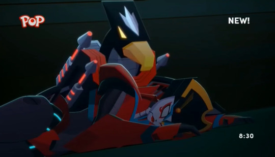
Beaky please don’t peck my girl (that is kinda cute though)
Windblade she isn’t a pest!!!
Laserbeak watches her fly off like “I get no respect and no thanks???”
HECK YEAH GET THEM FLIERS!!! Jetfire please be careful bud, Starscream has some old beef with you
OH NO ALL THE ALTERNATE UNIVERSE SOUNDWAVES
The only downside to knowing all these characters and getting excited about cameos is it’s that many times more likely that a character I like will die 8(
YEAHH WAY TO GO LASERBEAK you’re the real MVP
JEEZ HE GOT OPTIMUS RIGHT IN THE CHEST
HEY CAN SOMEONE PLEASE SAVE OPTIMUS
OH SHOOT WHO IS THAT
OH FRICK OH FRICK ITS MEGATRON!!! HELL YEAH
Megatron, a million universes away: My “Optimus is in trouble” and “Starscream is being a menace” senses are tingling, gotta go back to Cybertron
FRICK that was a cool entrance
Oh man what happened to his eye--HOLY FRICK HE LOOKS HOT
AYYYYYY ITS THE OG BLACK HELMET MEGATRON LOOK AHHHHHHHHHHHHHH
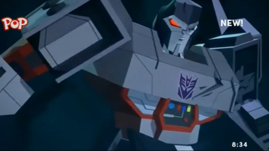
MAN I FRICKIN LOVE MEGATRON
KUP NOW ISN”T THE TIME FOR YOUR COMMENTARY (that was cute though)
Oh my gosh when Starscream started to say “You’re too late to save your--” for one very frightful minute I thought he was going to say something about Optimus like “partner” or something and I felt every muscle in my body tense up lmao, I should���ve known better but RATS
WHAT
WHAT THE FRICK THAT WAS SO FRICKIN COOL
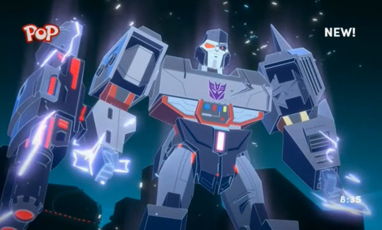
IS THERE ANYTHING HOTTER THAN WAKING UP TO SEE YOUR OLD FLAME STANDING OVER YOU GLOWING LIKE A VENGEFUL ANGEL ABOUT TO KICK STARSCREAM’S BUTT
POWERS OF CYBERTRON UNITE??!?!?!?!?
EVEN OPTIMUS GOT SOME
BOYFRIENDS PUNCHING STARSCREAM’S ARMY OF QUINTESSONS TOGETHER!!!! SHADOWSTRIKER!!! BEE AND SOUNDWAVE!!!! GOSH THIS IS SO GOOD
WRECK THEIR SHOP SOUNDWAVE!!!!!!!!!!!!!!
Starscream you’ve sentenced them like five thousand times what’s new about this OH RIGHT I FORGOT ABOUT THAT GLOB STUFF
ASTROTRAIN!?!?!?!?
Starscream: NO ONE CAN STOP ME *CUTS TO WINDBLADE* wanna bet nerd
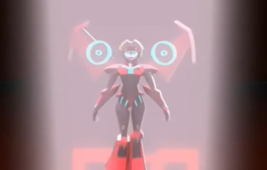
I LOVE my beautiful girl
Oh that is some nasty looking Quintesson tech
Uh oh u good Windblade???
Croaton can you please slap Starscream out of the sky before you leave it’d save us a lot of time
Aw man I wonder what Megatron saw that made him sorta regret the stuff with Starsc
WH
HE”S BARING HIS SPARK!?!?!? WAIT IS THAT ANOTHER MATRIX
ARE THEY GONNA FUSE????
MEGATRON PRIME
GOSH I REALLY THOUGHT THEY WERE GOING TO FRICKIN SPARK FUSE THERE FOR A SECOND
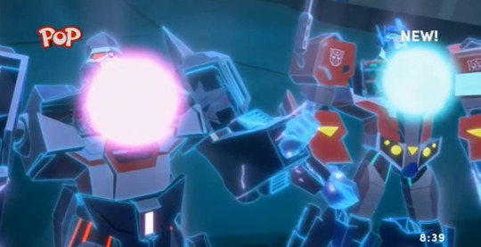
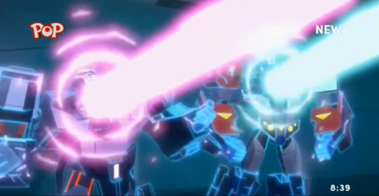
*CUE “THE POWER OF LOVE” AT FULL VOLUME*
Ok but what the heck did Astrotrain do???
If you get along with someone you don’t like the universe probably won’t end pfft, thanks Kup
CREEPY BUGS???
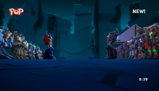
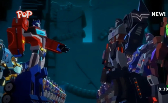
Megatron please take his hand :(((
IM LOSING IT MEGATRON REALLY IS A HUGE KID *takes out a piece of chalk and draws a line between them* this is MY side of Cybertron, this is yours
guess galavanting through space didn’t change him TOO much
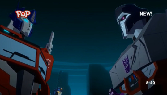
Guhhh these opposing sides shots always break my heart I WISH THEY COULD OVERCOME THEIR DIFFERENCES AND BE FRIENDS AGAIN SOMEHOW....
Dang Astrotrain is HUGE compared to the rest of the bots, I wonder what he looks like in bot mode
SO MUCH HAPPENED IN THAT EPISODE (and I had to take a break in the middle of it) I FORGOT I STILL HAD THREE LEFT thank the stars
I genuinely can't believe Megatron essentially drew a line between him and Optimus and went "This side of Cybertron is MINE, the other side is yours"
*cue shenanigans of Autobot and Decepticon buddies trying to secretly cross the line to visit their friends in the other faction*
gosh fanfic always depicts Megatron and Optimus sneaking around meeting each other for smoochies I'd LOVE to see their subordinates being the ones doing the sneaking around while Megatron and Optimus are just like "GUYS....". Fingers crossed for the next episode!
Episode 18
CYBERTRON LOOKS SO PRETTY....
oh my gosh they actually built a wall
WAIT DID CLOBBER SERIOUSLY SWITCH SIDES OMG SHES AN AUTOBOT NOW
WHAT BEE CAN FLY!?!?!? WHAT!!!
LMAO LOCKDOWN NICE BOARDER PATROLLING
Well it took all of 30 seconds to confirm my theory lmao man I frickin love this show
Man I can’t believe how quickly they beat the Quintessons, I REALLY THOUGHT THE AUTOBOTS AND DECEPTICONS UNITING AGAINST THEM WOULD BE THE BIG SEASON FINALE I’m thrown for a loop now lol
ew those colors remind me of Sentinel Prime I hope that’s not him
OH WAIT IS THAT IACONUS MY BAD
PRIMA???? OH?????
Grand Imperium?????
Omg did Rack’nRuin switch sides too? I thought they were Decepticons
JETFIRE COME ON BUD OPTIMUS IS TRYING TO HAVE HIS MOMENT
Croaton city!!!
LMAO SKYBITE’S SHARING HIS POETRY....CUTE...
But where is Soundwave!!!!!
I’m with you Bee, those insects are creepy
WOW ASTROTRAIN IS HUGE
“And WHO rescued you from that tyrant” OH??? ANOTHER UNIVERSE’S MEGATRON MAYHAPS???
“I must know if the barrier holds!” OH!!!! Oh no is the final battle gonna be against all the other universe’s people who Megatron burned as he gallivanted through the multiverse??? I SURE HOPE SO
Gosh not to be predictable but that new armor looks so frickin good on Megatron
OPTIMUS IS SO STRONG
POOR OPTIMUS....
“During wartime, decision-making came so easily” MAN....THAT HURTS.....
oh he’s looking for Windblade!!!
AW SHADOW STRIKER C’MON, I THOUGHT YOU GUYS WERE BUDS NOW
“I know better than ANYONE what it’s like to be left broken on the battlefield. I did what I could” MY HEART JUST SWELLED THREE SIZES FOR SHADOW STRIKER....I LOVE HER....(ALSO THAT HURT)
Bee it REALLY seems like you should’ve had a plan / backup team for this!!!
BEE YOU’RE GONNA RESTART THE WAR!!
RODIMUS!!! YOU’RE BACK TO YOUR RED FLAME SELF!!!
WHIRL!!! OMG MY BABY
Wow that wall does a crummy job of keeping out fliers
SOMEONE PLEASE CATCH WINDBLADE
Thank you Whirl
OH JEEZ HERE COMES MEGATRON
SKYWARP!!! (I say while being super scared for my faves)
Whoa Megatron actually backed down
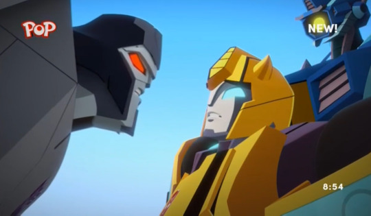
Nice
CHROMIA!!!! SAVE HER PLEASE
Episode 19
Ohhh are we gonna get to see Caminus??????
BEAST MACHINES?????
omg they’re gonna have to collect Windblade’s mind like they collected Bee’s memories
Chromia that doesn’t sound too convincing (you’re super cute though so I forgive you)
MORE BIRDIES!!!
A CYBER HORSE????
IT”S A JET!?!??!
OH MY GOSH OH MY GOSH OH MY GOSH IT”S CRYSTAL CITY!!!!!!
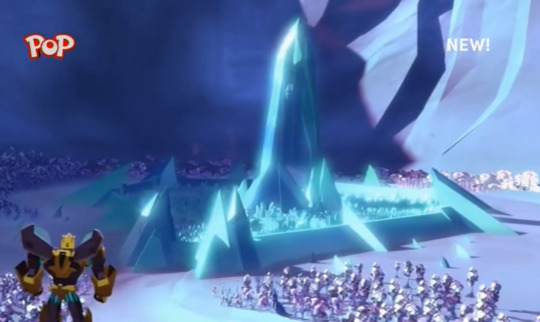
AGAIN, I WANNA SHAKE HANDS WITH EVERY BACKGROUND DESIGNER WHO WORKED ON THIS SHOW
OHHH mirror selves!!! Scary but pretty!!
OH MY GOSH!!! IS THAT RAVAGE!?!?!?!?
PLEASE LET ME SEE MY LITTLE BOY!!!!! AHHHHHHHHHH
AHHHHHHHHHHHHHHHHHHH!!!!!!!!!!!!! PLEASE BE RAVAGE
HOLY FRICK THAT LOOKED AWESOME??? KNIGHT??? A REALLY COOL KNIGHT???? WHO ARE YOU
Thunderhow??
My first thought was “Someone got their Warriors Cat oc into Transformers” and that cracked me up
KNIGHT OF THE PRIMES???
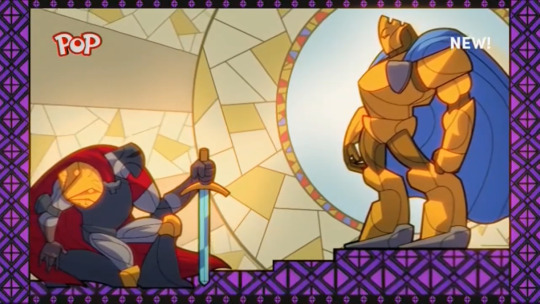
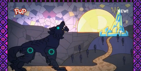
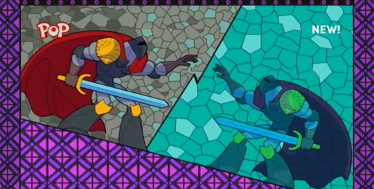
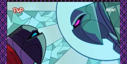
THIS STAINED-GLASS STYLE ANIMATION IS GORGEOUS
I like this dude but something tells me they’re gonna have to fight / kill him later
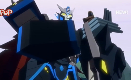
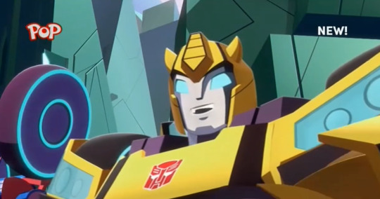
Bee’s smile is so cute!!
lmao nice lore-speak Chromia
They should just blast through the walls of the maze
“That sounds like a nightmare” “Scrap that!” THEYRE SO CUTE omg way to break the rules you two
CRYSTAL WINDBLADE!!!!
oh shoot many crystal windblades
I love the little “tink tink tink” sounds her feet make
Just her arm???? Jeez louise are the rest of the episodes gonna be about collecting Windblade?
Oh it’s Thunderhound
Optimus is just like “PLEASE leave me alone”
Petition for Optimus Prime to just get a frickin vacation
Episode 20
Man I’m so sad this series is almost over
Everyone in Mac’s bar without Mac..... :( Cute to see Percy as the bartender though
IS...IS THAT WHEELJACK?
OMG WAIT THAT”S THE COSMIC RUST WHEELJACK BACK FROM LIKE EP 2 or 3 IN SEASON 1????
“The Past” I FRICKIN KNEW WE’D SEE YOU AGAIN!!! IT WAS TOO WEIRD HAVING HIM WANDER AROUND IN AN EPISODE WITH NO EXPLANATION LIKE THAT
COWBOY WHEELJACK IS SO GOOD
Man Cyberverse is so frickin weird, I love this cartoon
Oh there’s my boy Soundwave
JEEZ THIS DUDE’S GOT NO FEAR
Megatron looks so cute...
“This is Autobot territory! You can’t--oh guess you can” pfft
I can’t believe Transformers is a western now
Optimus is the sheriff around these parts lol
Aw man Optimus JUST put that thing in there
OPTIMUS IS SO STRONG....I LOVE MY BUFF BOY
WILDWHEEL? Oh my bad, guess that’s not Wheeljack
“No one ever tried to find me” :(((( I wonder how many other bots felt that way
“I was one of the good guys! But you left me on that planet!” OW....
Pretty terrible shot Wild Wheel
OH NO....Innocent civilian got hurt, now Optimus is serious
Wild Wheel Optimus has been through a WAR your cowboy training aint gonna cut it
WELL THAT WAS A. WEIRD EPISODE. ALRIGHTY THEN I can’t wait to see how Wild Wheel is going to pop up in future episodes
Me: haha evil cowboy robot Wild Wheel: I felt abandoned because no one searched for me and I was forced to do horrible things in order to find my way home Me, tears streaming down my face: Haha....cowboy robot
8 notes
·
View notes
Text
heres the art i promised to post a while ago. its under a readmore bc i'm going to have a picture and then commentary underneath it. mr. selkie first and then my ultra ocs
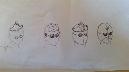
ok this was the earliest set of sketches for mr. selkie. i say this bc theres technically one earlier sketch for him in my sock drawer tjat was even worse so you will be forever left wondering. anyways for this set, i drew left to right so you will see my thought process to combine the crown and seashell. i originally thought he was wearing sunglasses like those shitty aviator ones. the last one was a unicorn bc for a moment i thought selkie meant narwhal. still, i'm very proud of that horn even if it wont make it to the final design.
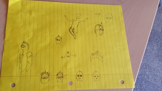
heres the next page of sketches. just to get a feel for mr selkie's proportions i sketched patrice on the back of this piece of paper and he doesn't look too bad.
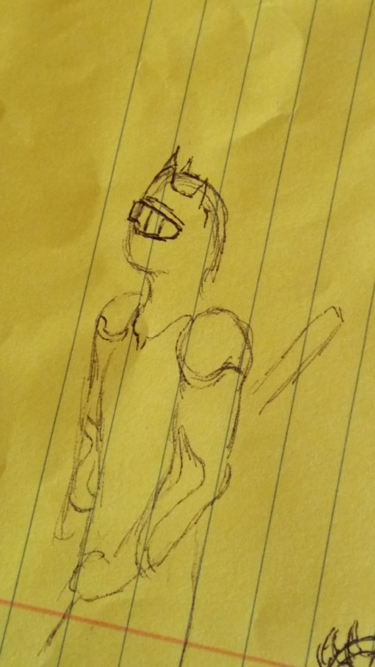
i like this one bc he has chest and shoulder armor that looks good, along with some accents which complement his figure. i also decided to try a different design for his glasses(?) sorta thigy, almost like a hockey mask with the lines. but at least its better than the cursed sketches i did near the bottom.
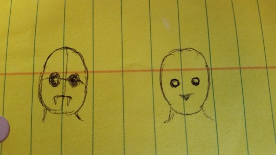
these are the cursed sketches near the bottom btw. the one on the left was based on a walrus and the one on the right was based on a seal. maybe if i go the evil döppelganger route for one arc i will use them again.
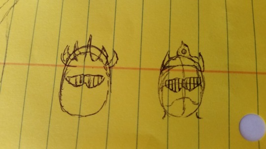
these are the two beside them, when i was trying to get a feel for possible crown designs and how the lines on the glasses should work. the one on the left is a blatant kuuga ripoff
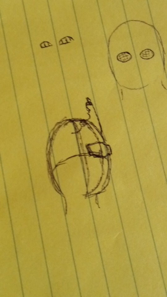
this is where i perfected the side-profile of the glasses, and tried to add the crown which i practiced twice below.
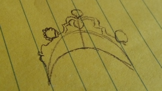
this was the first crown design i tried, and looked up the selke cup to steal some of the fancy whoops and shells from it. i was like "oh a selke crown gotta base it off the real thing" and this was my first draft.
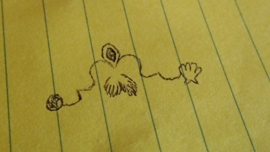
this one's the more refined version, though i didnt add as much detail as i could have. i was torn between having seashells on the end and round jewels, so i put one on each side to see what looked better.
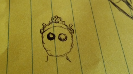
heres it, but tiny and on a really-fucked up seal eyes design. stare into his soulless eyes, they will take you to the abyss.
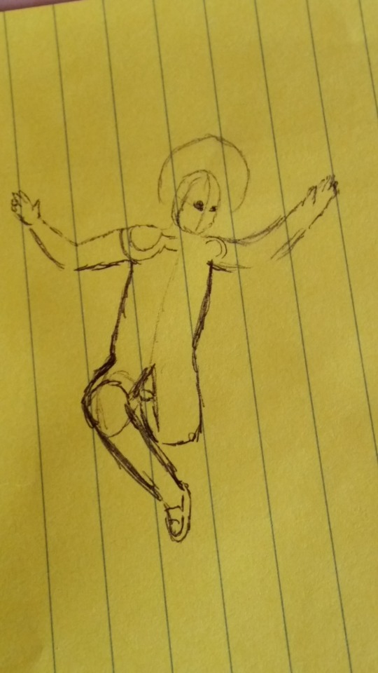
last for this side of the page i decided to try some renaissance painting like sketch but i havent seen enough of them so its Like This. the circle is a halo bc it was meant to be like a renaissance painting.
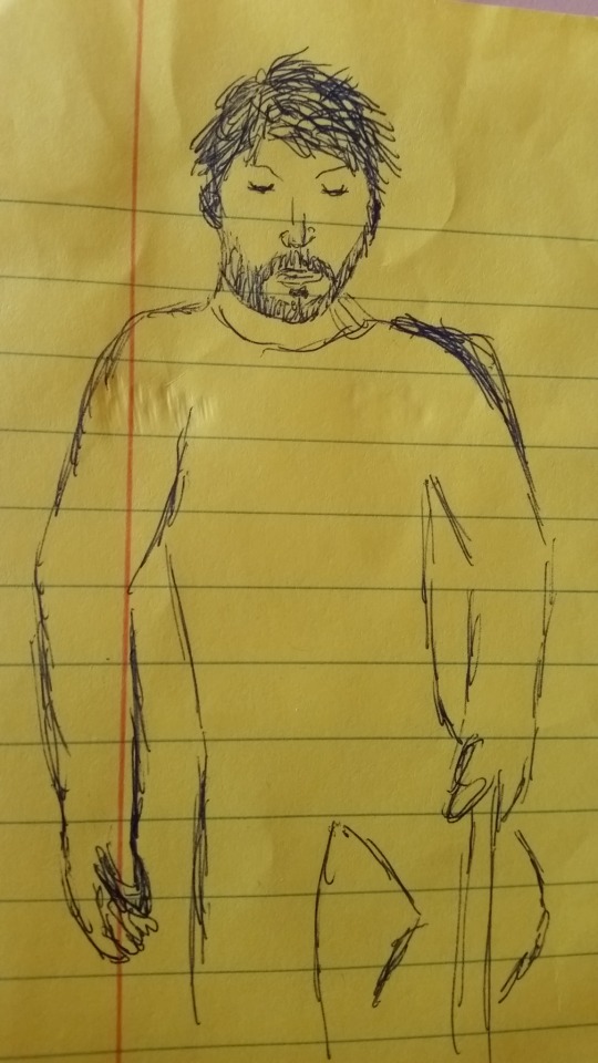
bonus sketch on the back based on a pic i looked up to base this on. despite his okay proportions here i didnt always manage to replicate them on the reverse of the page.
okay, thats it for mr. selkie designs. on to the ultras!
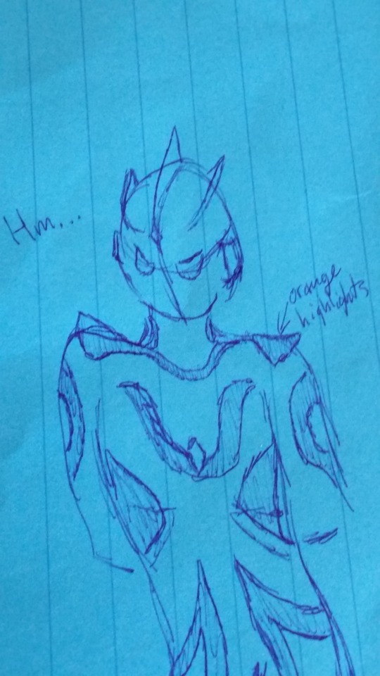
this one was my first one, and the eyes Miiiiiight have been based a lil on Venom... the body (save for the diamond on this ultras chest) is black, but the shaded parts are orange. this one is the only one i thought up a color scheme for. the ultras sketches were bc i opened up a google doc called "rejected ultra ideas" which is where i listed out all the concepts for ultra characters which i thought would be immediately shut down in tsupro's board room. anyways, i used to have an "orange ultra" on there but since ultrawoman grigio is now canon i had to change that. so then i decided to sketch this ultra based on a monarch butterfly. for the rest of them, i used random number generator to get the prompts which inspired these.
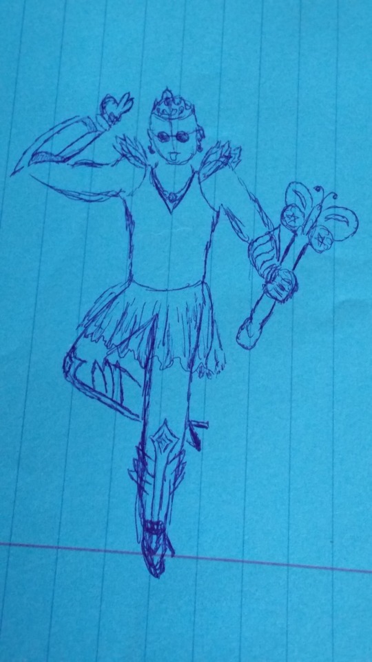
next from my rejected ultra ideas doc was "ultra whose power comes from their shoulder pads" except i decided to draw an ultra whose a magical girl instead. what gorgeous shin armor! i dont know how to draw fancy clothes so you will just have to suffer with me on this
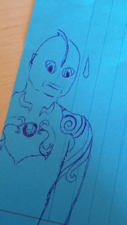
lastly, here is "ultra with anime eyes. theyre a regular ultra, but with anime eyes." this one doesn't have sluggers so they look kinda plain. i didn't know what to do for this ultra's accents or shoulder armor so i just made stuff up. i like to think this ultra tries to keep a deadpan expression.
2 notes
·
View notes
Note
Imma just need you to answer every one of those OC questions. I thirst for more information.
STOP this is so sweet omg…ive answered some already but ill definitely answer the ones i havent for u!
this is super long by the way so for yalls sake im putting it under a cut lmao
1. Is there any OC of yours you could describe as a “sunshine”?
i think id definitely say amara and jeanne fit this description a lot. jeannes favorite color is even bright yellow, like the sun!
12. Name an OC that isn’t yours but who you like a lot
i LOVE @elliexer‘s ocs… like all of them. every single one. theyre amazing
14. Introduce an OC with a tragic backstory
ill talk abt dominiques! basically, in my story she becomes queen at age 20 after her own parents (the previous monarchs) died tragically. she married her then-boyfriend, marius, and he became king. in their universe, the king and queen rule jointly, and one can override the others actions, etc etc.
she was really in love with him at first, and she did her best to be a just monarch, but power corrupts and marius, whose family were nobles always aching for more, became more and more evil the longer he ruled the kingdom. it got to the point that he was killing innocents based on his whims, like just because he felt like it. dominique had loved him, but after seeing what he became, she knew what she had to do, and had him assassinated.
on top of that, she had been sick for many years and was dying of her illness, she had no family left, and none of her children were interested in ascending the throne. she had to give her entire familys lineage away to her closest lady-in-waiting (actually annaliese) because of her husbands evil ways. and thats ALL JUST THE BACKSTORY… not even starting with what happened to her in-story lmao
15. Do you like to talk about your OCs with other people?
yes omg i fucken love it… i get worried when i do tho cause i feel like i talk too much lmao
16. Which one of your OCs would be the best at biology (school subject)?
annaliese definitely, and probably mathilde as well! also dolores because thats literally her job (shes a doctor)
18. Any OC crackships?
i think takako x aurelie would be cute!
19. Introduce an OC that means a lot to you (and explain why)
all of my ocs mean the world to me, but i gotta give special mention to annaliese and marianne! i first created them when i was figuring out my sexuality, and initially they were just the queen and her lady-in-waiting. around the time that i was starting to embrace my gayness, i made the switch from that to them having been good friends (but still the queen and her lady-in-waiting), and finally i changed it from that to them being joint rulers together and also married and in love. thats definitely the first time i began to accept that gayness was ok and good!
20. Do any of your OCs sing? If they sing, care to share more details (headcanon voice, what kind of songs they like etc)?
i like to think that all of my ocs sing! itd take so long to go into the details of it LMAO but i definitely imagine different voices and musical styles for each!
22. Is there any OC of yours people tend to mischaracterize? If yes, how?
not to my knowledge :o
23. Introduce OC that has changed from your first idea concerning what the character would be like?
most of them! i think, of all of my ocs, annaliese has changed the most. initially, she was supposed to be a cruel tyrant that, at the end of her story, was going to be deposed and possibly killed. she was also russian i think LMAO… and she had the throne by birthright
in the current story, annaliese is queen not by birthright, but by choice. in her story, she was initially a servant in the castle of the queen and king (dominique and marius), and worked her way up the ranks to being dominiques closest confidant. after a long time, dominique, who was dying, sent annaliese to kill the king, and, because the princesses were not interested in ruling, she was given the crown as payment.
while annaliese does still have a bit of that “iron-fist ruler” type thing, its not NEARLY as bad as it was, and shes certainly not a cruel tyrant anymore. shes also not russian now, shes french
24. If you could meet one OC of yours, who would it be and why?
i think i would meet elyse! shes cool and can do magic
25. The OC that resembles you the most (same hobby, height, shared like/dislike for something etc?)
amara for sure. the only real difference between me and her is that she has violet eyes, which i decidedly dont lmao
26. Have you ever had to change your OC’s design or something else about them against your will?
not to my knowledge!
27. Any OCs that were inspired by a certain song?
annaliese was inspired by dont mess with me by temposhark, and i DONT wanna hear ur judgment.
28. Your most dangerous OC?
probably elyse… shes a wild card!
29. Which one of your OCs would go investigate an abandoned house at night without telling anyone they’re going?
definitely jeanne, probably elyse30. Which one of your OCs would most likely have a secret stuffed animal collection?
jeanne, dolores, ophelie, and aurelie!
31. Pick one OC of yours and explain what their tumblr blog would be like (what they reblog, layout, anything really)
i think takako would have a really minimalist blog, like, just a black and white transparent theme, and she’d only reblog aesthetic pics
33. Your shyest OC?
i think that would be ophelie… shes VERY quiet and nervous a lot, but shes really nice!
34. Do you have any twin characters?
yes!! i actually had a bunch of twin ocs back in the day, but the only ones i still actually use are mathilde and aurelie! theyre identical twins and are the children of dominique and marius, which makes them the princesses!
35. Any sibling characters?
yes! mathilde and aurelie, of course, and marianne and jeanne!
36. Do you have OC pairs where the other part belongs to someone else (siblings, lovers, friends etc)?
as in, i have an oc in a relationship with someone elses oc? if so, sort of! @agithahime and i used to be really into rvb, and so we made rvb ocs that did everything together lmao. their names are charlotte (hers) and marceline (mine) !
37. Introduce an OC who is not quite human
definitely the goddess of night, who is more like the physical embodiment of night. she actually doesnt exist on this plane, but whenever she does arrive on earth, the night follows her wherever she goes. she looks roughly like this (also designed in rinmarus dollmaker!):

38. Which one of your OCs would be the best dancer?
i think marianne and aurelie would be really elegant dancers!
39. Introduce any character you want

this is mathilde! she is one of the princesses in annalieses story. shes a really sweet girl, and very beautiful, but also very shy. shes also trans! and she decides against taking the throne because, apart from having no interest in ruling, she wants to travel the world and find her calling. shes a very intelligent girl and i love her
(also designed in rinmarus dollmaker btw!)
40. Any fond memories linked to your characters? Feel free to share!
honestly i just get so happy writing their stories… it feels good knowing their tales are being told!
41. Has anyone drawn fanart of your OCs? If yes, maybe show a picture or two here (remember sources & permissions!)
not to my knowledge, but id be SO HAPPY if someone drew one of my ocs… id honestly sob my eyes out LMAO
42. Which one of your OCs would be the most interested in Greek gods?
elyse!! she LOVES greek mythology, but like. to an unhealthy degree almost. aurelie also really enjoys greek myth!
43. Do you have any certain type when you create your OCs? Do you tend to favour some certain traits or looks? It’s time to confess
i always give my ocs wavy or curly hair, without fail. the only time i ever give an oc perfectly straight hair is if their hair is short, because then straight hair looks cool LMAO
44. Something you like about your OCs in general
theyre always really creative and intelligent!
45. A character you no longer use?
i have SO MANY characters i dont use lmao… a lot of them were either ocs for a work that im not interested in anymore, or their stories just made no sense. of all my ocs that i dont use, my favorites are definitely the two twins! their names are momo and naruka
in their story, momo was shot and killed, but because they had been switching clothes that day, everyone thought it was naruka who had died and naruka decided to keep the charade up, too scared to tell anyone the truth. its really fucked but anyway! heres a picture i drew of them, but never finished:

46. Has anyone ever told you that you treat your OCs badly?
thankfully no lmao… i love my ocs!
47. Has anyone ever (friendly) claimed any of your OCs as their child?
im sure sam has a few times LMAO
48. OC who is a perfect cinnamon roll, too good for this world, too pure
definitely jeanne. she is a ray of sunshine and i love her
49. Which one of your OCs would most likely enjoy memes
ABSOLUTELY JEANNE LMAO… also i think probably aurelie too
50. Give me the good ol’ OC talk here. Talk about anything you want
of all my ocs, only one thus far is straight (marius) - the rest are all same-gender attracted in some way!
as for gender, thus far 4 of them are trans, but i definitely plan on looking at some characters again and maybe changing that :^) if ur wondering, the trans characters are elyse (agender), mathilde, dolores, and ophelie (trans women) !
#anya's anons#long post#this is SO LONG... it should be under the cut#but if its not coming up as it ive tagged it as long post just in case#thank u so much for sending this ask by the way anon! i love u!#oc tag
4 notes
·
View notes