#Finding a balance of colours was a bit tricky for this one
Explore tagged Tumblr posts
Note
Can i ask how you made your most recent artwork? I'm terrible at watercolours but trying to improve! The colours always flow into each other with mine and i get wobbly lines, but yours is so crisp. It's a wonderful flowing painting and i could stare at it for ages too :-)
Ooh so this is a tricky question... I think not having the colours flow into each other is a combination of:
1. How long you wait for things to dry, and whether the patches of colour touch each other while wet
2. How much water you put on your brush (finding a balance between enough to paint a whole section, but not enough that it gets drippy... I figure this is probably also dictated by the type of brush?
3. The absorbency of your paper - some paper lets the paint sit for a while so you can push it around, some soaks it up faster!
My solution for the timing thing is sometimes to have a few paintings on the go, so when I have to be patient with one drying, I can be working on another.
With this one I only had to wait a little bit in between painting 3 layers of squiggles, and then it dried completely before I added more colour
So now to the actual making of: I painted lines with a flat brush, so that the width stayed even. I did 3 sets of squiggles, each in a different colour. One set went horizontalish, one verticalish, one diagonalish, and as I go, I'm trying to fill white space as evenly as possible. Once they dried, I filled in white gaps and overlaps with a smaller brush. I usually pick a colour and then hop about the page, so there isn't much opportunity for colours to bleed since they don't touch while wet (although I do have to manage not to drag my hand through it!). Then I'll pick a different colour and repeat. It's just a matter of balancing - and I'll often repaint the same space twice or thrice, if I end up with too much of one colour in one spot. I think it's meditative and is a good exercise in precise brushwork, which you definitely get through practice. If your colours bleed, just wait for it to dry and then paint over. OH and that's the other key!! I use gouache as well as watercolour! So I have some opacity which does allow me to paint over!
7 notes
·
View notes
Note
hi :) i hope it's okay to ask, i love your colorings especially on your the bear gifs, would you consider making a tutorial for how you colour the kitchen scenes in the show, like the scenes that have a lot of white in the background and are quite bright? i find them really hard to color without making everyone's skin look muddy and i'd love to know how you make yours look so good. no worries if not though!

hellooo! sure, here's a quick tutorial on bright scenes :)
i would recommend checking out my general coloring tutorial here where i talk more in depth about my process as i'm just gonna go through it briefly here. here's my gif right after sharpening:

it's a pretty bright scene with lots of white and it can be tricky to color it properly and not make the skintones washed out. i like my gifs to be crispy and have a lot of contrast, so here's what works best for me:
i always start with layers and curves, they're the most helpful guide for me when it comes to working with literally any scene ever. i explained how i do it in my previous tutorial, so you can check it out, but i basically pick the brightest and darkest parts of the scene with the pipette tool which helps to neutralize the overpowering color if there is one and just makes the scene more natural (e.g. if it's too yellow, it will automatically tone down the yellow). in this case, the scene has a little bit of a blue tint, so it reduces the appearance of the overall blue tone (i really hope it makes sense lol). i usually set the opacity to around 50-30%. here's the result of just two layers: levels and curves:

it's a subtle change but it deepens the shadows and it's always so much easier for me to color after i do this step, so i never skip it lol.
next up, i use a gradient map to bring out the shadows even more just because i think it looks better (especially on the bear scenes, i noticed! or any 4k footage tbh). so i just add a gradient map layer, black to white, set it to soft light and set the fill to 10%:


and since this makes the gif just a little bit darker, sometimes i want to bring back the brightness a little bit because i looove contrast! here are my exposure layer settings:

and here's what we've got:

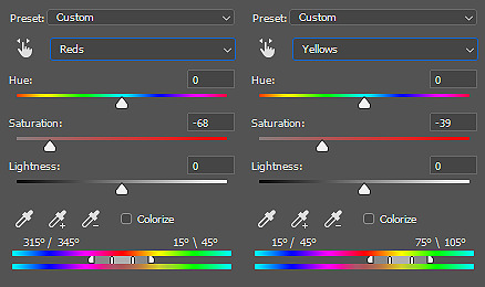
looking pretty good but sydney's skintone is looking a little bit too orange at this point and we don't want that! there are some wonderful tutorials how not to orange wash poc and i highly recommend checking a couple of them out to see which method works best for you, but i personally like using selective color and toning down the warmth of reds and yellows in the scene. for example, these are my settings for the red color, the opacity of this layer is set to 23%:

i do a similar thing with yellow, just messing around with the settings and seeing what looks best.
and then i add some additional layers like color balance and hue/saturation to bring it all together and that's it!

i put this together pretty quickly but hopefully i was able to help out! let me know if you have any questions, i'd be more than happy to help/ recommend something :)
25 notes
·
View notes
Note
OOH do you have any old motogp forum recs?? I would love to see what fans were saying in like the early 2000s, but I have no idea where to look
lemme check my bookmarks... r1-forum I've gone through a fair bit, threads dating back to early 2004. motogpforum goes back to early 2005. motorsportsforum picks up late 2006-ish, that one I've gone through in its entirety for the early alien era. motorradonline24 is admittedly in german but has the BIG selling point that it goes all the way back to 2001. apriliaforum also goes pretty far back but it takes a little longer for discussion of actual racing to get going. there's definitely more I've checked out - I might make a proper list at some point, but just to start you off
the thing about these forums is that it's undoubtedly interesting and useful to get some context of fan opinions (good mix of actual nuance/worthwhile discussion and just slagging off a bunch of riders)... but if anything they're even more precious as a record of actual *news* that has otherwise been scrubbed from the internet. there's a lot of drama and controversies and anecdotes that only exist on these forums
which... tbh there's been quite a few that I haven't included in my posts just because I'm not entirely sure they quite pass the burden of proof requirements. but man, so many of them are so interesting. it's a tricky balance. just as an example - one particularly nasty thing casey allegedly said about jorge that IF TRUE does feel like it would add something to my understanding of casey. but the article only exists on forum pages... still, it made it to three different forums I can find and is written in the usual tone of the author, so I feel fairly confident the original article existed. but then again, the article itself is just an anecdotal conversation relayed by one bloke. on the other hand, this is a reputable enough commentator you wouldn't expect to COMPLETELY make it up - and funnily enough I have even found a photo of him talking to casey that specific weekend. on the other other hand, it's a colourful anecdote that might have been exaggerated for effect. then again, I can kinda see casey saying it - not least because casey confirmed in his autobiography years later that he was pissed off at jorge that specific weekend. but it does feel like the sort of thing that should have caused a controversy... like if jorge saw what casey allegedly said you'd expect there to be nuclear winter, and there's no further trace of it. hm
so what do you do with that kind of thing, share it or not? the further you go back with this stuff the worse it gets, where I keep finding - plus am being sent - increasingly wild quotes from early noughties motogp. at least most of those are from news sites, some of them of dubious quality, but generally you'd really like to find at least one other source backing up the quotes. which often you won't get!! so yeah, it's all interesting context and gossip, but as ever I'd advise being wary of the specific stories. even the funny ones. especially the funny one
anyway, all that being said. this ask was sent in relation to a post about laguna 2008, so I'm going to take this excuse to actually share some discussion of laguna 2008
so. taking u through the fan chat of the weekend from one specific forum with select commentary... here's the thread starter

reminder that dani was injured at the sachsenring and would eventually opt against racing (effectively ending his title bid, but michelin was useless anyway that weekend)
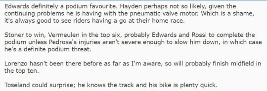
relatively good reason to believe in english-speaker (and in particular american) overperformance at the track. obviously hayden won there the first two years, edwards even beat valentino to second in 2005 which has got to be the only time that year he finished ahead of vale. often more familiar with the track, or it just suits their riding style better. and ofc vermeulen did bag a distant third. still. valentino in the trenches if people thing edwards will beat him icl
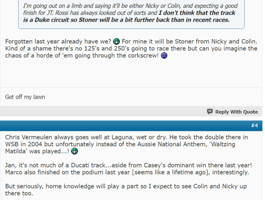
have to say. the idea of the 125/250 riders going down that corkscrew fills me with a visceral sense of horror

'marco' btw as in marco melandri, in the middle of his ducati season from hell
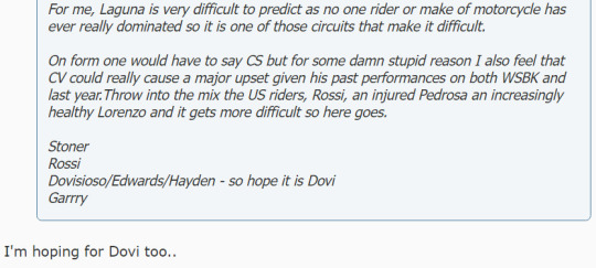
dovi super popular in 2008 fyi, darling of the posters. everyone was obsessed with his rookie season
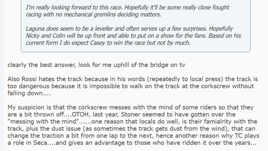
plenty of solid foreshadowing happening here you have to say

it is very motogp rider behaviour, and also very valentino behaviour, to look at the corkscrew, go 'hm i don't think this is even safe to WALK down', and then fucking hurl yourself at the other guy into that very same corner as you're both travelling at horrifying speeds on a motorcycle. going tentatively through that bit of the track during practise and then in the race he's making his bike go bounce bounce like a trampoline
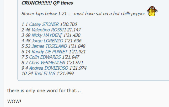
wow!

*stares at camera*

still nasty work to say this, he repeated it in several interviews I think
okay, no forum posts during the race itself so now we skip to the post-race discussion

which is what the tone from a lot of posters was like
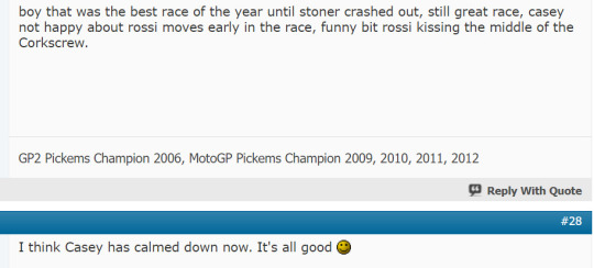
narrator: casey had not calmed down
(if you watch the podium ceremony and see some of the photos without context, you WOULD think they're having a laff. it's just that they're having a laff while casey is telling valentino that he's lost respect for him and valentino is delighted)

two australians on the podium btw

jorge highside cameo

a lot of people were whinging about a lot of 800cc races being boring because a lot of them were. you can copy and paste much of what people are saying about racing these days, if you want to get an idea of the tone

casey fan writes in

again. cannot be stressed enough how casey very much had not calmed down. but that's the fun thing about that rivalry, like they will ALWAYS have a tonal mismatch between their face-to-face interactions and whatever out of pocket things are being said in the press. casey also really big on the pissed off smile which helps
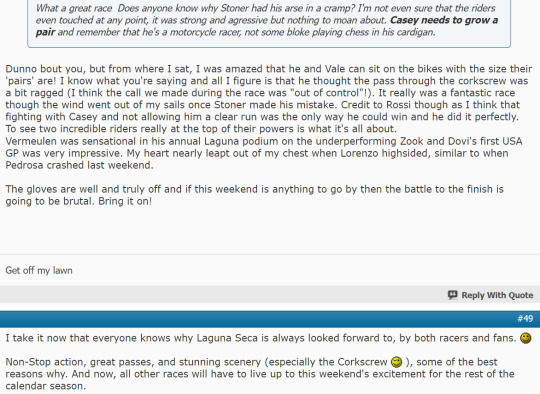
'not even sure that the riders even touched at any point' is. pushing it

yeah the no handshake thing really didn't get a positive response (casey did ofc eventually shake valentino's hand on the podium)

is it really a clean battle if you think someone will fall off

don't want to say that it's a lost cause because casey DID get smarter about this stuff, but ducati certainly aren't doing shit
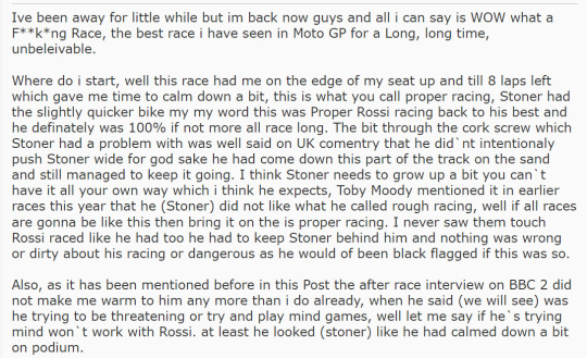
so much of laguna and its legacy is about both of them threatening each other lol, please allow him


again, podium chat categorically not a friendly conversation. otherwise qualified casey defence

likewise

thought this was interesting in terms of discussion of actual rules - valentino said a few years ago the move wouldn't be allowed anymore and he thinks that's a good thing
“It needs rules,” he said. .”Because the situation with the overtaking manoeuvers and everything is much more extreme now than it was in Laguna Seca in 2008. The routes have changed a lot, now there is no more grass next to the slope, but the green stripe. “That was done for safety. Because if you catch the grass at that speed, you'll fly away. The asphalt, on the other hand, is less dangerous. In my opinion, however, you have to make a rule and say that you shouldn't touch the green at all - see it as if there were still grass there. “At the level we have reached today, which is extreme in many respects, everyone goes over the curbs and is all green if you don't have a clear rule. I think that's the right thing to do.”
but yeah tbh... I know casey disagrees but I feel like the move WAS probably fine by standards of back then

some more rules chat

and more

"will be hearing big footsteps every time he is in front"

and here we are then. not much that's groundbreaking, but I do find it interesting!! this is a pretty pro-casey audience... most of these forums were generally pretty positive about him. english language speakers were way more hostile towards dani and later jorge for various reasons - you'll also find at least some distaste for valentino in these spaces alongside the usual adulation. so that's the yardstick... this is probably close to as casey-friendly as discussion of the race got among the wider fanbase. it was always going to be a tough sell to air his grievances about this race until a few years had passed. the general reaction was that the racing had been hard but fine, an extremely welcome contrast to the general quality of racing at the time. and almost nobody thought casey should have reacted as he did in parc fermé. interesting contrast with jerez 2005 actually (though admittedly sete not particularly popular in most forums) - sete was low key seen as having a more legitimate grievance than casey. anyway, obviously this blog's stance is that sportsmanship is overrated, but that's how you end up getting the poor bloke apologising in brno
#i did recently find an actual clip of an actual interview valentino did qatar 2004 that i could verify with my very own eyes#which was very exciting. but that kind of thing is winning the lottery of motogp archival research. just won't happen every day#//#brr brr#batsplat responds#//ht#the rider for whomst fan perceptions have done a most radical 180 is definitely dani. pretty widely hated back in the day#admittedly that'll be exaggerated in english forum threads - presumably lots of americans there who obviously loathed him#is quite funny seeing casey write about the us fans' pure love for racing like buddy u do know they're just booing someone else right??
8 notes
·
View notes
Text

THE SHIRTS I DESIGNED FOR MY FRIEND'S WEDDING DINNER ARRIVED
aaaaaaaaaaaa 💕


She wanted One Piece characters for her fiance's "Mr" shirt, and Dragon Ball for her "Mrs" shirt. It's their favourite anime for their respective shirts. I can't afford to give her a nice wedding gift at the moment, so I offered to do these as the wedding gift!
The brief she requested: for the MR shirt to have Luffy, Sanji and Zorro. For MRS to have Goku, Gohan and the 4th dragon ball. A preference for the "MR" and "MRS" to be prominent
I am barely familiar with either of these shows. So some research was needed lol. Because both of these anime are long running shows, the characters she gave me names for that she requested on each shirt have multiple appearances. For the Mr shirt, I went with season 1 appearances for the gang. The Dragon Ball characters was a bit harder to find the right appearances for. I initially accidentally pulled references from different seasons, which meant conflicting timelines lol. Also, the size of the dragon ball seems to change of the course of the show?? She requested not to see the design until it was finished - to have it be a surprise. Which is fine! I can accomodate that, though it meant muscling through my self doubt. I couldn't ask her for verification on a sketch out of concern it would spoil the surprise.
Striking a balance between the words and the graphic was tricky, and I ended up only having the text be 1/3 of the shirt... but before I had these shirts printed I showed her the final design and she said she was really happy with it. It was a huge relief after essentially working in the dark with my fingers crossed.
I'm new to this process. This took weeks of work (admittedly not consistently, but chipping away a bit at a time) between work and just needing mental breaks. Mental health being up and down. Hormones. Great stuff. But these are the iterations of the sketches - some of them I went back and forth with the text vs graphic ratio, wondering about fonts, wondering whether to incorporate floral motifs I used for their wedding dinner invites, etc.


One important aspect I want to document - first time using free form vectors with the pen tool!

Because I wanted the option to scale this for printing I figured I'd test my hand at this? And fuck, am I glad I have this new PC to accomodate for the extra loading power to allow for it. I grabbed a screen print for Zorro's mouth here - that's one pen stroke of the 5 I did to shape his mouth. In other parts of the shirt, I couldn't achieve a shape I wanted so I carved the lines with an erased line. This results in... many, many.... vector lines.
I compiled my wips into gifs - in my version of CSP I can only animate up to 24 frame though, so its super speedy.


and then the final results...


I wanted a transparent window to the background so that the text could pop forward (hopefully to make it more prominent!) - so again, using a vector pen with an eraser/transparent colour I did some devil fruit and shenron shapes to be less graphical. With that see-through window I hoped it would invite the shirt fabric colour into the design to mix with the colours I chose. It all looks a bit flat, but from what I understand from researching a bit, this is prefereable from having soft colour blending which doesn't print as well. So anime style shading worked out pretty well in that respect?
I went with a Melb based printing company called PrintLocker (and they chucked in some free gummy bears!). With this company I could do a front, back and sleeve prints. It cost extra to have each of these zones with a graphic, but I think it was worth it. Plus, shorter shipping time! It was express posted too, which I didn't think was included in my overall shipping/delivery time.
When I saw the option for sleeve prints I definitely wanted to utilise it. So I had the idea that when standing side-by-side with their shirts on that it might be cute if their sleeves said Mr and Mrs that faced each other.

So there it is. Weeks of work with a result I'm a bit chuffed by. Again, this was my first time printing my work to shirts by myself. I don't know if I'll do this again for myself, but at least I know how to do it now! Wahoooo~
3 notes
·
View notes
Text
Review: Unicorns - Heart and Soul

Title: Unicorns Directed by: Sally El-Hosaini and James Krishna Floyd Written by: James Krishna Floyd Starring: Jason Patel and Ben Hardy Director of photography: David Raedecker Production designer: Robert Wischhusen-Hayes Art director: Chris Evans-Wilson Costume designer: Nirage Mirage Year: 2023
Unicorns is a story of worlds colliding and others forced to skirt around each other; Luke, a straight, white mechanic from Essex stumbles accidentally into the world of British-Muslim drag queen Aysha. After their first fateful meeting, they step tentatively into each other's lives, finding comfort and friendship in each other's company while being painfully aware of the outer world and how it affects them and their relationship.
As Aysha, Jason Patel balances an endearing confidence with a grim awareness of the world and her place in it. Aysha navigates her life with an uncompromising sense of self-preservation that stems from a desire to be safe in the world, presenting and identifying as her true self, but knowing that the world isn't safe for her to be in yet. Luke, a heretofore straight, single father, kisses Aysha the night they meet, but runs away when he realises that she is not the cis-woman he thought she was. After this night, Aysha and Luke become inextricably linked, each wholly fascinated by the other and any time one tries to pull away, the other won't let them do so. As a queer Muslim, Aysha is living a double life; she’s kept Aysha a secret from her conservative parents in Manchester while trying to keep Ashiq at a distance from Luke who is still coming to terms with his evolving sexuality. Luke invites Aysha into his family through his young son, but struggles with the traditional views of masculinity that are still evident in his environment and the people he spends time with. Ben Hardy is electric in the role, keeping his emotions caged, as he grows accustomed to Aysha's world and a new understanding of his identity, but always simmering underneath the surface ready to burst. Their chemistry is organic and honest and makes real a situation that might be unusual to many people, but is, ultimately, about trying to live your life.
Unicorns explores everything from sexual identity and gender roles to cultural identity, but it is, at heart, a love story between two unlikely people. Bearing in mind those tricky subjects, that love is never easy for Aysha and Luke even when the dynamic between the two actors makes it seem like the easiest thing in the world.
Other bits:
I'm trying to incorporate more crew into these reviews depending on what stood out to me, for Unicorns it was a lot of the aesthetic/visual elements
the colour schemes throughout the film are gorgeous, even when it's grey and brown and dull it's still so powerful and effective
I love how the film allows time for Luke and Aysha to connect to each other after their initial meeting; their attraction to each other is always simmering underneath but they don't act on it prematurely instead they get to actually enjoy each other's company before pursuing a physical relationship
as much as I loved the build-up of their relationship, I was left wondering about the connotations of Luke's attraction to Aysha as opposed to Ashiq and how Aysha/Ashiq actually identifies; at the end Aysha seems to embrace Ashiq somewhat more but I wasn't sure how Luke played into that and would have been interested to explore this part of their dynamic more (Unicorns 2 is what I'm saying)
the way they get physically closer to each other as they grow more comfortable in each other's presence - all of the visual cues in this film are amazing
PSA: if I've incorrectly labelled Aysha or there's an issue with me referring to her as Aysha/Ashiq please let me know and I'll edit, any mistakes are made out of well-meaning ignorance and I'd love to be educated on the matter if I'm incorrect! (I'd also love to be complimented if I've done well, just sayin' 😉)
#finally got my head together to write this#a lovely lovely movie#unicorns#unicorns 2023#jason patel#ben hardy#sally el-hosaini#james krishna floyd#film review#reviews#movie review#I'm not good at writing reviews
6 notes
·
View notes
Text
Day 723
An act of kindness reminded me I still have a long way to go in being a functioning adult.
I’m pretty proud of the changes I’ve managed to make in the past year. It’s taken a lot of trial and error, but I can say I’m in a better place now than when I was a year ago. In fact I came home and immediately began to put dishes into the dishwasher (including the cat’s stuff) in preparation of the other cleaning that has to be done today.
However, because of poor everyday memory, the fact no one had explicitly told me this had to be done or because it just never occurred to me, there are things I don’t do, and I should.
For example, my Pilates instructor used to sell shoes before he became an instructor. I think he did a lot of other things, probably majored in dance at some point. He’s one of those older generations that just did a lot of things because it was easier to do so back then. He’s also, in the whole time I’ve known him, been very, very mindful of my own abilities.
Including, allowing me to keep my shoes on and taking the extra time to help clean the soles so I don’t leave footprints in his studio. This is because I have a leg difference, by 2.5 cm or an inch, which makes some balancing exercises a bit tricky. So he’s always been aware of my shoes, my custom leather shoes because between the leg difference and the ankle-foot orthotic, I was never going to be able to modify off the shelf shoes to fit comfortably.
Especially not with wide, small feet, a combination that was a nightmare to shoe shop for growing up.
Despite having worn leather shoes for over a decade, I forgot you need to care for your leather shoes. The black ones I had more or less gotten away with just wiping them (when I remembered to), but the newer brown ones were getting kind of scuffed. This was probably a combination of a different type of leather and the fact I was going out a lot more into the community. One of those outings is that I make a point to walk to my Pilates’ instructor’s studio.
While it always meant I was early for lessons, it was a good ten minute walk that allowed me to practice moving up hills and being on uneven sidewalks. Today, when I showed up early for lessons, my instructor asked me an odd question. Was my mother going to pick me up at the usual time? And by usual time, it meant that even if I was early to a lesson I would have to hang around for a bit because I wasn’t leaving any sooner unless I took myself home.
I told him yes, thinking that maybe he had another appointment he had to keep when he excused himself to go get something. He comes back a few minutes later with a shoe box with shoe polish in it. Excitedly, he told me that he and his wife visited the big city and came across a shoe repair shop which had a wider range of colours than what you’d find locally, including polish that was somewhat closer to the brown my shoes were. He then offered to polish my shoes, assuring me that he was perfectly fine doing so.
And so for the first time in a very long time, I got my shoes polished and realized… I needed to come up with a routine to take better care of my shoes.
And shoe polish…
And probably something to weatherproof the winter boots.
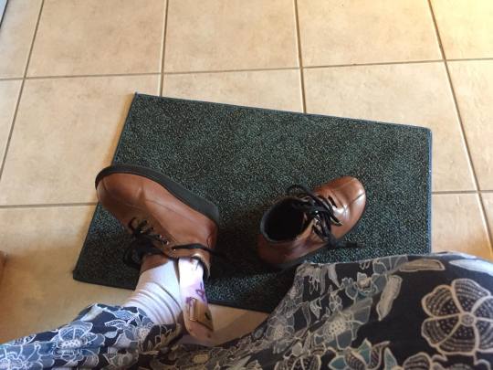
#polished shoes#acts of kindness#he's also very passionate about well maintained shoes#learning to adult#shoe care
2 notes
·
View notes
Text
Into a Lighter Dream - A Diana [Zero Escape] Fic

[Read on Ao3!]
Rated: M (16+) Zero Escape/Zero Time Dilemma Diana/Sigma (not the focus) Content Warnings: Standard Zero Time Dilemma Content Warning, Suicide Attempt, Suicide, Death of Children. Words: 2.5k
Summary: So the twins have been teleported. And then what of the four left behind? There is no one coming to save them. There is no hope of escape. They'll come to their own end, by their own hand, then.
A look into the after math of The Hope of Two ending.
–
It’s somewhat tricky, balancing a baby in one arm and holding a pencil in the other, but somehow Diana manages. Somehow Diana manages, she thinks, sums up most of her life pretty well. Somehow she manages her way through a marriage and a divorce, somehow she manages her way through a death game, and barely she manages the aftermath thereof. It’s strange though, because somehow it’s the waiting that’s the hardest. Those long 10 months, where the inky threads of death just streamed into the corners of her vision ever slightly more with each passing day. And yet, in some way, it was the most blissful she’d ever been. The first indulgence she’d truly had in an age, a love that felt sturdy when everything was rocking.
Musing on this, idly, Diana leans down and presses a gentle kiss to Phi’s forehead. She spares a moment of thought for her other daughter, the Phi sent back in time. And then again, to her son.
“Let them be safe. Let them find their happiness.” Diana whispers in her own head. It’s the same words she’s repeated to herself ever since she sent her children back, whisked away into a corner of space and time she’d never see.
But the Phi in her arms is the one who remained, still left behind. The only Phi left in this world, with her namesake having vanished. Again, Diana takes a moment to wish for that Phi’s happiness and safety, though the ache in her chest reminds her it’s fruitless.
Somewhere though, there must be a Phi living something different. Somewhere, Diana believes, she is living happily. Diana, Sigma, Phi and Delta, all peacefully in one place. No turmoil, no games, just the picture of a normal family.
This world is far far from that ideal. Diana feels a bit like an animal, laying down wounded. There’s a sense of peace washing over she recognizes as acceptance.
In a few hours, she will sleep. Following which, she does not expect to wake up.
Diana frowns down at the paper doily. It’s not exactly the best suicide note, but it’s not exactly a suicide note either. Everything’s half done here, half a life lived, half a romance she shares. What’s the point in worrying about it any more?
With the end so close, Diana finds her fears washed away. After living so much of her life in a constant drone of worry, it’s almost startling how still she can find herself.
Acceptance, even of her inevitable demise, can be a beautiful thing. The fading of her colours becomes a soft pastel, so it’s still beautiful, isn’t it?
Her pains have become nothing but a dull ache in the back of her mind. Yes, her stomach gnaws away at herself even as she tries to satiate it with water. She hasn’t eaten in a week, it’s unsurprising. But what had felt like her organs being pulled into a black hole at first has faded now. Not because she isn’t hungry, but because there’s nothing left she can do about it.
It’s just acceptance now. It’s all washing away.
The pencil slips out of Diana’s grasp as she finishes the note, rolling right off the table and onto the floor. There’s no reason to pick it up, so she leaves it. Let the lounge feel a bit lived in. Let there be prove she had lived for once in her life, even if only for a short time.
Diana slumps back against the couch, tucking Phi in closer to her chest. The baby stares back at her, bright wide eyes, taking in everything about her mother’s face. Diana smiles, giving her daughter another kiss on the head. She deserves so many more than Diana can give her. She deserves so much more than this.
They all do.
She’s too tired to mourn anymore. After the mania and madness of the past 10 months, it’s just… going to end. And it’s a strange feeling, because in some ways this had been the primary thought in her mind ever since Sigma had told her about the food supplies. Even with everything, the fights, the sex, her own children- every thought she had was accompanied by a shadow, a reminder that soon, it would all go away.
If there’s one comfort Diana can take, beyond knowing that Sigma will be there with her, is that they’re taking it into their own hands. Agency is a comfort, particularly in a place like this.
(In the back of her mind, she knows she never had any true agency. She knows everything, each step she takes, the precise positioning of each molecule of her body holds the exact space in time someone had calculated for. It makes her feel like each of those atoms are scratching up against each other, buzzing with an urge to lurch, to send reality spinning out of place, if only to be free for a fraction of a second.)
Phi fusses in Diana’s arms, somewhat restless. She’s not fussy, not usually, though Diana supposes she doesn’t have much ground to stand on with that claim. Phi is merely days old. Still, Diana just knows. She’s her baby, of course she knows. For everything she’d studied, for all the scientific data she’d memorized in college, for every dissertation she’d read, nothing compared to really holding her own daughter in her arms and knowing the power of a mother’s love was both real and magic.
She’s being far too idealistic than she has any right to be, but she’s earned the right to have a little misguided optimism by now.
A mother’s love is real. A mother’s love is magic. And with her magic, Diana rocks side to side, rocking Phi with her, and whispers her spell.
“Let them be safe. Let them find their happiness.”
Maybe she spends a few minutes in that daze, a murmured half lullaby, maybe longer.
It’s only when Sigma sits down next to her, wrapping an arm around her shoulder and pulling her in a touch closer, that she’s pulled out of reverie.
Once it would’ve startled her, but there’s something about Sigma’s embrace that she finds herself relaxing into without even thinking about it. If Diana ever mentioned it to Sigma, she’s sure he’d explain it as the morphogenetic field, her body remembering the other lives they’d had together, or such and so. And perhaps that is the case. Diana won’t rule it out. Personally, however, she’d pinpoint the cause as something simpler.
Sigma makes her feel safe. That’s all.
“Everything’s set up,” Sigma murmurs, pressing his words to the crown of Diana’s head. “If you’re ready.”
How do you ready yourself for something like this? No matter how much she’d been preparing for this, mentally or physically, she’d never be ready.
But the note she’d been writing was finished, and that was all that was left to complete, so in that sense…
“Mmhm.”
She can’t get the words out, but she nods anyway, humming in affirmative.
Sigma squeezes her a little tighter.
“We’re going together. Don’t worry.”
The worry has long since bled out of Diana, pooled at her feet and spilled across the floor. So she won’t worry. She won’t.
She stands, slowly so as not to disturb Phi too much. Sigma follows, bringing his arm down to help support Delta, carried on his right shoulder. It’s probably not the safest way to hold him, but it won’t matter soon.
They walk out slowly, Diana casting glances around each part of the room as she bids it farewell. It’s not exactly like she’ll miss this place, after everything she’s been through here, but in someways, she supposes she will. Contradictions like that only make sense in a place like this.
“It was a good letter.” Sigma whispers, in lieu of a farewell to the space. “You did good.”
Diana nods. She’s appreciative, and flattered, but it’s getting difficult to express it.
And slowly, step by step, they make their way through the halls until finally. The last room. The relaxation room.
Diana steps in carefully, minding the large box-shaped contraption set up on the floor. It resembles a fog machine, in fact most of it was a fog machine, but with the modifications Sigma has made… it couldn’t be called that anymore. It’s function had changed, the weight of it’s worth was altered. No going back from that.
A long black cord runs out from it, up towards one of the beds in the corner. A chunky “on/off” switch breaks off the clean line of the cable, sitting right at the foot of the bed.
Diana tries not to think about it yet. Not quite yet. She turns her attention to the dial on the wall.
“What environment would you like?” She asks, though they have already had this conversation several times, and settled on an answer long ago.
“The sky pattern.” Sigma answers, though Diana’s fingers have already begun to twist the knob. It clicks, clicks, and the walls, floor, and ceiling all distort around them until finally coming to the sky pattern. Diana’s favourite, even now.
The clouds soar past them, off into a non-existent distance. Freedom that has never been, and never will be.
“Perfect.” Diana murmurs. “Shall we go, then?”
Sigma nods.
Carefully across the room now, Diana keeps away from the walls though she knows the sky is only fake, the drop off into the sky unreal.
(She’d tried it once, less than a month into confinement and in a drunken haze. Turned the pattern to clouds and stood near the edges. Closed her eyes and let herself tilt, teeter forward. Willed herself, begged for something to just slip. Slammed her head against the wall and sunk to the ground, sobbing. Hits her head against it again. Again. Maybe this time something will change. But it doesn’t, it never does. Until Sigma had found her, and simply carried her back to the lounge, lying her to rest on the couch. He’d been so gentle. So warm. She’d almost considered doing it again just to feel that kind of embrace.)
Sigma passes Delta over to Diana, and she settles into the hold. She clutches both her children to her chest, feeling the miniscule sound; their hearts beating in sync.
“Let them be safe. Let them find their happiness.” She thinks without even trying, even when she knows it’s got to be too late.
Sigma settles down onto the relaxation room bed, taking a moment to position himself comfortably. Carefully, he keeps the “on/off” switch tucked into his right hand, but doesn’t hit the switch just yet.
“Join me,” He says once he’s settled, “Love.” He finishes, and Diana’s heart could just break in two when he talks like that. It’s enough to make her want to slap him, try and claw her way out just a little more.
But… Diana is so tired. And so hungry.
Gently, Diana positions herself tucked into Sigma’s body, pressed so close they might as well have been one person. Her head rests on his shoulder, positioned so that she could look into his eyes. Phi lies against her chest, and Delta is shuffled over so most of his body lies on Sigma’s.
Sigma’s embrace is warm and tight, as he reaches his left arm around his family. Diana feels, if just for a moment, that everything was worth it if she got to hold this second within herself.
“Ready?”
“One second…”
Diana tucks her hand into her shirt, pulling out the necklace she’d kept tucked away. Her fingers are shaking a bit, so it takes a bit of effort, but she manages. Slowly, clumsily, Diana turns the key for the bluebird music box. And turns. And turns. She turns until the box cannot possibly take anymore, and the springs inside the device whine in protest. Then, she releases it, and tinny music notes begin to fill the room.
Sigma smiles quietly.
“Needed a bit of mood music?”
“Ha ha.” Diana deadpans, but she’s smiling at him, “I just… wanted to listen to it one more time.”
“I know.”
There’s a moment of silence, or rather, the quiet melody of a music box filling such. Phi’s eyes widen a bit as the tune goes through, seemingly enamoured by the sound.
“I’m ready.” Diana whispers, before she can change her mind. So before anyone can say anything else, Sigma flicks the switch from “off” to “on”, and the room begins to fill with Soporil B.
“This’ll keep us out for… how long?” Diana whispers, voice nestling in between the melody and the quiet fssshh of the Soporil smoke machine.
“The canister I found in the transporter room had approximately… 25 litres in it, give or take, and the machine is set to run at steady intervals to prevent it from burning out the supply.” Sigma replied, whispering the explanation in Diana’s ear, “As we are already exhausted mentally and physically, and none of us have eaten or drank in the past few days, it should knock us out pretty hard.”
It’s not the Soporil that does the killing, Diana knows. It’s the starvation, and primarily, dehydration they’re banking on. Collapse the internal organs, let heart failure kick in. Sleep through all of it. That had been the plan ever since Sigma had managed to find the canister of Soporil in the transporter room, tucked in a lower cabinet. It was strange how they hadn’t noticed it before. Almost as if it had been placed there deliberately after it had been clear there was no chance of complete survival. Even when the plan had been to transport themselves, not their children, they’d worked to set this up for those left behind.
If it was deliberate, just Zero cleaning up close ends, then Diana supposes she’s grateful it’s something cleaner like this. Slow, maybe, and even in a haze of drugged-up dreams, she’s sure the pain won’t completely vanish… but it’s better this way. Better to go together, to dream anything, and simply slip further into that dream until nothing remains.
Diana blinks.
It’s a slower thing than she’s used to, the weight of her eyelids grows stronger with each moment.
“Ss-Sigma.” Diana says, words starting to slur slightly, “I love you.”
Sigma just hums quietly, for a moment. Then,
“I love you too, Diana.”
“I love you.” Diana repeats. “I love you. I love you. I wantta be the last- last thing… I say. You… and Delta and Phi, I- I love you. I love you.”
It’s such a messy love. She’d call it broken, but that would imply there was ever a time that what they held wasn’t tattered. It’s always been like this. A bit charred and melting. Like a moment frozen in time, like a snow globe, like a bird in a cage, the sort of love captured in this bubble. But it’s really love. The details are blurring away in the Soporil fog.
The music box notes distort and shift, they twirl into birds songs on the breeze. Diana doesn’t feel the weight of Sigma’s arms, of Phi lying on her chest. Her body dissolves along with them, until they’re all nothingness together.
Maybe she’s dead now. Maybe she’s still dying. It’s all a fog. It’s all fog.
The play is over now. The story is done.
It was all for nothing, and yet it was so integral, to everything.
The actors have bowed; said their goodnights. The lights on the stage have all shut off.
One day, Diana thinks, someone might find them. Four bodies in a state of decay, find their bones all on top of each other and not be able to tell who is who.
But for now, for the rest of her life, Diana listens to that music box. To the sound of her family breathing.
Her thoughts don’t make sense anymore. Her mind is a cloud, the room is a cloud, it’s all a harmony of abstractions.
It’s a field of white.
It’s the absence of anything.
It’s over now.
…
Goodnight.
[End]
#zero escape#ze#zero escape fanfic#fanfiction#fanfic#voids fic#zero escape spoilers#diana ztd#zero escape diana#sigma klim#sigma zero escape#diana/sigma#digma#is that the shipnname#please dont tell me its digma#sigana#thats not better#diana x sigma#zero time dilemma#zero escape ztd#zero time dilemma spoilers
2 notes
·
View notes
Text
random updates:
***i'm getting vaxxed for covid on Thursday, it'll be a little tricky as i'll be in the middle of my night (current sleep cycle is 4am-4pm) but i've been on the waiting list for a month and don't want to put it off. Flu vax done in November - bit of a hefty one with proper flu like symptoms after, for two days-.
***I had an accident Monday night: went to grab some bicarbonate of sodium from its twee cardboard pouring box in the bathroom cabinet above the washing machine and grabbed carbonate of sodium from a very similar twee pouring box, put it in a glass of water and threw that down my gullet instead.
Thankfully my body responded immediately and violently, so all I have is a mild chemical burn to the throat and a reverse-sunglasses-tan-looking wine coloured petechiae around the eyes. I had activated charcoal on hand and waited 30 minutes for any signs of shock.
I blame the packaging on the washing soda being cottage core "all natural" nonsense with no warning symbols as well as extreme exhaustion from non-stop acid reflux for the past week. I'll be picking up omeprazole from my vax appointment at the chemist on Thursday.
***Current walks for Lily are carefully timed with the sun going down above the hills but not out long after dark because there's an added complication: Lily gets blinded by car headlights. A little tricky to avoid the main road once the sun sets but doable.
She remains happy as ever despite losing some weight and back leg balance. She's slowed down slightly but I wouldn't be surprised if she was still enthusiastic about walks even in six months: I refashioned a toddler's coat to fit her and she's been fine about cold weather since but she'll defiantly refuse to walk if it's raining.
*** Sis is allowed to put weight on her triple fractured once twisted foot (now with a plate and 8 screws) but only lightly. This effectively means moving from a wheelchair to crutches to a walker which means access to more places in the flat.
There's a neat trick where she places the foot on a weight measure balance to find how much pressure is possible before pain kicks in. She's wiped but hopeful.
1 note
·
View note
Text
How to Choose the Best Denim Fabric Online in Nigeria
Denim fabric is a versatile and timeless material, often used for making jeans, skirts, jackets, and more. With the rise of online shopping, purchasing denim fabric online in Nigeria has become more convenient. However, selecting the best denim fabric online can be tricky, as there are many factors to consider. This guide will help you navigate the process of choosing the perfect denim fabric for your project.
Know Your Denim Types
Denim comes in various styles and weights, so it’s important to understand the different types before making a purchase:
Lightweight Denim: This type is softer and more flexible, making it ideal for making shirts, skirts, or light jackets. It's breathable and comfortable for warmer climates.
Mid-weight Denim: A balance between lightweight and heavyweight, mid-weight denim is perfect for making jeans, dresses, and casual jackets. It offers both durability and comfort.
Heavyweight Denim: Often used for jeans and workwear, heavyweight denim is thick, durable, and sturdy. It’s a great choice for making garments that require extra durability and structure.
Stretch Denim: For a more comfortable fit, stretch denim is blended with a small percentage of spandex or elastane. This type of denim has more flexibility and is ideal for making fitted clothing like skinny jeans or leggings.
Understanding the type of denim fabric you need will help you make an informed decision based on your project requirements.
Check the Fabric Composition
Denim fabric is typically made from cotton, but many variants are blended with other fibres to alter their texture and functionality. Common blends include:
Cotton and Polyester: This combination increases durability and wrinkle resistance.
Cotton and Spandex: As mentioned, this blend provides stretch and is ideal for clothing that needs a bit of flexibility, like jeans or fitted skirts.
Pure Cotton: Pure cotton denim is breathable and soft, ideal for garments that need to be comfortable and natural.
Make sure to check the fabric composition listed on the online store to ensure it matches your desired qualities for the project.
Consider the Color and Wash
Denim comes in various colours, from classic indigo to lighter washes and even coloured denim. Consider the look you're going for:
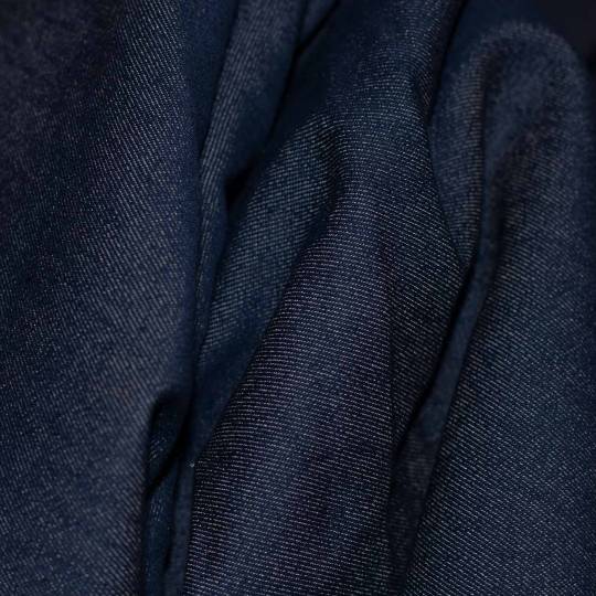
Indigo or Raw Denim: This is the traditional, dark blue denim that fades over time and gives your garments a unique patina.
Washed Denim: Lighter and softer, washed denim is treated to give it a faded look and feel. It’s great for creating a relaxed, casual appearance.
Coloured Denim: Available in a variety of colours, coloured denim is perfect for those looking to create something more vibrant and eye-catching.
When shopping online, ensure that the colour and wash of the denim fabric meet your expectations by reviewing product photos and descriptions.
Check the Fabric’s Durability and Quality
Denim quality can vary significantly from one supplier to another. Pay close attention to the fabric’s weight and texture to gauge its durability. A heavier weight indicates a stronger fabric, while a lighter weight might be more suitable for casual wear.
Make sure to read product reviews and ratings if available, as they can provide insights into the fabric’s quality and whether it matches the description provided by the seller.
Understand the Price Range
Denim fabric prices vary based on the quality, type, and supplier. While you may find affordable options, be wary of extremely low-priced denim, as it might be of inferior quality. If you’re working on a large project, it’s worth investing in higher-quality denim to ensure longevity and a professional finish.
Choosing the best denim fabric online in Nigeria requires careful consideration of the fabric type, composition, colour, durability, and price. By understanding these factors and doing thorough research, you can make an informed decision to buy from JayBecks Store and ensure that your denim project turns out beautifully. With the right fabric in hand, you can create stylish and durable garments that are sure to impress. Call 0908 146 6711 to place your order.
0 notes
Text
Finding your voice and style as an artist
There's a great deal of advice out there about how to find your voice and style as an artist, but it doesn't necessarily address the why question.
If you primarily create art as a passion, finding a recognisable style doesn't really matter that much. You are free to explore and experiment as much as you want! However, if you want to turn you art into a business and make an income, then developing a consistent brand is more likely to be successful.
Of course, some people want a consistent style for other reasons - for example, they want to become well known and recognisable, but aren't particularly interested in creating an income. Also, specialising in one style or medium can give you the opportunity to excel and build your skill set. Sometimes focusing on one thing can be more fulfilling and rewarding. Everyone is different!
Many artists do a bit of both. They might have one or two art styles that they create primarily for income, and then experiment with others in their spare time. Often they will use separate social media accounts with different names to distinguish them.
There are even successful artists who create in more than one style, such as The Naked Pastor who creates comics about religion and politics, but also paints delicate watercolour landscapes. While choosing only one style is often simpler for marketing purposes, you don't have to limit yourself.
So before you go any further, you have to find your why.
The tricky thing about finding your voice and style is that it needs to be narrow enough to be consistent and recognisable. Yet it also needs to be expansive enough to allow for growth, variety and experimentation. Finding this balance is easier said than done, for most of us. We don't want to get bored and stuck just making the exact same thing over and over!
I found this perspective from Michelle Gaugy very insightful:
"Ultimately, you must decide what kind of career you wish to have. It takes many years to develop a mature style and many years to get that style presented to and accepted by a demanding public. Simultaneously, you must continue to grow artistically. The tightrope you must walk is how to maintain your artistic integrity and growth and still have a recognizable style that meets the needs of your collectors. This is a very difficult and tricky thing to accomplish.
There is great risk involved. Greater risk can result in greater payoff - but it can also result in failure. The art world is littered with the bones of failed artists. Only you can develop the acute sensitivity required to determine “how much risk” and “how much change” will work for you at any given time. But I will suggest to you that you must always do this in the context of the larger question: What is it that you wish from your art career in total?"
Here are some tips which have helped me with this. I will freely admit, I haven't got it all figured out yet! I'm still learning and growing as an artist myself.
One: If you're a student or beginner, don't worry about finding your style. This is the time to experiment and explore, and it will stifle your creativity if you try to narrow it down prematurely. Often your style will unfold organically over time, as you find what you enjoy most. Be playful and have fun with it!
Two: I would recommend working in a series, for example a series of 10-15 works base on a particular theme or idea. This can help tie your work together. Creating in a series also works well if you want to put on an exhibition.
Try sticking with one medium and a consistent colour palette for a while, as this will tie your work together visually. Or if you prefer to change your colour palette, try a consistent subject matter, e.g. landscapes, nudes, animals, etc.
Alternatively, you could tie your work together thematically, by focusing on a particular idea or concept such as climate change, indigenous rights, etc.
Three: Look at your favourite artists for inspiration and ideas. Find 3-5 artists you admire, and write down what elements you like best in their work. For example, do you like the colour? The texture? The linework? What emotional impact does it have? You can combine these elements in a new and unique way as you cultivate your own style and voice.
Four: What kind of process do you enjoy the most? Many of us focus on what kind of art appeals to us aesthetically, and what we prefer to look at. That's an important consideration to begin with. Yet I find it more helpful to consider, what actually feels good to make? What processes do I enjoy? If you enjoy the actual creative process, it will be far more sustainable.
Five: My final and most important piece of advice is to be patient with yourself. It's normal to feel lost, confused and unsure on your artistic journey. You don't have to figure everything out immediately! So if you have no idea what your style and voice is, don't put too much pressure on yourself. Trust and have faith that it will unfold and become clearer with time. Always give yourself compassion.
Further Resources:
Find Your Artistic Voice by Lisa Congdon
How to Find Your Style: A Guide for Artists
How Do I Find My Art Style? Artprof
1 note
·
View note
Text

I've been having a bit of art block lately so I figured a small drawing would do me some good. Thus, I took a gander at older Flora ^.^
#Professor Layton#Flora Reinhold#Curious Village#Finding a balance of colours was a bit tricky for this one#I tried to go more floral with a golden apple scarf and the leaf design but she also has a mostly warm colour palette#her bun is just based on pastries lol like a swirl or something#does the choker look familiar? :)#my art
44 notes
·
View notes
Note
A while back there were some tumblr discussions on the nuances/differences of discrimination between us vs the uk (and really everywhere else) and I really appreciated your takes/insights on it. As an American born-raised desi, would it be alright to ask what the experience is like in Britain? Also, is there a lot of difference being Afghani vs Indian vs Pakistani vs Nepali etc in how women are perceived in social or work spaces? I was considering studying/working abroad and wondered where my blind spots were, to make balanced and thoughtful choices. If you'd prefer a dm convo or this isn't an ask you're feeling then no worries. Much respect on individual space and privacy. Thanks for reading 💕 💕 (ps. how is LOLITA?!?!? anybody's favorite novel?!?! not acceptable/deeply troubling)
Hi hi
Obvi I haven't lived in America so I can't do a thorough unbiased report back but I can say that I have been exposed to enough variety of American media to get a grasp of what it is like there. So with that disclaimer in mind, let's rock and roll.
The Asian British Experience is something different to the American experience. Straight off the bat, the main difference in America the term Desi only includes Pakistani Indian and Bengali dispora whereas in the UK, Desi includes Nepal and Sri Lanka. There is a big more of the good old subcontinent togetherness here vs in America. If you are South Asian you are South Asian, there isn't any nitpicking.
The UK is tiny compared and when you look at just many South Asian we have compared to the general population, it is a lot a lot. Our culture is very integrated here in the UK. You average Brit knows a decent bit about South Asia and South Asian culture/history. South Asians are regarded the model minority. We aren't going to go into the whole model minority minority myth thing here but I am not going to lie, it does work in our favour. For example, schools here work on catchment or exam sitting. And back when I lived in England there was a huge problem of South Asian students being picked over Black students to be in certain better schools. As a south asian, along with other Asians we were definitely treated different to other poc in terms of the ease of which subjects we were allowed to pick, who got sent to competitions simply because we are Asians.
Do we have colourism and racism within the South Asian society?
Ye lol. But like I always say the UK, unlike America has the problem of classim. So rich south asian treat poorer south asian far worse than I have seen white people treat south asians.
North Indians, here, have a bad rep for being rude to other south asians which is something every Desi will agree on lol
Colourism is slightly tricky. That will take more explanation.
Working as a Desi in the UK?
All south asians get lumped as one. This isn't necessarily because people just see us as one ( which people do but we are all neighbours and it isnt wrong to say our cultures are similar). Again the model minority thing comes to play and we have those advantages over other poc.
I cant speak too much on work life because I havent had a office job yet but I did have ask my sisters And this is what she said.
'When people find out you are South Asian, there is an automatic pressure of being perceived as highly skilled. You are expected to the best at your job and mistakes are frowned upon because you are south asian, you are smart'
I am still waiting for a response from my other sister who arguably has a better insight because she has worked at a top job in one of the biggest companies.
Off topic but my other sister from another mister pointed out that as a highly educated South Asian women, dating becomes incredibly harder. Your dating pool gets smaller and people become more intimated by you.
I could go on and on about being South Asian in the UK. Being British South Asian vs being a FOB South Asian. The expectations. Our impact on culture here.
But the UK is a brilliant place for South Asians. We have enough of our own people for you here lol. No but genuinely, all it will take for you to settle well here is to make friends with one South Asian and the rest will come easy. There is mutual rule of 'support other south asians' that Desis follow here so you will be fine here. We have people in high places everywhere here so networking is easy peasy.
Feel free to dm me if you want i dont mind,
Much Love
Daphne
Edit : READ the comments.
My mutual @sweetsop has raised very good point there. I realised I didnt include the Hindu vs Muslim thing. Racism between Hindus and Muslims is most definitely a thing but in this day and age it is mostly just the older generation and FOB ( fresh of the boat aka immigrants ). My generation is quite good with the religious differences, like ten years ago Hindus and Muslims would not have been friends and there was so much shit between the two groups.
I should also add, it isn't sushine and rainbows here. You will experience racism here but that comes with being a minority anywhere. POC against POC racism is quite prominent. White people are racist here too but depending on where you live, its whatever. I have heard far worse from POC than from white people.
( I am also slightly tipsy rn so please pardon whatever this sporadic mess is )
39 notes
·
View notes
Text
Colouring rainbow gifs
The lovely @buckiecap and @djarsdin requested a tutorial of some gifs from this TFATWS rainbow set.
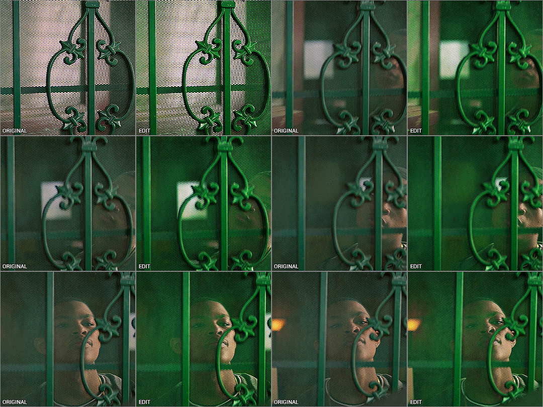


My colouring process is kinda chaotic and it always depends on the gif itself. These three gifs will highlight the similarities and differences in how I colour my rainbow gifs.
You’ll need some understanding of basic gif making and adjustments. I use Photoshop 2021 but I imagine these processes will still work in other versions.
Some basic tips:
When doing rainbow sets, once I've got my base gif ready, I always make a hue/saturation layer on saturation +100 so I can see what colours I'm working with. I just keep it hidden so i can check how my colours are doing throughout the editing process.
Also something to stick at the back of your mind: you want your final gif to be as “monochromatic” as possible - make sure your final palette will be only black + shades of whatever colour you're targeting. This is not only to make the gif as colour-focussed as possible, but it also helps with saving your gif under 10mb. That saturation +100 layer I always keep hidden at the bottom of my gif so I can keep an eye on what colours are present.
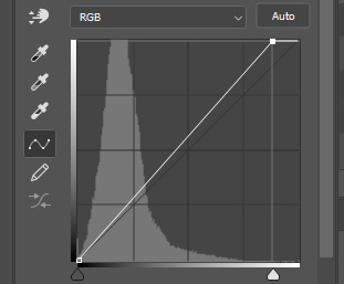
It’s also helpful to understand how RGB and CMYK colours work and what to add/subtract when you want to bring out a certain colour. A good example of this is with Colour Balance:
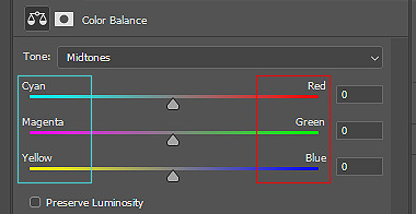
You’ll notice the colours on the left are Cyan, Magenta and Yellow (CMYK), while the other side is Red, Green and Blue (RBG). So if you want more cyan in your image, you’d push the bar towards cyan, but then you’re compromising the reds. In Selective Colour adjustments, the panel is reversed.
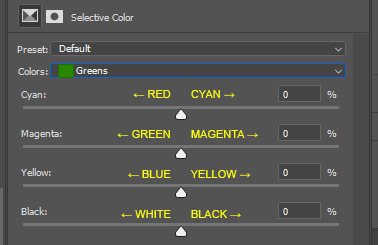
This knowledge is absolutely necessary when you’re doing any adjustment, so keep this in the back of your mind as I work through the tutorial.
Green gif - Eli's door
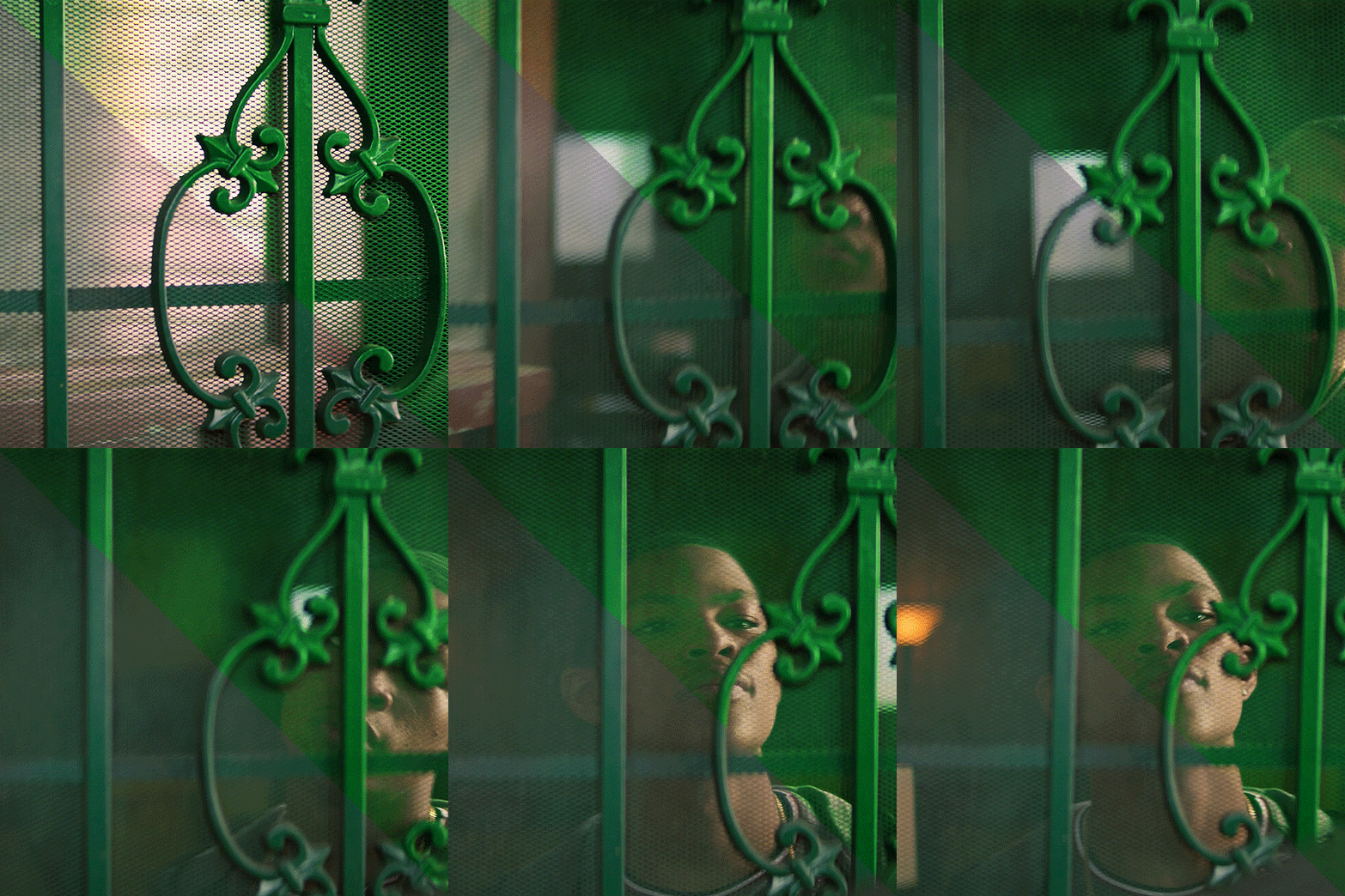
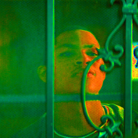
So I start with my hue/saturation on saturation +100 to check what I’m working with here. This gif of Isaiah's grandson opening the door has green, yellow and red as the dominant colours, and I can see a bit of cyan on the right. I’ll keep that hue/saturation layer hidden as a reference.
Normally when I make gifs I start with a curve or levels layer to get any unwanted hues or create a more visible scene. But in this gif, I'm pretty happy with the colours, so I'm just using a simple curves adjustment, because I want to have whatever is behind the door as the ‘background’ and the door frame is the ‘foreground’, so only a slight adjustment is needed here.
Since the colours are already prominent, I'm going to make the green more visible and vibrant. I do this by using selective colour in the green colour to make the green stand out. When thinking of CMYK adjustments, you might think that Magenta -100 would work, as that normally pushes the greens, but I find that this makes things grainy and patchy looking, as you can see here:
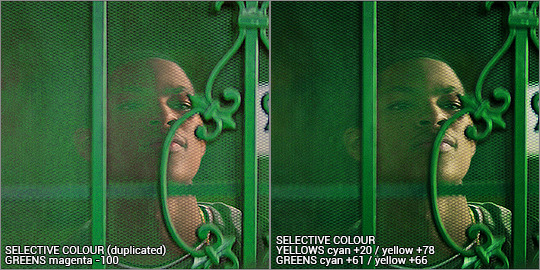
Instead, I’m enhancing cyans and yellows, and only pushing the magenta back just a little bit towards green. I’m not sure why green specifically does this, but it’s useful to know this when you’re colouring.
With the yellows, I want to push those more as well, since the amount of yellow usually influences the green-ness of the gif.. I'm also going to max yellow too since that will also make the green pop, but I also have to be careful not to distort the skin colour too much. I also want to balance the skin tone with a little redness so he doesn’t look like he has jaundice (skin tone will be explored later in the gif process)
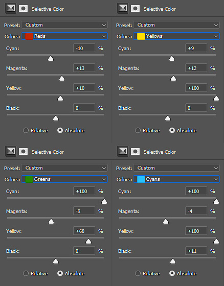
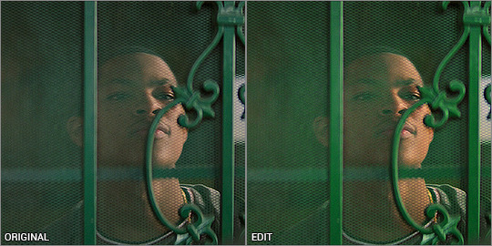
I've added another selective colour layer on top of that, only adjusting the greens just to make it pop a little more. Don’t be afraid to use more than one selective layer, this can really bring out vibrant colours if you use it right.
Just to get some more depth, I add a colour balance layer, again just subtly pushing the cyan and yellow up and not playing with the green too much. Then my usual last layers are with a vibrance and brightness/contrast - I’m usually quite generous with contrast so I can bring out the different shades and it makes things a little more vibrant too.
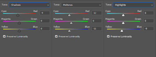
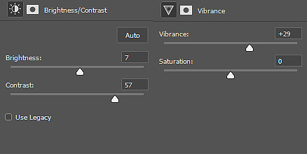
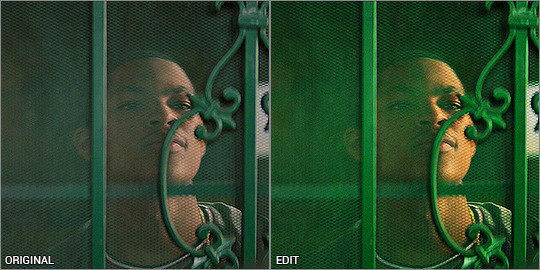
This next step is really important when colouring people with dark skin - you want to lower the redness from their skin so they don't look unnaturally orange, as you can see here:
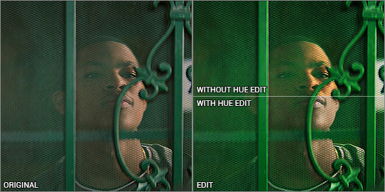
There is a fantastic tutorial here about colouring dark skin tones and avoiding the orange-washed look, and I recommend all gif makers to take note! It's difficult especially when doing rainbow gifs, and it takes some practice. I do this with a hue/saturation layer, and specifically targeting red and yellow and reducing saturation. I might need to play with selective colour or colour balance to get it right. Luckily Eli doesn’t move around too much, so I can use a mask to adjust only his face.
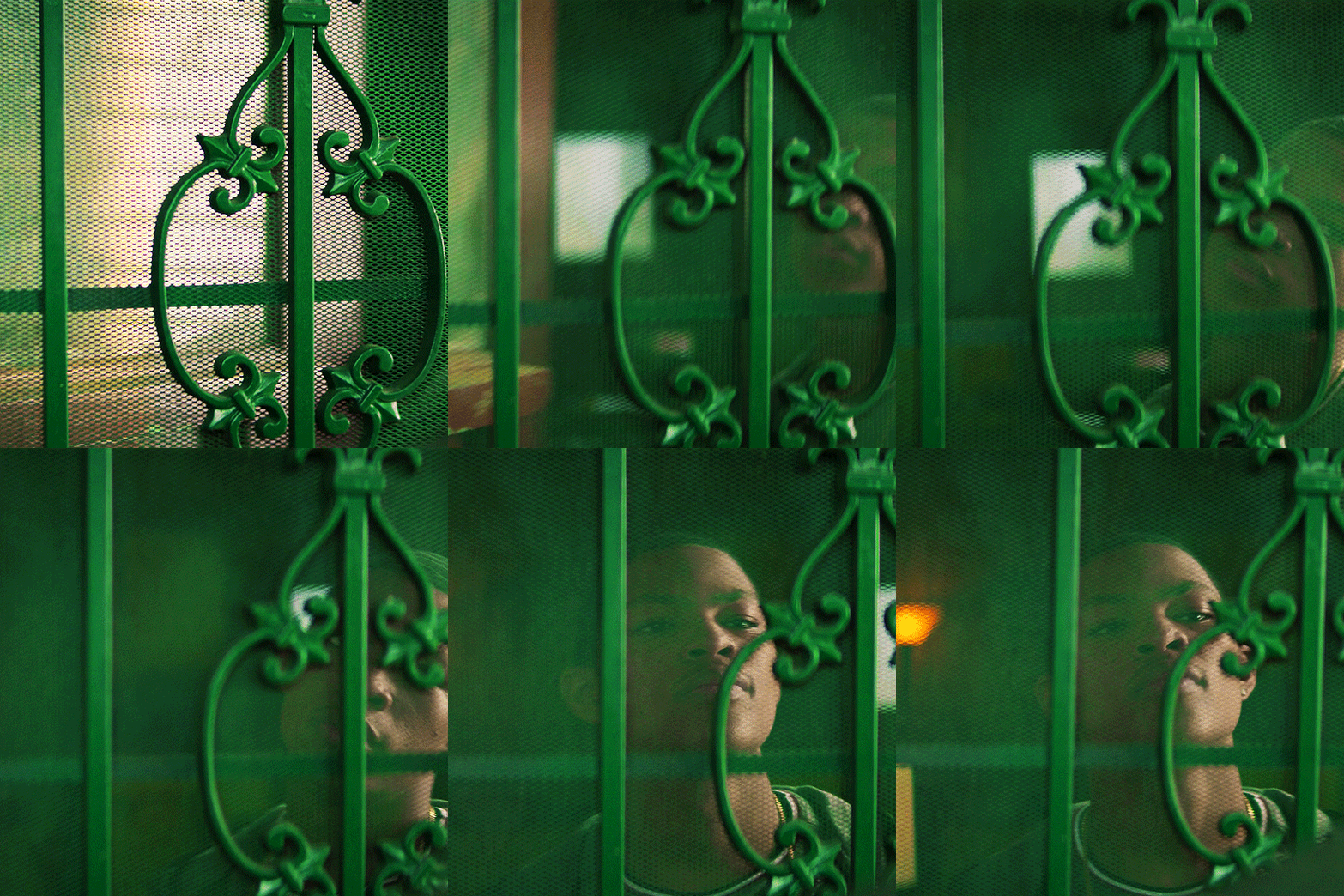
And that’s the end product! now just ignore me as I re-upload the green gif in my set so you don’t see such a horrible jaudiced skin tone sldkfjsldkf
Yellow gif - Karli vs Sam
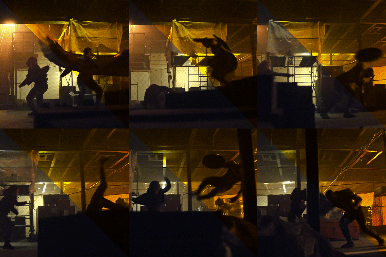
I'm gonna be completely honest here - this gif was very tricky to do. I actually have about three different versions of it. At first I thought "this is the yellow gif so I'm only going to have yellow tones", and did selective colour to get rid of any traces of green AND red, because I didn't want any orange at all. It ended up looking quite dull:
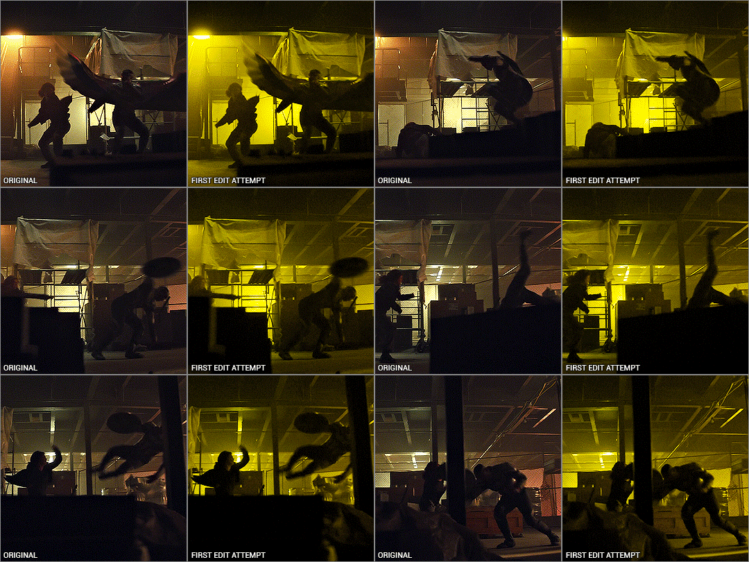
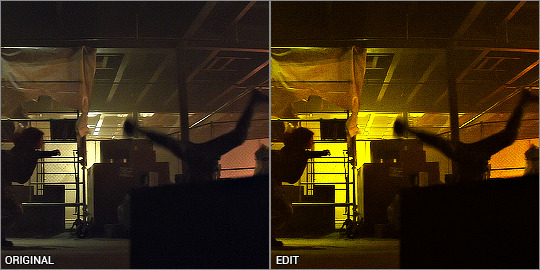
I mean.. yeah it’s yellow........... but it’s kinda boring. So I deleted all adjustments and watched the raw gif, and noted the orange light contrasting with the pale light. The raw gif itself already had some beautiful lighting - why get rid of it? It depends on what you want, but I like my rainbow gifs to have a different colour there to contrast with the main colour.
Starting off with a hue/saturation layer with saturation 100+, I can see there are clearly yellows and reds and a bit of green on the ceiling.
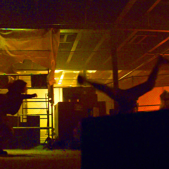
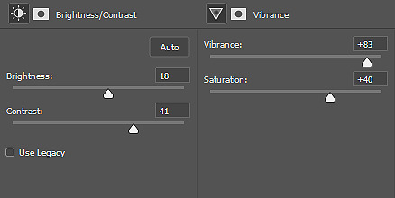
I thought the contrast of the orange and pale lighting was too good to mess up so I started with that. My first layers are vibrance and brightness/contrast to exaggerate the silhouettes and bring out the colours that are already there.
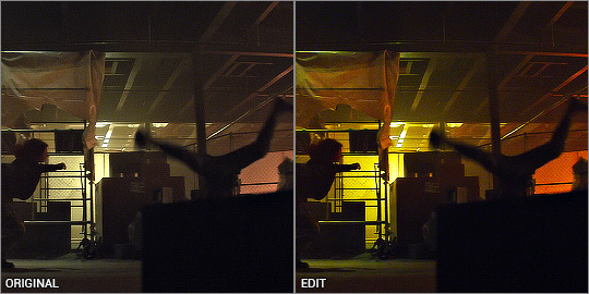
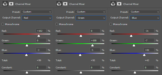
I added a channel mixer layer to narrow down the colours. I wanted to fill the white bits with yellow, and with channel mixer I’m able to manipulate colours into something else while still looking natural and blended. I won’t be doing too much colour manipulating here so the settings are very minimal. I don’t know how to explain it but it just takes a little fiddling to figure out what works for your gif. You’ll notice the white reflections on the ceiling are now a solid yellow colour:
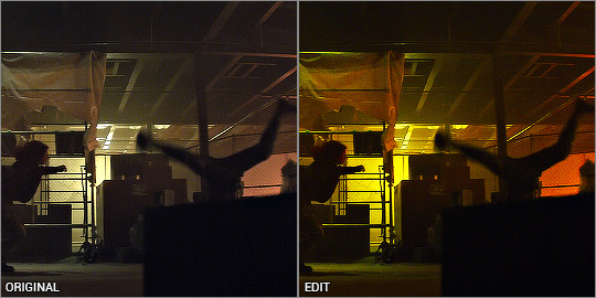
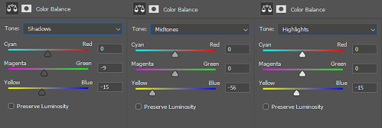
Next is a colour balance layer. I'm basically trying to bring out the yellow out. This is really just trial and error. I added a bit of magenta to bring the depth of the orange colours in the darker shades:
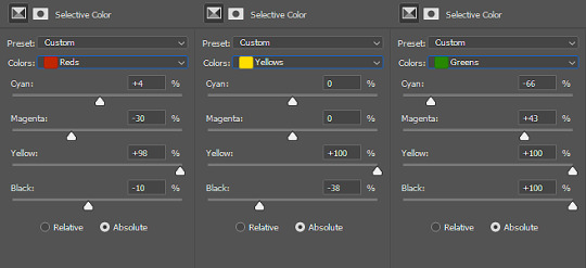
Now for selective colour. I'm often adjusting all of these while hiding/showing the hue/saturation layer I have kept at the bottom. This time, I’m aiming to subtract the reds and bring it down to a warm orange, and I do that by bringing it towards cyan/away from red, and away from magenta/towards green.
Then I max out the yellows so it becomes the most dominant colour. I've also manipulated the green to make sure it is excluded from the gif - again, checking with the hue/saturation layer at the bottom, while keeping my eye on the ceiling and other places where I’ve noticed green lurking about. I don’t want any unwanted shades ending up in the final colour table.
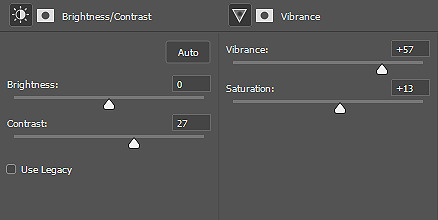
Finally, I finish with yet another vibrance and brightness/contrast layer, just because I like things bright and vibrant!
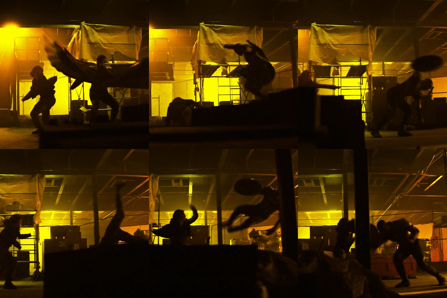
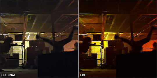
And there it is! The orange is still there and adds a contrast, but you can tell that the main colour is the yellow. This gif seems very straightforward but I assure you, it took me quite a while to get this one right. This gif was a joy to work on because Sam was so very extra in this fight sequence lolll
Pink gif - suspicious mechanical grenade? idk
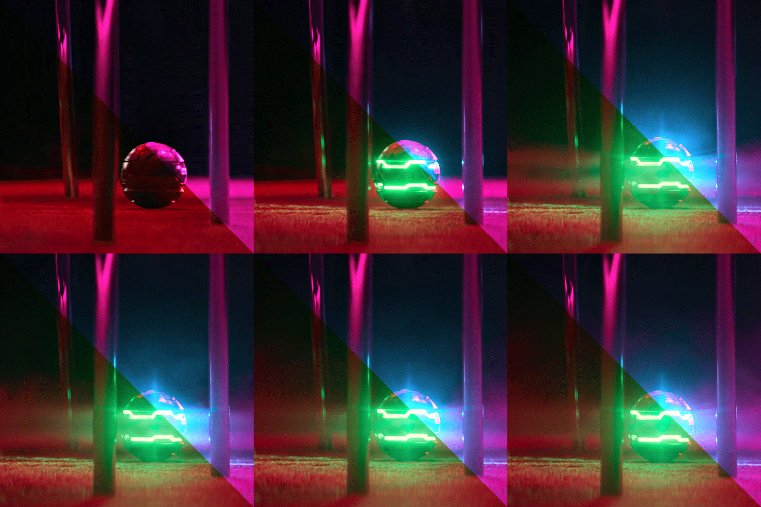
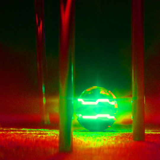
While this gif may look simple, it actually took a couple of tries before I got the colouring right. You'll notice when the ball activates, there is a bright green light that highlights the gas released and it reflects on the chair legs and carpet.
At first I tried this with the above mentioned selective colour method - which I thought turned out okay but it didn't sit with me right. Notice the reflection of the blue light on the carpet - it definitely isn't blue and more like a green-orangey kinda colour, and it doesn't look natural at all.

So I re-started from the beginning and had a look at what I’m working with, starting with hue/saturation at saturation +100. I can see that the original gif has red and green as the dominant colours, with yellow bits blending the two on the carpet. That’s what I was having issues with the selective colour - so I’ll be doing it differently.
Enter: channel mixer. I’m gonna be honest............. I have ZERO idea how the channel mixer really works! It’s all a matter of trial and error, but I’ll try and explain my process step by step.
I normally start in the blue channel (again - no idea why, it just works for me). I start with the reds, and I know if I go over 0, it will push the reds towards cyan, which will get it more purple-y:
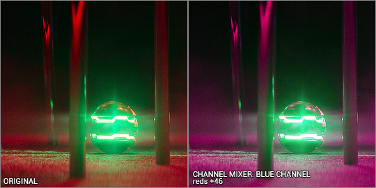
Ooooh looking good!!! then I want to push the greens towards magenta, so that needs to go over 0 as well:
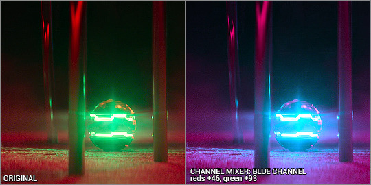
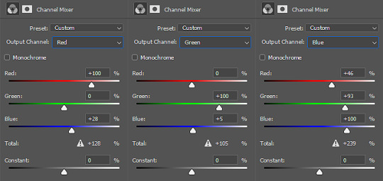
Woohoo! It’s already starting to look good. The green light and the way it blends into the red/pinks have all been completely changed into the cyan hues, so there’s a perfect reflection you can see on the carpet! Yay! I had a fiddle with the green and red channels but nothing too drastic. Here are the settings:
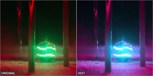
Even with just the single adjustment, I was already pretty happy with it and only did a few touch ups: I added a selective colour layer to bring out a more pinky-purpley colour, then a levels layer to brighten things up. It might seem very backwards to add a brightening tool at the end, but I didn’t want to mess up the original colour shades because I liked having the dark shadows lit up by the ball’s light.
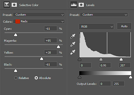
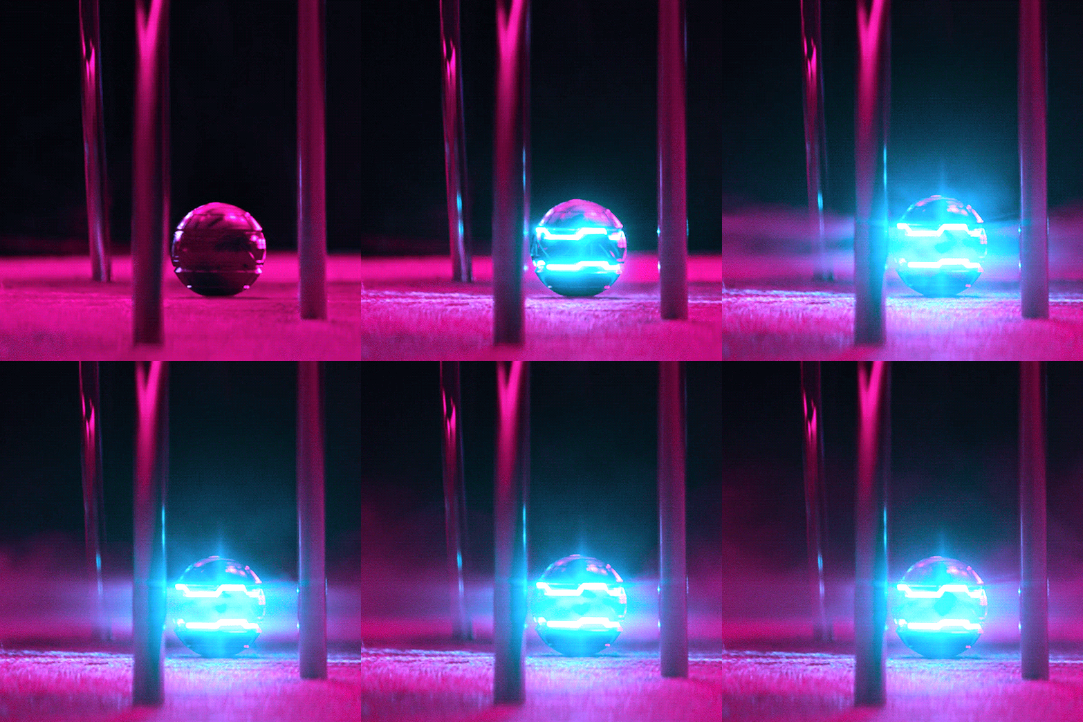
And that’s it! Only three adjustment layers, but it took some time to play with the different adjustments and what worked best. Channel mixer can be really intimidating but it works like a charm when you manage to figure it out.
the end!
Finally I have to give credit to some amazing content creators and their brilliant colouring tutorials that have made such a huge impact in the way I edit. Some brilliant guides include:
this colouring tutorial by @favreaus
this colouring tutorial by @inejz-ghafa
this colouring tutorial by @meliorn
I hope this tutorial has been helpful! I’ve tried to explain myself as best I can, but let me know if you’d like any clarification or have any questions. I’m still learning how to do things, and honestly most times it’s just randomly clicking things until something works out!
#gif tutorial#coloring tutorial#rainbow gif tutorial#gif editing#completeresources#dailyresources#chaoticresources#allresources#photoshop tutorial#fyeahps#dailypsd#**mytutorial
267 notes
·
View notes
Text
Identity and Hua Cheng
I’ve been trying to write this one for a while only to be stymied by the fact that Hua Cheng deliberately obscures his identity to such an extent that it’s difficult for readers to get a solid grip on. Hua Cheng’s identity, as he presents it to the world, is smoke and mirrors. He’s a shapeshifter who doesn’t use his true form, all his names are equally false, and his insincere smile and presentation of himself as acting on a whim obscures what he actually means seriously. Hua Cheng is a butterfly trying to hide that he was ever a caterpillar and to that end anything that relates to his past in any way comes with layers of misdirection.
What he hides, though, is who Hua Cheng is, not that he is Hua Cheng. His symbols and colours are consistent enough that everyone meeting him usually knows who he is. For instance, in the gambling hall they’ve never seen his true skin before but find it unremarkable he’s wearing a new one. Nor does it give them any difficulty in recognising him.
It’s only around Xie Lian that he actually tries to disguise himself and even then it doesn’t seem as if he’s trying very hard. He’s just trying to be non-threatening and that’s tricky if you present yourself as a ghost king.
*
Xie Lian
Hua Cheng’s love for Xie Lian is at the core of who he is. As a ghost it’s his driving obsession, even as a human it shaped him. Xie Lian once told Hua Cheng “live for me” and Hua Cheng took him precisely at his word.
It’s not something Hua Cheng advertises, though, at least not before Xie Lian himself is back in the picture. If he decided to make it obvious then, given his general level of subtlety, everyone in the three realms would know. It’s not that he’s ashamed to love Xie Lian, although he might feel like Xie Lian should be ashamed to be loved by him. Mostly, I think, it’s just too close and vulnerable a thing for Hua Cheng to let other people near. He Xuan and Yin Yu seem to know, but before Xie Lian’s visit to ghost city (where Hua Cheng was not subtle at all) that seems to be it.
Despite keeping it to himself Hua Cheng does surround himself with symbols that evoke Xie Lian in ways discernable only to him. The coral pearl. The butterflies for someone seeking a flower-crowned god. The scimitar because Xie Lian said he should use one. The red umbrella because Xie Lian once gave him one.
He also acts on Xie Lian’s words - perhaps because they had so few interactions he tends to put a lot of weight on every one of them before getting to know Xie Lian as more of a person. Someone else’s meta suggested that Ghost City is at least partly a reaction to Xie Lian saying that things like the ghost lanterns should be sold in a specialised place to people who know what they’re getting - and Ghost City very much runs on those lines. Hua Cheng’s approach to the 33 gods he challenged was likely not just revenge but because Xie Lian said they were bullies who didn’t deserve to be gods.
*
Maio Heritage
There isn’t much attention drawn to this in the book - I think MXTX was worried about the implications? - but Hua Cheng’s use of silver jewellery points to this. Some of the motifs he uses, like the butterflies, have roots in maio culture as well as symbolic connections to Xie Lian.
It’s a shame we don’t get more of this, because it’s implies a choice on Hua Cheng’s part to reclaim a heritage he seems to have lost his connection to as a human. The jewellery is part of his ghost king persona, part of the self he crafted and chose to be.
*
Red
An important colour for Hua Cheng and one he seems to have reclaimed after people reviled him for his red eye. The eye itself is turned into a weapon, its curse into something under his control (... somewhat, E-ming is a wilful sword). The colour is worn almost as a warning, reclaiming the implications as well as the colour itself. Yes, seeing him probably is going to fuck you over. Yes, he is evil and demonic. He’s a ghost king! What are you going to do about it?
*
Wealth and Beauty
Hua Cheng is rich. He has a ridiculous amount of things which he doesn’t seem to care about at all beyond having.
Hua Cheng’s forms are always beautiful, to the point he’s referred to as appearing as “a seductive woman” despite having zero intention of ever seducing anyone except Xie Lian.
These are also the things he lacked as a child. Things he was ashamed of lacking - he hates the ugly, wretched child he used to be.
*
Lone Wolf?
This is one where he says he is but he is not. He grew up with no one on his side, ostracised by everyone, and it’s made him determinedly self-sufficient. He won’t let anyone have power over him and he keeps people at a careful distance, but he doesn’t actually like being alone.
With the ghosts of ghost city his bark is decidedly not worse than his bite but he does always bark before biting. They can mess around with him as much as they like up until he says “scram” - and then they are gone.
Having He Xuan in his debt seems like a way to keep the power balance on his side in a relationship that’s a bit more friendly than he intended to let it get. I strongly suspect he’s not getting paid back.
While Xie Lian’s not snarly about it, he’s also inclined to claim he’s fine on his own when he actually doesn’t like being alone at all. Put them together and no wonder they’re incredibly clingy.
94 notes
·
View notes
Text
Festive Fuelstop

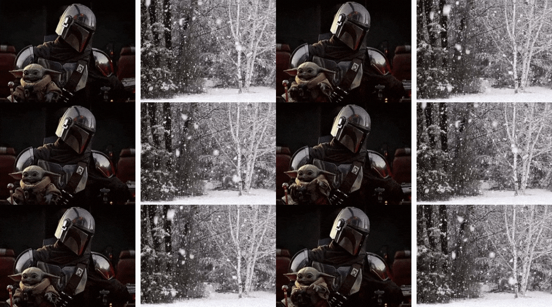
Pairing: Mando x Reader
Warnings: None.
Summary: You, Mando and the Child end up in a small town and get pulled into their traditions.
A/n: Happy Holidays, my loves!
You walked out of the Crest and took a breath of fresh air after a week of being trapped inside the flying metal. Despite having to make an emergency landing, you were thankful that the fuel line had started leaking just to stretch your legs. You and Mando had landed on the outskirts of a charming village where the mechanic actually refused the credits that the Mandalorian offered to repair his ship.
“Oh, golly. I can’t take payment now - I haven’t made any repairs.” The man chuckled heartily and whistled for his best workers to get on the job. The repairman then focused back on the new arrivals. “Why don’t you hold on to those credits and take your family down to the markets in the meantime?”
Mando appeared to have frozen so you leaned forward and pulled his hand back, flashing a smile to the kind man.
“The markets sound wonderful - could you point us in the right direction?”
You were given instruction to follow the wooden path down the hill until you reached a clearing into the central part of town which you, Mando and the Child followed.
When you reached the bottom, the townsfolk were in a buzz carrying boxes of shiny strings and coloured balls from one part of town to the next. Homes were decorated with lights strewn across the fences and roofs, some even had a green wreaths on the front door. Adults met up with one another with a grin as they walked in the same direction while children chased each other in tow.
You and Mando exchanged curious glances. This wasn’t something either of you had come across and your confused expression caught the attention of a passerby. The man stopped before the two of you and pointed.
“Visitors?” He guessed with a smile on his face that highlighted a hidden dimple.
You returned the smile and Mando nodded, “Our ship is being repaired uphill.”
“Well then it’s in safe hands. Please, feel free to join us in the Square while you wait.” The man invited and then walked away in the same direction as everyone else. It seemed like the whole town was headed that way.
Folding your arms, you turned to the bounty hunter, “Is it bad that I want to know what’s happening in the Square?”
“We have to keep moving.” Mando reminded as he looked around the buildings. “Maybe find a diner of some sort.”
You watched as more of the townsfolk left their homes and bit your lower lip as you thought - then you heard the child croon and idea came to mind.
“If everyone’s in the same place then none of their lodgings, food or otherwise, will be open. We’ll have a better chance to blend in alongside everyone else while seeing what has everyone so excited.” You said. “And the kid might never experience this again.”
The Mandalorian cocked his head to the side when he heard you.
“Are those reasons for the kid or for you?”
You shot him a side-eye and shook your head. Without hearing his argument against the plan, you followed the crowd and - in a few minutes - his beskar arm braces were bumping beside you.
It was a short walk to the heart of the town where a large green tree gleaming with lights and decoration sat in the middle. Your jaw dropped, eyes mesmerised with the sight that you almost knocked into the woman in front of you had it not been for Mando pulling you back. As the last few people joined, you realised that it was getting too close-for-comfort for the child so you moved to a more open space a little further from the festivities.
You returned to staring in awe at the magnificence of the tree and couldn’t help but smile, “What are they celebrating?” You wondered just as a little boy zoomed past with his friends, hearing your question. He stopped before you and Mando and placed his hands on his hips.
“You must be travellers! Tonight begins the First Ice of Holly Day. We gather around the tree just before the snow begins to fall - which should be starting soon!” The young boy explained and then ran off leaving the baby to lean over his cradle and coo.
Soon? You looked up to the skies and noticed that they had now been filled with frosty grey clouds. The sun began to fade away which illuminated the lights around the entire town making everything glow. As it darkened just a touch more excitable voices began talking quickly, most of it inaudible. You were so caught up in the moment that you hadn’t realised Mando tensing up beside you until you turned to him. He looked like he was ready to be jumped. You opened you mouth to chide him when there was a joyful cry from the far side of the tree.
“Look - look! It’s snowing! Holly Day has begun!”
You , Mando and the Child looked up once more and, sure enough, small snowflakes descended upon the happy town. A chilled breeze set in and you remembered that you weren’t properly clothed from when you exited the ship a while ago. You were about to suggest finding some coats when Mando turned his head toward the clearing.
“We should head back. I don’t want to be caught in a snow storm at the base of a hill.” He told you. You glanced at the baby trying to catch the snow in his mouth and sighed. Mando was right.
You shivered slightly, dusting the snow from your shoulders. “Point made. But before we head back, I need to stop at a vegetable stall.”
“Why?”
You pursed your lips and squinted at the green womp rat in the cradle, “Because somebody keeps ‘force-flinging’ the celonslay into the refresher.” you leaned down to the baby and used the tip of your index finger to lightly press on his button nose. “Vegetables are what’s going to make you big and strong.”
You straightened back up and noticed the crowd the beginning to disperse as you looked around them to find some place that sold healthy greens.
Mando pointed over your shoulder quietly and you followed his hand to where a row of merchants stood with their goods just past the tree. You thanked him and requested that he and child stay put until you returned. The bounty hunter didn’t argue and so you ventured off to the markets. As you passed the tree you smiled once more at its beauty. A part of you wondered if Mando would oppose to having a small one in the ship. But then you thought better of it because if Mando didn’t oppose then the kid might tear it apart or worse, jam it into the refresher.
You passed the first stall which happened to be filled with florals and ‘Holly Berry Seed Pots’ and over to the second one where rows and rows of fruits and vegetables sat. Scanning the items, you spotted the celonslay and decided against purchasing it again. The Child clearly didn’t like it. As you browsed, a head popped up from behind the stall - it belonged to the man you first met upon reaching the town.
“It’s you.” You realised.
He chuckled and quirked a brow. “Twice in one day? I’m beginning to think that you’re following me.” He teased lightly and tapped his hands on the wooden counter top. “I’m glad you decided to come to the Square.”
The man inquired about how you felt about experiencing the First Ice and you told him the truth of how you adored the way it was celebrated. You both then returned to the task at hand and you asked for his suggestion on a vegetable that a baby would enjoy.
“Children are tricky to pick for.” The Merchant hummed as he looked over the available selection. “But I do have some gimer canes. If the kid is teething, he can chew on this to get important nutrients with a sweet taste. He might even do a happy dance.”
Your eyes lit up along with your smile, “That’s perfect, I’ll take four.”
“Gimer canes are fairly rare so...”
“I’ll pay you double.” You offered instantly, not bothering to discuss it with the Mandalorian.
You expected the Merchant to take the credits right away but he laughed admirably at you. “I was actually hoping that you’d come with me to the Holly Seed Planting tomorrow instead.”
As much as you wanted to stay, you and Mando were due to leave the planet in under an hour. Your shoulders visibly slackened and the Merchant seemed to have understood. He reached beneath the counter and lifted up a paper bag, handing it over to you.
“Here, consider it an early Holly Day gift.”
Slightly confused, you looked inside and saw four pieces of the rare cane. You didn’t know how to express thanks besides repeating the word in the hopes that it would be enough.
“It’s okay, really.” The Merchant said softly. “Times are strange, we may meet again.”
You flashed a smile and thanked him once more before turning to leave.
You returned to the Child and the Mandalorian shortly after and noticed the mechanic of your ship walking away from the beskar-plated man with a spring in his step and humming a tune.
“Was that...?”
“It was.” Mando sighed. “Apparently, the repairs won’t be ready until tomorrow afternoon because the mechanic doesn’t want to miss out on the ‘festivities’.”
You couldn’t really blame the creature for halting work and you looked over at the hill pathway that led to the ship. “Old fashioned camp out in the broken cargo hold?” You suggested.
“It’s getting dark and you’re exhausted. We’ll stay in town until the repairs are complete.”
This meant that you could repay the Merchant in full.
“Why are you smiling?”
You wiped the escaped emotion from your face and cleared your throat. Balancing the bag against your hip, you looked around the well-lit town, deflecting the question, “I’m sure that there’s a good lodging around here.”
And you were right, a short walk down the road landed the three of you at a comfortable inn for travellers. But as luck would have it, finding a decent sized room in the towns busiest time proved to be difficult and so, you, Mando and cradled baby were placed in a smaller, single bed compartment with extra blankets to compensate. While it was quaint, a part of you wished that you were back on the Razor Crest.
As Mando settled into the temporary sleeping quarters by checking the perimeters, you helped the kid out of his cot and onto the soft mattress. This hadn’t been the first time that there was only one bed between three individuals so you and Mando decided to take one side each to make sure that you were both well rested. And, to be involved, the Child would walk across the surface before sitting on the side that he wanted Mando to be.
The kid cooed and then smacked his lips which reminded you that he had not been fed the since lunch. You walked over to the table by the door and dug into the paper bag retrieving a stick of the gimer cane before carefully handing it to the baby to taste.
Mando joined your side as the pair of watched the child chew on the cane with a happy squeal.
“He likes it.” Mando noted, relatively surprised. Your mouth hung open as you watched the green womp rat do a little seated ‘happy dance’.
The Merchant was right.
Speaking of the man, you remembered to tell the bounty hunter of your plans the next day, explaining - once again - that it would be a good way for the kid to learn and enjoy other customs. His sigh told you that he wasn’t thrilled but, ultimately, he resigned. “Fine but we’re leaving the moment the Crest is fixed.”
You tried to contain your smile but it slipped out which led to the Mandalorian shaking his head and heading for the bed to get some decent rest. He picked up the child and moved him to the centre before laying down on the sheets. As you watched the baby find a comfortable sleeping position against his chosen-father, you realised that you were fairly exhausted from the day. You took up the blankets that the lodging provided and laid along the empty bed space, covering yourself and the kid just before falling asleep to the burning candlelight.
When you woke to birdsong, you found that the child had switched sleeping allegiances and was now snuggled in your arms. Mando stepped out of the refresher and helped you to get ready for the day by removing the womp rat from your hold which led the child waking up with a small wail until Mando pacified him with a gimer cane.
Once all affairs were in order, you paid the lodging owner in full and left for the Merchant’s stall where the man had just farewelled a customer.
“Can I have four more gimer canes?” You wondered and the moment the Merchant saw you, he abandoned his job, rushing to the front with a smile.
“You- you’re still here.”
Nodding, you gestured to where Mando stood with the child, “Our repairs will be done this afternoon which means we can go to the Holly Seed Planting.”
The Merchant nodded and boldly took your hands when he spoke. “The Planting is in a few hours but there are things we can do before that!” He looked over your shoulder to Mando, “Tell me, friend. Have you ever gone sledding through fields of freshly lain snow under trees of light?”
Mando stared back through his visor, “Only to capture my bounty.”
The Merchant didn’t know what to make of the statement and you chuckled to lighten the air, “Sledding sounds wonderful!”
And that’s what you did. The Merchant took the three of you to a sledding field and you almost forgot about your mission to find the child’s people. Mando took the green womp rat for a ride after caving to his pleading coos while you rode with the Merchant.
Once the snow-filled fun had run its course, you all ventured back into town for a hot meal at the local cantina and a short rest before learning that enough time had passed for the Holly Seed Planting. You and Mando followed the Merchant over to the large tree where, at its base, several plots were dug in long rows along the white frost.
“What’s so special about this event?” You asked as curiosity enveloped when you noticed people gathering in pairs.
The Merchant took your hand and pointed across, “Holly Seeds are special, they bloom fast with emotion and identical where love is pure. It’s a rare sight to see but it doesn’t make it any less fun to plant.”
“What happens to these seeds after?”
“We nurture them through the year, their roots and leaves merge until they form the Town’s next tree for Holly Day.”
If you had left the day before, you never would have learnt about something so amazing.
“Oh - I think it’s starting. Let’s go get a seed.” The Merchant told you excitably.
Mando made no effort to move quickly, instead he held onto the child and stepped back. “I think the kid and I will wait this one out.”
A part of you wished he wouldn’t remove himself but once the Mandalorian made up his mind, he often stuck to it. You focused on the Merchant once more, painting the snow with your footprints until you both collected a Holly Seed Pot each and kneeled by two empty plots.
“Okay,” The Merchant said, nestling a little closer, “so all we need to do is hold these next to each other and if everything is right, they’ll bloom.”
You held out your pot until it clinked against the Merchant’s. Almost instantly, a bud peered through the Merchant’s soil and it quickly grew into a stem ... then leaves sprang forth ... and finally, a white-petaled flower emerged, tilting forward like a bell.
You looked down at the pot in your hands and there was nothing - not even a hint of green.
You gave a dry chuckle to hide the way your heart sank, “I can’t imagine it’s good news if nothing happens, right?”
The Merchant shook his head to not worry you but you could see in his eyes that this came as a surprise to him too. Clearing your throat, you flashed him a smile and looked around the place where bursts of colourful flowers came to life. “So, what happens next?”
“Usually, we walk around and see if there are identical flowers before we plant them into the ground but...”
You noticed his eyes flicker to the various pots, clearly trying to spot his match, and placed an gentle hand over his shoulder.
“Go ahead, it’s okay.” You told him as he once told you. The Merchant hesitated briefly until you repeated yourself.
You got to your feet as he thanked you and then you watched him walk through the crowd. Glancing at your sad-looking pot, you remembered something and looked up to find your travel associates.
No green or beskar could be seen. You did, however, see the mechanic once again. He had just arrived and was talking to a friend about how he had just finished a job.
The Razor Crest must have been ready. You intended to give a farewell to the Merchant but when you saw him standing by a young woman with an identical white flower, you decided against it.
Let him have this moment. Taking the plant, you decided to blend out of the crowd and back to somewhere familiar.
—
The Merchant was kind but Mando felt his dislike for the local grow every time you were present. He blamed the whimsical nature of the town but Mando felt something envious surge in him whenever you talked about the Merchant with a smile. Then he had to spend the day watching the pair of you laugh and joke and... hold hands - Mando seriously feared that you may have been falling in love. When the Seed Planting came around, he tried to ignore the way you and the Merchant had grown fond of one other so he stood to the back of the crowd. He was blending in quite well until a sweet old lady spotted him and the child and handed him a Holly Seed Pot of his own. He tried to give it back but the woman ignored him and moved on. The Child cooed and Mando turned to see you kneeling by the snow and holding your pot against that of the Merchants.
He heard the baby croon and attempt to speak.
“I know buddy...”
The child started tapping his hands over Mando’s gloves and pulled his attention from the Jedi over to the pot in his hands.
A red flower had sprouted almost instantly while was distracted. The edges of the petals ran gold like ink.
His mind flew to what the Merchant had said about quick blooming flowers and the Mandalorian felt his heart race.
‘Fast with emotion.’ He had said.
Turning around, Mando made a quick getaway just as the townsfolk gathered to ‘ooh’ and ‘ahh’ around the flowers. Thinking fast, he decided to head back to the ship, almost bursting into a sprint. The child had fallen asleep during the trip so when Mando finally got to the Crest, he laid the infant down before getting to work. He took the pot plant over to the carbonite chamber and shut it inside with a hiss.
—
The walk uphill was long and exhausting. There were multiple times when you considered throwing the pot behind you but something always made you rethink and forget the option. When you finally reached the Crest, you spotted Mando fiddling by the carbonite chamber and the kid asleep in his cradle. You dumped the pot on the side bench and headed past the Mandalorian for the cockpit.
“I’m ready to get out of here.” You said, climbing up the ladder. Without missing a beat, you sat in the pilots seat and prepared for take off, closing the doors of the cargo bay. You were a fast flyer so you had the ship up in lightspeed in no time only dropping out when you were several systems away. As you prepped the ship for autopilot, you heard the familiar armour behind you.
“I’m sorry it didn’t work out.” He said gently. “The Jedi Order and the Mandalorian Way don’t give much room for romance.”
You leaned forward and flicked on two switches. A disappointed sigh escaping over the console. “I know. Sometimes, I hope for a sign that will lead me down a different path - one where I don’t walk alone. But it’s always a fools hope.”
The Crest’s engine sputtered, shaking loose a pipe above your head which made you frown when it bumped your head. “Dank farrik.” You muttered. “Can you get me something to fix this?”
The beskar helmet nodded and Mando turned down the narrow corridor. He went down the stairs to grab a wrench from his tools cabinet when a flicker of gold caught his attention.
Sitting on the bench was your Holly Seed Pot, a green stem had rose from the mud, blooming a red Holly Flower with gold trimming - just like his.
Masterlist here
#theladyofmanyfandoms#theladyofmanyfandomsfanfiction#gif is not mine#mando x reader#mando imagine#the mandalorian x reader#the mandalorian imagine#mandalorian imagine#mandalorian x reader#din djarin x reader#din djarin imagine#star wars x reader#star wars imagine#xmas special
224 notes
·
View notes
Text
Drowning Too Deep_2.1 || KNJ || JHS
▬▬▬▬▬▬▬▬▬▬▬▬▬▬▬▬▬▬▬▬▬▬▬▬▬▬▬▬▬▬
-> Picture Source - Pinterest
▬▬▬▬▬▬▬▬▬▬▬▬▬▬▬▬▬▬▬▬▬▬▬▬▬▬▬▬▬▬
Drowning Too Deep [Namjoon x Hoseok x Reader]
Part 1 || Part 2 || 2.1 || 2.2 || Part 3
▬▬▬▬▬▬▬▬▬▬▬▬▬▬▬▬▬▬▬▬▬▬▬▬▬▬▬▬▬▬
Genre - Established!Boyfriend(s) au; Poly;
Summary - Alone at home, nothing but thoughts, pent up emotions, roaming fingers and a wild imagination... that is... until your boyfriends catch you in the act.
Word Count - 1.6k
🎶 - Anyone - Justin Bieber
It had to be her, it just had to - Namjoon
▬▬▬▬▬▬▬▬▬▬▬▬▬▬▬▬▬▬▬▬▬▬▬▬▬▬▬▬▬▬
Choices were a part of everyone's life - - she was definitely one he could never turn back from, one he didn't want to turn back from.
It wasn't easy for Hobi, or any of them for that matter, but they had all grown up together; Hobi knew and felt and observed and listened. Joon took action, implemented and took charge. Cues, after years of being together with people were unspoken. Sharing dorms and cramped spaces, privacy non-existent, problems solved as a family in family meetings. Yeah… it took time.
Joon had had his fair share of bad days with Taehyung. Namjoon was too serious when they first met each other - - the random thoughts and eccentric actions, 'the world would go on anyway' energy, it took Joon some time to realize that Taehyung cared, just differently.
Over time Namjoon exercised looking at both the heads and tails of a situation, stopping to smell the roses, using the rose-coloured glasses and Taehyung grew to understand why there was a need to be serious in certain circumstances, that not everyone deserved a smile, that the black and white existed on either side of the grey.
Most importantly, he was Joons maknae. Every hyung had a maknae; Jimin and Hobi were roomies, Jungkook had Jin and Taehyung was Joons. It couldn't necessarily be called a responsibility, but Joon wanted Tae happy, stress free, in control, able to think level-headed and be strong.
Joon had to learn how Taehyung worked. How he liked his food. His distaste of coffee. His eye for fashion and style. In return he trusted Joon with lyrics, with ideas, with his vocal range. And somehow, they just...were. Just were. As themselves. As each other. It worked. They had made it work.
But with mistakes, misunderstandings and arguments, and time. Y/n had barely been here a year, and yet…
'I don't think you're wrong, Tae.'
Joons ears perked up at the statement. He had a clear view of them as they all faced the wall length mirror.
Y/n sat side by side on the floor against the wall of the dance studio right next to Taehyung, who currently had his head hung low, legs stretched out in front of him.
Tae's argument with Jungkook the day before had been weighing on everyone's minds.
Jungkook had left for vocal practice immediately after the group dance practice and Jimin was caught in between the both of them.
Jungkook isolated, he needed silence, he needed to be ready to talk first. Taehyung needed to talk, to drive his point home, to be himself. Jimin needed to clear his head. He loved too hard, knew both of them weren't wrong, but it was tricky to handle a situation where what you said could break someone's heart if it spoke for either of them.
Joon himself tried, earlier on, yesterday, last night even, to diffuse the situation but to no avail. He had found Taehyung in Jimins bed that morning. Jin reported Jungkooks door locked, when it was generally closed or slightly ajar. They weren't on talking terms, avoiding each other at the dorm, staying as far away as possible for the group schedule. It was obvious they had decided to keep their distance until further notice.
Y/n was passing by when she noticed them; Tae, Jin, Hobi and Joon were the only ones in the studio.
They needed the extra practice, and Tae was only scheduled for vocals late this afternoon so he hung back. They could see how deflated he was. She saw it as soon as she stepped in, asking for him to check out the twitter trend affiliated to him going on by ARMY's before looking up from her phone and reading the room.
Intrigue, general interest not even the least piqued, even she could put two and two together, after all, everyone had heard of argument that transpired in the studio the day before.
Greeting them softly with a nod, she walked straight toward the sulking puddle of grey sweats, shirt and beanie.
She bent down at first, whispering a few words, pointing to her phone, and when he shrugged in nonchalance, a mumble that sounded like he would 'check it out later,' uncaring of her suit, she sat down, her heels kicked off and placed on the side, socked feet stretched out next to him.
She had gotten used to them over the last year. She knew who she had skinship privileges with. Jimin liked hugs, Jungkook liked clinging on the odd day, and Taehyung liked her overall. He said she had a specific minty scent that curled around him and Joon knew the perfume firsthand, having seeing the bottle on her dresser so many times.
She hadn't visited the night before, texted Hobi and Joon that their family came first, she shouldn't be a part of it quite just yet.
It seemed a couple hours had changed her mind considering what she did next.
'Listen,' she stared ahead at the mirror as she spoke.
'I haven't been here very long and I have no right to say anything about this. But Tae,' Y/n looked at him, placing her hand over his to have him look up at her. 'You know you're not just anyone to him.'
Hobi helped Joon with a particularly subtle hip movement that would make a step easier to manoeuvre, Jin next to him nailing it in three tries. They pretended to be preoccupied, uncaring that the music wasn't even turned on.
Offering up a soft smile, she continued, 'The people that coax us out of our shell, the people that reassure us, the ones that grab onto our hands when we get off balance, the ones we find home with, sometimes it's hard to accept that we rely on them as much as we do.'
'I won't leave him alone, Y/n. I would nev-.'
'I know you won't. And deep down he knows it too. But you are all growing up Tae. You know more people and have grown into so many new things about yourselves.'
Y/n could hear the desperation in Tae's protest, his eyes filled with hurt at the very idea of ever leaving Jungkook to do life alone.
'I mean look at his tattoos, look at your hair, and you all want to do more side projects.'
Ofcourse, Taehyung had never meant to sound insensitive about pursuing acting jobs, and he didn't mean to say that their group, their lifstyle, was something they should just put behind them.
Lowering her head to meet his eye, she brought him out of his mini spiral and continued.
'This is the only family he's ever known Tae, he knows everyone won't live together someday, he knows he wants to do things that are different, that are on his own, he knows he can't have both worlds always, but knowing doesn't mean it hurts less. Acceptance doesn't mean being ready to move on, and he, himself needs to come to the realization that he can come back to you when he's done, his brothers...his hyung.'
With her soft touch and her words, recognition slowly sunk in.
'Like I said, you aren't wrong,' she closed one eye, measuring a shirt distance with her thumb and forefinger in front of it, 'but your mind, and how it works, sees things a bit further ahead than Jungkook right now. So, you can either go to him, and talk to him, about the pressure, and the pace and the after, even if it's not what he wants to hear, or you can just give him time and let him come to you.'
Y/n clasped his hand in hers, letting it fall in her lap as she whispered her next words, 'We don't stay far from our homes for very long, he will come back to you,'
Joon found Hobi in the mirror, he had his chin up in pride, a smile akin to Joon's own, and Jin turned toward them at the same moment, blinking slowly as he nodded his head once.
It did something to Joon to have the sign given, so silently, so freely, because Jin was their hyung, the eldest, nothing would go on without his consent. There were no serious dislikes about Y/n but this, this moment, it was a yes, it was an approval, it was a statement - - your choice is not wrong.
When Joon turned back to her, seeing Taehyung's face light up at the tweets on her phone screen, seeing her smile at him, genuinely happy on a sweaty dance practice floor, next to a brother they would protect always, Joon's head immediately filled with maybees.
Because maybe it was that she took over without meaning to when they were busy or when they couldn't get anywhere with the situation.
Maybe it was her words. Maybe it was that she took the time to make the people important to them understand.
Others might see it as butting in, an emotionally off kilter person would feel like she was meddling in business that was not hers. She could have gotten fired, had they just said the word.
But Y/n sat there, disregarding her own busy day, to make sure Tae understood that he was the bigger brother even if by only a year.
She did it all without looking at Hobi or Jin or Joon, she didn't need them to be there, to see or to show off, she did it because she was that type of a person.
And maybe, just maybe the blanket on Joon's heart, an emotion full of warmth, spread in earnest because when she spoke of homes and shells and coaxing, the emotion behind it said one thing only to him - - Hobi and Joon…they were her home.
Part 1 || Part 2 || 2.1 || 2.2 || Part 3
▬▬▬▬▬▬▬▬▬▬▬▬▬▬▬▬▬▬▬▬▬▬▬▬▬▬▬▬▬▬
#kim namjoon#jung hoseok#jung hoseok x reader#jung hoseok x you#hoseok#hoseok fanfic#namjoon x reader#namjoon fluff#hoseok fluff
35 notes
·
View notes