#Entablature
Explore tagged Tumblr posts
Text
For reference:
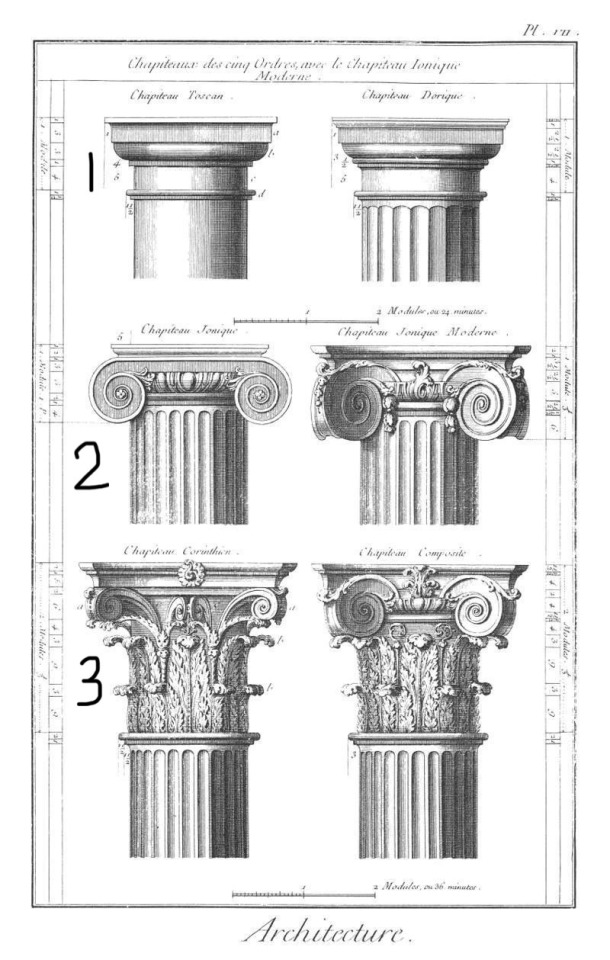
#my polls#upload#order of Greek architecture#ionic#doric#Corinthian#greek architecture#architecture#columns#classical order#I numbered them to make the diagram more clear lol#architectural elements#design#architectural design#ancient greece#Ancient Greek architecture#the ancient romans took inspiration from Ancient Greek architecture and created two additional column styles#but these are the OGs and really the only ones that matter lmao#that’s a lie composite style is gorgeous and deserves an honorable mention <333#composite columns#ancient architecture#neoclassical#Neoclassical architecture#history#historical architecture#pillars#architectural columns#entablature#Greek order of architecture#marble
13 notes
·
View notes
Text

[Entablature.]
3 notes
·
View notes
Text
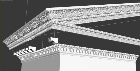
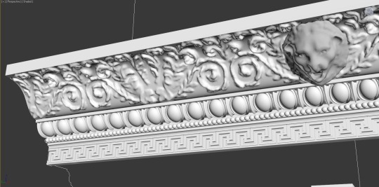
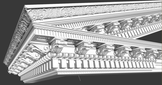
Here are some screenshots of some models that I have been working on in my free time. They are of the raking cornice of the entablature of a Roman Temple. The molding is enriched and also intersects in a particular way—it's not easy and there are lots of polygons. It is meant to be printed someday so I can have a Roman Temple in 1:60 tabletop scale. :) The first two pictures are what I am working on now. They are from an original Corinthian entablature that I designed based on actual Roman styles from antiquity. As I have modified the style, it is not 100% historic but very much captures the style and flair of the temples of the high Roman Empire. It is for the temple of Heliopolitan Sol, an imaginary temple to the sun god in western Anatolia or perhaps Syria. :) The third picture is a raking cornice that I worked on previously. It is based on the neo-classical style as presented in Robert Chitham's 'The Classical Orders of Architecture.' I have abandoned it because it is neither original nor sufficiently original for my liking.
#non-Midjourney#3D Modeling#3D Printing#Roman Architecture#Roman Temple#Raking Cornice#Entablature#Corinthian Order
3 notes
·
View notes
Photo

Sun Room Medium Mid-sized contemporary sunroom design idea
0 notes
Photo
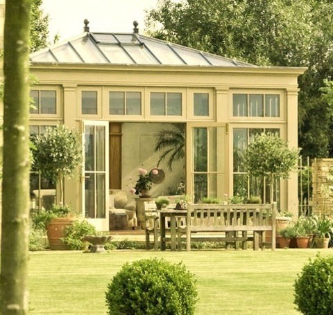
Traditional Sunroom An illustration of a mid-sized traditional sunroom style
0 notes
Text
Contemporary Sunroom - Medium
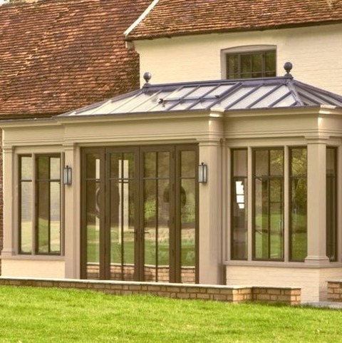
Mid-sized contemporary sunroom design idea
0 notes
Photo

Sun Room Medium Mid-sized contemporary sunroom design idea
0 notes
Note
hi there i saw your comic and i didn’t want to distract from the point but are you genuinely into column differentiation. because if so that sounds fascinating and i would love to hear about it
yes i am!! i opened tumblr to several requests in my inbox for this so here we go, a quick overview:
There are five general types of columns in Greco-Roman architecture: Doric, Ionic, Corinthian, Tuscan, and Composite. I’m mostly going to focus on the Greek 3, as Tuscan columns are basically just Doric columns but bald and Composite are, surprisingly, a composite of other types.
(technically there’s also Roman Doric vs Greek Doric but we’re keeping it simple)

In terms of the shaft, all 3 Greek columns are relatively the same, they differ the most in their top chunk aka the entablature. Doric columns are very simple, growing more complex with ionic and even more so with Corinthian. However do not confuse complexity with appeal! Corinthian Columns are often over decorated and gaudy.
For example, look at the Supreme Court building.

This is an abomination. The Corinthian columns exude opulent wealth and frivolous decor, which is not what you want from a building meant to instill justice. But it’s the US so who’s shocked. Anyways

Compare to the long lasting elegant Doric columns of the Parthenon. They may look simple, but they’re also complex in a way you might not expect: the Greeks used columns to form optical illusions.

The columns actually aren’t straight, they’re curved just right to make the whole building appear perfectly straight. For a modern example, lets look at the Haunted Mansion at Disneyland! Surprisingly the imagineers at Disney have an overlap with the ancient architects of Greece: they mess with perspective to create broader illusions of size and depth. And look at those beautiful Doric columns. Elegant. Graceful. A sign of wealth without excess. This should be our supreme court

3K notes
·
View notes
Text

#Remains of capitals#entablature and pediment. Temple of Saturn#at the Roman Forum. Rome's main street#the Via Sacra#passes under it and crosses the whole Forum down to the Colosseum. The ruins belong to the 3rd phase of the Temple of Saturn#built after a fire around 360 AD...
0 notes
Text
Fantasy Guide to Interiors
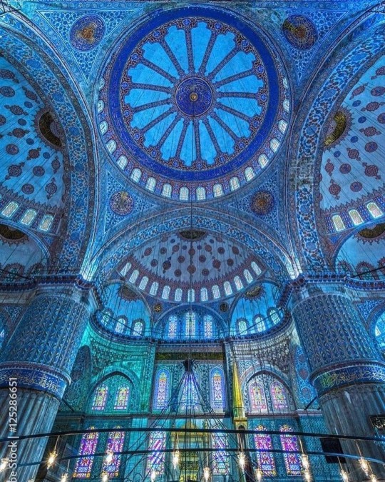
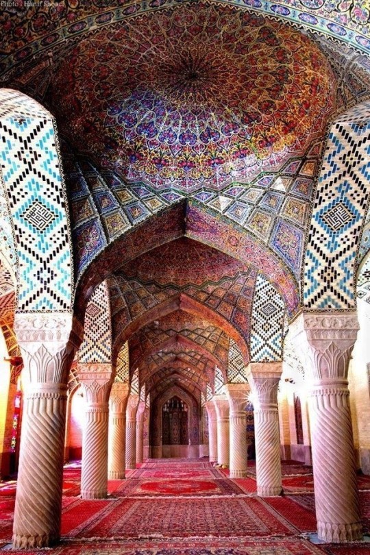
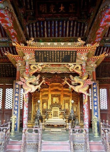
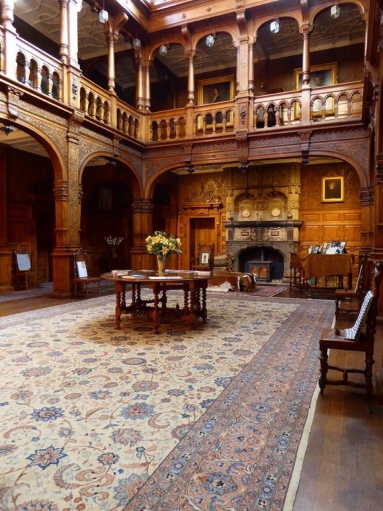
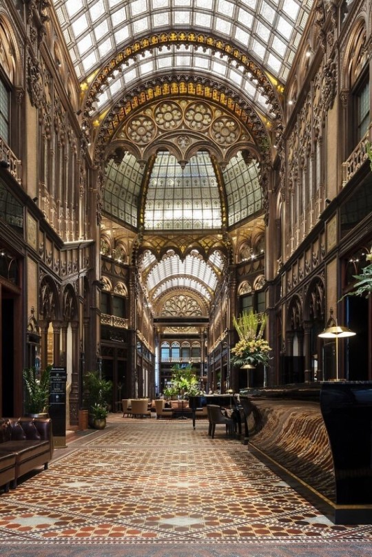
As a followup to the very popular post on architecture, I decided to add onto it by exploring the interior of each movement and the different design techniques and tastes of each era. This post at be helpful for historical fiction, fantasy or just a long read when you're bored.
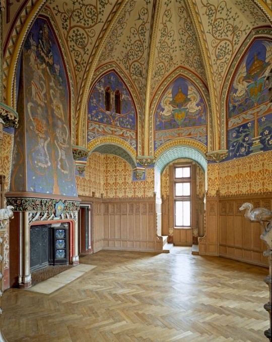
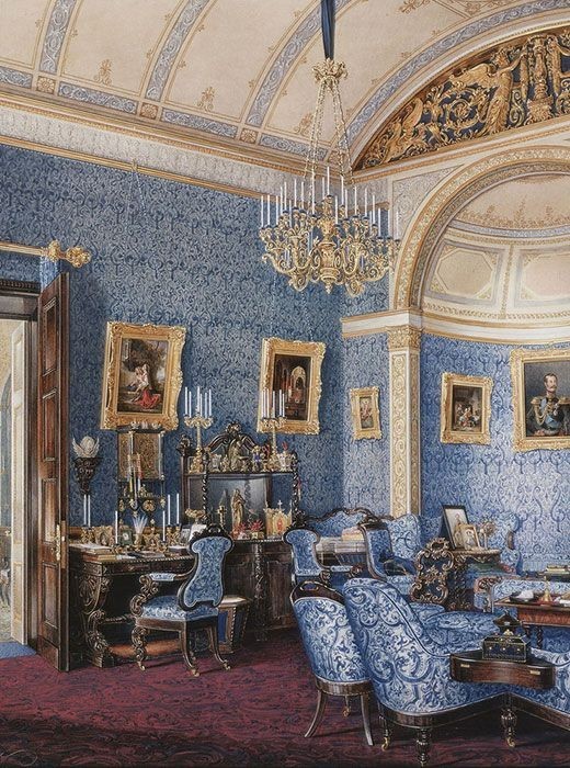
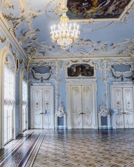
Interior Design Terms
Reeding and fluting: Fluting is a technique that consists a continuous pattern of concave grooves in a flat surface across a surface. Reeding is it's opposite.
Embossing: stamping, carving or moulding a symbol to make it stand out on a surface.
Paneling: Panels of carved wood or fabric a fixed to a wall in a continuous pattern.
Gilding: the use of gold to highlight features.
Glazed Tile: Ceramic or porcelain tiles coated with liquid coloured glass or enamel.
Column: A column is a pillar of stone or wood built to support a ceiling. We will see more of columns later on.
Bay Window: The Bay Window is a window projecting outward from a building.
Frescos: A design element of painting images upon wet plaster.
Mosaic: Mosaics are a design element that involves using pieces of coloured glass and fitted them together upon the floor or wall to form images.
Mouldings: ornate strips of carved wood along the top of a wall.
Wainscoting: paneling along the lower portion of a wall.
Chinoiserie: A European take on East Asian art. Usually seen in wallpaper.
Clerestory: A series of eye-level windows.
Sconces: A light fixture supported on a wall.
Niche: A sunken area within a wall.
Monochromatic: Focusing on a single colour within a scheme.
Ceiling rose: A moulding fashioned on the ceiling in the shape of a rose usually supporting a light fixture.
Baluster: the vertical bars of a railing.
Façade: front portion of a building
Lintel: Top of a door or window.
Portico: a covered structure over a door supported by columns
Eaves: the part of the roof overhanging from the building
Skirting: border around lower length of a wall
Ancient Greece
Houses were made of either sun-dried clay bricks or stone which were painted when they dried. Ground floors were decorated with coloured stones and tiles called Mosaics. Upper level floors were made from wood. Homes were furnished with tapestries and furniture, and in grand homes statues and grand altars would be found. Furniture was very skillfully crafted in Ancient Greece, much attention was paid to the carving and decoration of such things. Of course, Ancient Greece is ancient so I won't be going through all the movements but I will talk a little about columns.
Doric: Doric is the oldest of the orders and some argue it is the simplest. The columns of this style are set close together, without bases and carved with concave curves called flutes. The capitals (the top of the column) are plain often built with a curve at the base called an echinus and are topped by a square at the apex called an abacus. The entablature is marked by frieze of vertical channels/triglyphs. In between the channels would be detail of carved marble. The Parthenon in Athens is your best example of Doric architecture.
Ionic: The Ionic style was used for smaller buildings and the interiors. The columns had twin volutes, scroll-like designs on its capital. Between these scrolls, there was a carved curve known as an egg and in this style the entablature is much narrower and the frieze is thick with carvings. The example of Ionic Architecture is the Temple to Athena Nike at the Athens Acropolis.
Corinthian: The Corinthian style has some similarities with the Ionic order, the bases, entablature and columns almost the same but the capital is more ornate its base, column, and entablature, but its capital is far more ornate, commonly carved with depictions of acanthus leaves. The style was more slender than the others on this list, used less for bearing weight but more for decoration. Corinthian style can be found along the top levels of the Colosseum in Rome.
Tuscan: The Tuscan order shares much with the Doric order, but the columns are un-fluted and smooth. The entablature is far simpler, formed without triglyphs or guttae. The columns are capped with round capitals.
Composite: This style is mixed. It features the volutes of the Ionic order and the capitals of the Corinthian order. The volutes are larger in these columns and often more ornate. The column's capital is rather plain. for the capital, with no consistent differences to that above or below the capital.
Ancient Rome
Rome is well known for its outward architectural styles. However the Romans did know how to add that rizz to the interior. Ceilings were either vaulted or made from exploded beams that could be painted. The Romans were big into design. Moasics were a common interior sight, the use of little pieces of coloured glass or stone to create a larger image. Frescoes were used to add colour to the home, depicting mythical figures and beasts and also different textures such as stonework or brick. The Romans loved their furniture. Dining tables were low and the Romans ate on couches. Weaving was a popular pastime so there would be tapestries and wall hangings in the house. Rich households could even afford to import fine rugs from across the Empire. Glass was also a feature in Roman interior but windows were usually not paned as large panes were hard to make. Doors were usually treated with panels that were carved or in lain with bronze.
Ancient Egypt
Egypt was one of the first great civilisations, known for its immense and grand structures. Wealthy Egyptians had grand homes. The walls were painted or plastered usually with bright colours and hues. The Egyptians are cool because they mapped out their buildings in such a way to adhere to astrological movements meaning on special days if the calendar the temple or monuments were in the right place always. The columns of Egyptian where thicker, more bulbous and often had capitals shaped like bundles of papyrus reeds. Woven mats and tapestries were popular decor. Motifs from the river such as palms, papyrus and reeds were popular symbols used.
Ancient Africa
African Architecture is a very mixed bag and more structurally different and impressive than Hollywood would have you believe. Far beyond the common depictions of primitive buildings, the African nations were among the giants of their time in architecture, no style quite the same as the last but just as breathtaking.
Rwandan Architecture: The Rwandans commonly built of hardened clay with thatched roofs of dried grass or reeds. Mats of woven reeds carpeted the floors of royal abodes. These residences folded about a large public area known as a karubanda and were often so large that they became almost like a maze, connecting different chambers/huts of all kinds of uses be they residential or for other purposes.
Ashanti Architecture: The Ashanti style can be found in present day Ghana. The style incorporates walls of plaster formed of mud and designed with bright paint and buildings with a courtyard at the heart, not unlike another examples on this post. The Ashanti also formed their buildings of the favourite method of wattle and daub.
Nubian Architecture: Nubia, in modern day Ethiopia, was home to the Nubians who were one of the world's most impressive architects at the beginning of the architecture world and probably would be more talked about if it weren't for the Egyptians building monuments only up the road. The Nubians were famous for building the speos, tall tower-like spires carved of stone. The Nubians used a variety of materials and skills to build, for example wattle and daub and mudbrick. The Kingdom of Kush, the people who took over the Nubian Empire was a fan of Egyptian works even if they didn't like them very much. The Kushites began building pyramid-like structures such at the sight of Gebel Barkal
Japanese Interiors
Japenese interior design rests upon 7 principles. Kanso (簡素)- Simplicity, Fukinsei (不均整)- Asymmetry, Shizen (自然)- Natural, Shibumi (渋味) – Simple beauty, Yugen (幽玄)- subtle grace, Datsuzoku (脱俗) – freedom from habitual behaviour, Seijaku (静寂)- tranquillity.
Common features of Japanese Interior Design:
Shoji walls: these are the screens you think of when you think of the traditional Japanese homes. They are made of wooden frames, rice paper and used to partition
Tatami: Tatami mats are used within Japanese households to blanket the floors. They were made of rice straw and rush straw, laid down to cushion the floor.
Genkan: The Genkan was a sunken space between the front door and the rest of the house. This area is meant to separate the home from the outside and is where shoes are discarded before entering.
Japanese furniture: often lowest, close to the ground. These include tables and chairs but often tanked are replaced by zabuton, large cushions. Furniture is usually carved of wood in a minimalist design.
Nature: As both the Shinto and Buddhist beliefs are great influences upon architecture, there is a strong presence of nature with the architecture. Wood is used for this reason and natural light is prevalent with in the home. The orientation is meant to reflect the best view of the world.
Islamic World Interior
The Islamic world has one of the most beautiful and impressive interior design styles across the world. Colour and detail are absolute staples in the movement. Windows are usually not paned with glass but covered in ornate lattices known as jali. The jali give ventilation, light and privacy to the home. Islamic Interiors are ornate and colourful, using coloured ceramic tiles. The upper parts of walls and ceilings are usually flat decorated with arabesques (foliate ornamentation), while the lower wall areas were usually tiled. Features such as honeycombed ceilings, horseshoe arches, stalactite-fringed arches and stalactite vaults (Muqarnas) are prevalent among many famous Islamic buildings such as the Alhambra and the Blue Mosque.
Byzantine (330/395–1453 A. D)
The Byzantine Empire or Eastern Roman Empire was where eat met west, leading to a melting pot of different interior designs based on early Christian styles and Persian influences. Mosaics are probably what you think of when you think of the Byzantine Empire. Ivory was also a popular feature in the Interiors, with carved ivory or the use of it in inlay. The use of gold as a decorative feature usually by way of repoussé (decorating metals by hammering in the design from the backside of the metal). Fabrics from Persia, heavily embroidered and intricately woven along with silks from afar a field as China, would also be used to upholster furniture or be used as wall hangings. The Byzantines favoured natural light, usually from the use of copolas.
Indian Interiors
India is of course, the font of all intricate designs. India's history is sectioned into many eras but we will focus on a few to give you an idea of prevalent techniques and tastes.
The Gupta Empire (320 – 650 CE): The Gupta era was a time of stone carving. As impressive as the outside of these buildings are, the Interiors are just as amazing. Gupta era buildings featured many details such as ogee (circular or horseshoe arch), gavaksha/chandrashala (the motif centred these arches), ashlar masonry (built of squared stone blocks) with ceilings of plain, flat slabs of stone.
Delhi Sultanate (1206–1526): Another period of beautifully carved stone. The Delhi sultanate had influence from the Islamic world, with heavy uses of mosaics, brackets, intricate mouldings, columns and and hypostyle halls.
Mughal Empire (1526–1857): Stonework was also important on the Mughal Empire. Intricately carved stonework was seen in the pillars, low relief panels depicting nature images and jalis (marble screens). Stonework was also decorated in a stye known as pietra dura/parchin kari with inscriptions and geometric designs using colored stones to create images. Tilework was also popular during this period. Moasic tiles were cut and fitted together to create larger patters while cuerda seca tiles were coloured tiles outlined with black.
Chinese Interiors
Common features of Chinese Interiors
Use of Colours: Colour in Chinese Interior is usually vibrant and bold. Red and Black are are traditional colours, meant to bring luck, happiness, power, knowledge and stability to the household.
Latticework: Lattices are a staple in Chinese interiors most often seen on shutters, screens, doors of cabinets snf even traditional beds.
Lacquer: Multiple coats of lacquer are applied to furniture or cabinets (now walls) and then carved. The skill is called Diaoqi (雕漆).
Decorative Screens: Screens are used to partition off part of a room. They are usually of carved wood, pained with very intricate murals.
Shrines: Spaces were reserved on the home to honour ancestors, usually consisting of an altar where offerings could be made.
Of course, Chinese Interiors are not all the same through the different eras. While some details and techniques were interchangeable through different dynasties, usually a dynasty had a notable style or deviation. These aren't all the dynasties of course but a few interesting examples.
Song Dynasty (960–1279): The Song Dynasty is known for its stonework. Sculpture was an important part of Song Dynasty interior. It was in this period than brick and stone work became the most used material. The Song Dynasty was also known for its very intricate attention to detail, paintings, and used tiles.
Ming Dynasty(1368–1644): Ceilings were adorned with cloisons usually featuring yellow reed work. The floors would be of flagstones usually of deep tones, mostly black. The Ming Dynasty favoured richly coloured silk hangings, tapestries and furnishings. Furniture was usually carved of darker woods, arrayed in a certain way to bring peace to the dwelling.
Han Dynasty (206 BC-220 AD): Interior walls were plastered and painted to show important figures and scenes. Lacquer, though it was discovered earlier, came into greater prominence with better skill in this era.
Tang Dynasty (618–907) : The colour palette is restrained, reserved. But the Tang dynasty is not without it's beauty. Earthenware reached it's peak in this era, many homes would display fine examples as well. The Tang dynasty is famous for its upturned eaves, the ceilings supported by timber columns mounted with metal or stone bases. Glazed tiles were popular in this era, either a fixed to the roof or decorating a screen wall.
Romanesque (6th -11th century/12th)
Romanesque Architecture is a span between the end of Roman Empire to the Gothic style. Taking inspiration from the Roman and Byzantine Empires, the Romanesque period incorporates many of the styles. The most common details are carved floral and foliage symbols with the stonework of the Romanesque buildings. Cable mouldings or twisted rope-like carvings would have framed doorways. As per the name, Romansque Interiors relied heavily on its love and admiration for Rome. The Romanesque style uses geometric shapes as statements using curves, circles snf arches. The colours would be clean and warm, focusing on minimal ornamentation.
Gothic Architecture (12th Century - 16th Century)
The Gothic style is what you think of when you think of old European cathedrals and probably one of the beautiful of the styles on this list and one of most recognisable. The Gothic style is a dramatic, opposing sight and one of the easiest to describe. Decoration in this era became more ornate, stonework began to sport carving and modelling in a way it did not before. The ceilings moved away from barreled vaults to quadripartite and sexpartite vaulting. Columns slimmed as other supportive structures were invented. Intricate stained glass windows began their popularity here. In Gothic structures, everything is very symmetrical and even.
Mediaeval (500 AD to 1500)
Interiors of mediaeval homes are not quite as drab as Hollywood likes to make out. Building materials may be hidden by plaster in rich homes, sometimes even painted. Floors were either dirt strewn with rushes or flagstones in larger homes. Stonework was popular, especially around fireplaces. Grand homes would be decorated with intricate woodwork, carved heraldic beasts and wall hangings of fine fabrics.
Renaissance (late 1300s-1600s)
The Renaissance was a period of great artistry and splendor. The revival of old styles injected symmetry and colour into the homes. Frescoes were back. Painted mouldings adorned the ceilings and walls. Furniture became more ornate, fixed with luxurious upholstery and fine carvings. Caryatids (pillars in the shape of women), grotesques, Roman and Greek images were used to spruce up the place. Floors began to become more intricate, with coloured stone and marble. Modelled stucco, sgraffiti arabesques (made by cutting lines through a layer of plaster or stucco to reveal an underlayer), and fine wall painting were used in brilliant combinations in the early part of the 16th century.
Tudor Interior (1485-1603)
The Tudor period is a starkly unique style within England and very recognisable. Windows were fixed with lattice work, usually casement. Stained glass was also in in this period, usually depicting figures and heraldic beasts. Rooms would be panelled with wood or plastered. Walls would be adorned with tapestries or embroidered hangings. Windows and furniture would be furnished with fine fabrics such as brocade. Floors would typically be of wood, sometimes strewn with rush matting mixed with fresh herbs and flowers to freshen the room.
Baroque (1600 to 1750)
The Baroque period was a time for splendor and for splashing the cash. The interior of a baroque room was usually intricate, usually of a light palette, featuring a very high ceiling heavy with detail. Furniture would choke the room, ornately carved and stitched with very high quality fabrics. The rooms would be full of art not limited to just paintings but also sculptures of marble or bronze, large intricate mirrors, moldings along the walls which may be heavily gilded, chandeliers and detailed paneling.
Victorian (1837-1901)
We think of the interiors of Victorian homes as dowdy and dark but that isn't true. The Victorians favoured tapestries, intricate rugs, decorated wallpaper, exquisitely furniture, and surprisingly, bright colour. Dyes were more widely available to people of all stations and the Victorians did not want for colour. Patterns and details were usually nature inspired, usually floral or vines. Walls could also be painted to mimic a building material such as wood or marble and most likely painted in rich tones. The Victorians were suckers for furniture, preferring them grandly carved with fine fabric usually embroidered or buttoned. And they did not believe in minimalism. If you could fit another piece of furniture in a room, it was going in there. Floors were almost eclusively wood laid with the previously mentioned rugs. But the Victorians did enjoy tiled floors but restricted them to entrances. The Victorians were quite in touch with their green thumbs so expect a lot of flowers and greenery inside. with various elaborately decorated patterned rugs. And remember, the Victorians loved to display as much wealth as they could. Every shelf, cabinet, case and ledge would be chocked full of ornaments and antiques.
Edwardian/The Gilded Age/Belle Epoque (1880s-1914)
This period (I've lumped them together for simplicity) began to move away from the deep tones and ornate patterns of the Victorian period. Colour became more neutral. Nature still had a place in design. Stained glass began to become popular, especially on lampshades and light fixtures. Embossing started to gain popularity and tile work began to expand from the entrance halls to other parts of the house. Furniture began to move away from dark wood, some families favouring breathable woods like wicker. The rooms would be less cluttered.
Art Deco (1920s-1930s)
The 1920s was a time of buzz and change. Gone were the refined tastes of the pre-war era and now the wow factor was in. Walls were smoother, buildings were sharper and more jagged, doorways and windows were decorated with reeding and fluting. Pastels were in, as was the heavy use of black and white, along with gold. Mirrors and glass were in, injecting light into rooms. Gold, silver, steel and chrome were used in furnishings and decor. Geometric shapes were a favourite design choice. Again, high quality and bold fabrics were used such as animal skins or colourful velvet. It was all a rejection of the Art Noveau movement, away from nature focusing on the man made.
Modernism (1930 - 1965)
Modernism came after the Art Deco movement. Fuss and feathers were out the door and now, practicality was in. Materials used are shown as they are, wood is not painted, metal is not coated. Bright colours were acceptable but neutral palettes were favoured. Interiors were open and favoured large windows. Furniture was practical, for use rather than the ornamentation, featuring plain details of any and geometric shapes. Away from Art Deco, everything is straight, linear and streamlined.
#This took forever#I'm very tired#But enjoy#I covered as much as I could find#Fantasy Guide to interiors#interior design#Architecture#writings#writing resources#Writing reference#Writing advice#Writer's research#writing research#Writer's rescources#Writing help#Mediaeval#Renaissance#Chinese Interiors#Japanese Interiors#Indian interiors#writing#writeblr#writing reference#writing advice#writer#spilled words#writers
3K notes
·
View notes
Text
Some Architecture Vocabulary

Arcade: a succession of arches supported on columns. An arcade can be free-standing covered passage or attached to a wall, as seen on the right.
Arch: the curved support of a building or doorway. The tops of the arches can be curved, semicircular, pointed, etc.
Architrave: the lowest part of the entablature that sits directly on the capitals (tops) of the columns.
Capital: the top portion of a column. In classical architecture, the architectural order is usually identified by design of the capital (Doric, Ionic, or Corinthian).
Classical: of or pertaining to Classicism.
Classicism: a preference or regard for the principles of Greek and Roman art and architecture. Common classicizing architecture is a sense of balance, proportion, and “ideal” beauty.
Column: an upright post, usually square, round, or rectangular. It can be used as a support or attached to a wall for decoration. In classical architecture, columns are composed of a capital, shaft, and a base (except in the Doric order).
Cornice: the rectangular band above the frieze, below the pediment.
Dome: a half-sphere curvature constructed on a circular base, as seen on the right.
Entablature: the upper portion of an order, it includes the architrave, frieze and cornice.
Frieze: the wide rectangular section on the entablature, above the architrave and below the cornice. In the Doric order, the frieze is often decorated with triglyphs (altering tablets of vertical groves) and the plain, rectangular bands spaced between the triglyphs (called metopes).
Metopes: the rectangular slabs that adorned the outside of Doric temples, just above the exterior colonnade.
Order: an ancient style of architecture. The classical orders are Doric, Ionic, or Corinthian. An order consists of a column, with a distinctive capital, supporting the entablature and pediment.
Pediment: a classical element that forms a triangular shape above the entablature. The pediment is often decorated with statues and its sides can be curved or straight.
Pronaos (pro-NAY-us): the entrance hall of a temple.
Triglyphs: a decorative element of a frieze consisting of three vertical units.
Vault: an arched ceiling usually made of wood or stone, as seen on the right.
Writing Notes & References ⚜ More: Word Lists
#writeblr#writing notes#terminology#writers on tumblr#architecture#writing prompt#poetry#literature#poets on tumblr#spilled ink#creative writing#writing reference#dark academia#light academia#lit#worldbuilding#studyblr#langblr#booklr#bookblr#word list#writing resources
584 notes
·
View notes
Text


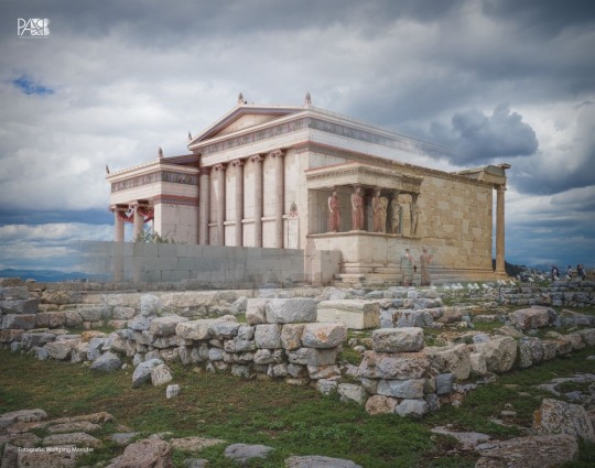
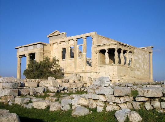
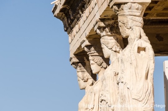
The caryatid is a term that in architecture refers to a female sculpture, with the appearance of a column, which holds an entablature above its head. One of the most typical examples is the tribune of the caryatids in the Erechtheion. Athens.
79 notes
·
View notes
Text

[ roevember day 4 - ship ]
From the journal of Estelle de Laussienne, 24th of the 4th Umbral Moon, 5 7A.E.
Is it not funny what tricks our eyes can get up to? Medical literature on the visual system has been coming out of Sharlayan at an efficient clip, but it's hardly the brand new frontier of study the Studium's psychology department is touting. We have known about its oddities since the first spearfisher discovered that water lies about a fish's location. Such progress in that time! Humanity has embraced this imperfection of ours with great relish. Traditional Ul'dahn religious art, for example, relies heavily on ambiguous images, with both Nald and Thal coexisting within the same figure at the same time, the dominant shape shifting with the viewer's perception; Thavnairian folk art, too, often employs similar tricks to depict the harmonization of Manusya and Mrga, blending man and animal two ways in a single piece when observed right-to-left or left-to-right. Even the cities we build delight in the simple joy of fooling the eye. The limited space of Ishgard combined with the nobility's hunger for grandeur has made forced perspective a popular architectural flourish; it is not uncommon to enter some immense gallery with a distant statue of Halone on the far wall, only for the illusion to break some four or five yalms into the room with the realization that the statue is all of two fulms high. Ala Mhigan muqarnas create phantom scales of depth, emerging or receding by the angle of the light and the inclination of the viewer. Sharlayan itself has tucked optical refinements inside its colonnades and entablature: the impression of sharp geometric perfection -- straight lines and right angles -- is a fiction told by its many hidden curves.
What a marvelous little engine we have in our heads. I've been thinking about this in the weeks since Raha has returned to us.
Physically, nothing has changed. He is a twenty-four year old man in fine health. The stasis was absolute: no growth to speak of in the nails and hair, no atrophy of the muscles, no softening of calluses or fading of scars that might indicate cycles of skin regeneration. It's as if he has simply slipped between calendar years like a city native knows an alley shortcut. And yet he is different. Like blinking away an afterimage, there is the lingering negative of something that no longer exists.
When the Coerthan cold gusts northerly into Mor Dhona, Raha will disappear into his thoughts, hunched over his mug of coffee, ambling about the Rising Stones' common room as if afflicted by a ghostly rheumatism, and I will think, There is the Exarch. How strange, then, to see him without the burden of his crystal; without the grey in his hair where all that lively red has bled out. There is a compartment of my mind that struggles terribly with this. Could it not be a glamour? A bit of Allagan showmanship? Then, hours later, I will watch him jaunt up the battlements of the Toll, flirting gamely with gravity as if it were a pretty classmate, where he will settle into a crenel to watch the Gloom roll in from Silvertear, and I will think, There is the G'raha Tia I knew. Unmoored from the moment, I will think -- Has Rammbroes banished him from camp again? Has he come to find me for that archery lesson? And then he will spot me from his perch, and I find myself startled back to the present by the royal red of his left eye. Is that the same boy? Surely not. That eye ought to be as blue as the waters off of Corvos. The future can't have happened yet.
Binocular rivalry. Two distinct images in competition. It's hardly fair to the man he's become, but I wonder, too, if this is how he saw me that day in Lakeland -- if his own mind fought to reconcile my reality with the composite of me in his mind's eye, patched together through secondary sources, blurred by decades and distance. Perhaps we never truly see each other. Perhaps it is time to find the same joy in it as our artists and architects do.
There is only one thing for it. I must correct my vergence. No sooner than it is announced that we make for Azys Lla, Raha leaps for the prow of Tataru's airship, and I do not see that young man of years past ready to bolt for the horizon; and he reaches back for me, to ensure that we are not separated, and I do not see the reserved elder who carefully accounts for each soul around him, made cautious by loss. With my eyes shifted just-so, with no expectations for the image I am meant to see, the man in front of me -- bright-eyed, wide-grinned, laughter clear and steady -- resolves into something new.
#ffxiv#my wol: estelle#roegadyn#roevemberxiv#roevemberxiv2024#my writing#overtly shippy? no#has something blatantly to do with a physical ship? also no#estelle...she is a yapper#she will never get directly to the point#gently sprinkling worldbuilding out of a little handcranked pepper mill#shadowbringers spoilers
53 notes
·
View notes
Text
“Oh my god” Leo cackles “Oh my god Querido are you okay?”
“M’ good m’ good” Jason reassures, sitting up so he can kiss Leo all over his face. He may be chuffing out how pretty he is in Wolf at the same time, who's to say
When he pulls back to look at Leo he is backlit in the pre-sunset haze of the big arched window. It sets his hair into a glowing halo, laurels of light and fire, the entirety of him glowing and golden. Jason can't help but think he looks divine smiling down at him all gap-toothed and auburn, like the vistage of the gods who visit him and ask for his prayers, like he is made of more than mere flesh and bone and fire.
Jason could build such a temple to his Leo, one that all of Olympus would be envious of. Gold and copper and bronze, painted marble and intricate mosaic. Ionic pillars, open impediments, detailed entablature. And a skylight, so when Jason goes down on him on the alter the light will still catch his hair
It's probably sacrilege, even thinking about it in his position, but Jason doesn't care. Not when it's Leo, never when it's Leo. He kisses him all the same
79 notes
·
View notes
Text

Canticle to the Setting Sun
High in my tree-top gazebo, I nest among gray squirrels, watch cardinals fly and blue jays fuss and flutter. Yellow-robed finches harmonize elaborate duets while a grosbeak sings solo. As an orchestra tunes before evening performance, each sound intones a distinct timbre. The air hushes
and the ceremony of the sun begins. The sky colors quietly, opens with chords of peach, lavender and vermillion. Arches and beams of hickory and oak soften. The leafy green entablature, like the mossed limestone, whispers wind and waves. The wafer of light deepens to blood red. Its slow descent to the sea becomes the bread and wine of nature. The ritual complete,
chipmunks burrow home while bird chant fades into memory. Crickets and hoot owls awaken. A German shepherd barks. Finally the mind quiets and there is a moment of no sound. Fireflies flicker, candling the dark. Only the hummer's sweet syrup hangs unchanged. Ruby red, it witnesses day's death, its rebirth, catches the first glimmer of dawn. by Mary Jo Balistreri
29 notes
·
View notes
Photo

Temple of Vesta/Hercules, Rome
The Temple of Vesta is the popular name given to the round temple near the Tiber River in Rome (now Piazza Bocca della Veritá). The association with Vesta is due to the shape of the building but in fact it is not known to which god the temple was dedicated. It may have been dedicated to Hercules Olivarius, patron of the Portus Tiberinus oil merchants, as three or four temples to the Greek hero are known to have stood in the area of the Forum Boarium where there was also a Great Altar to Hercules.
The temple is Greek in style and was probably the work of an eastern Greek architect. The building also uses that quintessential Greek building material, Pentelic marble, from near Athens. At the time of construction Pentelic marble was one of the more expensive building materials and so was rarely used for large projects. The columns, entablature and cella walls were constructed with this marble whilst the inner cella wall was lined with tufa and stucco.
The temple is 14.8 m in diameter (50 Roman feet) and has 20 exterior Corinthian columns standing on a 360 degree, 5-stepped tufa podium. The unusually high columns are 10.65 m (36 Roman feet) tall and are topped by composite capitals, which have a combination of Ionic volutes with Corinthian acanthus leaves. All of the capitals are constructed from two separate pieces and the flat ends of the column flutes, the single block used to carve the foot, base and plinth of the column, and the integration of the base into the first step of the podium are all typical features of 1st century CE architectural practice. The cella entrance was flanked by two tall rectangular windows, one on each side, and these remain visible today.
Some sort of disaster struck the temple in the 1st century CE as 10 columns on the north side were replaced using Luna marble and a capital, very similar to the originals but not an exact replica, was replaced on the south side.
The relatively good condition of the building is due to the fact that it was converted into a church and the oldest records (1132 CE) refer to the building as the church of S. Stefano alle Carozze ('of the carriages'). The building is today without its original roof and entablature. In addition, the top portion if the cella wall was replaced using brick-faced concrete and windows were added in the 12th century CE. In 1475 CE a fresco was added above the temple's altar. In the 17th century CE the church was re-dedicated to S. Maria del Sole ('of the sun') only to be then deconsecrated within two centuries. Finally, between 1809 and 1810 CE the podium of the building was excavated, the surrounding ground level was lowered, and the building was restored once again.
Continue reading...
36 notes
·
View notes