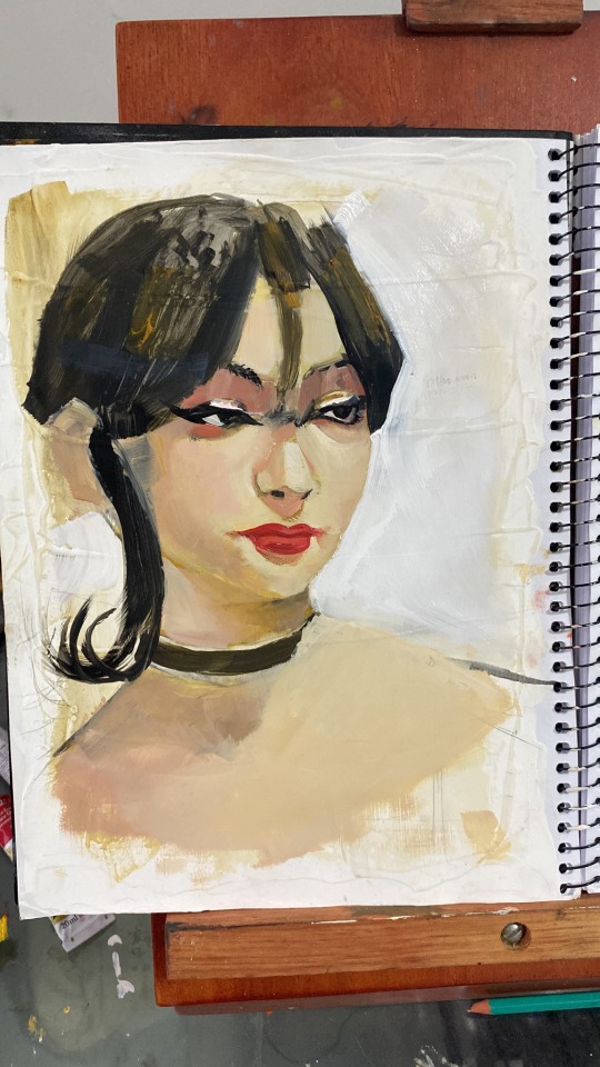
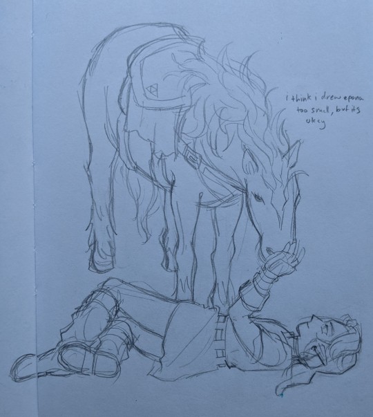
#Edit: i figured out the saturation problem
Explore tagged Tumblr posts
Visit Tumblr Blog
Explore Tumblr blogs with no restrictions, modern design and the best experience.
Last Seen Tumblr Blogs


Fun Fact
After the announcement of the deal with Yahoo!, there were 170K signatures of unhappy Tumblr users petitioning to prevent the sale in 2013.
Note
I like the new banner!
AWWWWW, THANKS XD
I know it probably looks blurry, so please click on it, zooming in helps too, but I'll still add close ups.

Close ups under the cut :)


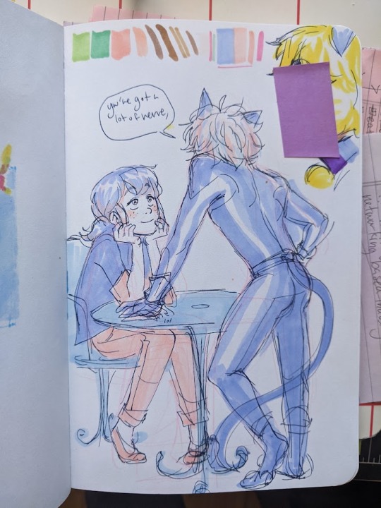
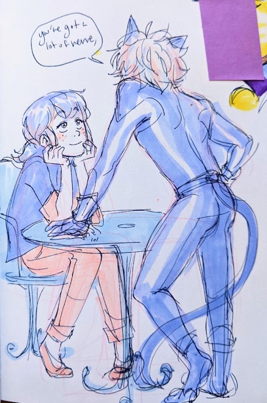
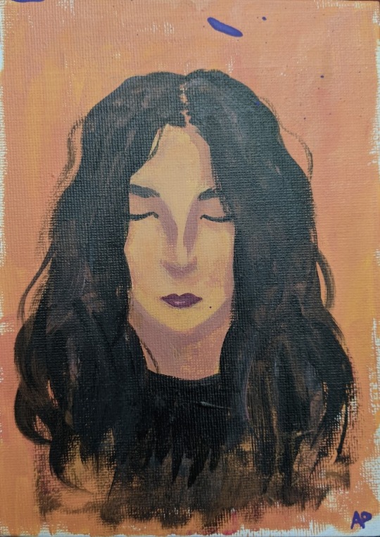
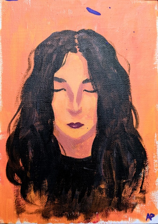
#That's it I give up#I tried everything thing but my pic is blurry and somehow more desaturated? Idk why it looks nothing like how it looks in the app ;_;#Edit: i figured out the saturation problem#you see I made the illustration on my phone#but I use my tablet for tumblr. And I'm looking at the same download side by side#and for some reason my tablets image appears desaturated#while my phone looks good???? I wend back and forth with this and there nothing I can do. And I akso can't fix the blurriness.:/#wendy o koopa#iggy koopa#morton koopa jr#lemmy koopa#larry koopa#pom pom#super mario#nintendo#nintendo fanart#gijinka#humanization#koopalings#ludwig von koopa#roy koopa
29 notes
·
View notes
Text
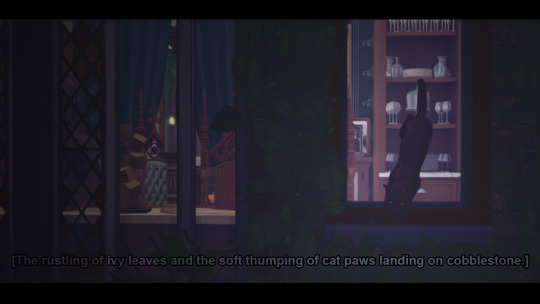

(SEMI) CHARMED KIND OF LIFE: EPISODE 1, PART II. “AT LEAST IT’S NOT STILL ON FIRE”
Transcript Below.
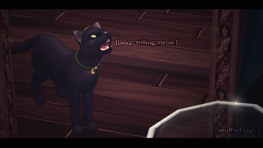
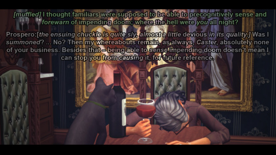
[Prospero, Minerva's familiar, hops down from his perch on the windowsill to come inside. Once within earshot, where he knows his Caster can hear him, a trilling meow echoes through the dining room to get Minerva's attention.]
MINERVA: [muffled, not moving from her slump that has her face mashed against the surface of the now clean dining table.] I thought familiars were supposed to be able to precognitively sense and forewarn of impending doom; where the hell were you all night?
PROSPERO: [The ensuing chuckle at her question is quite sly, almost a little devious in its quality.] Was I summoned? ... No? Then my whereabouts remain, as always, Caster, none of your business. Besides that – being able to sense impending doom doesn't mean I can stop you from causing it, for future reference.
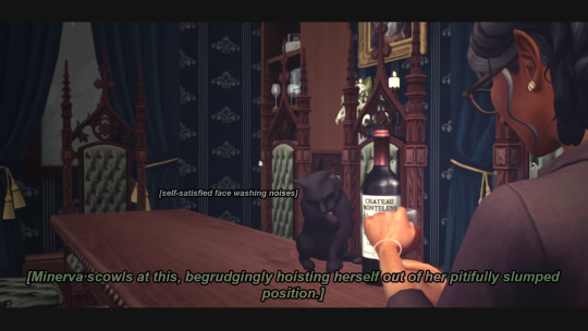
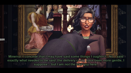
MINERVA: [She scowls at her familiar's retort, begrudgingly hoisting herself from her hunched position while Prospero begins nonchalantly yet smugly cleaning his face.] I concede that I may have said some things I oughtn't – No, I said exactly what needed to be said, the delivery could have been more gentle, I suppose – but I am not the bad guy here.
#Sims 4 Story#TS4#The Sims 4#Story Simblr#TS4 Story#Glimmerbrook#Glimmerbrook Premades#Charm Family#Minerva Charm#Prospero the Familiar#(Semi) Charmed Kind of Life#by The Power of Greyskull I believe I have found an editing style I'm frickin HAPPY WITH.#That also flows well with the roughness of the Pilot I put out in a weird sense?#like it starts out way saturated and bright and optimistic BEFORE dinner#and now it's this.#Please excuse me taking like 10 posts to figure out how to unsuckify the lighting and solving the OVERlighting problem I had with Reshade#And also excuse the numerous tags where I try to justify the Overlighting problem with a lore loophole.#As always you can click to embiggen and look at the HQ but I'm adding transcripts now#I can't see worth a fuck so I worry no one else can either lol
3 notes
·
View notes
Text
You ever not consider how important something is until it’s swapped with something else?
Yeah, that’s how I’m feeling about this edit.
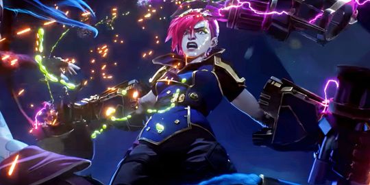
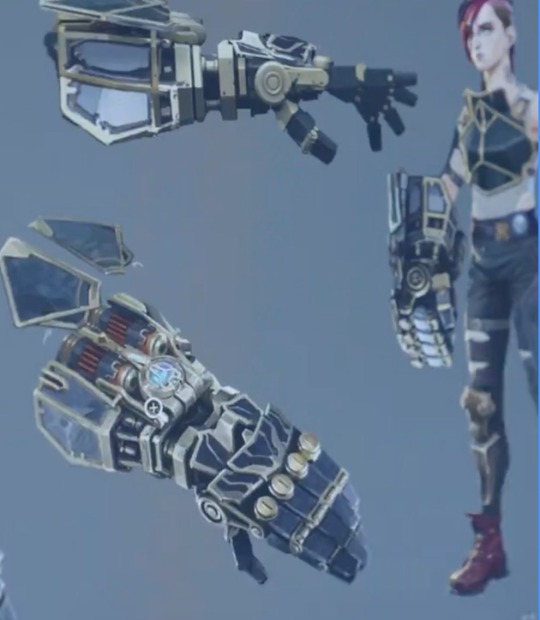
On the surface, red Vi and blue Jinx just seems obvious, they’re an important duo who are very different people, so give them contrasting colors. Then the blue contrasts with Jinx’s pink pants, and the red contrasts with Vi’s blue gauntlets, it’s all nice and simple.

Then I see this edit, and holy shit the colors are really important actually.
Vi is bright red(and also pink) because she’s violent and physical. She’s not the hulk, per say, but one of the most fundamental and consistent aspects of Vi’s characterization is her tendency to solve all of her problems by punching, that’s all over both seasons.

Furthermore, blue is the color of science in Arcane, it’s the color of technology and of Piltover. Vi doesn’t wear it because she’s a Zaunite who’s not a scientist or an inventor. Look at it in terms of her gauntlets:
When Vi first gets her gauntlets in S1A3, they’re all bright blue and gold, very clearly not any of the colors associated with her, and thus clearly not hers.
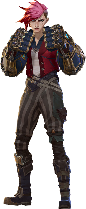
In S2A1 when Caitlyn gaslights her into becoming an enforcer, that unfamiliar blue and gold covers her entire design. She’s not just using Piltover’s tools anymore, she’s become part of their system. Now her hair is signaling how uncomfortable she feels in the role.
It’s not easy to see, but Vi actually paints her gauntlets black in her pit fighter era, the hextexh energy still notes that they’re not from her world, but by painting them she has made them her own.
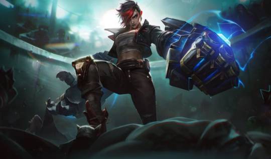
Then in S2A3 she gets new gauntlets that are still black, because Vi is working with Piltover, but not allowing them to take her over like they did in act 1.
Vi actually lots of interesting storytelling in her colors, I could make a whole different post about the meaning of black in her design, but I’ve yapped about her enough by now.
But with all that being said, if blue is the color of Piltover, why is it also Jinx’s color?
First off, Jinx’s blue isn’t the the deep navy of Piltover, that’s Caitlyn’s color, she instead has the saturated, electric blue of hextech. This is not coding her as a Piltovan, it’s coding her as a scientist.
Jinx doesn’t solve her problems by punching, that’s Vi’s thing, she solves them by building bigger and better weapons to shoot and/or blow them up with. She’s very much not Piltovan, but she’s blue because she is very much an inventor. After all, her plotline in season one is all about stealing and reverse-engineering hextech, something even Piltover’s top scientists couldn’t figure out.
However, even if she doesn’t prefer it, when Jinx does fight physically, guess what color follows her?

Jinx may not be a fighter generally, but when she does fight, she channels a little bit of her older sister.
#anyway that’s my monthly yap session out the way#come back next month for a ten thousand word essay on how bad solo leveling is#arcane#vi league of legends#vi arcane#jinx arcane#jinx league of legends#arcane season 2#arcane spoilers#long post#character design#color theory#colors in character design
120 notes
·
View notes
Text
…make a psd?
this is a question i get pretty routinely, and i’m going to tell you upfront: there is no one way to make a psd. there’s no ‘better’ way, no ‘easier’ method, you just have to figure it out yourself.
with that said, this post is going to be how i, personally, make my psds, just for the sake of reference. my way isn’t better or worse than anyone else’s—it’s just the way i do things ¯\_(ツ)_/¯
i. making a showcase/moodboard
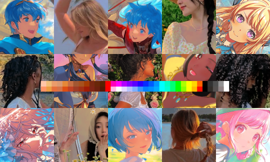
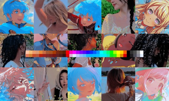
depending on the psd you want to achieve, your moodboard will probably look different—if you’re making a blue psd it will be mostly blue, if you’re making a psd based on a certain character or card set it will be based around that, etc. i made myself a general showcase that i test my psds on that includes both irl images and darker skin characters, because i like for my psds to work for those purposes most of the time. my showcase is below if you’d like to use it!
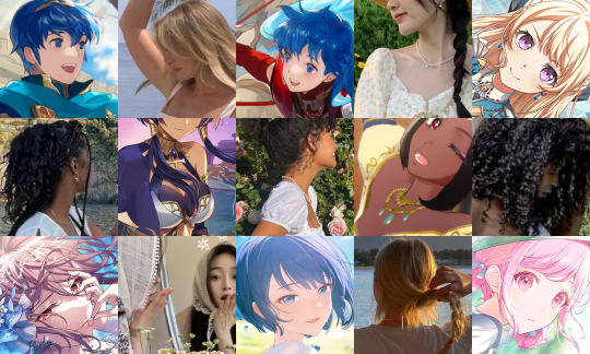
it’s best to include sources you edit frequently so you know what works on them and what doesn’t but how the moodboard looks exactly is up to you ¯\_(ツ)_/¯ i also recommend using swatchies (original by zeroresources on d*viantart) as long as you bear in mind that swatchies is not a great guideline for actual dark skin
ii. creating the base
actual step two is creating a folder but that takes like two seconds. do make a folder though or you will be sad.
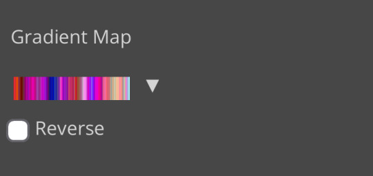
after making a folder, start making the base of your psd; whatever the foundation is going to be. depending on how you want your psd to look, this will look very different. i personally always start off with a gradient map, just to get things going
my settings for this are the default black and white gradient map set to reverse, and it’s set to blending mode soft light at 35% opacity. i typically do something in the range of 20-45% opacity depending on how i want it to look
i’m honestly not sure where i picked up this habit but it does make it a little easier to get things going for me personally. it’s a simple change but it’s a good start. if you want higher contrast you can do the same thing but without reversing the gradient map
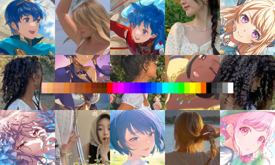
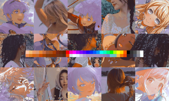
next thing i do when creating a base is add a selective color layer, which helps things pick up the pace. i’m too lazy to write it all down but these are my settings:
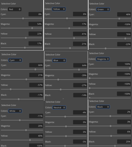
worlds ugliest collage so i don’t max out my images LMFAO apologies. obviously depending on what colors you want to focus on this will look different. for this one i completely axed magenta and emphasized blue and red/yellow. i also maxed out the black in white, which is extremely typical in my psds. this is what our psd looks like now:
pretty different already, right? nice!
next thing i typically do is another selective color layer. it’s typically pretty similar to the first, but once again that depends on the psd! the worlds worst collage again:
pretty much the same but a little different. and our results:
as you can see, this is pretty saturated and a little all over the place. not to worry—let’s move onto the next step!
iii. let’s get serious
this step varies a lot depending on what my psd needs, but because this one is pretty sayurated right now and that seems to be my main problem, i’m going to add a photo filter in a light grayish-blue to help desaturate and cool it down
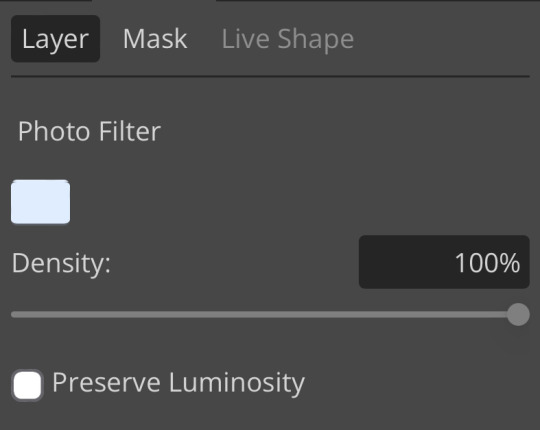
(i unchecked preserve luminosity here because i think it looks neat. i don’t recommend doing that if you’re using a darker color bc it gets hard to see, but you can do whatever forever)
obviously this isn’t the only way to desaturate but i find it fun. observe:
definitely better, at least to me, but still not great. we’re going to add another selective color layer bc the skintones look kinda wack. welcome back world’s worst collage:
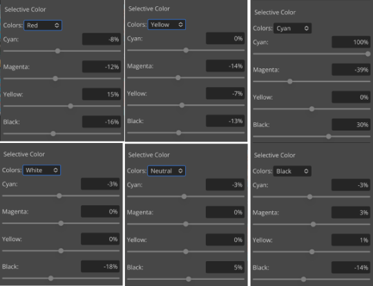
i only adjusted some of the colors in this one because i wanted to fix specific problems; namely that the darker skin tones were too dark and ashy.
mission accomplished
with that done, it’s time for hue/saturation! for funsies ദ്ദി(˵ •̀ ᴗ - ˵ ) ✧ this part i just had some fun with. a new collage:
and the results:
purple! this wasn’t what i originally had in mind but it was much more fun to do tbh LMAO i decided to turn the cyan/blue into purple because it looked better in my head
iv. okay now get silly again
now that the main meat—so to speak—of our psd is done, we can add some fun layers. if you want ideas for this, i have a post about it, but what i’m gonna add as my first silly layer is channel mixer, which is one of my personal favorite layers
pretty simple adjustments for channel mixer honestly ¯\_(ツ)_/¯ but i thought this would look fun. as a general rule of thumb i don’t mess with the red channel so much because it tends to screw over my skintones, but, as with anything, you’re free to do whatever forever
next fun layer i’m gonna add is a noise gradient map, also just for funsies
i randomized until i got a nice pink-ish kinda one. i was hoping for blue but all the blue ones were too green and i got impatient LOL
a little fucked but for sure fun. i set the gradient map to soft light at about 15% opacity. it gave the psd a fun texture and a bit of extra warmth
v. finishing touches
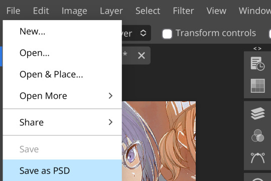
sometimes i add a couple more layers, sometimes i add less, but this psd feels about done so imma wrap it up. i typically don’t save my psds as the showcase for my storage’s sake, so i’m gonna grab something to use as an icon. i typically go ahead and size it at about 300x300
hello, haruka! once i have my icon set i duplicate the folder into the new project and name both the project and the folder. how you name it is up to you, i usually either use a random word generator or just whatever comes to mind. in this case, i’m just naming it ‘tutorial psd’ lol
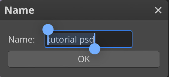
then go to file and save as psd, bada bing bada boom you’ve got a psd ☆〜(ゝ。∂)
as i said at the beginning, there’s no one way to make a psd. this isn’t the only process or even the best one, it’s just how i personally work. the best way to make a psd on your own is fuck around and find out <3 canarysage out
…so that’s how you do it.
P.S. the psd i made here will be posted under the tag #tutorial psd. you’re free to poke around in it and use it as per usual. if you want to copy it, feel free, but don’t claim it’s your own or repost it as your work. thanks!
P.P.S. wondering about adjustment layers? see photopea for dummies. wondering about something i haven’t covered yet? shoot me an ask ദ്ദി(˵ •̀ ᴗ - ˵ ) ✧
71 notes
·
View notes
Text
I thought it might be fun to do a little behind the scenes for the last story post! You guys might be surprised how little actual editing was involved. I mainly just crop, add brightness and saturation, clean up any small bits of clipping or weirdness that bother me, and then add captions! Do you want to know what actually took me the longest?
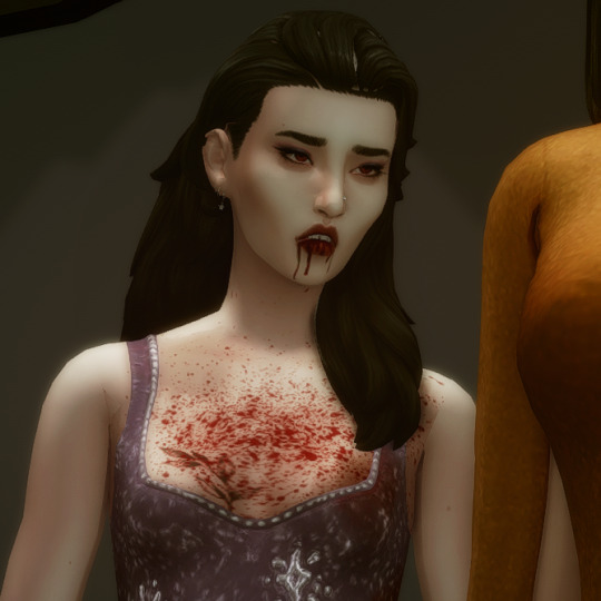
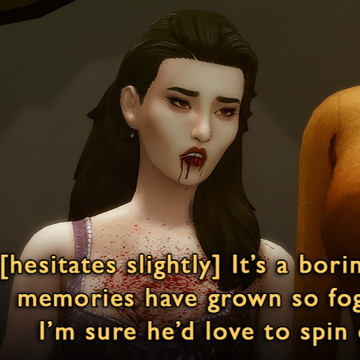
This hair had some problem areas that showed up in live mode but not CAS. It's such a tiny thing, but it annoyed me, so I had to touch it up in nearly every screenshot. Luckily, the darkness of her hair means I didn't have to do a perfect job.
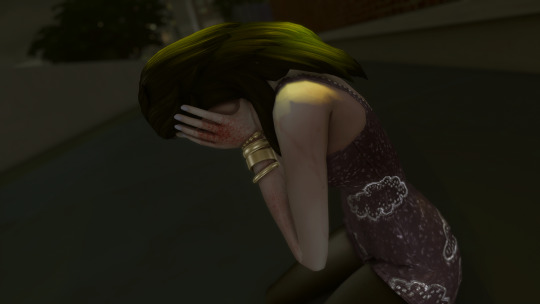
The effects were all done in-game. Lilith has the alluring visage vampire perk, which creates the red haze and mind control spiral. Unfortunately, Helena crossed her path too closely, and rather than set the shot up again I used the clone brush in Photoshop to edit out the effects around her head (vampires who can successfully do mind control on other vampires are exceedingly rare). By the way, I later figured out a quick and dirty method for dispelling unwanted visual effects on a Sim is to remove buffs in MCCC.
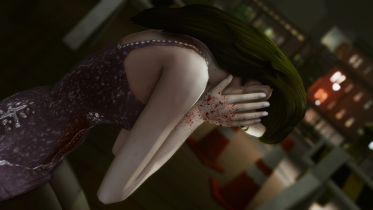
As I've mentioned, I had to shoot the attack scene twice. The first attempt was too dark, the location wasn't very visually interesting, I was in an area of San My where I had less camera control, and I used the Effects Player, which ended up being less eye-catching (hey, sometimes vanilla is the best option!). They would have worked to get the point across, but I think you can really see how I learned and improved upon my vision!
These comparison shots are all uncropped and unedited, by the way. Reshade/Relight truly does the heavy lifting. I've also gotten better at finding an angle I like and sticking with it, even if that's only because I don't want to adjust Relight all over again, lol! Speaking of angles, that last shot was done using the Dutch angle trick I learned in this tutorial by @surely-sims! First-person camera is actually super useful for storytelling. If you don't already know about this head-turning trick, it'll change your life. It comes in clutch for changing the eye line of a posed Sim since I'm not always great at getting that right in Blender.
Anyway, I don't know if anyone will find this super helpful or interesting, but I'm always open to questions about taking and editing screenshots, even though I feel like most of what I know has just been absorbed through osmosis and trial and error!
#ts4#sims 4#the zhaoverse#long post#i didn't even talk about the gifs but they were as simple as simple gets lol#i just saved the camera position in tab mode (ctrl + 5-9)#took two pictures from that angle#and then faded one shot into the other#all you need is the most basic gif making tutorial you can find#i use photoshop but i'm sure there are easier ways to do it#blood tw
64 notes
·
View notes
Text
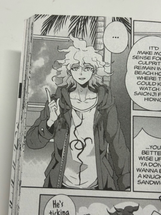
The Sideburns Scheme Post #74

(For reference: The Sideburns Scheme)
Crowley, Good Omens 2, Episode 5, The Ball, Crowley giving Gabriel hot chocolate
...
Sideburns Check

This scene is brief and mainly shows Crowley's left sideburn since the right sideburn is too blurry to confirm much of anything.
Still, that long left sideburn fits into the longest-length category that happens around Gabriel when humans aren't around.
...
Brighter Red Streak Check

The more saturated red streak of hair can be found.
...
Hairstyle Changes

I don't really think the scene gives enough to work with on figuring out how the hair might have changed, but here is a composite picture so you can decide for yourself.
...
Earthly Objects
(For reference: Earthly Objects | Crowley's Name Usage or Lack Thereof in Season 2)
There have already been signs that we are dealing with an outside force, such as the Metatron, reading and/or editing the story as it plays out.
He's been possibly censoring the alcohol use by having the camera cut away during certain drinks.
Now he's going to start censoring words. If it isn't him, some outside force from the character speaking is doing it.
The story will make this censorship more evident later with Mrs. Cheng and Mrs. Sandwich.
It is not as clear here, but I do think it's happening.
Gabriel is not allowed to say Crowley's name during Good Omens 2—ever. He's been allowed to bend or break the rules, but this rule is one he cannot break.
Who is against using Crowley's name?
The previous scene just told us Uriel is.
A later scene will show that Uriel says, "which there isn't," followed by the Metatron saying, "which there isn't," when the Metatron notes the "institutional problem." That implies Uriel has been conditioned to think that way as part of an institutional problem. Uriel will also later be shown to be very alarmed and concerned about if they have done anything wrong, to displease the Metatron. So, that's a set of tangential clues that this name thing is related to what the Metatron wants.
In every ball invitation scene, Crowley's name was not said. Crowley's name was not said during his own invitation to the bookshop. It wasn't said when he was in Demon Mode and told Gabriel to jump out the window.
Muriel is the one who got to say Crowley's name in the previous scene before getting the message that they shouldn't do that again.
Even though they are guided on that rule, they still got that name in while these specific events are happening to bring in that supernatural zone that will let Crowley and Muriel meet when and where they do later.
I think Gabriel tries to say Crowley's name after receiving the hot chocolate and before Crowley leaves the room.
The word doesn't come out, and music overlays where it would be. It's just before Gabriel says, "You're really nice."
Crowley himself reacts as if he heard his name said.
With this name issue in mind, maybe there are two standard sets for this scene.
I am not sure of the below. These are guesses.
Crowley holding the cup would be point #1.
The name "Jim" on the mug would be point #2.
Crowley and Gabriel having their hands touch while Crowley gives the hot chocolate would be reciprocal touch they have for point #3.
Gabriel's attempt at saying Crowley's name would still be credited or at least intended for point #1.
Crowley's touch on the rug outside the room as he leaves would be point #2.
Gabriel drinking from the cup while altering the physical touch on that cup would be point #3.
...
For paying attention to the pockets...
Crowley's Tied Hands might retie if a blurred strike on a lapel edge is allowed. The other signs are there. His watch is visible when he says, "Don't thank me," His right index finger is extended when he starts to turn, pauses, and says, "And I'm not." His left thumb joint meets a jacket edge as he is crossing the threshold out of the room.
In addition to that, the Belt Head is shown with some focus when Crowley passes the cup to Gabriel. There is a light in the room leading to this one that is to Crowley's right when this Belt Head is shown closest to the camera.
When Gabriel tries to say Crowley's name and says, "You're really nice," the cut reminds us of the nearby lamp that could have been an overhead light for the Belt Head in this scene. Then the Belt Head gets another possible overhead light through the lamp to Crowley's left as he exits the room. There is yet another lamp that's to Crowley's left and feasibly above his Belt Head in the room Crowley enters on his exit. It's the same lamp that was the Belt Head's right-side Overhead Light when Crowley first entered in the previous scene he had with Gabriel.
Crowley has a small self-made pocket with his legs when he says, "Don't thank me."
Otherwise, the main pocket that interests me isn't actually in this scene but that the preceding Muriel scene is pocketed between the Demon Mode scene and this one.
...
Story Commentary
This scene calls back to a scene in season 1 in which Crowley reacted angrily, or seemingly angrily, to Aziraphale calling him "nice."
With Crowley no longer working for Hell, he denies being nice here, but his reaction isn't as strong or angry as what season 1 showed.
Crowley was not nice when he entered the room and even with my theory of the supernatural zone, he has an ulterior motive.
Crowley's manipulating Gabriel as a catalyst to bring in this supernatural zone, but he might be doing that from a previous agreement he had with Gabriel. The storming out sequence in episode 1 shows us that something was cut, and whatever it was, appearance swaps involving Gabriel, Aziraphale, and Crowley replaced it. That means Gabriel was in on a plan.
That plan led to this draft of the story we see that's going to have Gabriel and Beelzebub end up together, leaving their positions vacant and ready to be replaced.
Crowley is still doing all of these various actions with the supernatural zone as part of something for Gabriel. These things aren't done exclusively for Gabriel. I'm sure Crowley gets something out of it too. Based on how things eventually play out, it was a mutual agreement. Theoretically, Crowley and Gabriel are not friends, but they were, and what was left from that previous friendship was enough for this story to happen. Muriel probably had a big role in the matter as well.
...
This scene focuses more on both Crowley and Gabriel compared to their last shared scene in that Aziraphale is not mentioned at all. Humans outside in the street are not shown, as Gabriel's head largely obscures the window he almost jumped out of.
...
That's it for this post. Sometimes I edit my posts, FYI.
...
Main post:
The Sideburns Scheme
#crowley#david tennant#good omens 2#good omens#good omens s2#good omens season 2#good omens meta#good omens analysis#good omens crowley#crowley good omens#good omens clues#good omens theory#good omens theories#good omens speculation
23 notes
·
View notes
Note
AAAAHHHHH!! CONSIDER MY SHIT FLIPPED!! THE BLACK BUTLER LIVES! What are your thoughts on the new art style?
BRO I'm with you, flipped like that pancake I managed to throw half out the pan���� I still can't believe. best Monday every fr.
and ooo thanks for the question, I wanna hear your thoughts after this👀 I've already said a little bit about this in the tags of some other posts, as well as touched on it in my master post of the crew, but I suppose I may give a big final answer(for now, from this teaser).
judging the art alone, not the fact that we get a new anime or anything exciting like that, just the art alone... it's very pretty!
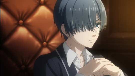
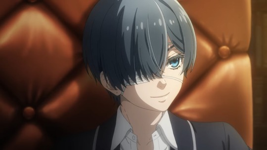
yea this is very pretty. the kid looks great, small and good, and his hair looks feathery and neat, so I approve. I think they nailed his general proportions, I think they'll do a great job at keeping them consistent during episodes! the image to the right does looks a tiny bit like a 3d asset, which is a bit jarring compared to the previous anime style, but I'm flexible towards this change. even if he looks like a video game cutscene character, I usually love cutscenes!!
but here's the drama I'm sure you're here for. yes, unfortunately, there are some wee things that I don't love as much🤏
the first thing, it really doesn't matter and I should shut up about it now... but YOU asked so ajdjfksksk why did they have to shrink sebs jaw cmon my favorite art of him ever was during the Greenwitch arc so don't tell me I'll NEVER be able to see that style of him animated😫 I just like prominent features man. I know he's meant to be pretty but but but....
ah okay. heres the main thing that I think most people may agree with.
these are two screenies of sebster from the teaser. honestly, as ☆luxurious☆ as his lashes are, I'm not a fan of the left image. the airbrush on his hair feels a tad overdone. I love the attention to detail, especially in the one on the right, it shows a lot of love! but there's just something about it that's a bit off for me.
and I think after 24 hours I've finally figured it out: it's the colors.
the realization started to hit me when I saw my favorite edit so far here by @ashxketchum. the colors have been edited to be much more saturated and warm. and I think this is exactly what is missing here.
I even tried my own hand at it, and yea personally, I think slapping a saturation, tint, and just a BIT of contrast on the whole thing can do numbers on it.
already I like it(no I'm not just praising my own work, it's not the best edit out there I did it in 30 secs). I think the reason for this is because the background is very rich in contrast and warm tones, so the characters(particularly sebastian who is all black) stand out when they are muddy and low contrast. I love stylistically when contrast is high, but that's just a personal thing, and I shouldn't hold a studio to those standards.
I tried it for the poster too though, which again I felt was a bit off. official art has never been the most top tear, and the poster is GOOD, the background is awesome and the two peeps looks amazing. but my problem with it was clear once I did another color edit.
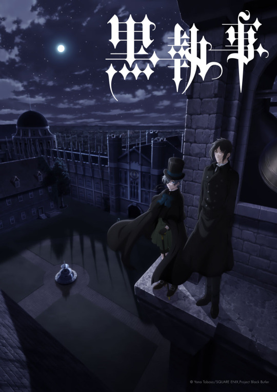
(edit on the right)
again, I feel like everything was very muted in the left original, not to mention a tad monochromatic. I really think a kick of contrast and hue could do wonders.
BUT. I know that at the end of the day, it's not a big deal. I don't really care. would it make my day or whole year if they slapped a color filter on it, or continued to work on the color grading of the scenes? probably yea! but my opinion isn't obsolete, and most of all, I look forward to and respect the artists decisions.
so no I'm not "fixing" the art😅😒.
and finally, I think this is awesome:

(I had forgotten but this gif is edited by @kilruas from this post)
GORGEOUS. could it turn some people off cause it's mostly cg? maybe. idc though. gorgeous. gimme some of that beverage.
sorry for the rant, hope it's what you wanted! I think that's everything... I like it 85%!
#my asks#thanks for the ask bud!#kuroshitsuji#black butler#kuroshitsuji 2024#2024 anime#my text posts
57 notes
·
View notes
Note
hi sel! i was wondering if you had any tips or tricks or advice for making fic banners and dividers? yours are always so cohesive! ❤️🧡💛💚💙💜
hi nonie! omg i'm so flattered you asked me this 🥺 i’m happy you like them!! admittedly, i am a bit particular about the aesthetics of my fics, but don't really expect anyone to notice 😭
i am by no means a designer! but i'll share a few of the things that have worked for me 🥺 under the cut will be what i do for sizing, editing, and inspo!
SIZING (w x h dimensions, 300 dpi)
› banners: 1280 x 320 for my thicker banners. 1280 x 249 for my thinner ones. i've been preferring the thicker ones lately just because i prefer how it looks on the post compared to my thinner ones (more balanced and stuff!)
› dividers: 1280 x any size you want or 500 x 5. i have both jpg (thinner) and png (thicker) versions for my dividers, mainly because my jpg ones stopped working after a while* 😭 i use the png ones more now because the actual image itself is also bigger in height; there are transparent spaces above the bar itself that allow more control over the space your divider will have between text (please let me know if this is confusing! i'm not sure if i'm explaining it well).
*tumblr can be really selective with the media it allows on the feed and tags, and for some reason, some dividers have been causing that problem 😭 i still haven't figured out what characteristics/factors exactly cause it, but i suspect it might be a combination of size + colours. i usually have to do test posts to make sure it appears!
i'm attaching some screenshots below for reference!


EDITING
› software: photoshop, figma. though i know there are others you can use (e.g., photopea, canva, picsart, etc.)! i just use these because i'm more accustomed to them 🥹
› process:
find a manga panel i like and clean it up (background removers can usually do the trick)
find colours i like and use it as the base for the background
*if using photoshop/figma/photopea: set the manga panel layer as 'multiply'
add the text
*for dividers: i usually just grab from the background of the banner (either i crop a portion of it or colour a long, thin rectangle the same colour)
attaching what my editing board looks like on figma! (i could be more organised but i usually do these things in such a rush i could never be bothered 😭)


› things i consider
for general fic banners: i like to keep a consistent format, which is: character panel + name + identifiable colour because they're the details that i'd like to inform people of first when they stumble upon my post! (some people will put fic titles too, which i don't do bc i can't be bothered to mess with the spacing 😭)
*keeping a consistent format also makes it easier to duplicate elements of your banners into other banners you'll be making! ex. if i'm writing 2 different gojo fics and decide to change what manga panel to use, at least i can always duplicate certain elements (i.e., name text) and find colours along a similar saturation/hue! it makes things a lot quicker and easier.
for event fic banners: i usually pattern it after the event banner itself! so for example, the fics under my 'how to be your loverboy' collab share similar elements (i.e., the wavy edge) to the main event banner. sometimes i use the same colours too (i.e., in's and out's event).
*on dividers not showing up on the dash: i notice it a lot more with light-coloured banners (some neutrals) and super thin ones. to find a way around this, i either change the colour and/or the size OR i'll find a photo that shares the colours i want and crop it to the size that i want (for some reason, it works this way 😭)
INSPO
i usually browse through pinterest for inspo on digital design stuff! i learned a bit of UX/UI so there's also a part of me that's influenced by its trends.
lately, i've been really into gradients! because it's a fun and easy way to make things look clean but not boring, and i think it can evoke the ~vibe of the fic based off the colours you end up choosing!
when i can't think of anything and want to come up with the banner quickly, i'll usually choose a photo/aesthetic i associate with the fic and blur the image until all you see are kind of blobs of colours. they're similar to gradients but have more shapes and require less of your brain power 😭 (i.e., by your passenger seat, and there's something...)
... and that's it!
sorry for this really lengthy post, i hope it's helpful nonie 🥹 let me know if you have any other questions/if anything is unclear!
#sorry it took me a while to answer!! i was gathering what to say 🥹#i hope this was helpful!#ask#rep#anon#reference
7 notes
·
View notes
Text
Me: I’ll try to be more active on tumblr
Also me: *disappears for 4 months*
Anyway, keeping up in social media has always been a challenge for me so, I1l give myself a break.
Ive been precticind quite a lot with oils recently. It was already something I wanted to do, but I was figuring out how to for a while.
the thing is, painting always scared me, when I was trying digital painting, It was always so overwhelming. I didn't really knew what to do, and I could do anything, there were no rules, no limitations and no easy process, at least not in my head.
But since I started oil painting, everything seems rigth, everything is starting to make sense. why the blocking, and why we aint the way we do, and how color works. Oh GOD! color is finally starting to make some sense to me!
I need paint, I need the need to mix it and pay attention to the saturation, and the pigments and the contrasts, I need to touch it, and to smell it and to feel the texture when it is dry. It is a whole different experience that the digital world can't provide. And a whole understandment that the digital can only replicate very poorly.
Recently I've realized how much of a megalomaniac I am and How my personal projects are always too complex for someone with no experience at anything and that's probably oneof the reasons it's so hard for me to finish anything. so I wanted to start this slowly. I wanted to paint one small object that I liked, so I picked Candles.
I also have bookbinding as a hobbie of mine, so I also bind a book just for studiyng painting. I used my very first painting of a candle I did during the pandemic when I was first trying out oils as a detail for the cover.
after that I started practicing painting just candles. Simple. with some notes to each just so I can orient myself
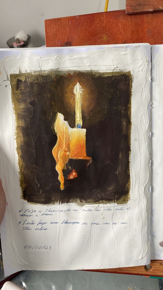
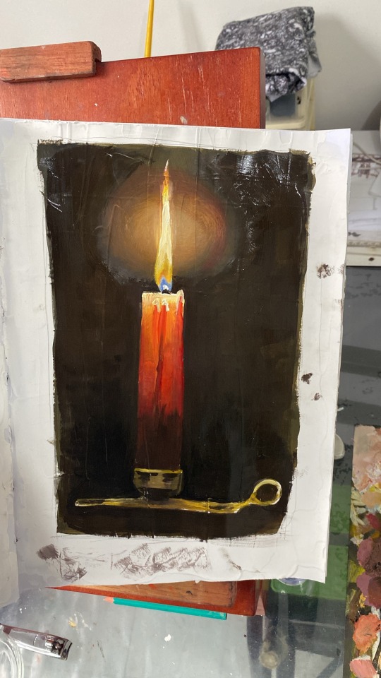
"paint the glowing around the candle before doing the flame"
"try blocking the whole candle in one color only"
but recently I got a commission from a friend, and I wanted to try and do it on oils. At first I tried doing it by observation alone. But I had many structural problems I should have solved in the drawing phase and the colours would not save it..
So I started over and decided to actually break the portrait apart and... you know... do things correctly...
I separated her face in more simple shapes and tried working out on a composition that would work better. after some editing on ClipStudio, I used Adobe color wheel to produce a pallete, which I used to guide me
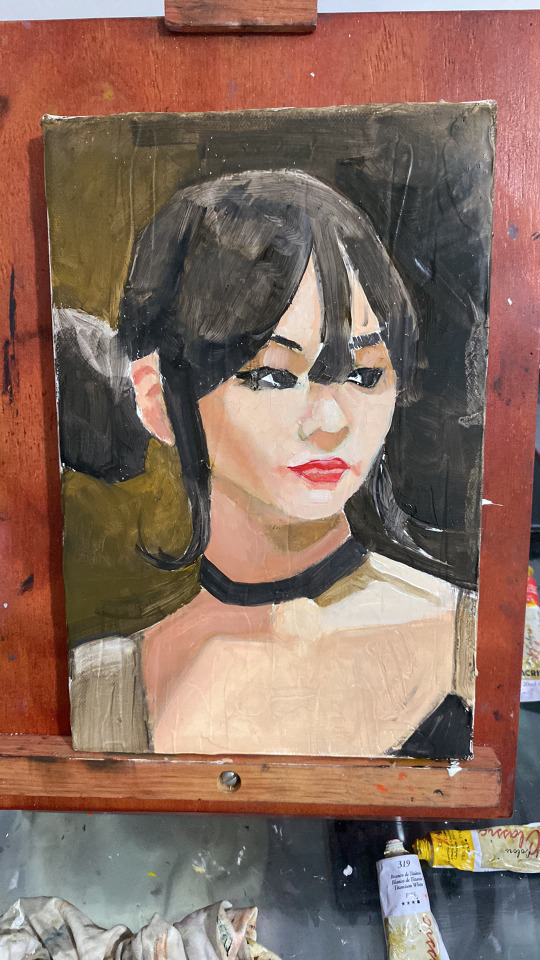
This is the result so far... Although this is still the "ugly stage" I'm already pretty happy with it.
I just wanted to share my experience with painting so far. I don't know if other artists can relate, but painting seems less scary now that it is physical. I can touch it and bend it and it is actually pretty fun!
5 notes
·
View notes
Note
idk if anyone has asked this before but how do you manage to make your traditional art come out w a clear and crisp quality when you upload it bc i've been trying to figure out how to improve that for my own art
i might've answered this before i don't mind repeating myself
STEP 1: make sure you have good lighting!
take your photos next to a window on a bright day, not in direct sunlight because that can cause glare or over expose the image, but next to a window where the ambient light is even across your piece
taking pics on a rainy day or after the sun sets? no problem! all you need is bright ambient lighting, like what you'd find in a well lit bathroom, light that isn't shining directly on you, but reflecting off the walls, diffused and even
when taking your picture you wanna make sure there are no shadows, be it cast shadows from your hands, or shadows on one side of the page due to focused light
here's a side by side:
on the left side there's this gradient of value across the image because the light is just hitting the page from the top, and there's some visual striping caused by my lamp
on the right the image is evenly covered in light from a nearby window, so there is no gradient
of course the left image is exaggeratedly bad but if you photograph and edit with uneven light your end product will be passable, but not as great as it could be
here are some more examples post edit, notice the gradient across the drawing and the shadow on the bottom half
again not TERRIBLE but not ideal
STEP 2: photograph straight on, up close and crop tastefully!
when you're taking your picture stand up if you can, and i mean it, just get right on top of the piece and make sure your camera is parallel, because taking a pic at an angle can really distort the proportions of your drawing
also make sure you're fitting as much of the drawing into your picture as possible, you don't wanna lose quality unnecessarily by photographing from a distance
and when you crop, try and get out as much unnecessary space as you can, of course give the image breathing room, don't crop down to the edges of your image, but also try and cut out your thumbs or desk if you're going for that crisp professional look
all the rules in this section can be broken if it's done intentionally!
here are some examples of off angle/weirdly cropped drawings with my desk in the background but it's on purpose:
STEP 3: time to edit!
so this part is really going to depend on what software you personally use to edit and getting familiar with it, i use my phone's built in editor which is the google photos editor, ive used ios photo editing, ive used photoshop and procreate and most programs generally have the same couple of editing scales so im going to be general
FOR BLACK AND WHITE ART:
1. turn the saturation aaallllll the way down
we don't want the yellow of the pages or the warm light of your lamp or the blue tone of the sun on our white paper, unless you're going for a black and white in sepia sort of look, then edit to your discretion, but in general for black and white i eliminate all color
2. crank the brightness and contrast (highlights/white point/exposure/brilliance) UP and turn the black point/shadows DOWN
we want to create as much visual contrast as possible and make the darks REALLY dark and the brights REALLY bright, especially if you have a drawing that has very little midrange values, this worked well for my stamps, but for a pencil drawing you want to keep those details and middle values so the settings won't be as extreme
depending on what program you use the names and effects of each setting might be a little different, so fiddle around to find out what everything does!
here's a before and after
FOR COLOR ART:
1. increase saturation! (and vibrance on ios) depending on your piece and your camera and the medium and the lighting your image and its colors can come out a number of different ways, but usually cameras will not capture the vibrancy of real life colors. and personally i just like boosting them anyway :) i think it looks really nice!
2. turn the brightness and white values up, but not too much, we don't want to wash out any colors but if you have a white of the page we still want that to be bright white
3. turn the black point/shadows down just a little, we don't want to completely overpower the light and color values with darks and shadows, but we still don't want it to look washed out and dull
and lastly (for both B&W and color) fiddle with some other specialized settings! play with curves! or pop, or HDR or whatever other slider you have access to, figuring out what each does and which ones you like will help you get your final image closer to your tastes
happy editing and art making!!! i hope this was helpful :)
#did i stay up until 5 am today writing this ask.... yes....... yes i did#ANYWAAYYY enjoy this never before seen art lmao#ask#tizzy talks#my art
371 notes
·
View notes
Note
(anon who doesn't think bobtarion is hot and should maybe come up with an easier way to identify himself. I'm also Lorroakan request guy but that's not important now)
No, the edited version is worse and I'm trying to figure out why. Bobtarion (lookswise, and SOME of the surface level of his personality) reminds me of a specific type of middle aged queer man that I am not trying to fuck but enjoy hanging out with sometimes.
This new Bob is like. He's trying to be a very serious elf lord and failing at it. Like I do think I prefer this look to his original one IN GENERAL but *he's* not pulling it off for me.
Maybe if I knew nothing about his character and just saw this new guy I'd be interested? hard to say. I think changing hair+eye color and making him a little less pale would go a long way for me, but the vampire fans wouldn't be pleased.
YOU'RE THE LORROAKAN REQUEST GUY? okay yeah you def need a nametag. Come up with one, maybe Sapphire? The gem Lorroakan has on his chest?
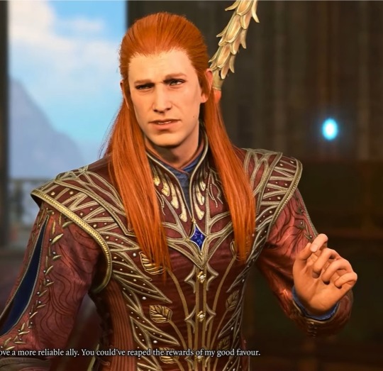
Anyway, I'm actually tempted to boot up the game and start editing Bob's looks based on your description. Give his skin more colour or saturation since his skin tone is literally called "vampire skintone," which has a really dull and lifeless colour.
Change his hair colour? Maybe platinum blonde to stay close or we can go fully to black or brown.
The problem is, his face genuinely refuses to work with anything else. Also I am very sleepy that is another obstacle between me and the pc.
His eye colour is almost the exact same one as Cazador! Actually it is Cazadors eyes in the edited picture because I thought it would add more drama. His edited look is what I imagined his ascended vampire self to look like, a try hard lord.
A non vampire au Bob look would be interesting ngl.
1 note
·
View note
Note
First of all, thanks so much for your detailed answers! I'm glad you took the time out of your busy schedule to respond.
As for his eye color, I mentioned in my ask that his eyes are clearly blue at times, but yes, they are also greenish. In fact, I think there are times when they are clearly greenish, even if you just look at Rui Komatsuzaki's art, for example, below is one of the official art on the cover of the official art book:
So often, on merchandise and such, this eye color is the standard. Like this and this.
I agree with you that gray is really the right color. This is just my guess, but Komatsuzaki tends to paint with low saturation, so he increases the saturation as a final touch, and I think Nagito's eyes would be too distinctly blue or green. But just as a matter of taste, I was a little curious what color you prefer for Nagito's eyes.
Incidentally, what I think is the right color for Nagito is something like this:

(This is part of a drawing I did for Hajime's birthday that I posted earlier. I was wondering if there were others that would be better, but not as many as I thought because I have a tendency to draw him with a closed eye expression...)
------------
Also, thanks for mentioning his hair color! That's right. Sometimes it's clearly red and sometimes it's not. It is interesting to point out that it is even purple! XD (Come to think of it, the hair color of the Nagito figure designed by Kei Mochizuki was also purple.)
I also feel that it varies from art to art whether his bangs are also red or just the back of his hair is red. The reference sheet says that his hair gets whiter as it goes to the top of his head, so the hair on the top of his head is definitely white, but I think the color of the tips of the bangs is inconsistent. Personally, I interpret his bangs as white and only the back of his hair as red, as shown in this image:
I know a lot of people think Nagito's showing Junko's arm art looks bad but I honestly like it.
Huh? Do many people not like it? If so, it's very surprising. I like it a lot, just like you! While he is acting out of the ordinary by transplanting Junko's arm, I like the fact that his facial expression is like that of a child who is excited about something.
I also like the art of Nagito standing in front of the flame because it uses the design of his hair. Because in the reference sheet, his hair is described as unstable, like a flickering flame.
------------
By the way, I've seen you mention the Danganronpa 2 spin off mangas many times, but this post made me decide to buy them! The Nagito in this manga has the physique of a "180cm" tall man. (This is a side note, but I just learned that his height setting is lowered in the English version! XD) I will read this manga and use it as a reference because I always have the problem that I tend to draw Nagito too young (almost like a ten year old kid).
------------
While I'm at it I also want to highlight his reference sheet, it's clearly consistent because that's the job of a reference and I think his expression is pretty cute here.
THIS!!!! is how I always feel too! Nagito's face on the reference sheet is so cute. I've seen it so many times to reference it, but no matter how many times I see it, I can't help but be surprised at how cute he is.
In fact, Komatsuzaki's drawing style has changed a lot since his early days, and perhaps the most recent drawing of Nagito he did was the bonus art for the collector's edition of Danganronpa Decadence, in which he looks much more mature.

(I actually didn't know about this art until recently. When I first saw it, I was confused by how insanely cool he was and how short his hair was. lol)
Speaking of reference sheets, I like how thin Nagito's thighs look compared to Hajime's ones. There is no big difference in the silhouette, but Hajime's pants have more horizontal lines where the fat seems to be pushing out the cloth, while Nagito's have fewer horizontal lines, so I think his legs are thinner. I know a lot has been said about the thickness of the chest, but I thought few people mentioned the thinness of the thighs, so I wrote about it. (Sorry for my crazy point of view...)
I was just rambling on about what I remembered from your response rather than replying to you, I hope you can tell that I found your answer very interesting.
To conclude, I would like to talk about my favorite art of Nagito. If I were asked the question, this would be the first thing I would mention:
(This is a screenshot taken from the Ultimate Gallery of the Switch version of SDR2.)
I really think this art is a good and pretty representation of his face. I like that this art clearly shows how he looks with his coat off and how thin his body is. (This does not mean that I like thin-bodied characters. I just think that it is part of the design of the character of Nagito Komaeda.) I also like the chain on his pants, so I like that it's drawn as well.
Sorry to write at almost as long as or longer than you. Thanks so much for your answer!
Hi Zen! This might be another difficult question for you to answer, but I'd like to ask: Which official artwork of Nagito do you like the most?
Even in the official art, he looks different sometimes, doesn't he? I am still confused as to what color his eyes are. (In a lot of fanfic they are described as gray, but in some art they are clearly blue).
I would like to know which of the official artwork, whether in games, anime or manga, is your favorite.
Whoa!! that Is a difficult question! I'll try to answer it though haha!
I have a lot of them I like but choosing one is pretty difficult... so I'll just start this answer off with a discussion on the inconsistencies statement! I believe Nagito's eyes are definitely gray, at some points it maybe hard to tell but they're definitely gray! There are a few anime moments where his eyes feel green, some promotional material straight up changes it to green, and a small amount spin off art may change it to something that can be interpreted as blue, but for the most part they are absolutely gray.
I think the only actual very small change he undergoes is his color tips? His hair always has a gradient but the colors used for it are a little inconsistent sometimes. In Danganronpa 3 they're red and occasionally purple so it's a little weird haha! Sometimes he's not drawn with his gradient at all, a slight gradient with the same color, a red gradient, or a purple gradient so it's pretty confusing. His gradient also changes with how prominent it is depending on the art if there even is one. He's drawn most often with red subtle tips though so I think that was the intention. You could probably chalk it up to lighting if you wanted Lol.

While I do love a lot of his sprites I think some of them are pretty restrictive and lack all of the emotions we know he's able to show because he does in other appearances. This is why I really like when the Mangas allow him to be very expressive beyond what his sprites can convey! I think his sprites can really excel with some expressions but falls flat with others.
Rambles about his sprites in Dr2 and his slight inconsistencies aside, a lot of his art is great! (I'm very biased) but I do have some strong opinions, positively and negatively, on quite a few of them. The main thing is that I don't know if I actually have a favorite??? It's a really difficult question.
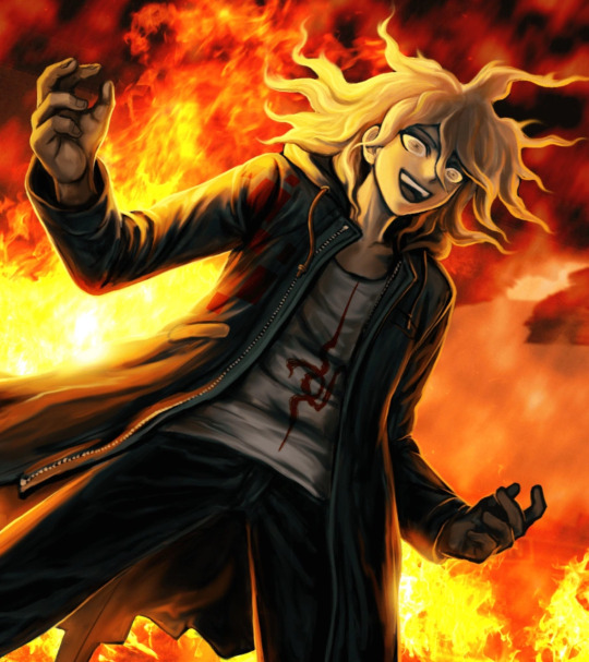
But I do want to highlight these three dr2 cgs I really like! He isn't fully 100% consistent here but I really like them. I know a lot of people think Nagito's showing Junko's arm art looks bad but I honestly like it. Nagito about to play Russian Roulette is such an awesome moment too! The one where he has the fire behind him is not only really cool, but also a really good in game shot of most of his body from a different angle!
I truly, again, love his manga art! His specific spin off's manga has a lot of really amazing, interesting, and fun visuals! Even if I'm not really fond of the anatomy the artist uses it's still really good stuff. The Danganronpa 2 spin off mangas have really good anatomy and expressions he looks sooo good there I'm in love with it.

While I'm at it I also want to highlight his reference sheet, it's clearly consistent because that's the job of a reference and I think his expression is pretty cute here. I don't really see people talk about it so I just wanted to also bring it up Lol.
For the most part I've really struggled to directly answer your question because he has a lot of different interpretations, art, and appearances that all mix together into one mental image or understanding of what he looks like for me. I really love most all of his art so it's hard to say. Nagito has a lot of different tones in his art as well, from his crazed ramblings to happy expressions, he has so many tonally different art pieces because he excels at being sweet and intimidating. This makes it even more difficult!
In conclusion, I don't believe I can come up with an absolute answer for you unfortunately. Regardless though, I definitely learned from this that I have strong opinions on all of his art. I hope you enjoyed my appreciation for some of his art and small talk about mild inconsistencies of his haha!!
Apologies this took so long and Thank you for your ask <3
39 notes
·
View notes
Text
Raw footage
For this shot, I tried to do a POV shot of my dad looking at my mom while she holds his hand. I can adjust the HSL later when editing so the colour or saturation won't be a problem but however, I think that the two people in the background are a little distracting so I might try to figure a way to edit them out.
0 notes
Text
an easy visual guide on what to do when the psd you love doesn’t work as it should on the screencap you picked.
a common problem with heavier psds, some friends have asked me before how i make psds work for multimuses and stuff like that so i decided to make this little tutorial in case anyone else struggles with that out there. i’m not the best at explaining, but it’s simple enough.
to me, the first step is to look at the picture that comes with the psd, often unedited. in this case, i’ll be using my psd 005 as an example. i made it using screencaps from z/endaya in the s/piderman movie. as you can see, the picture is low contrast and low brightness with a blue-ish green-ish filter. we know that because there isn’t too much variation between the white colors and the black colors, so we know the contrast and brightness are low. and we know it’s cyan / green tinted because the highlights have a blue undertone to them, and the shadows have a green / yellow undertone. pictures with similar tints and contrast will look the best with that psd.

side note: if you can’t tell what’s the tint of your screencap, you can use the color picker and select the brightest spot to figure out the highlight tint, and the brightest shadow to found out the tint for the shadows. in this case, these are colors.


so if i take this picture of s/ydney s/weeney that looks nothing like z/endaya’s in terms of brightness and tint, it obviously won’t look good. it’s much warmer toned and brighter, though there is a similar amount of contrast it doesn’t matter much when both of the other things are off.

it’s an easy fix which isn’t always the case but it’s easy to understand the basics. start with a color balance layer to even out the tones of your picture to make them more similar to the one the psd is based on. you start editing the one that first pops up but you can also use the ‘highlight’ and ‘shadow’ options later if the pictures are too different and the psd still doesn’t work.
and then you can add a brightness & contrast layer. because we’ll be lowering the brightness considerably we’ll also have to lower the contrast, otherwise it’ll deepen the contrast levels of the original picture which we don’t want, because it’s already good.
it’s already okay if you don’t wanna take too long, but to me it’s still too saturated, so you can add a vibrance & saturation layer and make it a little less colorful.

remember that the adjustment layers must go BENEATH the psd for it to work, otherwise you’ll just be changing the psd.

#ps tutorial#photoshop tutorial#rp tutorial#psd tutorial#idk what to tag this as lmao#but yes#mine: tutorials.
203 notes
·
View notes
Text

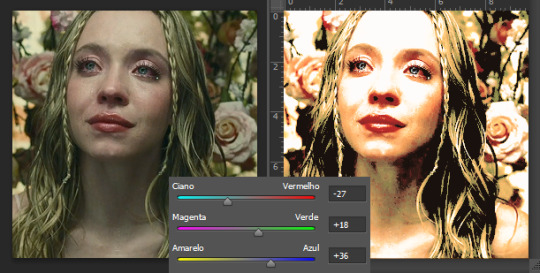
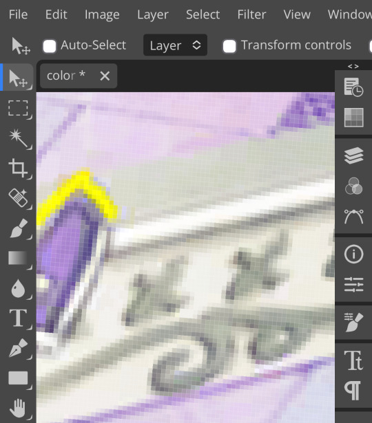
…color correct an image in photopea?
so, you’ve finally finished a psd. it’s everything you imagined and more. you go to apply it to your image and get…

…well, that. what the fuck, you may be thinking, this looked fine on my tester images! and it probably did! the problem with this image is that it’s just. overbearingly purple.

which may be fine for the image itself, but it doesn’t work for editing purposes. you end up with weird bits (why’s her hair blue? why’s the contrast so low?? what the fuck is happening) and an image that frankly hurts to look at. so, the question remains. how do you turn that into—

—something more like this? well, don’t worry, because i’m canarysage and i make things more confusing instead of less, and i’m here to save your eyes and psds
i. white balancing
if you keep up with photopea for dummies, you probably recognize this term from my post curves for dummies. i’ll go ahead and re-explain it, though.
white balancing is done using either a curves or levels layer—it doesn’t matter which, they both do the same function. i use levels because i don’t have to scroll to reach the eyedroppers on mobile LMFAO but they both do the exact same thing ¯\_(ツ)_/¯
add a levels/curves layer below your psd folder and turn the psd off. look at your image and determine what you think are the darkest and lightest parts—or, if it’s easier, what parts you want to convert to #000000 black and #ffffff white. once you’ve figured that out, go into your levels layer.
see those three squares at the bottom? that’s the important part. first thing i’m going to do is tap that black square. the black square turns whatever color you pick into #00000 black, so i’m going to use the eyedropper it pulls up and select a darker part of my image
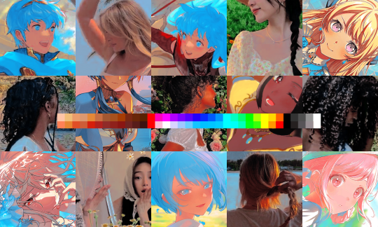
for this picture, i selected ena’s pupil, because it’s rather grayish in the original. this will help add some contrast. (also i zoomed in really far because i have shaky hands and wanted to make sure i was “aiming” correctly. you don’t have to do that i’m just insane)
repeat this process with the white square. the white square turns whatever color you pick into #ffffff white, so pick a lighter part of your image. also, for the sake of my sanity, do not choose a skintone when doing that. for the love of god
mega zoom to the rescue again. i picked the whites of her eyes because those look really weird if they’re not white, frankly. other good choices are highlighted areas on objects or things that are already white (like the paper in her sketchpad)
now we’re going to do the gray square. this is the part which is trickiest, so don’t be annoyed if it takes a few tries. choose the color in your image that you want converted to gray—in other colors, figure out which color is most overpowering and select that. i recommend not picking a saturated color for this, because it’ll look—

—really bad. ow, green. i recommend picking a color that’s reasonably close to gray already, but it depends on how much correcting your image actually needs. you just have to eyeball it.
pixels. for this image, i chose the decals on this picture frame in the background; they’re reasonably close to gray but still purple enough to do the correcting i want.
after white balancing, your image should look significantly better already. here’s mine at this stage:

it’s a little strange, but that’s going to be covered by our psd anyway, so don’t worry about it. if your picture still looks really off, you can add a second levels/curves layer and white balance again, and you can just repeat that until it looks how you like it. i’m pretty happy with this, though, so we’re moving on.
ii. photo filter
(photopea refreshed on me so i had to recreate my white balancing, forgive me if it looks inconsistent. let this be a lesson on saving your wips as psds)
okay, step two! this one is way easier, don’t worry. add a photo filter layer above your white balancing layer and below your psd. fair warning, this step requires bare minimum knowledge of color theory—as in, what colors are opposite each other on the color wheel. godspeed
look at your image and figure out what looks off about it. feel free to toggle your psd on and off as you do this, it’ll help. in my case, mine ended up too warm and too saturated. so, to fix this, i’m adding a very low saturation green photo filter
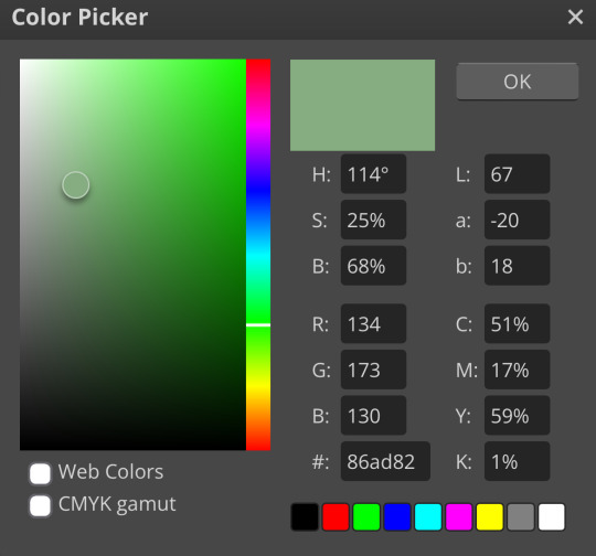
which, obviously, made it… green:

to fix that, we’re just lowering the percentage of the photo filter here. how much you lower it depends on your image and your personal preference, but, for reference, i set mine to about 30%. if you want to, you can mess with blending modes and opacity in this step, but i just left it as is
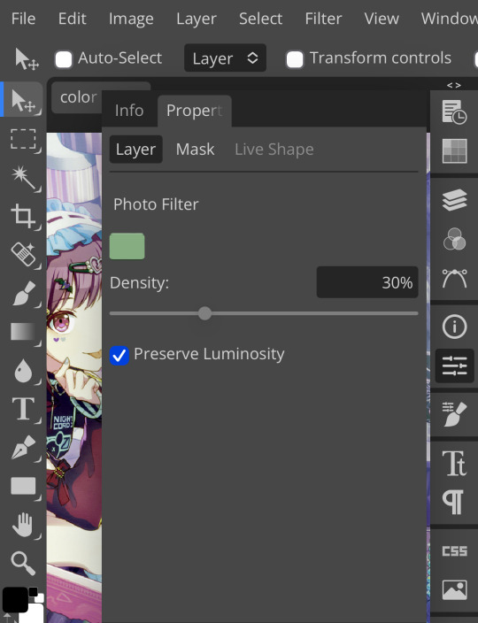
yay, less green ^_^ like with the white balancing, you can add as many photo filters as you want. i’m real lazy so i’m just doing one, but you can just keep stacking them until your image looks right—sky’s the limit. for me, i’m going to step three:
iii. brightness/contrast
pretty self explanatory. brightness/contrast isn’t a color corrector; it’s a lighting corrector. it adds brightness and contrast, obviously. look at your image again with and without the psd, and figure out what it needs. the psd i’m using for this is pretty dark, so i’m adding brightness and lowering the contrast:
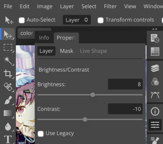
like so. this step can also be accomplished with curves, levels, or exposure, but brightness/contrast is the simplest and least finicky of those options, so i personally prefer it ¯\_(ツ)_/¯

pretty minimal change, but i wanted to demonstrate this step anyway, as it can be pretty important on some images. with that done, time for the last step:
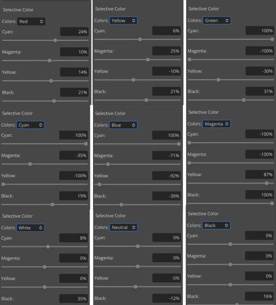
iv. selective color
like all the previous steps, this goes under your psd and above the other layers we’ve added. what exactly you do with selective color once again depends on your image and psd, but what i did was darken my blacks and whites,
very minimally adjust the neutrals,
remove magenta from magenta and add magenta to green,
and remove cyan from my reds and yellows.
which, all in all, gives me this:

which, if you’ll recall, is a far cry from our original image. now, if you turn the psd back on, you’ll get this:

which i consider a marked improvement from what we originally had. these steps can be mimicked on pretty much any image as long you tweak it enough. obviously you’ll have to finagle and adjust depending on your image, but it’s actually pretty easy! observe:


…so that’s how you do it.
51 notes
·
View notes
Text
Dirty Work - Critical Reflection
Working on this film was a lot of fun but also came with challenges. During my role as the cinematographer, I learnt a lot from the mistakes I made during the shoot, such as not having planned the lighting properly, which came to be an issue when I had to compromise some shots visuals to accommodate for the lighting we had to work with. This is something that I will definitely take as a lesson in properly understanding the set I’m working on prior to shooting. I also had issues with the tripod I booked out as it was missing a screw, so I will make sure next time to set it up before leaving the equipment store. One other thing I would say is that I need to build my confidence in cinematography, because I think that lack of confidence did not help me when I was on the shoot. When booking equipment, we had to book the Canon XF100 camcorder which was all that was left as an option as everything else was already booked out. Given that a lot of other students were booking camera equipment at the same time I realised we should have booked earlier so we didn’t run into this problem. I was the person who booked everything from the equipment to every Protools/foley session for the whole production, which was something I was happy to do but did teach me the value of time management. The camera quality and its abilities were definitely subpar compared to the black magic camera, which got me down as I was responsible for the visuals, and if I couldn’t work with this camcorder to make the film look good, I would let the group and the film down. I think that despite this I managed to do good with the camera, and the handy straps did come in useful when filming handheld, especially in the bathroom/shower where I had to crouch and stand in a small space. During post-production I had a hand in helping James with editing and sound design, which was really difficult being that neither of us were really familiar with the software AVID and Protools. Through help though from the wonderful people at Screen Academy, we got through it and figured out things together, with James putting in a lot of the editing work.
The crit for our film went surprisingly well, as I was full of doubt and worry that the audience wouldn’t respond well to it. The notes I have from the class were really lovely and helped me look at the film from different perspectives. Some notes we received were that the shot of David’s reflection in the window was good, and that every shot tells you something different. Someone also said that the shot of the knives is really sinister, which is good as it was definitely the idea we went for during the shoot. There was also a comment that the red lighting was good at the end and shifted the tone of the film.
The feedback from the lecturers and staff were really insightful and gave me a much better idea of the kind of things to think about on the shoot. It was mentioned that when filming faces, getting some light reflection in the eyes is important to make the character more identifiable to the viewer and pull the audience in to care about a character. This is something I hadn’t thought of but helps me see how I can improve my lighting skills in the future and think critically about even the tiny details of lighting that are important in a shot. It was also said that in the shots at the sink, there were some problems with the light as it was low but was much brighter when the actor turned around and faced the door. This was to point out some inconsistency in the light source’s distance and placement and is something I will definitely be more mindful of in the future. We were also told that you can lock in the exposure with a ‘false colour’ setting on the camera, something I hadn’t heard of before, and plan to look into. It was pointed out that if you use saturated colour for too long in film it’s too tiring to the eye and so the scene at the end with mixed lighting looks good, as the bathroom is red, and the hall is white. This made me realise why the shots worked well paired next to each other. They also said that the reflection worked well but it might have been better if we cut back and forth from sink to reflection, something that I hadn’t considered in the edit. Also, the branding of the character’s hoodie was pointed out, which I hadn’t noticed but is a key detail of the costume, so I am going to be weary of this in the future. We also received feedback that we crossed the line/180-degree rule at the sink scene, which I should have been more careful not to do when getting each shot in the scene where the character is walking from one side to the other side of the room. It was also noted that the lighting was dark at some points, something I knew had hurt some shots at the end. It was mentioned that there was a lack of confidence in the cinematic language that is working well in the film, and I can totally see this, which is something I can take forward, as I know now to really embrace the visual language. A note I also wrote down was that from screenplay to shoot, visuals become more important, and I think this is relevant to the amount of talking that we ended up with in the final film, some of which could definitely be substituted with more visual cues and performance from the actor, to show off the power of the audio-visual language.
Overall, I am really proud of the final film we created as a group, and despite the challenges and hiccups along the way, we created something worthwhile. The role of cinematography is not easy but it was incredibly fun to work with James as director to create some fun visuals for this film. Looking forward I am excited to do more cinematography work, and really gain that confidence I think I need more of when working on a film.
2 notes
·
View notes