#Edit: fixed the saturation
Explore tagged Tumblr posts
Visit Tumblr Blog
Explore Tumblr blogs with no restrictions, modern design and the best experience.
Last Seen Tumblr Blogs


Fun Fact
China blocked Tumblr because of pornography and censorship problems in 2013.
Text

Vivec writing their sermons
392 notes
·
View notes
Text
Creature Creature Bark
2K notes
·
View notes
Text

*crumples him up like a piece of paper & misses the shot at the trashcan by about a quarter mile* ah shit
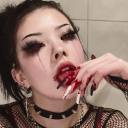
#scrunkle scrunkle scrunkle sckrunkle—#one of my fatal flaws is that i always yearn to draw charas Too Cute & somft etc x'3c#he does the anime thing where his eyes get drawn Over his hair & i Hate that 😂😂😂#doodles#alastor#hazbin hotel#edited to fix the saturation/exposure bc i didn't realize How jank it was before lmfao
22 notes
·
View notes
Text
New pfp :D

#im really proud of this painting!! probably the best ive done this year so far :)#to my noots who have been used to my old ; im issuing a formal apology 😭#*moots#north arts sometimes#traditional art#sona art#acrylic#artists on tumblr#original art#The orignal scanning was so saturated oml 😭 nothing some editing couldnt fix but DANG
3 notes
·
View notes
Text

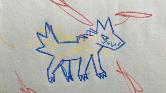
was thinking of naevys, zenith's mom friend, and thinking about her whole deal a bit because i struggle to just make side characters without developing them at least a little lol. she's a widow and had three kids, two daughters and a son, and lost both daughters during wyrm war one. decided i wanted to design the daughters, so here they are! the whole family follows/followed kezdall, hence the bear symbols. extremely lazy armor here but we don't worry about that, this gets the idea cross well enough. i think they were both clerics, maybe a cleric and a paladin? they both fought in the war rather than being civilian casualties, i know that. daughters went out to fight in the war, son stayed home to watch out for mom and dad. might draw the son separately, we'll see how far this inspiration takes me lol
#zenith lucked out in a LOT of ways with naevys being the one who found him#one way i'm thinking of here being that naevys knows how to take care of curly hair so now zenith does too lol#i think sitting him down to comb out his hair (probably after helping him wash it) and braid it back out of his face felt nostalgic for her#how many times did she do that for her own kids#i'm tempted to redraw long-haired-daughter (alystin) with braids instead of a ponytail actually#considering drawing all three kids together so maybe then. we'll see!#art tag#naevys tag#not pictured but still belongs in her tag#eratee tag#alystin tag#hmm i think their skin is too saturated. yeah definitely too saturated#edit: fixed their faces and gave alystin a braid. better
2 notes
·
View notes
Text

more gouache practice
#tried to edit the colors and make them a little less dull but also not weirdly saturated either and ejh#anyways i paitned both practice pieces like last week i think? idk#also i painted this over an old pen sketch cause i didnt feel like drawing anything new lol#gonna finish this evantually and fix the hair but and add details but also knowing me i also might not end up doing any of that lol#art#doodle#gouache#painting#gouache painting
15 notes
·
View notes
Text

Cringetober Day 3: Oversized Prop
This is an fairly new OC of mine, which I think I'm going to name Tavie (pronounced Tay-vee, short for Octavia). She's a spider-themed magical girl who goes to a private school, and... that's all I've got. Her story is still developing. But, for now, enjoy her comically large sawblade.

#cringetober#cringetober 2024#OC: Tavie#my art#original art#original character#oc#sawblade#cw sawblade#tw sawblade#cw razor#razor#tw razor#BTW if it looks desaturated it’s because the color settings on my tablet were not set correctly#so things looked a lot more saturated than they actually were while I was drawing#so I had to edit the image after export and turn up#the saturation on it#but it’s fixed now!! apparently it was set to like some adobe colors or something
2 notes
·
View notes
Text
Missed dnd so bad. I love when there is a thing and its all I ghink about
#very fun …#zzz now … exciting I have 1 7 hour shift tomorrow and then a 5 hour shift the next day … win ..#gonna try very very hard to finish editing the petit scans …! theyre pretty simple to get thru#the most I need to mess w is for some reason a lot of pages had their colors scan in like. with lines of less saturation#so ive just been fixing that manually. not a huge deal !#when I grab the character art ill fix it up even more for each one. I already need to redraw bits of a couple from page margins (sorry…)#this is like the one book I didnt wanna skin .. ive been trying to find it for ages … let me have this one ..#txt
6 notes
·
View notes
Text


@x-i-l-verify, here you go!! Sky has chosen Four as his unfortunate victim for nap time... but after a while, Four doesn't mind too much 😂
I hope you like it!! halfway through my ipad like had a heartattack and like started glitching so the saturation looks different between panels but oh well 😂😭 i couldn't figure out how to fix it, so let's just say that the sun moved a little bit lol
EDIT: i fixed it 🤣 youtube helped me
#linked universe#linkeduniverse#asks#requests#lu sky#lu four#fluff#this is actually my first little comic!!#it was a lovely break from homework and i so enjoyed making it!!#still relatively new to digital art so sometimes my ipad does things that i cannot control#i swear it has a mind of it's own!!#i like to imagine that four was just minding his own business and sky just yanked him over#before four could protest he was stuck in a death grip lol#eventually he just gave up and went to sleep
855 notes
·
View notes
Text
Gotta start with a good base!


The red gash was just straight onto gesso
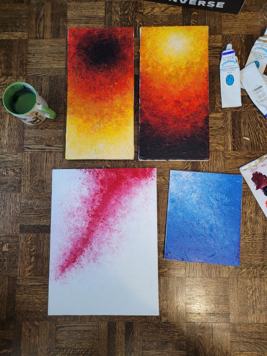

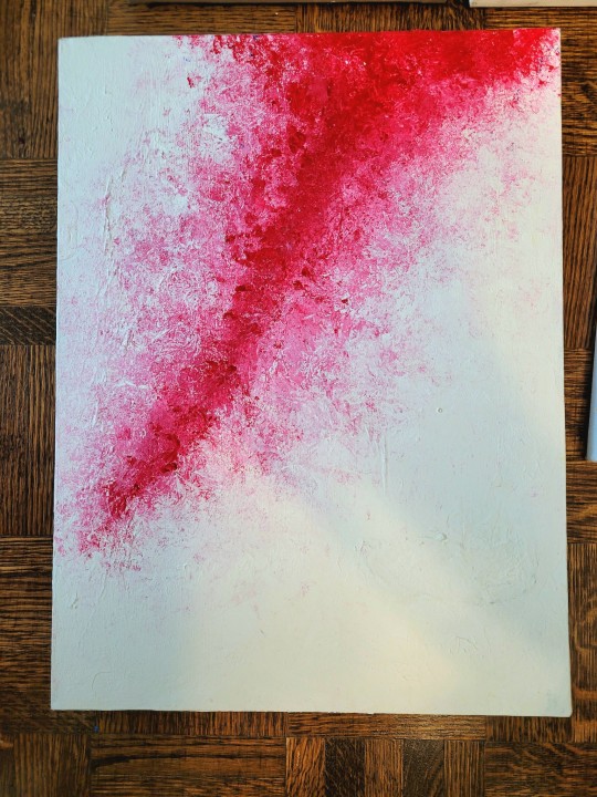
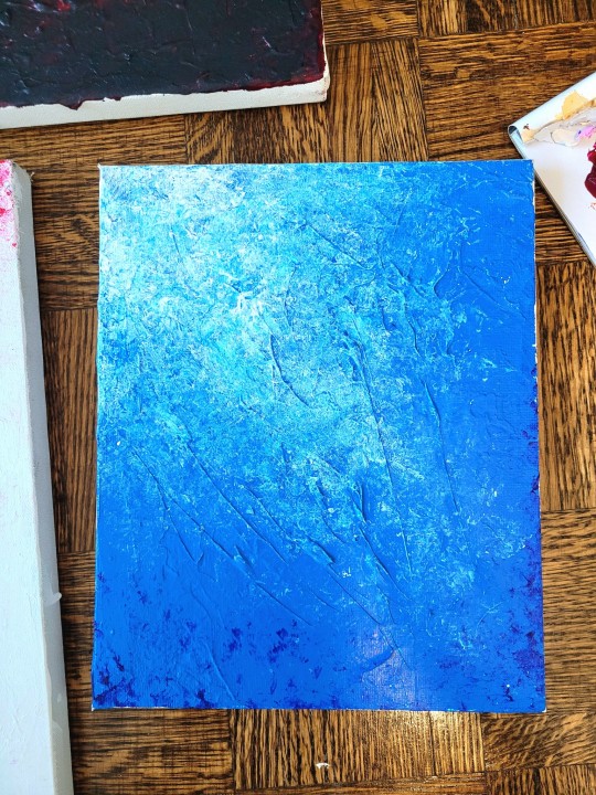
Did some texture paintings because i have so many canvases just sitting around
#when i did the bases for the ones on the left they looked so shit#i was like ah crap ive wasted the canvases#trust the process my friends! give it time!#also i edited the photos on top a bit to fix the saturation lmao they were so dark#i took them at like 5pm it was getting dark theyre closer to the real thing now
70 notes
·
View notes
Note
Coloring anon here, yes, I would definitely like to know more about how you color frame by frame and the other techniques you mentioned! It would be much appreciated, thank you!
Hi anon! I'd be happy to go over my preferred methods for colouring!

First resort (ideal):
Painting over shots with little movement (the first method in this tutorial)
Colour manipulation using selective colours (the second method in this tutorial; alternate tutorial -> i also sometimes add a hue/saturation layer on top to manipulate the cyans/blues as well)
Second resort:
Keyframes for shots with consistent movement where it's easy to hide "imperfections" (tutorial 1, tutorial 2)
Last resort:
Frame by frame colouring -> DISCLAIMER: the way I do this method is the easiest way I've gotten it to work for me but that also means that it's very inflexible when it comes to editing any of the colouring afterwards. Once you start colouring in frame animation mode you're basically locked in so you need your gifs to be exactly the way you want them prior to adding your colour
So in this tutorial I'll go over how I do my frame by frame colouring as well as how I create actions to automate the repetitive parts of this process! (Some resources that explain how to create actions are here: 1 2)
To use the select subject feature you will need Photoshop CC 2018 or later
Step 1: Preparing your gif with base colouring
So first you want to do your base colouring for your gif in timeline mode, which I've explained here. I keep my gifs short (ideally 40 frames or less) since this colouring process is tedious!
I make sure that in my hue/saturation layer, I turn the saturation in the yellow, green, cyan, and blue tabs all down to -100 (and for the yellows I usually add around +20 to +60 in lightness)
Here's my gif with the base colouring that I'll be starting with:

Note: turning down the saturation in almost all the colours gives you that nice silver/grey neutral background to paint on top of. It's a lot less noticeable when your painted layers aren't perfect
Step 2: Converting to Frame Animation Mode
I use the save action from this action pack to convert my gif from timeline mode to frame animation mode.
You cannot edit your base colouring from this point onwards!
Step 3: Using Select Subject
If you're recording an action this is the step you would *start recording*
This is what your window should look like:

Making sure your first frame and first layer are selected, go to Select at the top of your window and click Subject

You should then see the marching ants outline around the person in your gif

You then want to create a new solid colour fill layer (which can be found when you click that little circle icon at the bottom of your layers panel), and set the layer blending mode to colour.
The layer mask will automatically be created since you had the marching ants outline.

Since my person is in colour and not the background, I want to invert the layer mask by clicking on it and using command + i (or ctrl + i), and now this is what it looks like:

Note: Select subject isn't always perfect!!!, depending on how cluttered the scene is and how much contrast there is between your person and the background, select subject could either do a really good job like it did here, or screw up a little like it did here:

That's okay though because it still gives us a good base to start from! We can fix any issues by painting with black and white brushes on the layer mask.
Step 3.5: Create clipping mask
Thanks to @wolfchans for telling me about this because it gives us back a little bit of flexibility when colouring frame by frame! Instead of merging down, we can make a clipping mask instead. Right click the solid colour fill layer and select create clipping mask.


If you're recording an action, it's at this point where I would *stop recording*
Step 4: Fixing the layer mask if needed
So now I want his jacket and t-shirt to also be purple, and to show his fingers behind the glass. I make sure the layer mask is selected, and paint with a brush at 60-70% hardness (painting with black erases the colour, painting with white shows the colour). User smaller brush sizes to paint smaller details!
This is what my canvas and layer mask look like now.

Step 5: Repeat
Now I click on my second frame and second layer, and repeat steps 3-4. As you can see, using the clipping mask allows you to still see and edit the colouring of the previous frame, just make sure you click on the right frame and it's corresponding layer when you're doing further editing.

This is where an action is super helpful in cutting down all the repetitive steps and clicks you need to do. So at this point I'd just play the action I created and paint on the layer mask as needed.
Repeat for all your frames and then you're done! After this I convert it back to timeline mode again so that I can add my text and do any other effects such as blending or transitions. Hope this helped!!
#answered#Anonymous#*tutorial#userbeanie#userwintersoldado#userishh#userfaiths#usercats#usertj#tuserhol#userahri#usereus#usershreyu#userchibi#userbunneis#usermibbles#uservivaldi#carolook#userbuckleys#usertenacious#tuserheidi#userholtz
229 notes
·
View notes
Text
talking about james somerton's dogshit color grading
okay, i see people talking about how poorly james somerton's videos are lit and at first i was like "how does this dumbass not understand three point lighting, its like something you learn about within the first month of film school" but then someone on twitter pointed out he probably just didn't know how to properly grade footage and i was like ooooh my god how did i not realize?
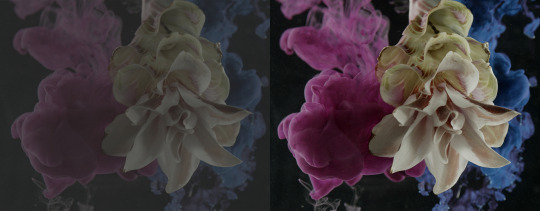
so when you first shoot something, it will probably look fine on your camera, but when you import it to your computer it might look like dogshit on your monitor, like in the image on the left. this has to do with whether you shoot it in LOG or RAW. basically RAW= huge file size but no change in saturation/exposure/white balance, ect. LOG= smaller file size but really ugly, little saturation and contrast, etc.
when you take this footage into your color grading software, you have to put a LUT (look-up-table) matching the camera you shot on onto the LOG footage to restore it so it looks like the image on the right. After that, you can start grading (fixing the exposure, adding colors to the highlights or shadows, there's a million different things you can do when you color grade.)
but whoever edited these (I'm assuming it's James, who we can always count on to be extremely lazy in his "creative" endeavors) just skipped that crucial step and went straight into color grading the LOG footage. Which is a huge no-no.
that is the reason why shots like these look so weirdly lit. conversion to LOG literally drains the contrast and saturation from the footage. which is why it is STEP ONE to correct it in post. but this dude probably just went straight into applying filters and colors and just thought upping the exposure or brightness would fix the footage.
obviously i don't have access to these files personally, so i can't say this with 100% certainty, but it would explain why the footage looks so damn weird. in my personal opinion it's not a lighting mistake necessarily (though the choices of colored gels he uses for his lights are very questionable.)
1K notes
·
View notes
Text
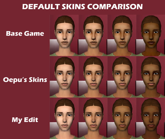
90 GENETICIZED SKINTONES + DEFAULTS
EDIT: NOT POSTING THIS ON MODTHESIMS ANYMORE BUT THE MEDIAFIRE DOWNLOAD HAS BEEN FIXED. REASON BEING THAT SOME SKINS HAVE DISCOLORATION THAT I DON’T HAVE THE TIME TO FIX : /
First of all, Happy holidays!
This is my second post, and the whole purpose of this Tumblr account is for me to share Sims 2 content that I personally use.
Now, for my game, my favorite skintone set is by oepu, which were defaulted by Sadisticpyro, both on modthesims.
I love this skin because it's not too cartoonish and also not too realistic/shiny. I like that it too has two-toned lips, and has the same lip color as mine. It also goes well with the proportions of how I make my sims.
Anyways, I don't like the skintone shades of any default skintone replacements out there because generally, they make skintone 1 and 2 look the same, and skintone 3 wayy lighter, so I created my own variation and modified the oepu skin: - I made skintone 1 lighter, skintone 3 darker and more saturated, and skintone 4 more saturated and less contrasted. - I made the male and female sims have the same skin so that they don't look too drastic from one another. - I also lightened the nose and browridge shadows so that the skin is compatible on monolids and non-prominent noses.
picture comparison of sims 2 skins: base game, oepu's, and my edit
Afterwards, I used python to turn the 4 skintones into 10 skintones first, each skintone number has these genetic values (using Wardrobe Wrangler):
1 - 0.1 2 - 0.15 [default skintone 1] 3 - 0.2 4 - 0.3 [default skintone 2] 5 - 0.4 6 - 0.5 [default skintone 3] 7 - 0.6 8 - 0.7 [default skintone 4] 9 - 0.8 10 - 0.9
Then, per 10 skintones, I made 3 sets of undertone variations: cool, neutral and warm. So now you have 30 skintones. I thought the first set of 30 was too saturated, so I made the "Natural" versions of them. Then I also decided to make them even more desatured, these are the "Pale" versions. So overall, 90 skintones.
Because I used python, some skins are pixelated, but I really don't mind it. Also, the teeth for some is yellowish but there's some cc teeth overlays you can find online.
DOWNLOAD HERE (MEDIAFIRE) 👈 mediafire link has the default edits, the nondefault geneticized skintones, and a gif preview of the skintones.
Note: If you choose to use the default replacements, remove any default skin replacements you may have in your game.
Again, huge credits to oepu and sadisticpyro for the og skins. I don't think they're active, but if i'm asked to take this down I will gladly do so. I'm just here to share what I already use in my game.
Happy Holidays everybody! 🎊🥳
160 notes
·
View notes
Text
PHOTOPEA TUTORIAL / PHOTO FILTER FOR SKIN TONES:
a tutorial on HOW TO BRING OUT SKIN TONES if an image is 'too gray' (faded) or has too much of one (likely over saturated) color! this technique can easily be applied to icons that already have a border ! just put your focus on the base image / icon ! this works on relatively anything, including poc and non-poc. WHAT YOU WILL NEED: photopea...and your desired your base image(for example, i'll be showcasing inconsistent or otherwise dark/faded scene lighting, like twilight and saw). DISCLAIMER: not all lighting/images are the same, nor are psd colorings. while some colorings may be designed to bring out reds/yellows(which is the filters we'll be using in this specific example), others may mute them and you may have to improvise with whatever color the psd you're using is designed to focus on. this is just a general idea, you will have to explore as you see fit. it's all going to depend on your personal taste !
by the end of this, you should be able to manage results like this !

cool, huh?....anyway, on with the mechanics !
EXAMPLES:

[ BEFORE PSD ] [ SYNOPSIS ]
#01 / LEFT IMAGE ABOVE: too much green, becomes muted with psd and doesn't show variety. #02 / RIGHT IMAGE ABOVE: the colors are very faded in this scene, and the pink focused psd in question made the image seem gray. we will start with EXAMPLE #01. i will be using the same PSD on both, a custom psd i made and focuses on reds/pinks.

as you'll see above the PSD has now been applied...but now it's kinda boring :// (there's nothing wrong if you don't mind how it is above, everyone's got their aesthetic choice—HOWEVER, we're aiming to add skin tone...)
once you have your image open, you'll want to go to image>adjustments>photo filter; i went ahead highlighted it in yellow for easy finding !

since this psd DOESN'T mute reds/yellows, (and those are usually the base of most/general skin tone combinations) i applied both a yellow and red filter. now, these colors i'll be using in this example, because they're in my default colors on the photo filter option—you can totally choose lighter or darker variants of these colors, or like i said, a different color altogether based on how the PSD you're using works. the toggle setting doesn't have to be exact to this example either—this is just what worked best on this image combined with the chosen PSD ! // RIGHT IMAGE IS THE FINAL RESULT AFTER APPLYING THE RED FILTER AFTER THE YELLOW.


repetition on a different example . . .


this scene in particular is very faded, and the red feels a little blotchy/over saturated here...so i'll show you an EXTRA STEP you can use ! in saying this, you don't have to do exactly this; you can even choose to go ahead with selective color to fix your image, without doing the filters, if you find that suitable. but i'll be showing you the magic of selective color to balance out the red toned overlay.

same concept as before, just a different selection: image>adjustments>selective color. think of selective colors as "balancing" the colors. it does have a toggle selection for each color, which is super helpful, including diminishing or adding white highlights. given the PSD colors, naturally, i'll be focusing on yellow and red.


it's now got a general skin tone and red is not as blotchy !
[ FINAL RESULTS / CONSISTENCY WITH PSD APPLIED ]

this is a great hack i use quite a bit, it's great for maintaining consistency in your icons when the lighting is working against you...hope this was comprehensible and helpful, happy editing !
#* RE - RELEASE#* MY TUTORIALS.#sorry i didnt realize i forgot to reupload this one!#long post /#FREE TO REBLOG !#rp community#icon tutorial#rp icon tutorial#psd tutorial#roleplay coloring#roleplay help#roleplay resources#roleplay community#roleplay graphics#coloring psd#psds#icon psd#psd#roleplay psd#rp graphics#rp psd#rp resources#tutorial#editing tutorial#rpc tutorial#editing resources#psd coloring
235 notes
·
View notes
Text

Hello everyone! With the poll on my main blog, many ppl have voted for a psd tutorial so here it is! Here are some things to note:
✦ ・ There is NO fixed way on making psds and this is simply my way of going through it.
✦ ・ this will be a in depth tutorial so it'll show u my whole process! Skip to step 3 for actual process.
✦ ・ there are other tutorials on tumblr that i def recommend! Such as @/canarysage and @/imbermagnvs
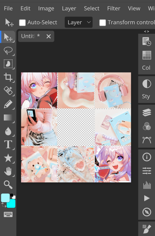
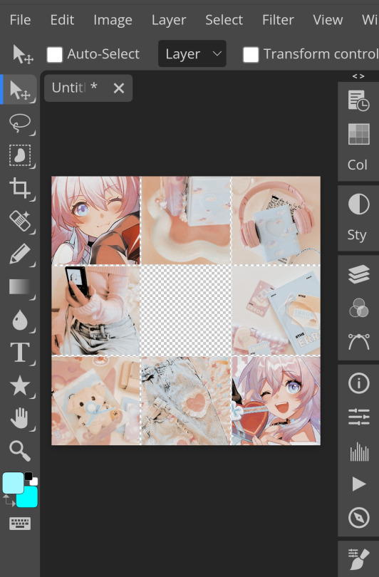
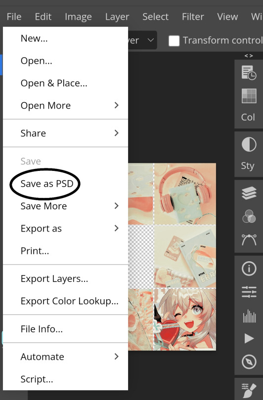
1. Lets get straight to the point! Choose the image(s) you want, i often make a moodboard first but thats optional and you can just choose ur image. (not sure if anyone needs this but to import or place images, press file -> open)
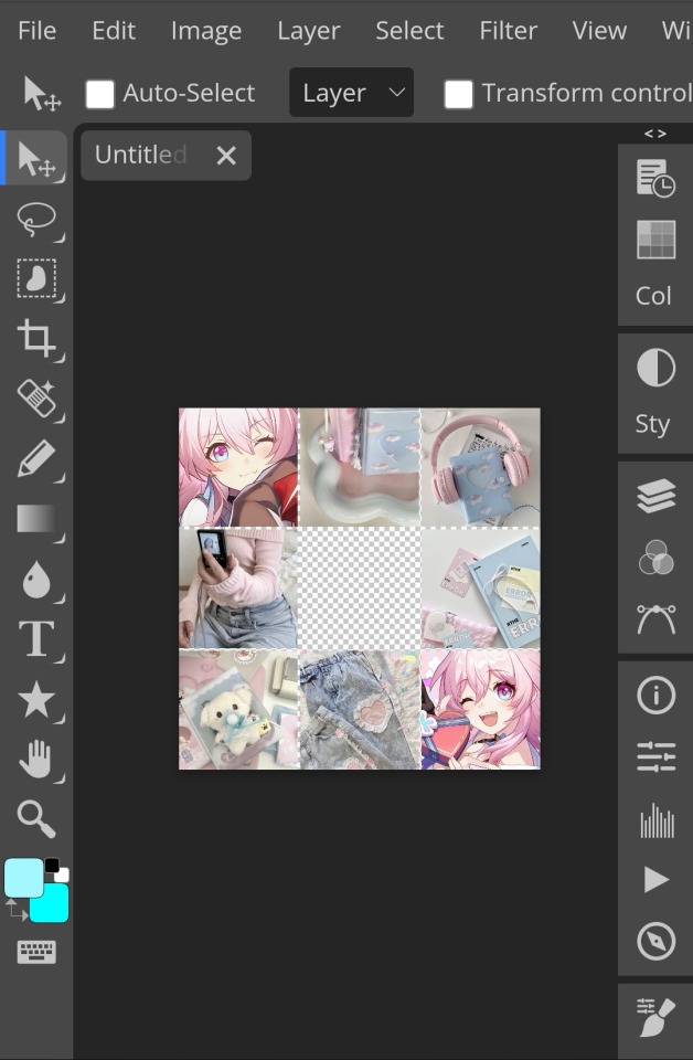
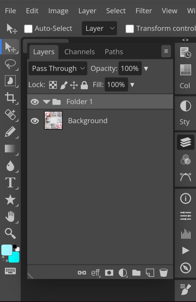
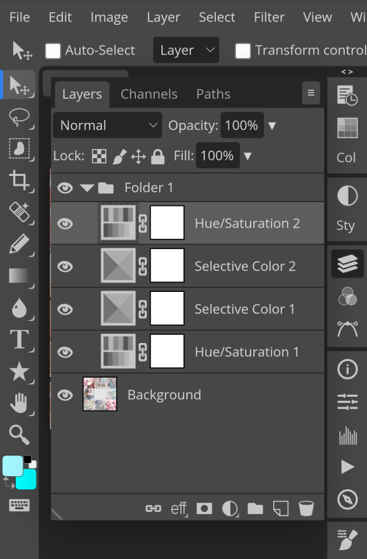
2. Next, make a folder by pressing the layer button (the 5th button the right based on my image)
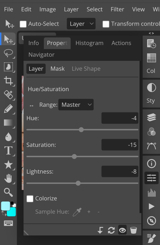
3. Firstly, i use hue/saturation to make her a lil more vibrant so my colours can be more uhhh vibrant or vivid.
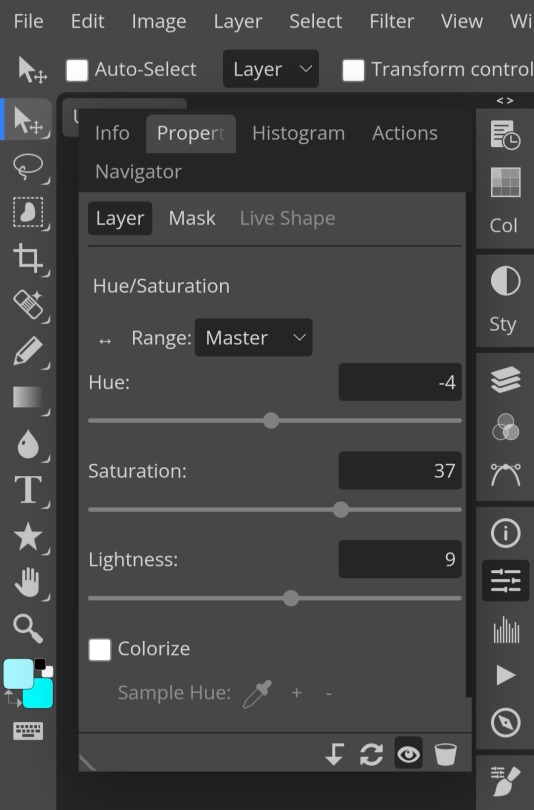
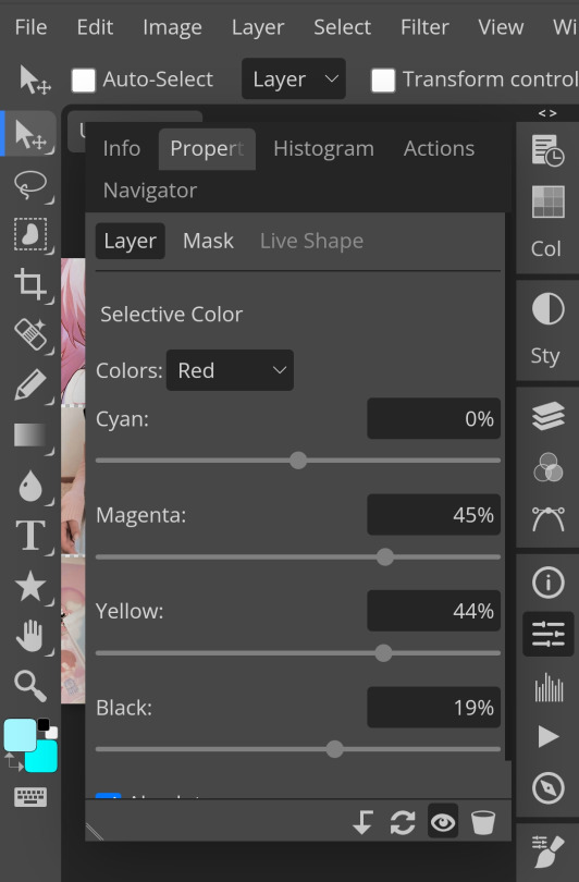
4. Now, every editors fav! Selective colour 💓 I'm not really good at explaining so pls visit canarysage to see what it is! It's good to tweak some colours without affecting the other colours.
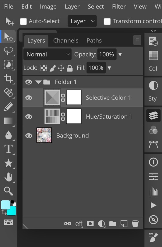
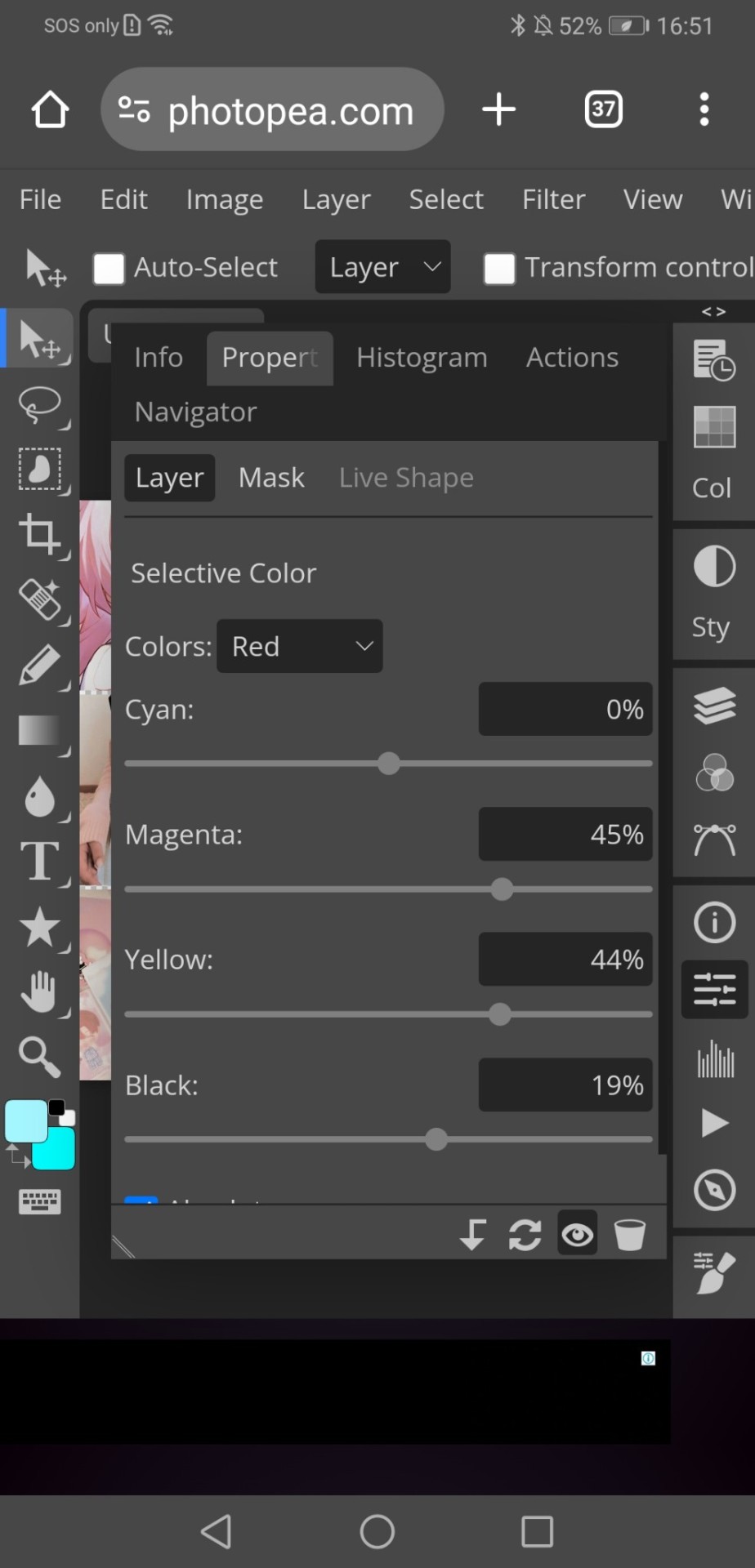
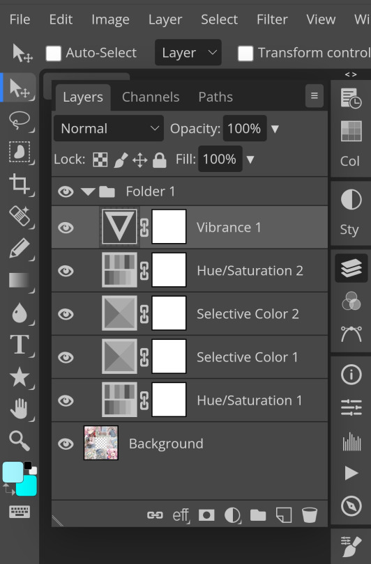
5. I recommend adding more selective colours as i added few more but cuz of the limit i can't show u help but i recommend adding 2-3 anyways! This is the psd so far which seems okay but to me it doesn't pop out so I'll be adding on
7. So i decided to add hue/saturation w the same reason as point 3.
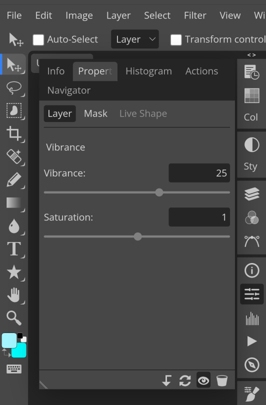
8. Next, i use vibrance to not oversaturate the image.
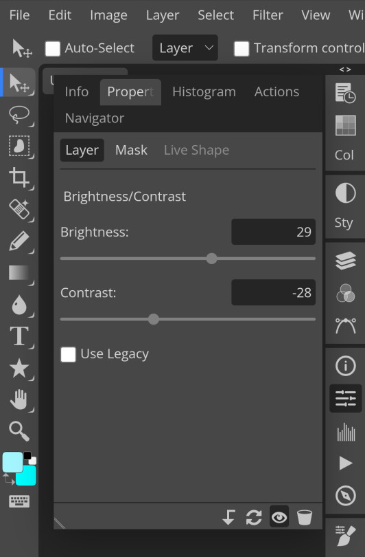
9. Now i use brightness and contrast, It’s often used for quick n straightforward edits to enhance visibility.
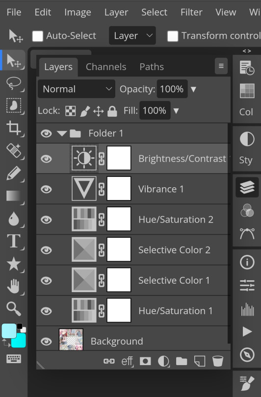
10. Let's add another hue/saturation layer cuz why not! Please remember to experiment w what u do since this is how you can have your own "style" of making ur edits.
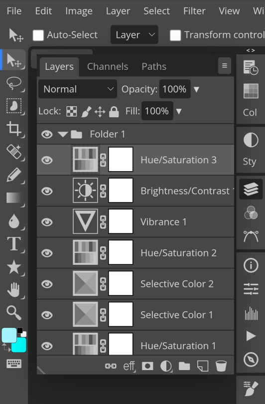

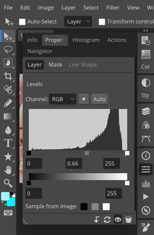
10. Next, let's add levels! I recommend checking out canarysage since they explained it better than i ever could.

11. Now, another layer of selective colour
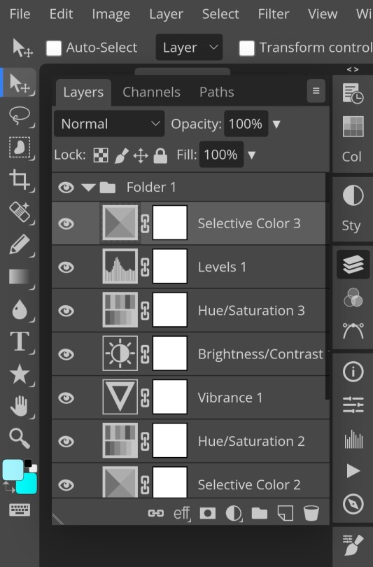
and tada! This is my psd so far but i love those psds that r bright so I'll add on but this is optional!
12. Now let's add a channel mixer to create some custom effects <3
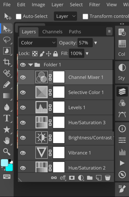

And here's the psd outcome! You'd wanna save it as save as psd (i HIGHLY recommend you put ur psd on a 100x100 canvas w a pic so it doesn't take much space)
ANOTHER NOTE!! i always test my psd on dark skin characters afterwards and made adjustments when needed i realised my selective colours made em abit red so feel free to adjust if ur using this tutorial! If u made it this far drop a follow 😈
146 notes
·
View notes
Text

I was asked how I edit my photos.
It’s always incredibly flattering when people find them so clean that they mistake it for digital❤️
But I just use the edit function in my photos.
I try to make it bright but just enough for the lines to remain visible. Turn down the Saturation. And then use the mark up function and select the marker to color over any specks or (because my paper is thin) the drawing on the other side of the paper peeking through. (I used to use the eyedrop tool to get a white that matches the paper every time. But eventually I stuck with one.) Then I edit again similar to how I did the first time. If the white I set for the marker doesn’t match it kinda fixes itself after I turn up highlights.
120 notes
·
View notes