#EXPLANATION:
Explore tagged Tumblr posts
Text
Clarifying the Relationship Between Popovers and Dialogs
New Post has been published on https://thedigitalinsider.com/clarifying-the-relationship-between-popovers-and-dialogs/
Clarifying the Relationship Between Popovers and Dialogs
The difference between Popovers (i.e., the popover attribute) and Dialogs (i.e., both the <dialog> element and the dialog accessible role) is incredibly confusing — so much that many articles (like this, this, and this) have tried to shed some light on the issue.
If you’re still feeling confused, I hope this one clears up that confusion once and for all.
Distinguishing Popovers From Dialogs
Let’s pull back on the technical implementations and consider the greater picture that makes more sense and puts everything into perspective.
The reason for this categorization comes from a couple of noteworthy points.
First, we know that a popover is content that “pops” up when a user clicks a button (or hovers over it, or focuses on it). In the ARIA world, there is a useful attribute called aria-haspopup that categorizes such popups into five different roles:
menu
listbox
tree
grid
dialog
Strictly speaking, there’s a sixth value, true, that evaluates to menu. I didn’t include it above since it’s effectively just menu.
By virtue of dialog being on this list, we already know that dialog is a type of popover. But there’s more evidence behind this too.
The Three Types of Dialogues
Since we’re already talking about the dialog role, let’s further expand that into its subcategories:
Dialogs can be categorized into three main kinds:
Modal: A dialog with an overlay and focus trapping
Non-Modal: A dialog with neither an overlay nor focus trapping
Alert Dialog: A dialog that alerts screen readers when shown. It can be either modal or non-modal.
This brings us to another reason why a dialog is considered a popover.
Some people may say that popovers are strictly non-modal, but this seems to be a major misunderstanding — because popovers have a ::backdrop pseudo-element on the top layer. The presence of ::backdrop indicates that popovers are modal. Quoting the CSS-Tricks almanac:
The ::backdrop CSS pseudo-element creates a backdrop that covers the entire viewport and is rendered immediately below a <dialog>, an element with the popup attribute, or any element that enters fullscreen mode using the Fullscreen API.
That said, I don’t recommend using the Popover API for modality because it doesn’t have a showModal() method (that <dialog> has) that creates inertness, focus trapping, and other necessary features to make it a real modal. If you only use the Popover API, you’ll need to build those features from scratch.
So, the fact that popovers can be modal means that a dialog is simply one kind of popover.
A Popover Needs an Accessible Role
Popovers need a role to be accessible. Hidde has a great article on selecting the right role, but I’m going to provide some points in this article as well.
To start, you can use one of the aria-haspopup roles mentioned above:
menu
listbox
tree
grid
dialog
You could also use one of the more complex roles like:
treegrid
alertdialog
There are two additional roles that are slightly more contentious but may do just fine.
tooltip
status
To understand why tooltip and status could be valid popover roles, we need to take a detour into the world of tooltips.
A Note on Tooltips
From a visual perspective, a tooltip is a popover because it contains a tiny window that pops up when the tooltip is displayed.
I included tooltip in the mental model because it is reasonable to implement tooltip with the Popover API.
<div popver role="tooltip">...</div>
The tooltip role doesn’t do much in screen readers today so you need to use aria-describedby to create accessible tooltips. But it is still important because it may extend accessibility support for some software.
But, from an accessibility standpoint, tooltips are not popovers. In the accessibility world, tooltips must not contain interactive content. If they contain interactive content, you’re not looking at a tooltip, but a dialog.
You’re thinking of dialogs. Use a dialog.
Heydon Pickering, “Your Tooltips are Bogus”
This is also why aria-haspopup doesn’t include tooltip —aria-haspopup is supposed to signify interactive content but a tooltip must not contain interactive content.
With that, let’s move on to status which is an interesting role that requires some explanation.
Why status?
Tooltips have a pretty complex history in the world of accessible interfaces so there’s a lot of discussion and contention over it.
To keep things short (again), there’s an accessibility issue with tooltips since tooltips should only show on hover. This means screen readers and mobile phone users won’t be able to see those tooltips (since they can’t hover on the interface).
Steve Faulkner created an alternative — toggletips — to fill the gap. In doing so, he explained that toggletip content must be announced by screen readers through live regions.
When initially displayed content is announced by (most) screen readers that support aria-live
Heydon Pickering later added that status can be used in his article on toggletips.
We can supply an empty live region, and populate it with the toggletip “bubble” when it is invoked. This will both make the bubble appear visually and cause the live region to announce the tooltip’s information.
<!-- Code example by Heydon --> <span class="tooltip-container"> <button type="button" aria-label="more info" data-toggletip-content="This clarifies whatever needs clarifying">i</button> <span role="status"> <span class="toggletip-bubble">This clarifies whatever needs clarifying</span> </span> </span>
This is why status can be a potential role for a popover, but you must use discretion when creating it.
That said, I’ve chosen not to include the status role in the Popover mental model because status is a live region role and hence different from the rest.
In Summary
Here’s a quick summary of the mental model:
Popover is an umbrella term for any kind of on-demand popup.
Dialog is one type of popover — a kind that creates a new window (or card) to contain some content.
When you internalize this, it’s not hard to see why the Popover API can be used with the dialog element.
<!-- Uses the popover API. Role needs to be determined manually --> <div popover>...</div> <!-- Dialog with the popover API. Role is dialog --> <dialog popover>...</dialog> <!-- Dialog that doesn't use the popover API. Role is dialog --> <dialog>...</dialog>
When choosing a role for your popover, you can use one of these roles safely.
menu
listbox
tree
grid
treegrid
dialog
alertdialog
The added benefit is most of these roles work together with aria-haspopup which gained decent support in screen readers last year.
Of course, there are a couple more you can use like status and tooltip, but you won’t be able to use them together with aria-haspopup.
Further Reading
#Accessibility#alerts#API#aria#Article#Articles#code#container#content#course#CSS#css-tricks#data#dialog#Difference Between#Explained#explanation#Features#focus#gap#grid#History#hover#it#Light#list#menu#Method#Mobile#mobile phone
0 notes
Photo
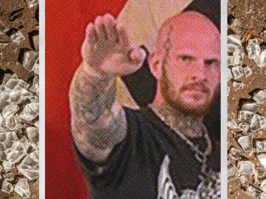
How Concerned Citizens Drove a Neo-Nazi Out of Rural Maine
Christopher Pohlhaus planned to build a fascist training compound in the woods of rural Maine. The local journalists, veterans, lumberjacks, and policymakers weren't having it.
Pohlhaus, 37, is a former U.S. marine, an itinerant tattoo artist, and a hardcore white-supremacist influencer. He is loud and hostile, and proud to be both. His voice is pitched surprisingly high, and he has a slight Southern drawl. He has a large body and small bald head; a blue-black tattoo crawls up the right side of his face, from his chin to his forehead. Over the years, Pohlhaus has collected thousands of social media followers, who know him by his nickname: Hammer.
Hammer had been living in Texas for a few years when, in March 2022, he bought the land in Maine. He told his followers that he was going to use it to build a haven, operational center, and training ground for white supremacists.
Check out our excerpt of The Atavist’s latest blockbuster story.
1K notes
·
View notes
Photo

PORTO ROCHA
895 notes
·
View notes
Photo
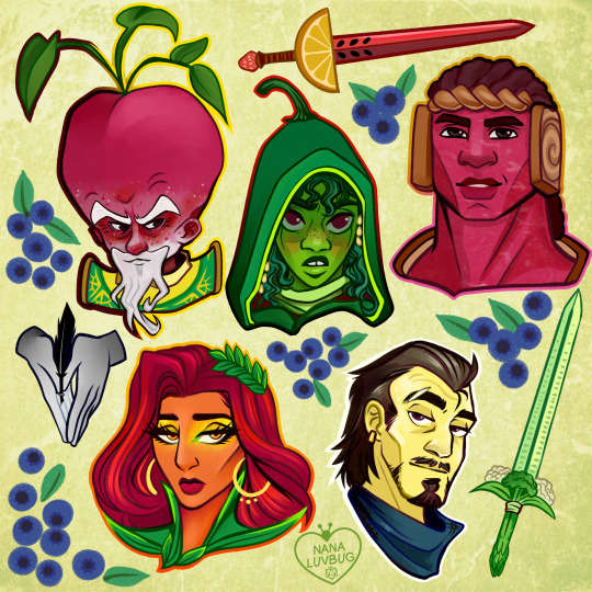
🧀🥪🌶️🥭 The Ravening War portraits 🧀🥪🌶️🥭
patreon * twitch * shop
[ID: a series of digitally illustrated portraits showing - top left to bottom right - Bishop Raphaniel Charlock (an old radish man with a big red head and large white eyebrows & a scraggly beard. he wears green and gold robes with symbols of the bulb and he smirks at the viewer) Karna Solara (a skinny young chili pepper woman with wavy green hair, freckled light green skin with red blooms on her cheeks. she wears a chili pepper hood lined with small pepper seeds and stares cagily ahead) Thane Delissandro Katzon (a muscular young beef man with bright pinkish skin with small skin variations to resemble pastrami and dark burgundy hair. he wears a bread headress with a swirl of rye covering his ears and he looks ahead, optimistic and determined) Queen Amangeaux Epicée du Peche (a bright mango woman with orange skin, big red hair adorned with a green laurel, and sparkling green/gold makeup. she wears large gold hoop earrings and a high leafy collar) and Colin Provolone (a scraggly cheese man with waxy yellow skin and dark slicked back hair and patchy dark facial hair. he wears a muted, ratty blue bandana around his neck and raises a scarred brow at the viewer with a smirk) End ID.)
#trw#the ravening war#dimension 20#acoc#trw fanart#ttrpg#dnd#bishop raphaniel charlock#karna solara#thane delissandro katzon#queen amangeaux epicee du peche#colin provolone
2K notes
·
View notes
Photo
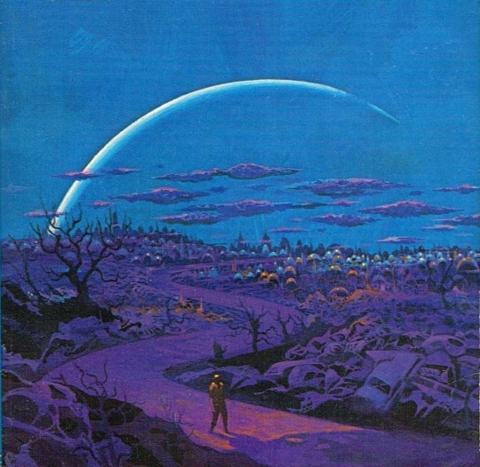
One of my favorites by Paul Lehr, used as a 1971 cover to "Earth Abides," by George R. Stewart. It's also in my upcoming art book!
1K notes
·
View notes
Quote
もともとは10年ほど前にTumblrにすごくハマっていて。いろんな人をフォローしたらかっこいい写真や色が洪水のように出てきて、もう自分で絵を描かなくて良いじゃん、ってなったんです。それで何年も画像を集めていって、そこで集まった色のイメージやモチーフ、レンズの距離感など画面構成を抽象化して、いまの感覚にアウトプットしています。画像の持つ情報量というものが作品の影響になっていますね。
映画『きみの色』山田尚子監督×はくいきしろい対談。嫉妬し合うふたりが語る、色と光の表現|Tokyo Art Beat
152 notes
·
View notes
Photo


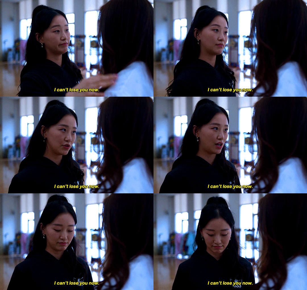



#thistension
XO, KITTY — 1.09 “SNAFU”
#xokittyedit#tatbilbedit#kdramaedit#netflixedit#wlwedit#xokittydaily#asiancentral#cinemapix#cinematv#filmtvcentral#pocfiction#smallscreensource#teendramaedit#wlwgif#kitty song covey#yuri han#xo kitty#anna cathcart#gia kim#~#inspiration: romantic.#dynamic: ff.
1K notes
·
View notes
Photo

No one wants to be here and no one wants to leave, Dave Smith (because)
111 notes
·
View notes
Photo
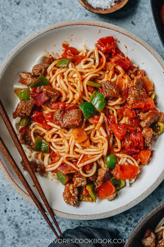
Noodles with Lamb Sauce (Laghman, 新疆拌面) Xinjiang laghman features chewy noodles served with a bold and rich lamb and tomato sauce that is bursting with flavor.
Recipe: https://omnivorescookbook.com/recipes/uyghur-style-noodles-with-lamb-sauce
122 notes
·
View notes
Photo


CJ from Hello World (MSPFA) by phasedsun?
112 notes
·
View notes
Text
Anchor Positioning Quirks
New Post has been published on https://thedigitalinsider.com/anchor-positioning-quirks/
Anchor Positioning Quirks
I am thrilled to say, that from this week onwards, the CSS-tricks Almanac has an entry for each property, function, and at-rule related to the new Anchor Positioning API! For the last month, I have tried to fully understand this new module and explain it to the best of my ability. However, anchor positioning is still a new feature that brings even newer dynamics on how to position absolute elements, so it’s bound to have some weird quirks and maybe even a few bugs lurking around.
To celebrate the coverage, I wanted to discuss those head-scratchers I found while diving into this stuff and break them down so that hopefully, you won’t have to bang your head against the wall like I did at first.
The inset-modified containing block
A static element containing block is a fairly straightforward concept: it’s that element’s parent element’s content area. But things get tricky when talking about absolutely positioned elements. By default, an absolutely positioned element’s containing block is the viewport or the element’s closest ancestor with a position other than static, or certain values in properties like contain or filter.
All in all, the rules around an absolute element’s containing block aren’t so hard to remember. While anchor positioning and the containing block have their quirks (for example, the anchor element must be painted before the positioned element), I wanted to focus on the inset-modified containing block (which I’ll abbreviate as IMCB from here on out).
There isn’t a lot of information regarding the inset-modified containing block, and what information exists comes directly from the anchor positioning specification module. This tells me that, while it isn’t something new in CSS, it’s definitely something that has gained relevance thanks to anchor positioning.
The best explanation I could find comes directly from the spec:
For an absolutely positioned box, the inset properties effectively reduce the containing block into which it is sized and positioned by the specified amounts. The resulting rectangle is called the inset-modified containing block.
So if we inset an absolutely positioned element’s (with top, left, bottom, right, etc.), its containing block shrinks by the values on each property.
.absolute position: absolute; top: 80px; right: 120px; bottom: 180px; left: 90px;
For this example, the element’s containing block is the full viewport, while its inset modified containing block is 80px away from the top, 120px away from the right, 180px away from the bottom, and 90px away from the left.
Knowing how the IMCB works isn’t a top priority for learning CSS, but if you want to understand anchor positioning to its fullest, it’s a must-know concept. For instance, the position-area and position-try-order heavily rely on this concept.
In the case of the position-area property, a target containing block can be broken down into a grid divided by four imaginary lines:
The start of the target’s containing block.
The start of the anchor element or anchor(start).
The end of the anchor element or anchor(end).
The end of the target’s containing block.
The position-area property uses this 3×3 imaginary grid surrounding the target to position itself inside the grid. So, if we have two elements…
<div class="anchor">Anchor</div> <div class="target">Target</div>
…attached with anchor positioning:
.anchor anchor-name: --my-anchor; height: 50px; width: 50px; .target position: absolute; position-anchor: --my-anchor; height: 50px; width: 50px;
…we can position the .target element using the position-area property:
.target position: absolute; position-anchor: --my-anchor; position-area: top left; height: 50px; width: 50px;
The IMCB is shrunk to fit inside the region of the grid we selected, in this case, the top-left region.
You can see it by setting both target’s dimensions to 100%:
The position-try-order also uses the IMCB dimensions to decide how to order the fallbacks declared in the position-try-fallbacks property. It checks which one of the fallbacks provides the IMCB with the largest available height or width, depending on whether you set the property with either the most-height or most-width values.
I had a hard time understanding this concept, but I think it’s perfectly shown in a visual tool by Una Kravets on https://chrome.dev/anchor-tool/.
Specification vs. implementation
The spec was my best friend while I researched anchor positioning. However, theory can only take you so far, and playing with a new feature is the fun part of understanding how it works. In the case of anchor positioning, some things were written in the spec but didn’t actually work in browsers (Chromium-based browsers at the time). After staring mindlessly at my screen, I found the issue was due to something so simple I didn’t even consider it: the browser and the spec didn’t match.
Anchor positioning is different from a lot of other features in how fast it shipped to browsers. The first draft was published on June 2023 and, just a year later, it was released on Chrome 125. To put itinto perspective, the first draft for custom properties was published in 2012 and we waited four years to see it in implemented in browsers (although, Firefox shipped it years before other browsers).
I am excited to see browsers shipping new CSS features at a fast pace. While it’s awesome to get new stuff faster, it leaves less space between browsers and the CSSWG to remake features and polish existing drafts. Remember, once something is available in browsers, it’s hard to change or remove it. In the case of anchor positioning, browsers shipped certain properties and functions early on that were ultimately changed before the spec had fully settled into a Candidate Recommendation.
It’s a bit confusing, but as of Chrome 129+, this is the stuff that Chrome shipped that required changes:
position-area
The inset-area property was renamed to position-area (#10209), but it will be supported until Chrome 131.
.target /* from */ inset-area: top right; /* to */ position-area: top right;
position-try-fallbacks
The position-try-options was renamed to position-try-fallbacks (#10395).
.target /* from */ position-try-options: flip-block, --smaller-target; /* to */ position-try-fallbacks: flip-block, --smaller-target;
inset-area()
The inset-area() wrapper function doesn’t exist anymore for the position-try-fallbacks (#10320), you can just write the values without the wrapper
.target /* from */ position-try-options: inset-area(top left); /* to */ position-try-fallbacks: top left;
anchor(center)
In the beginning, if we wanted to center a target from the center, we would have to write this convoluted syntax
.target --center: anchor(--x 50%); --half-distance: min(abs(0% - var(--center)), abs(100% - var(--center))); left: calc(var(--center) - var(--half-distance)); right: calc(var(--center) - var(--half-distance));
The CWSSG working group resolved (#8979) to add the anchor(center) argument for much-needed brevity.
.target left: anchor(center);
Bugs!
Some bugs snuck into browser implementations of qnchor positioning. For example, the spec says that if an element doesn’t have a default anchor element, then the position-area property does nothing. This is a known issue (#10500) but it’s still possible to replicate, so please, just don’t do it.
The following code…
.container position: relative; .element position: absolute; position-area: center; margin: auto;
…centers the .element inside its container as we can see in this demo from Temani Afif:
Another example comes from the position-visibility property. If your anchor element is off-screen, you typically want its target to be hidden as well. The spec says the default is anchors-visible, but browsers go with always instead.
Chrome currently isn’t reflecting the spec. It indeed is using always as the initial value. But the spec’s text is intentional — if your anchor is off-screen or otherwise scrolled off, you usually want it to hide (#10425).
Anchor positioning accessibility
While anchor positioning’s most straightforward use case is for stuff like tooltips, infoboxes, and popovers, it can be used for a lot of other stuff as well. Check this example by Silvestar Bistrović, for example, where he connects elements with lines. He’s tethered elements together for decorative purposes, so anchor positioning doesn’t mean there is a semantic relationship between the elements. As a consequence, non-visual agents, like screen readers, are left in the dark about how to interpret two seemingly unrelated elements.
If we’re aiming to link a tooltip to another element, we need to set up a relationship in the DOM and let anchor positioning handle the visuals. Happily, there are APIs (like the Popover API) that do this for us, even establishing an anchor relationship that we can take advantage of to create more compelling visuals.
In a general way, the spec describes an approach to create this relationship using ARIA attributes such as the aria-details or aria-describedby, along the role attribute on the target element.
So, while we could attach the following two elements…
<div class="anchor">anchor</div> <div class="toolip">toolip</div>
…using anchor positioning:
.anchor anchor-name: --my-anchor; .toolip position: absolute; position-anchor: --my-anchor; position-area: top;
…but screen readers only see two elements next to one another without any remarked relationship. That’s a bummer for accessibility, but we can easily fix it using the corresponding ARIA attribute:
<div class="anchor" aria-describedby="tooltipInfo">anchor</div> <div class="toolip" role="tooltip" id="tooltipInfo">toolip</div>
And now they are both visually and semantically linked together! It would just be better if could pull it off without ARIA.
Conclusion
Being confused by a new feature just to finally understand it is one of the most satisfying experiences anyone in programming can feel. While there are still some things about anchor positioning that can be (and are) confusing, I’m pleased to say the CSS-Tricks Almanac now has a deluge of information to help clarify things.
The most exciting thing is that anchor positioning is still in an early stage. That means there are many more confusing things coming for us to discover and learn!
#2023#Accessibility#ADD#agents#anchor positioning#API#APIs#approach#aria#Articles#Best Of#box#browser#bugs#change#chrome#chromium#code#container#content#CSS#csswg#custom properties#Dark#details#dimensions#diving#dynamics#explanation#Features
0 notes
Photo

PORTO ROCHA
523 notes
·
View notes
Photo

HRH The Princess of Wales in Southport today, on her first engagement since completing chemotherapy. It’s so good to see her!❤️ --
#catherine elizabeth#princess catherine#princess of wales#princess catherine of wales#catherine the princess of wales#william arthur philip louis#prince william#prince of wales#prince william of wales#william the prince of wales#prince and princess of wales#william and catherine#kensington palace
113 notes
·
View notes
Text
GENERAL MEMES: Vampire/Immortal Themed 🩸🦇🌹
↳ Please feel free to tweak them.
Themes: violence, death, blood, murder, depression/negative thoughts
SYMBOLS: ↳ Use “↪”to reverse the characters where applicable!
🦇 - To catch my muse transforming into a bat 🌞 - To warn my muse about/see my muse in the sunlight. 🩸 - To witness my muse drinking blood from a bag. 🐇 - To witness To catch my muse drinking blood from an animal. 🧔🏽 - To witness To catch my muse drinking blood from a human. 🦌 - For our muses hunt together for the first time. 🏃🏿♀️ - To see my muse using super speed. 🏋🏼♂️ - To see my muse using their super strength. 🧛🏻♂️ - To confront my muse about being a vampire. 🌕 - For my muse to lament missing the sun. ⏰ - For my muse to tell yours about a story from their long, immortal life. 🤛🏽 - To offer my muse your wrist to drink from. 👩🏿 - For my muse to reminisce about a long lost love. 👩🏽🤝👩🏽 - For your muse to look exactly like my muse's lost love. 👄 - For my muse to bite yours. 👀 - For my muse to glamour/compel yours. 🧄 - To try and sneakily feed my muse garlic to test if they're a vampire. 🔗 - To try and apprehend my muse with silver chains. 🔪 - To try and attack my muse with a wooden stake. 👤 - To notice that my muse doesn't have a reflection. 🌹 - For my muse to turn yours into a vampire. 🌚 - For my muse and yours to spend time together during the night. 🧛🏼♀️ - For my muse to tell yours about their maker/sire.
SENTENCES:
"I've been alive for a long time [ name ], I can handle myself." "I'm over a thousand years old, you can't stop me!" "Lots of windows in this place, not exactly the greatest place for a vampire." "Do you really drink human blood? Don't you feel guilty?" "Vampires are predators, [ name ] hunting is just part of our nature, you can't change that." "You just killed that person! You're a monster!" "Tomorrow at dawn, you'll meet the sun [ name ]." "Can you make me like you?" "Do you really want to live forever?" "You say you want to live forever, [ name ], but forever is a long time, longer than you can imagine." "What was it like to live through [ historic event / time period ]?" "Did people really dress like that when you were young?" "What were you like when you were human?" "We’re vampires, [ name ], we have no soul to save, and I don’t care." "How many people have you killed? You can tell me, I can handle it." "Did you meet [ historic figure ]?" "Everyone dies in the end, what does it matter if I... speed it along." "Every time we feed that person is someone's mother, brother, sister, husband. You better start getting used to that if you want to survive this life." "[ she is / he is / they are ] the strongest vampire anyone has heard of, no one knows how to stop them, and if you try you're going to get yourselves killed." "Vampire hunters are everywhere in this city, you need to watch your back." "Humans will never understand the bond a vampire has with [ his / her / their ] maker, it's a bond like no other." "Here, have this ring, it will protect you from the sunlight." "I get you're an immortal creature of the night and all that, but do you have to be such a downer about it?" "In my [ centuries / decades / millennia ] of living, do you really think no one has tried to kill me before?" "Vampires aren't weakened by garlic, that's a myth." "I used to be a lot worse than I was now, [ name ], I've had time to mellow, to become used to what I am. I'm ashamed of the monster I was." "The worst part of living forever is watching everyone you love die, while you stay frozen, still, constant." "I've lived so long I don't feel anything any more." "Are there more people like you? How many?" "Life has never been fair, [ name ], why would start being fair now you're immortal?" "You want to be young forever? Knock yourself out, I just hope you understand what you're giving up." "You never told me who turned you into a vampire. Who were they? Why did they do it?" "I could spend an eternity with you and never get bored." "Do you really sleep in coffins?" "There are worse things for a vampire than death, of that I can assure you [ name ]." "You need to feed, it's been days. You can drink from me, I can tell you're hungry." "The process of becoming a vampire is risky, [ name ], you could die, and I don't know if I could forgive myself for killing you." "I'm a vampire, I can hold a grudge for a long time, so believe me when I say I will never forgive this. Never." "You were human once! How can you have no empathy?" "You don't have to kill to be a vampire, but what would be the fun in that." "You can spend your first years of immortality doing whatever you want to whoever you want, but when you come back to your senses, it'll hit you harder than anything you've felt before." "One day, [ name ], everything you've done is going to catch up to you, and you're never going to forgive yourself." "Stop kidding yourself, [ name ], you're a vampire, a killer, a predator. You might as well embrace it now because you can't keep this up forever." "You can't [ compel / glamour ] me, I have something to protect me." "When you've lived as long as me, there's not much more in life you can do." "You want me to turn you? You don't know what you're asking me to do." "You really have to stop hissing like that, it's getting on my nerves." "I'm going to drive this stake through your heart, [ name ], and I'm going to enjoy it."
#ask meme#symbol meme#roleplay sentence meme#sentence starter meme#rp sentence prompts#vampire ask meme#ask box#ask memes#vampires#tw : blood#tw: violence#tw: death#tw: depression#tw: vampires#tw: murder
149 notes
·
View notes
