#Design Tips
Explore tagged Tumblr posts
Text
Design tip: adding "imperfections" to your character designs helps differentiate and diversify them, and makes each individual design more interesting. Add acne. Blemishes. Moles. Freckles. Keratosis pilaris. Vitiligo. Eczema. Other skin conditions. Give them an overbite or crooked nose. Your designs will be more unique this way and they'll be visually interesting even without having to clutter other parts of the design.
"but I don't know how to do any of that" okay look up tutorials or just go in blind and try! You're allowed to do it "bad" and then get better with time.
426 notes
·
View notes
Note
Hello! I adore your art, and I was wondering if I could ask you a question:
How do you come up with your designs? They are so pretty, especially Eddie and James ♡♡
I'm asking this because I'm having trouble creating designs for both Gordon and James for my AU, Hope.
Thank you for seeing this, I wish you a splendid day/night! :3
Why hello!!!
Oh gee I would ramble alot in this
Before I make a design, I like to list things that I like about them, their hcs, their ethnicity, and their primary colors


For example, Edward's primary color is blue, but he as a character is a kind and soft soul, in my hc his patience thins faster in adults, so a combination of white and red is a great indicator of this, The red being on his Tie and hair tie so it doesn't overpower the other colors.
My James is the one that's a little complicated, mainly because he's more based on his ethnicity, but him being a vainy, self-centered and show-offy means he likes to stand out, he likes being in the center of attention, so gold is the next best option, but for my James because he have aspects of him that is more cozy (he likes cooking, making clothes and learning languages), earthy Brown is used to support the bright red, that also helps with tuning down his personality a bit.
And next, are Shapes!


Again, their personality plays a big part, in Designing it's a factor that you would want to show your character's personality through their design, The three pillars of Round, Square, and Triangle Aspects plays a huge role.
If you see here, My Edward has a more fluffy, friendly look to it, with a hint of an old soul, and a fire that had died out, his design is rounded.
The same with my James, he has more edge, a sharper touch than Edward!
Appearance is also important, wether you go hand to hand by giving them buffers like a literal anthropomorphic trains, mecha, or more human etc, appearance is an indicator.
You might make them all have the same uniforms because they're a worker, but giving (for example) Gordon square glasses, then combining it with his basely square body type, can indicate he's a strict person, so on.
My James has alot in his design
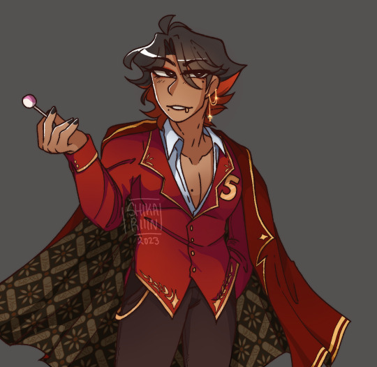
Golden details in his clothing, Brown as a secondary color, darker red on his coat so that it doesn't clash with the main red in his outer, earrings and lip piercing indicating he loves accessories to support/show off his appearance, the moles I give him for that beauty marks, the Batik on his coat to represent his proudness of his home country, the coat that he make himself, he wears make up to touch up his appearance.
Alot can go on in a design, Mine is not God-Tier level designing, and I'm not an extremely experienced character designer, but these are the indicators I usually do whenever I make my designs.
In simple terms, list what you want to have in your engine design, and build it off from there, this is to prevent overcrowdedness.
And that's all! Thank you for the ask!
You don't have to follow it step by step, be as comfortable as you like, these are just factors and tips to help in designing🩵
Hope it helps!!!
#ttte#thomas and friends#ttte edward#thomas the tank engine#ttte humanized#ttte fanart#ttte james#ttte human au#digital art#character design#tips#design tips#character design tips
75 notes
·
View notes
Note
Hiiiii mootieeeeee
Do you have any character design tips perchance 👉👈
So personally for me the first thing I think about is the story. What vibes do I want this character to have? What's their goal, their aesthetic? What's their personality. And then I build them off of that.
For example, my AU designs. Especially TCAU.
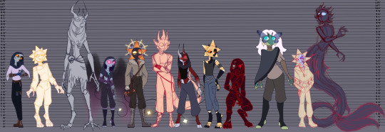
KC is the one that I think about the most for this example (I even did a doodle of him for this :D )

You can immediately tell what his "vibes" are supposed to be. His personality isn't immediately apparent, but it does leave a first impression. He is scary, or meant to be scary. He's tall, lanky, monsterous. He immediately makes you start assuming things about him and what he's like. His lifestyle is reflected in his design.
We can even put shape theory to the test here! They all have the same sort of body type but they way they hold themselves and their silhouettes are important.

Triangles → Sharp, dangerous, dynamic Squares → Strong, stable, reliable Circles → Friendly, soft, innocent
Then you want to think of proportions! Different proportions can reflect aspects of a character’s personality, role, and background:
Larger or smaller proportions can instantly communicate personality traits at a glance.
Tall & lanky → Graceful, mysterious, or eerie
Short & stout → Sturdy, strong-willed, or comedic
Large upper body, small legs → Brute strength, less agility
Small torso, long limbs → Fast, agile, unpredictable
Proportions & Power Dynamics
The larger a character is compared to others, the more dominant or powerful they feel.
The smaller a character is, the more they might feel vulnerable, underestimated, or agile.
A character’s proportions can also reflect the world they come from:
Harsh Environments → Characters might have sturdier, survival-ready builds (e.g., thick limbs, broad shoulders for heavy labor).
Urban, Fast-Paced Settings → Sleek, agile designs might emphasize speed and efficiency.
Magical Beings → Exaggerated proportions (e.g., elongated arms, huge eyes) can make them feel inhuman.
Proportions naturally shift as characters age:
Young characters → Larger heads, bigger eyes, smaller bodies (e.g., chibi, Disney style).
Teen/Young Adult characters → More balanced proportions but still slightly exaggerated (lean or athletic).
Older characters → Broadening or shrinking in ways that emphasize age, wisdom, or frailty.
Different cultures within a world can influence how characters are built.
A nomadic desert tribe might be slimmer for endurance, while a mountain warrior society might be thicker and more muscular.
Social status can also reflect in proportions:
Elites/Nobles → Tall, regal postures, well-fed, symmetrical features.
Laborers/Farmers → Stocky, calloused, built for work.
Scholars/Wizards → Lean, refined, more delicate hands.
And of course my favorite. Color theory. I try to match colors to the characters "skin tones", so that things mesh together well. I always start with skin colors to figure out everything else. Find a color palette online! Find a picture of a feeling you want to go for (sunsets, calm, chaotic, etc) and color-pick it! Have fun with it! If you feel like things are off you can make it grey scale to see if it's unbalanced.
This is by no means a comprehensive guide, it's just the things I think about when I do character design. I put a lot of thought into world building and visual story telling when I design characters. What is their purpose? What's their personality? How do they flow with their setting? And build from there!
28 notes
·
View notes
Text
Help guys, what’s some sort of feature I can slap on my character to make her more distinct? Right now she’s resembling some other characters too closely and I don’t want that you know??
#this is so vague I’m sorry#but if you were to throw a list of things to add to characters at me#I’d be eternally grateful#cough cough if moo is reading this#it miiiiiigghhhhttttt have to do with a certain megan potentially cough cough#character design#design tips#help#jadethebluerambles
27 notes
·
View notes
Text
Some underrated creatures you can use for character design inspo (with no specific order)
Earwigs
Crayfishes
Centipedes
Chameleons
Gharials
Dholes
Wolverines
Nautili (nautilus)
Pangolins
Fossas
Frilled sharks
Okapi
Platypuses
Vaquitas
Komodo dragons
Thrips
Whip spiders (AKA tailless whip scorpion)
Barn owls
Ostriches
Star nosed moles
Coral snakes
Anacondas
Red bellied black snakes
City doves (common pigeons)
Angler fishes
Mole crickets
Cobalt blue tarantulas
Arabian sand boa (look this one up, it's funny i promise)
Weasels/stoats
Cross fox
Termites (I'm for real, yes)
Falcons
Sparrowhawk (qarghi)
Antlions
Moray eels
Lancetfishes
Prawns/shrimps
Ethiopian wolves
Hyena
Honey badgers
Hornets
Bumblebees
Lice
True crabs
Tarantula wasps
Dumbo octopuses
Seals
Otters
Vampire squids
Jellyfishes
Sea cucumbers
Red eyed tree frogs
Common toads
Silverfishes
Common grasshopper
Cicadas
Bristletails
Botflies
Phasmids
Aphids
Red pandas
Lobsters
Yeti crabs
Damselflies
Death moths
Fenec foxes
Capybaras
Arctic hares
Pygmy shrew
Stag beetle
Aye-aye
Chimps
Gibbons
Mantis
Rats
Red wolves
Tasmanian tiger-wolves (it went extinct long ago but it counts)
Tasmanian devils
Dingos
Ravens
Azawakh
So many animals to choose from, leave grey wolves and domestic cats alone a bit please/hj
#animals#character design#character design inspiration#writing inspiration#design tips#art#oc#oc art#oc maker#i might add more later
16 notes
·
View notes
Text


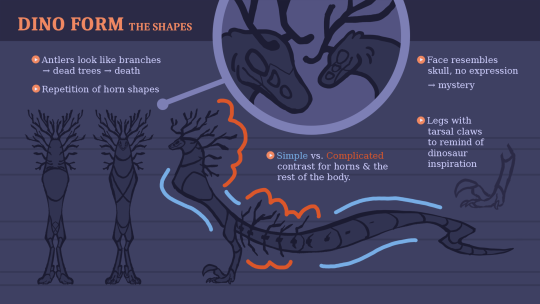


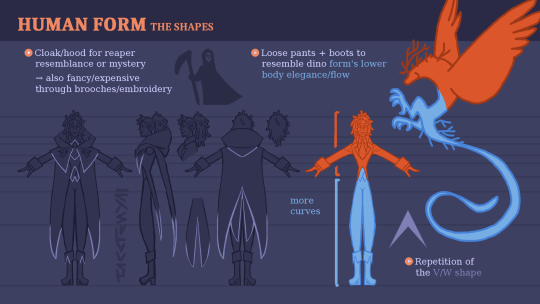
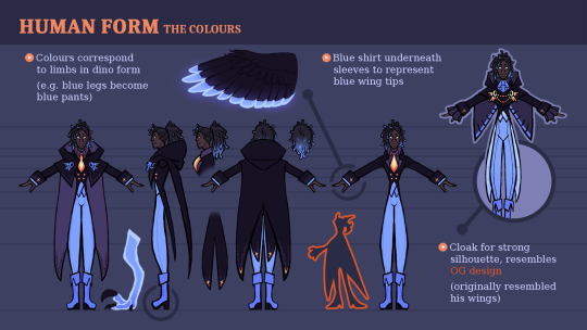

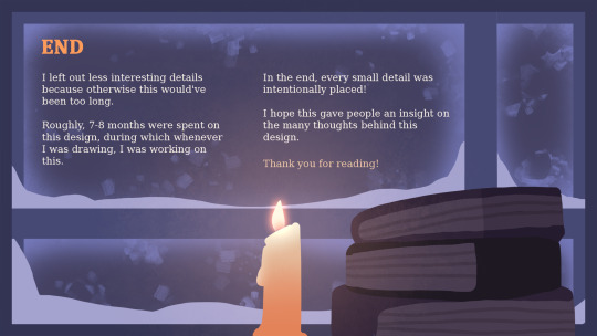
Kasifer's design has a lot of thought put into it, so I always really wanted to share this information!
So here is a peek at how the process went and what I specifically intended with the design. It's not all of it but it's a pretty good overview.
Maybe this is even interesting to any other people who like character design!
398 notes
·
View notes
Text
anyone else struggles with DESIGNING BOOTS ON CHARACTERS????
and this is not about DRAWING feet and shoes
just DESIGNING them
WELL LET ME GIVE YOU A TIP: the next time you’re out shopping for shoes, take PICTURES
examples:
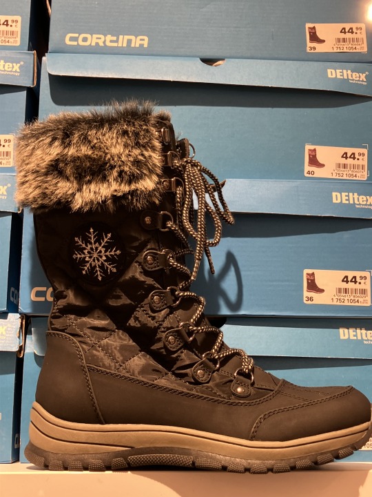
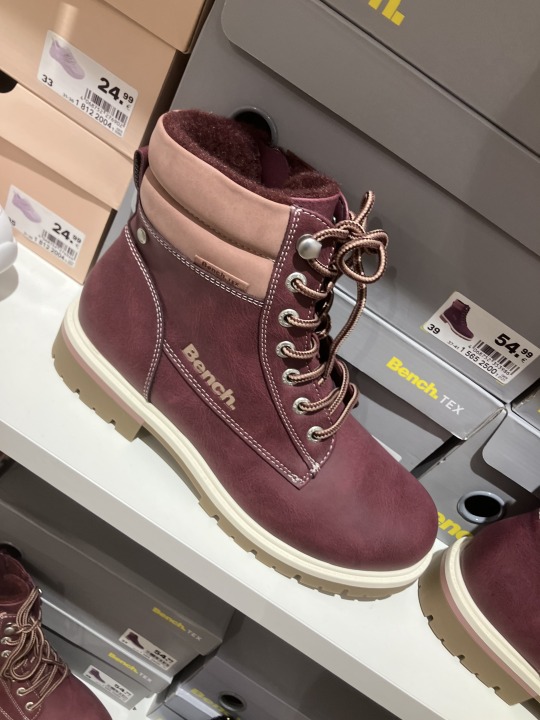
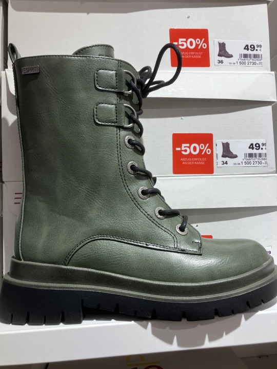
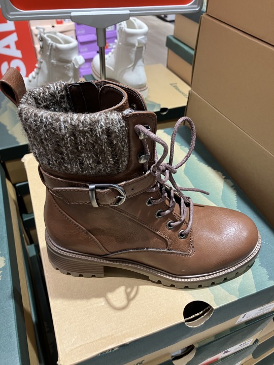
This helps me with designing them; look for where the boots are sewed typically, how tall they are, what DESIGN ELEMENTS they have
7 notes
·
View notes
Note
Hi! I hope you are doing well and having a nice day/night
I've seen that you've previously worked with adoptables and I'm personally interested in making some too! But really besides a decent reference I don't know what else I'd let you do or how they work...
I've looked for some tutorials but I thought I'd ask someone with experience directly as well. If you have any tips to share or tutorials from other artists that might be useful I'd really appreciate it.
Again I appreciate your time and as an added bonus I love your art!!! beautiful as always ;)
yes!! absolutely! I know every artist has a different way of going about this, but in the most helpful way I can I want to help teach you guys too!
So, when it comes to creating adoptables, there are two ways of going about it: Creating a design from scratch, OR redesigning, an already made design that is yours. (Also knows as Re-Sells if you bought the design previously, but have permission to re sell it from its original owner, aka the artist.)


aand Boom!

a neat note i want to mention is that themes and aesthetics can be used interchangeably! Never limit yourself and throw yourself into the creative process, do anything, for everything makes sense when YOU are the one in charge in making a design :)
I hope this helps!! You've got this! and im so sorry for the late response aae!
emoji generator link here!
19 notes
·
View notes
Text


✏️Here are a few design tips if you're looking to include artwork in your books!
While ebooks don't have these constraints, it's still good to keep them in mind just in case you ever make the switch to paperback.
Art by the wonderful Comt216
#everyone's a catgirl!#tip#design tips#paperback#writeblr#Please take me to that hot spring#seriously I'll do anything
8 notes
·
View notes
Text

The Art of Color Coordination in Color Theory
#color theory#colors#color coordination#infographic#infographics#educational#designers#design#art#art theory#artists#art tips#design tips
49 notes
·
View notes
Text
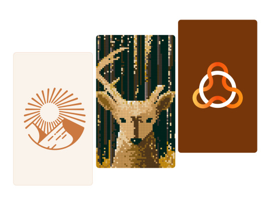
Look at the first design, and you immediately think: "Oh, it's simple, I know how to design it too."
And do you know what? 95% of people who think it's simple couldn't do it, or at least they did it wrong.
I just uploaded a tutorial video on Illustrator tips will blow your mind and change the way you design. I hope it proves helpful to you. If you like it, please give me a thumbs up. Thank you!
Video:👉 These Illustrator Tips will Blow Your Mind (Part 1)
#logo#logo design#logotype#logo inspiration#graphic design#logo designer#design#illustrator tips#illustrator tutorial#illustrator tips and tricks#adobe illustrator#design tips#illustrator for beginner#advanced illustrator tutorial#dainogo#tutorial#logo tutorial
29 notes
·
View notes
Text
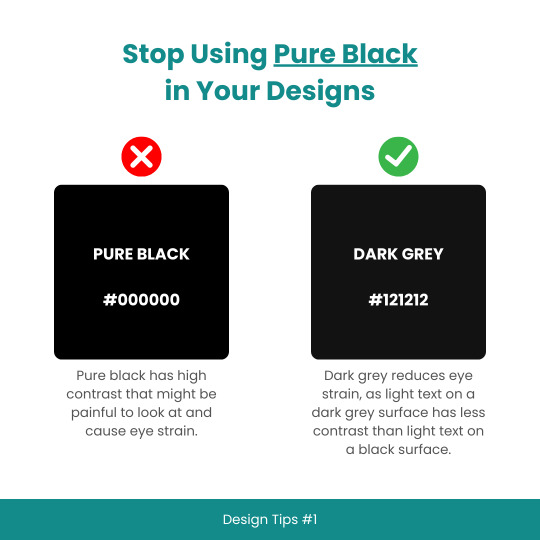
Design Tips #1: Stop using Pure Black in your designs
50 notes
·
View notes
Text

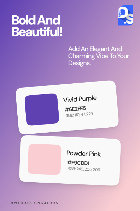
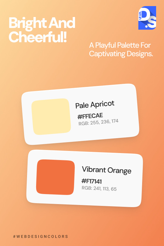

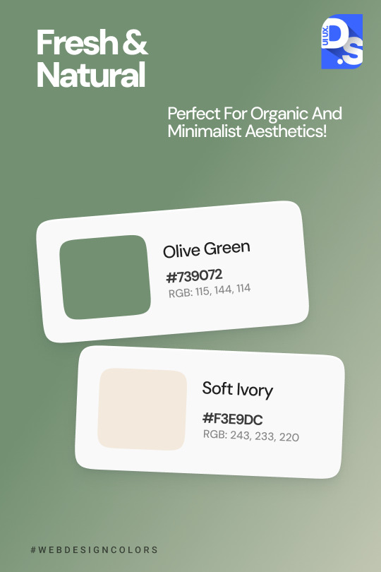

Colors bring life to your designs! 🎨✨ Discover inspiring combinations that will make your designs shine and stand out from the crowd. Whether you're creating a website, mobile app, or graphic, the right hues can tell a story and evoke the perfect emotions. Check out these eye-catching palettes and start transforming your designs today!
#ui ux design#web design#ui ux trends#uidesign#ui ux agency#ui#ux#color palette#graphic design#design tips
2 notes
·
View notes
Video
youtube
how to add dynamic Page numbers in Canva
#youtube#canva#canva design#canva tutorial#canva update#canva new feature#page numbers#dynamic page numbers#graphic design tips#design tips#tutorial#learn design#design tutorial#book design#book pages#book page numbers#canva tutorial for beginners
2 notes
·
View notes
Text
Texture in Digital Pattern Design: Essential Guide to Pattern Effects
Hey texture explorers! 💫
You know that moment when you're staring at your pattern design thinking "why doesn't this look like the ones I love on Pinterest?" Yeah, we've been there too (like, a lot 😅). After countless hours of trying to figure out why our designs felt... flat, we finally cracked it: TEXTURE.
We're not talking about those overwhelming, over-the-top textures that scream "I just discovered filters!" We mean those subtle, gorgeous details that make digital patterns feel alive. You know the ones!
Here's what we've learned on our texture journey (and we're still learning!):
→ Sometimes the smallest grain makes the biggest difference
→ Abstract textures aren't as scary as they look
→ Gradient textures? Total game-changer
→ Those "happy accidents" with mixed media often turn out to be the best designs
We've put together everything we wish someone had told us when we started - all the trials, errors, and tiny victories that got us here. Because honestly? We're all figuring this out together, and that's what makes it fun!
✨ Check out our full guide here: https://design2repeat.com/texture-in-digital-pattern-design
Let's keep exploring and creating together! Drop us a note if you've had any texture "aha!" moments - we'd love to hear about your journey too!
#digital art#pattern design#artist resources#design tips#art tips#digital design#surface pattern design#artistic#art reference#artists on tumblr#design resources#pattern tutorial#digital pattern#texture tutorial#art tutorial#design help#artist help#pattern artist#surface design#pattern maker
2 notes
·
View notes