
Redtail | She/They | Bigender demienby aporagender hypergirl | lesbian
Last active 60 minutes ago
Don't wanna be here? Send us removal request.
Statistics
We looked inside some of the posts by redtailarts101 and here's what we found interesting.
Average Info
Notes Per Post
537K
Likes Per Post
292K
Reblog Per Post
243K
Reply Per Post
2K
Time Between Posts
11 days ago
Number of Posts By Type
Text
16
Photo
1
Last Seen Tumblr Blogs


Fun Fact
Average visit duration of Tumblr.com is 10 mins and 25 secs.
Text
I'm converting my original tags to an actual text addition because I can, and adding on more thoughts because I can do that too. Mostly gonna pertain to digital
2 other free programs are IbisPaintX (unless IbisPaintX is the paid one and IbisPaint is the free one). It has ads but it's pretty good. And I use Sketchbook, formerly Autodesk Sketchbook but it became an independent company from Autodesk so now it's just Sketchbook. It's honestly really good, apparently it used to suck and had some asinine layer limits but it's actually great and I think part of that is because they got away from the parent company. Ibis you can pay to remove ads, and Sketchbook you can pay for premium features, but the free versions of both are some of the best for free art, you can customize a lot and you have TONS of tools.
But like I said in my tags: I'm largely self taught. I've looked at a few tutorials and picked up a thing or 2 from K-12 art classes, but you can self teach. The idea that art is inaccessible is a lie made up by AI bros who were disappointed that they weren't experts immediately and don't want to put in the effort to learn. It's literally so accessible that we've been doing it since we lived in caves. I actually kinda advocate against going to art school or getting an art degree because it's a waste of money, you can learn everything for free.
You also don't need an art tablet - the phone is a good enough medium. I draw everything on this little screen, and I'm good. I tried a tablet once but it was too big for me to get used to. You don't need a fancy stylus either, you can do it all with your finger if that's all you can afford, or a dollar tree stylus if you really want a stylus. It's amazing how little you actually need. A fancy drawing tablet and stylus with tons of features is hella cool but that's only an optional luxury. You can be just as good with your phone and your hand if you learn how to harness the tools.
That's the big thing - everything is just tools. Some programs come with better tools or more tools but you can only create a masterpiece if you learn how to harness them. Programs with more tools can make it easier to do things, but basically every program can achieve the same look if you know how to use it. A stylus can make the transition from paper to digital easier, but there's ways to transition without one (I learned from taking pictures of my physical drawings and tracing them to get the hang of drawing on a screen). A nice tablet with a wider interface might make it easier than a small screen phone, but if you get used to the phone then it's suddenly easier to use the small screen. People learn how to master Microsoft Paint on their computers and it's really cool. Pencils and paper are really cheap. Everything expensive is optional.
Can't afford art school?
After seeing post like this 👇
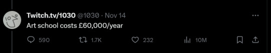
And this gem 👇
As well as countless of others from the AI generator community. Just talking about how "inaccessible art" is, I decided why not show how wrong these guys are while also helping anyone who actually wants to learn.
Here is the first one ART TEACHERS! There are plenty online and in places like youtube.
📺Here is my list:
Proko (Free)
Marc Brunet (Free but he does have other classes for a cheap price. Use to work for Blizzard)
Aaron Rutten (free)
BoroCG (free)
Jesse J. Jones (free, talks about animating)
Jesus Conde (free)
Mohammed Agbadi (free, he gives some advice in some videos and talks about art)
Ross Draws (free, he does have other classes for a good price)
SamDoesArts (free, gives good advice and critiques)
Drawfee Show (free, they do give some good advice and great inspiration)
The Art of Aaron Blaise ( useful tips for digital art and animation. Was an animator for Disney)
Bobby Chiu ( useful tips and interviews with artist who are in the industry or making a living as artist)
Second part BOOKS, I have collected some books that have helped me and might help others.
📚Here is my list:
The "how to draw manga" series produced by Graphic-sha. These are for manga artist but they give great advice and information.
"Creating characters with personality" by Tom Bancroft. A great book that can help not just people who draw cartoons but also realistic ones. As it helps you with facial ques and how to make a character interesting.
"Albinus on anatomy" by Robert Beverly Hale and Terence Coyle. Great book to help someone learn basic anatomy.
"Artistic Anatomy" by Dr. Paul Richer and Robert Beverly Hale. A good book if you want to go further in-depth with anatomy.
"Directing the story" by Francis Glebas. A good book if you want to Story board or make comics.
"Animal Anatomy for Artists" by Eliot Goldfinger. A good book for if you want to draw animals or creatures.
"Constructive Anatomy: with almost 500 illustrations" by George B. Bridgman. A great book to help you block out shadows in your figures and see them in a more 3 diamantine way.
"Dynamic Anatomy: Revised and expand" by Burne Hogarth. A book that shows how to block out shapes and easily understand what you are looking out. When it comes to human subjects.
"An Atlas of animal anatomy for artist" by W. Ellenberger and H. Dittrich and H. Baum. This is another good one for people who want to draw animals or creatures.
Etherington Brothers, they make books and have a free blog with art tips.
As for Supplies, I recommend starting out cheap, buying Pencils and art paper at dollar tree or 5 below. For digital art, I recommend not starting with a screen art drawing tablet as they are more expensive.
For the Best art Tablet I recommend either Xp-pen, Bamboo or Huion. Some can range from about 40$ to the thousands.
💻As for art programs here is a list of Free to pay.
Clip Studio paint ( you can choose to pay once or sub and get updates)
Procreate ( pay once for $9.99)
Blender (for 3D modules/sculpting, ect Free)
PaintTool SAI (pay but has a 31 day free trail)
Krita (Free)
mypaint (free)
FireAlpaca (free)
Libresprite (free, for pixel art)
Those are the ones I can recall.
So do with this information as you will but as you can tell there are ways to learn how to become an artist, without breaking the bank. The only thing that might be stopping YOU from using any of these things, is YOU.
I have made time to learn to draw and many artist have too. Either in-between working two jobs or taking care of your family and a job or regular school and chores. YOU just have to take the time or use some time management, it really doesn't take long to practice for like an hour or less. YOU also don't have to do it every day, just once or three times a week is fine.
Hope this was helpful and have a great day.
84K notes
·
View notes
Text
Even though it's got a bug that's pissing me off right now, I'm always gonna appreciate Sketchbook (formerly Autodesk Sketchbook, but now it's own independent company) for creating new features when it released a premium bundle instead of paywalling existing ones. I was worried when I'd found out about Premium that a bunch of features I used would suddenly be behind a paywall but no, the app is still intact, and new free features like steady stroke (a better stabilizer than Predictive Stroke) are being added. Most of the time, companies would just put existing features behind the paywall, but they did what they're supposed to do - create new ones. And I think that was a smart decision too because it avoided people being mad at them and ditching the app for IbisPaint or something. Instead, premium users are happy with the new tools they got for paying, and regular users still get to enjoy the app with all of it's functionality, save for the bug that's causing my layers to corrupt for no reason at all and crash the app. They'll fix it, I've reached out about the bug. But yeah, the choice means everyone's happy and no one hates them. You can make incredible things on Sketchbook without the need for premium features, even if they might make things easier, because most brushes come with a degree of customizability (some more than others), layer blending modes still have great selection, plenty of tools in the toolbar exist, you can customize your preferences, all kinds of shit can be done for free. And that sorta makes it one of the only art apps that has premium features that also has a fully functional, highly customizable base version filled with dozens of tools at your disposal, as far as I'm aware.
#sketchbook#autodesk sketchbook#except not autodesk anymore#they're free from autodesk and the app is great
0 notes
Text
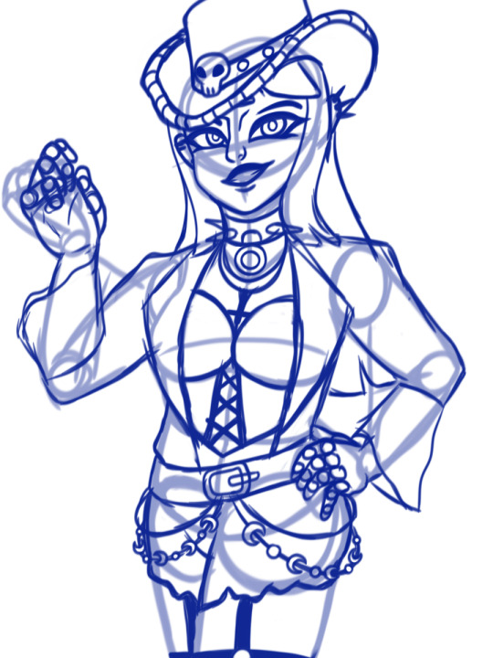
Finished her

[Image ID: A drawing of Nico Robin, with her pre-timeskip look. She has a medium complexion, straight jet black hair with bangs, and angled teal eyes. She's wearing a purple cowgirl hat with a black stripe in the middle, decorated with metal studs and a metal skull, various earrings, a choker with spikes and a ring, a chain necklace and a necklace with an upside down cross, a purple bustier top, a black loose suitjacket with wide-opened sleeves, net gloves, a belt with 4 chains off of it, 2 going to her left and 2 going to the right (the top chains are plain, the bottom ones are decorated with crescent moon charms), black jean shorts, and garters connecting to the tops of stockings that can't be seen. End ID.]
Apparently western goth is a thing and Nico Robin would be it
Art WIP
5 notes
·
View notes
Text
One Piece anime critique: the women used to have very distinct faces but over time Toei homogenized them

Like... The bottom 3 aren't exactly the same but they're all very similar compared to the variety in the top 3... I wish they'd just kept it consistent. Nami has rounded eyes with a flatter bottom and low corners. Vivi has D-ring eyes, with a higher outer corner than inner. Robin has slender, almost parallelogram shaped eyes with a high outer corner and low inner corner. Not this middle-eye and perfectly aligned corners look for all of them. Why would you do this
Bonus artist rendition/me stylizing their before and after eye shapes

#one piece#one piece critique#art critique#nami#nami one piece#cat burglar nami#vivi one piece#nefertari vivi#vivi nefertari#nico robin#robin one piece#vivi#miss all sunday
24 notes
·
View notes
Text
Apparently western goth is a thing and Nico Robin would be it
If ur seeing this check notes because I finished her
#one piece#nico robin#ms all sunday#miss all sunday#one piece robin#robin one piece#western gothic#western goth#she was so pretty in the ms all sunday outfit so when I wanted to gothify her I just had to be inspired by it
5 notes
·
View notes
Text
I saw horrors while looking for all the Usopp fanart so here's all this to cleanse my brain and spread the Usopp agenda


(if you saw that I forgot his armband no u didn't)
91 notes
·
View notes
Text

how can they hear the truth above the roar?
9 notes
·
View notes
Text


I think girl phoenix wright's hair would look something like this
10 notes
·
View notes
Text
drawing a fem!version of a character but making them skinnier should have consequences spiritually i think. nightmares for a week
28K notes
·
View notes

Text
saw this on Twitter, so... here's a reminder to keep boycotting or start doing so if you were unaware of the boycotts!

also, remember to do your daily clicks here (it's 100% free to do; how it works is that it generates ad revenue that goes towards aiding Palestinians), spread word about what's going on, and donate to vetted fundraisers if you're able to!
26K notes
·
View notes
Text
The way to avoid this is the same as you use to avoid same face syndrome actually! Funny how this works. Under the cut is all my art advice, if you're looking for constructive criticism here. (And I mean constructive, it's all as polite as I could make it)
When you have a character design, you pick aspects to keep consistent. This character isn't too far off, but there are parts of his face that are inconsistent, and I can help you make them more consistent.
Let's start with the eyes. For the most part, you've done well! One thing you've managed to keep very consistent is the placement - good job! But there's mild inconsistencies in the shape, which I'll demonstrate.
Let's look at these 3 sketches specifically.

The top two have a relatively consistent top of the eye. It's the lower part where it gets inconsistent. The top drawing has an upward curve. This could be a result of the expression, in which case disregard this, but his left (our right) eye doesn't have the same look as the other eye that invokes the idea that he's just smiling. The middle drawing has a more smooth, rounded bottom that curves downward but not by much, and the slope is still consistently going upwards. In both of these, his eye's outer corner is at the top.
The bottom one, however, is inconsistent. The top is not flat for most of the eye like it is on the others, coming to a point close to the inner corner. This one comes to a point in the center, and on his right eye (our left) it's closer to the outer corner. The inner and outer corners are also notably even with each other, and meet in the center of his eye instead of low or high.
You should have a specific eye shape in mind for the character, and you should think about all of these things. Where are the inner and outer corners placed? What shape does the bottom and top make? It can take time to get it all consistent, believe me, but once you get it down you'll have a distinct eye shape that can be kept consistent for your character and your character alone.
The next, most glaring inconsistency, is the nose. The size and nosebridge slope are changing. Some sketches portray the nosebridge as a mostly straight slope down, and some have it heavily curved inward. Some have the whole nose relatively large on his face, and some have it pretty small. Decide the size and stick to it.
The final inconsistency is the eyebrows. Across all but one they're fine, but in the top right corner of the page they are drawn quite thin compared to how they're depicted in all of the other sketches.
The ultimate cause of same face syndrome and changing face syndrome is the same - not deciding on unique features and specific facial details as a part of the character design. Often, artists can simply not think of these things, and don't consciously decide all of the specifics of their character design when it comes to facial features. This either manifests in global consistency across the board, with the artist defaulting to one very specific set of facial features in the eye, nose, mouth, and eyebrow shapes, sizes, and placements. Or, it manifests with inconsistency, where the character or multiple characters don't have defined facial features and instead they change from drawing to drawing. The solution to both problems is to have made decisions about each character's features, in detail, and it may take time to develop this consistency as you notice more details you want to make a decision on. This solves same face syndrome, as it gives each character different traits instead of all the same, but it solves changing face syndrome as well as it makes a decision on the details that would otherwise change.
Keep up the incredible work! Hope this advice helps.
same face syndrome? I don't have that. I can't fucking draw the same face on the same character twice
74 notes
·
View notes
Text
Or specifically, sex-oscillating (I may have spelled it wrong) @someguythatdrawsstuff
This was the wrong account fuck
Heyo Hai, talking about new gender feelings now - Fry
⚠️Mentions of gender reassignment surgery below (adding this just in case anyone is uncomfortable with surgery talk):
Mainly wanted to talk about this because I had an eye-opening conversation with some people in a discord server I'm a part of yesterday
I'm confident that I'm transfemasc, androgynous, genderless boygirl, abimultigender (gender I coined), cistrans, cisneu/null, and neotrans
Basically, I'm agender, a trans male, and pretty neutral and/or null to be perceived as a "girl"
Like, I genuinely don't care one way or the other if people use she/her on me
I noticed I wasn't expecting gender dysphoria in the past, it was just insecurity on not being "trans in the correct way"
I'm no longer insecure about basically being girlneu/null, and I've never felt happier
Also, I do want bottom surgery (dualsex), but not top surgery
Or, I guess transmasc top surgery
I think I want bigger boobs-
Don't care if people think I'm weird for wanting that; it's my body, not yours
I still want testosterone ofc, but not too much, I guess
I use it/he/she + neofluid pronouns now, and I prefer to be referred with gender neutral names and terms as well
Just don't use they/them on me pls- unless if you're referring to me and my system members at the same time
My chosen names as of right now are still Fry and Chat, but still
TLDR; I (Fry) technically can't be misgendered now- no matter how hard transphopes try
K bye-bye
16 notes
·
View notes
Text
HIGH ON STANDARDS LOW ON SKILL. CREATIVE PROCESS MAKE YOU ILL
96K notes
·
View notes
Text
Say it with me everybody:
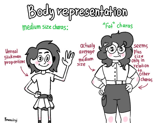
If you make your thin characters have stickman proportions, your artstyle is exaggerated proportions. Your fat characters should not be only a little bigger than your thin characters. The difference should be exaggerated. I made a chart

[ID: A white background drawing with blue sketches. Above is a simple sketch of a girl, in blue, with thin stickman-like cartoon proportions, a skirt, a v-neck, and above-shoulder length straight hair, on the left. To the right is the same girl but with slightly larger proportions, a curved line on the side of her mouth, and curved lines under her eyes. To the right of her is a red x. Below is a green check mark, and the first girl again to the right. To the right of her is herself again, but drawn actually fat. Her face is normal. End ID.]
[ID for OPs image: a simple drawing on a white background. The outlines are black and most of the coloring is also white, except darker spots which are gray, and some pink spots on both character's cheeks, elbows, and knees. It reads "body representation" on the center top. The text is in white, outlined in black. Below that is more text, in green, reading "medium size charas:" on the left and ""fat" charas" on the right. The medium size chara has stickman-like cartoon proportions, above-shoulder length spikey hair, a plain t shirt, a belt with a pocket, a skirt, and the tops of her socks showing. Her ears are showing. Her hair, belt, skirt shading, and socks are gray. She is smiling and waving. She has one red arrow pointing to her, and red text saying "unrealistic stickman proportions." The fat chara has more realistic proportions, shoulder length curly hair with a heart hair clip, glasses, notably smaller eyes with larger pupils, a smaller nose, a collared t shirt, a belt, and shorts with a pocket. Her hair and shorts are gray. She is also smiling, and she has her hands on her hips. She has two red arrows pointing to her, and text for each. One says "actually average/medium size" and the other says "seems plus size only in relation to other charas." End ID.]
And then they are like the only plus size Chara in the show.
10K notes
·
View notes
Text


tutorial for drawing characters with cleft lip! sorry that it's mostly unilateral-centric but it makes up the vast majority of resources and photos. still tried to get tips for drawing bilateral clefts in though.
please keep in mind that this is an introductory drawing tutorial and has some generalizations in it, so not every “X is Z” statement will be true for Actual People : )
if you draw any characters using this feel free to tag me!!
36K notes
·
View notes
