#Design Theory
Explore tagged Tumblr posts
Visit Tumblr Blog
Explore Tumblr blogs with no restrictions, modern design and the best experience.
Last Seen Tumblr Blogs


Fun Fact
Tumblr is used by 21% of adults online aged 18-29 years.
Text
On Color Choices in Character Design
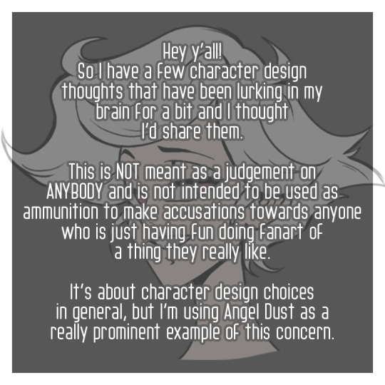
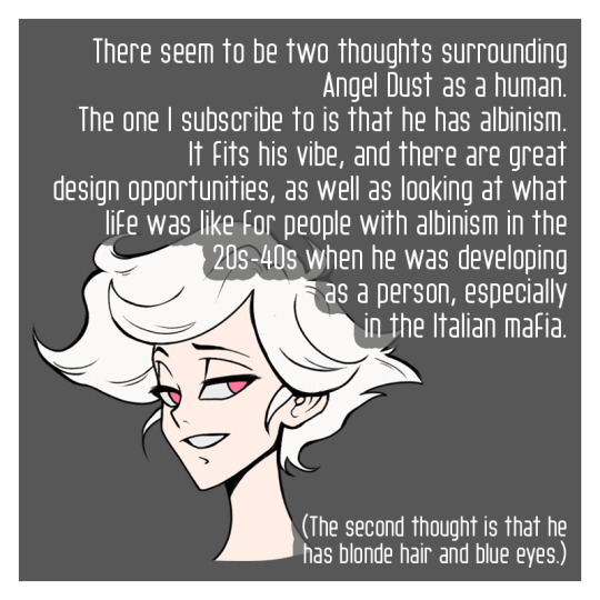
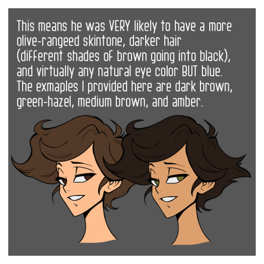
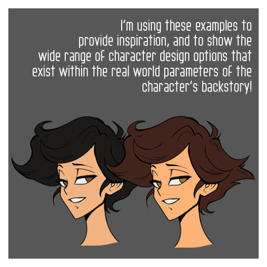
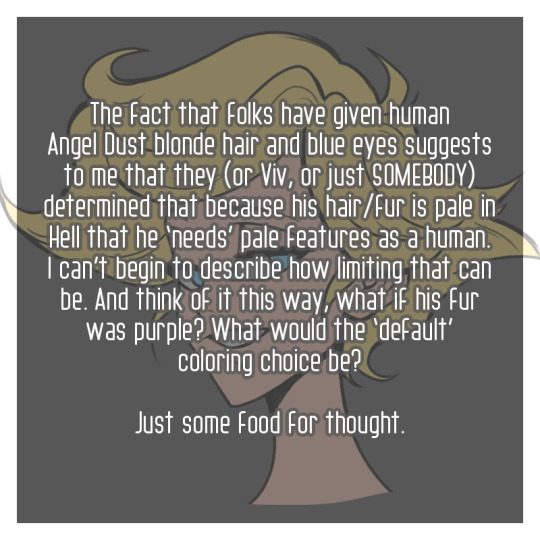
***Remember that this isn't meant to tell anybody they're wrong about character design. These are, at the end of the day, fantasy cartoon characters. It's just an invitation and a suggestion to experiment.*** One final bit to roll around in your brainses. This is just about blonde characters in general. Reach out past blue eyes!!!!! I bring up human and pre-fall angel versions of Lucifer with this subject as well. I think we need to step away from blonde hair and blue eyes indicating ‘goodness and purity,’ and we need to do that 1000 years ago. The history on that is loaded beyond words. And for those who don’t know just how deep that subject goes, with legitimate love in my heart I recommend reading on this subject. Not to advance your art. Just because it’s a difficult, but useful thing to know when it comes to being an open-hearted human in our world. <3 And, as someone who grew up with blonde hair very dark brown eyes, and black eyebrows/body hair, it really bummed me out that artists never seemed to notice that most blonde folks don’t even have blue eyes! But they desinged E V E R Y blonde character with blue (or sometimes green) eyes. Lucifer has these beautiful MASSIVE black eyebrows. Our body hair color is WAAAY more closely tied to our eye color, with how it is determined by our genetics. So why don’t we play with him having gold, or silver eyes as an angel - something less human entirely - and as a human, how about reddish brown? (let’s not even go into how most people with blonde hair as children end up with much darker hair as they reach adulthood, if we wanna get really particular about real world stuff) Just try more things, explore different ways people can look, and keep an open mind. Love you! ---
#my art#character design#design theory#hazbin hotel#hazbin hotel fanart#hazbin angel dust#hazbin lucifer#angel dust#lucifer morningstar
73 notes
·
View notes
Text
I wrote a flowery text about this style, AI and what I think the future of the design industry will look like soon!
67 notes
·
View notes
Text
Replaying AC6 (its like my 8th run at this point) and I'm only now beginning to wonder why lots of the AC designs you see from characters dont have a more reliable weapon in their right hand.
The only ones that come to mind that do are Rusty, Nightfall, and Iguazu (using kinetic weapons specifically) while many others opt for a more explosive option in their right hand and their main weapon in the left hand.
Some examples of that are Sulla and Volta, both opting for an explosive in the right hand and a more aggressive close-range weapon in the off hand. (Not to mention poor Ziyi who only has small grenade launchers in either hand)
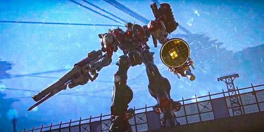

Having learned a bit more about the community and older games I suspect its because many AC vets found it was better to play the game by holding the controller upside down like this
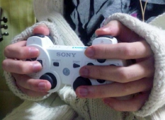
and thus would select a reliable primary for their left hand. So this strikes me as a subtle nod to the series' past, as well as a statement on the character/AC and their design theories/preferences.
#armored core#mecha#armored core 6#handler walter#augmented human c4 621#ayre#ac6#g5 iguazu#Sulla ac6#G4 Volta#headbringer#cannon head#little ziyi#rusty#nightfall#kinetic weapons#armored core theory#design theory#lore
115 notes
·
View notes
Text
Marvel...Rivals...Maybe?
Ngl, my interest was fairly low on first announcement a ways back and has remained fairly low throughout the various explainers, releases, gameplay footage.
Third person in a PvP environment has some issues with cameras, environment clipping, and hitboxes as a general practice, but they might have solved for all of those. Still skeptical...
But then I saw these two:
A Strategist (support for Overwatch mains), that is two heroes in one; one the healer/buffer, the other utility/debuffer.
The uniqueness of the hero(es) kit is not to be denied, as switching between the two seamlessly during the match is a very solid take on something that has long been thought of as awkward in design execution.
Often times this concept leans more toward one of a pair being much more limited in scope, treated more like a totem or avatar for the main character.
This will be (to my knowledge) one of the first times that the concept has a shared level of equal measure between each. I'm anticipating them being a favourite-
-at the very least though, it's gotten me intrigued enough to want to give it a try.
(That and Overwatch Classic has also ended and I've got no real urge to go back and play after that enjoyable 3 week period. Not until the rest of the promised tests make an appearance)
#game design#design theory#Marvel Rivals#Cloak and Dagger#color me intrigued#The partition between them seems like it's been handled very well but only testing is going to really reveal anything
24 notes
·
View notes
Text
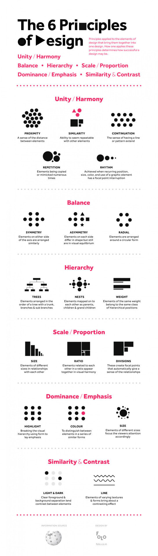
Six Principles of Design
84 notes
·
View notes
Text
"Roleplaying games provide a singular experience combining mechanics of play with elements of narrative. It is the interaction of play and narrative that provides the unique experience; wanting one or the other generally means you’re best served by a different sort of game or different sort of media. This interaction, though, can be done in a million different ways and it can be done well or poorly. When we talk about diegesis and mimesis in games, we’re talking about the linkages, the elements that let you play with narrative and narrate your play." - @levelonewonk
7 notes
·
View notes
Text
“Pokémon aren’t supposed to be objects”
“Pokémon shouldn’t look this human it’s weird”
Gang. They are SUPER SENTAI, TOYS, AND KAIJU. They’ve been this since the beginning


#like I don’t know if they sat down and were like ‘yes make this one more human this is what the kids want’#but clearly this was a small project that was super hard to work on and its impetus WAS trying to make kaiju fight each other#sugimori is on record saying Rhydon and Nidoking were explicitly supposed to be kaiju at first#(notable because Rhydon is widely known as the first Pokémon that was designed)#when you start looking at new designs through this lens it’s a lot more fun#like yeah man they were godzilla in a gachapon capsule. it was the 90s in Japan.#redeem my boy Quaquaval his design is a fantastic show of warms/cools control and unmistakable silhouette#and he’s a POWER RANGER#if this was developed a decade or two earlier it might’ve been about Gundams#Pokémon#design theory#character design#kanto#gen 1#pokémon red and blue#I love thinking about this shit I love character design so much
7 notes
·
View notes
Text
youtube
"American design, influenced by these immigrant artists, would later become a tool in the Cold War, showcasing the freedom of the West as opposed to the oppression of the East.
While the USSR was very open about creating a unifying propaganda message, the United States was a lot more sneaky. If you think you know mid-century modern design brace yourself, because its role in American propaganda is pretty crazy - but first we got to talk about the father of modern propaganda: Edward Bernays.
He wrote the book on manipulating public opinion with propaganda (like, he literally wrote the book and it's called Propaganda).
Bernays thought that humans were driven by base instincts and animal desires, he felt that the horrors of the World Wars were proof of humanity's irrational and dangerous behaviors; his solution to our irrational nature was to harness these base instincts and redirect them toward something less destructive: consumerism.
He focused on creating inner desires within people through advertisements and propaganda, then corporations would sell a product to satisfy that inner desire. Bernays called this method "the engineering of consent". Even President Hoover embraced Bernays' plan and consumerism became central to American life.
This entire strategy was to keep people docile and distracted so that society remained stable and aligned with the government's broader agenda.
Now, obviously it didn't always work out, but it was the key to economic success in America.
Bernays believed that the American public was just a herd that could be directed through propaganda - if this sounds like some weird wacky conspiracy, go ahead read Bernays books, he's shockingly open about his plans.
Even though American and Russian ideals were completely different from each other they both used design and art to unify and guide their citizens. Like I said before propaganda is about creating a unifying message, you want to control the narrative. From a design standpoint a few factors allowed Bernays to engineer consent towards consumerism...".
#manipulation#propaganda#consumerism#capitalism#design#united states#there's so much to quote here#design theory#Youtube
3 notes
·
View notes
Text
rap battle: cromatic circle vs circle of fifths
2 notes
·
View notes
Text

Triangle Mesh
#square circle triangle#isometric#rhombus#geometry#geometric#color#colour#primary#primaries#red yellow blue#contemporary#art movement#design theory#less is more
2 notes
·
View notes
Text
Worldbuilding Eating Utensils in Fantasy
Okay okay okay... so I just watched this Utensil Design video and I was like. Omg. This is SO COOL! It's got some pretty sick real-life worldbuilding, so I immediately began to think about it in my world.
Maybe I am WAAAAY too detail oriented with my worldbuilding but honestly, it's not like I'm neglecting my characters and storytelling -- I just also wanna visually design everything to be slightly to the left of reality...
youtube
The Tl;dw:
Forks only became popular because of Italian pasta
Christian Priests thought forks were "the Devil's utensil" cuz like pitchforks. No forks. God gave you hands for a reason.
We should bring back eating knives
Chinese Chopsticks were considered to be refined while knives were considered barbaric by early Confucianists -- and thus, they belonged in the kitchen, while daintily picking up pre-chopped food with chopsticks is good
Chopsticks in Japan are considered a bridge between food and your mouth, just like bridges cross rivers or trees bridge you to the Gods. There are celebrations surrounding chopsticks when you're born and when you die. It's a BIG big cultural thing.
In India, your different fingers activate different chakras, so eating with your hands helps connect you to the natural world
So anyway, with those VERY COOL revelations (but seriously, go watch the video), I did some more worldbuilding on Yssaia's eating utensils. Please reblog or something to tell me about your world's eating utensils!
Here's mine:
Northern Culinary Tools
Northerners primary use eating knives -- cutting off their portion of food at the table -- and everyone carries their own set when going to eat at another person's house. This is also because, if someone is going to stab you, everyone is going to want to have their weapons on them.
Finger foods are not unheard of, but are more rare due to the prevalence of gloves year round. They are considered to be more intimate and/or lower class, depending on the context.
Soups are just drunk out of the bowl. Spoons are only for serving.
Demons
Eat with their hands or other shapeshifted appendages. Why would they waste effort making them when they can just bring the food to their mouth with their hands?
Among the Northern Demon Lords, there is probably some etiquette about how you do this (You can't just like gorge yourself with your mouth and dump it into your gullet all the time). It probably has to do with appearances to other people and maximizing your politeness and minimizing how easy it is to steal from you.
Sealfolk
Selkies are known for eating bowls of mackerel, eels, and sea grass whole. Because they can. They probably also invented forks for stabbing slippery things and then eating them. However, unlike in Western culture, you are not expected to eat the whole thing in one bite. You can stab and then take smaller bites off your fork.
Southern Culinary Tools
Southerners use chopsticks and bone spoons in conjunction with more disposable utensils, such as bread, to eat -- due to the heavier reliance on frying and boiling in their cuisine. Their food is generally warmer overall and, in some regions, spicier, thus making it physically harmful to eat with just your hands.
Also, the heavier reliance on fermentation in Telethens means you don't wanna put your filthy hands in the brine or you'll ruin its balance -- you have to use chopsticks to pluck stuff from the jars.
Sidebar: When I do revisions on my webfic, I am ABSOLUTELY going to have to have a scene where Arlasaire learns or even simply complains about having to use chopsticks and that is HILARIOUS.
That being said, the Blood Tsars -- particularly in the South East -- eat more with their hands due to long term connection with Demons. Designing food correctly for manual consumption + the ability to elegantly eat food with your hands and disposable utensils is considered peak culture there.
#worldbuilding eating utensils#fantasy world#worldbuilding#fictional world#utensil design#cultural differences#writerblr#writers on tumblr#writerscommunity#creative writing#writing#worldbuilding details#real life worldbuilding#Yssaia#Amaiguri#design theory#Youtube
16 notes
·
View notes
Text
Study
#genshin impact#honkai impact#honkai impact 3rd#doodle#fan art#sketch#work in progress#genshin fanart#random#shitpost#drawing#genshin wanderer#raiden#raiden mei#yae sakura#yae miko#theory#game theory#design theory#story themes#backstage
13 notes
·
View notes
Text
Grogu was fascinated by starship design. From the small single person fighters and scout ships to the huge transports and industrial processing centers, they all spoke to him. Mostly they said, wow, should resources have really been used this way? And then they said, we never thought anyone other than humans would fly us. Finally they said, sure if just one critical component fails the whole thing fails, but what of it?
Okay, okay. They didn’t really talk to him like that but they did make him worry that the people who designed them weren’t always thinking about what the occupants needed. They didn’t even think about what the droids and mechs needed. That was a big cause for concern because it was pretty apparent to Grogu that the Imps, former or otherwise, didn’t like doing maintenance work and avoided it whenever possible. When you realized that their ships weren’t designed for maintenance it became much more understandable when they fell out of the sky like a rock.
Now, Moff Gideon’s ship hadn’t done that. At least, not yet. But Grogu was pretty sure it would. Look at that thing! All sorts of angles and harsh planes. Nothing natural about it all. It was just an engine, a cockpit and a couple of wings. Hurt anyone of those systems and the whole things fails. That wasn’t good design! Nope. It wasn’t.
Now good design would have answered the question, what are we trying to do here? Then a bunch of things would have been recorded. Need to be able to fly in planetary atmosphere on a repeated basis. Need to be able to fly in the vacuum of space, also on a repeated basis. Need to… what? Hold cargo?, hold people? The choices there were pretty limited. Most cargo didn’t need life support systems, but all people did and some cargo did, other wise you wouldn’t have Rancors living on more than one planet.
Grogu laughed at that. He could just imagine the person designing the space craft that needed to move rancors from Dathomir to Tatooine.
“Hmmmm, let’s see. You need to move twenty full grown Rancors, from here to uh… where? Tatooine. That’s a dessert planet. Rancors can’t thrive there. Oh, you want them for ‘pets’? And you’ll build them an appropriate enrichment center underground to keep them from getting sun and wind burned there? Well, I’m not really concerned about that, but does the ship need to remain on the planet for any length of time? After all designing for a jungle’s level of heat and humidity for a quick trip there is very different than designing for a holding facility that will be utilized until the proper enrichment center is constructed.”
Grogu laughed again. The voice in his head was kind of a cross between the Client’s and Greef Karga. Two men who had very specific ideas about what looked good and what was necessary. Then his dad’s voice popped into his head.
“Listen, what do you have available right now? I can make them cold if I have to.”
Yup, there was always someone willing to do the thing a completely different way. Didn’t make it better or worse. Just different. You needed to pay attention to those people because sometimes their ideas were great, but other times their ideas, well, they weren’t the thing any other designer would want to underwrite. Like the time Din Djarin used the N-1 to help Greef Karga put in a new entryway arch for Nevarro City.
The old arch had been damaged by pirates, not Moff Gideon this time. High Magistrate Karga had been able to get a new one fabricated, but he didn’t have a crane, a work sled, or even the mechs to help with it. Grogu considered that just a problem that you had when you didn’t plan far enough ahead, but the High Magistrate managed to spin out a tale of woe that got Grogu’s dad to say, “Let me help you out.”
Well, first they tried to just use Din’s flight pack. Grogu found that fascinating. But as much as they tried different rigging set ups and lengths and types of ropes and materials, Grogu was pretty sure that no matter what Din tried the arch only lifted up a 2 tenths of a meter. No where near far enough for it to be properly installed.
Then, some of the other Mandos came over to help but that didn’t work either. They kept bumping into each other, getting burned, flying in the wrong direction. Din Djarin sent them home. Then he offered to use the N-1.
Grogu could have told him that the N-1 wasn’t designed for that sort of work. He could have told him that heat of the exhaust would melt the strongest cable they had. He could have told him that hover mode in that ship caused a lot of vibration that could affect the foundations that had been created for the archway. But he didn’t. He was too busy healing the various injuries for the Mandos who helped earlier.
So he wasn’t on hand to watch them attach the durasteel cable. He wasn’t there to remind them to put the thrust on it’s lowest setting. He was mostly sad that he missed being there to see Din position the archway and watch it fall onto the foundations and see them crumble into dust and the archway sink deeply into the ground.
But he did see the finished product and leaned next to it and asked his dad to take a vid. The Mandalorian refused and stomped off. Grogu wondered what was bugging him. The design was perfect. It was exactly the right height for Grogu to lean against and rest his hand on the ‘Welcome to Nevarro City’. It looked great next to him.
2 notes
·
View notes
Text
youtube
This critique of technology in our every day life feels valid and worth watching.
0 notes
Text
Overwatch Design: Hazard
It's been a while.
Now that the 6v6 test is slowly winding down (a month and a bit of solid testing and queue times is more than I expected to get in, honestly) and the Dev team is looking toward the next iterations (Moth Meta Classic and Min 1/Max 3, both of which are going to be less ideal versions of the format), I thought it prudent to go into another deep dive about the most recent hero release, and lemme just say-

This fuckin' guy.
There is a lot to like about Hazard; predictable mobility (A Winston jump + fair Doomfist rocket punch) , limited kit application (Bone Spurs + Not-ridiculous Dmg Reduction), space making (all of the above) and with some quirky weaknesses (Wall climb's odd slow down at the tail end is perfect for sleeps/knifes/walling). Overall, a really strong foundation with few/fixable adjustment zones.
And then there's the God. Damn. Wall.
Look, I enjoy Tank. It's been my main since jump, back when I mistakenly thought Mei's Wall was as good as a barrier and kept blocking my team off from being killed and allowingtheenemytohealbehindmywallandcontesttheobjectiveforfree-
(I was a Reinhardt main and didn't know it yet)
So it stands to reason I'm going to be a bit more harsh about my Tank critiques in design. Albeit, the recent slew of Tank releases has also been a bit concerning across the board, but that's another discussion- especially given most of Hazard's kit is very solid with plenty of potential.
But I cannot stress enough how bad it is to provide a front line presence, who is going to be spending the majority of their time not glancing back at their teammates to see what they are doing?
A totem mechanic with collision.
There is a very very very good reason why Mei is not a Tank.
Because if you thought getting walled off from shooting the enemy was bad, having your sightline artificially blocked so you can't heal, help, move, or adjust due to the same is worse. Significantly more so when it's your own teammate (even if unintentionally 99% of the time) doing it.
Where you go, I can't follow
"Drop the Wall!"

Totems are mechanics that can be deployed to produce various effects in the game. Some examples:
Baptiste's Immortality Field
Illari's Pylon
Soldier's Biotic Field (technically)
Symmetra's Teleporter/Turrets
Barriers
Most of these function quite well, with some allowing for destruction, and thus, interactivity between heroes. Totems play an important role in design, allowing for the detachment of some of a Hero's kit potential, into a separate component; an avatar representative of some of their potency, at the cost of a more simplified (and counterable) interaction or-
Totems can be destroyed, blocked, avoided, or misplaced depending heavily on player interaction and input
But when a Totem possesses collision, the stakes increase to a rather significant degree; there is no longer room for error, as the totem's very existence represents both resistance and obstacle to everyone in the match.
This isn't to say Collision Totems can't be done well?
Mei's Ice Block, for instance, is a fairly balanced and well executed example. The context here is that Mei converts herself into the Totem, removing the potential for the rest of her kit in favour of achieving a more resilient state. That transformation comes at such a significant cost, that the scenarios in which it is useful are isolated, even niche. This gives the ability Texture in a way many other mechanics in the game can't hope to achieve.
And Mei's Ice Block can still severely hamper her own teammates.
Collision Totems need to be handled carefully and the why of it all comes down to a sticky topic where Player Input (or Skill if you want the gameplay translation) is concerned: Precision.
A player's ability to be precise is a huge measure of Player Input, allowing for fantastic gameplay moments, highlights, and unmistakable expressions anyone can recognize-
-but when mechanics like Collision Totems are highly dependent on precision to achieve even nominal success?
You've gone and created a situation in which even just learning the hero, is going to frustrate players. Learning is, by nature, imprecise and the road to minimizing how detrimental your gameplay is on your teammates is going to build an unnecessary level of frustration onto the hero.
There's a reason people referred to Mei as Satan in Overwatch 1.
Broad MMR is filled with people learning; not just the hero they are playing, but heroes they are playing against, and with as well. To climb in ranks, MMR, or just Player Input, you will make a lot of mistakes.
In a game like Overwatch, with a boatload of variance at every level, that learning could take (has taken for many of us) years.
Hazard's Wall represents, not just a Collision Totem, in the same sense as Mei's own Ice Wall, but a super-amped up version of it that multiplies the frustration for all.
I really hate that Mole Hill

It isn't as big as Mei Wall. It isn't as imposing as Mei Wall. It isn't as confusing as Mei Wall (multiple pillars each with their own health pools but no distinct visual effect to represent this before being damaged)-
-but hooooo boy howdy does it do a lot more than Mei Wall ever could!
Persistant knockback on contact
Burst Damage on contact
Anti Mobility on contact (no wall climb)
Omni-placement (not land-locked)
And that's in addition to the standard blockading effects of a Mei Wall. As a Totem, Jagged Wall provides far more impact when on the battlefield against enemies, to the point it can be considered as useful and engaging as a Torb turret, which is to say-
Jagged Wall's effects are broad enough in application that it must be considered in every teamfight at the same level of detriment as powerfully automated totems like Immortality Field and Turrets
Trying to operate outside of that paradigm, makes it very difficult to navigate a teamfight (especially from a Divey Tank with mobility to boot) given it can appear very suddenly to ruin plans, engagements, and retreats.
But that...was sort of the design goal. It's frustrating playing Tank and having an inanimate object counter large portions of your kit, but we've got experience with that. It's a familiar frustration at least.
It's when the Hazard is out ahead or mixing it up with the enemy (as one does when Tanking) and you are attempting any of the following as his teammate:
Healing (him or your fellow teammates diving with him)
Supporting (discords, immo fields, suzus, life grips, etc.)
Tanking (6v6 format makes duo with him a significant gamble)
Finishing off low enemies
Sniping
Trying to navigate narrow corridors or tight confines
Free movement/Mobility in a teamfight
That "appear very suddenly to ruin plans, engagements, and retreats" becomes an unacceptable level of frustration in the design.
A Collision Totem appears, decreeing that the engagement has now changed and/or ended, not because the Hazard was purposefully trying to end it, but because the Wall appeared and blocked off LoS for any number of the possibilities listed above.
Wall takes the agency of your teammates and puts it as a secondary priority to a Tank who cannot afford to look around and take into account the dozens of ways in which his teammates might be trying to leverage their own mechanics, kits, and Roles, to achieve success.
A Hazard is more likely (and well within expectation) to Wall himself off from an enemy trying to kill him when he's low, than rely on the healing from his teammates. It just so happens to, inadvertently, interfere with many of the other possible plans his teammates might have had for engagement purposes.
And, to reiterate, this is less of a problem (but still one) the higher in 'Skill' or Rank one gets, but learning takes time and mistakes happen while you learn, which is a far far closer experience to the vast majority of the Overwatch Playerbase. The fact it's going to cost your teammates their own opportunities too is what makes it bad design.
So what can be done?
Honestly, removing the Wall entirely could yield some really positive results.
I know it's a unique mechanic for the Tank Role (even if not for the game itself), but the isolated potential wrapped up in that Totem could be repurposed towards large portions of his kit, expanding both his mobility, engagement potential, and Texture to make him an ideal Tank.
Without Wall, there's room to increase Violent Leap's versatility, both in the initial Leap as well as the Slash (both of which are separate activations). Increasing his ability to change directions or linger in the air between the two stages of the ability, could significantly refine his engagement potential, while allowing for a stronger knockback the longer he lingers between each stage (and maintaining the counter element of it) or activating Spike Guard briefly to absorb enemy CDs/Burst hits before the slash.
His Wall Climb as well, would benefit from a versatility and potency boost; losing the wall means losing the awkward use of climbing it to reach higher ground...which feels like a waste of the ability where other Tanks with similar mobility can achieve most high grounds just fine off a single CD.
Allowing him to perch on vertical surfaces, or gain further height at the cost of climbing slower, or even resetting the first stage of his Violent Leap at the apex of the climb would all be beneficial to his gameplay.
Give his Spike Guard knockback, for isolation and space-making potential. Heck, allow Spike Guard to add temporary increased Knockback for up to 2s if it damages an enemy.
Give his Ultimate a little extra root time.
Allow Bonespurs to persist on the field for upto 1-2s (this....might be too much for the engine to take, but the idea is still solid theory).
All of it is plausible and clarifies his uniqueness as a Tank-
-if you just. Get Rid. Of the Damned. Wall.
Overall, it's superfluous to the rest of his kit, with very little kit cohesion and can be removed without impacting the rest of his gameplay much at all. It's a bit of bloat that is very easily snipped off in favour of cleaner, adjustable changes that make his gameplay more unique.
And you also get rid of the overly frustrating elements that were never meant to go on a Tank to begin with.
#overwatch#design theory#game design#gamecraft#DROP THE DAMNED WALL#Hazard#How did you wall yourself off from your own Healers?! How?!
14 notes
·
View notes
Text
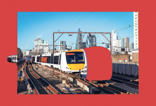
Riding Backward to Move Forward A Mindful Journey in Motion
The best way to leave London is backward. Not in regret, not in reluctance, but literally—get a seat that faces the opposite direction, sit down, and watch the city fade away in slow, cinematic reverse. I realised this while traveling to visit my friend Owen in Brighton. The train ride, which was just a bit over an hour, had a surprisingly profound effect on me. Since there were no charging spots and my phone was about to die, I was forced to notice something truly majestic.
The train advances, and meanwhile, from your seat, the world is unwinding. Buildings fall back into the distance, telephone poles lean away as if confiding secrets, trees bow their heads in polite farewell. It's as if time itself has loosened its grip, unspooling in numbered frames rather than the accustomed blur.
As daft as it sounds, this small action of declining to ride in the momentum of the train flips everything on its head. It changes the texture of movement, the manner in which the world reveals itself. Instead of pursuing the future, you see the past unfold, second by second, into memory. And in this reversal, there is a quiet revelation: sometimes in order to see clearly you need to stop rushing ahead and instead let the world come to you.
The Psychology of Slowness
There is science to this slowness. Research in cognitive psychology indicates that when we're moving quickly—physically or mentally—our brain filters out aggressively, sacrificing detail for efficiency. But when we slow down, we see movement differently (such as watching the world fall away instead of speeding by), we take in more. We see texture, pattern, and subtle changes in light.
If you're a visual thinker, this is magic. The slower you go, the more you notice. There's a reason designers enjoy long walks for inspiration: walking at a relaxed pace makes you pay attention to things, and paying attention to things makes you curious. John Maeda, in his book The Laws of Simplicity, writes:
‘The simplest way to achieve simplicity is through thoughtful reduction’
But let's be honest with ourselves, you cannot remove what you haven't actually seen. When you reflect on things, it sort of makes you stop for a moment and view the world not so much in terms of what's coming next, but on the basis of what you've experienced. And when you do that, you begin to see not only with your eyes, but with your mind.
Less Striving, More Seeing
Creativity happens in presence, not panic. Graphic design at its finest is a clarification of thought. A process of considered reduction, supported by a boundless curiosity. It's a matter of stripping away the irrelevant noise until all that remains is what's significant. But in order to accomplish that, you have to first allow yourself the time to truly discern what's important. When we slow down, we observe more, so have faith that good ideas arrive when you release your grip so tightly.
‘Don't rush the thing you want to last forever.’
With no distractions, and just the gentle white-noise of the train for company, the backward-facing seat I was sitting on struck me as a metaphor. Rather than always rushing forward into the next big thing, what if we slowed down and took in what's already happened? What if getting clear isn't so much about pushing through but just stopping and embracing the world arrange itself into something that actually does make sense?
The Art of Seeing Differently
There is something poetic about watching the city disappear and understanding that you are, in fact, moving ahead. When we design, we undertake a similar process. Drawing upon influences from the past, taking from memory, seeing old concepts in a new light. The best ideas typically come from revisiting with fresh eyes, from returning to old sketches, discarded inspirations, the margins where raw, unbridled creativity first started taking shape. Or as Margaret Atwood simply put it. ‘The waste paper basket is your friend’
But it isn’t just this sense of refreshing your vision. It’s a moment in forced reflection. A moment to create space. The iconic graphic designer, Paula Scher, once said, ‘You have to be in a state of play to design. If you’re not in a state of play you can’t make anything’
But play requires this space. It requires the luxury of observation, the willingness to sit and let the world unfold. Watching the landscape peel away from a backward train seat is its own form of play. An exercise in reframing, in seeing the ordinary as extraordinary.
Try it yourself. Take a train in reverse and confront the past. Watch the streets unwind, the skyline shrink, the suburbs stretch out into green. Let your mind wander over the rhythm of the rails, the soft blur of colour outside the window. Watch the world like a designer, like a thinker, like one who'll allow inspiration to come to them instead of chasing after it.
For sometimes, the best way to move forward is to sit still and look back. ⊹₊ ⋆
1 note
·
View note