#Color Model Cels
Explore tagged Tumblr posts
Visit Tumblr Blog
Explore Tumblr blogs with no restrictions, modern design and the best experience.
Last Seen Tumblr Blogs


Fun Fact
BuzzFeed published a report claiming that Tumblr was utilized as a distribution channel for Russian agents to influence American voting habits during the 2016 presidential election in Feb 2018.
Text
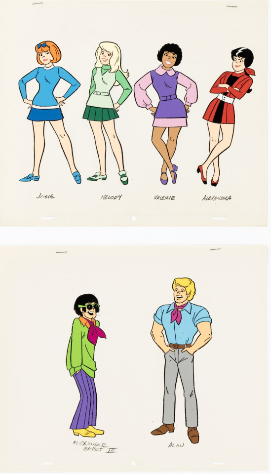
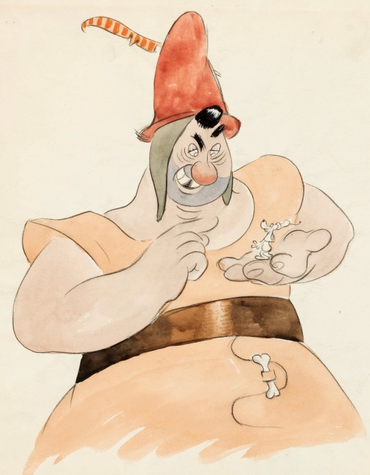
Josie and the Pussycats Color Model Cels Original Art Group of 2 (Hanna-Barbera, c. 1970)
#Josie and the Pussycats#Color Model Cels#art#animation#vintage#tv#Hanna-Barbera#1970#Josie#Melody#Valerie#Alexandra#Alexander#Alan
131 notes
·
View notes
Text
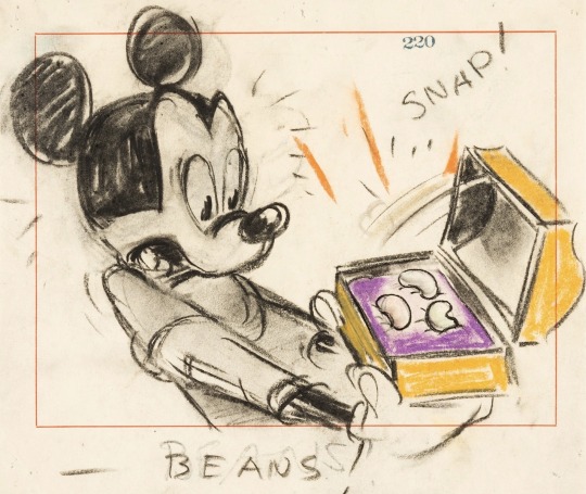
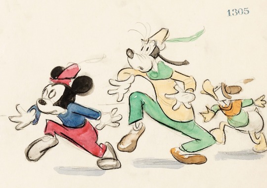
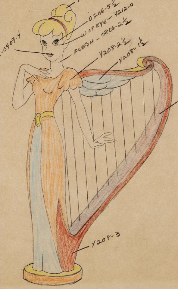

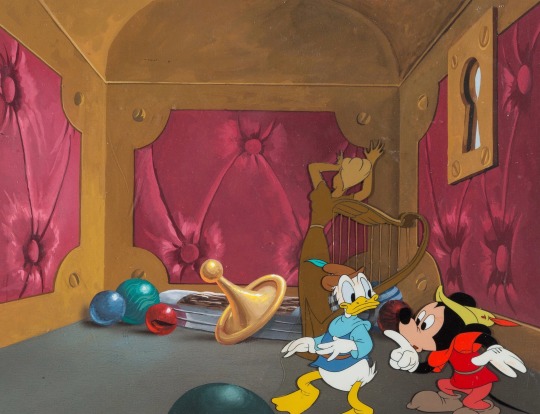
Production Art “Mickey And The Beanstalk” (1947)
#40s#disney animation#fun and fancy free#segment#production art#storyboard#storyboard panels#character designs#concept art#model sheet#color chart#animation cel#mickey mouse#goofy#donald duck#willie the giant#magic harp
140 notes
·
View notes
Text
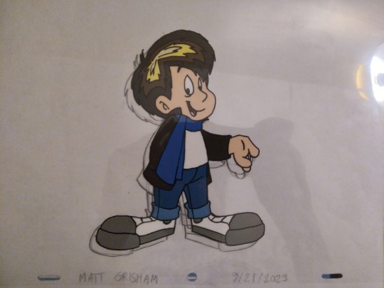
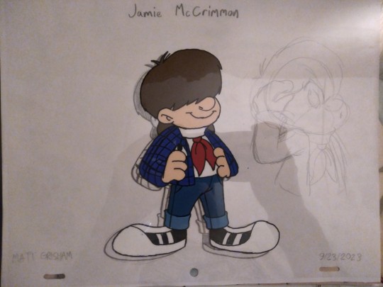
Fanmade color model cels of The Doctor and Jamie McCrimmon from BBC's Doctor WHO. Sketched on animation paper. Traced with Sharpie oil paint marker (extra fine point) and painted on reverse side with Apple Barrel acrylic paints.
Doctor WHO © BBC
The Doctor character design © @grishamanimationstudios102
#doctor who#dr who#color model#cel#animation cel#jamie mccrimmon#1960s#nostalgia#british#scottish#grishamanimation1#fanart#art#traditional#ink and paint#bbc#british broadcasting corporation#sci fi#time travel
8 notes
·
View notes
Text
Okay but can you get your cel shading outline to vary the line weight in response to the light source
#I'm pretty sure it can be done#might not be able to do it with the usual backface culling outline mesh thing thats usually done which i don't know the name of#might be able to achieve it with like a rimlight or something#instead of having it be directly behind the model it would be slightly offcenter favoring whichever direction the light source is#pretty sure you can link angle dependencies or whatever its called like that#i want to see realtime gameplay that actually looks like traditional media when it isn't moving#show me paint texture in the color fills#show me shadows under the cel and that thing where when only the arm moves its visibly on a separate cel layer#show me the outlines wiggling a little bit or looking like rough uninked xerox process animation#show me the occasional color error that there was no budget to go back and fix#maybe you can fuck with getting the paper wet or torn and have that be rendered realistically. have the stylized stuff react to it#get smudged realistically or whatever#there's stuff you can do now because you can achieve basically anything visually#its a shame most of the infinite money is going into realism instead of like. trying interesting things.#you've been able to get cgi to look like a painting for a while now how long before games figure that shit out#my immediate next thought is also 'is there a way to achieve this with drawings?'#and i wonder how well a character made up of billboarded sprites would hold up to for example a camera rotating around them
0 notes
Text
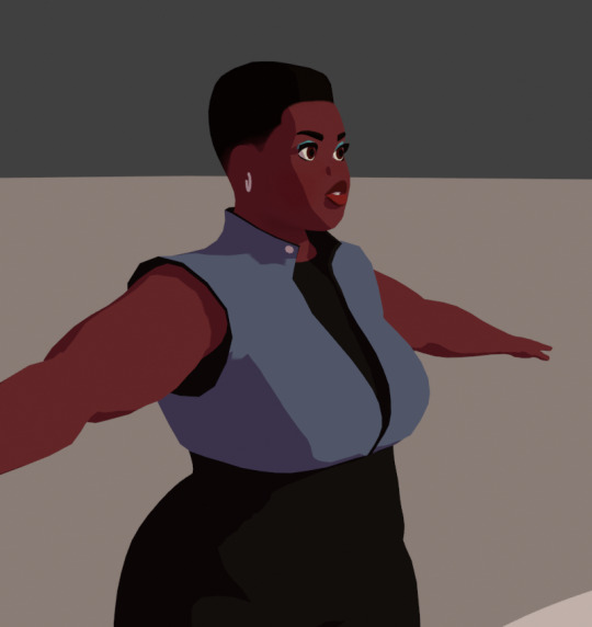
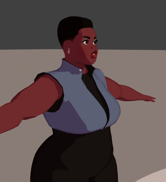
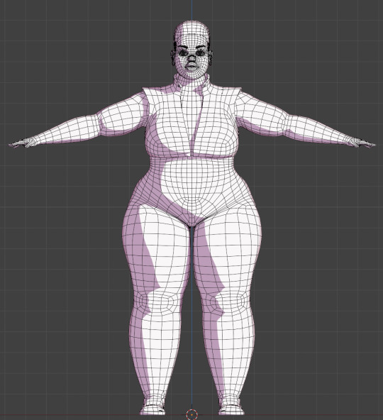
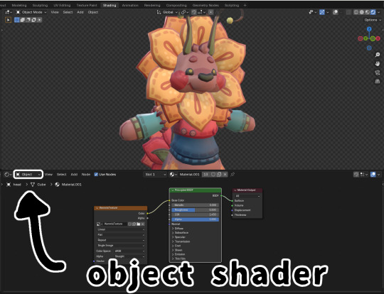
My model appeared on the Tumblr radar! I appreciate all the comments! It was interesting to hear that multiple people didn't realize it was a 3D model. I work a full-time job and modeling in Blender is one of my hobbies. Whenever I look back at my earliest models, I'm always shocked at my improvement. I look forward to seeing where I'll be at a year from now.
Multiple people asked how I was able to get my cel shader to look good. I've learned a lot from watching multiple videos and reading various blogs over the years. Here are a few things that I did for this model.
To start, here is how my shader graph looks like.
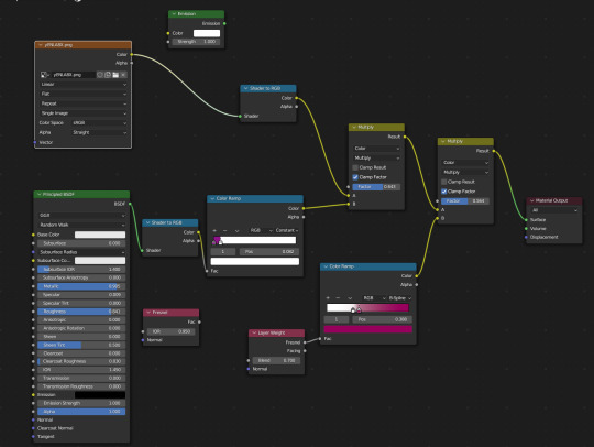
I have the Layer Weight plugged into the Color Ramp. This creates a soft outline around the model so that when objects of the same color overlap, it doesn't look flat. I've been experimenting with the options, but as of now, I like the way the B-Spline option looks.
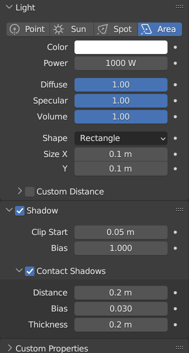
Something else that I change is the shadow color on the color ramp. By default, it's set to black. This always felt dull to me, so I will usually change it to a magenta or purple. I also keep an Emission node ready so I can switch the model to all white. This mostly helps when modeling so I can see how the light will interact with the model in this style. Adjusting the settings of the light also improves the shadows.
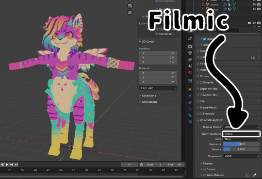
Also, change the Color Management from Filmic to Standard. This ensures that the colors you're using to paint your model will look the same in the viewport. This option can be found at the bottom of the Render Properties.
Check out these resources for more useful tips. Also, the props are from a Synty pack. I picked them up years ago when they were on sale.
Anime Shading In Blender (INTRODUCTION) Lightning Boy Shader - Beginner Guide - Shading & Modeling Tips
Synty™ Store - 3D Assets for Games (Unity + Unreal) – Synty Store
#3dmodeling#character modeling#cel shaded#blender3d#character design#character art#plus size art#tutorial#blender#original character
122 notes
·
View notes
Note
hey there! I've been working in blender for a while now but I'm really enthralled by how clean and kinda cel shaded your textures look would it be alright to ask what your general shader setup looks like or how you achieve that? thanks!
Thank you for asking! My shader setup is pretty simple, I just use an emission shader or just plug the image straight into the output haha if there're any shadows on my models it's usually painted in by hand I think the biggest thing that helps my shader look so nice is that I change my color management settings from filmic to standard

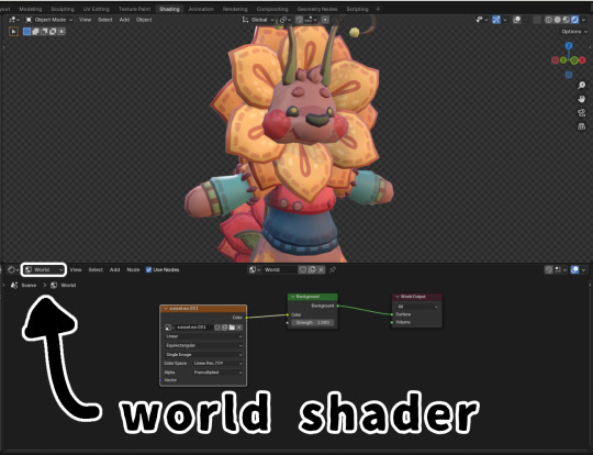
Other than that I have used the default principled BSDF shader a few times with one of the default "studio lights" or HDRIs as the world lighting
Here's a tutorial on how to set up the HDRIs to be rendered if you're interested
youtube
67 notes
·
View notes
Text
Vidu and the Quest to Make More Toons
So, a ways back I talked about Minmax, but I've been trying out basically all the video generators looking for the tools I need, and low and behold this week I find out I've been accepted into the Vidu Artists program now, wherein I get credits and access to access their cooler features in in exchange for... talking about the tech and how I use it.
Well twist my arm. I shall endeavor to be objective and informative despite free stuff (a challenge my spirit needs practice withstanding if anyone else wishes to test me)
So let's talk Vidu.
(outside of being converted to gif, no animations in this post have been cut or edited)

Also, everyone say hi to Maureen the Lizard Queen, every hero needs an evil queen that really wants in his pteruges, and she's that for TyrannoMax.
Vidu's got a bit more oomph under the hood than MinMax (no shade to MinMax, they're brand new and very promising) and it's way too early to be picking winners when it comes to video.
Anyhow, basic features that are nice include the options to upload start and end frames, options for a 4 or 8 second duration (more about that later), and a cleanup/upscale. Credits line up more or less with seconds. 4 credits for a 4 second clip, 8 for an 8 second, and again at upscale. It's straightforward in a way a lot of services aren't.

Apetomic Pyle, done on the fast settings. (not to shabby still, and it gave him monkey legs which a lot of systems balk at)
If you're on the $30/mo tier, you can choose to do a double-cost "quality" over "speed" option. Thankfully, the artist program gets me access. Since there's not yet a seed option it's hard to do a direct comparison, but the quality is going to be a must if you're doing anything that looks like cel. Much cleaner, much smoother.


(4 and 8 second quality gens)
One of the nicest features is the character reference feature. Basically it's like Midjourney's --cref, but with a very strict adherence to character details.
The above images used reference shots of Maureen and Dr. Underfang, and it got the stripes on Underfang's tie right in basically every gen. That's a ridiculous level of character model adherence and, for my purposes, all but essential.
It did misinterpret Maureen's undertail coloration for a sort of fin or drape, but the shot I used was oddly cropped, and sometimes stuff like that happens with gen AI. Given my measuring stick for errors is the era of animation I'm emulating, whatever does slip through is only going to make it more authentic.


There is a limitation in that character-reference and text-only prompts default to 16:9 presently with no options to adjust, but some room to pan is always handy and most people are going to be outputting for phone and not outdated CRT televisions, so, it's understandable it'd be a lower priority feature for the devs.


Walk cycles! By Saint Eniac it's a miracle!
On the left we have one prompted with TyrannoMax's control art, and on the right we have one using that art as the starting frame (4 and 8 seconds, respectively).
Way More details under the fold.
Vidu likes a hefty prompt.
A lot of detail and evocative language helps, and older prompting tricks like mojo-jojoing important concepts are back. For the Max walk cycles above I used:
1986 vintage cel-shaded cartoon character walk cycle. The orange dinosaur-anthro wearing blue gladiator armor walks toward screen right, the camera tracks him, holding him in center-frame. He completes a full, brisk walk cycles from the side view. He walks boldly, back straight, head high, heroic. His tail sways behind him as he moves. The whole clip has the look and feel of vintage 1986 action adventure cel-animated cartoons. The animation quality is high, with flawless motion and anatomy. animated by Tokyo Movie Shinsha, studio Ghibli, don bluth. BluRay remaster. flat chroma-key green screen background
The potential for use with my Filmation-inspired technique is readily apparent. Both versions are on-model as much as any two shots in a 1980s action-figure shilling cartoon would be, some minor blurring to clean up in post but nothing serious. It should be pretty easy to extract the needed frames for looping and compositing.
Some Extra Points
There are the usual issues with hands, though more often than not it corrects my four-fingered anthros to having a human five-fingered hand. Buzby Spurlock animation was known for those kinds of inconsistencies, though. So an opening credits video is much less far off than it was at the last post.
It's also generally impressive how well it does with my dinosaur characters. Non-humanoid dinosaurs are difficult for most image generators, much less anthrosaurs in a vintage aesthetic. Vidu has yet to override the character art to give Underfang or Max the Jurassic Park style t-rex jaw, which is something both MJ and Dall-E 3 have trouble with.


Human characters like Kitty Concolor here, much more stable.
As always, clips are curated. I didn't choose my absolute best ones (gotta have something for the videos), and I'm working on a fun series of jank reels across all the generators.
#vidu#vidu artist plan#ai video#ai animation#tyrannomax#ai tutorial#ai assisted art#cartoons#80s nostalgia#unreality#maureen the lizard queen#dr. underfang#ApeTromic Pyle
79 notes
·
View notes
Note
Sort of a difficult question to answer since it's fairly open-ended, but regardless, What all has inspired you to draw the way you do? The way you work with shape language in characters is incredible to me and I aspire to be someday as smooth and clean with drawing the way you are. It's reminiscent of early 2000's cartoons but still modern enough to be distinguishable, so I'm wondering if you got any inspiration from that era of cartooning specifically? Wish I could properly word how much your art and the way you depict both the toon handlers, and the founders of Gardenview has affected me, because it is a LOT. I don't mean to put you up on some sort of special amazing pedestal since we're all human after all, but god damn has your shit changed me. Keep doing what you do, I'll be one of the many people cheering for you on the sidelines. I'd love to know more of the thought process behind how you design characters because it's truly special. Adds a discrete layer of charm, if you will. Things like small accessories, i.e giving shrimpo a sailor outfit or maybe even making some things a certain outline color like Delilah's blue-ish glasses.
saying it’s like early 2000s cartoons but still modern and distinguishable is such a meaningful compliment im not sure how to describe it :’] i was born 2002 so that era of cartoons is a big part of what i grew up watching ! I’m not sure there were any specific cartoons that’s influenced my art style, i think it was just evolved from whatever felt right and looked good ! i remember thinking ‘why don’t any of these cartoons give the characters irises. where is their eye color’ so i draw my humans with irises. ‘why do these guys all have four fingers, that’s not correct’ so i draw humans with five fingers
as for accessories, particularly on the human dw characters, i think it’s just a matter of ‘the toons are going to have more simplistic designs bc they’re drawings, the humans are going to dress like humans do’ so they’ll have accessories, watches, bracelets, earrings, etc, or i’ll change the outfit to be more realistic/look like something a person would actually wear. I’ve said it before but the handler’s uniforms as seen in-game look goofy as hell I’m sorry. why are their undershirt and pants the same color. the undershirt being darker than the vest doesn’t look right. don’t fucking get me started on arthur’s shirt collar and vest and sleeves. if it’s a black shirt why are the sleeves white. why is the collar the same green as the tie. why is there a line of black you can see above the collar. is he wearing a fake collar or is it just bc roblox models are printed on designs like legos. so i draw it as a black collared shirt and the white sleeves are Attached to the vest
also i particularly care about differentiating how the toons are drawn vs the humans bc i already have a universe of ocs that is just humans and toons interacting, so i need ways to differentiate how each of them are drawn, so they don’t look like they like. came from the same Thing. i want them to look a little off standing next to each other, bc one is a regular human person and the other is a living drawing :] usually by using different line thickness, or a drop shadow so the toons look like a cel, + more obvious things like more expressive movements/expressions, toons adhering more to shape language where humans don’t
also of note w shrimpo’s little sailor collar, that came from me wanting to put repeating motifs in some of the toons designs :] the the collar itself has a stripe on the back like the hem of his shirt/dress, and the knot is the same shape as his shrimp tail. i do this on at least a few other characters, i draw tisha’s dress as a napkin hem to mimic the shape of the box fold on the side of her head, i draw lace on the hem of teagan’s dress to mimic the scallop shape on the top of her head, things like that :]. giving delilah glasses just came from ‘she’s old she could have little glasses on’, them being that cyan was just to match her gloves :] giving arthur mobility aids came from looking at the gardenview building and the distinct lack of stairs(all the ramps and elevators) and thinking w my sibling ‘at least one of the founders was likely already disabled for them to have Built the building like this, bc like. in the 80s? im not sure they would’ve considered it otherwise’ bc at that point we didn’t have their designs yet
#the monarch’s court#dandys world#wasn’t sure how to end that ask Conclusively but id already been writing for uh maybe an hour#thank you again though :’]
42 notes
·
View notes
Text
thought i’d make a post showing/teaching my animation process for my most recent finished project!!! animation is really fun, it’s my absolute favorite form of art in the world and i love sharing how i approach it! without further ado, let’s get into it!
1. roughs

the goal here is to establish the big things in the animation. what are the main movements? what is the timing? what’s the general layout of the space the animation is occurring in? in my roughs, i like to use multiple colors to keep things separate and clear. you should also not be focusing on the details either!!! you are trying to get the most basic, fundamental forms down and moving before adding ANY detail. trust me, no artist on earth can crank out a finished animation without first taking this messy, less-than-pretty step.
2. tie downs

at this point, once the movement is down, you can start adding more details and clarifying things. in the tie down stage, you’re refining things— medium details, faces, character clothing, etc. you’re not trying to make it super clean. THIS IS SO IMPORTANT DO NOT TRY TO MAKE A CLEAN ANIMATION STRAIGHT OFF OF THE ROUGHS YOU WILL MAKE MISTAKES THAT ARE INSANELY ANNOYING TO FIX THAT LATE IN THE PROCESS!!! worry about perfect cleanliness in the next step!
3. final lines/cleanup

NOW i start worrying about how clean i want it to be. this stage sucks i am not going to lie. it is tedious and slow and agonizing because every single line has to move in a way that makes sense. DO NOT JUST INK OVER THE TIE DOWNS. if you do that it will look terrible and wobbly. you have to make sure everything is on model, that forms and lines move in a way that makes sense, and that there is no jitter or “sticking” (happens when lines are drawn over lines from the previous frame, which makes the line appear to “stick” in place). additionally, you’ll notice the red lines— these are color separation lines that will not be visible in the final animation. i use these for sappha’s stripes and hair highlights, as well as her two-tone irises. while not visible here, there is also a separate animation layer for final shadows.
4. coloring
and then comes color!! I do my cleanup and coloring in clip studio paint. If you’ve done everything correctly and there’s no gaps between lines, CSP’s fill tool will allow you to pretty quickly and easily fill your cleaned up animation. for this animation, i also threw together a shitty messy background in about 20 minutes and then gaussian blurred it (im not good at painting lol).
5. compositing

once the coloring is done, i move into my fully legal copy of After Effects, and begin compositing. this entails taking the animation elements (cels, backgrounds, etc) and combining them, color grading them, and adding effects like blurs, gradients, and light bleed. your two most important effects in AE are fast box blur and gradient ramp— honestly, you don’t need much more than those two to make a well-composited animation (besides some color stuff like gamma/pedestal/gain). once that’s done, i export it as an MP4 and a PNG sequence, import the sequence into CSP or Toonsquid (my favorite animation app for the ipad), and then use that to export a gif of my final animation!
and that concludes the most basic rundown i can give without writing wayyy too much. if you’ve got any specific questions, please hit up my inbox, i love talking about art and animation with people interested in learning!
29 notes
·
View notes
Text
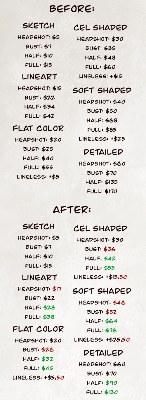
Yakut’s Commission Sheet 2025
[OPEN]

Finally made a brand new commission sheet!! I really like the way it turned out, and if I spot any mistake now I Will cry myself to sleep, because GODAMN it took fucking 12 hours to make this.
Transcript, T.o.S., and other important information under the cut!!
Yakut Arts Commission Sheet
Sketch
Headshot - $5
Bust - $7
Half body - $10
Full body - 15
Line Art
Headshot - $17
Bust - $22
Half body - $28
Full body - $36
Flat Color
Headshot - $20
Bust - $26
Half body - $32
Full body - 45
No line art: + $5,50
Cel Shaded
Headshot - $30
Bust - $36
Half body - $42
Full body - $55
No line art: + $15,50
Soft shaded
Headshot - $46
Bust - $52
Half body - $64
Full body - $76
No line art: + 25,50
Detailed
Headshot - $60
Bust - $70
Half body - $90
Full body - $130
Other stuff:
More characters: + %50 of the price per character
Background: + %70 of the price
Complex design: + %15 - %30 of the price
Hard to draw: + %10 - %40 of the price
Currencies that I accept:
$ - United States Dollar (USD)
€ - Euro
R$ - Brazilian Real (BRL)
Payment via:
PayPal
Stripe
PIX
* All the prices are the same, no matter the currency. If you want a $20 Flat Color Headshot but only use euro, then you will pay €20;
* If you are american or european, you CANNOT pay in BRL;
* While PayPal is the most popular and most used option, I highly recommend Stripe, because you don’t need an account to pay and I can safely send you an invoice via e-mail.
Prices before and after comparison:
I will draw:
Furry, Anthro, Feral, Animals, Creatures, Fanart, Fruit/Candy/Regular gore, NSFW, kinks, suggestive art, Complex designs, Partially mecha, Horror, Weapons/Armor, Cosplay, Magic, Skeletons/bones, Latex, Copyrighted characters, and others.
I won’t draw:
Humans, Extremely heavy gore, Fully mecha (Synths are an exception), Offensive art, Some fetishes, Watersports, Scat, Things that make me really uncomfortable, Commercial commissions, Things I can't draw because it's above my current level.
Terms of Service
1. Commercial Commissions:
- I do not work with commercial commissions. Any use of your commissioned artwork is for personal, non-profit purposes only.
- It is not permitted to use the commissioned artwork for commercial purposes, such as resale, mass reproduction, or any other form of profit.
2. Usage Restrictions:
- The commissioned artwork is not allowed to be used for artificial intelligence training or any form of data analysis.
- Reselling the commissioned artwork, especially as an NFT (non-fungible token) or any other form of tradable digital asset, is strictly prohibited.
3. Copyright and Intellectual Property:
- I retain all copyrights and intellectual property rights to the commissioned artwork, even after delivery.
- The client does not have the right to claim authorship of the artwork or use it in any way that infringes upon the artist's rights.
4. Use of Images and Promotion:
- I reserve the right to use images and information about the commissioned artwork, including the final product, for promotional and marketing purposes, unless specifically agreed otherwise.
- When reposting the images, it is highly recommended that you repost the version that is watermarked and/or glazed/nightsahded, which will also be delivered to you along with the "clean" version of the image, to prevent stealing and it being fed to A.I. models.
5. Custom Designs:
- Custom designs created by the artist are not to be resold or used for commercial purposes without explicit permission from the artist.
- If reselling is permitted, the price of the resold design must be equal to or lower than the original price set by the artist, but never higher.
6. Payments and Refunds:
- Payments for commissions must be made as agreed between the client and the artist before the start of the work. All transactions must be conducted in United States Dollars (USD), unless otherwise agreed upon.
- No refunds will be granted after the commencement of the creative process unless there are exceptional circumstances agreed upon by both parties. In that scenario, if the client does not want to continue the project, a partial refund will be granted based on how far I have completed the commission, but if for any reason I am the one who cannot work on your project anymore, I will give you a full refund.
- If you are Brazillian, you will have the special option to use the currency Brazillian, Real R$ (BRL) and pay via PIX.
7. Privacy:
- During the payment and commissioning process, both parties may have access to private information such as full legal names, addresses, and contact details. Both parties agree to respect each other's privacy and refrain from disclosing or doxxing any private information shared during the transaction. Breach of this clause may result in legal action.
8. Limited Liability:
- The artist will make every effort to provide high-quality work and meet the client's expectations. However, the artist is not liable for any damages arising from the use or interpretation of the commissioned artwork. [Example: The infamous YouTuber Verbablaze commissioned a $50,000.00 animation of him and the Hazbin Hotel character, Charlie, where they were being shown in a suggestive situation. Verbablaze posted the animation and got criticized and made fun of because of it. If you were to commission me, and then get into a controversy because of what you commissioned, I would not be held responsible and I will reserve the right to rather or not make a statement on the situation and/or get involved.]
9. Delivery Timeframe:
- While I do not work with strict deadlines, it is generally expected that the commission will be completed within a timeframe of 1-2 weeks to 1 month. However, please note that the actual delivery time may vary depending on the complexity and workload of the project.
10. Revisions:
- I understand that clients may have specific requirements or preferences. I am open to accommodate up to 10 major changes to the commissioned artwork. Please note that these revisions must be requested and finalized before the rendering process begins. Once the rendering process has started, I can accept up to 5 additional minor revisions, but major changes may not be feasible at that stage. Any revisions beyond these limits may be subject to additional charges or renegotiation.
11. Modifications to the Terms of Service:
- The artist reserves the right to modify these terms of service at any time, with prior notice to clients.
By proceeding with an art commission from me, Yakut, the client acknowledges that they have read and agree to these terms of service. Any violation of these terms may result in appropriate legal actions.
Here are some artwork quality examples:


Commission sheet creation Timelapse:
To make a commission request, you can send me a direct message (DM) to me on Tumblr, Bluesky, Twitter, or Instagram. I am not active on Discord so there’s a 90% I won’t see your message.
#commission#commissions are open#commission sheet#furry commissions#comms#art comms open#furry comms open#commission art#commissioned art#commissioned work#comms are open#artist comms#comms info#YakutArts Commissions#Yakut Commissions#commissions#art#artists on tumblr#artwork#drawing#digital artwork#digital art#furryart#design#furry#sfw furry#yakutarts#yakut arts#furry artwork#furry artist
19 notes
·
View notes
Text
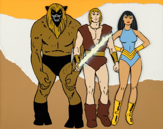
Thundarr the Barbarian Publicity/Color Model Cel Based on Alex Toth Design (Ruby-Spears, 1980)
This sharp hand-painted cel of the show's main stars Ooka the Mok, Thundarr, and Princess Ariel was based on drawings by the show's designer, comic book/animation legend Alex Toth (1928 - 2006).
#Thundarr the Barbarian#Publicity/Color Model Cel#Alex Toth Design#vintage#art#1980#Ruby-Spears#Ooka the Mok#Thundarr#Princess Ariel
51 notes
·
View notes
Text
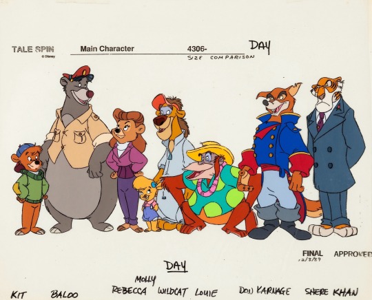
Character Line Up Model Cel “TaleSpin” (1989)
#80s#disney television animation#production art#model cel#color chart#character designs#cast#talespin#disney afternoon#disney#animation art
86 notes
·
View notes
Photo
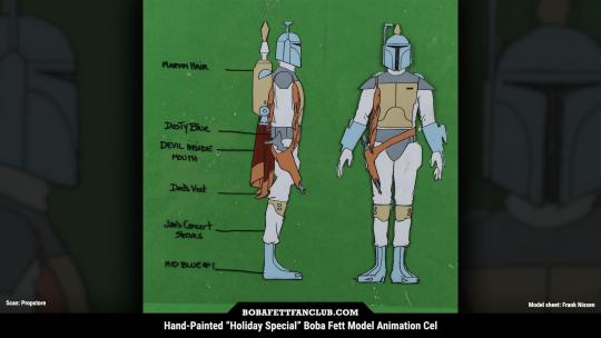
Hand-painted "Star Wars Holiday Special" Boba Fett model animation cel Model sheet art by Frank Nissen Scan courtesy of Propstore, where this sold for $5,355 in 2024 Another version of this omits the color labels on the left and has "Boba Fett (Bounty Hunter)" written at the bottom
15 notes
·
View notes
Text
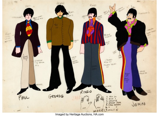
Artist Uncredited Beatles Yellow Submarine Paul McCartney, George Harrison, Ringo Starr, and John Lennon Color Model Cel Animation Art (United Artists/King Features, 1968) Source
“An extremely rare original hand-painted color model cel focusing on the Beatles in their "everyday" outfits, with color instructions written in ink and china marker on the acetate. Note the special instructions for Ringo's many rings!”
24 notes
·
View notes
Text
lesson O1: cel shading and how to achieve it.
Project SEKAI uses a unique shading method, which is a cross between rendering techniques and what is commonly referred to as "Cel Shading." Cel Shading was a term coined by animators before computer animation, who worked in "cels" or hand-drawn scenes. Because of the limitations of the time, the animators had to find a cheap and simple way to shade, resulting in the shading we see usually in modern animation.
Project SEKAI uses this style in combination with rendering tactics to create their iconic art style.
In this lesson, I'll be going over how Project SEKAI achieves that look by breaking down their Live2d models and card cutouts.
Cel Shading is the basis upon which everything in Project SEKAI is shaded. Commonly, this is seen in: Live2d models and card trims. Here are some examples.
In both examples, you can notice the more "simplistic" style of shading. Now, the real question is: "How is this done?"
To explain this, I'll be using the card trim on the right as an example.
Firstly, artists need to put base colors under their lineart. Base colors are the bare-bones, not shaded colors. This is to provide a guideline as to what areas need what colors. Below, you can see the same Nene card trim, but reduced to its base colors.
It is a bit sloppy, considering I made it myself, but the point is; there is still **some** shading blocked out where it's needed. For comparison, see below.
So, now the question is: "how do I even do Cel Shading from here? I've gotten my base colors down, now what?"
And, luckily, I can share that too! First, let's start by doing the most important thing, deciding where our light source will be.
In this card, it looks to be at the top right, coming down to shine on her.
The yellow is where I estimate the light would hit her. Now, we need to decide where our darkest areas are.
In this card, the darkest colors would be away from the light, meaning they would be to the left.
The red is where I estimate the darkest areas would be. The areas behind her arm would also be darker than the rest of the card, since they aren't being hit directly by the light.
This understanding of lighting will help me to place my shadows and highlights later!
After this, I'd suggest putting in a new layer on top of your base colors, and clip it.

Now, I would be sure to grab a reference. For this drawing, I will be referencing the original trim, as well as the full card. I will be using a reference window, but use whatever works for you!
Now, we can get started! First, I'm going to block out where the **lightest** areas would be. I will be loosely following the card trim as a reference. Using the places we previously determined would be hit by the light, I blocked them out with loose colors.
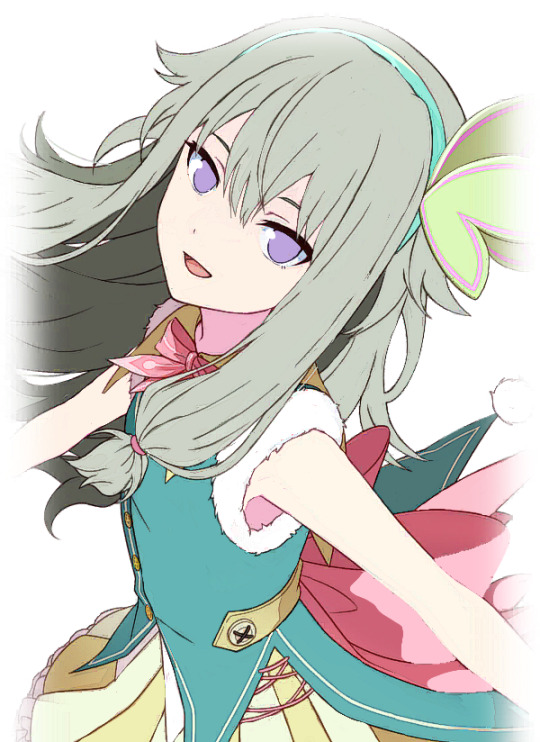
We know that these areas would be directly exposed to the light if it continued at the angle we previously determined. Now, as for the headband, I decided to block out a very light yellow color. This is because of something called ambient lighting. Ambient lighting is just when highlights have a similar color to their light source. This is seen a lot in photography, and sometimes, even in cards!
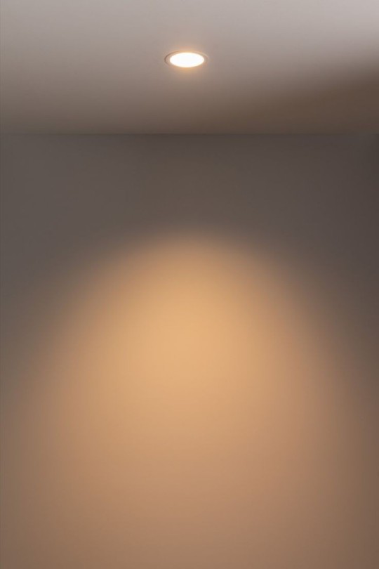
As you can see here, the light itself has a yellow tint, so the wall behind it will also appear yellow as a result.
We can also see it in Rui's newest card!
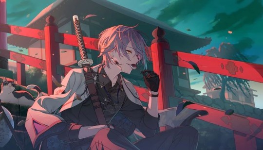
The light behind him is a reddish-pink, so that light bounces onto him, and makes the highlights appear that color. You can also see it on the railing and the building behind him!
Back to Nene, I then blocked out some of the darkest parts of her, based on our previous assumptions about the source of the light.
I shaded the areas of her dress according to how the bow was shaded. Since they were in almost the same place, we can use it as a guideline. We know that the dress isn't exposed to the light, since it is in front of the bow. As for the arms, we know the arm closest to her face would be fairly far from the light source, so I blocked out a shadow there as well.

Here, I adjusted some of the shadows, and I added some shadows to the dress. I blocked them all out in shapes, which I will go back and refine later.
I also added some shadows to the white fur on her dress. I paid specific attention to the edges of it in an attempt to make it seem "fluffier."
Here, I blocked out more shadows of her dress based on how the light would hit her. Now, we'll move on to the hair!
While it is messy, I wanted to ensure that the areas I placed shadows in would line up with my assumption of the light source. So, I toggled back and forth between the reference for the light source and the card itself to see where it fell. Now, with that, we are done blocking our our shading! I would suggest duplicating this layer to touch up everything to ensure you're satisfied with it.
The eyes will be a lesson by themselves, seeing as I didn't want to rush out two lessons in one and overwhelm people with so much information. This was a longer post than I anticipated anyhow.
If you have any questions, please feel free to shoot me a dm or an ask in the ask box! I hoped this helped at least a few people, and I will try to do weekly/bi-weekly lessons if I can!
If you found this helpful, please consider reblogging this post for more reach! I want to help as many people as I can!
#art tutorial#art study#project sekai art#pjsekai#pjsekai art style tutorial#proseka art academy#art lessons#nene kusanagi#kusanagi nene#shading test#cel shaded#prsk
39 notes
·
View notes
Note
Have you ever drawn WAAGZ Bill in your own style? I think you said your style is pretty similar to an extent but I'm curious what he'd look like if you weren't style matching! Ive ended up with a sort of hybrid, I was drawing him entirely my style then practiced on model, and I've found the most fun way for me to draw him (my art style has been mostly developed based on my fandoms requirements, so... tbh I got a lot of practice in my PATB and DHMIS phases lol, and originally gravity falls when i first started drawing, and now MORE gravity falls)
What you see is my style for Bill. I possess no other style in which he would be drawn.
i said on this post that that picture is mostly my style, but like,, compare him to the original character and he's pretty on model still. i made the pointy parts and flat parts a bit more rounded but that's about the only change. what makes it my style?
lineart & line weight. the way I draw ruffles & folds. the way i render lighting, shines, and shadows—half cel shaded, half gaussian blurred glows, colored gradient shadows. How I draw fingers. How I draw calves (and forearms and legs & arms, but they're not visible in this pic). Coloring the lines. Textured backgrounds.
I do lineart & line weight the same in all my art. Since I started texturing my backgrounds, I've used the same texture brush throughout. When I shade/highlight Bill (or other characters), I do it the same way. When I color lines in Gravity Falls art style, I do it the same way. Bill doesn't wear ruffly clothes. (but i've drawn him in a fancy dress—unposted—and when i did, i drew ruffles that way.) If I drew Bill's fingers or limbs in my "usual" style, that would make them Wrong, because that isn't what his hands and limbs look like. he has tiny rounded fingers and uniform-width noodle limbs, not pointycurvy fingers and sexy supermodel calves.
I don't have a "my style" for how I'd draw eyes or noses or mouths or head shapes if I weren't style matching. that's The Shape Bill's Head Is. that's The Shape His Eyes Are. that's What His Hair Looks Like.
#marsupials of mars#ask#about my writing#(<- i don't have an about my art tag and i ain't gonna start one so it's getting sorted under here)
13 notes
·
View notes