#Canva text effect
Explore tagged Tumblr posts
Visit Tumblr Blog
Explore Tumblr blogs with no restrictions, modern design and the best experience.
Last Seen Tumblr Blogs


Fun Fact
Total funding amounts to $125.3M.
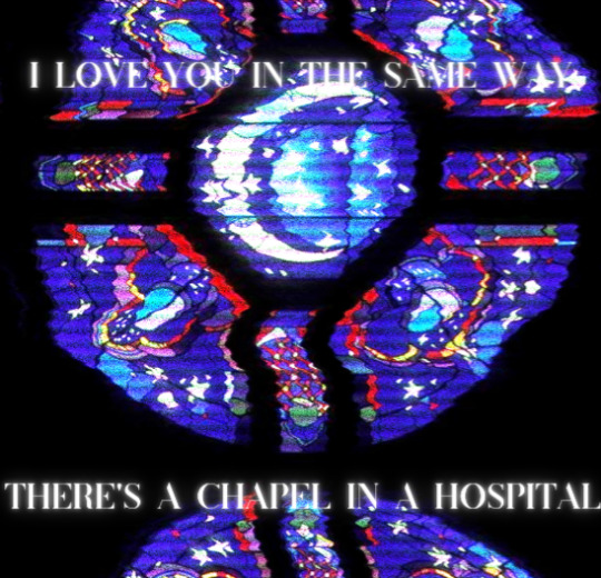
Text
#canva#keepcanva#canvadiscuss#canva templates#canvapro#tutorial#canvafree#united kingdom#united states#united arab emirates#text effects#canva text effect
0 notes
Video
youtube
Canva Splice Text Effect Tutorial: Create Stunning Visuals!
#youtube#Canva tips#Canva tutorial#Canva design#canva text effect#text effect#Splice text effect#graphic design#design tutorial#learn design#tutorial#text effect tutorial#Canva designer#typography
0 notes
Text


low quality link click doodle dump
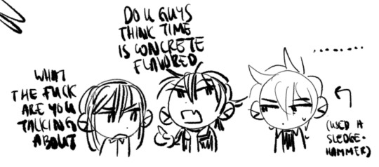
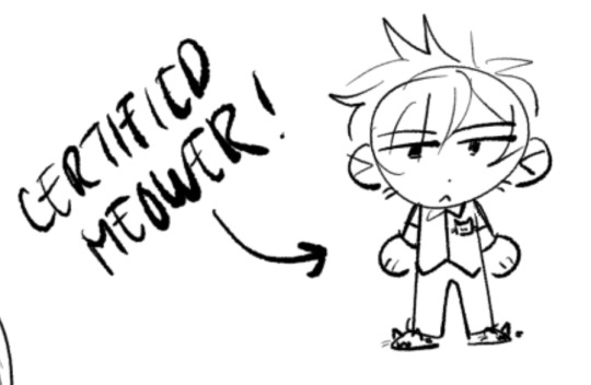
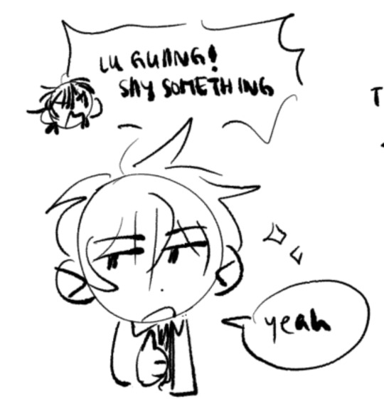
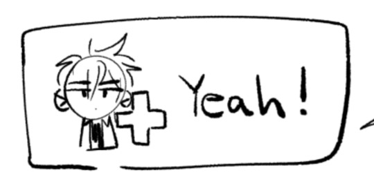
#id in alt text#my art#link click#link click spoilers#时光代理人#lu guang#cheng xiaoshi#qiao ling#li tianchen#liu xiao#photo squad#squinky collection#every time i try to draw them normally i have another funny thought and i fill the whole canvas with these sorts of things#so heres all of them that ive done so far :]#lu guang in particular is very very fun to squinkify. his -_- meower swag#“concrete-flavored time” is referencing a discussion duckthedoof and i are having about whether time travel in link click is dominated by#the butterfly effect or by stable time loops. and dr who waters of mars is just because well dr who tries to rewrite time to save someone#and it goes badly. thematically relevant
129 notes
·
View notes
Text
one foot in your bedroom
and one foot out the door
#*holds out hand* come to hum hallelujah world with me#Lu rambles#my edit#music#fob#fall out boy#canva tried to screw me over with this one for some reason if I have two text boxes and try to slap a glow effect on both of them#it changes them to say the same words#so I had to like. save the image with one line. then go back and add the 2nd line. then save it a 3rd time so the fuzz quality would match
269 notes
·
View notes
Text
I present, an art:
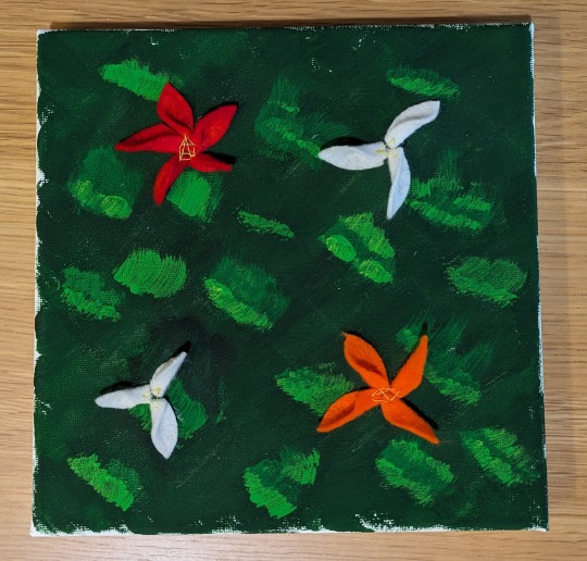
Mixed media: acrylic, felt & cotton thread on canvas
#art#mixed media#wandering graphics#dru attempts art#image description in alt text#idk if I want to add a flower in the middle. probably not tho#ended up not using the pastels - they didn't have the effect I wanted because of the texture of the canvas#the flowers were glued on but the glue wasn't really taking hence the thread#New Year's resolution complete: Buy a canvas. Paint the canvas. Hang the canvas. That’s art baby!#I've still got a 2nd canvas to play with but I'm out of white paint so it'll have to wait
8 notes
·
View notes
Text
Canva Free Everything You Need to Know About Free Version of Canva
If you’ve ever felt intimidated by graphic design or thought you needed a degree in Photoshop to create stunning visuals, let me introduce you to Canva. Whether you’re a small business owner, a student, a social media enthusiast, or just someone who loves creating, Canva Free is a game-changer. In this article, we’ll dive into everything you need to know about Canva Free—its features,…
#canva#canva 2025#canva ai#canva course#canva design#canva design tutorial#canva for beginners#canva free#canva hacks#canva pro#canva pro free#canva text effects#canva tips#canva tips and tricks#canva tricks#canva tutorial#canva tutorial for beginners#design with canva#easy canva tutorial#how to use canva#how to use canva app#how to use canva for beginners#how to use canva tutorial#learn canva#tips for canva#tutorial canva#video canva
0 notes
Text
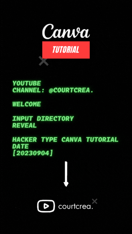
Text animation in Canva Tutorial
0 notes
Note
How do you make your stamps? :0
Disclaimer: this is an obscenely long explanation, with pictures. Efficiency is stupid
So, for the static ones, I make a 99x56 px file on ibis paint x. Other programs are probably available online but I don't use them.
After that, I either upload an image I want to make into a stamp, or I draw one.
Then, I find a frame I want to use. Ill upload them here but let it be known I stole all of these right from deviantart


Most of them are from Lil-Devil-Melii on deviantart. The rest i have no idea. They're not all 99x56px but you can crop the canvas it's fine
Make sure to erase the edges of the picture , so they're transparent. It's not as cute otherwise
Upload those frames over your image in whatever art program you're using and viola, stamp.
For moving ones, it's a lot harder. Mostly because I refuse to download Photoshop.
There are a couple ways to do this. Some are simple animations, like with flashing text and whatnot. For these, you download the individual animation frames from your art program. Make sure it's transparent.
Then, upload each frame to ezgif.com under the option "GIF maker." You can play around with how fast each frame goes and whatnot but in the end, it'll be a stamp with some rad text that moves. This is easy, and doesn't make me want to shit my pants and cry. If you're new, do this. This is fun. This is good. This does not kill me inside
I made that↓ stamp with this method :)

this next one is how we turn gifs into stamps. This one makes me sad. It involves math and sucks. But we gotta do it. For the vibe
First, grab your gif. I'm using this cow gif because it's awesome

Then, I resize it using ezgif. Literally everything for this will be using ezgif. I am a simple man
At this point you should decide what frame to use. I'm using this one because its the first one I clicked
Figured out what size the inside of the frame is. That's what I resize the gif to, so the edges can be transparent. The inside of this one is 93x50 px, so those are the dimensions I'm making the gif.
Figure it out by putting the frame into ibis paint and realizing the canvas to fit just the inside of the frame, then seeing what the dimensions are. But there could be easier ways

Woah it's so small now
Then, still on ezgif, I go to the "crop" option.
Make sureeee to upload the smaller gif
press the button that says "extend canvas size", and then put the "width" and "height" as the dimensions for your FRAME. This'll put a bit of a transparent border around the gif. For this frame, I did 99px and 56px.
The "left" and "top" boxes show how many pixels the cropping happens from the edges of the canvas. The formula for finding that is
(width of gif / 2) - (difference between gif width and frame width / 2) = left box
For me it's (93 / 2) - (6 / 2) = 43.5
Then you do the same.for the height, which for me ends up being 22 from the top
This is reallyyy touchy and annoying though
Here's my result , with no visible difference

Okay so THEN you go to the "overlay" option, under "effects." And upload your frame. If the cropping was done right, you shouldn't have to move the frame at all and can just download it
Here's my result:

if you don't care about transparency, you can resize your gif to be the same size as the frame, and then put the frame over it. But I'm a slut for transparency
Anyways. I'm sorry if anything was unclear, it's two am. And I hope this was helpful :) these really are fun to make once you get it down
also if anyone has an easier way to make stamps from gifs, please god tell me
#web graphics#old web#neocities#custom#custom blinkies#stamps#page decor#web resources#da stamps#deviantart stamps#blinking gif#How to#tutorial#How to make stamps#Spacehey#deviantart#rentry graphics#old internet#early internet#stamp collecting#ezgif#stamp making#stamp template#Stamp frames#blinkies
6K notes
·
View notes
Text
@illiteratesblog
i eat albums like delicious meals one after the other. and the songs are the courses
#reblogging text#i feel as if you would like this post idk <3#i mean honestly i love albums more than just one off songs. they just hitttttt#its like looking at a painting in its entirety and consuming the art as the artist intended vs zooming in on one specific part of the canva#it just doesnt have the same effect listening to one songggg#BUT STILL LIKE they hit tho#idk what im trynna say but yEah#ur like my only mutual who i see talk abt music or rb music stuff so here. i hope u dont mind me tagging u so u see this lol#(im like v awkward aaaa fml ANYWAY)#hope ur having a good day
33 notes
·
View notes
Text
Generative AI Policy (February 9, 2024)

As of February 9, 2024, we are updating our Terms of Service to prohibit the following content:
Images created through the use of generative AI programs such as Stable Diffusion, Midjourney, and Dall-E.
This post explains what that means for you. We know it’s impossible to remove all images created by Generative AI on Pillowfort. The goal of this new policy, however, is to send a clear message that we are against the normalization of commercializing and distributing images created by Generative AI. Pillowfort stands in full support of all creatives who make Pillowfort their home. Disclaimer: The following policy was shaped in collaboration with Pillowfort Staff and international university researchers. We are aware that Artificial Intelligence is a rapidly evolving environment. This policy may require revisions in the future to adapt to the changing landscape of Generative AI.
-
Why is Generative AI Banned on Pillowfort?
Our Terms of Service already prohibits copyright violations, which includes reposting other people’s artwork to Pillowfort without the artist’s permission; and because of how Generative AI draws on a database of images and text that were taken without consent from artists or writers, all Generative AI content can be considered in violation of this rule. We also had an overwhelming response from our user base urging us to take action on prohibiting Generative AI on our platform.
-
How does Pillowfort define Generative AI?
As of February 9, 2024 we define Generative AI as online tools for producing material based on large data collection that is often gathered without consent or notification from the original creators.
Generative AI tools do not require skill on behalf of the user and effectively replace them in the creative process (ie - little direction or decision making taken directly from the user). Tools that assist creativity don't replace the user. This means the user can still improve their skills and refine over time.
For example: If you ask a Generative AI tool to add a lighthouse to an image, the image of a lighthouse appears in a completed state. Whereas if you used an assistive drawing tool to add a lighthouse to an image, the user decides the tools used to contribute to the creation process and how to apply them.
Examples of Tools Not Allowed on Pillowfort: Adobe Firefly* Dall-E GPT-4 Jasper Chat Lensa Midjourney Stable Diffusion Synthesia
Example of Tools Still Allowed on Pillowfort:
AI Assistant Tools (ie: Google Translate, Grammarly) VTuber Tools (ie: Live3D, Restream, VRChat) Digital Audio Editors (ie: Audacity, Garage Band) Poser & Reference Tools (ie: Poser, Blender) Graphic & Image Editors (ie: Canva, Adobe Photoshop*, Procreate, Medibang, automatic filters from phone cameras)
*While Adobe software such as Adobe Photoshop is not considered Generative AI, Adobe Firefly is fully integrated in various Adobe software and falls under our definition of Generative AI. The use of Adobe Photoshop is allowed on Pillowfort. The creation of an image in Adobe Photoshop using Adobe Firefly would be prohibited on Pillowfort.
-
Can I use ethical generators?
Due to the evolving nature of Generative AI, ethical generators are not an exception.
-
Can I still talk about AI?
Yes! Posts, Comments, and User Communities discussing AI are still allowed on Pillowfort.
-
Can I link to or embed websites, articles, or social media posts containing Generative AI?
Yes. We do ask that you properly tag your post as “AI” and “Artificial Intelligence.”
-
Can I advertise the sale of digital or virtual goods containing Generative AI?
No. Offsite Advertising of the sale of goods (digital and physical) containing Generative AI on Pillowfort is prohibited.
-
How can I tell if a software I use contains Generative AI?
A general rule of thumb as a first step is you can try testing the software by turning off internet access and seeing if the tool still works. If the software says it needs to be online there’s a chance it’s using Generative AI and needs to be explored further.
You are also always welcome to contact us at [email protected] if you’re still unsure.
-
How will this policy be enforced/detected?
Our Team has decided we are NOT using AI-based automated detection tools due to how often they provide false positives and other issues. We are applying a suite of methods sourced from international universities responding to moderating material potentially sourced from Generative AI instead.
-
How do I report content containing Generative AI Material?
If you are concerned about post(s) featuring Generative AI material, please flag the post for our Site Moderation Team to conduct a thorough investigation. As a reminder, Pillowfort’s existing policy regarding callout posts applies here and harassment / brigading / etc will not be tolerated.
Any questions or clarifications regarding our Generative AI Policy can be sent to [email protected].
2K notes
·
View notes
Video
youtube
Canva Design Tutorial: How to Create and Animate Neon Text | Step-by-Ste...
#youtube#canva#canva design#canva tutorial#canva tips#Canva text effect#Canva text animation#Canva designer#Text animation#Neon text#neon text effect#neon text animation#graphic design#learn design#tutorial#text effects
0 notes
Text
• SFW Headcanons Collection •
How do you both spend quality time together.
Characters included: Aphelios, Ezreal, Hwei, Jayce, Jinx, Kayn, Sett, Viktor, Yasuo and Yone [separately] x Fem!Reader
Mari's notes: It's just a silly and cute post. The part of the text involving Sett and Yone was written with me particularly thinking about @nana2amuro <3

Aphelios
Walk under the stars: You both usually take night walks in a quiet place, looking at the stars and talking about dreams and future plans.
"The Moon is beautiful today" You spoke with joy, squeezing his hands affectionately. "It's in the same lunar phase as the night we met."
Aphelios nodded, smiling with his eyes before pulling your body against his, initiating a tender kiss.
Ezreal (Heartsteel)
Making a personalized playlist: Creating a playlist with songs that represent your relationship or special moments you have shared together was your idea not only to express your love but also to show that you appreciate how essential music is to him.
"This song was the first one from Heartsteel" You whispered against his neck as you cuddled.
"It's the song that was playing that night, remember? At that concert where I saw you in the audience”
"How could I forget the day we met?"
Hwei
Connection with art: Creating something together, whether painting or drawing, is something that connects you not only with art but with each other. You can spend hours searching for the best materials or the most vivid paints for your next canvas without getting bored.
"Do you think these shades of blue match the background of the painting?" You asked Hwei, bringing numerous containers overflowing with paint in your arms.
"Watch out!" Too late. You tripped and a bit of paint splattered on the canvas, besides staining your clothes.
“I'm sorry, I didn't mean to... I didn't notice that the containers were ajar”
"Hey, it's okay. The painting turned out more artistic this way and... Well, you still look incredibly beautiful even covered in paint”
Jayce
Movie or series marathon: Choosing a series or movies that both of you love and spending hours watching them with treats, cuddles and kisses is essential to ensure a cozy moment away from everyday worries.
"Ah man, this protagonist is so stupid" He exasperatedly said, turning off the television.
"Jayce, are you really going to get mad at a character? It's just a movie, love”
"I prefer to cuddle with you while we kiss rather than waste time watching this cheesy movie."
"How can I deny you this?" You pulled him in for a kiss. "But you have to promise me that you'll watch the next movie I choose until the end."
Jinx
Self-care moment: Doing skincare with different face masks, moisturizing each other's hair, painting nails with different nail polish shades and trying out new makeup styles on each other is simply one of the funniest things you two can do together.
"Do you like this nail polish color, darling?" Jinx asked you, gently squeezing your shoulders before sitting down next to you.
"It's beautiful, but it's so hard to get a good finish."
"Nah, I'm an expert at this! Extend your hands, princess, your journey of just painting your nails black ends today”
Kayn
Game night: Having fun with simple activities, like board games or even card games, always creates a competitive atmosphere between the two of you, ensuring lots of laughter throughout the matches as well hugs and kisses for the winner.
“Aha, I won! I want my kisses and cuddles immediately”
"You cheated, Kayn! You broke about three rules from the game manual!”
“Silly detail. And does that make me less deserving of my girlfriend's attention?" You rolled your eyes.
"Come here then" You patted your thigh, inviting him to lie on your lap.
Sett
Making a memory album: Collecting photos of you both, keeping souvenirs from trips or even tickets from events to later create a physical album about the most important moments of your journey as a couple was a sweet and effective decision to record your love.
"Sett, look how cute this photo is!" You whispered, showing it to him.
"Oh heavens... That day was funny" His ears twisted in shame. "But I'm still embarrassed"
“Ah, come on! You were sleeping in such an unusual position... Look, you were even hugging a stuffed animal”
"Hey! Can you stop provoking me?”
"I'll stop, but this photo is definitely going in our album!"
Viktor
Spending the afternoon in a cozy café: On the rare occasions when you manage to get Viktor out of the lab, you take him to cafes. Sitting at a table in a pleasant environment to chat - even if for a few brief hours - enjoying the time together with a good cup of coffee, tea, or cappuccino is invigorating, especially for your workaholic boyfriend.
"Did you like their coffee, Vitya?" He nodded, placing the empty cup on the saucer.
"It's good, but I particularly prefer the coffee you make for me yourself."
His hand reached yours across the table, squeezing it gently before genuinely smiling at you. "Thank you for caring so much about me"
Yasuo
Meditating together: It’s not uncommon for you to join Yasuo in his meditations to relax and share a moment of calm and harmony.
"Yasuo, dear, I was wondering if you would like to go-” Seeing that your boyfriend was in deep meditation, eyes closed and face focused, you blamed yourself for interrupting him. "I'm sorry" you whispered, turning your back to leave.
"Come, meditate with me"
"Are you going to hold my hands while this happens?"
"What wouldn't I do for you, huh?" He sighed, still with his eyes closed, but with a slight smile forming on his lips.
Yone
Writing love letters: You write cute letters or notes to each other, expressing your most intimate feelings and then keep them to read later.
"What is this, love?" You asked, kissing him softly on the lips before showing the small envelope in your hands.
“Ah, that? A letter I wrote about you during a difficult day…”
"Can I read it?"
"Of course, but don't blame me if I sounded too cliché in the text." He ruffled your hair in a delicate manner.
#aphelios x reader#ezreal x reader#hwei x reader#jayce x reader#jinx x reader#kayn x reader#sett x reader#viktor x reader#yasuo x reader#yone x reader#lol x reader#lol fluff
234 notes
·
View notes
Text
eaudera's detailed tutorial for skin rendering
okay loves i've put together a tutorial in text form detailing my step by step process of shading darker skin + the brushes and techniques I use and why I use them. you will be following along as we shade a piece together, you can find the lineart to the piece here. *turn off your true tone and night shift displays for the most objective viewing.
i wrote a lot on the preview pictures, if you find spelling errors (which you def will) or are unable to read my handwriting, you'll find the typed out version of the writing in the alt text feature.
disclaimer: i'm not an art professor nor am i academically/classically trained in art. a lot of the verbiage and techniques i'm using to teach you all here are from my current self taught and observed understanding of art, light, and anatomy
support me: kofi / ig / twt / commissions
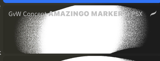
firstly, here are my two staple brushes. you can find the second brush here, i modified it by making it larger.
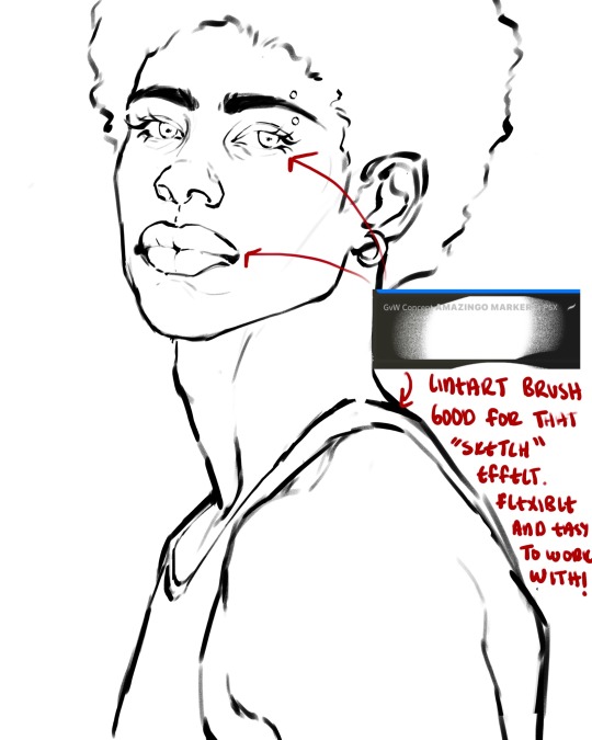
the lineart brush is very good for easy sketching and simultaneously cleaning up that sketch to produce the final lineart you'll be using in your piece. the diffusion from the erased parts/the diffusion created by lowering the pressure of your pen creates a light graphite effect which i enjoy! give it a shot.
you'll notice quickly that there are lighter strokes throughout this lineart, these are simply acting as rendering guides for me in order to remember certain placements. i erase/draw over these lines a lot.
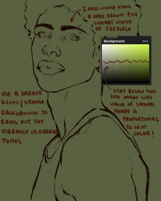
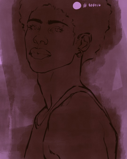
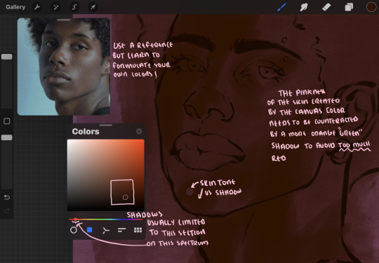
i initially learned to shade skin on a completely grey background with very slight orange undertones, and for a while this was very helpful in providing the most objective view of the base colors you're using (objective as in free of being effected by colors of different values). as you might know, using a white background for dark skin will seemingly darken the value and dim the vibrancy of your base colors, and using a black background will do the opposite. if you're using a darker skin tone, you want your canvas shade to be of a value that is proportional to your skin tone to avoid the same problems created by colors with too light or dark of a value. now if you're using a screened device to draw, you have the extra burden of screen reflections/wavering color output on different screens, so you're never really sure if the exact color you're using will be consistent across the board. priming your canvas with neutral colors will help with that. whereas priming with more vibrant colors will slightly change the undertone of your skintone (especially if you're using a low opacity brush), but it makes for a funner canvas and more creativity with your color palette imo. if you're a beginner i recommend you stay below the wavy line to avoid too light of a canvas shade.
for these same reasons i avoid keeping my lineart jet black. when you lay down the base colors under a black lineart it can look very unfavorable.
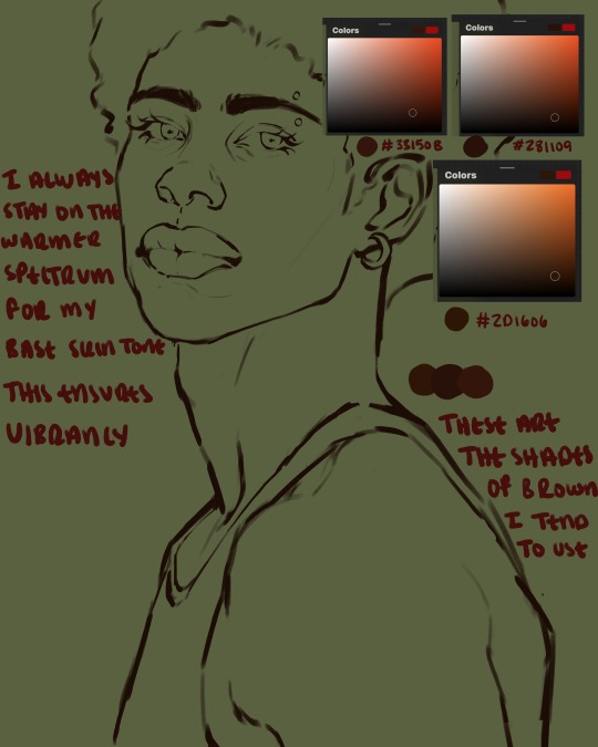
here are some skin tone variants that i tend to use the most, peep how i never wander off too far to the left of the spectrum where the reds are. i definitely favor red-oranges as compared to green-oranges for my skin tones, however, because i stay primarily on the left side of the color spectrum for my rendering, red can quickly become too much too fast. so i make sure to use a skin tone that can work very well with green-orange shadows. for this specific piece i will use the third shade (#2d1606).
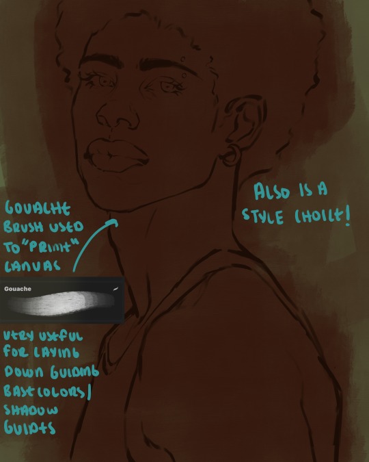
heres where the gouache brush comes in handy. i use it very loosely to "prime" the canvas almost. if you've ever done oil painting you'll realize very few artists draw directly onto a completely white canvas, though i've already primed my canvas essentially by changing the background color, i loosely shade over it with the skin tone color using the gouache brush. i find this gives me a better grasp on the composition of the piece due to increased harmony between the canvas and the skin color. it also looks really cool to me and resembles a real canvas almost.
as stated before, priming your canvas with neutral colors (grey) can help give you a more consistent view of your base colors, when you get the hang of understanding the colors you most often use (i.e, how they interact with other colors), you can start using more vibrant and fun colors to color your canvas with! the gouache brush changes opacity depending on the pressure exerted by the pen, if you zoom in you'll notice patchy areas where the canvas color bleeds through the layer more prominently than it does in other areas. for some people this might throw off the consistency of the shadows, but you should be fine as long as you're using a consistently opaque brush (which we will be doing)
i know i recommended beginners use a grey canvas like i did, but since this tutorial is using my techniques i figured i'd also teach you guys how to use variantly opaque brushes to your advantage. we will be drawing on the pink canvas from here on out.
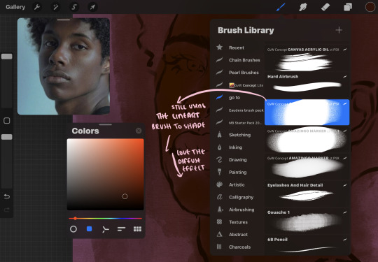
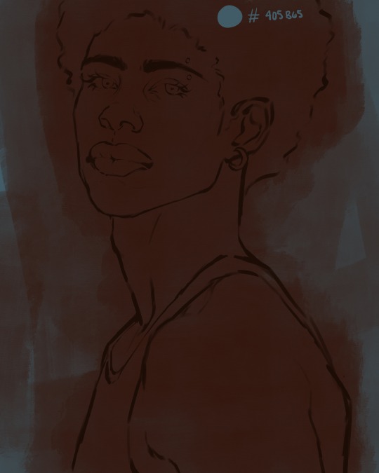
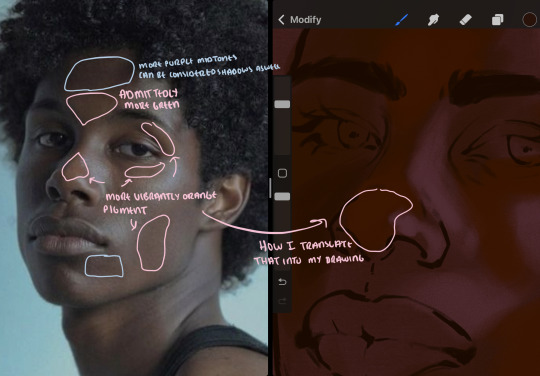
a reference is so helpful, i still rely on references to guide my shadows/lights. i'm past the point of relying on references for exact coordinates for rendering or lineart, but they are still incredibly helpful. in most references of darker skintones you come across, color dropping directly from the picture will give you very grey colors! we want to prioritize vibrancy in this case, so attempt to formulate your own colors or colordrop and increase the vibrancy :)! keep in mind i'm now using the lineart brush to shade. the diffuse/soft corners of this brush allows fewer pixels to be scattered wherever you lessen the pressure, this is perfect for color dropping medium colors to blend two colors together. you'll see how i blend colors later on.
as mentioned previously, red can become too much too fast- so i avoid monochrome rendering as much as possible by using shadows of different undertones. my most frequent combination is using a red-orange skin tone and then using a green-orange shadow.
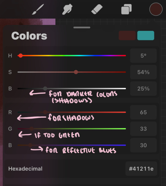
the value spectrum will be your best friend in mixing values and undertones, i use it all the time to formulate the best less saturated darker shadow that is proportional (not too dark, not too grey) to my skintone value. if the shadow is too green simply increase the magenta, if you're looking for a "reflective" shadow, increase the blue.
when i begin shading, i always slide the curser to a truer orange color on the spectrum and increase the saturation (slide towards the right) while i decrease the brightness (slide down). heres how it looks when i'm jumping between shadows and highlights while trying to keep my colors proportional (but not identical) to whats happening in the reference ^. i most often times will rely on the value tool, however.
you will notice that a lot of darker skin tones have patches of orange vibrancy, these areas are most common on the nose and cheeks. this is only a detail to pay attention to if you're going for more of a realism rendering style :)
now onto how i prefer to bridge/blend colors together by utilizing the blend tool.
i do not like simply blurring colors in order to blend colors together, it can lead to overblending which can make your portrait look heavily gaussian blurred (think 2010 deviantart art... yea that). the brilliant thing about procreate is you can utilize brushes really efficiently, which include changing the brushes you use for blending. so in reality, artists who use the blending tool on its own can still have portraits that don't look it! there also exists plenty of brushes that have properties allowing it to blend into its surrounding colors are you draw. but in my case, the above photo is 99% of the times how i will bridge two colors together. doing this allows me to keep pretty consistent brushstrokes across the whole portrait, which i enjoy. it also gives me better control of the shapes i use in my rendering, an aspect that is pretty easy to lose when you're using the blending tool directly and solely.
in case the blending process is a bit hard too see, heres that same process recreated with different more visible colors:
now once you've placed your shadows where they generally tend to be (according to the reference photo), let's make those shapes a bit more specific and pick up on smaller details to make your rendering look more complete.
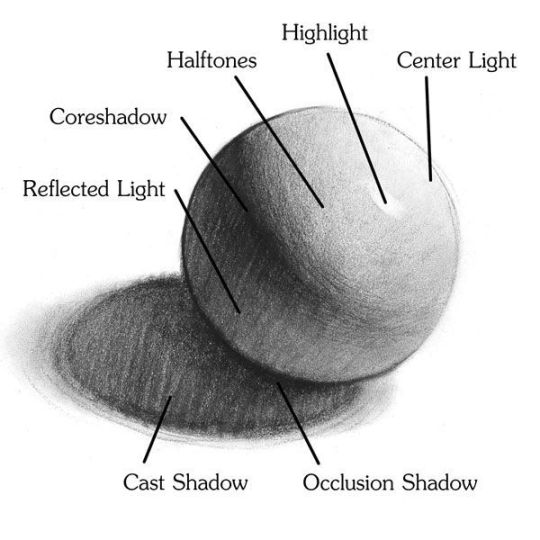
your base colors will never be as dark or as light as you need them to be when you begin rendering, making sure you have a decent contrast between your lightsource highlights and the shadows is key to capturing the essence of a light being cast on your character. it's much easier to keep building upon your shadows before rendering the highlights, i laid down the highlights only to create a guide/help me map my shadows better. do not darken the entirety of the areas affected by shadow, you'll find that shadows are rarely ever the same value, it's a gradual process affected by things like position, height, etc. so make sure the darkest of your shadow colors are preserved only in areas where the shadows are the or should be the darkest.
you'll notice i labeled some areas as "detail", adding very specific shadow placements is a detail. in the reference, the model has a pretty prominent brow bone, creating a shadow over where his eyelid creases just above his lash line, paying attention to feature details like this help enhance the rendering and its realism.
now that i've mapped my shadows i'm going to move onto to rendering my highlights and the region of the face where the lightsource is most prominent.
i described shadows as a gradual process earlier, this is because of the lightsource. light tends to spread when its further from the affected surface, creating a larger area affected by the light. of course, this varies depending on how intense and how close/far the light source is. in this case, the light is being casted above him further to the other side of his face, but again, remember that the face is not 2d and more prominent areas are affected more by light. it's due to this that there still exists a, albeit very minimal, shadow beneath his cheekbone. i exaggerate the shadow here for stylistic purposes, but it also helps in keeping me uphold that contrast between the highlight and shadow once again. so i refrain from blending the light into this area like i did in other areas.
midtones are the areas most unaffected by the light source, they're neither shadows nor highlights. and because light spreads, it is brighter in certain areas and darker in others. it is most easiest to blend the darker ends of the highights into the midtones of your portrait. you can emulate this by once again using your blend tool. blend the outer areas of the light and colordrop this color and use it as the darker light more proportional to the midtones. note that before i add even lighter shades to the areas where light is most concentrated, i blend what highlight placements i currently have there.
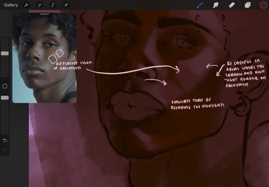
we're going to switch gears now and focus on the reflective shadow occurring on the darker half of his face.
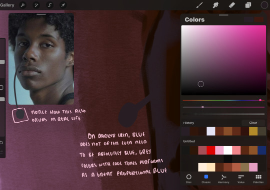
this shadow is a reflection from the lighter background the model is up against, the light being casted above him is allowing for some bounce back from his surroundings, leading to very faint light visible in areas primarily affected by shadows. hence why i'm referring to these colors as "reflective shadows".
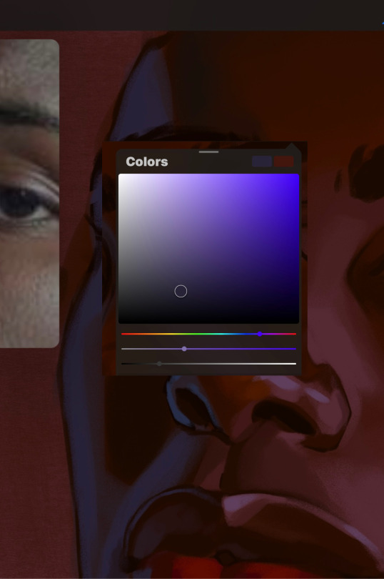
in this case, the reflective shadows are blue, or appear to our eyes as blue. on darker skin, "true" blues (blue-purple) are not often times present. what is present rather, is a very grey tone with cool undertones/a grey tone on the blue side of the spectrum, which creates a blue that is much more proportional to the value of the skintone than a true blue. in this case i used a deeper grey on the pink color spectrum, which is more purple. this was intentional, and was done in order to create some sort of color harmony between the contrasted deep oranges im using for the bordering shadows and the blue-grey i'm attempting to emulate.
while i utilize this blue-grey, out've a purely stylistic choice, i still introduce true blues to my rendering. in fact i love using blue/purple reflective shadows in my art, it creates a stunning and colorful render. in this case, i used the blue-grey as a stepping stool to introduce that trueer blue more naturally. you'll see this happening in the second picture above, where i used a slightly more vibrant and slightly more brighter blue, and used it on areas where this reflection was more prominent (and therefore brighter).
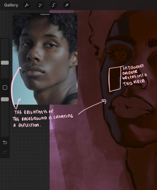
you'll notice how the shadows that border on these reflective colors are less saturated and darker than the shadows on his chin. introduce a darker and less saturated (more green) shadow to that area on his cheek and the darkest shadow of this photo, the sunken area near his nose bridge and inner eye corner. i emphasize this line in the lineart so you can follow this shadow more accurately:
this is also a detail in my opinion and can make your portrait more realistic if you include.
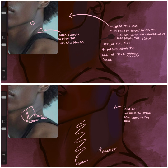
we're going to pivot to his neck area before continuing. you'll find the area of his neck with the most light is also the least vibrant, i laid down a grey base color to emphasize this detail in the portrait. afterwards i added key details. i wanted to stay at least somewhat true to the color dynamics occurring in the reference hence why i used the grey, but i'm not a very big fan of using blatant grey directly on the skin, so i made it more blue.
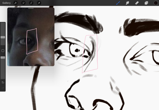
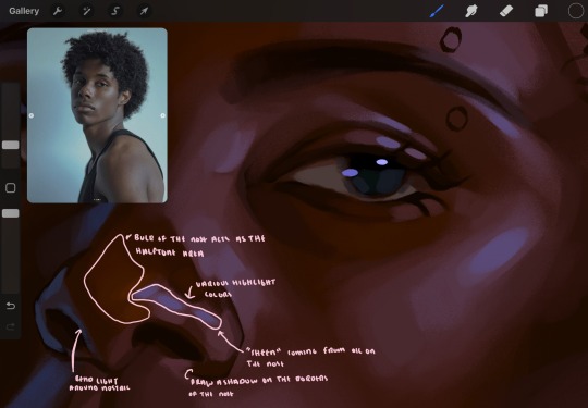
moving forward, the outer eye and the nose can be some of the most "detail focused" areas of the face when it comes to rendering. due to their more "bulbous" anatomy, light tends to curve around them in more complex ways than the flatter parameters of the face.
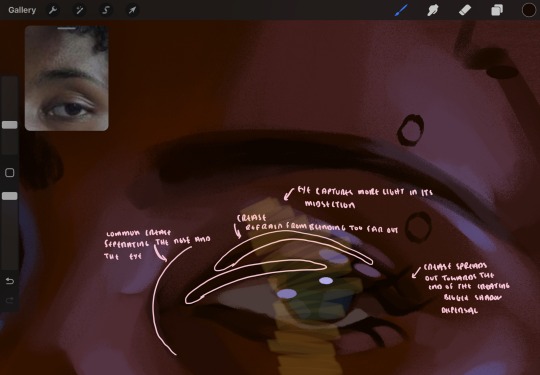
when it comes to the many creases that surround the eye, the skin folding over itself creates a very thin shadow from between the folds. the key to rendering this crease is to concentrate the blending to a very small scale, do not overblend the area because the hill created by the crease very easily captures light, creating an area where the shadow and highlight meet in very close proximity. slight blending is needed for this area, you can deepen the shadows in both horizontal corners of the eye for more accuracy. the midsection of the total eye area (eyeball and socket) tends to capture the most light, remember this is due to how bulbous rounder shapes tend to capture light from whichever direction its coming from.
this is of course the case for the nose as well. highlights are typically placed as a dot on the outermost part of the nose by artists, but highlights also spread on either side of the tip of the nose. the nose tends to collect a lot of oil, creating a sort of sheen on the upper parts of the nostril. when rendering a portrait where the position of the head is more cast to the side, the highlight of the nose changes from the bulb of the nose, to the upper nostril. in this case, the highlight spreads, causing a "half tone", or the remnants of the light on the bulb of the nose. this is the easiest place to blend highlights and shadows together. now for the shadow detailing on the nose, i'm actually drawing on top of the lineart on a separate layer. which i'll go into detail about in the next part. you want to focus the shadow on where your lineart is, the outermost part of the nose.
now were going to really detail your portrait by introducing a new layer, the detail layer! this isn't technically apart of the skin rendering, so i'm gonna keep it very brief. this is the layer you're going to render the lips, eyeballs, and eyebrows. more specifically, the purpose of this layer is to reduce the reliance on lineart. in terms of order, it goes above the lineart layer. we're going to soften and even erase the lineart in certain aspects. i use bolder/thicker lines when creating my lineart, but this can become a nuisance/hinderance when rendering.
starting out with the lips:
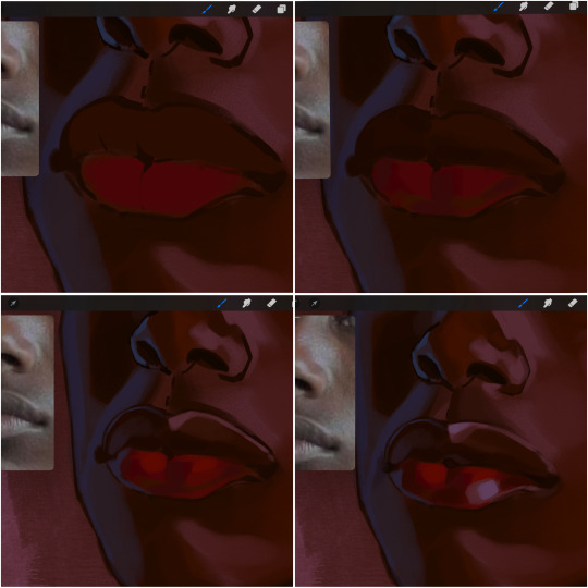
people w brown skin tend to have two toned lips, with the top lip resembling the same skin tone as the face and the bottom lip being redder/pinker and lighter than the upper lip. in my case, i prefer a more vibrant red for the bottom lip. once i lay down these base colors, i begin shading on the second layer.
i personally enjoy the look of a poutier lip shape, this includes emphasizing the middles of the lips as opposed to the ends. i've highlighted the shapes that this lip shape often entails. the small circles on the corner of the lip line are just pockets that occur when the mouth is closed and become emphasized by the fat around the mouth. the parameters of the lip lines do not often meet these round corners, theres often times a "double lip line", that exists around these areas. i love including that in the art, its very easy to emphasize by simply drawing a highlight from the corner of the lips along the curvature of the bottom lip towards the middle.
shadow mapping on the lips tend to go: highlight, shadow, highlight, shadow. the top lip going inward creates a highlight on the most outward part: the top of the lip. and the bottom lip curving outward thus creates a shadow on the bottom of the lip.
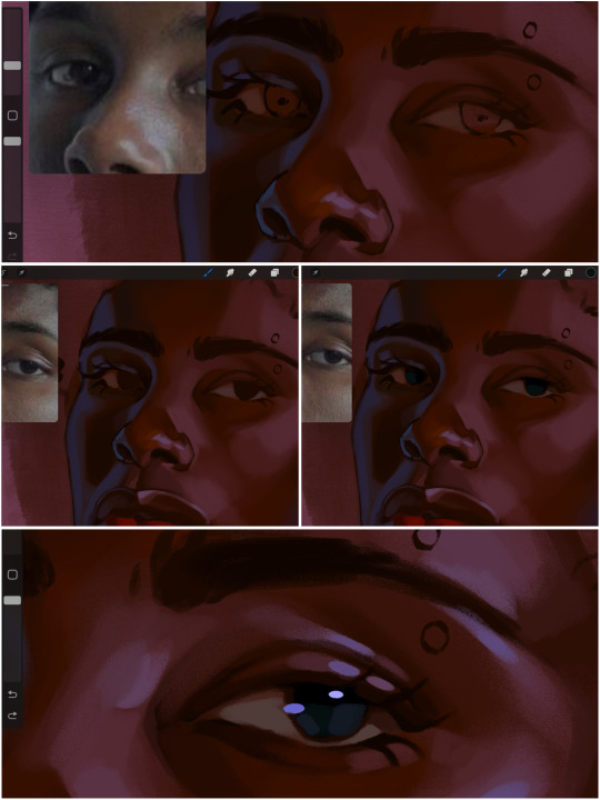
when it comes to the eyeball, i don't draw the white parts as solid white, nor do i make them too bright most of the time. they're most often times an orange grey, i also dont spread this color out if you can notice the uncolored white part of the eye. i do this intentionally to keep some of the shadows that are naturally present on the eye. very specifically right where the upper eyelid sits on the eyeball, it tends to create a small shadow that follows the curvature of the eye. this shadow is crucial, if you can see the first and second picture do not have this shadow, making the iris look more exposed and the eye appears to be held wider.
when it comes to the iris, i do very little. if i'm drawing a dark colored eye i will cover the entire iris brown, before darkening it with an almost black color. i leave the brown sides of the iris exposed to aid in bridging the values between the whiter parts of the eye and the very dark iris. this blended ring also appears on all eyes in real life. lastly, dark eyes tend to show light reflections much easier than lighter eyes. these reflections can be any color in art, in this case i kept it blue-green. i bend these reflections around where the pupil would most likely be depending on the drawing.
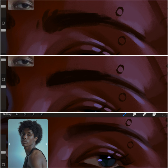
next, the eyebrow. i find it tedious to draw individual eyebrow strands when it comes to rendering, i actually prefer to blend the parameters of the eyebrows to create cohesiveness. sparse and fine eyebrow hairs are penetrated by light and shadows more than what you'd find on the scalp. it's harder to see light on someones scalp due to the bulk of hair crowding the scalp, whereas as its easier to see such light on the eyebrow. to introduce this concept to my art, i will initially draw the entire shape of the brow. then when rendering, i erase the parameters, leaving the darkest part of the brow. then i blend. the lower brow bone will be blended the least, whereas the area of the eyebrow connected to the T zone will be the most blended thanks to the shadow following the nose bridge. the far end of the brow by the hairline tends to be the lightest given the light source.
and lastly, i loosely draw a white border around the portrait for stylistic purposes. then i combine the layers (group together your layers, then duplicate and compress the duplicate group so that you still retain your individual layers) to edit. i typically add noise and play with the curve setting. and heres the finished image:
i hope you enjoyed!!
#i didnt proofread this if u find spelling errors pls lmk#black artists on tumblr#digital art#illustration#painting#black art#commissions#tutorial#art tutorial#how to shade#rendering tutorial#brushes
281 notes
·
View notes
Note
hi! would it be possible to post a tutorial of how you created the shapes in this set /post/753222419295158272 thank you :)
sure I made the gifset a while ago so don't have the psds saved but i decided to make a new gifset with a similar shape effect and show you how i made that :)
tutorial below the banner/cut

first start by making and colouring your base gif as you'd like. for the example i'm making today i'd like a pink gif.
for simplicity i'll put all the colouring layers in a group so it is easier to see what's going on with the shapes, but this is not a step i usually take.

once you've got your base gif ready search for the image/shape you would like to appear on your gif. in this case i searched for glinda's crown :)
make sure the image has no background and save it. if needed go to https://www.remove.bg/ and remove the background from the image then save it.
open your saved image in photoshop and drag it onto your gif. typically i drag it on the gray area outside the image canvas so it will land in the centre of the canvas.


if the image is too big resize it by using the transform function (ctrl +t)

right click the image layer and go to "Blending Options" (you can also do this by double clicking the layer (but not on the layer name as this will prompt renaming the layer)


go to color overlay and change the colour to white with blend mode normal and click ok

convert the new image layer to a smart object by right clicking and selecting the relevant option

change the blending mode of the new smart object to 'difference'

go back into blending options now and change the color overlay to the desired colour with the blending mode set to 'color'

at this point you can also add a stroke and drop shadow


this results in the below result

i noticed a bit of background missed from remove.bg

so i now add a layer mask and mask over the errant mark


and that's the basics of how to make a shape like the one in the gifset you linked. you can now add any text or other embellishments you may like.
a few other tips:
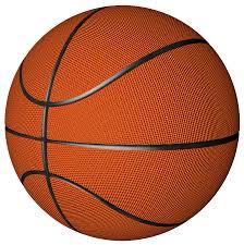
play around with your stroke settings, i did this a lot when making the so highschool gifset (e.g. i think the basketball one used the centre option)
the stroke option will outline what doesn't have a solid fill. to get each part of the basketball outlined like it is in the gifset i used an image like the first one below where the lines on the ball were also transparent to get the strokes i wanted (if that makes sense). if the whole image was solid, like the second image the outline would just be a circle basically.

in most cases the method i showed here is the best method, but for the so highschool book image i did something slightly different where instead of doing a straight smart object i also duplicated the shape on top with all the details left in. i applied the same effects to the bottom layer as above and on the duplicated layer also set that to difference and added a color overlay like the above


gives a result like this:

you can tweak how this looks a bit by using a selective colour layer clipped to the top layer. i wanted a bit more definition on the hat so i ended up with this after tweaking the neutral and blacks channels

overall my advice is to experiment and see what you like as that is what i basically do :)
#asks#resources#ps help#usergif#allresources#yeahps#completeresources#resourcemarket#dailyresources#tutorials#photoshop tutorial#*mine#i hope this helps/makes sense
91 notes
·
View notes
Text
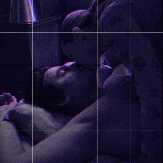
Someone asked me how I created the fade transition in this gifset which I’ll try to explain in the most comprehensive way that I can. If you've never done something like this before, I suggest reading through the full tutorial before attempting it so you know what you'll need to plan for.
To follow, you should have:
basic knowledge of how to make gifs in photoshop
some familiarity with the concept of how keyframes work
patience
Difficulty level: Moderate/advanced
Prep + overview
First and foremost, make the two gifs you'll be using. Both will need to have about the same amount of frames.
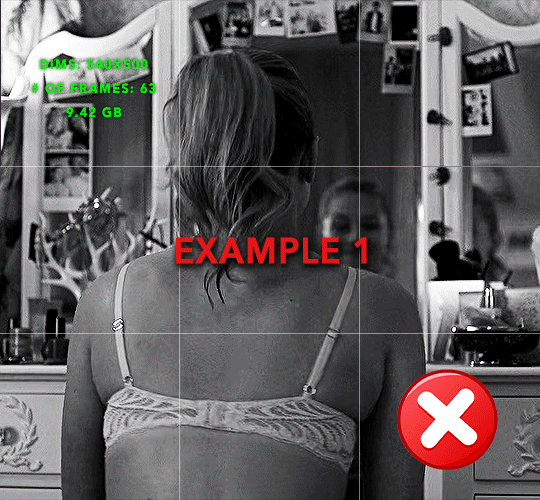
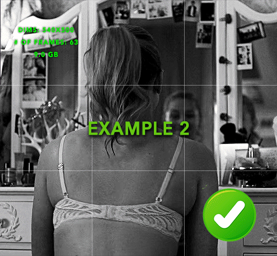
For ref the gif in my example is 540x540.
I recommend around 60-70 frames max total for a big gif, which can be pushing it if both are in color, then I would aim for 50-60. My gif has a total of 74 frames which I finessed using lossy and this will be explained in Part 4.
⚠️ IMPORTANT: when overlaying two or more gifs and when using key frames, you MUST set your frame delay to 0.03 fps for each gif, which can be changed to 0.05 fps or anything else that you want after converting the combined canvas back into frames. But both gifs have to be set to 0.03 before you convert them to timeline to avoid duplicated frames that don't match up, resulting in an unpleasantly choppy finish.
Part 1: Getting Started
Drag one of your gifs onto the other so they're both on the same canvas.
The gif that your canvas is fading FROM (Gif 1) should be on top of the gif it is fading INTO (Gif 2).
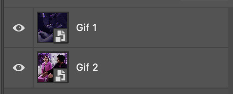
And here's a visual of the order in which your layers should appear by the end of this tutorial, so you know what you're working toward achieving:

Part 2: Creating the grid
Go to: View > Guides > New guide layout
I chose 5 columns and 5 rows to get the result of 25 squares.
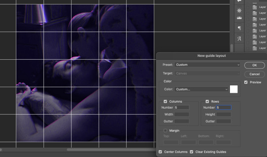
The more rows and columns you choose, the more work you'll have to do, and the faster your squares will have to fade out so keep that in mind. I wouldn't recommend any more than 25 squares for this type of transition.

To save time, duplicate the line you've created 3 more times, or as many times as needed (key shortcut: CMD +J) and move each one to align with the guides both horizontally and vertically. You won't need to recreate the lines on the edges of the canvas, only the ones that will show.
After you complete this step, you will no longer need the guides so you can go back in and clear them.

Follow the same duplicating process for the squares with the rectangle tool using the lines you've created.
Align the squares inside the grid lines. The squares should not overlap the lines but fit precisely inside them.
This might take a few tries for each because although to the eye, the squares look all exactly the same size, you'll notice that if you try to use the same duplicated square for every single one without alterations, many of them will be a few pixels off and you'll have to transform the paths to fit.
To do this go to edit > transform path and hold down the command key with the control key as you move one edge to fill the space.
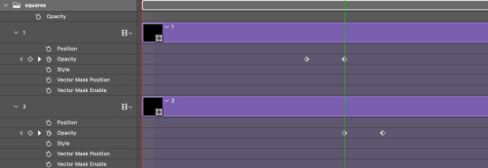
Once you're done, put all the squares in their separate group, which needs to be sandwiched between Gif 1 and Gif 2.

Right click Gif 1 and choose "create clipping mask" from the drop down to mask it to the squares group. This step is super important.
After this point, I also took the opacity of the line groups down to about 40% so the lines wouldn't be so bold. Doing this revealed some squares that needed fixing so even if you aren't going dim the lines, I recommend clicking off the visibility of the lines for a moment to make sure everything is covered properly.

Part 3A: Prep For Key framing
I wanted my squares to fade out in a random-like fashion and if you want the same effect, you will have to decide which squares you want to fade out first, or reversely, which parts of Gif 2 you want to be revealed first.
In order to see what's going on underneath, I made Gif 1 invisible and turned down the opacity of the squares group.

If you want text underneath to be revealed when the squares fade away, I would add that now, and place the text group above Gif 2, but under the squares group.

Make a mental note that where your text is placed and the order in which it will be revealed is also something you will have to plan for.
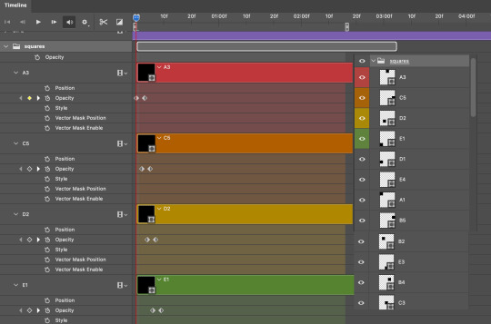
With the move tool, click on the first square you want to fade out. Every time you click on a square, it will reveal itself in your layers.
I chose A3 to be the first square to fade and I'm gonna move this one to the very top of all the other square layers.
So if I click on D2 next, that layer would need to be moved under the A3 layer and so on. You'll go back and forth between doing this and adding key frames to each one. As you go along, it's crucial that you put them in order from top to bottom and highly suggested that you rename the layers (numerically for example) which will make it easier to see where you've left off as your dragging the layers into place.

Part 3B: Adding the Keyframes
This is where we enter the gates of hell things become tedious.
Open up the squares group in the timeline panel so you can see all the clips.
Here is my example of the general pattern that's followed and its corresponding layers of what you want to achieve when you're finished:
So let’s try it!
Expand the control time magnification all the way to the right so you can see every frame per second.

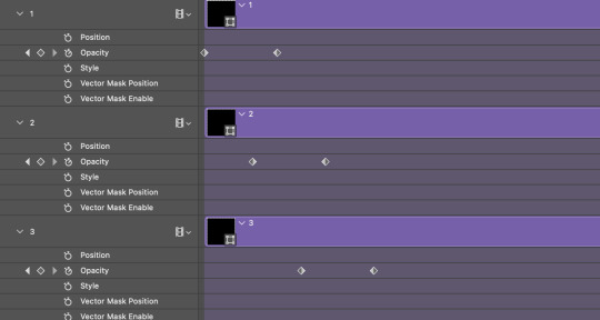
As shown in Part 3A, select your first chosen square.
Where you place the time-indicator on the panel will indicate the placement of the keyframe. Click on the clock next to opacity to place your first keyframe.

Move the time-indicator over 3 frames and place the next key frame.

Things to consider before moving forward:
Where you place your very first keyframe will be detrimental. If you're using a lot of squares like I did, you may have to start the transition sooner than preferred.
If you're doing 25 squares, the key frames will have to be more condensed which means more overlapping because more frames are required to finish the transition, verses if you're only using a 9-squared grid. See Part 4 for more detailed examples of this.
The opacity will remain at 100% for every initial key frame, and the second one will be at 0%.
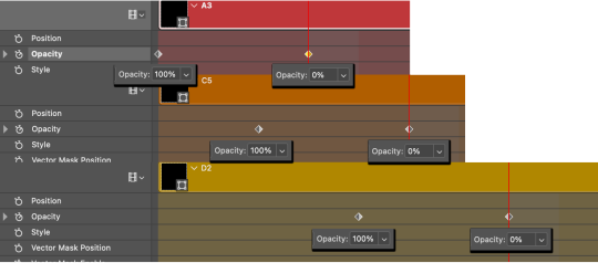
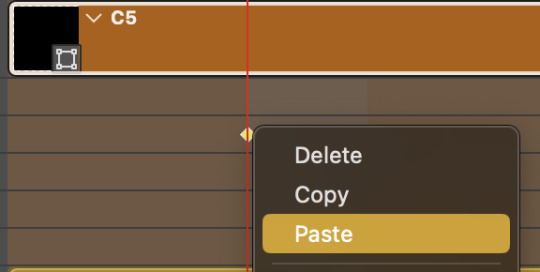
Instead of creating two keyframes like this and changing the opacities for every single clip, you can copy the keyframes and paste them onto the other clips by click-dragging your mouse over both of them and they'll both turn yellow. Then right click one of the keyframes and hit copy.
Now drop down to your next clip, move your time-indicator if necessary to the spot where the first keyframe will start and click the clock to create one. Then right click it and hit "paste".

Tip: When you have both keyframes selected, you can also move them side to side by click-dragging one of them while both are highlighted.
Your full repetitive process in steps will go as follows:
click on square of choice on the canvas
drag that square layer to the top under the last renamed
in timeline panel: drop down to next clip, move time-indicator tick to your chosen spot for the next keyframe
create new keyframe
right click new keyframe & paste copied keyframes
repeat until you've done this with every square in the group
Now you can change the opacity of your squares layer group back to 100% and turn on the visibility of Gif 1. Then hit play to see the magic happen.
PART 4: Finished examples
Example 1
the transition starts too soon Cause: initial keyframe was placed at frame 0
the squares fade away too quickly Cause: overlapping keyframes, seen below. (this may be the ideal way to go with more squares, but for only 9, it's too fast)
Example 2
more frame time for first gif
transition wraps up at a good point Cause: in this instance, the first keyframe was placed 9 frames in, and the keyframes are not overlapping. The sequential pair starts where the last pair ended, creating a slower fade of each square.
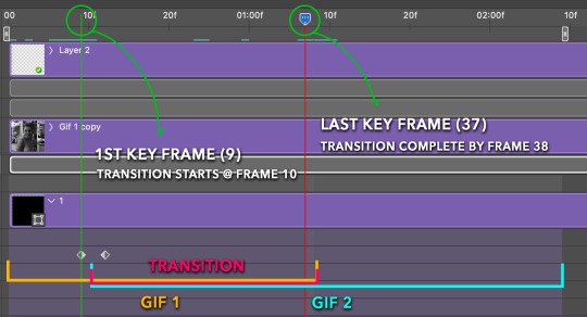
Part 5: Final Tips and Saving
You can dl my save action here which will convert everything back into frames, change the frame rate to 0.05 and open the export window so you can see the size of the gif immediately.
If it's over 10gb, one way to finesse this is by use of lossy. By definition, lossy “compresses by removing background data” and therefore quality can be lost when pushed too far. But for most gifs, I have not noticed a deterioration in quality at all when saving with lossy until you start getting into 15-20 or higher, then it will start eating away at your gif so keep it minimal.

If you've done this and your gif is losing a noticeable amount of quality and you still haven’t gotten it below 10mb, you will have no choice but to start deleting frames.
When it comes to transitions like this one, sometimes you can't spare a single frame and if this is the case, you will have to return to the timeline state in your history and condense the key frames to fade out quicker so you can shorten the gif. You should always save a history point before converting so you have a bookmark to go back to in case this happens.
That's pretty much it, free to shoot me an ask on here or on @jugheadjones with any questions.
#gif tutorial#photoshop tutorial#transition tutorial#grid tutorial#usergif#ps help#tutorials#tutorials*#resources*#requested
412 notes
·
View notes
Text
ᯓ MOBILE EDITING APPS ୨୧
!!! % multipurpose: 𖥻
★ picsart
★ canva
⠀
!!! % for text: 𖥻
★ phonto
⠀
!!! % for drawing: 𖥻
★ ibispaintx
⠀
!!! % to fix quality: 𖥻
★ remini
⠀
!!! % for filters, effects + preset edits: 𖥻
★ B612
★ snow
★ soda
★ prequel
★ epik
★ hypic
★ glitch lab
★ vaporgram
⠀
!!! % for presets: 𖥻
★ polarr
★ foodie
★ vsco
★ koloro
★ lightroom
⠀
!!! % to edit and make gifs: 𖥻
★ gif maker, gif editor
★ gif maker - gif editor
⠀
!!! % to remove background (to make pngs): 𖥻
★ background eraser
(you can also use picsart for this)
⠀
!!! % to find pictures and resources like moodboards, unfiltered ulzzangs, editing needs, etc: 𖥻
★ deviantart
★ pinterest
★ tumblr (if u do some research)
⠀
!!! % font keyboard: 𖥻
★ fonts keyboard
★ stylish text - font keyboard
⠀
!!! % for aesthetic symbols: 𖥻
★ unicode pad
⠀
!!! % for kaomojis: 𖥻
★ kaomoji
⠀
!!! % for video editing: 𖥻
★ alight motion
★ capcut
★ kinemaster
★ rarevison vhs camcorder (it's just for the vhs filter)
★ vn
★ funimate
#editing needs#resources#aesthetic#kaomoji#symbols#aesthetic symbols#carrd icons#messy bios#bios#bio#soft#messy moodboard#messy layouts#messy icons#kpop moodboard#kpop layouts#kpop icons#aesthetic moodboard#aesthetic bios#aesthetic icons#aesthetic dividers#rentry inspo#kpop#kaomojis#carrd#icons#twitter#layouts#messy symbols#inspiration
595 notes
·
View notes