#Brian Duffy Photography
Explore tagged Tumblr posts
Text
Capturing Icons The Legendary Photography of Gered Mankowitz!
Gered Mankowitz is a London photographer, born in 1946 as the first son of the late playwright, author, and film writer Wolf Mankowitz. He is well-known and respected as a celebrity portrait photographer, having once been the Rolling Stones official photographer and taken internationally recognized images, such as the cover shot of Jimi Hendrix for 'Ultimate Experience.
#photographic art gallery#photographic gallery#photographic exhibition#brian aris#eric ceccarini#professional photographs#terry oneill photographer#jimi hendrix art#brian duffy photography
0 notes
Text

Brian Duffy - Pirelli Calendar (1965)
#brian duffy#pirelli calendar#photography#fashion photography#vintage fashion#vintage style#vintage#retro#aesthetic#beauty#60s#60s fashion#1960s#1960s fashion#swinging sixties
147 notes
·
View notes
Text


Jane Birkin, London 1965 Photography by Brian Duffy
#girlblogging#lana del rey#vintage fashion#vintage aesthetic#marilyn monroe#this is a girlblog#1960s#jane birkin#lana del rey aesthetic#1960s fashion#1960s model#1960s style#1960s history#swinging london#swinging sixties#swinging 60s#girlsofthesixties#sixties#60s#60s fashion#marianne faithfull#girlblogger#coquette#dollette#gaslight gatekeep girlboss#lana del ray aka lizzy grant#girlblog#girlblog aesthetic#brian duffy#photography
88 notes
·
View notes
Text

Brian Duffy, David Bowie
15 notes
·
View notes
Text

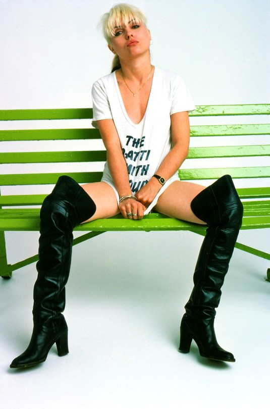
Debbie Harry, 1977 by Brian Duffy
#Brian Duffy#Debbie Harry#music#music photography#punk rock#fashion photography#fashion editorial#vintage
99 notes
·
View notes
Text

"This vintage image, signed by Duffy, is revealed for the 1st time to celebrate the 44th anniversary of the 1980 Scary Monsters (& SuperCreeps) album launch. This was the 5th and final shoot Duffy worked with Bowie and their 3rd album cover." (via duffy-archive on instagram)
#i mean it's been seen in the contact sheet before but the signature is new#but this is the first actually detailed version of the photo i think so i'm sharing it here in case y'all aren't on insta#david bowie#scary monsters (and super creeps)#80s music#brian duffy#ashes to ashes#bowieposting#photography
11 notes
·
View notes
Text

Benson & Hedges advert by Brian Duffy.
#Duffy#Brian Duffy#photographers#advertising#advertising photography#product photography#cigarettes#smoking#fatal#fatalism#disaster
3 notes
·
View notes
Text

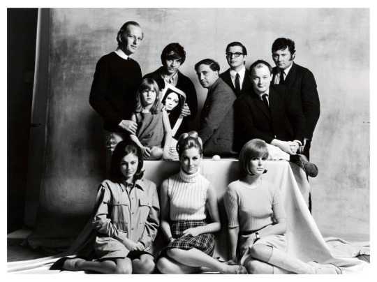
Six photographers with their favourite models by Terence Donovan
#David Bailey#Susan Murray#Len Fulford#Don Silverstein#Sandra Paul#Brian Duffy#Paulene Stone#Terence Donovan#Jackie Bisset#John Cowan#Carolyn Cowan#photography#1960s#black and white photography#UK
6 notes
·
View notes
Text
Brian Duffy for Queen magazine, 1965
0 notes
Text
Rankin Research Task
Photographer Research
Cecil Beaton
Beaton was a British fashion photographer and set designer. Demonstrating an aptitude for a very wide range of creative areas from a young age, Beaton showed a particular interest in photography throughout his whole young life in education. Leaving Cambridge without a degree, however, he spent some time in New York to properly learn about photography until being recognised by New York Vogue in 1927, who took him on as a staff photographer. He would also go onto work for the magazines London and Paris counterparts in the 30s, as well vanity fair where he would feature multiple Hollywood starlets in his front covers during this decade. He was even favoured by the British royal family and took portraits of its highest-ranking members on multiple occasions.
Setting the tone for fashion photography at this time, Beaton was known for extravagant and well thought-out set designs in his work, likely drawing from his multiple other design and art based skills. This could also likely be due to the fact Beaton was known for not being too technically reliant on the camera itself but preferred to approach shoots as setting up model and set as close to his vision as possible till it was a simple matter of pressing the shutter. Often taken on his standard rolliflex that he used a lot. These sometimes obscure backdrops, often with geometric shapes and patterns, paired with the classy, glamorous yet conservative aesthetic of the 30s resulted in very unique imagery which is what I would say what eventually helped cement him into the household name that he is in fashion today.

Here is a good example showing Beaton's affinity for geometry and shapes in the 30s - the polkadots compliment the cow print of the lady's coat ensuring there is a cohesive theme throughout. They also provide a glamorous yet fun feeling to the image which is why I think it is quite unique for a fashion image from this time. Lighting up the draped polkadot sheet from behind helps the texture of it to be more visible which I like, while also blowing out the middle section so the outline of the lady's profile stands out even more.

I really enjoy this image for its simplicity in its use of the negative space. This combined with the high-key nature of the photograph, using strong lighting to blow out the details and textures on the walls makes it even easier for the model to be the focus of the image. The photographers use of the rule of thirds also helps this.

Another prime example of Beaton's expert use of geometry. The repeating squares not only help frame the model but the repetition draws the viewers eye into the centre, like an optical illusion, ensuring the viewers eye is always focused on the model. The high contrast and even use of lighting to limit shadows helps to keep the patterns nice and flat, making the image as effective as it is.

In this photograph, I like how the model has been positioned in between the two mirrors to showcase both her side profiles - which is always a good idea when shooting a fashion image and gives it more depth. The overheard light illuminating the dust on the upper part of the mirrors is also a nice detail and helps bring out the polished nature of the models clothes, as well as the softness of her face.
David Bailey
David Bailey is a renowned English fashion photographer, along with photographers Terence Donovan and Brian Duffy, he helped cultivate and capture the image and energy of the "swinging 60's" - a period in British culture where popular culture and pop music heavily influenced fashion, as well as instilling a free, permissive attitude into the nation. Bailey left school at the age of 15 and would go through a series of dead-end jobs in his early years and even being called briefly into the army until 1958. It was after this that he was determined to pursue photography. Getting rejected from the royal college due to his lacking in education, he worked as a studio assistant in multiple studios gaining experience for very little pay until finally getting contracted by British vogue in 1961. He worked with the magazine through most of the decade as first on staff, then as a freelancer for 15 years.
Baileys style could be defined by stark black and white backgrounds with high contrast, usually cropping in quite tightly with a square crop. His subjects being a huge variety of celebrities and household names at this time. His series of "clean-white" studio portraits that show close-ups of his subjects against a flat white backdrop is where some of his most well-known shots have been created. He directed and interacted a lot with his models in order to get the shots he wanted, viewing them as being the most important aspect of a fashion photo.

One from his "clean-white" series, using separate lights on a white backdrop to create a flat, white space allow the shadows and form created on the subjects to be fully appreciated. The use of the flamingo and model on equal sides of the frame balance the composition. The featuring of the bird also gives narrative to the models feathery headpiece - resulting in what I think is a very chic but fun fashion image.

I really enjoy baileys use of colour here, the saturation of the yellow with the deep reds representing the shadows instead of black create a very eye catching result. The use of the mash fabric over the face is also really nice as it creates this grainy quality within the shadows, while interacting with the light and distorting the models face in a subtle way.

In this studio image, the way Bailey has the model facing away from the camera allows for the viewers full attention to be on the back of the dress, which I like for a fashion shot. The way the folds wrap around like a wave and create these nice gradients of shadow are very pleasing to look at. I also like how there is more negative space showing the edges of the backdrop to add more context.

Another clean white studio shot. The way the photographer has got the camera really close to the model captures a lot of detail on the models face as well and the texture created by the rim of the hood, and it blends nicely into the white background. The way the model is posed with the hood tight around their face implies a boyish fun nature which I think the photographer has done purposefully to accurately capture their personality.
1 note
·
View note
Text
Visions Unveiled: A Photographic Journey by Duffy Photography!
Discover the world through a lens at Brian Duffy Photography Art Gallery. Capturing moments frozen in time, our exhibition showcases the beauty of life, nature, and human emotion. Each photograph tells a unique story, inviting you to explore the intricate details and vibrant colors that paint our world. Join us in celebrating the artistry of photography.
#photographic gallery#brian aris#eric ceccarini#photographic exhibition#photographic art gallery#professional photographs#terry oneill photographer#jimi hendrix art#Brian Duffy Photography
0 notes
Text

Brian Duffy - Vogue Patterns Ad (Vogue UK 1965)
#brian duffy#pattie boyd#vogue#photography#fashion photography#vintage fashion#vintage style#vintage#retro#aesthetic#beauty#sixties#60s#60s fashion#1960s#1960s fashion#swinging sixties#editorial#vogue uk#vogue patterns
136 notes
·
View notes
Photo

British gangster, Reggie Kray playfully spars with his grandfather, Jimmy ‘Cannonball’ Lee. c.1967 (photo: Brian Duffy)
101 notes
·
View notes
Photo

Photo: Brian Duffy - 1968.
84 notes
·
View notes
Text

Amanda Lear by Brian Duffy
47 notes
·
View notes
Photo

Jane Birkin, 1960s
By Brian Duffy
#jane birkin#british model#british actress#french icons#1960s icons#1960s fashion#60s style#60s icons#60s singer#60s actresses#60s aesthetic#60s vintage#60s 70s 80s 90s#photography#black and white#brian duffy
56 notes
·
View notes
