#Article:
Explore tagged Tumblr posts
Visit Tumblr Blog
Explore Tumblr blogs with no restrictions, modern design and the best experience.
Last Seen Tumblr Blogs


Fun Fact
Tumblr was the first site to host the blog for President Barack Obama in 2011.
Text
The Importance of Investing in Soft Skills in the Age of AI
New Post has been published on https://thedigitalinsider.com/the-importance-of-investing-in-soft-skills-in-the-age-of-ai/
The Importance of Investing in Soft Skills in the Age of AI
I’ll set out my stall and let you know I am still an AI skeptic. Heck, I still wrap “AI” in quotes a lot of the time I talk about it. I am, however, skeptical of the present, rather than the future. I wouldn’t say I’m positive or even excited about where AI is going, but there’s an inevitability that in development circles, it will be further engrained in our work.
We joke in the industry that the suggestions that AI gives us are more often than not, terrible, but that will only improve in time. A good basis for that theory is how fast generative AI has improved with image and video generation. Sure, generated images still have that “shrink-wrapped” look about them, and generated images of people have extra… um… limbs, but consider how much generated AI images have improved, even in the last 12 months.
There’s also the case that VC money is seemingly exclusively being invested in AI, industry-wide. Pair that with a continuously turbulent tech recruitment situation, with endless major layoffs and even a skeptic like myself can see the writing on the wall with how our jobs as developers are going to be affected.
The biggest risk factor I can foresee is that if your sole responsibility is to write code, your job is almost certainly at risk. I don’t think this is an imminent risk in a lot of cases, but as generative AI improves its code output — just like it has for images and video — it’s only a matter of time before it becomes a redundancy risk for actual human developers.
Do I think this is right? Absolutely not. Do I think it’s time to panic? Not yet, but I do see a lot of value in evolving your skillset beyond writing code. I especially see the value in improving your soft skills.
What are soft skills?
A good way to think of soft skills is that they are life skills. Soft skills include:
communicating with others,
organizing yourself and others,
making decisions, and
adapting to difficult situations.
I believe so much in soft skills that I call them core skills and for the rest of this article, I’ll refer to them as core skills, to underline their importance.
The path to becoming a truly great developer is down to more than just coding. It comes down to how you approach everything else, like communication, giving and receiving feedback, finding a pragmatic solution, planning — and even thinking like a web developer.
I’ve been working with CSS for over 15 years at this point and a lot has changed in its capabilities. What hasn’t changed though, is the core skills — often called “soft skills” — that are required to push you to the next level. I’ve spent a large chunk of those 15 years as a consultant, helping organizations — both global corporations and small startups — write better CSS. In almost every single case, an improvement of the organization’s core skills was the overarching difference.
The main reason for this is a lot of the time, the organizations I worked with coded themselves into a corner. They’d done that because they just plowed through — Jira ticket after Jira ticket — rather than step back and question, “is our approach actually working?” By focusing on their team’s core skills, we were often — and very quickly — able to identify problem areas and come up with pragmatic solutions that were almost never development solutions. These solutions were instead:
Improving communication and collaboration between design and development teams
Reducing design “hand-off” and instead, making the web-based output the source of truth
Moving slowly and methodically to move fast
Putting a sharp focus on planning and collaboration between developers and designers, way in advance of production work being started
Changing the mindset of “plow on” to taking a step back, thoroughly evaluating the problem, and then developing a collaborative and by proxy, much simpler solution
Will improving my core skills actually help?
One thing AI cannot do — and (hopefully) never will be able to do — is be human. Core skills — especially communication skills — are very difficult for AI to recreate well because the way we communicate is uniquely human.
I’ve been doing this job a long time and something that’s certainly propelled my career is the fact I’ve always been versatile. Having a multifaceted skillset — like in my case, learning CSS and HTML to improve my design work — will only benefit you. It opens up other opportunities for you too, which is especially important with the way the tech industry currently is.
If you’re wondering how to get started on improving your core skills, I’ve got you. I produced a course called Complete CSS this year but it’s a slight rug-pull because it’s actually a core skills course that uses CSS as a context. You get to learn some iron-clad CSS skills alongside those core skills too, as a bonus. It’s definitely worth checking out if you are interested in developing your core skills, especially so if you receive a training budget from your employer.
Wrapping up
The main message I want to get across is developing your core skills is as important — if not more important — than keeping up to date with the latest CSS or JavaScript thing. It might be uncomfortable for you to do that, but trust me, being able to stand yourself out over AI is only going to be a good thing, and improving your core skills is a sure-fire way to do exactly that.
#ai#approach#Article#Articles#Artificial Intelligence#career#circles#code#coding#Collaboration#collaborative#communication#course#CSS#Design#designers#Developer#developers#development#factor#focus#Future#generative#generative ai#Giving#Global#hand#how#how to#HTML
4 notes
·
View notes
Photo

PORTO ROCHA
1K notes
·
View notes
Photo
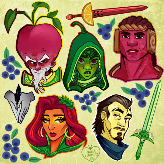
🧀🥪🌶️🥭 The Ravening War portraits 🧀🥪🌶️🥭
patreon * twitch * shop
[ID: a series of digitally illustrated portraits showing - top left to bottom right - Bishop Raphaniel Charlock (an old radish man with a big red head and large white eyebrows & a scraggly beard. he wears green and gold robes with symbols of the bulb and he smirks at the viewer) Karna Solara (a skinny young chili pepper woman with wavy green hair, freckled light green skin with red blooms on her cheeks. she wears a chili pepper hood lined with small pepper seeds and stares cagily ahead) Thane Delissandro Katzon (a muscular young beef man with bright pinkish skin with small skin variations to resemble pastrami and dark burgundy hair. he wears a bread headress with a swirl of rye covering his ears and he looks ahead, optimistic and determined) Queen Amangeaux Epicée du Peche (a bright mango woman with orange skin, big red hair adorned with a green laurel, and sparkling green/gold makeup. she wears large gold hoop earrings and a high leafy collar) and Colin Provolone (a scraggly cheese man with waxy yellow skin and dark slicked back hair and patchy dark facial hair. he wears a muted, ratty blue bandana around his neck and raises a scarred brow at the viewer with a smirk) End ID.)
#trw#the ravening war#dimension 20#acoc#trw fanart#ttrpg#dnd#bishop raphaniel charlock#karna solara#thane delissandro katzon#queen amangeaux epicee du peche#colin provolone
2K notes
·
View notes
Photo

(vía Another America 50 by Phillip Toledano)
75 notes
·
View notes
Photo
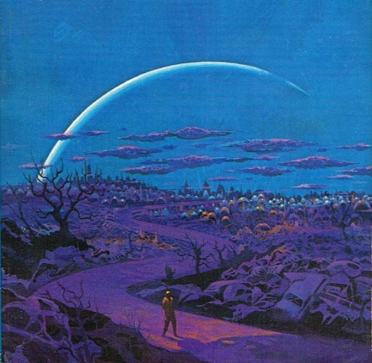
One of my favorites by Paul Lehr, used as a 1971 cover to "Earth Abides," by George R. Stewart. It's also in my upcoming art book!
1K notes
·
View notes
Quote
もともとは10年ほど前にTumblrにすごくハマっていて。いろんな人をフォローしたらかっこいい写真や色が洪水のように出てきて、もう自分で絵を描かなくて良いじゃん、ってなったんです。それで何年も画像を集めていって、そこで集まった色のイメージやモチーフ、レンズの距離感など画面構成を抽象化して、いまの感覚にアウトプットしています。画像の持つ情報量というものが作品の影響になっていますね。
映画『きみの色』山田尚子監督×はくいきしろい対談。嫉妬し合うふたりが語る、色と光の表現|Tokyo Art Beat
156 notes
·
View notes
Photo


#thistension
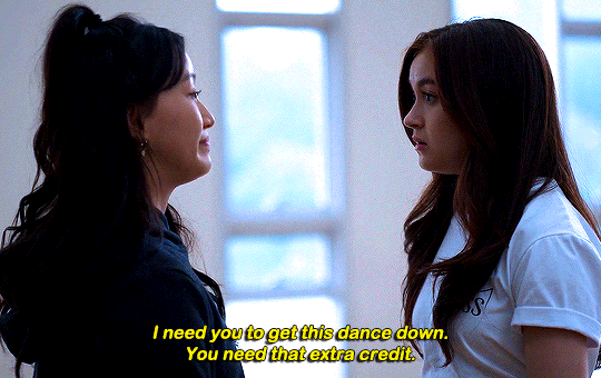
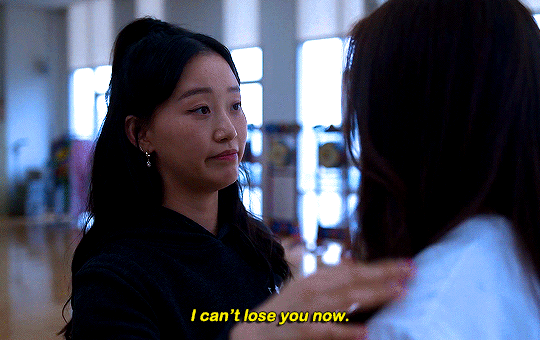
XO, KITTY — 1.09 “SNAFU”
#xokittyedit#tatbilbedit#kdramaedit#netflixedit#wlwedit#xokittydaily#asiancentral#cinemapix#cinematv#filmtvcentral#pocfiction#smallscreensource#teendramaedit#wlwgif#kitty song covey#yuri han#xo kitty#anna cathcart#gia kim#~#inspiration: romantic.#dynamic: ff.
1K notes
·
View notes
Photo

No one wants to be here and no one wants to leave, Dave Smith (because)
111 notes
·
View notes
Text
Revisiting CSS Multi-Column Layout
New Post has been published on https://thedigitalinsider.com/revisiting-css-multi-column-layout/
Revisiting CSS Multi-Column Layout
Honestly, it’s difficult for me to come to terms with, but almost 20 years have passed since I wrote my first book, Transcending CSS. In it, I explained how and why to use what was the then-emerging Multi-Column Layout module.
Hint: I published an updated version, Transcending CSS Revisited, which is free to read online.
Perhaps because, before the web, I’d worked in print, I was over-excited at the prospect of dividing content into columns without needing extra markup purely there for presentation. I’ve used Multi-Column Layout regularly ever since. Yet, CSS Columns remains one of the most underused CSS layout tools. I wonder why that is?
Holes in the specification
For a long time, there were, and still are, plenty of holes in Multi-Column Layout. As Rachel Andrew — now a specification editor — noted in her article five years ago:
“The column boxes created when you use one of the column properties can’t be targeted. You can’t address them with JavaScript, nor can you style an individual box to give it a background colour or adjust the padding and margins. All of the column boxes will be the same size. The only thing you can do is add a rule between columns.”
She’s right. And that’s still true. You can’t style columns, for example, by alternating background colours using some sort of :nth-column() pseudo-class selector. You can add a column-rule between columns using border-style values like dashed, dotted, and solid, and who can forget those evergreen groove and ridge styles? But you can’t apply border-image values to a column-rule, which seems odd as they were introduced at roughly the same time. The Multi-Column Layout is imperfect, and there’s plenty I wish it could do in the future, but that doesn’t explain why most people ignore what it can do today.
Patchy browser implementation for a long time
Legacy browsers simply ignored the column properties they couldn’t process. But, when Multi-Column Layout was first launched, most designers and developers had yet to accept that websites needn’t look the same in every browser.
Early on, support for Multi-Column Layout was patchy. However, browsers caught up over time, and although there are still discrepancies — especially in controlling content breaks — Multi-Column Layout has now been implemented widely. Yet, for some reason, many designers and developers I speak to feel that CSS Columns remain broken. Yes, there’s plenty that browser makers should do to improve their implementations, but that shouldn’t prevent people from using the solid parts today.
Readability and usability with scrolling
Maybe the main reason designers and developers haven’t embraced Multi-Column Layout as they have CSS Grid and Flexbox isn’t in the specification or its implementation but in its usability. Rachel pointed this out in her article:
“One reason we don’t see multicol used much on the web is that it would be very easy to end up with a reading experience which made the reader scroll in the block dimension. That would mean scrolling up and down vertically for those of us using English or another vertical writing mode. This is not a good reading experience!”
That’s true. No one would enjoy repeatedly scrolling up and down to read a long passage of content set in columns. She went on:
“Neither of these things is ideal, and using multicol on the web is something we need to think about very carefully in terms of the amount of content we might be aiming to flow into our columns.”
But, let’s face it, thinking very carefully is what designers and developers should always be doing.
Sure, if you’re dumb enough to dump a large amount of content into columns without thinking about its design, you’ll end up serving readers a poor experience. But why would you do that when headlines, images, and quotes can span columns and reset the column flow, instantly improving readability? Add to that container queries and newer unit values for text sizing, and there really isn’t a reason to avoid using Multi-Column Layout any longer.
A brief refresher on properties and values
Let’s run through a refresher. There are two ways to flow content into multiple columns; first, by defining the number of columns you need using the column-count property:
Second, and often best, is specifying the column width, leaving a browser to decide how many columns will fit along the inline axis. For example, I’m using column-width to specify that my columns are over 18rem. A browser creates as many 18rem columns as possible to fit and then shares any remaining space between them.
Then, there is the gutter (or column-gap) between columns, which you can specify using any length unit. I prefer using rem units to maintain the gutters’ relationship to the text size, but if your gutters need to be 1em, you can leave this out, as that’s a browser’s default gap.
The final column property is that divider (or column-rule) to the gutters, which adds visual separation between columns. Again, you can set a thickness and use border-style values like dashed, dotted, and solid.
These examples will be seen whenever you encounter a Multi-Column Layout tutorial, including CSS-Tricks’ own Almanac. The Multi-Column Layout syntax is one of the simplest in the suite of CSS layout tools, which is another reason why there are few reasons not to use it.
Multi-Column Layout is even more relevant today
When I wrote Transcending CSS and first explained the emerging Multi-Column Layout, there were no rem or viewport units, no :has() or other advanced selectors, no container queries, and no routine use of media queries because responsive design hadn’t been invented.
We didn’t have calc() or clamp() for adjusting text sizes, and there was no CSS Grid or Flexible Box Layout for precise control over a layout. Now we do, and all these properties help to make Multi-Column Layout even more relevant today.
Now, you can use rem or viewport units combined with calc() and clamp() to adapt the text size inside CSS Columns. You can use :has() to specify when columns are created, depending on the type of content they contain. Or you might use container queries to implement several columns only when a container is large enough to display them. Of course, you can also combine a Multi-Column Layout with CSS Grid or Flexible Box Layout for even more imaginative layout designs.
Using Multi-Column Layout today
Patty Meltt is an up-and-coming country music sensation. She’s not real, but the challenges of designing and developing websites like hers are.
My challenge was to implement a flexible article layout without media queries which adapts not only to screen size but also whether or not a <figure> is present. To improve the readability of running text in what would potentially be too-long lines, it should be set in columns to narrow the measure. And, as a final touch, the text size should adapt to the width of the container, not the viewport.
Article with no <figure> element. What would potentially be too-long lines of text are set in columns to improve readability by narrowing the measure.
Article containing a <figure> element. No column text is needed for this narrower measure.
The HTML for this layout is rudimentary. One <section>, one <main>, and one <figure> (or not:)
<section> <main> <h1>About Patty</h1> <p>…</p> </main> <figure> <img> </figure> </section>
I started by adding Multi-Column Layout styles to the <main> element using the column-width property to set the width of each column to 40ch (characters). The max-width and automatic inline margins reduce the content width and center it in the viewport:
main margin-inline: auto; max-width: 100ch; column-width: 40ch; column-gap: 3rem; column-rule: .5px solid #98838F;
Next, I applied a flexible box layout to the <section> only if it :has() a direct descendant which is a <figure>:
section:has(> figure) display: flex; flex-wrap: wrap; gap: 0 3rem;
This next min-width: min(100%, 30rem) — applied to both the <main> and <figure> — is a combination of the min-width property and the min() CSS function. The min() function allows you to specify two or more values, and a browser will choose the smallest value from them. This is incredibly useful for responsive layouts where you want to control the size of an element based on different conditions:
section:has(> figure) main flex: 1; margin-inline: 0; min-width: min(100%, 30rem); section:has(> figure) figure flex: 4; min-width: min(100%, 30rem);
What’s efficient about this implementation is that Multi-Column Layout styles are applied throughout, with no need for media queries to switch them on or off.
Adjusting text size in relation to column width helps improve readability. This has only recently become easy to implement with the introduction of container queries, their associated values including cqi, cqw, cqmin, and cqmax. And the clamp() function. Fortunately, you don’t have to work out these text sizes manually as ClearLeft’s Utopia will do the job for you.
My headlines and paragraph sizes are clamped to their minimum and maximum rem sizes and between them text is fluid depending on their container’s inline size:
h1 font-size: clamp(5.6526rem, 5.4068rem + 1.2288cqi, 6.3592rem); h2 font-size: clamp(1.9994rem, 1.9125rem + 0.4347cqi, 2.2493rem); p font-size: clamp(1rem, 0.9565rem + 0.2174cqi, 1.125rem);
So, to specify the <main> as the container on which those text sizes are based, I applied a container query for its inline size:
main container-type: inline-size;
Open the final result in a desktop browser, when you’re in front of one. It’s a flexible article layout without media queries which adapts to screen size and the presence of a <figure>. Multi-Column Layout sets text in columns to narrow the measure and the text size adapts to the width of its container, not the viewport.
Modern CSS is solving many prior problems
Structure content with spanning elements which will restart the flow of columns and prevent people from scrolling long distances.
Prevent figures from dividing their images and captions between columns.
Almost every article I’ve ever read about Multi-Column Layout focuses on its flaws, especially usability. CSS-Tricks’ own Geoff Graham even mentioned the scrolling up and down issue when he asked, “When Do You Use CSS Columns?”
“But an entire long-form article split into columns? I love it in newspapers but am hesitant to scroll down a webpage to read one column, only to scroll back up to do it again.”
Fortunately, the column-span property — which enables headlines, images, and quotes to span columns, resets the column flow, and instantly improves readability — now has solid support in browsers:
h1, h2, blockquote column-span: all;
But the solution to the scrolling up and down issue isn’t purely technical. It also requires content design. This means that content creators and designers must think carefully about the frequency and type of spanning elements, dividing a Multi-Column Layout into shallower sections, reducing the need to scroll and improving someone’s reading experience.
Another prior problem was preventing headlines from becoming detached from their content and figures, dividing their images and captions between columns. Thankfully, the break-after property now also has widespread support, so orphaned images and captions are now a thing of the past:
figure break-after: column;
Open this final example in a desktop browser:
You should take a fresh look at Multi-Column Layout
Multi-Column Layout isn’t a shiny new tool. In fact, it remains one of the most underused layout tools in CSS. It’s had, and still has, plenty of problems, but they haven’t reduced its usefulness or its ability to add an extra level of refinement to a product or website’s design. Whether you haven’t used Multi-Column Layout in a while or maybe have never tried it, now’s the time to take a fresh look at Multi-Column Layout.
#:has#ADD#almanac#Article#Articles#back up#background#book#box#browser#challenge#clamp#colours#columns#container#content#course#creators#CSS#CSS Grid#css-tricks#Design#designers#desktop#developers#digitalocean#display#easy#English#Explained
2 notes
·
View notes
Photo

The Delian League, Part 2: From Eurymedon to the Thirty Years Peace (465/4-445/4 BCE)
This text is part of an article series on the Delian League.
The second phase of the Delian League's operations begins with the Hellenic victory over Mede forces at Eurymedon and ends with the Thirty Years Peace between Athens and Sparta (roughly 465/4 – 445/4 BCE).The Greek triumph at Eurymedon resulted in a cessation of hostilities against the Persians, which lasted almost six years. Whether or not this peace or truce followed from some formal treaty negotiated by Cimon, son of Miltiades, remains unknown.
Nevertheless, the Greek success at Eurymedon proved so decisive, the damage inflicted on Persia so great, and the wealth confiscated so considerable that an increasing number of League members soon began to wonder if the alliance still remained necessary. The Persians, however, had not altogether withdrawn from the Aegean. They still had, for example, a sizeable presence in both Cyprus and Doriscus. They also set about to build a great number of new triremes.
REDUCTION OF THASOS & THE BATTLE OF DRABESCUS
A quarrel soon erupted between the Athenians and Thasians over several trading ports and a wealth-producing mine (465 BCE). Competing economic interests compelled the rich and powerful Thasos to revolt from the Delian League. The Thasians resisted for almost three years. When the polis finally capitulated, the Athenians forced Thasos to surrender its naval fleet and the mine, dismantle defensive walls, pay retributions, and converted the future League contributions to monetary payments: 30 talents annum. Some League members became disaffected with the Athenian reduction of Thasos. Several poleis observed the Athenians had now developed a penchant for using "compulsion." They started to see Athens acting with both "arrogance and violence." On expeditions, furthermore, the other members felt they "no longer served as equals" (Thuc. 1.99.2).
The Athenians, meanwhile, attempted to establish a colony on the Strymon river to secure timber from Macedon, which shared its borders with the west bank. The location also proved a critical strategic point from which to protect the Hellespont. The Thracians, however, repelled the League forces at Drabescus. The Athenians soon realized the threats from both Thrace and Macedon made permanent settlements in the region difficult as they were essentially continental powers, and the League fleet could not reach them easily. Designs for the region, however, would not change, and the Athenians would return there again.
The Delian League had by this time demonstrated an inherent conflict from its beginnings: on the one hand, it engaged in heroic struggles against the Mede and extended its influence, reaping enormous benefits (especially for its poorer members). On the other hand, it also suppressed its members and soon demanded obedience from them.
The League engaged from the outset in a form of soft imperialism, collecting and commanding voluntary naval contributions and tribute while Athens used those resources and led all expeditions, enforcing continued membership but also showing little or no interest to interfere with the internal mechanisms of any member polis (unless it openly rebelled).
Continue reading...
35 notes
·
View notes
Photo

PORTO ROCHA
738 notes
·
View notes
Photo

Beautiful photo of the Princess of Wales departing Westminster Abbey after attending the Commonwealth Day Service. --
#catherine elizabeth#princess catherine#princess of wales#princess catherine of wales#catherine the princess of wales#william arthur philip louis#prince william#prince of wales#prince william of wales#william the prince of wales#prince and princess of wales#william and catherine#kensington palace#british royal family
83 notes
·
View notes

Text
GENERAL MEMES: Vampire/Immortal Themed 🩸🦇🌹
↳ Please feel free to tweak them.
Themes: violence, death, blood, murder, depression/negative thoughts
SYMBOLS: ↳ Use “↪”to reverse the characters where applicable!
🦇 - To catch my muse transforming into a bat 🌞 - To warn my muse about/see my muse in the sunlight. 🩸 - To witness my muse drinking blood from a bag. 🐇 - To witness To catch my muse drinking blood from an animal. 🧔🏽 - To witness To catch my muse drinking blood from a human. 🦌 - For our muses hunt together for the first time. 🏃���♀️ - To see my muse using super speed. 🏋🏼♂️ - To see my muse using their super strength. 🧛🏻♂️ - To confront my muse about being a vampire. 🌕 - For my muse to lament missing the sun. ⏰ - For my muse to tell yours about a story from their long, immortal life. 🤛🏽 - To offer my muse your wrist to drink from. 👩🏿 - For my muse to reminisce about a long lost love. 👩🏽🤝👩🏽 - For your muse to look exactly like my muse's lost love. 👄 - For my muse to bite yours. 👀 - For my muse to glamour/compel yours. 🧄 - To try and sneakily feed my muse garlic to test if they're a vampire. 🔗 - To try and apprehend my muse with silver chains. 🔪 - To try and attack my muse with a wooden stake. 👤 - To notice that my muse doesn't have a reflection. 🌹 - For my muse to turn yours into a vampire. 🌚 - For my muse and yours to spend time together during the night. 🧛🏼♀️ - For my muse to tell yours about their maker/sire.
SENTENCES:
"I've been alive for a long time [ name ], I can handle myself." "I'm over a thousand years old, you can't stop me!" "Lots of windows in this place, not exactly the greatest place for a vampire." "Do you really drink human blood? Don't you feel guilty?" "Vampires are predators, [ name ] hunting is just part of our nature, you can't change that." "You just killed that person! You're a monster!" "Tomorrow at dawn, you'll meet the sun [ name ]." "Can you make me like you?" "Do you really want to live forever?" "You say you want to live forever, [ name ], but forever is a long time, longer than you can imagine." "What was it like to live through [ historic event / time period ]?" "Did people really dress like that when you were young?" "What were you like when you were human?" "We’re vampires, [ name ], we have no soul to save, and I don’t care." "How many people have you killed? You can tell me, I can handle it." "Did you meet [ historic figure ]?" "Everyone dies in the end, what does it matter if I... speed it along." "Every time we feed that person is someone's mother, brother, sister, husband. You better start getting used to that if you want to survive this life." "[ she is / he is / they are ] the strongest vampire anyone has heard of, no one knows how to stop them, and if you try you're going to get yourselves killed." "Vampire hunters are everywhere in this city, you need to watch your back." "Humans will never understand the bond a vampire has with [ his / her / their ] maker, it's a bond like no other." "Here, have this ring, it will protect you from the sunlight." "I get you're an immortal creature of the night and all that, but do you have to be such a downer about it?" "In my [ centuries / decades / millennia ] of living, do you really think no one has tried to kill me before?" "Vampires aren't weakened by garlic, that's a myth." "I used to be a lot worse than I was now, [ name ], I've had time to mellow, to become used to what I am. I'm ashamed of the monster I was." "The worst part of living forever is watching everyone you love die, while you stay frozen, still, constant." "I've lived so long I don't feel anything any more." "Are there more people like you? How many?" "Life has never been fair, [ name ], why would start being fair now you're immortal?" "You want to be young forever? Knock yourself out, I just hope you understand what you're giving up." "You never told me who turned you into a vampire. Who were they? Why did they do it?" "I could spend an eternity with you and never get bored." "Do you really sleep in coffins?" "There are worse things for a vampire than death, of that I can assure you [ name ]." "You need to feed, it's been days. You can drink from me, I can tell you're hungry." "The process of becoming a vampire is risky, [ name ], you could die, and I don't know if I could forgive myself for killing you." "I'm a vampire, I can hold a grudge for a long time, so believe me when I say I will never forgive this. Never." "You were human once! How can you have no empathy?" "You don't have to kill to be a vampire, but what would be the fun in that." "You can spend your first years of immortality doing whatever you want to whoever you want, but when you come back to your senses, it'll hit you harder than anything you've felt before." "One day, [ name ], everything you've done is going to catch up to you, and you're never going to forgive yourself." "Stop kidding yourself, [ name ], you're a vampire, a killer, a predator. You might as well embrace it now because you can't keep this up forever." "You can't [ compel / glamour ] me, I have something to protect me." "When you've lived as long as me, there's not much more in life you can do." "You want me to turn you? You don't know what you're asking me to do." "You really have to stop hissing like that, it's getting on my nerves." "I'm going to drive this stake through your heart, [ name ], and I'm going to enjoy it."
#ask meme#symbol meme#roleplay sentence meme#sentence starter meme#rp sentence prompts#vampire ask meme#ask box#ask memes#vampires#tw : blood#tw: violence#tw: death#tw: depression#tw: vampires#tw: murder
155 notes
·
View notes