#Also say hi to colored lineart!!
Explore tagged Tumblr posts
Text

Henlo I drew the besties too ( o`ω′)ノ💜💙
Part two of THIS!
Himeros belongs to @nova2cosmos Basic belongs to me
#scheduled post#my art#undertale#undertale au#utmv#inversotale#sans#himeros!sans#outcode#basic!sans#Holy moly I discovered I LOVE drawing ecto.#Also say hi to colored lineart!!#I like the pastel look I gave to this piece X3#I love these two 🥺#Future me: I forgot to post this for a whole week pardon me X''D
49 notes
·
View notes
Text
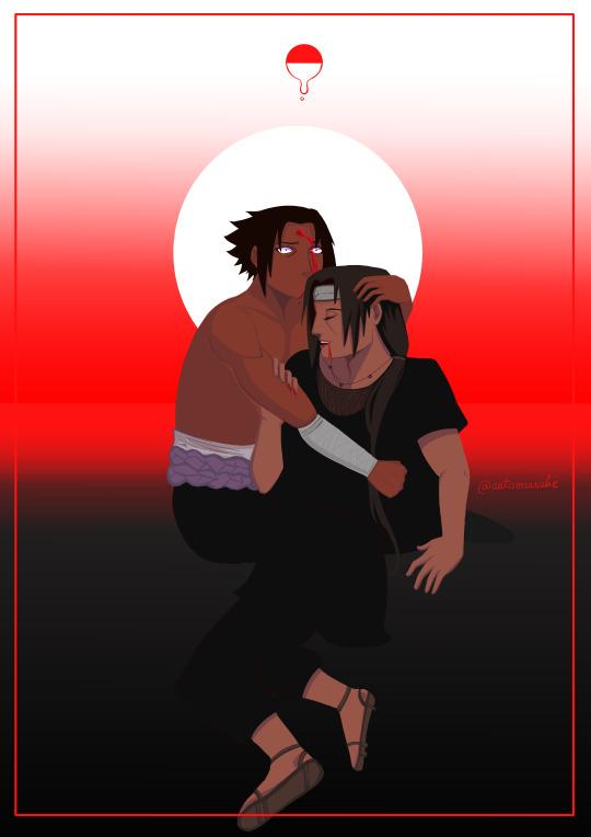
ivan the terrible (bday art for @achilleslyre ^_^)
[ID: Redraw of the painting 'Ivan the terrible', with sasuke holding a dying itachi in his arms, one hand holding his waist and the other on his head. Itachi is smiling softly, blood coming from his mouth as he says something. Sasuke is looking wide-eyed at nothing, the blood from the last forehead poke trailing down his chin. The background is a gradient beginning from the bottom, from black to red to white. There is a white circle reminiscent of a halo behind sasuke, and the uchiha crest above him. End ID.]
#sasuke#itachi#uchiha sasuke#uchiha itachi#uchiha brothers#naruto#naruto fanart#idraw#HAPPPPYYYY BDAY JITTER HOPE U SPEND IT WELL RESTED AND WELL FED!!!!#i tried to do lineart. realized how daunting that would be. then decided to fuck it and just slapped some colors on#also my first time drawing itachi (i think)#i like his long hair. thats all i can say i like about him KAOPFSKOPAJF
37 notes
·
View notes
Text

10-18.
More TØP posting as I catch up. Everyone’s been saying Tyler is a cat and I have to agree, though I could not reconcile the hair and ears so double ears it is LOL
#this was definitely just an excuse to draw Tyler and also cat ears#referenced a SAI pic which is why I went nuts with the colors sorry for your eyeballs#my art#Draw Anything At All October#Tyler Joseph#Twenty One Pilots#cliqueart#I feel like none of my sketches will ever fully look like him if only because I can’t do his like#really distinctively red lips??#in pencil#my skills are inadequate to convey it through lineart LOL#but his nose is so good I will keep working to perfect the nose
13 notes
·
View notes
Text

#oc#haven#rex#monochrome#contents: a little raunchy for tumblr#doodle#really high effort one but it's about the shapes more than anything else lol#meme redraw#comic#i may color this. the original plan was to color it. however i spent all my energy for coloring on drawing an aftermath coda#im fond of this one. there's a lot happening in it#haven and rex are both dressed "up'' to annoy the other's plus-one minor enemy#<- specific au element#rex is wearing a weezer shirt because haven knows that'll piss off taran. haven is dressed up like rex's best attempt at a mid-00s surfer#because he knows felyx cant fucking stand haven and is also into buff masc dudes dressed in jeans with rhinestones and thinks it'll be funn#to put felyx in the Lustful Colander#(he is right)#haven's house is not actually a cool neat influencer home or whatever there's no like open floorplan white walls light bamboo floor bullshi#going on here. it's all like green and red granite tile and shit. the man has been around for a very long time he knows what kind of decor#he's fond of. those ARE fish tanks in the walls though. and a spiral staircase#the man has been around for a very long time. he does not give a shit if what he likes is 'tacky'#also when the one speechbubble he says gets weird it is because he is using a magic power and forcing rex to put his cigarette out. rex is#naturally kind of annoyed about this. it used to make haven wince when he put his cigs out on his hands so he keeps doing it every time thi#happens but he has not yet cottoned on to the fact that haven has fully stopped wincing and now just thinks it's a normal habit he has#and has no idea that it's specifically aimed in his direction#also haven has no issue with giving head but rex isn't aware of that. they don't communicate well#and what Rex is actually aware of mostly consists of 'asking him to bottom turned into a giant argument and then a physical actual fight#and he broke my jaw in like four places over it and it was awesome but i didnt get what i wanted' and kind of gave up on the subject#he couldve been getting his d!ck sucked this whole time and he didnt know it. so sad#lineart
21 notes
·
View notes
Text

trans eugene trans eugene
#i want him#i was too lazy to shade lol#also too lazy to do lineart#just cleaned up the sketch a bit#choosing to ignore the in game texture#and giving him a cream tummy#cuz it's just hot ngl😭#i do enjoy the different ways ppl color his body tho#i can lie and say this was just anatomy practice#but i was just being self indulgent#eugene animal crossing#animal crossing eugene#eugene ac#ac eugene#eugene acnh#acnh eugene#eugene#animal crossing#my art
45 notes
·
View notes
Text

jonathan sims head archivist of the magnus institute london
#IM JUST POSTING HIM RANDOMLY BECAUSE I CANNOOOOOT FOR THE LIFE OF ME DRAW ANYONE ELSE. I HAVE APHANTASIA MAN IT'S HARD OUT HERE#i just started season 3 and heard him mention the graying hair i was like hm.. what if i tried drawring some characters.#i'm actually super happy with how he looks... i had some prior inspiration bc i followed one artist who's posted fanart b4--#(which is how i first heard of the series) and so i already kinda had a picture of him in my head bc of that (i love their art sdfghgfdjh)#so i was jus sketchin and i was like.... yeah this looks ok. i wanted his hair to be kinda just pokin up every which way in front--#--because i imagine him constantly running a hand through it. otherwise it'd look nice n tidy. i just sketched til it looked good enough#the eyes were easy because i wanted sharp and tired. the color was just me testin shit out and being like oooo that looks pretty#the outfit..... i just googled some like business casual stuff LOL. i thought it looked nice#bag and flashlight because he's dungeon crawling#he's also filipino for no reason other than i said so#OHHH YEAH freckles. freckles are cute. also worm scars.#i gotta say i didn't wanna put glasses on him but i thought he looked nakey without em.. but also it might be bc i was strugglin w lineart#the glasses make him look younger i think. which is bad!! he needs to look at least 35!!!#i dunno if i have it in me to draw the others;;;;;;;;;; martin i can't figure out a color scheme for-- and tim & sasha.... waauugghhh....#it's hhhhaaardd because when i'm like reading anything i cannot *picture* characters.... i just get like..... a feeling yknow.....#again i already had some vague images for jon (and martin) bc i saw fanart before lol so that's what showed up in my head#i have a good *feeling* of what sasha should look like but i cannot for the life of me draw it....#i keep sketching and going “noo this doesn't look like her” <- i DON'T know what she looks like#i've somehow instead ended up with a sketch that really feels like melanie tho lmao#if you're somehow at the bottom of this long ramble i will send you $500.#the void given form
11 notes
·
View notes
Text
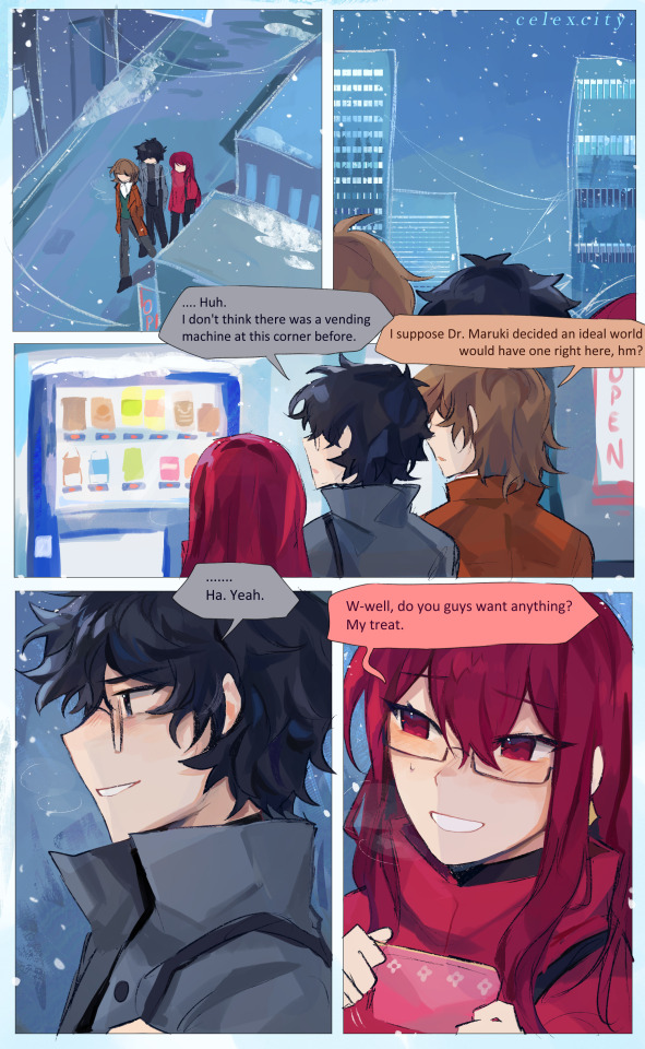
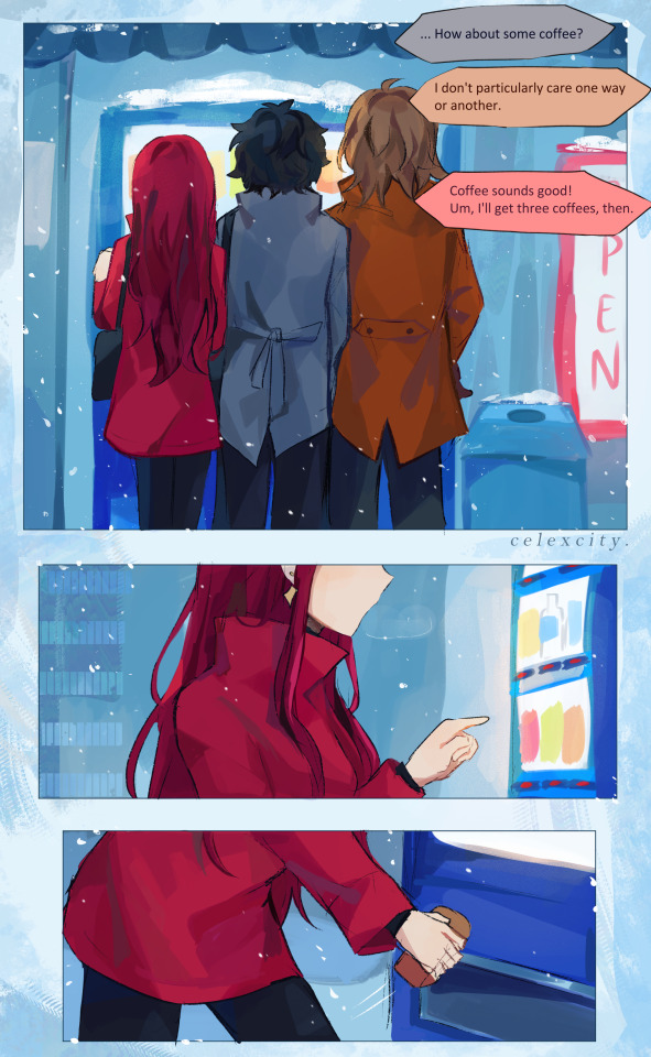
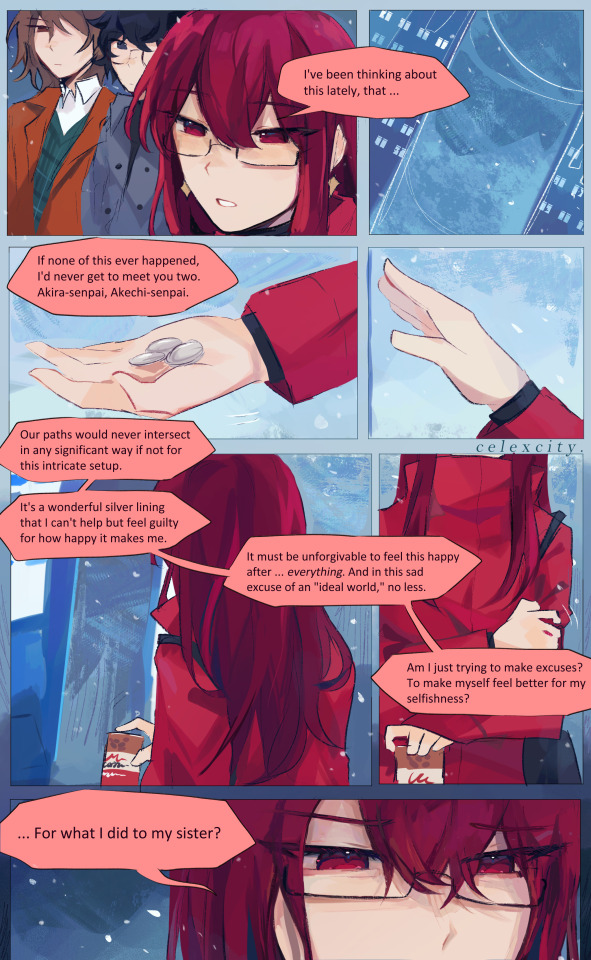
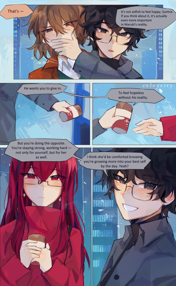
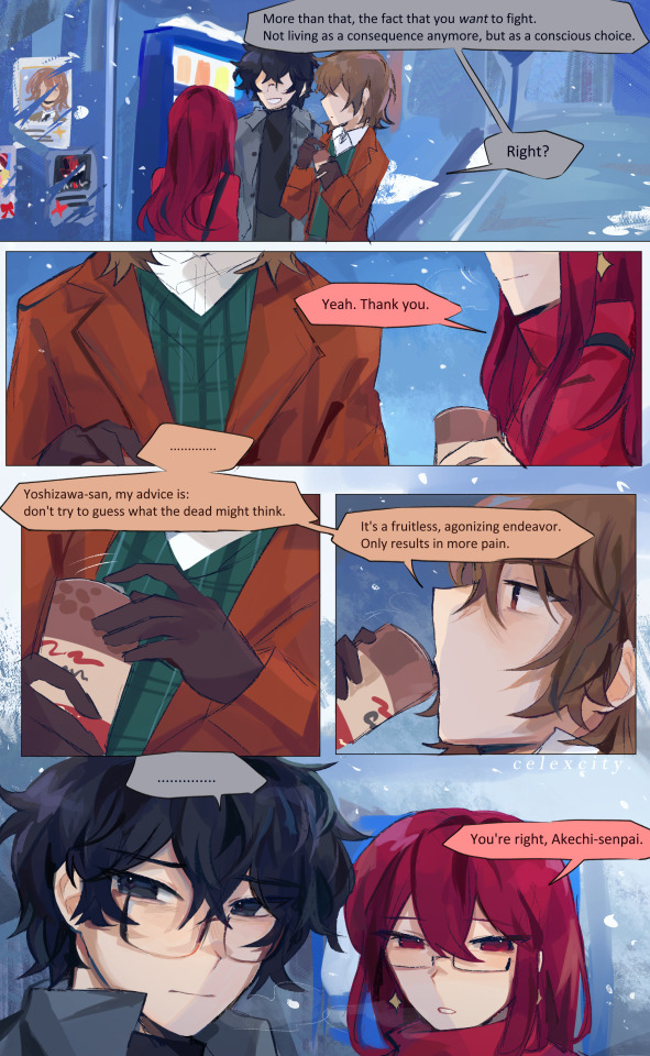
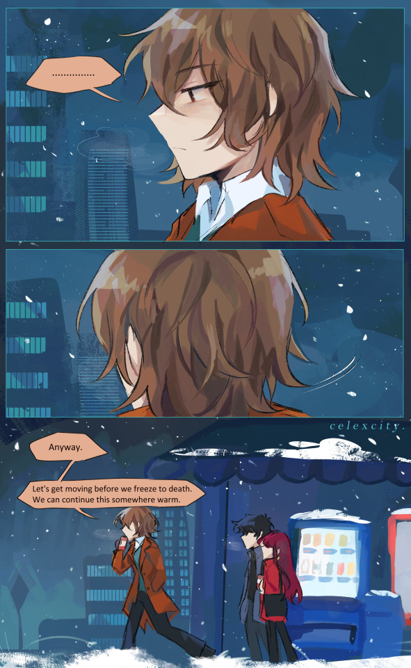
vending machine coffee
hi guys i did not move for 7 hrs until i finished this HELP MEEEEE (From the lineart+colors stage btw.... it basically took 7 hrs for rendering LKDSKJADKSAHD)
this is technically long winter au (royal trio r trapped together for longer than like 10 minutes) and this is.. i guess.. like a week in? to maruki's actualization. so theyre all very antsy and anxious (and sumire and goro havent reaaaalllyyy had many heart-to-hearts yet)
ANYWAY do u think abt the horror of being slam dunked into an ""ideal reality"" and not knowing what's real and what's fake and Most horrifically. getting used to the fake part
i like to think in long winter au they band together super close bc theyre tbh frightened of this reality, don't know wtf could happen if maruki could do This then he could do Anything right. so they walk all together like ducks in a line LMAOOO
akira feels disheartened at akechi's joke in page 1 - like yeah shit ur right. what's real and what's not. sumire distracts them by buying coffee
akira covers akechi's mouth bc he thinks hes gonna say some dumb shit (he wasn't)
(also for the record sumire hands the first coffee to goro and then the 2nd to akira then akira picks the last one up for her)
THE WAY AKIRA SMILES AT SUMIRE IM GONNA JUUUUUUUUUMP (i forgot to draw his bag strap there. fml. whatever)
woah the posters on the wall thats crazayyy is that the detective prince, the phantom thieves, and kasumi yoshizawa (tm)???? woahhhhh smile
akira grimaces at akechi's ""advice"" bc he Knows how real it is. He knows how haunted goro is by 1) his mother's death. 2) his murders. 3) the death of his Child self and his dreams of being a "hero of justice." sumire obviously doesn't know all this baggage so she just takes it at face-value like "yeah ur right senpai now that i think abt it!" but it really weighs heavily on akira and goro realizes that in the last page. so hes like. shit. well. ermmm. awkward lets get outta here
i like the colors on the last page eheh
ok time for me to eat something im feel like im dying.
#royal trio#shuakesumi#sumire yoshizawa#akira kurusu#goro akechi#persona 5 royal#cele draws#cele comics#hep meeee helpppppppppp#long winter
753 notes
·
View notes
Note
If I want to study someone's art or style, how do I do that? Like where do you even start when looking at an illustration that they made 😭thank you!!!
Here’s stuff i think about. i don’t do that many style studies, so idunno how helpful it is! pls sound in tha comments if anyone has tips:)
Pinpoint what stuff you like, and focus on that. Focus on technique rather than exact replication, for example ( just first thing comes to mind) if you like rostov’s disco elysium cover art and want to study it, don’t just repaint the image, find what’s key in the style. looseness, maybe? then, instead of copying the image with your technique, try to apply the same looseness. (feat. shitty 5 min sketch plz dont judge example of how i normally approax paintings, versus a study. ALSO not to say u CANT do this it's just how i would study, myself. )
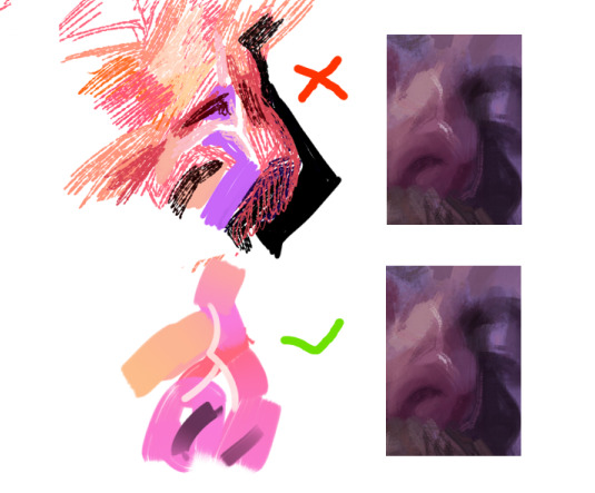
That being said, don’t force yourself to make art decisions that feel unnatural to you. a lot of the time artists make decisions based on their weaknesses as well as strengths. I do very shaky, hatchy lineart because my hands are very shaky. I focus on painting what I* feel is important and fun.
Instead of copying a style from a picture, look at a variety of pictures and find technique. For example a lot of people redrawing a screenshot in “sailor moon style” or “ghibli style” will draw… let’s say, an old man, looking like a usagi because that’s the screenshot they looked at, instead of watching what stylistic choices for example takeuchi made when stylizing an old man. So the “studies” end up homogenous. I personally find it unproductive to replicate a painting for purposes of study, but like focusing on individual elements. say you like egon schiele, replicating whole paintings at a time IMO isn't gonna do much, but maybe you can set out on a series where you sketch copy his hands or feet from different paintings, and then try stylizing your own hands the same way? Or maybe your fave artist draws moonlight like a blue stream, or a red one? Try applying only that light to your paintings.
You could also color pick or look at the colors they make and paint whatever you want with those same colors, to understand how they work together and what can be done with them.
Also, if you can, look at their influences! Everyone learns art by seeing others art. Chances are they saw art they liked and picked from there what elements they enjoyed. Looking at the inspiration can help make some of the techniques more obvious.
Basically focus less on copying(not that copying is bad- but not always helpful for studying), and more on what you like. If you find what you like, you can work from there and try to think about your own art from the same perspective.
IDK if this helps as i said, feel free to add onto^_^
487 notes
·
View notes
Note
hi!! i just wanted to say, i LOVE your art!! i started drawing my kris design with braces after seeing dubs of your comic on yt, and when i found you on tumblr i was beyond excited to see all of it in context. i’m a comic artist as well, and i was wondering— how do you choose your color palettes ?? besides obviously picking colors from the characters themselves, that’s a given— but your comics are bright and colorful and just a real pleasure to read because they’re so visually appealing. hope this question hasn’t been asked before!!
Thank you so very much!
So I really went into your question under the cut. So feel free to proceed if that is something that interests you.
The answer is honestly not that exciting. For the characters I really only do pick colors off the original sprites. Which is why they look so bright and colorful. If you try to do that yourself, you will quickly notice how SATURATED the sprites are. And not only the sprites, but also the backgrounds.
A little trick I use is that for pre-existing backgrounds I take all the colors and brighten + desaturate them just a teeeensy tiny bit. That way the characters in the foreground pop way more.
Another way to make the colors pop even more is to use colored shading AND colored lineart! That really IS what ties everything together. Let me show you..

This is a panel without the colored shading and lineart.

And this is it again WITH all that good stuff. Quite the difference, no?
But you're asking about color palettes, so I guess you also mean for the characters/outfits I designed? A lot of it boils down to color theory. I am by NO means an expert on that subject, but when looking at the Dark World designs specifically, you will notice how I did it.
For example: Frisk's Dark World color scheme is mainly analogous. That means the colors are right next to each other on the color wheel. But there is a little bit of complimentary in there.
Here, lemme visualize it...

Frisk's color scheme is a light green, darkish blue green, light yellow and a splash of pink. The red is there mostly just for lore reasons.
One thing I noticed when looking at the sprites of all the Dark World versions is that they are EXTREMELY bright and saturated.

That is something I tried to capture as well, but I think it didn't neccessarily nail it a lot of the time. Especially for Frisk's color scheme. If I stuck closer to what the game is doing, then in theory they would look more like this (using Kris' colors as a reference)

Looking back, I WOULD tweak their colors slightly more nowadays. Just so that the contrast between the colors is a little stronger and they don't blend together as much. This improves the readability of your design. Not all people are able to perceive every color of the rainbow, so readability is EXTREMELY important. Best way to see that is by desaturating them and checking the grayscale. Like so (left is the one closer to the game's colors)

Man, this REALLY makes me wanna fix their color scheme. This has been bugging me for a while now. (Though I'm kinda afraid that people point out that they look different.)
163 notes
·
View notes
Note
I found your Tumblr recently and omg I love your art style., it's so inspiring :D I just subscribed to your patreon because I need more haha.
I was wondering if you have any tips for colouring your artwork?
Thanks so much for the extra support! I’ll go into rendering a face with a reference pic below (because I think that’s what people practice/look at the most) with an absolutely quick and dirty breakdown
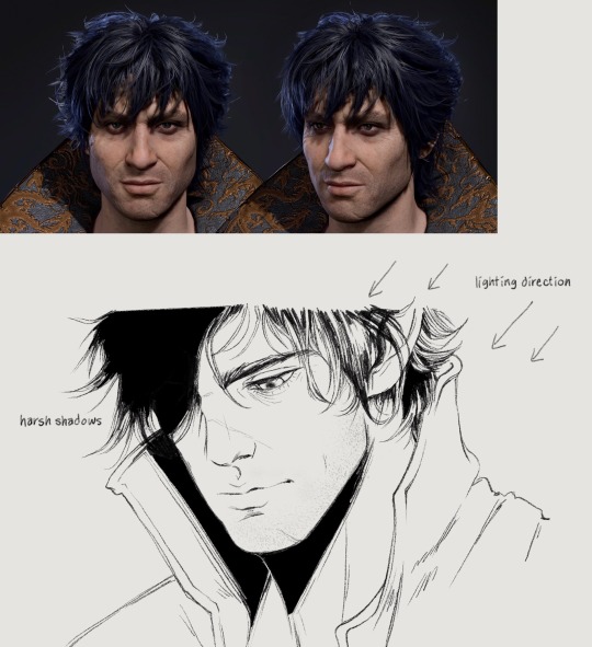
I already incorporate the heaviest shadows into my lineart a lot of the time, but I still have to think about shading where the light hits when coloring happens
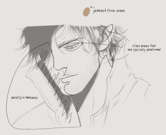
Since this is coming from top right, the left half of his face will also be heavily shadowed. Understanding 3d planes and how it affects a shadow assists with getting lighting down correctly. I’ve outlined the obvious quadrants that I’ll typically shade with the darkest color. But before that you have to lay down a flat, a color I grabbed from the front of Gortie’s cheek- I think this is a very mid tone. Using a mid tone first is how I think most everyone colors/shades. I can’t say this is how I always do it, sometimes I like to work dark to light, sometimes I start coloring from the top or bottom or side, it depends on what feels good and I get distracted very easily. If I rewatch my timelapses I can see where I got bored of an area for a while and jump somewhere else/come back later
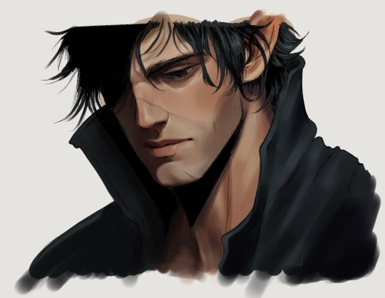
If I know I want to fully render something I don’t bother with cell shading. Not saying this is a good practice, in fact don’t do this until you have lighting practice under your belt.
Colors- go with the reference picture and grab colors from the areas of the face that you’re shading, but increase or decrease the saturation as needed
Forehead- I darken the hairline and add shadows for the loose strands of hair. This is something simple I’ve found elevates the 3d aspect
Eyes- look at eye makeup tutorials, no joke. It’ll show you where to add highlights to make the eyes pop. This is a stylistic choice, but I like my characters looking like they walked out of Sephora. I’ll give them eyeshadow and add a highlight to the upper lid and the inner tear trough. For the actual iris I shade really simply just making the lower part brighter than the top
Nose- bring the bridge forward with the lightest color, add a shine to the tip, darken the side and carry that to the cheek
Lips- upper lip dark, lower lip not, add a shine, I dunno what else to say about this sorry 💧
Chin- shade under the lip and bring the shadow down in a crescent shape
Everything else is sticking to the personal character’s features, like shading his cheekbone and laugh line. I also add a blush tone over the cheeks and nose (again stylistic)
Link to Timelapse: https://youtube.com/shorts/q7E-g05W0m4?si=shZFpHQwNuyO6Qt1
youtube
I’ll try to do an actual infographic later when I have time because I keep getting asked about coloring. Just know that I’m still learning new stuff every day and these things should be taken as a “this is what I’m doing now” sort of thing!
149 notes
·
View notes
Note
Hi!! I'm a big fan of your work and I was just wondering how you plan out compositions?
for me, the story/concept/feeling u wanna convey is the basis for all composition! technical components like line weight, posing, coloring, etc. are all in service to "what is the image supposed to say?"
example: wanted to draw valentines-themed saiou, so i drew them in a chocolate box! ...but it was kind of unsatisfying, so i re-drew ouma and moved some bg elements to try to make a more balanced and interesting composition.
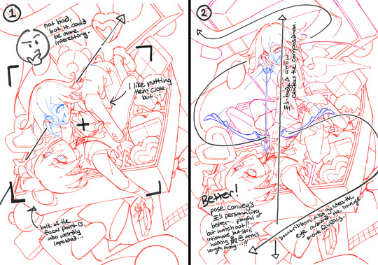
posing reflects a lot of a personality, so "how does the pose express the character's own personality/feelings towards the other?" prompts ideas for how to arrange the composition. like in this case... western valentine's theme -> if ouma had cupid''s arrow? -> needs more distance to nock and draw -> ouma perching on/pinning saihara down. that's the flavor -> then, rearrange the ribbons and treats to follow the flow...
i'll also check layout and values throughout: for example, after finishing fontaine's aq, i wanted to draw smth about furina & focalor's partnership, and focalor controlling her from the shadows... so the concept was "a dance where you can't relax from your partner's lead."
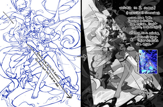
the lineart's a hot mess, but the spotlight helps divide the image, direct the focal point and ties into the aq story.
tl;dr: pose, sightline and visibility are the key traits i focus on in a draw, but the bottom line is always "story" first. hope this helps... even a little bit (':
#ASK EVER#i feel like someone asked me about composition before but i can't find that ask. sorry...#the other aspect that drives all my poses and comps is just “how much can i twist these two characters into each others personal space” lol#or the third option “theres a lot of empty space in this canvas... (add wings) (add wings) (add wings)”
500 notes
·
View notes
Text
Artists that inspire me!
I'm a huge fan of art and these are only skimming the top of the wonders of the artist community and those that inspire me.
@iliothermia a trans Jewish artist who creates undeniably trans and Jewish art!!! Hyde's linework and composition is masterful, and his attention to detail is immaculate. He has a shop where he sells beautiful high quality prints, stickers, pins, bookmarks, and a few other odds and ends! Oh, did I mention he draws everything with a MOUSE!
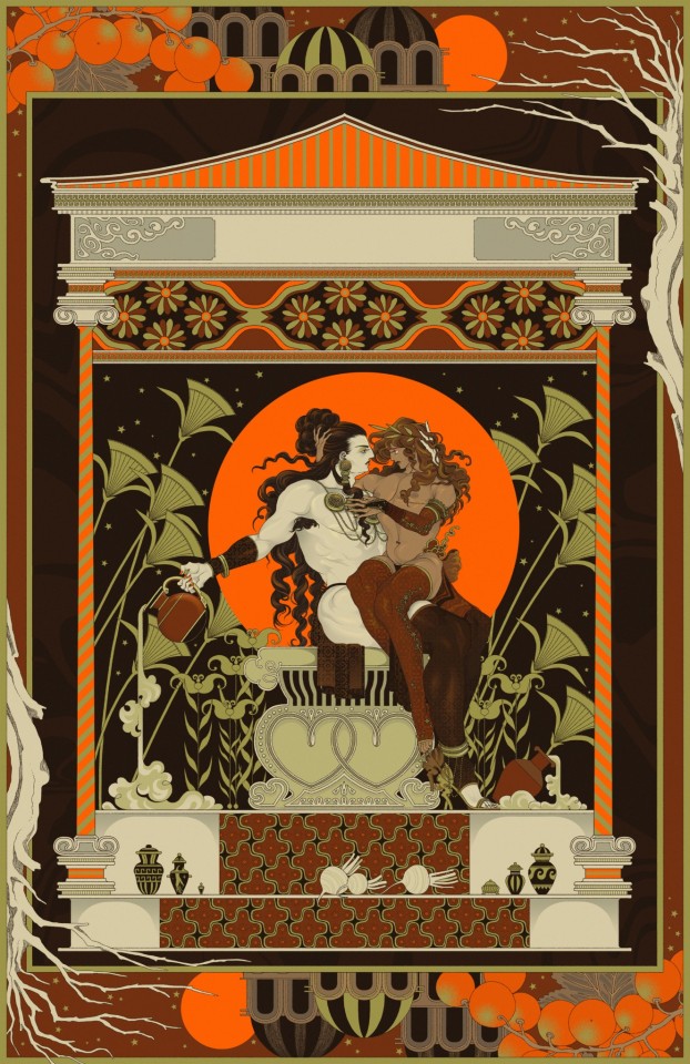
@eleheba another trans Jewish artist I adore. Skilled in black and white work and color. Composition is crazy. It's the kind of work I'd think to find in old medieval books. They're definitely a modern day master artist. They also have a shop!
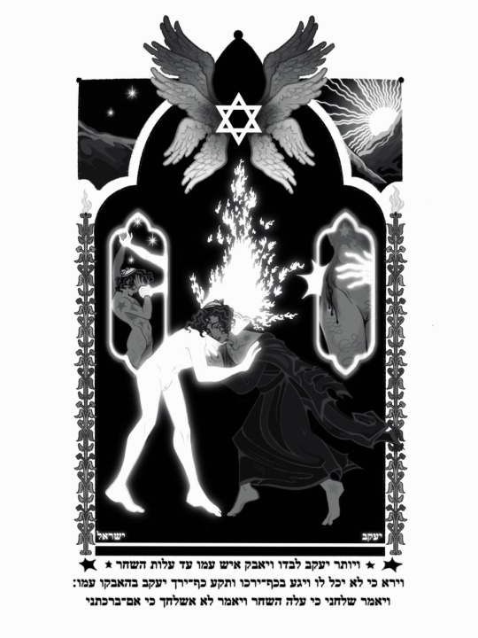
@stayatsam this artist has inspired me endlessly and got me into portraiture. Another transgender W. Sammi creates beautiful portraits with a unique coloring style. Edgy, gothic, and beautiful.
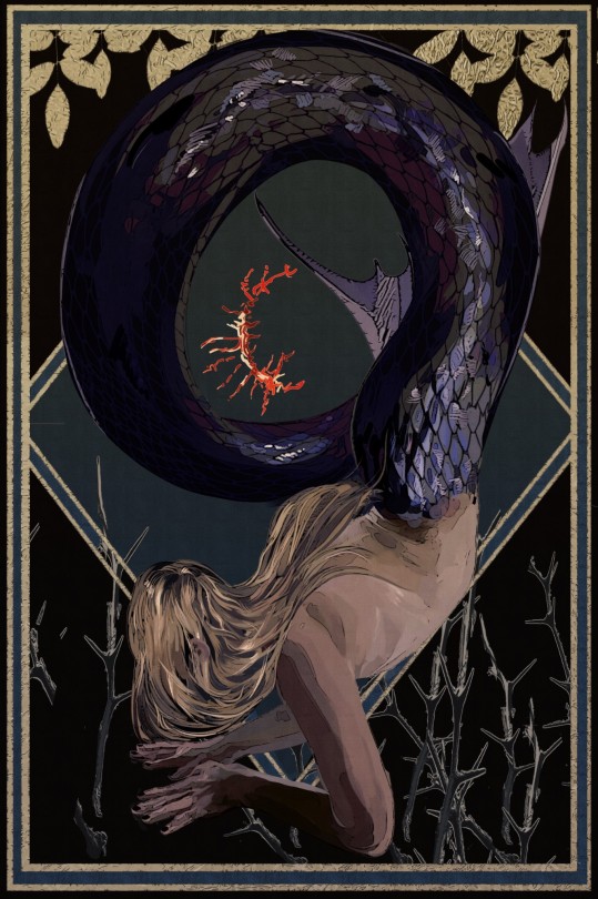
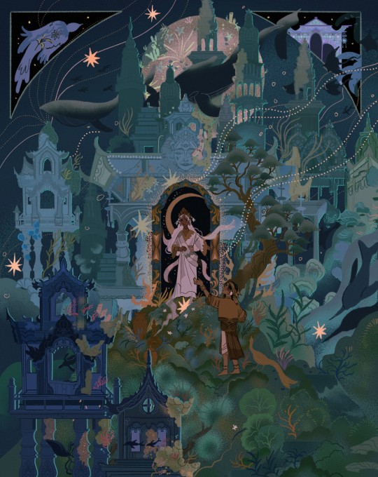
@littlestpersimmon I'm struggling to find the words to describe how incredible this artist's work is. Dreamy, ethereal, romantic, and detailed. He create enchanting mlm pieces inspired by southeast Asian art and culture.
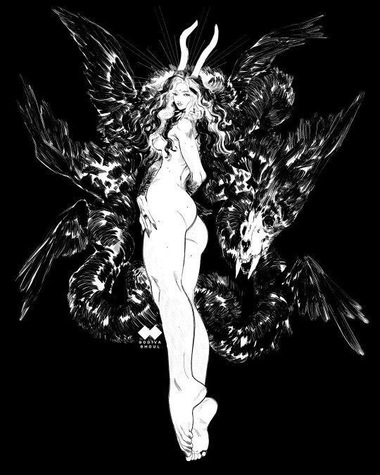
@godivaghoul an erotica artist who creates dashing gothic scenes. Beautiful women with spectacular line art...need I say more?
@wiltkingart dark and moody paintings with incredible use of color. A focus on trans mlm. Another artist that deeply inspires me.

@skulkingfoxes on instragram and Twitter (edit: and now tumblr!) Rowan has incredible lineart and character design. They have several comics as well as a shop! Their composition and use of black and white is skillful and immaculate. I wish I could steal their hands

@the-nothing-maker their art always wows me. They have amazing control over color and use colored pencils!!! Genuinely their work GLOWS I wish I could see them in person.
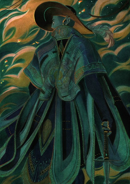
@bunabi another master of color and character design. All her art feels soft and dreamy. She also make brush packs!

@rennybu where do I start... Adrienne's art is colorful, soulful, and dreamy. And so so tender. Not to mention they're incredibly kind! Here's a commission I got from them...agh I'm tearing up

Unfortunately I've run out of image space. The list could go on until I've named every artist on the internet. I hope you give these wonderful people a follow!
And of course all my wonderful art friends but you can just check out my tag #friend art
#rennybu is not the only one here whos incredibly kind#working with them was just so much fun#rambles#are these artists potentially very popular and dont need me to recommend them? perhaps.
2K notes
·
View notes
Text
I actually find the topic of "Nomura's evolving art style as he takes on more and more responsibility at Square (and subsequently has less time to Do Stuff)" really fascinating.
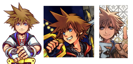
Like, If you compare his art from the KH1-DDD era to his current day art, I think there's a noticable difference to his approach: how many steps there are in his art process, how he chooses to finish a piece, and the shift from a clean digital style to a more organic traditional one.
He used to use very clean, black lineart; bold colors; and more instances of defined/hard shading for that digital, almost cell-shaded or vector kinda look. Nowadays he goes for a more sketchy + watercolor style with pencil lineart, broad washes of faded color, and color shading that's a bit more blended and simplified in places (relying more on the pencil shading to create distinct shadows), with the hard edges more often reserved for scattered, bright highlights. (He's made art like this in the past eras too, such as the KH main menu arts which all have a watercolor quality to them, but the lineart was a bit more defined then and less sketchy, and thus slightly different from his current stuff.)
I think the Dark Road key art is a very good example of his current art style. The sketchy, almost brown lineart. The watercolor quality that emerges where two colors meet and overlap. A little desaturated and earthy. Color shading that's very broad, soft, and loose, with sharp highlights here and there.
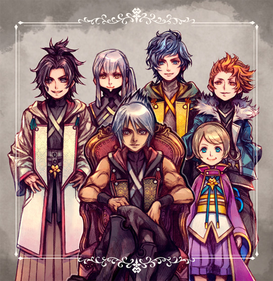
Both styles have their merits (I personally love this sketchy era of his), but I think it's pretty likely that he adopted this as his "main" art style in order to adapt to time crunch. He doesn't need to do time-consuming lineart and precise shading anymore; he can use the original sketch as the lineart instead. Heck, he can fill in a bunch of the shading via pencil during this sketching phase to save even more time, and then can paint in a more watercolor-y kind of way that allows him to color in quicker, broader strokes.
And then there's the occasional art mistake that has become a bit more frequent in recent years, by my estimation. Which I imagine, again, is due to running out of time to notice/fix those mistakes. Things like Ephemer's arms being a bit too long in this UX art, the Kingdom Key being slightly off-model in this anniversary art, or the ears on this Mickey Mouse symbol being two different sizes on this Utada album art.


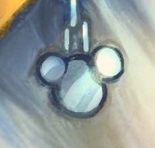
(Which isn't to say that he hasn't made art mistakes in the previous eras, for example he initially got the colors of Riku's shirt mixed up in the Re:CoM cover art before fixing it, but I still think the mistakes were a bit less frequent back then.)
And like, hey. I draw, too. Amatuerishly, but I do. I don't blame Nomura for possibly needing to change his approach to making art in order to meet deadlines, nor do I blame him for these little art mistakes that ended up falling through the cracks. I imagine he simply doesn't have the time anymore now that his job has shifted from (primarily) being a character designer/illustrator to (primarily) being a director of multiple, simultaneous projects. Or maybe I'm totally wrong about this and his art evolution had nothing to do with time crunch, who knows. I think his current art style is gorgeous either way!
Anyway, I just think this is an interesting example of someone taking their art and adapting it to a difficult and highly limiting situation, experimenting with new things and finding the means to still make art even when you have less time to do. Also a great example that professionals are human and will make mistakes even in professional products, and it's not the end of the world, it just happens. If you ever obsess over a mistake in your art...maybe take solace in knowing that it happens to everyone. Even people who have been in their field for a very long time.
97 notes
·
View notes
Text
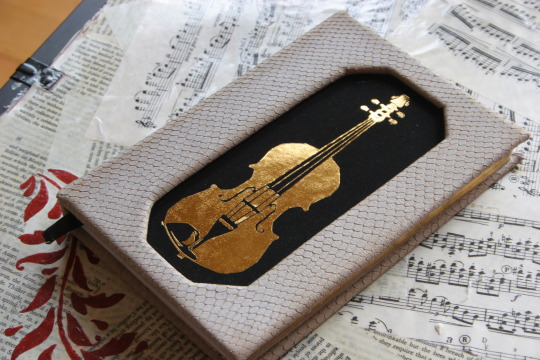
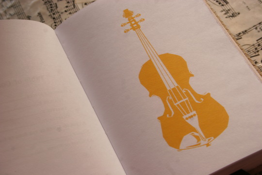
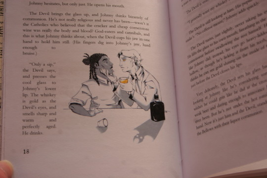
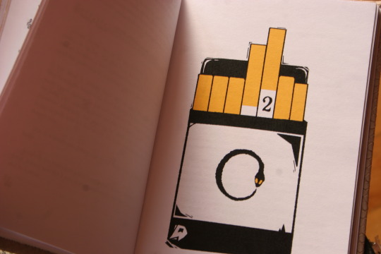
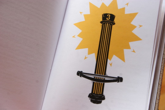
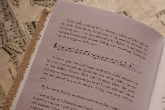
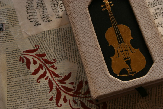
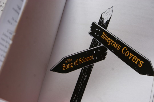
I've now received four (four!!!) different copies of my fic, bound and illustrated by different artists---and there's still a deep, almost reverential feeling I get when I hold them in my hands, lay them out. Ironically for the subject matter, they feel decidedly holy. After all, where else am I going to get proof that I did this---even if "tell a story about music and the devil" is one of the sillier things you can do to occupy your time.
But to be less vague, this is the kind gift of @fleabitebooks / @kettle-bird! They reached out to me a few months ago, saying they wanted to bind my Devil Went Down to Georgia fic, and would I like a copy too? As I would never say no to a gift like that, I gleefully accepted.
If you've been following me long enough, you've seen their art in my Cornstalk Fiddle tag, and I am pleased to say that the images lose none of their power. I think the choice to stick to a limited color palette works beautifully here---the golden-yellow of the title pages and the larger art almost seeps through the paper. With the crisp lineart and shading, it ends up being both lovely and vaguely ominous, a sign of the eldritch things moving around/beneath the story.
(Also, I realize this is not a major aspect, but....I love how truly awkward-looking the Devil is. He looks like a Southern Gentleman, and I love that touch of weakness in his jaw.)
I also deeply adore some of the design choices---chapter 3 starting with the cornstalk fiddle and the triumphant starburst of golden-yellow? The white snakeskin-threaded-with-gold pattern used to bind the book? The way the paragraph breaks and endsheets are music? Amazing. Just amazing.
Maybe I should revise what I said above. Yes, having your silly fic about a country song turned into a physical book is proof that you did it, finished it---but it's also proof that someone else did too. In this case, @kettle-bird sat down with my fic and carefully copied it, played with fonts (oh, those are fantastic too by the way!) and spacings and margins; they drew art, colored it; laced the book together, made and bound the cover, then shipped it off to me.
Which means....if I did this, then I was hardly the only one.
166 notes
·
View notes
Note
Oh uh forgot to ask in the previous ask (the one with the digital piece of candy and scurrying and stuff)
How do you draw art so good
Like
Is there a method you use or is that just the style you've gotten over time?
you've activated my trap card
I'm just gonna preface that this tutorial is from someone who was not professionally trained and didn't have a lot of free time for art, so a lot of the tips I have is short cuts I use to get the best results quickly
If you genuinely want to get better at art then please look at references and practice that is always the best
However if you are like me and only really do art for fun but want to go faster then these are for you pfppt
Overall I'd say my style is influenced by speedpaints I would watch when I was younger, I like analyzing how people do things and what makes something look "good" to me
I always recommend watching them because they will often have techniques you've never seen before or do things a certain way that you can try out yourself
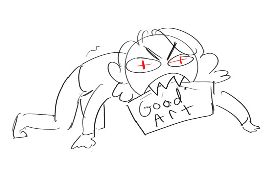
I consume good art, it feeds me
but seriously it can be super helpful when developing your own methodology, or just generally trying something new
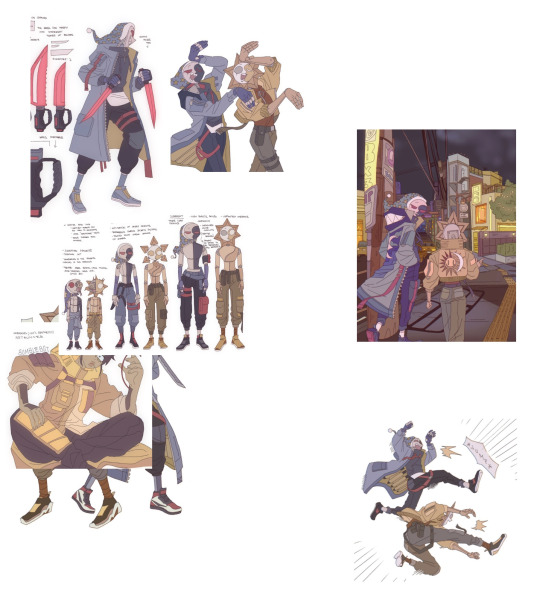
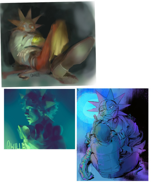
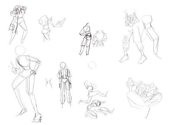
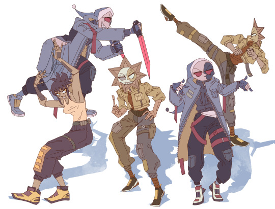
Usually it starts with me pulling some references from artists I really admire and sort of sketching out how they do the things I like
For example 8um8le has like super good anatomy and poses so I focused on trying to replicate how they do that
venemous-qwille is super good at color and pulling focus so that's what I focused on in my study of them
In general I'd say my process is sketch -> silhouette -> color -> shading -> render
I really don't like doing lineart lol

I'd say for the sketch the most important part is using references and just kind of fudging it until it looks correct anatomically/physically
General rule of thumb is spend time on areas of interest, and keep non important areas light (like the stitching on his pants)
I don't do lineart because I think its unnecessary for most paintings I do
I naturally tend to put more time and focus on areas of interest (like hands and feet) and if you use a brush with opacity for the sketch, those areas are naturally going to be darker in the final sketch
Of course this is gonna be different for everyone but it's what works for me
Sometimes I do a really really sketchy layer underneath my sketch/lineart, just so I know where everything is going
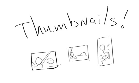
Use thumbnails! They are great to help figure out the general layout of things and what pose I wanna do
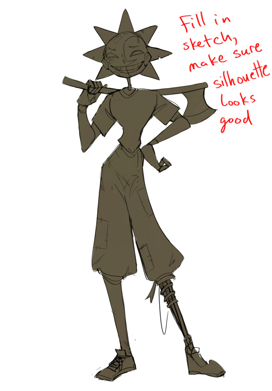
Next is what I call the "silhouette" layer
This is super important for me cause it helps me refine the figure and make sure the pose/anatomy looks correct, also depending on what color I choose for the silhouette helps guide what colors I'm going to use on top
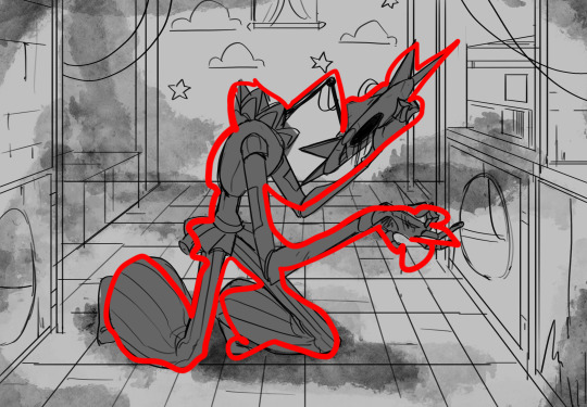
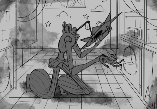
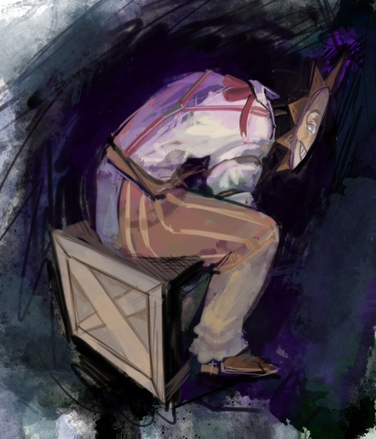
This piece is a good example of how it works. The silhouette shows me how the figure interacts with the background, how the pose looks and if its any good
The silhouette layer doesn't have to be super clean, as long as it follows the sketch decently well and shows where the figure is then its fine
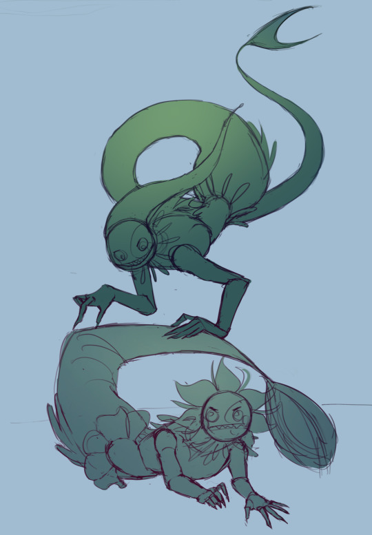
I also sometimes make the silhouette layer multiple colors to help guide shading and vibe
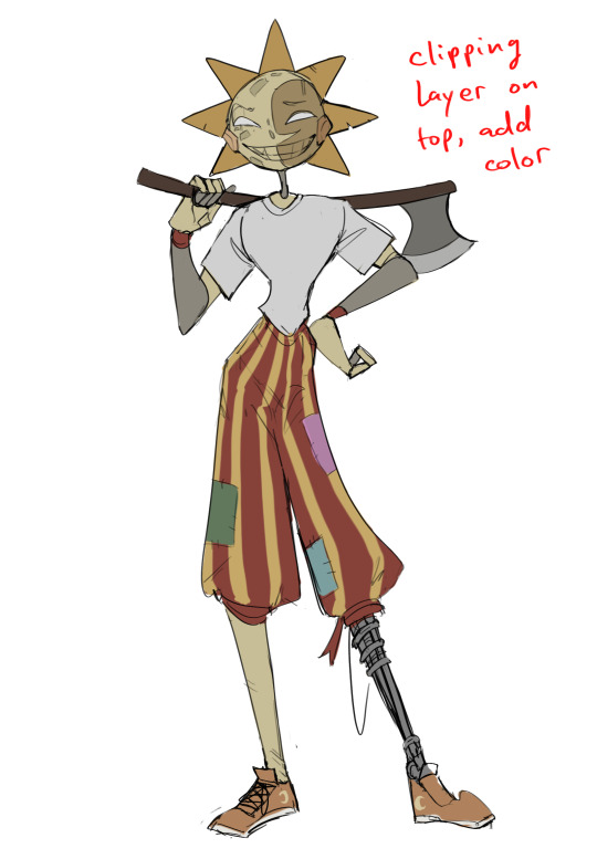
Next is the coloring layer. I usually make this a clipping layer on top of the silhouette layer, or I change the silhouette layer to alpha lock, either way it saves me time on coloring everything in

Sometimes I am super rough with the coloring too, using like an airbrush or my fav watercolor brush just to generically block in color where I want it
Works out cause most objects have like a bounce light to them from surrounding objects, so this is sort of a cheat I use to get that effect without all the work lol
Also don't be afraid to have the lower silhouette layer shining through, having multiple colors sort of subtly shining through the piece helps lots
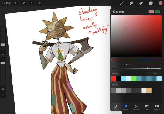
Next is the shading layer, this is usually another clipping layer, usually set to "multiply"
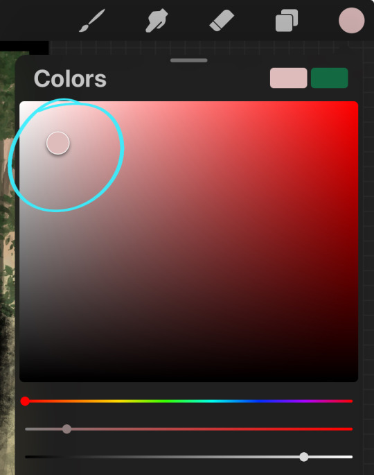
The colors I pick here is usually within this range, any color works, just depends on the piece and vibes.
Since this piece is set in a sunset forest I choose a more desaturated orange for the shading layer
I know there's a whole thing about multiply layer being a crutch (and it kind of it) but it is a useful tool when you just want some darker values across the piece but don't want to go through the process of color picking every single darker shade
Also in my opinion it looks better than picking a darker color and setting it to a lower opacity, idk I just think the color has more "depth"
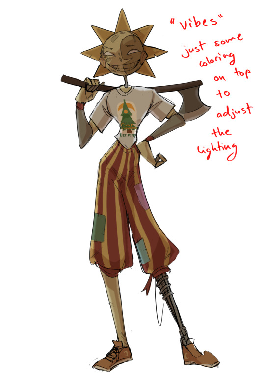
Next is the hardest to explain, sort of the vibes layer
Usually its just a layer of more concentrated color on top of the normal color and I fudge with the settings and values until I get a result I like
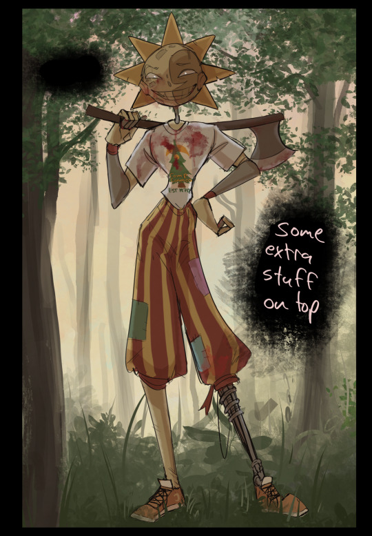
Next is the longest step, is the "extra" or the render stage.
Usually I add a background before this step so that if I need to merge the figure better with the background I can
If I render with a white background but he's supposed to be in a dark forest, its going to mess with the lighting severely
Also this is when I add more "vibe" layers on top to get the figure to match the background better
Backgrounds in general I recommend checking out @/derekdomnicdsouza on instagram he's got lots of great tutorials for breaking down backgrounds simply

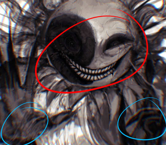
I'd say general rule for the rendering layer is to focus on the areas of interest and spend less time on areas you don't care about
I even blur stuff out on the edges I don't want people to see, partially to save time on fixing mistakes in areas I dont care about (oop), but mainly to help draw the eye to the areas I do want people to focus on

Theoretically parts of the background should like mesh with the characters, parrallel lines are a no no unless they are directing a viewer to look somewhere, things that are perpendicular help bring things together
tbh I'm still not the best at layout and probably need more practice, but overall this is what I like doing
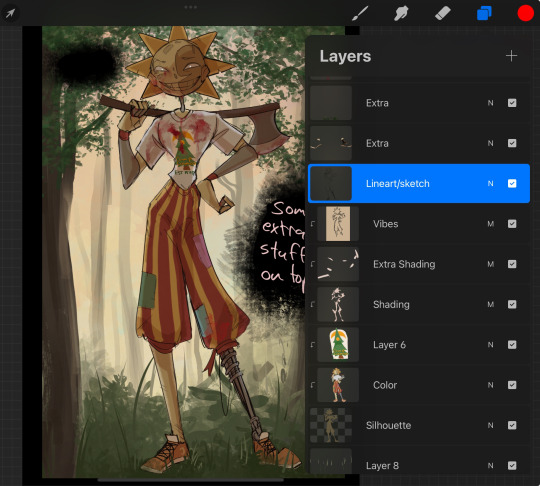
Overall this is what my layer set up ends up being
Sort of a sandwich with the lineart/sketch as the "meat" lol
Color and basic shading below the sketch, clean-up and rendering on top
I like this method cause it's super flexible if I ever want to try something different or try to replicate someone's style
I can make each step less or more messy depending on the end result and can add a lineart layer if need be. Also if there's a part that is straight up not working or needs to be removed its super easy to do cause I can just paint over it on the "extras" layer, color picking from the surrounding area to get the same vibe
Generally rule of thumb for my style is: get the initial layout of colors, form and shading to look good, then the rendering should be smooth sailing
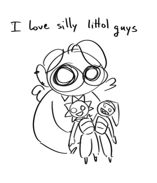
Really the best advice I can give to get better at art is to enjoy what you're doing and become very very obsessed with drawing a silly little guy
You'll eventually get very good at drawing them pfptpf
#sundrop#moondrop#long post#art tutorial#fnaf sun#fnaf moon#I draw them way too much holy guac#ask#this is for you asker#idk if anyone else is interested in this kind of stuff#i apologize for ranting lol#also me struggling to spell silhouette like 15 times
114 notes
·
View notes
Note
May I request platonic yandere ROTTMNT turtles kidnapping a scared reader they see as a sibling? Like, them all working together to kidnap the reader. Also, you make good art :)
Note: please turn up your device's brightness!

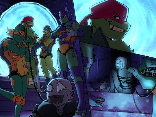
It's Mikey's birthday and luckily for him, his beloved brothers have a special new surprise for him to bring home...
Sorry for the horrendously long wait! This took some time to cook up, so thank you for the patience :) Surprisingly, the coloring process for this piece was much more tolerable compared to my last illustration, despite being more taxing and complicated. Although, I can't say the same for the lineart. That was a whole nightmare that took me 4 whole days to complete. I played around with perspective, and although it's not all that accurate, I tried my best to make it look how I wanted it. I've included the versions of the illustration with and without the dialogue bubbles, since I wanted to show some of the details that was covered by the text! I had some fun trying to make the background look like a convincing space despite my lack of skill in that field. Sorry if my English doesn't make sense, I'm overstimulated from high dosages of caffeine so I apologize in advance :)
taglist: @dynabann
#yandere rise of the teenage mutant ninja turtles#yandere tmnt#yanteetles tellings#yandere#yandere rottmnt#rise tmnt#obsessive yanderes#rottmnt x reader#male yandere x reader#yandere thoughts#yandere rise of the tmnt#yandere raphael#yandere donnie x reader#yandere donnie#yandere donatello#yandere leonardo#yandere leo#yandere mikey#yandere michaelangelo#rise donatello#yandere art#yandere tmnt 2018#rise leo#rise mikey#rise art#rottmnt fanart#yanteetles art
2K notes
·
View notes