#All the base ink colors in this art are ink colors from the base 2 campaign!
Explore tagged Tumblr posts
Text

16. Fav Agent
HAVE YOU EVER HEARD OF AGENT 4
#splatoon#splatoon oc#splatober#agent 4#SHE IS MY EVERYTHING#Agent 4 I loooooooooooooove you#All the base ink colors in this art are ink colors from the base 2 campaign!#Please bring back lavender and soda (seafoam green) again I'm begging you (and glittery ink!)#All the base ink minus pink (that's her preferred color lol)#LoR's art dump#agent 4 (chloe)
13 notes
·
View notes
Text
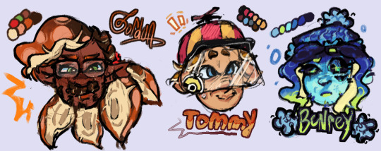

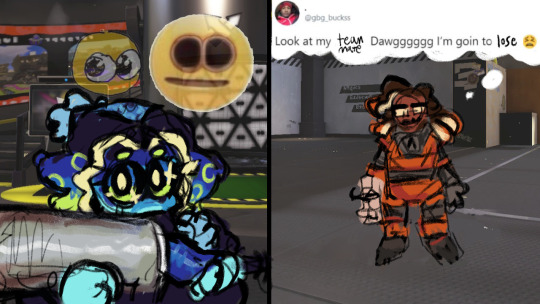
been meaning to post my designs for these little guys forever. insane splatoon rambling under cut to explain design choices and lore related things ... read my autism boy
btw this is a repost from our art side blog this was written and drawn like months ago <- minorly rewrote some things tho
thx splatoon users drfreeman & drcoolatta for fueling my splatvrai autism brainrot ... i hate u /J

GORDON
idk how to explain this but Theoretical Physicist is inkling coded . maybe its cuz splatoon species social hierarchy
Native ink color is Orange, but he has Dark Brown tentacle roots.
Uses custom weapons to attach in place of his prosthetic; It works best with Splatlings but can be adjusted to attach other weapons.
If the thing above didn't make it obvious, he's a Splatling main. He switches out depending on his mood though.
sighhhhh technically an Agent... stares at the ceiling...Main character...
His arm loss is like pretty much the same as in-canon but it's with the octarian army shrugs. don't ask me why he doesn't just regenerate it cuz hes a squid thats for me to know and you to find out. (get partially sanitized loser)
Born & Raised in Inkopolis pre-splashtags; He wasn't informed of the switch to Splashtags being expected when participating in most activities around Inkadia.
TOMMY
I forgot why i made him an inkling why did i do that. I think it was bc i didnt wanna make them all octolings but i was wrong srry we all make mistakes /hj I ALREADY REDREW HIM ONCE IM NTO DOING IT AGAINNN
Native ink color is orange-brown.
His hat has an eye guard for sensory reasons; He covers up as much of his skin as possible because he doesn't like the feeling of foreign ink on him.
He isn't a specific weapon main, he just uses any long-range weapon to minimize the possibility of getting ink on himself. If he has enough guarding, he prefers to use N-ZAP '89.
Makes his own gear for sensory reasons as well :) It's legal when ur dad's the G-Man.
Exclusively plays in Turf Wars, Anarchy Battles, etc with friends. He hates playing with people he doesn't know.
Born in Splatsville !! He feels like a Splatsville resident. His occupation is resident I cannot imagine him doing Anything
His dad is that creepy curtain in one of flounder heights windows /j
BENR(E)Y
Octoling bc I wanted him to be sanitized :) Other than the visual part of being sanitized, I thought him being clinically dead fits /hj also lore reasons below
Pre-sanitization, his native ink color was blue.
Great Turf War veteran; He didn't do anything in the war itself, he was just enlisted lol. He was primarily security for the Octarian Domes in the years after the war. Yes, that also means he is over 100 years old.
"Raised" (debatably) in Octo Canyon.
E-liter main (4-star Base + 5-star Scope) and avid squidbagger. He also uses any heavyweight weapons (dynamo, tenta, etc)
Absolutely hates working at Grizzco, he only does Turf Wars and Anarchy Battles. He only works at Grizzco during Big Runs. The type of guy that does X battles.
Professional Anarchy / Ranked / X Battler btw. That's literally 90% of what he does.
Got on Gordon's azz over him not having a Splashtag; i wonder what that parallels.
BUBBY
Genuinely don't have a lot to say about his design. He gives off Splatoon 2 Octoling vibes (showoff /hj) also i wanted to make his hair wispy like it should be.
Native ink color is a light blue-gray gradient.
The drawing doesn't give it credit but I swear those are glasses not goggles .. they're opaque-colored slanted oval glasses !! ^_^ u can interpret them as spiked or just eyelashes, both are right.
oh also the text under bubby says "Is Best" in some splatoon font we downloaded awhile ago . i think it was ripped from splatnet
Blaster main. I don't know how to explain this one but it feels right.
helps with the practical Map props (ie ink rails) and with some weapon gear manufacturing ^_^ tech guy
COOMER
Was going to make him an Octoling for the convenience of making his hair curly but i didn't want to make all of them octolings + i think his personality generally fits Inklings more.
Native ink color is an off white gradient.
Slosher main cuz he likes moving his arms. this makes sense to me. Also is a fan of Splatlings and other Shooters.
i felt ill trying to design coomer without making his eyes two lines with eyelids
War Veteran...Stole some octarian tech and got fucked up super limbs. Cyber Inkling stealing from octos !! [inkadia crowd goes wild] /j
anyways outside of the war™ he's a data researcher. just generally. he does shit with splatfests and eggstra work.
If you splashed him with ink he would stand unmoving. He would not shake it off.
DARNOLD
Ok i'll be honest the Octoling choice is primarily bc Octolings have the afro style & inklings have no textured hair styles (i didnt have the energy to design smth that could work) . His personality fits octoling too though :3
Native ink color is red-orange.
The fucked up guy that makes those drink effects people never use ( i use them ... )
He doesn't participate in Turf Wars or Anarchy Battles, but he works some gigs at Grizzco for extra cash every once in awhile !
the type of guy that goes after flyfish cuz no one else will . god bles !!!
not a lot to say about his design & his place in inkadia , it kinda speak for itself . he just wants to get by and make his drinks in peace . #autism ... he is pretty much exactly the same as his canon self
#my art#hlvrai#half life vr ai#half life but the ai is self aware#i dont usually tag things this hard but ur GOING 2 read my autism /j#benry#benrey#gordon hlvrai#gordon feetman#hlvrai benrey#hlvrai gordon#hlvrai tommy#hlvrai fanart#dr coomer#hlvrai coomer#hlvrai benry#hlvrai bubby#dr bubby#hlvrai darnold#darnold pepper#<- I FUCKIN FORGOT DARNOLDS TAGS
213 notes
·
View notes
Text


☆ Shops: Etsy │Ko-fi
☆ Tips: Ko-Fi - All my new art is posted here first, any tip, commission or shop orders grant you access to that art early!
☆ Commissions: Ko-fi │ Etsy [ Commissions are open on a revolving basis I tend to only accept 2 commissions at a time, when those are complete I re-open them ]
Mini Painting [Pokemon] │ Mini Sculptures │Sketch/Watercolor
Other places to find me:
Twitter(inactive) │ IG (Inactive) │ Blusky │ Cara
Craft Blog @zuccninis │ Sketch Blog @squashni
Miscellaneous info below (Mediums, Contact, etc):
Mediums: I'm a traditional artist and my main medium is watercolor.
I'm not being paid to promote any specific brand, if your looking to start out use what is accessible and affordable to you! With that said here is what I use:
Watercolor: Renesans Half pans, Holbein watercolor tubes, Winsor & Newton Professional, and Daniel Smith Extra Fine Watercolor.
Watercolor inks: Dr. Ph Martins Radiant Concentrated watercolor and Ecoline Liquid Water Colour (These are why some of my watercolor pieces are so vibrant.)
Brushes: 0.5, 1 & 2 Foldable travel watercolor brushes, and those waterfilled brushes.
Paper: Fabriano Hot Pressed Watercolor paper, I usually bind these into my own books.
Other Mediums: Microns, Prismacolor Color Pencils, Posca Wax pastels, Paint markers, Tombow water based markers, Ballpoint pens, Acryla Gouache, and Crayola crayons.
If you are looking to get into watercolor my best advice is to invest in actual watercolor paper. For watercolor the most important thing is the paper, nice paper can make even crayola look beautiful. 300 Gsm is ideal.
For Mini Paintings:
Liquitex Acrylic Gouache and Golden SoFlat Acrylics
Mini Canvases (3x3in)
Mini Easels (5in)
Clear Gesso
Small paintbrushes, brand does not matter I tend to buy whatever is tiny and is a reasonable price. I use Synthetic brushes.
It should be noted that I do scan in all my artwork, I use a epson perfection v370, I've had this scanner for years and it works pretty well, you just need to mess around with the settings. I edit all my art in Clip Studio Paint to remove any lint or dust and to fix up colors.
[Traditional art can be pretty expensive so I recommend if your looking to try any medium to buy a little bit at a time and buy things piecemeal.]
Other Info:
Business Contact: [email protected] [Don't send me unsolicited trash]
If you wish to contact me for other matters most of my DM's are closed, Best places to contact me is Etsy for order issues, or Ko-Fi. (Don't ask me for my Discord that's for friends only.)
If You see my art getting reposted/re-uploaded, report it, the only accounts I post on are included above. Anywhere else I'm being impersonated. Please don't support low quality repost accounts that steal art from actual artists. Many times these accounts screw over actual artists since they love to monetize and sell stolen work.
I schedule posts on here on all my accounts! Schedule is Mon-Wed-Friday on Zuccnini, Bonus posts/Reblogs are Tues-Thurs and Saturday-Sunday.
Dont tag my OC / Original Character art with "pokemon" or any other fandom tags, This is NOT a pokemon blog this is my illustration blog.
As for Fanart: People are free to draw and commission art of my OCs, feel free to tag me in it! I do ask no nsfw without my permission.
That's most of the info I can think to include for this.
-
Extra-Curricular art:
[18+ Obviously]
nsfw twitter │ NSFW Bluesky
213 notes
·
View notes
Text
Frye is not a Vampire Squid.
It's one thing to headcanon something, but it's another to pass it around a fact, which is why i have to say: Frye is not canonically a vampire squid. This idea originated from a popular twitter thread made at the time of Splatoon 3's direct, and the evidence it's based on is...weak. And yet I still see this info passed around... Yeah I think Frye is just supposed to be a regular Inkling.

the splatoon team has shown us that inklings, like humans, can have a lot of diversity. while our player character models are limited, in-universe its a different story. these are all considered regular inklings. look at the varied eye masks, faces,...they can even have blue skin! So i think that frye is just the splatoon team showing us how more diverse inklings can be.
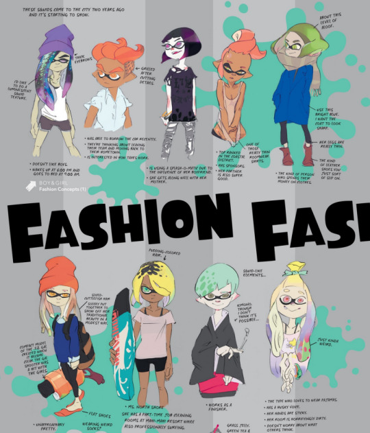
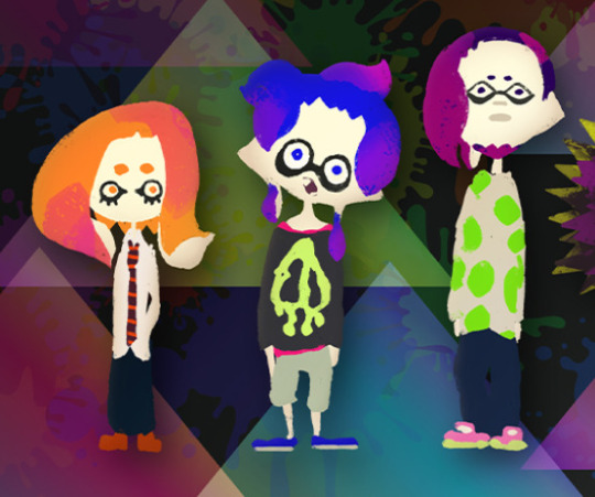
I made a google drive folder of Inkling hairstyles with a lot of concept art, you can see many diverse examples. To address the other specific points of evidence used:
Long fangs: All Inklings have sharp "teeth"/ beaks. Inkling beak shapes can vary. the last one appears to have a snaggletooth.

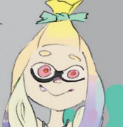
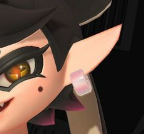
Long ears: Ear shapes can vary as well. compare ears of the squid sisters with the player character. Pearl has short ears. hell even the player inkling ears between s2 and s3 are different.
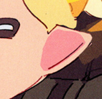
purple fingertips: prior to S3, fingertip coloration was something only seen on octolings, not on inklings. with how her and Shiver can freely change finger tip colors according to their ink, it seems like just a thing inklings and octolings can Do and we just haven't seen much of until now, like how we didn't see much varied hairstyles until s2. Perhaps with how integrated octarian culture is in the splatlands, inklings have caught onto this style as well? Her earrings, the sharp pointy bits in her design: Yes this was used as evidence for the vampire squid thing. That's all eel motifs.
Now the biggest reason she cannot be a vampire squid... vampire squids are NOT squids! They're more closely related to octopuses, but really, they're their own thing (also they're called 'bat octopuses' in japanese... the language the splatoon developers speak. nothing to do with vampires or squids)
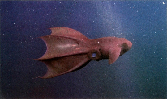
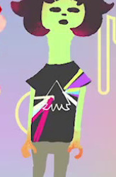
With how splatoon's designs have been so far, other species of cephalopods are not guaranteed to look like inklings, especially if not closely related to ink-producing squids and octopuses (and vampire squids are not) Here we have a dumbo octopus (not octoling). also nautiluses. In the case of a species that would be more closely related to the playable species, what seems to be an octoling based on a blue ringed octopus.


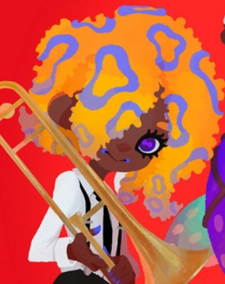
Going off this, if the splatoon team were to make a vampire squid character, it most likely wouldn't be a subtle 'inkling/octoling but 2 inches to the left,' For such a unique species, I think they would be pretty explicit about it in the design itself. And considering that they are deepsea creatures that do not produce normal ink, a vampire squid in splatoon might look pretty odd! In conclusion...please stop claiming frye is "supposed to be" or "canonically" a vampire squid, it's a flimsy headcanon based on superficial traits at best and there is zero evidence that was the developer's intent.
(And while I'm here, Pearl is not confirmed a pygmy squid, marie is not confirmed to be a firefly squid, marina is not a webfoot octopus etc. That's fanon based on their japanese names, not canon. As far as we know, the player inklings and inkling idols are all just one species of inkling. inklings and octolings seem to take inspiration from multiple species, but it's not confirmed if they are those species.)
734 notes
·
View notes
Note
Hey, what pens do you use to draw? And do you start with a pencil sketch before you start using the pen or do you jump right into using ink?
Hey! I use all kinds of pens actually: gel pens and fountain pens most often. I've written about my favorite gel pens some time ago, btw. Recently I've started using oil-based ballpoint pens a lot though, both for sketching and doing cleaner line art. It's a bit tricky, because they don't work well with alcohol-based markers, but I think I'm starting to get used to it. I love how the lines they produce look softer, similar to pencils, so it's very easy to do a colorful lineart with smooth gradation.
Normally I do a rough sketch of the basic shapes with a light colored marker or oil/gel pen, rarely pencil. I don't like using pencils at all tbh, so I try to avoid it as much as possible. If it's something complex and I'm not sure I can handle this w/o lots of erasing, I prefer doing a rough sketch either on a separate piece of paper with a pen or digitally, and then transfer it into the sketchbook/other paper through light table. I hope someday I'll be able to jump right into drawing with ink and not regretting every single line I do, but it's a loooong way to go from now 😅
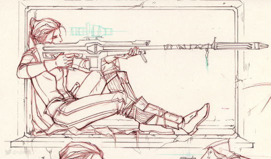
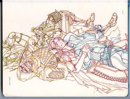
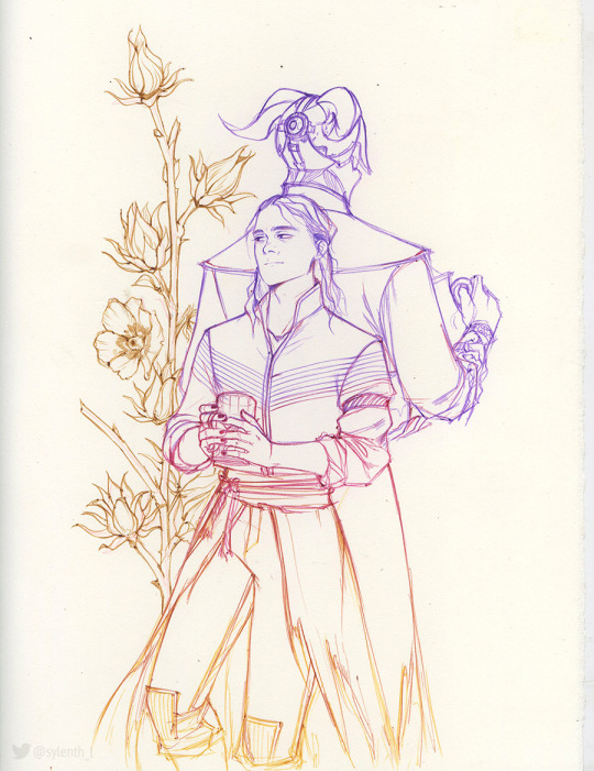
For fun, here are some sketches/lines I have left done with different mediums: 1 is colored pencils + fountain pen, 2 - markers + gel pen, 3 - oil-based ballpoint pens.
Warning: unedited scans!
151 notes
·
View notes
Note
hi broski ummmm what programs do you use for art and what brushes
I use procreate! For lineart/sketching I usually use a slightly modified version of the Shale brush in the default procreate “calligraphy” section- just w/ the streamline feature turned down to zero and more like…size variation? (Idk I modified it a year and a half ago I don’t completely remember what I did lol)
Then for my grayscale comics, like these,

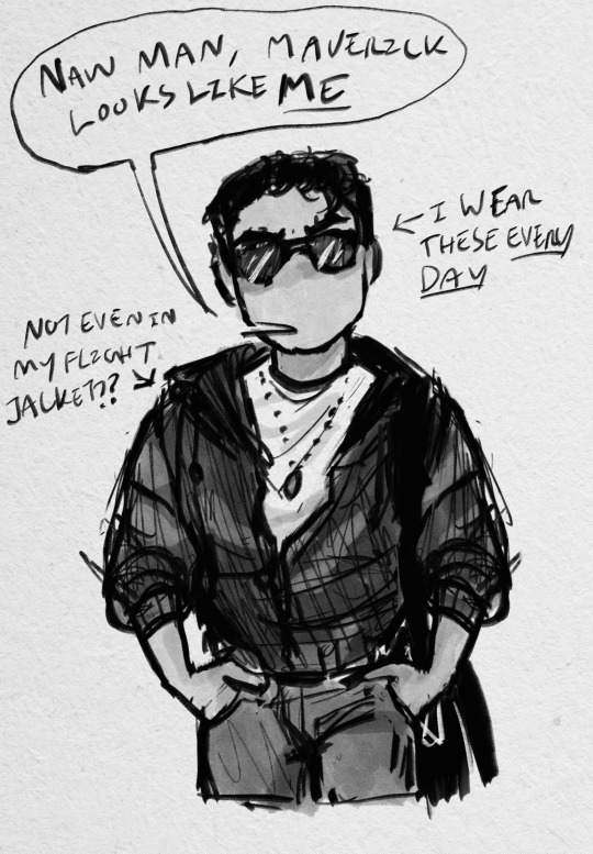
I use this Copic marker brush w/ just straight up black and varying levels of opacity. Usually I don’t use blending brushes in these, but in my most recent one I did.
For my colored stuff tho I use a lotta this pencil brush for everything (shadows, highlights, base flats, etc) and then depending on whether I want something more painterly (like the ocs on the left) or more cell shaded (like stevepop on the right), I either use soft texture brushes or a chalk brush (I cannot for the LIFE of me find where this chalk brush came from?? I’ve been digging but idk I can’t find it outside of my duplicate??) for highlights
Some other brushes/brush sets I use (all of them are free as of rn ‘cuz I’m broke):
Habook Brushpack (specifically the rectangle one- it puts down flat colors nice and fast but also doesn’t annoy me the way most “ink” brushes do!)
Laurenillusrated Brushpack- I use these mainly for skin, they’re really nice. (Also, @laurenillustrated is on tumblr- her art is so pretty, it’s like a storybook istg. Check it out if you haven’t it’s AMAZING)
I’ve recently started using @loish’s brushpack too, and I ADORE these brushes. I used them a TON on the Christine poster. You can get them by signing up for Loish's Digital Art School, which is a great collection of art resources as a whole, and it’s totally free. Would absolutely recommend
And finally, for the halftone texture I like to put on everything, I use the Halftone Hospital Basic Tone Kit. All of their brushes are fantastic, definitely check them out if you like the look of traditional art but also like the lower supply cost of digital art lol. Or just in general, ‘cause they’re great
(Then for the paper texture overlays I love so much, I usually use stock photos tbh.)
Anyhow, these are some of my favorites. But I do use others too, and this all came from years of playing around and finding what I like! I had this phase about…1 1/2-2ish years ago where I hated my art style and nothing was coming out right. It pushed me to try a bunch of different brushes- in retrospect I don’t think the brushes were what made it better, I just improved over time, but I had a lot of fun trying out different brushes. So definitely try ‘em out and experiment, because it really is a fun time :))
(As for my workflow, I talk about that here if you wanna know more about how I draw!)
28 notes
·
View notes
Text


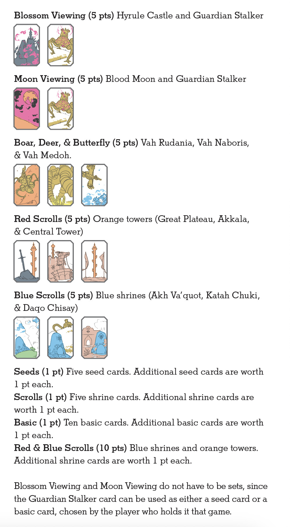
[image description: photos of a Breath of the Wild-themed hanafuda card deck, art rendered with hand-drawn inks and colors printed letterpress from linoleum blocks. hanafuda are a Japanese style of playing cards where the faces only use imagery, with no pips, ranks, or point values printed. there are 12 suits of 4 cards each, 48 total. in the classic deck design, suits are unified by particular flowers or plants; in this version the unifying elements for each suit are plants, creatures, or items from Legend of Zelda: Breath of the Wild. suits of horses, Guardians, koroks, dragons, ex. there are also photos of the small linocuts used to print each color, one cut for every color on each card. cards are about 1 3/8 inch by 2 1/8 inch. end description.]
🎊🎊 tadaaaaa 🎊🎊 here tis, my craftalong project for Desert Bus for Hope 2024! the event starts Nov. 8th this year, and this card deck is up for silent auction starting 6pm PST on Saturday the 9th.
hanafuda!! very very fun to get familiar with this card deck and its games. i think about doing other formats of card deck all the time and always just have to wait for a subject matter that compels me to intersect with a structure that interests me. nintendo started out producing card decks, and maybe they have made LoZ hanafuda in the past—i didn't find one but i'm truly bad at web research—anyway there isn't one available now, only a 52-card deck with alternate Zelda art.
i limited the scope to BotW for lots of reasons, big one being keeping the suits tightly defined to specific things and places, & utilizing one singular map type/environment interface. even adding TotK seemed like a nightmare for keeping suit assignments tidy. each place is a specific location in-game (with some adjustments for better composition, like, Akkala tower is there behind Foothill Stable, but i made the angles of the view cleaner), and wherever applicable, items rendered with surrounding context are done as a specific location where that item appears in-game (the sword in the rock is a real place, where you can pick up a rusty sword and see the Great Plateau Tower beyond). i'll admit to some extra heavy lifting on Satori Mountain but i only actually cheated once: Silent Princess flowers don't grow at the Springs around the statues of Hylia. but that's it!! everything else is real.
the Brights are the Master Sword, Hyrule Castle, the Blood Moon, Hylia, and the Dragons; tanzaku are shrines and towers; instead of Boar-Deer-Butterfly it's Rudania-Naboris-Medoh; instead of sakura-viewing and moon-viewing parties there are…………oh no and oh NO parties?? (guardian stalker + hyrule castle, stalker + blood moon.) in these photos, the suits are laid out in order, January to December. I made a little guide to go in the box based on the one for Nintendo's Mario Hanafuda, which also includes instructions for playing Koi-Koi.
8 colors, 88 blocks, +1 very simple reduction cut for the Sheikah eye on the back side. the classic deck is completely blank on the back, but if i hadn't done the eye i think the deck would've been missing some kind of unifying umbrella. and if you're asking yourself, hey, even with overage it’s only 5 copies of each card, why not hand color the cards? i also asked this. i tried some things and unfortunately did not like the texture at all. Only 88 little lino cuts would do for my brain worms. each card is two layers of 120# cover cross-laminated together. the drawings went down first on each copy; the back sides were printed on separate sheets before lamination. laminated, pressed, colors printed post-lamination, then each card die cut out of the 3x3 inch sheet. i very much like the color palate that came out of it; since the pen drawings went down before colors i printed the grey first to find the bottom end of the value range, bookended it with the yellow, and filled in the middle. my favorite color of the bunch turns out to be the soft brown, or maybe the "gold" with no metallic in it.
i would say this card deck was about as much work as last year's tarot deck but it wasn't all the same kind of work—i didn't have to trawl through a novel of text for excerpts and battle feelings of intellectual inadequacy to have confidence in my reading comprehension, for instance. i had to learn how to draw, like, 20 things i hadn't drawn before, and carve 88 little lino cuts, but it's just not the same kind of effort. long hours, but largely calmer. the tiny but thicc little cards are so nice to hold. i am quite happy with the style of the illustrations i found, trying to make them recognizable objects, so small, and two-color. all in all very satisfying!! (confession: i logged quite a bit of footage from my own BotW playthrough to get reference material but i still haven't actually finished Medoh myself. or fought Ganon. i keep putting it off to mess around and get armor upgrades instead. gotta get to that finally.)
wip
under the cut: the body of the little game guide that went in the box, with instructions for Koi-Koi and explainers on the yaku.
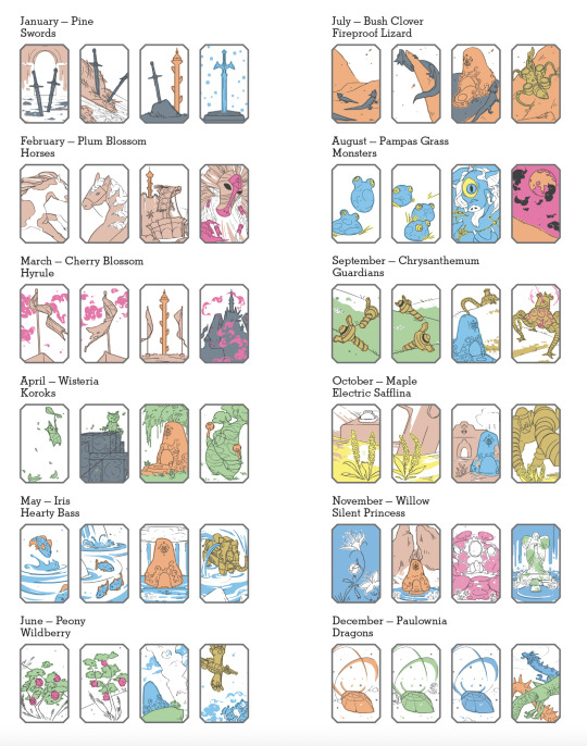


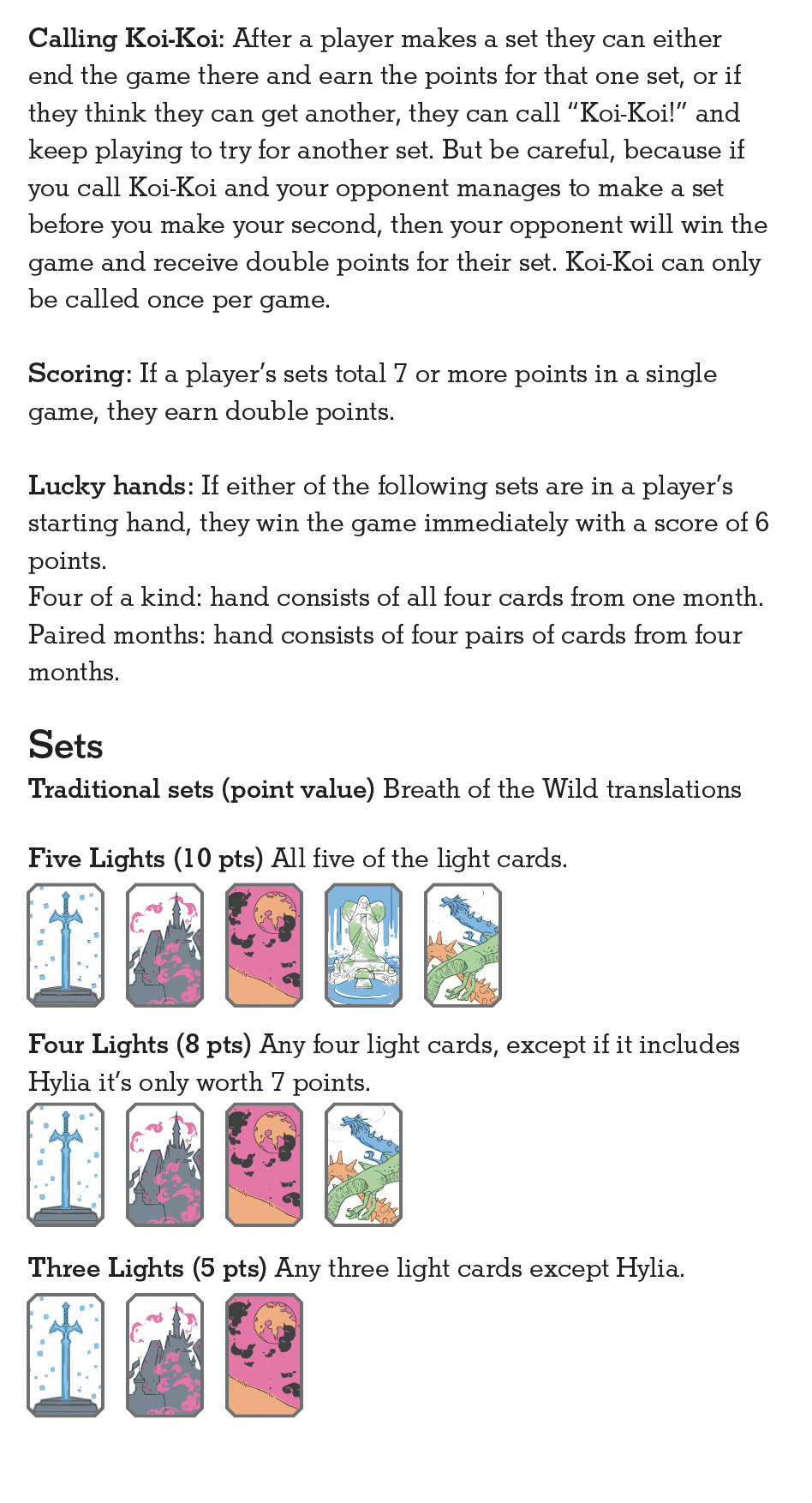
#desert bus for hope#desert bus for hope 2024#letterpress#letterpress printing#linocut#printmaking#book arts#legend of zelda#breath of the wild#botw#loz#db2024#finished works#long post
19 notes
·
View notes
Text
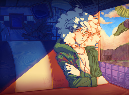
Nagito Color Study | Please do not repost, reblogs are welcome though! Brushes & Techniques & a progress pic below the cut
Uhhhh okay, how to explain this one. I was rereading “Logically Lucky” by PinkSweetSmoke and some of the visuals in the earlier chapters really struck me. The way that they write this relationship is pretty dynamic, and I wanted to see if I could use colors to talk about how Hajime and Nagito feel for each other and what they’re going through emotionally? So this is fanart for that fic, directly inspired by that fic based on the established vista(s) and also the style of writing their relationship, but it doesn’t really make sense unless I say all of that lol? But it wouldn’t exist if not for that fic, so I’d feel weird not mentioning it.
Brushes used (Clip Studio, Free):
Main: “ラフペン” from gyuukotu’s “Fill Set (塗りセット)”, content ID 1695210 Fill: Default India Ink brush pen - the rough pen is a little unpredictable, so I used this to flat the image and make sure that there were no gaps Cloud Flat: "荒筆" from gyuutoku's “Fill Set (塗りセット)”, content ID 1695210 Cloud Blender: I downloaded it from the internet instead of the app 2 years ago and cannot find, with certainty, where it came from, since I get rid of everything on my hard drive that's not art every year :( there are lots of good cloud blending brushes out there for free, though, and I typically use the gouache blender Misc. Techniques: Screen Distortion: I used CSP's free cloth texture clipped above the "blue" layers and then liquified it in places for the screen distortion effect Gradient Mapping: I cannot overstate how helpful gradient maps were for minor color corrections, you guys PLEASE try them on a finished piece of your own if you haven't used them yet. Click Layers > New Correction Layer > Gradient Map and then choose from the premade gradients before adding your own so you can see how they worked. I used a few different ones clipped to specific areas w/ lowered opacity & hard/soft light settings where I felt like the color was falling flat and it was SO helpful at giving it just that little bit more depth. Hearts: I've discovered that you can cheat at hair and clothing rendering by just making hearts. Try and see how many you can find lol Color Theory in General: The whole point of this piece, after it stopped being fanart (lol rip), was to be a color study focusing on the contrast between shadow and light and what I could do within the blues & the yellows to make them appear as if they're actually different colors. In the blue section, everything is p much blue, nothing is any other color. In the sunny section, a lot of the stuff is warmer variations of the standard colors, since I wanted it to be more vibrant and didn't feel like I could achieve that if everything was shades of yellow and orange. That being said, I stuck as closely to that as possible. But ANYWAY, juxtaposing the two starkly different color profiles also helps the blues in the blue side read as colors that they aren't, which was part of why I did this study. Sneaky sneaky: I just modified the diner a bit in order to get the colors I wanted, i.e closing the blinds bc I can. As an artist it's important to remember that YOU have full control over every single part of the piece, you just should ideally have a reason to create inaccuracies/ break rules or else it can end up being a bit messy and disorganized & details/ your vision can get lost.
Aaaand finally, the sketch from TWO AND A HALF MONTHS AGO:
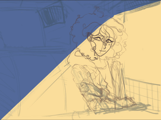
#trusttheprocess 😭😭😭
#nagito komaeda#sdr2#color study#super danganronpa 2#nagito fanart#my art#october 2023#jesus I started in july#but I also like let it sit for a good 2 months after the mockup#so shhhh#fav#komaeda nagito#character study#fanart
73 notes
·
View notes
Text
December Devlog: A Year of Progress
After launching the updated, feature-complete demo last month, I promised that by the end of 2024 I would have an updated timeline of expectations for the full release of Amadeus: A Riddle for Thee ~ Episode 1 ~ Waltz. I feel this is especially important given how many times I pushed back the launch date this year.
I think I now understand why that happened.
TL;DR:
Part 1 - On Episode 1's Timeline
Episode 1's timeline was repeatedly pushed back because I realized making the game good mattered more to me than meeting an arbitrary deadline.
The full episode will release in 2025.
A date will not be announced until the game is nearly finished.
Part 2 - Looking Back at 2024
A list of milestones between the original February demo release and the recent feature-complete update.
Read on if you'd like a lot more words on what this year has been like, and where things are at right now.
Steam | itch.io | More Links
On Episode 1's Timeline
Amadeus began development when I was in grad school studying music composition. I was in an environment where deadlines were external and they were tight, and I learned the incredibly difficult skill of "how to scope properly to actually finish things." This skill is invaluable and the very first public demo for Amadeus (the web-based one with no ink or color assets) was a product of those priorities: it was finished on a really ambitious timeline, and certain corners were cut to just get something out there on time.
One of those cut corners was definitely the narrative. I hadn't actually figured out where I was going with the story. Even in the version from February that was released on itch and Steam, I only had a vague idea of what the full story was; it was not until just last month that I had released a game accurately representing the introduction to a fully planned-out, 5-part story.
This past year, I slowly shifted priorities away from the grad school #grindset and back towards making a work of art that I am really happy with. I could have chosen to stick with my fall 2024 release date just to get something out there. If I had, the narrative would be less coherent, it would lack several gameplay features, and it wouldn't look or sound as good. It would exist, but it wouldn't be the game that it will be, now that I chose instead to take extra time and make a better game.
I do have a final release date in mind, and I am going to earnestly work towards meeting it. But I've finally learned my most important lesson from 2024: I won't announce the release date until I'm certain it will be met, until the game is finished save for pure nice-to-haves. I don't want to make any more promises that won't be kept.
I WILL make a promise that I'm certain I can keep: it's coming in 2025. If you play the updated demo I hope that you will feel confident in this too. The baseline of the game is finished and it's feeling really, really good.
So! Where are we now, a month after that demo update?
This month I've had to briefly shift focus to real life and getting a new job. My current job is part-time which has allowed me more time to focus on Amadeus, but I am not very passionate about the work itself which has ultimately caused me to burn out, both on the clock and off. It's resulted in me not being able to take advantage of my spare time because work stress was seeping into it. I am really hopeful that what I'll be moving to instead will be personally fulfilling, and still leave more time for Amadeus than a typical 40-hour 5-day work week.
While the lifestyle shift was my main priority, I still did a lot of project management work to get back into development for the final stretch. It's been a month of pulling my head out of the weeds on the now-finished demo and zooming back out to look at the full episode's remaining needs. I've read back through all of my brainstorming and planning materials, catalogued these materials for ease of future reference (which are in about 8 million different physical notebooks and digital files), and revised my outline to make sure it all makes sense with the narrative that's now finalized.
It's not the kind of month where I have lots of nice flashy things to show, but this work was definitely necessary for me to get in the right headspace to finish the rest of the project. And I did find the time to draw another background! Dartmaure now has a downtown plaza:
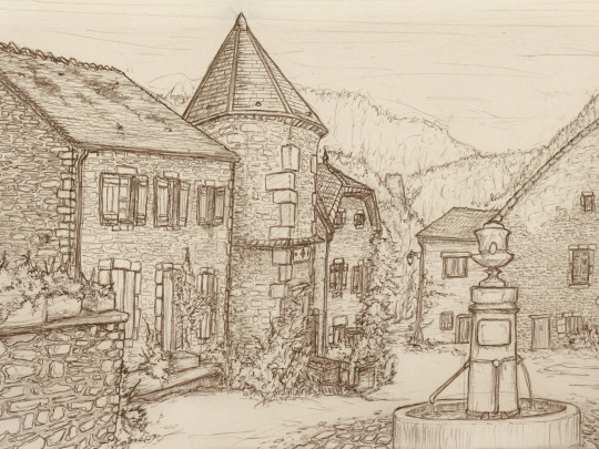
December 2024 has been an important month to get me excited about the full scope of this project again and find a work-life situation that will let me stay motivated in the long term. That's vital, because Amadeus is turning into even more of a long-term commitment than I'd already known it would be.
Speaking of long-term... I want to take the remainder of this devlog to look back on the full year. I have been working on Amadeus for nearly 2 years at this point, but this past year in particular has been kind of insane.
At the start of 2024, I thought that by the end of it I would have released Episode 1, which didn't happen. I had also thought that the final episode would look and play almost exactly like the first demo, just with some additional scenes; this isn't what happened, either.
As it turns out, the game I would end up building has so much more polish and depth to it. It would even get exhibited at MAGWest's Indies showcase! I genuinely think the game I am making exceeds all of my own prior expectations of what a game I would create all on my own could be.
(I mean, let's be clear: it's still a janky no-budget solo indie passion project by most standards. But it's so much more polished and has so much more depth to it, narratively and aesthetically, even mechanically, than I would have possibly imagined a year ago.)
It's really come together over the past year, a little bit at a time.
Looking Back at 2024
February 2024 - Original Demo Release
Launched the original version of the Episode 1 ~ Waltz demo on itch.io and Steam.
This version isn't playable on itch anymore, nor is it accurate to the narrative. You can opt into the old build on Steam if you are curious, as a matter of pure historical record.
March 2024 - 100 Wishlists on Steam
Perspective: this number is small for most developers, but it was a major milestone for me.
April 2024 - Wrote a Mystery Game
Took a month away from Amadeus to write a game for the Mystery Game Jam: Robot Detective and the Case of the Automurderated Intern.
The jam host described it as having an "Agatha Christie-like twist."
This collaboration let me focus purely on the craft of writing, which later helped me really improve Amadeus's story.
June 2024 - Steam Next Fest & Major Narrative Benchmark
Participated in my first Steam Next Fest.
Very stressful and a great learning experience.
Finalized the game's full narrative and wrote 1st draft of the entire script.
July 2024 - Major Mechanics Benchmark
Coded & implemented a majority of needed key mechanics, including:
glossary menu
save & load
seamless audio looping
rich text support
visual feedback on mouseover
August 2024 - Getting There
Made an opening cinematic that plays in-game.
Redesigned menus and interactive screen UI.
Finished a new, convention-exclusive build for Amadeus.
September 2024 - MAGWest
My first ever tabling experience!
Received so much motivating, inspiring, and positive feedback on the game.
Gained confidence that the game is in a good place to be finished based on this foundation.
People loved the art and sound direction :)
November 2024 - Feature-Complete Demo
Released the current feature-complete demo update for Amadeus.
Demo build is based on the MAGWest build with additional features and a new scene.
Currently live! On itch and Steam.
For those of you that have been following the game since February, most of this isn't news; but it's still really motivating to look back and see how much was accomplished in a year. Thank you so much for following this project. Please look forward to the full release - I promise it will be so worth it!
Happy new year - and don't forget to bookmark linktr.ee/amadeusgame for all of your Amadeus-related needs. ;)
7 notes
·
View notes
Note
Not a suggestion, more a question - how do you make your stickers? Your art inspired me to make stickers but I don’t know where to start!!
Ooh Tutorial Time! I have a small rundown of my process here. (I’ve got a video here, but I’ve had an update in my materials. Also this got a little away from me, I hope this helps and lemme know if there’s anything I need to elaborate on!)
--- Materials: Printer - Epson Ecotank 8500 Cutters - Silhouette Cameo 4s (I’ve got 2 at the moment) Paper - Zicoto Glossy Vinyl Laminates - Glossy and Holo Star Laminate (Both Self Adhesive) Misc Off Brand Sticker Cutter mats Ruler Squeegee with extra microfiber wrap Sports glove tack spray or sewing basting spray
Printer - Aim for a photographic printer at the minimum. General print quality, color variety, and paper handling will make sure your prints are the highest possible quality. They’re a little more expensive, but my last printer lasted 4 years with frequent weekly printing. The ecotank is nice, it’s more visual that the ink is actually disappearing than the pre-filled cartridges lol. Cutter - I’ve only used Silhouette, but I’ve heard to stay clear of Cricut due to general cut unreliability and lack of customer service assistance. I’ve also heard great things about the Siser Juliet cutter from mutuals. In order to use 2 machines at the same time, I had to purchase the Business license ( p sure it was a one time $50 purchase, but I can work twice as fast). If you want to cut by hand, check out what kind of ergonomic scissors you can find. Classic scissors over time can really screw up your hands, especially when you’re making fine cuts.
Printing and Sizing - The Silhouette Studio resizes your stickers without many issues with quality changes. This does kinda depend on the base size of your files. I always make my stickers on a canvas 3000x2000 pixels and 300 dpi. I wouldn’t go any lower than 100 dpi for print, and no larger than 500 dpi, but you can always test this out.
Paper - I enjoy the luster of the paper I linked above, there’s almost a pearlescent quality to it. If you’d like a different quality, I recommend still sticking with glossy vinyl for your paper. Laminates on matte sticker paper have had a lot of trapped air underneath for me and it tended to be more likely to bleed in contact with water despite being laminated.
Laminate - If you’re just doing paper finish stickers, you can skip this step :)
Laminate them to make them more water and scratch resistant. The laminates I’ve listed are all self adhesive. There are also heat adhesive laminates, which require a heat laminator. I haven’t experimented much with heated laminates. Mine are best rated for hand wash, though they can go through the dishwasher a few times. When laminating your sticker sheet, be sure to not cover your registration marks. When your cutter tries to read over them and the surface is really reflective, it can cause the machine to read improperly (and it’s worse with the holographics lol). Either precut your laminates like I do in the video I linked above, or you can use matte tape over your laminate to dull the sheen. If you accidentally cover your registration marks, the matte tape is a lifesaver. Self laminating takes some muscle memory to not get bubbles trapped under the laminate, but a wide squeegee and firm pressure helps make sure you get as few bubbles as possible. Mats - Your cutter will come with a few, but I find that my off-brand ones are just as good and less expensive. I prefer low-tack, but there comes a time when the tack is absolutely gone, and I have 10+ mats just sitting around. That’s where the Sports Glove spray or Sewing basting spray comes in! After washing them (soap and water, then dry for a few hours), I hit them with a few coats of spray. Right now I’m using Pow’r Tac Grip Spray. It’s just ok, but this leaves less residue on the back of my stickers than the Basting Spray I used to use. I retack every month or so, but that’s more bc I’d prefer the mats to be less sticky than risk ripping my backing sheets.
----
If there’s anything you’d still like to know, please let me know!!
#my art#tutorial#stickers#sticker making#art tutorial#my process#i'll never gatekeep lol#paleo party
14 notes
·
View notes
Text
HAPPY HALLOWEEN!!!! HAPPY SPOOK HAPPY HAUNTING NIGHT!!! I present an Arttober challenge I completed :D
This was part of GinganinjaOwO's "ActuallyInfected" art challenge that took place for 20 days with 10 prompts each starting and ending every other day to get to play around with ideas, and the best part is that its all centered around the most common of art mistakes people face!! From marker bleed to files corrupting this was extremely fun I highly recommend checking it out even if its past October as its such a nice way to get yourself to learn to embrace the mistakes in your art rather then get worked up about them and stress:]
I decided to go full on traditional with this one with the hopes of getting back to my roots and enjoy just Creating for me without the worry of impressing an audience! I feel so proud of these especially after having not done traditional art in years Not to mention color anything without the burnt out defeat of it not looking like the exact colors on a ref sheet or what I had in mind. All in all very fun and here is what I made:D!!!
Day 1, Marker Bleed, ISAT edition:3


Day 2 & 3, Corrupted File & Misprint, based on misprint stickers


Day 4, Scrapped, based on a story I had scrapped then recently picked up and revised (my favorite one out of all of this I love it sm Sam my dear I'm sorry for what I'm putting you through<3)

Day 5, 6 & 7, Spilled Ink, Analog Film & Broken Model


Day 8 & 9, Tangled Thread & Blue Screen


Day 10, Anomalies (anime fight edito💥/j)

Since this I've been cracked out on making designs and sketches for projects and stories, I literally wake up and go to drawing and go to sleep excited to wake up and draw this is amazing
And a little extra doodle for the group of 6 in 'The Calamitous Heart' who didn't get an illustration focused on their suffering, he gets to sleep instead :D

#my art#actuallyinfected#actuallyinfected2024#isat fanart#isat siffrin#Berry 2.0#Juneberry Cookie#crk oc#Disco Dancer#jsab oc#jsab sona#Sunset Steve#Sam#Lizi#rainbow steve#Kallisto#void steve#Kizzy#Loden#light steve#steve saga oc#The Calamitous Heart#steve saga au#Ereka#Poison Ivy#Prismatic Spectral AU#art prompt#arttober
7 notes
·
View notes
Text
Disney's The Gremlins Over the Years
Chapter 1: Gremlins (Part 2)
This is Part 2 to Chapter 1. If you want to read Part 1 first, it's in the link below.
Due to the recent events with Epic Mickey Rebrushed, I thought of making a series of posts dedicated to Disney's infamous characters from the canceled WWII movie The Gremlins. The character designs of these guys have changed many times during the concept art process and over the years. Today, this is a collection of male Gremlin designs. The female Gremlins were called the Fifinellas, which I will get to them in the next post. For those discovering this, in summary, Disney was making WWII movies and shorts for the war effort. They were going to adapt Roald Dahl's first book about these guys, and several things like people getting tired of war movies and figuring out how to make the movie, which was canceled. I'm making these posts for fun and to help give artists ideas for their OCs and fanart. I would post some sample pictures and a minor breakdown in each post. I might miss some because there is so much, so this is just a handful of pictures and photos I collected over the years. We really need to make a Disney Gremlin's Wiki.
Anyways, let's jump into THE FUTURE!
Canceled Live Action/Animated Project (1992): Jumping forward into the future, Jerry Rees, director of The Brave Little Toaster, and Steve Leiva were trying to make a feature based on the original story with live action with animated gremlins like Who Framed Roger Rabbit. The illustrators for the project were Steve Moore and Frans Vischer. Again, GLAD they didn't we didn't get this style of the characters since they're far from the original designs. Here are two samples by Steve Moore.


Return of the Gremlins (2008): When Disney made those terrible DVD sequels, Dark Horse and Disney made a deal to reprint the original book, make merchandise, and release a three-part comic sequel in 2008. The first cartoonist was Dean Yeagle, but he could not finish, so DreamWorks artist Fabio Laguna came in to do the final issue. In this story, Old Pilot Gus's grandson, Young Gus, goes to Old Gus's home in Brittan to handle the property sale. But SURPRISE! It's inhabited by the Gremlins that Old Gus befriended during WWII. Chaos ensues...

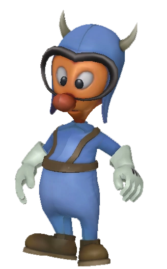
Epic Mickey (2010): Now, the moment you've all been waiting for, the game that introduced most of us to Disney’s Gremlins. Here are the variants we remember split into two groups: 3D Gameplay and 2D Cutscenes. Going forward, some of these pictures are from the Epic Mickey Wiki.
3D Gameplay


2D Cutscenes


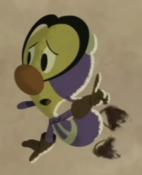

Epic Mickey Comic (2010): In the 64 page-long graphic novel, the only Gremlin character who appeared in the comic was Gremlin Gus.
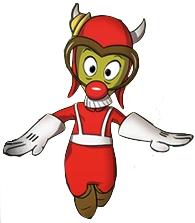
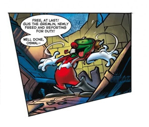
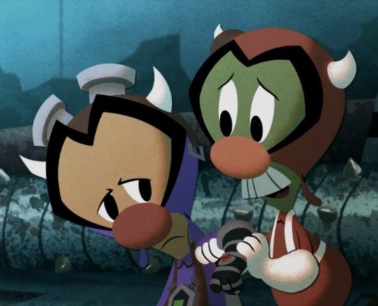
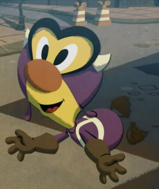
Epic Mickey (2012): In the sequel, we get more variants of the Gremlins and a Gremlin Prescott redesign.
3D Gameplay
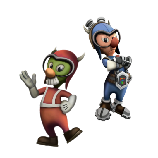


2D Cutscenes
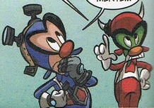
Epic Mickey Comic (2012): Gremlin Gus was joined by Gremlin Prescott and Gremlin Jamface.

Donald Duck #18 Comic (2015 IDW): This is the crossover we have wanted since the Comic Cover. In a translated European Swedish comic of 'Rue Brittania!', Donald and Fethry get a new assignment: travel back in time to WWII and face the Gremlins to de-gremlin the airfield. Artists: Pencils and Ink by Flemming Andersen and Colors by Digikore Studios.


There's a lot more I could add, but we would be here all day. If this post gets popular enough, I will do more on the side before the game comes out. If there are changes to the Gremlins in the Reboot, I'll make a Part 3. Hope this post is a helpful source for old and new Gremlin and Epic Mickey fans alike!
#disney the gremlins#disney gremlins#epic mickey gremlins#gremlin gus#gremlin jamface#gremlin prescott#epic mickey#epic mickey 2#fifinella#widget#part 2
25 notes
·
View notes
Text

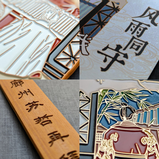
The trouble with collecting merch is it’s difficult to stop once you start. This Jingsu enamel pin is by the prolific 长风万里, who is responsible for some of the most iconic NiF pins (check out the weidian store for a partial selection). Like many fan-made pins, it’s a re-rendering of a scene from canon, in this case episode 52 [x], where Jingsu look on as thunder and wind portend the storm brewing on the horizon after Princess Liyang has agreed to present Xie Yu’s confessed crimes at the Emperor’s banquet.
The pin emphasizes the storm in both design (bamboo leaves scattering in the wind) and name: 风雨同守, loosely enduring the tempest together. As for why the image has been transposed onto a tattered scroll, the pin maker said the inspiration came from rubbings/拓印 and elaborated some more:
Personally, I think of this as an excavated artwork (with the surface damaged in its old age) that was created out of Jingyan’s longing. As if Jingsu actually existed in history and will live on for a long, long time. 我自己把这个当做是一件出土的画作(年岁久远画面有所破损),是景琰怀念所做。就好像历史上真有他们的存在,靖苏真的来���方长。
Historically, rubbings not only create an impression of existing artwork but are themselves artworks that take skill and patience. The typical process starts with adhering paper to a stone carving, then ink is dabbed to the paper such that the flat surface takes on the color of the ink while carved areas remain white (here’s a process video). Collecting rubbings was a popular pastime of the literati, and rubbings of good calligraphy were especially in demand for study and appreciation, serving a similar purpose to block printing in allowing many people to see replicas of an original. The originals may have also come from a non-stone medium: some artworks originally on paper or fabric were replicated onto stone so that rubbings could be made and collected [x]. Nowadays, ancient rubbings are valuable artifacts, especially in cases where the carving has been lost.
The rubbing influence is very clear in the second version of the pin, here juxtaposed against one of its inspirations:
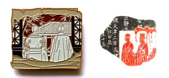
Though the text on the right rubbing says it’s from the Tianping Era of Eastern Wei, Year 2/魏天平二年 (535 CE), which is contemporaneous with the Liang dynasty that loosely inspired the fictional NiF Liang, I couldn’t find an actual historical artwork corresponding to this rubbing, and the mass antique market is flooded with fabrications (it’s also thoroughly possible I simply failed to find the original). But here’s a real fragment of a stone Buddhist votive tablet and its rubbing that’s now at the Art Museum of the Chinese University of Hong Kong [x]:
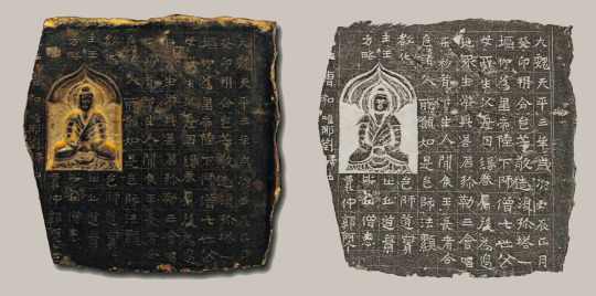
The text says that this was made in Tianping Era, Year 3, one year after the one above, and describes the building of a Buddhist pagoda in offering, which was a common practice at the time. This monochromatic rubbing style was also quite typical; though both black ink and red ink (cinnabar-based) rubbings existed separately, they were not really seen in combination in a single rubbing until much later. What is believed to be the only surviving book of bicolor rubbings before the modern era was made in the Qing dynasty around the 1800s and was itself a copy of a lost multicolor work from the same dynasty [x].
In this context of transference of art and meaning between mediums, it’s all too easy to imagine a backstory for this Jingsu scroll: first there was a stone carving, close enough to the actual scene that the artist must have worked from Jingyan’s memory of that day. Instead of the more common approach of carving the outline or the background, the artist decided to carve the foreground so the figures were sunken into the stone. And later, a rubbing was made and mounted onto a scroll, buried and excavated, then finally rendered from fiction to reality in the form of an enamel pin. Each creation is an act of remembering and reinventing, of placing yourself in the observer’s shoes, of stoking the flames of the original story—the fire burns on through metaphorical wood replaced over the centuries, its appearance ever-changing, its core not forgotten.

That’s enough of reading too much into things—I also like the pin on its own. One thing that 长风万里 does well is not just sell pins but also communicate the entire behind-the-scenes process with the QQ group, which is several months’ worth of iterations that I find at least as interesting as the final product. For this pin, you can trace through chat logs how the pin evolved all the way from the original concept sketch to the pieces of metal that fit in your hand (thanks to 长风万里 for letting me share the draft versions here):

Once the pin maker comes up with an idea and decides to go for it, the initial sketch is given to the commissioned artist (this pin was drawn by Forwrite, on weibo and lofter) along with reference images. The artist turns these into a line drawing following the design rules of enamel pins (each block of solid color should be fully enclosed by lines, for example). Some artists will color in the line art while other pin creators commission only the line art and fill in the colors themselves. The final colors are limited to the available palette at the factory chosen to make the pins, and once the color vector art is handed to the pin factory along with instructions on detailing and finishes, the physical manufacturing process begins in earnest (this could be the subject of its own long post).
You may have noticed that there are some color changes from the vector design to the physical pins, most notably the sky in the top pin. This came about as a serendipitous accident where the factory colored the sky of the sample pin dark blue instead of the requested sunset yellow, but the pin buyers active in the group chat liked the dark blue enough that it was kept as the final color. The light grayish blue variant ended up being chosen for the backing card/背卡 instead:
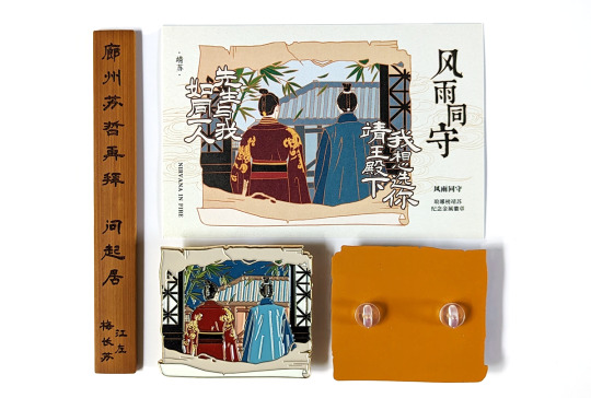
Though backing cards are nominally named for their purpose in supporting the pin, practically no one sticks their pins through these cards in Chinese fandom; instead, collectors generally buy cases and books to keep each piece in pristine condition. And so unlike utilitarian cards that are meant to serve as a background to the pin, fully designed backing cards that stand on their own are very much a thing. The card also adds back in the iconic Jingsu lines that were in the original concept sketch, I want to choose you, Your Highness Prince Jing/我想选你靖王殿下 from Mei Changsu and Sir and I are as one person/先生与我如同一人 from Jingyan.
And now for the last part of the merch package that comes with the pin: the wooden piece on the left is an inscribed bamboo name slip/名刺 meant to resemble what MCS might have presented Jingyan when he visited his manor in episode 9 [x]. This was a preorder bonus to encourage buyers to get on board early, since the upfront costs to commission the artist and get a sample made at the factory are a significant portion of the overall costs (if not enough people preorder, the pin is canceled and the payment refunded, and the pin maker has to take the loss of at least the artist’s fees).
Name slips were the ancient analogs to modern business cards and an important tool of connection building in the ancient bureaucracy. The tradition of presenting a slip before you visit someone’s residence, especially if you’re lower in status than the person you’re visiting, persisted for many dynasties while the form of the slip evolved over time. Even though the visitation slip in canon appeared to be a bound paper booklet, folded books wouldn’t appear until the Tang dynasty—though paper was invented in the Han dynasty, it took time for the manufacturing process to improve sufficiently for a fundamental shift in writing mediums. Bamboo slips were what they would have used in the real Liang dynasty (plus, the modern-day replica is objectively great merch that can be used as a bookmark/fidget stick/cosplay prop/whatever else you can think of).
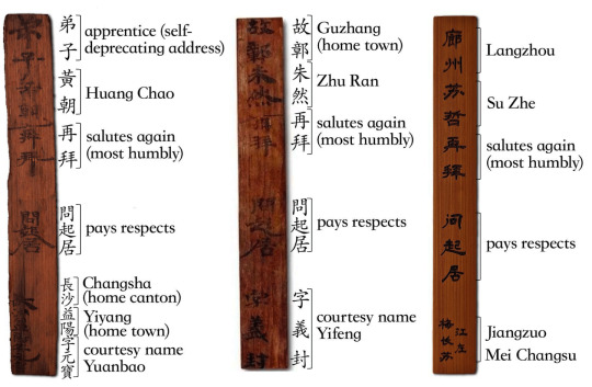
Slips from around the NiF time period generally stated some combination of your given name/名, your courtesy name/字, the region you’re from, and some boilerplate deferential language. Here are two real ones from Huang Chao/黄朝 and Zhu Ran/朱然 of the Three Kingdoms period next to MCS’s, with the meaning of some phrases listed in parentheses after the literal translation (using two of MCS’s names is a good solution for the lack of courtesy names in canon):
To balance out all the white background product photography, I’ll close with some texture shots:
#cost for everything was ¥90 or about $13#overseas shipping not included#先生与我,如同一人#chinese fandom#nirvana in fire#琅琊榜#merch review#long post
82 notes
·
View notes
Text
2024 Megaman Valentine’s Day Fanart Contest Rules Thread *CLOSED*
Hiya. Anybody still using social media or drawing and not using AI? OK, cool. Drawing neat Meganman pics contest #17 for Lovey Dovey Day sponsored by me and stuff is go time. After last year was a little different, and went the gift exchange route, it's back to your regularly-scheduled competition this season. The deadline this year will be on Tues., Mar. 12th, 2024. Nearly a month AFTER Valentine's Day? Wh…why? Because I'm tired, and you all are too, that's why. Or, well, read on to find out. XD As is the usual norm, there are two categories this year, one for Talent and one for Humor. You are allowed to submit one entry for each category, if you would like. If you place in one category, you will be automatically disqualified from the other, for reasons of fairness, and to give other people a chance to win a prize.
CATEGORY 1 (Talent): Black and White Day

This year, good ol' Steamboat Willie, the first Mickey Mouse cartoon, went into public domain and people got somewhat excited about that. On top of games like Cuphead or Bendy and the Ink Machine, the retro look of 'Rubber Hose' animation has had a bit of a revival over recent years. You might even know a fellow Mega Man artist or two who has experimented with that style, or maybe even own a Mega Man shirt that has the pic above on it, as I do. So, for this year's talent category, your goal will be to create a beautiful monochrome piece in a retro Rubber Hose art style celebrating the pseudo-Valentine's holiday known as White Day. What is White Day? How would you draw something for it? If you've played X DiVE, you certainly know about the White Day outfits for characters such as Alia, Cinnamon or Axl. But here is a basic explanation via Wikipedia: "White Day is relatively new, created by the confectionery industry in Japan. White Day was first celebrated in 1978. It is celebrated one month after Valentine's Day, on March 14th. It started as an "answer day" to Valentine's Day on the grounds that men should pay back the women who gave them chocolate and other gifts on Valentine's Day. Men are expected to return gifts that are at least two or three times more valuable than the gifts received in Valentine's Day. The color white was chosen because it's the color of purity, evoking "pure, sweet teen love", and because it's also the color of sugar. Gift exchanges happen between romantic partners, friends, and coworkers. Traditionally, popular White Day gifts include food like white chocolate, marshmallows, candy, cookies, and other "white" accessories like jewelry, bags, lotions, and lingerie."
Content Requirements: * Mega Man characters of your choice celebrating White Day * Mimicking retro "rubber hose" art style (Eg: Steamboat Willie era Mickey Mouse, Betty Boop, Popeye, Cuphead, etc.) * Black and white/monochrome palette. Seeing as this is a Mega Man contest, a retro Game Boy screen-like greenish tint is acceptable. As it is for love, I will also accept a garish Virtual Boy reddish tint, if you are that daring. Otherwise, try to keep your art retro-looking, using black, white and grey. No full-color illustrations for this category. * As this is the talent category, judging will be primarily based on the effort, creativity & overall concept of your piece. How well you pull off the rubber hose style for your characters and how well your picture fits the White Day theme.
CATEGORY 2 (Humor): Showing Some Skins

If you are like me, you have a favorite skin/outfit in X DiVE and you never end up changing it out. It may not be Christmas or Halloween anymore, but you might be that person who always uses Christmas Ferham or Halloween Vile, regardless of the time of year. So, forget the Cupid costumes or giant teddy bear outfits this Valentine's. Create your own holiday skin/outfit you wish would have been implemented in DiVE, but it's being worn at the wrong time of year. For the humor category this year, I would like you to create a funny Valentine's day pic where some character is wearing the wrong holiday outfit/skin that kinda changes the whole mood of a romantic evening together. Then again, it may or may not kill the romance, and might enhance it. Whether it be St. Patrick's Day Toad Man driving Snake Man and Ophiuchus out of a candle-lit restaurant, Tron Bonne picking up her date on her Macy's Thanksgiving Day Parade Float Gustaff, Tax Day Armor X crunching numbers with Alia in bed while asking her if she plans to file single or jointly this year, or someone risking themselves for President's Day sexy Mr. Lincoln skin Proto Man, the romantic holiday mismatches are endless!
Content Requirements: * A Megaman character of your choice wearing any holiday-themed skin/outfit that does not really belong for Valentine's Day, in a Valentine's Day setting. * As this is the humor category, judging will be based primarily on how funny your piece is. Creativity, concept and execution may get you some bonus points. But the focus of this category is how well you make us laugh, not how technically skilled you are at art!
PRIZES:
The winners for both the Talent and Humor categories will receive the following:
1st Place: $175 USD 2nd Place: $100 USD 3rd Place: $75 USD
SUBMISSION GUIDELINES:
When you submit, I would prefer you include the following information in this format, along with your entry:
(Your name/preferred alias) – As much as I usually know who you are, there’s always someone new or somebody who has a different preference from what their email name says. A link to your preferred social media account also works.
(Category this entry is for) – You can either say 1/2, or Talent/Humor
Anything else you feel I need to know about your piece is always welcome.
Only submit your own work, as usual. Any character, major or minor, from any series is allowed. Pairing characters from different series is totally allowed. Same-gender pairings are completely fine. OCs are allowed, as long as your art contains at least one canon Megaman character.
As always, participants are allowed to submit from all over the world.
Paypal is still the preferred method for cash prize payouts. Please have a valid account to receive your winnings.
Youngin’s, get your parents permission before entering.
Entries can either be e-mailed to me at rock2125[at]hotmail[dot]com, or you can just DM/note me a link to your pic.
DO NOT post your pics in this thread, your dA galleries, Twitter, tumblr blogs, other sites, etc. until the contest is over. This is the fairest way for competitive reasons. I prefer to keep them all secret until the deadline has passed. I’ll edit a confirmed entry list in this thread when I receive them. So you won’t be in the dark about whether or not I’ve received your entry.
DEADLINE:
The deadline for this contest will be Tuesday, March 12th, 2024, by the global end of the day. This gives you nearly 2 months to finish your entries! And if I'm lucky, results can be posted on or near White Day, which is March 14th. A little different this year, both to give people more time, and to fit in with this year's themes mixing it up.
MISCELLANEOUS INFO:
As usual, If you don’t plan to enter, but would like to help me judge, please let me know through DM or mention so here. Never hurts to have extra opinions on all the entries.
Bug me with questions if you have any. Please join in, and good luck to everyone who enters!
Confirmed Entries:
Cat 1 Talent - HikariLux, @eulogysinger, Kaitlin.EXE, @wennastudio, Komito, @sylviidaee,
Cat 2 Humor - AbilityField, @aurantia-ignis, Miralie
24 notes
·
View notes
Text
ask dump #3!
rch
Yes and no! Holetta Baby is a character song for a story I wrote in high school with some friends I've since fallen out of touch with --- because of that (esp. since some of the characters were based on ourselves), and because it's frankly bizarre, I don't know if I'll ever share too much about it.
All you really need to know is that it's from the perspective of a man whose wife flew away as he gradually realizes that she's never coming back. IIRC she was just fleeing for a while because their love was forbidden, hence "Loving you's so good I fear it's wrong." In reality, she got trapped on an island somewhere and he was too heartbroken to consider the possibility that she might need rescuing.
Thank you!!! I really can't overstate how happy I am that Townsend resonates with other people who have intrusive thoughts. It's something I still have trouble talking about but she's been a good outlet for that. Also quite happy that the angst is hitting right ehehe
art

Honestly no, I have so much trouble with that too OTL. Occasionally I use the warp tool on a sketch to help put an interesting line of action before I actually do lineart? I recently started experimenting with drawing in fisheye perspective too, and that definitely shakes things up.
Thank you so much!!
I almost always draw in Procreate (with an iPad + apple pen). I have 2 sets of favorite brushes on there - these are what I usually use:
6B Pencil (found in the "sketching" category). I use this for EVERYTHING from lines to rendering.
Studio Pen ("inking")
Medium Hard Airbrush aka the most generic brush on earth
Inka ("inking")
Spectra ("painting") - annoying because it can alter colors by pressure though
Then I have this set I call 'ink kit' which I use when I want to change things up without actually switching mediums lol
Blackburn ("drawing") - Really thick brush that makes me think a little harder about lines. I also have a duplicate modified to make it a little smoother and smaller & I switch between those two when doing lineart on these pieces
Gesinski Ink ("inking") - one of those pens that's flat so it's really thin or wide depending on the angle
Oil Paint ("painting")
Watercolor ("painting") -- just for coloring stuff in when it doesn't have to be precise
Also these niche uses:
Driven Snow ("elements") for freckles
Nikko Rull ("painting") for skin texture
adamandi

It was just a fairly thick curling iron (curled upwards all over my head) and then a lot of hairspray. If I remember correctly, the first night it was done by our costume designer Hahnji Jang (@/hahnjij on insta!) and then I did it myself the rest of the nights. It was definitely their idea at least - my hair is naturally pretty flat and up til then I assumed Vincent's would be too, lol.
No idea where the bag (or really any of it) is from, sorry. I really liked walking around in his swooshy jacket, and I ended up buying it afterwards. As far as normal people clothes I would actually wear, I really really liked his pants, which I was unfortunately not able to keep.
There actually exists in my mind a completely different "biblically accurate Vincent," which is the Vincent I had been picturing all the way up until the actual performances. I always pictured him with long black hair and freckles, and I considered drawing on freckles for the show because of that.
11 notes
·
View notes
Note
Two things
Any tips for line work?
Any tips for drawing eyes?
You’ve got a killer style for that and I struggle for things like that, so was wondering what you do for that and have any advice for a young artist? Also Steve is gender goals and me and him have the same haircut which makes me happy. Comics with an older queer character are nice, makes me happy to see someone like me get to get older like that :]
This ended up really long, sorry...
"Style" is really just an amalgamation of every decision an artist makes. When you're starting to learn, your brain is processing a LOT on the technical and fundamental side. In time, these will become tools for you to use as you please.
Your style is in you already, I assure you. It's the clothes you love, your favorite color, the season that makes you comfy... Art is a form of communication, and the first person you have to learn to communicate with is yourself. It's a lifelong process of growth, self love, and personal expression. It's nothing to rush!
these are from 2011, 2016, and 2023!
(13, 18, and 25 years old)
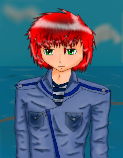
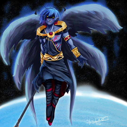
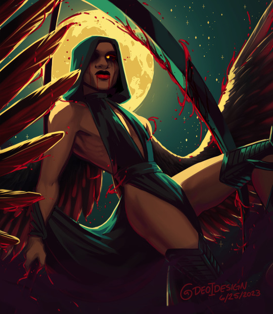
You can see how my skills have evolved, but my tastes are rather much the same. I've still got an absolute ton to learn.
When it comes to lineart, if you find yourself regularly struggling with "losing energy from the sketch", then making your lineart thicker might be a solution; thicker lines are a lot more forgiving!
This is a common issue many artists struggle with. It happens because the sketch has multiple lines, so the brain gets to choose which one it likes most. When you do lineart that choice isn't up to the brain, so it's not tricking itself to seeing all its favorite lines anymore.
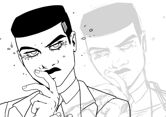
Lineart can also help you define depth. Generally speaking, thicker lines tend to be on closer objects, and further away objects have thinner lines. You'll also lose more and more detail (and sometimes edges) the further away an object gets.
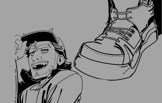
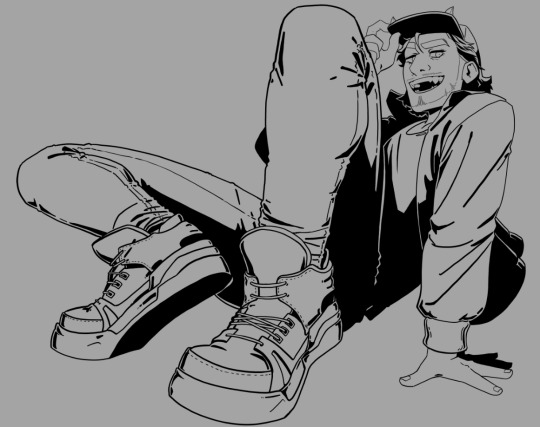
It can also define light in your lines. solid blacks can block out entire sections of shadow. Another option is hatching, and another is stippling. It doesn't have to define light, though, many styles define their light through various other shading methods.
My biggest tip for lineart is to practice "line confidence." fill a sketchbook page with lines that span the entire length of the page, evenly distanced, as straight as you can, without lifting the pen. Do this every day. Fill a page with ellipses, fill a page with circles. Do this every day. Eventually, you'll learn to 1: draw with your entire arm, which will save you a lot of quite literal pain in the future, and 2: you'll be able to draw the right line the first time more often, which will save you time and frustration!
I didn't have an example offhand so I did this to show what I mean, but I highly suggest doing this on paper in ink and not on the computer, if you can.

When it comes to eyes, definitely look lots to real people, and also pay attention to how artists stylize them! There's generally 4 main things to keep in mind:
1: the top lid. This one is major for defining the expression, so it changes a lot depending on context.
2: the bottom lid! this one doesn't move nearly as much.
Each lid has a vertex, and changing where the relative high and low points are on them between characters can change a lot about what the eyes are saying.
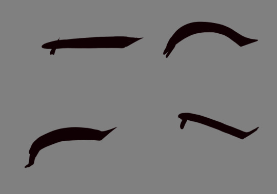
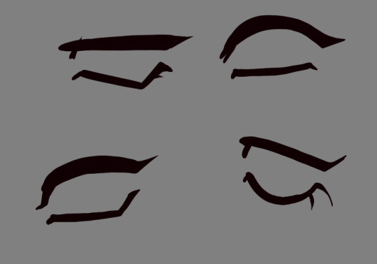
3: the sclera (whites of the eyes), iris (color of the eyes), and pupil (the hole we see out of)! These change an absolute TON based on style.
4: the eyelid!
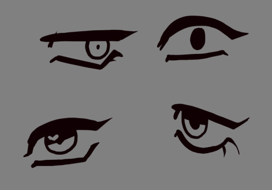

and here's me just moving each of the elements around! it changes a lot about what the eye is saying as you change each element, play around with them! try not to always go with your first choices.
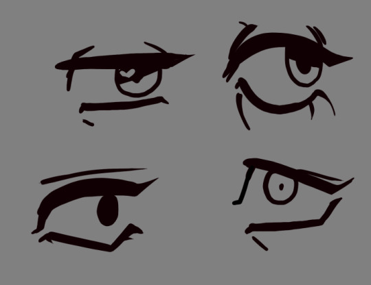
There's a lot more to eyes than this, and a lot more to lineart as well... but I hope this is something of a starting point! Getting better about art is about learning to think and study everything you see. I genuinely see the world differently than I did 10 years ago, and I'm much happier for it (and a much better artist!)
And when it comes to writing stories about queer characters who get to be older and still happy, I hope to someday see you making stories that bring someone the same sense of comfort you had reading my work. I hope it someday becomes normalized, mundane even. And I know it starts with people like you deciding it's important! We're here, we've always been here, and we're not going anywhere.
Best of luck on your artistic journey, I wish you a long lifetime of growing closer to yourself through your art.
59 notes
·
View notes