#ART DIRECTION
Explore tagged Tumblr posts
Photo

‘Continuum’ by Cinzia Campolese
234 notes
·
View notes
Text

"The Art of Manspreading" (0001)
#ai man#ai generated#ai artwork#gay ai art#gay art#homoerotic#art direction#fashion illustration#ai gay#abdominals#athlete#muscular#tattoo#scruffy#sneakers#gym shorts#manspreading#male form#male physique#male figure#bleechers
34 notes
·
View notes
Text
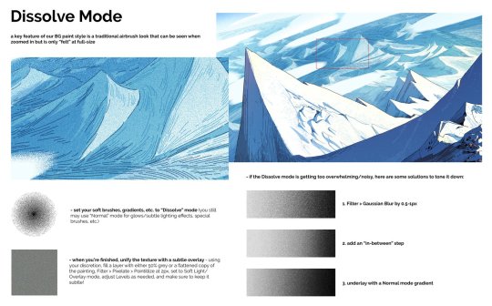
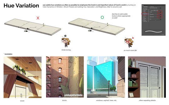
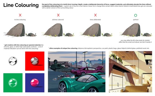
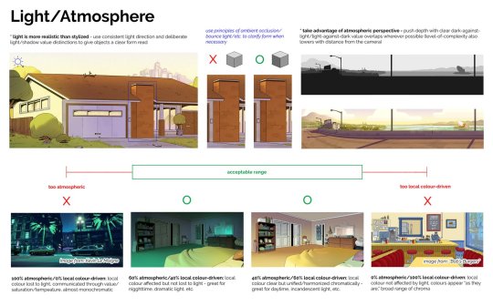
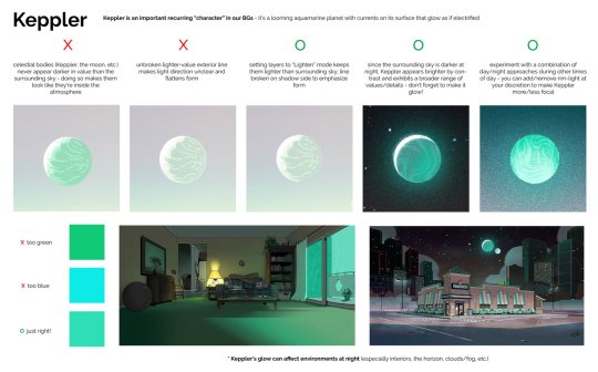
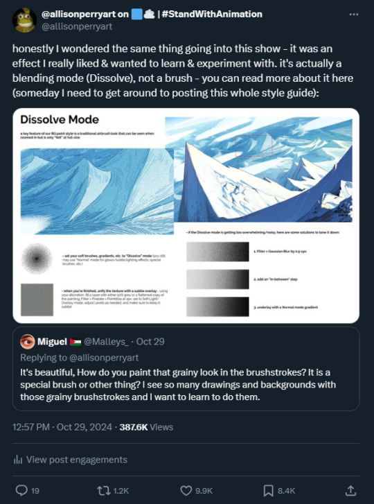
PDF:
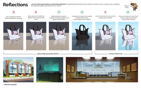
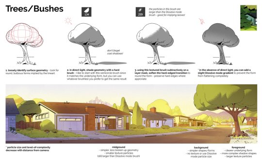
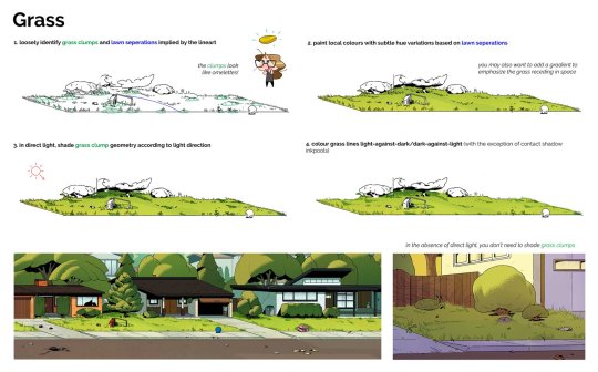
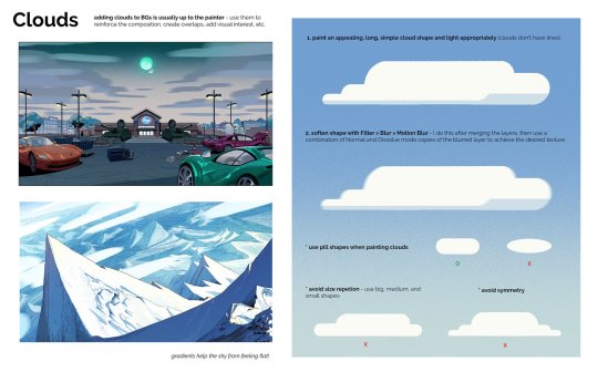
Back from my birthday hiatus, and um, wow... was not expecting this kind of overwhelmingly positive reaction to a simple QRT about how we used Dissolve Mode in our BG paintings on Carol and the End of the World (see last image) - since people seemed to have enjoyed that so much, I thought I'd put all the pages of the Carol and the End of the World BG Paint style guide I drafted in one post! TBH I'd been meaning to do this for awhile but kept forgetting since I have it in a different folder than the BG paintings themselves... I believe all the paintings are mine and all the designs are by Alex Myung unless otherwise noted. I wrote this pretty early on pre-vis, so some of these guidelines got a little massaged during production, but the broad strokes are definitely still there! This wasn't the only style guide on the show BTW! A couple of our other leads Alex Myung and Kal Athannassov also put together a BG and Character Design style guide that are super cool - unfortunately I don't have the files myself (nor would I feel comfortable posting work that's not mine) nor do I think they've posted them yet, so if you two were looking for a sign to do so, this is it!! Now you have everything you need to paint like a Caroler - thanks for looking!! Showrunner: @dan-guterman Art direction: @ellemichalka
#style guide#art direction#Photoshop#mountain#house#city#street#tree#grass#office#exterior#interior#cloud#night#day#lead#leadership#background#background painting#background paint lead#supervisor#carol#carol and the end of the world#adult animation#animation#cartoon#Netflix#Netflix animation#allisonperryart#allison perry
616 notes
·
View notes
Text
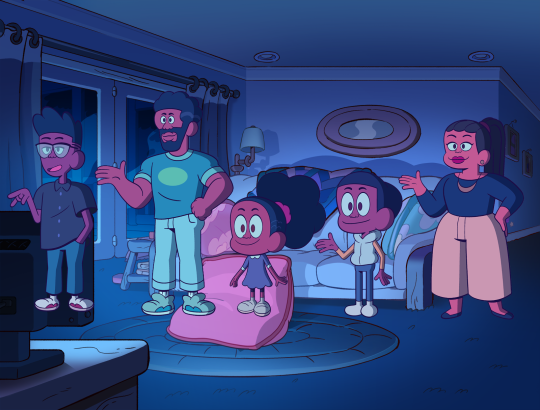
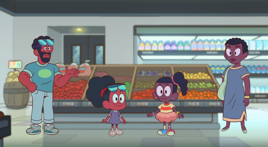


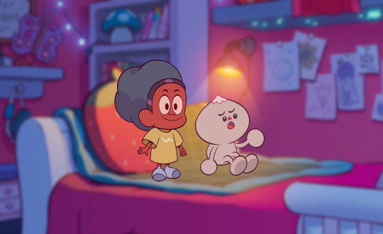


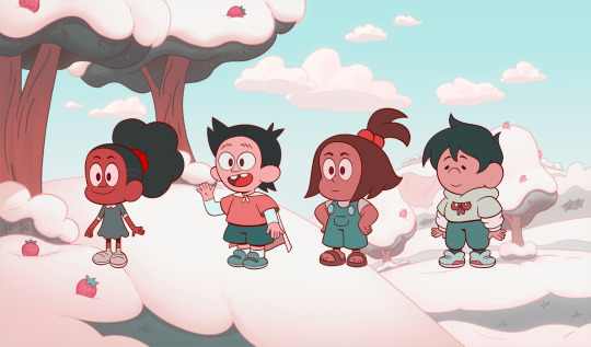
Jessica's Big Little World - Palettes
New episodes of Jessica's Big Little World are airing this week (and are on Max)! Here are a small sample of some of palettes from the series by our Art Director Benjamin Anders and his color design team: Jessica Yost, Leigh Luna, W. Scott Forbes & Candice Messado
#jessica's big little world#jblw#color design#art direction#benjamin anders#w scott forbes#candice messado#Jessica Yost#Leigh Luna#craig of the creek
980 notes
·
View notes
Text

Disposable Pleasures ° vol⁴ series artwork by blck-xcvi
- Design instagram: blck.xcvi
#blckxcvi#blck xcvi#artdirection#graphic art#art direction#cover art#coverart#experimental texture#grimes#joji#hybrid art#hybridart#artists on tumblr#visual communication#visual concept#digital visuals
430 notes
·
View notes
Text
Production Designer Alison Gartshore gives a tour of Kate and Anthony Bridgerton's rooms for Architectural Digest.
Source
#bridgerton#kanthony#anthony x kate#kate and anthony#kate bridgerton#kate sharma#kate x anthony#kate sheffield#anthony and kate#anthony bridgerton#kathony#bridgerton season 3#production design#art direction#bridgerton bts#set design#architectural digest#youtube
600 notes
·
View notes
Text
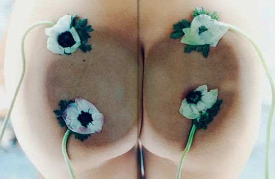
Shot by Drew Vickers for The Plant magazine.
2K notes
·
View notes
Text
I saw a video of a girl (@NicqueMarina on youtube) talking about this, and I needed to write it down with visual references
Rant about amazing art direction on movies and shows is my passion, so yall have to listen to me because if you follow me, you know I'm insane about this.
Okay, we can rant about the beautiful choices in wicked, right?
Okay, so we all know Glinda is the one that has an impact on Elphie's fashion choices and stuff. Is her role. It was her mission, and we saw how she started letting her hair down and stuff 💖
BUT HEAR ME OUT

When they go to the Emerald City, Glinda has this outfit

The puff sleeves are familiar...

It's so much like the first Elphie's outfit!
Elphaba changed Glinda too. Even in the way only Glinda was supposed to change Elphie.
*for good in the background* Okay but
When Glinda is going after Elphie and the monkeys are flying, one of them rips THAT PART OF HER CLOTHES. Because in that moment, Glinda is losing Elphaba.
Elphie is separated from Glinda.

And here she doesn't have it anymore.
Okay, that's it. You can keep going with your day now 😭
#wicked witch of the west#wicked the movie#wicked musical#wicked the musical#wicked#wicked wizard#art direction#musicals#musical theater#galinda x elphaba#elphaba x glinda#glinda x elphaba#elphaba thropp#glinda#galinda is a lesbian#wicked glinda#glinda the good witch#glinda upland#wicked galinda#galinda upland#galinda the good witch#gelphie
160 notes
·
View notes
Text
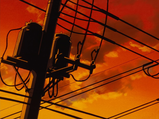
Detective Conan : Art Direction (渋谷幸弘 Yukihiro Shibutani - 石垣努 Tsutomu Ishigaki)



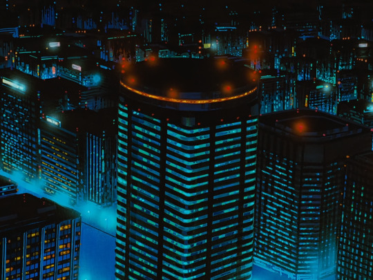
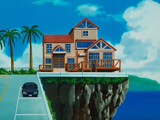
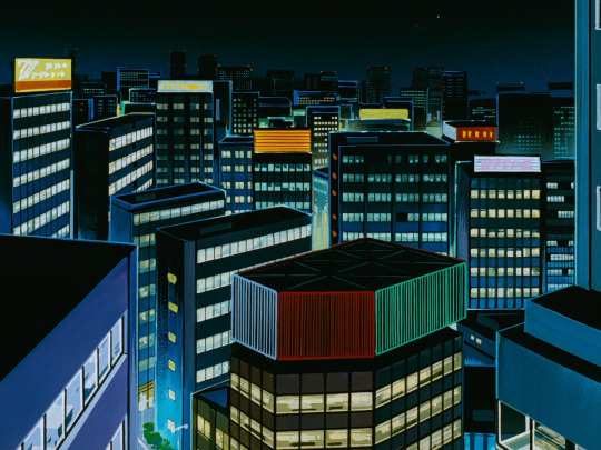

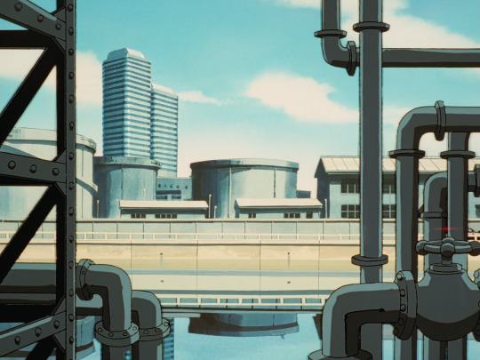


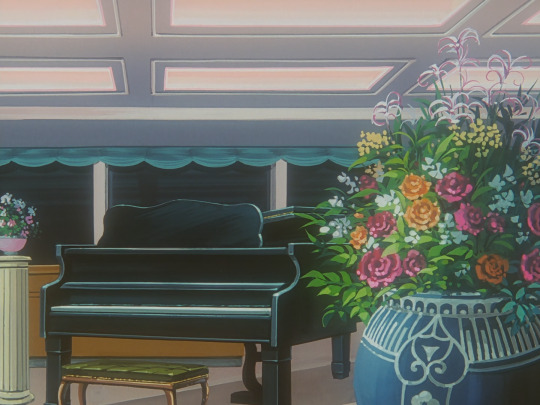
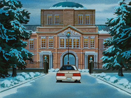
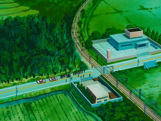

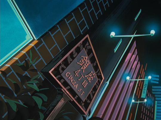
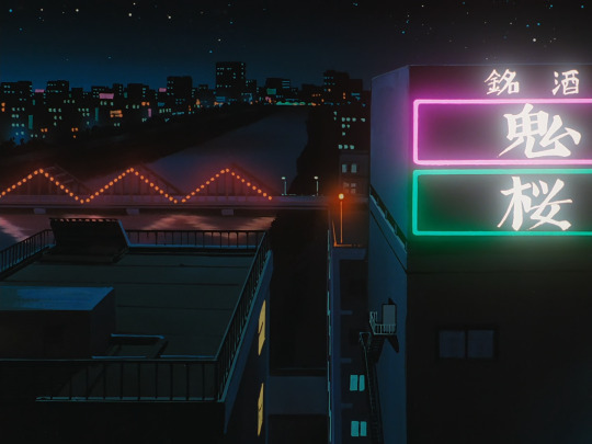

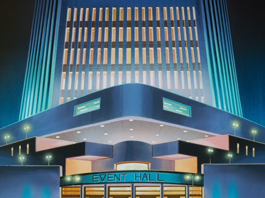

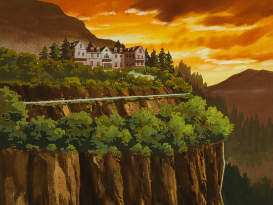
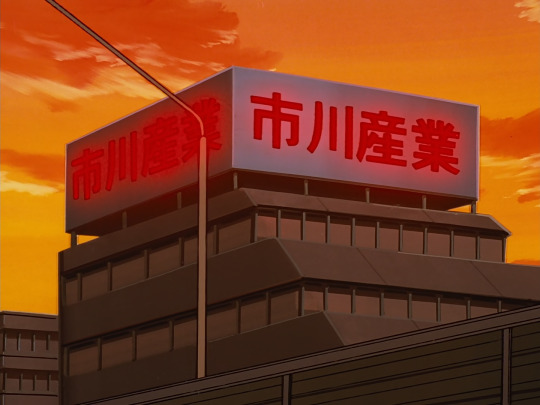
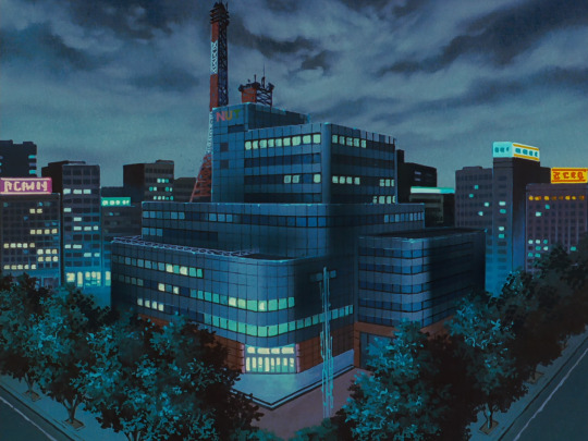


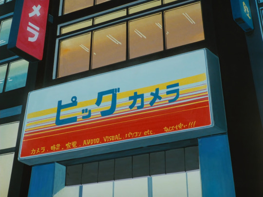
#名探偵コナン#gosho aoyama#case closed#dcmk#anime#90's#retro anime#background art#cell animation#art#art direction#detective conan
383 notes
·
View notes
Text
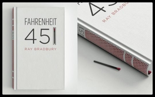
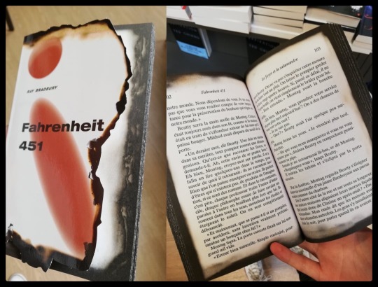
2 unusual editions of Bradbury’s ‘Fahrenheit 451’.
#fahrenheit 451#ray bradbury#francois truffaut#book cover#bookporn#books#bookbinding#literature#science fiction#science fantasy#the martian chronicles#graphic design#creative#art direction#julie christie#1966#brave new world#1984#the martian
522 notes
·
View notes
Text


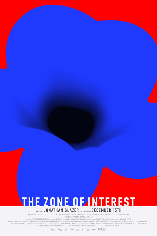

The Zone Of Interest film posters by Neil Kellerhouse
#Neil Kellerhouse#Graphic Design#Art Direction#Film Poster#Film#Movie Poster#Movie#Zone of Interest#The Zone of Interest
505 notes
·
View notes
Photo

Phone case ad for /envi.global/
41 notes
·
View notes
Text

"Surveying the Terrain" (0002)
(More of this series)
0001
#ai man#ai generated#ai artwork#gay ai art#art direction#gay artwork#queer fashion#fashion illustration#muscular#sneakers#eyeglasses#braided hair#bearded man#black male body#black male beauty#athlete
34 notes
·
View notes
Text


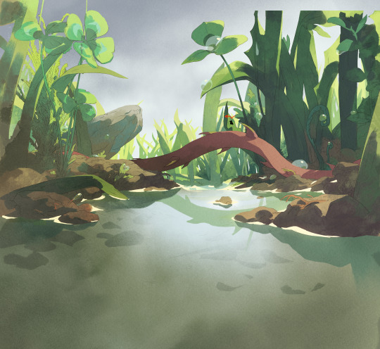

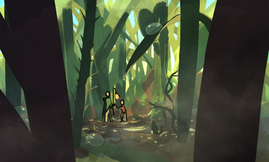


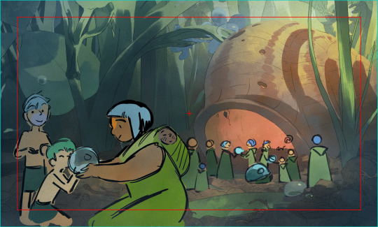
Tobie Lolness ♥ La prairie was one of my favorite parts of the series to work on ! There was almost no pre-production and we had to devellop everything from scratch ! I did some lineart for these too, and we spent twice as much time on the episode as usueal - it was thrilling ! We put all our love and efforts in it ~
#Tobie Lolness#grass#tiny people#background art#animation#2D#french animation#art direction#artistontumblr
539 notes
·
View notes
Text
Ahoy friends! I've been thinking a lot about my old pal the Revenge recently while working on a few art projects, and I suddenly remembered that we have the website of an art director from S1 of Our Flag Means Death, Samantha Avila, where the specific paint colours used in the exteriors were given.
Decided I'd track down the listed paints from the original companies (Benjamin Moore for most, Sherwin-Williams for the Glitzy Gold) and make myself a Procreate palette, then thought I should share it with everyone! Here's a link to a Drive folder that includes this image, the downloadable swatch/palette for Procreate (edit: and now for Illustrator, too!), and a PDF of the key colour diagrams of the Revenge (see below).
These colours are for the exterior of the ship, but I'm pretty confident they're repeated inside Stede's cabin as well (you can see more cabin details in the submission to the Art Directors' Guild Awards in 2022/23, which they won!)
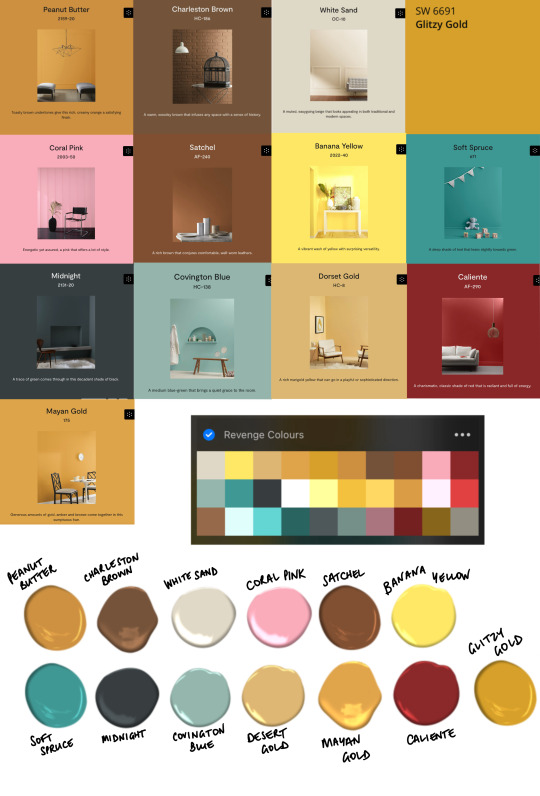
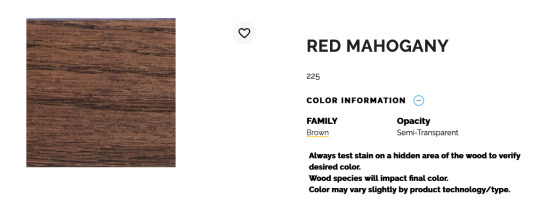
The first 13 colours in the palette are the specific colour swatches, and the rest are light or dark shades of those, per the light/shadowed examples in the images and the delightful digital dollops that the Benjamin Moore website provides. The only colours missing are the custom stains for the unpainted wood. Only one of those (Rich Mahogany from Minwax) is listed with the number #225- that corresponds to Red Mahogany, which is here:
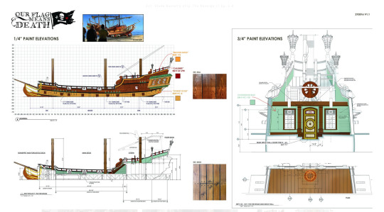
Here are the key colour diagrams used to put this together, available on the website linked at the start and in the Drive folder also linked.
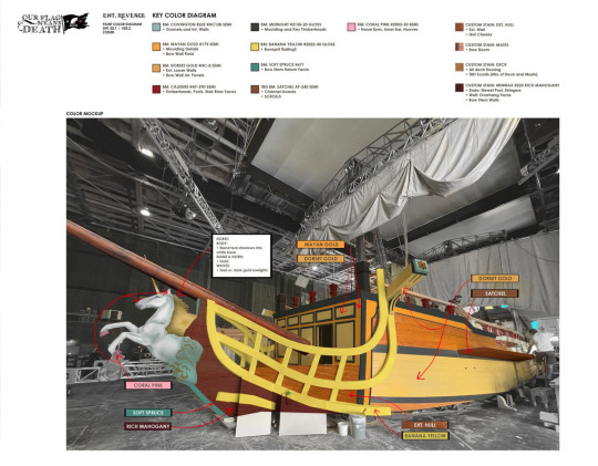
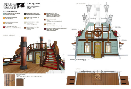
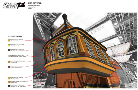
I hope this helps! I'm looking forward to incorporating some more specific and deliberate Revenge colours into my art going forward, too.
#ofmd#our flag means death#ofmd bts#art direction#set design#the revenge#art resources#procreate#color palette#color diagrams#nerdily specific paint details#adobe illustrator
140 notes
·
View notes
