#ALSO - the secondary and tertiary colors?
Explore tagged Tumblr posts
Text

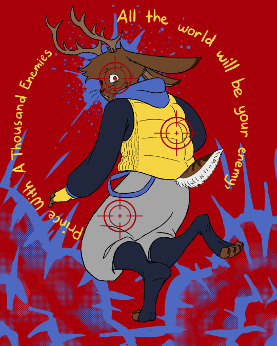


He tore across the hill
faster than any creature in the world.
All the world will be your enemy,
Prince with a Thousand Enemies.
And whenever they catch you,
they will kill you.
But first, they must catch you...
digger, listener, runner.
Prince with the swift warning.
Be cunning and full of tricks...
and your people
will never be destroyed.
#eyestrain cw#ls#spoke#rek#planet#jumper#kab#zam#btw planets spiky crown thing represents his heart rate while the round one represents his respiratory rate smile#also spokes colors represents his emotions cause i cannawt be assed to color the whole rainbow with him anymore#also if youre wondering about the drastic change in designs; these are my primary designs lol#(except zams; his is my tertiary one cause i cant figure out a way to make his primary one look good sadge)#the ones that i keep drawing aka the more human looking ones are my secondary designs#as much as i prefer more human but to the left designs i do wanna use my primary designs more#so im kinda soft banning myself on using them until i dont want to anymore or if a drawing looks better with my other designs lol#my posts
415 notes
·
View notes
Text

[ID: A digital drawing of Tashiro, Hanzawa, and the previous ping pong club president from Sasaki to Miyano. Prev pres is carrying Tashiro piggyback while Tashiro kicks his legs up and leans back carelessly, hands holding loosely around Prev Pres' shoulders. Hanzawa walks slightly in front of them; they're all smiling and talking with each other animatedly. The color palette uses bright, saturated greens, blues, yellows, and pinks. The background is decorated with various shapes and patterns. The artist's signature "sunnfish" is written in the bottom right corner. /End ID]
I like to imagine either a) tashiro twisted his ankle or something or b) he petulantly asks prev pres to carry him. maybe on the regular.
#gonna start hitting prev pres over the head for not having a name#and for being in one chapter from the novels. nobody even care him#writing IDs is hard . do i mention the little sicko details that i kinda put there on purpose but dont wanna point out#bonus id: tashiros hands kinda look like they're around prev pres' neck#anyways#sasaki to miyano#sasaki and miyano#i love maintagging my secondary and tertiary characters. you will look at my friend who does not have a name#prev pres#tashiro gonzaburou#hanzawa masato#and if you've made it this far. happiest of birthdays to the lovely dirtbrain :) i love you :)#queueing this up for midnight and going to bed. yaaayyy#sunnfish.png#my art#described#procreate#also really sorry for my propensity for the brightest colors imaginable#tw eyestrain#prevpreshanzashiro#hanzawa to tashiro
41 notes
·
View notes
Text
hey!! please check out my sales tab, i have a couple gen 1s in there :} and im trying to make some treasure and clear up some lair space... im also saving up for a snapper breed change and a crackle tert for a dragon im turning into an oc of mine!! so! pls take a look if youre in the market for new dragons!!
#flight rising#fr sales#flight rising sales#dragons for sale#flight rising dragons#not sure what to tag for this... but i hope people buy my dragons 😅 i really want that snapper scroll and crackle gene...#and an eye color change... i want to change him to faded eyes...#but im just rambling now lmao im hoping i can get him all gened up soon tho!! im setting my sights on that snapper breed change scroll#i already have scrolls for what his primary and secondary will be but i dont have crackle yet for his tertiary...#ill get there though :}#hes gonna be my bg3 tav Ourish#i love ourish... my fat dragonborn will be a fat snapper#im making an astarion dragon too for him to be with LMAO#bc ourish romanced astarion and also i want to have them Together...#gay people!!! or. gay dragons????#gay dragons yeah!!!
6 notes
·
View notes
Text
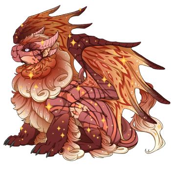
Obelisk Female
Coral / Peach / Marigold , Pinstripe / Flair / Sparkle
Arcane Pastel
#flight rising#flight rising dragon#flight rising scry#scrying workshop#fr scries#flight rising imperial#modern breed#fr obelisk#flight rising obelisk#coral peach marigold#pinstripe primary#flair secondary#sparkle tertiary#arcane pastel#pastel eyes#fr arcane#marigold is legit one of my favorite colors on the wheel to work with#in case you couldn't tell#yknow#with all the bajillion marigold-having dragons i've done over the time i've been doing this#also fun fact but initially i misspelled 'sparkle' as 'sprarkle' and now i will never be able to unsee that#it's going in the mental vault of funny misspelled words#like sprimkle and spinch and chimkem numngets#ranibow sprimkle lives in my head rent-free btw#and i am physically incapable of seeing spinach without thinking spinch
3 notes
·
View notes
Text
Not liking Magia Record that much is so unfortunate sometimes because it goes like this
Online: New Madoka magica content! Me: Oh boy! This has nothing to do with Magia record and doesn’t change the core of the series does it? Me:…Right?
#If you like Magia Record good for you!/gen#It’s brought in more people and has created a universe that’s filled with oc potential#I try not to say I don’t like it because “it’s different”#I don’t like the doppel concept so much and there’s so many characters and situations going on at once that it all just kinda melts togethe#Also why are most of the Magia Record girl’s outfits just midriffs and thongs?#What bothers me the most is the outfits#The Holy Quintent have a formula for their outfits they’re a main color with a secondary color and a white tertiary color and are all mainl#Symmetrical#Also some people think they may have spotted Magia record references in the walpurgis rising trailers#I’m fine with Magia record being its own thing outside of canon but if Magia record stuff is actually in the movie I don’t think I’ll enjoy#It as much#Thank you for coming to my ted talk
0 notes
Text
Heavenbound AU
Masterpost
Angel Dust "Angie"

So I can avoid confusion between Angel and angels, his stage name is Angel Dust but he goes by Angie casually.
Side note: I'm too ace for this guy, yikes. Don't mind me clutching my pearls.
Spider family:

More notes under the cut to reduce clutter. There's info about the whole Spider family and some info about the Mafia as well.
Angie's redesign took me a while to nail down. I looked at other people's designs for inspiration, but nothing felt right. I wanted to give his head shape more structure, but it's too iconic to significantly change. Many people added spider fangs but I think they always look too cluttered and ugly. I also wanted the right balance of masculine and feminine for his outfit.
I am not a fan of heterochromia in character design, unless there is a reason or it's used sparingly. Angie's design is complicated enough with the gold tooth, extra eyes and arms, and body patterns that the heterochromia would just be too much.
Instead of giving him fangs that jut out like a real spider, I chose to just give him a main pair of fang-like teeth, while the rest are smaller.
It didn't make sense to me why he's able to retract his tertiary set of arms, beyond simplifying for animation, but I also do not want to manage all of them all the time, so I'm keeping that little ability. I'm justifying it with the idea that he was only ever somewhat interested in the family business, so he had less of a hand in it than his Pop or Arackniss(both of which cannot retract their extra limbs at all). I also wanted the sets of arms to have a hierarchy in how he uses them. Also didn't like the shoulders canon gives his secondary arms. They look weird to me.
The main set has 5 fingers on each hand and are relatively normal, because they're the equivalent of his human arms. The secondary set is a little smaller and a little more bug-like, with 4 fingers. The tertiary/retractable set are smaller and have 3 fingers.
I tried giving him a spider butt, but I couldn't wrap my head around how he would wear any type of pants. Not that he would be opposed to going around nude, but I just wasn't interested in that.
Casual:

I remember reading somewhere that Angel likes to dress more comfy rather than provocatively outside of work. So I decided his work outfits are the skimpy, sexy stuff. His main outfit is his typicall out-in-the-town fashionable stuff, which tends to cover him up more(gotta pay for those goods). And lounging clothes are just purely for comfort.
Main outfit-
I really wanted something that alluded to his mobster background. He may not really be involved of all that now, but it's still a part of him and that would linger. For as much as he modernizes, he's still a product of his time. Anyway, that's why I gave him pinstripe pants and a blazer.
I didn't want to lean too far into either masculine or feminine styles. He is undoubtedly feminine, but he was raised in an environment where suits and violence was the fashion. I actually searched for 40s gangster costumes for women, counting on the fact I'd find the silly sexy costumes so I could get ideas for a more feminine spin of the classic mobster.
I tried a boob window shirt for awhile, but it didn't let me show enough chest fluff. So I traded it for a V neck, which can work for both masculine and feminine styles.
Eventually I settled on a crop top blazer, since it gives a sort of suit jacket vibe while being feminine. I preferred the short gloves from the pilot, at least on his main arms, and used the longer style from the show for his secondary arms.
In canon, his "skin" color and the white of his clothes just don't have enough contrast. So I used more pink, and had the color of his fluff be a different hue than his shirt. I liked the stripes on his jacket before, but I didn't want to add any more complexity, especially when I already committed to the pinstriped pants.
Overall, I like this outfit for him. Maybe that has something to do with my personal tastes, but I think it suits him.
Body markings:

He wasn't a star until Val came around in the 70s, so he wouldn't have been quite so glam before that. He still had more mobster habits. I used his older, pre-pilot, Zoophobia design as inspiration, which used a low saturated purplish color. I thought it struck a nice balance between his mobster roots, and his later glam style.
I wanted to make the pattern something easy for me to remember. The heart design got pushed lower down because I needed more room for his chest fluff. His hands don't have anything because I didn't like how it looked with his lounge clothes. The stripes on his arms reference the stripes on his canon, pilot, and pre-pilot jackets. The stripes on his legs represent garters(suspenders that hold up socks or stockings).
Human- Anthony "Tony"

Many human versions of him that I've seen make him look too modern. I think they would absolutely work for a modern human au, but not for the 1940s. So this is my take on what he would have looked like while he was alive. The Mafia is almost exclusively Italian, and overwhelmingly Southern Italian/Sicilian. Sicily was settled by the Greeks during the antiquity period, so many people there have Greek ancestry. The vast majority had dark hair and a tanner complexion(less than 7% are blonde in modern day). Northern Italy has more variety, with up to 25% blondes in modern day. I find it unlikely that an Italian-American mobster would have such light blonde hair(darker blonde, maaaaybe). I found only a couple of a blonde mobsters, and the pictures still look pretty dark. I just believe he would have had a more typical Mediterranean appearance: naturally dark hair and olive-toned skin, rather than the fanon platinum blonde more typical of Scandinavian areas.


Hair coloring in the 40s was always done professionally, and primarily used by women, and they usually didn't want it to be obvious. Bleached hair on a man(especially with naturally dark hair) would be far too much to maintain discreetly. He hadn't publicly embraced his feminine side while he was alive. His family was Catholic, and being gay was a no-no. But murder was okay for some reason. Don't question the mobster logic.
His brother and sister knew he was gay, parents did not. Arackniss was too tired to care, and Molly was supportive. She would take him to be her "bodyguard" when she would go out and do fun things, but it was partly an excuse she provided for him to do gay things.
Angie had mixed feelings about his participation in the mob. Sometimes it was fun, other times he'd really rather be partying. But he was a made man and swore an oath of loyalty. He can't just back out.
He spent his free time with drugs, guns, and hot guys. Then died of drug overdose in his early-mid 30s in 1947.
He wasn't publicly out as gay until Hell. His parents hated it and basically disowned him when they found out. But why should Angie care at this point? He's already in Hell. So he just parted ways with them(technically the oath of loyalty ends at death. It's not like the Mafia can really kill him for leaving now, since they all just regenerate anyway) and has kept in sporadic contact with his siblings. They aren't close anymore.
Spider Family:
Ma and Pops were mostly because I wanted to play with character design. And since they have no official designs, I had more room to play with it.
The whole family became spiders because they were involved with the "web of crime" that is The Mafia. Family relation does not automatically mean sinners will look similar. They usually don't.
Pops (real name Enrico, the Italian version of Henry. Nickname "Big Cig". Almost every mobster listed on wikipedia had a nickname) inherited the position of mob boss from a relative. I'm not thinking hard about historically accurate crime families, so this is a fictional family that we will pretend had a significant presence. He died not long after Anthony, in the early 1950s in his mid 60s via gang violence. He never managed to get to the same level of power after his death. He's a minor Overlord at best, but does hold some influence.
In Zoophobia, Angel and Arackniss had a dad named Henroin. A play on "heroin". So when considering a real name for him, I searched for a variant of Henry that sounded more Italian. I designed him before I knew he had a design, but I wasn't exactly impressed by Henroin's design, so I totally ignored it anyway.
Design-wise, I wanted to go for a stereotypical mob boss vibe, and it lends itself well to the more bulky, crustacean look. The resemblance to Mr. Waternoose was unintentional. He cannot retract any extra limbs.
Spider traits- I wanted to give everyone varying degrees of spider traits, partially determined by their level of Mob involvement and how dangerous they are. Pa is venomous(through his clawed hands), has super strength(because spiders are proportionally strong compared to their size), can super jump(cuz jumping spiders is the theme), and can summon a couple of guns. He's too large to crawl on walls and can't spin webs.
Ma was always at Pop's side, helping with the less violent aspects like finances. She did her share of poison murders as well. Ma died alongside Pop and is still at his side. She's arguably the more dangerous of the two at this point. She looks easy to take advantage of, but it turns out she has potent venom.
I didn't have anything canon to go off of, so she's technically an OC. I haven't put a ton of thought into her name, but I think I'll just go with Maria. Molly is named after her, I guess.
Design- Had to go with a femme fetale mob wife. The hourglass motif is because of her venomous nature, and not for any husband-killing. She can retract her extra limbs, because she is more dangerous than she initially seems.
Spider traits- she's more venomous than Pa(through her extra limbs), can wall crawl and super jump with her extra limbs, and spin webs(to ensnare prey. I think it might come from her hair bun and/or mouth, but I don't want to think too hard about it.). She's actually the more dangerous of the two, partially because she appears less threatening, and partially because the way her extra limbs are set up gives her more reach and agility. She cannot summon guns, and she doesn't have super strength.
Arackniss (real name is Giovanni, Italian version of John. Goes by Jon. Nicknamed "Little Cig", "Don Jon") worked as the underboss until Pa died, then took over as mob boss, making sure Molly was taken care of. He died in a shootout with police in the 1960s. He was around 50ish. He is on speaking terms with their parents, and sometimes works with them. He's tired and very addicted to coffee and cigarettes.
Apparently an old QnA revealed his real name to be Jonathan. Not sure if it's still true, but I didn't find anything more reliable. I found no examples of any historical mobster named Jonathan, despite there being many many Johns/Giovannis.)
Design- I wanted him to be unable to retract limbs, unlike Angie, but also wanted to avoid drawing all of them. So I used his overcoat to cover them, and he habitually keeps his hands in his pockets. Again, he can't retract any limbs because he was heavily involved with the mob. I changed his eyes from red to yellow, because I felt the yellow suited him better and reduces the overuse of red in general.
Spider traits- He can wall crawl, has super strength(which most don't expect because he's pretty scrawny), has super jump, and can summon guns. He cannot spin webs, and his venom is non-lethal and inflicted via bite(which isn't super useful to him).
Anthony/Tony "Wild Tony" was a soldier in the Mafia. He could have been a Capo(caporegime) if he was more committed. But he had a tendency to party and goof off. Technically, membership of the mob ends through death. Being the first to die, he was separated from the mob and didn't care to recommit. Angie partied hard and enjoyed gun violence, until Valentino came along. Valentino swept him off his feet with promises of fame, fortune, and love, convincing Angie to sell his soul.
Design- already covered most notes, but for organization: he can retract one set of extra limbs because he was involved with the mafia, but he was lower level.
Spider traits- He has less than the previous three. So he can super jump, spin webs(via mouth...he can make it kinky), and summon guns. He technically can wall crawl, but not for very long, and he usually uses it for things like pole dancing. He is not venomous at all, and does not have super strength.
In canon, Molly is in heaven, but I don't find it likely because of how the Mafia works, so she's in Hell now. (Real name is Marietta, which is an Italian version of Mary, and Molly is a nickname)She was the spoiled daughter and knew about the family's criminal activity. She knew, profited, and didn't care. She's guilty by association. Anyway, I'm gonna say she died about 10 years after Anthony, approx 1957, around the age of 40. Haven't thought too hard about how she died. Then she probably went and found some powerful, hot guy to sell her soul to. Not sure.
Design- I was going to give her an extra set of legs, but I couldn't wrap my head around the anatomy of it and just decided to stick with extra arms. She can retract all her limbs because she was "hands off" with the mafia.
Spider traits- she has the fewest because she was the least involved with the mafia. Aside from the obvious physical traits, she can only spin webs(because it is symbolically more domestic. Also via ponytail and/or mouth, but I don't want to think hard about it). She cannot wall crawl, or super jump, has no venom or super strength.
The Mob:
The Mafia is very patriarchal, so all members are men, as women were never formally initiated. But women were still significantly involved in a variety of ways. Most often by instilling mafia culture to the kids, drug trafficking, finances, or economics. Some helped as launderers, couriers, shills(con artist), drug traffickers, informants, and other typically non-violent roles. Some acted as proxies for their husbands in prison(which is becoming increasingly common in modern times).
Quick chart for Mafia organization, via the FBI.

Simple rundown of terminology because I didn't know the difference between Mob and Mafia, and I've now done too much research to not write it down in a relevant place:
mob- a group of people, usually disorderly
gang- crime group, ranging from loosely organized street gangs to structured syndicates.
syndicate- group of individuals or organizations that unite for a common goal. Can be legal or illegal.
cartel- (type of syndicate) a group of individuals or organizations that collude to control a business market via supply and demand. Can be legal or illegal.
The Mafia- originated in Sicily. Ethnically Italian gangs, referred to as "families" that may or may not have actual familial relationships. Characterized by a distinct hierarchal structure.
The Mob- the American extension of The Mafia. (ie. it's the same thing)
The Commission- the alliance of the various Mafia/Mob families. Older generation members, called "Mustache Petes", only worked with fellow Italians, sometimes even only Sicilians.
The National Crime Syndicate- multi-ethnic alliance of various criminal organizations. Most prominent being The Mafia/The Commission and Jewish syndicates.
All somewhat organized crime groups are gangs. Crime syndicates have a higher level of organization, and cartels deal in specific businesses. Eventually the terms mafia and mob were applied to other ethnic gangs that operated similarly. Such as the "Jewish Mob" and "Russian Mafia". But THE Mafia and THE Mob refers to Italian gangs.
(Jan 28, 2025- fixed the tags) (Jan 31, 2025- added a couple more notes about his human design, particularly the hair color)
#hazbin hotel#hellaverse#angel dust#angie#hazbin anthony#arackniss#hazbin molly#hazbin spider family#angel dust's father#angel dust's mother#human angel dust#hazbin hotel redesign#heavenbound au#a3 art#fanart#character sheet#digital art
460 notes
·
View notes
Text
Writing Notes: Negative Emotions

One of the more popular psychological theories of emotions is Robert Plutchik’s Wheel of Emotions.
Plutchik (1980) stated that there are 8 basic emotions: joy, trust, fear, surprise, sadness, anticipation, anger and disgust.
Plutchik went further by pairing the emotions with their opposites and then creating the wheel of emotions, which serves to elaborate on how complex and interactive our emotions are.
As mentioned, Plutchik paired the basic emotions with their polar opposites to help further develop his theory, so:
Sadness is the opposite of Joy
Anticipation is the opposite of Surprise
Anger is the opposite of Fear
Disgust is the opposite of Trust
Plutchik’s wheel is a strong visual representation of how our emotions present themselves.
As you can see the core emotion decreases as you move outward on the wheel.
Plutchik also used color to represent the intensity of the emotion: the darker the color, the more intense it is. So at its most intense trust becomes admiration, and at its least intense, acceptance.
It’s a fantastic starting resource for helping us further develop our understanding of how our emotions present themselves, how they fluctuate and how they can interact with each other. It has informed further psychological research in this area and is often the foundation from which researchers exploring emotions have based their research (Eckman, 1999, Parrott, 2001, Lazarus & Lazarus, 1996).
Shaver et al (1987) and later Parrott (2001) proposed a ‘tree’ of emotions which broke emotions into primary, secondary and tertiary dimensions.
This includes 6 primary emotions:
Love
Joy
Surprise
Anger
Sadness
Fear
...with associated emotions that develop at the secondary level, and again at the tertiary level. For example, if the primary emotion is joy, the secondary emotions could include cheerfulness, optimism or enthrallment and the tertiary level could include pleasure, triumph or hope.
Cambria, Livingstone, and Hussain (2011) took Plutchik’s wheel to another level and developed ‘The Hourglass of Emotions’.
In their book, they built on Plutchik’s 8 basic emotions and broke them down into 4 dimensions:
Sensitivity
Attention
Pleasantness
Aptitude
They also made distinctions between which of the emotions were positive (joy, trust, anger, and anticipation) or negative (disgust, sadness, fear, and surprise).
Source ⚜ More: On Emotions ⚜ Notes & References ⚜ Writing Resources PDFs
#emotions#character development#writing reference#writeblr#psychology#writing inspiration#writers on tumblr#spilled ink#dark academia#literature#writing prompt#character building#poets on tumblr#light academia#fiction#creative writing#writing inspo#writing ideas#writing tips#writing advice#writing resources
152 notes
·
View notes
Note
Transparencies are a a heavy load but would still balance out to be a better choice than all the different permutations if that's what you mean.
What kind of interface would you want for peahen simulator? Wasn't there some dragon breeding site ages ago?
Yeah, that was what I meant! And flight-rising is still around, but it's not... that kind of thing isn't really the same. The parents each have three colors, and each offspring randomly gets assigned one in each "spot" (primary color, secondary color, tertiary color), and they can't carry the other as a het. Same for the pattern "genes." So, it's COOL and all, but it has very shallow game mechanics as far as breeding goes. Even compared to some other breeding sims games that track genotypes for generations.
Very honestly, something like this would work just fine (this one is.... ugly as sin, but it is what it is), but we don't quite know peafowl genetics with the same depth as mouse genetics so the different autosomal genes would just kind of have to be treated like they aren't on the same chromosome until someone proves they are. So, drop downs for each autosomal color (treating each color as non-allelic, so each color would need a drop down for wt/het/homo), a drop down for sex-linked (since they're "alleles" in the sense that you can only have one per sex chromosome. except in the case of peach. because peafowl did a weird thing), a drop down for pattern, and drop downs for the leucistic genes. Select all the genes from the drop downs, hit calculate, it spits out a genotype, and each genotype codes to a phenotype. It doesn't even NEED a photo, but it would be cool to have a photo show up, OR to have a second page that does like this thing for horses. Which isn't a calculator, but would help people visualize their result.
There's ONE more problem- some stuff doesn't always show the same in the phenotype, and some stuff doesn't breed true. Het pied, het white, and dark pied all CAN show in the phenotype with white flights and a white throat latch, but they also sometimes show NOTHING. Het white eye CAN show in the phenotype with some white eyes or body silvering, but it can also show nothing. Pied x pied gives three different offspring genotypes, and idk if it's possible to do multiple results, with or without percentages. Hets would give the same problem of multiple results. What happens when someone picks a complicated bird and you end up with

It's daunting. But maybe there's scripts that can produce that?? like list all the combinations. I don't know enough about coding to know if that's even possible. especially with the sex linked stuff
163 notes
·
View notes
Note
Review shiny eevee and evolutions?
For sake of ease, we're going to group these by how good their shinies are, starting with:
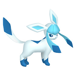
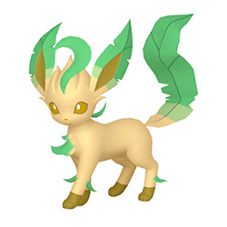
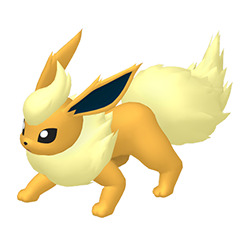
The "I don't think you tried at all" shame corner (Glaceon, Leafeon, and Flareon): Doing all of these at once because I have the same issue with all of them: they are WAY too similar to the original colors, leading to incredibly boring and underwhelming shinies.

Glaceon: Just ever-so-slightly lighter than the original; the sprites had a tiny bit more contrast but not much. I would recommend making the whole thing white, which is a nice snowy color; sure, it does kind of share shiny Eevee's palette then but Jolteon and Espeon are both green so it probably doesn't matter.
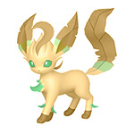
Leafeon: The body is a tad darker, but good luck noticing. You could make the body a light green for something monotone, you could make the leaves brown or red, something autumn-y; literally just anything else would be better.
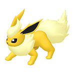
Flareon: Flareon the least bad of this group and mostly suffers from 3D conversion (its old sprites were more red while the old shiny sprites were more of a brownish gold). Easiest fix would just be to make the shiny a purer yellow like the above edit, or you could swing the opposite and do a deep red instead.
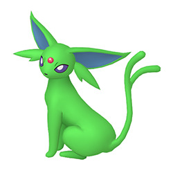
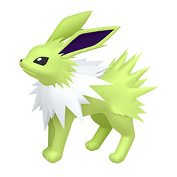
The "fine, but why?" corner (Jolteon and Espeon): Both of these ones are nice and high-contrast, and are very easy to spot compared to the non-shiny versions. The only issue with them is that the greens here feel very... random? They're not bad, but they don't feel natural.
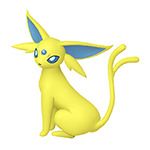
Espeon: I like that it looks a bit like a space alien, but that really has nothing to do with the actual 'mon itself. For a Pokemon associated with the sun, you'd think they'd go for a yellow with a blue gem or something like the above (would tie it into Umbreon's shiny). At the very least, the green they chose feels way too dark for Espeon; a nice light, minty shade would've helped a lot, especially with a yellow gem or something. Also, I dislike that it has three different accent colors (red, purple, and blue).
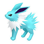
Jolteon: The shade of green here works a lot better than the one used for Espeon, but it's an odd choice for an electric-type; once again, not bad, just odd. I would've just gone with a cyan-ish blue, which is still high-contrast but much more on theme.

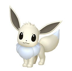
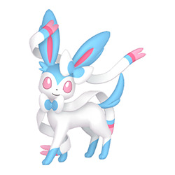
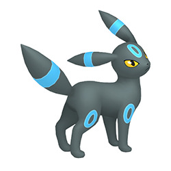
The "actually good shinies" corner (Vaporeon, Eevee, Umbreon, and Sylveon): These ones are all bangers; lots of contrast and with color choices that feel natural for each.
Vaporeon: While this one borders on not having much to do with the theme, purple is at least close to blue hue-wise, so while it's not necessarily very water-y it doesn't feel like it's completely coming out of the left field either.
Eevee: Eevee's whole thing is that it's supposed to be plain and normal, so neutral colors are a must. The very light cream they used here stands out compared to the darker brown originally used but still works with the concept. Using a cream instead of pure white also allows it to keep a tiny bit of color. (I'm not posting an image of the g-max here, but I think it uses the same cream so no issues there.)
Sylveon: Sylveon doesn't actually change its hues; instead, it opts to swap its secondary and tertiary colors. This can be a risky gamble, but it works here because there was so much more pink in the original design compared to blue, so the change still really stands out. Because it uses the original palette in different proportions, it also doesn't run the risk of the colors feeling too random. Also it's trans, so that's a bonus.
Umbreon: Umbreon's shiny is a banger and you don't need me to tell you that. Swapping accent colors can be risky because it's not always that noticeable (see that Lunatone review I did a few days ago), but the yellow was such a prominent and bold part of the design that the blue swap stands out, helped by the fact that it pops really nicely against the black body is a nice "nighttime" color. Swapping the eyes to yellow further helps differentiate it, and it keeps the kind of "eerie" look that the original's red eyes invoked.
Overall: Vaporeon, Eevee, Sylveon, and Umbreon have great shinies. Espeon and Jolteon have okay shinies that are high-contrast but don't feel very natural. Glaceon, Leafeon, and Flareon barely change and are just plain boring.
#eevee#eeveelutions#glaceon#leafeon#flareon#espeon#jolteon#vaporeon#sylveon#umbreon#pokemon#shiny pokemon#pokemon reviews
120 notes
·
View notes
Text
Let’s Build Your Flight Rising Sona!
Breed: Determined by the breed most prominent in your den + hibden!
Gender: Determined by your gender! ENBY, gender fluid, nonconforming folks choose what feels best!
Age: Choose hatchling if you prefer sunrises, choose Dragon if you prefer sunsets
Primary Color: Your favorite FR color
Secondary Color: The color most often found in your room
Tertiary: Your childhood favorite color
Element: Your flight!!
Eye Type: If your age is an even number, choose from: Bright, Dark Sclera, Glowing, Innocent, Pastel, Rare, Uncommon. If your age is an odd number, choose from: Common, Faceted, Goat, Multi-Gaze, Primal, swirl, Unusual
You get to gene yourself however you want, mix and match to find the best look for yourself! (Also bonus points if you can find your dragon self on the AH)
#flight rising#funny little dragon game#I already know mine is gonna come out wack#but that’s the fun part#reblog so others can participate too!
398 notes
·
View notes
Text
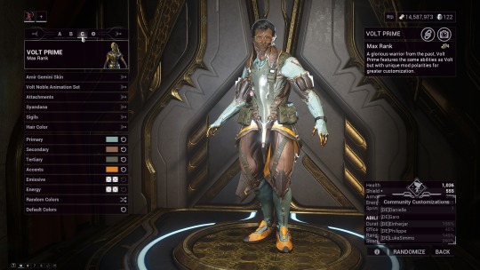

At the request of @softwordshavepower : the classic volt setup for bestest boy! Under readmore because I am formatting this AWFULLY! and a quick disclaimer: he's only base-adjacent colors! this is what Volt-volt looks like with the pallet I gave Amir! ever so slightly different, could just be a trick of the light if you didn't know better!

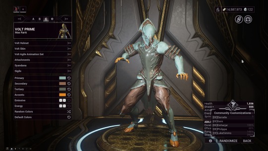
here we go!

his primary needs to have the legacy colors enabled! you can switch back after selecting it

his secondary (a slightly warmer brown than base but very slight)
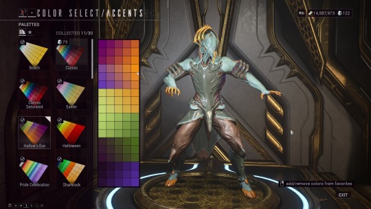
his accents (a little brighter than base, but scratches the same color itch)

and tertiary! (same color set as his primary but with legacy turned OFF) His attachments also have different colors!
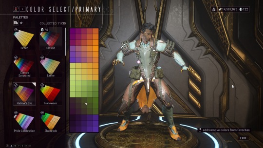
primary!

secondary!

tertiary!
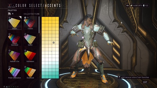
accents!
it makes him look more like he's wearing just. stuff you could get. almost army green and whatnot. I kept the volt armor off in the captura pictures, not sure why its on here but it is! Anywhoozle, hope you enjoy :3c
43 notes
·
View notes
Text
So I have a theory about Metaphor: Refantazio. I think at some point in production, Alonzo was supposed to join your party, but they swapped him out for Junah.
I first noticed when looking at Junah's design that for the most part, the party is... designed to look good together? Almost everyone here looks like a cohesive unit, despite being wildly different people of all different races, species and backgrounds. BUT they're also designed so you can tell at a glance which one you're looking for, even on a chaotic screen full of this game's wacky UI and particle effects etc. And it's because of the colors used in their design.
Specifically, they're all wearing mostly black and white, with one heavy secondary color, and sometimes 1-2 tertiary colors. Hulkenberg's red hair, Strohl's yellow jacket, and Eupha's lime green tights are the best examples. Heismay and Basilio don't need as strong of an accent color because their silhouettes are so unique compared to the rest of the party, but Heismay still gets cream for his fur, and Basilio gets brown.
And then there's Junah:
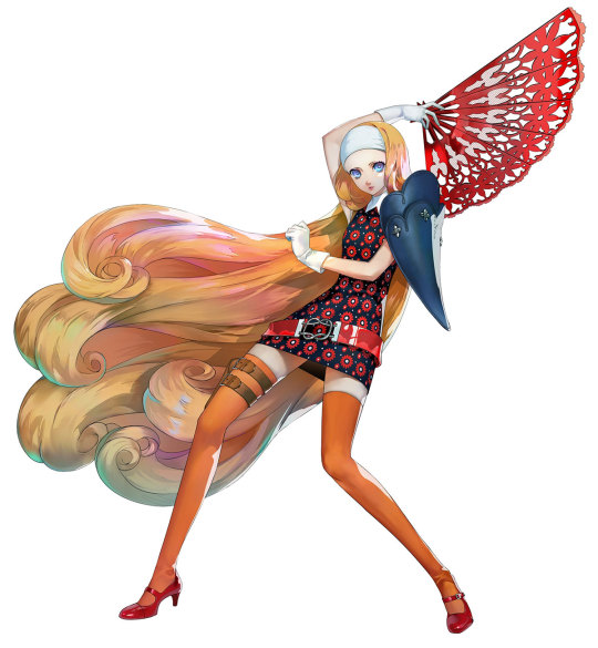
It's not even CLOSE. She's got a red-orange-yellow color palette. Run around with her in your party for a bit and you'll see how much she sticks out compared to the rest of the group.
Compare Alonzo:

Yeah. You could debate whether he fits in completely, but he's still a LOT closer to the party aesthetic.
Narratively, Alonzo also has an arc that would be right at home for a party member in a JRPG. Whereas many have pointed out that Junah's big moment of joining the party feels at least a little bland, as does her bond arc. It feels like it got retrofitted into the story sometime during development.
34 notes
·
View notes
Text

Mark of a Hero by @amelias-calamity-quintet
Epic Fantasy | Teen | AO3 | Ongoing
Synopsis: Hyrule is at peace, or so the Royal Family would have its people believe. Something is afoot in the kingdom, and someone needs to do something about it. Least likely would be Marksmen Link Sayre- a mercenary and monster hunter doing his best to get by. Until a job goes wrong, and he gets roped into the secret plans of Hyrule's princess. Now Link must play the part of the Hero to dive deeper into the mystery, and maybe stumble into a legend of his own.
------------------------------------------------------------------------------
This story feels so much like a Zelda game it’s hard to believe it’s not part of the franchise! Between unique dungeons, fun and exciting NPCs, and a party of heroes that are absolutely lovable, this story is definitely one to check out. Link is an animal-loving, capable, hilarious hero who is always trying to do his best for the people he loves, and Zelda is a powerful princess with something to prove. Definitely a worthy story to put on your TBR! - abbyz-elda
Mark of a Hero is an epic scale Zelda adventure that expands upon the lands, lore, and people of Hyrule and beyond. These lands outside of Hyrule have the definitive Zelda vibe to them, and they each have their own uniqueness to them as well. Exploring Hyrule and its neighbors gives many opportunities for the Zelda lore to be explored and expanded upon in ways that have been very fun and fascinating to learn and read about. The world of these books are also full of colorful and endearing characters that you can't help but fall in love with -- as well as a terrifying legion of villains you'll love to hate. I've had the amazing opportunity to be an early reader for the series, and I've immensely enjoyed every moment of it! I'm currently on book 4, and I can say that I've been excited to read each and every chapter and to see how the story twists and turns. Through the distinctive settings, the many charming characters, and the compelling plotlines, you can tell that Amelia has put much care into their research and their craft to write this story! - doubtfulloser
A very quintessential and uniquely engaging Legend of Zelda story, Mark of a Hero feels like it is in fact part of the franchise: - it is set in a very vast and detailed world, absolutely full of interesting and unique background and tertiary characters; - it has a really, really cool Link in Link Sayre, mercenary and unwitting pretend hero who we all expect really is not pretend at all; - it has an amazing take on the Princess Zelda, the role, the royal dynamics, and how the one we're following in this story is responding to the challenges it all creates; - it has boss fights and puzzles, and will make you think that this could 100% be a really cool game to play; - it has amazing secondary characters, from a gossipy Zora to a completely ordinary old man, the supporting cast is just an absolute delight. This story is in progress, and it is already epic even though there is a lot left to come. A long read for sure, but it could easily become your comfort fic for a nice long while. - Karama9
------------------------------------------------------------------------------
You can find @amelias-hart at AO3, Bluesky, and Wattpad.

#original legends#loz: original legends#legend of zelda#zelda fandom#zelda fanfiction#zelda#loz#Mark of a Hero#markofahero
22 notes
·
View notes
Note
Black is secondary in trample not tertiary. Black gets more trample than blue or white and when blue or white gets trample it is a bend. Thus, you must differentiate black trample with blue/white trample. Red/green is primary albeit green is more primary. In reference to hexproof, white must be secondary as white grants hexproof to the player or a permanent and white can grant your whole team hexproof. By definition, tertiary colors do not often grant an ability but white can mass grant it so it must be secondary. Also there are a few white creatures with hexproof.
Tertiary colors can have gaps between them. We consider trample tertiary in black, white, and blue.
Normally, primary colors are the colors mass granting an ability. Sometimes we do it in secondary colors. In rare occasion, we do it in tertiary colors, but it’s rare.
Us doing that doesn’t change how we consider the ability in the color. It’s not a defining ability.
I’m giving you our general rules. Magic is a game that does some amount of rule breaking, so us printing a card doing something doesn’t redefine how we define something.
47 notes
·
View notes
Text
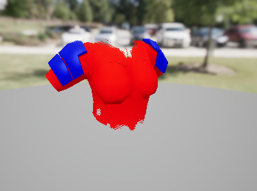
okay so. i think i can get up to nine colors per armor palette in lesser beast if i use an RGB mask and some vertex color fuckery to figure out which colors to use. like. hang on
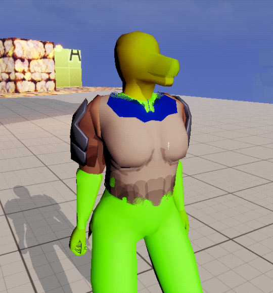
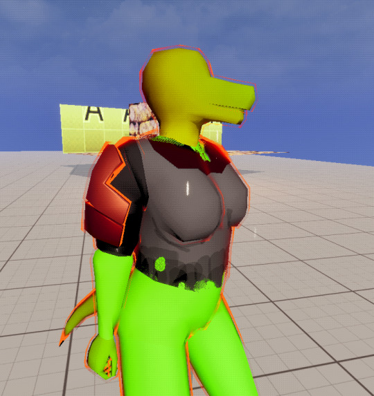
okay ignore how shitty this armor model looks. see how there's two metal colors here and then three cloth colors for the shirt? the idea is that there's 9 colors, 3 each for primary/secondary/tertiary "slots" which are determined by an RGB mask
but then for each color of that mask, the red and green vertex colors on the mesh are used to pick one of 3 colors in that slot
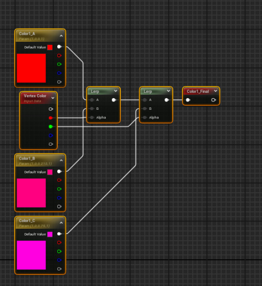
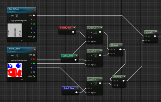
so. red mask + black vertex colors = Primary Color A, red mask + red vertex colors = Primary Color B, red mask + green vertex colors = Primary Color C. and then the same deal for the green and blue mask channels
i'm also using the Blue and Alpha vertex colors for metallic/specular/roughness info. "but wait mabel that's two channels for three properties, you can't be that bad at math"
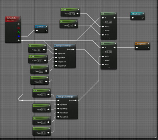
blue channel is just specular by itself; the alpha channel is basically two channels crunched into one. if the alpha is between 0.0 and 0.49 it's treated as a non-metal, and that range is rescaled to 0.0 to 1.0 to get the roughness. 0.5 to 1.0 is treated as metal and that range is also rescaled to 0.0 to 1.0 for roughness
so this way i don't need separate specular/roughness/metal textures for armor, i can just have the base diffuse+alpha, the mask texture, and then (if needed) an emissive map. yippee
35 notes
·
View notes
Text
explaining the game mechanics of lioden to people who are used to petsims like neopets or flightrising is literally so funny like
your dragons appearance in flightrising is controlled by three genes: primary (body), secondary (wings), and tertiary (other). they are born with a certain color in all those slots but you can buy an item to randomize them, and then either buy or collect items to change their patterns
meanwhile your lions appearance in lioden is controlled by a base color an 10 marking slots (but you can spend money to buy more) and the base color is inherited based on genetics with different levels of rarity and is usually a solid color but some have patterns and some can be applied with items and most markings can only be inherited from parents at different levels of rarity but they appear at different random opacities based on ????? so sometimes youll have an extremely rare marking at 1% opacity and some markings can be applied by an item but you dont get to choose what the marking is, its either 100% random or special items give you four markings it will choose between. also dont spend too much money on a lion if you dont have a jellyfish for them or theyll die of old age
19 notes
·
View notes