#85 logo
Explore tagged Tumblr posts
Text
THE STORY OF THE 85 LOGO 🏍️
Since Yibo was spotted on the race track, the conversation around the logo is picking up again. This has been discussed so many times before & in bits and pieces but I want to give it a go and make my own version of it’s history. It’s a mix of the logo itself as well as the cpn speculation surrounding it’s origin. I’m not gonna talk about other related designer zz candies, this is only for the logo.
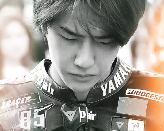
I used this video by R背靠大树好乘凉W as a guide on the timeline but i did my own fact checking and added a lot more points especially with Parts II-IV of this post.
I. THE ORIGIN
11/10/2018, Yamaha Racing Team weibo account posts the first look of the 85 logo. At this point, everyone already knew who this is supposed to be. It’s also cute how the time it was posted had the timestamp “28” which is Ai Bo, another clue.

“ driver number 85 is coming soon! “
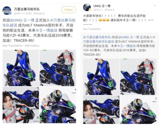
1/19/2019, The same account officially shared that Yibo will be joining the MLT YAMAHA team for 2019 and Tracer 85 was born. Yibo also reposted this and replied with :
Happy New Year to all! ! ! ! ! racing career has begun! ! ! ! ☺️☺️☺️Please call me driver Wang Yibo! ! ! ! ~~~~~
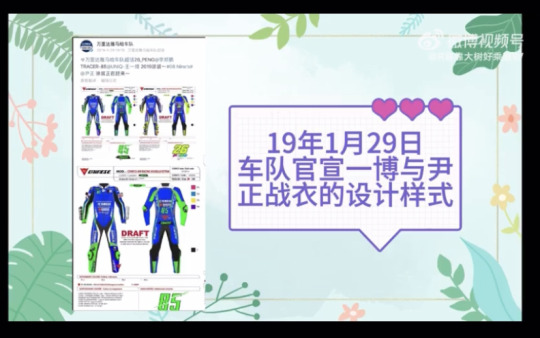
1/29/2019, the draft for Yibo’s Tracer 85 racing suit was released by the weibo account. It prominently features “85”.
Now a key player in this whole designing mystery is DAINESE a company that describes themselves as: Dedicated to producing the most effective safety solutions in every arena where athletes continually push the human body and mind to surpass their prior achievements. From our motorcycle racing origins to alpine skiing, mountain biking, competitive sailing and outer space. So they posted about the racing suit itself as well as the helmet. Again, both things featured the 85 logo, along with other symbols that is an entirely different cpn on it’s own.
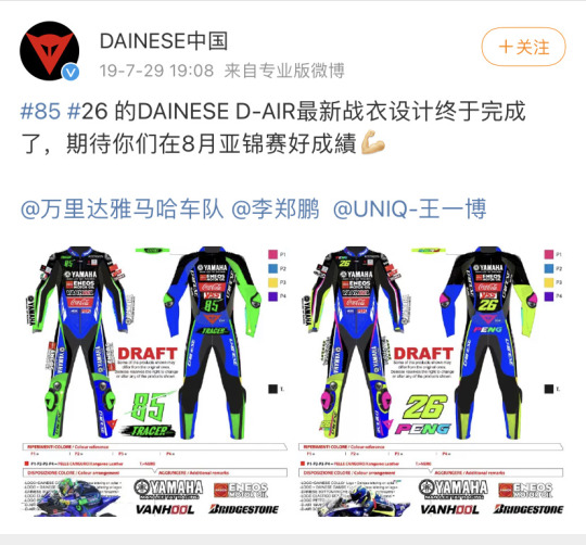
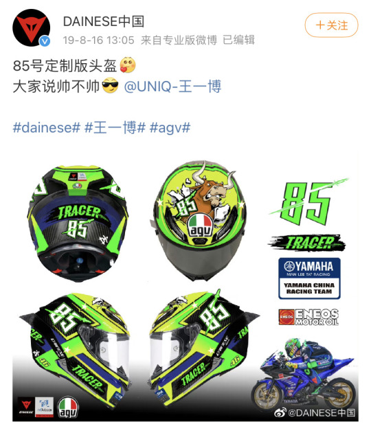
It’s so obvious that a professional company will make this for WYB. Even if we CPN that the logo was made by XZ, or even a rough sketch of it and passed on to Yibo, down to this company’s team to refine. There is just no way that XZ will write his name down as the owner of it, if we didn’t have that BTS video of their conversation about it then we won’t have a confirmation. Even if we have that video, there is still the probability that XZ didn’t follow through.
Then someone asked the company itself about the origin of the logo and they said WYB brought it himself.
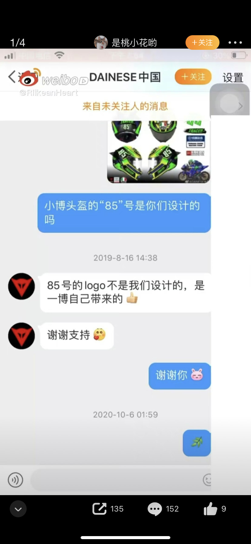
The logo of No. 85 is not designed by us, it is brought by Yibo himself
Thank you for your support
If you look at the original post for the racing suit, the comments are all wf being so prissy about who designed it. I know that this post is supposedly about the 85 logo but the suit is a huge part of that. Also I think it’s about time to clear up the fact that cpfs are not trying to discredit anyone who made WYB’s gear. Why can’t we just be happy that he has a cool moto suit with the 85 on it? We are. We really are. It’s just that analyzing the elements within it is something that CPFs love to do. Not even for the relationship part of it but just to understand him better. The thing is, I don’t look at it and think only about how “handsome” yibo is. I also wanna know what it means. The details. This is something that represents him as a racer so I will naturally be curious about what’s on it. Not to say that so/os are shallow or anything, It’s just that we are two different kinds of fans. Our brains don’t work the same way. That’s fine. I wish people will one day accept that we all approach fandom in different ways. If you don’t like something— then ignore it.
So the conclusion here is, 85 was not an idea/logo made by the company DAINESE. Yes, they produced the gear and finalized everything. They were hired by YAMAHA to do so. However the one who drew that logo on a piece of paper is unknown.
Our best guess is Xiao Zhan. 🫶🏼
II. IMPORTANCE OF 85 TO YIBO
85 represents Yibo’s birthday, August 5. But it’s really became his “identity” when Tracer 85 was born. Even if he wasn’t racing, this number became a recurring theme & design with his endorsements. For example when he did a collab with Miniso, the goods had 85 on them.
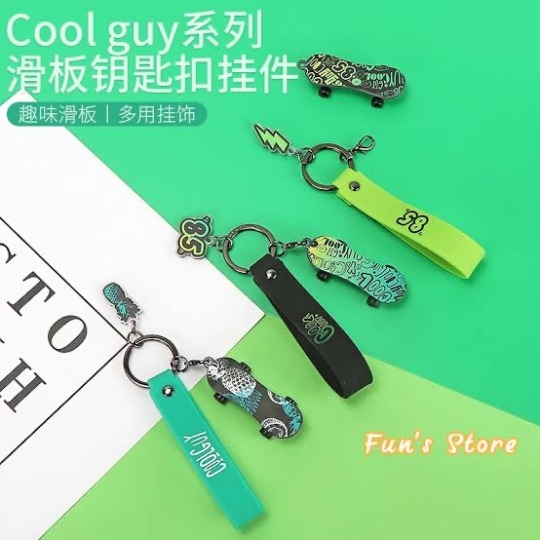
He has moved to the “Panther” more recently but 85 and 0805 is still very much a Yibo’s thing. There are even endorsements that have 85 on the price they sell his items for ( example is Richora ).
So using 85 is not a spur of the moment thing and goes beyond his racing career.
III. OTHER SIGHTINGS ( of the logo )
Aside from the race track, the most important way the logo was incorporated was through merchandise. Whether it’s the custom phone case that only Yibo has —
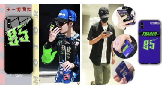
or the infamous 85 cap which was repped by yinzheng. the sus part here is yibo commenting, only acknowledging the post but then yz had to reply back with : lemons grow on lemon trees, under the lemon tree there’s me. which means he is jealous and then yibo had to reply back with a series of emojis that makes things more suspicious.

sure, yinzheng can mean that he is jealous of the merch. that yibo has his own now and that the whole tracer 85 now goes beyond being a racer. but the cpf explanation to this is that he is jealous that wyb has someone that made this amazing logo for him too. it's really so cool to have your own designer at home.
a fan favorite would be this cap, released by Day Day Up in their WYB goods line back in 2020. What’s interesting is, the number of pieces available for it’s initial presale was 1005. LOL. 1005 is October 5, of course, XZ’s birthday. I think the number of pieces for a presale though not entirely up to yibo, may still be influenced by him. It could easily be 8500 pieces just to be meta but no. Why 1005? Is it a nod to the guy who made the 85 design? Plus if this logo was owned by Yamaha or Dainese, then why was it allowed to be used commercial by a completely different entity. Our answer is that it’s Yibo.

It’s curious that the cap received this special treatment, because out of all the merch sold in that line, it is the one that had the 85 logo in it’s original form. The rest had their own iteration of 85 but the cap is the closest to the “logo”. This is why a lot of fans, and CPFs specifically wanted to get it.
My favorite memory from when this line came out was the loud speculation about the logo and it’s connection to XZ. There were even talks of 🍤 buying something cause if XZ is the designer, then it’s also a XZ merch. This is the same year when 🍤 was going around SDC3 filming cause XZ was supposedly there. So yeah. This cannot be confirmed and no shrimp will ever admit but it was definitely a rumor going around that time. Looking back, that CPN was beneficial ( in a way ) to shrimps because it casts XZ in a good light. They know XZ’s capability so they can sort of agree to it. Not that we need so/o fans validating our opinions/speculations, but it’s a possible explanation to their reaction. Compared to motos who were angry with the association and insulted XZ. Implying that he isn’t capable, they can say that cause they don’t know XZ.

IV. Connection to Xiao Zhan “the designer” and candies
Turtles pointing to XZ as the designer is not only rooted in CPN, but the fact that making logos was his previous job. Even before the leaked video, it made sense to the community because after all, this is what XZ is good at. He’d done it for years in school and as a professional. There were photos of his previous work that leaked and he also talked about logo-making when he visited the bilibili office. Where he shared how frustrating it was to work with clients. More recently, in one his vlogs, we could see him explaining his thoughts on a visual logo for XZ Studio.
youtube
( video is about xz the designer, mostly talking about it during xfire / xnine days )
So his capability, closeness & familiarity with WYB at the time of the logo’s conception is key. CPFs are very familiar with how XZ makes art and logos for himself so to us it’s a rational speculation to think XZ had some influence on this.
There is another talk about Yuehua being the one who made it. They do have people who can make those right? However it was pointed out that with how they make logos for their other artists, it’s unlikely. They did claim the rights to the Panther, but the identity of the artist was left blank on the application. No one ever did claim ownership of this Logo or the Panther in public. Why wouldn’t they? It’s free promotion.
CPN Clues:
• 85 read as 28. Ai Bo + the Z.
• The Z is really my favorite clue 🥺🥺🥺🥺
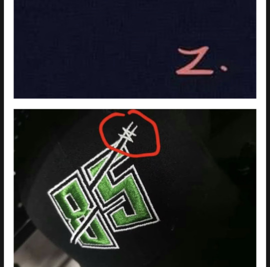
• How it looks very similar to the M skateboarding logo. Which can also look like a 85.

• Some other explanation on what the 85 could mean. It’s XZ’s style to have hidden meanings aside from what you actually see.

• The minimalist design that screams XZ.
The 85 logo talk and cpn have really been in full swing when EVISU released those photos and I hope BXGs ( especially big accounts on the bird app and beyond ) will rein it in with the Xiao Zhan association. We already know how hostile the environment is so it’s best to not use his full name. It’s actually a common CPF way of doing things, not using their full names in our posts. As excited as we all were, the whole point was that tracer 85 is back, not the CPN. I know it’s tricky to find a balance with how our brains are wired, but you will learn. It should always be them as individuals first.
85 logo and all other “designer GG” is one of those CPN that is very popular and widely circulated in the bxg community — and with good reason. However, it is in no way to take away 85 from Yibo. It’s him. It is his brand and it will always be his.
This is one in a couple of “yizhan mysteries” out there that keeps the BXG flame alive 🔥. These (alleged) silent collaboration/s between them are so great because it shows how well they work together as a team.
-END.
133 notes
·
View notes
Text


Tint and no tint cus i love both
FINALLY DREW FANKID AU SILVER YAY💖💖💖 WITH HIS DAUGHTERS YAY💖💖💖!!!! AND A RARE MOMENT OF OPAL SMILING OMG!!!
I’m actually so genuinely proud of this art—
#fish actually liking her handwriting for onceee#sth#sonic the hedgehog#sonic au#au#sth au#fish’s fankid au#sonic#silver the hedgehog#quartz the hedgehog#opal the chameleon#art#my art#espio the chameleon#hydra the seedrian#hydrangea the seedrian#asteroid the cat#(<-those last 4 r a KINDA cus Quartz is texting Esp and Aster#but Hydra is just kinda mention by Aster so)#sonic fankid#sonic fanchild#fankid#fanchild#espilver fankid#espilver fanchild#OVER 85 LAYERS. AND SOMEHOW MY IBIS DIDN’T LAG?? (well until i flipped it-)#quartz w her btw phonecase expect u cant see the bts logo cus its sideways🫶#bts* not btw
104 notes
·
View notes
Text
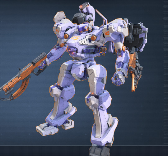
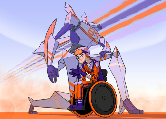

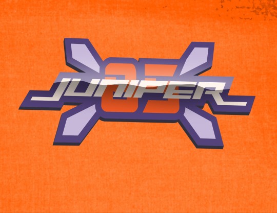
Got a job for you, 85.
#armored core#armored core 6#art#illustration#character art#original character#my art#character design#mecha#Juniper 85#The hdr made the colors on all bugaboo on the logo screenshot#I promise they're more accurate to my original design on screen 😭
18 notes
·
View notes
Text
I was a cheesemonger for ~3 years and these are my favorites as remembered off the top of my head. We would sell these to tourists at like $15/lb to $30, but you really don't have to spend that much to get good cheese! The best part of the job was learning Cheese Lore
Red Witch - It looks like this! The closest comparison for most people is gruyere. They wanted to make a spooky cheese and they went out there and did it😭

Ewephoria - a sheep's milk gouda - aged and young are two completely different things and they're both The Best
Hanfmutschli - also good but tbh it was more just fun to sell. It's got hemp seeds. Last I heard they were researching how to make a weed sequel

Cirone - It tastes like dirt! And kinda like chocolate. They let the cheese mites at this one😁
Gjetöst - a CUBE, which they have both cheesed and caramelized
Like 95% of goat cheeses
ESPECIALLY Midnight Moon! (another gouda)
Prairie Breeze - A ✨Sweet✨ Goddamn Sharp Cheddar
The cheese with lemongrass ants on it that I saw in a catalog and could never talk my manager into ordering💔
#there were really good blue cheeses too but none were Faves#cheese meta#the other ones look like various cheeses#cirone and hanfmutschli are from the same place#they are bold enough for their main logo to be like 85% udder#cheese is a wild subculture
10K notes
·
View notes
Text


#NEIGHBORHOOD#DP Basic Straight-Leg Selvedge Jeans#$270#+ Dickies® Logo-Embroidered Appliquéd Twill Jacket#$410#+ Medicom VCD WU Small PVC Figurine#$85
0 notes
Text
What Font is used for the Rockstar Games Logo? (Gaming) (What Fonts) (Fonts Blog)

Logo ©Rockstar Games
Article by @warrenwoodhouse #warrenwoodhouse
The font that is used for the Rockstar Games logo is called Neue Helvetica Paneuropean 85 Heavy by Linotype
#warrenwoodhouse#2024#gaming#fontsblog#whatfonts#what fonts#rockstar games#logos that use the neue helvetica paneuropean 85 heavy font
0 notes
Text

Happy chapter day, everyone! The Japanese RAWS for Chapter 85 will be out in a few hours. Shirahama posted this drawing of Olruggio on twitter to celebrate.
[ID: Modern Olruggio on a reclined deck chair with brushbug on his chest, checking a tablet with a Witch Hat logo on the back. There is a steaming travel cup beside him with the design of the apprentices' hat on it and he's wrapped up warm with a blanket over his knees.]
336 notes
·
View notes
Text
HERMITS AND THE OLYMPIANS MASTERPOST (07/31/2024)
------------------
Hermits and The Olympians/Emperors of Olympus is a Hermitcraft/Empires SMP based Percy Jackson AU based off my art and headcanons!
(Please do not use the tags for other PJO AUs as I use them to specifically label what's based off mine.)
------------------
Seperated by art/doodles, headcanons/discussion, fanfics:
# 1 MUMBO PORTRAIT # 2 GRIAN, PEARL, SCAR & MUMBO ART # 3 HaTO FAN CREATION GUIDELINES # 4 GEM, CLEO, DOC PORTRAITS # 5 ETHO & BDUBS THANK YOU CARD # 6 STRESSMONSTER THANK YOU CARD # 7 CAMP EMPIRES FIRST APPEARANCE; BAD BOYS DOODLE # 8 OUTDATED CAMPERS GODLY PARENT SUMMARY # 9 CHIBI MUMBO THANK YOU CARD # 10 GRIAN CLOSE UP # 10.5 WATCHERS CAMEO??? # 11 BDUBS & SCAR; DEMETER CABIN'S HONORARY CAMPER # 12 RENDOG PORTRAIT # 13 MUMSCARIAN / RE: AU SHIPS # 14 IS THERE A CANON PLOT? Answer: I stick with what is canon to me, but I do not force others to follow so. As I am too lazy to do an actual plot. # 15 CHIBI STRESS & MUMBO # 16 BDUBS..? # 17 ETHO PORTRAIT / 1ST AU FICLET # 18 I JUST THINK THEATER KID ARES KID REN IS FUNNY # 19 JOEL AND LIZZIE; SOULMATES IN EVERY UNIVERSE # 20 ORACLE GEM...? # 21 oh snappers! (LOW QUALITY ETHO DOODLE) # 22 AT THIS POINT, DIONYSUS, ARES, AND APOLLO SHOULD FIGHT TO THE DEATH TO SEE WHO GETS CUSTODY OF REN # 23 SKIZZ & IMPULSE PORTRAITS / HEADCANONS # 24 ZEDAPH PORTRAIT
# 25 Camp Oracle’s Journal; Hermits and The Olympians # 26 GRIAN - THE DEATHLY ACTIVITIES MANAGER # 27 ISKALL & TANGO PORTRAITS # 28 KERALIS & XISUMA'S PERSONALLY MADE CAMP PIN # 29 I REALLY LIKE MAKING FUN OF REN /AFFE # 30 I ALSO REALLY LIKE INCLUDING MARTYN INTO THE MIX /AFFE
# 31 TREEBARK ARE MY BOYFAILURES # 32 RENDERED CAMP LOGOS (PNGS IN DISCORD SERVER) # 33 SHELBY & SCOTT PORTRAITS # 34 ETHUBS MY BELOVEDS :) # 35 INTRODUCING: GIGGS # 36 RE: CAMP EMPIRES AND CAMP HERMITCRAFT DOUBLES # 37 LET OLD MEN BOND LIKE OLD MEN (ETHO & TANGO) # 38 OFFICIAL HaTO DISCORD SERVER ANNOUNCEMENT # 39 MYTHICALSAUSAGE PORTRAIT # 40 XISUMA PORTRAIT # 41 HaTO FIRST COMIC SHITPOST # 42 FALSE, KERALIS, & BEEF PORTRAITS # 43 WELS & HYPNO PORTRAITS # 44 MUMSCARIAN FIRST MEETING DOODLE # 45 WHY IS WELS AN ATHENA KID? # 46 HOW IS GEM THE ORACLE # 47 HaTO SECOND COMIC SHITPOST (PRIDE MONTH) # 48 DESERT DUO ANIMATIC; INSPIRED BY BEAN'S TRAITOR SCAR FIC
# 49 MARTYN PORTRAIT / HEADCANONS # 50 IF SCAR WERE TO BE APHRODITE'S.... # 51 REN VS JARS # 52 LIZZIE PORTRAIT # 53 HaTO SCAR & GEM EMOTES # 54 HaTO CHIBIS BOUQUET DOODLE # 55 GRIAN AND HIS SON # 56 KATHERINE ELIZABETH PORTRAIT # 57 MUMSCARIAN MATCHING ICONS FOR PRIDE # 58 HOW ARE YEAR ROUNDERS GETTING EDUCATION? # 59 SHINY DUO MATCHING ICONS # 60 AROACE PEARL (PRIDE MONTH) # 61 BISEXUAL CLEO (PRIDE MONTH) # 62 CAMP CUDDLE SESSIONS # 63 TREEBARK COMEBACK # 64 When Does a Man Become a Monster?; Hermits and The Olympians
# 65 BOAT BOYS MATCHING ICONS # 66 WHAT DOIN'? CAMP HERMITCRAFT EDITION # 67 "I'M A CHILD OF DIVORCE" GESTURES TO ETHUBS # 68 MORE ETHUBS HEADCANONS CUS IM GAY AND SO ARE THEY # 69 DO NOT ANGER THE NON-ZOMBIE WOMAN, MR. ETHO # 70 NATURE WIVES # 71 I COMPLAIN ABOUT THE HEPHAESTUS CABIN'S ABILITIES # 72 TREEBARK MATCHING ICONS # 73 OLI PORTRAIT & HEADCANONS # 74 IT'S NOT ME IF THERE'S NO ETHUBS # 75 WELCOME TO HERMITCRAFT: GRIAN TEXT ADVENTURE # 76 GEM'S ORACLE CAVE TOUR
#77 THE BOYS (+ GEM) GO SHOPPING FOR SUITS #78 PEARL CHARACTER CARD #79 Camper Files; Hermits and The Olympians #80 STRESS PORTRAIT #81 CUBFAN PORTRAIT #82 FWHIP PORTRAIT
#83 PIXLRIFFS PORTRAIT #84 RANCHERS #85 WHY DO I HAVE SO MUCH TREEBARK IN MY INBOX? #86 IDK HOW SAD I'M SUPPOSED TO MAKE SCOTT #87 LONG TIME, NO NATURE WIVES? #88 AREN'T WE ALL A LITTLE SILLY FOR GRIAN SOMETIMES? #89 I HOPE YOU ALL KNOW I JUST BE SAYING ANYTHING ATP
# SECOND MASTERPOST LINK
OTHER HaTO Related Links:
HaTO Roleplay Blogs Masterpost by gem-the-oracle HaTO Archive of Our Own Series HaTO Discord Server
#Hermits and The Olympians#Emperors of Olympus#hermitcraft#hermitcraft au#hermitcraft fanart#hermitshipping#trafficshipping#Percy Jackson AU
360 notes
·
View notes
Text
The Grocery Trip

Yandere Alhaitam x reader
I had a dream about yandere Alhaitam and me going to a grocery store (though in the dream it was in the modern era). I wanted some sort of unhealthy drink powder and he refused to buy it. I just felt like I had to make this scenario into a fic. I am thinking of writing different grocery store scenarios with different yandere genshin men.
Masterlist
Word count: 597

The grocery store was quiet save from the bell which chimed whenever a customer entered. A colourful isle caught your eye. Rows upon rows were filled with colourful items from Fontaine.
You turned to your grey haired companion. “Can we take a look at the new items from Fontaine? Please?”
Alhaitam’s expression unamused. “Fine” his answer followed by a sigh. His hand that were not holding the basket, linked with yours. The gesture was meant to look like a romantic gesture, but you knew he was only trying to make you stick with him.
Upon a closer inspection some of the various Fontainan gods were things you had never heard off. Some were nutritious meals that you only needed to heat up and some were rather unhealthy snacks.
A orange red container with a logo of a smiling strawberry caught your eye. Frizzy Pop. You took a hold of the container and turned it around to read the description. It was some sort of powder you mixed with water to get a sweet and refreshing drink. Just what you needed.
With a smile you turned towards Alhaitam. “Can we get this? It looks really delicious!” you waved the box in front of his face which earned you a scowl.
“Absolutely not” his expression stern.
You rolled your eyes “Why not?”
He grabbed the Frizzy Pop out of your hand and inspected it like it was a the most serious thing. “You can’t even pronounce 85% of these ingredients”
“Ugh come on!” you threw your head back and dramatically sighed. “Why must you be so strict?”
“Call me strict all you want. I just care about your wellbeing. Is that so hard to understand?” Alhaitam crossed his arms. His muscles flexing slightly with annoyance.
You whined and dragged your hand across your face in irritation. “I am my own person. I don’t really need to listen to you!”
“Oh yeah? What would be of you if you didn’t, hmm? Would you perhaps be living on the streets? Oh that’s right… You would” his eyes cold. What he said was true. He had indeed helped you out of a though financial crisis and given you a place to live. In exchange he had kept you under his watchful eyes in the name of love. At least that’s what he so bluntly called it.
“It’s a drink powder Alhaitam. It’s not a big deal! And besides I already follow your recommended nutrition plan”. He had given you a long list of foods you could and could not eat. He had been very strict about it and he made few exceptions. He said it was in your best interest. You did argue with him at first. You hated how he thought he had the right to choose what you ate or not, but after a while you stopped with the arguments. You had noticed how on edge he had been lately and you knew very well that he was extremely close to just look you away in his house.
“It is a big deal. If you actually had any knowledge about nutrition and different ingredients you would know what I mean” he scoffed. His arrogant tone making your eye twitch.
“Now let’s put this back and pay for our things” he put the container back in place.
He squeezed your arm with his bicep in a warning. “ I really do love you, you know?” he pressed a quick kiss on the top of your head. His blue orange eyes filled with love deeper than what you could ever wish to understand.

#yandere#yandere genshin#yandere genshin x reader#yandere genshin impact#yandere genshin x you#yandere genshin x female reader#yandere genshin imagines#yandere alhaitham#genshin x reader#genshin impact x reader#genshin imagines#genshin impact#al haitham x reader#alhaitham x reader#genshin impact alhaitham x reader#alhaitham#yandere male#male yandere#x reader#genshin x female reader#yandere x female reader#yandere x reader#x female reader#female reader
487 notes
·
View notes
Text
Cliff Edwards - When You Wish Upon a Star 1940
"When You Wish Upon a Star" is a song written by Leigh Harline and Ned Washington for the 1940 Disney animated film Pinocchio. It was sung by Cliff Edwards in the character of Jiminy Cricket, and is heard over the opening credits and in the final scene of the film. It won the 1940 Academy Award for Best Original Song, and was therefore the first Disney song to win an Oscar. "When You Wish Upon a Star" is widely considered as the signature song of The Walt Disney Company and is often used as such in the production logos at the beginning of many Disney films since the 1980s.
Harline and Washington delivered "When You Wish Upon a Star" to the Pinocchio story crew in early autumn 1938, and they recognized it right away as a spotlight song that should be given prominence in the film. Disney decided that the song should play over the opening credits, and used as a musical theme throughout the film. The Library of Congress deemed Edwards's recording of the song "culturally, historically, or aesthetically significant" and inducted it into the National Recording Registry in 2009. The American Film Institute ranked "When You Wish Upon a Star" seventh in their 100 Greatest Songs in Film History, the highest ranked of only four Disney animated film songs to appear on the list.
In Japan, Sweden, Finland, Norway, and Denmark, the song has become a Christmas song. The song features in Disney's one-hour Christmas special From All of Us to All of You, originally broadcast in 1958 in the US, but now considered a Christmas tradition in the Nordic countries, where it is broadcast on Christmas Eve every year since 1959. 🎄⭐
"When You Wish Upon a Star" recieved a total of 65,8% yes votes!
youtube
#finished#high votes#high yes#disney#cliff edwards#soundtracks#film score#40s#english#o1#o1 sweep#lo24
539 notes
·
View notes
Note
WIBTA for wearing Lovejoy merch?
Lovejoy is an indie rock band I really like, and last year I went to a concert and bought a hoodie that has the logo on it. The ticket was about $70 and then another $85 for the hoodie. It's really comfortable, and I'm usually really insecure about my appearance but this hoodie makes me feel happy about how I look because it fits nice and I like the color. I really enjoy the band's music too, I love the lyrics and vocals and instrumentals and I think a lot of their songs are amazing. However, about a month ago, the singer of the band admitted to abusing his ex girlfriend.
But I really like the hoodie and I spent a lot of money on it, and I bought it months before any of the bad things the singer did had been revealed. And it was only the singer that did anything bad, the three other members (as far as I know) are completely innocent, and didn't even know the singer was an abuser until recently. I don't think it's fair to hate a band based on the actions of a single member.
Would I be an asshole to continue wearing the hoodie knowing what one of the band members did?
203 notes
·
View notes
Text

I can't help it, I have to critique this.
Disclaimer: I'm about to rip this logo to shreds. If that's is going to offend you, don't read on. Especially don't read on and then get pissed off at me, because you will only have yourself to blame. 😅
I also want to start off by saying that this has absolutely nothing to do with who designed it (or didn't design it), or who it was designed for. I love GG and DD, but ultimately my reaction to this logo design has absolutely nothing to do with either of them.
I have to say it couldn't be more disappointed with this logo. I feel that it fails on every level. Here are a few of the reasons why:
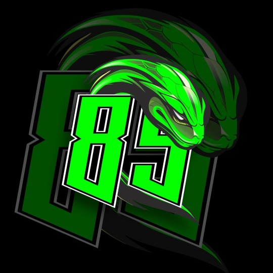
It is devoid of any personality. I guess I've been spoiled by the cool panther logo that we have known and loved, but I would have preferred to see something with more street style to it. Something with more individuality - something connected to Yibo and his aesthetic. This doesn't scream 'Yibo' to me. It just looks very conservative, like something designed for a brand (which it was, I guess). That's not to say the illustration isn't well done, because it is, and it does do a decent job of bringing in some automobile elements into the snakehead design (the geometric scales, the flames under the eye), but no matter how well illustrated something is, it's not going to make a good logo just because it's pretty. Logo design is actually a complex process that requires a lot of skill and experience, and a solid background in communications and design. Being able to draw well is only a very small part of that skillset. In fact, there are some outstanding communication designers who can't draw very well at all.
It fails as a logo design. The number one thing any logo needs to do is communicate. This doesn't communicate anything at all. It doesn't even immediately read as a snake. In fact there's really very little snake-ish about it, and all of the coolest elements of a snake - its long winding body, its forked tongue, its glassy eyes - none of those features are incorporated here. It also doesn't read as an 85, it could be an 89. Terrible - a truly inexcusable error. For a racing logo, there's really nothing speedy or fast being communicated here at all. The snake looks like it's about to fall asleep. Even the kinetic energy that could have been communicated through the position of the snake's tail is wrong. The tail is pointing in the opposite direction it should be, and the snake does not look like it's moving forward, it looks like it's draped over the logo, exhausted, and like the entire snake is maybe 5" long.
The designer doesn't seem to have respected the spirit of the original design. They should have used that original design as a starting point and built upon it rather than go in their own direction and then paste what they did on top of the existing logo. As a result the overall look is disjointed and unharmonious. It just doesn't crackle with the exciting energy that comes from a well-designed, well-balanced, aesthetically strong logo design.
I really can't stand it. Yes, the snake itself is beautifully illustrated, and the illustrator is talented, but they have failed as a logo designer in this particular case.
I love the idea of the snake being incorporated into a racing logo, but everything that makes a snake cool, everything that makes a snake well aligned with a racing brand, everything that conveys speed and energy is just completely lacking here.
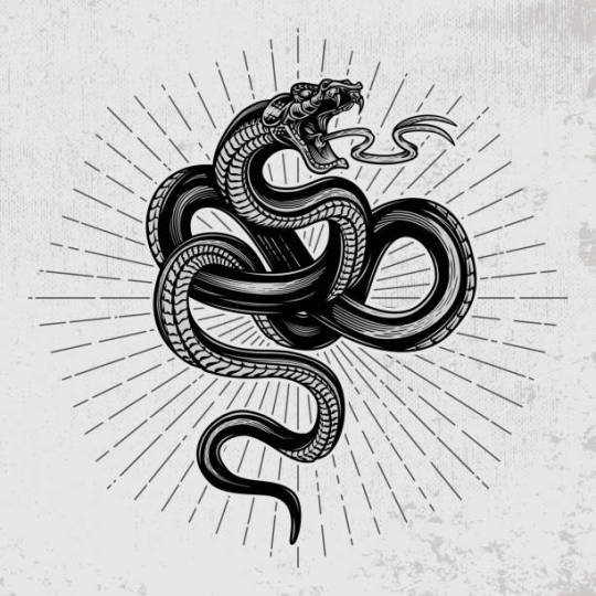
Just to give you an example of some more dynamic snake logos, here are a few just from Google image search (and I'll put the Evisu one here again so you can compare). I'm not saying that I love these designs, but they are much more energetic and dynamic than this logo:

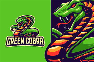
And I find this one pretty inspiring simply because it gives me ideas about creating a snake with a tire tread underbelly, which would be so cool.
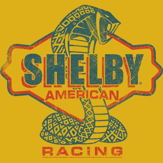
And if you look at the classic Ford Shelby logo, compare that with the Evisu one you can see how much more dynamic and unique and distinctive and exciting the snake is in this one, even though its position is more static and it's not as smoothly rendered. It has style.
There's a part of me that feels a little bit bad for ripping into Yibo's new logo, but I'm angry on his behalf, because I feel like he deserves a lot better than this.
And all the designer would have needed to do to make this a more exciting logo and one that communicates what it needs to communicate is to make the snake head a little bit smaller so it's not blocking the number 5, give it a more dynamic pose where its mouth is open and its fangs are showing and its tongue is sticking out, and expand its body so that its body is visible behind - or even winding around - the numbers, and where you can see the curls of its body, and its tail is facing in the correct direction to make the snake look like it's moving forward.
Edit: here's what I mean:
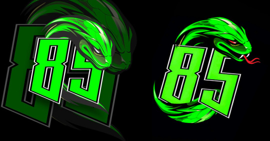
I still don't feel that the illustration style is compatible with the original logo design, but I could overlook it if it was actually making any effort at all at communicating a racing theme.
Just my two cents. It's possible I will warm up to it more when I see it on the car. Placement and context can make a big difference.
I think it's cool that Yibo wants to use that green bamboo snake for a logo, I just wish it had been better designed.
Edit: more on this here.
60 notes
·
View notes
Text

wang yibo - evisu
Wang Yibo is circling along the way, but he is always fearless and racing upwards. He is "green" and transformed. EVISU joins hands with @UNIQ-王一博to create the new logo No. 85 "Bamboo Leaf Green Snake". It is unique because of love 🐍, and it is full speed for love! 🐍 "Bamboo Leaf Green Snake" will debut soon, so stay tuned!
#wang yibo#OMG THIS IS SO SLYTHERIN OF HIM#and as a fellow slytherin i’m happy#so i guess the melon of him racing this week is true
41 notes
·
View notes
Text

EVISU teams up with Wang Yibo to create new logo #85 "Green Bamboo Leaf Snake". 🐍"Green Bamboo Leaf Snake" debuting soon
(They say that Evisu has changed the logo on the racing car, we will see it soon. Yes, this is the same snake from the tropical forest when he was looking for gibbons.)
29 notes
·
View notes
Text
also why the fuck is f1 store's shipping so expensive?? I almost just bought a mclaren hat with the retro logo on it during the 25% sale, despite not actually being a big lando or mclaren fan (love you though oscar) because I'm a kiwi and national pride you know?? and its already wildly overpriced but its Less overpriced than it would normally be so i get all the way to putting in my address and Tell Me Why standard shipping to NZ is $40 NZD which is barely less than the cap itself???? I'm not paying $85 NZD For A Cap. which is a shame cause I wanted that cap.
21 notes
·
View notes
Text


#Nike Solo Swoosh#Men's Full-Zip Hoodie#$77.97#$110#29% off#Michigan Wolverines Legacy Classic Arch Over Logo#Men's Nike College Pullover Crew#$85#Nike Attack#Men's Shoes#$103.97#$130#20% off#Use code JUMP25 for an extra 25% off#Sail/Coconut Milk/Pale Vanilla/Fir#Nike “Made in the USA”#$100
1 note
·
View note