#400 printed materials
Explore tagged Tumblr posts
Text
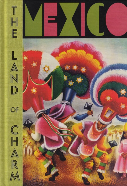



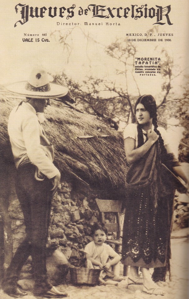
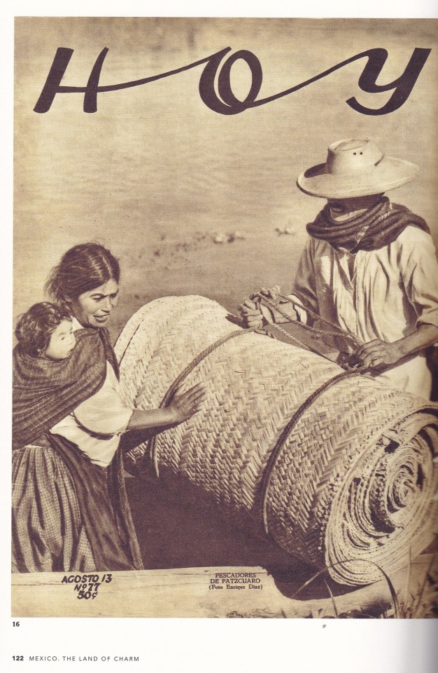


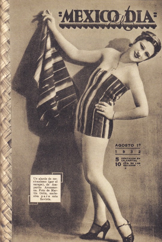
Mexico The Land of Charm
edited by Mercurio López Casillas
texts by Mercurio López Casillas / James Oles
presentation Steven Heller
Editorial RM, Mexico - Barcelona 2022, 224 pagine, 18x25 pagine, ISBN 9788417975517
euro 35,00
email if you want to buy [email protected]
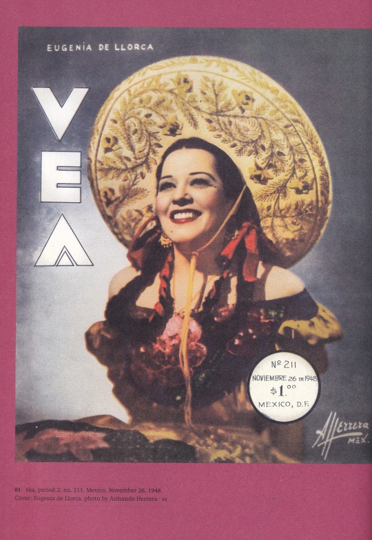
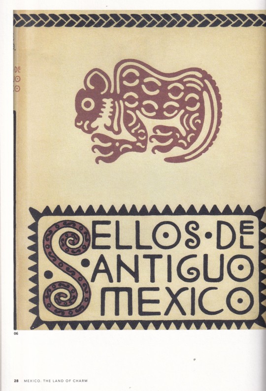
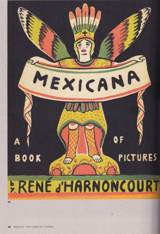
Mexico: The land of Charm is a beautiful and fascinating visual tour of the popular universe of Mexican Vintage Prints, from the Mexican Revolution to the 1950s. This stunning volume includes over 350 images from the collection of the most important and influential collectors in Mexico. This volume gathers a surprising and engaging sampling of more than five hundred pieces of printed matter: material that circulated between the 1910s and the 1960s, with prints run of anywhere from a thousand to tens of thousands of copies. These ephemeral, utilitarian publications flooded streets, newspaper stands, bookshops, and homes, in the common aim of disseminating an idealized image of what is considered typically Mexican. Drawn from private collections and the holdings of museums, with no claim to completeness, the material in Mexico: The Land of Charm ranges in size from stamps to posters, and includes supports such as books, illustrated magazines, photography magazines, songbooks and musical scores, almanacs and calendars, tourist guides and maps. The result is impressive, in terms of both individual examples and the collection as a whole: these images are now a part of Mexican history.
25/01/24
#Mexico#Land of charme#post-revolutionary Mexico#400 printed materials#books#magazines#brochures#posters#calendars#postcards#fashionbooksmilano
8 notes
·
View notes
Text
Hyahime presents: That time when a jsk became an ironing board cover..
Today i'm sharing a classic from cgl many of you have definitely heard about: The ironing board fiasco. The story of a girl, her dad's fiance and many feels.
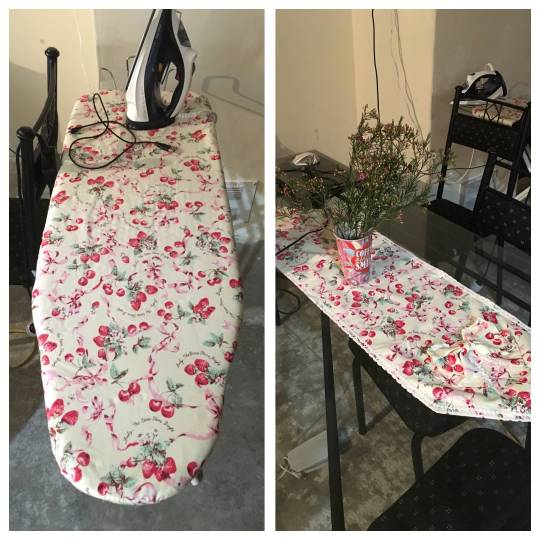
Everything started when OP shared this image and said the following:
Due to some unusual circumstances, I'm currently living in a partially-renovated house with my dad and his fiancé.
His fiancé is a very sweet lady who is very thrifty. She makes all her own clothes and and will usually find a practical use for something, rather than throw it out (i.e recycling old bottles and jars to pot plants).
I had a Baby The Stars Shine Bright Strawberry and Cherry Ruffle jumperskirt that I didn't wear anymore, so I was planning to sell it. From memory, it cost about $400.
I put it out in the main room next to a pile of clothes I planned to donate to Good Sammies, so I'd remember to take photos of it for the sale. I then went away for a week to visit my grandparents
When I came back, I noticed the pile of clothes had disappeared. Cool, my dad and/or his fiancé had donated them for me. But wait… Where was the jumperskirt?
It was then that I saw the sight portrayed in the uploaded. My dress had been cut up to to make an ironing board cover and a tablecloth. I don't know where the rest of the material is.
It appeared that my dad's fiancé had assumed the jumperskirt was part of the donation pile, and thought there was no harm in 'recycling' it for her own uses. In her efforts to pretty up the concrete-y wasteland of a house, she had unknowingly destroyed an expensive brand dress.
Literally the only thing I could do in that moment was stare blankly. I can't even be mad at her, she had no idea.
So now I have a BTSSB ironing board and table cloth.
the story immediately caught the attention of users as they scrolled. Some found it terrible, others couldn't help but laugh..
Though some were quick to say it must've been fake.


So.. did OP fake this for attention? Let's investigate.
It is very unlikely the fabric was gathered from a replica, judging by the print details and the fact that this isn't a very sought-after or popular piece you'd see everywhere.
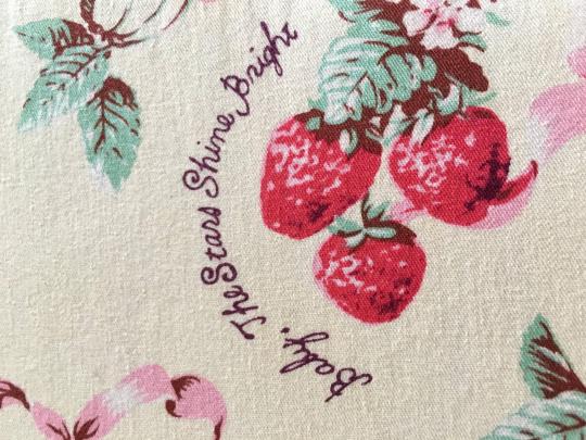
But how did one dress result in so much fabric? Although it looks like a lot, one anon pointed this out:

But she knew she'd get the attention, right? ...yes, but I don't think anyone would come up with this specific odd way to recycle a lolita piece and make the community react.
OP responded to the questions and thoughts with the following:

At this point, some anons were pretty much just fighting over if it's okay for OP to be so calm or not. Which.. is a little bit weird. Others were more emotional about this than the victim themselves.


But what you may not know is.. there's more. There's more to the Kawaiironing fiasco.
Op comes back.
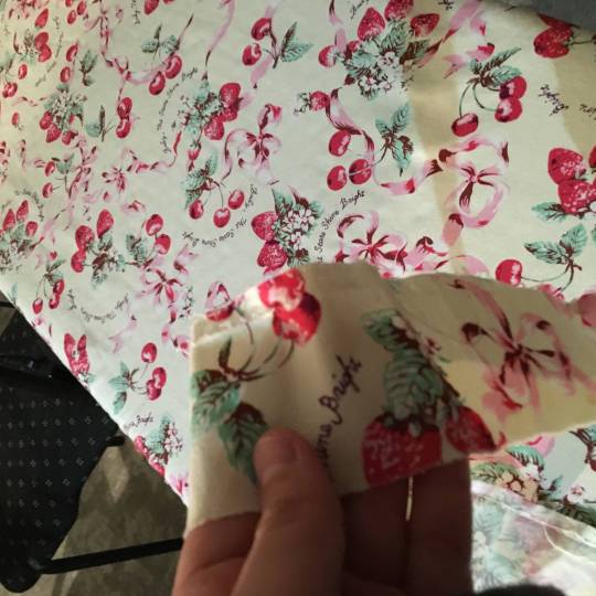
I queried the whereabouts of the remaining material and she showed me. She said my dad told her I was "throwing them out" (I have no idea where he drew that conclusion as i specifically said I was donating a bunch of clothes, so at the very least he should have assumed I was, you know, donating them), so she thought it was fine to cut up. My fault anyway, didn't separate the "sell" pile from the "donate" pile. HOWEVER… There were a few other brand dresses I was planning to sell. I assumed they had been donated with the rest of my clothes, as they were nowhere to be found. I was a little sad about that (they were valuable Angelic Pretty, BBSTB and Metamorphose), but oh well. Then I looked in her material bag and found they had also been cut up… When dad said I was "throwing THEM" out, he did not state a plural by accident… Pics to follow.

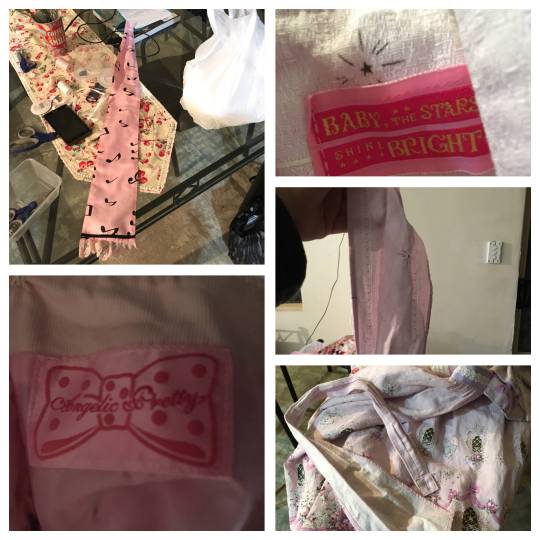
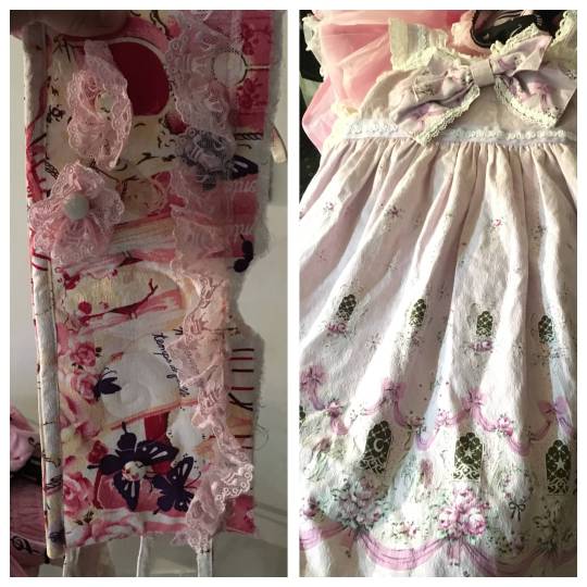
If anyone wants individual versions of those pics lemme know.
The loli gods frown upon me today for my unbecoming carelessness in handling burando.
Op decided to keep the truth a secret: ignorance is bliss, and her stepmother did not deserve to feel the guilt of ruining so much burando.. or to know that so many lolitas were in shambles knowing about her crafts.
..Although, anons said this wouldn't stop her from doing it again. Maybe she should know so she doesn't cut up even more dresses.

One thing is certain. that's a really cute ironing board cover. Maybe the fabric could become even more random burando stuff: headbows, little makeup bags, cup coasters, mats.. oven mitts?
Lolita home goods for all! we demand a cute life!(✧∀✧)/
#memorybox#eglfashion#jfashion#lolita fashion#egl#old school lolita#egl community#classic lolita#egl fashion#sweet lolita#gothic lolita
161 notes
·
View notes
Text


Gunderholfen (2019) is another print-on-demand megadungeon (this is probably the most economical way to go about publishing a megadungeon — this one runs just over 400 pages). Ostensibly a dwarven fortress, then the fastness of an archmage, the complex is something like 900 rooms spread across ten levels, several sub-levels and a floating pocket dimension where the demonic Abyss is leaking in. And, if that isn’t enough, the introductory section says material exists for a whole second volume. If that isn’t impressive enough, apparently the whole thing is a one-person project — design, layout, art and cartography all done by author G. Hawkins. And it is their first published design outing.
I will say, Gunderholfen isn’t quite as vibrant as the other megadungeons I’ve talked about this week. It’s done in a much older style and even then is more Keep on the Borderlands than Dark Tower. There are modern flourishes — I appreciate the tactics for monsters and the social direction for NPCs and factions. But this is ultimately a pretty meat and potatoes old school dungeon crawl, just on a truly massive scale. Expect terse room descriptions of two to three sentences, dominated by monster attribute blocks and some small pieces of advice. It definitely lacks a lot of the weird stuff that gives so much OSR material its zestiness (no cornstalk warriors here). I appreciate that, though, it leaves some room for me (compare to Completely Unfathomable, which has so much energetic personality I dunno how I could ever hope to run it).
Zesty or not, it’s still a massive accomplishment. I really love Hawkins’ art, too. What he lacks in verbal descriptions he often makes up for in the accompanying illustrations that depict strange and atmospheric spaces. I’d pick up volume two, if it manifests.
124 notes
·
View notes
Text
Review 8 in series of Dragon Age Veilguard
60 hours in 58 actual gameplay
Something came to my attention. I need to make it crystal clear that I utterly love the diversity in DAV. It's fantastic. I'm also a heavily left leaning, non-binary, queer as fuck reviewer, editor, and author.
I'm on media blackout while I play this, so I'm only getting second-hand info on how awful it is right now in the DA Fandom. Please be safe and take care of yourselves. Arguing with incels and white supremacists is completely pointless. They sea lion worse than an actual sea lion. Your mental health is important.
Though, every single time the anti-queer brigade comes out for a new DA game, I sit there thinking 'have you bozos ever played any DA game, like, ever?' My guess is nope.
Part 7 is here.
Spoilers for Dragon Age Veilguard
Critical review CW strong language.
Well. If I'm right about who the Gloom Howler is, and I'm almost certain after the Cauldron... I really fucking question the reading comprehension of whoever wrote that arc.
She loathed doing what she was ordered to do to the griffins. She saved the last clutch of eggs, left secret clues on where to find the nest kept in stasis, and answered her calling early so no one could get the information out of her. All in the hope that future generations would be worthy of griffins again. And now she's doing the exact opposite? Seriously?
I mean, I'm aware that the supplementary material isn't something everyone is gonna read, but as far as I know the printed materials are considered canon. Which means they've taken a sad, epic story and completely reversed it in a retcon I'm not sure I can forgive them for.
I've marinated myself in the Lore of this world. That's an incredible disservice to her sacrifices to save the last remaining griffins. It's a disservice to the writer of Last Flight, too. That's not even touching on the 'of course when you shove a blade into the bones of a roughly 400 year dead arch demon... it will come out bloody?' Excuse me now? Someone has watched too much jurassic park, because that would be utterly impossible.
Once again, I'm asking myself What. The. Actual. Fuck. were the devs and writers thinking?
Surely they know at least some of us have read the printed stuff?
Did they think we'd have forgotten? Unfortunately for these retconning incompetents, (I am so, so sick of retconning in general, and fed the fuck up with it in this game) autistic and AuDHD folks like me tend to have razor keen memories about our special interests. Whoopsies.
Last Flight wasn't my fav of the books, but it was beautifully written and heartbreaking with a gleaming golden string of hope.
And this is the end of that story? ARE YOU FUCKING KIDDING ME?
I can honestly think of only one way they could make that make sense. And my trust in Bioware writers now lives below sewer level, so I'm not hopeful they'll go that way.
It's possible that I'm wrong, but understanding and critiquing media is my actual job when I'm not recovering from a pulmonary embolism. And yes, absolutely, I could've written far, far better material.
How. Can someone please tell me HOW a company that has something as successful as DAI under their belt... makes... this? I swear this game (DAV) is like some of the worst AI written shite I saw in ESO back when I played that years ago.
I guess I should say machine written. Whatever. I've heard ESO was doing that a long while ago. And the blah storylines and boring assed questlines proved it.
This game reminds me of that. Though, I think they were probably written by actual humans... I really have to question where exactly they scraped up the writers for them.
The street? A back alley? A mud pit? Did they give apes access to a keyboard and use whatever claptrap they came up with? (Yes. They did. Humans are apes.)
It's common enough in Hollyweird that writers working on a particular IP (intellectual property... IE Dragon Age or Witcher etc.) often utterly loathe the source material. I fail to understand why or how that would be okay, because we can fucking tell, you know? You can tell when a writer loves their work, and when they don't. And we wonder why so many things in hollyweird fail.
Is that what happened to DAV?
They had a fucking blueprint for fuck's sake! DAI was RIGHT THERE. It won GOTY if I recall correctly. No one wanted a game exactly like DAI but dear fucking gods something... not this... would've been far preferable. If they'd used DAI as a sort of map? A guideline or outline? DAV might’ve been a good game. And the sad part is that it actually could have been. With just a little more care, less streamlining to mediocrity, better editing and writing? This could've been another win for Bioware. As is, if it wins anything I'll be suspicious of bribery.
It's just so... meh. Where it's not outright bad.
And even though I'm under media blackout so I can write a truly unbiased review... it wouldn't surprise me if some fans were going gaga over this travesty of a game. Just because it has Dragon Age in the title.
It sucks when you want desperately to love something. But you just can't because you can see the flaws. And the flaws far, far outweigh the good parts.
And none of those good parts are even unique. They're just lifted from other games.
And I got the load up with no CC glitch again. Lost about an hour of playtime figuring out when it happened and which save to reload. I'd really hoped the damned hour long update would've taken care of that.
What a sad mess this game is.
Though on the positive, I do love the new takedown mechanic. And it's oddly satisfying to clear blight. I like tracking things. IRL too. I grew up in a subsistence hunting family. Though, I always just used a camera. I know how to track stuff, so that's fun. I like the ballista and zip lines. There are good parts of the game... but they aren't the parts that really matter.
I had to turn Taash down for Romance because it happened way too fast. I barely felt like I knew them, and my demi ass needs more than what we got before committing to a relationship.
It's warming up with Lucanis, Emmrich, and Davrin. I'm not decided yet. And this is where a polyam mod would be great. There's no reason polyam shouldn't have been included in the game. It could've been just a few characters okay with it like BG3, but the rep and possibilities would at least be there.
I'm incredibly fed the fuck up with the narrative that turns Solas into an awful person. They're trying so fucking hard to paint him that way. They're hammering it home so hard I really can't recommend (at this point) that Sollavellans play it. It's possible that will change, but... sigh. They've even got my Rook saying negative shit about him. Shouldn't that be a choice that I get to make about my Rook? How they feel about Solas?
And if I could kick the incredibly unintelligent and massively fucking annoying Lace Harding off a cliff, I absolutely would. Hard. And laugh while I did it.
Everyone blames Solas. Why is everyone so far up Mythal's asshole that they're forgetting it was always her requiring her bound servant IE enslaved spirit who never even wanted a body (forgetting that part?) Solas to do what she said. That he tried over and over again to dissuade her?
You know, as a friend said, they could've hired a bunch of Ao3 fic writers and paid them in pizza or waffles and come out with better story lines than this.
Oh, but no, it's all Solas's fault. And the narrative is so fucking heavy handed on that that it's honestly nauseating me a little.
What. The. Actual. Fuck.
Section 9 here.
#dragon age veilguard#veilguard#da veilguard#dragonage#dragon age#dragon age Veilguard review#dragon age Veilguard critical#Bioware Critical#Veilguard Spoilers
25 notes
·
View notes
Text

I don't want to put anyone in the notes on the print/steal a replacement knob for an oven post on blast but nope. wrong. printer beam attack.

also wrong, but with more qualifiers. Taking a peek at the local hardware store, a low end stove is in the $800s on sale. A good medium-high quality 3D printer is also in the $800s. A cheapshit 3D printer can be had for $200. So you can do the math on that one.
But to discuss a 3D printer paying for itself in home repairs, that's actually pretty easy.
I got a 3D printer for about $800 in 2018. In the last two years, for home repairs, improvements, and quality of life, I've printed about:
30 custom color matched brackets for a lighting system, none of which could be purchased. To approximate it, you'd need to buy all of the pieces and then modify them using sandpaper, primer, and paint and just the materials to modify the pieces would run you about $30 and 2-3 days of work.
Nail guides for installing a pocket door, not a purchasable item
12 fancy shelf brackets for the bathroom closet, $10+ per piece
36 basic shelf brackets for the basement storage racks, $5+ per piece
various glue and cut guides
cover for drier exhaust tube hole
4 brackets for curtain to cover unwanted mirror, can't be bought
6 custom brackets for curtains over main windows, can't be bought
2 windowsill cleats to tie off the curtain pulls, $5+ each
3 bends for the hand rail replacement project, $60+ each
blast gates for dust collection system for power tools in the basement, $30 per gate
30 clips for the gallery hanging system to work with my cheapass frames, the clips that don't work are $2+ a piece
plumbing pieces for the wet/dry vacuum, can't be bought
plumbing pieces for the rain collection system, can't be bought, similar parts $15/piece
various small boxes and organizers, $5-30 piece
tabs to secure forces air register covers to the wall, $0.50/piece but they'd look like shit
and some stuff I'm forgetting
Not counting the things that couldn't be bought, gas to run to the store, shipping costs, or the money my time is worth and using the minimum estimates, that list totals $1017. Estimating the uncountables, I guess that I've gotten upwards of $2000 of value from the printer.
Materials cost, not counting the printer:
about two hours per model (average, some take like 10 minutes) to create the model, total 32 hours. At $20/hr for my time, that's $640.
about two hours per print run (average, some take a few minutes, others take 6 hours).
electricity for the computer to model and the printer to run. Given that heating and cooling and cooking in this house is all electric, I consider this round off to the total costs of operating the house.
filament to feed the printer: three reels at $30/reel (estimated) = $90
That totals about $730 of costs to operate the printer.
Subtracting operating costs from obtained value, I get $1270. So in two years, the printer has well and thoroughly paid for itself and left $400+ in my pocket.
And the convenience of having parts made exactly the way I want them, the first time, with limited modifications, almost zero waste, and almost instantly is truly a lifesaver. I cannot overstate how much better that has made my life. I can start work on something, realize I need a part, and have the part ready to go by the time the work gets to where the part is needed. And I live super close to the store; it would be even more valuable to me if I lived further from the store.
and for funsies I've also printed:
hand wheel for antique sewing machine. If you can buy the parts, it'll run you over $1000.
Spinning wheel. IDK $300-$3000.
cute watering can for my plants. Can't buy it but equivalent would be $30-50.
and more!
I joke about the 3D printer being my most valuable tool but it really is. Many, most even, of my most annoying problems can be solved with it.
#While I'm having unwanted opinions on the internet#3D printing#Ill advised posts#$400 ain't much but it ain't nothing that's for sure#And it's been fun to run the numbers#So much stuff I couldn't have or do without the printer#And I really don't make novelties and toys#This is a utility printer for solving problems
13 notes
·
View notes
Note
i would love to see the cost breakdown for producing a handmade item!
well if you insist (infodump voice)
so it does depend a lot on the item itself-- at least in my case. Tiered skirts use up more fabric than a standard gathered skirt. in my case, the body fabrics i buy usually have a width of around 100cm (give or take 5cm-10cm), and so i can do easier math. if i wanted to do a basic 50cm long skirt, that would take about 120cm of fabric or so. something like the dear rose skirt with a double tier and tucks (note: tucks can use up a lot of fabric!) is more like 350cm. a lot of print fabrics i buy are sold by the metre, but most of the solids (and laces) i use are actually sold by the yard (~90cm), so that's also something to keep in mind.
another thing to keep in mind is wholesale vs consumer pricing-- for small brands like mine, you can't always get wholesale pricing or justify purchasing the minimum lot size of a fabric, so fabric can end up more expensive than if you were a brand producing larger product runs. for example, the burberry fabric i use is around $17/y, but is $4/m if i purchased wholesale (50m or so), but then I would have to count on being able to sell that many items and store the extra fabric while i made them. the my dear rose fabric is about $10/m (not counting fees, shipping, and customs) consumer level, but wholesale it's $5-$7USD (under current conversion rates) depending on the lot size i buy (6m minimum, up to 18m). some fabrics are more expensive (gobelin, velveteen, silk, and corduroy, as well as discontinued fabrics i purchase secondhand) can run $20-$35/m, while the lawn fabric i buy is extra wide (150cm) and runs as low as $5/y for 5y(for reference, i can get 6-7 liners out of each 5y pack).
so you'd be looking at around $25 in fabric for something simple (ie, a Burberry Basics skirt, which i'm using as my baseline for a cheap to produce item), but as much as $105 for a tiered velveteen or discontinued print skirt. for something like my (as yet unreleased) rose petal tiered skirt (the red velveteen one with cotton lace in my first post, which i'm using as an example of my most expensive to produce item), which uses more like 6m of fabric, it can get up to $180 for the body fabric alone (i did make a version out of inexpensive linen for ~$60 though)
this is just the body material though. (liners come out to, say, about $5 each?)
trims are where things get really complicated and at times really pricy! a lot of laces I get come out to something like $1-$4/y (and come of packs of 10y to 50m) but that can get pricy quick when you're using a lot of it-- i need at least 200cm of lace for an ungathered lace hem on a standard skirt, but sometimes as much as 400-800 if I wanted to add lace to the hem of a tiered skirt (my record is 16m of lace on one item). i won't get into braids and ribbon trims right now because they're not used as often and the prices are way more wildly variable.
so you're probably looking at anywhere from $15 of lace (200cm x 3 rows = 600cm or just under 7 yards) for something like the burberry basics skirts, or as much as $30 in lace for something like the aforementioned rose skirt.
elastic is negligible, thank god-- i get 20m rolls for around $10 which adds up to less than a dollar per skirt. i also won't include thread, since I can't really calculate how far a spool goes.
so to recap, that adds up to around
$45 in raw materials for a burberry basics
but more like $215 in raw materials for the rose tiered skirt (velveteen version).
so depending on your fabric and lace choices, you end up either saving a pretty good amount of money, or getting to where you understand why Burando is so expensive (lol)
but this is all before labour! (note: cost of labour is kind of only relevant if you're selling your work-- if it's for yourself, there's no need to bother with this step)
if i go for quick and dirty techniques (result looks fine, but won't be machine washable and will need touch ups on the future) i can get a basic skirt pumped out in 2 hours if I'm in the zone, but 4-8 hours is often more realistic if i'm doing french seams and rolled hems, a ton of gathering (ie, tiers), or adding a ton of trims, tucks, or other special details. some items like OPs may take me several "workdays" to get through.
the min wage in my area is $16, but most jobs start at $20. since i consider myself an amateur, i use that as my starting rate, and go up if I'm doing anything especially fancy. so that's as little as $40 in labour, or as much as $160. $80 is about average. (I do sometimes lowball my own labour costs, though, because I would prefer to keep items relatively affordable and this is all extra disposable income for me rather than smth i do to survive.)
which brings us to $125 or so for a burberry basics (materials + labour-- though I'm currently selling them for $100 because in the future I should be able to buy the fabric at wholesale amounts, which will reduce the cost of production by quite a bit-- but for the average person $125 is more realistic) or as much as $375 for my most complex design. ofc, for a person hand making something at home, the cost of labour isn't actually money you pay, you're just paying your own time-- i just added cost of labour for posterity here. factories and production lines can probably cause this number to vary, because professionally trained seamstresses or groups doing different levels of assembly may be able to work faster than I, one person doing every step myself, can, and likely don't follow californian minimum wage laws.
that's not to say handmade is INHERENTLY expensive-- the cheapest option I covered here is still cheaper than a branded item, and there are cheaper ways to go about things (for example, if you found a fabric you liked on sale, that $45 material cost could go down a bit-- or like I mentioned, the material cost for the rose skirt going down from 180 to 60 by simply swapping the fabric type. likewise, if wholesale fabric is an option, prices can be reduced even further).
These are all for main pieces, too. accessories can be made on the cheap (i can usually get 2-3 rectangle headdresses out of 1/4 yard of fabric, ie like $5 a pop. wrist cuffs are even cheaper to produce).
all this to say:

but also if you just want to make something for yourself and not like, producing items for commercial sale, it's definitely more affordable than big name brand, and i honestly recommend trying it at least once, bc then you get to decide things like fabric quality, construction type, and sizing all for yourself AND you get the massive dopamine hit of making something yourself.
as an aside to close on: yes i do have plans to post some of my original patterns for public use. and yes i am willing to share sources for some of my materials if they're available on a consumer level.
i hope everyone got something out of this because it was kind of fun to write about!
15 notes
·
View notes
Text
SCUMSUCK's wishlist.
first posted on fedi for the snowflake challenge #7, then edited to my site...
Non-tangible items:
I am a hungry hungry buttslut for art, fic, and other creations with my characters. 🙏🥺 Here's a gallery with some stuff I've gotten.
I am a hungry hungry anal masochist for comments 😼 I think the sorta comment I'd like right now is a quote I can put in the work description, like "This shit made me watch wrestling and now I'm gay" - t. John Cena.
I am very demure and modest when it comes to anon messages 💅 One of the things I miss most about the cesspool of tumblr, is getting enough questions about my silly scoutspy characterizations to create, well, my own characters out of them! Anons that stroke my shaft are a great way to get me to churn my brain and make something creative like the 300 scsp doodles or 500 headcanon posts of 2018, as opposed to sending me something blunt like "draw linguini's feet".
Forbidden fourth wish: I wish that one day someone could find scans of that YinYang monster x Vincent Valentine FF7 doujinshi that was my favorite as a wee lad! It was called "Meteo Daiou" by New Technical Punk-FF (Isuzu Suzuki). The last evidence of its existence is on this archived Sodasexy page. My life is a repeating circle. Even the scanner says this is GROSS and put it in their squick section. But Maggie age 8 liked it a little too much! Goth dude getting somno-bung by a hungry monster informed the rest of my yaoi career.
Physical items:
I like usable items that leave little waste.
Bar soap in natural, mild flavors. I got that dang eczema and anything that's too fragrant will turn me into the stay puft marshamallow man.
Books! I tend towards nonfiction, biographies, and art + photography books. Right now I'm looking at Devin Townsend's biographies...
Small pieces of usable art from indie artists, like paper stickers and washi tape! I like to put them on my sketchbooks to tell them apart.
A Brock Lesnar #69 football jersey.
Looseleaf tea! I like to try all sorts of new flavors. I can't do floral mixes, but I do like black, green, red, and white tea.
A good metal fountain pen! I've found a couple of brush pens I like. I guess it's time for me to get into stiffer tips.
Some drawing/writing ink! I like to try all sorts of new colors, especially for lineart and ink washes.
A shed or trailer to store our art.
A screen printing room and set-up that is safe from the weather and cats stepping everywhere.
A pigment printer so I can make even more vibrant stickers and art reproductions! I guess I've heard good things about Epson Ecotanks and the Canon Pixma Pro-200/300/400 lines.
An upgraded computer that can load 40 chunks in minecraft's view distance, and use big digital brushes without lagging.
I guess some big ol' terabytes of hard drives to archive my work.
More materials for our fence (wood pallets, metal fences...)
8 notes
·
View notes
Text
Another Post About Crowley's Terrible Handwriting
Actually his handwriting here isn't terrible, it's just, like Anathema's spelling, 300 years too late.
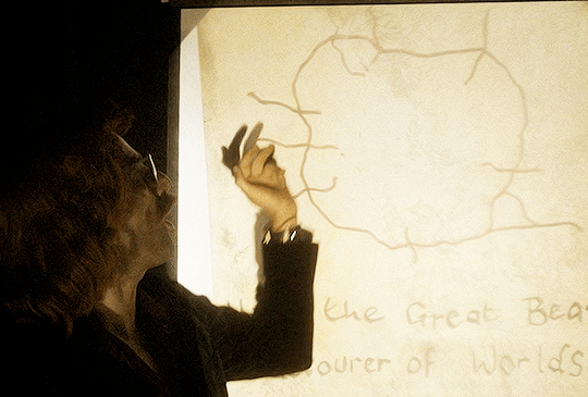
So first, I posit that we can be reasonably confident this is Crowley's handwriting because he is very likely the only celestial being besides Aziraphale who can spell devourer correctly.
Crowley has taken more care than usual with his penmanship today because this is a Fancy Presentation, and there are some delightful things to note about it:
--The beautiful serifs on each letter and variation in width of the strokes (the lowercase r's especially)
--Enthusiastic but intermittent capitalization of nouns
--The L that ends "Hail" is a small capital like the ones used in the Bible to spell LORD; the l in Worlds is lower-case
--The lozenge shape of the letter o
--Both s-es are oversized and dip below the writing line
--The kerning is terrible, the script wanders off the writing line at several points, and the location of the writing line is not imagined consistently
I am not an expert in the history of handwriting, but every single point of this suggests to me that Crowley learned to write in English in the late 16th or early 17th century, between say 1570 and 1620, and he learned to do it by copying printed material, not somebody else's handwriting. And it looks like late 16th-century writing. Or rather, like somebody learned to write by copying late 16th-century print and hasn't practiced enough for his style to change significantly in the last 400-500 years.
This means Crowley would have learned using a quill pen, poor devil, and if that's true no wonder he doesn't do it more often. (I wonder if this is why he now owns a pen that looks like it can break the sound barrier; if the Bentley is a permanent replacement for the loathsome, buttocks-abusing horse, maybe he keeps the expensive pen as self-reassurance that he'll never have to write with a quill again.) Quill pens would explain the lozenge-shaped o's: quills can only make a downstroke, so writers who used them shape o's as lozenges made of four downstrokes. Someone who learned writing with a quill would shape his o's like a calligrapher.
16th/early 17th century is the earliest I think Crowley would have learned to write in English because before that there was no block print; there was no print at all, only handwritten scripts of varying legibility, none of which look remotely like Crowley's handwriting does.
Here's what print looked like in Germany in 1471 (printing does not arrive in England for another 5 years after this):
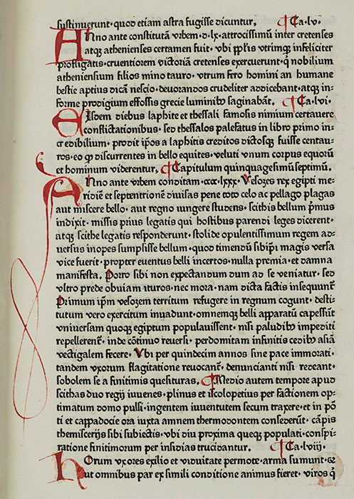
The printing press showed up in England in 1476. Between 1500 and 1600, England got its shit sorted out wrt fonts and typesetting and started turning out what we would recognize today as readable material.
Here's what English printing looked like in 1623, c. 150 years after the German one above:
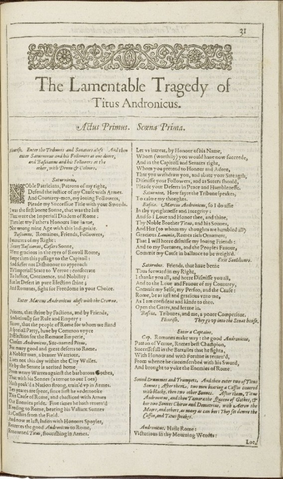
Not bad, right? I've received Xerox copies less legible than this in classes I paid for. I think it is likely based on his handwriting that Crowley learned to write from printed material a decade or two older than this. The adornments Crowley puts on his letters are serifs, not ligatures: these are not letters that were ever meant to join up in cursive, but letters that were copied from typeset.
From the 16th through the mid-19th century, variations in how a handwriter capitalized letters were very common, and two of these variations show up in Crowley's writing as well.
First, English inherited from German the capitalization of all its nouns. You can see it in Titus Andronicus, above (1623). Due to variations in education and taste, this quickly shifted to capitalization of whichever nouns the writer (or publisher, or printer) felt were important to capitalize, as you can see in Paradise Lost from 1688, below. Hail the Great Beast, devourer of Worlds.
Second, It was also very common during this time to capitalize terminal letters of words, either as a sign to the reader that previous letters had been omitted or because writers using quill pens wanted to be sure readers knew what letter they were looking at through the smudges and weird spacing and general wretchedness of the reading experience imposed by quill writing. I think this latter reason may be why Crowley writes "HaiL" when his other letter L, in "Worlds," is both lowercase and carefully printed with a pretty serif.
Handwriters in English between 1500 and 1800 also had a major hard-on for abusing the letter s, which was shaped like a lowercase f (to contemporary eyes) or a loose S, either of which drop below the writing line. Here's an example in print from 1688:
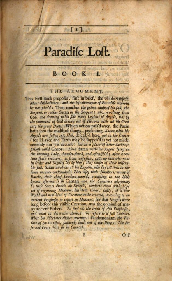
Use of the long S in print fell out of favor and disappeared abruptly in the UK after 1800.
Crowley's S-es could be a holdover from this: they both drop below the writing line, and they're both oversized.
What I think we can say for sure is that he's not very good at writing s-es, so they always turn out bigger than he intends. The S in "Beast" is noticeably different at the left curve than the S in "Worlds," which I would expect for someone who hasn't written thousands of s-es yet, and the S in "Worlds" looks very much like someone has faithfully rendered a shape they have seen rather than written a letter. Since he can write a letter r elegantly but can't do a curved s, it suggests to me that he hasn't had as much practice doing the curved s yet as he has the other letters, which fits with someone used to writing a long s 75% of the time.
Even the kerning speaks to me of someone who learned to write with a quill: leaving (comparatively) large spaces between letters gives the ink somewhere to drip and smudge without rendering the letter illegible.
There's one other reason I think Crowley probably learned to write in English in the 16th century: He's lazy, and he probably wouldn't have needed to know before then.
The movable-type press arrived in England in 1476. The Protestant Reformation kicked off in England c. 60 years later in 1534 when Henry VIII declared himself head of the English Church. Prior to the surge in literacy among the wealthy and merchant classes in the 16th century, thanks to this intersection of printing press and Protestants (who believe it's important that each person read the Bible for themselves), almost no one knew how to read, including most of the gentry and nobility, and still fewer knew how to write. If you had a message, you sent a guy or you showed up yourself. If you had something you wanted recorded, you summoned a scribe. If you needed to know something, you found somebody who knew and you asked them.
By the time of Queen Elizabeth's accession in 1558, 82 years after William Caxton began operating England's first movable-type printing press, a fully literate royal court were passing each other and their spies and their assassins gossipy notes like everybody was a 12yo in math class. Elizabeth wrote letters and poems. Among the gentry gentlewomen replaced monks as the medical caregivers for their communities (bc Henry shut down all the monasteries), and they wrote and shared and copied multi-generational "receipt books" and herbals of medical and cosmetic treatments. In the space of a single generation, literacy--the ability to write, not just to read--became a prerequisite for functioning in the upper echelons of society.
So if he didn't already know by then, Crowley would have needed to learn to write in English in the mid-16th century. And he would have had to learn it with a quill. (Wearing black probably came in handy for all the ink he spilled or dripped on himself.)
Last to consider is the W in "Worlds," which has no serifs and is not written with any particular attempt at straightness or symmetry. To me this suggests that Crowley learned to write w's from a modern reference, not his original reference. And this makes perfect sense: w was very much in use in the 16th century in English, but nobody agreed on how to write or print it, so there were crossed v's, two capital U's, and this weird gothic lowercase n with extra tentacles. W, Crowley would have learned, always needs to be checked up on before you commit.
Crowley's spelling here is modern, which is frankly a huge achievement for someone who was present for the formation and transformation of all 3 English languages. The contemporary Modern English we use today was a going concern for over 2 centuries before anyone wrote an English dictionary, and it was three centuries before dictionaries became authorities on how to spell correctly and people started giving a shit about that. (Before that as long as people could read the word and understand what you meant by it in context, you'd spelt it correctly.)
Taken together, the W and the modern spelling suggest that although Crowley almost never writes by hand, he reads regularly. This matches with two Words of God I've seen from Neil Gaiman (which I am too lazy to find and link) in which he mentions that Crowley likes to read but won't admit to doing so or to liking books.
Aziraphale should get him a book about ducks for Valentine's Day.
87 notes
·
View notes
Text

This is fascinating! By Stefan Hager (FB)
“We currently have 5,800 plus Greek New Testaments manuscripts, 10,000 plus Latin manuscripts, and 9,300 plus manuscripts in various languages). if we were to stack the manuscripts we have found today it would reach more than a mile high). Beating all other historical records of the ancient world. for example, no one doubts the historical person “Homer” as we have 1.800 plus manuscripts of his life, yet we have 25,000 plus manuscripts of the life of Jesus, and that doesn’t include secular sources). And considering that the earliest copies of the New Testament are written within 25 years after the death of Jesus, but the earliest copies of Homers works are written 400 years after the death of Homer. Jesus is the gold standard for historians. If we’re going to doubt Jesus. We might as well doubt all ancient history.
Comparing these manuscripts we find that the teaching, stories, doctrines of the bible are all surprisingly the same. reading a bible in English vs reading a bible in Russian. It may be worded differently but you get the same story/biblical doctrine).
Tho no one manuscript is perfect. Through the centuries, minor differences arose in the various copies of the Scriptures. The vast majority of these differences are simple spelling variants, inverted words (one manuscript says “Christ Jesus” while another says “Jesus Christ” or different ways people have spelled names). or an easily identified missing word. In short, over 99 percent of the biblical text is not questioned. Of the less than 1 percent of the text that is in question, no doctrinal teaching or command is jeopardized. In other words, the copies of the Bible we have today are pure. The Bible has not been corrupted, altered, edited, revised, or tampered with.
“The early books of the bible” were so vastly copied and wide spread that if one group in Africa wanted to change any part, believers in Israel, Rome, Alexandria would have easily identified the change to the wide spread text/message.
This is also evidenced by the Dead Sea scrolls (large portions of Old Testament) which were found in 1947. These scrolls are dated 200BC. So Jesus would have those as scripture during his earthly time, and the content of those scrolls match. If we look at any bible in any chapter and we look at the Hebrew and the same chapter it’s going to read the same way we have today, now it is true there are variations in reading/wording or translation. Every book prior to the printing press has variations. The Quran has variations, The point is, variations don’t give you a different text, a different theology, a different meaning.
Here’s a scaled down example. using textual criticism and cross checking manuscripts. We can pretty much reconstruct what the original said. How does this work?.
Consider the following example. Suppose we have four different manuscripts that have different errors in the same verse, such as Philippians 4:13:
1.I can do all t#ings through Christ
2.I can do all th#ngs through Christ
3.I can do all thi#gs through Christ
4.I can do all thin#s through Christ
Is there any mystery of what the original said?. None whatsoever. By comparing and cross checking manuscripts. the original can be reconstructed with great accuracy and the reconstruction of the New Testament is easier than this, because there are far fewer errors in the actual New Testament manuscripts than there are represented by this example. Plus a vast amount of material to work with.
Any unbiased document scholar will agree that the Bible has been remarkably well-preserved over the centuries. Even many hardened skeptics and critics of the Bible admit that the Bible has been transmitted over the centuries far more accurately than any other ancient document.
There is absolutely no evidence that the Bible has been revised, edited, or tampered with in any systematic manner. No one group has ever had control over the biblical text. The sheer volume of biblical manuscripts makes it simple to recognize any attempt to distort God’s Word. There is no major doctrine of the Bible that is put in doubt as a result of the inconsequential differences among the manuscripts.
Ancient scribes often copied books letter by letter (one by one). not sentence by sentence. It was a long process but they assured Accuracy. And they would count the letters of the copies and count the letters of the original. if the original had 500 letters and the copy had 497 letters, they would destroy the copy and restart.”
38 notes
·
View notes
Text
Resin printing CAN be cheap, as cheap as using DAS clay for prototyping instead of Ladoll or Epoxi clay. However, a good printer (+499$) good, durable resin not brittle shit stuff (+60$ per liter) curing station (+80 DIY/300$from company) plus protective equipment (+120-400$) plus sandpaper, and other consumables for finishing the print (30/60$)... they all add up. That's not even considering the cost of Primer and filler clay for prototypes. People think I'm making money out of this. Yes I do, but cost of the doll barely covers the prototypes/ finishing/casting/shipping materials/ taxes.... I make like 20$ per doll and that doesn't even cover the hundreds of hours invested in working. I really help and welcome everyone into the hobby, but dollmaking is not for the money greed..... It's my job and I barely make it for food through winter...
~Anonymous
16 notes
·
View notes
Note
Do you think DC is going to reprint Red Robin (2009) in the near future?
Oh there is the crystal ball (and ~$400 USD second hand market) question!
Short answer: no.
Longer answer: the problem we have with both Dick and Tim in terms of reprints is that they have really long series.
Batman & Robin 2009 had a reprint last year as it’s Damian’s first title and Gunn wants to use him for movies (though is saying he’s riffing off Batman and Son - which also gets regular reprints).
Batgirl 2009 has been announced for a reprint, and my cynical interpretation of that decision is they want the Steph-and-Damian issues in print for the new Jeremy Adams kid team title they’re announcing with Steph as the team babysitter.
So on the face of it, I wouldn’t be too shocked if they also added a Red Robin reprint of Yost…except for the fact that both Dick and Tim are getting Compendium reprints of their Dixon runs coming out right now.
Now. Personally I’m irritated as these are reprinting the same material as the 2015-2019 reprints of Robin and Nightwing, though admittedly it is 9 years since the last trades collecting these periods. But they will likely sell well.
And I don’t think Tim is currently high enough on the sales totem pole for DC to be putting out a SECOND one of his titles for reprint right now.
Do I want a Red Robin reprint and would I be delighted if one was announced shortly? Yes! I really want to own the run. Do I expect it? No.
#also I hate to harp#but one of the best ways to show DC people want to buy titles about a character#is to buy them when they’re printed#let them see reprints sell - so I can have a Robin collection that goes past War of the Dragons
13 notes
·
View notes
Text
Jason Wilson at The Guardian:
A Guardian investigation has identified former University of California, Irvine (UCI) lecturer Jonathan Keeperman as the man behind the prominent “new right” publishing house Passage Press and the influential Twitter persona Lomez. The identification is based on company and property records, source interviews and open-source online materials. The reporting has revealed that Keeperman’s current status as a key player and influential tastemaker in a burgeoning proto-fascist movement came after years of involvement in far-right internet forums.
Much of that journey coincided with his time at one of the country’s most well-regarded writing programs: Keeperman first came to UCI as a master of fine arts (MFA) student, and was also a lecturer in the English department from 2013 to 2022, according to public records. The emergence of Passage Press and other such publishers has been a key part of the development of a swathe of the current American far right, which is seeking to capture US institutions – or develop far-right equivalents – as part of a political and cultural war against what it sees as the dominance of a liberal “regime” in America. In a June 2023 podcast interview, Keeperman characterized Passage Press and its literary prize as part of this effort to “build out alternative infrastructure, alternative institutions”.
It is a fight wholeheartedly embraced by Donald Trump and his supporters in the Republican party, especially in their railing against “the deep state” and promises of retribution should Trump win the 2024 presidential election. The Guardian repeatedly contacted Keeperman requesting comment on this reporting, at a personal Gmail address and a Passage Press address, and left a voicemail message at a telephone number that data brokers listed as belonging to Keeperman, but which carried a message identifying it as belonging to a member of his household.
[...]
Scary ideas – and wanting to be recognized
Passage Press books include a Tucker Carlson-blurbed anthology of writings by “human biodiversity” influencer Steve Sailer; a similar retrospective from “neo-reactionary” guru Curtis Yarvin; and a print version of the biannual Man’s World. Like many other far-right publishers, Passage’s list is bolstered by reprints of out-of-print or public-domain books by historical fascist and reactionary writers. These include books by radical German nationalist and militarist Ernst Jünger; Peter Kemp, who fought as a volunteer in Franco’s army during the Spanish civil war; and two counter-revolutionary Russian aristocrats, White Russian general Pyotr Wrangel and Prince Serge Obolensky.
[...] Passage Press differs from many others in its niche in offering new work by the contemporary far-right’s intellectual celebrities, and in curating in-person events and a far-right literary award. The publisher also produces high-end limited editions of selected titles. The “patrician edition” of Noticing, a book by Sailer, for example, is “bound in genuine leather, gold-foil stamping” and “Smyth-sewn book block”, according to the website. Though lavishly produced, the “patrician” offerings appear to have generated significant income for Passage. At the time of reporting, Passage had sold out its limited run of 500 patrician editions of Noticing at $395 apiece, according to the website. This equates to some $195,000 in revenue. An earlier patrician edition of winning entries in the 2021 Passage prize sold 250 editions at $400 apiece, according to the website, representing another $100,000 in revenue. The publication of Noticing – also available as a $29.95 paperback – was spun out into a series of in-person events in Austin, Los Angeles, Miami and New York City, held in March, April and May.
The Guardian reveals that the identity of far-right X account Lomez belongs to UCLA lecturer Jonathan Keeperman.
#Jonathan Keeperman#Lomez#University of California#UC Irvine#Passage Press#Steve Sailer#White Nationalism#Right Wing Extremism
9 notes
·
View notes
Text

PHSI 2023 Is Officially Over!
I closed the submission form this morning and just mailed/emailed the fifth and final batch of cards! I sent everyone in the fifth batch an email today that either confirmed your Holiday Card has shipped or included your eCard, so double check your inbox and junk folders if you didn’t see anything come through. Please wait patiently for the delivery of your physical Holiday Cards; they can take up to 2 weeks to be delivered.
Also, thanks to everyone who has donated to my Ko-fi for this project so far! Your kindness has covered 61% of the postage and materials for everyone’s cards so far this year!

PHSI 2023 might be over, but not everyone's cards have been covered yet!
The percentage grew from last week again (thank you everyone who donated), however there's still a need to spread kindness and support PHSI by covering the cost of your card or someone else's! Over the course of PHSI this year I mailed almost $400 USD of Holiday Cards! As of today I have received just over $225 USD in donations. Ko-Fi doesn't take any fees out of donations, but PayPal does (about 20% on average), so the donated amount I receive to pay for the cards is even lower!
If you can help cover the cost of this wonderful fandom tradition, even in just a small amount, please consider donating so everyone’s cards can be covered this year. After all, doing something nice for others is what this initiative is all about! Please visit ko-fi.com/247testing and click the Donate button if you’d like to give $4 or more to cover the cost/postage of your card or someone else’s. There isn't a time limit, so you can donate at any time too; my Ko-Fi is always open!

Random Interesting PHSI 2023 Stats!
This year I mailed/emailed a total of 112 cards all over the world! These cards reached Portal Fans in lots of places, like the United Kingdom, Germany, Australia, Brazil, Canada, Japan, Poland, India, the US, Romania, Italy, and New Zealand!
About 83% of people chose to receive a Physical Card this year, which is good feedback considering the change from making the cards myself to using an online service. While the cost per card ended up being a lot higher (just over 2x the cost of making them myself), it was definitely worth it to not have to print, cut, fold, type, label, and mail them all on my own!
I plan on running PHSI the same way next year, as well as looking for ways to bring the cost of the cards down while maintaining the same level of quality and novelty you're all used to! Thanks again to everyone who participated this year, and special thanks to @purrtal2 for providing the artwork for this year's cards!
This is 24-7-testing, wishing you all a wonderful end-of-year. Thanks everyone!
#please go donate#every bit helps!#psa#please boost#PHSI 2023#portal holiday spirit initiative 2023#5th year of phsi!#5th anniversary#portal fandom#fandom tradition#aperture science#aperture laboratories#portal#portal 2
14 notes
·
View notes
Text

Restored 1950s Tokyo City Bus
Location: Edo-Tokyo Open Air Architectural Museum, Koganei, Tokyo Timestamp: 13:12 on October 25, 2023
Pentax K-1 II + DFA 28-105mm F3.5-5.6 31 mm ISO 400 for 1/360 sec. at ƒ/8.0
Nestled within the Edo-Tokyo Open-Air Architectural Museum lies a fascinating piece of history—a meticulously restored vintage bus, the TS11 model, built by Isuzu Motors after the war from 1952. As you explore the museum, you'll come across this relic, which I feel is just one testament of many to Japan's post-war resilience and innovation.
The bus in my photo is actually part of a personal collection that is on loan to the Tokyo Metropolitan Government for use at the museum. This is why when you receive your printed English guide at the museum, there will be no reference or information available regarding the bus. Please read on to learn some interesting facts and history!
The TS11 model, with its 4WD capability, played a small but influential role in post-war Japan. Its sturdy design allowed it to navigate even the most challenging terrains, including mountainous and snowy regions. In 1957, a similar bus was entrusted with the honor to transport the Emperor and Empress to Mt. Fuji for a climb to the summit, a testament to the reliability and trustworthiness of the bus.
Fast forward to the present day, vintage buses, like the TS11, are experiencing a revival, thanks to the efforts of rural bus operators. Newspaper articles from The Asahi Shimbun and The Mainichi highlight labor shortage struggles faced by bus operators who have turned to restoring old buses as a way to promote not only ridership from tourists on weekends and national holidays, but also to attract bus enthusiasts (bus spotters, bus otaku, etc.) as possible new hires at their companies.
The charm of these buses transcends generations, captivating both the young and old in Japan and even tourists from overseas who have become familiar with the retro design of these old buses from novels, anime, and manga.
If you examine my photo closely, you'll notice a replica of an old license plate near the radiator grill. Above the front window, you can also see the bus route number “47” (四七) and the route destination “Ueno-Hirokoji” (上野広小路), which is a subway station on the Tokyo Metro Ginza Line, in Taito Ward, Tokyo.
Unlike modern buses designed for maximum passenger capacity, these vintage buses, with engines positioned in front of the driver, offer several advantages: better engine cooling efficiencies, easier access for maintenance and repairs, reduced vibration and noise for passengers, and increased safety for drivers in frontal collisions.
Preserving these vintage buses not only honors Japan's history but I think they can help enrich the present and the future, connecting young and old through shared memories and appreciation for cool design and innovative engineering.
Visit my blog post for Google Maps links and links to all of the original source material that I translated for this post: https://www.pix4japan.com/blog/20231025-edo-bldg-museum.
#都市景観#ボンネット型バス#江戸東京たてもの園#東京#pix4japan#pentax_dfa28105#pentaxk1mkii#urbanscape photography#Japan#Tokyo#bus#Edo-Tokyo Open Air Architectural Museum
18 notes
·
View notes
Text

Big Little Book no. 260: Spider-Man Zaps Mr. Zodiac (1976) by George S. Elrik
Big Little Books were small books first published by the Whitman Publishing Company in 1932 that featured text on the left pages and accompanying images on the right. Many were tie-ins with existing comics, books, radio programs, movies, cartoons, and other stories. Once Big Little Books proved successful, other publishers began printing their own versions. The BPCL has almost 400 of the many thousands of Big Little Books published.
Spider-Man Zaps Mr. Zodiac is a later Big Little Book where Spider-Man fights a shapeshifting villain who can take the form of the twelve zodiac signs. It is this villain's only appearance.
The Browne Popular Culture Library (BPCL), founded in 1969, is the most comprehensive archive of its kind in the United States. Our focus and mission is to acquire and preserve research materials on American Popular Culture (post 1876) for curricular and research use. Visit our website at https://www.bgsu.edu/library/pcl.html.
#bgsu#libraries on tumblr#spider-man#spiderman#spider-man zaps mr. zodiac#big little books#btw this book was brought to my attention by a coworker who said 'didn't you say tumblr likes crustaceans?'
3 notes
·
View notes
Text

[ℙ𝕒𝕡𝕖𝕣 𝔻𝕠𝕝𝕝 - ℝ𝕠𝕤𝕒]
I recently hit +400 followers on Artfol, +200 at Inkblot and +100 on Pillowfort (some fo you follow me on multiple sites, hey I see you) To celebrate that I created this paper doll. It’s free to download and use via my ko-fi shop (although, it’s pay what you want and I don’t mind a tip~)
Go get it, print it on your fav (or not fav) paper and enjoy. You can either use flaps for the clothing or cut them off and use tape or blue-tack like material!
► ko-fi.com/s/661009ea9a
তততততততততততততততততততততততততততততততততততত
All links @
🍆 Vinders.gay 🍆
Support me @
🍆 Kofi - ko-fi.com/vinders
🍆 Patreon - patreon.com/vinders
1 note
·
View note