#3d map
Explore tagged Tumblr posts
Text
Fascinating possibility. Asks some tantalising questions.
27 notes
·
View notes
Text


Shaded relief of the Europe. This one will be changed soon with a shaped version where borders will be shown.
If you like our work, want to see our daily updates (or want to say hello to our studio), consider to follow our Instagram or Twitter account. Otherwise if are interested in our prints or have a custom request check our shop.
5 notes
·
View notes
Text
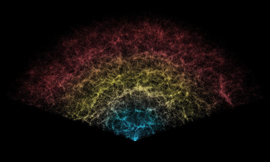
DESI Map !
A slice of the 3D map of galaxies collected in the first year of the Dark Energy Spectroscopic Instrument (DESI) Survey. Earth is at the tip, with the furthest galaxies plotted at distances of 11 billion light-years. Each point represents one galaxy.
This version of the DESI map includes 600,000 galaxies — less than 0.1% of the survey's full volume.
Credit: DESI Collaboration/NOIRLab/NSF/AURA/R. Proctor
#art#cosmos#cosmic#universe#blast#space#wallpaper#desi map#3D map#galaxies#galaxy#dark energy spectroscopic instrument#survey#NOIRlab
23 notes
·
View notes
Text
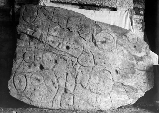
Saint Belec Slab | Oldest 3D Map in Europe
5 notes
·
View notes
Text
The biggest ever 3D map of the universe, featuring more than 6m galaxies, has been revealed by scientists who said it raised questions about the nature of dark energy and the future of the universe.
The map is based on data collected by the Dark Energy Spectroscopic Instrument (Desi) in Arizona and contains three times as many galaxies as previous efforts, with many having their distances measured for the first time.
Researchers said that by using this map, they have been able measure how fast the universe has been expanding at different times in the past with unprecedented accuracy.
The results confirm that the expansion of the universe is speeding up, they added. However, the findings have also raised the tantalising possibility that dark energy – a mysterious, repulsive force that drives the process – is not constant throughout time as has previously been suggested.
Dr Seshadri Nadathur, a co-author of the work and senior research fellow at the University of Portsmouth’s Institute of Cosmology and Gravitation, said: “What we are seeing are some hints that it has actually been changing over time, which is quite exciting because it is not what the standard model of a cosmological constant dark energy would look like.”
Prof Carlos Frenk, from Durham University and a co-author of the research, said that if dark energy was indeed constant in time, the future of the universe was simple: it would expand on and on, for ever. But if the hints found in the map stood up, that would be called into question.
“Now all of that goes out the window and essentially we have to start from scratch, and that means revising our understanding of basic physics, our understanding of the big bang itself, and our understanding of the long-range forecast for the universe,” he said, adding that the new hints left open the possibility that the universe might undergo a “big crunch”.
The research, which has been published in a series of preprints – meaning it has yet to be peer-reviewed – reveals how the team first created the 3D map, then measured patterns in the distribution of galaxies that relate to sound waves that occurred in the early universe, known as baryon acoustic oscillations.
As the size of these patterns is known to be regular, the team was able to calibrate the distances to different galaxies in the map, allowing them to work out how fast the universe has been growing over the last 11bn years, with a precision better than 0.5% over all times, and better than 1% between 8bn and 11bn years ago.
Frenk said the precision itself of the measurements was notable given that galaxies could be billions of light years away, and billions of years old. “It’s mind-boggling that we can measure anything to a precision of 1%, which is precision you get in the laboratory in physics for high-precision measurements,” he said.
Andrew Pontzen, professor of cosmology at University College London and author of the book The Universe in a Box, who was not involved in the work, said Desi was one of a slew of exciting new astronomical surveys cataloguing the night sky, with one of the primary goals being to measure the rate at which our expanding universe has speeded up.
“Like measuring the acceleration of a car, charting the universe’s expansion tells us about the ‘engine’ powering cosmic acceleration. That engine is known as dark energy,” he said.
However, Pontzen noted that our knowledge of how dark energy operates was limited. “The new data, when combined with existing measurements, would seem to contradict the simplest possible explanations for dark energy,” he said.
“At face value, that’s an exciting step forward. But as the team themselves caution, there is a huge amount still to understand about this data and early results should be taken with a healthy grain of salt.”
7 notes
·
View notes
Text
Good morning everyone!! Check out this article. The largest 3D map of the universe EVER made: First breathtaking images from Euclid's 'cosmic atlas' are revealed - as scientists stitch together 14 million galaxies Hope you enjoy! Have a nice day!!
4 notes
·
View notes
Text


3D Star Maps
Greek (or Modern Western) 88 Constellation Stars
Plate Cartee Projection


Orthographic Projection


0 notes
Text
The Oldest Three-dimensional Map

Source: https://phys.org/news/2011-11-genographic-humans-migrated-africa-arabia.html
Water was far more important a consideration when traveling before more modern methods of traveling, so knowing how and where water traveled and pooled was extremely important to our ancestors in the distant past. Before paper or writing, there needed to be other ways of relaying information to others, some of which likely continued through to today in sketched maps into sand. More permanent maps were included in paintings on cave walls or etched into rocks or tusks.

Source: https://cosmosmagazine.com/history/archaeology/3d-map-in-palaeolithic-cave/
In December of 2024, a paper was released detailing the study of a sandstone cave near Paris, France called Ségognole 3. The cave was rediscovered in the 1980s and was known for 'sexual figuration' and the representation of horses. More recently, as detailed in the 2024 paper, it was noticed that the floor of the cave had been deliberately etched so that it represents the landscape, especially the watersheds, of the area around the cave. This is thought to have happened about 13,000 years ago and is likely the oldest map of this type that we know of. This places it in the Paleolithic, or Old Stone Age, which was from about 3.3 million to 12,000 years ago.

Source: https://www.researchgate.net/figure/Segognole-3-is-one-of-4-engraved-grottoes-numbered-Segognole-2-through-5-in-an_fig2_267939409
The map as some features that don't appear to be natural as well as representations of the natural world around the cave. It is thought that some of these represent efforts by early humans to alter the world around them, or possibly good shelters, though it is possible these markings have a deeper meaning, especially in relation to the other carvings in the cave.
This cave also demonstrates that people were able to control water in such a way that it carved the waterways into the cave floor. It wasn't known prior to this that early humans had such a deep understanding and control over the hydrological processes and their effects on sandstone to get the results desired.
5 notes
·
View notes
Text

Nuremberg, Germany
Winston Tjia
0 notes
Text
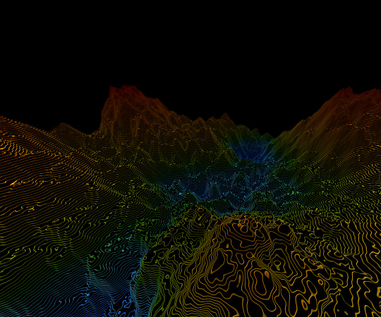
RF Planning for 5G Networks: Challenges and Solutions
The advent of 5G networks guarantees low latency and massive connectivity, transforming communications. However, maximizing the capability of 5G requires meticulous planning for RF. This article focuses on the troubles and solutions related to RF plans for networks that help 5G. It focuses on important factors like 5G network , RF planning software, in addition to telecom management software for networks.
Click to read more about RF Planning for 5G Networks: Challenges and Solutions
#rf planning#RF Planning#rfMAP#3D Maps#Digital Map#Wireless Maps#Telecom#5G Networks#Network Planning#3d Network planning#fiber planning#fttx#rf maps by lepton#lepton software#lepton maps#2.5D Maps#Map Data#rf planning tool#network coverage#3d map
0 notes
Text
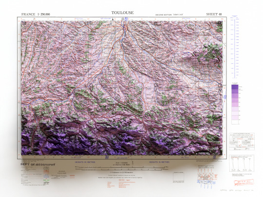
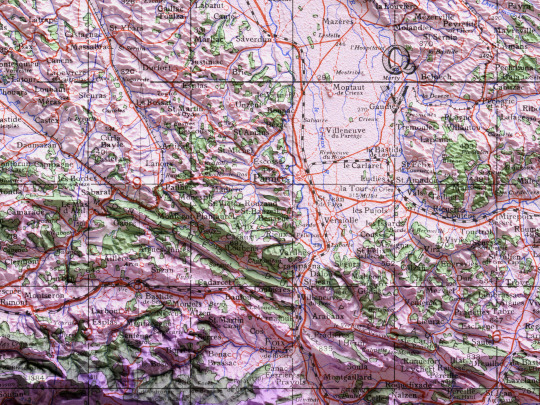
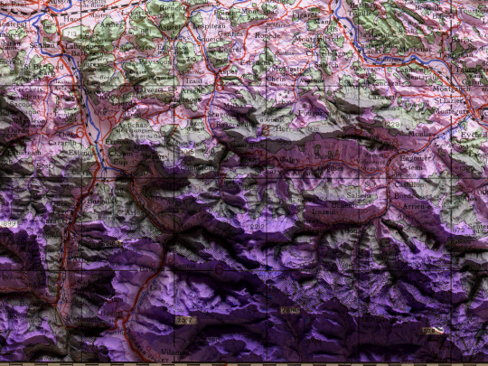
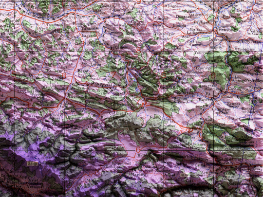
🗺️ 𝗠𝗔𝗣 𝗜𝗡𝗙𝗢 Toulouse. GSGS (Series); 2738. 2nd ed.,Great Britain. War Office. General Staff. Geographical Section. 1943. Source: Mapster
If you like our work, want to see our daily updates (or want to say hello to our studio), consider to follow our Instagram or Twitter account. Otherwise if are interested in our prints or have a custom request check our shop.
#france#toulouse#shaded relief map#3d map#print art#gis#cartographyart#cartography#topographic map#maps#geography#world history
5 notes
·
View notes
Text

#nintendo#pokemon#funny#gaming#video games#lol#humor#meme#kyogre#hoenn#gba#gameboy advance#2000s#maps#geography#pokemon ruby#pokemon sapphire#pokemon emerald#pokemon oras#3ds#retro#2000ish#retrogaming#dank memes#gen iii#gen 3#legendary pokemon#team aqua#memes#pokemon omega ruby
18K notes
·
View notes
Text
youtube
This video showcases my Blender model of the planet that the Scud aliens call home, the fourth and final world I've mapped out for @jayrockin's "Runaway to the Stars" project. A *lot* of maps were created in service of this final render, and also in service of presenting the special qualities of this planet. I intend to show you as many of these as I can under the cut, and also in subsequent posts focusing on some of the more interstitial, ancillary maps and figures that played a part in producing the primary maps you'll see in this main post.
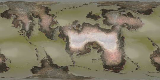
Before I show the first maps I made for this project, what you see below are the satellite-style maps for the Equinoxes and Solstices, in order of (Northern) Spring, Summer, Fall, and Winter, the latter serving as the texture for the Blender object you saw in the video.


__________
With that matter covered, our next focus is this project's foundation: Geology. While I didn't spin as elaborate a tectonic history for this planet as I did for the Ayrum commission, I did work out as much detail as I could for the more recent geological activity, to set the stage for the elevation data - including a narrower focus on the coastal shallows that host the Scud populations.


__________
Once I could move on to climate, my first step was finding this planet's relative Insolation, which I managed thanks to @reversedumbrella's code and coaching. With an obliquity of only 16 degrees, this planet's yearly maximum Insolation levels stick close to the equator, compared to pole-to-pole oscillation we see on Earth

__________
Having a rough sense of where heat would concentrate seasonally and how the landmasses would deflect water in light of the planet's retrograde spin, I was able to set down the bi-annual ocean currents (Northern Summer above and Northern Winter below), then the monthly water temperatures pushed around by said currents, and finally -after factoring in many other considerations- the monthly land temperatures as well (combined in the second gif)


__________
Next came the seasonal air pressure maps and subsequent wind patterns (my first time creating those from scratch), which later factored into the precipitation maps. The incredible temperatures at the largest continent's interior make a desert of most of it, and the other interiors are fairly dry too, but all that heat on the equatorial ocean generates a *lot* of evaporation which ends up coming down elsewhere.


__________
With temperatures and precipitation mapped out for each month, I was able to find how the accumulation and melt of ice and snow played out, too. Given such a hot equator it's surprising to see freezing temperatures hold out in some places, but low obliquity and high elevation shield what areas they can, it seems.


__________
All this monthly data was then painstakingly combined and compared and plugged into equations to produce maps of discrete climate zones, using both the Köppen (left) and Trewartha (right) classification systems. The higher latitudes see some overlap with Earth's conditions, but the Tropics...


__________
I never really finished the map I wanted to make with my own loosely customized classification system, but I *did* get as far as this breakdown of the areas that sometimes surpass 56.7 degrees Celsius, Earth's record for highest surface temperature ever directly measured. And as you can see, that earthly record is broken by a *significant* fraction of this planet's surface, and far exceeded by the equatorial continent's deep interior

__________
The final phase of this project dealt with creating satellite maps of this planet's surface (which you saw at the top of this post), which started with a map of dry and submerged substrate, then a density map of the vegetation that sits atop it, then the colors of that vegetation under annual average conditions (demonstrating how they would appear in-person, rather than the area's appearance from orbit), and finally plant colors under seasonal conditions (same conceit as previous). In concert with the seasonal ice and snow maps, it was the four maps in the last sequence which were overlaid on the Substrate map, using the plant density map as raster masks, to produce the final Satellite-Style maps.


__________
This planet's sophonts being a marine species, it was then worth focusing on the conditions underwater, which included monthly seafloor temperatures (first gif), annual discharge of sediment from rivers (magenta in the 2nd gif), and seasonal upwelling of nutrients from deeper water (blue in the 2nd gif).


The creation of all my maps seen in this post was possible thanks to Photopea, which has been my go-to for several years now. The resolution kinda got crunched when I uploaded these here, so when I share them on Reddit later I'll add those links under this. These have also already been posted on Twitter, which you can see here if you like. Thanks for scrolling all the way down here!
#digital painting#Photopea#digital 3d#Blender#mapmaking#imaginary maps#Runaway to the Stars#Rtts Scuds#speculative planetology#speculative geology#speculative climatology#alien planet#major post#commission#christopher maida artwork#Youtube
764 notes
·
View notes

