#3d card flip
Explore tagged Tumblr posts
Text
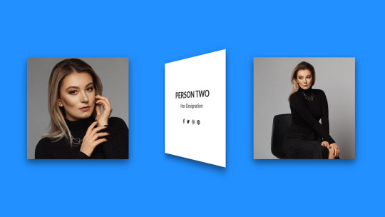
CSS 3D Flip Card Effect
#css 3d card flip effect#card flip animation#css animation examples#css animation tutorial#html css animation#3d card flip#card flip css#html css#neduzone#css#html#css3#frontenddevelopment#webdesign#basic css tutorial
4 notes
·
View notes
Text

3D Responsive Image Gallery
#3d responsive image gallery#responsive web design#html css#divinector#webdesign#css3#css#frontenddevelopment#html#responsive web development#image gallery html css#flip card animation#css animation#learn to code
3 notes
·
View notes
Text
Is this an error or on purpose?? It's driving me insane!!!
(I'm just parsing through my own theory and doubts, you don't have to read this)
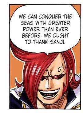
Ichiji's eyebrow that's under the bangs is the subject of fans' theories, and I wrote about it too, but I really just... sometimes have very strong doubts about it. With the insane time crunch of Shounen Jump schedule, what if it's really just a mistake that nobody caught?

One of my line of thinking was "this panel is so big, surely sensei can't possibly screw it up?" But the answer is, yes, he can screw up a panel that's that big.
When Venus blocked Zoro's attack, not only is he holding the sword in the wrong hand, but the sword is also missing its iconic Kitetsu cross-shaped guard. That Venus vs Zoro panel takes up half a page. On the manuscript paper, that would've been massive, and yet there it is.

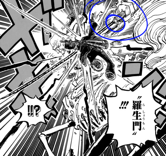
As far as I can tell, this was not edited, changed, or fixed in the final volume version. So, I dunno, maybe all the weird eyebrows is literally nothing and he just messed up.
If I may use myself as an example, I have drawn their eyebrows facing wrong directions multiple times, and sometimes I never noticed there was anything wrong until days or even weeks later.
I not only drew the lines, but also rendered the colours in detail. I didn't do it all in one sitting. I went over the image multiple times with fresh eyes, across many days, and not for a single moment did I notice the eyebrow was wrong. It's not impossible that sensei experienced the same thing.
The anime scene cannot be used as reference because I don't think the anime staff are privy to any future lore or backstories from sensei. I would assume that they often had to fill in the gaps with educated guesses on their parts.
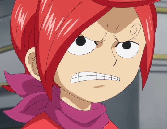
Pre-timeskip the anime have once displayed Sanji's other eyebrow facing the wrong direction and/or simply missing its curl.

Also in Whole Cake's finale episodes, the anime included a short filler bit where all of Sanji's bros made it safely back to the Germa ships. This is proven to be wrong when the cover story revealed Niji and Yonji got caught while still on land by Big Mum and didn't manage to escape.
The only way you can reconcile these is if you imagine a scenario where Niji and Yonji initially made it out just fine, but had to jump off the ship to fight Big Mum. Otherwise there's just a flat out discrepancy between manga and anime.
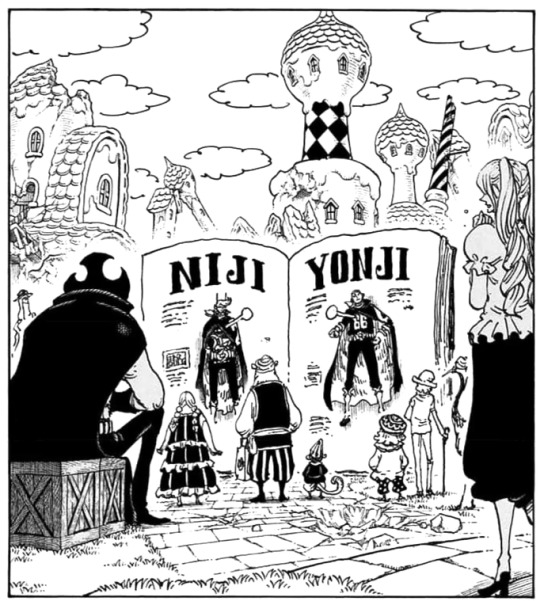
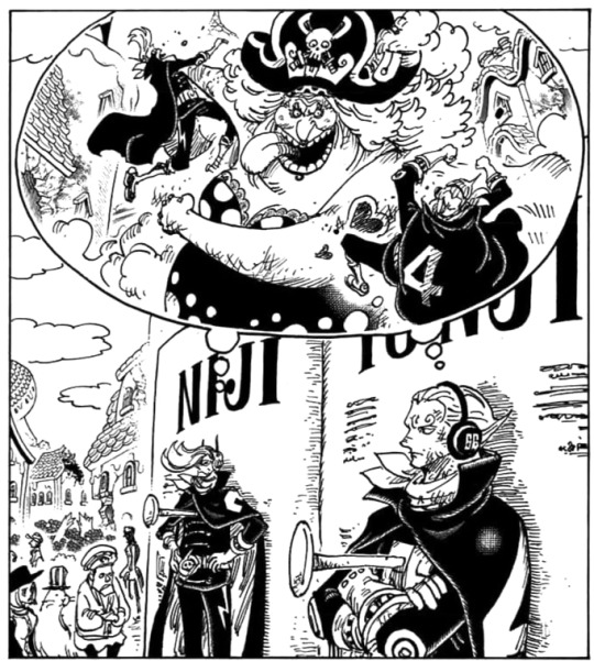
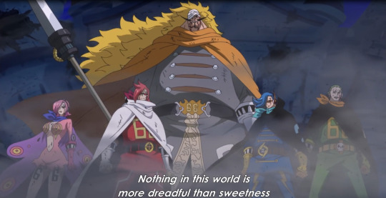
I don't think the Pirate Warriors 3D model rips are also any solid confirmation that Ichiji and Reiju's eyebrows are different either, because I found what is purportedly a model from the first game, where Sanji also has the eyebrows facing wrong directions:
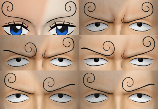
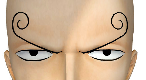
(left: all siblings from Pirate Warriors 4, right: Sanji from Pirates Warriors 1)
In my guess, what happened was that they just made half a face (and body), which is then mirrored to create the other half. See below for what I mean:
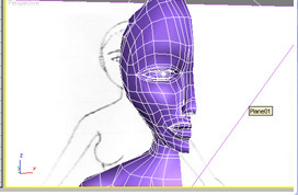
In my opinion what happened was that with Ichiji and Reiju they just left the brows in mirrored state because they didn't know for sure. Look at Reiju's irises. The highlights are also mirrored. It really looks like they just created one half of the face and copy + flipped it:
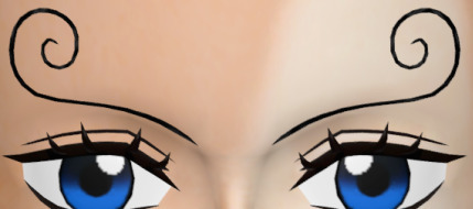
The eyebrows are modelled onto the polygons and not just textures, so they really could've just copy + flipped the half model and never bothered changing it afterwards.
Or, if not, maybe they saw the anime scenes, thought that Ichiji and Reiju's eyebrows are facing different directions, and then followed suit. The Pirate Warriors models are made based on the anime rather than the manga (as you can see with Reiju's eyes being blue and not purple).
Whereas with Niji, Sanji, and Yonji they might have went through the trouble to edit the eyebrows to be more accurate to the series since they know for a fact what their brows look like.
So yeah, I don't know, this thing has no answer at all until Germa shows up in the series again (or revealed in Vivre Cards).
48 notes
·
View notes
Note
TIL there'll be an update to EN on the anniv?
What are they adding?
i'm assuming that it'll just be the same update that JP got but EN sometimes doesn't entirely sync the updates so take this with a grain of salt
character archive - essentially an album where you can view all the cards, costumes, stamps, alt vocals, area conversations etc that you have unlocked for every character! it's a pretty cool feature and is sorta similar to the Album from SIF as a reference for the 3 people who follow this account who played that game
mirror mode - flips charts vertically
massive character rank system update - lots of new missons! skill level and master rank missions are now split by rarity due to Bday/4*s being significantly harder to rank up. alt vocals, number of cards (trained & untrained iirc are considered separate cards), area item level, and paid costumes now add to character rank. your ranks will be adjusted with the update and you will get thousands of gems (a lot of people last year were recording 20-30k)
improvements to virtual live 3D - characters will now face each other when talking to each other and generally move more naturally, including blinking
kizuna ranks updated to show the correct sekai-specific vsingers instead of the deafult one. the default ones are still selectable if you like them though
stamps for sekai-specific vocaloids that aren't miku will be added to the stamp shop
increased caps - rank cap increased, friend cap increased, mad skills and madder skills title cap increased, etc
mission pass update - some rewards are increased and music cards are removed for the free one. paid mission pass removed virtual coins and replaced them with wish pieces.
past paid costumes added to the shop permanently (still paid mind you). once a paid mission pass costume turns two it will go into the shop
character cosplay avatar costumes permanently added to the virtual shop (still paid)
43 kizuna ranks will be added a little bit later in October
158 notes
·
View notes
Text
talking about the art style for this show because I am lowkey (high key) obsessed with it and how unique and genius it is.
Warning: this is sort of a long-ish post. Everything here stated is purely subjective lol
S1’s style has a certain charm to it but personally doesn’t actually give me that wave of “nostalgia” (I started watching the show in 2023 summer) but it does have a certain aura to it. I personally love experimental styles and for the time this came out I still consider it to be very unique. Noting the experimental phase of it where things look less polished and the line weight isn’t as well executed as it is in the later seasons.
Using rigging for the time this series came out was certainly a bold choice with the realism and complex designs that this show used while also having a perfect balance with well done cartoony style. Archer is one of the most well known cartoons when you look into rigged animation! Floyd County’s process of using Illustrator and After effects together at the time was certainly bold as well. The team for this show was not as big as most people might think, as it states in the Art of Archer book that there were around 70 artists, illustrators, etc.. that worked on production. Compared to the average Hollywood animated movie, it’s surely a small crew. Using multiple levels for character movement, as the usual storyboarding that’s essential for any animated project (you cannot have a quality animated series without story boarding!), having to design an entire new model when the state of any character changes (scars, scrapes, torn clothes, etc..) which becomes a lot of extra strain, along with the actual design process in illustrator and using skeletal positioning as well. It’s truly impressive imo!

The backgrounds and settings throughout the show were also very cleverly executed. Using 3d modeling and royalty free assets to paint textures and the amount of detail was insane. Apparently Adam had a good eye for everything.

I really admire the effort that goes into all of the details in the show’s settings, along with the painted scenery. Which only improves over time. As you can see the quality difference between the earlier seasons and the latest.


S1 Malory’s office and S2 Tunt Manor
Vs


S6 Office and Tunt Manor. Notice the different in light fixtures and textures, the marble walls moving away from more of a tile texture, and the lighting in Malory’s office is much more smooth, the texture of the chairs, etc.. I love the improvement.
The more obvious and interesting part about all of this is the actual character design changing over time. I will always wonder what those first season 1 and 2 storyboards looked like. (If anyone ever finds any info on that please feel free to let me know! Ik there’s a few artists portfolios out there that are more easy to find and I’ve seen S12/11/etc..)
As with S1, it had a certain charm to it in which I love. The funny looking experimental angles, I wish we got to see more of, just for the silliness alone. Im glad they tried their best with dynamic poses. </3


I’d say there’s definitely even just a difference between the line weight in S1 vs S2, it’s slightly more smooth in S2 depending on the pose. Depending on the show you’re watching, I noticed line weight is sort of an underrated and mostly overlooked technique upon other people I’ve seen talk about art styles. It adds a lot of depth. Dynamic poses are not easy.
Not all line weight is used for dynamic posing though

I love this shot in particular. From what I remember and notice the most is that this is the first shot in the show where there’s much detail like the card reflection of the characters, they’re flipped like proper mirroring (obviously the modelling is not perfect for Ray, he still looks a little janky which isn’t a huge shock since we only saw him a handful of times in previous season) But the line weight for Malory’s thumb is something I appreciate very much and just thought this was a cool shot and shows a huge step up. The text boldness and format is also well done.
I guess the last elephant in the room surely is the actual style for the characters changing over time. There are about 3 different changes throughout the series, based on looks, clothing and movement. I wont get into specifics but it is always going to be entertaining to me how stiff and wonky certain shots looked. Not everything looked super goofy though.
I will never hate you scoliosis Lana </3

It’s very entertaining to see the changes through out the show.


(Malory’s hair was a tragic mess. Bless her cold heart <3)
First two seasons are where its flip flopped the most. Models were more stiff, tho on the brighter side the movements were still up to par with the action scenes. It’s still perfection. Some of the one-offs had funny designs (Krimenski, Uta, Mannfred, etc..)
Fast forwarding to S3 is when the improvements finally come in,


Noticeably mostly with Archer, Malory and Cyril (though he still has his old glasses. I much prefer his post S5 ones)
Lana and Ray still look a little off but certainly different in face shapes and Lana is much less- “S” shaped lol. Pam has improved looks as well.

The side profiles have had an improvement as well up to this point. But it doesn’t change much going down the line. The side profiles are very rarely shown. Krieger’s head finally looks less stiff as well. Cheryl looks completely different, with her hair being much more consistently styled. Also, notice the clothing saturation specifically, it’s much more toned down. The colours tend to match better more than they did before in S1 nd 2.
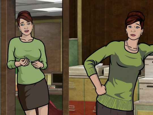
Completely new character…. Hah.
Moving on past S3, since the character models stay pretty much the same, everyone at this point has their new looks leveled out, notably Ray and Lana

This style pretty much remains the same through out the next few couple seasons. The models and settings have a new flair, the lighting improved immensely, especially with Vice. I dont wanna drag this on for too long but the modeling stays the same until the coma seasons.
One of the biggest reasons I love the coma seasons is that it brings a lot more to the table for the show as I played around with 3 different completely new environments. It mostly likely brought a lot of new people to the production crew as it cover a lot of architectural different and themes (jungle islands, temples, spacecrafts, etc.. )
Going forward past the coma seasons straight to S11 is where the style gets a little harder to explain the huge differences. Backgrounds and shots look very polished and none of the characters look stiff in any way anymore.

We’ve also gained more soft lighting on the characters compared to mostly pre S6, dynamic lighting was improved immensely. In the Art of Archer book the majority of the animation process that is presented is mostly BTS for S6 and so on, though it does go into the works of Vice, its mostly with the musical production though they do delve a bit into the music video, which is a whole other level of its own. The environmental feel excels greatly with the lighting changes and also background ambience. Much of which was actually visible in the Danger Phone mobile game (RIP </3) I’ve always thought the sound design in this show was clever enough but it got significantly better over time.. Atmosphere makes a big difference. I’d love to add more specific examples but tumblr DOES have a limit on media that can be in one single post. But I can recommend going back and rewatching the show wearing headphones/earbuds and you will notice the difference.
Just a few extra things I wanted to point out is that as much as the animation has improved there are little quirks I do miss about the older seasons, for example the clothing colour changes. It really added more depth and realism to the show and I think despite it being subtle it was something that the majority of us fans enjoyed. But assuming they needed a different model for every colour worn, I could see why it was weeded out. Maybe it helped with the polish! That’s just personal bias.
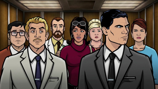
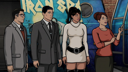
The difference is subtle, but it’s there! The faces shapes and body proportions have been “improved” slightly. But I genuinely think thats due to setting changes and having higher quality animation tools. But lighting makes a huge difference.
I don’t have a lot of cons for the art style improvement besides really that “nostalgia” feeling a lot of ppl have for this show. I personally believe pre- S11 is when the artstyle was the best, of course with having a few sacrifices
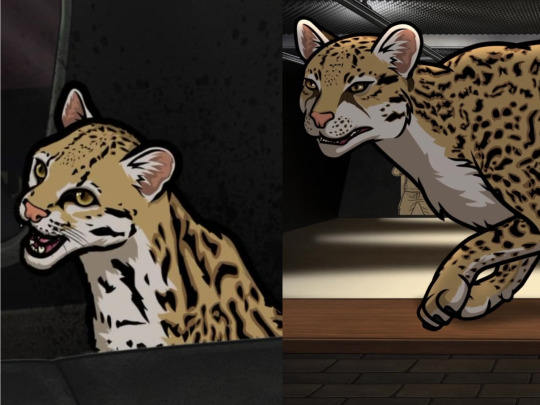
Not sure how I feel about this one. He looks less like an ocelot in the right panel. The colours do look better but Babou’s eyes are eyes extremely different, not a fan of it. Some things just look better than before!
I would also like to take a moment to appreciate this gal’s glow up.. Not to drive too far from the point of this post but Im glad they kept Trinette relevant.
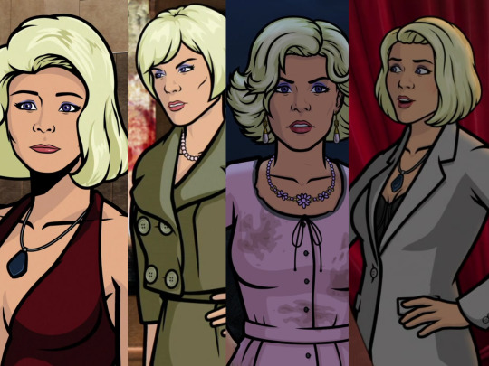
Not 3, but 4 different improvements. Even though she has 3 completely different hairstyles there’s still the difference in quality..
Anyhow, I’ve run out of gas for this post and I’ve pretty much covered mostly everything I wanted to go over. I definitely would like to cover more on this topic but unfortunately tumblr has different plans.
Anyways I love this show so much and everything a bit and probably has one of the most compelling art styles out there with a very passionate studio. I think Floyd County is unique on its own and even just outside the art style there’s a lot more to be said about this show’s greatness. If you read this far and actually enjoyed reading my word vomit… well- thanks! Hoping to write more someday if I get any more literate than LOL
If i missed any details or got anything wrong then plz let me know! Most of everything here is subjective and I may perhaps be a bit biased with some things, but thats just me
#archer fx#long post#this is a lot and i tried my best to have it organized#unfortunately i have adhd#sterling archer#lana kane#malory archer#pam poovey#Cyril figgis#Cheryl tunt#archer
16 notes
·
View notes
Text


My pose reference card decks currently come in two flavors!
The first deck is a collab with @posemuse that features my photo on one side and a 3D cross contour workup of the same pose on the other side. The second deck is a high and low perspective deck with one side of each card a low angle pose while the flip has a high angle pose. All the poses are different in this deck, lots of variety! There is also a free preview digital download. Both decks come with a book ring that opens so you can keep them together and rearrange them.
I'm planning on making more of these in the future! According to my last poll, it might be hands.
194 notes
·
View notes
Text
Pick-A-Pile: Autumnal Heartstrings: How Your Next Partner Will Stir Your Heart This Fall Season 🍂
This is a timeless reading about how your next romantic partner will pull on your heartstrings and stir your passions during any Fall season!😄
Left-to-Right: Pile 1, Pile 2, Pile 3


👑Check out my masterlist to see all of my pick-a-card readings😊
✨ Visit my shops at Ko-fi.com or J.Goddess Tarot✨
🔮Disclaimer: This reading is for entertainment purposes only. Tarot readings are based upon my intuitive interpretation of the cards and about possibilities based on your current energy. Energy is forever changing and nothing is set in stone. Always remember, you have your own free will to make whatever decision you feel is best.
🔮How I read: I use a mix of tarot cards, oracle cards, along with my intuitive abilities of claircognizance, clairaudience, and clairsentience.
🔮How this works: Close your eyes and take deep breaths, pick the pile you are most drawn to. If you aren’t drawn to any pile then that’s okay, these messages aren’t for you at this time.
Pile 1

Tarot Cards: Ace of Pentacles, 7 of Cups (in reverse), 3 of Wands, Wheel of Fortune, Ace of Cups
Hi my Pile 1's! So I see you crossing paths with your next partner as you buckle down and get serious about money. This could be a person that you meet in a Finance or Accounting course at school, a person you meet when you go to a social or professional mixer and they know alot about money, at an investment seminar for real estate or flipping houses, etc.
Now, when it comes to love, this fall, you're stepping into a season of new beginnings and exciting possibilities in love. You're not just sitting back and waiting for romance to find you; you're actively seeking it. With a sense of optimism and readiness, you're looking forward to exploring new relationships. You're planting seeds for something meaningful, ready to embrace new adventures in love with open arms. Your energy is all about anticipation and embracing the potential for something real and lasting.
Whatever the case of how you two connect, you will be first and foremost be seeking to learn more about money -- how to earn more, invest more wisely, how to make it grow. The relationship with your next partner will start out as platonic before it moves into being romantic. Your next partner has a clear idea of what they want in a relationship, no more beating around the bush. Meeting them might feel like fate, like they just waltzed into your life right on cue. They're all about seizing the day and diving headfirst into love, which is just the kind of energy you’re vibing with.
You have a curious mix of being open to love but also being very focused on financial abundance. So this is an interesting line to tow. The mix of your readiness to embrace new love adventures and your future partner’s clear-headed, passionate approach is the perfect recipe for a beautiful, passionate relationship. Take your time and really get to know one another before sex and this will be a much deeper connection.
Pile 2

Tarot Cards: 2 of Cups, 9 of Wands, 5 of Cups, 2 of Wands (in reverse), The High Priestess
Hey my Pile 2's, I am getting that your next partner is a soulmate connection. You already know one another in the 5D even if you haven't crossed paths in the 3D (yet).
This fall, you’re in a place where forming a deep, meaningful connection is at the forefront of your heart. You’re ready for a relationship that’s built on mutual affection, respect, and emotional support. You’re looking for a partner who reflects your depth of feeling, someone who matches your emotional commitment and understands your needs and desires.
Your next partner is someone who’s been through their fair share of life’s ups and downs. They’ve developed a resilience and a bit of a protective shell, but underneath that, they have a heart full of strength and endurance. They’re ready to stand by your side, ready to face any challenges that come your way. Their past experiences have made them a strong, dependable presence in a relationship.
There's a familiarity and love between the two of you that exists on a level deeper than the two initially understand and you two are really drawn to each other. This connection likely starts because you have some minor overlap of associates that you both know and you will likely cross paths held by someone you both mutually know, but aren't necessarily close to.
In your upcoming relationship, expect some moments where past heartaches or letdowns might pop up. But here’s the cool part – these moments are going to teach you both how to cherish what you have right now and look forward to the good times ahead. It’s all about learning from the past and focusing on building a bright future together.
This fall, you’re in for a love story filled with deep connections and lots of personal growth. Your relationship is going to be about really understanding each other and trusting those gut feelings. You’re heading into a meaningful, enlightening romance where you’ll explore all the emotional depths together. So, get ready to trust this journey, dive into the love, and soak up all the valuable lessons this season has in store for you.
Pile 3

Tarot Cards: The Magician, 6 of Wands, The Sun, 4 of Wands, 8 of Wands
Hi my Pile 3's! So what's coming through for you is that your next partner is someone you have been consciously manifesting. Like you didn't manifest them per se, but you have been working on manifesting someone with their qualities. This fall, you're in a fantastic spot for love. You're feeling empowered and ready to create something special in your romantic life. You're all about building a relationship that's not just exciting but also has a solid foundation. Your heart is open to a connection that's full of joy, support, and stability. You're ready to celebrate love, looking for a partner who shares your enthusiasm for life and deep connections.
There is alot of positivity and overall good vibes in this pile when it comes to the energetic connection, friendship and relationship between you and your next partner. Your future partner is stepping into your life with a whole lot of confidence and a recent win under their belt. They've got this "just conquered the world" vibe and are super excited to jump into a romance with you. They're the kind of person who loves to dive right into love, bringing a rush of excitement and quick-paced romance to the table. Imagine someone who's ready to sweep you off your feet and isn't afraid to move fast in love.
Your relationship is gonna be super awesome and full of good vibes. Think lots of laughs, straight-up honesty, and just feeling really happy together. You guys are gonna totally love hanging out with each other. It's gonna be this real, genuine kind of bond where you can just be yourselves, no faking it. It's all about having a blast and making the most of every single moment together.
As amazing as this fast-paced, joyful connection is, keep an eye on how quickly things are moving. Your partner's enthusiastic approach might sometimes feel a bit overwhelming. It's important to communicate and make sure you're both comfortable with the pace of your relationship. A good chat now and then will ensure you both are on the same page and growing together in a way that feels right.
Gear up for a fall that's gonna be like one epic romantic adventure, non-stop. With your vibes and your partner's energetic, all-in spirit, you guys are totally writing a love story that's nothing but thrilling. Just make sure to hit the brakes once in a while to really soak in all the awesome ways your relationship's blooming. You're in for a ride that's all about fun, love, and a ton of unforgettable moments – this autumn's gonna be legendary!
Other Resources:
Website: https://www.jgoddesstarot.com/
YouTube Channel: https://www.youtube.com/JGoddessTarot
Tumblr Subscription: https://www.tumblr.com/jgoddesstarot/support
Exclusive Readings Subscription on Ko-Fi: https://ko-fi.com/jgoddesstarot/tiers
Continual Improvement Survey: https://forms.gle/MYnBds9oZUHJ7VWa8
#j goddess tarot#tarot reading#tarot pick a card#tarot community#pick a card#pick a pile#jgoddess tarot#pick a card reading#intuitive tarot reader#pick an image#free tarot reading#free tarot readings#free tarot#bipoc tarot reader#your next partner reading#next partner pac#next partner pac reading#next partner pick a card#fall in love#love in fall season#fall season tarot reading#love tarot reading
75 notes
·
View notes
Text
Dating game that surprised me... A lot!


Recently I started to play a mobile game called "Love & deep space" and I need to admit it - This game really surprised me.
When my ex-friend showed me this game, all I saw was: dating, pretty 3D, Korean looking men. I told her it's pretty and didn't think much of it because it wasn't out yet.
Few days ago while trying to get up from bed in the morning I suddenly remembered about this game and I decided to check if it's out. It was, so I downloaded it and started playing.
At the very beginning, the game was just a pretty looking game. I need to say that wasn't ready for the kinda limited but nice character creator (no possibility to change chair color & length - only available in photo booth option) and a voice modification option.
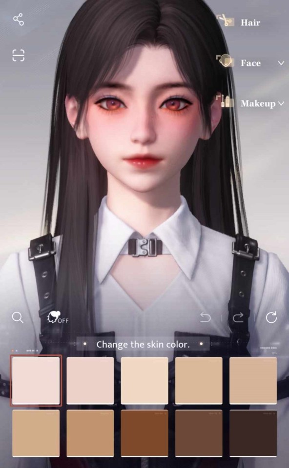
Main character looks pretty!

I just played through the story and my jaw honestly dropped when my game suddenly flipped to the side for a fighting section of the game
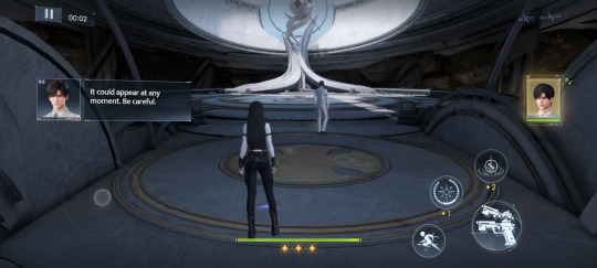
I was not ready, BUT I quite enjoyed it. Fighting reminds me about Genshin on mobile, dodge, tap, tap, tap, be careful of your health, etc.
Fighting parts aren't THAT hard, but at the same time you need to upgrade your cards and add things to them to make them stronger. Pretty basic stuff.
There are lots of fight related activities that give really nice rewards and drop materials needed to making your team stronger.

NOW THE BEST PART! - THE MEN!
Game has three love interests
Xavier - The sleepy boy
Zayne - The doctor
Rafayel - The artist
Each of them have his place in the story, and each is so much more than he looks like at the very beginning.
I honestly love Rafayel, maybe because he is an artist... he is also a little annoying, but it's also kinda sweet. I have the most memories with him and the highest lvl.
Furthermore, I love how going through the main story isn't the only way to interact with them. The game provides lots of options to spend time with them and learn new stuff about them.
You can go hunt for plushies in a claw machine or play a game that is like tic-tac-toe but with cats and cards, or you can take a photo with them. One of my many favourite things, I mean LOOK:
(in order, I mentioned them before)
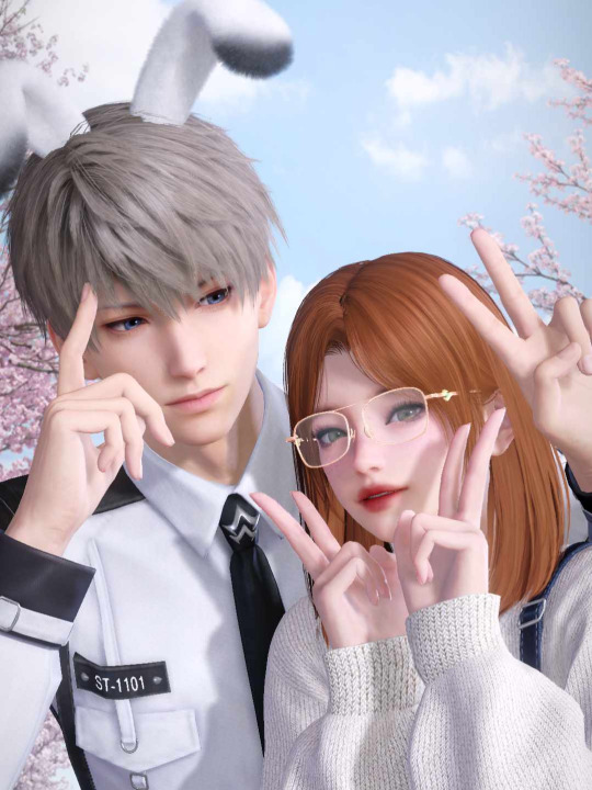
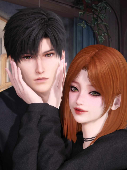
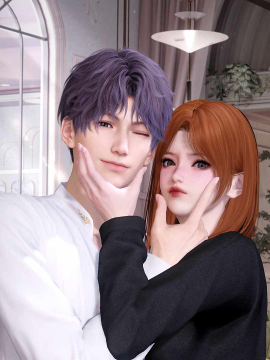
I love it because in this mode you can actually REALLY change your MC's look, which is wonderful! You can change your hair length, color, change make up, outfit and add accessories. Also, you pick poses and background. You also can do pics of your MC, just him or couple pics or mix of everything!
Of course, the main story isn't the only thing, there are also plenty of 'side mini stories' that are unlocked by getting specific memories.

THE LAST THING, I TRULY FALL IN LOVE WITH!
I am a sucker for ASMRs, especially the ones with my favorite characters. I can spend HOURS listening to those.
This game has something similar! You unlock specific audios by obtaining the right memories.
There are two versions - the first version is more of a story thing so you can listen, but it has "subtitles" that describe what MC says and what is happening. You don't have to, but yeah, it's a bit hard to imagine what's exactly happening sometimes.
But the other version... ooooh the other version. It's made to be JUST listen to! No subtitles or anything, just... listen and enjoy what you hear

In summary:
I really fall in love with this game. It's so much more than I expected it to be. It offers a lot of rewards and makes it easy to obtain decent cards without throwing your real money away. Sure, it's gacha game, but it's not as annoying as it could be. Sure, you still can spend money for it if you want extra features, but if you look for a game that isn't just about spending your money, it's a good pick.
Animations look nice, cards are pretty, voice acting is good, story is ok I'd say.
As for me, it's a good game! I am recommending it! A lot!

#love and deepspace#xavier love and deepspace#zayne love and deepspace#rafayel love and deepspace#love and deepspace rafayel#love and deepspace xavier#love and deepspace zayne#app recommendation#mobile game recommendation#recommendation
37 notes
·
View notes
Text
Day blog
Okay so I read some more Neville, re-worked and added new self-concept cue cards and then I fell asleep, no robotic scripting this time.
I feel like recently I've been so focused on my sp (cause of the circumstances) but also I've just been thinking about him a lot, even before I heard about the circumstances. I'm trying not to be heartbroken and depressed and LOA has helped me cope immensely, but damn I need to focus on my career and finances now.
There's so many pivotal events that I want to occur in my life and they all seem daunting to manifest (ik ik limiting belief and everything is possible) but I'm not going to let my fears or 3D get in my way, cause I'm getting everything I want regardless! (I'm getting the bag, the house, the man, the career, the accolades, all of it)
My current life just looks so different than my 4D life so it's jarring. I think I really need to lock in and convince my subconscious more that I am deserving of everything I want.
But yeah here's what I worked on last night with the cards:


Again my self-concept fixing method is to write a list of all of your current negative beliefs about a topic, and then flip them into the positive. It doesn't matter if there are statements that use negative tense cause these aren't affirmations, they will become your waking, conscious beliefs.
Here's a Neville quotes that further explain the importance of self-concept when manifesting.
In other words, “Whom do you say that you are?”. For your conviction of yourself — your opinion of yourself — will determine your expression in life.
You have to watch your thoughts but also take some time to think of where those thoughts even came from to begin with. Who are you constantly telling yourself that you are and does that match your desires? If not then that's where the issue lies.
9 notes
·
View notes
Text
Balatro-Inspired Spinning Card Tweetcart Breakdown
I recently made a tweetcart of a spinning playing card inspired by finally playing Balatro, the poker roguelike everybody is talking about.
If you don't know what a tweetcart is, it's a type of size-coding where people write programs for the Pico-8 fantasy console where the source code is 280 characters of less, the length of a tweet.
I'm actually not on twitter any more, but I still like 280 characters as a limitation. I posted it on my mastodon and my tumblr.
Here's the tweetcart I'm writing about today:
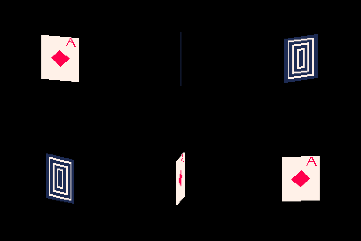
And here is the full 279 byte source code for this animation:
a=abs::_::cls()e=t()for r=0,46do for p=0,1,.025do j=sin(e)*20k=cos(e)*5f=1-p h=a(17-p*34)v=a(23-r)c=1+min(23-v,17-h)%5/3\1*6u=(r-1)/80z=a(p-.2)if(e%1<.5)c=a(r-5)<5and z<u+.03and(r==5or z>u)and 8or 8-sgn(h+v-9)/2 g=r+39pset((64+j)*p+(64-j)*f,(g+k)*p+(g-k)*f,c)end end flip()goto _
This post is available with much nicer formatting on the EMMA blog. You can read it here.
You can copy/paste that code into a blank Pico-8 file to try it yourself. I wrote it on Pico-8 version 0.2.6b.
I'm very pleased with this cart! From a strictly technical perspective I think it's my favorite that I've ever made. There is quite a bit going on to make the fake 3D as well as the design on the front and back of the card. In this post I'll be making the source code more readable as well as explaining some tools that are useful if you are making your own tweetcarts or just want some tricks for game dev and algorithmic art.
Expanding the Code
Tweetcarts tend to look completely impenetrable, but they are often less complex than they seem. The first thing to do when breaking down a tweetcart (which I highly recommend doing!) is to just add carriage returns after each command.
Removing these line breaks is a classic tweetcart method to save characters. Lua, the language used in Pico-8, often does not need a new line if a command does not end in a letter, so we can just remove them. Great for saving space, bad for readability. Here's that same code with some line breaks, spaces and indentation added:
a=abs ::_:: cls() e=t() for r=0,46 do for p=0,1,.025 do j=sin(e)*20 k=cos(e)*5 f=1-p h=a(17-p*34) v=a(23-r) c=1+min(23-v,17-h)%5/3\1*6 u=(r-1)/80 z=a(p-.2) if(e%1<.5) c= a(r-5) < 5 and z < u+.03 and (r==5 or z>u) and 8 or 8-sgn(h+v-9)/2 g=r+39 pset((64+j)*p+(64-j)*f,(g+k)*p+(g-k)*f,c) end end flip()goto _
Note: the card is 40 pixels wide and 46 pixels tall. Those number will come up a lot. As will 20 (half of 40) and 23 (half of 46).
Full Code with Variables and Comments
Finally, before I get into what each section is doing, here is an annotated version of the same code. In this code, variables have real names and I added comments:
[editor's note. this one came out terribly on tumblr. Please read the post on my other blog to see it]
This may be all you need to get a sense of how I made this animation, but the rest of this post will be looking at how each section of the code contributes to the final effect. Part of why I wanted to write this post is because I was happy with how many different tools I managed to use in such a small space.
flip() goto_
This pattern shows up in nearly every tweetcart:
::_:: MOST OF THE CODE flip()goto _
This has been written about in Pixienop's Tweetcart Basics which I highly recommend for anybody curious about the medium! The quick version is that using goto is shorter than declaring the full draw function that Pico-8 carts usually use.
Two Spinning Points
The card is drawn in rows starting from the top and going to the bottom. Each of these lines is defined by two points that move around a center point in an elliptical orbit.
The center of the top of the card is x=64 (dead center) and y=39 (a sort of arbitrary number that looked nice).
Then I get the distance away from that center that my two points will be using trigonometry.
x_dist = sin(time)*20 y_dist = cos(time)*5
Here are those points:
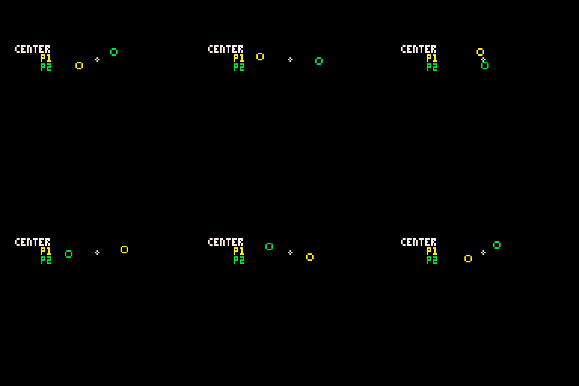
P1 adds x_dist and y_dist to the center point and P2 subtracts those same values.
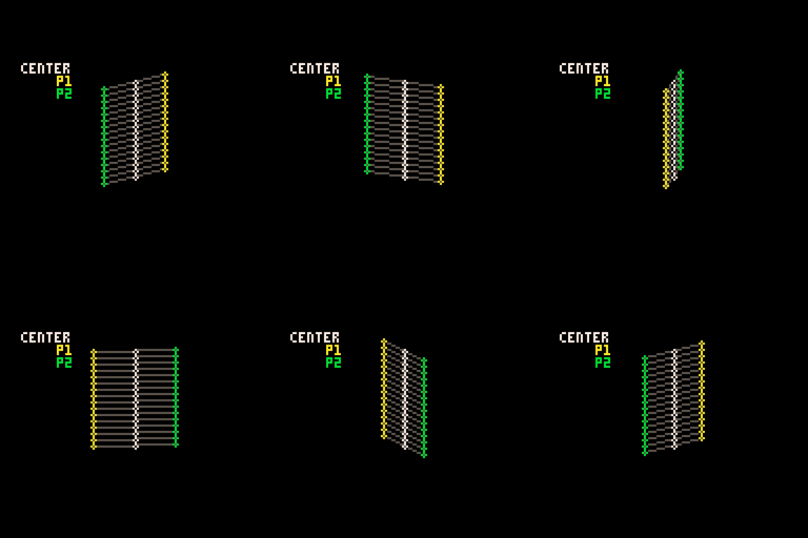
Those are just the points for the very top row. The outer for loop is the vertical rows. The center x position will be the same each time, but the y position increases with each row like this: y_pos = row+39
Here's how it looks when I draw every 3rd row going down:
It is worth noting that Pico-8 handles sin() and cos() differently than most languages. Usually the input values for these functions are in radians (0 to two pi), but in Pico-8 it goes from 0 to 1. More info on that here. It takes a little getting used to but it is actually very handy. More info in a minute on why I like values between 0 and 1.
Time
In the shorter code, e is my time variable. I tend to use e for this. In my mind it stands for "elapsed time". In Pico-8 time() returns the current elapsed time in seconds. However, there is a shorter version, t(), which obviously is better for tweetcarts. But because I use the time value a lot, even the 3 characters for t() is often too much, so I store it in the single-letter variable e.
Because it is being used in sine and cosine for this tweetcart, every time e reaches 1, we've reached the end of a cycle. I would have liked to use t()/2 to slow this cart down to be a 2 second animation, but after a lot of fiddling I wound up being one character short. So it goes.
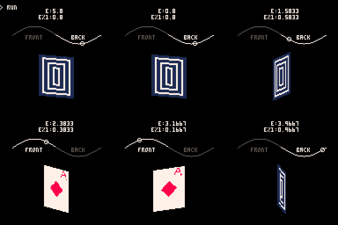
e is used in several places in the code, both to control the angle of the points and to determine which side of the card is facing the camera.
Here you can see how the sine value of e controls the rotation and how we go from showing the front of the card to showing the back when e%1 crosses the threshold of 0.5.
Drawing and Distorting the Lines
Near the top and bottom of the loop we'll find the code that determines the shape of the card and draws the horizontal lines that make up the card. Here is the loop for drawing a single individual line using the code with expanded variable names:
for prc = 0,1,.025 do x_dist = sin(time)*20 y_dist = cos(time)*5 ... y_pos = row+39 pset( (64+x_dist)*prc + (64-x_dist)*(1-prc), (y_pos+y_dist)*prc + (y_pos-y_dist)*(1-prc), color) end
You might notice that I don't use Pico-8's line function! That's because each line is drawn pixel by pixel.
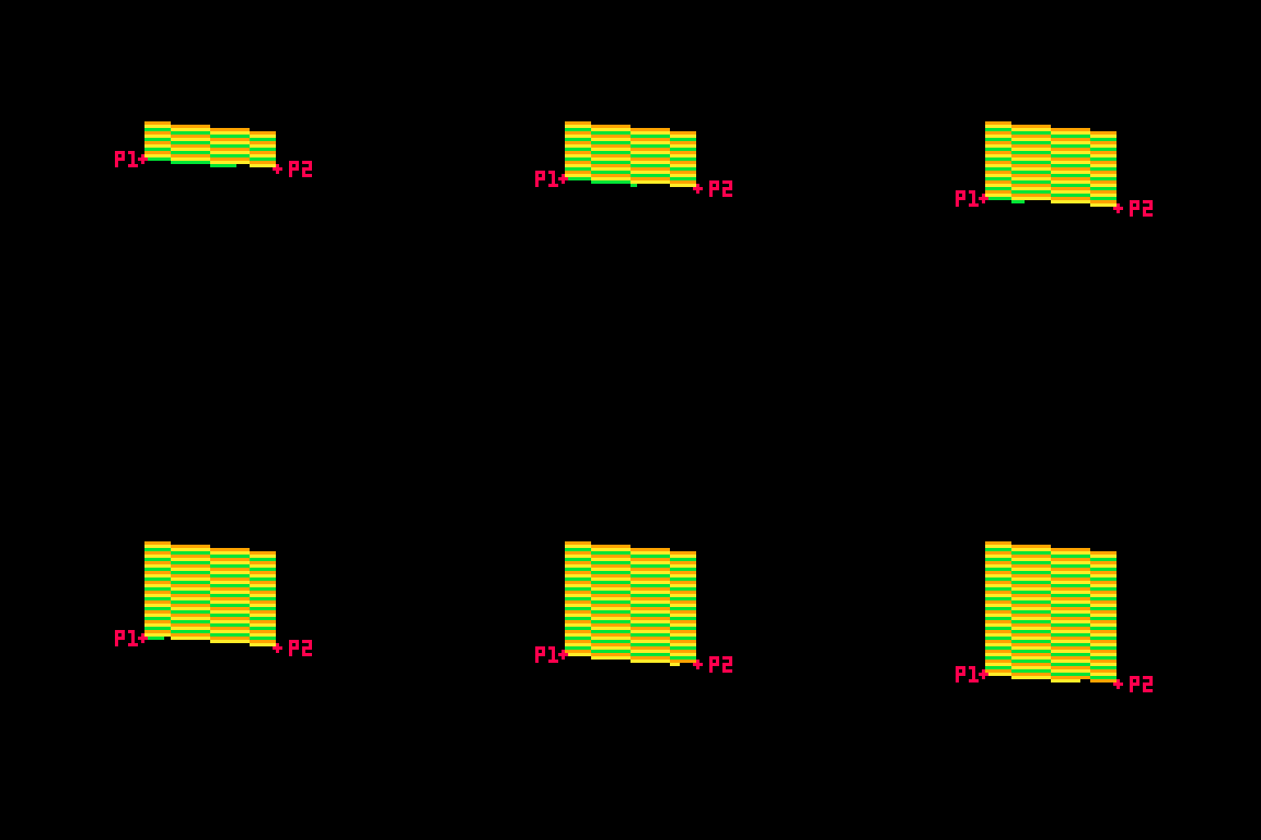
This tweetcart simulates a 3D object by treating each vertical row of the card as a line of pixels. I generate the points on either side of the card(p1 and p2 in this gif), and then interpolate between those two points. That's why the inner for loop creates a percentage from 0 to 1 instead of pixel positions. The entire card is drawn as individual pixels. I draw them in a line, but the color may change with each one, so they each get their own pset() call.
Here's a gif where I slow down this process to give you a peek at how these lines are being drawn every frame. For each row, I draw many pixels moving across the card between the two endpoints in the row.
Here's the loop condition again: for prc = 0,1,.025 do
A step of 0.025 means there are 40 steps (0.025 * 40 = 1.0). That's the exact width of the card! When the card is completely facing the camera head-on, I will need 40 steps to make it across without leaving a gap in the pixels. When the card is skinnier, I'm still drawing all 40 pixels, but many of them will be in the same place. That's fine. The most recently drawn one will take priority.
Getting the actual X and Y position
I said that the position of each pixel is interpolated between the two points, but this line of code may be confusing:
y_pos = row+39 pset( (64+x_dist)*prc + (64-x_dist)*(1-prc), (y_pos+y_dist)*prc + (y_pos-y_dist)*(1-prc), color)
So let's unpack it a little bit. If you've ever used a Lerp() function in something like Unity you've used this sort of math. The idea is that we get two values (P1 and P2 in the above example), and we move between them such that a value of 0.0 gives us P1 and 1.0 gives us P2.
Here's a full cart that breaks down exactly what this math is doing:
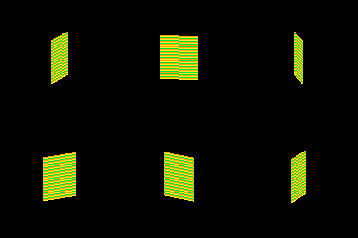
::_:: cls() time = t()/8 for row = 0,46 do for prc = 0,1,.025 do x_dist = sin(time)*20 y_dist = cos(time)*5 color = 9 + row % 3 p1x = 64 + x_dist p1y = row+39 + y_dist p2x = 64 - x_dist p2y = row+39 - y_dist x = p2x*prc + p1x*(1-prc) y = p2y*prc + p1y*(1-prc) pset( x, y, color) end end flip()goto _
I'm defining P1 and P2 very explicitly (getting an x and y for both), then I get the actual x and y position that I use by multiplying P2 by prc and P1 by (1-prc) and adding the results together.
This is easiest to understand when prc is 0.5, because then we're just taking an average. In school we learn that to average a set of numbers you add them up and then divide by how many you had. We can think of that as (p1+p2) / 2. This is the same as saying p1*0.5 + p2*0.5.
But the second way of writing it lets us take a weighted average if we want. We could say p1*0.75 + p2*0.25. Now the resulting value will be 75% of p1 and 25% of p2. If you laid the two values out on a number line, the result would be just 25% of the way to p2. As long as the two values being multiplied add up to exactly 1.0 you will get a weighted average between P1 and P2.
I can count on prc being a value between 0 and 1, so the inverse is 1.0 - prc. If prc is 0.8 then 1.0-prc is 0.2. Together they add up to 1!
I use this math everywhere in my work. It's a really easy way to move smoothly between values that might otherwise be tricky to work with.
Compressing
I'm using a little over 400 characters in the above example. But in the real cart, the relevant code inside the loops is this:
j=sin(e)*20 k=cos(e)*5 g=r+39 pset((64+j)*p+(64-j)*f,(g+k)*p+(g-k)*f,c)
which can be further condensed by removing the line breaks:
j=sin(e)*20k=cos(e)*5g=r+39pset((64+j)*p+(64-j)*f,(g+k)*p+(g-k)*f,c)
Because P1, P2 and the resulting interpolated positions x and y are never used again, there is no reason to waste chars by storing them in variables. So all of the interpolation is done in the call to pset().
There are a few parts of the calculation that are used more than once and are four characters or more. Those are stored as variables (j, k & g in this code). These variables tend to have the least helpful names because I usually do them right at the end to save a few chars so they wind up with whatever letters I have not used elsewhere.
Spinning & Drawing
Here's that same example, but with a checker pattern and the card spinning. (Keep in mind, in the real tweetcart the card is fully draw every frame and would not spin mid-draw)
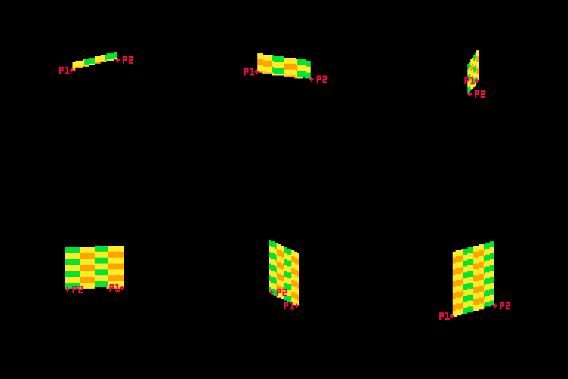
This technique allows me to distort the lines because I can specify two points and draw my lines between them. Great for fake 3D! Kind of annoying for actually drawing shapes, because now instead of using the normal Pico-8 drawing tools, I have to calculate the color I want based on the row (a whole number between0 and 46) and the x-prc (a float between 0 and 1).
Drawing the Back
Here's the code that handles drawing the back of the card:
h=a(17-p*34) v=a(23-r) c=1+min(23-v,17-h)%5/3\1*6
This is inside the nested for loops, so r is the row and p is a percentage of the way across the horizontal line.
c is the color that we will eventually draw in pset().
h and v are the approximate distance from the center of the card. a was previously assigned as a shorthand for abs() so you can think of those lines like this:
h=abs(17-p*34) v=abs(23-r)
v is the vertical distance. The card is 46 pixels tall so taking the absolute value of 23-r will give us the distance from the vertical center of the card. (ex: if r is 25, abs(23-r) = 2. and if r is 21, abs(23-r) still equals 2 )
As you can probably guess, h is the horizontal distance from the center. The card is 40 pixels wide, but I opted to shrink it a bit by multiplying p by 34 and subtracting that from half of 34 (17). The cardback just looks better with these lower values, and the diamond looks fine.
The next line, where I define c, is where things get confusing. It's a long line doing some clunky math. The critical thing is that when this line is done, I need c to equal 1 (dark blue) or 7 (white) on the Pico-8 color pallette.
Here's the whole thing: c=1+min(23-v,17-h)%5/3\1*6
Here is that line broken down into much more discrete steps.
c = 1 --start with a color of 1 low_dist = min(23-v,17-h) --get the lower inverted distance from center val = low_dist % 5 --mod 5 to bring it to a repeating range of 0 to 5 val = val / 3 --divide by 3. value is now 0 to 1.66 val = flr(val) --round it down. value is now 0 or 1 val = val * 6 --multiply by 6. value is now 0 or 6 c += val --add value to c, making it 1 or 7
The first thing I do is c=1. That means the entire rest of the line will either add 0 or 6 (bumping the value up to 7). No other outcome is acceptable. min(23-v,17-h)%5/3\1*6 will always evaluate to 0 or 6.
I only want the lower value of h and v. This is what will give it the nice box shape. If you color the points inside a rectangle so that ones that are closer to the center on their X are one color and ones that are closer to the center on their Y are a different color you'll get a pattern with clean diagonal lines running from the center towards the corners like this:

You might think I would just use min(v,h) instead of the longer min(23-v,17-h) in the actual code. I would love to do that, but it results in a pattern that is cool, but doesn't really look like a card back.

I take the inverted value. Instead of having a v that runs from 0 to 23, I flip it so it runs from 23 to 0. I do the same for h. I take the lower of those two values using min().
Then I use modulo (%) to bring the value to a repeating range of 0 to 5. Then I divide that result by 3 so it is 0 to ~1.66. The exact value doens't matter too much because I am going round it down anyway. What is critical is that it will become 0 or 1 after rounding because then I can multiply it by a specific number without getting any values in between.
Wait? If I'm rounding down, where is flr() in this line: c=1+min(23-v,17-h)%5/3\1*6?
It's not there! That's because there is a sneaky tool in Pico-8. You can use \1 to do the same thing as flr(). This is integer division and it generally saves a 3 characters.
Finally, I multiply the result by 6. If it is 0, we get 0. If it is 1 we get 6. Add it to 1 and we get the color we want!
Here's how it looks with each step in that process turned on or off:
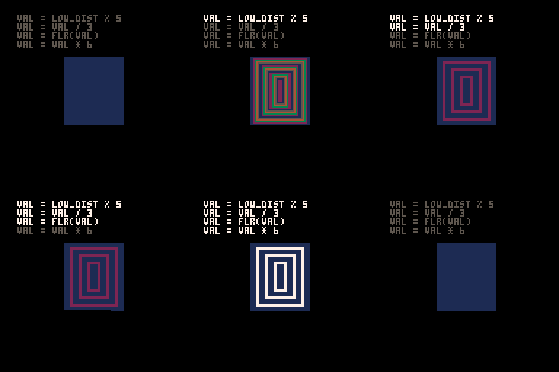
A Note About Parentheses
When I write tweetcarts I would typically start by writing this type of line like this: c=1+ (((min(23-v,17-h)%5)/3) \1) *6
This way I can figure out if my math makes sense by using parentheses to ensure that my order of operations works. But then I just start deleting them willy nilly to see what I can get away with. Sometimes I'm surprised and I'm able to shave off 2 characters by removing a set of parentheses.
The Face Side
The face side with the diamond and the "A" is a little more complex, but basically works the same way as the back. Each pixel needs to either be white (7) or red (8). When the card is on this side, I'll be overwriting the c value that got defined earlier.
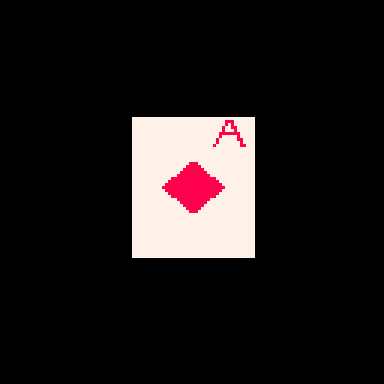
Here's the code that does it (with added white space). This uses the h and v values defined earlier as well as the r and p values from the nested loops.
u=(r-1)/80 z=a(p-.2) if(e%1<.5) c= a(r-5) < 5 and z < u+.03 and (r==5 or z>u) and 8 or 8-sgn(h+v-9)/2
Before we piece out what this is doing, we need to talk about the structure for conditional logic in tweetcarts.
The Problem with If Statements
The lone line with the if statement is doing a lot of conditional logic in a very cumbersome way designed to avoid writing out a full if statement.
One of the tricky things with Pico-8 tweetcarts is that the loop and conditional logic of Lua is very character intensive. While most programming language might write an if statement like this:
if (SOMETHING){ CODE }
Lua does it like this:
if SOMETHING then CODE end
Using "then" and "end" instead of brackets means we often want to bend over backwards to avoid them when we're trying to save characters.
Luckily, Lua lets you drop "then" and "end" if there is a single command being executed inside the if.
This means we can write
if(e%1 < 0.5) c=5
instead of
if e%1 < 0.5 then c=5 end
This is a huge savings! To take advantage of this, it is often worth doing something in a slightly (or massively) convoluted way if it means we can reduce it to a single line inside the if. This brings us to:
Lua's Weird Ternary Operator
In most programming language there is an inline syntax to return one of two values based on a conditional. It's called the Ternary Operator and in most languages I use it looks like this:
myVar = a>b ? 5 : 10
The value of myVar will be 5 if a is greater than b. Otherwise is will be 10.
Lua has a ternary operator... sort of. You can read more about it here but it looks something like this:
myVar = a>b and 5 or 10
Frankly, I don't understand why this works, but I can confirm that it does.
In this specific instance, I am essentially using it to put another conditional inside my if statement, but by doing it as a single line ternary operation, I'm keeping the whole thing to a single line and saving precious chars.
The Face Broken Out
The conditional for the diamond and the A is a mess to look at. The weird syntax for the ternary operator doesn't help. Neither does the fact that I took out any parentheses that could make sense of it.
Here is the same code rewritten with a cleaner logic flow.
--check time to see if we're on the front half if e%1 < .5 then --this if checks if we're in the A u=(r-1)/80 z=a(p-.2) if a(r-5) < 5 and z < u+.03 and (r==5 or z>u) then c = 8 --if we're not in the A, set c based on if we're in the diamond else c = 8-sgn(h+v-9)/2 end end
The first thing being checked is the time. As I explained further up, because the input value for sin() in Pico-8 goes from 0 to 1, the midpoint is 0.5. We only draw the front of the card if e%1 is less than 0.5.
After that, we check if this pixel is inside the A on the corner of the card or the diamond. Either way, our color value c gets set to either 7 (white) or 8 (red).
Let's start with diamond because it is easier.
The Diamond
This uses the same h and v values from the back of the card. The reason I chose diamonds for my suit is that they are very easy to calculate if you know the vertical and horizontal distance from a point! In fact, I sometimes use this diamond shape instead of proper circular hit detection in size-coded games.
Let's look at the line: c = 8-sgn(h+v-9)/2
This starts with 8, the red color. Since the only other acceptable color is 7 (white), tha means that sgn(h+v-9)/2 has to evaluate to either 1 or 0.
sgn() returns the sign of a number, meaning -1 if the number is negative or 1 if the number is positive. This is often a convenient way to cut large values down to easy-to-work-with values based on a threshold. That's exactly what I'm doing here!
h+v-9 takes the height from the center plus the horizontal distance from the center and checks if the sum is greater than 9. If it is, sgn(h+v-9) will return 1, otherwise -1. In this formula, 9 is the size of the diamond. A smaller number would result in a smaller diamond since that's the threshold for the distance being used. (note: h+v is NOT the actual distance. It's an approximation that happens to make a nice diamond shape.)
OK, but adding -1 or 1 to 8 gives us 7 or 9 and I need 7 or 8.
That's where /2 comes in. Pico-8 defaults to floating point math, so dividing by 2 will turn my -1 or 1 into -0.5 or 0.5. So this line c = 8-sgn(h+v-9)/2 actually sets c to 7.5 or 8.5. Pico-8 always rounds down when setting colors so a value of 7.5 becomes 7 and 8.5 becomes 8. And now we have white for most of the card, and red in the space inside the diamond!
The A
The A on the top corner of the card was the last thing I added. I finished the spinning card with the card back and the diamond and realized that when I condensed the whole thing, I actually had about 50 characters to spare. Putting a letter on the ace seemed like an obvious choice. I struggled for an evening trying to make it happen before deciding that I just couldn't do it. The next day I took another crack at it and managed to get it in, although a lot of it is pretty ugly! Luckily, in the final version the card is spinning pretty fast and it is harder to notice how lopsided it is.
I mentioned earlier that my method of placing pixels in a line between points is great for deforming planes, but makes a lot of drawing harder. Here's a great example. Instead of just being able to call print("a") or even using 3 calls to line() I had to make a convoluted conditional to check if each pixel is "inside" the A and set it to red if it is.
I'll do my best to explain this code, but it was hammered together with a lot of trial and error. I kept messing with it until I found an acceptable balance between how it looked and how many character it ate up.
Here are the relevant bits again:
u=(r-1)/80 z=a(p-.2) if a(r-5) < 5 and z < u+.03 and (r==5 or z>u) then c = 8
The two variables above the if are just values that get used multiple times. Let's give them slightly better names. While I'm making edits, I'll expand a too since that was just a replacement for abs().
slope = (r-1)/80 dist_from_center = abs(p-.2) if abs(r-5) < 5 and dist_from_center < slope+.03 and (r==5 or dist_from_center>slope) then c = 8
Remember that r is the current row and p is the percentage of the way between the two sides where this pixel falls.
u/slope here is basically how far from the center line of the A the legs are at this row. As r increases, so does slope (but at a much smaller rate). The top of the A is very close to the center, the bottom is further out. I'm subtracting 1 so that when r is 0, slope is negative and will not be drawn. Without this, the A starts on the very topmost line of the card and looks bad.
z/dist_from_center is how far this particular p value is from the center of the A (not the center of the card), measured in percentage (not pixels). The center of the A is 20% of the way across the card. This side of the card starts on the right (0% is all the way right, 100% is all the way left), which is why you see the A 20% away from the right side of the card.
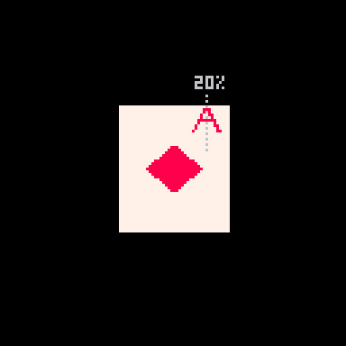
These values are important because the two legs of the A are basically tiny distance checks where the slope for a given r is compared against the dist_from_center. There are 3 checks used to determine if the pixel is part of the A.
if a(r-5) < 5 and z < u+.03 and (r==5 or z>u) then
The first is abs(r-5) < 5. This checks if r is between 1 and 9, the height of my A.
The second is dist_from_center < slope+.03. This is checking if this pixel's x distance from the center of the A is no more than .03 bigger than the current slope value. This is the maximum distance that will be considered "inside" the A. All of this is a percentage, so the center of the A is 0.20 and the slope value will be larger the further down the A we get.
Because I am checking the distance from the center point (the grey line in the image above), this works on either leg of the A. On either side, the pixel can be less than slope+.03 away.
Finally, it checks (r==5 or dist_from_center>slope). If the row is exactly 5, that is the crossbar across the A and should be red. Otherwise, the distance value must be greater than slope (this is the minimum value it can have to be "inside" the A). This also works on both sides thanks to using distance.
Although I am trying to capture 1-pixel-wide lines to draw the shape of the A, I could not think of a cleaner way than doing this bounding check. Ignoring the crossbar on row 5, you can think about the 2nd and 3rd parts of the if statement essentially making sure that dist_from_center fits between slope and a number slightly larger than slope. Something like this:
slope < dist_from_center < slope+0.03
Putting it Together
All of this logic needed to be on a single line to get away with using the short form of the if statement so it got slammed into a single ternary operator. Then I tried removing parentheses one at a time to see what was structurally significant. I wish I could say I was more thoughtful than that but I wasn't. The end result is this beefy line of code:
if(e%1<.5)c=a(r-5)<5and z<u+.03and(r==5or z>u)and 8or 8-sgn(h+v-9)/2
Once we've checked that e (our time value) is in the phase where we show the face, the ternary operator checks if the pixel is inside the A. If it is, c is set to 8 (red). If it isn't, then we set c = 8-sgn(h+v-9)/2, which is the diamond shape described above.
That's It!
Once we've set c the tweetcart uses pset to draw the pixel as described in the section on drawing the lines.
Here's the full code and what it looks like when it runs again. Hopefully now you can pick out more of what's going on!
a=abs::_::cls()e=t()for r=0,46do for p=0,1,.025do j=sin(e)*20k=cos(e)*5f=1-p h=a(17-p*34)v=a(23-r)c=1+min(23-v,17-h)%5/3\1*6u=(r-1)/80z=a(p-.2)if(e%1<.5)c=a(r-5)<5and z<u+.03and(r==5or z>u)and 8or 8-sgn(h+v-9)/2 g=r+39pset((64+j)*p+(64-j)*f,(g+k)*p+(g-k)*f,c)end end flip()goto _

I hope this was helpful! I had a lot of fun writing this cart and it was fun to break it down. Maybe you can shave off the one additional character needed to slow it down by using e=t()/2 a bit. If you do, please drop me a line on my mastodon or tumblr!
And if you want to try your hand at something like this, consider submitting something to TweetTweetJam which just started! You'll get a luxurious 500 characters to work with!
Links and Resources
There are some very useful posts of tools and tricks for getting into tweetcarts. I'm sure I'm missing many but here are a few that I refer to regularly.
Pixienop's tweetcart basics and tweetcart studies are probably the single best thing to read if you want to learn more.
Trasevol_Dog's Doodle Insights are fascinating, and some of them demonstrate very cool tweetcart techniques.
Optimizing Character Count for Tweetcarts by Eli Piilonen / @2DArray
Guide for Making Tweetcarts by PrincessChooChoo
The official documentation for the hidden P8SCII Control Codes is worth a read. It will let you do wild things like play sound using the print() command.
I have released several size-coded Pico-8 games that have links to heavily annotated code:
Pico-Mace
Cold Sun Surf
1k Jump
Hand Cram
And if you want to read more Pico-8 weirdness from me, I wrote a whole post on creating a networked Pico-8 tribute to Frog Chorus.
16 notes
·
View notes
Note
Lol retard imagine thinking anyone cares about you're retarded monkey ass culture that gave the world such innovations as the "Brazilian butt lift". Imagine living in a "country" renowned for its tranny prostitutes
If we're monkeys we're some damn smart monkeys, seeing as we've invented
Chest photofluorography for screening for tuberculosis
The Jatene procedure for arterial switch operation (a type of open heart surgery)
The first scorpion and spider antivenoms (in 1908 and 1925)
Caller ID
The wristwatch
Phone cards for payphones
Voting machines
Radiography (x-ray images)
Rice strainer
The Kinect for X-Box
3D cinema
The artificial heart
The most green light bulb in history
Havaianas flip flops
Automatic transmission
Typewriters
The solar bottle bulb
The first radio transmission
Two kinds of martial art (Brazilian Jiu-Jitsu and Capoeira)
The portable stereo cassette player
The Walkman
Hot air balloons
The first plane able to do unaided takeoff and flight (the Wright brother's plane needed a catapult)
Brain-Machine Interfaces
and discovered
The pathogen, vector, host, clinical manifestations and epidemiology for Chagas disease
The pathogen for epidemic typhus
The disease cycle for bilharzia
What about you? what have you invented?
Or are you not as smart as us monkeys?
#brazil#inventions#medicine#racism#bigotry#racial slurs#brazilian inventions#the walkman#radio#wristwatch#airplane#anti venom#caller id#did you know#little known fact#wright brothers#try again#latino america#latin america#south america
60 notes
·
View notes
Text

3D Card Flip CSS Animation
#3d card flip#3d flip card animation#3d flipping card animation#3d flipping card#flip card css#css card flip animation#html css#frontend#codingflicks#learn to code#code#html#css#frontenddevelopment#css3#animation
1 note
·
View note
Text
Mimi
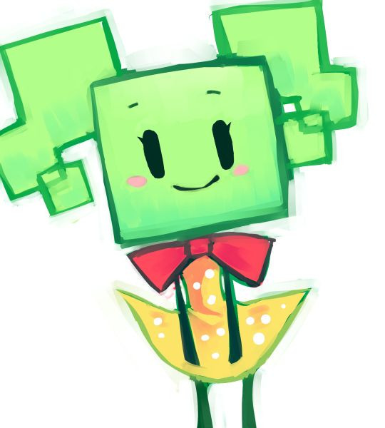
(credits of the image to its respective author)
Her name, is derived from the word "mimic", hence her name for her ability to shape-shift. Her true form is that of an evil-looking robotic spider, seen during most of the battles against her. Whenever Mimi is in her true form, her dialogue box is in a shade of purple with white text color, similar to the Shadow Queen and Bonetail in Paper Mario: The Thousand-Year Door.
Mimi gives a lot of information about herself in the "That's My Merlee!" show, here all of her information:
Her birthday is May 5.
Her childhood nickname was the "Odd Porpoise".
She likes to watch reruns of Super Ultra Goomba Bros.
Her favorite smell is old cheese.
When washing in the tub, she starts with mold in the tiles, then the faucets.
Her favorite food is tangerines.
Her type of guy is present in the bathroom during the quiz. (Most likely referring to Mario)
Her favorite animal is a demon.
She wants a boyfriend.
Her best feature is her effervescent personality.
Other aspects of Mimi's personality are revealed, such as how she hates brussels sprouts and old ham (carrots and peppers in the Japanese version) but hates the dark more. She also enjoys fashion, and is the one of the only characters who change their outfits. Mimi wrote in her diary that her dream of a perfect world is a gem-filled pool with hunky lifeguards; this is one of the many times Mimi is shown to have a love for gems (especially Rubees) and boys.
Like Mario and Dimentio, Mimi is gifted with the ability to flip to 3-D. Mimi can also hover in the air, fly and warp to different locations. Fact: When her eyes and arms stretch out into the other two pairs, make a casino-esque jackpot noise.
Mimi's true identity is shrouded in mystery. There are two theories, according to Carson, that may explain who Mimi really is: a failed Pixl created by the Ancients, or the unintended result of a witch's experimentation with shape-shifting potions. A third theory could be her True Form. If Mario flips into 3D, the player can see gears from inside Mimi's spider form, implying that Mimi may be a robot altogether. This could be supported also by the fact that she apparently explodes into pieces in Chapter 2-3, but survives. Another explanation for her explosion in 2-3 is that she was still invincible, so she survived.
Quotes
"Mimimimimimimimmimimimimimi!"
"I'm Lady Merlee's handmaid. My name's Mimi!"
"But you can call me Mimikins if you want!"
"Coins?! No one uses COINS anymore, you peasants! I SPIT on your coins!"
"ENJOY LABOR!"
"I guess I'll congratulate you... by tearing you into little bits like stupid confetti!"
"Nighty-night! It's bedtime for you guys!"
"I like getting what I want, so I do whatever I need to get it."
"DOOFUSES!"
Additional information
Catch Card: 191
Max HP ?? (6 hits)
Attack 1
Defense 0
Score 2000
Role Boss
Card type Uncommon
Location(s) Merlee's Basement (2-4)
Card location(s) Card Shop; Map 15
Card description It's Mimi, the adorable, yet slightly unstable shape-shifter! Word is, she has a crush on Count Bleck.
Tattle: Invincible. This is Mimi... So is this her true form? She'll come after you if you stay too long in any room... And our attacks don't work, so we should keep moving...
Normal: That's Mimi. She's a slightly childish shape-shifter that works for Count Bleck... Max HP is ?? and Attack is 1. Just go for the head when you attack... She will briefly stop when she gets hit... That is when you should go on the attack... She might also hang from the ceiling and throw Rubees at you...







Fun facts: Her name in japanese and korean came from "money", referring to her fondness of Rubees, which refers to her spider-like true form.
Mimi is the only one of Count Bleck's main minions who also serves as a Chapter boss.
Mimi is a rather prominent homage to the 1982 science fiction horror film The Thing. The film's main antagonist is an extraterrestrial organism capable of shapeshifting, and one of its most notable appearances in the film is as a grotesque, upside-down face on several spider-like legs; save for the alien origin, the creature's traits are prominently featured in Mimi's character.
The above text is from the Super Mario Wiki and is available under a Creative Commons license. Attribution must be provided through a list of authors or a link back to the original article. Source: https://www.mariowiki.com/Mimi
#spm#super paper mario#fanart#my researches#spm villians#Super Paper Mario Researches#my investigation#MarioWiki#Mimi
12 notes
·
View notes
Text
My game of the year is Kinfire Delve Callous’ Lab. Or Scorn’s Stockade. And, though technically coming out in 2023 I didn’t play it until 2024, Vainglory’s Grotto.
Hard co-op dice/card games that reward you just enough to keep you coming back.
I just wish there was some way to charge your lanterns more easily even if they were then somewhat nerfed.

I also played a ton of River Valley Glassworks. It’s simple but offers fun decisions. The expansions that came with Kickstarter actually dilute the fun, imo. Just don’t play it with someone with AP.

Another favorite was Harmonies. Great components and tricky, 3d puzzles to solve make for enjoyable gameplay without too much effort. The Spirit cards…. expansion?… added… not a lot to the game and some were clearly better than others. I only played with them once.

River of Gold was also a game I loved this year. But my game group didn’t feel it. I had a hard time convincing them play again so I fear I won’t have further opportunities to play it.☹️

I don’t have pictures but Flip 7, Cabanga, and Moonrollers also saw many repeat plays. And, despite myself, That’s Not a Hat. I enjoyed TNAH but man my short-term memory is… what was I saying?
#board games#kinfire#kinfire delve#card games#dice games#game of the year#river valley glassworks#harmonies#Flip 7#Cabanga#Moonrollers#that’s not a hat
3 notes
·
View notes
Text

Next Major Life Change 🍕🙏❤️ - November 2024 - Capricorn
Meditation: Potentially ending or losing a connection in the preshuffle, the meditation was a long winding staircase (haven’t you gotten this before?) down to…well, it looks like Hell 🔥 A cave or cavern maybe, to the center of the earth. Deep voices singing in monk chants or something while you descend this extremely dark and kinda slippery winding staircase that goes down for ages, and there’s no railing. You’re afraid to slip & fall. One step at a time.
What It Is: Great Adventure 🏴☠️
The first card out was The Devil. So. Capricorn is Capricorning 😆 I’ve actually been getting this same thing for a minute for you guys and it seems like now is the right time to say so, I’m hearing.
Why is Capricorn - The Devil? Because you are an earth sign connected to Saturn and your 3D reality the most, The Devil describes the pressure you feel every waking second, it’s the magic 🪄 of The Lovers in chains ⛓️ Once the story ends, the hero still has hefty a car insurance bill, damages to pay, and an insatiable drive to achieve over the rest of the family. Capricorn is the least likely sign to even give af about spirituality or things like this. Church for status maybe. Conservative. They’re closely tied to the 7 Deadly Sins as being the most materialistic sign, “Daddy” of the other signs, and the most tempted by pleasures of the flesh. Money. Sex. Success. Greed. Control. Rigid mindsets, toxic cycles, and all of the addictions involved to escape the pressure of all of that bs because Saturn doubles down on the pressure. Can you ever just sit and relax, or do you constantly neeeed to be furthering yourself, doing something, being “useful” - or you will be judged? By who? Yourself 💯 And you may judge others as harshly as you do yourself. “This is the way.” But sometimes it’s not, it’s what you’ve learned at some point and got stuck in because you probably thought it was the right thing to do. Maybe you’re wrong, stuck, obsessed, addicted - and can’t admit it. Pride is just another “sin” on the quest to achieve it all.
There lies The Devil.
For this specifically, The Devil is a rigid mindset, pattern, or habit that you’ve started to avoid a Tower - in your mind - but it’s showing up as being delusional. Could be related to medicine, substances, or addictions. Spirit is saying knock it off. I’m seeing Xanax. Or some kind of “home remedy” when you actually need medicine, could be switched. Quit taping up wounds and go to the doctor, or something to that effect. Or quit excusing life due to medicine/escapes…that would be for someone that knows what they’re doing. Purposely manipulating “the system” or something idk, it’s not going to continue.
Besides that - main story - overworking is a problem. You hold yourself back from opportunities and adventures because you are trapped in a mentality that the worst is going to happen and you need to be prepared for that inevitability. That��s what’s delusional - for most. There are adventures available, and you’re supposed to be in a “wandering” and adventurous mentality - but you resist it. On purpose. You came to this reading wanting to hear “you’re going on an adventure!” And Spirit is giving you that. But your character card is The Adventurer rev - because of The Devil - and The Devil is you darling 😘
The next major life change is you realizing how procrastination, addictions, distractions, deeply ingrained beliefs or childhood examples/lessons, or even outside things & toxic cycles…are keeping you stuck. Or rather, they’ve taught you to keep yourself stuck. 2 Wands is moving forward, planning your future; you have adventures available whenever you want to flip The Fool upside down and take a risk. Accomplishment is here - just waiting on you to pick a path 🏆 Some of you may be tempted by something that simultaneously triggers you - into waking up to all of this in your 3D reality perhaps - however it does. That’s how you know. You equally obsess over it - and it scares the hell out of you. Some could change things around and DO it. Some absolutely will not, and will see it as temptation. There’s no right or wrong, just that “adventure” is available and you’re resistant. Your choice.
#Capricorn#next major life change#November 2024#astrology#tarot#tarot reading#monthly#life#love#growth#change#spirituality
3 notes
·
View notes
Text
Riddle me what now?
Coming in just under the wire for @taznovembercelebration - today's prompt card was "missing piece" and it's short and silly.
Read below or on Ao3
-
"Hey, Krav, the guy came back in." Says Barry, like they don't work in a shop, like they don't see literally every guy in the world all day long every single day.
"Oh, okay, the guy, sure." Kravitz rolls his eyes to make sure Barry is aware he's taking the piss.
"You know the one, The Guy, not A Guy."
Kravitz looks at Barry as blankly as that statement deserves.
Barry huffs and adds, "the one with the hair!" As if that's a helpful fact, something useful to really help Kravitz nail down the mysterious guy's identity.
"Did he also have a face?" Kravitz asks sweetly.
"Fuck off, I'm trying to help you. He was the one you liked, with the stupid name."
Oh. It was Taako. Taako came back?
"He asked for you. Well, he asked for 'the goth hottie' so I'm making some assumptions, but you know." Barry gestures to himself and his work juniform. Kravitz still has no idea how Barry conned Kravitz into agreeing to the japron. "I'm assuming it wasn't me."
Kravitz finishes retying his sensible, stylish, black apron and picks up his black gouge. Out of the two of them there was no competition as to who fit the description. Kravitz, gothily, hotly (according to Taako), examines the train he's working on so he can concentrate on something that isn't this conversation. If he's busy then Barry won't be able to tell exactly how interested he is to hear that Taako thinks he's attractive.
"Oh?" Says Kravitz, all cool and unbothered, giving nothing away.
"And I know you thought he was really hot too, you know, with all the staring you did, and the thing your face is doing right now."
Fuck.
"Er... I... Nuh uh!" Kravitz says, seamlessly refuting Barry's wild accusations.
"So I got his number for you." He says brightly. A small ball of paper bounces off the side of Kravitz's head and lands next to his tools. "There you go!"
"You got his number for me for...?" Kravitz peters out before he can say anything he can't live down, finishing the sentence with 'sex purposes' is exactly what his brain wants him to do and is therefore likely to be a terrible idea.
"What do you mean?" Barry's doing his smug voice which means he knows exactly what Kravitz means and he's torturing him.
"For... You know... Business purposes?" There he did it.
"What else would it be for, bud?" Barry asks sweetly, flipping his conversational trap card. "You said you didn't find him attractive so I assume you wouldn't want it for anything but business reasons."
Was Barry actually going to make him say it with his actual mouth? Kravitz chanced a look over to Barry's work station, he was working intently on the 3d fire puzzle commission, pretending he wasn't invested in getting himself knee deep in Kravitz's love life.
Kravitz unscrumpled the paper on his desk.
"Text me maybe?" Was scrawled next to a number, underneath was Kravitz favourite part "Taako xoxo." That surely couldn't be business kissed, Kravitz read it twice and it definitely wasn't purely professional.
"I'm going to text him." Announces Kravitz.
"Great!" Barry says too quickly. "Just, er, just as an aside, totally separate to whether you and Taako should be dating or not, here." Barry leans over and drops something onto Kravitz's desk. "This is the missing piece of the puzzle he's looking for."
"Barry!"
"Well you were both clearly into each other and neither of you were going to do anything about it. I fixed it." He sounds unnecessarily pleased with himself.
"You took a piece from a finished product so that I'd be better able to hit on a customer?"
"Well when you put it like that it sounds bad..." Barry sounds genuinely upset.
Kravitz sighs. "You can never pull this stunt again, it'll tank our reviews."
"Aye aye cap'n." Barry salutes happily.
Kravitz starts drafting an apology text.
-
I hope you enjoyed! You can catch the next prompt here.
#Sorry for the formatting i did this on mobile while half asleep.#taznc#taz November celebration#taakitz#Noodyl Writes#taz fic
16 notes
·
View notes