#(please ignore the inconsistencies in the line art styles
Explore tagged Tumblr posts
Visit Tumblr Blog
Explore Tumblr blogs with no restrictions, modern design and the best experience.
Last Seen Tumblr Blogs


Fun Fact
The most popular pages on Tumblr are about Minecraft, GIFs, and David J. Peterson.
Text


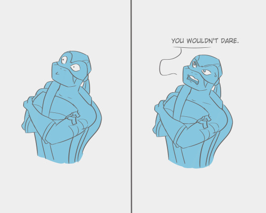
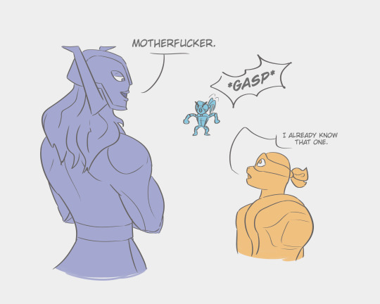
This is as good a time as any to mention that Draxum is a polyglot and can swear in so many languages
#rottmnt#rottmnt au#minor interference au#rottmnt leo#rottmnt mikey#rottmnt baron draxum#leonardo hamato#michelangelo hamato#rise of the tmnt#rise of the teenage mutant ninja turtles#rottmnt fanart#rottmnt fanfiction#my art#I've had this idea in my head for months and just now got to drawing it out#(please ignore the inconsistencies in the line art styles#i didn't feel like fixing that lol)#real a+ parenting there draxum#i realize that this joke would have worked better with raph instead of leo#however i didn't realize that until after i drew the whole thing out so i'm not gonna bother changing it
538 notes
·
View notes
Text

I intended this to just be a sketch, but i liked it so much that I ended up making a mini ref sheet of Aerine, the first dnd character I ever made. I’ve only been playing for around 2 years but out of over a dozen campaigns that ended early or fell through, she’s been the longest standing one ! So while her design and story is a bit “basic” compared to other characters I’ve made since then, she has a special place in my heart 🩷
here’s her spotify playlist and pinterest board too hehe
more random infodumping about her below !
Her campaign (Tales from Estaria) is from a homebrew world by my amazing dm! It’s very Victorian-era / steampunk inspired with lots of eldritch horror elements. The dress in her reference sheet (designed by @angeliets ) is intended to be her wedding dress! I had tried to draw her wedding dress myself before (which you can see in this tiktok i made about her ) but after seeing his design when joining his ko-fi membership, I knew I had to change it immediately. The veil is a bit different than his original design, as she would be using a veil gifted by her mother! Here are some more outfit ideas I’ve drawn (please ignore my inconsistent art style lol)

As for the quote I put on her ref sheet, it comes from something I said during a session. For context, our party visited a very religious country where magic coming from any source other than their god is illegal. We brought with us a child our party has been protecting, Peter, who who had celestial runes carved into his arms after his family was slaughtered by a cult worshipping a being known as the Lady of the Woods, one of the four eldritch beings who are trying to end the world.
While stopping in one of the towns for a rest, Peter’s scars were noticed by a civilian who thought we had kidnapped/harmed him. We tried explaining, but they were unresponsive and Peter, who has aasimar blood and is a draconic soul sorcerer without full control of his abilities yet because he’s a literal child, freaked out trying to pull away and used some magic. With that, the civilians then started calling HIM a monster and attacked him which is all it took for the entire party to go off on them.
Of course, as a party consisting of two tieflings, a hexblood, a warforged and Aerine, and with 3/5 being casters, it wasn’t a good look and the people started calling us devils. We did manage to do (mostly) non-lethal damage, and the warforged ended up crashing a carriage into the building for us to get away. Aerine said that line before slamming the carriage door shut which was honestly a badass moment for her as she’s normally very polite and gentle in her speech. She was extremely upset at the audacity of these people to use their religious beliefs to excuse hurting an innocent child, especially when moments before they were SO concerned.
She is very protective of the innocent, especially children. Which is also why her dislikes include the part about not liking when her party members giving children weapons. Several of the members have given Peter weapons or taught him how to use them. They do have good intentions, as they want him to be able to protect himself in case of the worst of they aren’t there to do so. However, she strongly believes that it isn’t a responsibility or burden that should ever be placed on a child, and that they instead should work to improve themselves and their abilities so that there is never a possibility of such a situation occurring.
NOW AS FOR THE MONSTER PART LMAO
So everyone knows the reputation bards have, and well, she’s probably the least bard of all bards in that manner (hooray strict and sheltered upbringings in a society literally inspired by the Victorian era!). I thought it would be a funny idea to roll the dice any time we encountered an NPC to see how attractive she found them, and it backs a long running joke. However, she would always roll super low for everyone ! It wasn’t until mid-battle one day when the warlock (who has a weird Venom-type situation going on) was in their monstrous form that I was like, hm, wouldn’t this count as an npc since it’s technically a different being? that I randomly decided to roll and got like an 18 or something really high like that 😂 since then, I’ve rolled for many more npcs and even monster type creatures (such as this death lich we came across) and she’s only - ONLY- rolled higher than a 14 for monsters.
Well, she did also roll very high (actually, it may have even been a Nat20) when I rolled for the tiefling ranger after he came back from 5 months(5 minutes in the material plane) of being stuck in the Feywild with a hot nymph with a beard from not being allowed to shave. It may or may not have sparked a small crush on him since then. Funnily enough, last session we encountered his human version in an alternate timeline from our own, and she did indeed roll lower in her attraction for his human version than his original version. So apparently the farther from human, the more attracted she is. A true monster lover!
Anyways this ended up , much more of a lore dump than I expected! I love talking about her and her adventures with the party, so I’ll probably be sharing more once in a while. Maybe even sharing art of the party members? Who knows !
#wah i love her lol#oc#original character#dnd oc#dnd character#oc ref sheet#my art <3#my ocs <3#aerine <3#tales from estaria <3
2 notes
·
View notes
Text
Hello! I've been doing some long, hard thinking about my current commission offerings.
TL;DR:
I am doing away with my "standard" menu (headshot/halfbody/fullbody/etc.) in favor of more experimental work.
Effective June 1, my commissions will close completely, including the waitlist.
If you want any of my current offerings, please let me know before then. You will be added to a final waitlist queue, with payment only required once I get to you.
If you're currently on my waitlist, or are interested in what's next, please see the bottom of this post. Once the final orders are complete, I will focus on relaunching.
Below is a more elaborate explainer of why I'm doing this, and what I'll be doing next.
Introduction
Essentially, commissions have worn on me more and more as time goes on (which may be tangible if you ordered one recently and it took months). Part of me wondered if I was burned out on art in general, or it was just becoming less of a hobby for me, but that sentiment didn't feel quite right. After all, I could still get grabbed by a picture idea every now and again, which I would then crank out in one evening.
Was there some sort of difference between the pictures I could hammer out quickly vs. the ones I couldn't? Well, I wouldn't make a post about an investigation without already having a prime suspect.
My Art Style
When I first started drawing aliased, it was to quickly crank out panels for my forum adventures, mostly because I was using GIMP and didn't know anything about brush settings. I was way too frustrated with anti-aliased lines and how little I could make them look how I liked, so I retreated into something completely different.
It worked for a while, but as I became more comfortable with the style, I developed bad, perfectionistic habits (something I've already mentioned being A Problem I Have). I would tweak lineart at the pixel level, just because some stray bump or two bugged the hell out of me. I consider this one of the reasons my art output has slowed down.
Trying to embrace a "perfectly inconsistent," or "consistently imperfect" look as "my style" just created its own irony. For example, I will deliberately draw patterns and textures by hand, because it sticks out too strongly otherwise if I just paste it in. You can bump into this quickly enough by scrolling through my various character references.
I would love a world where all my OC references feel "current," but as it stands, I'm finding it increasingly hard to work on the remaining characters I want to draw while commissions are also an obligation. Taking a break from aliased character art commissions in order to work on aliased character art references is...just doing more of the same? It isn't a break.
In order to create breaks that actually feel like breaks, I have to compromise. ONE of these has to go home and change. My personal art gets priority here, and I still very much want my OCs to look consistent in their reference art, so...I need to find a more efficient way to draw for money that keeps my dysfunctional brain entertained.
The Long, Slow Realization
Back when I used GIMP, I tried the chalk brush on a whim and ended up quite liking it. The rough look helped me ignore what I would consider "imperfections" otherwise. However, perhaps because I had a comic or character references I wanted to keep consistent, I mostly considered it a fun oddity and nothing more.
More falling dominoes that would eventually lead to this post were my experimental style offerings that I introduced last year (at the time, I just offered it because I thought people may be interested in art that looked relatively unique), Art Fight (having to agonizingly obey "finished not perfect" because of the event deadline), and other gift art I did around this time (the reasoning being, it's gift art, they wouldn't mind if I used it to experiment).
Now that I use CSP and am no longer bound by webcomic obligations, I've been experimenting more with brush settings. Wouldn't you know it, most of my modern art of my original stories is no longer aliased. I go "off-model" deliberately, fuck around with layer settings and effects, and enjoy creating pieces just because I saw a cool tutorial, brush, or program I wanted to try. These are the types of pictures I mentioned I could crank out in one evening. Maybe they're not "formal," but I feel like they're the most "me."
With all this new experience swirling around in my head, I finally realized: Why am I not selling art I actually find fun to draw?!
The New Offerings
Currently, I'm leaning toward one style of illustration only, cheaper than the experimental style I offer presently, and "rougher" as a result. I want something equivalent to my '22 Art Fight output; something flashy, unique, and most importantly, quick to do.
The specifics are what I intend to figure out while I work through the queue. Here are some thoughts already rotating around in my brain:
Should I offer price "tiers" that roughly equate a level of "polish" (equivalent to sketch/flats/shading) or just go with one-price-fits-all?
Should I still offer sketches as a cheap alternative, or is that too confusing with my Ko-fi already sort of being that?
Should I offer specific pricing for bust/halfbody/fullbody/etc., or was that another symptom of why I had commission burnout before, and should be avoided?
Should I eschew all of the above and just offer one thing at one price (e.g. "give me $50 and I'll draw your OC" with no other choices for the buyer), or is that too intimidating?
And so on. The last option is currently what I'm vibing with the most, but it's definitely the most daring idea of the bunch, too. (& If you have any thoughts on this, let me know! I have so much more thinking to do.)
The Old Offerings (But New)
When I reopen, I would like to have as few options as possible. However, I have considered the possibility that an old offering would speak to me and I would add it to the new menu again. Here are some thoughts on those:
Icons have a pretty high chance of coming back.
I've always liked drawing faces and headshots the most. If I decide not to bring back headshot sketches, I could just roll it back into "icons" and instead offer colored sketchy headshots. This would be similar to the headshots I did for Art Fight, but...with colors.
Half/fullbodies would depend on how the new style goes.
This is elaborating on what I said in the previous section. While I'm sure my core audience (i.e., you) will be fine with a potentially spontaneous angle to my commissions, buyers I'm less familiar with might not be. I want to try "one price fits all," but if someone gives me shit about me drawing a bust when they were anticipating a fullbody, I might have to add options to specify this.
Regardless, the style would still be "experimental" either way--the composition is what's important about it (which is also why I feel like I can get away with one single price). If anything, I feel like forcing myself into the little boxes of "halfbody" and "fullbody" was partially what was stifling me. Like, when do I ever consciously decide to draw a halfbody of an OC? I don't. It feels very arbitrary, and I'd like to distance from it.
MOST IMPORTANTLY: Character design is NEVER coming back!
I deeply appreciate those that did want a brand spanking new OC from me, but I've never considered myself to have a terribly strong design sense. They just kind of ended up being extra nervewracking to do because I had to design a character on top of drawing a fullbody. I will still take the final requests for these, but this is your absolute last chance for a Jovian Twelve™ Brand Original the Character.
What if I'm Already on Your Waitlist?
You don't have to do anything! I will get to you when I get to you. After June 1, I will close the waitlist, and whoever is on there will be able to have one of my old commission types, as promised. You can change your request anytime as long as I'm not currently drawing it!
Reminder that my waitlist is NOT "first come, first served;" I order it based on the complexity of what's wanted. Because of my slow pace, I didn't want to keep someone waiting forever when all they want is three sketch headshots, you know? This is a heads up that if you change your request, your position in the list may change as well.
I have no ETA when the current waitlist will be completed, given that currently, fullbodies are taking me months. Sorry :( Just another reason I'm making this post!!
What if I Want the NEW Style?
I will accept up to five (5) waitlist slots that want to "test drive" the potential new commission style, placed after the "traditional" queue is all cleared out. (So, you'd be waiting extra long.) If you're interested in this, get in touch! I will offer them to you at a lower rate than what I'm expecting to charge for the real deal, as thanks.
If you're already on the waitlist for something else, and want to test the new style instead, let me know! Just be aware this would bring you to the bottom of the queue as described above (but it WOULD give me one less commission I'd have to go through to get to the new stuff, WINK).
In the chance I get no takers the entire time it takes me to go through the waitlist, then the first five commissions I do in the new style will just have to be "test slots" instead.
Final Word
I know these long posts might not be terribly interesting to anyone that's not me, but I find it therapeutic to scrawl my thoughts out in text. Additionally, I'm over 30 years old and conclusions are still the hardest part in writing an essay. I can feel my writing style begin to devolve the closer I am to the end...
Uhhh.
Thanks for reading, and understanding?! See you soon, maybe?! Get in touch if you want to discuss Commissions From Me?? 💃 Cool.
#text#commission#why do i type huge essays like this? what's wrong with me#at least that's off my chest now I GUESS
20 notes
·
View notes
Note
Yes, please do a post after every Tsurune ep, reading them from your pov is amazing!! :D
Ask and ye shall receive. Here comes my opinion of episode 7. Really sorry for taking so long with this!
I usually begin with the positive points when doing these reviews, but I have to break this default here because I've never thought we'd come to this with KyoAni out of all studios. I almost fell off my chair with the horrible CGI in this episode. Yes, 3D and 2D walk hand-in-hand, especially for anime like Tsurune, but the viewers are not supposed to spot the 3D. I did mention before that the animation quality suddenly decreases at certain moments in this season, and this episode has been the worst example of that so far. This legit terrifies me and what makes it worse is that there are several causes for it. And again, this isn't just KyoAni. All Japanese animation studios have been seeing even if just a slight downgrade in overall quality for a few years now. We've just lost another one to this horrifying trend. I know it doesn't seem so bad and sounds like I'm exaggerating here, but this is unthinkable to the standards of such big-name studios. Unfortunately, the tendency is for it to continue, at least for now.
Another thing that bothered me is that this episode seems to be focused on long shots and showing the character's faces as least frequently as possible in order to mask the drop in quality. This is actually a commendable decision, since they're not just giving us static shots that feel a few seconds too lengthy, and instead are using these moments to explore the locations (gotta love that drawing of Kaito on the black board, for example). But it's hard to ignore the discrepancy in art style between said long shots and the contrasting close-ups.
Okay, enough about the animation and on to the story.
It's easy to tell from the first few minutes that KyoAni is still pushing Seiya as the MVP. Just as Seiya was the one who got Minato to realize where and how he had messed up in the tournament with the brilliant idea to record everything, and just as he was an indirect assistance to Kaito and Nanao making up not just by arranging for them to meet up at the dojo but also giving Kaito a prep talk, we have him being ahead of everyone once again in this episode. It's obvious from the beginning that, whatever the boys are trying to grasp here, he already has it all down and is just waiting for them to catch up to him. Yamamura Takuya might as well just make Seiya the protagonist at this point.
The whole deal here was about teamwork once again, but this time around, it was specifically about synchronization. Which, I must say, is one more thing that we should've had in S1 and are getting only now, therefore creating a disconnect between the level that this team should be and the level that it currently is. Just as I discussed in episode 6 that Minato shouldn't have to relearn everything from scratch because that's narratively inconsistent, the same applies to the way that the boys' team is relearning how to... well, be a team. They'd already been doing all of this for a while now, so it's kind of confusing to see them act like it's the first-ever time that they're trying it (not to mention it makes the viewers wonder how the hell they won the prefecturals when they can't even line up properly). Literally all of these movements and tips that they’re just figuring out are things they had been doing perfectly fine until this point and they wouldn’t even be able to participate in tournaments without knowing these basics in the first place. Yet suddenly they don’t. Make it make sense.
Another thing I'd like to make sense of is... why is Eisuke poor in the anime? I get that KyoAni is trying to sell him as someone Relatable TM, but that's going a bit overboard. He already has biological disadvantages (photosensibility), mental disadvantages (claustrophobia), club-related disadvantages (no dojo, no coach) and even spiritual disadvantages (wrong mindset being a bitch in general). There's already enough to sympathize without actually rooting for him. The scenes of Eisuke working hard at a café and having no money to hang out with his colleagues coming right in-between Ryouhei visiting Shuu's extravagant estate are kind of... not a very good look. Eisuke's situation in the anime sort of validate his envy. Makes it seem reasonable, and the only motive as to why it's not truly reasonable is because envy is Bad and you shouldn't harbor it even when the world is so ridiculously unfair. Miss me with that bullshit. I want this little shit to be the spoiled brat he is in canon. Life gave him lemons and he decided to take them and throw on other people. No amount of handicaps can redeem him from the pettiness of having lost to his juniors one (1) time.
All right, now following in this reverse order, we have the good points coming up!
I quite like that this episode showed a side of Masaki we hadn't gotten to see in S1, which is the pure-hearted, childlike elation he displays at his disciples fumbling for solutions and working together to solve problems. S1 was hellbent on the weird revenge stuff and kinda forgot that this guy genuinely loves to see his pupils making progress. The whole point of Masaki as a character is that he doesn’t see himself as the best fit for the job, but he actually is. Because he actually cares about these kids. Because he isn’t using them for revenge in canon. Because that doesn’t suit his personality at all in any possible way. And apparently, KyoAni at last understands that now, thank you very much.
One more thing that got butchered in S1 and this episode finally gave to us was Masaki's second nickname, "pervy old man". I gotta say I was particularly pleased by the fact that Minato's face and voice when he said it were exactly like how I'd imagined it when reading the books, but I'm still not digging the way that this was framed to make Masaki look like an actual pervert for the things he says without thinking. I get that the animators are trying to go for some lighthearted comic relief here, but underneath the joke, it's evident that they're also using these tidbits to poke fun at anything that seems remotely not-heterosexual in the series.
Sounds like another exaggeration, I know, but looking back at S1 and then at this episode, it's easy to find a pattern where Masaki either spouts a double entendre or is caught performing an action that doesn't seem appropriate, and when confronted by anyone about it, he responds in either a desperate or exasperated manner in order to clear up the misunderstanding immediately. These double entendres or actions always frame Masaki as preying on the boys, which is, of course, something that would never happen, so it's all played as a joke. The message this sends out is that the other person is totally overreacting, because Masaki would never make advances on his pupils, except this card is only ever used on the boys, specifically. So what we get between the lines is that making presumptions about Masaki's reckless word choice is ridiculous not just because he clearly isn't into kids, but also because that would be gay.
It's a simple recipe. We viewers are shown ambiguity on purpose and yet we're treated like we're reading too much into it if we so much as assume that it's ambiguous in the first place. Because if we assume it's ambiguous, we're also presuming the presence of homoerotic subtext, which is then shot down as something far-fetched, if not near-impossible. You know those scenes in movies where someone’s trying to connect the dots and comes up with overarching explanations as to how A relates to B, only to be dismissed by other characters telling them that they’re watching too much TV or something? That’s the vibe I get from this cheap-ass narrative device. It’s almost as if KyoAni is speaking directly to us, like, “I know this seems gay as fucking hell, but how dare you assume it's gay! You're implying that this perfectly decent man is a predator!”
Don't get me wrong, of course Masaki isn't actually suggesting or doing anything other than what he's supposed to. But what rubs me wrong about this approach is the fact that it gets gayness and p*dophilia lumped together. That's how KyoAni subtly rids this series of any unjustified gayness (i.e. gayness where you can't pay the "they're really good friends" card). And this is probably the clearest example of the difference between how the anime handles the gay subtext and how the novel does it. The anime makes it come from Masaki, in ways that are wholly unnatural, mostly through word usage that anyone with the bare minimum of common sense would never go for. It then makes the kids react negatively so that Masaki can brush off the delusions of these silly teenagers, because just how far ahead of themselves do they have to get to assume that their coach would want anything of the sort with them!
True enough, he would never want anything of that nature. The novel totally agrees with this. Except it doesn't laugh the gay away as a joke, oh no. The novel takes the gay very seriously. Which is why it gives the subtext from Minato's perspective.
Always from Minato's perspective.
Whenever we have anything coming from Masaki that looks or sounds like something else, it's from Minato's POV, 100% of the time. Not even other characters. Only Minato. And when it sounds like something else, it's usually Masaki being funny, but when it looks like something else, that's mostly Minato being confronted with something he wants that is directly related to Masaki, but that he can't have. Take the scene that this anime equivalent was based off as an example. Everybody (Seiya also tipped in) getting to have an exclusive lecture from Masaki, except for Minato. And there's great emphasis on the fact that everybody got to touch Masaki while Minato didn't. Plus the fact that even Shuu got to have his own share of it, despite him being from a whole different school. And Minato keeps sulking at how unfair all of that is, for days. He wanted to be there. Heck, he wanted to be the only one who gets this privilege. He has to hold it back and it gnaws at him. The pinning is real and it's never framed as negative, because it isn't.
When all is said and done, he manages to keep his ground. And in the end, he gets some sort of compensation for it, which always comes in the form of a private lesson and quality time. That's where he gets to have twice if not thrice as much of what he initially wanted. This is Ayano Kotoko working in accordance to Zen principles: you fight your inner demonds and desires, and for that, you get compensated with enlightenment. In Minato's case, he gets compensated both with that and... with Masaki. As far as plot devices go, that's just mandatory in the novel. It has both a character development and storytelling purpose and acts as a nod to Japanese archery and Buddhist ideologies, so removing that part is very much a disservice to the author’s intentions, but hey! KyoAni can’t pretend that it isn’t gay if it’s from Minato’s perspective. This would be just a kid having a puppy crush, which isn’t a crime and has no reason to be frowned upon if it’s unrequited. Ayano knows this and she makes conscious writing decisions based on that fact. So does KyoAni when reversing the positions.
Basically, KyoAni uses gay subtext in order to dismiss it in a total dick move. It's kind of their way of signaling, "Don't worry, snowflake audience who can't take anything that isn't cishet seriously, you can enjoy this show", and I find this kinda gross, to be honest. Meanwhile, the novel makes the subtext into the text itself, because Ayano Kotoko is powerful like that.
Anyway. I digress. Back to the good things.
The dedication to detail keeps delivering. I love the little things. The way Ryouhei goes back from school on a bus that is headed to a hospital. The knock on his door after he raises his voice that he knows is from his sister. The lush vegetation on the other side of the window looking like it's sprouting from Ryouhei when seen from behind. Shuu's reflex on the dojo's floor being tinted green. The way that a maple leaf falls on the pond and the ripples push away the other four leaves when Ryouhei starts talking about how far behind he is in comparison to everyone else in his team.
But I also love the big, in-your-face things. Ryouhei's shirt having no print except for the word "nice" in a small font next to his heart. Toujou serving cola in porcelain cups. Sae having the exact same reaction as Shuu when he drank it for the first time. The way that the light bulb lits up when Ryouhei talks about how Shuu's family is really supportive of him. The close-up on their wish slips.
My favorite has to be that fucking arrow casting a shadow over Ryouhei and Shuu. Second favorite those paper stripes. All of them represent not just the Kazemai boys' team, but also the girls' team, Masaki, Tomio, Shuu, Sae, Eisuke, Koushirou and even Minato's mom. I dare guess that one of them also represents Ryouhei's sister.
Honorable mention to the most obvious visual symbolism of this episode: the paintings. They sure were used a lot this time around. The painting in Shuu's study and the way his head fits perfectly under the crown in the center. When Eisuke is coarsed into hanging out with Koushirou after work, there's a painting of a grey dog being patted on the head beside him. When Shuu finally asks how Ryouhei and Sae knew each other, we see a painting of opening doors behind him. And goddamn. Goddamn. The way that the rest of the painting is revealed in the next scene. And the way the little boy looks like it's running from Shuu to Ryouhei. Fucking hell, what a good addition. If only KyoAni would put as much effort into the plot as it puts into this.
Also, other than paintings, there was that hilarious coca cola poster behind Eisuke when he's meeting up with Koushirou. For those who couldn't read it, it says, "Beginnings taste good. Peak youth", and that's a referrence to what the characters are going through right now. We're onto a new phase and that's youth at it's max.
Speaking of coca cola, anyone else feeling like KyoAni's going a little overboard with the marketing? First it was the kyudo tools, which I don't really mind, but then the accessories and now this. It's one thing to promote culture and small businesses that keep it alive, but coca cola.......... was kind of annoying. Even more so when there are already so many shows that are basically just one big ad nowadays.
#tsurune#tsurune tsunagari no issha#narumiya minato#takigawa masaki#takehaya seiya#fujiwara shuu#yamanouchi ryouhei#nikaidou eisuke#fujiwara sae#tsurune kazemai koukou kyuudoubu
13 notes
·
View notes
Photo


I had a lot of different ideas for this stream but not enough time, but here’s another stream sketch! Bless the gradient maps in Procreate and maybe I’ll do more when I don’t have a headache
#mcyt#mcyt fanart#dreamsmp#dreamsmp fanart#tommyinnit#tubbo#tommyinnit fanart#tubbo fanart#clingy duo#digital art#my art#stream sketches#the parallels in this stream#theres too many#and i wanna draw them all#again#thank goodness for the gradient map on procreate#literally my life line#ignore the inconsistent art style please
1K notes
·
View notes
Text
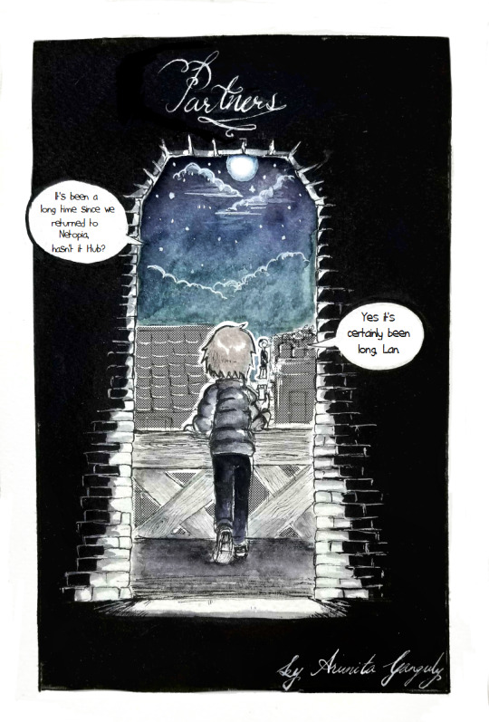
:The Origami King and Queen:

Welcome to this ask blog! I just wanted to say some things to note when asking a question here + some info about this au:
1. This is an au, so the characters have slightly different stories/personalities than those of the original characters from Paper Mario: The Origami King.
2. Please don't ask anything extremely inappropriate (no nsfw). Your ask will probably be ignored you if you do. (Sorry, but that sort of stuff just makes me really uncomfortable :/ )
3. I will (make an attempt to) draw in response to any asks you make. I usually use the line tool to make art that looks more clean. (My signature can usually be found near the characters I draw and is read as 'Riri', but I don’t usually sign ask responses.).
4. If you want to ask me a question, feel free to call me Riri or Riraro (my pronouns are she/they, just to let you know :D ).
5. It may take a while for me to respond to an ask. I will usually begin drawing for a response the day that I see it (if I don’t have a ton of chores/homework to do). It takes approximately two hours for me to complete a decent looking drawing so please try not to ask multiple questions within the span of 6 or so hours.
6. This blog will probably be much slower during school weeks. Don’t worry though! I’ll do my best to respond to any asks I receive. (Hopefully I’ll remember to check Tumblr every once in a while ;^; )
7. My art style is pretty inconsistent. (I don’t think I’ll be able to fix this problem anytime soon, but I’ll do my best! ^-^ )
Thanks so much for checking out my blog!
Summary of the au’s story (if I haven’t finished the story or for people who don’t want to read it): Olly runs away from home, and somehow manages to cross the Great Sea in order to make it to Toad Town. Because he used up all of his energy, Olly passes out. Then, he is found by a toad named Payne T., who essentially teaches him that the Origami Craftsman was not intending to be unkind and helps Olly make up with his creator and Olivia in time for them all to take part in the Origami Festival.
Here’s a crappy picture of Payne T.:

12 notes
·
View notes
Text
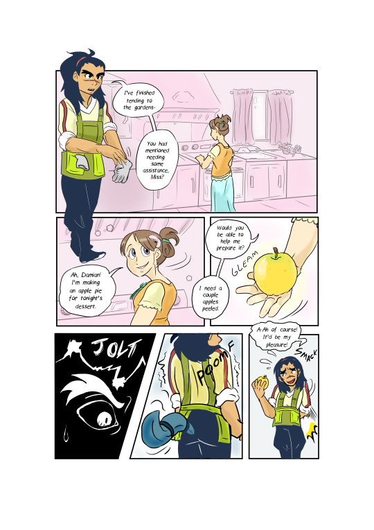
Art Feedback Session - Spookydoesstuff


"Our task was to make a mock intro to a show using our own original stories, either ones we had in the past or ones we made in class. I used Adobe Animate, which isn't very traditional for art to begin with.
I wanted something dramatic and more anime-esqe (inspirations being Persona 5's 2D animation, as well as the Cowboy Beebop intro.
The render itself didn't turn out as high quality as I had hoped, but that's on me for not figuring out how to render in a higher quality. With my time crunch (I had put off working on this until I had 1 1/2 days left, on top of a project for another class.)
I feel this could have been better? But I'm satisfied with it. I just wished someone had said something, even just asking about my characters (I dont generally ask here, at least about these specific ocs, just because I've had them so long and I want to give out more of their story through context and art. But in that class no one had seen them before and I would have loved explaining their story better than just 'alien cats')"
-- Spookydoesstuff

So! Let's start with the good. The color contrast is lovely, the bright red against the monochrome is a classic high tension color combo that really sells the adversarial stress of the scene. The characters themselves each have their own unique silhouettes, which means if you just filled each of the characters in with pure black and then showed me their reference sheets I could easily identify which character is which. The line work here is very crisp and clear, which for animation lends very well to streamlining and simplifying things. Your style itself applies very nicely to an animation style, again, thanks to its general simplicity will make the whole animation process much easier than a more detailed or complex style or design.
When thinking of areas of improvement, the first thing that is brought to my attention is expression. With the four-eyed cat in the second image, at a glance it's hard to see he's furrowing his brow a bit and his current expression comes across more as a neutral expression than a concerned, worried, or frustrated expression. I would recommend here adding a bit of emphasis on the expression with the eyelids or eyebrows so that it goes into the general shape of the eye instead of just above it or add a stylized eyebrow so it is more visible against the dark fur. Due to the thin line art, the line that marks where he's furrowing his brow is hard to spot.
Your art would also benefit from expression through body language! Cats, in particular, are incredibly expressive through body language. The ears in particular here are showing no emotion- Cats when anxious, scared, or angry will pin their ears back. Perhaps a bit more emphasis on bristling fur too- in the nape of the neck and the tail. Fluffing of tails is not just fear, but also aggression when raised high or thrashing. When curved it's fear. The nervous cat in the second picture might want to be keeping her head a little lower, as nervous cats will duck down, especially if submissive. Of course, since these are not standard cats, you are welcome to take these cat behaviors and alter them to your alien culture's standards! Go wild!
Also, look into playing with the line of action a little more. Even with characters that are standing still, exaggerating some curves in their body will add a hearty dose of personality. Plus, look into the 'law' of stretch and squish- I use the term law here loosely, it's more of a guideline.
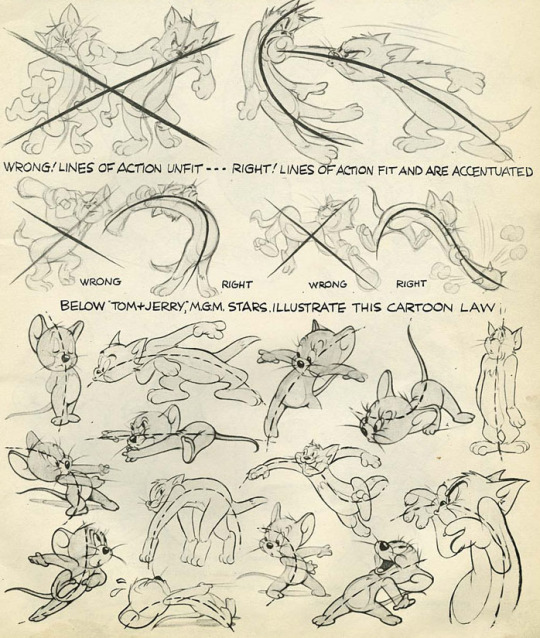
(Here are some image scans from a book called Cartoon Animation by Preston Blair, and there's a lovely tutorial on expressions from the comic Lackadaisy here!)
Next I'd like to mention the shading. There is a bit of an inconsistency between the way you shaded each character. Although lighting direction was ignored for style here, the particular techniques used for each piece should remain the same throughout each frame of an animation, each panel of a comic, or between related images in general. In the second photo, the highlights on the four-eyed cat almost looked like fur patterning, so maybe refining that highlight by making it a little darker would make it more obvious it was a highlight and not a change in fur color?
I think if you were given a little more time you would have managed with the shading, but still something of note to keep in mind for the future~
Finally I would like to address the environment... or the lack of it. The bright red background is lovely, especially in this grey scale-pop style of colors. My only issue is that it feels like they're floating in some red void- you have the darker red to denote the ground, but it doesn't feel very consistent with where the characters are placed and there's no shapes in the background to denote any kind of environment- no tree silhouettes, no building silhouettes, or any other objects that could denote where the characters are.

Above is an example from Persona 5 which kind of shows what I'm talking about. Looking at some perspective tutorials will actually show you a way you can manipulate the floor or gradients to help add some solidity to the ground. With this style I wouldn't even say you would need to add nearly as much detail to them as Persona 5's art- just some dark shapes and perhaps a gradient of sorts to give a sense of location to the scene would help.
Overall, wonderful job! My first impression was 'Oh hey this looks like something from Persona 5!' so you really got that feel you were looking for. You also immediately get a sense of relationship here- from an outsider's perspective with zero previous information on who these characters are or how they are related. You can clearly tell the four eyed cat is protecting the female cat in the back, and there's a sense of either accusation from the one-eyed cat or threat, and that the other two almost seem to be distressed as if they were once close to this character.
Keep up the good work, don't feel discouraged with the lack of feedback from your class. I really feel with a bit of practice in terms of expression and body language you can really make some great waves with your art! You have a great foundation.
In terms of art program recommendations, my wife and I both use Clip Studio Paint. You need the EX version for feature length animations unfortunately, but the PRO version is much cheaper and lets you do some very short animations however it is a very powerful illustration and comic tool as well. Krita is a totally free program that will let you animate as well and has a pretty robust illustration feature itself, but I'm not sure if it has anything specific for comic making.
A big thank you to Spookydoesstuff for being our first review and for being so pleasant to speak to! Please check out more of their art and their blog by clicking here to go to their tumblr!
7 notes
·
View notes
Text
The Longest Library #3: Griffin & Sabine by Nick Bantock (Or, Eidolon again talks way too much about previous relationships, also, pretty art!)
(This is a series in which I attempt to read and review all (or most of) my library of 297 books.)
Rundown: Postcard artist Griffin Moss gets a weird letter from a weird lady who can apparently see what he's drawing telepathically. They form an ill concieved bond over it. The story is told in colorful postcards and envelopes you can open and then read the mysterious things inside. 4.5/5 for calling me THE FUCK OUT and having some BOMB ASS ART.
I can't give it a full 5 because not everyone is going to have that experience when they read this. It's just going to look very strange and floaty and things won't make very much sense. This book hits close to home with me because it heavily echoes (more like yells about) my first long distance relationship. I'm not really able to see this book through any other lens, so that's what my commentary is mostly about.
So for the part that ISN'T about that stuff though: The art is amazing. Even though it's made by one person technically, both fictional artists have their own, distinct style. Let's be real: The art and the interactivity is the main draw of this book. There are envelopes inside with letters carrying a myriad of little details: Griffin uses a typewriter for his long-form letters, and bits where he's crossed out typos or added in letters with pen, or that Sabine's correspondence is something I now recognize as someone who uses quills or manual dip pens. The inconsistency in the color of her writings suggests she's using a homemade ink, brownish in color, slightly too watery. Maybe it's even watered down watercolor and not even ink at all. They've also made the background of her letters and cards a rich dark gray, while Griffin's is a clean, sterile white.
"Will you explain to me about those geometric paintings you did at Art college? I want to understand their hidden language of color and shape. It's so alien to me."
So this is about the fourth time I'm reading this book since I first got it, and now that I have to write about it, I'm noticing so many more details. Here the line "It's so alien to me."is written in smaller, slightly more rounded letters. The ink is much darker here too, suggesting she wrote this slowly, thoughtfully. What a detail!
Anyway that's it for the objective bits of the book, the rest is entirely subjective from here on out.
"The phenomenon that links us has taught me much about you, yet I am ignorant of your history."
My years and years of suffering emotional abuse set me up to be able to read and predict what was going on in your head perfectly, as well as respond in the most helpful ways with eerie precision, yet I am ignorant of your history, and who you really are (because you use such obtuse floaty language and metaphor. Who were you really? Suffering, but that's about all I could tell.)
"Why doesn't this alarm me as much as it should?"
Because we're already "in". And I "feel safe" to you because I've been trained to be the least offensive, most placating being in the universe. If I could build a business model on conversational comfort, if I could sell my goddamn empathy like the capitalist machine really wants me to, *I'd be so rich*. It would be like, a step down from therapist. Anybody want a virtual friend for like an hour? Gimme 20 and we can watch stupid videos or I can calmly talk you through bread making. It's okay, you can cry. GOD PLEASE LET ME JUST SELL MYSELF SAFELY, I WAS MADE FOR THIS GODDAMNIT.
"I want to hear everything. Write in detail. Tell me all about yourself. I demand to know - please."
This is like fucking CRACK to those with a suppressed self. An unwitnessed self. "Someone who's interested in ME, and won't yell at, ignore, or dismiss me for talking! Holy fuck I love you!"
"Finally I knew who you were. I counselled myself to be cautious and find out what you were like before revealing myself fully."
Sabine at this point is to the reader who I was to Him. A weird mythical creature, the non-human monster of your lonely adolescent imaginings, who is intimately aware of your secrets, "I've been watching you" it says before introducing you to a wondrous world free of the pains of living, where you actually feel loved and all is well forever and ever. Except I wasn't as inhuman as I wished to be.
"Occasionally I'd come home to a re-enactment of The Battle of Britain in the front room. [...] My entrance would make no difference to their dogfight, but when one of them accidentally (and inevitably) knocked over a pile of books, they'd stop instantly and unite to examine the extent of the damage."
The whole 'making light of a not-great home life because it was your normal for so long that you still haven't learned that you need to be horrified about it' thing. As well as passing it off as something funny. Thankfully this character's parents (SPOILER?) get literally run over by a truck and he gets sent to live with his mom's step sister who is really good and lets him ditch school to become a potter's apprentice and eventually go to art college. He never really deals with the grief when the step sister dies, OBVIOUSLY.
"And hearing that my existence eased your pain made my heart race. We have found one another, and I give thanks."
Hearing that my existence wasn't going to be punished but instead, made someone happy? Fucking HEROIN. Downplay it a little with grateful gentleness, I don't want to be punished for being presumptuous or for seeming like I like it too much. If I like things too much they get destroyed, hard.
"My kinsmen are responsive to me - but there is no one to reach my heart, and you who are so far away, have been closer to me than any man on the Islands."
This is something I remember. So far all they've done is shared eachother's life stories and gushed about how close they feel now. She (like my past self), has confused the feeling of 'finally, a witness! they're witnessing me! I've been Seen!' with the feeling of attachment. Of course she would feel infinitely more attached to this man. She's witnessed his most private moments as a creator for a good portion of her life. It's been a mainstay throughout her adolescence through adulthood, so of course an unwarranted sense of intimacy is going to be attached to this mysterious figure. The whole thing wrapped up in a dream like sense of mysticism.
"I remember your first erotic drawing; I was trembling from head to foot by the time you'd finished. Was that Sarah? No don't answer; I'm only teasing."
...Unless? (Man the implications hurt to think about. I REMEMBER THIS FEELING. This author has unintentionally called me out. I wonder how much of Sabine’s writing is actually calm, or if she’s reigning herself in almost constantly?)
"I was finding it hard to get over the idea of there being other men in your life when I reached the part in your letter about my erotic drawings. I stopped being jealous. We were lovers and I hadn't realized it. The drawings weren't of Sarah; they were of you."
ow ow ow ow ow ow JUST SAY IT ow ow ow ow, Also, I REALLY wanted her to be like 'bitch that looks nothing like me, what the fuck', but instead she's all like "So you've been making love to me ten thousand miles away - how tantalizing." URGH. TOO CLOSE, TOO FAST. DISENTANGLE YOURSELVES NOW. GRIFFIN GET HELP.
"I had failed to understand how unhappy you are. You cover up with jokes and a front of being self-contained. I'm worried for you."
EVEN SHE SEES IT, GET HELP.
"When you found me, I thought my loneliness had gone for good. I was kidding myself. I desperately desire your company. I haven't talked to anyone in three days. I was sure I was going to start seeing your pictures like you see mine. I've tried so hard. [...] How can I miss you this badly when we've never met?"
BECAUSE YOU MISS HUMAN CONTACT AND YOU DON'T HAVE ANY FAMILY LEFT YOU NERD, GET HELP. DON'T HANG IT ON ONE PERSON WHO IS TOO FAR AWAY TO HELP YOU IN THE WAY YOU NEED.
"Island magic works on island souls. You and I will heal eachother."
ANTIDEPRESSANTS MAYBE UUUUGGGGHHHHH
"I've started to hate this city, this country, all these stupid fucking people [...] I finally snapped. [...] I want to know what you look like."
*HEAVILY RECOILS*
"Why, my kindred spirit, are you prepared to settle for a postcard of my face? If you wish to see me, why not come here? What is there to stop you - you're clearly unhappy where you are. Come."
Yes. I offered and I offered and I offered. What's to stop you from just fucking TALKING TO ME instead of DISAPPEARING OVER AND OVER AGAIN. and then COMPLAINING THAT YOU'RE SO HURT AND LONELY. I'M LONELY TOO. WHEN I HAD THE MONEY YOU DIDN’T TAKE MY OFFER FOR ME TO COME SEE YOU, SO WHAT THE FUCK IS UP KYLE?
"Foolish man. You cannot turn me into a phantom because you are frightened."
This kind of sentiment is what lead to the breakup. This feeling of being large, and dark, and slighted. Being real and supernatural. Make your choice. Say REAL words instead of just flagellating yourself. Do I exist to you?
"If you will not join me, then I will come to you."
Unfortunately, Sabine has what I definitely did not: Mobility, the ability to make things real. She had a job and money and her own life and the ability to travel. I had a shitty little shared room in my parent's house where I spent most of the time partially starved and dodging devils in one form or another. Many many times I wanted to spontaneously show up and give him the closeness that he needed. But I couldn't. And he wouldn't take my words. He wouldn’t take me.
3 down, 294 to go.
6 notes
·
View notes
Text
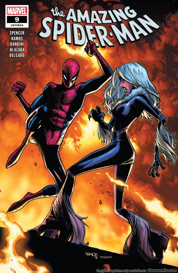
ASM vol 5 #9/810 Thoughts
I wrote this before the arc had finished so please bare that in mind if you read on because I recognize some of it might seem weird or redundant in the wake of the conclusion tot he arc.
Kinda sorta mixed feelings for this issue.
Okay so here are the aspects I DIDN’T like.
The recap page implies that the general public is starting to forget Peter ran Parker industries and that the heroes all think Spider-Man is in the pocket of the Kingpin.
Now recap pages aren’t actually part of a story so they don’t exactly count per se.
But if that is the intention of the author then the series has done a poor job of conveying the former. It’s just ignored the elephant in the room that was Parker Industry.
And whilst Spencer was saddled with that mess a mess it was nevertheless and he’s cleaned up a lot of other things. Whilst I didn’t consider it a mess necessitating any cleaning up nevertheless when Steven Moffat took over Doctor Who in 2010 (technically 2009 but that’s not important) very early on he established that the massive global Dalek invasion everyone on Earth knew about had been erased from everyone’s memories (mostly) meaning that now alien invasions could happen and new characters would react as though they were sceptical of the existence of wider alien life.
Again, this wasn’t necessary but the point being was that Moffat put the work in to fix something he perceived as a big problem that resulted from the prior regime. Spencer has been doing some of the same here but not addressed that biggest of elephants in the room that from it’s mere announcement the fanbase was collectively calling out as something that would fuck over the series going forward. Because absolutely not would the general public just forget who Peter Parker was in regards to PI, let alone the company itself.
As for the Kingpin thing, I never thought about it until just this issue but I kind of have issues with it now. Because even if the other heroes do not know Peter’s identity surely they DO know Spider-Man and/or Kingpin well enough by this point that they’d not presume Kingpin and Spider-Man to be buddies.
I mean there ARE ways to explain their feelings, like if they presume Spider-Man to be an imposter or something but him being on the outs with the other heroes merely because Fisk put on an appearance of them being friends in spite of their years of animosity shouldn’t make the heroes automatically resentful towards Spider-Man.
Again, it can work but Spencer needs to better elaborate upon it.
Moving in I did have a few issues with Felicia here. At first Spencer seemed to have her acting vindictive akin to stupidity of Slott’s run after SpOck sent her to jail. But then he explained why she was actually miffed at him and it made more sense.
Well sorta.
On the one hand Felicia has always been in love with Spider-Man and so if in character Felicia should jump at the chance to sleep with him if he propositions her. On the other hand though she does say Spider-Man was being creepy which and we get a mere snippet of what he was doing, so presumably he might’ve gone further than that.
The other thing I didn’t like was Peter’s attitude to Felicia. Hey I’m all for ignoring stupid continuity if you are trying to fix things, but here...that isn’t happening. Peter is treating Felicia as an old friend but she hasn’t been that since 2009 and he’s still lying to her. Maybe that will be fixed next issue and their old relationship established but right now it is problematic.
Oh and also the issue seemed to treat their old relationship as being messed up due to Felicia’s criminal tendencies when that wasn’t it. They hooked up in a monogamous relationship 3 times and whilst that was why they broke up the first time that wasn’t what happened on the second or third occasions.
Finally I wish Spencer wasn’t maintaining Felicia’s tendency to be evil. Being a Robin Hood style character okay sure. But here she is basically what she was like in 2009 (except not made into a vessel for Joe Kelly’s midlife crisis sexual fantasies) but if she’s still like that her character is still in need of repair.
Now this isn’t to say I hated every moment they interacted. Far from it. it was more on point than it’s been in a long time and much improved over BND and Slott’s run. So within the context of post-OMD Spider-Man it was good but within a wider context there are still problems. It is at least written better than before, I especially loved the acknowledgment of them making for a good team.
Finally I disliked the art. Common criticism by this point but it stands.
That’s everything I disliked but on the more positive side of things I felt that the general plot of the Thieves Guild is still a fun idea.
The Thieves Guild are an X-Men/Gambit concept but Spencer has put enough distance between them that this NYC chapter of them can be played enough as a ‘Spider-Man thing’. And the notion of them swiping all the paraphernalia of superheroes through the power of super thievery is a fun superhero plot.
I also don’t mind Felicia being a member of their ranks. I mean I feel like if she always had that tattoo Peter would’ve noticed by now, but there are numerous ways to explain that. If nothing else I love the scene between Felicia and her Dad, because it humanizes her, touches on her origin and allows her to be more her own character. I feel there is so much potential to be exploited from exploring Felicia’s relationship.
Now in spite of all those complaints I actually loved this issue because of the Mary Jane subplot. There are some feelings I’m wrestling with in regards to it though but on balance I think this was ingenious on Spencer’s part.
Okay first thing’s first. The artwork by Michele Bandini looked really nice. If you are going to have two artists work on the same story dividing them up based upon the subplot and the main plot is actually a pretty clever idea. I didn’t know there was going to be two artists actually and so when I checked out the preview pages before the issue’s release I was confused as to why Ramos’ style looked so much better from one page into the next. I wish Bandini had done the whole story to be honest.
But onto the subplot itself.
To begin with it’s just lovely seeing Spencer actually give MJ a subplot of her own and focus upon her. And it’s good focus too. So far he’s not really mishandled her in this story at all so Spencer seems to be a decent MJ writer. I hope this trend continues and the relative lack of Mj/his use of MJ within his first two arcs was more about building up Peter and also paying tribute to Superior Foes which landed him this job in the first place.
I didn’t see the Carlie twist coming. Honest of all characters that reveal could have been she was the farthest from my mind. For some reason my mind was fixated upon Bobby CCarr or Jonathan Caesar somehow.
Now Carlie is...controversial of course.
Carlie was one of the many lame Brand New Day era characters with her status made worse than many of the other ones because
a) She was at times a Mary Sue
b) She was pushed hard as the new love interest. I mean really, really, really pushed hard
c) She had an inconsistent character design
d) She was at times bland and at other times just...not nice. See her considering getting a Green Goblin tattoo to piss Peter off. Yes she was drunk but I don’t care how drunk or angry you are that’s like considering getting a Nazi tattoo to piss off your Jewish boyfriend. You are just nasty at that point
e) She was an idiot during Superior despite being the most sceptical person of Otto
Carlie to say the least was HATED by the fandom.
Now look let’s not sit here and pretend the fandom hate went beyond what was warranted by the character. She was treated as an 11 on the ‘this character sucks’ scale.
But that doesn’t mean she didn’t score a very solid 7 or 8 if you catch my drift.
Here though she is arguably written better than ever before, not in the least because most of those problems listed above are being avoided or addressed.
Rather than being an overcritical and judgemental asshole like in her last appearance who either attributes blame to Peter for the horrible things happening to her or else makes it clear the nature of who he is means he’s doomed to misery because no one could put up with that, here she acknowledges none of it is his fault and he deserves happiness.
Spencer does drop his continuity ball though by listing off the wrong reason for why Peter and Calrie broke up. According to him Carlie couldn’t handle dating Spider-Man but in reality it was the fact that he was lying to her that was the problem.
Whatever though, nobody cares why Peter and Carlie broke up, so long as they did.
Similarly, if Spencer wants to try and rehabilitate the character who neglected to inform her ‘friend’ and roommate that she might be dating a villain without realizing it, okay let’s give him and this character a second chance. If Carlie wants to say she always liked MJ in spite of her douche actions lets draw a line under it and try again.
Now we move onto the meat of the subplot. The support group for superhero supporting cast members.
This idea gives me some mixed feelings and it somewhat depends upon how it is handled going forward.
On the negative side, I do not want this to turn into a subtextually critical evaluation of how MJ handled life with a hero in a past or how older runs did. Also the story is somewhat ignoring how MJ DID have people she could talk to about this in the past, like Felicia and Aunt May. But currently neither character knows his secret, might not be finding out anytime soon so okay I guess I understand why Spencer is treating it this way.
I think Spencer’s putting in little lines of dialogue and presents a resistance within MJ to joining the group which makes it clear to us that, whilst Carlie felt alone and unsafe keeping Peter’s secret, MJ doesn’t feel quite like that even though it might be a struggle all the same.
Which is in character, remember she kept his secret for years beginning with AF #15. Similarly MJ has had issues opening up to people in the past and has seen first hand the cost of exposing Peter’s secret.
Now in spite of all I’ve said, I cannot tell you how much I ADORE the idea of a support group for super hero friends and family.
If Spencer plays this right it could wind up as one of the mainstays of the Marvel Universe’s architecture, like Night Nurse or what have you.
It just makes sense as a piece of world building for the Marvel Universe and is an emotionally engaging idea that ANY comic book series can pick up.
Moreover it highlights the innate quiet awesomeness that is Jarvis. Jarvis is like Alfred but to the whole Avengers and one of the most bad ass bad ass normals in the whole Marvel Universe so highlighting him as this proactive, helping and caring individual is appreciated.
This idea is a great addition to Peter and MJ’s relationship too as it gives Mj something to do aside from wait by a window and counters one of the most frequent weapons in the anti-MJ/marriage brigade’s arsenal.
“MJ can’t be with Peter because it’s worse than being with a cop because they get to talk to other cop’s families. It’s just so toxic for her!!!!11!!!”
See Fred Van Lente’s piece of shit MJ story in ASM #605 for proof of this.
But right here Spencer finds a solution to that complaint (which I’m sure the anti-MJ brigade just love him for) and one that makes justifying breaking them up again a lot harder.
Also guessing who all the people in the meeting was turned out to be really fun.
Over all I loved this issue because in spite of my problems with the Felicia end of things the MJ end was brilliant.
p.s. Isn’t it a little weird for Spider-Man to not remember what ‘Spider-Man’ did when they were separate people?
I guess you could argue that his memories from ‘Peter’ might be hazy too. Or that this weird science comes with ‘rules’ like that, e.g. one side has to dominate the other.
#Spider-Man#Black Cat#Mary Jane Watson#Mary Jane Watson Parker#mj watson#mjwatsonedit#Felicia Hardy#peter parker#Nick Spencer#Michele Bandini#Humberto Ramos#Marvel#Marvel Comics#Marvel Universe#X-Men#the Black Cat#Amazing Spider-Man
29 notes
·
View notes
Text
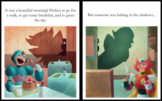
2018 Megaman Valentine’s Day Contest Results Thread!
Thank you all for your patience this year! I know this is a little later after the holiday than I would like, but one day is simply not enough to contain all this love! Once again, it’s always wonderful to have an assortment of both familiar faces participating, as well as many newcomers.
As always, this will be a rather massive thread, so bear with me. Most of it will be hidden after the break, so please do take a peek at all these wonderful entries!
Due to the size and sheer quantity of comic entries, there are plenty of images to view. For that reason, I’m sticking to thumbnails for now. Please click to view the entry in it’s full glory!
Also, my thanks to @jaybird-c for the help with judging this year. I’ll have some of his commentary with my own below.
The three raffle prize winners will be noted by their alias, as well.
For your reminder, there were two categories, broken down into Humor and Talent. There were 6 total Humor entries, and 14 Talent entries. So, to start off, we’ll begin with the category with the least entrants, and to fit with my tie-in promo art.

*EDIT* OK, now I think everything is good. So long thumbnails, to keep this shorter.
Once again, for an easy link to all the images in a single gallery, please go here: https://imgbox.com/g/uAbXkTDaot
Otherwise, I’ve tested it again on both mobile and desktop, and everything should link to a full image. It still does on my end.
*/EDIT*
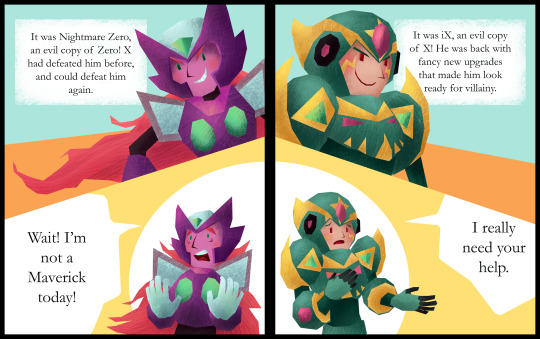
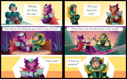
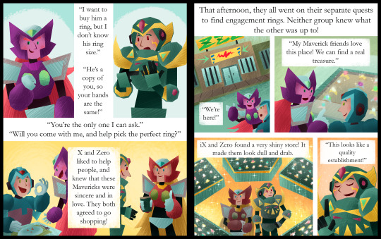
For Humor, this year’s theme was “Beauty and the Beastman.EXE.” The goal was to illustrate a mismatched Megaman couple, one in a monsterous, beastly form, with another more beautiful character that falls for them. Any allusions to the popular tale of Beauty and the Beast were welcome, but not a requirement.
Here are your top 3, followed by the remaining entries in alphabetical order by alias:
1.) @prar-draws: (*Prar wins $100 USD or an item(s) up to that value.)

Jaybird wrote: Prar's comic has the absolute best execution of a joke, increasing the tension until the last panel when it masterfully throws the audience for a loop. Prar's style complements the story very well by making each individual moment easy to digest, and the last panel also just happens to be really funny to look at on its own. Just thinking about it makes me crack up.
Miyabi wrote: While this piece really contains more tension and drama until the final panel, I agree that the build is what helps bring the big laugh at the end. You can also see the temperature rising for Ciel, as her cheeks get redder and redder as the panels move along. I felt it tied in to the Beauty and the Beast storyline nicely, and your chosen characters fit well to pull off the connection. Very cute, and well constructed comic!
2.) @amiable-apparition: (*a-a wins $50 USD or an item(s) up to that value.)
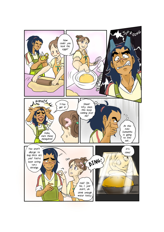

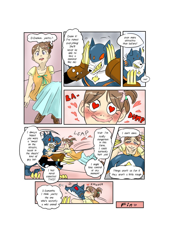
Jaybird wrote: I don't remember this scene from the Star Force anime. Must've been cut from the final release. Clever use of trickery regarding who the real "monster" is; poor Damian appears to have misjudged the situation something fierce. Good idea and use of twist.
Miyabi wrote: I guess Sam was the one who was ‘Hungry Like the Wolf,’ after all! I too enjoyed the spin at the end, it was a funny deviation on how her character was portrayed in the anime. Subject choice was strong here too, connecting the theme with a couple characters who fit well with the concept. Nice work with the variety of panels you created to set things up.
3.) @frankenchio: (*frankenchio wins $25 USD or an item(s) up to that value.)
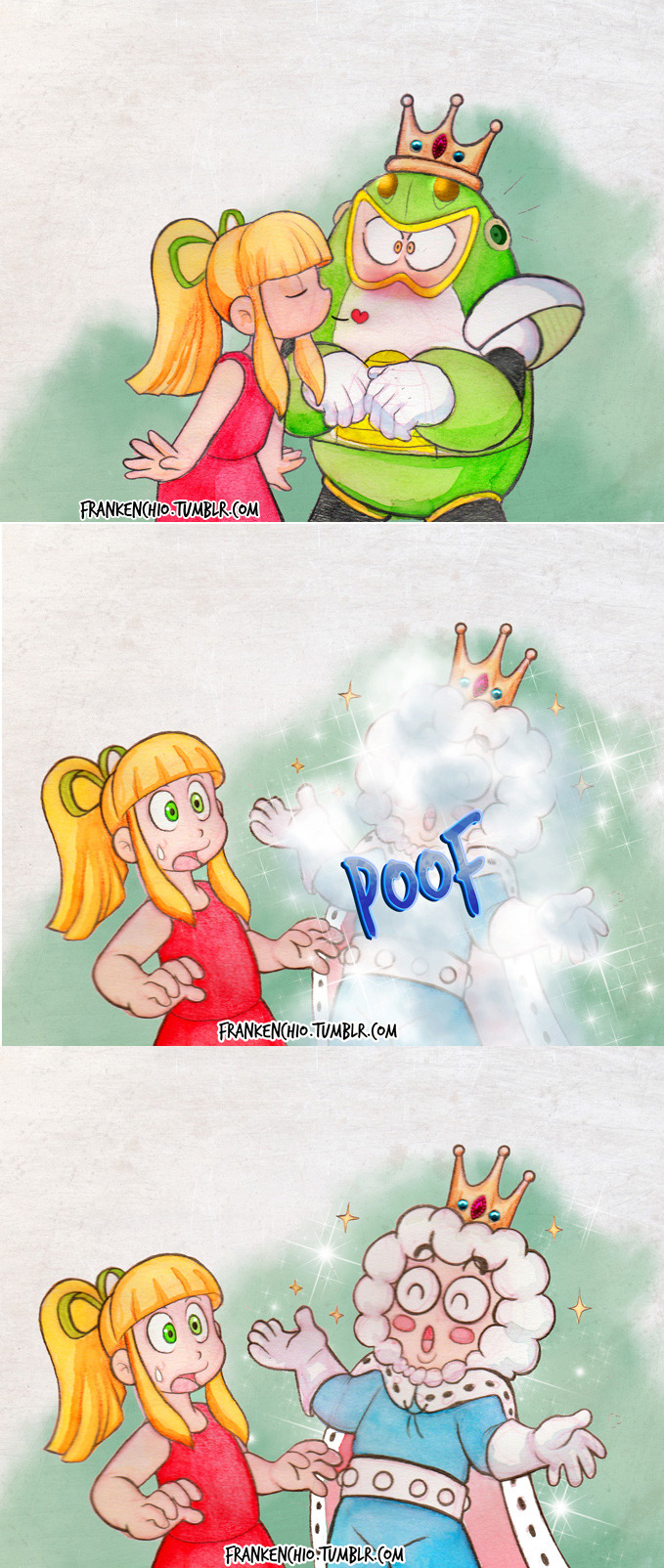
Jaybird wrote: Ah, the Princess and the Toad Man. Frankenchio's piece is a clever little reference to the classic fable, but most of the humor is in how Roll apparently didn't know what kind of prince was on the other end of that frog. Clever, pretty to look at.
Miyabi wrote: I like that you thought outside of the box with the theme, and used a totally different classic tale, but still connected it very well. Ice Man sure lucked out this time, after whoever cursed him into Toad form. While a simple few panels, your style is just adorable. Those jewels on the crown look really detailed!
Close, but not quite ~
Dark Dullahan:

Jaybird wrote: Dark Dullahan has the idea of recreating an actual Disney scene with Iris and (Zoanoroid?) Zero, which is very sweet. It took me a few repeat looks to digest what was going on here but it's amusing to see Zero protecting his wounds from the fierce and terrible Iris. Because she's obviously the worst thing that can happen to him. Cute, amusing scene.
Miyabi wrote: Sorry, I don’t know why this upload defaults to a side view, when I don’t even have it at that orientation. It automatically glitches that way, no matter how I upload it. :/ Anyhow, a clever spin using the EXE versions of Zero and Iris, living in a world where only reploids...no wait, they don’t exist here. This Beastly ZoanoZero will open up to her over time, I’m sure. But first, he needs to heal up. Again, good use of parodying the scene.
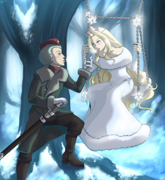
@drewblossom:
Jaybird wrote: The sheer concept of Rock-Belle made me wonder if they were going to throw in an FMA reference somewhere, but Drew's picture doesn't need it. They make good use of the Disney-classic-gone-wrong idea -- Oil Man and Time Man as Lumiere and Cogsworth are nearly inspired --though I think they didn't quite go far enough and should have rounded out the piece with a more feminine version of the suit; Rock-Belle changing into Mega *Man* raises questions about whether the main character's an actual girl or just a cross-dresser, which distracts from the joke.
Miyabi wrote: I guess Rock is both the beauty and the beast, for totally destroying those poor innocent talking inanimate object bots! While I had a good laugh at the quick-change blast, the character reactions, and the overall parody of the classic scene, sadly I did feel it just didn’t quite have the couple contrast/Valentine’s theme as well as others.
@erekisaiko: (*RAFFLE PRIZE WINNER* Captain N Height Chart)

Jaybird wrote: I feel like I'm missing a reference to something else. As amusing as the concept of JunkMan's and Meddy's unsanitary hospital sounds, the picture doesn't present us with enough information to make sense of what actually happened (i.e. why was JunkMan wearing a cardboard Falzer costume in the first place?), and [=ClockMan's=] joke lacks the punch it ought to have because the punchline has no set up. (Unless of course this is all just an incredibly obvious reference to something I've never been exposed to that would fill in all the missing context). Amusing concept in punchline, it's fun to think about how this situation could've arisen.
Miyabi wrote: Meddy’s not oblivious, she just has a big heart ready to heal any messy, junky slob! Cute and different idea having more of a ‘fake’ beast, although I think Junk still would count as a beastly character on his own, in some respects. Very well-drawn, and appreciate all the detail you put into your internet background.
For the talent category, the theme was “If You Like It, You Should Put a Ring Boomerang On It.” This category was all about proposal scenes. And I am shocked there was not a single Jewel Man! XD
Here are your top 3, followed by the remaining entries in alphabetical order by alias:
1.) @wintesm: (*wint wins $100 USD or an item(s) up to that value.)


Jaybird wrote: Jeez. Unrelenting Style. Your children's book painting is incredible as ever; your figures, your colors, your atmosphere, just about everything. I ran into a problem with your composition, though; the stark black page divider clashes with the predominantly horizontal-mirror structure and makes it hard to wrap your head around the story as its meant to be told. It was less of a problem once I trained myself to ignore it, and you use the divider very effectively in the second-to-last section, but it still made it harder to enjoy the work. Masterful technique, colors, perspective, expression.
Miyabi wrote: With your subjects, I felt this composition was a very clever way to tell the story, and kinda mirror their separate, but similar tales side-by side. As mentioned, you have such a fitting children’s storybook style, from colors to shapes, that shines once again! It’s a cute tale for such evil characters!
2.) @peach35: (*peach wins $50 USD or an item(s) up to that value.)
Jaybird wrote: Peach deserves a lot of credit for her mastery of figure-drawing and perspective. That's something a lot of people struggle with, and accomplishment in these matters should be recognized. Another good choice of simple background to highlight the main moment, and awesome use of colors and lighting to suggest 3D -- I'm far more fascinated by Gate's nose than I should be. Incredible faces, hands, colors, and general shading.
Miyabi wrote: The sense of confused shock on Alia’s face is a different reaction that most, as it’s apparent Gate is slipping that ring on in total surprise. Clean lines and soft lighting helped this piece stand out.
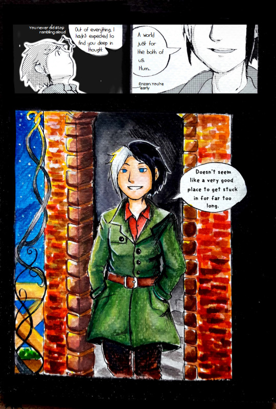
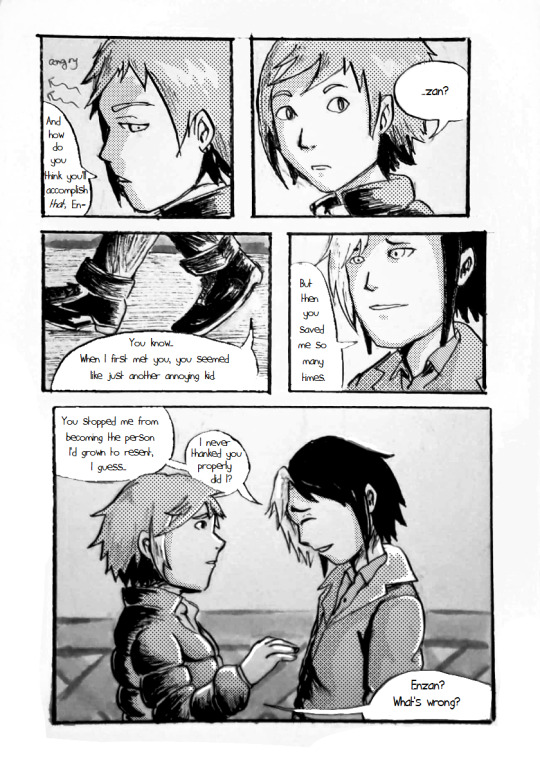
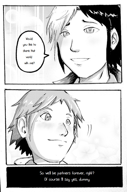
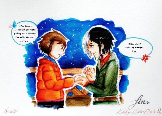
3.) @tianura: (*tianura wins $25 USD or an item(s) up to that value.)


Jaybird wrote: Tianura's style is difficult to read; the line quality can be inconsistent from panel to panel, some attempts to convey 3D positioning could use polish, and the panels never stray very far from simple torso and head shots. That said, the expressions are exceptionally clear (again, look to the eyes) and convey lots of emotion, and the page-by-page composition is very good. Very expressive faces, judicious use of colors for effect.
Miyabi wrote: I thought this was a creative parallel for life-long partners in using Netto and Enzan. You did a nice job keeping Netto’s goofy charm intact, with quite a few humorous lines. The ending was totally fitting for him, older or not. XD While I’m sure you would have liked to color the whole thing, I liked the differing use of screentone shading. And the watercolor look of the color pieces did give it some storybook charm as well.
Close, but not quite ~
@borockman:

Jaybird wrote: It's such a shame this isn't a humor category, because this deserves major points for funny (the Nana-Sigma romance anime that the fandom doesn't want, but nonetheless deserves). The linework itself is pretty good. Expressive, good use of background for mood. Also, Sigma, the ring goes on the ring finger.
Miyabi wrote: It’s a dream. It’s always a dream! Siggy puts the ring on her pinky because Nana’s his ‘lil pinky-poo... ;p With the tears running down her face, I really did like the emotional feel of the moment.
@digitallyfanged:
Jaybird wrote: In terms of sheer atmosphere, this is one of the best pieces. It looks like a still from some fairy tale picture-book. The forest scenery, the background, the flower-swing, the misting breath, the quality of the outfits and the details on the dress and sword all make this exquisite. Unfortunately the characters aren't quite as expressive as they ought to be -- this is very clearly a fairy-tale love scene of some kind, but what kind? Laika is clearly being emotional towards the princess, but what is he saying? "Who are you"? "You're beautiful"? "I love you"? "Be mine forever"? It's gorgeous, but it's a little too vague to tell whether it's on topic or not.
Miyabi wrote: Gorgeous scene that felt a bit like another Disney-ish tale, moreso of the Frozen variety. They may just be easy-to-use Clip Studio effects, but I really thought it was quite creative how you pulled off the swing design. The watercolor forest background is beautiful, as is Pride’s snow princess outfit. Pretty, pretty picture!
@drewblossom:
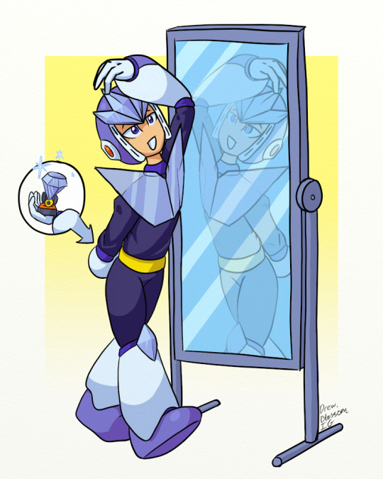
Jaybird wrote: I'm glad I saw Drew's title, because it took me a minute to figure out exactly what was going on -- for a moment I thought Geminiman was trying to propose to himself with that (fittingly) gaudy diamond. The linework is pretty good, and I like the lighting effects on Gemini's crystals and the translucence of his chest plate. I'll give them points for an ambitious concept, but the best mirror art looks at a scene from two different directions, and Gemini's reflection is simply a reverse of the main view. Good colors and lighting, elegantly simple background that does a good job of highlighting the main action.
Miyabi wrote: No better way to practice a proposal than to recite it in front of your self. Of course, if he is proposing to his clone, then I think with his nonchalant actions, he’s got this down already. XD Clever, and unique!
@hyperbole1729:
Jaybird wrote: This piece is another mix. It has some very nice things -- the colors are spot on, the composition is very nice (you take cues from the 18th century Romantic movement by having the whole world revolve around the subject), you clearly pay attention to character details, and your field of flowers is great.
Miyabi wrote: Another set of net-battling partners who seem like a great choice for being together forever. The background is a fitting place for Sal to do it, because I don’t quite see Miyu being the one to speak up and propose. That might be more of a frightening proposition. LOL Cute, traditional scene.
@iris-sempi:
Jaybird wrote: Iris-sempi's got style. The colors are interesting, the subject is clear, the linework pops out because it's -also- part of the colors, the cartoony elements fit in very nicely, and the presentation as a literature/manga cover is well-done. The technique is some of the best I've seen. That said, I have to ask, if you were going to go through all the trouble of creating such a cool cover, I think it's only fair to point out the title is blocked by the artwork, which defeats the purpose, especially on something's Volume 1.
Miyabi wrote: Just to clarify for everyone, the Japanese characters for this piece say "Let's Get Married" and "Sea Salt Honey." I thought it was a really clever mag cover format, where the characters really pop out against the pink background. With the waves, it really does feel like Splashy leapt out of the ocean to smack some salty sugar on Honey/Vesper Woman. Her vibrating antennae give some nice movement and comedic effect, too. Love it, but felt it just didn’t quite have the proposal feel as strongly as others.
@jb-artist: (*RAFFLE PRIZE WINNER* - Megaman 8 cel)

Jaybird wrote: JB's picture is very cute, and we don't have much actual oekaki here, so props. While you deserve even more props for how direct you are to get to the point, it's difficult to judge how we're supposed to interpret this -- is Alouette precociously misunderstanding the nature of a marriage proposal or is it an actual proposal to her older sister figure? The perspective rocks, the colors and lighting are good, and there are lots of little details that portray lots of love for the Zero series.
Miyabi wrote: Zero’s such the silent, brooding type, that he sends Alouette to do the proposal for him. I’m just not sure if that will help or hurt his rank in this stage! XD It is honestly really cute, especially when you see her doodles on the resistance base’s wall. I think that makes the piece more than anything, and was a clever callback to the game. I like how you set up the scene with the background, and those are some really nice mountains back there, too.
@lightlabs:

Jaybird wrote: Now this is pretty. Great composition to direct us through the piece (-nice touch- on giving the ring some bling) and rocking use of paint swatches for style. The art does a great job of directing us into the center, and the warm colors in the center do a lot to convey mood. Zero, you smug jerk, stop showing the rest of us poor schlubs up.
Miyabi wrote: Yes, this is happening. There is a reason for me to go on. What...what am I using this line foooorr? The warm colors and sparkles give it a unique glow, for what seems to be a night scene. The brush strokes give it a neat paint brush look, for your coloring, too. Nice work conveying their emotions with their expressions as well.
@pandapanic0:

Jaybird wrote: In terms of actual skill, the coloring is good and clear, the piece is composed well, the lighting effects are fairly elegant. If it were the actual humor category, the Ring Man's appropriately outlandish bid and Mega Man's exceptionally feminine reaction would gain the piece lots of laugh-out-loud points.
Miyabi wrote: Thank you for taking the title of this category literally and going for the humorous visual of a giant ring Ring Boomerang! Even if he says no, once he tries to get rid of that ring, it’ll just come right back. XD Rock’s blushing expression is cute. Nice crisp coloring and bold lines.
@shikai-the-storyteller: (*RAFFLE PRIZE WINNER* - Archie Worlds Unite Page)

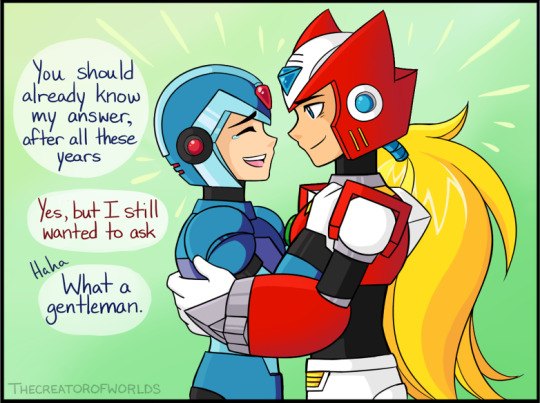
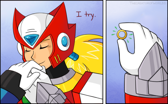
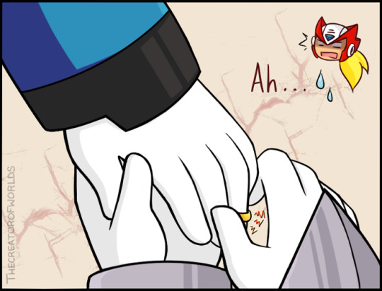
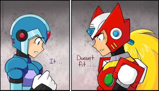
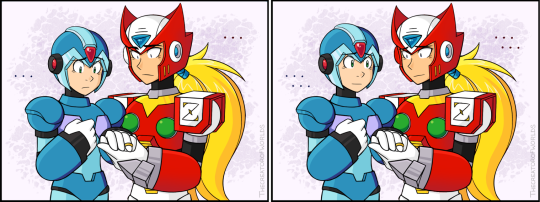


Jaybird wrote: On a panel-by-panel basis, the art is very good: crisp lines; good color and lighting; good technique with hands and faces; great use of background and expression to convey mood -- you got more mileage out of your backgrounds than probably anyone else here.
Miyabi wrote: Another nice job of mixing humor into your piece, while still keeping it a tender, sweet moment. Nice way of showing that things don’t always go as planned for a proposal, but sometimes it’s the thought and effort that counts. As always, your lines, colors and penmanship are smooth and flawless.
Superbasket5:
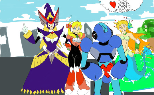
Jaybird wrote: Aww. If I've got this right, it looks like X is so nervous about giving Alia a valentine that he doesn't realize Berkana is giving Alia encouragement as well. I think. I have to wonder what Marty is doing here -- research tells me she has a crush on X, which seems like it would get in the way, and if that's the case, this impending trainwreck will be something worth watching. That said, the piece is still in its rough stages, especially your setting and perspective; I can't really tell where the characters are (outside at a park?), and Alia's hip is in front of X's arm.
Miyabi wrote: Alia has her support group, but I don’t know if she’s going to be able to pop the question to X with a crowd around her, either. XD Cute expressions, showing her nerves, while X is probably not quite expecting what’s hiding behind her back. I kinda wish we would get that visual of what she’s hiding as a cutaway, much like how you gave X a thought bubble for what’s going on in his head.
@yugiohlesbian:
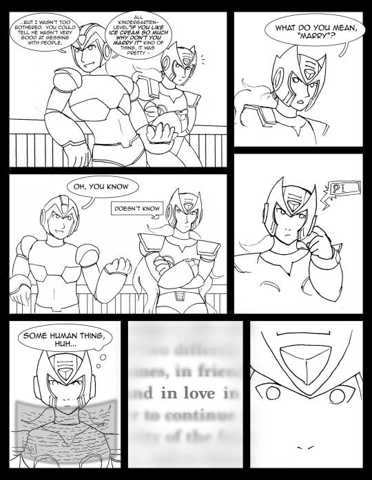
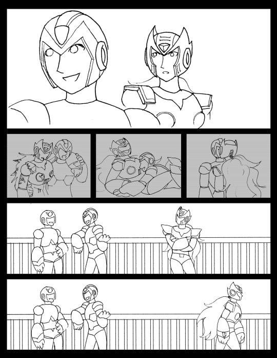
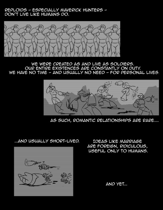


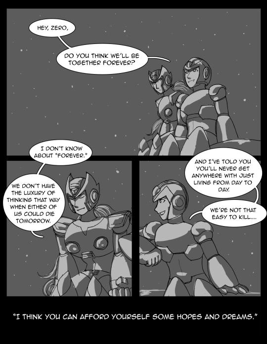
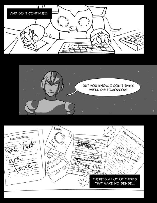

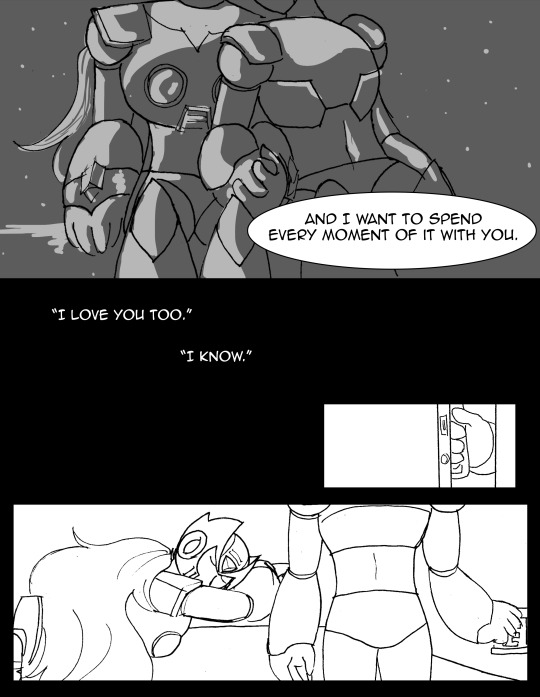


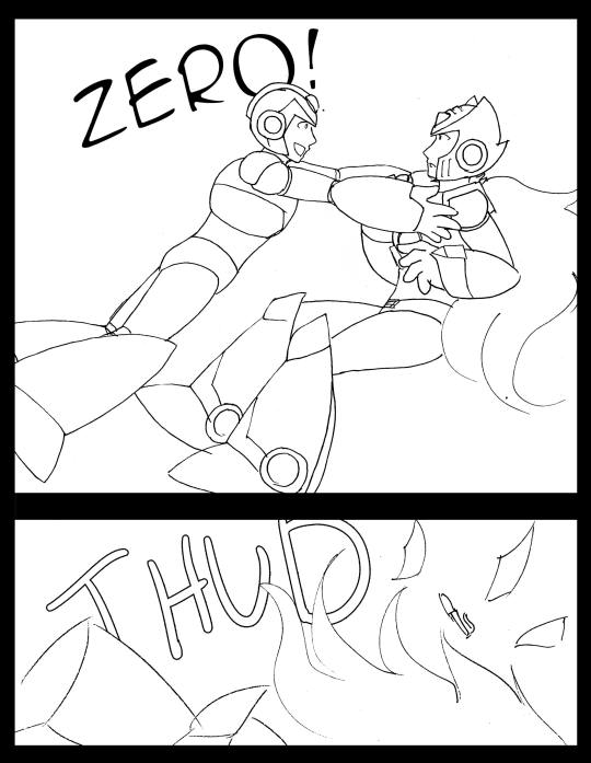
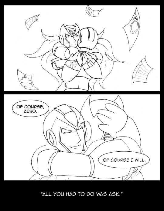
Jaybird wrote: Good job! I'd like to compliment you on how versatile your figures are and how you use that to make them very expressive; your use of perspective and individual panel compositions are both very versatile. While there isn't any color, the nighttime scenes do a good job with the lighting. Your style is pleasantly simple, but sometimes the panels seem to be oversimplified; more developed backgrounds would be welcome in several places.
Miyabi wrote: Totally different subject, but Zero, none of us understand taxes, either. I like how you illustrated the struggle of a reploid trying to understand human logic and traditions, and yet in the end, it still being something Zero didn’t truly need to grasp in that logical sense. While I know you wish you would have had more time to continue perfecting these panels, I agree that the night scenes stand out and give a good contrast between Zero’s computer research scenes.
Thanks once again to all who participated! I will be contacting the winners soon enough. Work will probably keep me from replying to everyone immediately, but if you don’t hear from me today, I will send a message about prizes hopefully within the next day.
For those awaiting the secret contest results...sorry, for another slight delay. Between finishing my promo art for this thread, and typing this, it took up too much time and I’ve gotta head to work. I will have those posted overnight, into Sunday morning, as it won’t be quite as intensive to write up. My apologies, but I hope you can all hang on for another 20 hours or less. ^^;
67 notes
·
View notes
Text
Anon Archives vol. 1
I really value communication with you guys, but I also don’t want to clog everyone’s dashboard. To fix this I’m going to be compiling anon messages into archives unless I feel they they should be answered separately. To receive a quick response, feel free to message me off anon so I can reply privately :) *smooches*

I think my lineart tool is just the default brush with max density and 10% min size. Here’s the settings for my two most used brushes :).
It’s a universe set entirely apart from our world and history - think of it more as a dark fairytale. In terms of aesthetics, though, I’d place it around 1880s-1900s.

Not all that different from the way a lot of artists use them! Just clipping masks with the texture layer set to “overlay” and opacity between 15-25 depending on the scale of the canvas. I’m very picky about my colours so all my textures are b&w to not mess with my hues.

“Stop, sto-” Wolfe manages to choke out around the blood coating the inside of his mouth, finally gaining control over his broken body as Ghasper’s influence retreats back into his bloodstream. Coward, he growls inwardly, and receives a mocking chuckle from the hound that reverberates from the very core of his being. Hunter towers tall and unmoving over him, eyes glazed magenta with Mallory arching proudly over his shoulder like a silent guardian. His usually full and luscious lips are contorted into a vicious snarl, sweat-drenched garb clinging to his sculpted thighs. Thick, toned, manly thi - [UNKNOWN FORCES VIOLENTLY WRENCH MY KEYBOARD FROM MY HANDS AND I’M FORCEFULLY ESCORTED FROM MY BLOG]
Thank you very much! When I was 15 I studied a 3-year course at WCS and graduated in 2015 with a degree in graphic design. I articulated straight on to 2nd year at University of the West of Scotland where I studied computer animation. It focused mostly on 3D. It’s not a specialised art school or anything but it doesn’t have to be - remember that if you plan to study art. I plan to go back to get my honours degree after my gap year! I graduate with my regular diploma in November I think.

That’s okay, anon! Believe me, just having people think of my characters as cosplay-able (what) makes me so happy. Thank you!
Thank you so much! I really appreciate you taking the time to check out my stuff. I hope I can continue to please you in the future :’) I’m totally not worthy of those sweet words u///u.
Thank you for your suggestion! I’ve seen a few webcomics do something similar, now that you mention it. I’m not so sure how I feel about cross-platforming my comic just yet, since I like the idea of a “central hub” of sorts...at least for the first few chapters. Tumblr does offer a lot of customizability (that’s not a real word Heather) but I think I’ll stick to Tapas or Webtoons for the moment! I really value your insight though, thank you.
Thank you very, very much! Oh man, I’m not really sure I’m the person you want to be taking any solid advice from, but I’ll give it a go. I consider myself way more of an illustrator than an animator, so I’ll give you drawing advice.
Be open to all kinds of art. Even if you live and breathe cartoons and character design, you’ll be surprised by how much you’ll learn just from taking the time to observe and appreciate things outside your own interests. I’m a dyed in the wool character illustrator and digital artist, but I can’t tell you how many hours I’ve spent marvelling at H.R Giger and Ilya Repin’s work. You don’t have to become a fine arts connoisseur by any means, but it helps to be open minded.
If you’re at the awkward in-between stages of your art - where you can draw with relative confidence but you’re struggling to find your individuality - try making influence maps. These helped me so much when I was 14 and going through my first “style crisis” where I hated everything I drew. This was because I was ignorant to my own interests. What do I love about my favourite artists? What gets my blood pumping? Why is it that I love vibrant colour pallets, cartoons and expressive eyes, but also marvel at the gritty eldritch atmosphere of Zdzisław Beksiński’s hyper detailed nightmare paintings? Is that even normal? It is. Variety is great as an artist and knowing what you as an individual like and dislike is invaluable.
When you draw, try and minimise the amount of times you take your hand off the page. If you’re prone to “flicking” your pen a lot, it can make your lines look inconsistent. By training your hands to make confident strokes, you’ll get cleaner drawings and learn to work faster.
If you’re a sensitive person then art can be a surprisingly difficult hobby to maintain, as you’ll find your emotions bleed out into anything you create. This is great for naturally driven people who can channel their frustration and insecurity into bettering themselves, but some people are fragile. That’s okay. There’s no shame in feeling overwhelmed. It’s alright to put the pen down and take a break for a while. Just promise me you’ll pick it back up again.
Gesture drawing is great for learning anatomy. Instead of getting caught up in having proportions/details perfect, try to instead focus on the pose in its most basic form. Capturing the momentum and direction of the body can give your drawings a more fluid look and reduce rigid characters.
Well, that’s just a bunch of really weird and vague tips but I hope it helps. It’s a broad topic to cover...if you need anything more specific then I’ll help as best I can :)
I think people need to tone down their virtue signalling and let people enjoy themselves. This is why people are too afraid to have fun anymore, and why merciless cringe culture is going to haunt young kids into adulthood. Animation memes will fall out of popularity like every fad in existence has done before it and you’ll get your wish.
#anon archives#asks#phew this took a while#but i read everyone's tags and captions and comments so I want to give back as much as possible#quite a rude anon at the end but i feel strongly about the subject#anon
207 notes
·
View notes
Photo

Ready, Class?
Our favourite purple pony princess has come a long way, hasn’t she?
... Or, has she?
Some number of fans in MLP community would tell you yes, of course she has, but then go onto say they still greatly prefer the old Twilight Sparkle. You know, the adorkable book-smart cynic with an insatiable curiosity and the impeccable intellect to back it up. Also, typically the one without wings.
They could tell you she’s grown and changed a great deal since the beginning of the show, yes, but counter-intuitively, perhaps too much. That she’s too calm, too collected, too powerful, and just too... in control.
We as an audience love to see characters work and strive to overcome their shortcomings, and especially in a show like this, where we crave that kind of continuity. It makes the episodes that came before feel like they matter more, since they have a real impact on stories moving forward.
But, some fans feel she’s just overcome too many faults. To the point that she may have even developed past what made her Twilight Sparkle!
And has she? Have they done everything that can be done with her character?
Not yet.
At least, I think so. But, to tell you where I think she’s headed, we’ve got to take a look back at where she’s been (it’s how this works).
And, again, I realize that in a slice-of-life show, it’s sort of debatable whether or not you can really say any of the characters have definite character arcs throughout the series. But, the pursuit of knowledge stops for no inconsistencies!
From Anti-Social Beginnings

Ah, there she is! The Twi we all know and love, right?
Seasons 1-3 were a golden time for our favourite egghead. She conquered her oblivious loner tendencies with only a moderate amount of eye-rolling and freaking out. That adorkable charm is sort of irresistible, and it’s mostly because despite the fact that she’s a know-it-all, she’s so unpretentious.
She used to be a borderline misanthrope, sure, but even in the first episode when she’s trying her absolute best to just do her job and ignore the crazy ponies trying to befriend her, she’s still kind and sweet to them. She’s always had a good heart, and part of that is because she doesn’t assume she’s better than other ponies just because of her abilities or her status.
Which is a double-edged sword. She’s a (mostly) humble pony, which has lead her to making friends with all sorts or ponies and never looking down on anyone (even when they’re complete screw-ups *cough* Sunset and Starlight *cough*), but it also sometimes means she doesn’t value herself nearly as much as she should.
And, because of that, I’ll say this: What Art of the Dress is for Rarity, the Smile song is for Pinkie, and I’ll Fly is for Rainbow Dash, The Failure Song is for Twilight. Does it capture everything about her character? No, but these character themes usually only embody the most important part.
Having a some kind of Ode to Science might better capture the sheer adorkable (I’ve already used that word 3 times, this is a great post) enthusiasm and thirst for knowledge that really nails who Twilight is. And maybe the ballad style doesn’t sell you on the Twiness of it all, I get it. But what that song does do is outline Twilight’s insecurity. Her doubt, her humility to a fault, her anxious tendency to imagine the worst.
And (obviously) her fear of failing her teacher.
Princess of Co-Dependency

How many times have I used that picture of Twilight crying over Celestia? Not enough, never enough.
I think this is absolutely one of the most underrated moments in the series. At the time, people talked about it, but nowhere near as much as I think it warrants.
Twilight just became a princess. She’s just barely gotten used to her new limbs in EQG 1, and still she has absolutely no idea how to be a princess of Equestria — and that’s what this whole two-parter is about, right?
Twilight’s been thrust into this new position she has no idea how to fill and the weight of it is crashing down on her. On top of that, she now has to face all these new questions about the future. Will she be a good princess? What’s her purpose? Will she and her friends grow apart?
She’s never been more lost. There isn’t a book on being a princess she could read. And you know what happens? You know what happens to the one pony she’s always looked to for guidance during the time when she needs it most?
She dies in front of her.
We as the audience know she’s going to get up, but Twilight has to face the death of her mentor alone. Effectively, in that moment, she has to face her future as a princess alone, too, without Celestia’s guidance. Twilight’s even wearing her crown in this shot, it’s absolutely symbolic.
There’s even a line she says that you can interpret two ways. When Twilight flies down and sees Celestia laying there on the floor, she says:
“No ... Why would Luna do this? Why now?”
You know what I mean, right? It fits in its original, probably intended context, as in Why would Luna do this now? But, given what doubts Twilight’s gone through in the entire first half of this two-parter, it also means Why now, when I’ve never needed her more?
Do I think this two-parter could’ve been executed better to get some of these ideas to really hit home? I don’t know, maybe, I’m not a professional writer, what do I know? But, my point is, those ideas are still at the core of this story, and in turn, at the core of how Twilight defines herself moving forward.
When all else failed, and she couldn’t turn to her mentor when she needed her most, she had to depend on her friends just like they depend on her. And, it makes sense. She’s the Princess of Friendship, after all!
As Celestia even later says, when the girls get their thrones, “What’s the Princess of Friendship without her friends?”
Rarity says something to the effect of ‘We’re simply lost without you,’ but what’s clear to me from this whole two-parter is that Twilight’s just as lost without them.
Unlike Celestia and Luna, who rule in tandem but ultimately each stand on their own (in Celestia’s case, to an extreme, since she ruled Equestria by herself for a thousand years), Twilight needs her friends to be Princess. She’s not a goddess-like matriarch, and even her magical prowess will never make her more important than her friends because she needs them to fulfill her destiny.
She’s both the leader of the group and nothing without them. It’s neat.
And especially so, because for the following 2 seasons, Twilight fails. Like, a lot. She even started a war for a few hours, that was a fun one.
After being a career student since she was like five years old, Twilight’s suddenly thrust into a new role-- the Princess of Friendship! But there’s absolutely no precedent for what that means, and because of it, her season 4 character arc is entirely about her coming to grips with the fact that there are no instructions anymore.
She has to define what it means herself-- and most of the time she’s struggling to find purpose, choosing to focus her efforts on solving the mystery of the chest (which honestly makes sense, that’s at least a clear goal she can attack with logic).
And after that? After that long season of just not knowing her purpose? She and her friends get a map! That sends them on friendship-related quests! Finally! Something she can work towards in her new role!
... Until her friends keep getting called without her.
And the whole arc of season 5 is pretty awesome (feels more involved than season 4′s to me), because Twilight is getting more and more tired of stagnating — and what’s worse, she has to face who she used to be and times she’s failed as a friend.
I wrote an actual university essay on Amending Fences (she said, surprising no one), so I’ll just leave it at:
“I’ve faced magical creatures, the end of Equestria, all sorts of things. But seeing how my actions affected you? That was one of the worst feelings I’ve ever had.”
- Twilight ‘I’m sorry I was an oblivious jerk’ Sparkle
Really quick aside here, I feel like among other things What About Discord? was missing one line that would’ve made it a continuation of Amending Fences. It doesn’t have to be exactly like this, but something to the effect of:
“But I wasn’t there. I wasn’t included. Maybe it’s my own fault for staying in and having a bort-sort-cation when I could’ve been making jokes and memories and having a great time with my friends! But I didn’t do that, did I? You all did! You were all there but ... I wasn’t there.”
“And, now I’m scared that I’m still making the same mistakes I used to make before I met you. What kind of Princess of Friendship still chooses books over her friends?”
I mean, that’s what that episode is about, anyway. Given that it probably takes place after Amending Fences, it’s not a stretch to imagine that’s what she’s feeling. Twilight’s built up her own lofty expectations for what the Princess of Friendship should be, not anyone else.
And its in part because of Princess Celestia.
The Student Becomes the Teacher?

It’s no secret that Twilight idolizes Princess Celestia. Like a lot. Out of all the lessons she’s learned, not putting her on a pedestal isn’t one of them.
In fact, if you watch The Best Night Ever and Make New Friends but Keep Discord, you’ll see just how much she hasn’t changed from early seasons. She still goes to the Gala with the exact same intentions, spending a night by Celestia’s side, and is even still surprised Celestia likes to cut loose. And the thing is, in the latter of the two episodes, Twilight and Celestia are supposed to be equals.
Back at the beginning of season 4, Celestia told Twilight there’s no need to bow to her anymore. Yet Twilight’s still driven to impress and please her old teacher because, well, she still looks up to her.
And that’s been constant all throughout the show. From her unrealistic expectations in A Bird in the Hoof, to her iconic freak-out at the idea of letting down her teacher in Lesson Zero, all the way to her insatiable desire to make things perfect for Celestia’s visit in No Second Prances. Twilight may have studied directly under her, but somehow after all these years she’s still the filly who was inspired to study magic after first witnessing the Summer Sun celebration.

But, if there’s a problem with Twilight’s character nowadays, it’s that she’s trying too hard to be like her mentor. Don’t believe me? Good, it’s always smart to wait for the proof before believing a claim!
See, Twilight kinda failed at her first attempt at being a teacher. Understandably so, since her niece had just been born and an entire empire was about to freeze to death, but the point is, in the end, she wasn’t there for Starlight.
And Spike, being the sweetheart that he is, told Twilight the one thing that would make her feel better: that this is exactly what Princess Celestia would’ve done with her.
So, let me just say that being able to step back and let her students learn for themselves is a good lesson. Especially for someone like Twilight, who’s more likely to plan every step along the way and not really let her students make the mistakes they need to make to learn for themselves. And this lesson even came in handy at the end of the season, when Twi was kidnapped and had to depend on her student to figure out the problem on her own.
But the thing is, Twi’s more than happy to be exactly like her mentor, and it’s hurting her in the long run.
Not because Celestia’s a bad teacher or even a bad character, but because Twilight can’t live up to the pedestal she puts her old teacher on.
Think about it. Let’s go back to What About Discord? Why does Twilight expect herself to be perfect? The Princess of Friendship can’t get jealous, apparently. The thing is, we know Twilight doesn’t have that much of an ego, she’s always been pretty humble (about most things — I can buy her being a little proud of her organizing skills every now and then).
You can even see it a little again in The Times They are a Changeling-- that whole ‘I may be the Princess of Friendship, but today — ’ thing. She’s got some expectations for herself, and I think you know why.
It’s because now that she’s a princess, and especially now that she’s a teacher to boot, Princess Celestia is her role model now more than ever. And not just Celestia how she really is — flawed, with a long history of mistakes and regrets — but Celestia as Twilight sees her. As that filly at the Summer Sun celebration saw her.
So, Twi’s trying to be a calm, level-headed leader and mentor, and sometimes she even succeeds. But even after learning breathing techniques to keep from panicking, she’s still prone to anxiety, and on the flip side, adorkable nerd-outs (four times!). A calm, wise guru she ain’t.
And more importantly, she ain’t a guru that’s perfect. She still makes mistakes, and this expectation that she can’t make any if she wants to be a good teacher is just plain wrong.
So, where is all this going? In Twilight’s search for meaning, she may have found the wrong answer in the short-run, but is there a better answer waiting for her in the long-run?
Yeah. Learning with her students.
That quote from The Times They are a Changeling I used earlier is kind of a step in the right direction. Even if right now she still seems to have high expectations for herself, she’s still more than willing to learn from others and stay humble enough to admit when she’s wrong.
Which is good, because the way Twilight sees Celestia — it’s just unattainable. Twi’s not an immortal, perfect goddess and she never will be. She’ll always be learning new lessons about life, love, and friendship.
But she still can use those lessons she’s learned to teach her students, friends, and potential allies. She doesn’t have to be perfect, or done learning about friendship. Because the one thing that makes Twilight Sparkle who she is?
A love of learning. You boil down Twilight’s character to one single, all-defining trait, to me, that’s what you get.
And to learn, you have to make mistakes and fail sometimes. Princess Celestia had the advantage of thousands of years of experience (and, by the way, only got it right with Twilight), which worked great for her. But Twilight can be a different kind of teacher: herself.
A more wise, adaptable, nuanced version, maybe, but above all, still the adorkable (five!) Twilight we all know and love.
Like this kind of thing? Well, good, ‘cause there’s more! Here’s a post with links to all the MLP editorials I’ve done! Not in the clicking mood? Don’t worry, I’ve got the last three right here:

Sunset’s, Applejack’s, and the Seasonal Rot Editorials
Year of the Pony
Header Image Only Possible Because of ...

Twilight Sparkle-Eyes Vector by Comeha
Starswirl the Bearded Wing Background Vector by Hourglass-Vectors
Enjoy some awesome vectors by two awesome vector artists! You’ve got two talented vector artists here who make stuff you can use for your projects (with credit)!
Never stop learning.
#twilight sparkle#mlp#mlp:fim#mlp: fim#My Little Pony#friendship is magic#mlp season 7#mlp s7#analysis#animation#cartoon#cartoons#editorial#twilight#twilight mlp#mlp twilight#mlp twilight sparkle#adorkable
38 notes
·
View notes