#(in combination with a personal psd.)
Explore tagged Tumblr posts
Text
#gabriel boutin#emilien vekemans#the bastard son & the devil himself#the bastard son and the devil himself#tbs&tdh#tbsatdh#smoking tw#smoking cw#psd courtesy of ariapsds (question).#(in combination with a personal psd.)#mine *#🙈
254 notes
·
View notes
Note
hiya! any tips on creating an immersive save that will attract not only you as the player but others as the viewers? your aesthetic is stunning and im so obsessed with everything you do!! <3
oh wow, this is a super sweet ask, @plumday.
let's see. I interpreted this as an ask about how I setup my sim save in a way that engages me. Hopefully this is helpful!
Setting Up TS4 Gameplay

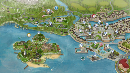
Revamp Sim Worlds
BRAVE THOSE LOADING SCREENS and leave your residential lot! (I promise it's worth it)
NEW LOTS - Each of my worlds have been renovated with lots I handpicked from the gallery - too much work? I recommend using a savefile! Here are some of my personal faves @ratboysims 1, @down-in-simsland 2, @folkling 3 & @sweetbeagaming 4.
RESIDENTIAL RENTAL - these lots help make the world feel more dense and lived in, plus condensing the local households to 1-2 lots leaves room for more non-residential lots to explore with your sims.
WORK AND SCHOOL - I recommend placing offices, schools, and daycare lots. These combined with a few mods (semi-active custom careers and Zerbu's go to school mod 2) and clubs are something I really enjoy.
Set Up Clubs
I really like @sojutrait's tutorial on how to use clubs to enhance your gameplay and is a MUST HAVE in my humble opinion. I usually have a family chore club, work clubs, neighborhood clubs, extended family clubs, etc... and it's so nice to click a button suddenly there are sims there making my game more lively.
To have more than 3 clubs per sim, I use this mod maintained by @kingzaceofsims.
I also use custom club activities so sims (MOSTLY) behave how I want them to. @srslysims has tutorial on how to make your own.
To be able to have club gatherings in vacation worlds I use this mod. It was helpful with sending my pixel kids to camp.
Set Up the Calendar
@aliennooboo made this AMAZING tutorial on setting up your sims calendar that I just adore. I find this helps me remember to do things with my sims and helps change up their day to day life.
Playing
ROTATIONAL GAMEPLAY - I find this keeps me engaged and prevents boredom. It keeps things fresh and allows me to explore different stories. Here is a great resource to get started!
GAMEPLAY MODS - I find adding various mods keeps my gameplay fresh and interesting. I recommend these creators (1, 2, 3, 4 & 5) in particular.
Screenies
POSES - As a gameplay person, I try to use poses sparingly. It disrupts the game for me but I find sometimes I can't convey what I want to without them, so I try to only use a few. This is what works for me, please do what works for you. Shout out to all the storytellers blogs, though, that keep me fed.
RESHADE or PSD files can add some fun color and effects to screenies. ONLY edit as much as you want to. I felt a lot of pressure to get better at this and I am finally finding the balance of how much and what kind of editing I actually like to do. I have collected reshades/gshades and resources here.
House Keeping
Keep back ups of your trayfiles, screenshots, households, lots, etc 'cause it's sims, things break and go wrong.
Keep your CC and mods organized otherwise fixing your game is a hug pain.
Reblogs and additional tips and recommendations welcomed!
HAPPY SIMMING!
471 notes
·
View notes
Text
14 / PHTHARTIC TEMPTATION
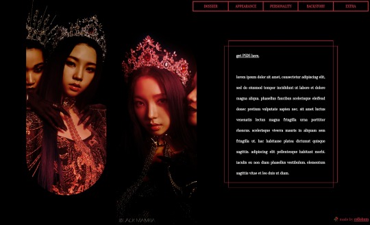
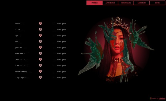
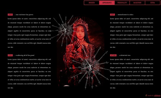
grunge ﹒ black mamba ﹒ single muse ﹒ character template
。 。 。 introducing phthartic temptation, a seven paged character template mainly catered towards pc use. it draws inspiration from and uses scenes of black mamba by aespa, and has a relatively dark, grunge mood to it.
⸻ [ features . ]
14" x 8.5" page size
a seven paged doc that includes a title page, and pages for a character overview, appearance, two pages for personality, a backstory, and an extra page with space for headcanons & a roleplay sample.
a folder of psds linked in the doc.
⸻ [ policy . ]
you may change the layout, color palette, images, etc.
you may combine this with my other docs.
you must get consent to take inspiration.
you may not combine my docs with other creators' docs.
you may not remove credits or make them hard to find.
you may not use for mass or commercial use, including as a server template.
you may not sell or redistribute my docs.
( faceclaim is karina from aespa )
#— m: docs .#google docs template#docs template#google doc template#google docs#rp resources#rp template#roleplay template#character template#multi-muse template#template#free#free template#character sheet#roleplay#discord rp#aespa#black mamba#karina
190 notes
·
View notes
Text
On Gifmaking:
So season 2's coming soon, and I wanna reflect on making gifs ever since I came back to Tumblr. I can't believe it's been 2 years of making gifs for this show!!!!! Look at how large my folder is lmao

And those are JUST gifs lol
Anyways, over time, my style has changed, especially how I color edit Arcane gifs. I kind of strayed away from a stylized filter color into just something that looks a lot more "natural" and works with the original scene.
Initially, I thought I'd save time, but I ended up not using my old arcane preset PSDs and resulted to coloring almost every scene manually. So in the end, it takes even longer to make them HAHAHA. It takes around an hour and a half for me to make a 10 gif set, basically. It also helps that I have a photography background, so coloring/editing is a lot simpler for me.
Here's a lil before and after of a dark scene (hiiiii viiiiiii <3)


Arcane is a REALLY dark show, but it goes for most of TV shows. Many of them are darker and harder to bring up the lights to make stuff look nice as gifs. Some people don't like to color their gifs, and that's okay. I personally just like color edited gifs more.
I've started learning how to upscale scenes myself, so that I have a better resolution and leeway to make things look "HD" more.
If you're wondering why my stuff look so "crisp", it's a combination of the scene's lighting, my sharpening settings on Photoshop and knowing how to upscale everything into 4k resolution. Of course, doing this needs an extremely beefy pc, which I am very lucky to own one.
Here's another before and after of a nicely lit scene. These are much, MUCH easier to do than all the darkly lit scenes because of shadows and lighting (caitlyn kiramman truly the rizzler <3)

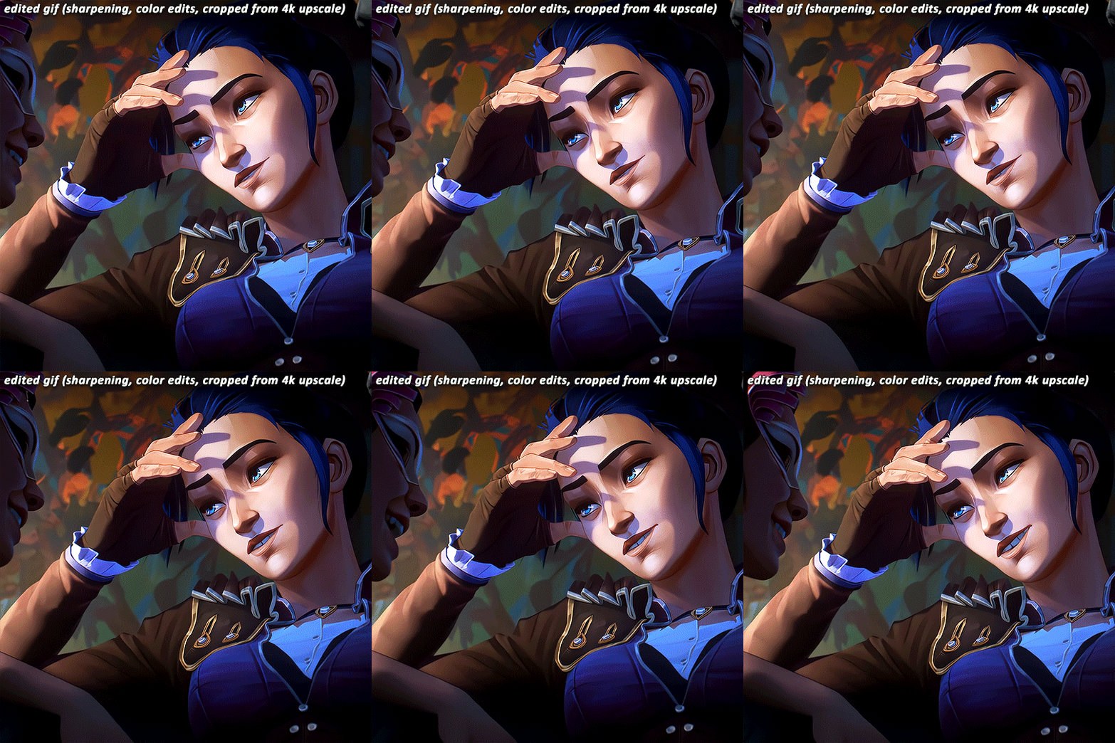
I've been very lucky to be able to essentially take a nice, long break for like a month doing nothing after being so damn busy for the last year and a half, so it's nice that I was able to make a ton of gifs and be chronically online for a short while LMAO.
It's been so fun! But it's time to go back to reality lmao. I closed reqs for a bit because I was just so swamped with them the last few days, and I wanted to gif scenes that I like this time. I've done like 2 weeks worth of gifs. And you will see Vi a lot bc she's on my mind a lot heehee 🥰what can I say, she's such a babe <3
Here's a lil sneak peek, just look at herrrrrrr 🥰🥰🥰 and yeah, 4k upscaled resolution really helps making these tight crops, it's why i never went back to 1080p lol. It's how I’m able to make zoomed in gifs look decent (like the kirammountains gifset lol)

Thank you so much for all the support, likes, reblogs, and the nice tags you guys give. Yes, I can see and read all of them (both the nice and nasty ones lmao). If you have nothing good to say about the characters or my editing style, or anything related to the edit, please I beg you, just write a separate text post about it <3 If you have nothing nice to say, don't say it in my edits.
Lastly, thank you to the people who share my stuff outside the site and credit the blog and link them back here. I see you and appreciate you <3 You guys don't know how much I appreciate shoutouts and link backs, because people stealing my gifs is something that I've dealt with after making them for like a decade.
Tumblr is sadly not what it used to be in the 2013-2015 era. There’s definitely less activity as time goes by, so I appreciate all the people who credit and link back to this sideblog. Unfortunately, there’s more people who just repost them and it gets wayyy much more traction in other soc med sites. Yeah, ofc I get a lil jealous, but eh what can you do 😞 can’t really stop em.
I also don’t like putting watermarks because it personally looks tacky to me, but I understand why other people do it.
Anyways, if you reached at the end of this lil rambling of mine, thank you! I sadly might be busy during November because that's usually busy season, but I'll try to make time for making gifs of Season 2! Thank you and enjoy your stay on this lil sideblog :)
#personal tag#arcane#long post#nothing i just have free time rn and i wanna spend time on it rambling and yes im tagging the public tag lol#goodbye leave hello real life again
111 notes
·
View notes
Text
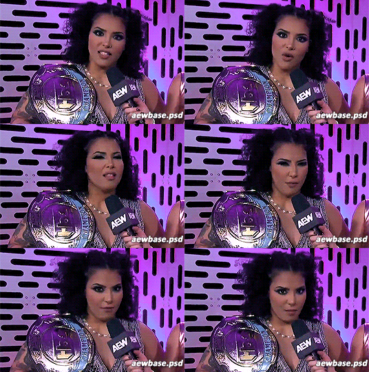
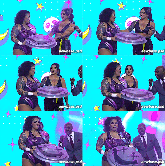
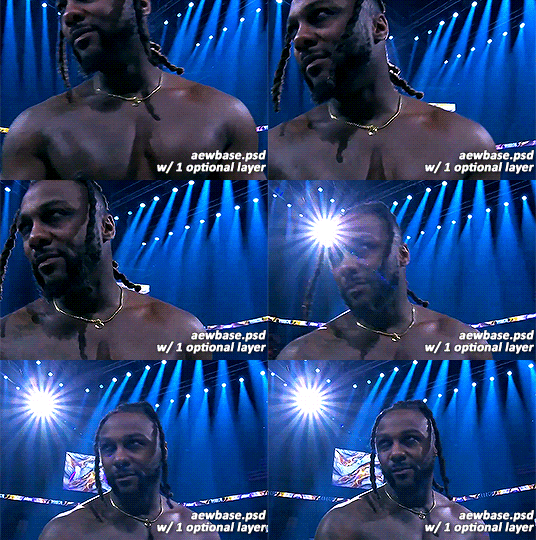
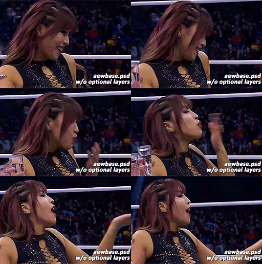
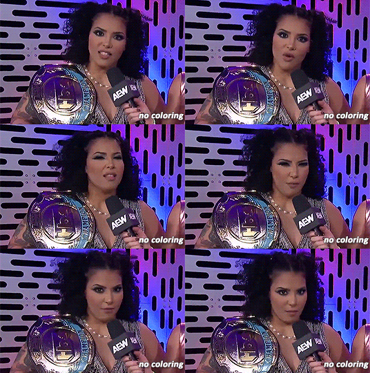
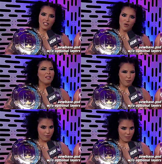
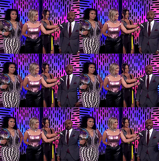
hi wrestling gif makers! as a gif maker & poc i've noticed some issues in coloring of certain black wrestlers, especially willow nightingale. though this was an issue that i believed to be solved last year, it seems to be happening again. so i decided to combine my gif making abilities and passiveness and make a little tutorial & re-release my psd used for gifs. hopefully this time, a visual guide will help remind you to not whitewash poc. here goes! gif tutorial here. psd here.
alright, you've made a gif!
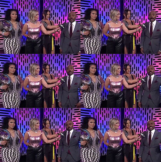
maybe your adjustments include a few of these layers?
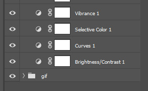
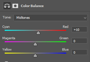
great! it's bright, it highlights the right colors, you're doing great. next up you'll want to add some vibrancy and pop those colors. i prefer to do this with my color balance. here are the settings for the optional color balance layer in the psd.
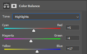
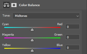
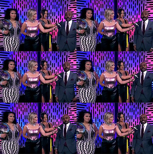
now personally? though stoke's complexion looks darker, willow's looks lighter compared to the previous gif. don't worry we fix that in post. but first, the second optional layer and my personal favorite: selective coloring. here are my settings & resulting gif:
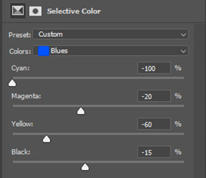
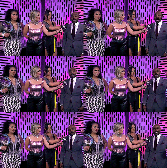
why do i do this? because i like the color purple. go wild in the selective color, it's fun. anyway, remember how i mentioned willow's complexion earlier? here's how i fixed it, back in color balance!
and here's the final gif!
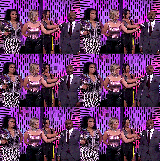
if you made it this far, congrats! again my initial gif tutorial is here. and my psd used is linked here. go forth & gif poc confidently & in their skin tone.
53 notes
·
View notes
Text

Gradient Maps For Dummies <3
— as written by a dummy
it’s been a while! hello gracious reader and welcome back to the series where yours truly fails at explaining things: photopea for dummies. if you’re unfamiliar, this is a series where the admin of this blog tries to explain how photopea works. whether or not the series is successful is yet to be determined.
today, we’re attempting to tackle yet another one of photopea’s adjustment layers: gradient maps. gradient maps have become more popular in the editing community lately, so i’ve been meaning to make this one for a while. apologies for the delay!

what is a gradient map? a gradient map is a form of layer that adheres a gradient to a photo’s dark and light values. a gradient fill is something different altogether, wherein a gradient is made atop the image without regard for the image’s original form.
think of it as a bedsheet. when held upright, a shield is just a rectangle, but if you lay it on something three dimensional, you can see the object beneath, because gravity causes the sheet to adhere to whatever is beneath. in our case, your image is two dimensional, but a gradient map applies different colors to the dark, light, and middle values.
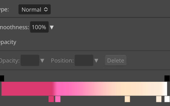
this is the gradient map used on all of the icons above. i made this one by experimenting with different colors. to add colors to a gradient map, double tap below the line, and you’ll see a small square appear. click the square to choose the colors you desire, and feel free to adjust it as you wish.
in photopea’s gradient maps, the colors closest to the left will adhere to the darkest parts of your image, while the colors closest to the right will adhere to the lighter parts of your image. the saturation and lightness values of your color itself don’t affect this at all—for example, here’s the same gradient map applied in reverse.

(to reverse a gradient map, toggle the reverse button as seen above. to undo it, just click the button again.)

pretty different, right? especially with no blending modes or adjustments in opacity, this gives your images a spooky negative look. if that’s what you’re going for, go crazy. if you want something a little more plain, set your darker colors on the left, and your lighter colors on the right.
exactly how the editor utilizes a gradient map is up to personal preference. some editors use gradient maps in lieu of complicated psds, while others like myself use gradient maps as one of the pieces of our complicated psds. gradient maps often go hand in hand with blending modes—for more on that, see here.
personally, i use a gradient map as a base for most of my psds.

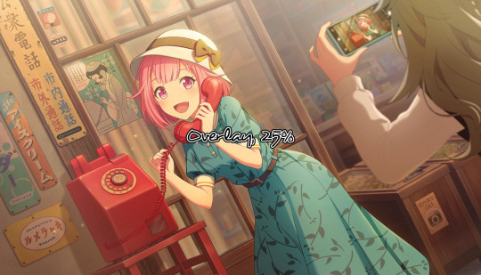
the exact settings are up to you, but i typically use either blending mode soft light with 50-75% opacity, or blending mode overlay with 10-25% opacity. the gradient map i use is one of the default ones available in photopea, a simple black and white set to reverse.

i like to use this gradient map to soften the colors and as a simple, easy to do base for all of my psds. if you look in some of the psds i have posted, you usually see this at the bottom or close to it.
how else can i use a gradient map? anyway you want, really! as you can see in my example image, gradient maps can be used to completely change the colors of your project, or to add a little bit of spice. something else you can use is a noise gradient map for texture.
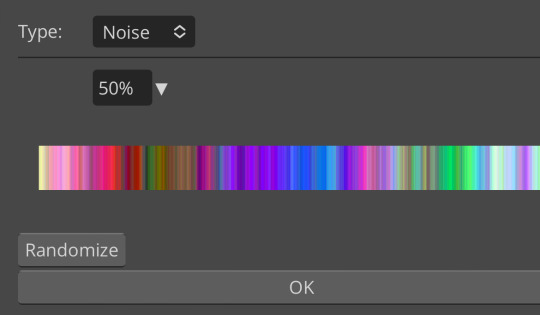
go to the gradient map itself as if you’re going to adjust your colors, and switch the type from normal to noise. then click randomize until you land on something you like!

it looks something like this. set to normal is pretty chaotic and janky looking, but set to soft light or to a lower opacity hue setting, this can be a great way to add some flare to your psds!
like with a lot of things in photopea, it’s best to experiment on your own and figure out what works best for you. i recommend playing around with opacity and blending modes, as well as what color combinations you personally like. every editor’s style is different, and the sky’s the limit with what you can do!
yours truly, canarysage
#i have a migraine so i sincerely apologize if this is incomprehensible#photopea for dummies#ʚɞ — tips.
67 notes
·
View notes
Text

Navigation: Masterlist✦Ask Rules✦PSD✦INSPO
Askbox✦Template✦Paid Readings
Advanced intuition: Cancerians possess a naturally developed intuition, often bordering on mind-reading abilities. They have a knack for picking up on unspoken cues and can be highly perceptive. Their cardinal nature makes them naturally suspicious of others if they sense any hint of deception or betrayal.
High expectations in relationships: When it comes to romantic partnerships, Cancerians have high standards and specific desires. They may have a long list of qualities and expectations for their ideal partner, making it challenging for someone to win their heart.
Compassionate and charitable: They are renowned for their big hearts and their inclination towards acts of kindness and charity. While they may be cautious about giving their heart to just anyone, they readily offer love and support to those in need.
Artistic souls: They possess expressive souls and often find their creative outlet in various art forms. They may excel in painting, architecture, sewing, storytelling, or any other artistic pursuit. Their imaginative nature can be particularly evident in activities like being a Dungeon Master in a role-playing game.
Emotional vulnerability: They tend to pay a high emotional price for situations that may not be worth the pain. They are sensitive individuals and can find themselves deeply hurt and betrayed, often hitting rock bottom when faced with emotional turmoil.
Generosity from the heart: They have a generous nature and are willing to give gifts with sincerity. When they are empathetic and know the recipient well, they choose gifts that align with the person's desires. Even when they don't know someone intimately, they give something they hold dear, reflecting their own affections.
Keepers of secrets: They tend to hide their emotions as a defense mechanism. They may not readily share their traumas or difficult life experiences, preferring to keep those matters private until they feel ready to address them.
Appreciation for leisure: They have a strong affinity for lazy, relaxed moments. They value their leisure time and cherish days when they can unwind and do nothing. Once they enter this state of relaxation, they are reluctant to leave it for anything.
Complex emotional landscape: They may not easily delve into their feelings, which can cause them to either explode emotionally or withdraw rapidly from a topic. This tendency to avoid emotional intensity is especially pronounced if the subject matter aligns with their vulnerabilities.
Lunar influence: They are strongly influenced by the phases of the Moon. Diana, the Moon goddess, reigns over their lives. During the waning and new moon phases, their loving nature may not be as prominent as it is during other times.
Affectionate beings: They thrive on physical touch and affection. They enjoy cuddling, hugs, and intimate gestures. They may even have a knack for inventing endearing displays of affection, such as the Eskimo kiss.
Nostalgia enthusiasts: They embrace the bittersweet feeling of "saudade," a combination of longing and nostalgia. They find comfort in reminiscing about the past, holding onto memories that evoke a sense of warmth and happiness.
Strong bonds with family and friends: Ruling over the fourth house, Cancer highly value the presence and support of their family. They consider their close friends as honorary family members. In relationships, they seek harmony between their partner and their family, longing for a sense of acceptance and inclusion.
Seek emotional connection: For Cancerians, intimacy goes beyond physical desire. They need a deep emotional connection and a sense of comfort and security with their partner before they feel ready for sexual intimacy. They require time to establish trust and establish a strong emotional bond.
Craving comfort: They have a deep need for a cozy and comfortable home environment. They desire a space that is both practical and inviting, where they can welcome their family members and create a sense of warmth and sanctuary.
Love for meaningful conversations: They enjoy engaging in meaningful discussions with others, particularly in the company of friends. Once they start a conversation, they are eager to delve deeper into the subject matter and can either enjoy lighthearted banter or engage in more profound debates.
Honest and straightforward: They value honesty and transparency in their actions and opinions. They strive to make their intentions clear and fulfill their commitments. They also have a strong sense of reciprocity and remember when they owe someone a favor or kindness.
Multifaceted individuals: Just like the phases of the moon, Cancerians can exhibit various personas and characteristics. They may have expansive phases akin to the full moon, nurturing phases like the crescent moon, or even melancholic traits. Around their Saturn's return (between the ages of 28 and 30), they can undergo significant personal transformations, similar to the changing phases of the moon.
Possibility of enemies: Over time, Cancerians may encounter and even create enemies. Those with strong egos and a desire for expansion may clash with Cancerians, as they don't find such qualities in themselves. When in contact with enemies, Cancerians may experience negative emotions and low vibrations.
(CC) AstroJulia Some Rights Reserved

#astrojulia#astrology#witchblr#astroblr#all about astrology#astro community#astro observations#astrology notes#witch community#astrology basics#cancer#cancer sun#cancer rising#cancer moon#cancer stellium
183 notes
·
View notes
Note
hello!! I hope this ask finds you well! I am a huge fan of your beautiful gif sets and want to get into gif making myself. I was wondering if there were any tutorials you recommend to get started? Thank you so much!
hi!! thank you so much, that's lovely of you to say! 🥰
I used a combination of these two tutorials to start with - I generally prefer the first one, but the instructions are for Mac users (and I use Windows) so for a couple of steps I needed to refer to the second one.
I'd personally never used Photoshop before I started making gifs, so with both of these tutorials I skipped the colouring sections at first (they seemed very overwhelming), and just began by practising making a handful of base gifs until I felt like I had the process down and had started to get a good idea of what worked/looked good to me (what cropping/aspect ratios I like, approximately how many frames I like in a gif, where to start/end the gif so that the loop looks good etc).
and then once I felt like I knew my way around a bit more, the way I learned colouring was mostly through the age old technique of fucking around and finding out - but I recently helped @prismatic-witch learn to make gifs and I wrote up a kind of basic colouring tutorial for them - so if you or anyone else is interested I could always type that up nicely and post it here - just let me know 😊
UPDATE: I posted my colouring guide here!
some other tutorials/resources that I've found helpful:
usergif resource directory (loads of tutorials and resources)
this gifmaking tutorial includes instructions on how to blur out burned-on subtitles or annoying video graphics
saving your colouring/psds
guide to channel mixer (colouring)
fixing dark scenes (colouring)
good luck and have fun!!!
#yeah super happy to post my colouring guide if it would be helpful!#ask#darcey.txt#gif making#gif tutorial
114 notes
·
View notes
Text
I'm not very active here but I'm very active on Instagram!
Multi Species Chibi Anthro Adopt Base! 35+ Species over 145 layers now available on my payhip and ko-fi! 10 us monies! :D
This is a Chibi Multi species Adopt base psd!
2 chest options
3 hand options
3+ feet options
2 body options
Optional eyelashes
14 cheek fluff options
3 hair fluff options
3 animal fluff options (mains and chest fluff)
35 tail options
34+ ear options
18 nose options
8 teeth options
5 tongue options
4 wing options
9+ Extra options
would love to be tagged in your creations ❤️
YOU ARE NOT BUYING A YCH SLOT THIS IS A BASE A PSD. I do NOT offer refunds on these purchases!
Rules as follow:
1.) YOU ARE allowed to make a profit from Adopts, YCHS, Commissions, etc, over and over there is no sale limit!
2.) YOU ARE allowed to use them as promo art, art for banners, icons, badges. I do not mind PERSONAL physical prints, shirts, keychains, stickers.
3.) YOU ARE allowed to combine them with other bases of my own (when i add them), backgrounds, etc. Or even other artists bases ONLY IF said artist grants permission!
4.) YOU ARE allowed to alter them, bodies, gender, species, you can even use the poses if you draw human art to draw over them and changing the faces to humanoids
5.) YOU ARE allowed to make gift art
1.) You are NOT allowed to sell or give the bases to someone else.
2.) You are NOT allowed to disperse on 3rd party sites, if you are reported doing so, you will be placed and shared on a public blacklist.
3.) DO NOT REMOVE MY WATERMARK! you can resize or move it but it needs to be VISIBLE! You can also make your own as long as my handle is clearly visible
Base by: Merlin_sage_laboratories
#fur #furryart #furryfandom #fursona #furries #furryfriends #furryartist #anthro #foxy#fursuit #fuzzy #furryfriend #furryoc #furrycommunity #furryartwork #owo #furrydrawing #furrypride #anthroart #fursonaart #furrys #furrycommission #base #mlp #brony #chibi #cute

9 notes
·
View notes
Text
making gifs - where to start
first up - source material and software downloads:
I recently got new versions of the twilight saga movies from Pahe, I went for the Bluray 2160p or 1080p whenever I could.
Use KMPlayer 64x to play and cap the movies.
You can get software like Photoshop from the various guides and websites suggested in this beautiful subreddit. This website is probably most user friendly.
1. how to make gifs?
This video tutorial is your most basic, bare-bone starting point. Grab a video you like, download KM player and get started.
2. adding a coloring
A coloring is what you add to your gifs to either color-correct them and make them look normal (looking at you - twilight blue tint) or to change the color palette for personal taste/visual effects.
Colorings usually come in the form of PSDs, as a pack of adjustment layers that has been saved in .psd format and uploaded for other people to download and use. Seldom, they come in the form of ACTIONs, as pre-recorded steps which will replicate on your project once you open the action in your Photoshop and activate it by hitting the "play" button.
Basic gif and coloring skills are all you need for your first gifs.
3. sharpening
Once you know your way around photoshop you can try your hand at sharpening. This is a tutorial on how to sharpen all layers at once "by hand". And some more advanced sharpening methods.
Nowadays, most people just record their usual sharpening steps and save them as actions. Or they use other people's actions. Here is a tutorial on how to use a sharpening action you've downloaded.
Here are a few more sharpening action sets you can use: x - x
4. adding text to gifs
This is my giffing arch nemesis so I'll just drop this tutorial here with zero explanation, y'all enjoy.
5. having fun with colors
This isn't something I do often so again, I'm just dropping this tutorial here with no explanation. But tldr gradient fill in combination with the right layer blending mode is your best friend whenever you want to add gradients, colors, colorful text, color changing text, aka all the fun stuff.
6. having fun with shapes
Now this is my bestie because where I struggle with colors and text I find messing with shapes comparatively easy. You can come across "gif templates" on tumblr fairly easily or make up your own shapes if you feel like it. Just make sure to keep it at a width of 540px total (each space between each gif should be 4px) and a height of I believe 750px total (but don't quote me on that last number).
This is a basic tutorial on how to plop two gifs into one canvas. The most important thing here is that you make sure that the number of frames or the lenght of the smart object is the same. Other than that you can go wild with this.
7. gif saving settings
@anue here on tumblr had THE BEST explanation for the different gif saving settings but went private and I'll legit never stop mourning that 💔
here are some other tutorials that attempt to explain the saving settings: one - two - three - four
most people roll with these settings but you're always welcome to adjust them for different gif sets and source videos. not every source video will like the same save settings (anime vs. disney vs. marvel action movie vs. snail documentary).
#tumblr#gif#gifs#gif tutorial#gif tutorials#*#I hope whoever comes across this finds it useful#tutorial
40 notes
·
View notes
Text

* 𝐏𝐈𝐍𝐊 𝐃𝐑𝐄𝐀𝐌 ╱ 𝐂𝐎𝐌𝐌𝐄𝐑𝐂𝐈𝐀𝐋 𝐔𝐒𝐄.
❪ ♡! ❫ Favorite or comment if you like the PSD!
❪ ♡! ❫ Please don't pass it off as yours!
❪ ♡! ❫ Do not modify or combine with other colorings!
❪ ♡! ❫ For personal use!
❪ ♡! ❫ Credits are not necessary, but I would greatly appreciate the dissemination of my content!
❪ ♡! ❫ Follow me or favorite me for more content!
✶ 𝐃𝐎𝐖𝐍𝐋𝐎𝐀𝐃 𝐈𝐓 𝐎𝐍 𝐌𝐘 𝐊𝐎-𝐅𝐈:
✶ 𝐅𝐎𝐋𝐋𝐎𝐖 𝐌𝐄 𝐎𝐍 𝐌𝐘 𝐃𝐄𝐕𝐈𝐀𝐍𝐀𝐑𝐓 𝐓𝐎 𝐒𝐄𝐄 𝐌𝐘 𝐍𝐄𝐖 𝐂𝐎𝐍𝐓𝐄𝐍𝐓!
#psd coloring#coloring#photopea#Photoshop#coloring psd#pink#pink coloring#soft psd#pink psd#psd#Devianart
8 notes
·
View notes
Text

deep sea. a 65x65 icon border featuring ocean and jellyfish motifs. going for $4 USD. all of the elements are combined except for the text layers which uses the times new roman font. this psd includes folders to put your psd and icon in.
this is for personal use only, and visible credit is mandatory for use. please do not redistribute or resell this or claim as your own or take any of the elements.
#rp resources#roleplay resources#roleplay template#rp template#rp icon border#rp icon template#icon border#icon border template
11 notes
·
View notes
Note
I really wanna get into making edits and was wondering if you have any tips (or if you could say the software that you use)

Oh it’s an honour to get an ask like this!
Personally I use ibis paint x, which I think most editors use IIRC. I don’t use the subscription to it so premium features are blocked off, but there’s still a lot you can do without it.
Outside ibis, I also use ezgif for gif-related edits. It’s also a good cheat for things. While ezgif's main function is to turn things to gifs, there’s a lot you can do with that. Say for instance you’re like me and you don’t have a good software for making gif edits. Ezgif has an option to combine images into a gif. What you can do to make an edit is to screenshot each frame of your image individually with small adjustments and then combine them into a gif. An example. Here’s an edit I made back in June.

While ezgif does have the option to crossfade images, it just makes the entire image a bit jarring. Therefore an alternative is to screenshot each frame with a bit of different opacity and then combine them. It’s much more cleaner looking! If you need a walk-through guide, let me know.
What else… oh yes! Some general tips.
I’m not a big fan of PSDs personally, but if you want to use them go ahead. You could probably play around with colours and filters on ibis to get a similar effect though. As an example - I love the colouring on this!

This is probably my biggest tip and while it’s much more of a general thing, I think it’s important. If you’re going to start an edit blog, do not let anyone ever tell you what you can or can’t edit. It’s your blog and I see so much stuff muffled in editing spaces. You like editing live action? Go for it. You like editing problematic sources? Go for it. You like editing very obscure things where the fandom only consists of three people? Hell fucking yeah go for it!
Editing styles are always changing, I’ve had many styles myself. Don’t feel like you need a certain style, eventually you’ll kind of slip into your own. Don’t feel pressured to follow a style that everyone else is doing.
Don’t rely just on pastel stuff - dark colours can make your edits stand out. Honestly I would love seeing more editors that use styles like emo, punk and goth if it suits them.
There are some good transparents on tumblr and Pinterest if you need misc things in your edits.
Starting out, I would recommend trying smaller edits first to properly find your feet. Moodboards and icons are a good start and can really help you figure out how you want to go about editing. Moodboards in themselves are a good trial. Do you want to do them with nine individual images or one image with all nine in? Should you lighten or darken or mono-colour the images so the colours all look similar or should you leave. Theres a lot that goes into an edit!
But most importantly of all: just have fun with it <3 Hope this helped anon!
4 notes
·
View notes
Text

Moodboard Monday
A mood board is a type of visual presentation or “collage” that combines images, text, and samples of objects in a composition. It can be based on a specific topic or created from materials chosen at random.
Create a moodboard of your character that offers a little more insight into the character. It can be gifs in a grid that represent your character's personality, it can be something showing off their aesthetic, there's really no limit to your creativity. For those that don't have photoshop, canva allows you to just choose grids or templates and pop photos right in and you can always just take images and arrange them right on tumblr. When it comes to coloring, you can slide any image into photopea with your desired psd. This is just for fun while everyone settles into summer and is not mandatory.
Aesthetic Gifs Moodboard Gifs
Moodboard Gifs 2
Moodboard Gifs 3
Moodboard Gifs 4 Collage Templates I know it's a payhip but it's free
Ripped Grid
Fancy Grid
Bigger Grid PNG Packs
Cute shapes and such
4 notes
·
View notes
Note
hiii can u do a tutorial on making layouts.. 👉👈
hihi !! I'm not 100% on what you mean, so this is more of a walkthrough of my process rather than a tutorial, but I hope it helps nonetheless!

my process consists of 4 steps: gathering resources, cropping, editing, posting.
︵☆ Gathering Resources 〃︶
Gathering resources is either the easiest or the hardest part of the process. Generally I use the source's wiki to gather official art, although some blogs here on tumblr also post transparents and assets. Sometimes I make my own transparents too, like the diona in these layouts that I transparented from this artwork.
All of these are taken from @/madomagitransparent !! It's good to gather more than you think you'll need, as sometimes it just doesn't crop well or work with the filters. I have a surprising amount of icons and headers that have been scrapped because of this.

︵☆ Cropping 〃︶
I use ibis paint to crop all the resources i've gathered down to either their icon or header size. This isn't required, but I like making sure everything is the same! Some platforms are also really particular about their header sizes, so this just makes sure none of your hard work is getting cut off when they're actually used.
For these layouts I stuck to official artwork and merch, but you can also use photography and do these same steps!

︵☆ Editing 〃︶
From there, you can use any editing software you're already familiar with! I personally use my own filters on polarr, but other editors sometimes post their own codes or psds for free use! I'll try and do a polarr tutorial at some point too, since it's really trial and error and a lot of the tutorials I found didn't really help me when I was starting out.

A thing to note if you are using polarr is that it doesn't support transparency! I'm unsure if this is a general thing, or if it's a paid feature, but either way all you have to do is reopen ibis paint, and use a clipping mask to bring it back!

For these layouts, I also used ibis to add a subtle blur effect! I can't find the tutorial in which I initially learned about this, but tldr: duplicate your image, gaussian blur, then use blend modes and opacity to get the effect you want!


︵☆ Posting 〃︶
Then the easiest part, posting! Sometimes I test layouts on a spare blog I have, other times I just mess around in the post editor to pair the icons up to headers. The people using your layouts will likely use a different combination anyway, so don't overthink this!
finished layouts can be found here ♡

19 notes
·
View notes
Text
@engagementscenario said "WCIF the 2nd and 3rd sims' hairstyles?" on my last post (I'm answering in a separate post b/c it got too long for a reply)
Second sim's hair is Jakea Boombayah by @mrs-mquve-cc, in the color Dynamite
Third sim's hair is Raon F64... that recolor is something I made myself for personal use because I wanted a dyed blonde hair with dark roots, but I basically combined this retexture by DigitalAngels with the mapping/psd from this dyed version by @esotheria-sims. I never uploaded it because I had some plans to do my own retexture for that hair someday and make new dyed versions then, but for as long as that stays languishing in my projects folder 😅 there you go
PS: no one care but that sim is Nova Curious, Lazlo & Crystal's daughter in my Strangetown, so that's why she has platinum blonde hair to look like ts4 Nova :)
3 notes
·
View notes