Note
hiii can u do a tutorial on making layouts.. 👉👈
hihi !! I'm not 100% on what you mean, so this is more of a walkthrough of my process rather than a tutorial, but I hope it helps nonetheless!

my process consists of 4 steps: gathering resources, cropping, editing, posting.
︵☆ Gathering Resources 〃︶
Gathering resources is either the easiest or the hardest part of the process. Generally I use the source's wiki to gather official art, although some blogs here on tumblr also post transparents and assets. Sometimes I make my own transparents too, like the diona in these layouts that I transparented from this artwork.
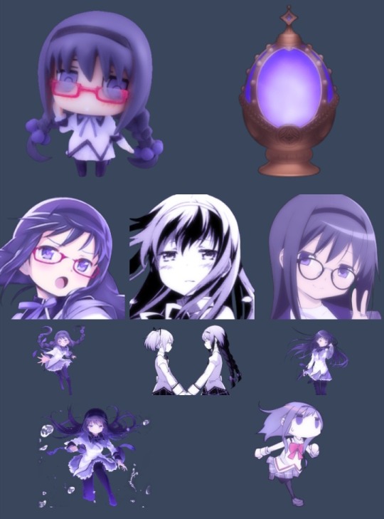
All of these are taken from @/madomagitransparent !! It's good to gather more than you think you'll need, as sometimes it just doesn't crop well or work with the filters. I have a surprising amount of icons and headers that have been scrapped because of this.

︵☆ Cropping 〃︶
I use ibis paint to crop all the resources i've gathered down to either their icon or header size. This isn't required, but I like making sure everything is the same! Some platforms are also really particular about their header sizes, so this just makes sure none of your hard work is getting cut off when they're actually used.
For these layouts I stuck to official artwork and merch, but you can also use photography and do these same steps!

︵☆ Editing 〃︶
From there, you can use any editing software you're already familiar with! I personally use my own filters on polarr, but other editors sometimes post their own codes or psds for free use! I'll try and do a polarr tutorial at some point too, since it's really trial and error and a lot of the tutorials I found didn't really help me when I was starting out.

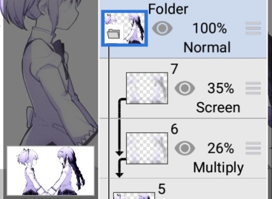
A thing to note if you are using polarr is that it doesn't support transparency! I'm unsure if this is a general thing, or if it's a paid feature, but either way all you have to do is reopen ibis paint, and use a clipping mask to bring it back!

For these layouts, I also used ibis to add a subtle blur effect! I can't find the tutorial in which I initially learned about this, but tldr: duplicate your image, gaussian blur, then use blend modes and opacity to get the effect you want!


︵☆ Posting 〃︶
Then the easiest part, posting! Sometimes I test layouts on a spare blog I have, other times I just mess around in the post editor to pair the icons up to headers. The people using your layouts will likely use a different combination anyway, so don't overthink this!
finished layouts can be found here ♡


20 notes
·
View notes
Text

take heart, victory will be ours ♡
ʚ﹕info ⋆ ꒰ extras blog for @skylics ꒱

4 notes
·
View notes