#(I tried rainbow lineart!!)
Explore tagged Tumblr posts
Visit Tumblr Blog
Explore Tumblr blogs with no restrictions, modern design and the best experience.
Last Seen Tumblr Blogs


Fun Fact
Post activity is at the highest at 4:00 pm EDT; notes peak at 10:00 pm EDT.
Text


Chuuya has had enough of the yapping!!!
#bungo stray dogs#bungo stray dogs chuuya#bungou stray dogs#bungou stray dogs chuuya#bsd#bsd chuuya#(I tried rainbow lineart!!)#(I do like the rainbow shading with regular colour lineart though)
380 notes
·
View notes
Text

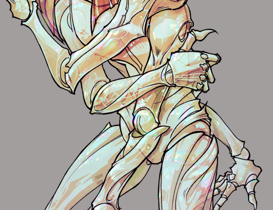
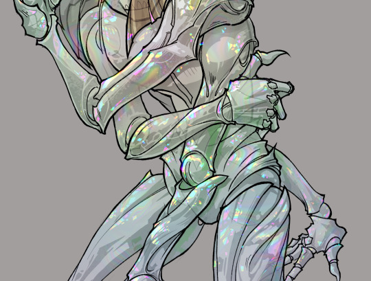
i would like to award kaveh the highest honor i can bestow 🖤💚🤍
open for better quality | no reposts
#kaveh#genshin impact#genshin#fanart#myart#doodle#this is The Prettiest kaveh and probably The Prettiest art i've ever drawn period#he is very special to me for many reasons#i love him so so much and i'm very thankful to him#and i tried out some of the new csp assets i got recently hehe#the sun/rainbow/dust and lace and clouds are all tools i'm trying out for the first time#and look i incorporated the wood pencil brush#it's so my style it makes me feel like i'm drawing traditionally which is enjoyable#wish i could redo all the apps i've submitted in the past to include this in my portfolio bc-#this lineart feels like it's truest to my style!! and this is what i'm really capable of!!#gonna stop patting myself on the back here but. i'm very happy w/ how this came out#oh and as a note i looked up flowers to put in the bouquet and acanthus means 'fine arts' which was fitting#one site said they can be used to celebrate an architecture graduate so!! perfect for kaveh
379 notes
·
View notes
Text
Something something alien superstar

(Don't copy/trace/repost/steal/etc.; Click for better quality!)
#i tried something new and just used the sketch layer for lineart#zooey electra#rainbow high#shadow high#jasper screams#jasper's art#mga entertainment
22 notes
·
View notes
Text
gonna show u guys a little opalescent highlight hack i threw together today
rainbow gradient above your main figure (i usually have all my main figure folders/layers in one big folder, so i can clip gradient maps + adjustments to it!). liquify tool to push the colors around a bit. STAY WITH ME I KNOW IT LOOKS STUPID RN I'M GOING SOMEWHERE WITH THIS
THEN: set it to add/glow (or the equivalent in ur drawing program), lower the opacity a bit, and apply a layer mask. then u can edit the mask with whatever tools you like to create rainbow highlights!!
in this case i'm mostly using the lasso fill tool to chip out little facets, but i've also done some soft airbrushing to bring in larger rainbow swirls in some areas. it's pretty subtle here, but you can see it better when i remove the gradient map that's above everything, since below i'm working in greyscale:
more granular rambling beneath the cut!
u could also just do this with a brush that has color jitter, but what i like about using layer masks for highlight/shading layers is how simple and reversible it makes everything. i can use whatever brushes i want, and erasing/redoing things is super low stakes, which is great when i often approach this stuff with a super trial-and-error approach.
example: have u ever thrown a gradient w multiple colors over an entire piece, set it to multiply etc, and then tried to erase it away to carve out shadows/highlights? it's super frustrating, bc it looks really good, but if u erase something and then change ur mind later, u basically would have to like. recreate the gradient in the area u want to cover up again. that's how i used to do things before figuring out layer masks!! but masking basically creates a version of this with INFINITE undo bc u can erase/re-place the base layer whenever u want.
anyway, back to rambling about this specific method:
i actually have TWO of these layers on this piece (one with the liquified swirls shown above, and another that's just a normal concentric circle gradient with much broader stripes) so i can vary the highlights easily as needed.
since i've basically hidden the rainbow pattern from myself, the colors in each brushstroke i make will kind of be a surprise, which isn't always great -- but easily fixable! for example, if i carve out a highlight and it turns out the rainbow pattern in that area is way too stripey, i can just switch from editing the mask to editing the main layer and blur that spot a bit.
also, this isn't a full explanation of the overall transparency effect in these screencaps! there's other layer stuff happening below the rainbow highlights, but the short version is i have all this character's body parts in different folders, each with their own lineart and background fill, and then the fill opacity is lowered and there's multiply layers clipped to that -- blah blah it's a whole thing. maybe i'll have a whole rundown on this on patreon later. uhhh i think that's it tho! i hope u get something useful out of this extremely specific thing i did lmao
12K notes
·
View notes
Text
Today is Dungeons & Daddies’s 5th Anniversary!

I haven’t been listening for nearly that long but the podcast and all its characters means a lot to me. Happy Anniversary!!!
Throwing the cropped sections under the cut because there’s a lot of stuff going on and I know Tumblr likes to throw half the pixel quality out the window. And also so I can ramble a bit about this piece!!!
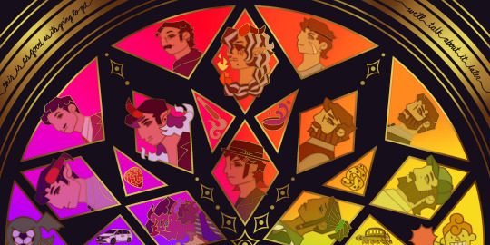
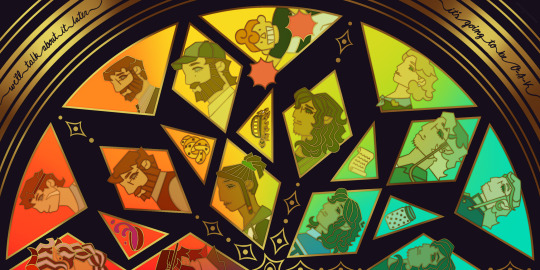
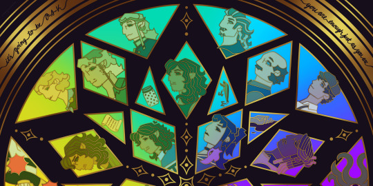
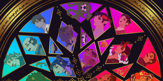
This piece has been months in the making, possibly an entire year. And by that I mean I’ve had a sketch of the comp scribbled on my whiteboard for ages because I wanted to save this specifically for 5th anni art. Now onto design stuff!
(First off a random thought: I really love how the garlic knot came out, I kind of want it as an enamel pin.)
I knew I wanted to make this a stained glass piece since the beginning, but I was also going to add flowers at one point but quickly dropped the idea. It felt like too much and I also didn’t want to fuss over flower language assignments for everyone. I was also going to add Doodler tentacles, but also dropped that idea pretty early. Kind of on accident, right at the end, I figured out how to make it even more stained glass-like but taking a duplicated lineart underneath the regular layer and turning the brightness all the way down, then setting it to overlay and adding a guassian blur. It’s very subtle but it adds that tiny bit of depth that makes it look more real. As for shading on the lineart/gold, I tried adding more highlight on the characters who died but once I evened everything out it wasn’t as noticeable anymore so I’m throwing that thought here so the attempt at least known lol.
The order of characters only changed a little bit from my original comp, I flipped the Wilsons and the Oaks so the rainbow could work. As for the anchors, specifically in season 2, I lined them up to the teens since the season 1 anchors lined up with each dad:
Tony —> Scary: his death was the beginning of Scary’s betrayal arc and also Willy killed him.
Guitar Pick —> Taylor: it’s not really aligned with Taylor at all, but the anchor was with Glenn so I put it next to his blunt.
Scroll —> Normal: was only because it was the last left to give him, but there’s the whole scene of him and Hermie in the Green Room so it still works!
Garlic Knot —> Link: one of two that he broke, but the more significant of the two with him telling Grant he never wants to see him again.
Small notes on the season 1 anchors: I put the layer of mold in the overnight oats but you can’t really tell with the overlay. And to make the supper bowl more interesting I added the fantasy sodas mix they dumped into it. The lure of actually drawn before so I just traced my own art lol.
As for the other smaller triangles, it took me a bit to figure out what I wanted to put there. I didn’t even think of adding the vehicles until two days ago but I’m so glad I did. I don’t really have my own take on the mascot version of the Doodler (yet?) so I borrowed the design from one of the stickers in their merch shop. Teeny was terrifying as just a front facing head so I made him cute again.
In the outer circles, I put what I felt was the most significant quotes for each family. I really wanted to use “It’s okay to be angry, it’s not okay to be cruel” but it was just a little too long.
That’s all I can think of! If you read all the way through, thank you for indulging me in my excitement to gush over this piece.
#dndads#dungeons and daddies#dndads fanart#dndads s1#dndads s2#dndads glenn close#darryl wilson#henry oak#ron stampler#jodie foster dndads#nick close#nicholas foster#nicky swift#grant wilson#sparrow oak#lark oak#terry jr#taylor swift dndads#lincoln li wilson#normal oak#scary marlowe#hermie unworthy#bill close#paeden bennetts#barry oak#willy stampler#meryl streep dndads#robert wilson#hildy russet#stud stampler
2K notes
·
View notes
Note
hi!! i just wanted to say, i LOVE your art!! i started drawing my kris design with braces after seeing dubs of your comic on yt, and when i found you on tumblr i was beyond excited to see all of it in context. i’m a comic artist as well, and i was wondering— how do you choose your color palettes ?? besides obviously picking colors from the characters themselves, that’s a given— but your comics are bright and colorful and just a real pleasure to read because they’re so visually appealing. hope this question hasn’t been asked before!!
Thank you so very much!
So I really went into your question under the cut. So feel free to proceed if that is something that interests you.
The answer is honestly not that exciting. For the characters I really only do pick colors off the original sprites. Which is why they look so bright and colorful. If you try to do that yourself, you will quickly notice how SATURATED the sprites are. And not only the sprites, but also the backgrounds.
A little trick I use is that for pre-existing backgrounds I take all the colors and brighten + desaturate them just a teeeensy tiny bit. That way the characters in the foreground pop way more.
Another way to make the colors pop even more is to use colored shading AND colored lineart! That really IS what ties everything together. Let me show you..

This is a panel without the colored shading and lineart.

And this is it again WITH all that good stuff. Quite the difference, no?
But you're asking about color palettes, so I guess you also mean for the characters/outfits I designed? A lot of it boils down to color theory. I am by NO means an expert on that subject, but when looking at the Dark World designs specifically, you will notice how I did it.
For example: Frisk's Dark World color scheme is mainly analogous. That means the colors are right next to each other on the color wheel. But there is a little bit of complimentary in there.
Here, lemme visualize it...

Frisk's color scheme is a light green, darkish blue green, light yellow and a splash of pink. The red is there mostly just for lore reasons.
One thing I noticed when looking at the sprites of all the Dark World versions is that they are EXTREMELY bright and saturated.

That is something I tried to capture as well, but I think it didn't neccessarily nail it a lot of the time. Especially for Frisk's color scheme. If I stuck closer to what the game is doing, then in theory they would look more like this (using Kris' colors as a reference)

Looking back, I WOULD tweak their colors slightly more nowadays. Just so that the contrast between the colors is a little stronger and they don't blend together as much. This improves the readability of your design. Not all people are able to perceive every color of the rainbow, so readability is EXTREMELY important. Best way to see that is by desaturating them and checking the grayscale. Like so (left is the one closer to the game's colors)

Man, this REALLY makes me wanna fix their color scheme. This has been bugging me for a while now. (Though I'm kinda afraid that people point out that they look different.)
166 notes
·
View notes
Text
The winners of the poll (as I kind of expected) were Rarijack and Appledash, so here are the linearts in case I fuck up on the colouring a usual :3


This is Pepper Dash and Gala Apple!
Pepper was named because (i didnt want to do zap apple its the most common one) a pepper is a spicy vegetable, and both AJ and RD like spicy things, but rainbow doesn't have a very high spice tolerance (but they pretend to). Also Applejack finds the name unnaturally funny. I imagine they fought over whose last name he would take. He was an active baby and a bit of a jerk as a foal, but he got over that. He is obsessed with cowboys and rodeos, and currently has a job as a cloud wrangler, but dreams of being a rodeo star, or a great heroic cowboy. He was given a fire salamander that he named Bubbles because of the circular marks on her. He's not creative with names. He is a canon ship kid.
Gala was named after the kind of apple called gala apples. I imagine Applejack spent a lot of time on finding the perfect name, and Rarity was very touched but also like go the fuck to bed it's not THAT important. Rarity was a little horrified when she saw the baby had GREEN HAIR, but she really tried to ignore it, because she still loved her. She learns to like green... she was a calm and curious baby, and a playful foal. She loves flowers and colours, and works at a flower shop that she runs, with money from her mom. She grows, arranges, and sells her own flowers, and loves it. She was given a rabbit, who she named Peach, because of the pale orange spots, and Peaches being her favourite fruit. Applejack tries to convince her to move apples up from second place. She is a canon ship kid.
#my art#traditional art#mlp shipping#mlp#mlp fim#mlp friendship is magic#my little pony#my little pony fim#mlp fanart#mlp g4#mlp oc#my little pony oc#my little pony fanart#ship kids#mlp ship kid#ship art#shipping#rarijack#appledash#rarity#applejack#rainbow dash#applejack x rarity x fluttershy x rainbow dash#wip#wip art#lineart
23 notes
·
View notes
Text

one of the color illustrations from Mahou Rainbow! I’ll be releasing the color pages from it over the next few months but the lineart/coloring pages will remain zine exclusives. It’s a magical girl zine and coloring book!
If you’d like to grab a copy and color this page yourself, you can see the links here, it’s still only $5 for the full zine. The theme for this page was ‘seasons’! I've always liked the idea of a magical girl who changes costumes to match the weather/seasons, and this isn't my first time drawing the concept, but I really tried to embody the seasons with these! ✨
#magical girls#mahou rainbow#zines#original#illustration#mahou shojo#who else is COLD. i wish this magical girl would come and change the season here. theres ICE OUTSIDE#not even snow just ice -_-...if ur gonna be this cold at least include snow!!!
48 notes
·
View notes
Text
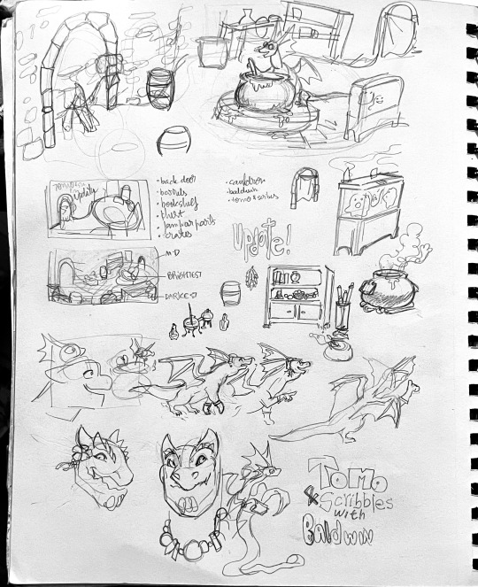

When I found out about the zine I would peck at doodling Tomo and Baldwin because my obsessive compulsive thoughts would kick in and demand I drew things "correctly", whatever my brain thought that meant. Despite that, I tried to keep the ideas flowing so that I could produce something I could actually submit as an application. I found some peace doodling background elements, which I sadly had to rush through at the coloring and lineart stages (it got really intense).


Some of the scrappiest stuff.
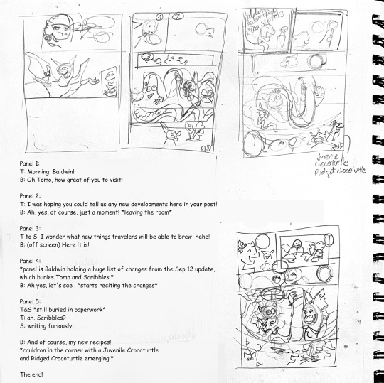
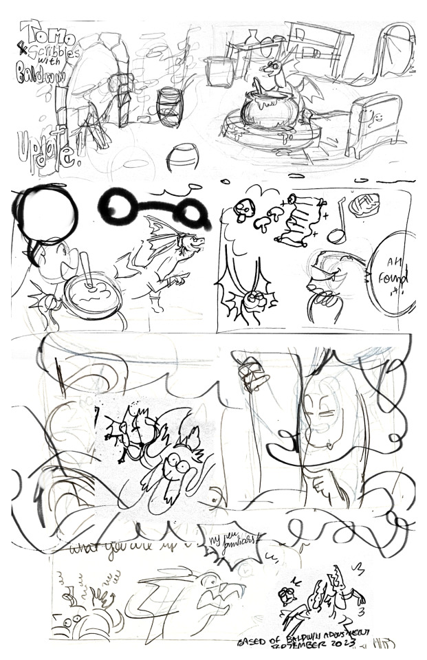
My initial composition and submission.
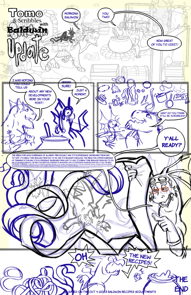
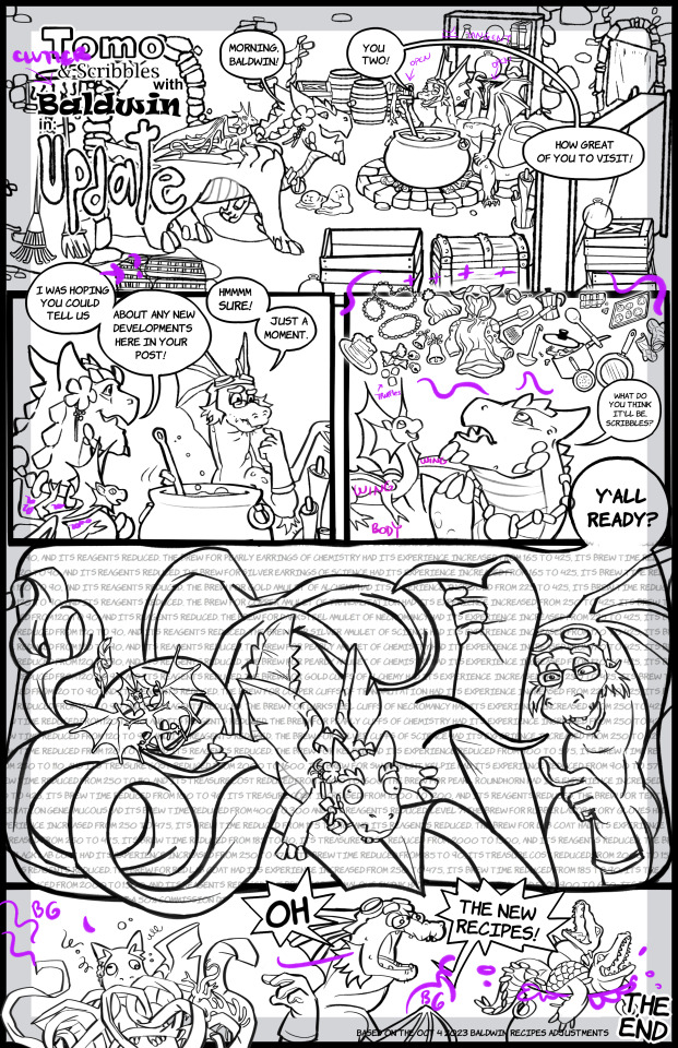
Lineart. LINEART. This was intense. Thankfully I've done a lot of digital work and was comfortable with masks and saving copies of everything, and merging anything I could together. I'd like to keep things looser next time and have even more confidence in lines so that my coloring could be on a single layer to achieve a more painterly style. Well, that was the other issue.
My OCD would go OFF if the colors for any of the characters were too "off-model" so I tried to keep them intact as much as possible. I ended up making that blabber balloon rainbow so that it would contrast and yet also blend in with the whole page that ended up coming out quite rainbowny. I enjoy the final result but maybe I could do something more muted next time. Quick mockup:

Thank you for checking out my process!
9 notes
·
View notes
Text

Wally Darling from Welcome Home ARG.
This was just something that spawn in my head when I was working on the speedpaint reel of my Wally and Yellow Guy drawing on my instagram. I was going to use 'Rainbow Connection' for that reel until an idea came in my head for a new drawing. I felt that song was so inlined with this upcoming drawing that I've decided to use a different song for my last drawing and use 'Rainbow Connection' for this speedpaint.
It was even supposed to have lineart with it but it become lineless art along the way. Either way, for a quick random idea, I'm quite proud of this.
Also, check out my speedpaint reel on instagram if you want to see the art process.
Now that's outta of the way. I wanna talk about Wally and my thoughts on what's his role is going to be in the story.
While there are a lot of things still a mystery, I feel there are some things established about Wally's character and the role he will play in the overarching story.
1.) Wally is fully aware he's a puppet and that he was part of the TV show: Welcome Home.
2.) All of his friends besides himself and Home are either missing or dead.
3.) He is somehow influencing the restoration project and can communicate through the website.
While I have no doubt Wally is going to be antagonist in the arg, I do wonder how he going to be portrayed as it goes on. Will he be pure evil? A victim? Or will be a decoy as the real big bad is lurking in the shadows? We don’t know Wally’s motives for starting the restoration project or why the show was canceled in the first place but I do have a theory.
I feel when Wally became sentient, he became disillusion with the world he was in and tried to escaped it. Whether he took the Doki Doki Route or his friends were caught in the crossfire is unclear but in the end, his actions caused his friends to be no more and the show to be canceled. So years later after everything, he manages to find a way to somewhat influence the real world through unknown means. He is now trying to bring back the show but his reasons for doing so can be two things.
The first reason is that he is still trying to escape into the real world but the other reason I think he isn’t just trying to restored his show itself but his friends. We have no idea why they are gone, just that they have disappeared. So, the restoration project may be part of a way to bring back his friends. To Wally, he can have everything when the restoration project is completed: His connection to real world, his friends, the show… everything would go back to the way it was… except it won’t. Wally is not the same puppet before everything started to go downhill. He aware what he is and know he basically in a cage. Not only that, he’s been mostly alone for years now before the start of the project. So, he basically a bit unhinged right now. If his friends do come back, whether they are still the same or become a dark version of themselves, it will not be the same as it once was before.
There is also Home as well. From we what we seen, Wally kinda fears Home as in a audio clip shows him sounding a bit scared of if Home like his song or not. Wally has also been seen worshiping Home. There’s definitely hints of a toxic relationship going on here and I have wonder if Home is the source of all dark stuff that’s been happening. There’s an instance where he was telling us to be quiet. Like if we make a noise, something might catch us. If it’s Home he is talking about, than we have to wonder what exactly is Home that making Wally scared of him.
Either way, I can't wait for more from this project and for the creator, Clown to take all the time he needs for himself and the project. This really blew up quick and it can be really overwhelming but I wish the best of luck for Clown.
#welcome home#welcome home arg#arg#welcome home puppet show#Wally#welcome home Wally#Wally Darling#welcome home wally darling#procreate#procreate art#digital painting#drawing#digital drawing#art#digital art#illustration#fanart#horror#lineless art#digital illustration#painting#puppet#horror art#mystery#artwork#digital#no lineart
29 notes
·
View notes
Text
okay so i threw this together in like an hour but in reality it took longer bc i fell asleep midway through it so its. 3am now and i dont have any more time to work on it. turns out setting it as my icon makes it look like shit because of the thin lines at such a small size so im gonna have to work out a solution tomorrow when its not 3am and im not falling asleep midway through. but i really like how the thin lines are so here it is at full size 😔
#not even sure about the background like is the rainbow too much#but also the biggest problem rigjt now is the lineart which is what takes the longest to fix so UGH#i feel like making it thicker would make it look bad though ???#IDK. its 3am#im awake now bc i slept but like. its 3am i just gotta lay in bed in rhe dark now 😭 even if im still on my phone i need darkness#brot posts#v posting#i wanted a flat color bg at first but i couldnt settle on a color and also is it too much flat colors .#like too flat… too boring …?#so i tried the rainbow#but now is it too much …#maybe if i made it more pastel so its not as. Much ???#but my laptop displays colors so badly that wrangling with the colors is a whole beast on its own#so AGAIN. its 3am i cant deal with it now#ALSO is anyone elsehaving problems with tumblr fucking destroying quality#like i cnt even say click for better quality bc its still. shit when you zoom in#like my lineart is so clean in medibang then here its like. no better than the original comic quality#like whats the point in cleaning it up at all then . i mean other than setting my own background for it i guess#my edits
1 note
·
View note
Note
Are there any medics on deneb? What’s the general population of the station?

Guess who just visited said color changing place

#octane#transformers#tf#ask blog#askblog#transformer#tf ask blog#transformers ask blog#unnamed colorful dude#I tried to fix the rainbow dudes colors#but their lineart and color are on the same layer 😔✌️
2 notes
·
View notes
Photo

i tried different coloring and i’m scared. i cant even tell if its good or bad because i’ve stared at this for too long
#sketchems#my art#finished#i just finished the sketch from yesterday#i dont know if thats cheating?#this took forever because#i tried a million different things#the style is new#the lineart is sorta different#the coloring is all over the place#the other one is just a person lmao#drawing#girl#dress#cardigan#i would normally tag the main colors but#this has every fuccin color of the rainbow help
1 note
·
View note
Text

word of the day (3): rainbow 🌈
@mcytmutualsmarch
I'll be honest it is an attack on my eyes but i tried something new with the colours so heh 🤷♀️
[ID. A digital drawing of c!Puffy. The lineart is green. Her hair is wooly and divided in brown and white. Her horn is rainbow. Her eye is yellow with a light blue inner ring and purple pupil. She's wearing a yellow sweater decorated with patters, green trousers, brown boots. End of ID].
78 notes
·
View notes
Text
Tried to post this the other day but tumblr ate it, here's a scratchboard of a beloved bearded dragon named Charlie which I made for my sister on glittery scratchboard
[ID: a video of a scratchboard paper which is mostly black, lying on a wooden desk. The image on the paper is a lineart drawing of a bearded dragon eating kale. The camera moves side to side, showing that the base colour of the scratchboard is a glittery, shimmery rainbow, changing colours as the light hits it differently. Beside the scratchboard is the metal tool with a plastic handle which was used to make this piece. End ID)
16 notes
·
View notes
Photo

Now that voting has closed, I can share my entry for the MLPArena spring coloring contest! I colored this lovely lineart by @shaiyeh.art with Prismacolor and Copic markers! I actually had some issues with the printer ink smearing, and I realized the perfect coverup - freckles! ☘️ What a cute fella, I’m very happy with how he turned out! 🍀 I love that he’s surrounded by thistle and clover, so I tried to pull in the purple thistle colors for his hair and the rainbow - with a little stripe of gold! 🌈#ponyguruart #markerart #mylittlepony https://www.instagram.com/p/Cb6F4f0JFHP/?utm_medium=tumblr
13 notes
·
View notes