#[<- image and sound design]
Explore tagged Tumblr posts
Text


Every single frame of this show could be put in a museum
#Wheres that one image that's like when you want to info dump but have no coherent sentences#and is a drawing of a guy holding a picture with tears running down their face#That's me right now#Only tears#It's so beautiful#from the sound design#To the shots the colors the acting the use of minecraft body language#The slowness and quiet#And the music my gosh the music#Just aaaaaaa#Whitepine
636 notes
·
View notes
Text
murder drones intermission vuzi send post
#needed to document my brainrot#this image should be accompanied with applause and yippee sound effects#murder drones#murder drones intermission#uzi doorman#serial designation v#vuzi#violetviolence
295 notes
·
View notes
Text
I'm gonna start posting some original fan Pokémon music I've been slowly making for my Cobblemon server. Here's a theme I did for Professor Acacia, an archeologist and fossil expert based in the spawn town "Apricorn Town."
#my music#fan music#my art#oc#pokemon#the image is the player skin i made for her npc#she was designed by snoozincopter. since he didn't post his design of her online i won't be posting here sorry#also everyone who guessed black and white's sound font in my last music post good job#everyone who guessed b&w2 SPECIFICALLY. how the hell did you know#also spot the pokemon leitmotif i snuck in there nobody's found it yet
206 notes
·
View notes
Note
I am very curious about the bingfan wips if you don't mind me asking about them :)
By all means—I love gushing about these two idiots with you (and now that the SVSSS muse has returned from its unauthorized vacay I think there might be more down the line 😉 ) So thanks @pr0cyon-lotor for getting this jump started again!
The Hungry Ghost cafe wip is a modern au where high schooler LBH gets a job at a sketchy rundown restaurant that he learns caters to hungry ghosts in an effort to keep them satiated and away from living humans. Unfortunately one of his coworkers is Ming Fan, who sometimes bullies him in school but now is horrified that LBH now has something over him. But they’re forced to work together and slowly start to rely on each other and see each other in a different light. The restaurant is owned by married JiuYuan (ofc 😝), (…there’s a betting pool among the employees that one of them is a ghost but no one’s sure who). It’s kind of a slice of life type fic which is prob why it’s so disjointed and nowhere near publishing lol, it’s mostly a fun thing to play around with.
As for the BingFan teen parents fic… Pretty much what it says on the tin! On a mission, Ming Fan and Luo Binghe get caught in a patch of Airplane’s ubiquitous fuck-or-die flowers and end up having weirdly cathartic hatesex. Unbeknownst to them, the flowers share a symbiotic relationship with a special vine that always grows with it, which they only find out about after they’ve recovered…
He was still groggy from the forced sleep that had dragged him down, and he wanted to scour himself clean from the evidence of their… mishap. He glanced to the side to see if Luo Binghe was of the same mind, but he realized his shidi was not lying next to him. Luo Binghe was a few feet away, crouched over a patch of flattened, stained flora. Ming Fan realized belatedly why it looked that way and turned his head so his hair could hide his burning face. But Luo Binghe wasn’t even looking at him. Instead, he was making a concerning stuttering sound. Alarm lanced through Ming Fan. “What’s wrong?” he blurted, scrambling to his feet and darting to Luo Binghe’s side. The plant his shidi was hunched over was more of a thick net of vines twisted into one larger stem. And there was something moving in the tangled nest at the heart. Ming again frowned, wondering if his talismans were still in his ruined robes. He opened his mouth to speak, but couldn’t. There was something… wrong. And then an infant’s cry shattered the pensive stillness. Ming Fan stared wide-eyed at the plant. “I recognize this vine,” Luo Binghe said slowly. “A couple who lived in the village I grew up in were unable to have children.” Ming Fan was dreading where this was going. He flinched at another infantile cry and Luo Binghe began gingerly peeling the leaves away from the tangled nest of vines. “…They spent a night on the mountain and returned to the village the next morning with a baby of their own. Not one they had adopted or stolen, but their own flesh and blood. They said there was a plant that if two partners water it with their spend, it will grow a child.” Ming Fan pressed his eyes shut but that didn’t keep out the words. Fuck fuck fuck. Please let this plant be a man-eater that attracts prey with the sounds of a baby, he prayed. But the universe seemed to have it out for Ming Fan in particular, because Luo Binghe’s soft gasp was confirmation enough. Ming Fan’s eyes sprang open just in time for the last thin vine to be peeled away from the tiny, squirming body of a baby.
They bring it back to the sect and try to pass the baby off as an orphan to be raised by one of the other peaks but MQF recognizes a plant-baby when he sees one and gets excited about studying it (while also giving BingFan a crash course in parenting). SQQ is excited for a whole ‘nother reason: he’s shocked Ming Fan was the one to fall into that particular wife plot but is delighted to be a surrogate grandfather to the Protagonist’s first child, no matter how unorthodox.
They can’t live in the dorms with a baby so SQQ gives them an empty hallmaster’s house (marriages happen among disciples i.e. LBH/NYY in PIDW so it’s not that uncommon) Domesticity ensues.
Soon the entire sect knows Ming Fan and Luo Binghe had a child together despite them trying to keep it a secret and everyone the best congratulation gift is unsolicited advise from all Peaks.
It takes a sect to raise a child, and this one’s no different.
#I just have this mental image of SQQ wearing a babysling while teaching his classes#grandpa!sqq is the self-designated babysitter while bingfan are attending their duties elsewhere#also#got the idea of the plant baby from a fic but I don’t remember which one… 😥#not even sure what ship it was—liushen or jiuyuan or whatever#if it sounds familiar let me know#you’ve got mail!!#svsss#bingfan#luo binghe#ming fan#shen qingqiu#shen yuan#jiuyuan#mentioned#aus I’d love to read#why is writing so haaaaard???#fml honestly#fic ideas#my writing
74 notes
·
View notes
Text
That one post of Veldigun!Alex stealing back their voice from the foundation through Toon Lankmann is such a hilarious mental image like HUH
Anyway quote i found that just fits that
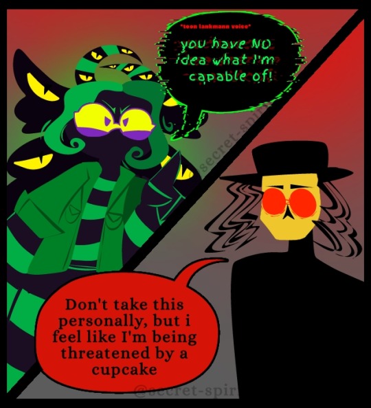
#dreams of an insomniac#doai#alex williams doai#doai sitcom au#herbert lankmann#like- the mental image of Alex taking the advertisement recordings and vacuuming™ them off of their sound#OR the literally stealing back their voice through an ACTUAL toon lankmann character it's just- idk i laughed so hard back then at that#anywah proceed to see me have an designing crisis over my veldigun alex design mostly through the horns
253 notes
·
View notes
Text
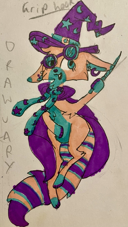
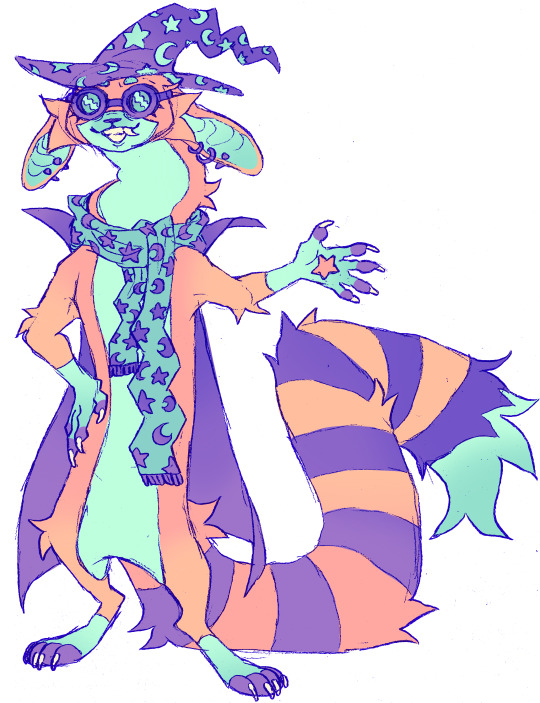
six YEARS of art between these two drawings. I'm proud of where I am now and the practice I've done over the years [: I can't wait to see where I go next with my art!!
#not just as an artist but as a character designer too!! though I tried to make it similar to the original#artists on tumblr#furry#furry art#furry oc#anthro#wizard#magic#I dont know why their name was 'griphook'#art improvement#character design#technically the second piece was ALSO traditional. I sketched it on paper with a pencil before transferring it to procreate#described art#accessible art#they look like an npc for a fantasy game... I like that :3#CHAT. HOW TO WRITE IMAGE DESCRIPTIONS THAT MENTION IMPROVEMENT WITHOUT SOUNDING EGOTISTICAL
182 notes
·
View notes
Text
prefacing this by saying it's obviously just my opinion, but i've spent soo much time thinking about what makes an eiffel design look the Most Eiffel to me, personally, so here are some design notes:
dark, wavy/curly hair. unkempt. anywhere between just past his ears to about shoulder length. usually tied back in a low ponytail.
scruffy!! never, ever clean shaven. his facial hair is most prominent on his chin, and there's a visible break between the hair on his upper lip and the hair on his cheeks. stubble, short/patchy beard, or hair just on his chin all work well depending on style.
visible arm hair!! and any other body hair that's relevant. generally hairy guy. anything that makes him scruffier looking is important.
long features - long face, long limbs. lanky body type, but with a bit of weight in the gut. bad posture. talks with his hands. wide, open body language: tall-ish with fairly broad shoulders, but most of the space he takes up is in his limbs so he can kind of comically fold narrowly into himself when scared / being yelled at / etc.
(classic Doug Eiffel Arms Behind Head While Leaning Back and Floating pose is always a winner.)
expressive, to kind of an absurd degree. tired eyes. lopsided smile. his eyebrows do a lot of the work: i often see people instinctively draw eiffel with sheepish "─┘└─" shaped eyebrows and it's very real to me. constantly hamming it up even when he doesn't mean to. he has the presence of a class clown that never grew out of it.
prominent nose, kind of "square rounded" in shape with a wider tip <- same as zach valenti's. i wouldn't say he looks exactly like zach valenti to me, but definitely very close, with a difference more in style than features. italian-american by association...?
generic star wars logo tee as his default outfit, but other generic logo tees for things he likes, or "undershirt worn as shirt" also feel true. the key point is that it has to look like he bought it at walmart for less than ten dollars. will wear it until it disintegrates.
not really a guy who accessorizes either, unless wearing his headphones around his neck counts.
rarely wearing shoes. holes in every single one of his socks.
orange is my preferred flight suit color for how it visually suggests eiffel traded one prison for another. needless to say, maybe, he should never be wearing it properly. usually tied around his waist, but he pretty much never wears long sleeves - even if he has the sleeves on, they're always rolled way up.
#wolf 359#w359#doug eiffel#i'm sure i have others but these are most of the key ones. in my opinion. sometimes i wish i didn't have such a set image#because i feel kinda guilty whenever i see otherwise nice art but i'm like oh... why did you shear him... <- most common reaction#and it makes me seem a little insane. but on the other hand. i think it's really fascinating#how consistently people tend to draw eiffel like wow is zach valenti a guy who looks exactly how he sounds. it's uncanny.#on the other hand my only strong hera design opinions are: aquiline nose. generally angular. shoulder length hair worn more to one side.#someday i'll learn to draw. maybe.
69 notes
·
View notes
Text

[172] Fanart for my stupid game (affectionate)
#172#xisuma#xisumavoid#daily xisuma#hermitcraft#I don't call it stupid because I hate it. it is a descriptor and a compliment#I have put maybe 5-6 hours into it. all but 1 of its graphics are stolen from doom and hexen. the one that is NOT stolen is a pixel art of#xisuma's face with the background just white. none of the aspect ratios for my sprites are fine#the background is a static image of DOOM REVENANT (with poor ratioing)#the gameplay is hilariously simple (dodge the torso guys coming from either side and collect the glowing blue balls that took me 3 hours#to figure out how to animate)#the menus are 15 point Ariel font on black background with little to no attention to to how it looks#my sound design is looping sigil 2 intermission music. comically evil taunts I stole from hexen. hexen flask pickup noise.#and of course when you die there is a scream of someone falling to their death (that I stole from hexen)#regardless I am going to go spend another 20 minutes playing. I think I've succeeded at game design
42 notes
·
View notes
Text
I did this meme with Dr. Afton and William Afton now its girlies turn
When they are both married/engaged to a man with "Afton" as his last name:

#Mrs Afton doesn't have an image for this meme as she doesn't have a Canon design#And Fnaf fandom has different views on what Mrs. Afton might look like#fnaf#Mrs Afton#mrs afton#I need stop using this meme#I did the boys now it's the girlies turn#I wonder how Dr. Afton pulled Mia#Mia Stone#thats not my neighbor#that's not my neighbor#Mr. W. Afton how did you pull a gal like Mia?#five nights at freddy's#five nights at freddys#I almost spelled five nights at freddys “Night Night at freddys”#God that's sounds like a ripoff of fnaf 😭#mia stone#Meme
103 notes
·
View notes
Text

Old friend charity Cruel twisted smile And the smile signals emptiness for me -----------------
I've always wanted to do something inspired by King Crimson's "Starless" : ) it's certainly my favorite progressive rock song.
Alternative/original version:

#I really like the way I drew ???% with a chalky texture. it'll be part of my design now#by the way the color palette and the shading are directly inspired by the album cover art#I have such a big image-sound association there was no other way for me to do something based on this piece of music#mp100#mob psycho 100#mp100 fanart#shigeo kageyama#???%#lalarts
36 notes
·
View notes
Text
my friend is adapting a book into a graphic novel, and so I was venting about how frustrating trying to read the beast and 15 manga has been. for me, the stylized art, while attractive at a glance, only shallowly engages in storytelling. instead, the artist seems far more preoccupied with (i) the aesthetic of individual panels and (ii) obscuring/hand-waving/distracting from the wonky perspectives, poorly designed panels, lack of movement/dynamism, and other technical inadequacies. if it was just a matter of the artist's skill falling short of their intention, that would be fine; but my impression is that there isn't any intention to work within the medium or engage in storytelling, and it deeply frustrates me because bsd's other adaptations have spoiled me by using the limitations and strengths of their mediums to expound on the story. by contrast, the 15 and beast manga struggle to tell any narrative, much less elaborate on the original.
but! I'm not an artist, and although I read a ton of comic books and manga, that doesn't mean I understand their technical components. hoshikawa's adaptations are also so lauded in the fandom, i also started to wonder if I wasn't just like projecting flaws onto it that didn't exist for no other reason than to be contrarian.
so i explained all of this and gave my friend my copy of the first volume of 15 to get their perspective. and after they flipped through a few pages, they were like the art seems technically fine to me. so I was like okay great I'm just being bitter then. and then they tried to actually read the panels, froze, and said, "oh." to which I was like, "the panels don't make sense when read together, right?" and they replied, "i don't think you can even call this sequential art."
which is to say, I've been vindicated, and what I lack in social grace, I have in metacognition and storytelling craft.
#bsd#bungou stray dogs#this has been nagging me for like way too long#anyway. i do really want a stormbringer manga. but i would like one adapted by a different artist.#i will be a little upset otherwise considering any adaptation's potential#and how poorly chuuya's fluidity and self control and dynamic use of his skill is adapted in 15#verlaine moves like chuuya but with even more polish and skill#and like. you could do SO MUCH with their fight scenes using comic panels creatively.#and fluidly#not to mention what you can do with the reveals and emotional devastation using page flips#the way junji ito adapts jump scares to manga by ensuring shocking images/reveals fall on the next page or at the end of a page#and bones certainly goes hard on what animation lends re: sound design and timing#i'll survive either way obviously#but idk it's just weird to me how it's not something anyone else seems to notice or discuss about hoshikawa adaptations
21 notes
·
View notes
Note
do you think in some evil twisted universe theres a boyri (boy kuri)
It would be evil and twisted for sure
#squidward We Serve Girls here Sir image#just kidding boyri just doesn’t sound fun to me…and girlbrey is an homage to his original design if anything#i know gender bends are contentious idgaf#quarshton
29 notes
·
View notes
Text
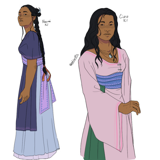
more side character designs now to the tune of the Kil sisters
#character design#art#Ciara Kil#Naomi Kil#you know what's fucked up? never heard the name ciara until a few months ago. it's pronounced with a hard c. like keera. that's fucked up#anyway her name isn't pronounced like that cause i said so. it's a soft c and you pronounce the i. see-are-ah#hard-c ciara doesn't fit her. soft-c ciara does. it's fantasy i do what i want. i makea the rules#anyway. needless to say im in love with them both#naomi especially im sorryyy she's so intricate. she's got so much little shit going on I heart her crazy style#shes very good at Doing Things Right but it is an active choice to do so. unlike Ciara who is just really naturally personable and likeable#and so even when she's a bit unkempt or pushy. she gets away with a lot because she's so damn easy to like#wheras naomi is A Choice. she Is Right not because she's likeable but because she puts effort into it#shes obsessed with her image (who else does that sound like? almost like they're products of the same environment or something)#shes Neat and Put Together and very formal. very traditional#and not just because of that but not helped by it she's very distant. just enough to be noticeable but not enough to alienate her#because since she's so curated elsewhere. everyone she's distant to assume that they're just not privy to whatever else is going on#they assume that SOMEONE is. and that someone just isnt them because they arent good enough. naomi has a way of putting herself in a place#where she is an unattainable goal. and that's all in her pursuit of Doing Things Right#i could talk about her for hours also. fucking love naomi#naomi and ciara and julian are all fun because they're all. So Different. but similar enough that if you look closely youre like...#yeah. yeah those three all came from the same place and you can TELL#even ciara who is generally more easygoing than the others. you can still Tell sometimes#case in point: she's stubborn as hell and not afraid to pick a fight to get what she wants#love her.#OC art#ocs
13 notes
·
View notes
Text


People Watching (2024) by 156/Silence SharpTone Records
Full res scans (300dpi)
#156/silence#metalcore#my scans#album art#should i tag that stupid name jack called the smiley guy by?#sure why not lmao#phillip watson#anyway i'm still obsessed with this album#the entire aesthetic is just fucking delicious#it's so creepy and uncomfy and i love it so fucking much#and like so much thought and effort went into the design of this album#and it matches the sound and style they’ve cultivated so well#it’s just really really well done and I’m obsessed#my scanner bands images like crazy sorry about that#one day i'll get a better scanner#some day
16 notes
·
View notes
Text

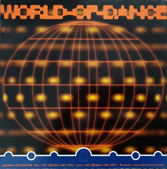
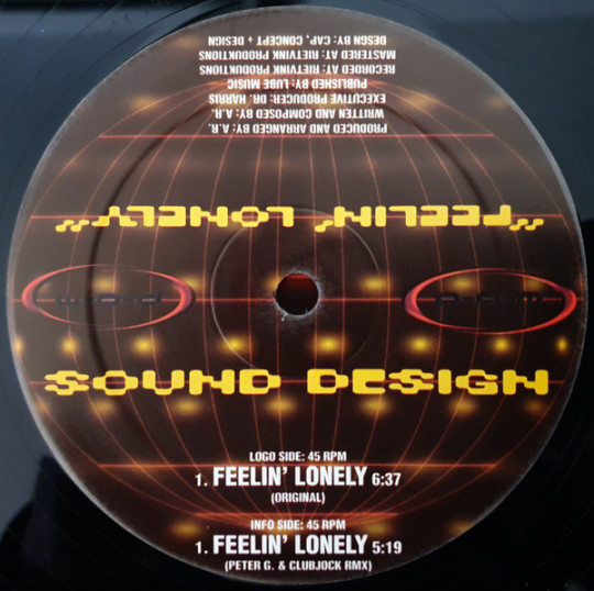

Feelin' Lonely by Sound Design (1999)
#99#90s#1999#1990s#art#cybercore#cyber y2k#design#disc#electronic#euro house#future#futuristic#futurism#graphic design#graphics#illustration#image#kaybug#music#sound design#y2kcore#y2kore#y2k aesthetic#y2k art#y2k core#y2k design#y2k futurism#y2k graphics#y2k
27 notes
·
View notes
Text

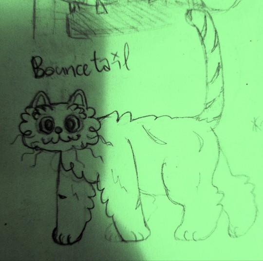

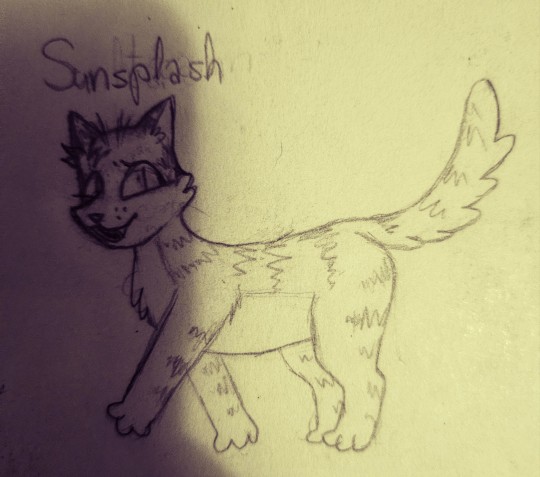

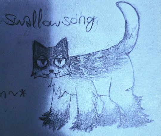
science team + benry and darnold as warrior cats! these are from last year but i kept forgetting 2 post them. btw sorry for the shadow its my phone (i dont have a scanner so i just have to take pictures)
#i dont have lore for these but they were really fun to design#amd name#bubbys warrior name was really hard because i kept accidentally making him sound too awesome#also benry's design is based off of a fancy pigeon ^_^ specifically the saxon fairy swallow pigeon. hence the name swallowsong#hlvrai#gordon feetman#benrey#benry#dr coomer#dr bubby#darnold pepper#tommy coolatta#hope i tagged everything right....#warriorcats#warriors#images that are horrid to see and look at
33 notes
·
View notes