#<- this is my usual art style [on csp] lol
Explore tagged Tumblr posts
Note
Can I now get a hhhhhhhh-YYYAAAAAAAAAA? Can I plz get a hhhhhhhhhh-YAAAAAA?
*shaking from the loughter*

its as if nothing happened at all !!
#IM SOBBING#IM SO SORRY#BACK TO ?? OUR IRREGULARLY SCHEDULED PROGRAMMING#hope ppl arent confused by this#<- this is my usual art style [on csp] lol#murder sans#dust sans#bad sanses#bar sanses#undertale au#sans au
116 notes
·
View notes
Text
its sooo silly but i feel like i have to make like an Announcement disclosing that yall might notice a bit of a change in my art style from now on 👉👈
#i recently downloaded csp and i've been trying it out#and i'm really happy to finally be able to make my art look the way i would've liked it to look all along#but its kind of a departure from my usual style and im afraid people wont like it!!!#even though i know whats important is that *i* like it. still tho lol. but hopefully yall will find it an improvement instead of a downgrad#<3#im still mostly on the ''playing around'' stage anyway#txt#midterms season is starting but i got a couple of kofi sketches down and ready to post that i'll be sharing soon!
35 notes
·
View notes
Text
Skirt Toge made a special appearance while drawing online with friends!
I ended up really liking how it turned out so I cleaned it up a bit, keeping on theme with the funky colors my friend drew behind him lol

#it’s lower res than I would usually shoot for but I had to work from a JPEG of my sketch and#i told myself I wasn’t gonna take too long on it so it wouldn’t matter (a lie)#but anyway!! sparkling!!! like sea salt#with all the toges I’ve been drawing lately I didn’t even need a reference lol#until the coloring at least (;w;) the uniforms have such a unique lighting style it took me hours hhhhhhhh#it makes everything look so soft and shiny and clean tho so 👀 i might have to do it again#anyway the lineart's not ideal if I were to make prints or charms but maybe I'll go back over it again with vector at some point#jjk#jujutsu kaisen#inumaki toge#fanart#siphisketches#siphiShowcase#my art#artists on tumblr#csp#(i drew the lineart in magma studio tho)#id in alt
60 notes
·
View notes
Text

oc-tober day 1: favourite oc! it's haru. he lives in my mind at all times.
#uhhhh is it still the 1st somewhere in the world? idk lol#oc-tober#bweirdoctober#bweirdoctober 2023#harukehn#gw2 art#gw2 oc#gw2 sylvari#this is totally not my usual style but i downloaded a pencil brush for csp and then i was POSSESSED by something#oc_tober#my art#wait is this the first actual art ive posted of him?#i think it is. lol ok.#say hi my son
18 notes
·
View notes
Photo


magical girl xion ✨🌙
#oneus#oneus fanart#I finally got csp and this was the first thing I drew in it#you can tell I change my art style when I switch programs lol the rendering is WAY different than my usual#but I love how it turned out#the iridescent sleeves ;;; perfect
8 notes
·
View notes
Text
Art style breakdown /tutorial(??)

Some friends asked so here we go : disclaimer im bad at explaining (so feel free to send an ask or smth)
Final art (long read so theres a timelapse at the end)


If its not for something important (commissions), i dont usually make a lineart for a drawing but just clean up the sketch , it wont be used anyway

I usually separate them by colors , mostly so i can Alpha lock them and not worry about coloring over parts
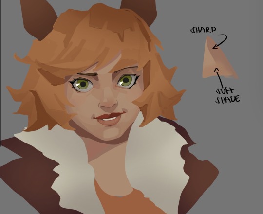
When coloring i use a soft airbrush to have gradients within the shading , so its not one solid color . How i shade is very blocky , lots of triangles lol (if im using CSP i love using the lasso fill tool ) but there are parts especially in the skin where I keep it smooth and blended, usually nose and cheek area . Using an asaro head is usually a good start to learning how to shade faces with planes in mind

Depends on the character, but I like adding shadows on the lashes/brows itself , make it look solid and 3d , it makes the eyes pop more imo

Using multiply layer to make the shadows darker for more contrast
At some point I’d merge everything together so i can just paint in one layer, easier to fix things with liquify too ; if im in CSP i keep the separate layers in one folder just in case i need em later but i cant really do that in Procreate cos of layer limits

This is the part where i make the shading more painterly .,To make the shading look sharper , i like adding lines on the edges .
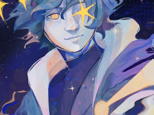
The fun part : adding the ✨
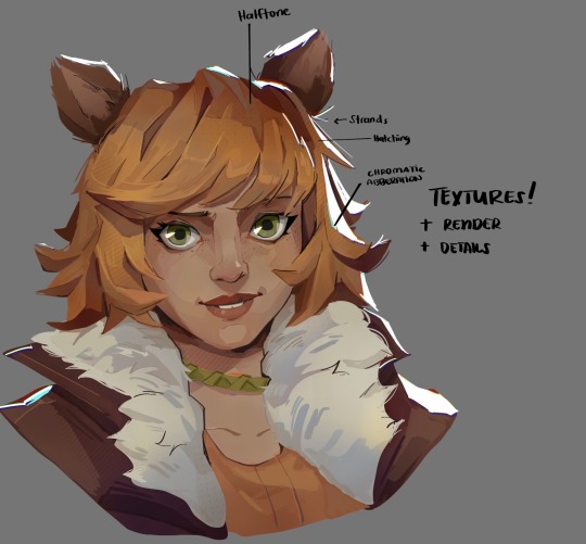
This is the part where I add textures , either from texture images or with screentone/hatching brushes. This is also around the part where i add the character’s accessories and stuff like scars and freckles (its just easier to add smaller things near the end than having them accidentally painted over at the start)
Whenever I feel like the drawing looks too much of a similar shade / temperature , I use a gradient map+layer effects (masked) on parts to give it variety . Technically you can do this by just having a layer effect on and manually adding colors but gradient maps make me go “ooooh didnt think of that color there “
CSP also has a posterization filter that i like using when i feel like some part looks too smooth to me.
I sometimes add in sketchy lines , and seeing how cool it looks in Marvel Rivals art ive been adding it more lol
Artists that influenced me are : Nesskain, Toni Infante , Valorant’s 2d art(their main artist is Suke) ,Arcane , Spiderverse and the most recent one ive been obsessing over is Marvel Rivals ( its got everything i want my art to be when it grows older lmao )
516 notes
·
View notes
Note
Hi Devo! If it's okay to call you that, I just wanted to say I'm a big big fan of your work and you made me fall in love with your silly doodles and masterpieces. First time sending in an ask considering how long I've been following you but I've gathered to courage to write my little love letter to you. I just wanted to ask how you color/render and how you study art? I love how your colors flow seamlessly into one another, and how your art just tickles my brain.
Anyways! Kuuya is so boyfailure and I love him but Asa. OH MY GOD ASA.
I want him so bad it's uncanny. His ears are so cute I just want to bite them. I want to unlock new things inside him. I want to do things to him. Literally all your submissive and breedable ocs will make me drool like a dog. Kuuya was my first love but Asa will be my last. I will kidnap him, carry him bridal style while he's in a wedding dress, and then kiss him silly. He will work at home and will make silly little things for the bedroom /hj.
(我想要对他做一些难以启齿的事情。我希望他属于我,让他崇拜我。我真想揪他的头发,让他发牢骚。他是我可爱的狗。)
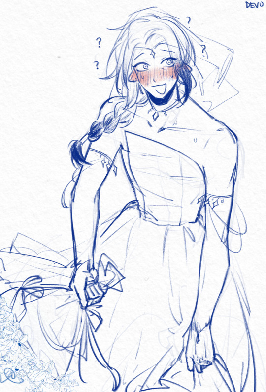
Thank you so much for all the kind words...!! here's a wedding dress asa for all your troubles
putting the art questions under the cut!
I've addressed a little bit on giving out advice for coloring here, and tbh im surprised you think my colors flow together well because i pick my colors pretty haphazardly LOL but generally speaking, nowadays my usual line of thinking is “how do i express [a certain shade of color] without using that exact shade of color”. Like if im coloring an apple then im thinking about all the colors except red that i can be using.
as for studying art, sometimes id straight up copy and paste other artists’ work into csp myself and re-trace anatomy/ action lines over it, colorpick it etc etc to really get a feel for their techniques. of course, this is all kept to myself privately. sometimes i also draw things specifically with the goal of emulating said techniques, like “for this piece im going to draw clothing folds like how X artist does it” etc
akjdfjksjsjd i hope all that makes sense / is useful! thank u for likin my stuff 🥺
p.s. i can read chinese and your little passage has not moved me in the slightest /lh
626 notes
·
View notes
Note
I absolutely LOVE your art style!! Your color theory amazes me lol—Do you mind giving a rundown of your process? 👀
oh thank you!! I can certainly try but it probably won't be very coherent. I picked this painting and tried to break it down, since it was one of my favorite palettes to work with and pretty simple

A large part of my color choices boil down to "this is pleasing to the eye" but I usually want each color to feel like it's part of the whole.
I LOVE the color red and the shades of red used on the meat here in particular are some of my favorite, so I wanted to find a way to bring out that red while still putting emphasis on Desiderio (the character portrayed) as the centerpiece of the painting.
First thing's first, I decided I wanted Red and White to be my two colors of interest here. This piece followed a "White, Red, White" layering, with a white background [ wall ] , red midground (is that a word) [ meats ], and a white foreground [ shirt ], which would sandwich that nice red between two white/grays.
When it came to choosing between cold/warm hues I thought about about what sort of atmosphere I wanted the whole piece to have, and settled on something alive and warm, a "fresh meat" idea.

So I decided the meats to be a nice warm tone of red, and then had the backdrop be a cool gray/white to contrast it and bring more attention to the meat. the white wall in the background's purpose is really only to accentuate the meat and Desiderio, so it's fine to not have really refined edges or brushstrokes.

When I started working on Desiderio, I gave him a warm, but really bright skin tone to pop against the whites of the background and that of his shirt. Since he was so warm, I added white fat on this hanging meat here so that attention could be drawn to his face, without the backdrop causing confusion against the warm colors of his face. The whites of the fat here are also rather cool
I had a LOT of white and red going on here, so to break that up while giving Desiderio some more room to shine I chose (almost) solid black for his pants and tie.
An all black tie smack in the middle of the piece drew way too much attention to the tie and away from the show (Desiderio and the meats), so I added red accents similar to the meats to help blend that area's palettes with the rest of the piece.
Those black pants at the bottom are pretty eyecatching, but low enough and also narrow that your eye can follow his lower body upwards to the rest of the pic; or looking down which can draw your attention to the splatters on the wall

I play around with CSP's color balance tool a LOT also, so the exact hues I start with are very rarely what I end with
But voila!

54 notes
·
View notes
Text
after god art style study --part 2
damn only 30 images per post
part one here!!
---
line art -------
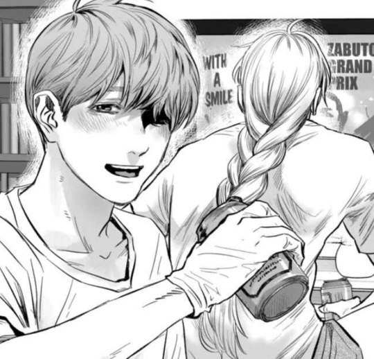
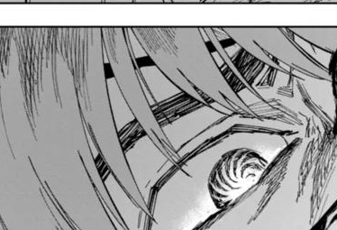
the line texture of eno's art in after god looks like an analog g-pen. it's is clean but retains a pretty textured feel and in some points, line art hatching or sketchy lines are used form the lines. particularly, larger drawings that would have thicker lines have the appearance of being hatched which gives it a very cool depth too.
if you try looking carefully, especially for the thicker dot tips left at the ends of g-pens, you can see lines aren't always drawn in one clean stroke.
I think the feathering/chicken scratch art technique can be utilized to create these fluffy-looking thick lines. though you would need a good idea how to control your lineweight while doing it to be able to maintain a smooth looking output.
custom csp tools
I do think a couple reoccurring art assets seen are custom csp brushes/tools not on the csp asset store. browsing the csp asset store brings up nothing or I haven't searched far enough. the immediate most obvious one to me is the eldritch stringy things, it looks like a looping ribbon brush. there's no way she's redrawing that shit 23892093 times, neither would I want to do that LOL. there is enough warping in each stroke for me to believe it's not a flat image being copypasted.
sometimes I like to download assets to be able to breakdown how an artist created them to make my own so aw I can't really break down how it works. but I think it's impressive the tool is super seamless, I can't really tell where the eldritchy horrors begins or ends as it's so fluid.

I'm sort of guessing tokinaga's facial/finger/leg scar is also a custom asset.

haven't found anything for orokapi's scales either so there's chance it's a custom brush too.

hair -------
hair is very detailed. you can see where the hair grows from on the head. I don't really have much to comment there.
waka's hair is usually the most detailed, given the amount of freedom pure black ink gives- you can detail as much as you want without worrying about how it interacts with the line art.
the extra thin strands is pretty consistent across all black-haired characters, like minami and yoriko. I don't think the extra thin strands are exclusive to waka just because she has long hair, since ushio and obikawa also have long hair but both have a lighter color.
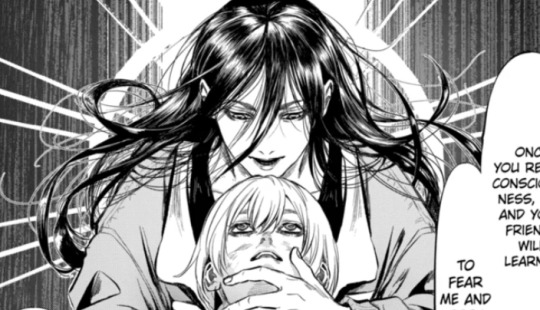
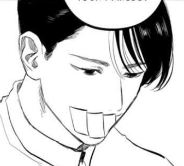
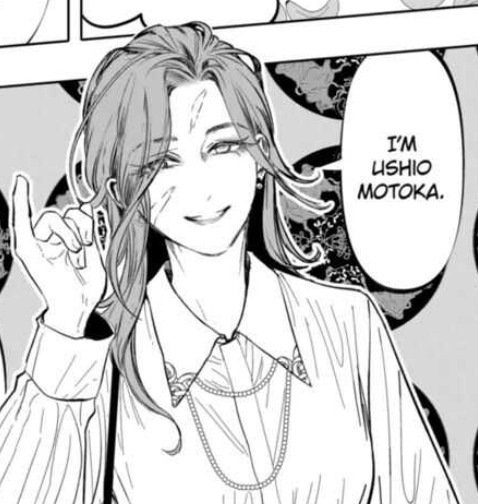
hair typically overlaid over the eyes does fully obscure the eyes underneath. so if not careful, large patches of hair or certain hairstyles can entirely hide the eyes and may not be great if you need to show the eyebrows and to emphasize a character's expression.
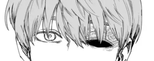
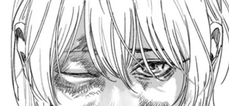
a workaround to keep the lines for the eyes visible is to erase small bits here and there to give the illusion of strands of hair that you're able to see past at what's behind it.

for darker-haired characters- usually waka- some lighter gray is also added to her hair to show her eyes/face.
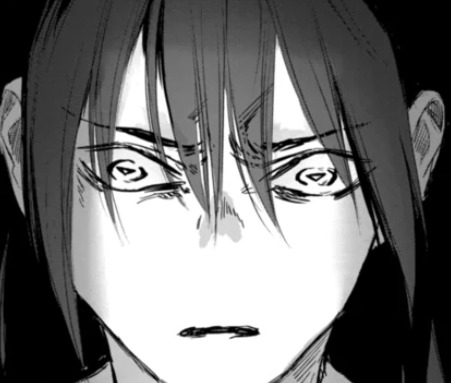
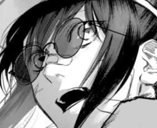
side profiles -------
the shape of the face is simple, but is much more defined than the typical cutesy moe animes with the tip of the nose to the chin usually being a flat single line. I appreciate the way the bottom lip is drawn and defined at certain angles.
I do really like the way the edge of the nose connects into the face. these side profiles give a super three-dimensional feel to the face, accentuated by the eyes

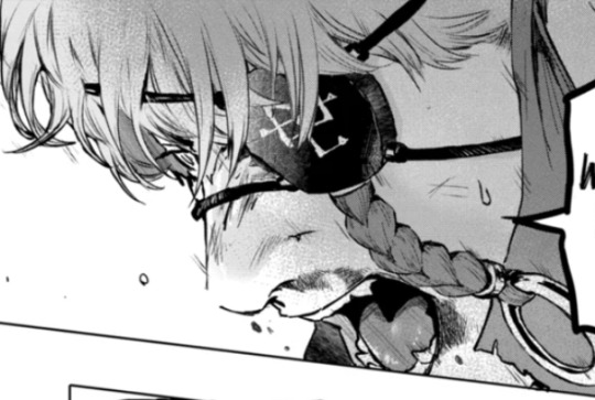
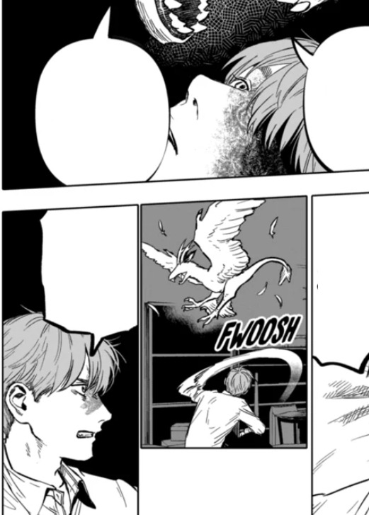
eyes -------
eno draws very pretty eyes hiiiiiiii
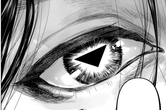
honestly I don't have a lot to say about the eyes. they stick on the end of semi-realism with the upper and lower eyelid being consistently drawn with circle irises. (that sounds obvious but some anime don't stick with circle irises or draw the lower eyelid)
a lot of feathering can typically be found around the eyes or makes up how the eyes are drawn. sometimes the eyelids are detailed in closer shots to really emphasize the 3d feel of the eyeball.
sometimes, the tearducts in the eyes are drawn.
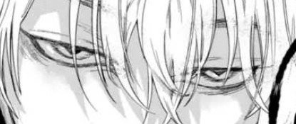
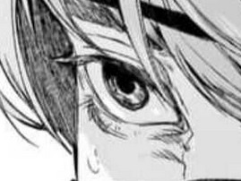

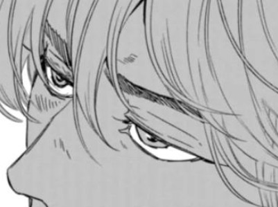
these eyes typically follow a consistent 5-line shape.
simpler eyes usually use 2-lines to make the shape.


most characters are not monolid and have an eyelid crease to help show the 3 dimensionality of the eye. very rarely the outer corner of the eye is not drawn with a connected line.
[fig below shows my study of the line strokes making up the shape of the eyes]

eyebrows -------
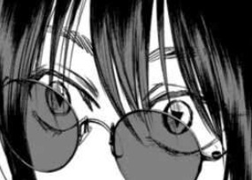
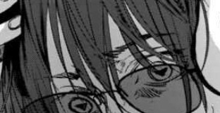
eyebrow detailing depends on the shot- if it's upclose to the face it will usually be more detailed with some hatched lines. otherwises they're typically a couple of lines. sometimes one or two "guidelines" can be seen for the top and bottom of the brow and the inside is hatched in.
teeth -------
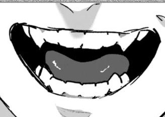
eno draws teeth
to be able to draw each individual tooth without it looking weird is skill. and depends on the art style, sometimes detailed teeth do not work for certain art styles (but that's not to say it's not impossible. if your goal is to make people feel uncanny with detailed ass teeth on a cute anime character, sure lol)
orokapi/obikawa's teeth do have prominent canines (snake) (lol) but other characters also have their molars slightly lined in. often, the teeth are not fully lined, where the main line art only shows defining the gums and the ends of each tooth.


coloring -------
after a while I did notice after god consistently uses gray to color tones. it isn't exclusively black and white with toning.
an 80 value or #CECECE is a good color to take from the study to use for manga shading.
I'm sort of guessing this may make the books cost more to print because gray ink is adds another expense.
application -------
and finally applying some of these details to my own art ✨
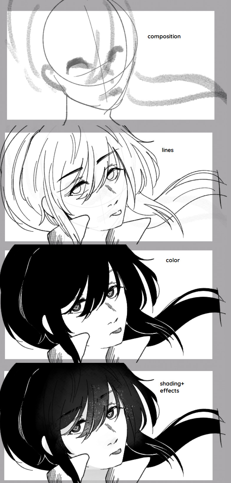
thanks for reading! hope this gave some cool insights into the art of after god :]
14 notes
·
View notes
Note
YOUR ART IS LITERALLY ENCHANTING HELLO??? I feel like I'll get sucked into it Narnia style... Would you mind talking about your art process 👀
thank you so much?!! i dont mind if you dont mind me taking this chance to yap
my art process has changed a bit since i last posted a step by step... i would say my ideation phase is still
seeing something that really makes me want to draw (ie alien stage round 6 or a really good gacha card (sorry) ) or forcing out thumbnails
go on my pinterest board of poses/colours from other artists i like for the general vibe (i reference a lot from my own photos as well, usually pics i take around my city/a lot of selfies taken from 0.5x angle LOL)
and then start the drawing. usually not a lot of thumbnailing..i would like to get better at that to explore more interesting compositions >_< also trying to flatten my art style a bit but i still go overboard with rendering extraneously oops
these days im also switching back to paint tool sai/csp on my pen tablet rather than procreate..i really dont like the blending engine sometimes and it makes it really difficult for me to motivate myself to paint there. i guess walking through a recent painting i like:
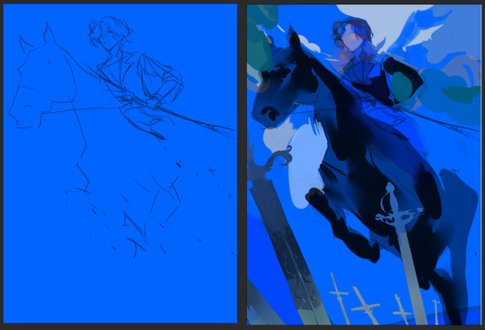
sketch on a colour bg ( usually this kind of decides the colour palette for the rest of the painting, building off of this main bg colour) (i erased some of it bc i was using it in the final painting ^^;;; it gets redrawn on top a little)
blocking the main foreground - sword, horse - just going from dark foreground > middle > background lightest as a frame of reference, having the least amount of detail at the right since i want the horse's hind legs to fade out in perspective

3. layer at a light opacity using a big brush to just suggest light/shadows (yellow at bottom right and around her face to complement and contrast the blue/purple)
4. render details (this is what gets me and i am very lazy and typically give up on a piece once we get here. working on it..)
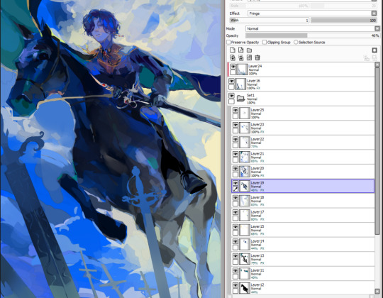
5. yeah. done! outline some desaturated areas (horse hind legs) with a saturated colour found elsewhere in the painting (lighter colour of the bg) and then add final touchups on top of everything. my layers dont make sense. also i love using the fringe effect on sai to fake edges/lines (every layer has it. yay)
#my art#asks#process#thank u op for letting me be yapatron 300000#idk if this is what u wanted but its what i can give
36 notes
·
View notes
Note
Your art is very beautiful! May I ask what brushes you use? I'd love to get the same effect with my art! (Oh, and I use Clip Studio Paint! Not sure which you use, but hopefully I can still find the same or similar brushes. Lol)
thank you very much!! Yeah for sure, here's pretty much all of the main brushes I use. I also use clip studio paint!
lineart/sketch brushes:


firstly, most of my stuff uses cy's grease pencil from this pack. it's funny bc i downloaded it years ago and didnt really like it at first. but when i tried it again a couple years ago i was like wait... this is SO good. i use it for sketching and lineart (first image). there's also csp's default "flat marker" which im apparently obsessed with (second image here). it's good for shading too! lastly (third image) i'll use the stumpy pencil pack here, this one i pretty much just use for lineart but it's by far my favorite clean lineart brush. i'll be honest i had to do weird conversion to get it to work in csp and i have no idea what i did at this point BUT ! if u search up how to convert it im sure The Internet can aid you as well. i think
Coloring:


when it comes to coloring i mainly use this water color pack and then this gouache pack (which doubles as what i use for my semi-lineless painting style- the second row here). if you see any coloring that looks more painter-like and textured it's most likely me using the gouache pack. sometimes i like to do the solid/base colors with an opaque brush and then use the water color to shade bc i like the textured look :P
side note: when i shade using another layer set to multiply, i'll either use the flat marker or cy's watercolor brush (both in the entry above this one)
Additional Stuff:
both of these for certain background help
this set of overlays (not a brush, but i figured i'd add it since it definitely helps adding texture to my work)
these textures (again, not a brush. i use these so that my backgrounds arent just Blinding White- mostly for myself bc plain white is hard on my eyes lol)
-
As You Can See I'm like. constantly messing around with new brushes. I actually have well over a hundred that I've downloaded LMAO. If you ever see a piece by me and want to know what I used, please let me know!! I'm usually able to remember the brushes I used, at least some of them :P especially more recent stuff, I've been experimenting a lot with painting methods and various new brushes
7 notes
·
View notes
Note
how do u color so nicely? sorry for such a vague question but your style and the way you color and shade stands out so much to me, its super unique, do you upload speedpaints or anything?
Lol its ok thank you so much! I haven't made a speedpaint since I was like 12 but they were fun so I could record more if anyone would be interested
My actual coloring process is hard to describe (and also generally very inconvenient but its the way I like to do things) so i will do my best to show you using this arcade drawing I never posted:

First my sketches are reallyyyyy messy. Also i draw on a grey background because supposedly it helps you choose better colors but idk if that's true. Also here's my sketch brush for CSP if anyone is interested

Second I put down flat colors. These ones are a little messed up since I erased them as I went later but this is the gist of it. My base coloring is messy and usually doesn't cover all the sketch since I change so much as I go anyway

Third i make a new layer above both the colors and lines layers and just paint over it until I like how it looks. usually my rendered/realistic drawings look bad until I do this. For this piece I had THAT ^ until i decided i didn't like it so I colored over it AGAIN: (colored over instead of restarting bc I liked the face)

NOTABLY, the most important part of my coloring process is probably color jitter. I mostly use a brush called flashito on CSP which has built-in color jitter, but you can turn it on on basically any brush you use. It basically just makes it so that each stroke has a slightly different saturation or hue based on your brush settings. It helps me get the color variety I like and works well with my insane painting process.
usually by the time I'm done painting something, I do so much that I can hide the lines and flat colors layers and it'll be virtually the exact same. Here's my arcade drawing without the flats/lines layers on

It's a little tedious but I like how it looks. This is a long post but honestly in short I think using a brush with color jitter will do a lot for you if you like the way my coloring looks. If u don't want flashito here's how to turn on color jitter on any brush on CSP, not sure about other art programs though

As for shading I honestly think I'm not very good at shading but i'm just critical because I'm myself. Usually i just try to remember that if the lighting is warm then the shadows will be cool or some sort of similar rule. unfortunately i love bright colors so it is hard for me to follow this
#not art#ask#I should start tagging asks#I'm glad my coloring style is unique because my sketching style is so inconsistent so it's my crutch
8 notes
·
View notes
Text

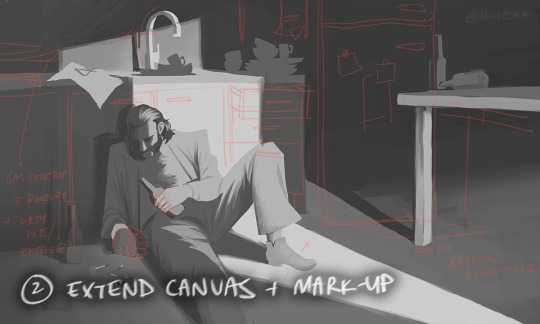


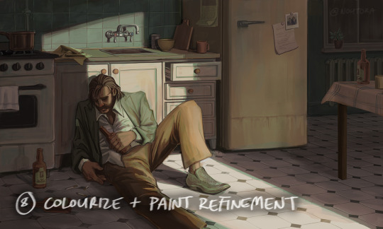

process stages & comments below
( original painting )
process: i did 70% of this (up to img #6) on my samsung tablet, on my train commutes, battling motion sickness & neck pain lmao
drawing on my tablet is still a lot harder & feels more restrictive for me bc i'm limited by unfamiliar software (still learning CSP) and lack of keyboard shortcuts (my digital art workflow for years). i also struggle with starting / continuing artworks on my tablet unless i've already planned / sketched most of the composition on my PC. likely because 90% of the time when i'm drawing on the tablet, it's on the train. hard to get in the zone as it turns out lol
this is the first full painting i've started and made substantial progress on purely with my samsung tab, so i'm happy it's starting to feel a bit more natural.
also first time i've tried doing a funky gradient map as a colour base. then applied colour on top with multiply blending mode. 10/10 would use fun gradient maps again - helped me introduce more colour variation bc i feel like my colours are usually quite flat by comparison
given the nature of the fucking bumpy melbourne trains & my broken commutes, i can still only do so much rendering on my tablet. the more refined painting will probably always happen using photoshop on my PC bc that's where i feel i have the most control
i tried not to overwork / overpaint it too much as i often tend to do, and kept the brush strokes rough and loose as much as possible. made sure my brush wasn't set smaller than a certain size so i wasn't tempted to go into fine detail. you can see i didn't refine harry's form/clothes much beyond img #4 because i didn't want to lose the soft/loose quality of the clothing folds. pretty damn proud of that shoe though. but then i posted it before i realised i forgot to paint in his fucking tie lmaoooo
but yeah, i got my tablet as a secondary drawing device to help me draw more often so i'm gonna keep trying to get the hang of it !!
composition/concept: the pose was referenced from this shot of arthur in peaky blinders and i had a vision of HDB slumped over in his kitchen like this

the composition was built around that, and i had the idea of framing it him in shadow and having a strip of light from a doorway illuminating his body. evidence of his drinking and smoking are kept in the shadows.
the original idea was to have a silhouette of someone standing in the doorway (likely jean finding him), but it didn't work with the overall balance & i felt like it interrupted the shape of the light too much / wasn't very legible at that angle. kitchen design was inspired by soviet & post-soviet era style kitchens.
*** feel free to send in an ask if you actually want me to explain how i did things in more detail. these are mostly thoughts for my personal reference
#disco elysium#harry du bois#art process#nohtora art#nohtora wip#sorry my notes aren't comphrensive/intelligible - it's more for me to remember & not a tutorial#always welcome to ask further though <3
60 notes
·
View notes
Note
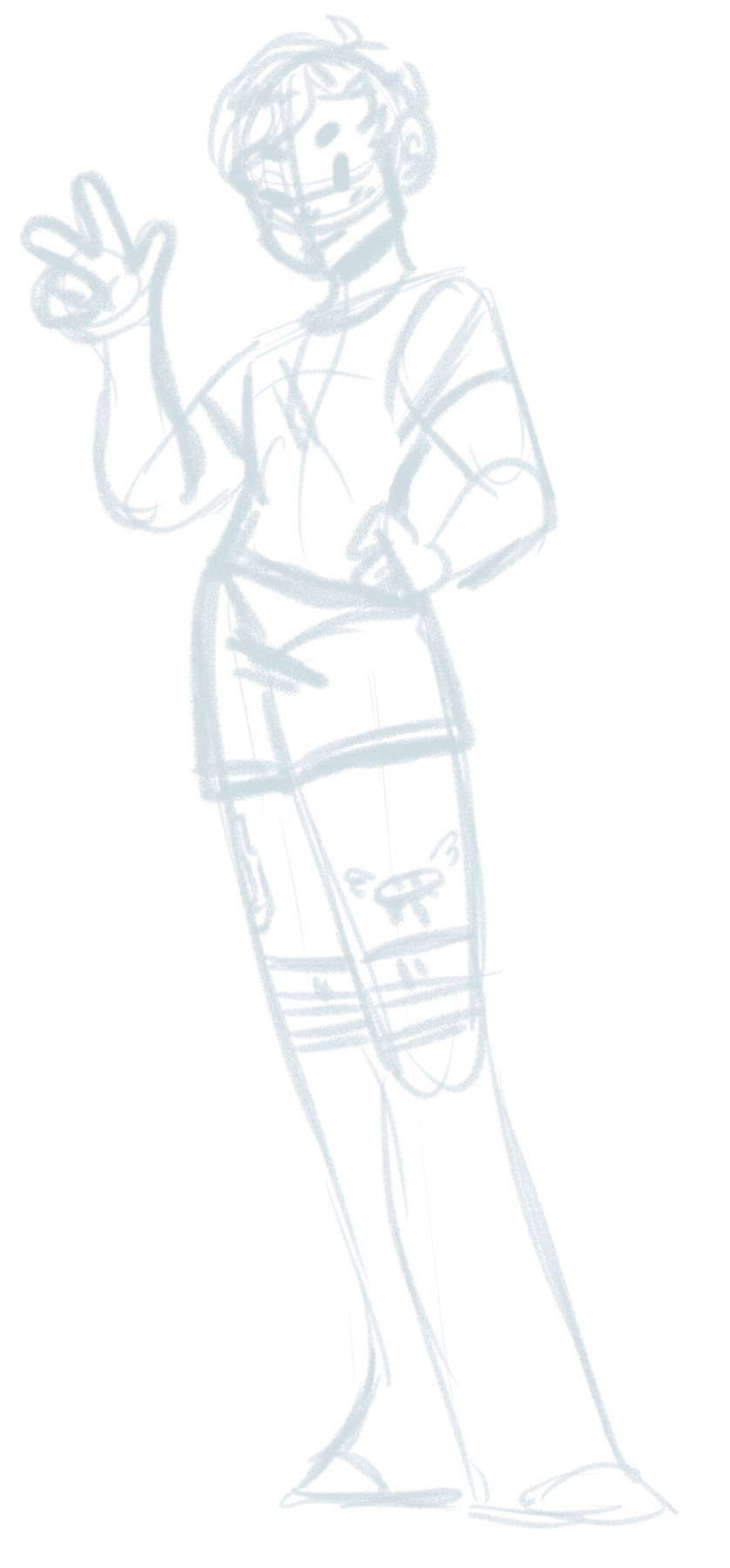
Could we have a brief tutorial on how you manage your simple pencil-like style, if you don't mind? I have no intentions of copying your work, but I would love tips on making quick but still neat and cute drawings.
// Sure thing! I'm not out here keeping any secrets lmao. The brush I use is the real pencil on CSP, but the derwent pencil on procreate is similar. also I use an iPad and apple pencil, i found they made it a bit quicker but obviously an investment that isn't necessary. Though if you have one, one way to speed up is that if you tap the side of the pencil twice it switches to the eraser.
here are the general settings i use. when I sketch, the brush size is 50, and when i line the brush size is 30 - also I put the stabilisation up to 100% for lines. obvi use multitude of different brush sizes for colouring.
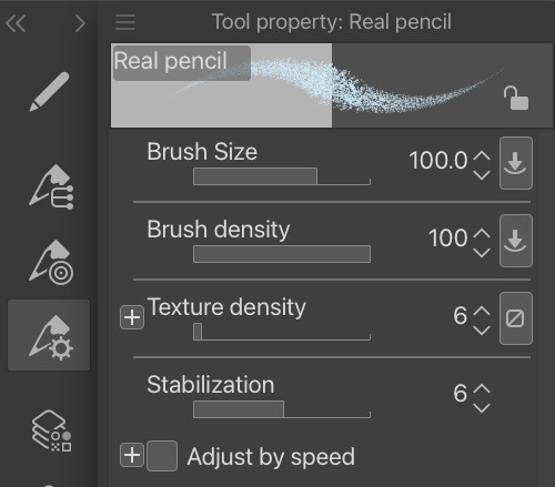
I sketch with any random mid tone and start like this, then fill out the torso
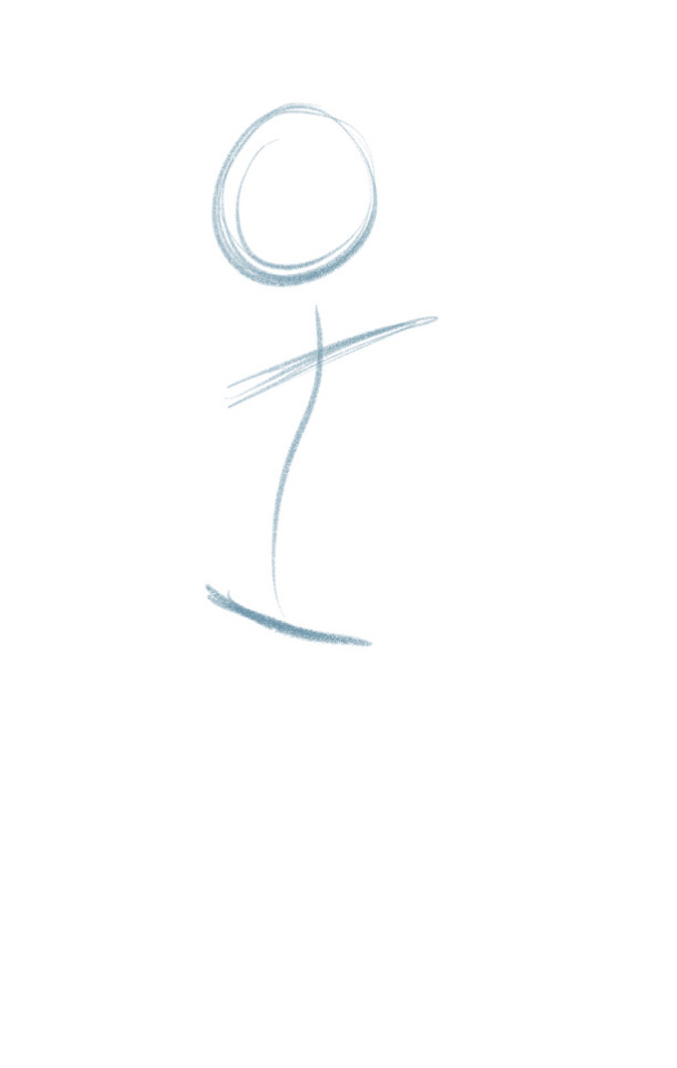
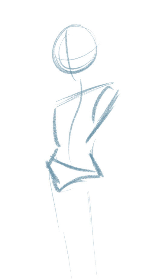
Sketching is always fairly messy. Point is to not give a shit about what it looks like, just get the vibe down.
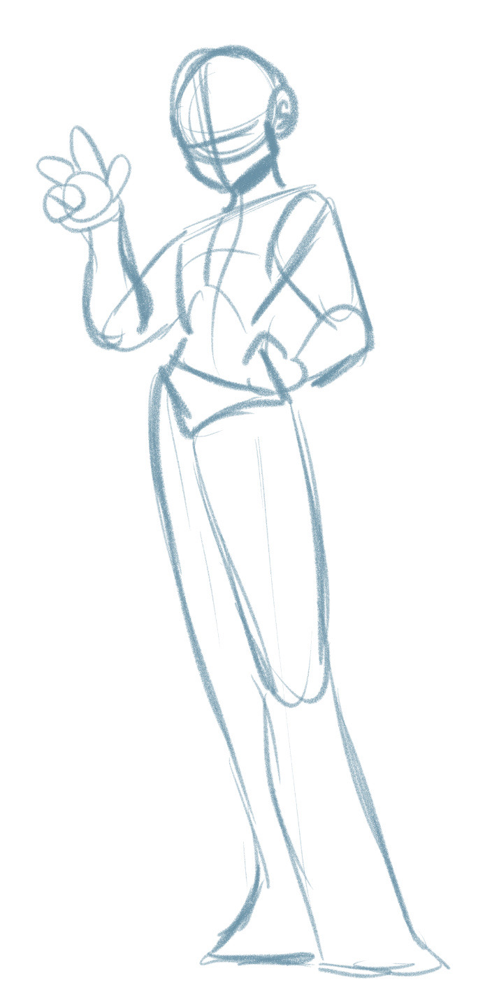
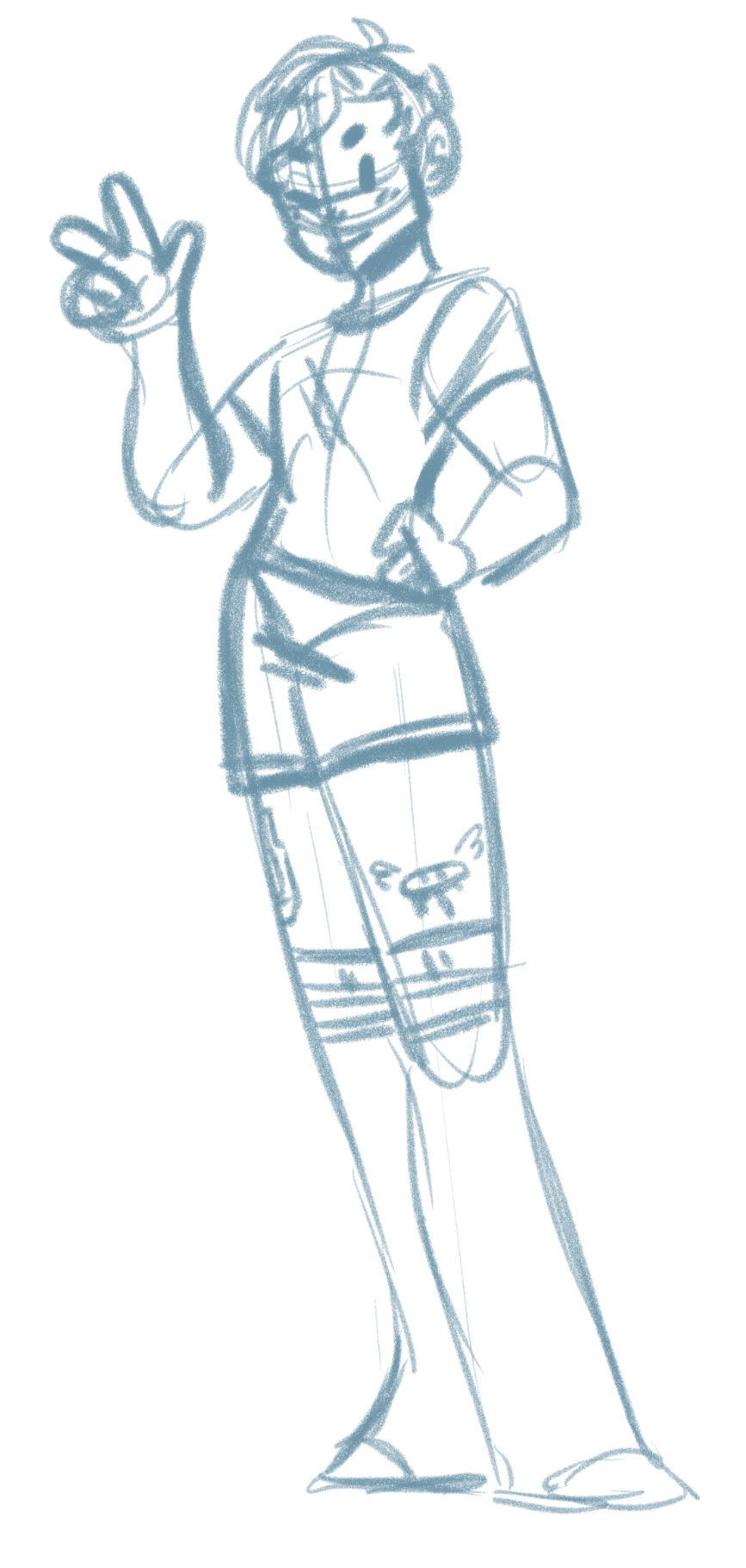
After torso I throw on the limbs. Usually i sketch out where the ribcage is too if I'm putting detail on the chest. Then I throw on details like the face and clothes
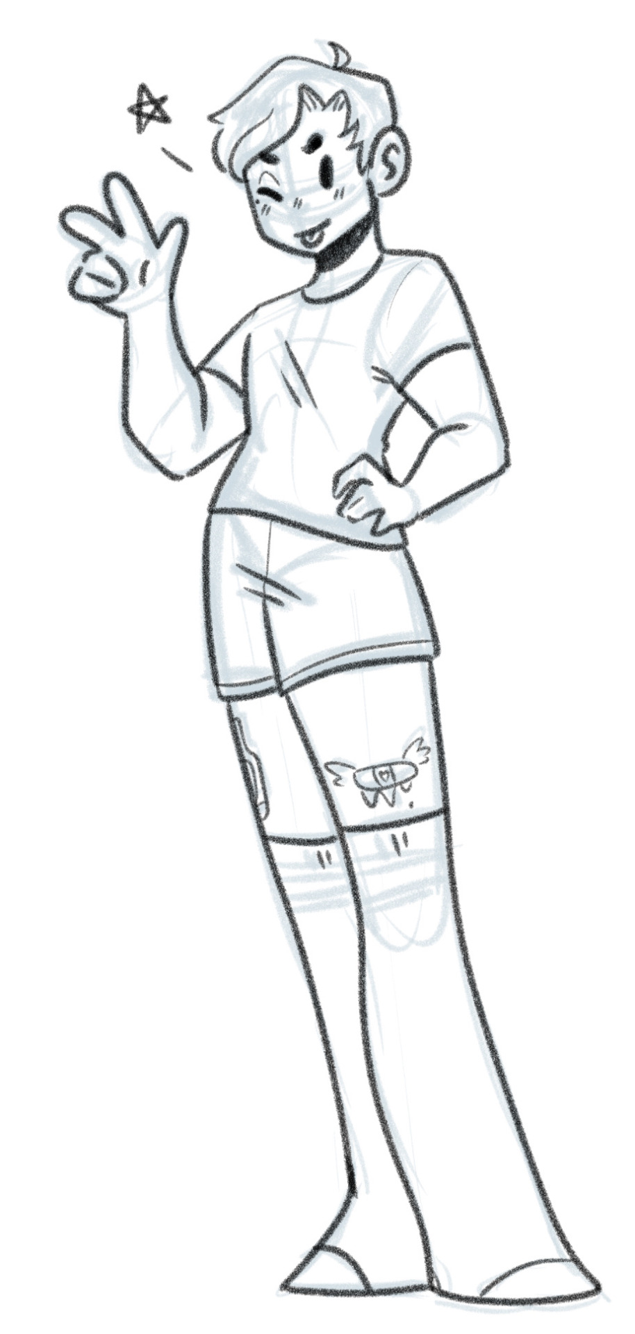
I'll then put down the transparency of the sketch layer and on a new layer throw on the line art. brush size 30, and 100% stabilisation. I have just realised the hands are two different sizes. this happens often because of how quick i try throw together things like this.
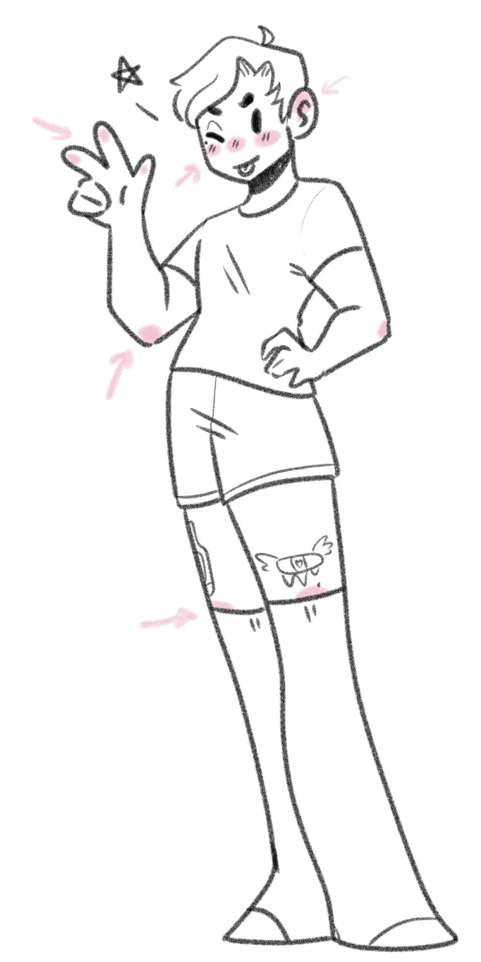
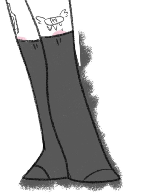
As for colouring, blushies go here, and usually i over colour with a large brush and erase around it. For bigger pieces I do a thicker line around the outside of the figure, select the space around it, invert selection, grow selection by 10px, fill in with white, and then use a clipping mask or transparency lock, then you don't have to erase around it. I stick to as few colours as possible and i rarely colour skin unless the character has dark skin cus if I don't it looks strange i've found lol. I use pastels as well, like if i'm colouring in black I colour it grey instead.
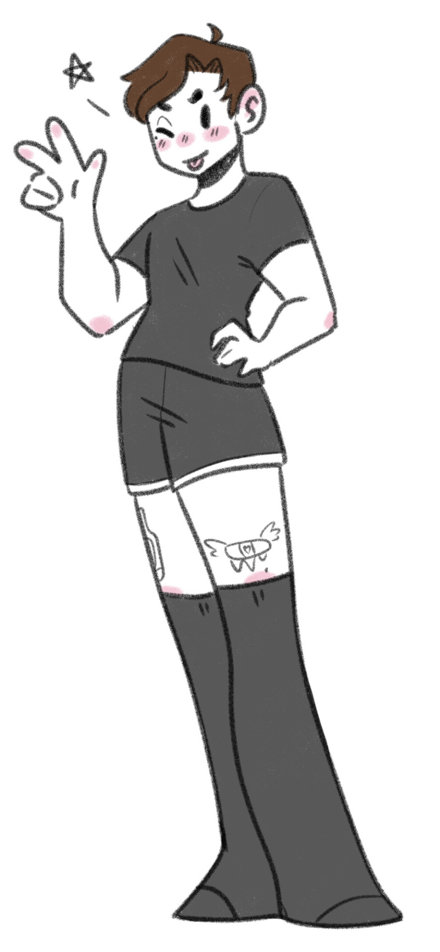
AND WE'RE DONE!
Drawings for this blog depending on complexity usually take me anywhere from 20mins to an hour. I'm not fussed about perfection cus I just wanna get them done to answer or doodle my thoughts. Since I started this blog I've gotten way quicker at drawing just cus i was drawing so much when I first started, I was able to adapt the style. I used to do it with like longer faces but somehow it evolved into something more chibi like. I also went through a massive style overhaul when I first started I used to draw something very detailed that took me multiple days, but now I have the simpler style I adapted from doing this which is faster. as you see from my commissions I still have the detailed style, a simple style, and the chibi style which is what I use for the blog.
TLDR; 1 sketch layer, use loose, quick lines. Don't stay stuck on details and perfection, the more you draw the more shortcuts you'll find.
idk if this was necessary brief but there ya go!
18 notes
·
View notes
Note
I know you've probably already answered this, but what settings do you use for your brush?
I'm using CSP and I really love that crayon line art style I've seen from you and a few other artists that makes drawings almost look like Pixel art.
I tried to do one like it in my latest drawing but couldn't get the brush looking how I wanted, any help is appreciated!
OH-- the rougher textured lines I usually do are entirely Kyle's Inkbox - Classic Cartoonist (which is in photoshop)!! I'm sorry if that's unhelpful- I don't personally use or know CSP much!! The rounder brush I usually draw/doodle in is the default animate cc brush, lol
7 notes
·
View notes
Note
Where/how do you get the ideas to make these super cute art? I love art but I basically copy others and I wanna have my own style.

What a nice question!! I could honestly write a book about this, but for now I'll keep it condensed. (maybe uhhhh a blog post later or smthn) ....Sorry it's long anyway lol
These are my thoughts as an independent illustrator/artist that has the time and freedom to create what I wish, keep that in mind. I can't vouch for what it takes to get through art school or build a portfolio for <specific thing X> cause I don't know shit about that, this is just for creating art that you love making.
✨️Developing a style ✨️
A lot of people talk about 'finding your style', but I'm personally an advocate of developing a style - and most importantly it being a process that never stops. Now I don't know how old/experienced you are, but especially when you are just getting into art (and with 'just' I mean years) it'll change a lot because you will be improving a lot!
Now for me personally, I've been busy ~finding a style~ since I was 10. And up to like 2 years ago (I'm now 28) I was frustrated I just wasn't able to find one. Every half year or so I'd try to get back into art "for real this time", stick to one medium and general style and/or subject, and within a matter of weeks become frustrated and then not draw for a good while. That style-mentality really took a toll on the fun I had in making art, but also stunted my own artistic development. I was restricting myself at a stage where I should be everything BUT. I told myself I wasn't good enough, not cut out to be a professional, wouldn't be able to sell myself if I couldn't stick to one thing, yada yada. Great mentality. I'm now in therapy!
Anyway, what broke me free of that was a promise I made to myself back in 2020. I told myself I would get back into making art, but this time, just do what feels fun *at any given moment*. Let go of the pressure. I didn't post to socials and just shared with my friends, and eventually started posting to my then very humble Twitter following. I liked Twitter, cause there wasn't the pressure that Instagram always gave me of having to have a perfect feed. So I drew digitally, I drew with pencils, did some painting, got oil pastels, tried collage. And those experiments all influenced one or another. That's been key for me. If I feel like I hit a creative wall, I just try another medium or another CSP brush or another app on my tablet. Just experiment with lines and colors and not worry about what ends up there. (it's usually cats) Creating like this kept the fun in it for me and I've created nearly every single day since then, and that too is key to style development: Create A LOT. Don't hyperfocus on one perfect piece when you can also create 4 good-enough pieces in the same time.
Now on the topic of copying: it's a natural thing to do. Just be responsible about it! (don't share on socials if you blatantly copy something. While it's a good method to learn certain techniques, it's something that should stay in your private sketchbook) Also be sure to study from many different places, don't fixate on just a couple of artists! Find what inspires you in real life: be it buildings or nature or animals or people or objects, and try to capture them in different ways: from realistic to just the basic shapes. You'll find out what kind of style and level of detail you're naturally drawn to soon enough. Creating your own visual library in your mind by drawing many different things is ultimately what will allow you to put your ideas to paper in a quick and intuitive way. Having a (cheap!) sketchbook that you don't show anyone but just goof around in and explore everything and anything is a very helpful tool.
✨️ Generating ideas ✨️
I get my ideas from SO many different places. Many of my cat paintings were actually created to deal with a strong emotion or feeling I was having at the time.
Now externally, I get a lot of inspiration from nature and from the place I live in. I used to live in a fairly urbanized area, but it wasn't until I moved to the country side with wide and far views that I saw daily that I started getting interested in drawing landscapes. I didn't draw a lot of cats until they were chilling in my garden everyday. When I lived at home I drew a lot of fish, cause my dad had an aquarium. What you see and observe everyday matters. Taking your camera or phone on a walk in the neighborhood and capturing small details is a great way to gather inspiration, even if the area is a bit boring. I have a Fujifilm X100F that I try to carry to most places I go, cause I can quickly photograph things and I like it better than phone photography.
I also draw a lot of ideas from the media I consume: shows, movies, games, comics, music... Sometimes it just hits that inspiration button and lights a lil flame that'll turn into an idea. I love the magical worlds Studio Ghibli creates for example and the soothing calmness that games like Animal Crossing and Stardew Valley have. Things like that just work their way into my art, often subconsiously.
I also draw what I yearn for: be it a doodle of a comforting hot bowl of soup when I crave it, or a beach scene cause I want to go for a beach walk. It's fun, and lets me daydream a little about things I maybe cannot have in that moment.
Another big thing is worldbuilding and storytelling: I have this fictional world in my mind that I desperately want to get out, and it will, piece by piece.
So yeah. There's many places to grab inspiration from. Writing down what inspired you is useful. Doing it every year or so is too, cause then you'll start to see trends and get a better understanding of what drives you. Cause in the end that's what's most important, I think: Find the things that ignite a flame in you and then let it out in a way that is fun and comforting to you. Don't worry about what other people are making or that you're not making what you 'should' make!
I hope this was somewhat helpful - it was fun to write at least, I have many thoughts about this :')
#art#art process#art education#personal#ask#thoughts#learning artist#learn art#creativity#art style#illustration#infodump#tldr: have fun making what you wanna make#you're spending more time with your art than anyone else#better to make sure you're enjoying it#artists on tumblr#art resources
162 notes
·
View notes