#//also i keep tweaking character designs lmao--
Explore tagged Tumblr posts
Visit Tumblr Blog
Explore Tumblr blogs with no restrictions, modern design and the best experience.
Last Seen Tumblr Blogs


Fun Fact
Tumblr’s website traffic is steadily declining.
Text

and we go right back at it !!
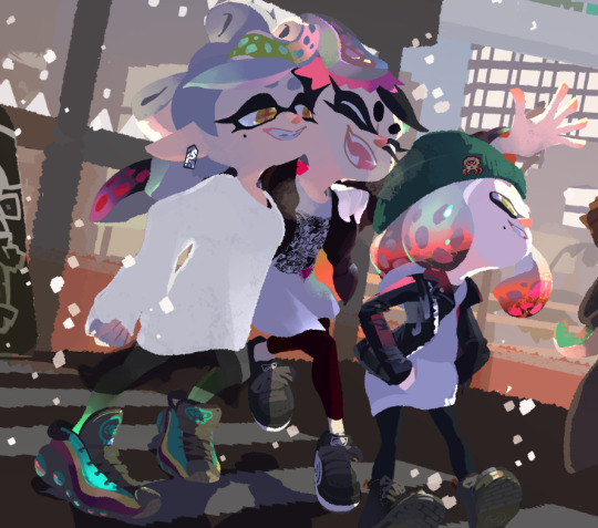
#just me hi#redoing the refs i Did last finish for ats+artfight because there were some parts i didn't like and i want to add little bonus outfits :D#//btw do NOT drink a lot of liquids if you don't like the Repercussions. they're. Repercussing#i have had a lot of tea today and ououuhrrghhhhhhhh [<- dying dramatically]#//also i keep tweaking character designs lmao--#oath + aura's last refs are pretty much up to date but kira + hid's are old compared to that and will just Not do hhfhsv#/OUh just sneezed so hard rn#//oh it may not be clear but i'm not up at 3 a.m. hfsh#Yet#it only turned twelve some something minutes ago so we survive for now :3👍#//YE but i gotta get on it now if i wanna be anywhere by tomorrow lol-#i think i'll watch the tomorrow people while i do that#i found the other day it has three seasons?? here i am thinking 'i'm almost done :)' Dude... hfbvsh#it Is interesting though i like it for that :3 really good for my background watching lol#the Saint is great and i haven't finished that either but it was getting stale and i would like to enjoy it hfhs#//anywho off and about now#toodles :3
7 notes
·
View notes
Text
Ive still been tryina get back into projects so like of course i was tryina work on THESE designs for Caraway County so far on the same canvas (always try to draw all your fellas on the same canvas to get a look at em all in the same place) but most responses I get are about the butch cow lady and how they want her/pos

and btw! random tip i realized. Do YOU wanna make a strong looking character? someone bigger than the rest and built? I have found that simply drawing a character wide and taller than the rest doesnt have the desired effect, and just makes em feel...scaled up? maybe not even "large" somehow. Well try shrinking the head, I lasso-tooled her noggin and suddenly she looks way better. (warning, big ramble in the tags LOL)
#shrink that head! widen that neck!#sometimes i forget that those funny tools in your toolbox are there TO be used and not cheating they were made to help you! let them help!#whenever i screw up an imagine or proportions i erase and redraw#and i realized you can just...lasso tool and mold it like playdough and then go back over it#especially at its rougher stages#and if yah dont like it? well usually I just duplicate the layer and lock it just incase! and also to compare úwù#i wonder if all of em have too much...white? i cant help it#i think off cream whites are my fave...#also im serious about that fact of drawin em on the same canvas. i designed em seperately but then went in and drew em on a wide page#and then tweaked from there!#also shorthands! important#sometimes i design characters and do such little details like the fabrics and stuff but i realize sometimes replicating those over and over#is a pain. so when yer designing a character keep in mind yer gonna draw em a bunch presumably. so know yer limits and know what detailsZ#thats you'll actually will draw later LMAO#thats mostly an animation rule but y'know!#my art#art#caraway county
5 notes
·
View notes
Text
right now tho I'm really fixated on rogue trader lmao I want to work on Ceciliana ✌😔
#her key details are there#I've been wanting to just keep playing more of the game tbh most of my ideas are small and simmering rn#I would love to play around more with her personality details and some of her past more for sure#biggest thing rn is wanting to play around with her design#I really dig her default drip for how I built her bc it's just so fitting but I might tweak some minor details#I mostly want to construct her face in more detail! see what direction I want to go with her!#her hair too tbh#my placeholder design for her was to just make my DOS2/Hero Quest character Agitha until I really Got To Know Ceciliana#and right now I think I might keep her white hair.. I really dig it.. might make it look a lil peppery.. not sure yet gotta doodle it out#style tho I'm really not sureeeee that's gonna be my biggest challenge to find out what I'm satisfied with 😩#I have an idea I wanna try but idk if it's gonna be satisfactory when I see it#IDK YET#I do have some doodle ideas tho lmao#I just want some silly drawings of her with abelard and argenta and pasqal#but probs won't get to them for a whileeeee#okay I just wanted to ramble and get some thangs out of my brain just thinkin out loud you know how it is#I'm excited abt new oc#I love when I get passionate abt something#bf is also very excited bc he loves warhammer and I've been listening to him talk abt it for like 10 years now#and he knows I've been interested in diving further in for a long time#so he is LOVING seeing me be this invested and talking abt Ceciliana#he is my biggest consultant on all the necessary details#rambling#ceciliana von valancius
2 notes
·
View notes
Text

Oh yeah, I have another AU and just like the Harlequin AU, it's a huge one
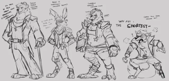
For the uninitiated, Origins AU is a slice of life + action adventure comedy centered around the Glamrock cast, as they try to get by starting their own band and maybe, kicking ass. No, Security Breach & Ruin isn't canon to this AU, its it's own world (though SB characters can show up as a minor cast).
I'm pretty sure the reason this au started was because I saw the baby Monty decal from Gator golf and thought, "Why is Monty the only one with this? The others should also have their origins too" (hence the name)

These are all SUPER old art btw, from all the way back to 2022
One thing led to another, and with the joint effort with my bf @nobody-nexus, Origins AU began with baby decal concepts, to fleshed out world(s), backstories and lore.
Lots, and LOTS of em. But for the sake of not boring anyone with details, I'll summarize.


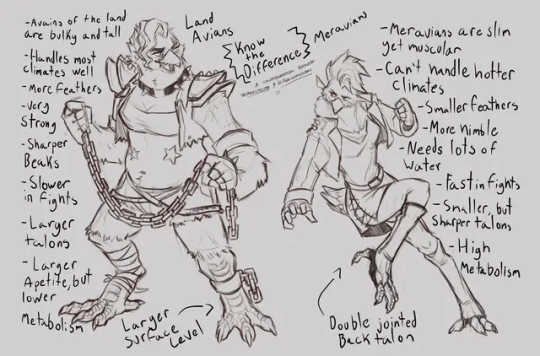
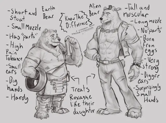
Freddy is an Alien space bear Supersoldier called an "Ursin'ul" (play on words on "ursine" and "arsenal") crash landing on earth, refusing to participate in propaganda and colonizing other planets once he found out the truth about his kind
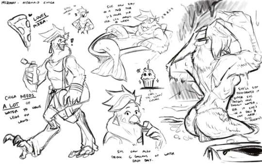
Chica is a rebellious yet naive meravian Princess who learns forbidden knowledge to be able to walk on land and explore the world beyond the sea, as long as she keeps hydrating
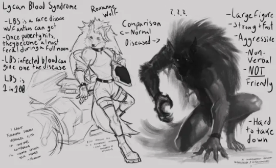
Roxy is the bad girl small-time rockstar that's closed off to most people due to her upbringing, and transforms into a werewolf when full moon hits
Monty is a 9-foot tall irradiated alligator being pursued by the government after he broke out, whom wants to study him in order to create potential bio-weaponized supersoldiers
And Bonnie is... Roxy's roommate getting caught in the crossfire. A normal guy with a lot of uncles (almost ALL Bonnies from the entire franchise are related to him), and owns a bowling alley. That's it lmao, he doesn't have a secret or a superpower like everyone, he's just the average menkisser
They're always pursued by The Rockstars in this AU, all with personal motives behind their actions: Francois being forced to find and retrieve Freddy by Levi's (Lefty) orders, Clarabelle wants revenge for her eye from Roxy, Felix is down horrendous for Chica and wants to marry her against her will, and Brian is tasked with retrieving Monty.

Other variants in the franchise have their own thing too lmao, HW dlc being weird country guys, Toys being a Mafia group/Toymakers with an ongoing feud with the Funtimes, Withereds/Classics being veterans in the ent. industry, and Fury's Rage enemies aren't enemies, but Monty's friends from his time in confinement. There's Nightmares too, but they aren't a thing until the end.


I've made lots of shitposts, artworks and designs alongside Nexus for this au, and one day, I wanna come back to it and work on tweaking stuff as well as story beats. For now, I got a lot of things I have to work on first and this serves as an archive for the au's ideas.
#ziku's insane rambles#fnaf#fnaf au#fnaf origins au#origins au#security breach#fnaf security breach#security breach au#five nights at freddy's security breach#five nights at freddy's#glamrock chica#glamrock freddy#glamrock bonnie#roxanne wolf#montgomery gator#freddy fazbear#bonnie the bunny#chica the chicken#fnaf foxy
385 notes
·
View notes
Text
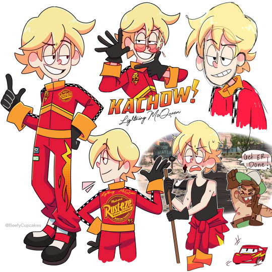

I watched the Cars trilogy recently and with that came a wave of nostalgia and a strange desire to make my own designs for the cars as humans. Aka taking all the charm out of Cars but scratching the brain itch.
So, no need to drag out the intro any longer, I have some notes written out about em for those who might be interested or just bored.
Lightning McQueen:
I tried to make his suit look as professional as possible, with references pulled straight from McQueen's paint job/stickers, while also keeping in mind that I do intend to draw him more so I didn't want to go too crazy with the design. In a perfect world I would've let my maximalist cravings win, but alas let's keep it digestible for my sanity.
I feel like everyone's kinda on this unspoken agreement that McQueen as a human would pretty much look just like Owen Wilson, and that's the big picture here. I used Wilson as inspiration while tweaking and exaggerating a few things to my preference. (Okay, well not everyone, lmao.)
The chevron markings on the front cut off at the side seams not wrapping around the entire suit as to not clash with the sponsor logo on the back.
Also, he's wearing special gloves to help him grip & have control over the steering wheel. I think sometimes that looks a little weird when his sleeves are down & cuffed, but I just feel like he needs to have the gloves there— especially when he comes out of the top half of the suit. (It's also lowkey supposed to mirror his 4 tires when you consider his shoes are also black.)
So yeah, that's basically all I have to to say regarding Lightning McQueen's page. I feel like a lot of my design choices are self explanatory and, honestly probably shared universally... I mean, he's really cut & dry. (But I love him ⚡︎)
▀▄▀▄▀▄▀▄▀▄▀▄▀▄▀▄▀▄▀▄▀▄
Mater:
I'm not gonna lie, Mater was a bit challenging for me. I definitely had to step out of my comfort zone but I wanted to stay true to the character and not butcher anything.
My first thought was to give him a fishing pole to substitute for the tow hook— but then the more I was thinking about it, the more that felt so... out of place? Radiator Springs is in Arizona, which is (not entirely, but mostly depicted in the movie as) a desert. And even though there are beautiful bodies of water in Arizona, in the movie I don't recall seeing any prominent ones, at least in relation to Mater. So, scratch that, instead I gave him a lasso, which isn't supposed to entirely substitute for the tow truck— no, he still drives a tow truck, but the lasso is so he can grab people/things similarly to Tow Truck Mater (very cartoony). My explanation for this is the cattle ranch. Yeah, Mater is a tow truck driver but perhaps he has a side hustle, or hobby, if you will.
Also, I didn't want to make him... dirty(??) Like, yeah, of course, Mater would obviously get a bit filthy from time to time, it's just in his nature, but that is NOT going to be the core of my design. In regards to the rust happening on him, I felt like instead I would substitute this with being very tan. Again, Arizona is a desert. Because of this, he would take off his shirt often, and this would substitute for the missing hood like on Tow Truck Mater. The removal of the shirt also reveals just how tan Mater actually is.
It's his uniformed overalls that have his original aqua color, but from years of wear & tear they've been patched up with brown patches, this would also reference the rusting. The one strap is supposed to mimic the one headlight being broken, and I know that's a stretch, believe me, I wanted to do something with his eyes but eyes are not the headlights in the Cars universe..... think about this. Think about it really hard... if you know what the headlights are in the Cars universe then this actually makes perfect sense.
He is taller and wider than McQueen, which is a reference to the literal frame of their vehicle counterparts. (A little hard to picture with these images, but eventually I'll draw them together!)
▀▄▀▄▀▄▀▄▀▄▀▄▀▄▀▄▀▄▀▄▀▄
That's all I have to say really, but do let me know what you guys think! Gas it up and it might encourage me to make a part 2 with some of the other characters! Who would you like to see next? ♡ Thank you so much for reading & have a great day, Kachow!!
#pixar cars#lightning mcqueen#tow mater#cars movie#cars fandom#cars fanart#pixar#beefycupcakes#rambles n shambles#gijinka#humanization#disney#im kinda embarrassed but oh well ig
281 notes
·
View notes
Text

These are my OT5 brainstorm pages. Elaborations on how I got to these below! I reference concept pages so if you see any pictures you don't recognize that's why. <3


First up is Cat Noir who I think is already perfect lmao. For my version though I wanted to lean closer to his PV design because I love it, like his larger triangle nose (you can't really see it at the angle in my drawing but it's there I swear!), the bigger bell, the more elaborate belt, etc.... so basically everything ... just in my style instead.
With my designs I think that whenever someone transforms into their miraculous persona it's based on what they think a hero looks like or what they think is cool. I think Adrien reads a lot of comic books and is a fan of characters like Batman (relatable for him LOL), Catwoman, and Nightwing, so his suit reflects that kind of vibe.
Extra: I decided that Ladybug and Cat Noir's masks go all the way up their foreheads because it looks nicer in my 2D style with their bangs haha.
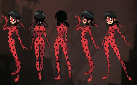


Next up is the one and only Ladybug! Unpopular opinion but I actually like the all red suit! My hypothetical series would be a webcomic, and I feel like in action scenes the red differentiates her from Cat Noir esp at a distance, and more red style keeps their color ratios even.
I like the ladybug designs with a bunch of black sections they're very cute! Just not for my au. (I think it's just me but I find drawing the ladybug designs with inverted red dots to feel sacrilegious in a way,,, just my neurodivergent brain lol)
And I am a long ribbons truther, I love them and they can be very expressive. Also I knew I wanted Marinette to have a more vertical circular eye shape because her shape vibe is definitely a circle (Adrien's is triangle) and it reminded me of the eyes for the main girl in princess jellyfish (I've never seen it, love the style tho)
Her hair is a more bright blue to contrast her hair against her suit, and make her look more cartoonish. I imagine her idea of a superhero comes from kids shows and some magical girl anime. So her hair has a plastic shiny texture to it because when she thinks 'superhero' she thinks of kids toys. Also I just like color! The blue kinda gives comic spiderman vibes imo (the version with the light blue instead of the navy)
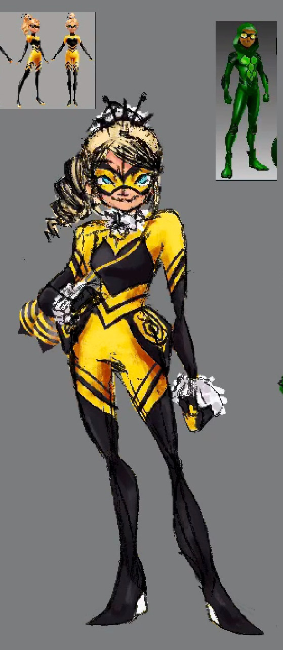
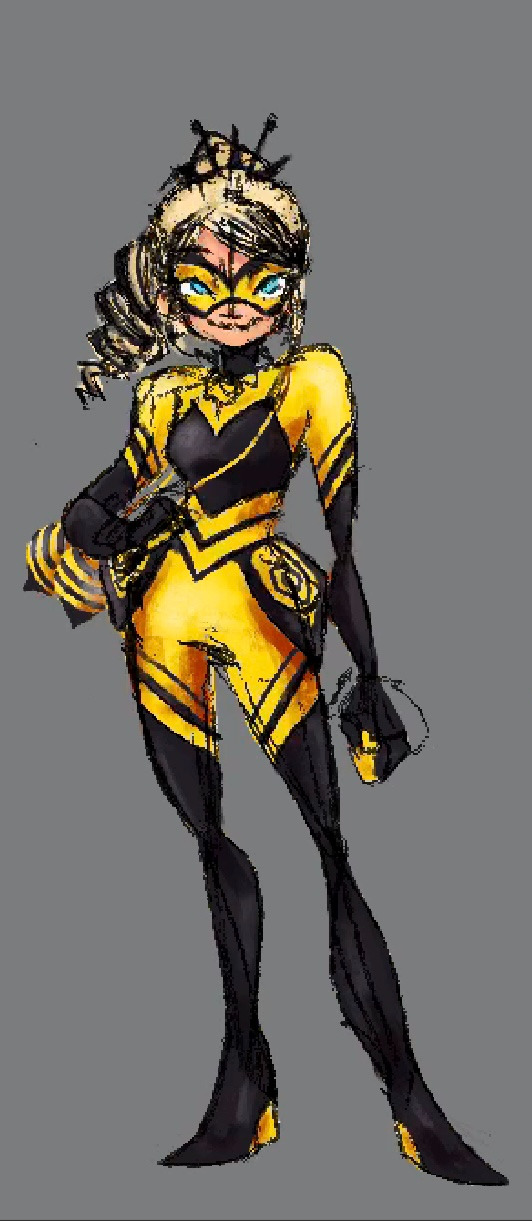
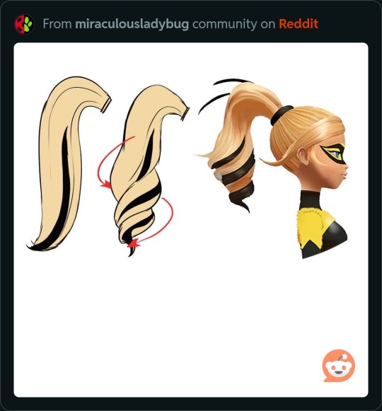
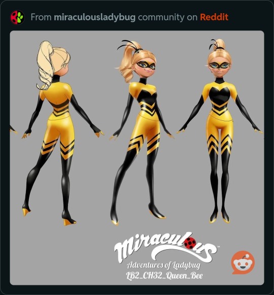
Queen Bee definitely changed the most throughout the design process. I really like her in-show design so I just tweaked it to be more my vibe. Adding a crown because she's a Queen.
Something that I've noticed is that Alya and Chloe actually share a lot of traits (There's even some old concept notes where I believe Alya and Chloe either switch names or roles at some point?? The miraculous concept info rabbit hole is real y'all) and I think this comes through in their final designs.
Like they both share a middle part, which bothers me for some reason, so I decided to give Chloe a little Ariana Grande side part into a ponytail.
I wanted each character to have a cool little piece on their costume, so I tried these little hip things to make her more commanding and girlboss, but currently her weapon is similar to ladybug's (but more like one of those hair ties w the little disco balls on them) and it would sit on her hip and would clash w her hip thingies, so I just decided to make her weapon the hip things instead, combining the two.
Something else that bothered me a lot was that Rena was the only one with white on her costume. Everyone has black but she's the only one with white... my brain says that this cannot be. So I tried to give Bee some fun white fuzzy bits but the texture just was too different...
And then I had the mega-brain idea to make her hair white to tie in the white from Rena. Her and Cat Noir both having blonde hair irked me as well LOL so this hit two birds with one stone. I wanted her hair to be sharper and more aggressively drill shaped because of her abrasive personality haha.
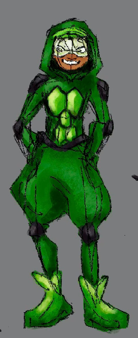
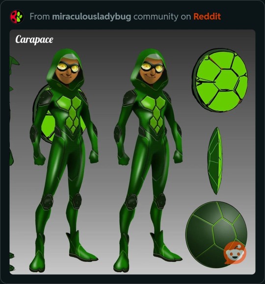
After that, is Carapace. I had an idea for him from the start because I felt like his in-show design just doesn't match his personality... I couldn't make his outfit all loose because I wanted to stick generally to the miraculous suit formula, but I feel like 'skin tight suit' just isn't his vibe. So he has a kind of hammer pants situation.
I think they capture Carapace's b-boy ninja turtle vibe while still looking like a miraculous outfit. Though I decided later that I wanted the pants to be a lighter color for contrast and the visor to be white (to tie in that Rena Rouge white).
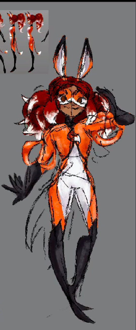
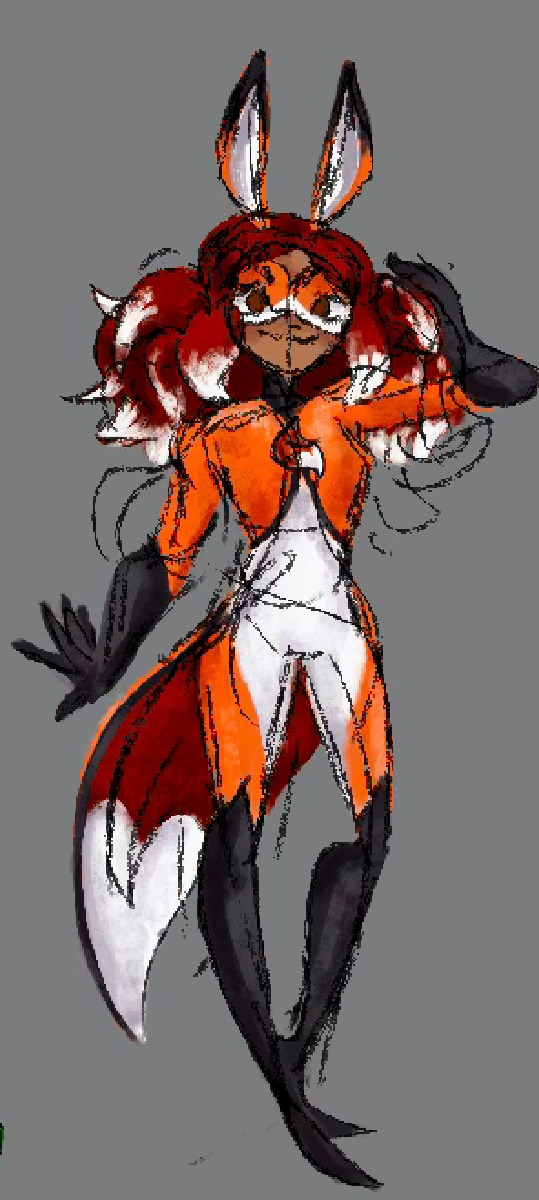
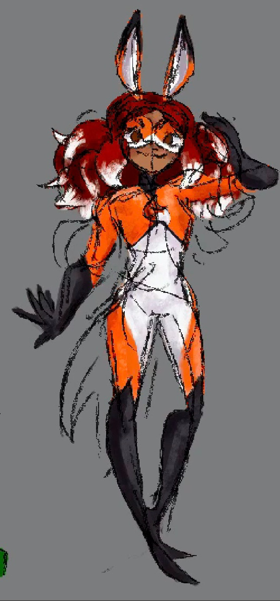
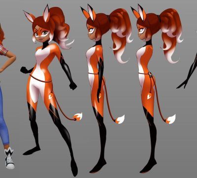
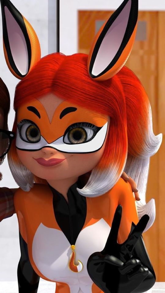

Lastly is Miss Rena! Something that bothered me (back on the similarities to Chloe) was that they both have ponytails (yes I know I'm crazy). Even though they have very different textures I just wanted each of them to be distinct from each other. So I put her hair down and just dramatized her regular hairstyle.
Also her and Queen Bee both have black gloves to their upper arms, which, you guessed it, bothered me. So I shortened Rena's to just reach her elbow.
I wanted her to look like a magic-man, her illusion powers evoke a showmanship energy to me. I imagine her and Cat Noir are quite the dramatic theater kid-esque duo.
So, for drama I tried some flowy arm bits, which I think ended up just looking a little strange, so I'll pocket that idea for something else. Then, I tried to add her coattail from the show, but it ended up looking a little frumpy, not the drama I wanted.
I ended up making her coat more triangular in the front, to give off the vibe of a magician's vest, and changed it to solider red/orange double coattails, which I think makes her more magic-man-ish. And I think the white ends made it too busy.

So those are my hero designs! I'm still working out Hawkmoth and Mayura, esp Hawkmoth because I am not good at drawing masculine older men...
If y'all want LESS of the artistic process let a girl know lol! I know some ppl like it but this is very long,,, all my drawings will not have text this long! thx for reading if you did tho xx
#miraculous au#miraculous fanart#miraculous fandom#miraculous ladybug#miraculoustalesofladybugandcatnoir#miraculous lb#cat noir#chat noir#marinette dupain cheng#adrien agreste#ml fanart#miraculous#miraculous ladybug fanart#carapace#rena rouge#miraculous art#queen bee#chloe bourgeois#alya cesaire#nino lahiffe#ml ladybug#ladybug and chat noir#tales of ladybug and cat noir#ladybug#bubsmiraculousau
316 notes
·
View notes
Text
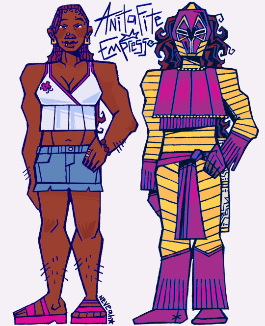
she needs to fight!!! here’s my redesign for anita :)
i felt like something was lacking in her costume and i wanted to take a stab at redesigning her so! here she is!
explanation will be under the cut :]
when i started this redesign, i knew i wanted to incorporate her cultural background a lot more. she is implied (i don’t believe they outright specify it) to practice specifically haitian voodou & both of my parents practice african traditional religions. so, i talked to my dad about different ways to connect that to her costume and he brought up west african masquerades.
i was sent many, many videos (thank u dad 🫡) of masquerades as well as celebrations of junkanoo, which is a festival that started in north america rooted in west african festival traditions & they both have bright colors & masks that i felt really lent itself to the empress costume


i knew i wanted to keep her general silhouette, but i tweaked it to better suit the masquerade & festival costumes e.g. her glove and boot cuffs being flipped.

the stripes were a common aspect, and i based the masks more on junkanoo than masquerades just because of the important meanings behind masquerading that i am not qualified to apply to a dc comics characters ajhdjsja. i also made her under armor a lot more yellow to have less people confuse it as her skin? which i’ve seen a few times.
speaking of, now onto her actual appearance. i think anita has a very cute design, but like many non-white comic characters , it is a bit of a struggle. but! that’s an easy fix.
first, i gave her knotless french curl braids, bc all the black vigilantes i draw have to have protective hairstyles apparently lmao. but also it’s a nice mix of the braids she wears in yj sometimes and her usual hair. yippee


(+ i just made her empress hair a wig, bc it’s very much more convenient & plays into the festival costume aspect)
and, finally, i made her skin tone a lot deeper bc, especially compared to her white teammates, her skin is super gray 😭 which is common for a lot of brown comic characters unfortunately. i could’ve just made her og skintone more saturated but ¯\_(ツ)_/¯ it’s a free country.

and that’s a wrap :^) ty to anyone who actually sat through my rambling! if anything came off unclear i’ve open to questions about it. bring back anita fite 2k24
#anita fite#empress dc#bart (as in bug art)#ANITA I MISS U#i hope my explaination makes sense 😭 me and my dad had like a 2 hour convo about it#i tried to tie the cultural stuff with comic book camp#the skintight like. gold-ish gray was killing meeee#fusha and yellow for the win#young justice#young just us#yj98#dc#dc comics#detective comics
400 notes
·
View notes
Text
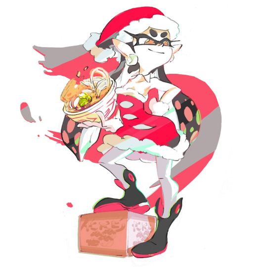
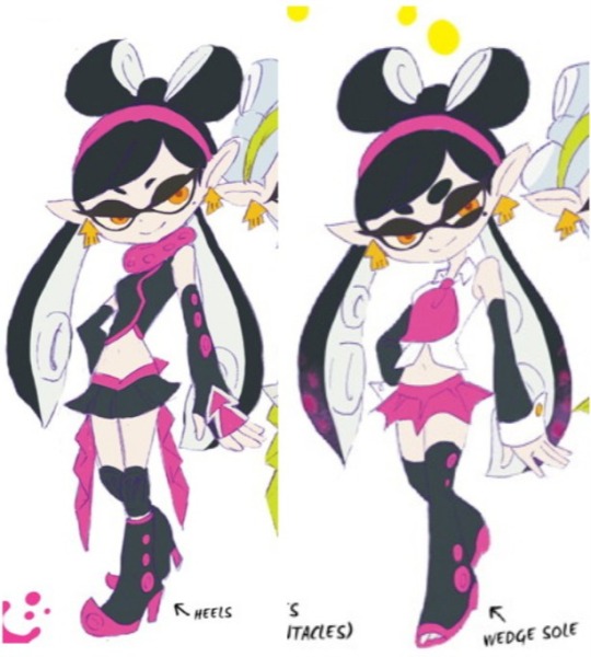
Rating all of Callie's Outfits!!!
I'm bored so i decided to go through most of Callie's different looks, including most from concept art and promotional material, and rate them all on a scale of 1-10.
1 = trash
2 = very bad
3 = bad
4 = below average
5 = mixed
6 = decent
7 = good
8 = great
9 = amazing
10 = perfect
Now I'm not an expert on character design or fashion so i may not have the most insightful and """"objective"""" takes or whatever, but I'm just going off how i feel about the looks. This is very subjective and if you disagree then that's perfectly fine. I also won't be including EVERY SINGLE outfit in every piece of concept art, some of it are just variants of pre existing outfits (Haicalive Kyoto Mix golden outfit, concept art of her squid sisters outfit but with a different pattern) and some are just concepts for the Squid Sisters in general and not "Callie outfits." (Splatoon 1 has a lot of these and uh... they are quite interesting... recommend looking at it on Inkipedia. Very.... interesting indeed.)
Anyways, let's get into it. (Images from Inkipedia)
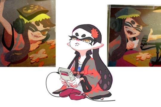
Splatoon 1 - Squid Sisters Outfit
Rating: 10/10
I think there's a clear reason as to why this outfit is so damn iconic. It's simple yet effective, it stands apart from Marie's outfit while still maintaining the theme of a "j-pop idol." It has a very strong silhouette, eye catching magentas that are complemented by the blue reflective parts on the outfit, and those pumpkin pants fit Callie's personality so insanely well. She looks absolutely adorable and stunning in that outfit.
Splatoon 1 - Young Callie
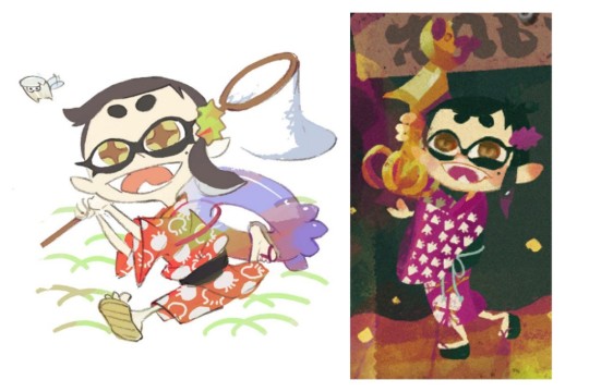
Rating: 10/10
Do i even need to say anything? LOOK AT HER! SHES SO CUTEEEEE!!!!!! UGHHHHHHHHAAAAAAA!!!!!! IM GONNA FUCKING EXPLODE FROM THE SHEER AMOUNT OF CUTENESS I'M SEEING!!! LOOK AT HER LITTLE KIMONO! AHHHHHH!!!!!
Splatoon 1 - Red Fox Splatfest
Rating 8/10
It's Callie wearing a Christmas hat and a nice red dress. What's not to love?
Splatoon 1 - Fancy Dress
Rating: 9/10
I literally cannot think of a single flaw or dislike about this dress. Maybe the dress is a bit simple? But that's me REALLY pushing it. It's still so fucking beautiful. SHE IS SO BEAUTIFUL! I NEEEEDDD a 3D model of this ASAP!
Splatoon 1 - Concept Art 1
Rating: 7/10
I mean, it's pretty good but it's not outstanding you know? Love the heels, the fabric at the back of her waist on the first image, the batwing like skirt on the second one. It definitely has a unique vibe to it I'll give it that. There's a decent amount of good things here, however i don't know how to feel about THAT short of a skirt on Callie. She was 17 at the beginning of Splatoon 1 and some of the dance moves she does involve moving her legs a lot so.... it would have... you know.... issues.... yeahhhh.... I would love to see this outfit get adapted but with some tweaks like maybe a slightly longer skirt, maybe higher heels and leggings that go up more her legs? Maybe her arm wraps on the left image could get rid of the dots and keep the squid head pattern? It's a pretty good outfit and has a unique feel to it, but it needs some tweaks.
Splatoon 1 - Concept Art 2
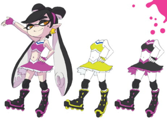
Rating 6/10
The roller skates are actually such an amazing idea for Callie and work well for her, they need to appear on a 3d model, I WANNA SEE CALLIE SKATING AROUND! COME ON! Anyways, this outfit is kinda... okay. The black and pink variant looks the best out of the three in my opinion but idk man, it's kind of just a regular cheerleading outfit. The roller skates give this like 6 points alone lmao.
Splatoon 1 - Concept Art 3

Rating: 8/10
This outfit with a few minor tweaks could easily become a 10/10 to be honest. If they either went fully black and white, or changed the white lines on the dress and shoulders to magenta it would look outstanding! Love the flashy sneakers too, it gives the impression that Callie can be both elegant and energetic, which, she is. Also if she had a more fancy piece of headgear that matched the fancy looking dress it would help as well.
Splatoon 2 - Hypno / Octo Callie
Rating: 8/10
I'm gonna be honest with y'all, i used to not like this outfit for Callie. People saw this outfit and said it was fire and amazing, however when i saw it, i saw all the misconceptions, all the misinformation, ruining such an interesting arc, boiling it down to "Callie was kidnapped, overpowered and then brainwashed with evil brain warping shades, being used by the Octarians as some slave and being branded with a tattoo." This outfit made me feel icky and really uncomfortable. Seeing a character i love being boiled down to some abused helpless victim when it's far from what truly happened.
However, after giving another look at it, after taking in all the information and the amount of time i spent trying to piece together her arc and all the events that actually took place beforehand. I gotta say, this outfit is growing a place in my heart. The colors are so strong in this and i can't exactly put my finger as to why. Turning the 3 cut pattern on it's side and putting it on her chest makes her look more "mature" i would say as well. And of course, the shades, they are iconic for a reason. The way the outfit sort of flows from top to bottom is really well done. But I think it kinda needs a few tweaks to make it flow better though, maybe cover up her arms with that leathery material on her chest, make that sparkly material on her legs flow up onto her midriff instead of having an exposed tummy would be kinda sick in my opinion.
It's honestly a damn great interpretation of an "Evil Callie." In the artbook they said that they wanted to make Callie more mature looking and i think they did a good job at it, but it needs some things added to it to help it flow better in my opinion. Also... Don't know how to feel about her underwear just poking out of her hips.... Like damn girl PULL UP DEM SHORTS!
Splatoon 2 - Tentakeel Outpost / Agent 1 Outfit
Rating 7/10
This outfit is just really cute and comfy looking, which makes sense because it's meant to be Callie in a more causal getup and it looks really adorable and warm. It has had a variant in Splatoon 1 where she has pink leggings and a sleeveless design but it has the same rating from me to be honest. The little star on the beanie too is awesome too, it's just such a nice little thing they added and it complements her lovely golden eyes.... so cute.... uh... moving on...
Splatoon 2 - Concept Art 1
Rating: 6/10
This one is kinda tricky for me to rate because i see what they were going for but... I think it needs some tweaks and a few changes. I think it would be cool to see the glowing pinkish red leggings go all over her body like a skin tight suit up to her shoulders and it would look pretty damn sick i feel. I love the long gloves, the heels, the color scheme is very interesting as well. Overall, it's decent but i think it needs some improvements.
Splatoon 2 - Concept Art 2
Rating: 8/10
I can totally imagine Callie chilling out in the beach bases in Octo Canyon with this on. I like how the boots and the bikini match her hair too in color. The fuzzy pink coat is so damn sick too, i love it.
Splatoon 2 - Concept Art 3
Rating: 2/10
No... Just straight up, no. You're already giving some people weird and icky implications with the final Hypno Callie design, but this just.... no man.... HOWEVER! The swirly eyes? Good addition, a little generic for a character under hypnosis but i wish they kept the swirly eyes. It would have furthered pushed the idea that Callie is not herself and has descended into villainy and given into the darkness in her head. But at least we got mods! (Look at frequent.squidsisters on instagram to see what i'm talking about. You won't regret it.)
Splatoon 2 - Concept Art 4
Rating: 6/10 (sorry for the low quality image i couldn't find a good image of this outfit anywhere)
Just like concept art 1, it's alright, it doesn't help that there isn't a clear enough image of this outfit but, i do love the transparent fabric on her dress? skirt? idk. But it looks nice. Still though the outfit looks a little plain for someone like Callie however it's got a nice color palette.
Splatoon 2 - 1st Anniversary
Rating: 10/10
I don't care what you say, i am the number 1 defender of this outfit, the fucking goofy socks, the blues and reds on her leggings and... bra? Leotard? Is she wearing a leotard under that? (I don't know anything on women's clothing I'm so sorry please don't hurt me....) Her pink lipstick, the necklace, IT'S SO DAMN GOOD! I NEED MORE OF THIS OUTFIT! NOW! I WANT A 3D MODEL TOO! GIVE IT TO ME! NOW!
Also this is the first time Callie has had one of her tentacles in front of her face which comes back later in the next game....
Splatoon 2 - Smash Bros. Splatfest
Rating: 7/10
She do be rocking dem shoes tho i gotta admit. It's good. i don't have much to say. The Smash Bros. earrings fucking rule as well, that's worth 6 points alone.
Splatoon 2 - Squidmas 2019

Rating: 5/10
Eh. It's okay, not really the most "Squidmas" thing you can wear but. The artwork is cute at least. The gang just chilling out, taking a picture, very cute.
Splatoon 2 - Splatoween 2020
Rating: 10/10
The fact that we never got a 3D model of this outfit is a fucking crime in it of itself. The headwear, the web like design on her neck and head, the lipstick, the fingertips, the gothic dress.... those... red eyes.....
She looks so damn hot, I'm sorry but this look is doing things to me that my lawyers are advising me NOT to elaborate on....
Splatoon 2 - Final Fest
Rating 7/10
I decided to break my rule on not covering variants because i really wanted to talk about this look, the gold colors used on this outfit are so damn good and i really cannot describe exactly why, Pearl's crown is such a lovely addition too, i fucking adore it. I can't give this anything higher than a 7 because its just a recolour and a crown and thats it... I really do wish they gave Callie a more unique "chaotic" look to her iconic outfit to match the theme better, but oh well. There's always next time.... which we will get to...
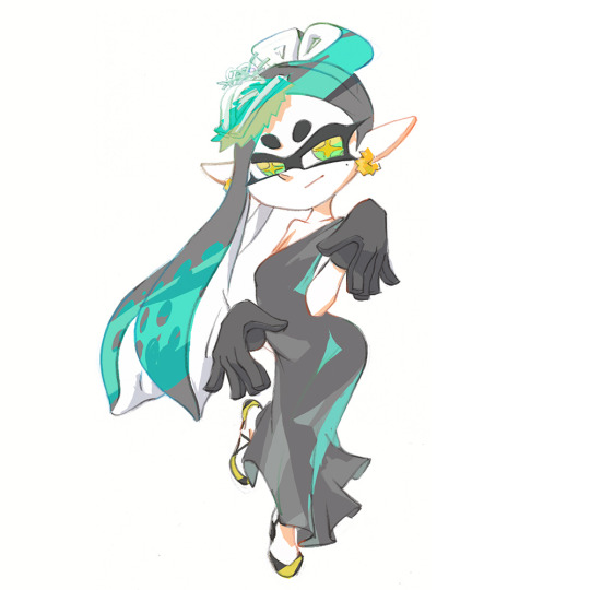
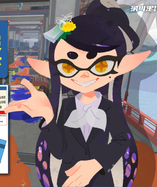
Splatoon 3 - Alterna Outfit
Rating: 10/10
When i tell you that this is my favorite Callie look, ever, do NOT take that lightly.
This outfit, in my personal opinion, is perfection. It combines all the different aspects of Callie's previous major designs into one perfect package. It takes the general shape and silhouette of Splatoon 1 Callie and mixes it with Hypno Callie's leathery and mature appearance, giving us an outfit that shows Callie's class and excitable nature. It's a mature and refined outfit, much like how Callie is in Splatoon 3.
I mean it's hard to fuck up an outfit that's mainly in black and white and thankfully they didn't. The ONLY thing i can somewhat see criticism for is the color choice, but thankfully, we got mods to give her the magenta back and it looks beautiful. I LOVE the silver aspects of the outfit too like the soles of the boots, the silver bandolier across her shoulder and the silver choker. And i like an outfit that has a choker... It does things to me... UM! ANYWAYS! YEAH PERFECT OUTFIT! UH! TOTALLY HAVEN'T TAKEN 100s OF PHOTOS OF HER... YEP! MHM.......
Splatoon 1-3 Pokemon Red Outfit
Rating: 6/10
I decided to put this here because this outfit appears in both Splatoon 1 in Splatfest art as well as in one of the Sunken Scrolls in Splatoon 3. It's a pretty cute outfit, i don't have any strong feelings towards it, it looks nice.
Splatoon 3 - Splatoween

Rating: 9/10
I prefer the other Splatoween outfit that appears in Splatoon 2's artwork but, this is still fucking awesome. She looks like a cute little pumpkin! SHES SO CUTE! The fucking red eyes too oh my GODDDDD!!!! The stitching face paint too!?! Oh man. My ONLY criticism is that the headpiece is too plain. If it was a Jack-o'-lantern or skull or something, it would easily get a 10/10 for sure. But overall, Callie looks like a cute little pumpkin and i wanna eat her up!..............
....not... not in that way tho get your mind out of the gutter-
Splatoon 3 - FrostyFest

Rating: 8/10
A damn great outfit for Callie that makes her look all nice and snuggly. She reminds me a lot of coffee for some reason and just by looking at her I'm craving for a nice cup of coffee. Also the best part of this outfit is that HER NOSE IS RED BECAUSE SHE'S COLD AWWW!! SOMEONE GIVE HER A HOT CHOCOLATE! NOW!
Splatoon 3 - Springfest
Rating: 9/10
This is the most girlypop Callie has ever been. The striped leggings, the eggshell head piece is fucking cute. I don't have any real complaints with this to be honest, maybe its a bit TOO colorful because of the different colored reflections on her body but, that's me REALLY pushing it there. This is such a cute outfit for her. The little face paint too omg....
Splatoon 3 - Summer Nights
Rating: 10/10
You guys know that one image of the monkey staring at the mid section of a woman and it says "neuron activation"? That's literally me. They gave Callie a new outfit that not only looks fantastic with such a great set of colors, shoes, head piece and zippers. But it's also designed to where it makes an outline on the underside of her belly.... nintendo... WHY YOU GOTTA DO THIS TO ME!?!?! I try to be all family friendly and level headed and shit but OH MY GOD! You're activating the primal urges in my body, you're making me go fucking feral with this design. YOU CAN'T JUST DO THIS TO ME! YOU'RE CHEATING! You can't just highlight her fucking fupa with that short dress!!!!!! AHHHHHHHHHHH!!!!!! WHY NINTENDO WHYYY!!!! God I'm not ready for the dances moves where she starts spinning around and bending over- UH....
....Anyways, yeah good outfit, love it. The hair? Idk how to feel yet. That's like the one area that isn't turning me on- I MEAN! THE ONE AREA THAT I MAY OR MAY NOT LIKE! AHAHAHA!!!!!!.....
I'm moving on before my made up lawyers yell at me-
Splatoon 3 - News Anchor Outfit
Rating: 10/10
I mean guys. Come on. What do you want me to say about this outfit? It's Callie in a suit. DO I NEED TO EXPLAIN WHY IT'S SO GOOD?!?! WHY DO YOU THINK EVERY SINGLE SPLATOON ARTIST ON THE PLANET MADE ART OF THIS!??! The only thing that i wanna talk about is, what's below Callie's waist? Is it a pencil skirt or pants? This is important information for me. I'm on teams pants because it makes sense for Callie's energetic personality, all the dresses she's worn have either been real short or loose. I don't think she would wear a real tight skirt that restricts her legs but who knows. NINTENDO YOU BETTER ANSWER THIS OR I SWEAR TO GOD-
Splatoon 3 - Concept Art 1
Rating: 7/10
We don't have a lot to go off when it comes to this concept art as it's pretty undetailed and sketchy looking, but looking at what they were trying to go for and giving Callie a post-apocalyptic look, it looks pretty good. Love the puffy sleeves, the gas mask is pretty awesome and the sort of sporty shorts? tights? Fit Callie as well. Don't have much to say other than that.
Splatoon 3 - Concept Art 2
Rating: 8/10
Now this? This is great. The ragged cape, the pants, the boots, the shirt, the fucking shades! This is an awesome look for her and it makes you wonder what kind of story mode were they originally going for. What kind of plans did they have for ROTM? Was it going to be set in the crater instead of Alterna? Hmm...
I would love to see someone give detail to this and make it a full piece of art to bring out it's full potential.
Splatoon 3 - Grand Festival Outfit.

Rating: 9/10
This outfit to me, is ALMOST perfect. She looks like a pretty princess with that cute dress on. I LOVEEEE her spike headdress, the shoes and the pearlescent hair color. However, i do wish there was just more color on the outfit in general, i get why they decided to go with this look because they wanted to have a color scheme that would unify all of the idols together. But, do wish there was some hints of magenta to break up the dull beige, or her iconic 3 squid stripe design she has on her Squid Sisters outfit, oh well!
So that is it for my ratings of MOST of Callie's different looks that she has had over the past 9 years. Callie is such a fashionable character and has rarely had any BAD outfits aside from one that was in concept art anyways.
Hoped you enjoyed my ratings and ramblings (and mildly horny incriminating talkings...) about this squid lady that i love so... so much... maybe a bit too much.... i need help...
#splatoon#callie cuttlefish#callie splatoon#splatoon 2#splatoon 3#outfit#hypno callie#octo callie#long post#rambles#shes so pretty#shes so hot#i love her#i want her#i need her#aaaaaaaaaaaaaa#shes so special to me
66 notes
·
View notes
Text
Angel Dust, character redone
I've been working on a full Hellaverse rewrite with my beloved @hoverboards-and-dragons, and here's the first of the characters I've worked on!
To start off with, Angel Dust! He's been renamed to Stardust, because for a show that features angels as characters, it's a bit odd to call another character by the name Angel. It's confusing, and when writing the fics for this it'll be a lot easier. Plus, the name Stardust just makes more sense as a stage name.
He's nicknamed Dusty by Cherri because if you've ever met an aussie you'd know any name with the word 'dust' in any capacity defaults their name to Dusty. It's the rules, I would know, I'm an aussie myself lmao.
As for his genuine name, it's still under works of what will happen there. But! Onto the design:

He's changed quite a bit! Still trying to keep the feminine aspects of his stage appeal, but adding a bit more to it!
Stardust is a witty, almost arrogant character. He has a habit of only taking himself seriously. Quick to poke fun at others but will become defensive if the same prodding is given back to him. Is significantly less self-advertising than the original, doesn't go on long rants about how desirable he is. Still forms quick interests in men that aren't particularly healthy for him, after all, his natural state is flirting, for better or worse.
There are other elements to him that will be explored in other posts, but a big thing to point out is his connection to femininity will be explored, as he starts with only really viewing it through a hypersexualised lens for his acting. Wants it to be more but doesn't know how to make it more, which will be tied to his character arc.
His design is to try and get a more genuine connection to the industry he works in, looking like more than just a costume. Gold accents signature to those who work for Val.
His fur is entirely dyed! Those are not natural colours or markings! He has to go through every time and redo it all, everything is made appealing and good to look at for the branding and show purposes. He doesn't have natural star and heart-shaped markings. His true patterning is a lot more like a real spider, rougher and less refined. I'll work on a non-dyed design eventually, but this is what I have for now.
All the characters are shorter than they are in the show, but Stardust is still one of the taller members of the cast.
He still has his son Fat Nuggets! And will be shown more clearly caring for him throughout the story. He also wears a friendship bracelet that matches with Cherri, since the two of them are inseparable besties. His dynamics with the other characters is still to be refined. Though his dynamic with redesigned Vaggie will be more akin to what they had in the pilot, but with minor tweaks that we're still figuring out.
His character is exploring the sex industry from a perspective of someone who doesn't want to be there. He enjoys the action, but it's not the industry he wants to be in. He is surrounded by characters who do genuinely want to be there, his coworkers fitting comfortably into the industry they chose, and he is intended as a contrast, especially with the exploration of his toxic "loving" dynamic with Val.


There will be more to discuss with him at a later point, but that's the basic rundown for him!
#homecoming-verse#hazbin angel dust#homecoming stardust#homecoming fat nuggets#hazbin hotel#hazbin hotel redesign
19 notes
·
View notes
Note
Is ragathas design like, inspired or did you make her own design by mind?
(Generally asking since I have my chance lmao)
And also- do they represent anything at all? Like the characters
Do they represent anything or like, have a hidden meaning behind them?
i keep the references of the designs and Ragatha's was this specific ragdoll I found

No reason other than the fact that It fit what I was going for-- the kind of ragdoll a little girl would set up in a tea party-- which is the entire vibe I was going for Ragatha.
I just made the dress blue to stay true to her original color palette... though I tweaked it from indigo to a softer sky-blue, the same way Pomni went from a red+blue to a magenta+teal...
this was so the characters still looked the same, yet off.. and also make them stand out from their original design, as Pomni looked the exact same to me with the blue+red palette.
136 notes
·
View notes
Note
Hey there! Let me just start by saying that I love your work on Lore Rekindled. I've been super into Mythologies ever since I was like 6 (so that makes it nearly 20 years of constant adoration lmao), and your retelling of the Persephone myth is honestly one of the best ones I've seen so far. Which brings me to my question: I was wondering whether you would ever like to turn rekindled into a wholly original project. Perhaps after changing character designs and tweaking some details?
Keep up the great work and have a lovely day!
Thanks so much! I'm so glad it's resonating with people looking for a more grounded approach. That was pretty much half of my goal, I wanted to try and expand on the more creative interpretations Rachel started with (such as the modern setting) but actually tighten the worldbuilding and keep it more on theme with the original myths. So I'm always happy to hear from y'all that it's accomplishing that exactly as I had hoped :)
I've had people ask me that question about making it a more original thing, and I have considered it just for the sake of like, "making something my own", but at this point if I did that I'd have to completely redraw Rekindled from scratch and I don't know if I have the energy or strength to do that LOL (I'm already infected by the redrawing brainworms on my original stuff). And it would defeat the point of why I started Rekindled in the first place - to bring closure to myself and others who loved LO in the beginning and saw all the potential it had but never really delivered on. To remove it from the LO stylization would make it more 'original and unique' but would also remove it from its original purpose.
That said, I am hoping to do some other adaptions of Greek myth stories that were either poorly done by LO or not covered at all after Rekindled is done, so I'm considering doing a more original interpretation separated from the LO retelling for those, as they wouldn't necessarily depend on the H x P retelling that Rachel tried to accomplish. That way I can sorta try and have my cake and eat it too LOL But we'll see! I gotta get through Rekindled first :' )
57 notes
·
View notes
Text

“These people seriously aren’t getting it.”
It's Blue! Blue in the Slime Rancher AU! Took me long enough to get to him, but he's here now--and he may or may not be covered in water. Posing is my worst enemy, lemme tell ya. I have two different versions of the same outfit just because I struggled with posing him in character.
He takes some obvious cues from the puddle slimes, but rest assured he's still the same Blue we probably know and love. And by that I mean he's still got a temper. Puddle slimes could never. I also intended for him to have some saber slime inspiration in there as well, but it mostly just manifests as really sharp teeth. Might tweak that in the future.
As per usual, more notes below the cut! :D
+ Blue (and Green) were the last to show up on the shared ranch. Despite arriving together, Blue and Green had only met right before going into stasis sleep on the shuttle. It was just more convenient to send them together.
This resulted in the two being closer to each other in the beginning, though Blue would heavily deny it. Green naturally just gravitated towards Blue as the only other new person there.
+ Speaking of Green, it was his idea for Blue to build an area of his own attached to the mini-Moss Blanket Green was working on. Kinda like a neighbor's situation. Except they still lived together, and Blue was refusing to acknowledge their friendship at that point.
+ Blue is one of the few people fond of the kookadoba fruit. At some point, once he arrives, Ogden (an in-game NPC) trades a few to the Rainbow Ranch through the Ranch Exchange, and Blue ends up demanding to know where to find them.
Blue and Ogden both explore The Wilds in pursuit of the kookadoba fruit, up until Ogden eventually gets to the point where it's too much for him, so a deal is opened between them. Blue continues to collect the fruit, and half of what he finds is traded to Ogden in exchange for spicy tofu. These two are unlikely friends.
+ Blue is the only one who actually knows how to cook, so keeping the others from starving falls to him. It starts out begrudgingly, like, "You guys live like this?? Here, let me show you what you're missing out on so you can cry about it." And then it just goes from there.
Red and Shadow may or may not have laid the praise on thick to keep him cooking for them, but shh, he doesn't have to know. He'll fight anyone who goes into the kitchen now anyway, so clearly, it can't be helped.
+ He has quite a few puddle slimes. They just naturally gravitate towards him when he's nearby, and he's not able to turn them away no matter what he says. Shadow has dubbed him, "The Puddle King," and regularly refers to him that way when talking about him on stream.
Puddles slimes are what got Blue to actually consider staying on the ranch. They need meticulous care and attention, but with Vio's help, he's pretty much perfected the art of taking care of them.
+ Blue only wears one glove so he can make contact with his slimes directly. They respond better that way and rough fabric stresses them out. From what he's discovered, they like smooth textures, like skin.
+ He tries so hard to pretend he doesn't care about the others, but he's not fooling anyone. He fistfought a tarr once because it was trying to attack Shadow (influences will be influences lmao), and that's not to mention all the times he's patched up Red after an explosion, or dragged Vio out of his lab to eat or sleep.
Green teases him relentlessly about it.
+ He doesn't talk much about his family, but from what he has said, the others get the vibe he doesn't like them. All they know is that he's out there with them because of some deal regarding inheritance. The details are unknown, and he'd like to leave it that way.
(Bonus: here's that alternate pose I was talking about. You can't see the little bubble keychain or his pouch ((full of medical supplies and one rubber duck)), but they are still intended to be there.)

(His design might be subject to change, I'm not sure how happy I actually am with it yet.)
#the king of puddle slime#and the return of shorts-all-year-around blue!!#four swords#blue link#the other's are mentioned#green x blue x red x vio x shadow#rambling#slime rancher au
15 notes
·
View notes
Text

dunmeshi au for my twst ocs bc I fell head first in the dungeon and got brain damage
[edit: a whole wall of text under the cut]
ok so this is set in the dunmeshi world but it's a separate story, unrelated to the main plot and characters
Shipwreck Cove is a dungeon on a cliff by the sea, near a coastal town. it's impossible to reach it by sea, as it's surrounded by constant whirlpools, the only way to get in is by climbing to the highest point of the cliff
great part of it's inner structure is submerged or surrounded by water, but it's still frequented by many adventurers bc the water that flows to the upper levels seems to have slight curative properties. legend says the water at the heart of the dungeon can heal incurable illnesses or even grant eternal life
🦑 Morgan (gnome) has been lord of the dungeon for something around ten years. his original wish is a secret
he was once an adventurer. he's an experienced mage both at healing magic and offensive spells (and has also studied the darks in secret), but his weak legs slowed down the party, who had no qualms in letting him know so, either by reproaching him or straight up letting him fall behind
one day, angry and frustrated, Morgan abandoned his party and ventured deeper into the dungeon by himself. by the time he noticed, he had reached the deepest level and, well, things happened
Morgan has severe abandonment issues. he created the quaintest little dungeon to lock himself in with his close circle. it was a beautiful and safe place, so that people could come and go at their leisure
soon enough, Morgan started feeling like people went more than they came back, so he started tweaking the dungeon bit by bit to discourage people from roaming. changing pathways, setting traps, creating more monsters. generally making it increasingly harder to navigate, until it became practically inhabitable except for the designated safe area, which was still pretty much a little eden
his resentment was such that he would find a way to make people part of the dungeon itself
at some point, tired of his body and of his lack of power over others, he turned himself into a kraken chimera, sealed his demon in a chest immediately afterwards, and has since then lived locked up with the few people he could trap in a wrecked ship at the deepest point of the dungeon, guarded by an ever larger kraken (that's his pet that he feeds other monsters and hapless adventurers to lol)
[only one person was ever able to escape Morgan's dungeon, an elf that used to be his closest confidant. however, just as they were about to step out, Morgan stole and sealed their magic in a locket that he keeps somewhere in his ship-home
this elf lives in a secluded area further than the outskirts of town, where they welcome adventurers to whom they offer incredible things in exchange of them traveling and conquering the dungeon, with the intention of getting back their powers that way]
🐒 Blake (tallman) and 🎇 Jacob (dwarf) are a pair of adventurers that hate each other yet have been working together for years lmao
they're quite successful in their expeditions but they're insufferable, so they're always looking for new members for their party bc the previous ones got fed up and left sksksk
they arrived at Shipwreck Cove following the legend of the water of life, each of them for their own reasons
(I still haven't decided if monkey Jacob exists in this au)
⚫ Avon and ⚪ Alba are a pair of walking mushrooms that are always together. they're funny to look at from afar, but they have a nasty vibe when you get close so adventurers prefer avoiding them
Morgan enjoys watching them tussle, so when more people started going in the dungeon he made them an area where they can still be seen while being out of reach enough from strangers. they've become some sort of a local attraction
(I originally thought to make them half foot florists, but a friend came up with this idea and I thought it was so funny that I adopted it lol)
🕰️ Eri (elf) is an historian. he feels a fascination for the short lived races, so he moves to different towns for periods at a time to document the daily lives of those who live and pass through there
🌻Lucas (kobold) is more of an explorer than an adventurer. he and 🛰️ Xander (dwarf), an inventor, travel the world together looking for strange materials and objects for Xander's experiments
🐻 Björn (tallman, bear beastkin) is an adventurer from the north that likes showing off his strength. he travels from one place to another looking for new challenges and creatures to beat
⏳ Noya (gnome) a scholar with an expertise in magical artifacts, who also studies the development of magic. since he's not allowed to study the origins of magic, he has had to settle for observing and studying how it evolves in every day contexts. he occasionally crosses paths with Eri
💋 Philly (elf) is a criminal enlisted by the Canaries against his will. his crimes include theft and selling of magical artifacts, arson, and murder, but true cause of his conviction was attempting to use the dark arts to extend his tallman lover's lifespan
(he's a die hard fan of the Daltan Clan novels and all the other prisoners hate him bc it's all he ever talks about sksbsk)
🎶 Aedon (tallman) kabru without the trauma is barkeep by day and singer by night. they like watching people and trying to guess their stories
and that's it, that's all I have for now✌️😋
#dungeon meshi#twisted wonderland#twst ocs#man am I really gonna tag all of them?? yeah...#blake margolis#jacob quinn#morgan heerser#avon desrosier#alba desrosier#eri zaman#lucas alcantaura#xander mavriporta#bjorn do well#noya zareen#philly pershing#aedon katsaros#artsyness
24 notes
·
View notes
Note
YOU GET IT I mostly don't have very strong opinions on canon Shattered Glass but there are certain very specific Concepts that I'm kinda miffed aren't used anywhere in canon or fanon as far as I can find. Very fun premise to imagine aus for tho
My personal cross to bear is that sg!Hot Rod/Rodimus should be BLUE. If you have a fire character and then you need to show that a different fire character is evil then you give them BLUE FIRE... unless the SG universe completely eviscerated his ego he would NOT choose a generic ass black and purple color scheme!!!!!
They got so close when Lost Light Roddy was briefly blue and purple... they flew so high only to crash and NOT BURN because black and purple isnt the color of fire and one of his most notable character gimmicks is that hw LIGHTS HIMSELF ON FIRE!!! However I do think SG comic Roddys stupid mustache is funny as hell. That gets a pass
If this comes off as very impassioned and shouty that's because it's like ass o clock in the morning and I still haven't slept lmao. I feel very strongly abt blue evil rodimus thank you for listening to my TED talk
-v3nth
it's ok i get you. the SG autobot designs really utilize some weird ass paint-jobs that i am certainly not a fan of. maybe this isn't a popular opinion, but... I actually feel like the changes are Too drastic. I always liked the thought of Shattered Glass being just... These are the same characters, but circumstances and only very mild tweaks to their personality have led them down a different path. I know that is not the case for the ACTUAL shattered glass universe, but I find that so much more compelling....
The canon blue and purple look for Rodimus or a simple blue and black sounds dope especially if you give him blue flames, but if i'm honest, i would be fine with Rodimus having tiny touches of red/orange while mostly black, to let you know that this ain't no regular Rodimus you're fucking with, while still keeping his trademark colour. He's already got the moustache, he doesn't need many more marks to distinguish him from normal Rodimus. Maybe that's boring, i dont know.
Also, i fucking hate Ratchet's purple, green and pure white combo if i'm to be honest. on the floor crying... look what they did to my wife...
#this is not even a critique of shattered glass i just think they didn't really think much about the colours#roddy gets to keep him funny moustache though#that is such a baffling design choice that i cannot ever be mad#texty#tf hc's
14 notes
·
View notes
Text
I was really sick last night so I'm taking it easy a little bit today before I try to get any work done, so I spent a few hours putting together Mal's farmhouse in the sims 4 :3
Lots of pics ahead so it's going under a read more! Also please excuse the quality, I have to play with low graphics because my computer is a potato that's like, 7 or 8 years old at this point. There's also a lot of rambling about stuff with my character and my fic in here if that's of interest to anyone too :3
Okay... Well first of all, Them!!


Mal looking like a little trucker in that cap and vest combo lmao but it's so cute :3 I think it suits his weird 20-something year old grandpa aesthetic!! I use mostly vanilla cosmetics so Mal's hair is a bit longer than it should be and Alex's hair is a bit shorter than how I draw it but I tried to keep them mostly accurate! I think Mal looks better in terms of design just because I've made him in the sims before and had years to tweak him to how he looks here lol
Now the farmhouse...! I tried to get the layout of the house looking like I imagine it, so it'll give you a good idea of how it's supposed to be laid out in my fic :3 how I describe it to be anyway! The outside is not at all accurate besides the placement of the crops and chicken coop. Beside the house should be a river (it's the meadowlands farm in stardew and I moved the cabin to be right beside the river where the chicken coop is initially when you start!) and further down past the chicken coop and crops should be a whooole bunch of fruit trees. I envision the farm as like, having an orchard of different fruit trees as the main crop for the farm's actual income, while the chickens and other crops are more for like, self-sustaining the family. Idk if that comes across in what I'm writing but I'm kind of trying to have Mal stumble his way through learning to farm rather than having an inherent idea of what to do or detailed written instructions left by grandpa lol


The kitchen and living area are one big space :3 idk why the door to the basement turned invisible, just sims being sims I guess. But imagine a door there behind the dining table and not just an open gap in the wall lmao


The living room wall is a different color than how I've drawn it so mission failed on that one lol but it's fine! It should be a record player instead of a jukebox and there should be a landline phone on an end table near the door, but sims 4 only has so much stuff in the vanilla. RIP to my landline phones from previous sims games, I think I miss that the most 😩 nothing quite makes me as nostalgic for childhood as a landline phone in the home. Anyway!


Beside the kitchen is a hallway which leads to the bathroom and to Mal's childhood bedroom which he no longer uses. The hallway is kinda cramped but I like that, it gives a vibe of those kind of houses that have little space and try to use it all to the fullest :3 I didn't notice the bathroom floor was wet before taking the bathroom pics, you can thank Alex for that. He had just jogged and showered and I guess left a puddle 😂 messy boy!!

And Mal's childhood room is very small but just has some cutesy stuff in it. The little bed and little wooden chest are some things that kinda come up in a few chapters I wrote so I was like 👀 those are essential


The master bedroom, which was Mal's grandparents' room but he's since moved into it. I think I also describe it as having a dresser in addition to the closet so that's missing... And there should be family photos but I don't think I have anything like that with my currently installed packs. The guitar was grandpa's, but I don't think Mal knows how to play? I had some idea a few months back about Sam teaching him guitar but I'm not sure now. Feels a little too intimate for the dynamic he and Sam have/will have! Besides that, Mal's love of music has manifested in dancing and singing so I think that's a fair trade :3 but he keeps the guitar anyway for sentimental reasons! And the green bedding, as made by Emily... but you know in my head I imagine her making a huge quilt for him, so pretend like there's a big quilt on the bed too lol


Last is the basement which looks nothing like it should lol. I forgot to reinstall the laundry pack so I'm missing that... but I imagine it as having the water heater, washing machine, some wine racks, and a woodworking table. Maaaybe casks or kegs like you can have in stardew? I need to think on it :3 But it would be this shape of room at least, just a small square room under the kitchen.
And then... I played a little and I kept getting stuff that felt so true to them lol


Vigorously nodding, yeah 😄
(small nsfw mention in the following paragraph fyi)
And then some spicy ones which made me laugh because this is also accurate to how they are. They were literally just talking btw not doing any romantic interactions 😂 Mal made some bad jokes and Alex was like oughhh I can't not fuck him 😫 I haven't started posting all the horny turmoil chapters yet but you'll see eventually, he's a little bit pathetic about it lol it's cute


And of course, it wouldn't be the sims without it doing some weird buggy shit (especially sims 4 lately... these QOL patches have added some weird quirks to how townies autonomously interact with your sims lol)

Wherein grandpa died and then immediately called, as a ghost, to ask if Mal wanted his company for sympathy... Hrmmm....... 🤔 Maybe it knew that grandpa's ghost shows up from time to time in stardew valley too lol
The end 🥰 Hope you enjoyed reading...! I'm gonna play with them more another time and if anything fun happens I'll be sure to share!!
9 notes
·
View notes
Text


WOW I CAME UP WITH ANOTHER AU-
I present:
✨Invader Kwazii✨
so I’ve been watching invader zim and I was like “omg what if I made a octonauts x invader zim AU” so here it is-
Kwazii’s zim (cuz I just thought it’d be funny)
Tominnow’s gir (for funnzies, + i don’t see much Tominnow content so I thought this would be a fun opportunity.
shellington’s dib (idk it just made sense to me)
Pearl’s gaz (cuz Shell’s dib)
Paani’s just a friend of kwazii (and later on, lover.) (I couldn’t really think of a canon character equivalent for him lmao)
peso’s keef. Idk it just made sense to me.
barna and inkling = Almighty Tallest. mostly because I thought it’d be funny. Dashi’s tak maybe?
and Tweak’s skoodge maybe? still trying to decide who gets who’s role.
the first image is the first design I made for him but I changed it a little (I added more green + gave him an extra tail to look more like an alien)
I drew the first two images yesterday but just finished the third one.
I might turn this into a fanfic someday so keep ur peepers peeled >:3
just know there’s gonna be Kwazini + shellso (later on, I’ve got some shit planned in my head for how shellso happens) oh yeah and pearlanca is also a thing here . and twashi as well for funnizes.
I’m gonna start thinking of stuff + plotting the outline :) it’s probably gonna a decently long fic if I get around to writing it someday.
#invader kwazii au#octonauts#kitty giggles#octonauts fanart#octonauts au#shellington#kwazii#paani#pearl octonauts#octonauts pearl#tominnow#the octonauts#octonauts above and beyond#octonauts fandom#octonauts kwazii#kittyz scribblez
14 notes
·
View notes